Soft Autumn makeup: your shades, and how to apply them
Soft Autumn makeup asks for warmth with something dulling it - brown under the peach, olive under the green - so the face reads as one quiet range instead of a set of separate features. Sixteen finished looks across four complexions, the four steps in the order they go on, and every shade collected into one list you can shop from.
- Four steps, in order
- Four complexions
- Everyday and evening
The order you apply it in
Start here
You are a Soft Autumn. Here is what to put on.
Everything on this page follows from one fact: your hair, your skin and your eyes all sit inside a narrow band of value, and every one of them has something dulling it. There is no bright point on this face and no dark anchor either, so any product that arrives fully saturated, noticeably cool, or much darker than the rest of you becomes the only thing in the room with an opinion.
Which means the shades that work are warm, and quiet, and chosen at your own depth rather than off a poster. Getting it right is mostly a question of dose, and of putting the depth somewhere small.
Warm, muted, and matched to your own depth: every shade with something stirred into it, nothing at full strength, and the depth kept to a small area rather than spread across the face.
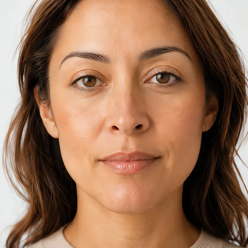

The same woman, on a medium complexion, at both ends of what this coloring carries. Notice that the loud version is deeper rather than brighter - that distinction is the page. All four complexions are in the very next section.
What is on this page
- Sixteen finished looks Four occasions at each of four complexions, with the shade named on every part of the face.
- Why these shades Four products set beside the version you probably own, and what each one does wrong.
- How to build it Base, cheeks, eyes, lips in the order they go on, with the technique for each.
- When you need more What actually changes after dark, and the four things that must not.
- How to buy it The jaw test, the words on a label worth trusting, and where your square sits on a brand grid.
- The shade list Every shade on the page at all four depths, in one block worth a screenshot.
Sixteen finished looks
Start here, because a shade name means very little until you have seen it on a face. Four occasions at each of four skin depths, and every card names the shade on every part of the face. Find the depth closest to yours and read across - from five minutes to the most this coloring will carry, which is less than most advice assumes and looks better for it.
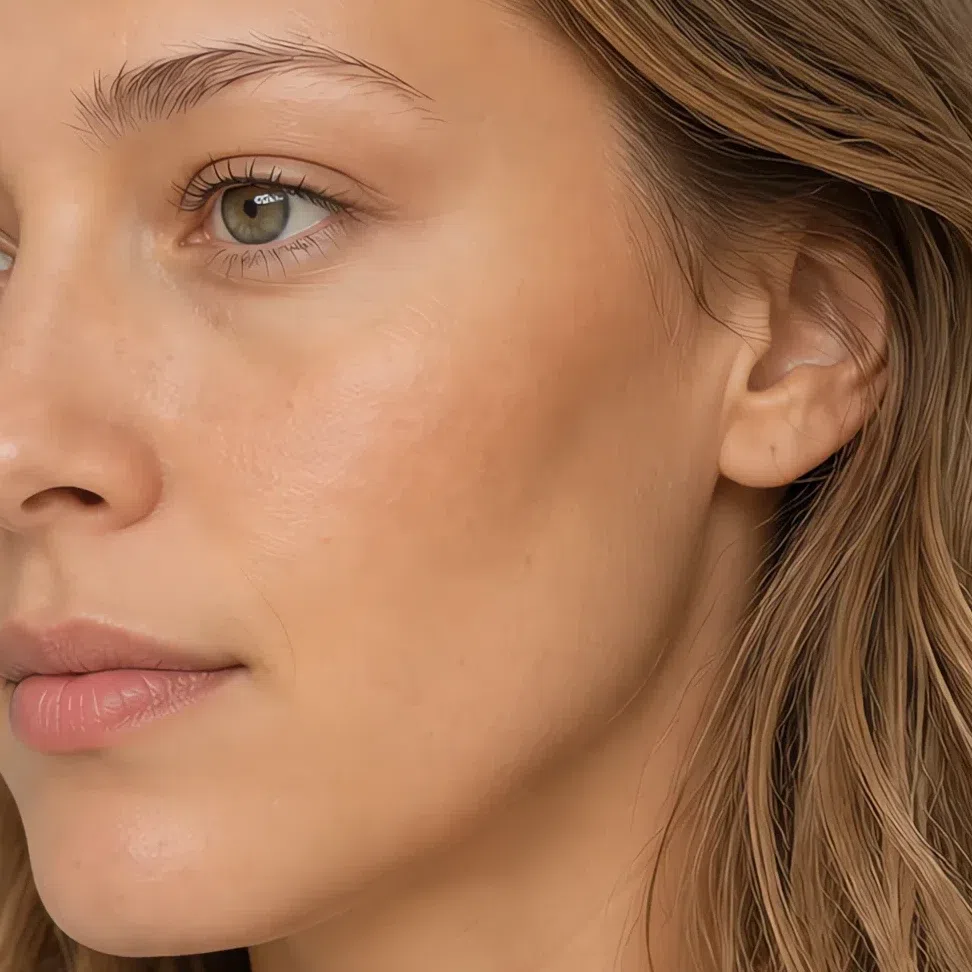
If you have fair skin:

- Base Fair - neutral-warm
- Blush Peach
- Lips Praline
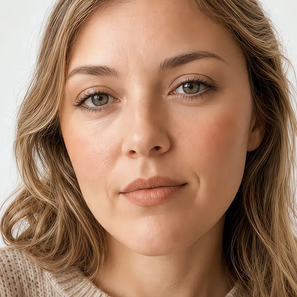
- Base Fair - neutral-warm
- Blush Peach
- Eyes Oat
- Liner Umber
- Lips Biscuit
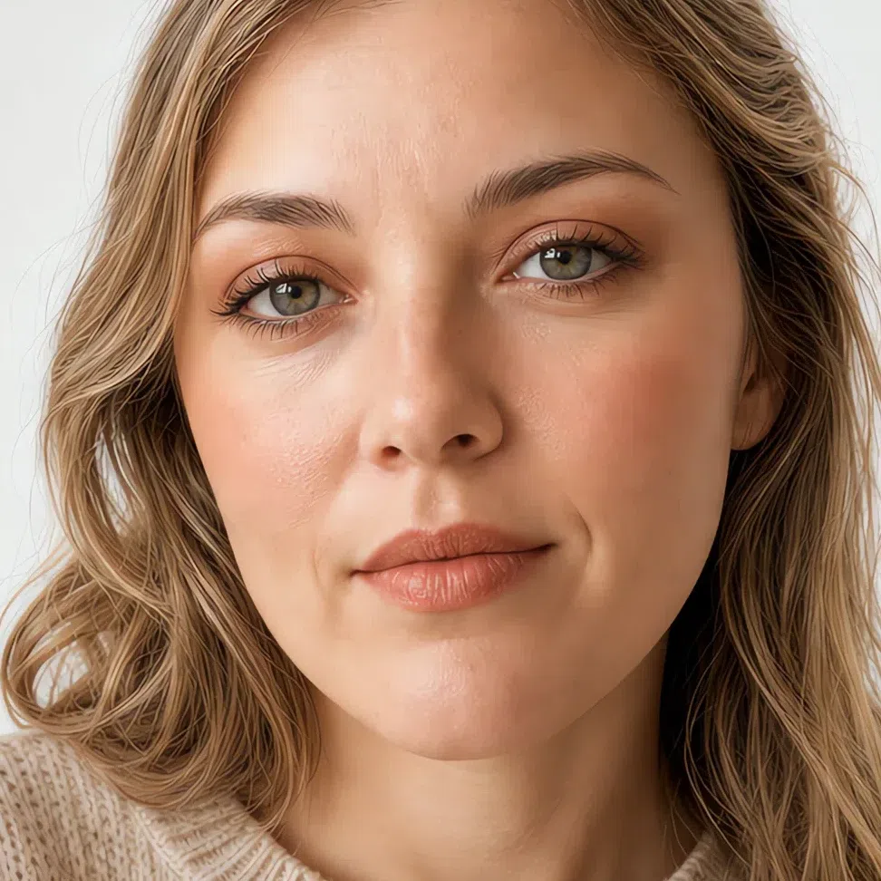
- Base Fair - neutral-warm
- Blush Melon
- Eyes Cognac shimmer
- Liner Umber
- Lips Terracotta
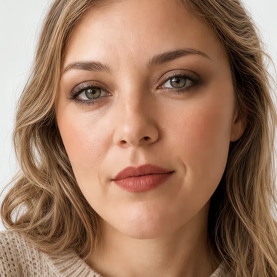
- Base Fair - neutral-warm
- Blush Clay
- Eyes Truffle
- Liner Walnut
- Lips Brick
If you have light skin:
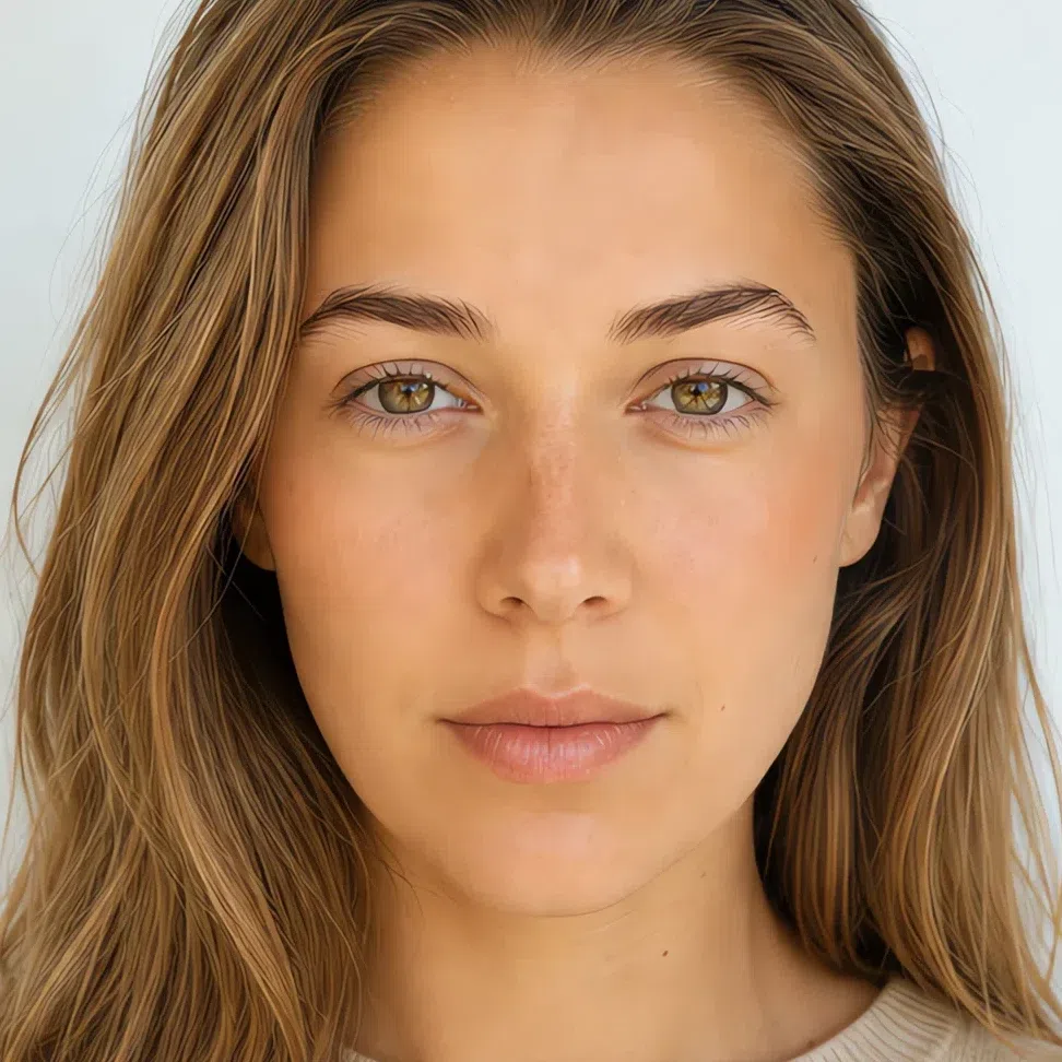
- Base Light - neutral-warm
- Blush Peach
- Lips Praline
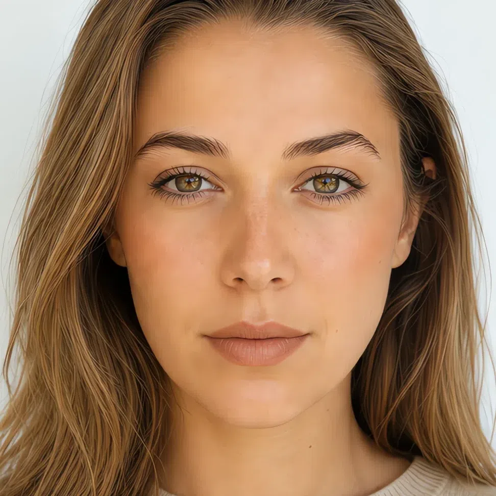
- Base Light - neutral-warm
- Blush Peach
- Eyes Oat
- Liner Umber
- Lips Biscuit
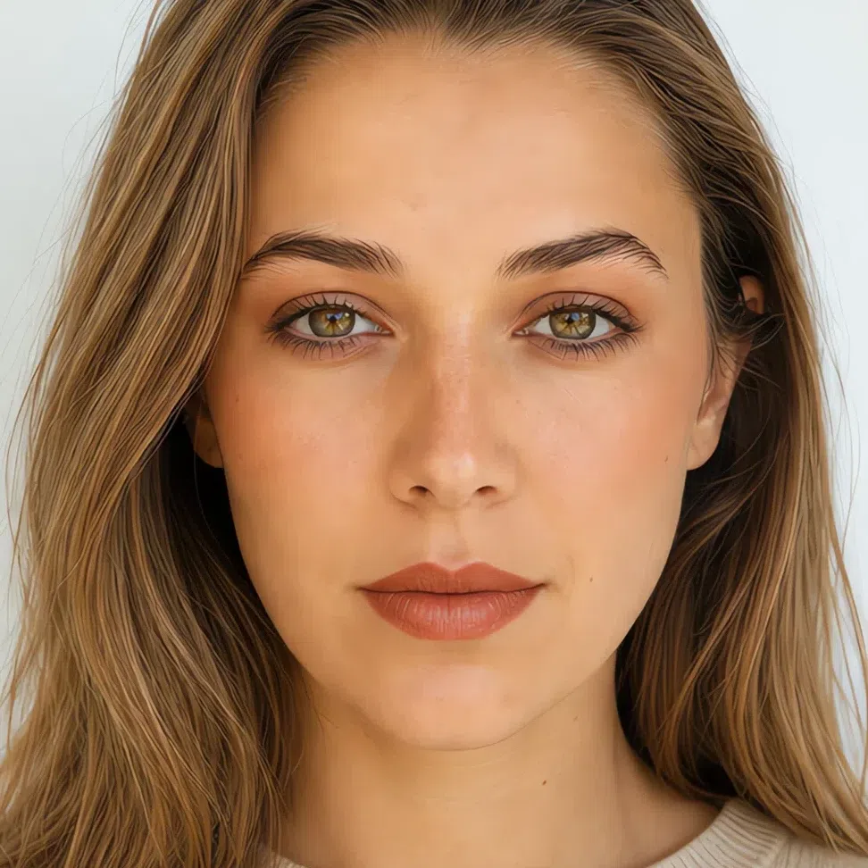
- Base Light - neutral-warm
- Blush Melon
- Eyes Cognac shimmer
- Liner Umber
- Lips Terracotta
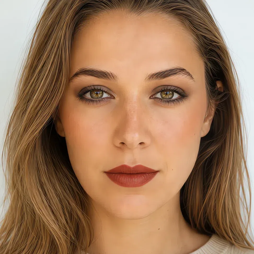
- Base Light - neutral-warm
- Blush Clay
- Eyes Truffle
- Liner Walnut
- Lips Brick
If you have medium skin:
- Base Medium - neutral-warm
- Blush Peach
- Lips Praline
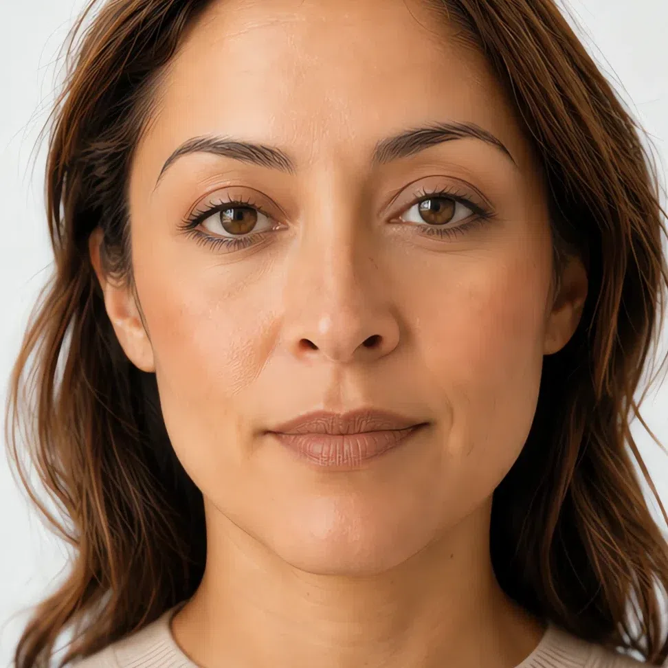
- Base Medium - neutral-warm
- Blush Peach
- Eyes Oat
- Liner Umber
- Lips Biscuit

- Base Medium - neutral-warm
- Blush Melon
- Eyes Cognac shimmer
- Liner Umber
- Lips Terracotta
- Base Medium - neutral-warm
- Blush Clay
- Eyes Truffle
- Liner Walnut
- Lips Brick
If you have deep skin:

- Base Deep - neutral-warm
- Blush Peach
- Lips Praline

- Base Deep - neutral-warm
- Blush Peach
- Eyes Oat
- Liner Umber
- Lips Biscuit

- Base Deep - neutral-warm
- Blush Melon
- Eyes Cognac shimmer
- Liner Umber
- Lips Terracotta

- Base Deep - neutral-warm
- Blush Clay
- Eyes Truffle
- Liner Walnut
- Lips Brick
Read down any column and the shade names stay exactly the same - Peach is Peach on all four complexions. What moves is the value behind the name: Peach is a soft peach on fair skin and a deep terracotta-brown on deep skin, and both of them are the same product family doing the same job. That is the opposite of how most advice is written, and it raises the question the next section answers - why these shades in particular, and not the ones already in your drawer?
Why these shades, and not the ones you own
Those sixteen faces are built out of a small number of swaps. Here are the four that carry most of the difference, each set beside the shade people with this coloring tend to own instead. Not one of the four is wrong by color family. They are wrong by saturation, by temperature, or by how much darker they are than everything around them.
Why these shades and not those
Tap a productUmber is already about as dark as anything on your face, which is all a liner has to be. True black is darker than any feature you own, so it stops reading as your lashes and starts reading as a line somebody drew along them.
Cool taupe gets bought as a neutral, and it is a neutral - a gray one. Your lid needs the brown kind. Gray on warm skin reads as the shadow under a tired eye rather than shadow placed on the lid, and it drains the green and gold flecks out of your iris on the way past.
This is the over-correction, and it is the one to watch for once somebody has told you that you are warm. The temperature is right and the dose is four times too high: a clean coral is more saturated than any part of your face, so it arrives as a circle of color rather than as a flush under the skin.
A blue-based red is the single most owned lipstick there is, and it misses on both axes at once - cool where your mouth is warm, and clean where everything else about you is grayed. It reads as a bright object attached to the lower half of your face.
Notice which side moves. The shade that works gets deeper as complexion deepens, so there is no single right hex - yours is in the cheat-sheet. The shade that fails does not move at all: it fails on saturation, on temperature, or on sheer depth, and none of those is a property of skin. Eyeliner is the exception that proves it - umber is umber on everyone. Hexes on the failing side are representative examples of the mistake, not measured products.
What the four have in common is not the hue, it is the size of the step. Every shade in your palette is warm and has something grayed stirred into it, so your face arrives with plenty of warmth and very little saturation, and with no feature standing far away from its neighbors. That is why a clean shade, a cool one or a very dark one all fail the same way: each becomes the only thing in the frame with a strong opinion, and the rest of you falls in behind it.
Knowing which shade to buy is half of it. The other half is where it goes and how much of it stays, and that is much easier to show in order than to describe.
How to build it, step by step
So here are those shades in the order they actually go on, with the half that a shade list always leaves out: how each one is applied on a face that has no contrast to hide behind. The order matters more here than it does on high-contrast coloring, because every layer is competing with the one underneath it for a very narrow band of value.
-
Base
Base: thin, and only where it is needed
Technique here is subtraction. Warm the shade on the back of your fingers rather than loading a sponge, press it onto the middle of the face, and carry what is left outward - by the time you reach the jaw there should be almost nothing on the tool.
Buffing in circles is what turns a satin base matte, because it lifts the sheen off as it goes. Press and roll instead, and the skin keeps its own surface. On a face this low in contrast the base is doing less work than you would think: its job is to even out rather than to cover, and every extra layer takes away another degree of the dimension you started with.
Foundation matched to your depth
Match on the jaw, apply from the middle out, and let it run into the neck rather than stopping at it. Coverage belongs only where the skin is actually uneven - the rest of the face wants the shade and nothing else.
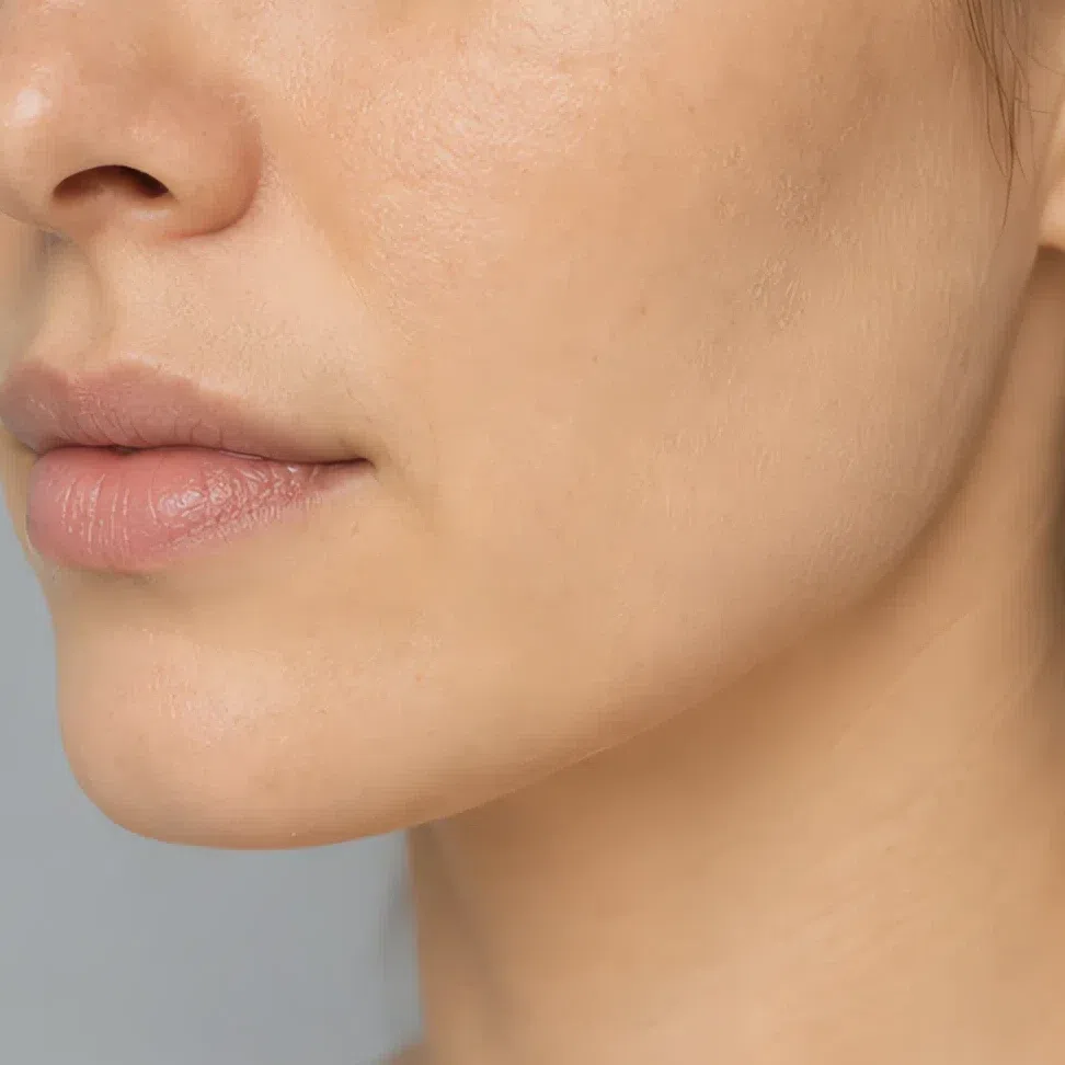
Fair - neutral-warm #E3CDB0 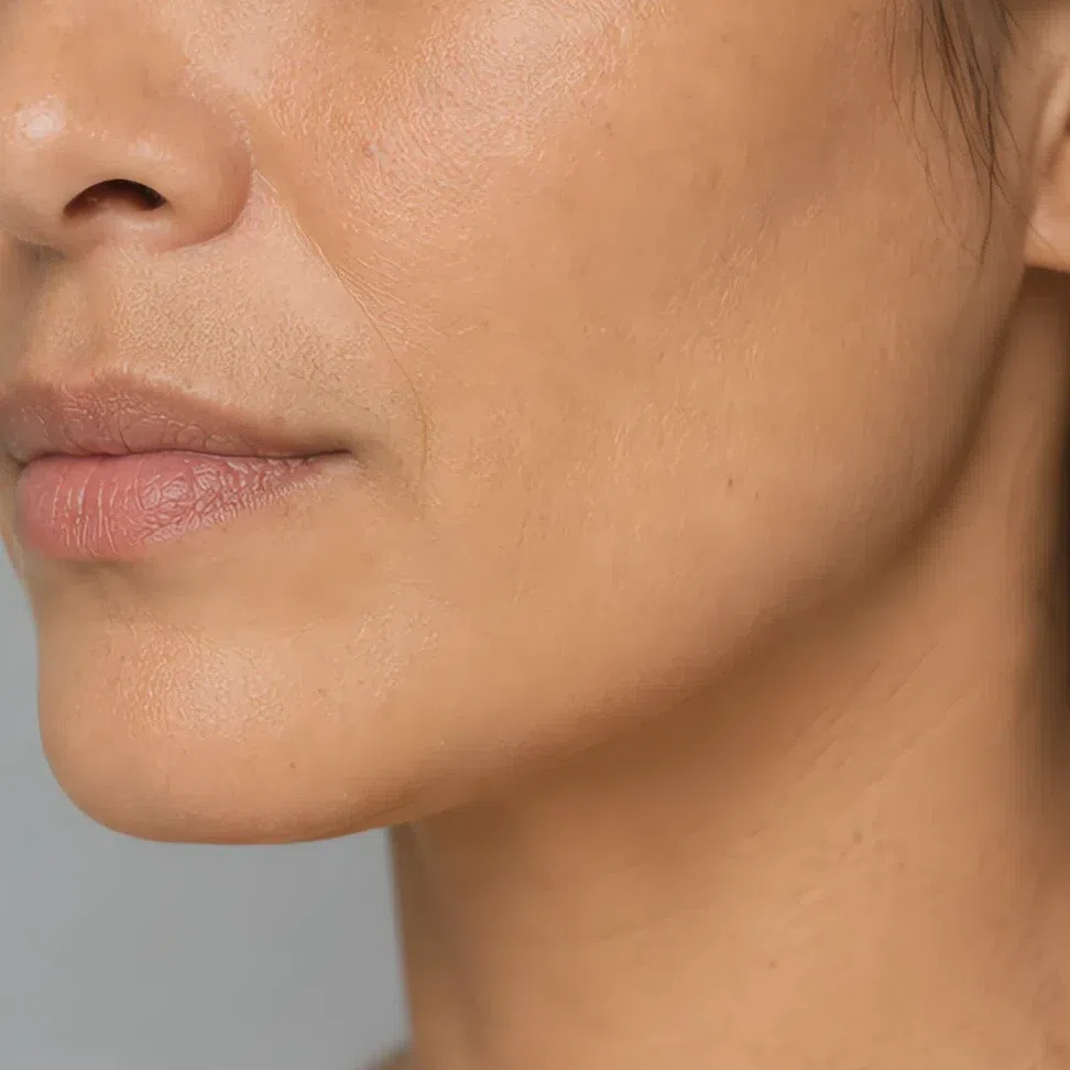
Light - neutral-warm #BFAF8E 
Medium - neutral-warm #B08F63 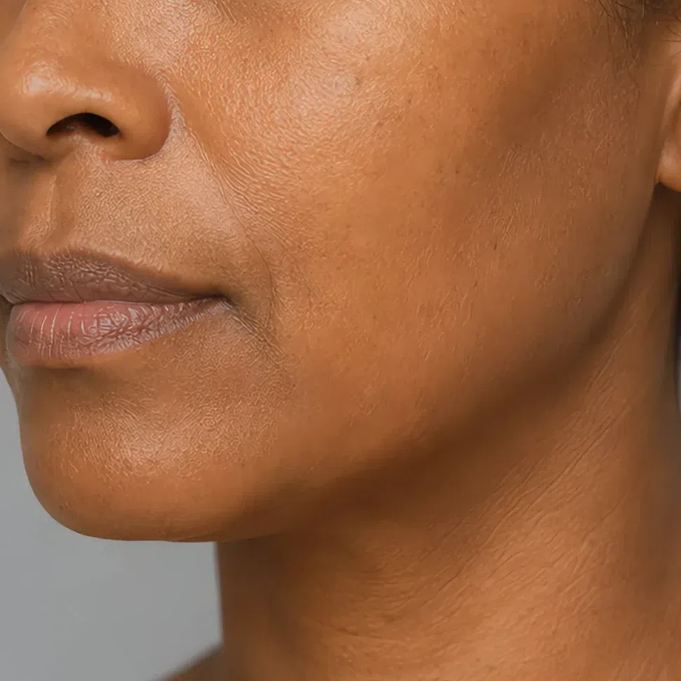
Deep - neutral-warm #836B4D Bronzer matched to your depth
It goes on before blush and follows the shape you already have: under the cheekbone, along the top of the forehead, and down the sides of the nose if you use it there. Warm skin takes a warm bronzer without arguing, so the mistake to watch is quantity rather than shade.
Fair - golden brown #A8794E 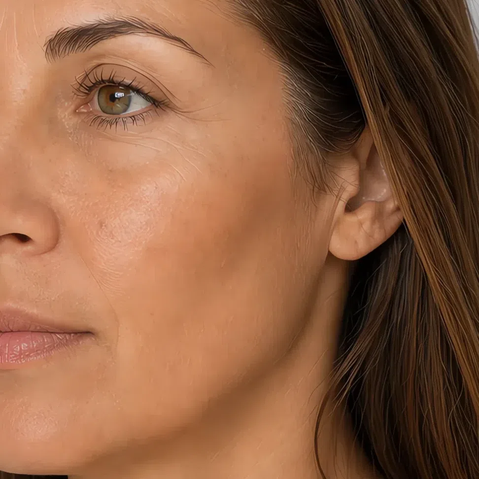
Light - golden brown #8C6745 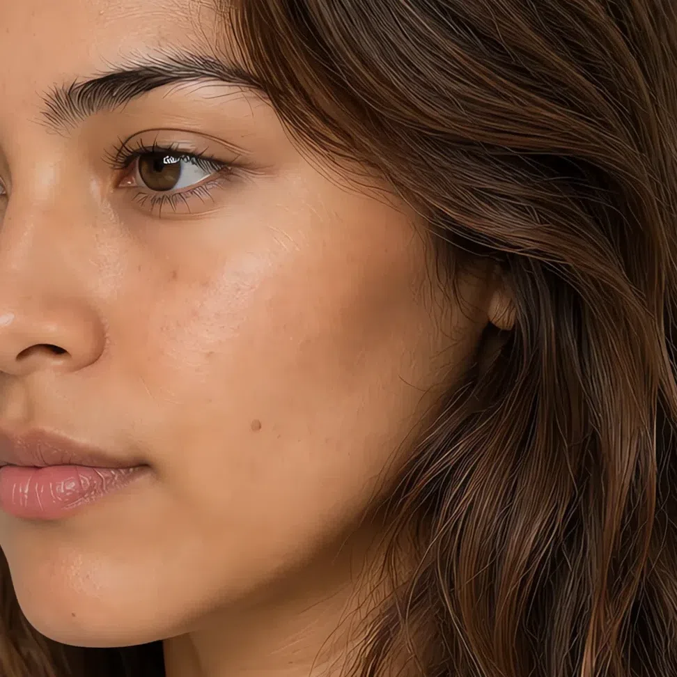
Medium - golden brown #72563C 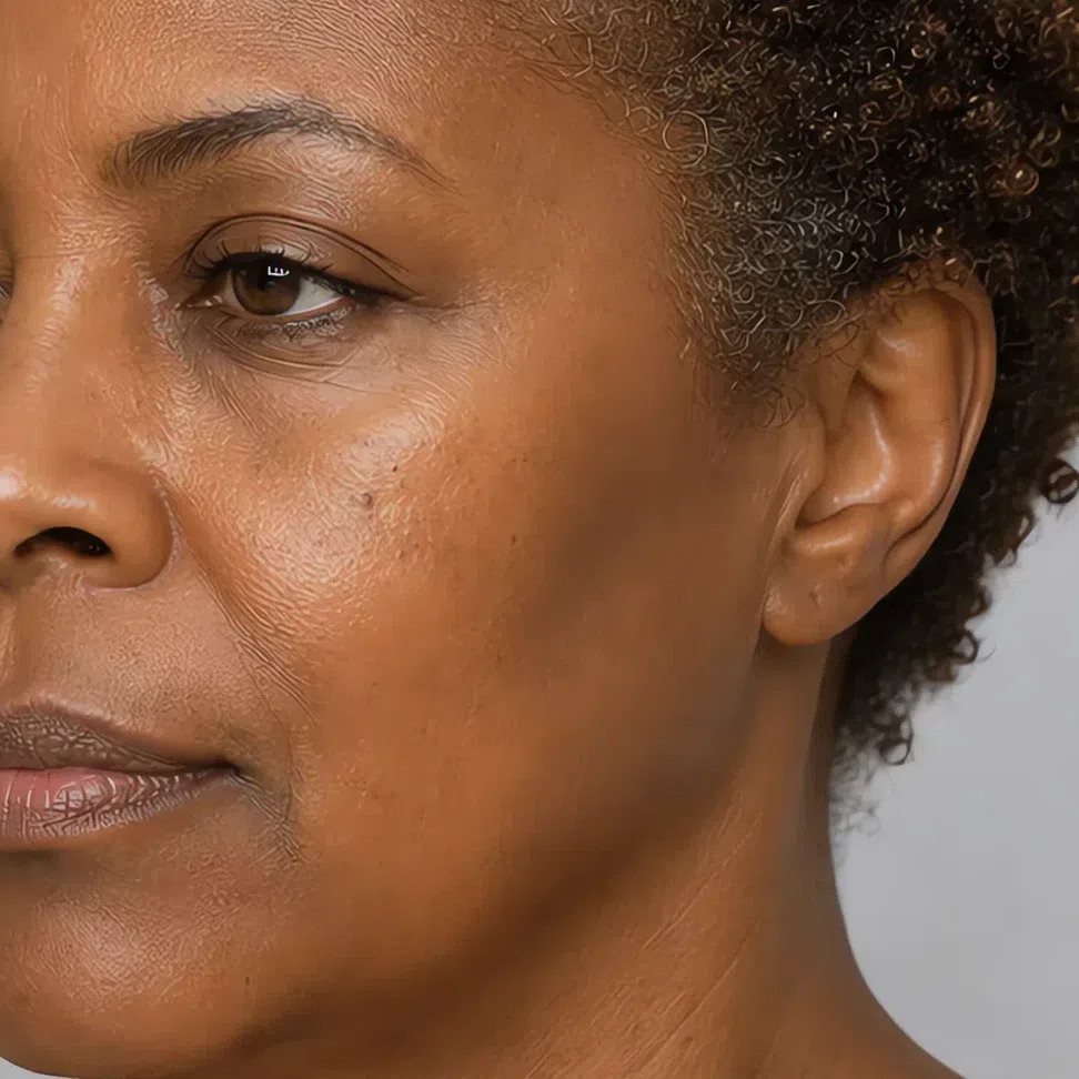
Deep - golden brown #594734 Tip Judge the jaw in daylight an hour later, never in the first five minutes at the mirror - a warm base oxidizes about half a step darker as it sets.
-
Cheeks
Cheeks: high, warm, and blended out to nothing
Cream first, with a finger, pressed onto the top of the cheekbone and faded toward the temple rather than in toward the nose. The warmth of your hand does the blending, which is why cream blush on this coloring rarely needs a brush at all.
Blush
Two light presses beat one heavy one. Build it in passes and stop while you can still see your own skin through it, because the target is a flush that reads as circulation, and circulation has no edge to find.
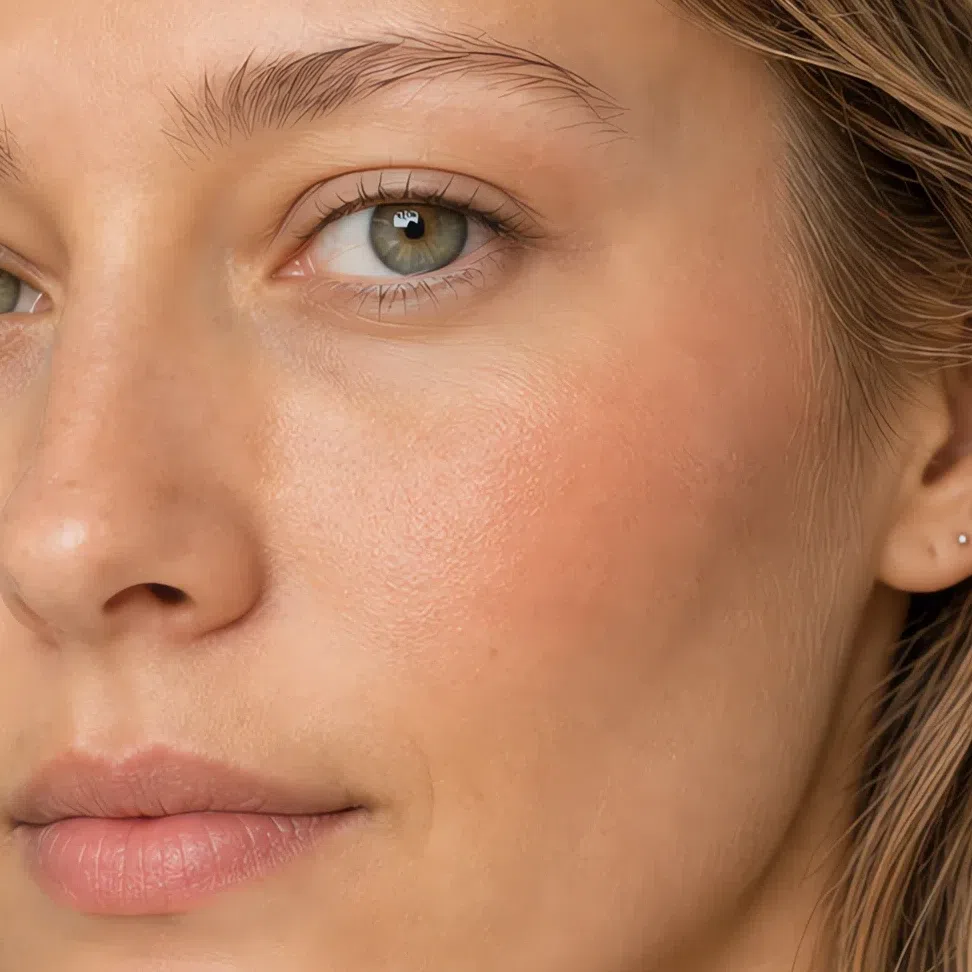
Peach #E6A886 Fair 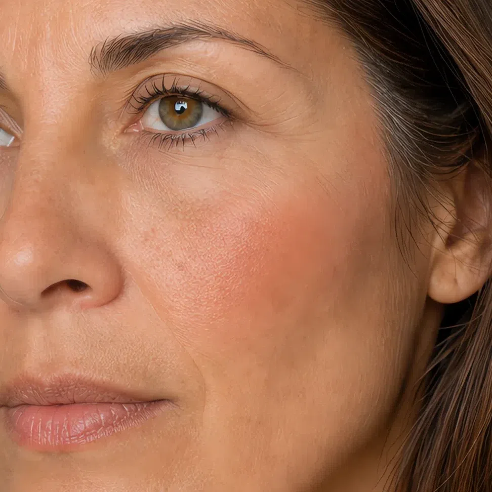
Melon #DE9A83 Fair 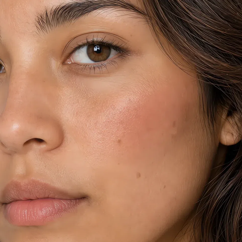
Rose beige #C99189 Fair 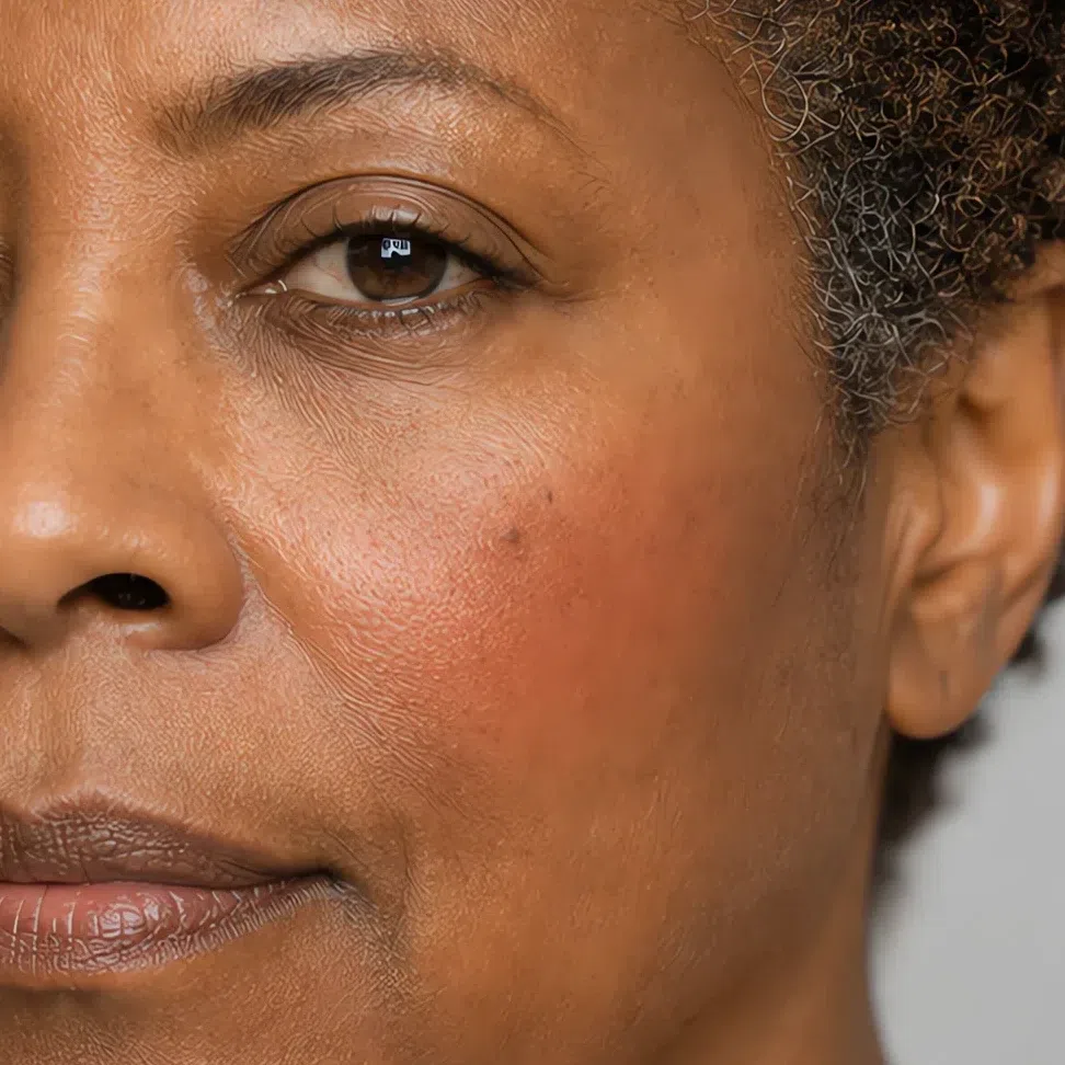
Clay #C97B57 Fair Same shade at four depths: Fair · Light · Medium · Deep Tap a step to read its value. The photograph stays as shot.
Highlighter matched to your depth
A fingertip of it on the very top of the cheekbone, above where the blush stops, and none on the brow bone or the cupid’s bow. One glow in one place is the whole allowance on a face that makes no shine of its own.
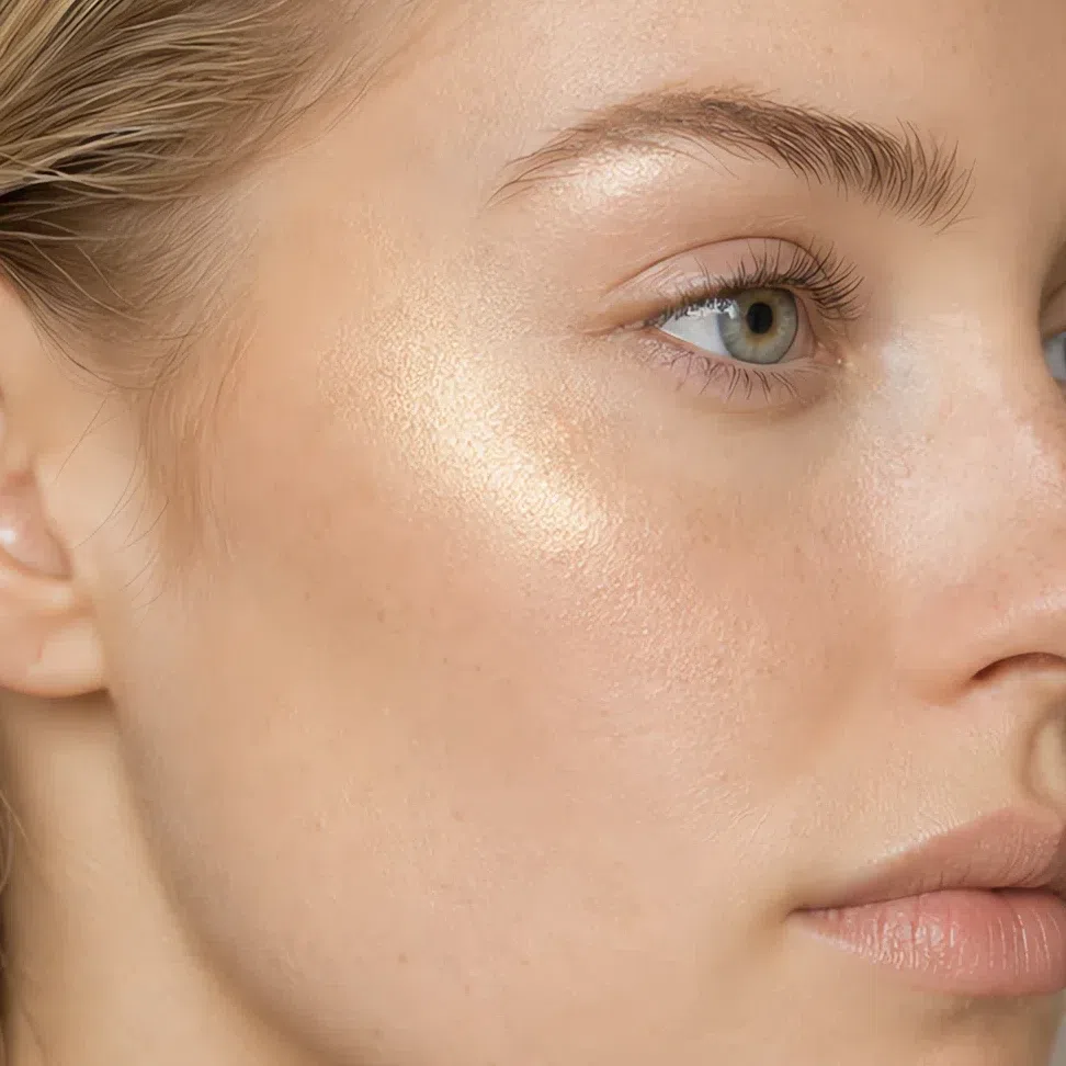
Fair - cream gold #F0DFC0 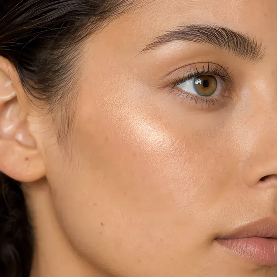
Light - peach pearl #F5CDB6 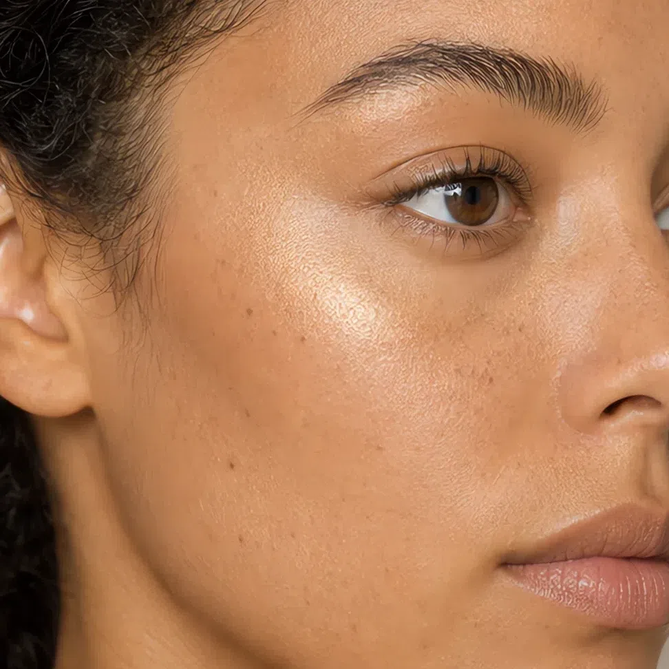
Medium - champagne #E8D3A8 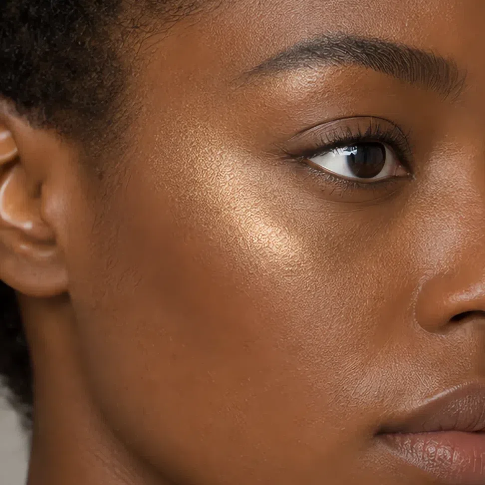
Deep - bronzed gold #D9B892 Tip Blush goes on before highlighter and above where any bronzer stops. Stacking all three in the same band is what turns a cheek into a stripe.
-
Eyes
Eyes: depth without a line anywhere in it
Everything on this eye is applied and then softened. Put the shade down with a flat brush, then go back over the outer edge with a clean fluffy one until you cannot find the place it ends. The second brush is doing as much of the work as the first.
Everyday eyeshadow
One shade, one wash, from the lash line to just above the crease. Skip the three-shade routine: on coloring this close in value, three shades on a lid arrive as three visible stripes rather than as depth.
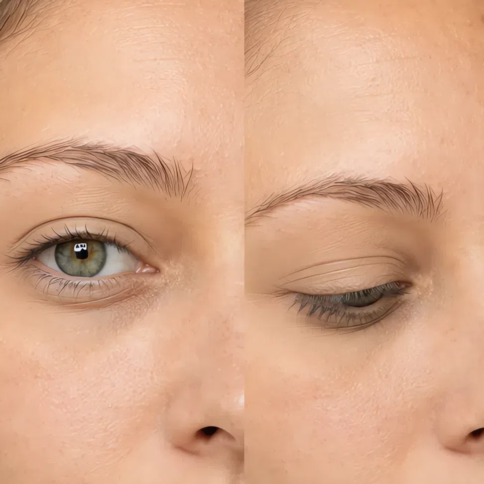
Oat #D8C3A8 Fair 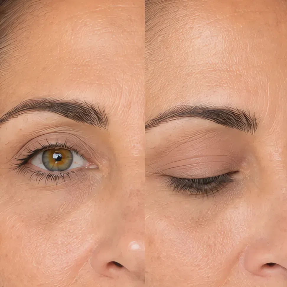
Shell #C9A79E Fair 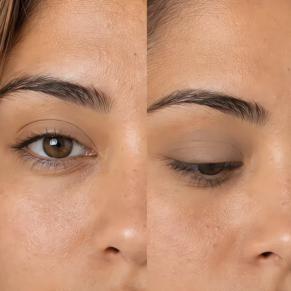
Suede #A08C79 Fair 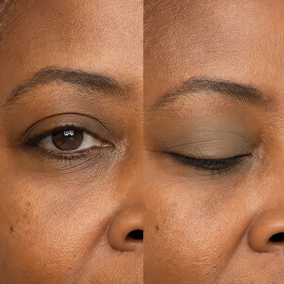
Moss #8F9779 Fair Same shade at four depths: Fair · Light · Medium · Deep Tap a step to read its value. The photograph stays as shot.
Evening eyeshadow
Same brush, smaller area. Take the deeper shade through the crease and the outer third only, and let the daytime wash keep the middle of the lid - that contrast is what makes an eye read as finished after dark.
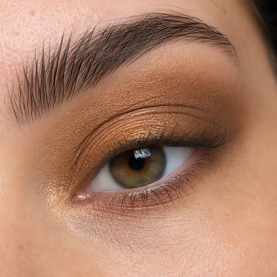
Cognac shimmer #A97C4A Fair 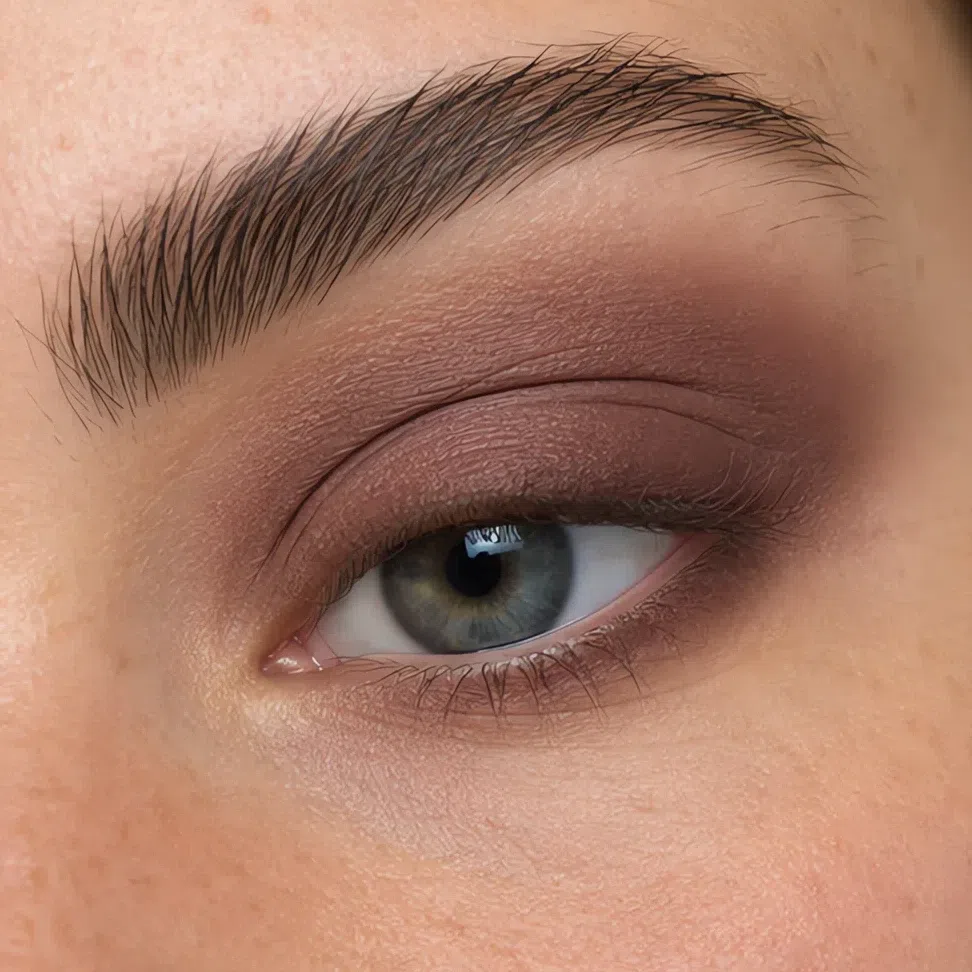
Raisin #6E4F4E Fair 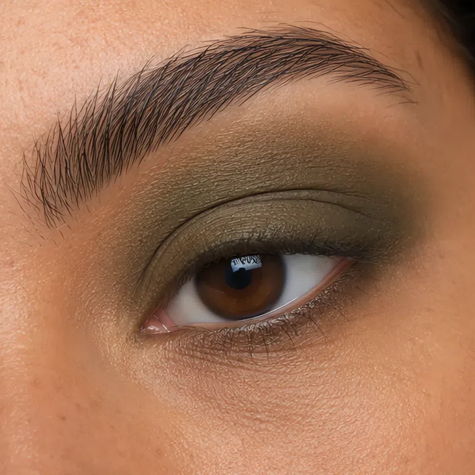
Pine #4F6350 Fair 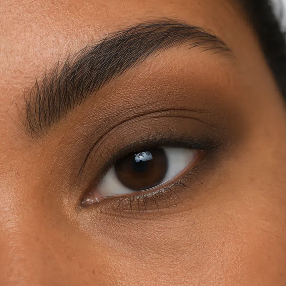
Truffle #5A4438 Fair Same shade at four depths: Fair · Light · Medium · Deep Tap a step to read its value. The photograph stays as shot.
Eyeliner
Push the color into the lash line from underneath rather than drawing along the top of it. What you are after is the impression of thicker lashes, and a line anybody can actually see is the thing that gives it away.
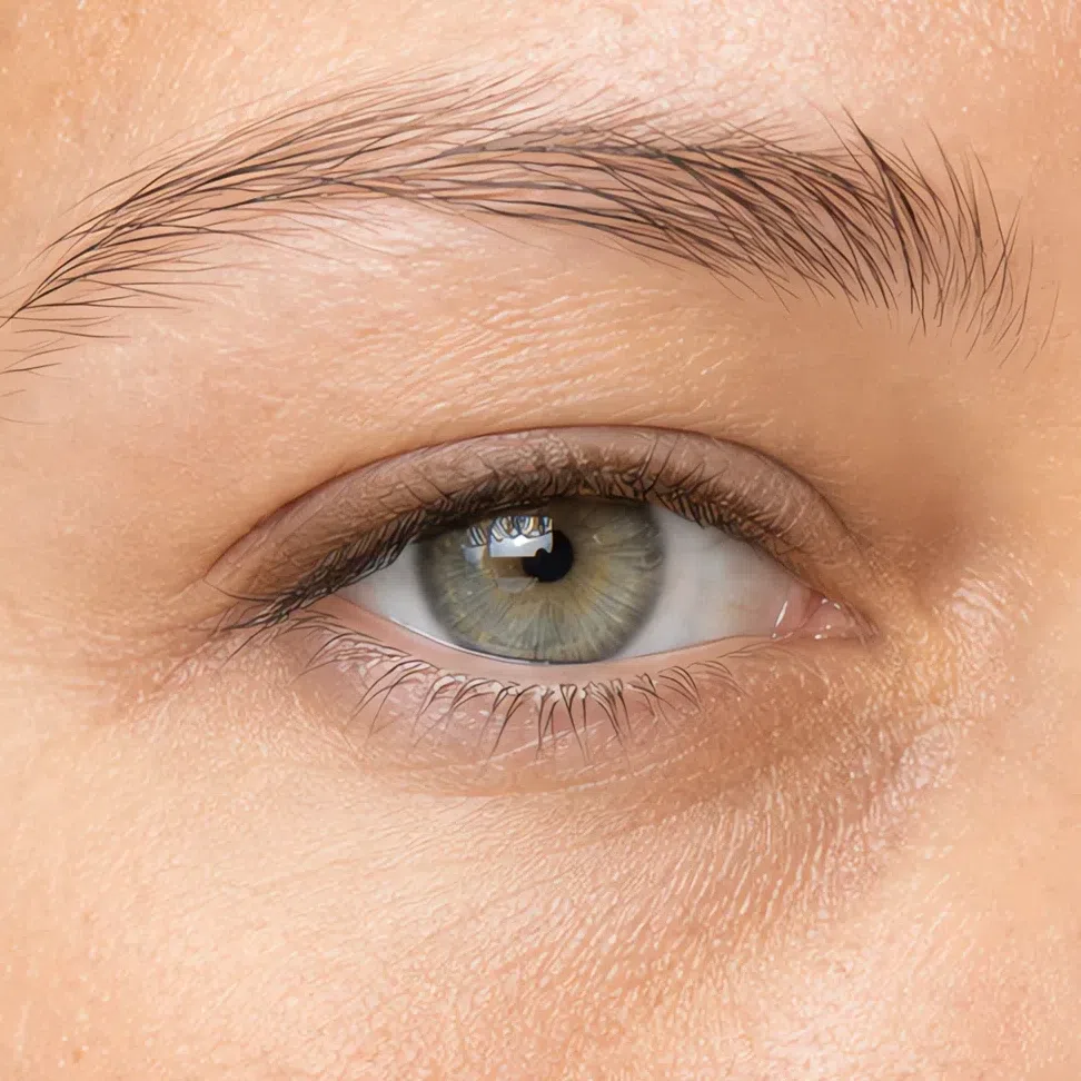
Umber #6B4E36 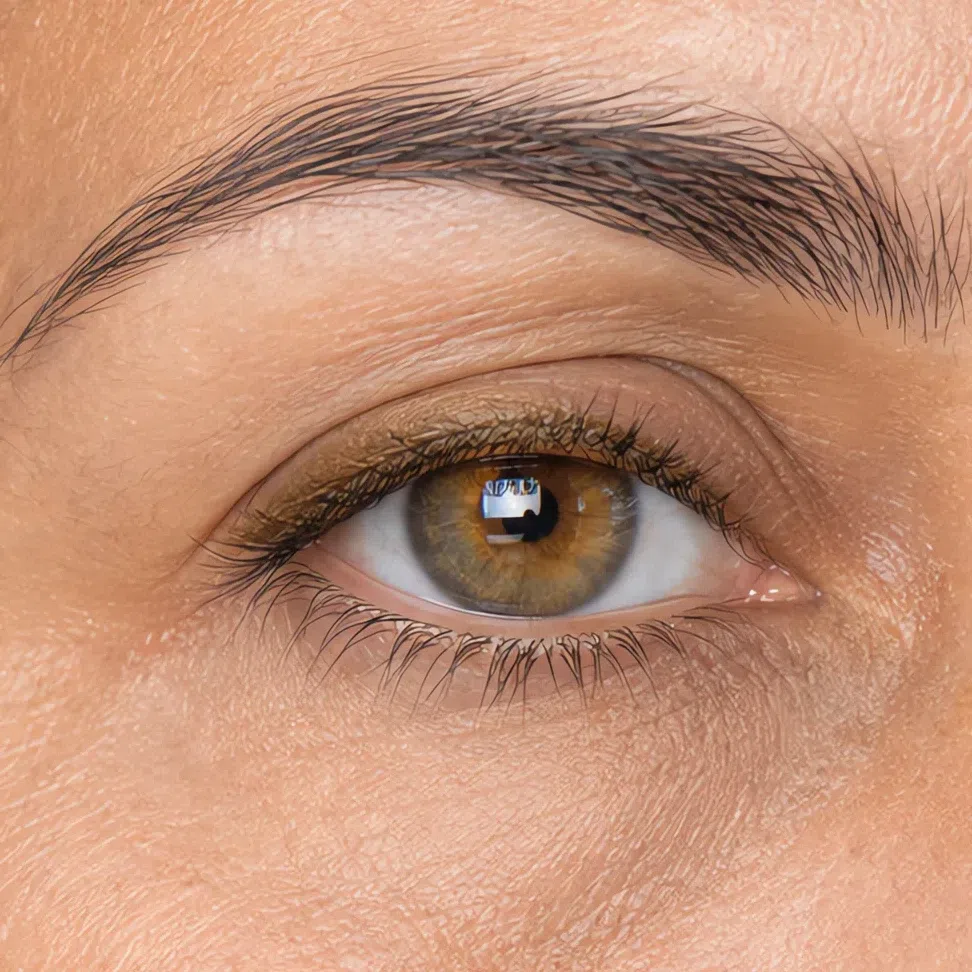
Brass #8A6338 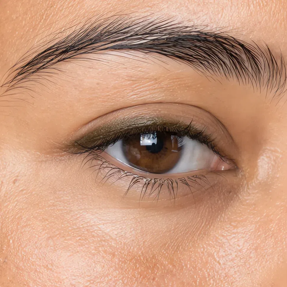
Fern #4E5537 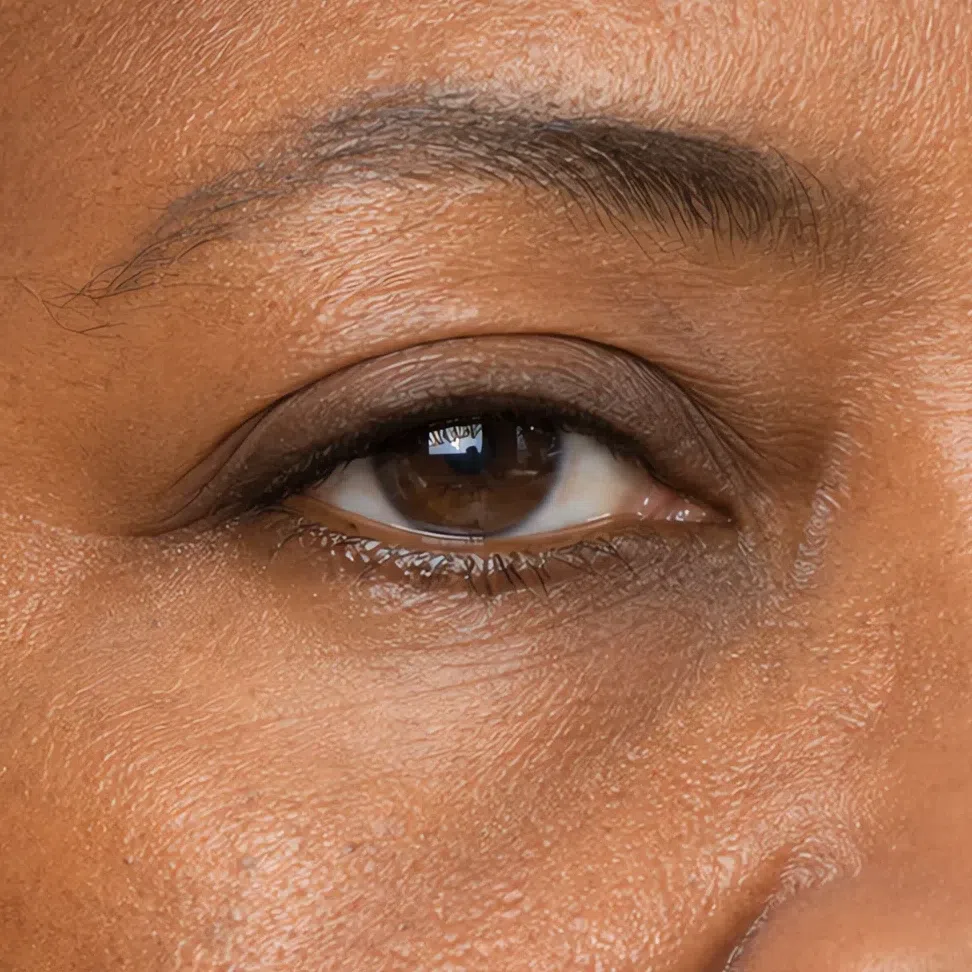
Walnut #42301F Mascara
Wiggle at the root, one coat, stop. The second coat is where a soft lash turns spiky, and a spike is a hard edge in the one place this face can least afford one.
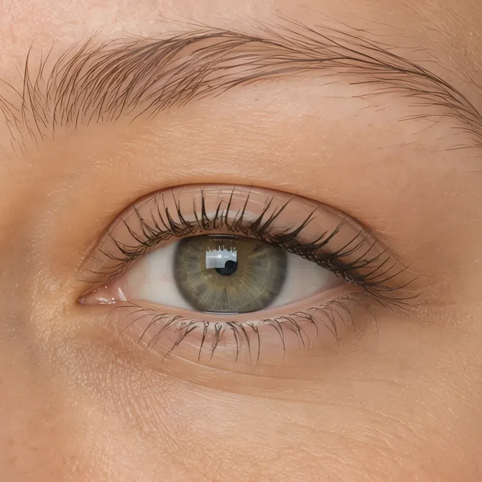
Coffee #4A3728 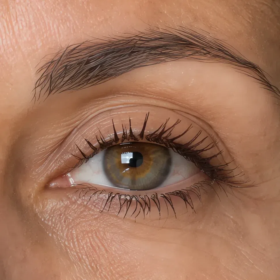
Pecan #6B4530 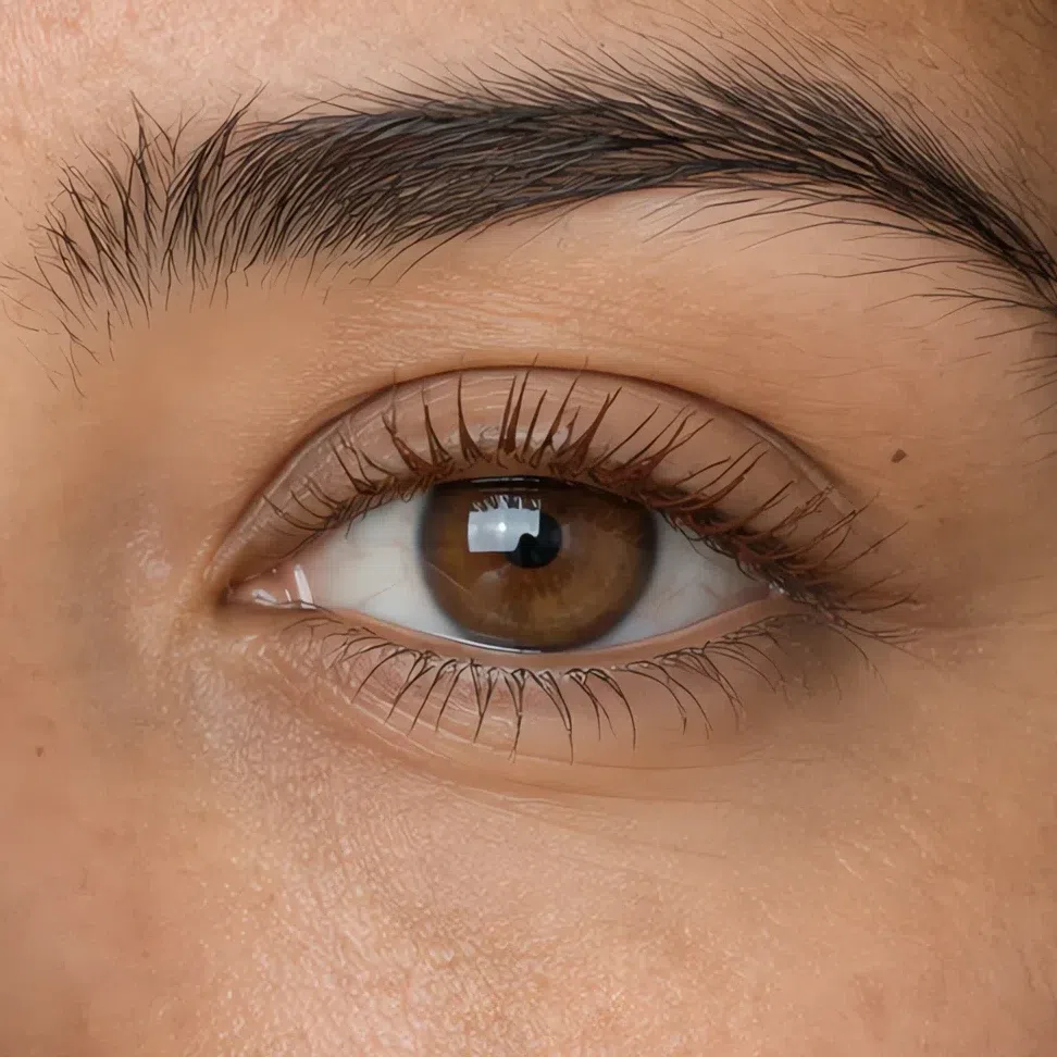
Brass #8A6338 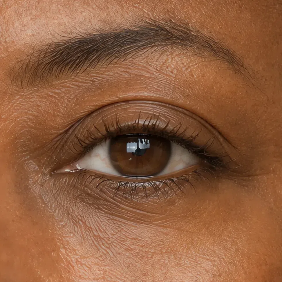
Brown-black #2E2620 Brows
Short strokes in the direction the hair grows, and leave the outer end lighter than the middle. Fill the sparse spots and skip the outline completely - an outlined brow is two hard edges on a face with none.
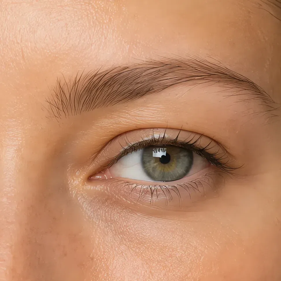
Tawny #A8886A Fair 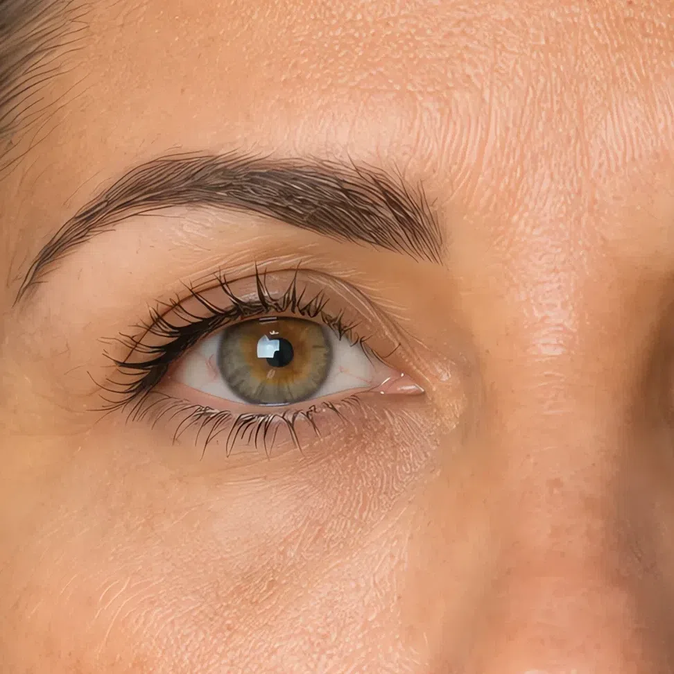
Driftwood #9A8A78 Fair 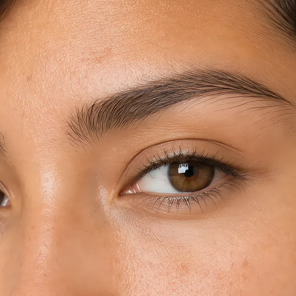
Acorn #8E7256 Fair 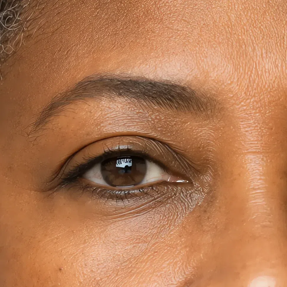
Bark #6E5238 Fair Same shade at four depths: Fair · Light · Medium · Deep Tap a step to read its value. The photograph stays as shot.
Tip If you can see where a shade starts or stops, it needs one more pass with an empty brush rather than a different shade.
-
Lips
Lips: pressed on rather than painted on
Both families go on the same way: from the center outward, with a finger or straight from the bullet, and with no liner drawn around the edge. This mouth wants a soft border, and the quickest way to lose one is to draw it.
Nude shades
Blot the balm off first, then press the color in. A nude applied over balm travels into the lines around the mouth inside an hour, which is the usual reason a shade that looked right in the tube is wrong by lunchtime.
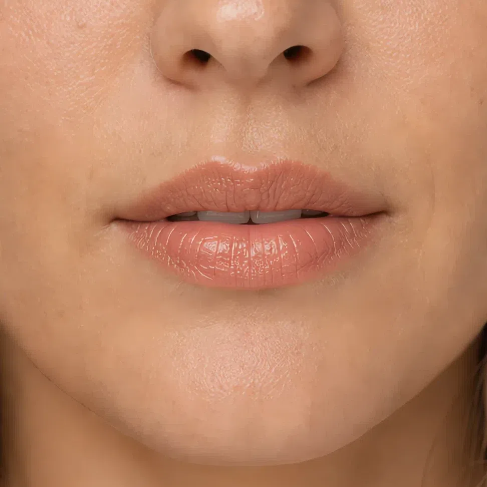
Praline #D7A98E Fair 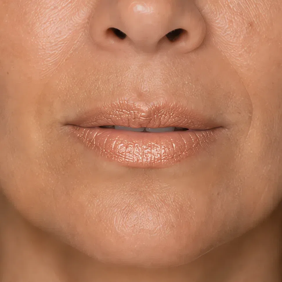
Biscuit #C4A184 Fair 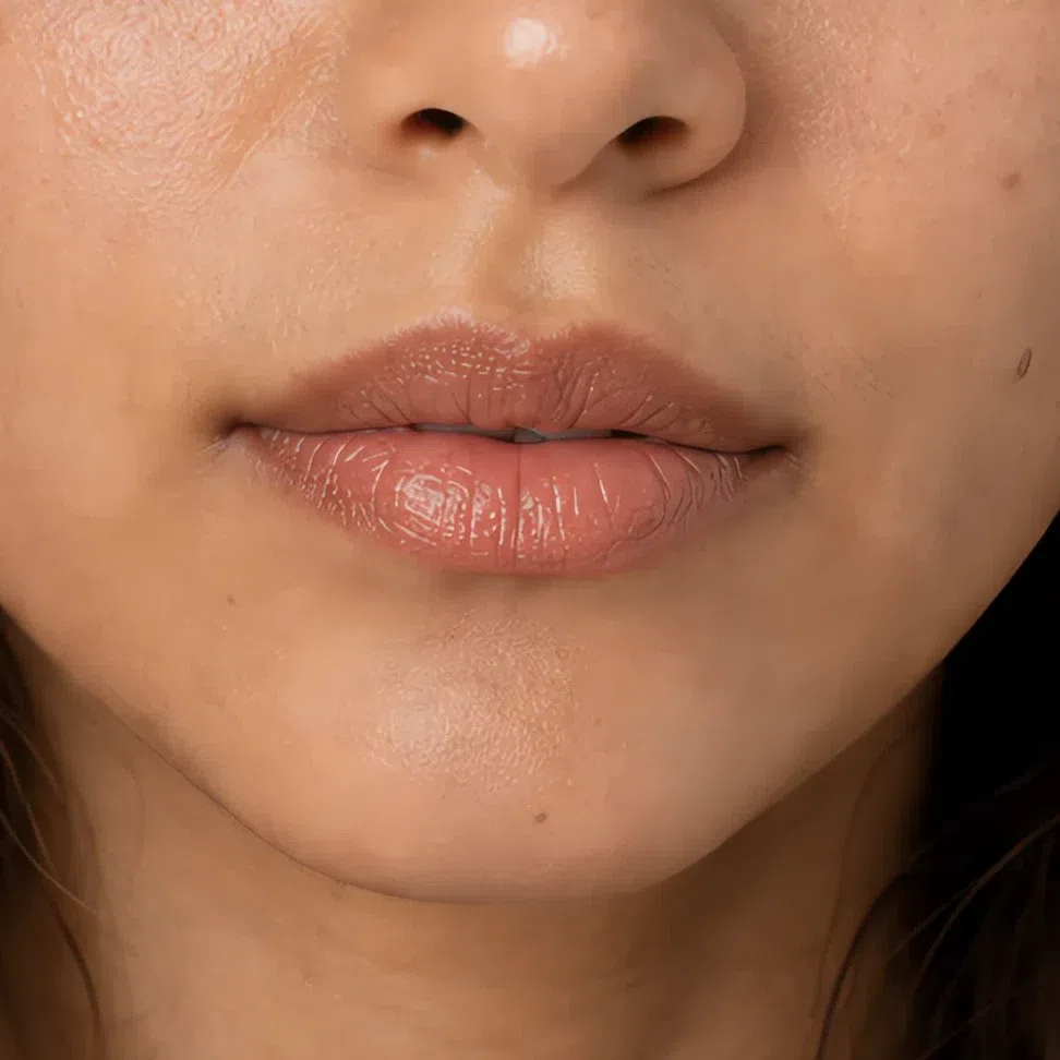
Toffee #B98A63 Fair 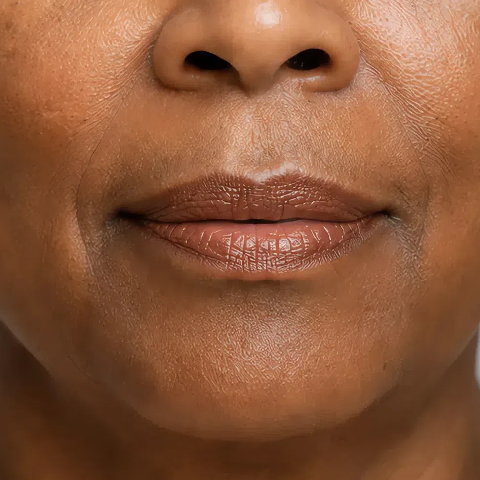
Nutmeg #96674A Fair Same shade at four depths: Fair · Light · Medium · Deep Tap a step to read its value. The photograph stays as shot.
Colored shades
One layer, blot, then a second only if it has to last. The blot takes the finish down to cream and stops the color moving, and it costs nothing but the ten seconds.
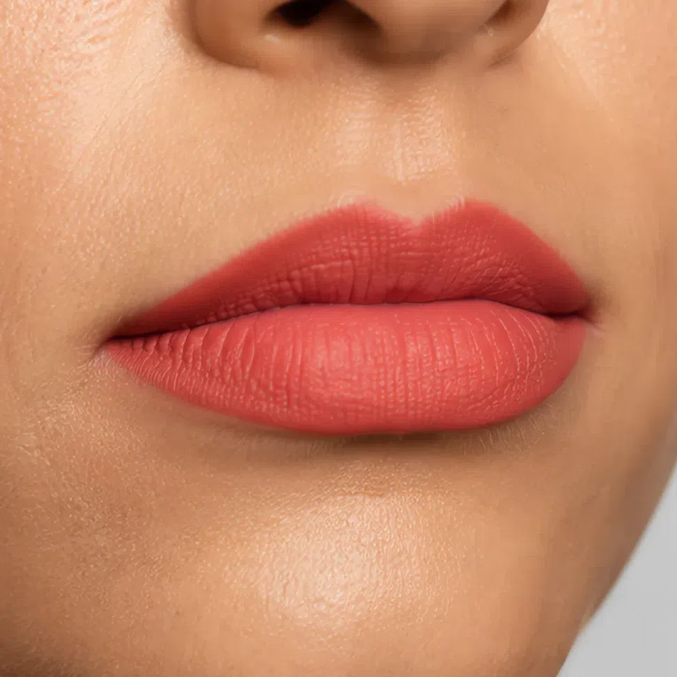
Persimmon #C85C48 Fair 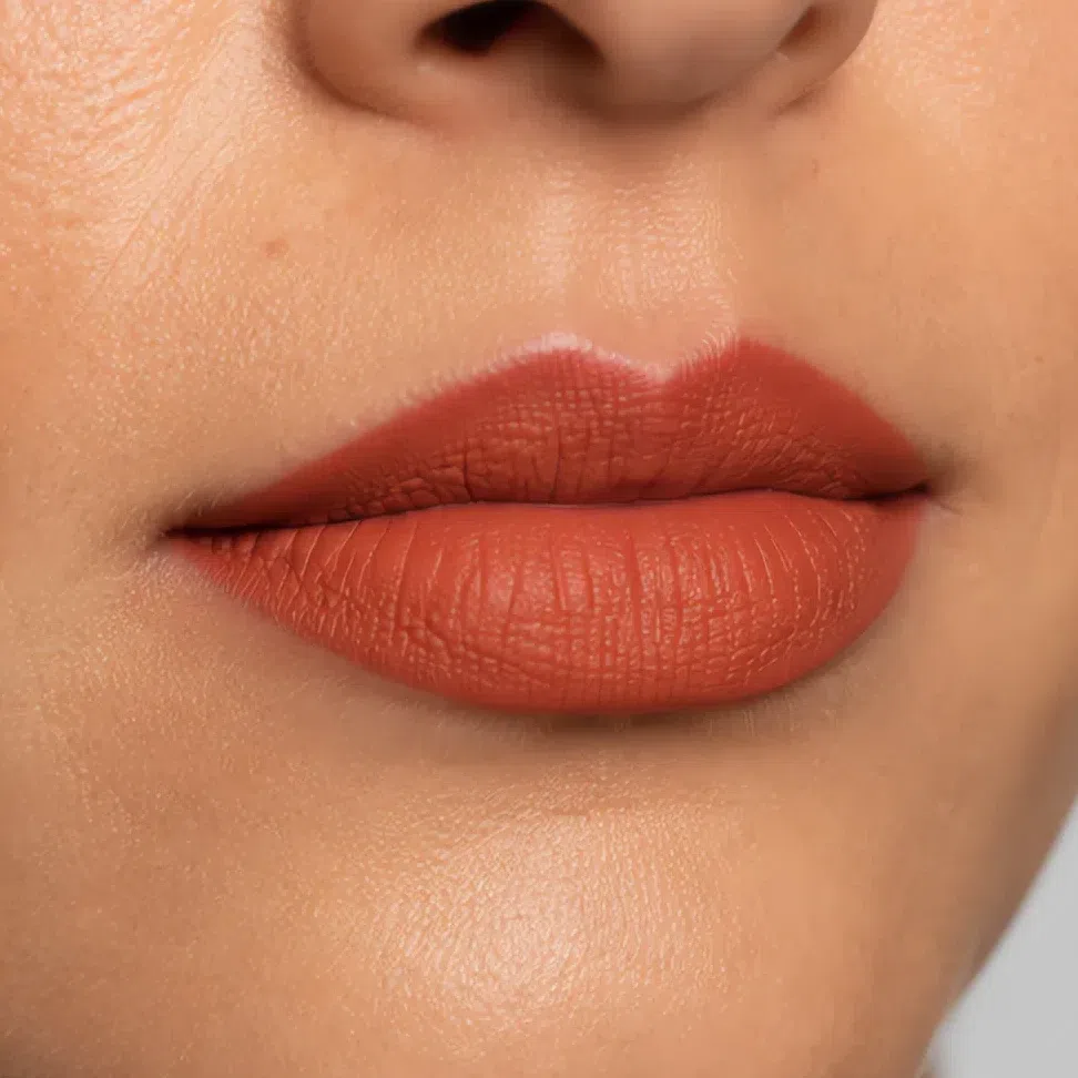
Terracotta #B46537 Fair 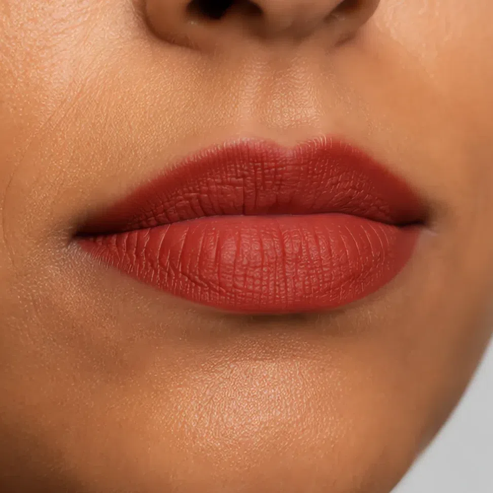
Brick #A34B36 Fair 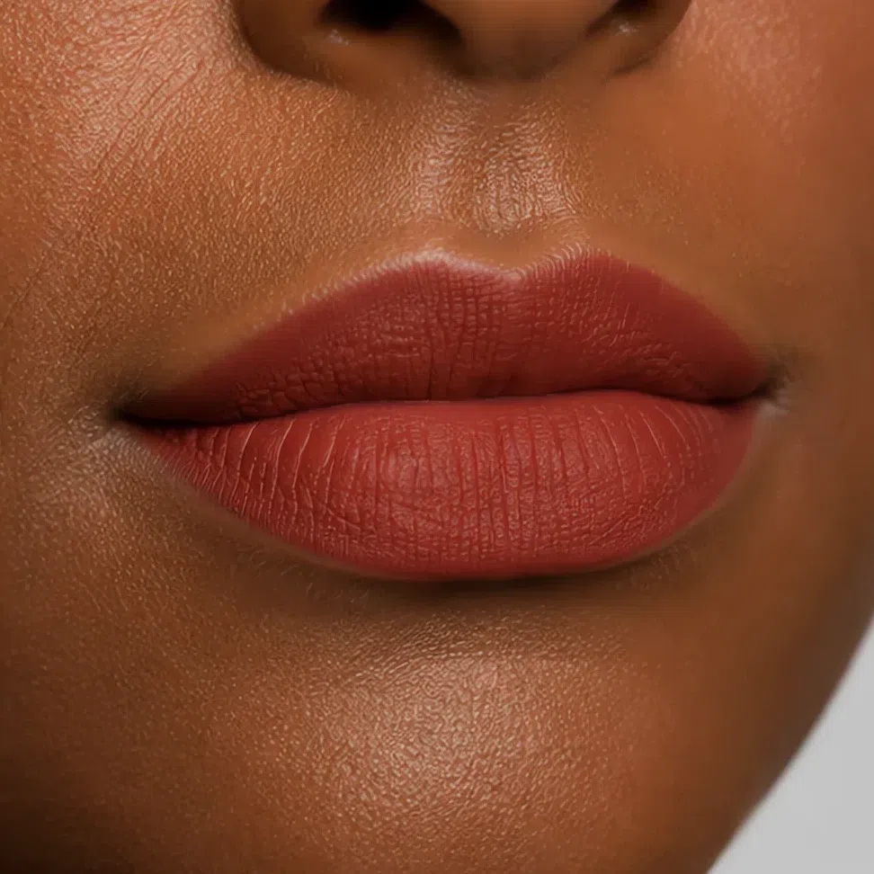
Paprika #8B3F22 Fair Same shade at four depths: Fair · Light · Medium · Deep Tap a step to read its value. The photograph stays as shot.
Tip Blot, then reapply. The blot is what takes a cream down to a stain that stays put, and it is the difference between a lip that lasts lunch and one that does not.
That is the whole daytime face, and on most days it is already more than you need. What changes when the light drops is smaller than you would expect, and it is not brightness.
Your evening face: what changes, and what must not
Less than you would think, and not in the direction you would guess. Two areas move between the daytime face above and an evening one - the eyes and the mouth - and four things stay exactly where they already were. Nothing gets brighter. The whole change is a step down the same ramps you have been reading all page.
Eyes
The daytime wash stays where it is. What arrives after dark is a deeper shade in a smaller area - the crease and the outer third - and a shimmer on the lid to give the eye somewhere to catch light. On low-contrast coloring an eye reads as finished when the depth has somewhere to sit, not when there is more of it.
- Leave the daytime wash exactly where it was.
- Put the deeper shade in the crease and the outer third only.
- Blend until you cannot find the place it stops.
- Tightline rather than drawing a line along the lashes.
The rule Deeper, and over a smaller area. Evening here is a question of where the depth sits, never of how much of it there is.
Oat stays the daytime lid. After dark Cognac shimmer becomes the lid and Raisin takes the outer corner - Truffle is too deep to sit anywhere but the tightline on skin this light.
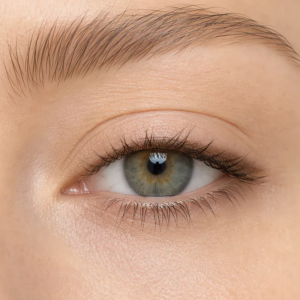
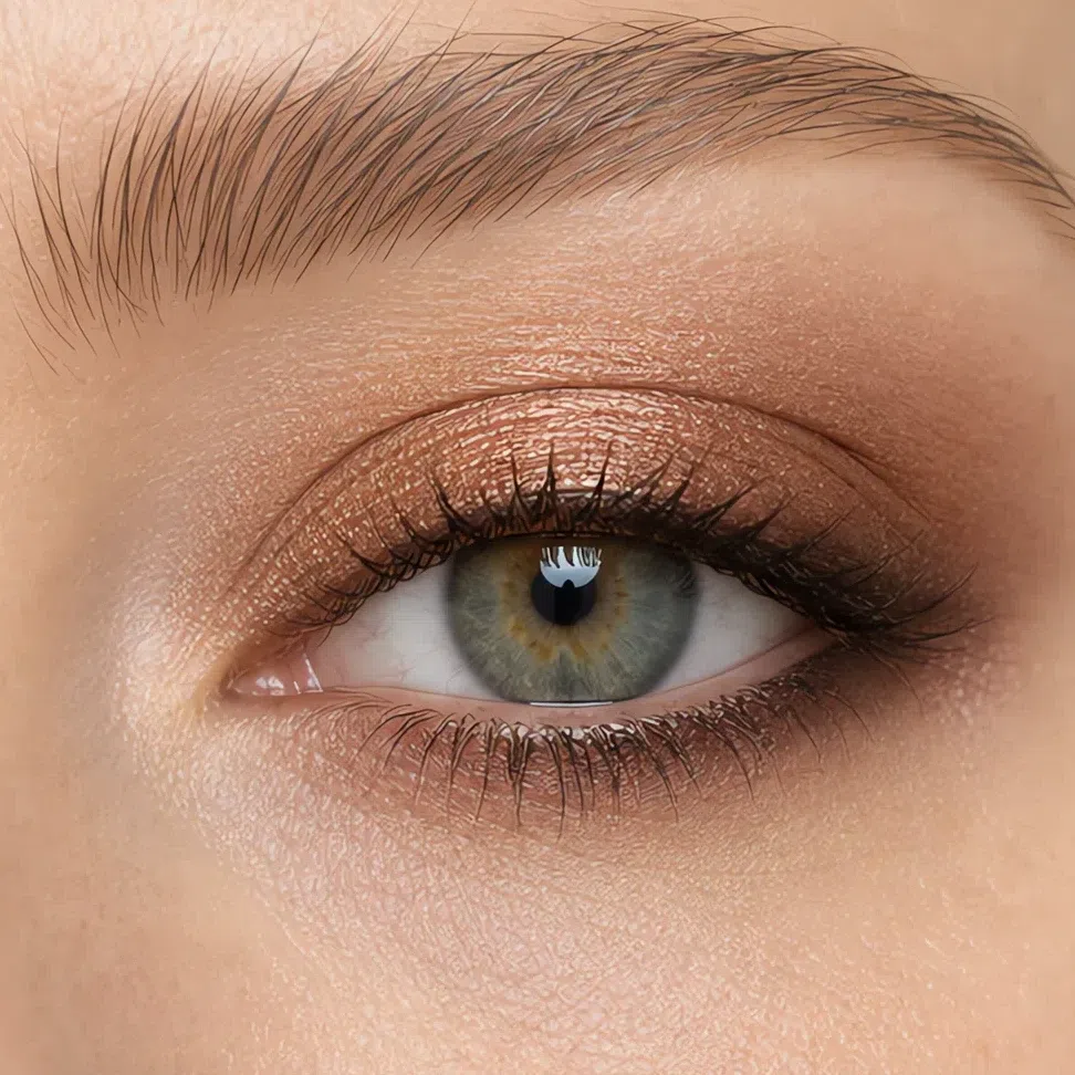 Deepest through the crease
Lid center stays lightest
It fades out under the lashes
Deepest through the crease
Lid center stays lightest
It fades out under the lashes
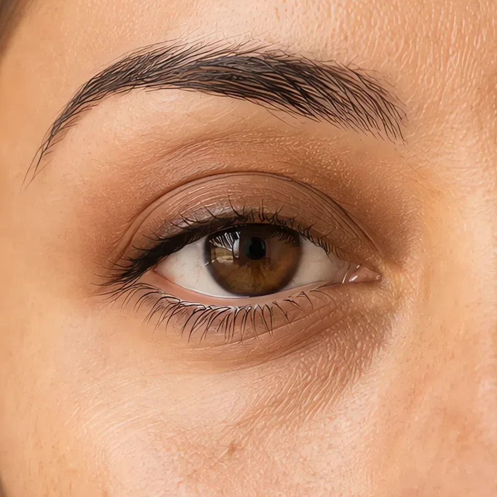
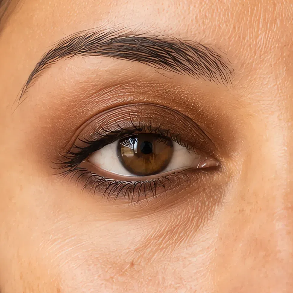
Oat by day. At night Cognac shimmer takes the lid and Truffle moves into the crease and the outer corner. This is the depth at which the deepest shade first earns a place on the lid rather than only along the lashes.
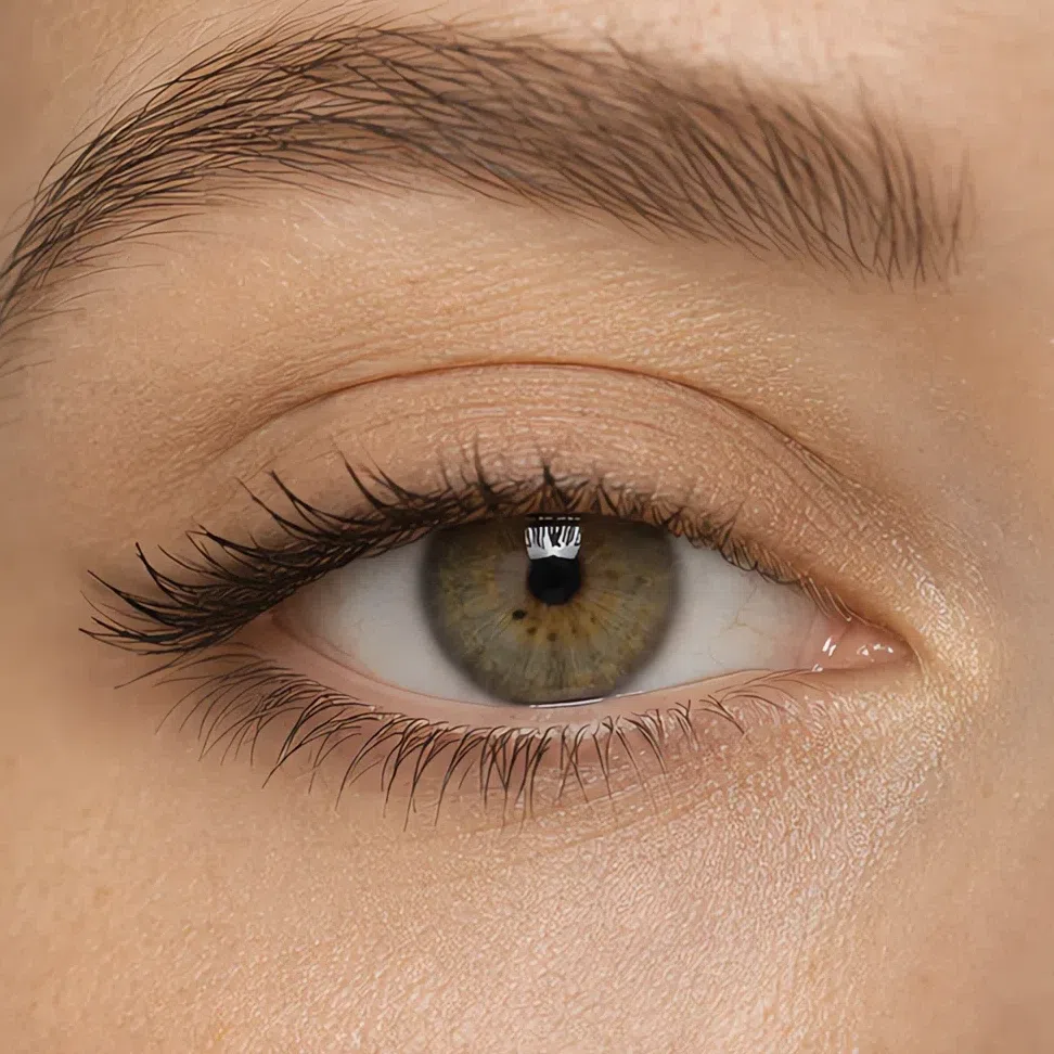
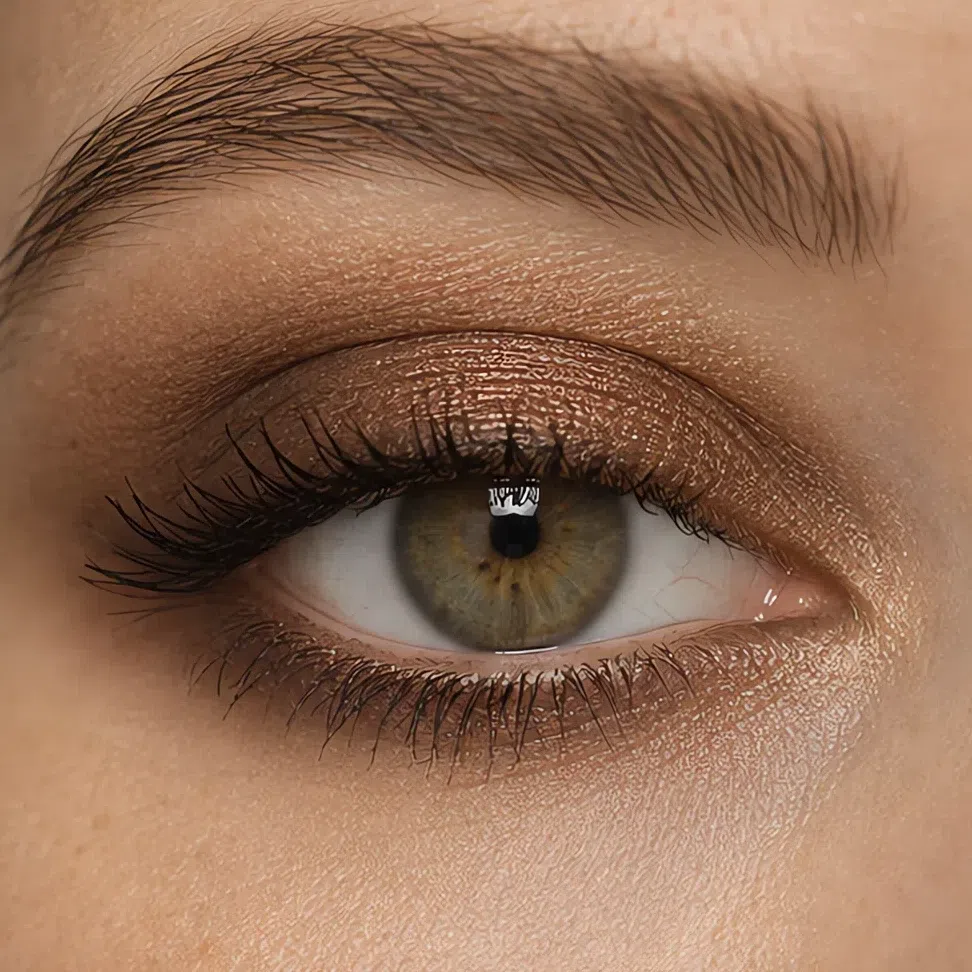 Deepest through the crease
Lid center stays lightest
It fades out under the lashes
Deepest through the crease
Lid center stays lightest
It fades out under the lashes
Suede is already the daytime lid, so evening deepens rather than replaces: Cognac shimmer over the lid, Truffle through the crease and carried further along the lower lash line than it goes on lighter skin.
 Deepest through the crease
Lid center stays lightest
It fades out under the lashes
Deepest through the crease
Lid center stays lightest
It fades out under the lashes
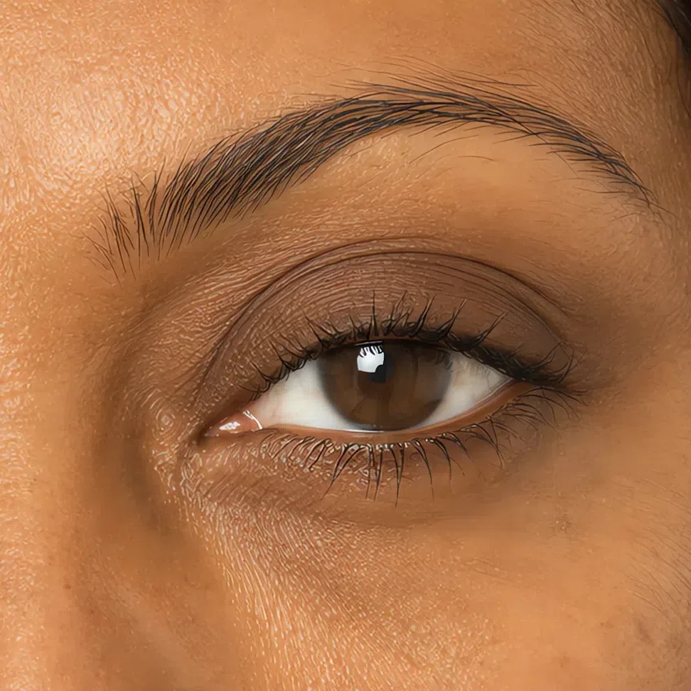
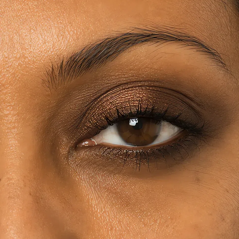
The order inverts here. Truffle becomes the lid itself and Cognac shimmer moves to the inner half to catch the light. The shade that was an outer-corner accent three rows up is the only one that registers across a whole lid at this depth.
 Deepest through the crease
Lid center stays lightest
It fades out under the lashes
Deepest through the crease
Lid center stays lightest
It fades out under the lashes
Lips
One step down the same ramp, and that is the entire instruction. The daytime nude and the evening color come from the two lip families on your palette rather than from different ends of a shop, so the mouth changes value without changing character. Which shade does which job is the part that moves with your depth.
- Blot the balm off rather than layering the color over it.
- Press the color on from the center outward with a finger or a brush.
- Leave the edge soft, and skip the liner drawn around it.
The rule The family never changes between day and evening. Only the value behind it does.
Praline by day, Terracotta by night. Brick and Paprika both go past what this complexion carries without the mouth becoming the entire face.
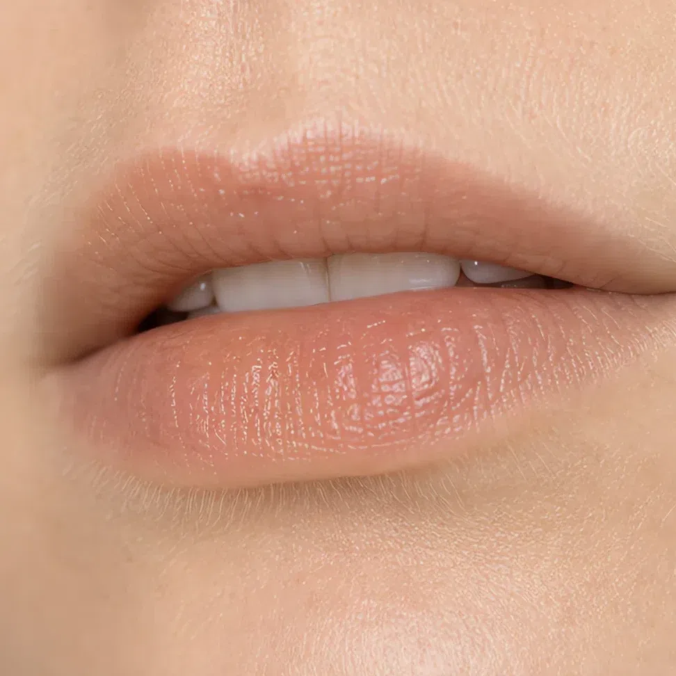
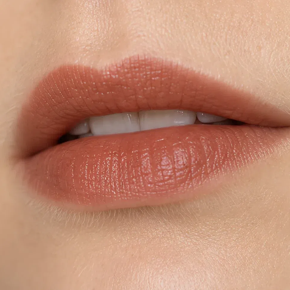 The edge stays soft
Build the color through the middle
The edge stays soft
Build the color through the middle
Praline by day, Terracotta by night - the same pair as fair skin, one step further down the ramp so it still reads as color.
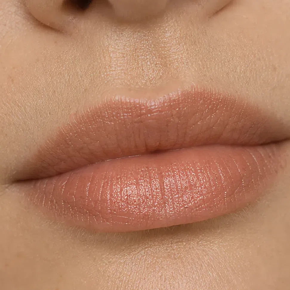
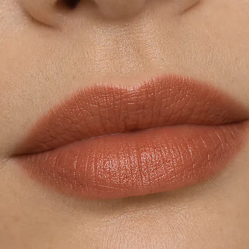 The edge stays soft
Build the color through the middle
The edge stays soft
Build the color through the middle
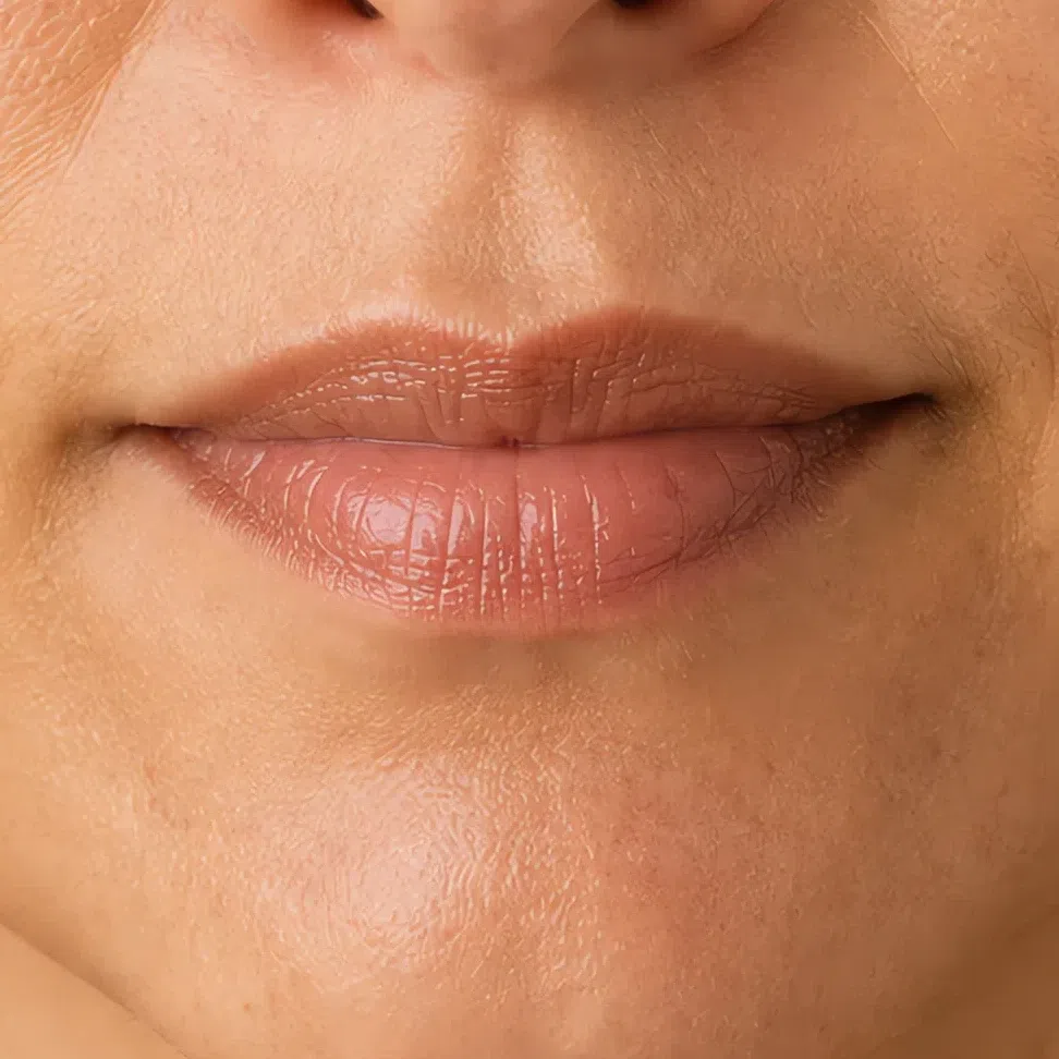
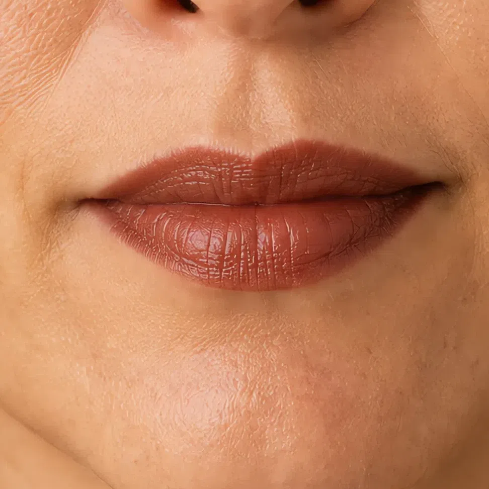
Biscuit is the daytime nude and Brick the evening lip. Terracotta has dropped to daytime duty by this depth, which is the clearest illustration of the rule on this page.
 The edge stays soft
Build the color through the middle
The edge stays soft
Build the color through the middle
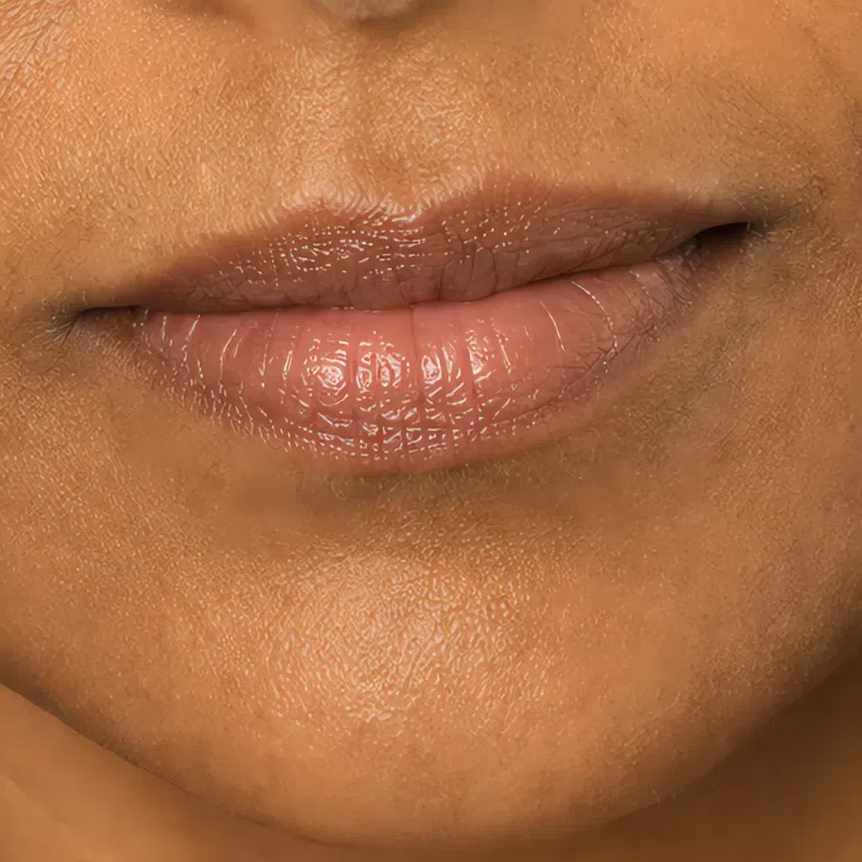
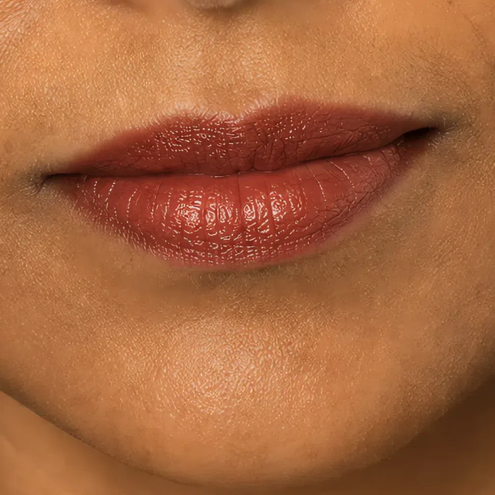
Biscuit by day, Paprika by night. Terracotta reads as a nude at this depth, so the evening lip has to come from the deepest end of the colored shades.
 The edge stays soft
Build the color through the middle
The edge stays soft
Build the color through the middle
What must not change
It stays the lightest thing on the eye. Deepening the middle of the lid closes the eye up instead of opening it, and it is the first thing people reach for after dark.
Same height on the cheekbone, same size. Blush that drops lower or spreads wider at night stops reading as a flush and starts reading as contour that went wrong.
Unchanged. Brows that get darker alongside the eye makeup push the contrast past anything else on this face, and the whole point of the evening version is that it stays quiet.
Still satin, still thin. More coverage at night is the single most reliable way to add ten years to a face in a photograph, and it is the change nobody notices themselves making.
Your evening face is deeper, never louder. Whether it lands, though, turns on something that is not the shade at all - how much light each of these products throws back at the room.
Why the right shade can still look wrong
The evening face above uses deeper versions of the same shades, and the other thing that changed between the two is how much light each product throws back. That is finish. It is the half of a product nobody reads on the label, and on coloring this muted it settles nearly as much as the shade does. Below is one lipstick on one mouth, photographed four times, with only the surface changing.
One shade, four finishes
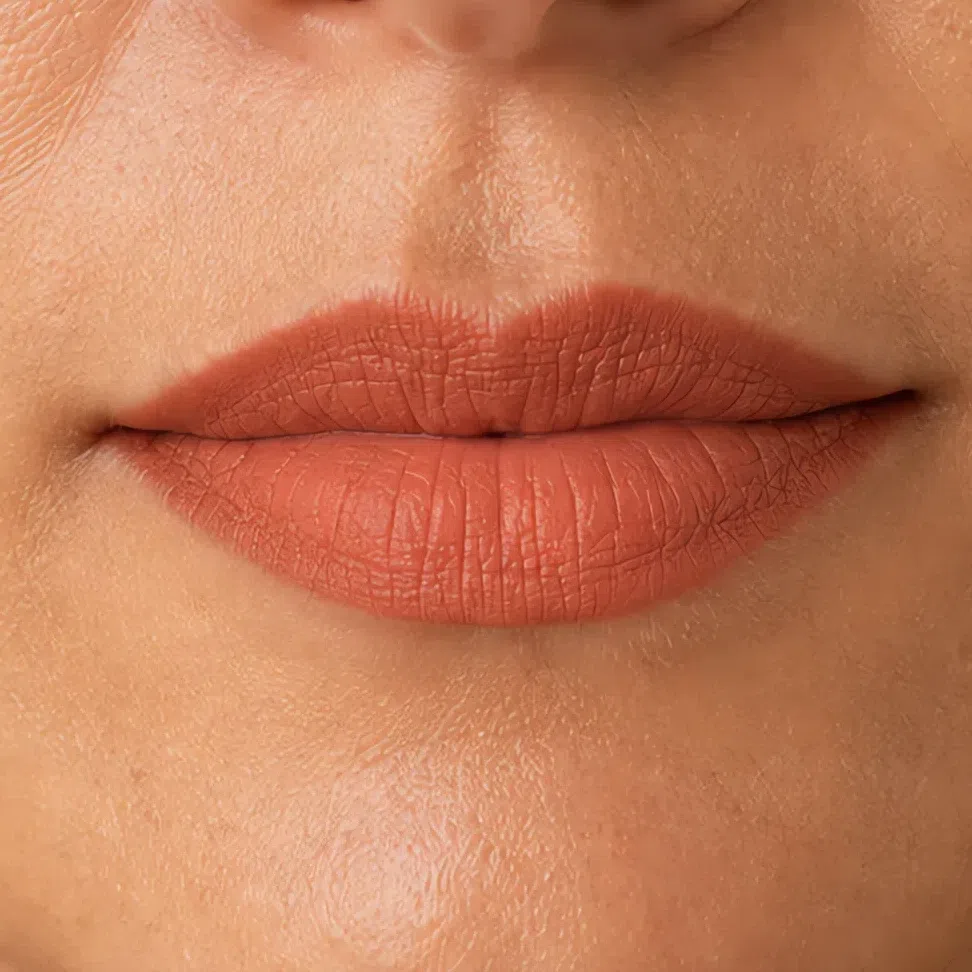
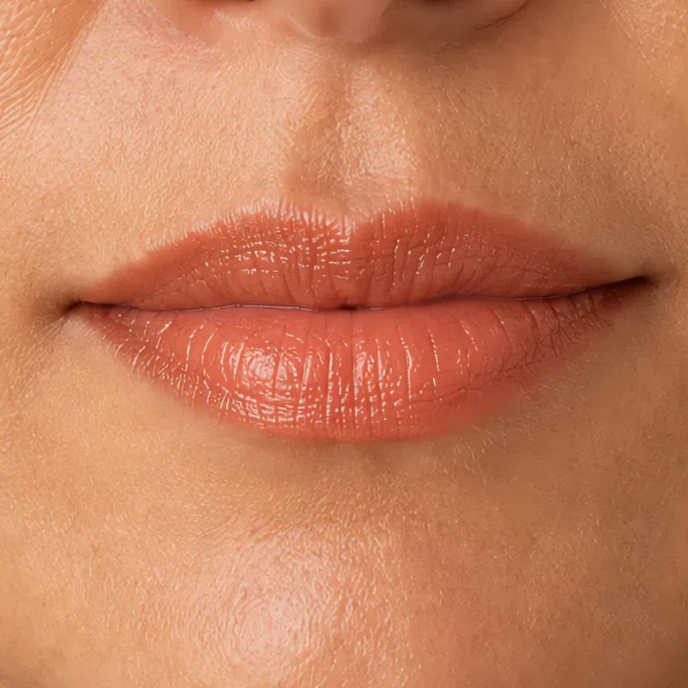
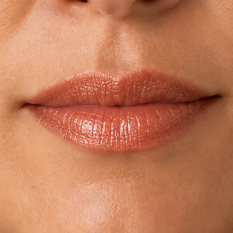
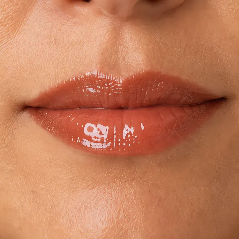
Your season already has a finish rule, and it is filed under jewelry: antique gold, bronze and rose gold, brushed or hammered rather than polished. That is not really a metals preference. It is a statement about the specular highlight - the small, hard, near-white reflection a shiny surface throws back at you. Polished chrome makes one. Brushed brass scatters it into nothing. Soft Autumn runs on low contrast, so the moment a hard highlight lands anywhere on the face it becomes the highest-contrast thing in the frame, and every feature drops a step behind it.
Ranked by what each finish does with that reflection: matte removes it, cream spreads it into a band wide enough to pass as skin, shimmer breaks it into dozens of small ones, gloss concentrates it into a single point. The order holds for every product you own. What changes from product to product is how much of it you can get away with, which is what the next four comparisons are for.
Where finish is hardest to judge
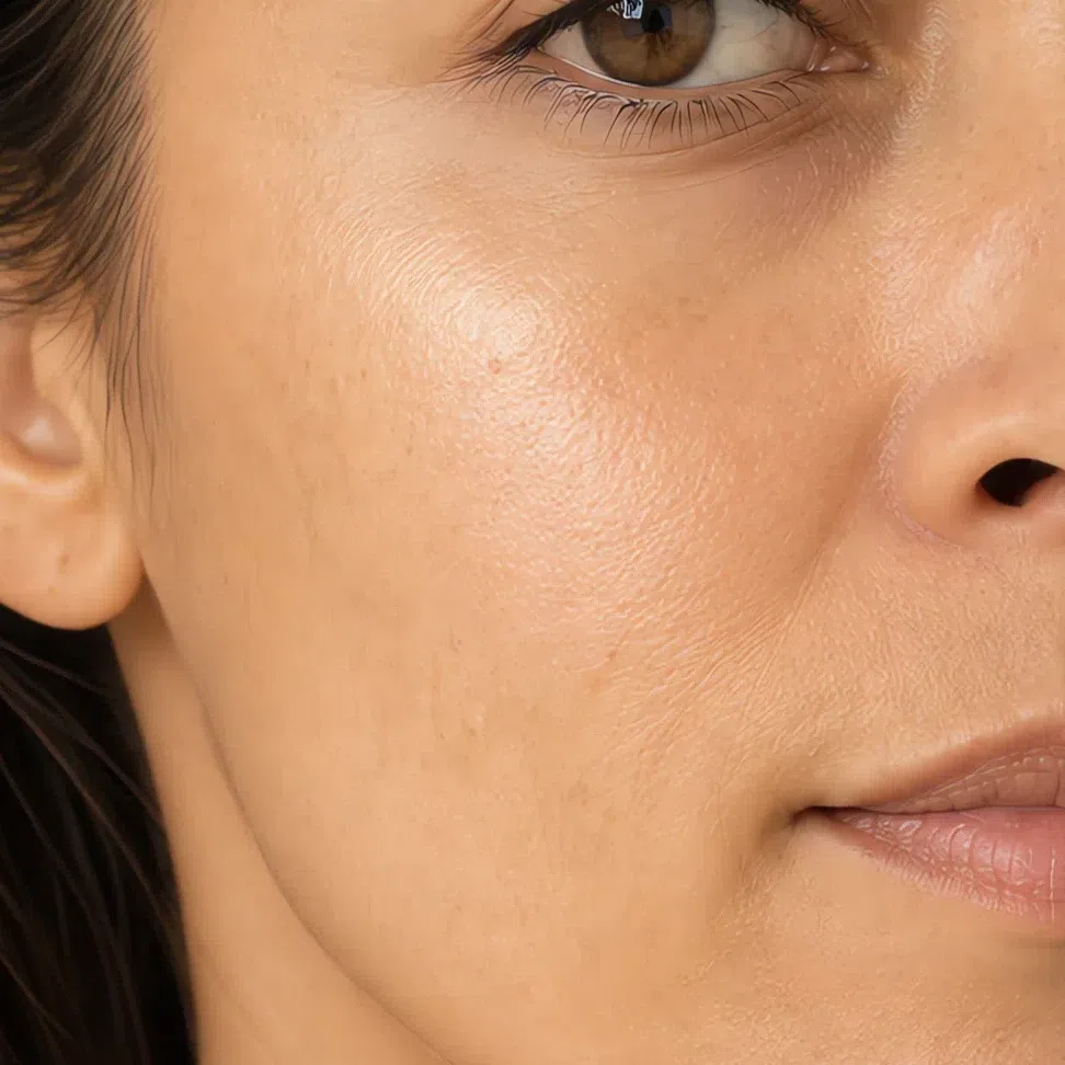
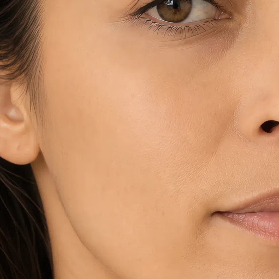
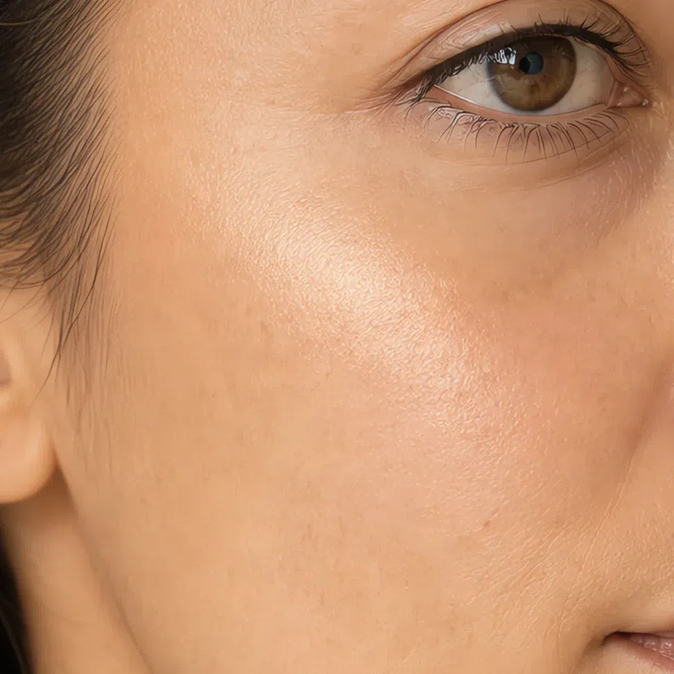
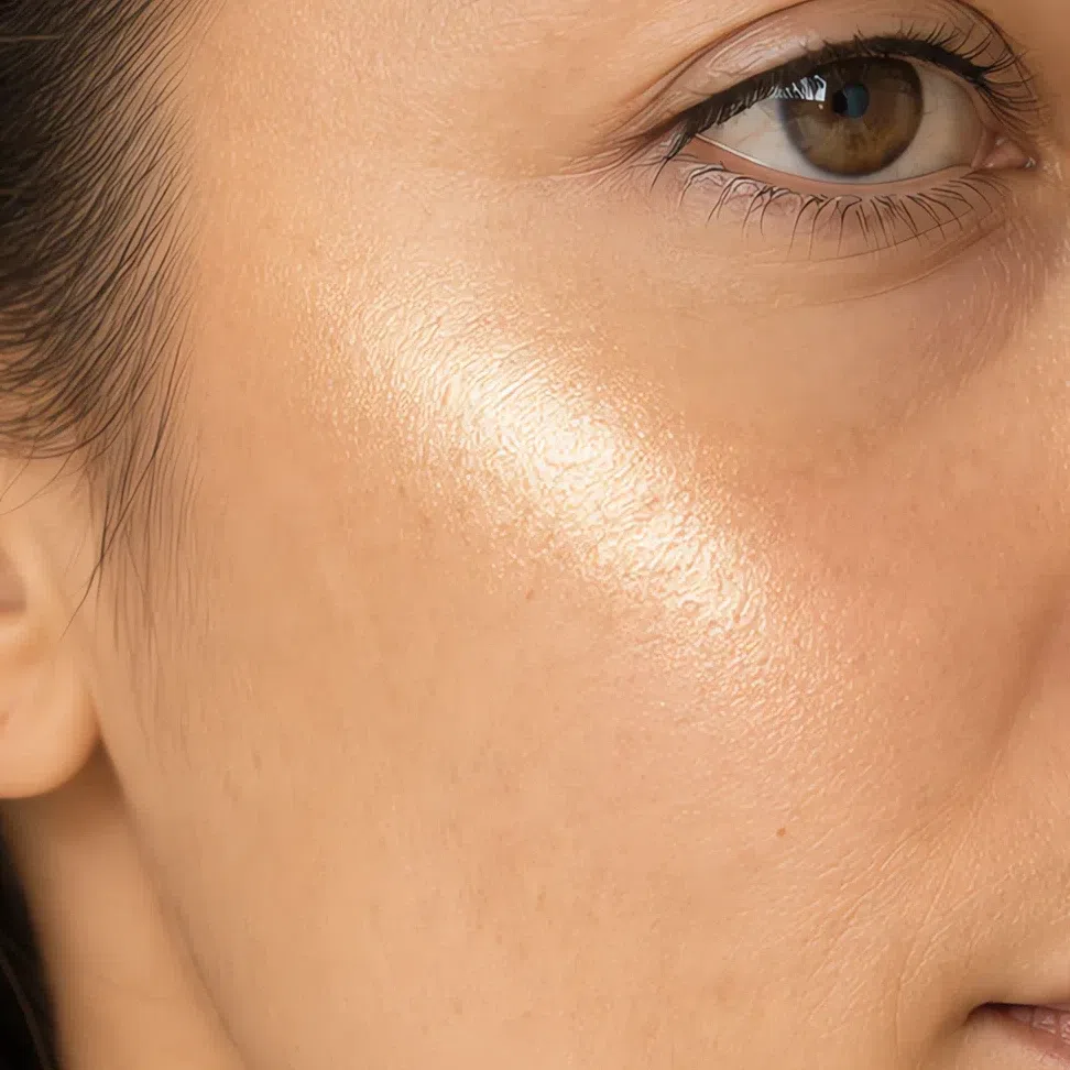
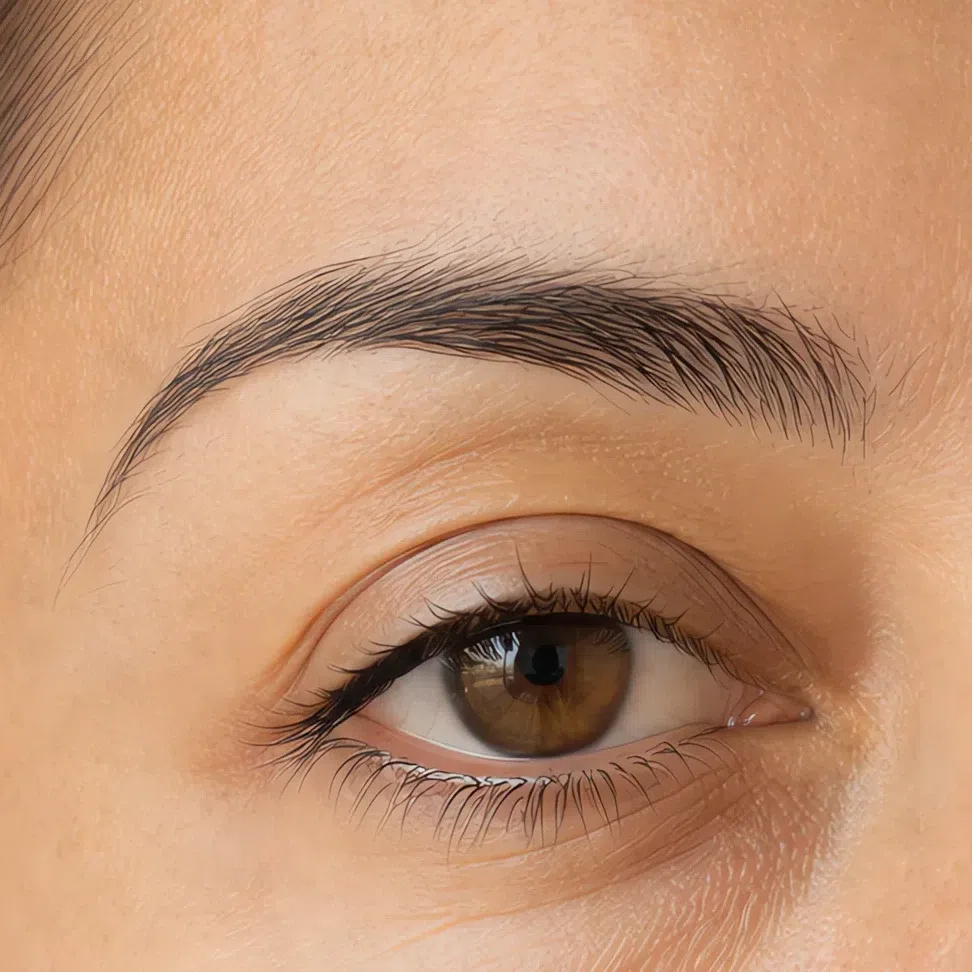
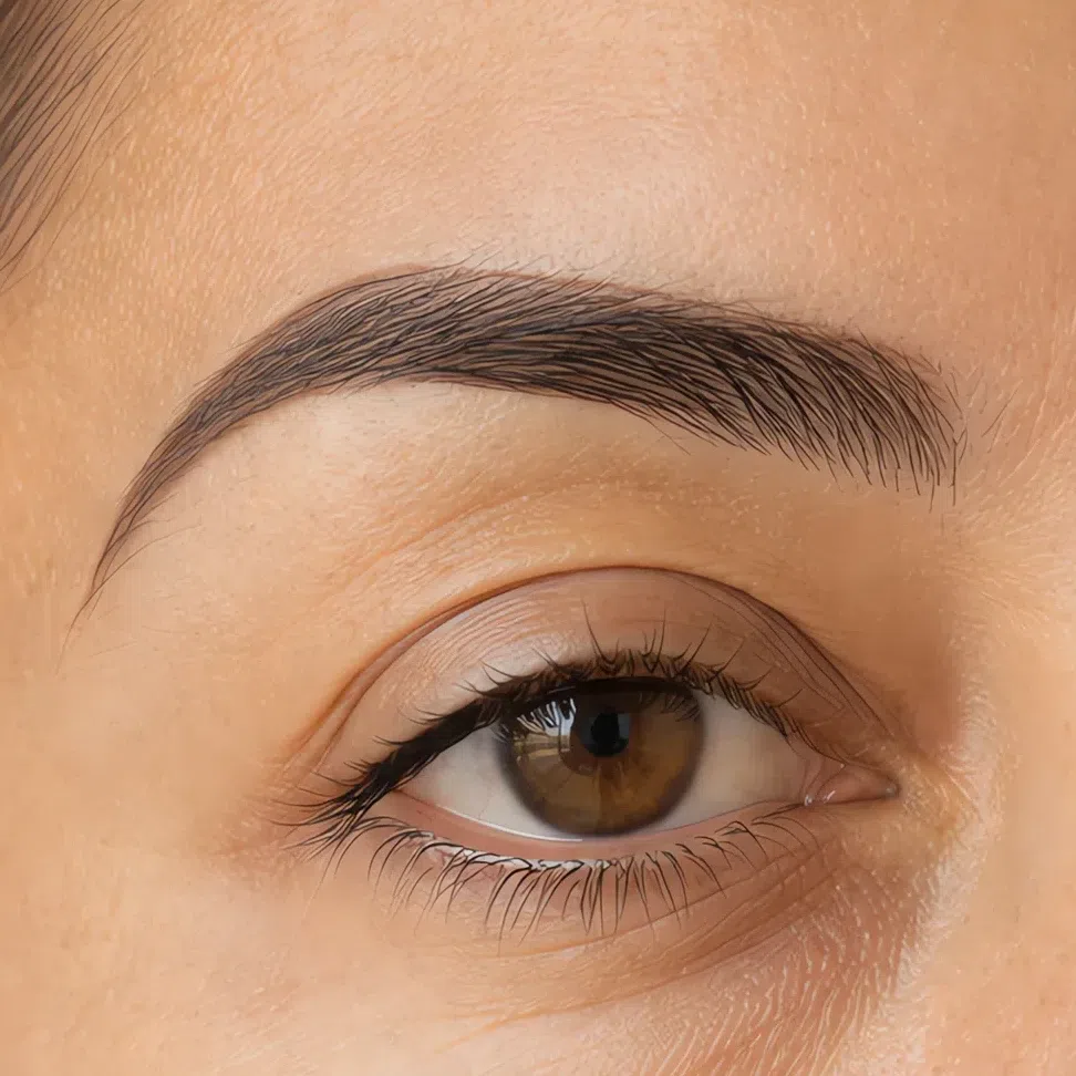
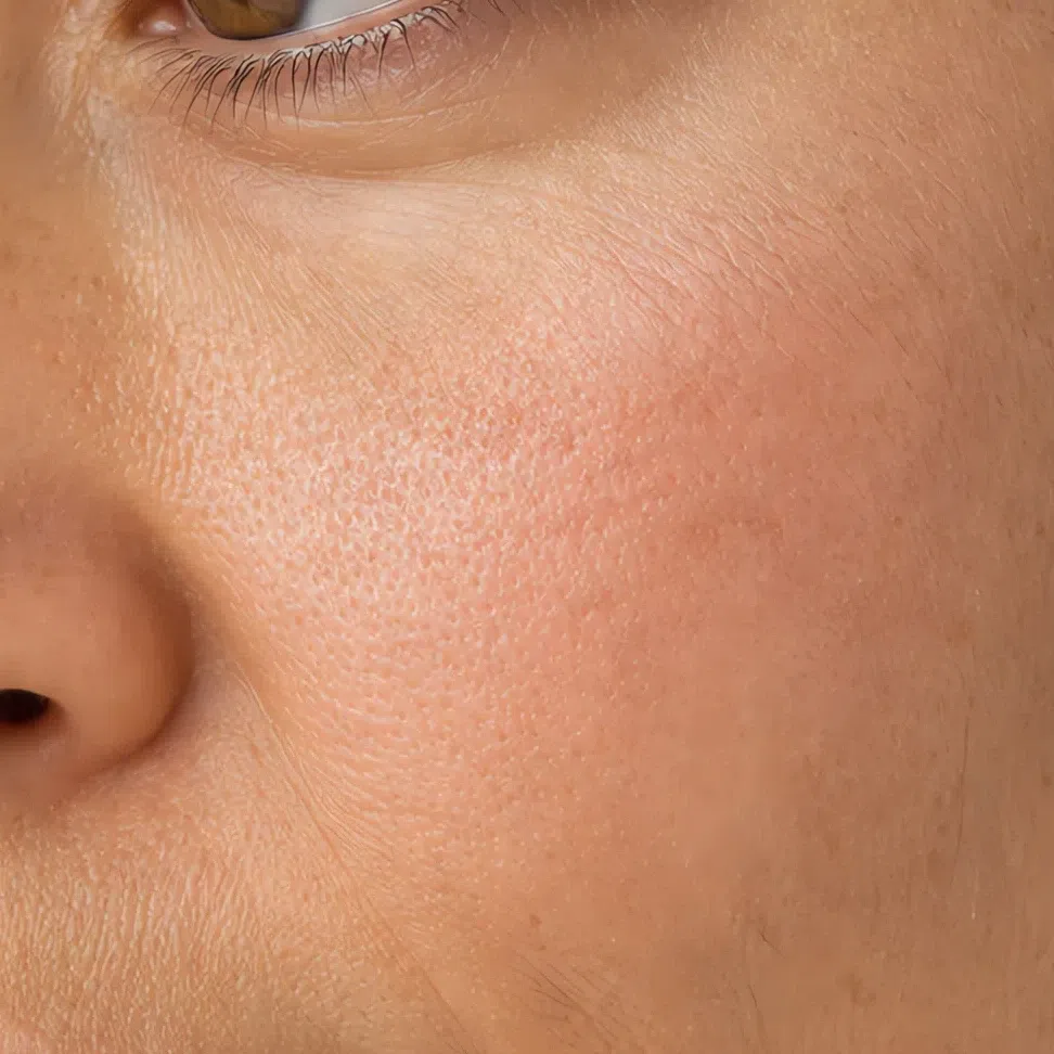
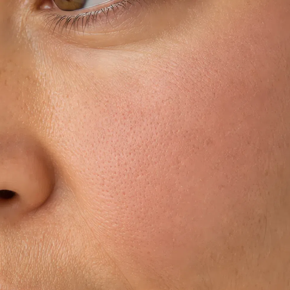
Eyeshadow has a finish decision too - matte or satin by day, and one warm shimmer after dark rather than a glitter - but it is the one product this page already photographs twice, in the everyday and evening sections. It stays in the list below instead of taking a fifth comparison.
What that means product by product
- Base
- Satin. A dewy glass finish adds a shine this skin never had, and full matte strips out the little dimension it does.
- Blush
- Cream first, powder only to set it. Cream sits in the skin instead of on it, which is the difference between a flush and a circle.
- Eyeshadow
- Matte or satin by day. After dark, one warm shimmer - cognac, bronze - across the lid alone, with the rest of the eye left matte. Glitter and silver frost are the two that go wrong.
- Brows
- Powder or a soft gel. A waxy pencil draws an edge and then shines along it.
- Lips
- Cream first, matte second. If you want shine, a sheer balm over a cream shade buys the softness without the hard point.
- Highlighter
- Soft warm pearl in champagne or a low gold. A metallic edge is the same mistake as gloss, on a wider surface and higher on the face.
The honest answer is about the product rather than about you. Powder everywhere is the instinct, and it costs more here than it would on a high-contrast face, because a low-contrast face has very little dimension to spare and full matte removes what is left of it. A satin base, powder only on the panel that actually goes shiny, and blotting paper in the bag will get you further than a second layer will. Warm skin also tends to oxidize a base half a step darker over a few hours, so judge a shade after it has been on you for an hour rather than in the first five minutes at the counter.
How to get the right one home
Everything above assumes you can get the shade home, and this is the part the shade lists skip: how to read a label, how to test, and why the test almost everybody runs cannot work.
The jaw test
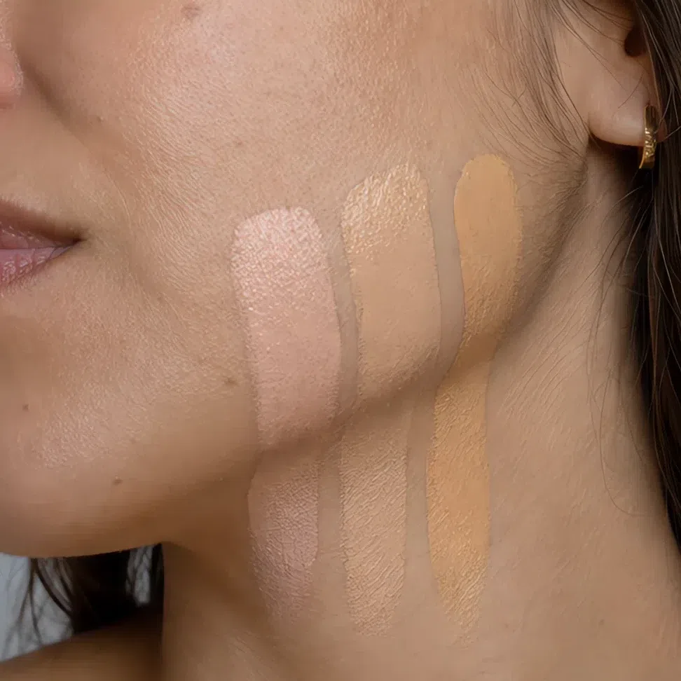
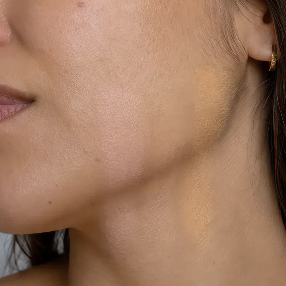
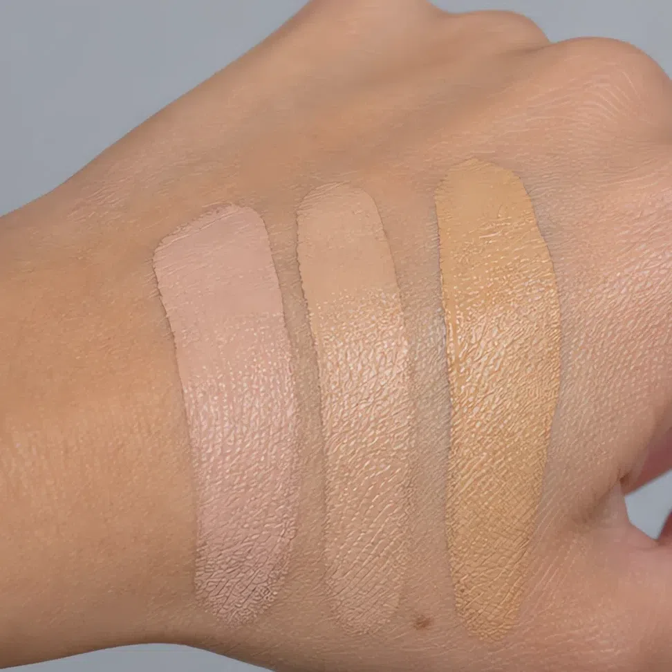
- Put three shades side by side straight across the jaw - not on your arm, and not on the back of your hand.
- Blend all three out.
- Go and find a window. Shop lighting is warm, and warm light flatters every golden shade in the range - including the several that are far too golden for you.
- The right one is the one you cannot find again. Not the one that looks nicest - the one you lose.
The whole shade grid, and the square that is yours
A foundation range is one big grid too: how deep the shade is down the side, which way it leans across the top. Below is that grid with only Soft Autumn plotted on it.
The outlined column is the answer, top to bottom: one undertone letter, any depth you are. A Soft Autumn in ivory and a Soft Autumn in deep brown ask for the same letter and get a different number - which is why the request is always your depth plus warm, never a shade name off a poster.
Three honest notes. The warm column is our values, not a brand’s - the same letter is a slightly different color in every range, and the depth number never transfers between brands at all, so no chart can print a shade you can order by name. The cool, neutral and olive squares are illustrations: each is the warm shade at that depth pushed toward that undertone, named the way a brand would name it, so you can recognize the wrong prefix on a shelf before you see what it does at the jaw. And olive is the honest maybe here rather than a no - the parent page describes this skin as honey, sand or olive sitting under the beige, so an olive base is a real match for a good number of Soft Autumns, particularly at the medium and deep rows. The jaw test settles it.
Reading a shade name
A name is a hint, not a promise. Brands use these words inconsistently and some of them mean nothing at all. They narrow the shelf; the jaw test decides. One warning specific to this season: golden and caramel can overshoot into the shades built for Warm Autumn, which are the same temperature with far more saturation. Warm is the direction, not the dose.
What the finish words on a label actually mean
- Satin, natural
- What you are looking for.
- Demi-matte, soft matte
- Also good - matte without going flat.
- Radiant, luminous, glow
- Dewy. Wearable if you set it, and a lot of face if you do not.
- Matte, velvet, full coverage
- Flattens you, and this skin is already matte. See the finishes section above.
- Metallic, foil, frost
- The gloss problem, in a pan - and frost puts a cool silver cast on a warm face.
Judging a swatch photo online
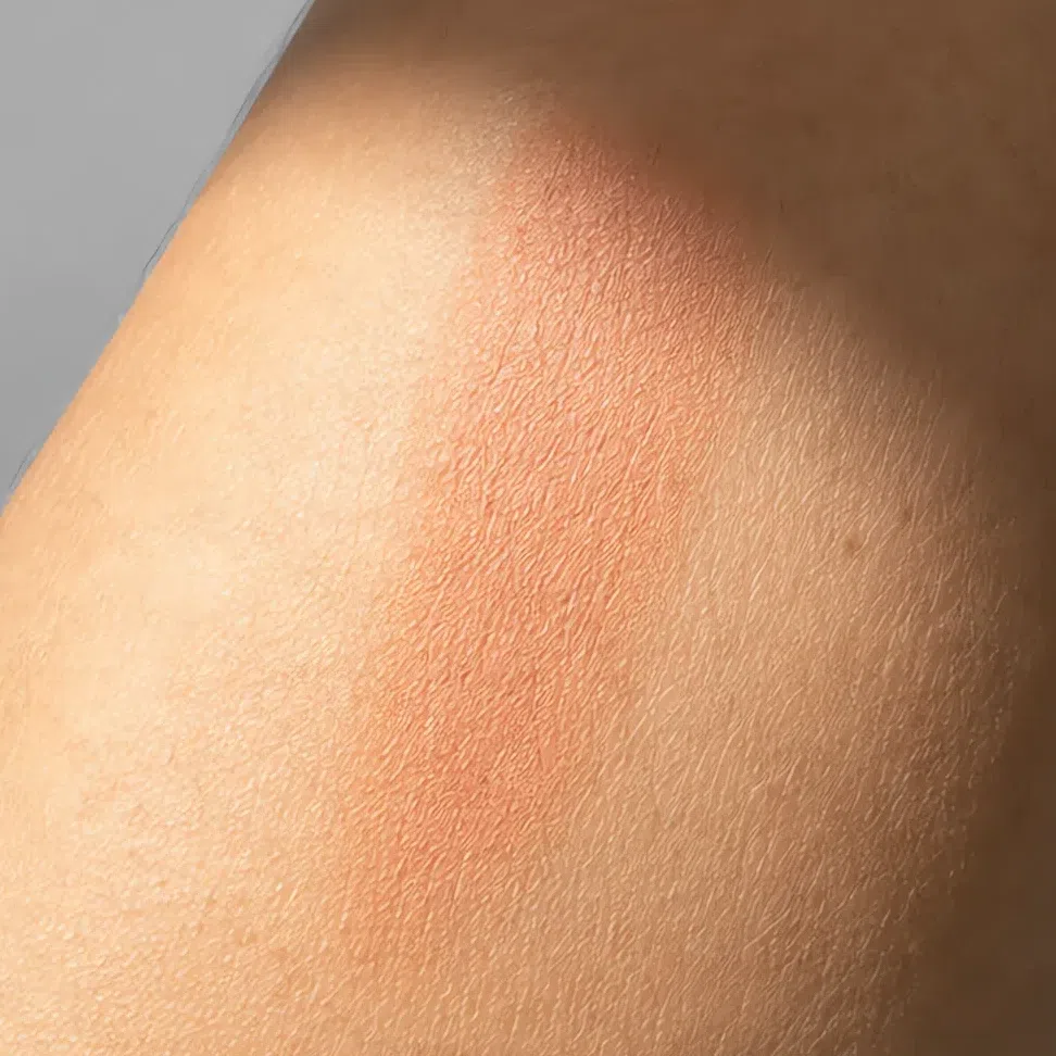
Swatch photos are shot under bright, flat, flattering light, and that light does something specific to a muted shade: it cleans it up. A dusty terracotta photographs as a clear orange, and the grayed quality that made it yours in the first place is the first thing the lighting removes. Two things help. Look for swatches on skin rather than in the pan, and prefer photos with a shadow somewhere in them - a shade that still reads muted where the light falls off is the one you will actually get.
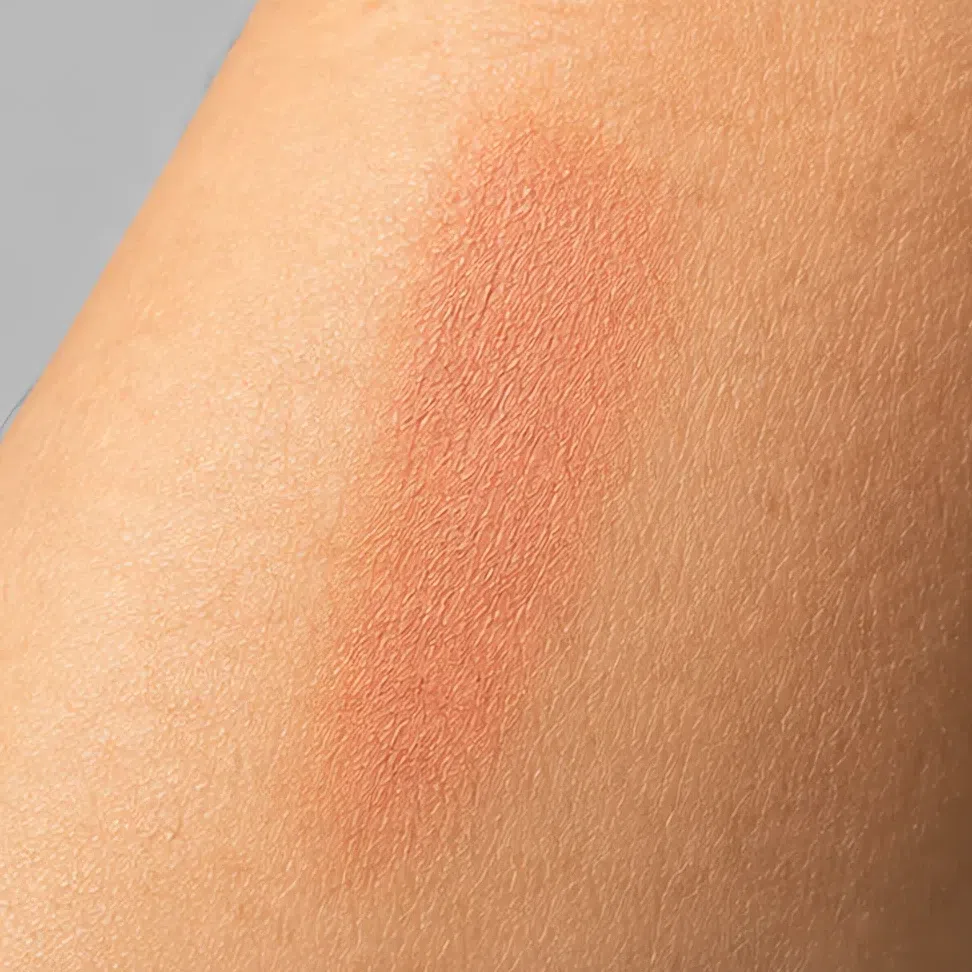
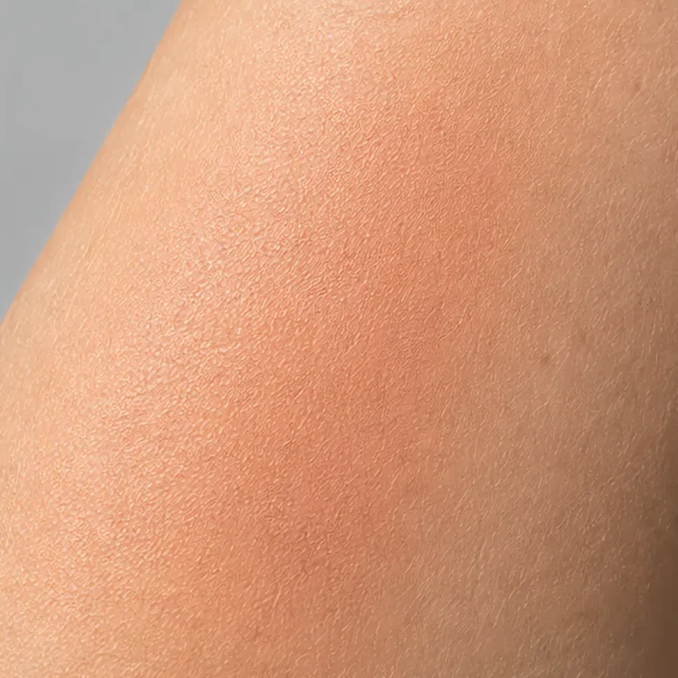

Shade ranges are reformulated and discontinued constantly, a name that is right this year is gone the next, and a recommendation nobody has checked is still a recommendation somebody spends money on. The method above outlasts any list - it works in a shop you have never heard of, on a brand that did not exist when this was written.
When it does not work
You have the shades, the order they go on in, and a way to get the right one home. This is the part you read afterwards, when something is off and you cannot name what. Almost everything that goes wrong on this coloring is one of two problems, and they pull in opposite directions - which is why "just go softer" is bad advice half the time.
Two ways it goes wrong
The makeup arrives before you do
- What it looks like
- In a photo the eye lands on your mouth or your cheeks first and finds your face second. People describe the look as "a lot" without being able to say which part.
- Why
- Nothing on this face is saturated. Hair, skin and eyes all have something grayed stirred into them, so a single clean, fully saturated product has nothing to answer to and becomes the loudest thing in the frame by a wide margin.
- Fix
- Keep the shade family and take the saturation out of it: sheer it down, press it in with a finger instead of building it, or move to the dusty version of the same color. You are lowering intensity, never depth.
It goes muddy, and reads as tired
- What it looks like
- A full face is on and you look flat, slightly sallow, or faintly dirty. Nothing is wrong exactly, and nothing has lifted either. This one usually turns up a week after the first problem, once you have corrected for it.
- Why
- Muted got mistaken for dull, and warm got mistaken for brown. Everything on the face landed at the same depth as the skin and in the same brown family, so there is no separation anywhere and the whole thing turns to sediment.
- Fix
- Hold the muting and put the depth back: one product a clear step deeper than your skin - liner, or the deeper end of your lip ramp - and one product carrying visible color rather than brown. You are raising depth and keeping intensity where it was.
And the shades that never work
Every shade below fails for one of three reasons, and once you can name which one, you can predict the next one yourself without needing a list.
Base and glow
- Pink-based beige cool
- Icy silver highlighter cool
- Optic white powder hard
- Bright bronze shimmer clean
Cheeks
- Fuchsia pink clean
- Cool baby pink cool
- Pumpkin orange clean
- Deep plum hard
Eyes
- Cool taupe cool
- Silver frost cool
- Electric teal clean
- Jet black hard
Lips
- Blue-based red cool
- Clear tomato red clean
- Icy nude pink cool
- Black cherry hard
What the three tags mean
- cleanToo clean
- Full saturation, with nothing grayed stirred into it. Your coloring has something dulling every single shade in it, so a clean color never looks like it came off the same face. This is also where the over-correction lands: bronze and pumpkin are the right temperature at several times the right dose, which is Warm Autumn territory rather than yours.
- coolToo cool
- Pink, blue-based, silver, icy. Your undertone is neutral-warm, and a cool shade laid over it argues with the yellow already in the skin - the face goes chalky rather than fresh, and it happens fastest at the jaw and around the mouth.
- hardToo hard
- Pure white, true black, anything at the far end of the scale. No feature you own sits far from its neighbors, so one product at an extreme invents a level of contrast the rest of your face cannot answer, and everything else drops back behind it.
The three tags above are the whole rule. A shade that is none of them is usually wearable even if it never appears on your palette, and a shade that is two of them is not worth the trip to the mirror. Hexes here are representative examples of each mistake, not measured values from a product.
Your shades, in one block
Everything above, in one place, so you can stop reading and start shopping. Names and hexes only - the photographs and the sliding ramps stay on the palette page, and this is the part worth a screenshot.
- FFair
- LLight
- MMedium
- DDeep
Base: foundation, cheeks and glow
- Fair - neutral-warm #E3CDB0
- Light - neutral-warm #BFAF8E
- Medium - neutral-warm #B08F63
- Deep - neutral-warm #836B4D
- Peach
- Melon
- Rose beige
- Clay
- Fair - cream gold #F0DFC0
- Light - peach pearl #F5CDB6
- Medium - champagne #E8D3A8
- Deep - bronzed gold #D9B892
- Fair - golden brown #A8794E
- Light - golden brown #8C6745
- Medium - golden brown #72563C
- Deep - golden brown #594734
Eyes: shadow, liner, mascara, brows
- Oat
- Shell
- Suede
- Moss
- Cognac shimmer
- Raisin
- Pine
- Truffle
- Umber #6B4E36
- Brass #8A6338
- Fern #4E5537
- Walnut #42301F
- Coffee #4A3728
- Pecan #6B4530
- Brass #8A6338
- Brown-black #2E2620
- Tawny
- Driftwood
- Acorn
- Bark
Lips: the nudes and the reds
- Praline
- Biscuit
- Toffee
- Nutmeg
- Persimmon
- Terracotta
- Brick
- Paprika
A family printed as one dot is the same on everyone - eyeliner and mascara only have to sit deeper than your own lashes, and that lands on the same four shades at every complexion. Foundation, highlighter and bronzer are one dot for the opposite reason: those four shades are the four depths, so the depth is already in the name and yours is one row of the four. Everything else moves, and the four columns are where it moves to. The full ramps, the photographs and the palette itself live on the Soft Autumn page. The full Soft Autumn palette →
Questions people ask
What makeup should a soft Autumn wear?
What is the best lipstick color for a soft Autumn look?
How to tell if you're a soft Autumn?
What colors to avoid for soft Autumn?
Can a Soft Autumn wear red lipstick?
What foundation undertone should a Soft Autumn look for?
Does Soft Autumn makeup change when I tan?
Where this came from
Six sources, and what each one is holding up: that a face has a measurable contrast level and that cosmetics raise it; what happens when you raise it on a face that had little to spare; why the yellow cast in this skin is worth keeping rather than covering; why depth and undertone are two separate things a base has to match; why a gloss reads as a hard bright point; and why the counter lamp and the window disagree about a shade.
-
Aspects of facial contrast decrease with age and are cues for age perception (opens in a new tab)
Porcheron, Mauger & Russell, PLoS ONE, 2013
Behind the premise in start here and both failure modes in when it goes wrong. Facial contrast - how far the eyes, brows and mouth stand out from the skin around them - is measurable, it falls with age, and it is what cosmetics raise. Soft Autumn arrives with less of it than most coloring does, which is why the question on this page is rarely which color and almost always how much, and where.
-
Differential effects of makeup on perceived age (opens in a new tab)
Russell, Batres, Courrèges et al., British Journal of Psychology, 2019
Behind the makeup arrives before you do. In controlled photographs makeup made 40- and especially 50-year-old women look younger, and made 20-year-old women look older. The authors put the reversal down to association rather than to optics: makeup reads as adult, so on a face that is not yet clearly adult it pushes the estimate up. Either way the finding is the one worth carrying - more makeup is not monotonically better, and there is a point past which it starts working against you.
-
Carotenoid and melanin pigment coloration affect perceived human health (opens in a new tab)
Stephen, Coetzee & Perrett, Evolution and Human Behavior, 2011
Behind the base step in how to build it and the case against a full-coverage base. Given the job of making a face look healthy, people raise its carotenoid coloration - the yellow one - more than they raise its melanin, and eating more carotenoid-rich food measurably increases yellowness in skin reflectance. The warm cast this coloring already carries is the thing a heavy base covers up first, and it is doing work.
-
Non-invasive measurements of skin pigmentation in situ (opens in a new tab)
Stamatas, Zmudzka, Kollias & Beer, Pigment Cell Research, 2004
Behind the shade grid in how to shop. Every instrument that measures skin pigmentation works off melanin’s ability to attenuate light - but hemoglobin in the dermal capillaries attenuates light too, and the paper’s point is that it has to be accounted for separately before either can be read. Skin color is two signals, not one. Our extension of that, not the paper’s: those are the two axes a foundation grid is drawn on, which is why your depth and your undertone are separate decisions and getting one right cannot rescue the other.
-
The dark side of gloss (opens in a new tab)
Kim, Marlow & Anderson, Nature Neuroscience, 2012
Behind the whole of finishes. A glossy surface throws back both bright specular highlights and dark specular lowlights, and the paper shows either one alone is enough to make a surface read as glossy - gloss is built out of that image structure rather than out of brightness. A gloss lip carries a hard highlight, a cream lip spreads it into a band wide enough to pass as skin, and a matte lip has neither. That is the ranking on this page, and why it holds for every product rather than only for a mouth.
-
CIE 013.3-1995: Method of measuring and specifying colour rendering properties of light sources (opens in a new tab)
International Commission on Illumination (CIE), 1995
Behind the jaw test in how to shop. This is the standard that defines how faithfully a lamp renders the colors of whatever sits under it, scored by comparing test-color samples under that lamp against a reference - and one of the samples in its own set is complexion. Shop lighting is warm and scores poorly, which on warm coloring cuts the wrong way: the counter lamp flatters every golden shade in the range, including the several that are far too golden for you. That is why the test has to happen at a window.
One distinction worth being plain about. The contrast research, the pigment biology, the gloss perception and the lighting standard above are sourced. Which blush, shadow and lipstick shades belong to a Soft Autumn, which shade plays which part at each of the four depths, and where the evening ceiling sits are our own analysis, built out from the palette on the parent page. No study has been published on any of that, and we would rather say so than dress it up in a citation.