
The Soft Autumn color palette: your shades and wardrobe
Soft Autumn is the gentlest of the three autumns - warm coloring under a soft gray veil, with hair, skin and eyes all sitting at nearly the same depth. Below: the full palette, the shades that gray you out, and the Soft Summer check that ends the argument.
Try the Soft Autumn color palette, shade by shade
The whole palette runs warm and low-saturation at the same time. Sand and mushroom do the base work, sea glass and antique rose are what goes near the face, and teal and terracotta carry the accent. Swap her top through them and watch where your eye lands: the dusty shades hand attention back to her face, the clean bright ones keep it for themselves.
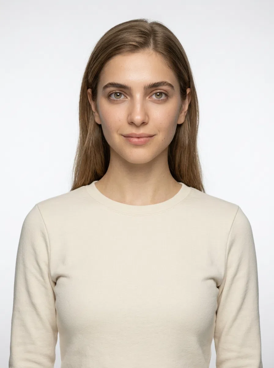
Soft Autumn in 30 seconds
Soft Autumn - also called Muted Autumn - is the least intense of the three autumns: neutral-warm in temperature, low in saturation, low in contrast. The Soft Autumn color palette lives at the dusty end of the season - terracotta, mustard, moss, cinnamon - and gold does more for this skin than silver does.
| Skin | Neutral-warm and matte, from ivory through light olive; a tan comes up golden-beige. |
|---|---|
| Eyes | Hazel, gray-green or tea-brown - dusty and flecked, never a clear single color. |
| Hair | Sandy blond through mid brown, muted at every depth - never ginger, never ash. |
| Contrast | Low - the defining trait: no feature is far lighter or darker than its neighbors. |
| Metal | Antique gold, bronze and rose gold - matte, brushed or hammered rather than polished. |
Wardrobe base:
Wear with care:
Muting is the requirement here, not a preference - there is no clean, pure color anywhere on the list below. Still weighing Warm Autumn or Soft Summer? Check it from a photo.
Am I a Soft Autumn?
Four traits, three tests, five minutes
Soft Autumn is the hardest autumn to catch, because nothing about it is loud. The warmth never arrives at gold, the saturation stays low, and the face reads as one gentle range rather than separate features. If bright, clean shades take your face over instead of lifting it, and people call your coloring calm rather than striking, start here.
Undertone and contrast decide the season, not how light or deep your skin is - Soft Autumns run from ivory through deep brown, and what every one of them shares is the neutral-warm cast, the low saturation and the short step between features.
1Skin tone: warm, and quiet about it
What defines Soft Autumn skin is a neutral-warm undertone, and the reason it is so easy to miss is that it declares nothing: no clear pink, and no gold strong enough to spot without holding something up against it. It turns up at every complexion depth, and the depth is never the clue. The undertone is.
One piece of your own history settles more than any mirror will: how far your tan gets before it stops. This skin browns a shade or two, holds there, and no amount of sun moves it past that point - so if you have ever come home genuinely bronzed, the answer is one of the other two autumns. Burning first is common here and rules nothing out; where the tan stops is what counts.
Then look at your own marks. Freckles, sun spots and moles all read as some flavor of brown in this coloring, and what makes them worth checking is the heat that is missing from them - a Warm Autumn's marks carry visible ginger or copper, and these do not. Depth changes how loud they are, never what color they are. No marks at all is not a result either way; plenty of Soft Autumns never freckle.
Three tests, all of them in daylight
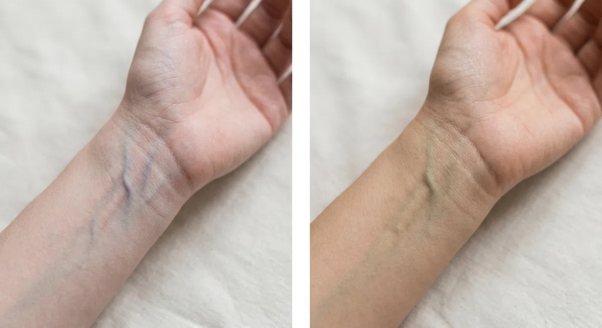
Stand where daylight falls on you and turn your forearm palm up. The light matters: a warm bulb pushes the answer yellow, a cool LED pushes it blue. Judge the network as a whole rather than picking one vessel and deciding from that.
- Greenish or olive, but not vividly so - neutral-warm, which is what this coloring runs on.
- Blue or violet - a cool undertone. Look toward Summer instead.
- You genuinely cannot decide - neutral, and for a neutral-warm type that is a normal result rather than a failed test.
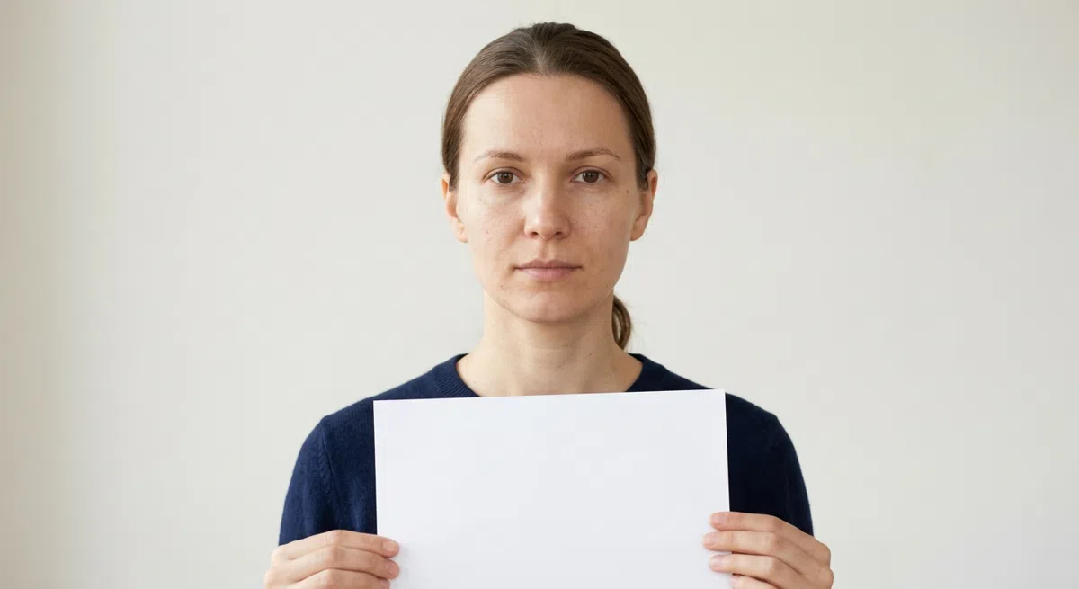
Makeup off, hair clipped back, a plain white sheet held just under the chin in daylight - the closer it sits, the more obvious the shift. Use printer white, not stationery: cream and ivory carry warmth of their own and answer the question for you.
- A soft golden or beige cast comes up - neutral-warm, and your answer.
- A pink or faintly blue cast appears - the undertone is cool.
- The skin looks a little gray - an olive nuance, which turns up in this coloring often.
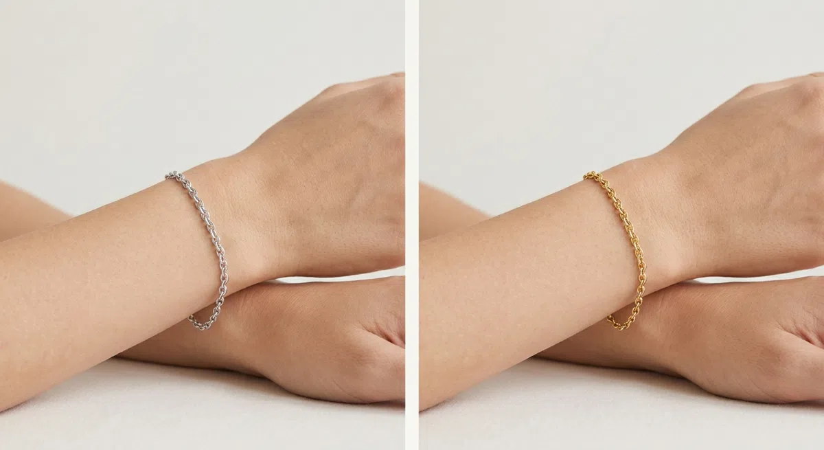
Silver on the wrist, look, off; gold on, look. Daylight, bare skin, no shimmer cream underneath. The metal is not what you are grading - the strip of skin beside it is. One of the two settles it, the other roughens it.
- Matte gold wins - warm, without the brightness. The characteristic answer here.
- Silver wins - a cool undertone, and a different season.
- Both look fine - neutral. The first two tests decide it.
Neutral-warm is a lean, not a declaration. If you have been hunting for obvious gold in your skin and not finding it, the absence is the finding - it separates you from a Warm Autumn rather than ruling you out of autumn.
2Eye color: complex, and slightly veiled
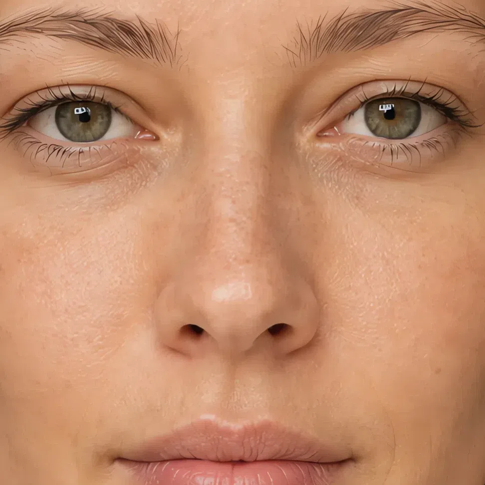
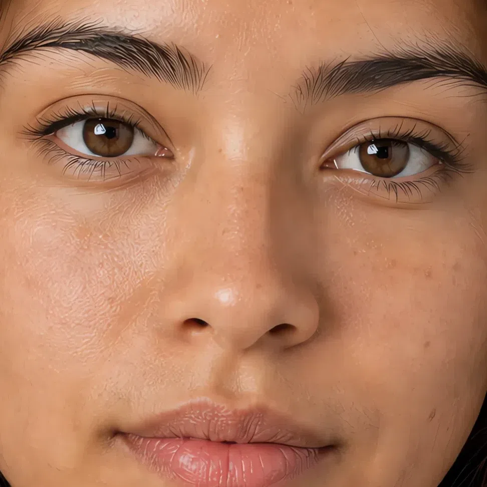
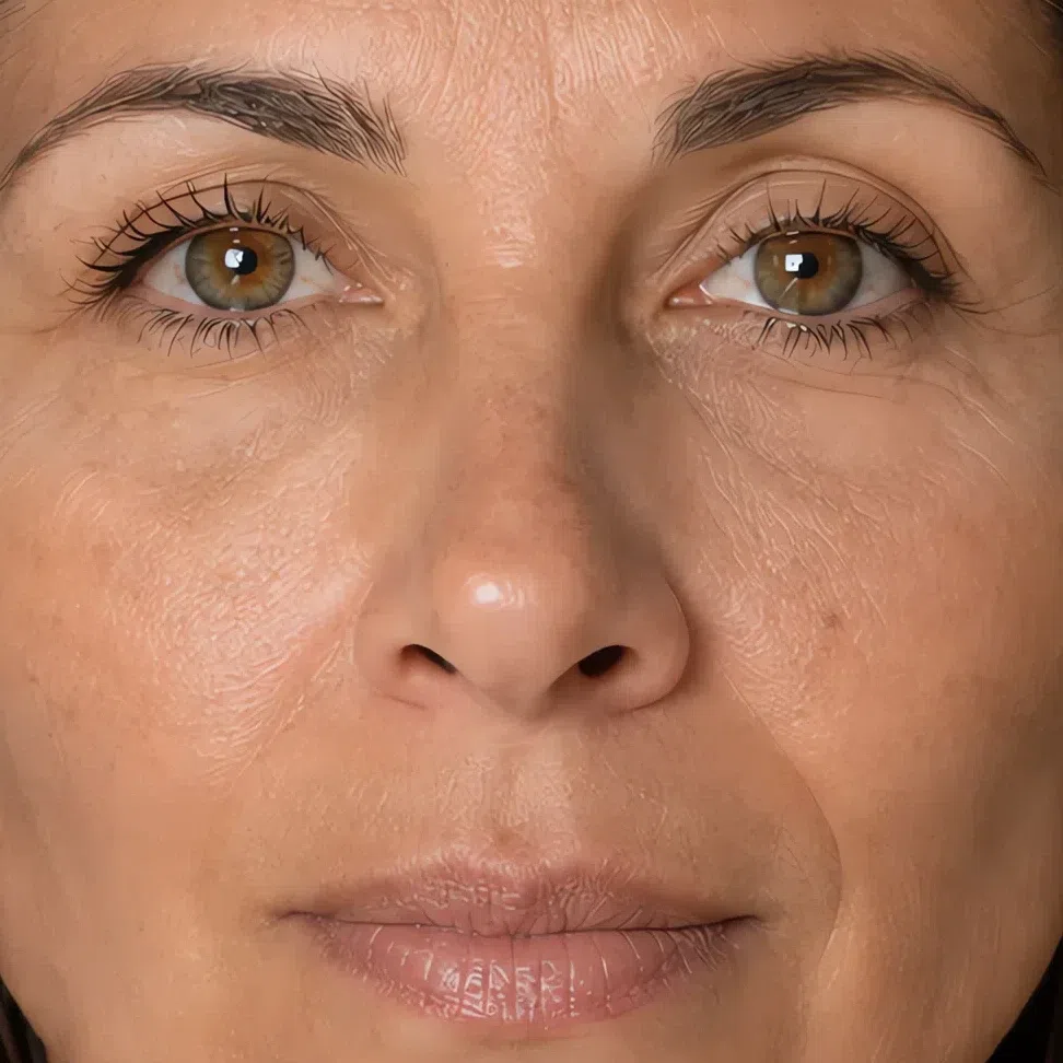
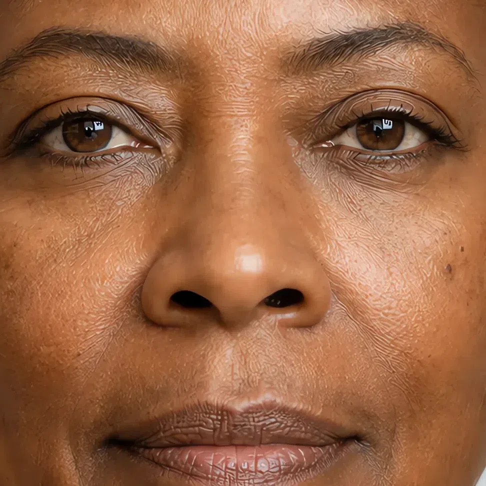
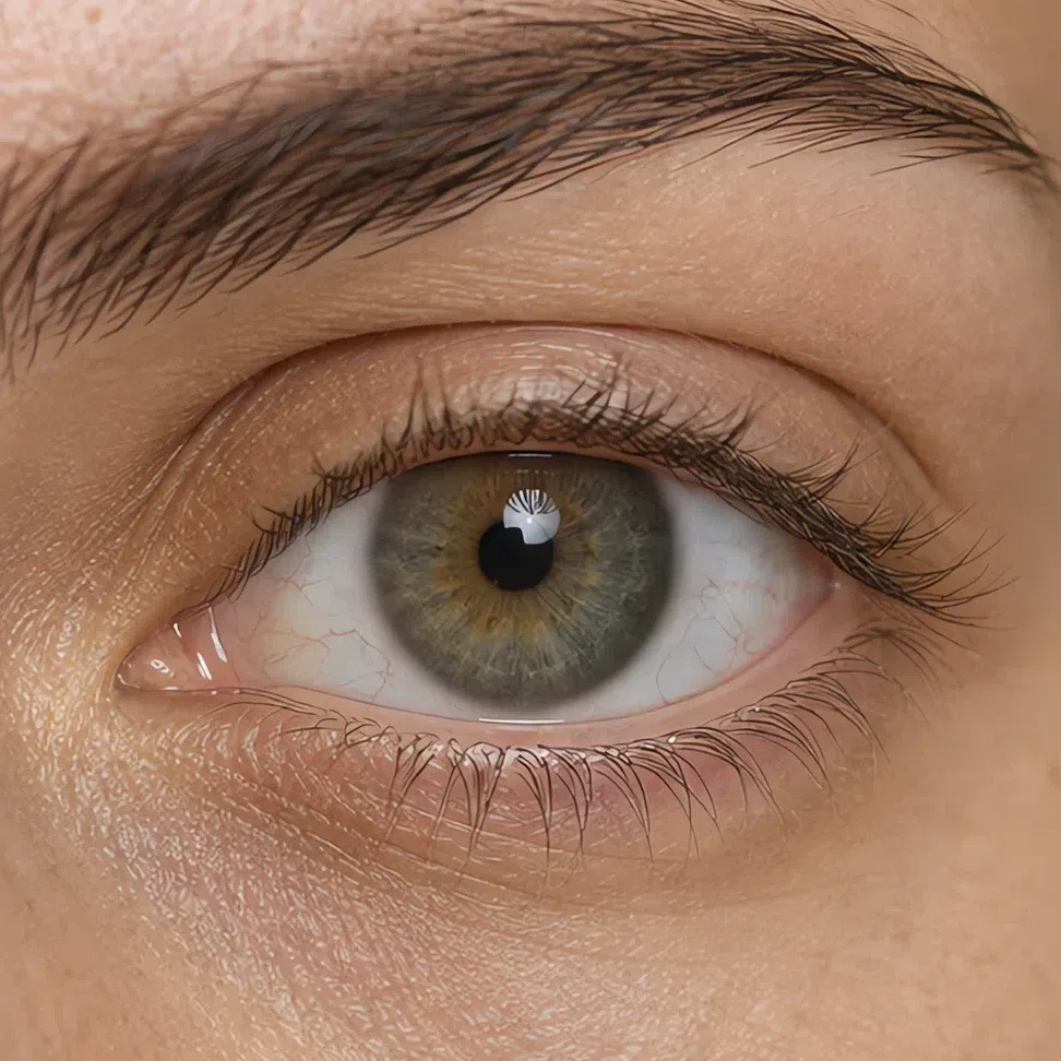
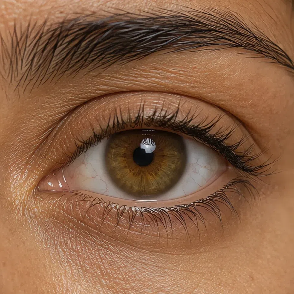
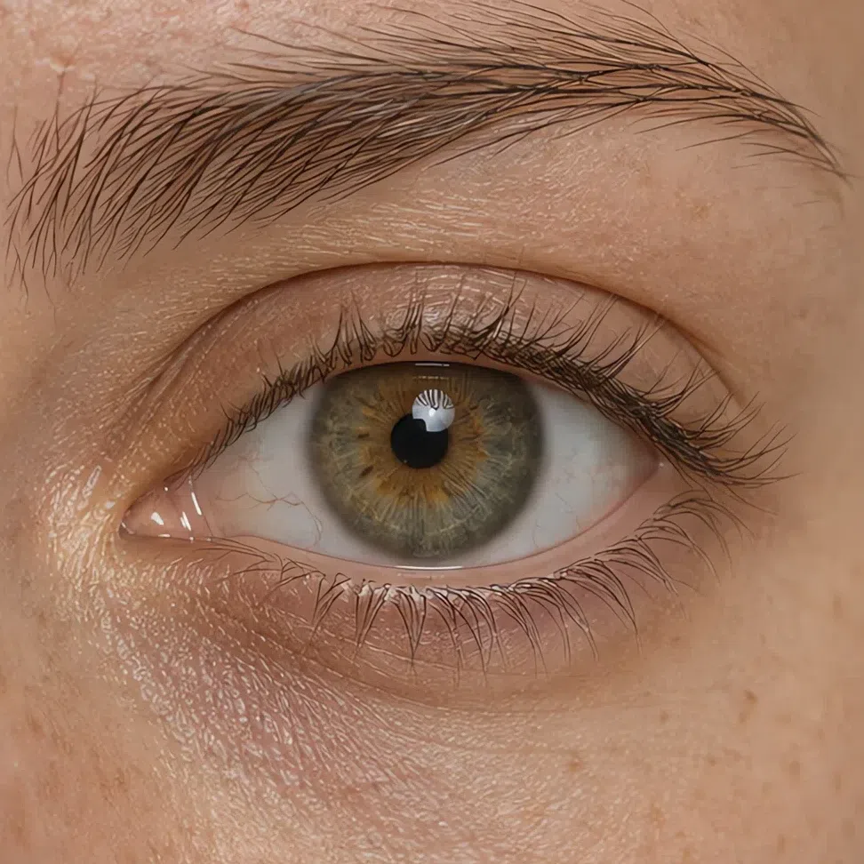
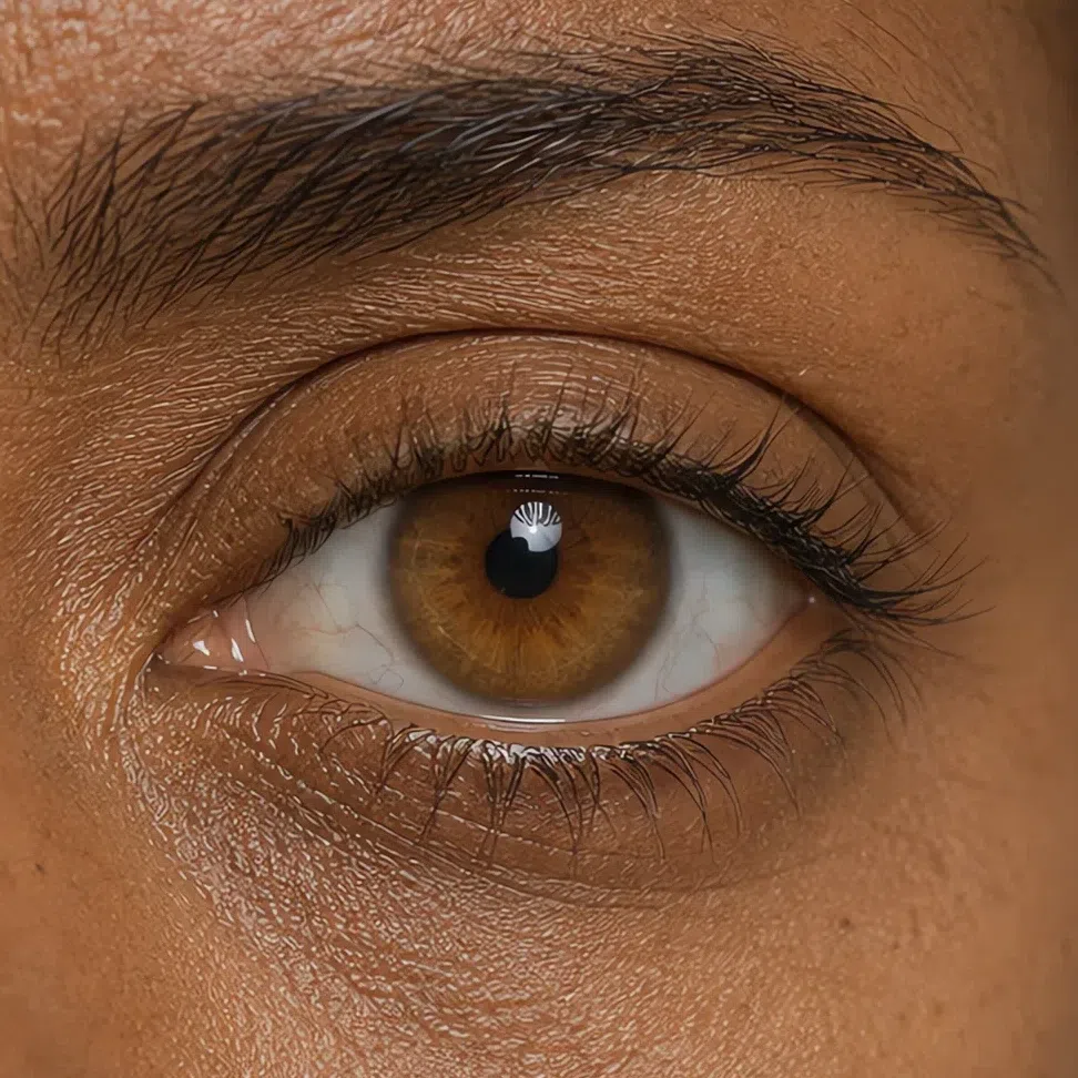
Soft Autumn eyes are never crystal-clear and never piercing. The color is always a mixture, and it always looks as though a thin film went over it - nearer to moss, marsh water and tobacco than to any single word.
Photograph one eye in daylight and open the shot as large as your screen will go. Two things decide it, and neither of them is the name of the color. The sclera reads creamy rather than white - lay a sheet of printer paper beside the photo if you cannot tell. That one thing takes a notch off the contrast of the whole face. And there should be no drawn edge where the iris ends: a crisp dark ring circling it belongs to a clearer coloring than this one, whatever shade sits inside.
Blue-eyed, and assuming that rules you out of autumn? It does not. Blue and gray both occur here, only never in their clean form - a blue nearer sea water than sapphire, a gray with olive or hazel warmth sitting inside it. What would rule you out is ice-blue or steel: those keep a hard edge, and nothing in this coloring does.
Stop trying to name the color and describe the mixture instead. A green that is part gray and part tobacco is the real answer, and the fabrics that suit you are mixed the same way.
3Hair color: the middle of the range
Natural Soft Autumn hair sits in the middle of the scale, roughly level 4 to 8 with most people between 5 and 7 - sandy blond, mousy brown, light chestnut, muted dark chestnut. Two absences do the identifying: nothing in it flames into ginger or copper, which is where a Warm Autumn goes, and nothing in it reaches black, which is where a Deep Autumn ends.
People call it mousy and leave it there, but in sunlight the same hair throws a golden or olive sheen that mousy does not cover. It lightens over a summer to soft golden strands and stops well short of platinum. Texture has nothing to do with the season.
Dyed for years and no longer sure what is underneath? Photographs from before about age ten will tell you, and so will an inch of regrowth read in daylight. Roots come back more muted than anyone expects.
The salon mistake here is reaching for an extreme. An ash toner strips out the warmth this coloring runs on; a copper gloss overshoots it. The muted mid-brown you were born with is the expensive-looking one.
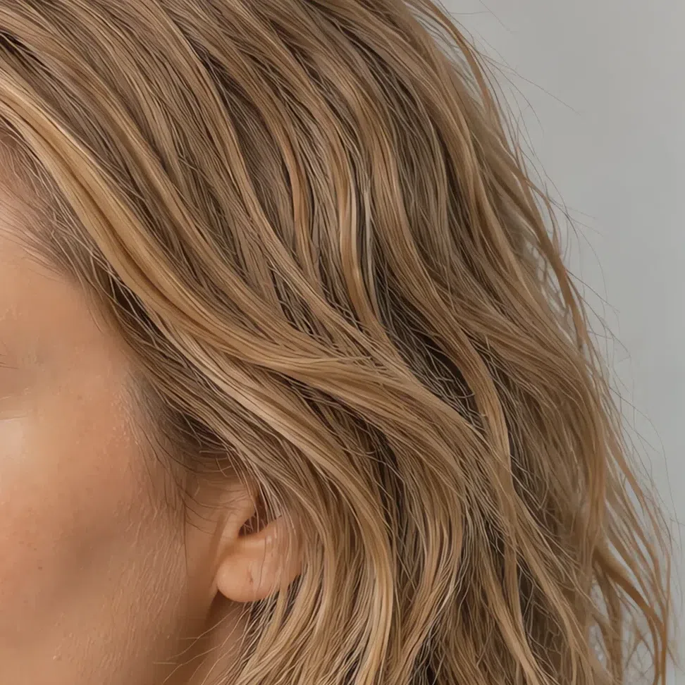
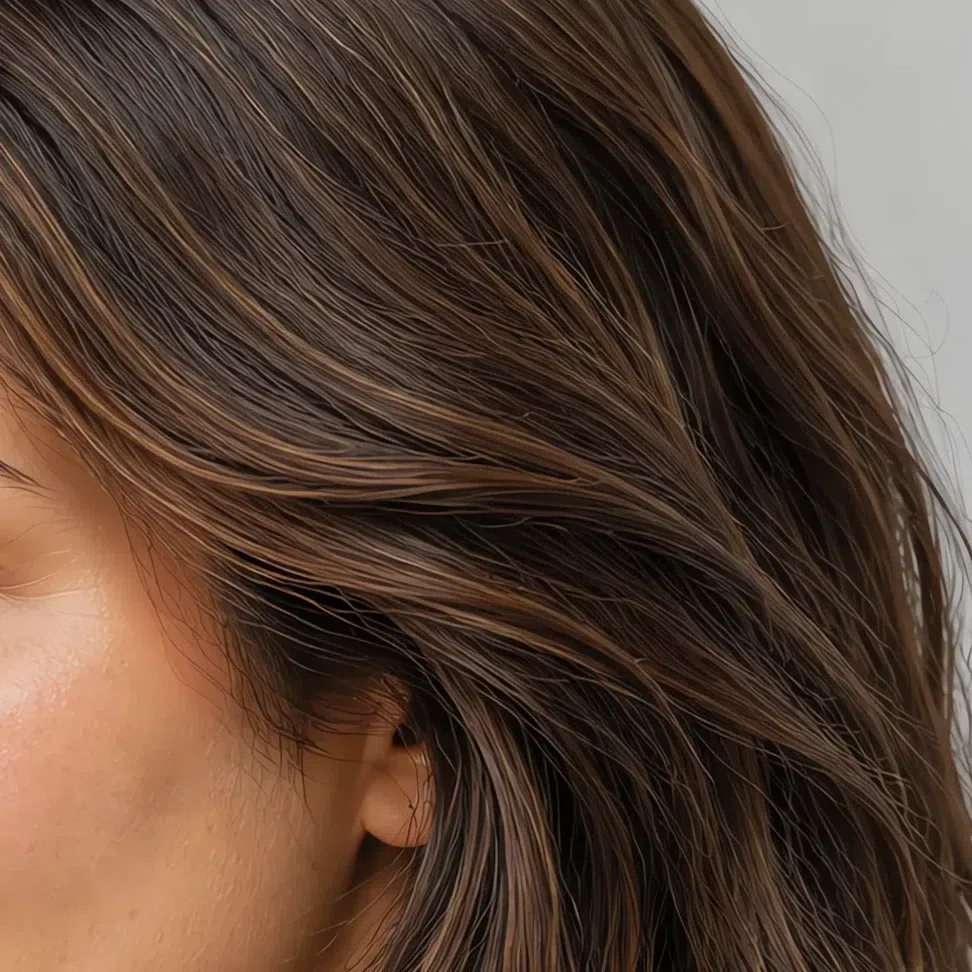
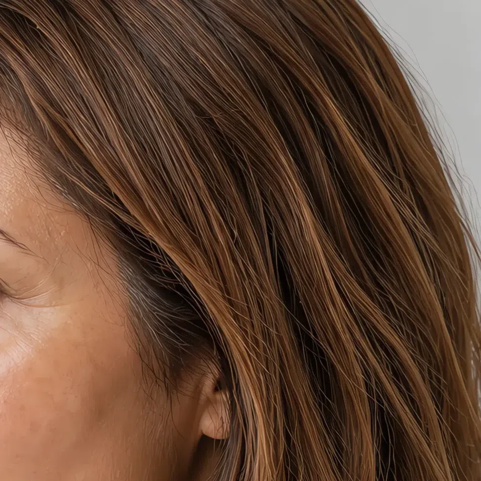
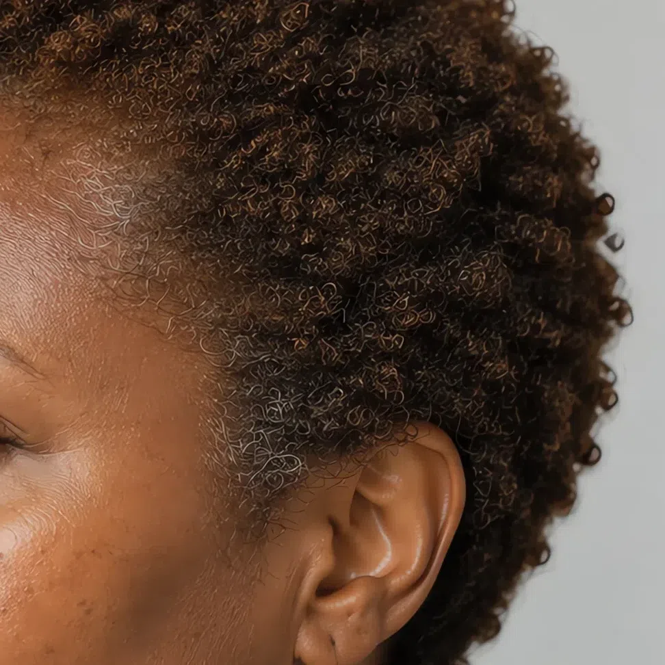
4Contrast: the trait that actually decides it
The strongest single sign of Soft Autumn is low contrast. Hair, skin and eyes land within a step or two of each other in lightness, so no one feature carries the face - they carry it together, and that is what makes the whole thing read as gentle.
Think of a painting done in sfumato: contours softened, colors running into one another, no hard edge anywhere. Even fair skin under fairly dark hair still reads soft, because the shades themselves are muted.
It holds at every depth, and harder at the deep end: when hair, eyes and skin are all deep, the distances between them shorten rather than stretch. A deep Soft Autumn is not a high-contrast person who happens to be dark - it is the same quiet face lower on the scale, and black flattens it just as it flattens a fair one.
Low contrast is a budget, not a restriction. You have about one step of difference to spend, so spend it on texture or on a single accent. Spend it on a hard light-dark split and the face loses.
- Two ways to check. Photograph yourself in daylight with no makeup and desaturate the shot: three close grays, with nothing reaching pure white or true black, means low contrast. Then check it in fabric - a pure black crew neck, then a soft gray-brown one. Low contrast is when the black takes the face over and the gray-brown gives it back.
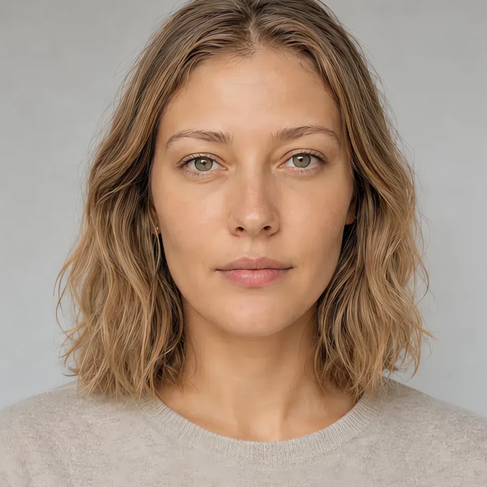
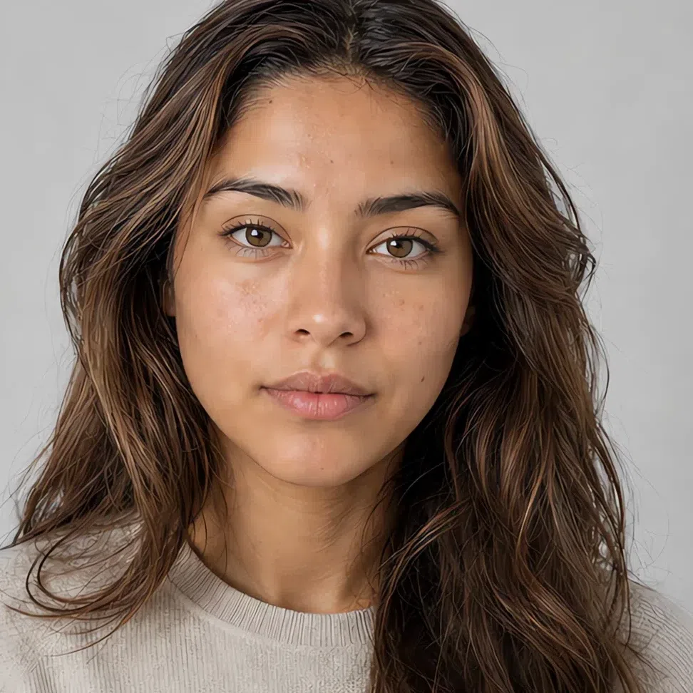
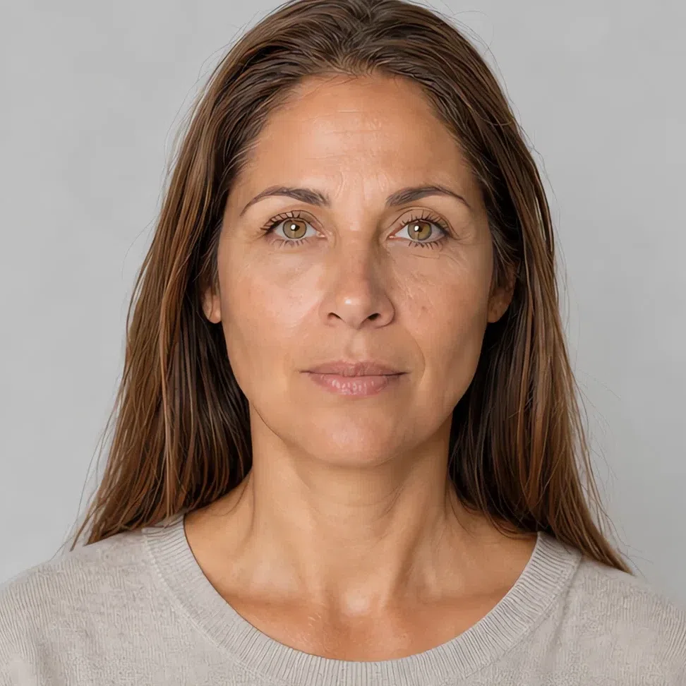

A Soft Autumn in daylight on the left, the very same shot desaturated on the right. Warmth is the first thing people reach for with this season, and it is the first thing grayscale destroys - what survives is lightness, which is the trait that actually decides the subtype.
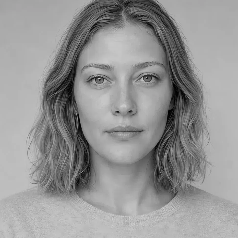
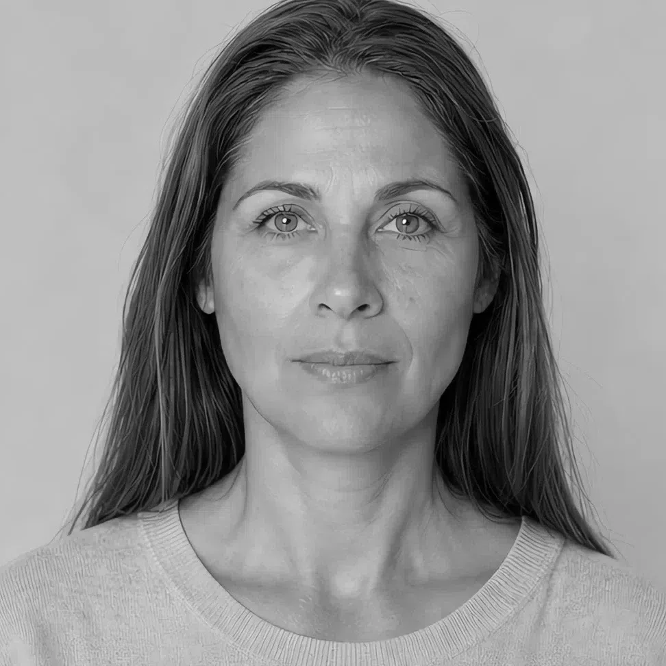

Hair Skin Ramp runs black to white
Judge one ramp at a time. Dots together means the face is made of neighboring tones; dots far apart means it carries a hard break. How far along the ramp the pair sits is depth; the gap between them is contrast. The gap does open slightly as coloring deepens, so it is a description of one face rather than a number to rank faces by.
5The color test: hold the palette to your face
The fastest way to settle this is to stop reading and pick up fabric. Daylight, makeup off, hair back, each color held under the chin for a few seconds. You are watching one thing: whether the skin along your jaw stays even and rested, or goes gray while the shadows come forward.
Black is the one people argue about, because it is sold as universal and it is not. Here it is simply too hard an edge: it drags shadow into the face, brings up anything blue under the eyes, and drains the jaw of what color it had. If black leaves you tired rather than sharp, that is the low contrast talking.
Colors that wake your skin up
If these leave your skin even and your eyes a shade brighter than they were, you are in the right season:
- Terracotta
- Olive
- Mustard
- Antique rose
- Sea glass
- Cream
Colors that drain you
If these pull shadows into your face and flatten the color out of your skin, they are not yours:
- Jet black
- Fuchsia
- Optic white
- Electric aqua
- Navy
Soft Autumn vs Warm Autumn vs Deep Autumn
All three autumns share a warm base, which is why people bounce between them for years. The names carry the answer: each of the three is named for whichever axis runs the show - softness, warmth, depth. Settle the top row and the eight beneath it mostly answer themselves. And if a quiz called you a True Autumn, that is the older name for Warm Autumn; Dark Autumn is the same column as Deep Autumn.
| Soft Autumn | Warm Autumn | Deep Autumn | |
|---|---|---|---|
| Leading axis | Softness. Muted first, warm second | Temperature. Warm, and there is no mistaking it | Depth. Darkness leads and warmth follows |
| Temperature | Neutral-warm. The warmth is real but it never speaks up | Openly warm. The most golden coloring in the system | Neutral-warm, sitting closer to neutral than Warm Autumn does |
| Depth | Medium. Runs from ivory to deep brown without changing which season it is | Light to medium, and often looks sun-touched year round | Deep. The darkest autumn, and the only one where black is even arguable |
| Clarity | Muted, as though a veil went over the whole face | Medium to rich. Colors stay clear enough to read as themselves | Rich and saturated, with weight behind every shade |
| Contrast | Low. In black and white the three features barely separate | Medium. The hair usually pulls away from the skin | High for an autumn - deep hair and eyes against skin that can be much lighter |
| Skin | Beige to light olive at the fair end, olive-bronze at the deep end. Matte, not translucent | Golden and peachy, and the autumn most likely to freckle | Olive through bronze, and rarely fair |
| Eyes | Mixed and dusty: gray-green, hazel, tea-brown, amber | Warm and bright: amber, olive, clear warm brown | Dark and deep - near-black brown, deep hazel |
| Hair | Sandy blond through muted dark chestnut. No ginger, no ash | Visibly warm, with copper, red or gold running through it | Dark chestnut, chocolate, or black with a warm cast |
| Metals | Antique gold and bronze, aged rather than polished. Rose gold on finer pieces | Bright yellow gold and warm stones | Gold, bronze, darkened silver |
If two columns still look equally like you, the details will not break the tie - the top row will. Say your coloring out loud in one word to someone who has never heard of seasons: quiet, warm, or dark. The word that arrives without effort is your column.
Soft Autumn coloring, up close
Every trait at four complexion depths
Everything in this coloring is held one step back. There is warmth in it, but you have to go looking for it; every shade has some gray folded in; and skin, hair and eyes land close together in depth. It is why a Soft Autumn will so often call her own coloring nothing in particular - the traits are all there, they are just speaking at the same volume.
Soft Autumn skin: warm without looking it
There is no porcelain pink in this skin, and no obvious gold in it either. The undertone is neutral-warm - a beige base with a faint peach or olive note running underneath - and the finish is matte and slightly velvety rather than translucent. It is a face that reads lightly sun-touched in February, having seen no sun at all.
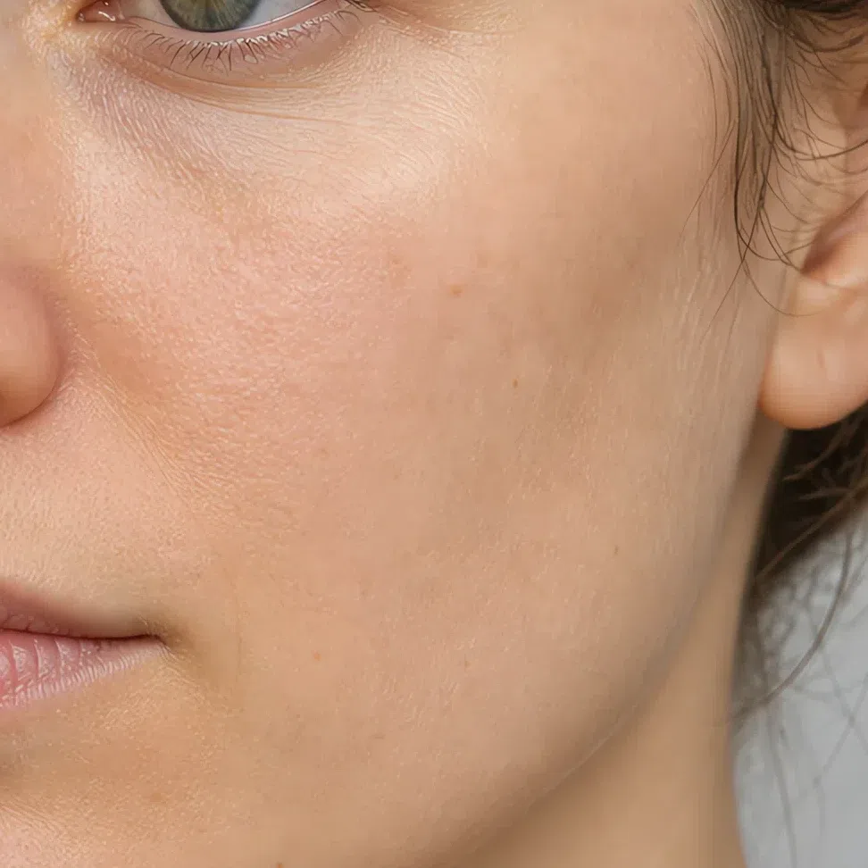
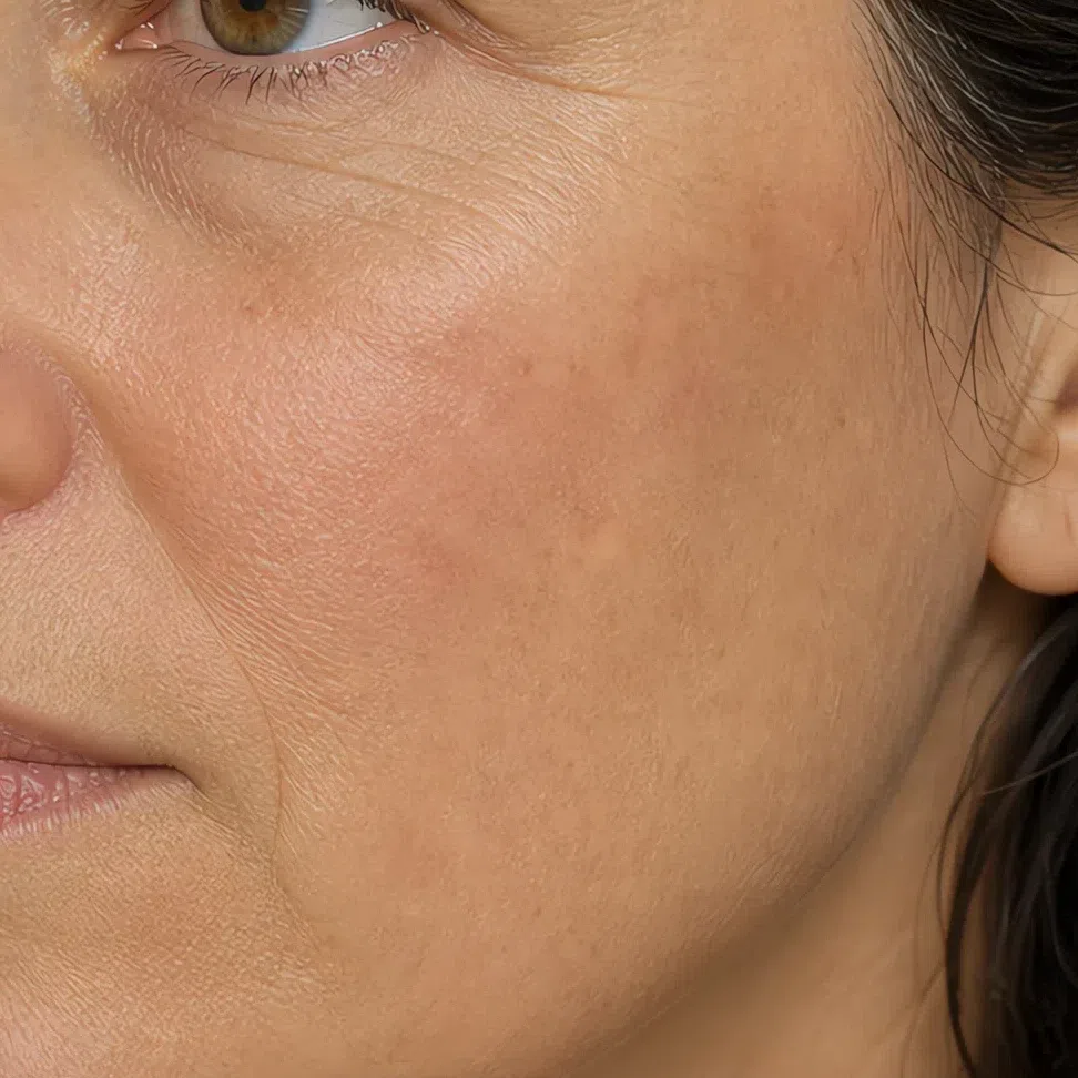
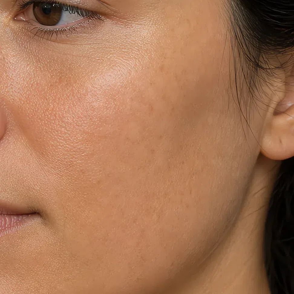
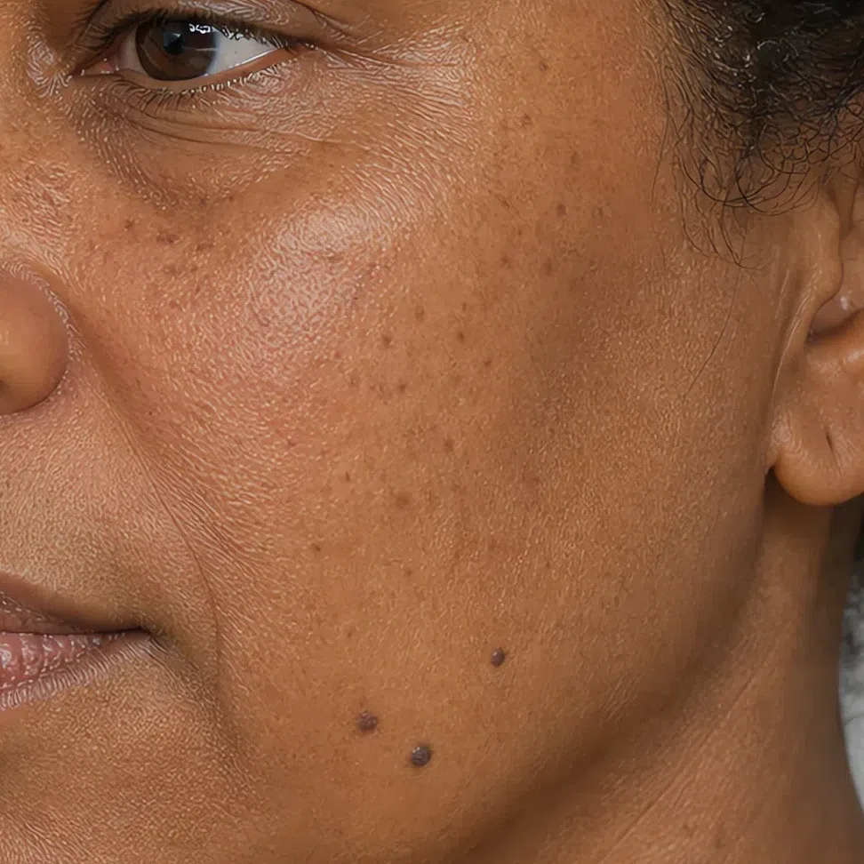
Yes. Ivory and light beige belong to this range as much as olive does - lightness is not the signal. What holds all the way along is the beige-peach cast under the surface and the matte finish, and depth only changes how easy they are to spot. At the fair end the warmth is quiet enough to get taken for a Summer's; at the olive end the same warmth gets over-read as real gold and lands people on Warm Autumn.
That in-between undertone is why complex, dusty colors settle on this skin as though they were mixed for it, and why anything clean and bright takes the face over instead of lighting it. The palette further down is built on that one fact.
Soft Autumn eyes: two or three colors at once
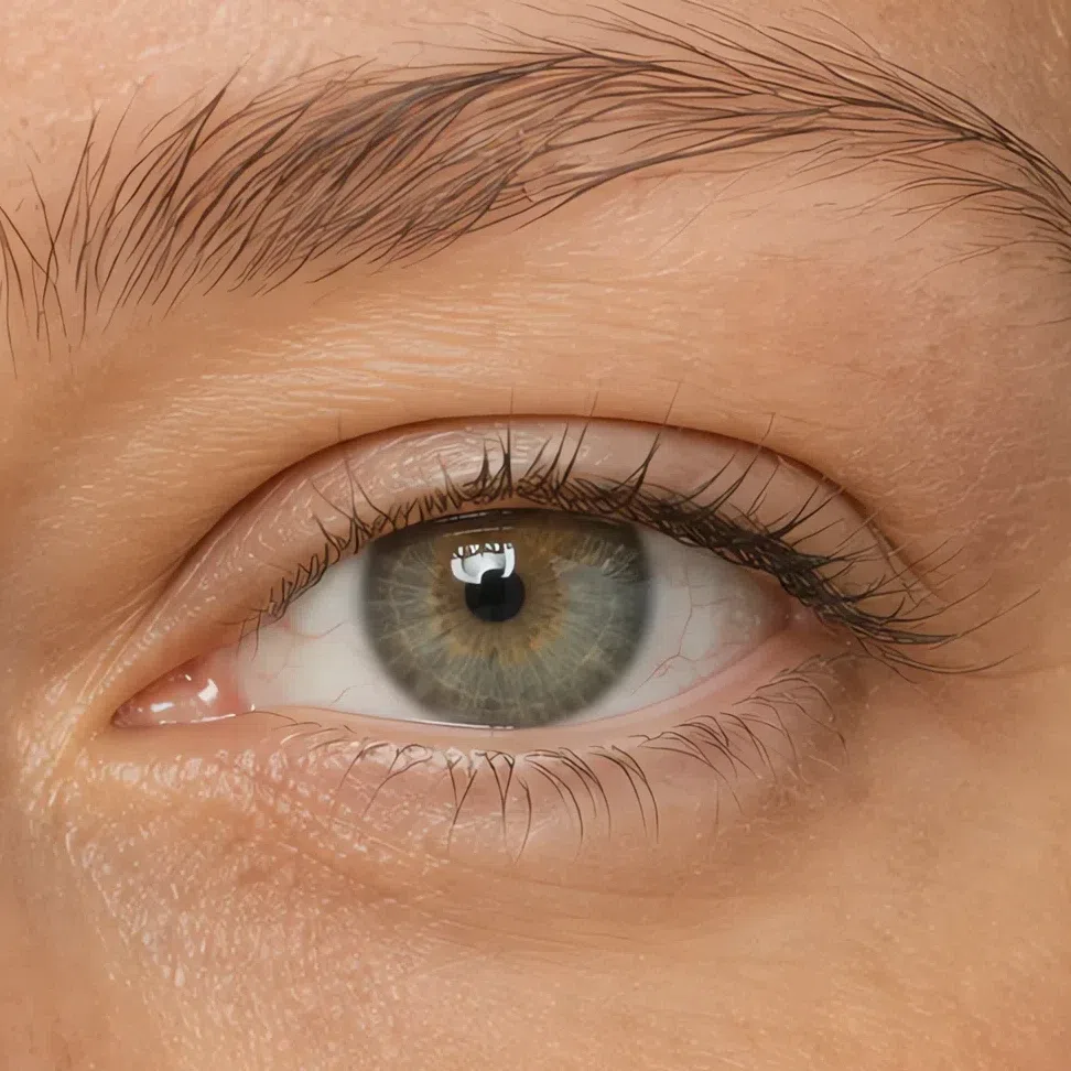
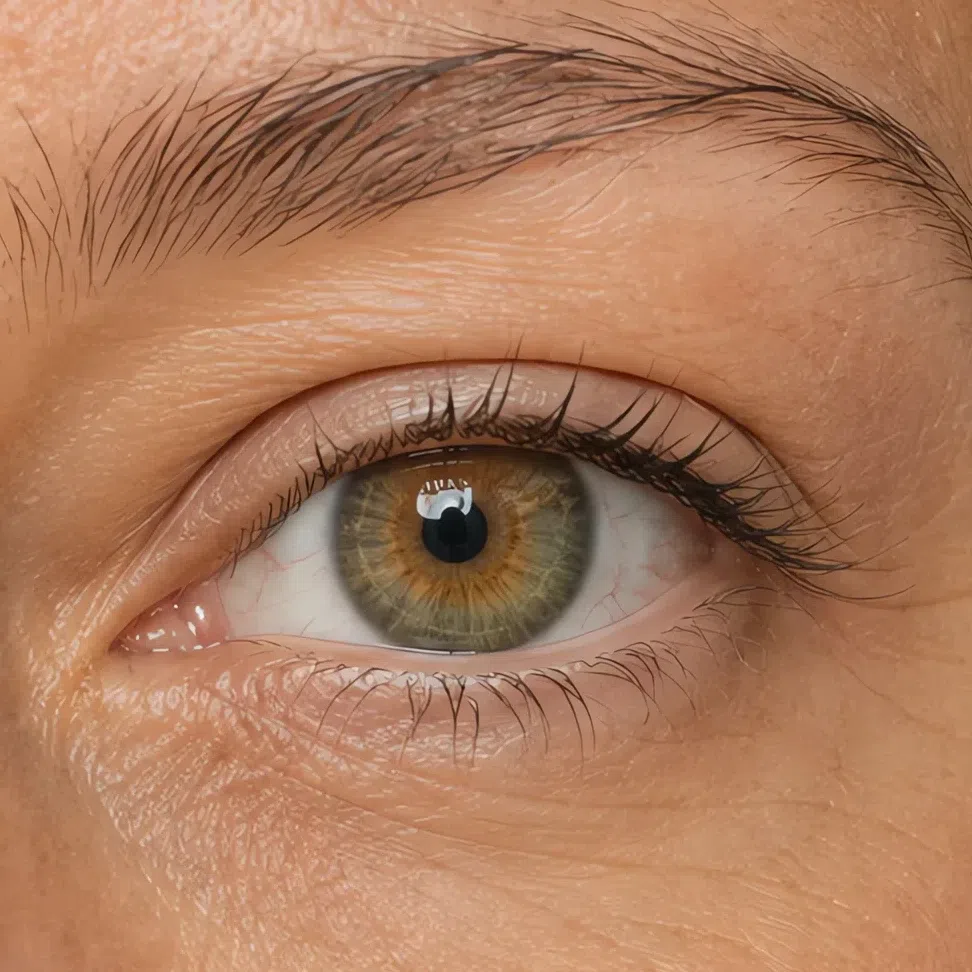
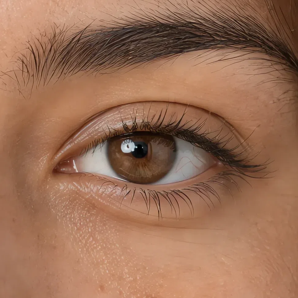
Ask a Soft Autumn what color her eyes are and you can get two answers in a week, and she is not being vague - the iris really does hold several pigments at once, with green, brown and gray mixed rather than layered. Blue happens here too, always dulled to storm sky or denim and flecked with green, never a clear light blue.
The four you will meet most often
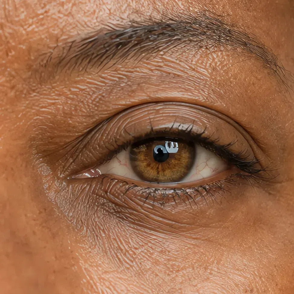
Three things that hold at any of those colors
- The color is mixed. One word almost never covers it. There is a second pigment in there and usually a third.
- The outer edge is soft. Where the iris meets the white, the color fades out instead of stopping, so nothing draws a hard circle around it.
- The pattern is uneven. These irises run deeper toward the rim with lighter flecks through the middle, which gives the eye depth without giving it brightness.
An iris built this way is lifted by colors that already contain what it contains: muted greens, warm browns, dulled blue-greens. Put a clean bright shade beside it and the eye stops being the most interesting thing in the face. That is the reasoning behind the makeup shades further down.
Soft Autumn hair: mid-range, and never extreme
Natural hair here is neutral-warm and always held back, and it lives in the middle of the depth range - nothing platinum at the top, nothing black at the bottom. The warmth reads as beige, sand or bronze carried inside the shade. It is also hair that lifts well: a summer outdoors leaves several tones running through it at once.
Four shades, lightest to deepest
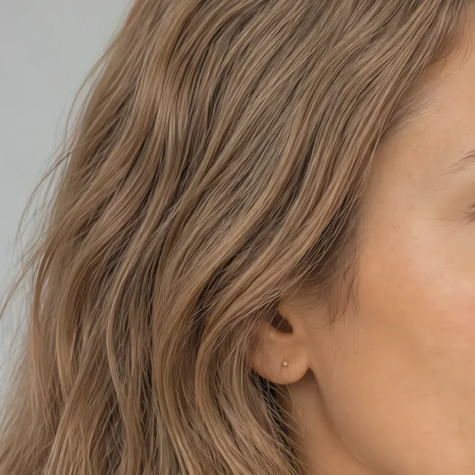
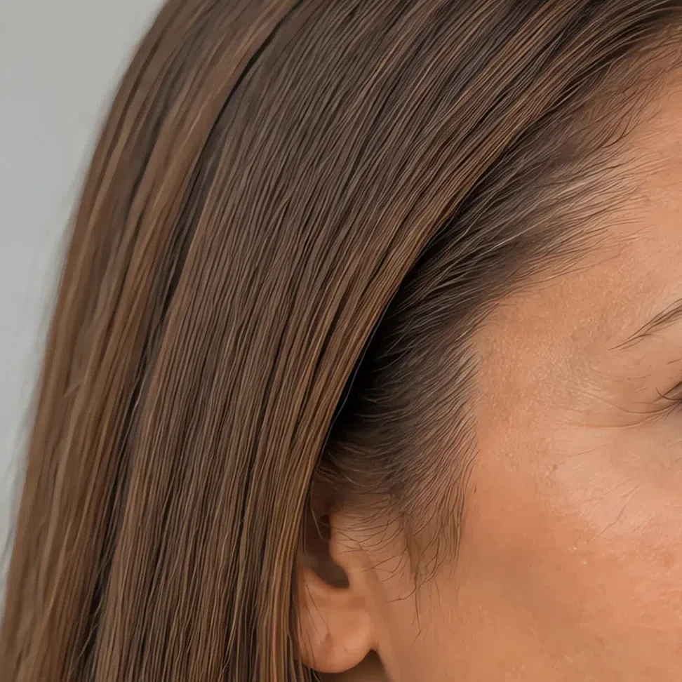
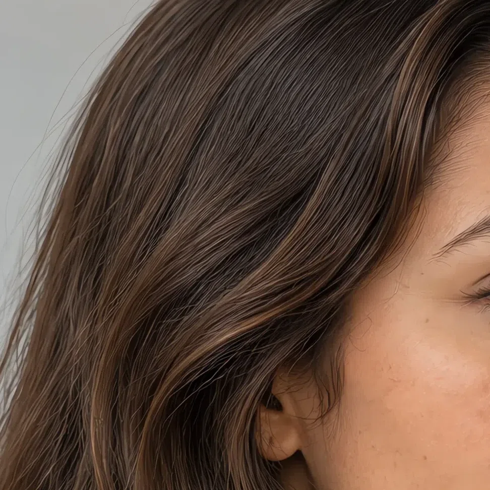
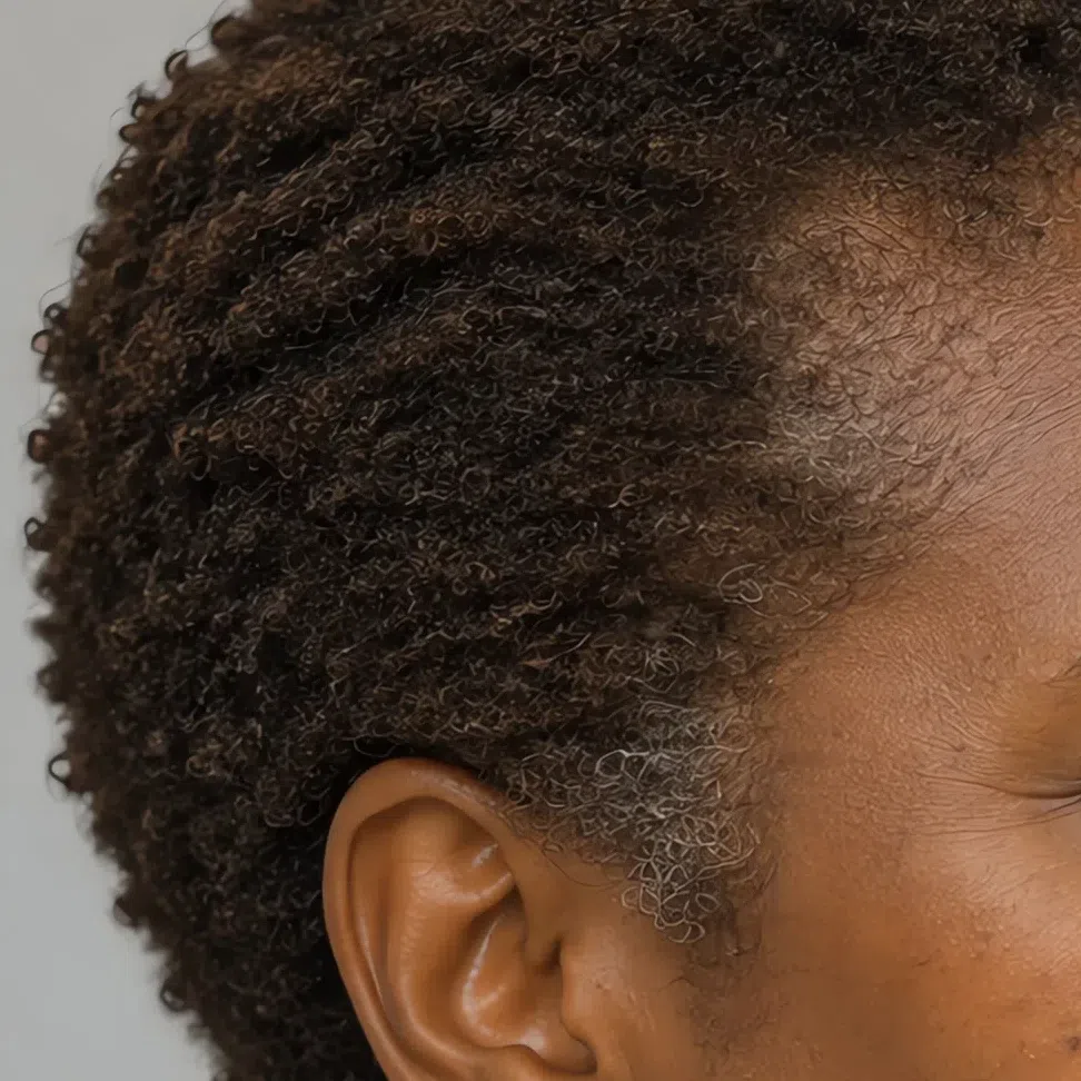
Four shades this hair never grows in
- Blue-black. The deepest natural shade in the subtype is still a brown. Black puts a step between hair and face that this coloring has nowhere else.
- Bright ginger or copper. Fiery red at full strength grows on Warm Autumn. Here it appears only muted, as a bronze the sun brings up.
- Platinum or ash blonde. Neither grows on a neutral-warm base, and neither flatters one. Cold blonde set against this face is what puts the tired look into photographs of it.
- Dark cool chocolate. The near miss that catches Soft Autumns most often: right depth, wrong temperature, and the face goes heavy behind it.
Your natural depth is the number every later decision refers back to. Lift too far above it and the face flattens; drop too far below and you introduce a step of contrast nothing else in the coloring answers. That reference point is what the hair color section works from.
The Soft Autumn palette: all 17 shades on one face
Warm, dusty, and never turned all the way up
Two things hold every shade below together. All of it is warm - there is yellow, gold or red sitting at the bottom of the color, never blue. And all of it is muted - a measure of gray has been stirred through, so nothing arrives at full strength. Warm without the muting is a different autumn. Muted without the warmth is Soft Summer.
The second half is the one people get wrong. Muted does not mean weak: these are complicated colors rather than faint ones, the way dry moss is a real green and fired clay is a real red. What they will not do is out-shout you, and that is precisely the job. Set a clean, full-strength shade beside this coloring and the fabric wins the photograph.
None of the cards below is a color chip. Each one is the same photograph with the garment repainted to the hex printed underneath it and nothing else in the frame touched - same face, same hair, same light. So judge what happens to her skin, not what happens to the sweater.
Base colors: the shades your wardrobe runs on
Base colors are the ones you end up owning the most of - the coat, the trousers, the skirt, the cardigan, the jacket you pull on without deciding to. Here they are warm, low-key and faintly dusty, and they get along with one another without any effort, which is the whole point: a quiet base is what lets a single accent read as an accent.
Neutrals: the five you buy in quantity
These five do the job that black, charcoal and hard white do in most wardrobes. And since it is the first thing everybody asks: yes, you can wear black. Below the collarbone it is fine - trousers, a skirt, a boot, a bag. What it cannot do is sit under your chin. Espresso and Wormwood carry that same weight up there, and neither of them costs you the face.
Four ways to put the base together
- Two depths, one idea. A Sand sweater over Mushroom trousers, or Cream over Sand. Nothing in the outfit has to work, and it photographs far better than it sounds.
- Let texture do the contrast. A Cream silk shirt under a heavy Espresso knit. The two shades are only doing light and dark; the surfaces are doing everything else.
- Base as canvas. Neutral head to toe, then one shade from the accent block on a scarf, a knit or a bag. One thing, not two - the moment there are two, neither is an accent.
- Swap black out at the edges. Shoes, belt and bag are where black hides in plain sight. Change those three to Espresso or Wormwood and the whole outfit warms up without a single new garment.
Muted pastels: the shades that go near your face
These six are the shades that actually touch you: blouses, dresses, knitwear, anything with a neckline. Still muted, but carrying more pigment than the base, so one of them will hold up an outfit on its own. If you have gone looking for a Soft Autumn green, there are three and they do different jobs: Moss near the face, Wormwood in structure, Olive down in the accents. The Soft Autumn pink is Antique rose, and there is only the one.
Accent colors: six shades with something to say
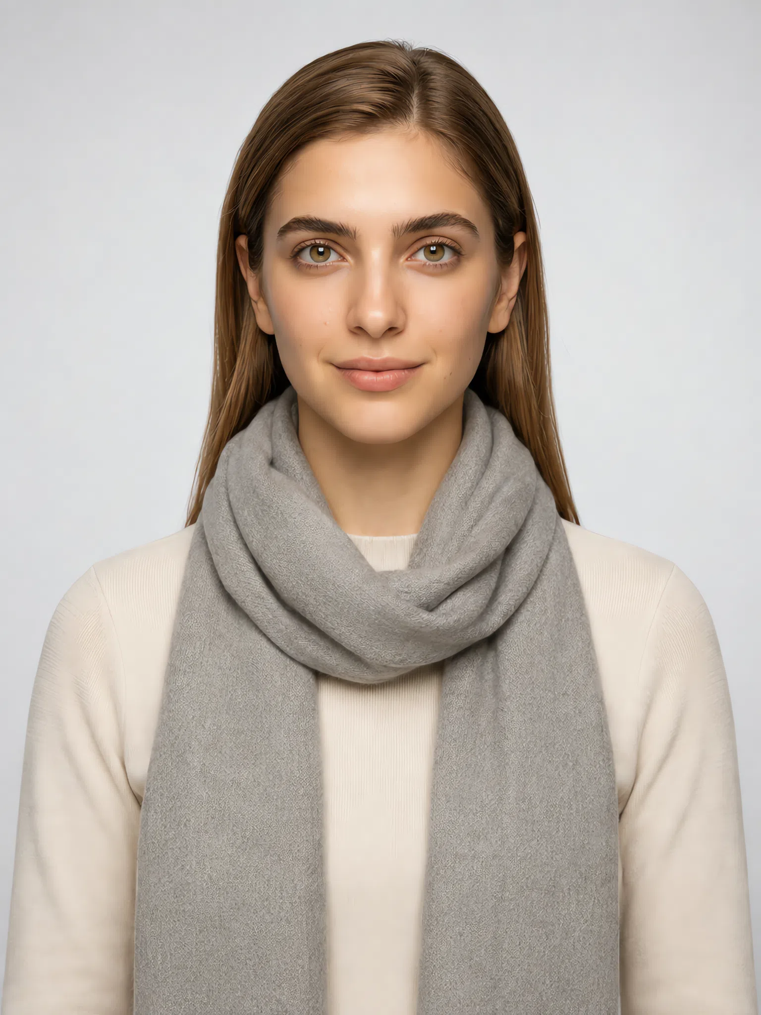
A muted palette still needs somewhere for the eye to land. Your accents are not brighter than the rest of the page - they are deeper and denser, the same warm pigment with more of it in the pot. That is why you can wear them at strength: they add weight rather than glare. What matters is quantity. One accent per outfit, held to one item, with the base doing everything else.
Deep and saturated shades
All six are shown here on a scarf over a Cream top, because that is roughly the amount of accent color you want anywhere near your face. Spread the same shade across a whole sweater and it stops being an accent and becomes the outfit. Below the neck you can be braver - a bag, a coat lining, a full skirt will take any of these at size.
Metal, stones and finish
Jewelry is the accent you put on every single day, which makes it worth more thought than any one garment. This coloring wants warm metal with the shine turned down, and the finish decides it more than the metal does.
Two rules that outrank the metal
- Finish beats metal. Matte, satin, hammered or brushed, every time. A mirror surface throws a hard white highlight, and a hard edge is the one thing this face has no answer for.
- Stones with some cloud in them. Jasper, carnelian, agate, warm turquoise, coral and amber all sit inside the palette with no adjusting. What to leave behind is bright polished silver, chrome and platinum - which is why Chrome has a card further down.
Color on an accessory: four pairings each
Four accessories, four pairings apiece, and both halves move - the accent on the accessory and the neutral underneath it. Tap through them and watch her face rather than the hat. The pairing that works is the one that leaves her skin looking like skin.
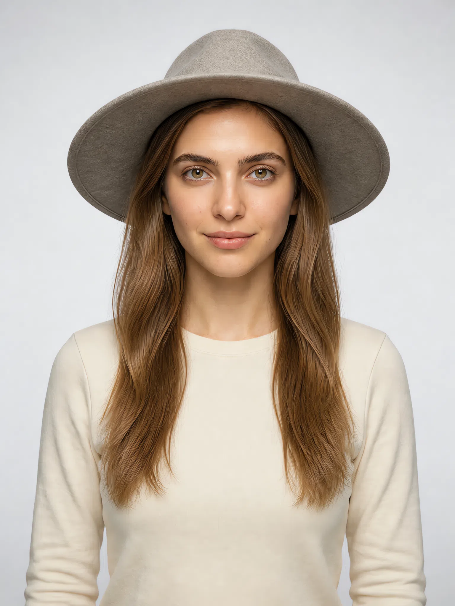
Hat
A hat sits above the whole outfit and is judged mostly from the side, so its color reaches your skin as reflected light rather than as a neighbor to it. Depth holds up there; pale shades disappear into the light.
Scarf
Nothing else you own lies flat against the jaw and throat, which makes a scarf the sharpest test of a color and the hardest to fudge. Spend the muted pastels here; save the deep accents for lower down.
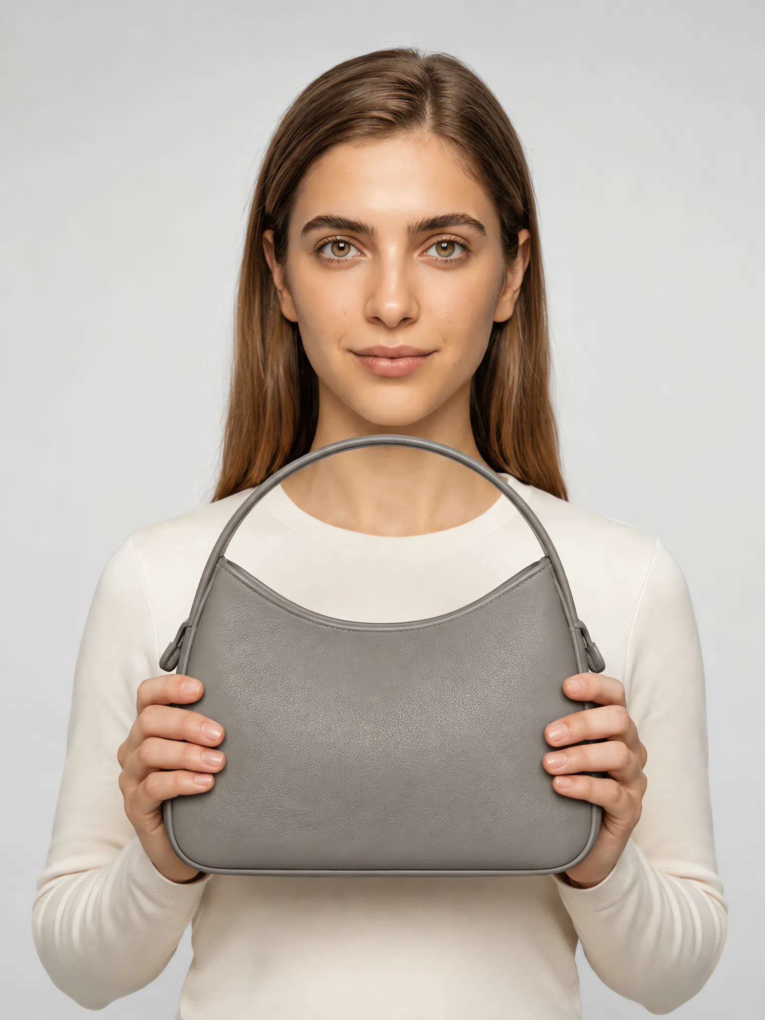
Bag
A bag has no skin to answer to. It sits far from your face and only has to agree with the outfit, which makes it the one place to be genuinely bold for the price of a single item.
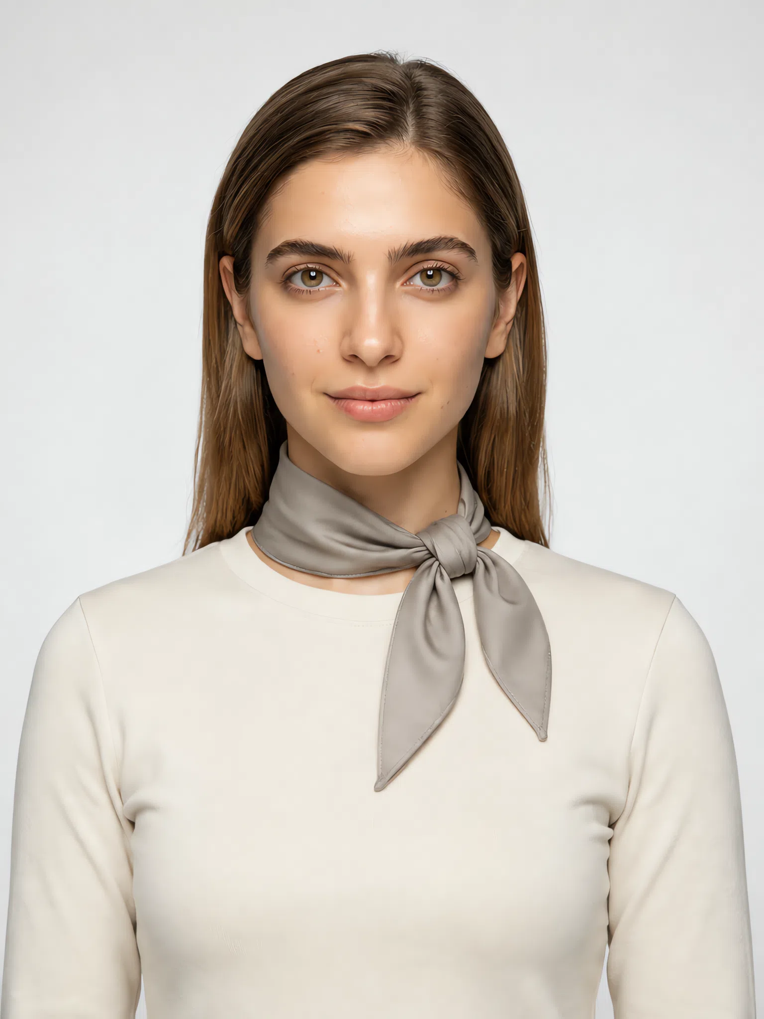
Kerchief
The smallest piece of color here, and the quickest fix for a plain outfit. There is so little of it that depth stops being a risk - a shade you would never wear as a dress is fine at the neck.
Soft Autumn colors to avoid
A color that is wrong for you does not merely fail to flatter. It takes something away: it grays the skin, deepens the shadow under the eye, and moves the most interesting thing in the photograph from your face down to your collar. Three families do that here, and each one gets there by a different route - saturation, temperature and value. That is why there are three short lists below instead of one long one.
Bright and neon colors
Color with nothing mixed into it. The hue is not the problem in this group; the volume is.
Why the bright ones fail
- The saturation gap. Every shade you wear well has gray stirred through it. Put an unmixed pigment beside that and the gap in intensity is larger than anything on your face, so the eye settles on the fabric.
- Nothing on you answers it. A high-saturation color needs something equally strong nearby - a dark brow, a deep eye, real color in the cheek. You are built out of half-steps, so there is nothing to answer with.
- It is the strength, not the hue. Pink, blue-green and yellow all have versions you wear beautifully: Antique rose, Sea glass, Mustard. Turn any of the three up to full and it stops being yours at the point the gray comes out.
Cool and icy shades
Cold and clean at the same time, which is the precise inverse of warm and muted. This is the group that changes your skin rather than merely clashing with your clothes.
Why the cold ones fail
- The olive comes forward. There is a green-gold cast under this skin that reads as depth in warm light and as sallowness in cold. A cool shade at the neckline is the switch between the two, and it works instantly.
- The flush turns gray. The soft peach color in your cheeks is low-saturation to begin with. A cold, clean neighbor drains what is left of it, and an even complexion starts to look patchy where it was not before.
- Clean is what does the damage. Cold on its own is survivable in a small dusty dose kept away from the face. Cold and clean together, right at the collar, is not - the same reason polished silver goes wrong where matte gold does not.
Hard darks: black and navy
You already own four dark shades that work. What these two do differently is arrive all at once, with no step in between.
Why the hard darks fail
- There is no step that big on you. Nothing on your face is more than a couple of paces from anything else on it, and that closeness is the subtype. A black or navy edge is a jump none of it can match, so the garment becomes the darkest thing in the picture.
- Every line gets deeper. Once the darkest thing in the frame is your collar, the eye recalibrates around it. Shadow under the eye, the line from nose to mouth, any hollow at all reads a step stronger than it is.
- Depth is not what fails. Espresso, Russet, Fig and Olive are all dark and all work. What separates them from black is that they get there gradually - brown, red or green mixed in, so the eye travels down instead of hitting it flat.
Soft Autumn color combinations
The palette is the easy half. Contrast is the half that decides whether an outfit looks composed or accidental, and yours wants to stay low to medium - shades a step or two apart, never a step and then a jump. Five that already do it, in the order the pieces go on.
Five outfits you can copy straight off the page
Each row runs left to right the way you would get dressed. The largest garment leads and the last chip is the smallest thing in the outfit.
Business harmony
Sand trousers, a Cream blouse, a jacket in Wormwood. Three warm shades a single step apart: it holds together across a room and still looks deliberate up close.
Spiced latte
A Terracotta dress or skirt under a Mustard cardigan - two warm shades sitting beside each other rather than opposite, so it reads as one idea instead of two. Finish with bronze hardware: a buckle, a cuff, a heavier chain.
Romantic evening
An Antique rose silk top with a Fig skirt or trouser. The same red family at two depths, lighter half up by your face - the order to keep whenever an outfit has a dark half.
Sea breeze
A Sea glass dress with the bag and belt in Mushroom. The warm gray-brown is what stops the blue-green tipping cold, and why this reads as autumn rather than summer.
Natural contrast
Olive trousers or a skirt with an Apricot blouse. The widest gap of the five, and it still works: both halves are warm and the lighter one does the talking near your face.
What all five have in common: nothing in them is running at full strength. That is the entire rule. And if you ever need to check a pairing with no palette in front of you, borrow the test the season is named after - bark, moss, dry leaves, wet earth and an overcast sky are five colors that have never once argued with each other, and not one of them is turned all the way up.
Soft Autumn clothes: a wardrobe built on your palette
Eight pieces, shown at four depths
A wardrobe that agrees with your coloring is a question of temperature more than of quantity. Soft Autumn skin, hair and eyes are neutral-warm and low in saturation, so the clothes have to meet them there: shades that look as though sunlight has already been at them, with brown or gold underneath. Get it right and the fabric hands warmth back to your face.
Working against you: clean cold color and hard edges. Optic white at the throat, a black jacket over everything, any shade that arrives at full strength - each ends up louder than you are. Shops stock all three by default, so this is a wardrobe you go looking for. The palette above has the shades; here they are as clothes.
Eight garments that make a Soft Autumn capsule wardrobe
The base is warm, neutral and deliberately uneventful - sand, mushroom, wormwood and espresso, which combine in whatever order you pick them up in. Color goes on top, one piece at a time. Where a shop offers the piece in white, take the cream. Each of the eight is shown on four women at different depths, because what puts you in this subtype is undertone, and undertone does not care how dark you are.
Everything here is chosen by color - the Soft Autumn palette turned into garments. The other half of the subject, how a capsule works as a system - how few pieces you can get away with, how to count what they make between them, what to buy first - is not covered here.
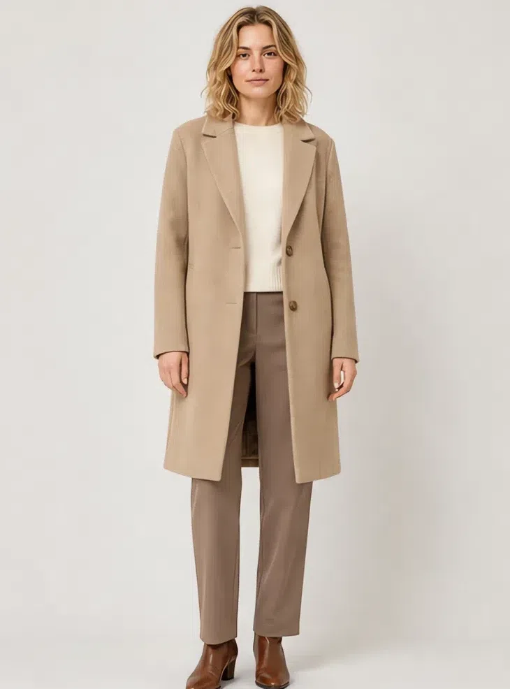
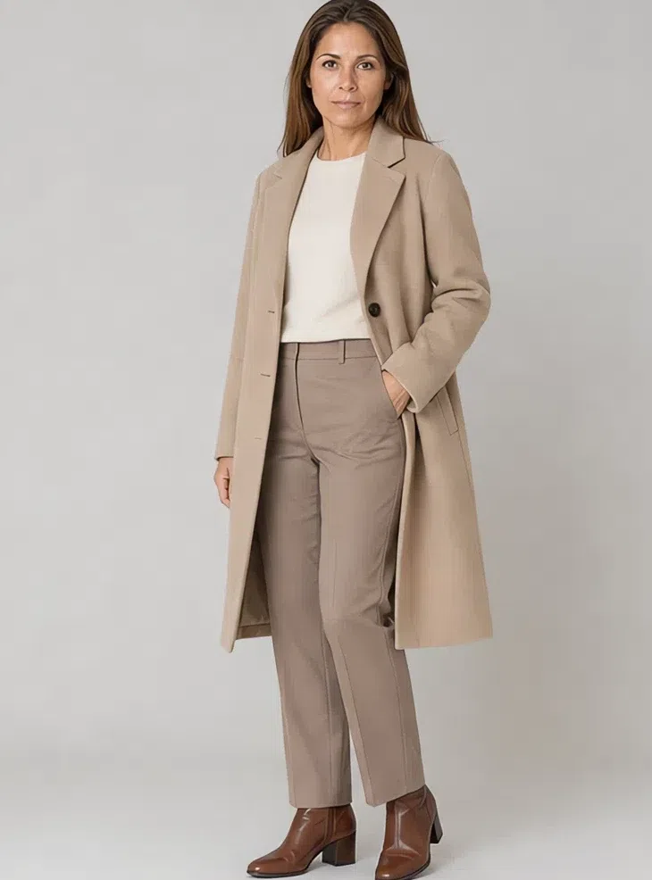
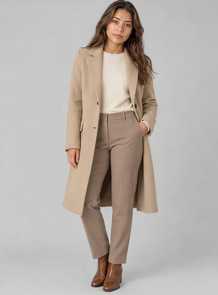
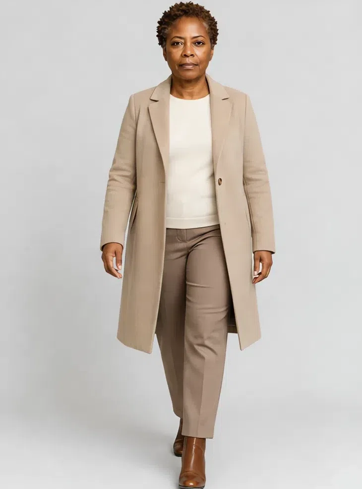
1Sand wool coat
The coat sets the temperature of everything worn under it, so make it a warm neutral rather than a gray one. Straight cut, knee or midi, wool with the weave still visible. Wormwood is the one to buy on a day you would otherwise have reached for charcoal.
Tip Over the cream knit and mushroom trousers it is already an outfit. Brushed buttons rather than mirrored, and boots in a soft brown.
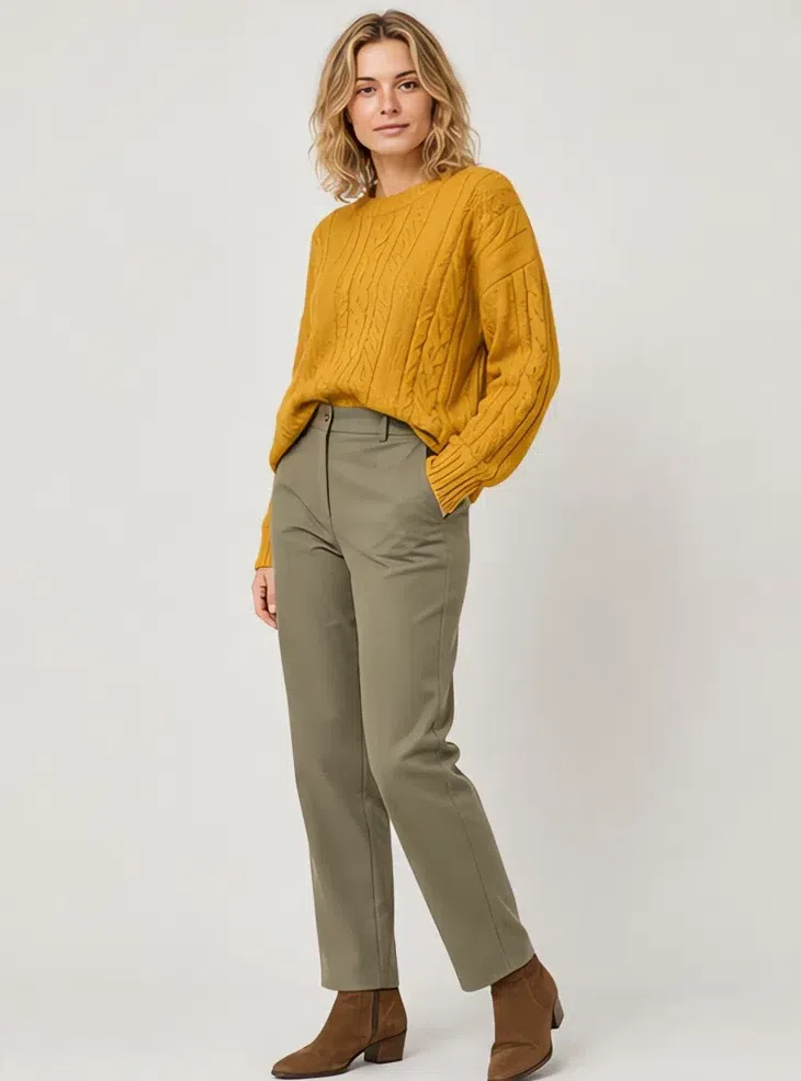
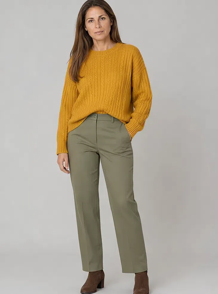
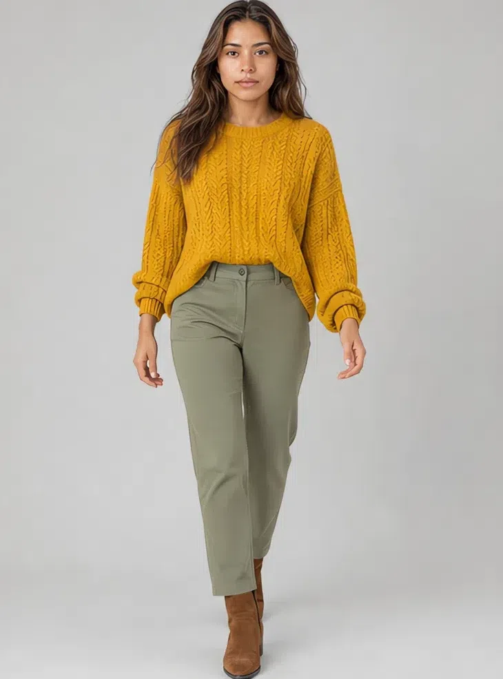
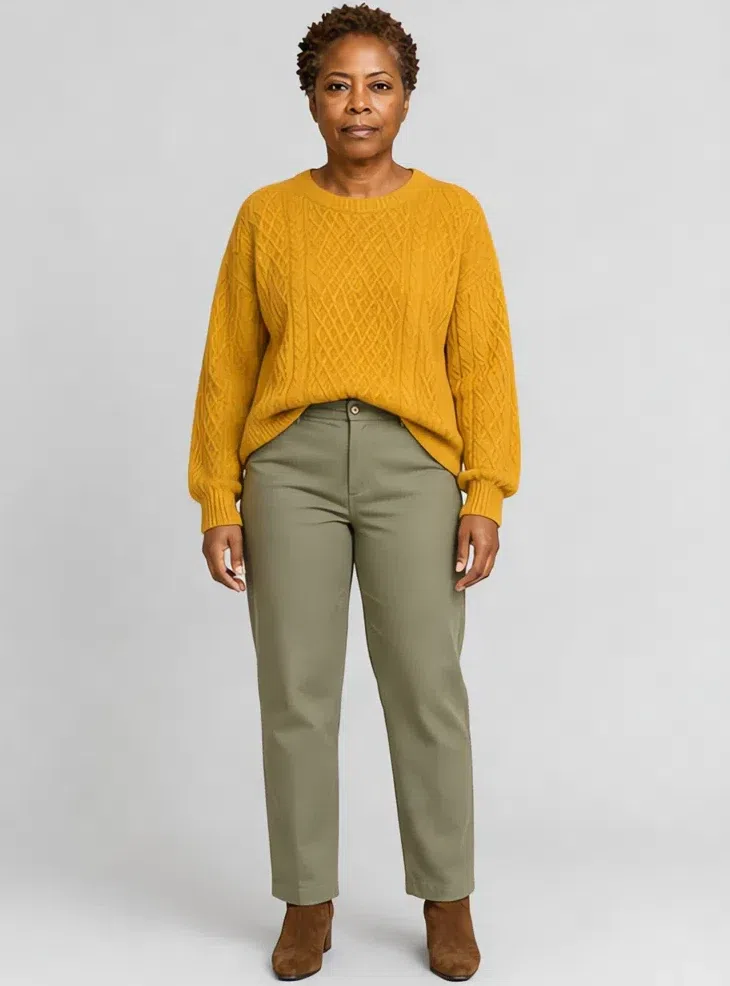
2Mustard merino sweater
Muted mustard is the loudest shade here that still behaves, and a knit is the place to spend it: near the face, pushing the same gold your skin already has. Fine merino or cashmere, relaxed rather than bulky, with a small cable so the surface catches light.
Tip Tuck the front hem into straight trousers so the volume stops at the waist. Moss trousers keep the whole thing in one temperature.
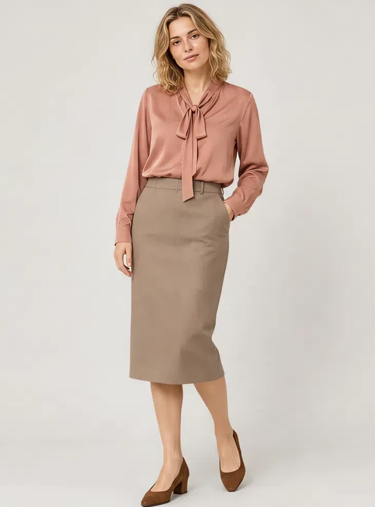
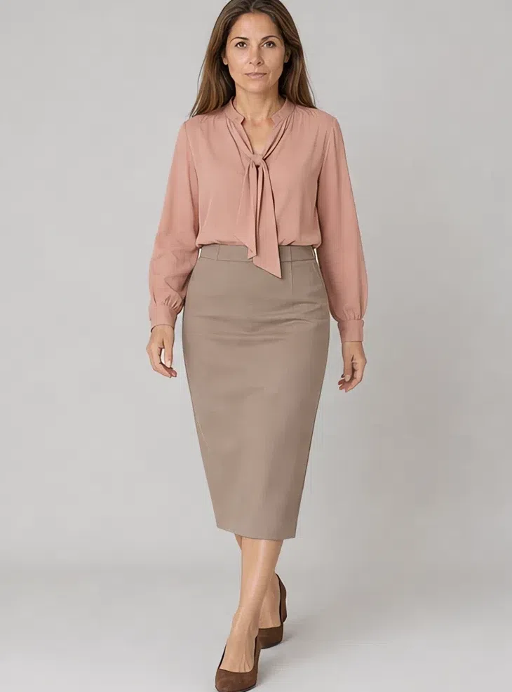
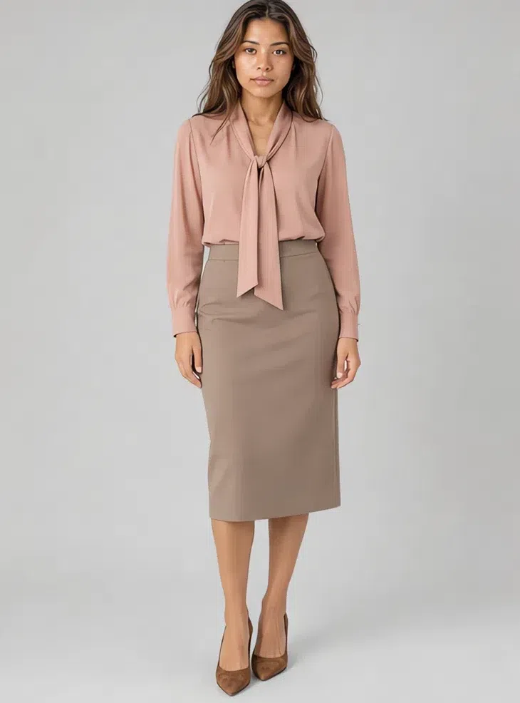
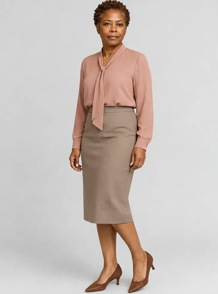
3Antique rose silk blouse
Where the wardrobe gets its softness back after a week of neutrals. Matte silk or washed satin, tie neck or a fuller sleeve, in a pink with clay under it rather than a cool powder pink. Close enough to your own coloring that the neckline stops reading as a border.
Tip Into a mushroom pencil skirt it reads as office. Loose over the corduroy trousers it reads as Saturday.
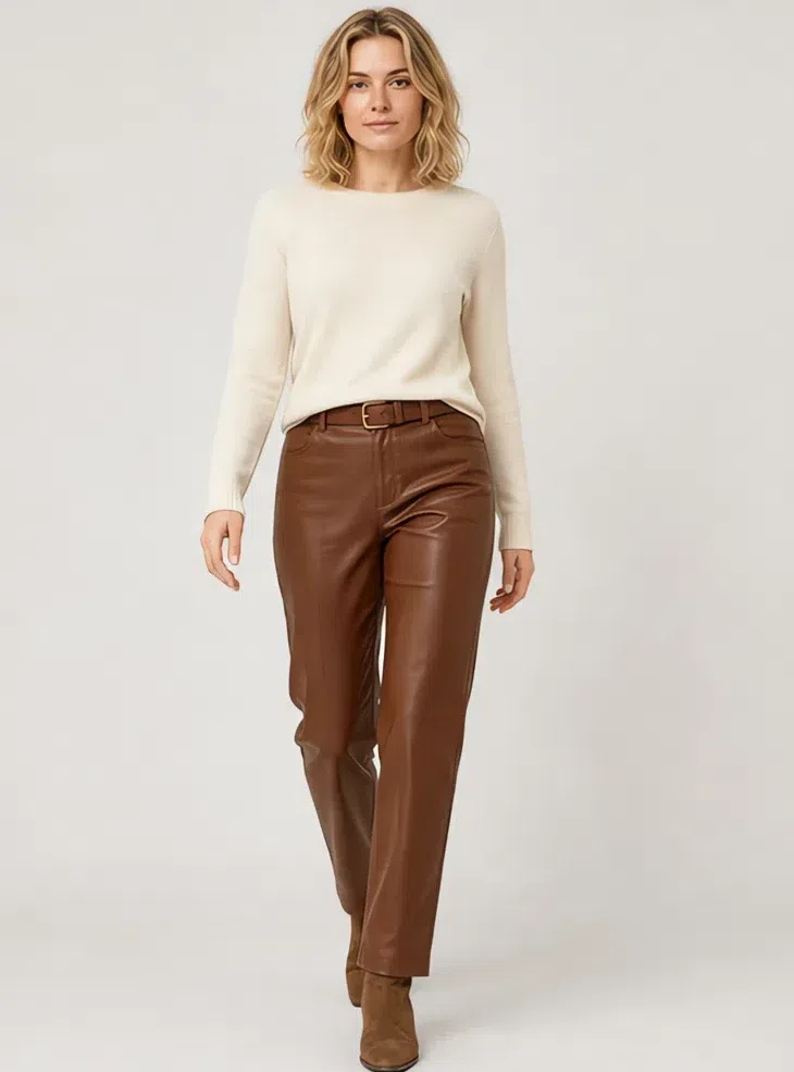
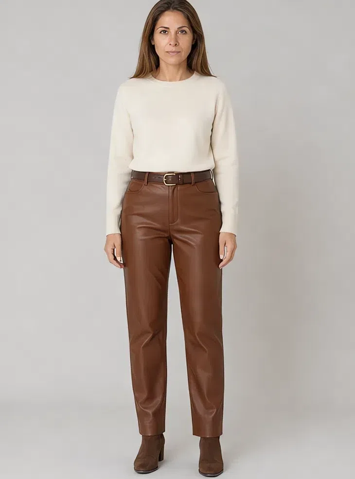
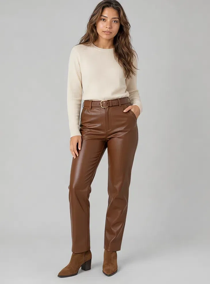
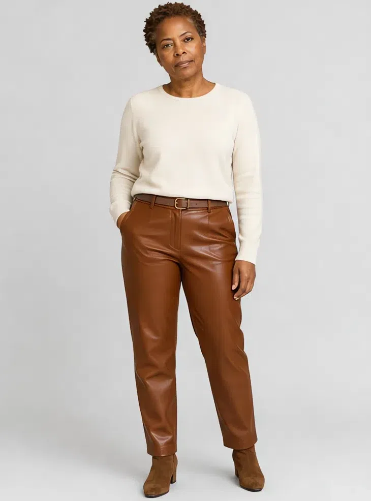
4Russet leather trousers
Leather in this wardrobe is brown. Russet holds an outfit down without cutting a hard line across it, and matte or lightly waxed hide beats anything with shine on it. Straight or slightly tapered, close to the leg without gripping it.
Tip A cream knit tucked in behind a slim brown belt is the whole look. Swap the knit for the blouse and it goes out at night.
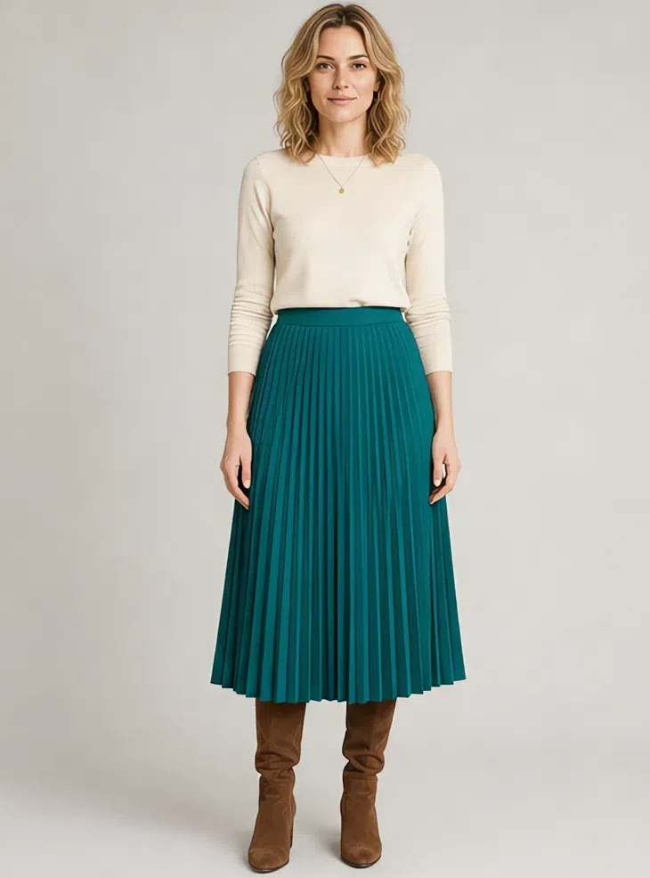
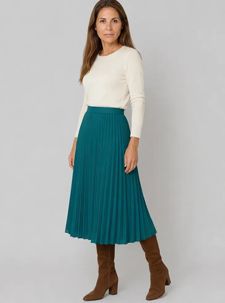
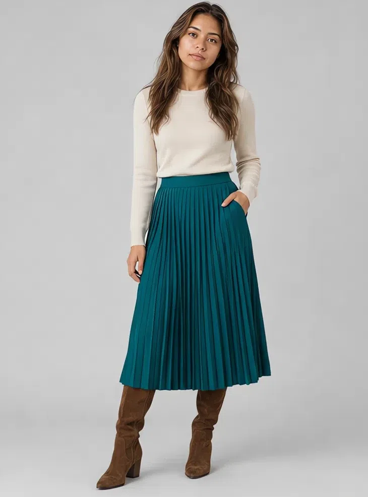
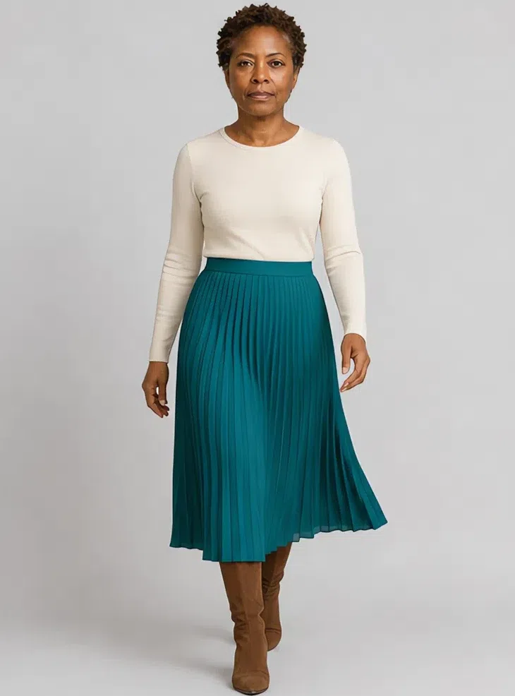
5Teal pleated skirt
One piece should be a color you would spot across a room, and teal is the candidate: deep, blue-green, the only shade here with real saturation in it. Soft pleats in fine wool or heavy silk, mid-calf, so the color moves when you do.
Tip A cream top above it leaves the skirt as the only event in the outfit. Brown suede boots, not black.
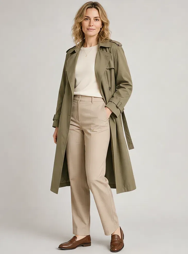
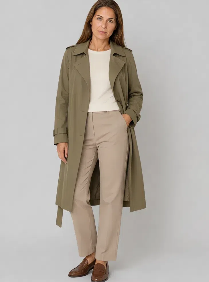
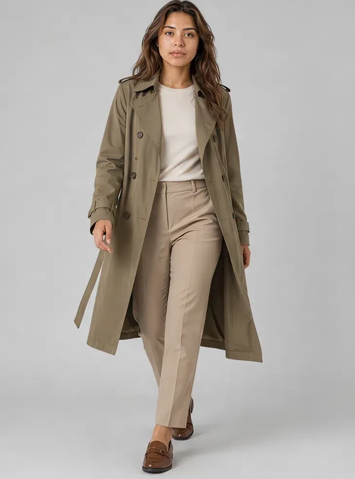
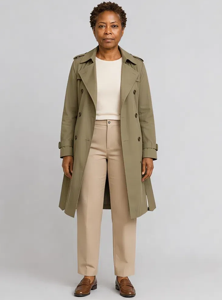
6Wormwood cotton trench
The between-seasons coat, and the piece that takes over from a gray raincoat. Wormwood hangs on the rail like a neutral and behaves like a color once it is on. Unlined cotton, belt and epaulettes, cut loose rather than architectural.
Tip Open over sand trousers and a cream top it goes everywhere. Belted and done up it becomes the outfit.
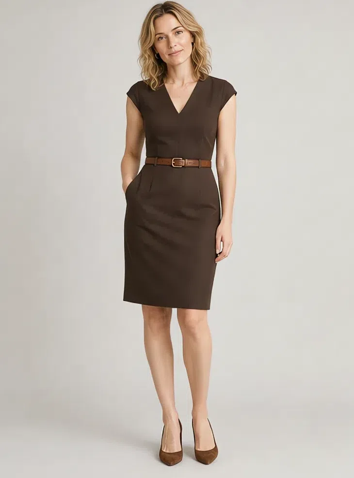
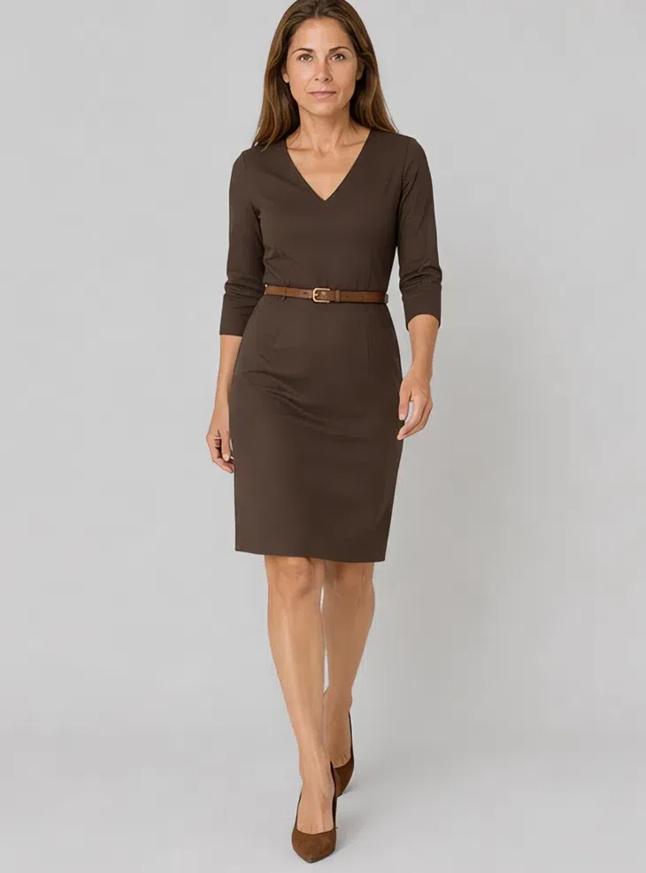
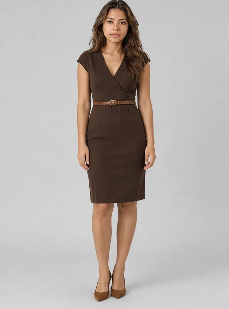
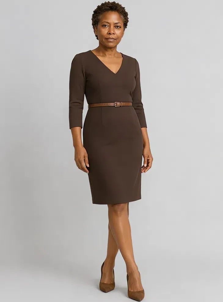
7Espresso sheath dress
The little black dress, in brown. Espresso gives the same depth without the hard step in lightness that black puts between the hem and your face, and at this contrast level that step is what drains you. Firm jersey or wool crepe, lightly fitted, at the knee.
Tip A belt one shade lighter marks the waist without breaking the column. Add the sand coat for the office.
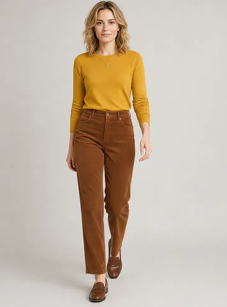
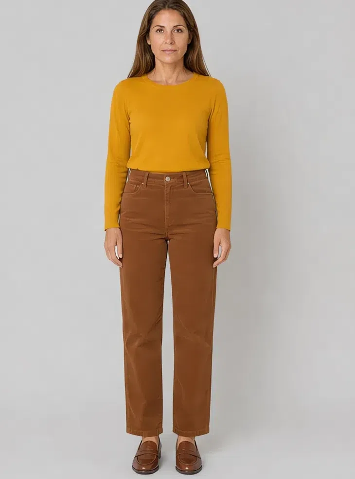
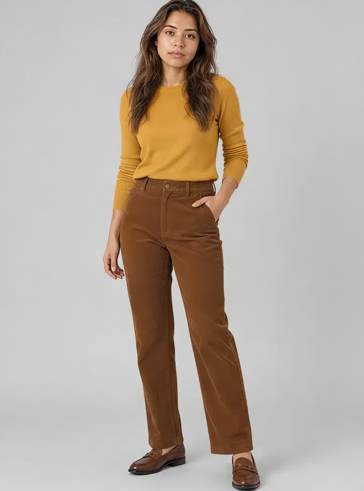
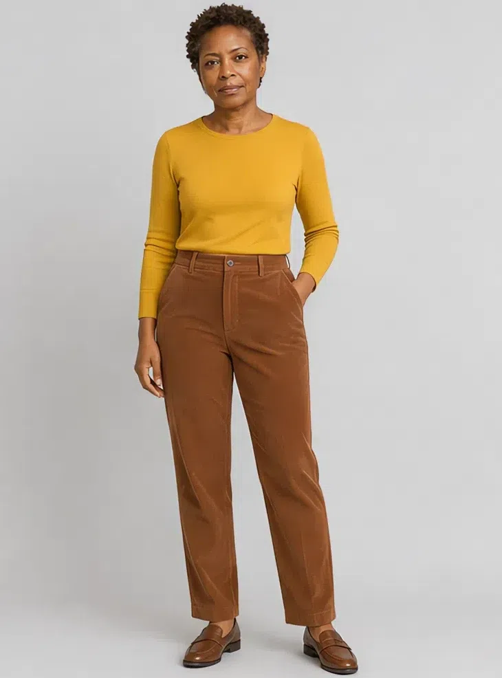
8Cinnamon corduroy trousers
Denim is the awkward slot here, since most washes land either too blue or too contrasty, so fine-wale corduroy takes it instead. Cinnamon is a warm brown with red under it, and the nap catches light the way muted shades want to be lit. If you want jeans, buy a soft faded wash.
Tip With the mustard knit tucked in and flat brown loafers, this is the pair you reach for most.
Five rules for combining what you already own
- Match the family, not the shade. What decides whether two colors sit together is the tint underneath them, not how light or dark each one is. Moss and olive are a long way apart in depth and near enough identical underneath, so a knit in one over trousers in the other reads as a single garment. Sort your closet that way once, greens in one pile and browns in another, and the pairs that already work will be lying next to each other.
- Opposite temperatures, matched depth. Your palette has a cool corner of its own, and it is allowed in the same outfit as the warm one. Teal and cinnamon are within a step of each other in darkness and in strength, and they lean opposite ways on warmth, so worn together neither takes over. What breaks it is a mismatch stacked on top of the temperature: if the cooler half is also the lighter or the louder one, it stops being a contrast and starts being the whole outfit.
- One shade, three surfaces. Different surfaces in a single shade do the work a second color would. Cashmere, suede and silk in mushroom read as three tones, because the nap, the grain and the shine each hold light differently and the eye takes that for depth. Worth trying before you decide an outfit is missing a color.
- Add the missing step. When two pieces refuse to work together, the fault is usually the size of the gap rather than either garment. Apricot is the lightest warm shade you have and russet the deepest, and straight against each other they land as a jump. Put terracotta between them, as a cardigan or a scarf, and the outfit steps down instead of dropping. Keep both pieces and go looking for the one that belongs in the middle.
- Count the hardware as color. Zips, buckles, buttons and the clasp on a bag are small, but they are metal, so each one carries a temperature you never chose on purpose. Antique gold and bronze fastenings stay quiet; steel and chrome put one cold bright point on an outfit that has nothing else bright in it. Go around your own coats and bags looking at the fastenings rather than the cloth. A good coat gets let down by its zip more often than by its color.
Makeup shades
Foundation, highlighter and bronzer matched to your depth, plus the shade list
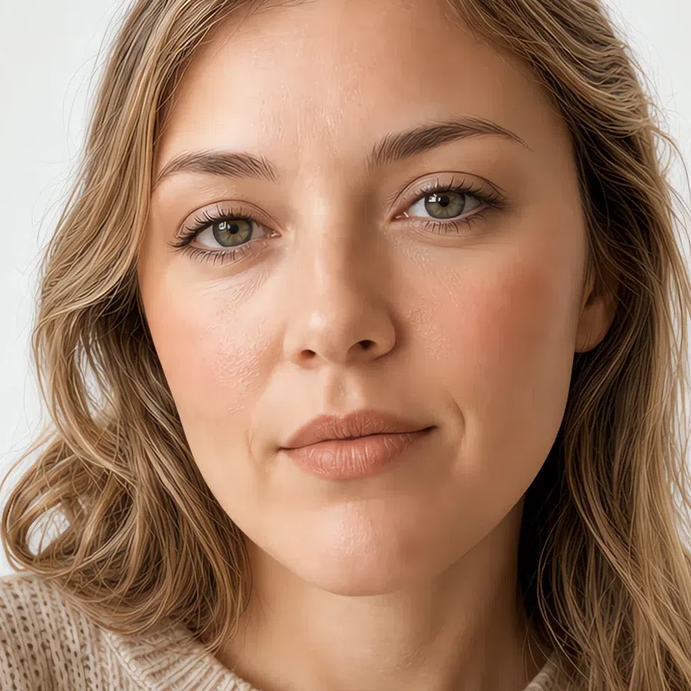
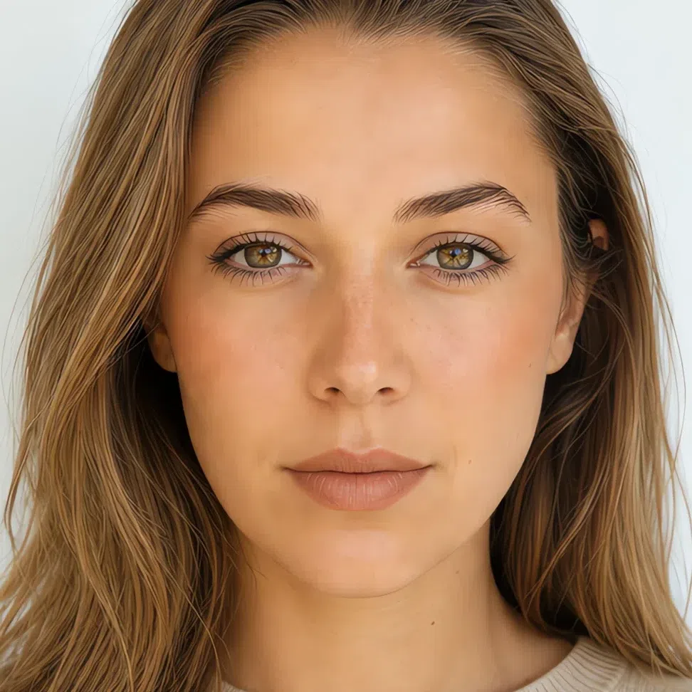
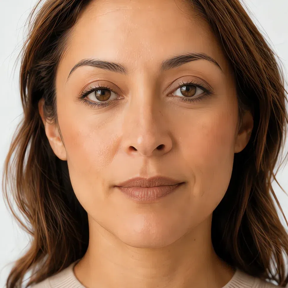
Three products are chosen by your complexion rather than by your season, so they are here with the four depths shown. Everything else is a shade list: the family is fixed by your coloring, and which value you take is fixed by how deep your skin is.
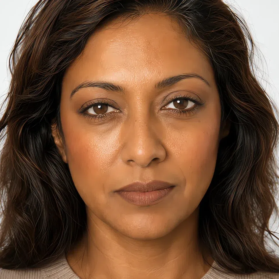
Base: what goes on the skin
A base that works here is thin. Your skin already carries a faint yellow or olive cast, and a heavy layer erases the one thing worth keeping. What you are matching is a neutral-warm undertone - honey, sand or olive under the beige.
Foundation matched to your depth
Undertone comes from your season, depth comes from your skin, and they are two separate decisions. An undertone miss cannot be rescued by getting the depth right.
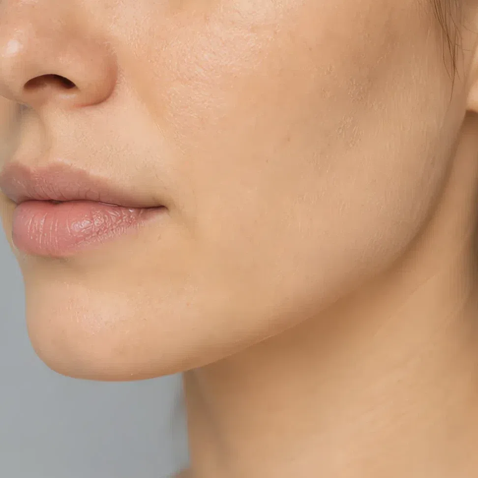
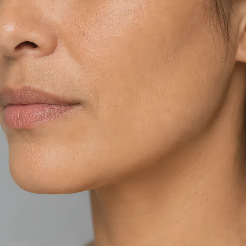

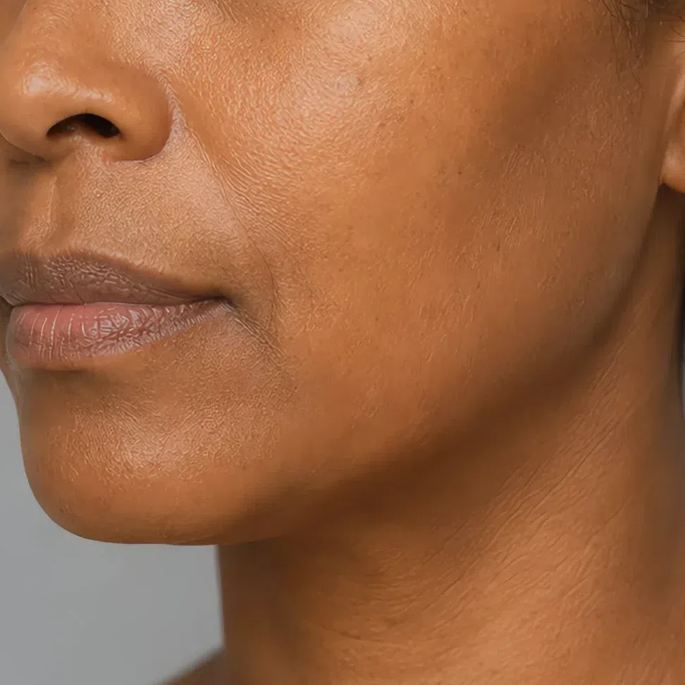
Tip Draw three stripes down the jaw and take them to a window. The right one stops existing. Testing on the back of your hand judges the wrong skin.
Avoid Rosy and pink-based shades, and very pale matte formulas a step above your depth. Both sit on muted skin as a mask.
If your face reads green rather than peach, take the olive-beige fork of your depth.
Blush
Peach and soft clay; pink is the one direction that fails outright. The family is fixed by your season, the value by your depth.
- Peach #E6A886
- Melon #DE9A83
- Rose beige #C99189
- Clay #C97B57
Highlighter matched to your depth
Gold-based, quiet, and only where light already falls. Cream gold, peach pearl and champagne do the job at their own depths; a silver or blue flash fights the undertone every time.
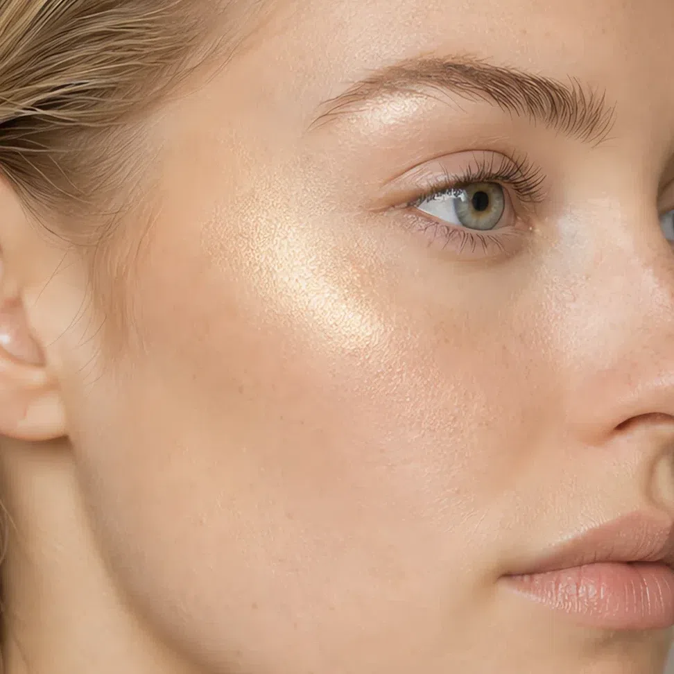
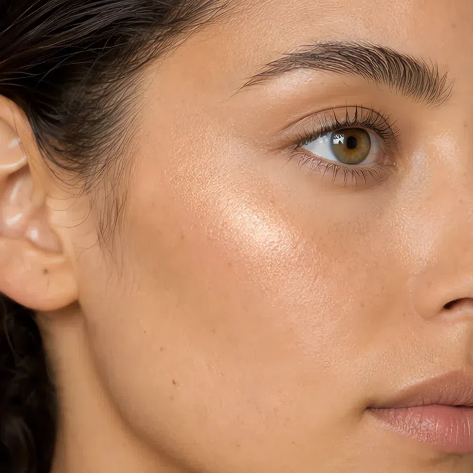
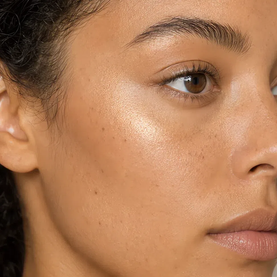
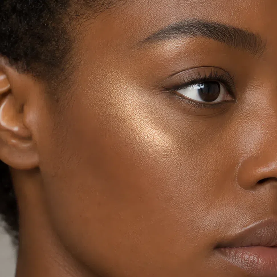
Tip Tops of the cheekbones, inner corners, a touch under the brow. A satin sheen still reads as skin; a sparkle reads as product.
Avoid Silver, pearly white and anything that flashes blue as you turn.
Bronzer matched to your depth
Bronzer is depth here, not a suntan. One golden-brown family, deepened to your skin, swept around the outside of the face, never as a line under the cheekbone.
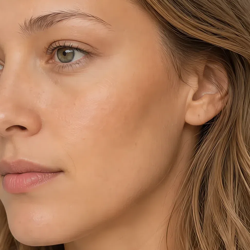
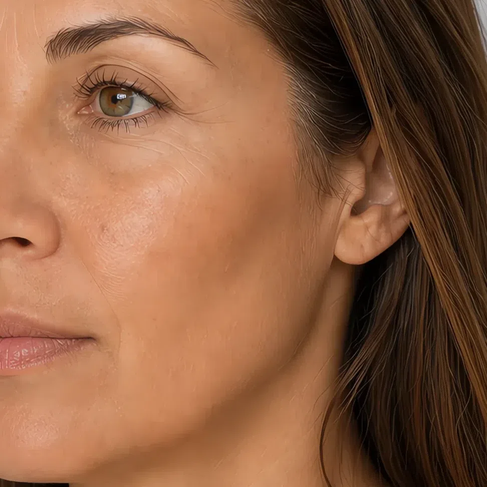
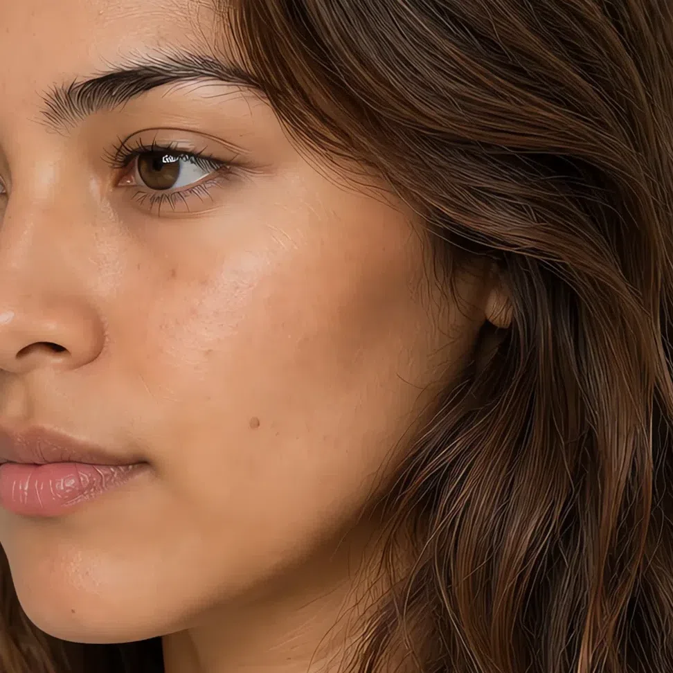
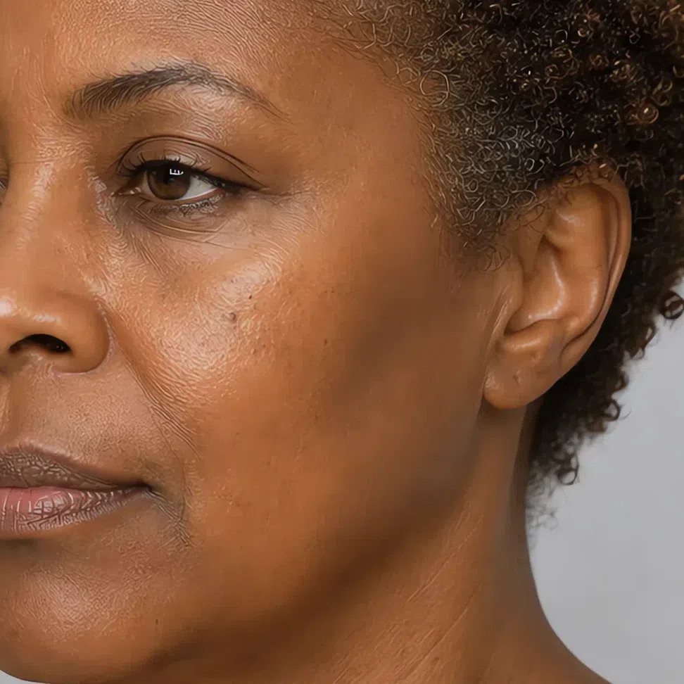
Tip The perimeter - forehead, cheekbones, jaw. If it registers as color instead of as depth it is too dark or sitting too far forward.
Avoid Hard contour stripes, and gray-brown bronzers sold as the cool option.
Eyes: shadow, liner, mascara, brows
This eye takes depth well and edges badly. The season fixes the family; your depth fixes the value inside it - which is why shadow and brows carry a four-step ramp under the swatch and liner and mascara do not.
Everyday eyeshadow
Four neutrals with something stirred into each - a beige carrying gold, a pinkish greige, a gray-brown and a drab green.
- Oat #D8C3A8
- Shell #C9A79E
- Suede #A08C79
- Moss #8F9779
Evening eyeshadow
The same four families taken two steps down, plus the one metallic this coloring wears comfortably.
- Cognac shimmer #A97C4A
- Raisin #6E4F4E
- Pine #4F6350
- Truffle #5A4438
Eyeliner
Brown rather than black, in four depths. All four read softer than black and are still legible across a table.
- Umber #6B4E36
- Brass #8A6338
- Fern #4E5537
- Walnut #42301F
Mascara
Brown every day; a black with brown underneath it rather than one with blue when you want weight.
- Coffee #4A3728
- Pecan #6B4530
- Brass #8A6338
- Brown-black #2E2620
Brows
Half a step lighter than your own hair, never above it.
- Tawny #A8886A
- Driftwood #9A8A78
- Acorn #8E7256
- Bark #6E5238
Lips: the nudes and the reds
Muddy is the compliment on this mouth. Every shade that works has a second color underneath it - brown under the peach, orange under the red - and the ones that fail are the clean ones.
Nude shades
Beige with warmth in it, not pink - a cool nude grays the mouth out.
- Praline #D7A98E
- Biscuit #C4A184
- Toffee #B98A63
- Nutmeg #96674A
Colored shades
Reds with earth in them: terracotta, brick, paprika, and a coral-red closer to persimmon.
- Persimmon #C85C48
- Terracotta #B46537
- Brick #A34B36
- Paprika #8B3F22
Hair shades
The colors that work, and the ones that never do
Wondering what to say at the salon, or how light and how dark you can take it? That is a page of its own. Open the hair color page →
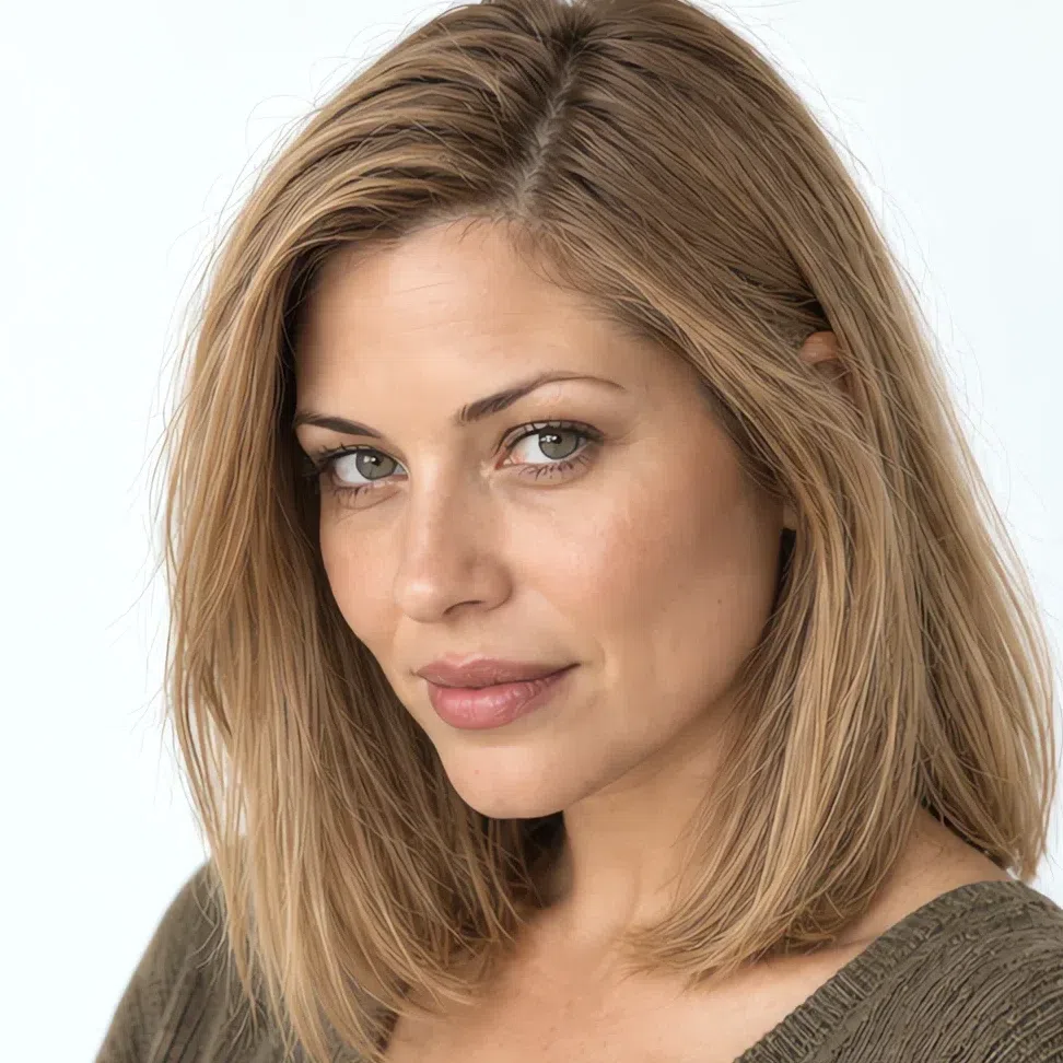
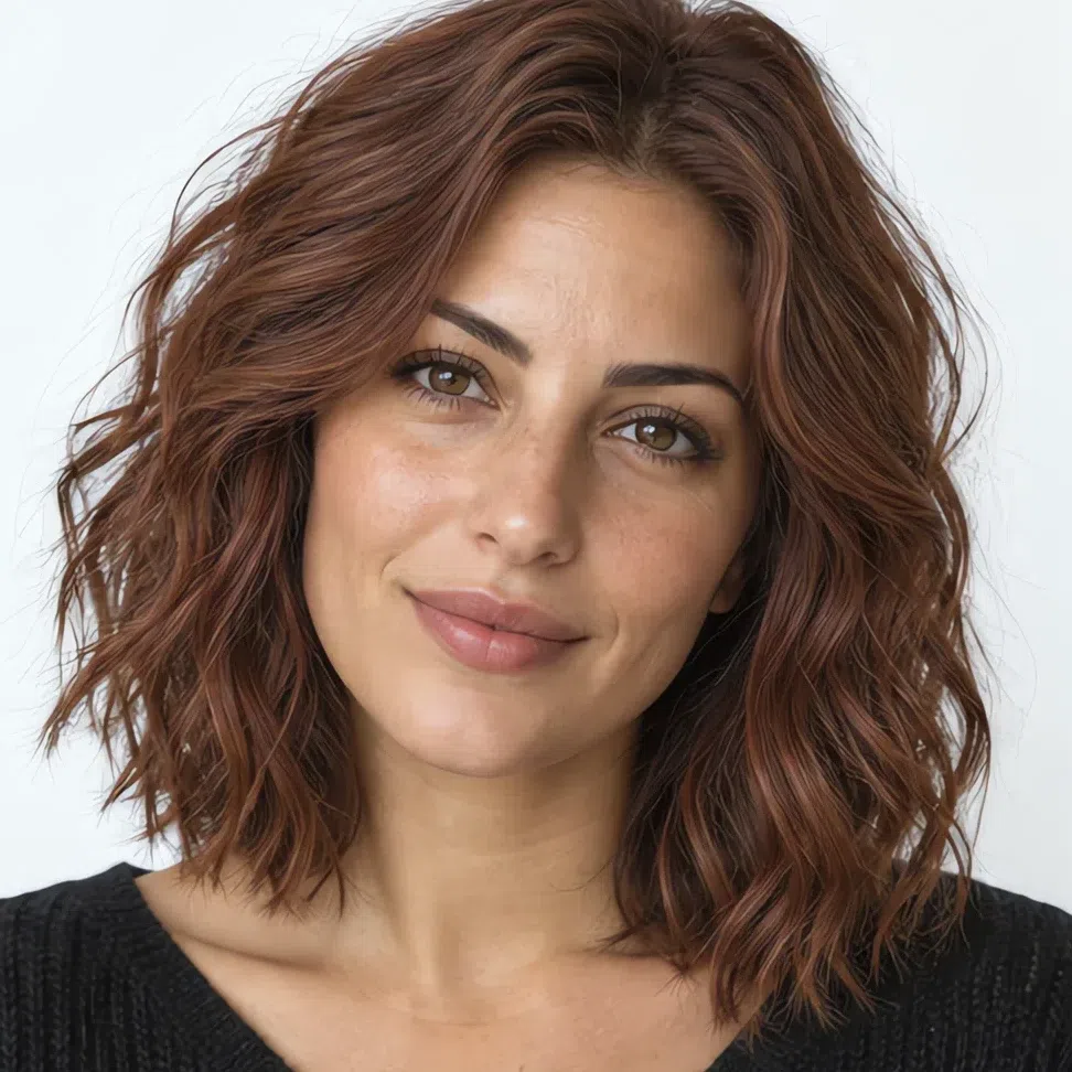
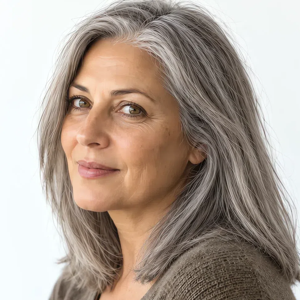
Hair is the biggest block of color you own and it sits two inches from your face, so a dye decision either settles the whole coloring or argues with it for six weeks. Everything below is neutral-warm and held back: gold, honey and nut-brown carried inside the shade rather than laid over it. The shade nearest your own depth will nearly always beat the most striking one here.
Blonde through light brown
Your base range, and where most Soft Autumns should stay.
The safe half of the range
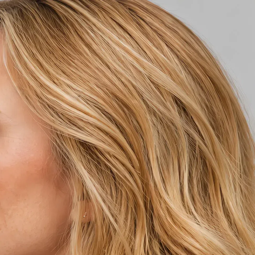
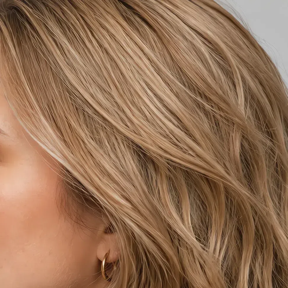
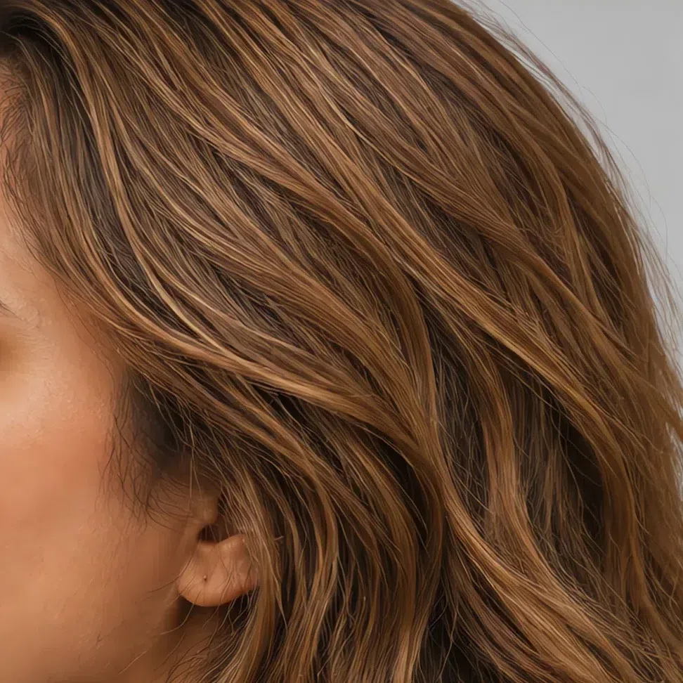
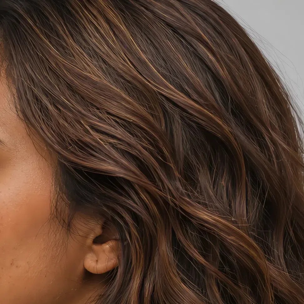
Each strip runs one tone across four salon levels - a step up, the shade itself, then two steps down. The number is the thing worth saying out loud in the chair.
Deeper tones, and two ways to break them up
Depth is open to you; a hard edge is not.
Weight without a hard edge
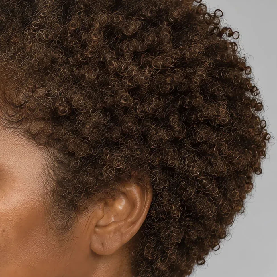
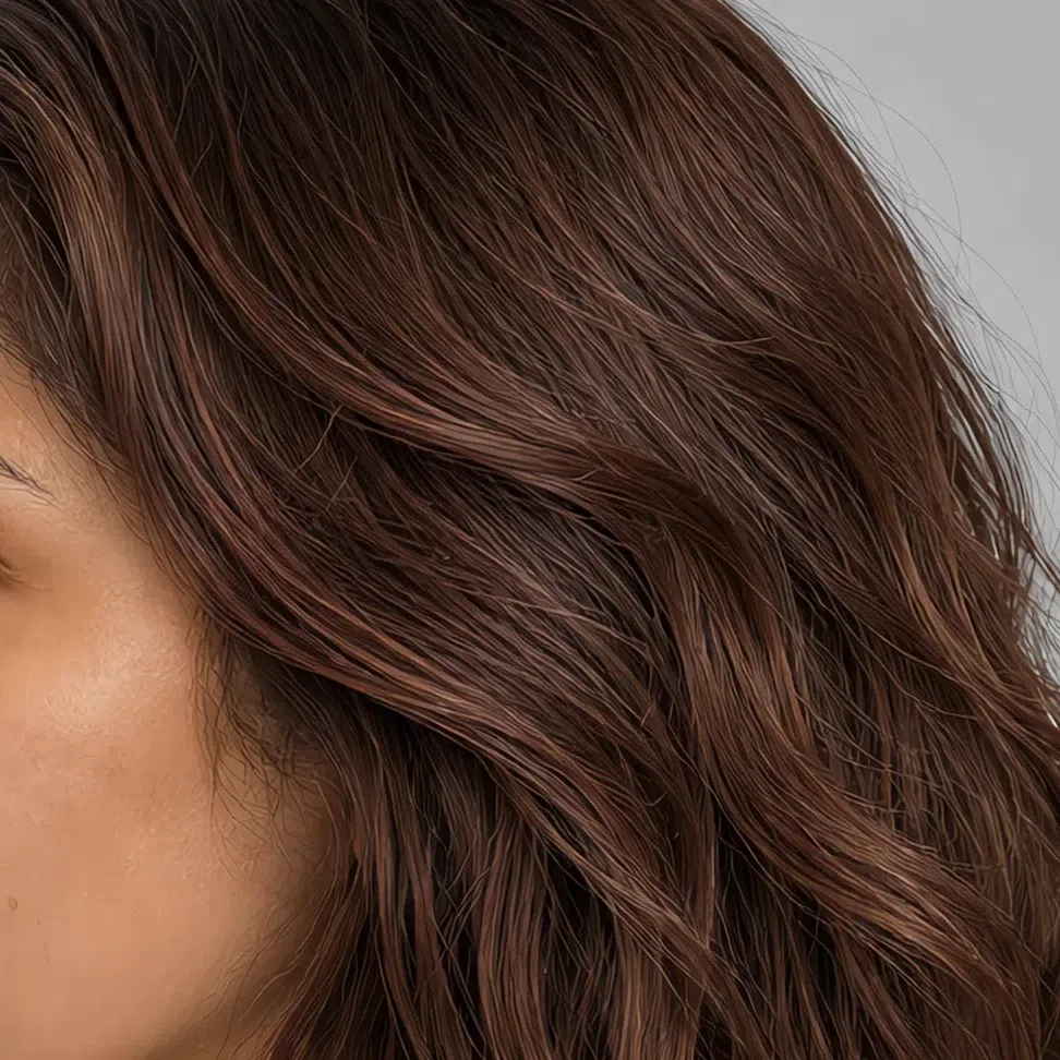
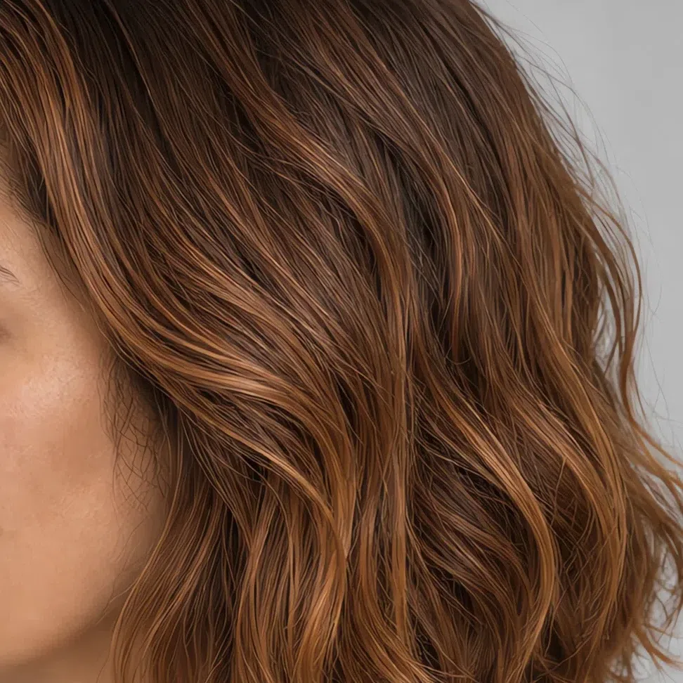
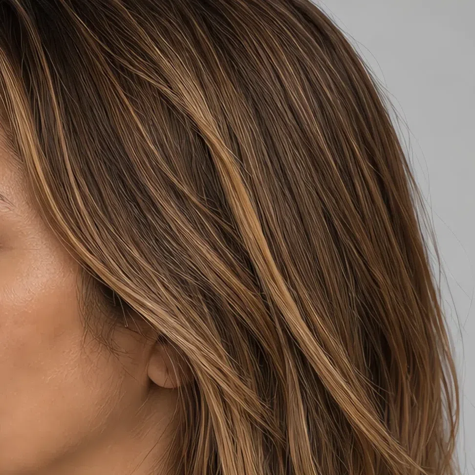
Each strip runs one tone across four salon levels - a step up, the shade itself, then two steps down. The number is the thing worth saying out loud in the chair.
Hair colors to avoid
Two families do nearly all the damage: anything ashed down, and anything at full strength.
Ashed down and cool
At full strength
Soft Autumn vs its neighbors: Warm Autumn, Deep Autumn, Soft Summer
Three head-to-heads, each settled by a single axis
All three autumns are warm and earthy, so temperature settles nothing inside the season. What separates them is which quality runs in front: Warm Autumn leads with heat, Deep Autumn with darkness, Soft Autumn with neither - here the loudest thing about the coloring is how quiet it is. Name that quality right and the rest follows, coat down to lipstick.
The fourth border sits outside autumn altogether. Soft Autumn and Soft Summer are muted to precisely the same degree, so softness cannot tell them apart - temperature is the whole difference, and the last comparison below is built on that axis and nothing else. Start with the four questions, then read the pairing you land nearest.
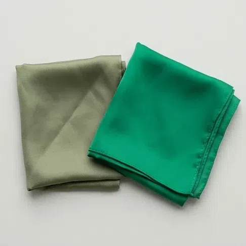
Hold two green scarves to your face - a muted moss, a clean emerald. Which settles your skin?
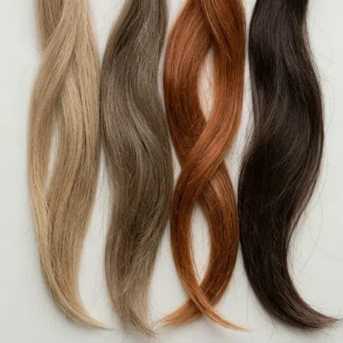
Your hair color with no dye in it
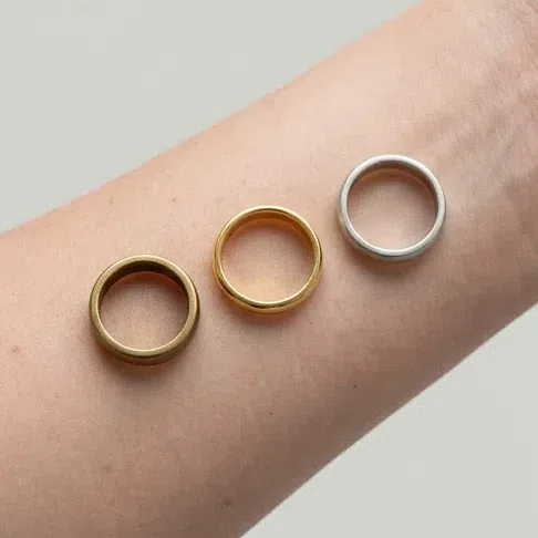
Compare gold and silver against your face in daylight
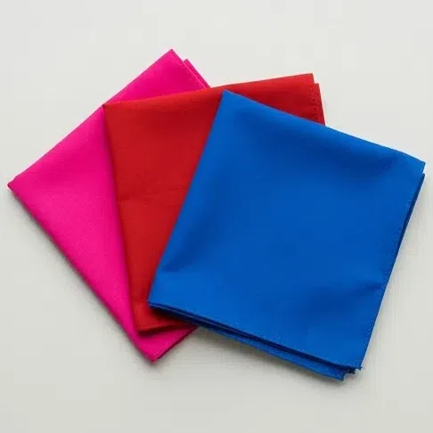
What does a clean bright color do to you - scarlet, shocking pink, electric blue?
The answers line up: warm, quiet with it, nothing on your face at full strength. This is your guide - start at the palette section.
Warmth is doing more work on you than mutedness. Clean warm shades beat dusty ones, and bright orange flatters you where it would shout over a Soft Autumn.
The full Warm Autumn guideYou need weight rather than softness. Saturated dark shades hold your face in place; light dusty ones let it slide.
The full Deep Autumn guideThe mutedness matches, the temperature does not: silver settles into your skin where gold sits on top, and cool shades beat earthy ones.
The full Soft Summer guideFour questions point; they do not diagnose. A muted coloring is the hardest kind to judge in a mirror, because everything you are hunting for is small by definition. Photo analysis measures undertone, saturation and contrast instead of eyeballing them.
Muted complexity vs bright warmth
Soft Autumn
Muted. Nothing runs at full strength. The colors are complex rather than strong.
Low. Hair, skin and eyes sit small steps apart, so nothing on the face answers a hard edge in cloth.
Complex and warm. antique rose, olive, fig, sea glass - warm underneath, dusty on the surface.
Unforced, slightly undone. Matte cloth with texture in it - suede, brushed wool, washed linen.
Fog with sun behind it, the last warm week of September, a cobweb lit from the side.
Warm Autumn
Saturated. Clean, full-strength color with no dust and no gray under it.
Medium. More definition - hair and eyes read as separate things, not one blur.
Bright and warm. Pumpkin, marigold, hot coral, clean warm red - nameable from across a room.
Sunlit, quick, high-energy. Copes with a light sheen as happily as with matte.
Golden October, a ripe pumpkin, turmeric and paprika in an open jar.
Test it on yourself: Find the brightest clean orange you own - pumpkin, nothing dusty in it - and hold it under your chin in daylight. A Warm Autumn lights up behind it. Here the fabric does all the talking: the orange is the only thing anyone remembers afterwards, and your skin looks coarser than it did a second earlier.
Blurred depth vs saturated darkness
Soft Autumn
Medium. The palette sits mid-way throughout - nothing pale, nothing near-black. The narrow band is the point.
Low. Brows, lashes and hair sit a step from the skin, so the face has no frame of its own.
Middling saturation. wormwood, sand and mushroom carry the coat, the trousers, the bag - gray's job, without the chill.
Calm, quietly assembled, never visibly trying. Fully matte - once a fabric shines it stops looking like you.
Autumn at first light, a landscape with the color turned down, sun-bleached leaves.
Deep Autumn
Deep. Saturated and dark, still warm underneath - depth is not coldness.
High. Dark hair and brows over lighter skin frame the face for free.
Dark and saturated. Dark chocolate, bordeaux, pine green, a blue-green deep enough to read as almost black.
Dramatic, formal, a little guarded. Handles sheen and heavy weave that would flatten a Soft Autumn.
Forest in late October, dark velvet, a pomegranate cut open.
Test it on yourself: Hold a near-black chocolate brown under your chin - not the softer espresso this palette runs to. On a Deep Autumn it locks in and the face looks finished. Here it behaves like something borrowed for the evening: the eyes go out first, then the whole face reads tired.
The pair softness cannot separate
Soft Autumn
Neutral-warm. Not the open gold of a Warm Autumn - quiet enough to argue about, decisive enough to settle every choice on this page.
Antique gold and bronze, matte instead of polished. Silver does not fight you, it stops registering - the metal goes dull and takes the skin with it.
sand, mushroom, moss, espresso. Each has a yellow or red floor under it, and that floor keeps the palette off gray.
Warm flecks in a muted iris - hazel, amber, tobacco - and even the grayed greens hold a gold speck. Freckles, if any, are gray-brown and sink in.
You drain. Gray-floored neutrals pull the peach out and leave the olive cast standing on its own; cool dusty pinks turn the mouth mauve. Nothing looks broken - you just look like you slept badly.
Soft Summer
Neutral-cool. Warmth may be present, but it is never the thing doing the work.
White gold, and silver that has had the shine knocked off it. Gold must be dulled almost past recognition before it stops looking borrowed.
Built on a gray floor - pewter, gray-cast taupes, slate. The gray is what makes them cool, and it is what a Soft Autumn cannot wear.
Smoke rather than warmth: gray-blue, gray-green, ash-brown. Freckles are rarer, and read cool rather than sandy.
They gray out. Sandy and brown neutrals raise a sallow cast on a Soft Summer, and the earthy greens tire the skin.
Test it on yourself: Run this on the boring end of your closet, not on a color you love. Hold a pewter-gray or gray-taupe sweater to your jaw, then swap it for sand or mushroom in the same light. On a Soft Summer the pewter is the sweater that steadies the skin, and the warm pair is the one that muddies it. Here it runs the opposite way: the sand and the mushroom put blood back behind your face, and the pewter leaves it looking printed. For a second opinion, hold ordinary printer paper beside your face: a peach cast surfaces here, and nothing warms up on a Soft Summer. That is why optic white sits on the avoid list above and cream replaces it - useful for a second as a diagnostic, unwearable as a shirt.
Not convinced any of the three is you? Go back through the signs in daylight, or start again from the color analysis guide. If two subtypes still look equally likely, that is the ordinary outcome at a border, and the argument for reading it off a photo rather than off a mirror.
Common questions about Soft Autumn
What does it mean to be a Soft Autumn?
How can I tell if I am a Soft Autumn?
What colors look best on a Soft Autumn?
What colors to avoid for Soft Autumn?
What are the best neutral colors for a Soft Autumn wardrobe?
Can a Soft Autumn wear black?
What jewelry and metals suit a Soft Autumn?
How do I choose foundation as a Soft Autumn?
What are Soft Autumns mistaken for?
What is the difference between Soft Autumn and Soft Summer?
What is the difference between Soft Autumn and Warm Autumn?
What if my favorite color is not in the Soft Autumn palette?
What else is Soft Autumn called?
Which celebrities are Soft Autumn?
Where this came from
The sources behind the factual claims on this page - where the four-season system came from, the color vocabulary the palette is built on, why olive skin is not the same thing as a warm undertone, and what "low contrast" means as a measurement.
-
Color Me Beautiful (opens in a new tab)
Jackson, Ballantine (Internet Archive), 1980
Behind the history in the intro, and behind the naming. Autumn has been a season in this system since Color Me Beautiful (1980) popularised it; the split into Soft, Warm and Deep came later, as the four seasons were subdivided.
-
A pigment color system and notation (opens in a new tab)
Munsell, The American Journal of Psychology (Internet Archive), 1912
Why this palette is called muted rather than dull. Munsell separates hue from value and chroma - saturation - and Soft Autumn is a low-chroma, mid-value family. That is the difference between it and Warm Autumn, which shares the temperature and carries more chroma.
-
The Art of Color: the subjective experience and objective rationale of color (opens in a new tab)
Itten, Reinhold (Internet Archive), 1961
The contrast idea underneath the low-contrast argument in the signs, and the origin of the warm/cool split itself - Itten taught color as contrasts at the Bauhaus, and his student Belle Northrup carried the warm/cool division into personal color analysis.
-
Aspects of facial contrast decrease with age and are cues for age perception (opens in a new tab)
Porcheron, Mauger & Russell, PLoS ONE, 2013
The same idea measured on faces. Facial contrast - how much the features stand out from the surrounding skin - is quantifiable from a photograph and varies between people. A Soft Autumn has less of it than the other autumns, and that is the number the whole "step, not leap" rule is protecting.
-
Non-invasive measurements of skin pigmentation in situ (opens in a new tab)
Stamatas, Zmudzka, Kollias & Beer, Pigment Cell Research, 2004
Behind the appearance section, and behind the warning that olive skin is not the same thing as a warm undertone. Melanin sets depth and hemoglobin sets the flush, measured as separate signals - so depth and undertone vary independently, which is why the shades here are shown on four complexion depths.
One honest distinction. The history, the color vocabulary, the contrast research and the skin biology above are sourced; which shades suit a Soft Autumn is our own analysis. Seasonal color analysis is a styling framework, not a clinical finding - no study says moss green flatters you. The test is your own face in daylight.
What is color analysis, how do you find your season, and what are the 12 types?
The main guide covers all of it - the four axes your season is built from, all twelve subtypes side by side, and a free quiz that places you in about a minute.
What is color analysis? For women and men