Soft Summer makeup: your shades, and how to apply them
The makeup that works on Soft Summer coloring goes deeper than most advice suggests and quieter at the same time. Sixteen finished looks across four complexions, the four steps in the order they go on, and every shade in one list you can take shopping.
- Four steps, in order
- Four complexions
- Everyday and evening
The order you apply it in
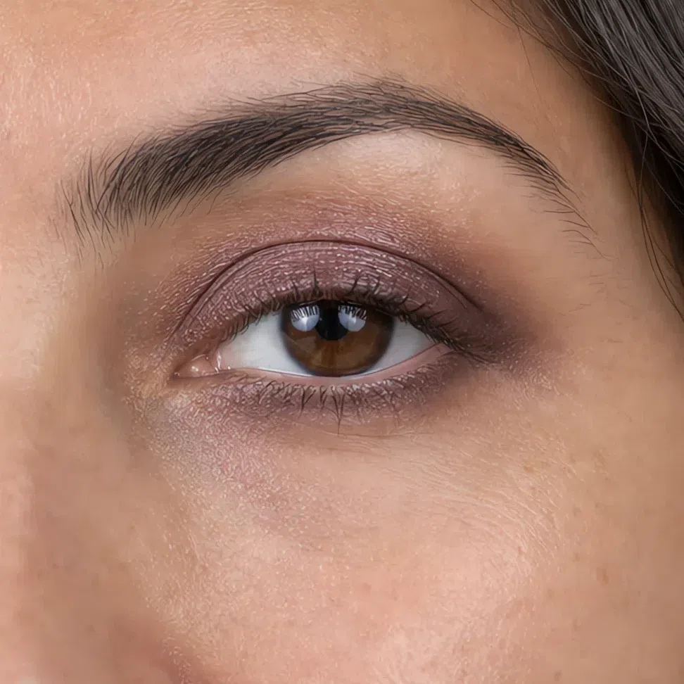
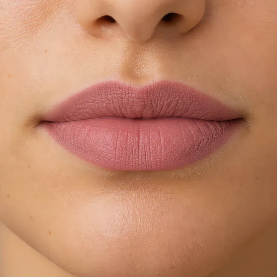
Start here
You are a Soft Summer. Here is what to put on.
Your hair, your skin and your eyes all sit inside a narrow band of lightness, and every one of them carries a little gray. Nothing on your face arrives at full strength. That is not a limitation, it is the one fact every decision on this page follows from.
It means your makeup has to go deeper than most advice suggests and quieter at the same time. Those sound like opposites until you see them on a face.
Add depth, not contrast. Every shade should sit a step or two from what is already there, hold some gray, and end without an edge you could trace.
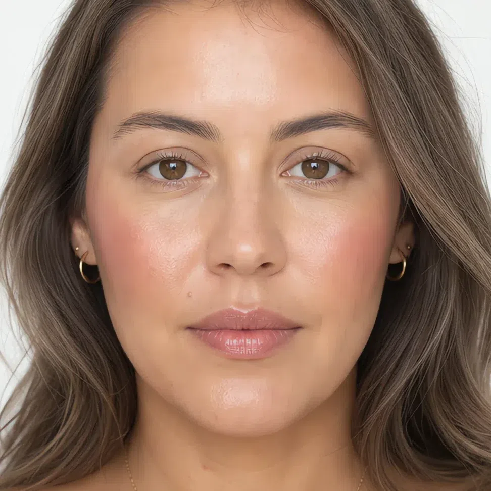
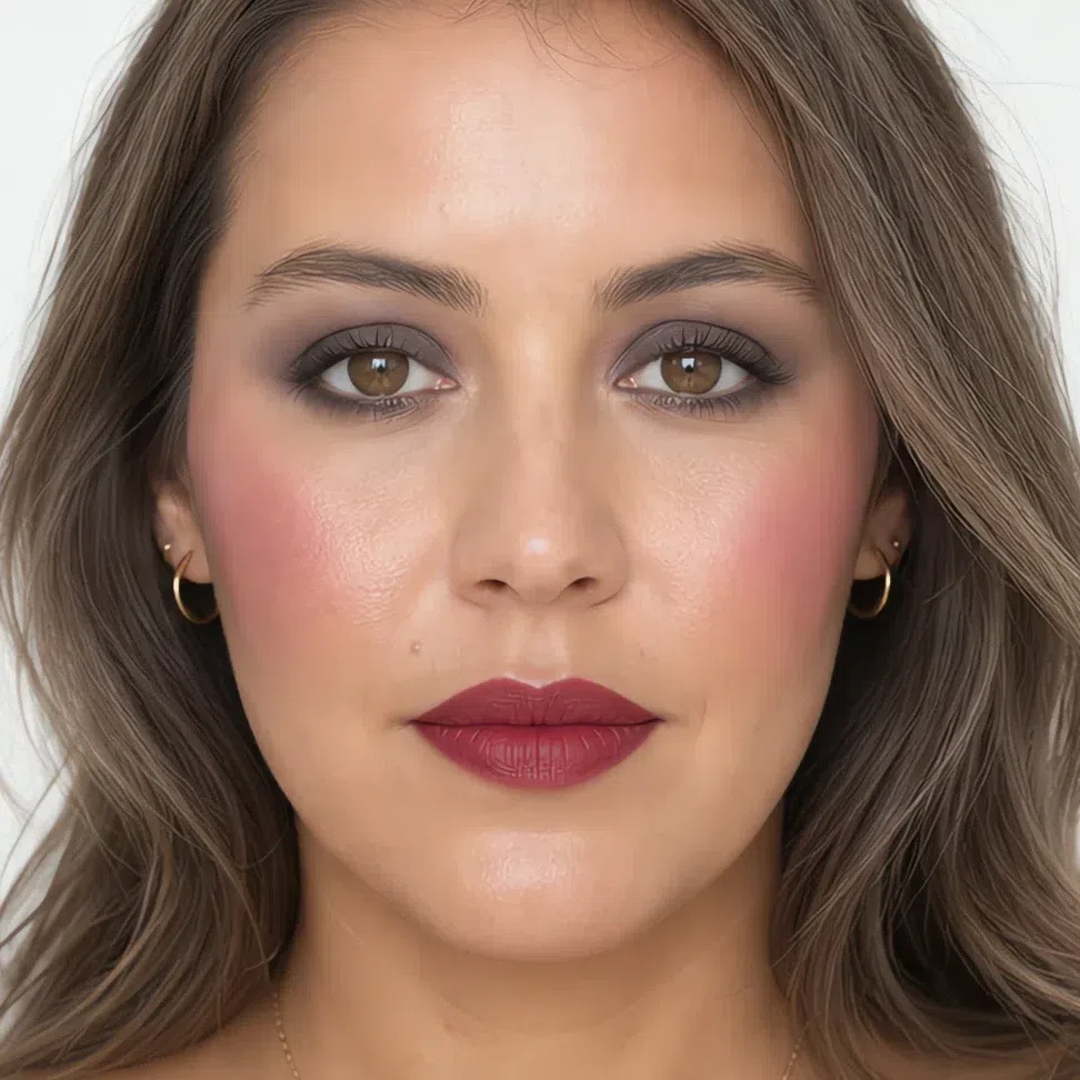
The same woman, on a medium complexion. Everything between those two ends is what the rest of this page builds, and all four complexions are in the very next section.
What is on this page
- Sixteen finished looks Four occasions at each of four complexions, with the shade used on every part of the face.
- Why these shades The four swaps that do most of the work, and what makes the ones in your drawer miss.
- How to build it Base, cheeks, eyes, lips, in the order they go on, with the technique for each.
- When you need more What to take further after dark, and the two things that have to stay where they are.
- How to buy it Reading a label, testing a shade, and why the test almost everybody runs cannot work.
- The shade list Every shade on this page in one block, at your depth. Screenshot it and go.
Sixteen finished makeup looks
Start here, because a rule is easier to believe once you have seen it. Four occasions at each of the four depths, with the exact shade used on every part of the face. Find the skin depth closest to yours and read across: the occasions run from a face that took five minutes to the most this coloring will carry.
If you have fair skin:
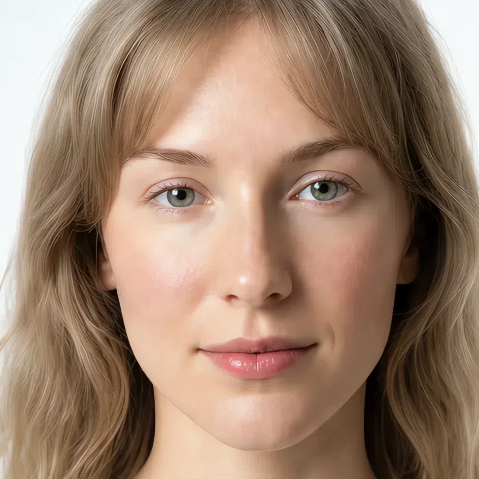
- Base Fair - neutral-cool
- Blush Muted rose
- Lips Muted rose
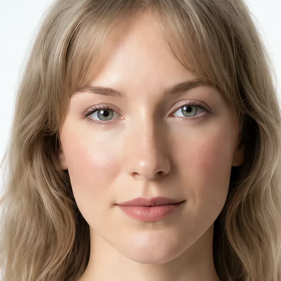
- Base Fair - neutral-cool
- Blush Muted rose
- Eyes Beige-pink
- Liner Soft brown
- Lips Muted rose
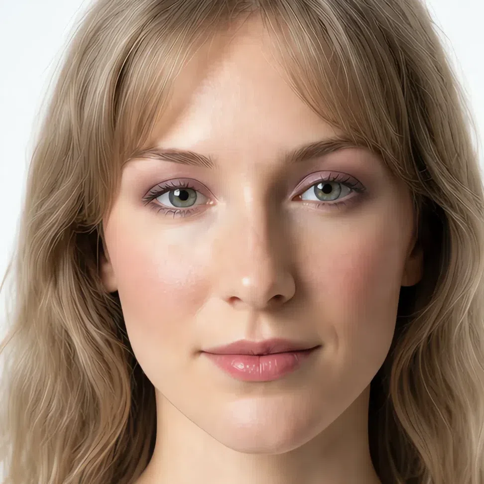
- Base Fair - neutral-cool
- Blush Dusty coral
- Eyes Plum shimmer
- Liner Gray-brown
- Lips Dusty raspberry
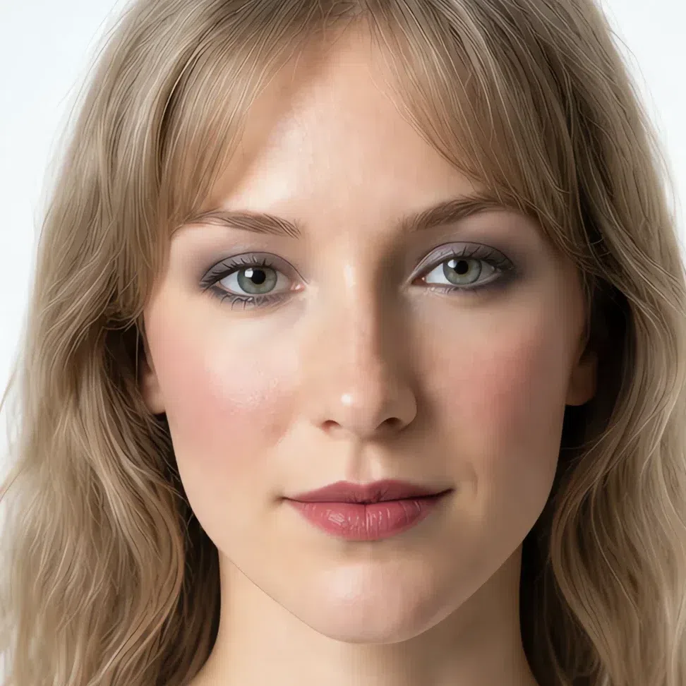
- Base Fair - neutral-cool
- Blush Dusty raspberry
- Eyes Deep graphite
- Liner Soft black
- Lips Muted cherry
If you have light skin:
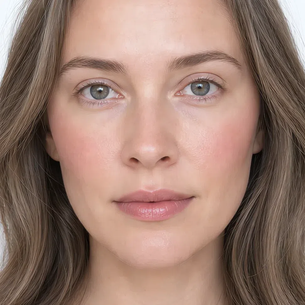
- Base Light - neutral-cool
- Blush Muted rose
- Lips Muted rose
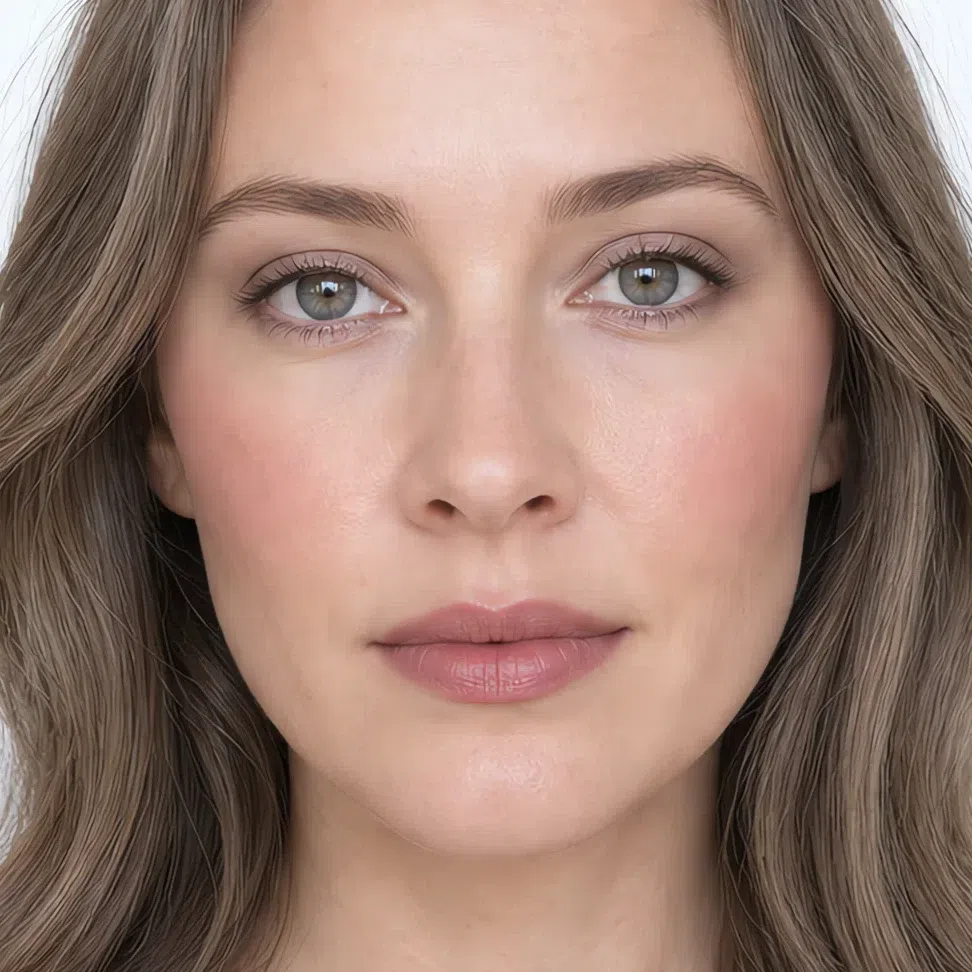
- Base Light - neutral-cool
- Blush Muted rose
- Eyes Beige-pink
- Liner Soft brown
- Lips Muted rose
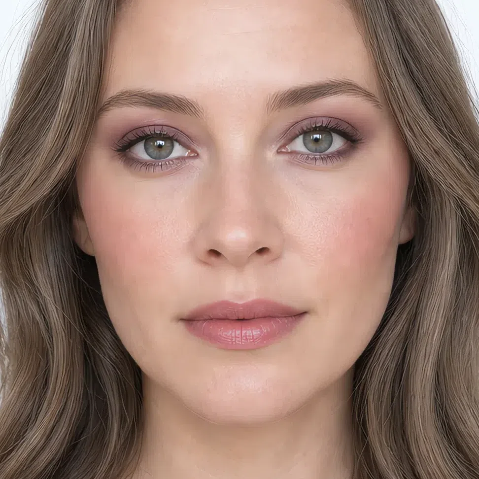
- Base Light - neutral-cool
- Blush Dusty coral
- Eyes Plum shimmer
- Liner Gray-brown
- Lips Dusty raspberry
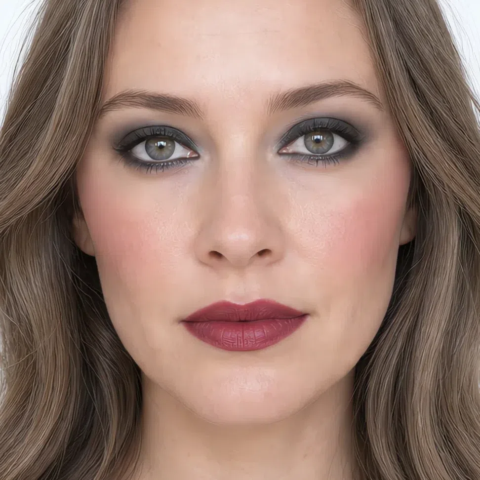
- Base Light - neutral-cool
- Blush Dusty raspberry
- Eyes Deep graphite
- Liner Soft black
- Lips Muted cherry
If you have medium skin:
- Base Medium - neutral-cool
- Blush Muted rose
- Lips Muted rose
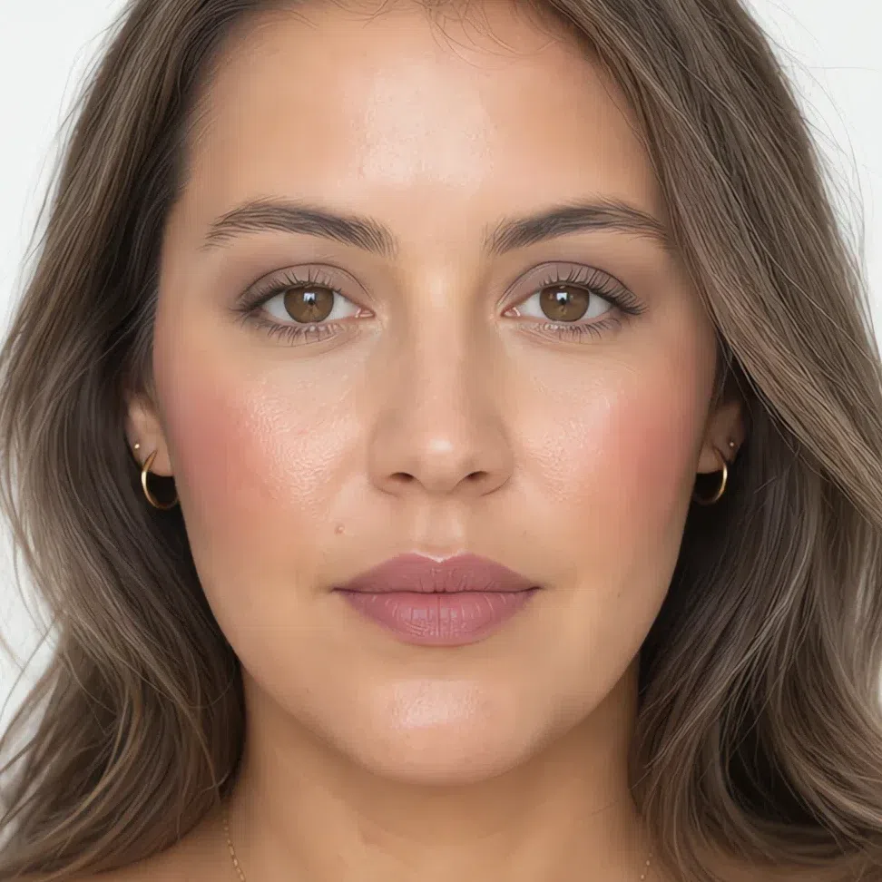
- Base Medium - neutral-cool
- Blush Muted rose
- Eyes Beige-pink
- Liner Soft brown
- Lips Muted rose
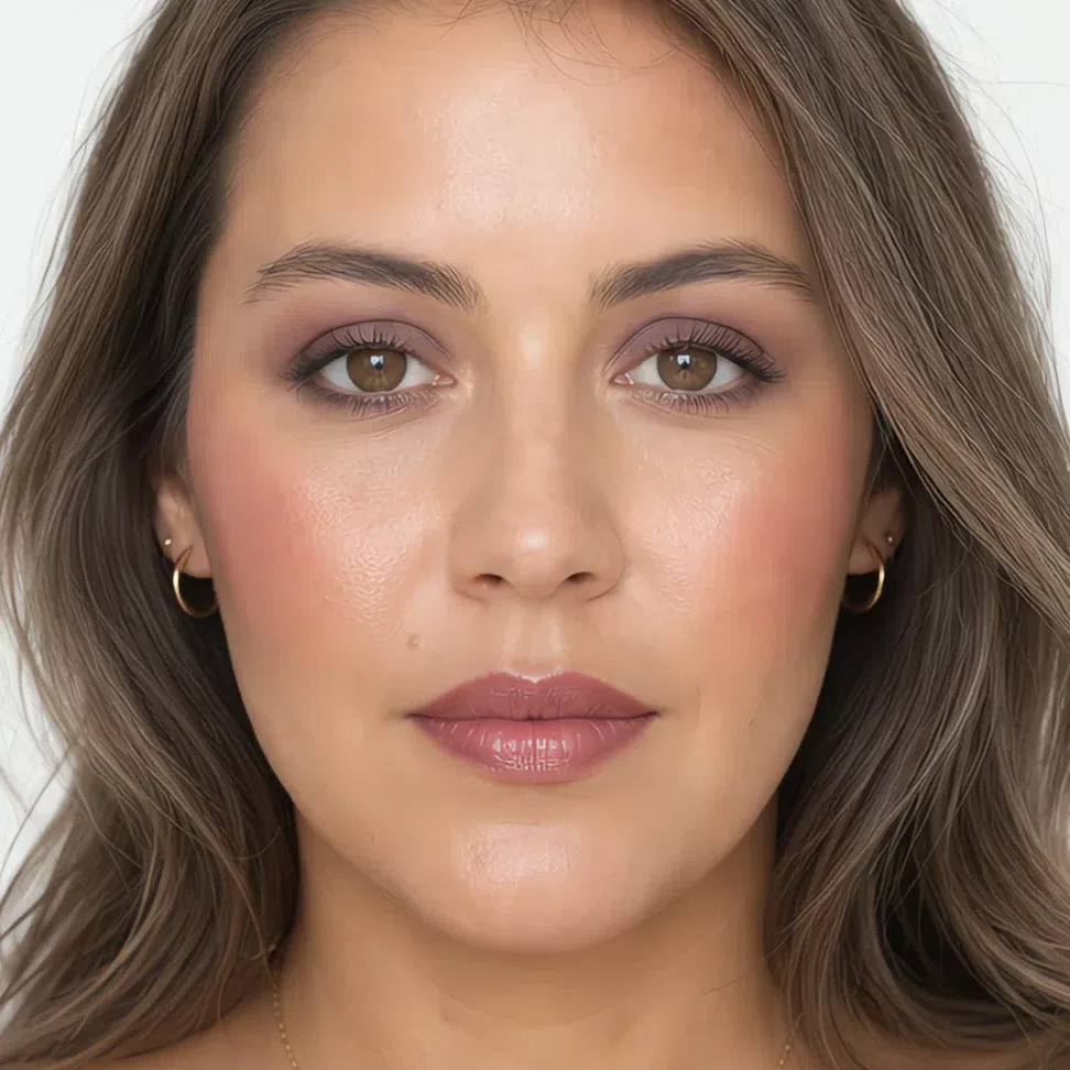
- Base Medium - neutral-cool
- Blush Dusty coral
- Eyes Plum shimmer
- Liner Gray-brown
- Lips Dusty raspberry
- Base Medium - neutral-cool
- Blush Dusty raspberry
- Eyes Deep graphite
- Liner Soft black
- Lips Muted cherry
If you have deep skin:
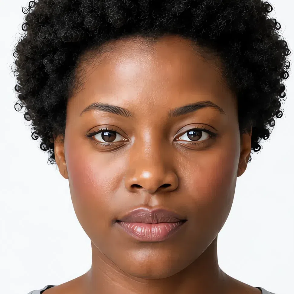
- Base Deep - neutral-cool
- Blush Muted rose
- Lips Muted rose
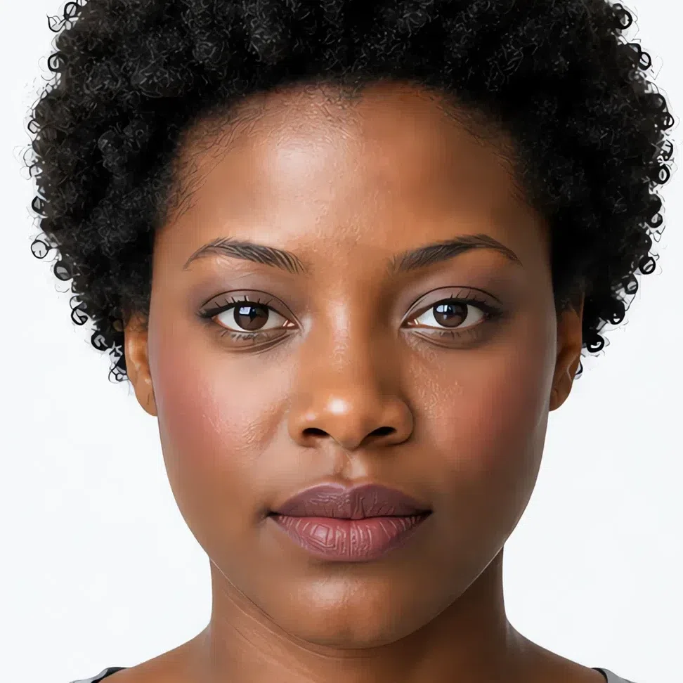
- Base Deep - neutral-cool
- Blush Muted rose
- Eyes Beige-pink
- Liner Soft brown
- Lips Muted rose
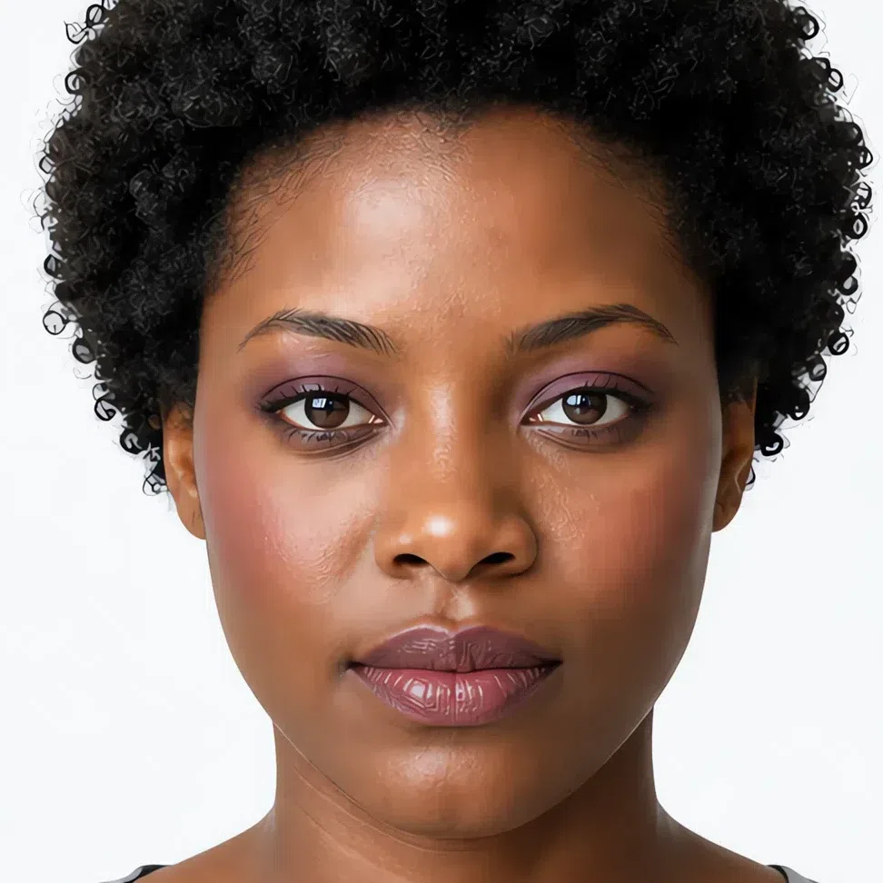
- Base Deep - neutral-cool
- Blush Dusty coral
- Eyes Plum shimmer
- Liner Gray-brown
- Lips Dusty raspberry
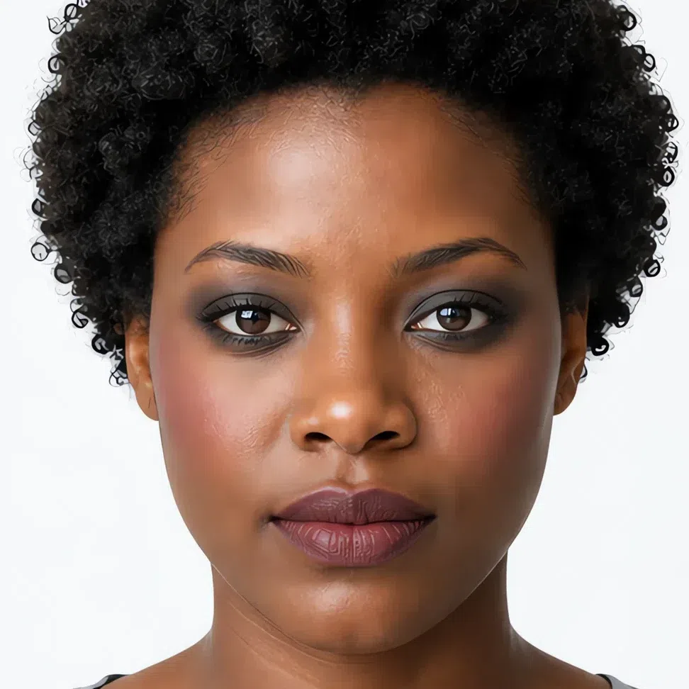
- Base Deep - neutral-cool
- Blush Dusty raspberry
- Eyes Deep graphite
- Liner Soft black
- Lips Muted cherry
The shade names are the same in every row. What moves between the depths is the value behind the name: muted rose on fair skin and muted rose on deep skin are the same blush, several steps apart. Which raises the obvious question, and it is the one the next section answers - why these shades at all?
Why these shades, and not the ones you own
Those sixteen faces are built out of a surprisingly small number of swaps. Here are the four that do most of the work, each against the shade most people reach for instead. Notice that almost none of them are wrong by color family. They are wrong by how loudly they arrive.
Why these shades and not those
Tap a productSoft black is still the darkest thing on your face, which is all a liner has to be. True black is darker than anything your face actually contains, so it stops belonging to you and starts reading as a line drawn on skin.
Both are violet. Yours has gray running through it, so it settles into the lid and stays there. The clean one keeps its own color and sits on top of skin that has no clean color anywhere in it.
Coral is less a problem of warmth than of clarity. It arrives at full strength while every other color on your face is halfway to gray, so the cheek becomes the first thing anyone sees.
A clear red asks the rest of the face to meet its intensity. Nothing on yours can, so the mouth ends up in a different photograph from the person wearing it.
Notice which side moves. The shade that works shifts as complexion deepens, so there is no single right hex - yours is in the cheat-sheet. The shade that fails does not shift at all: it fails on clarity, and clarity is not a property of skin. Liner is the exception that proves it - soft black is soft black on everyone.
What the four have in common is the size of the step, not the hue. Every shade in your palette carries a gray cast, so there is little contrast and little saturation on your face to begin with, which is exactly why anything arriving at full strength becomes the only thing anyone sees.
Knowing which shade to buy is half of it. The other half is where it goes and how far you blend it, and that is far easier to show in order than to describe.
How to build it, step by step
So here are those swaps in the order they actually go on. Four steps. The shades are the easy half; what follows each one is the technique that stops a low-contrast face from either disappearing or being taken over.
-
Base
Sheer, and only where you need it
Your base shades, by depth
Your season decides the undertone here - neutral to neutral-cool, never golden. Only your own skin decides how deep it goes.
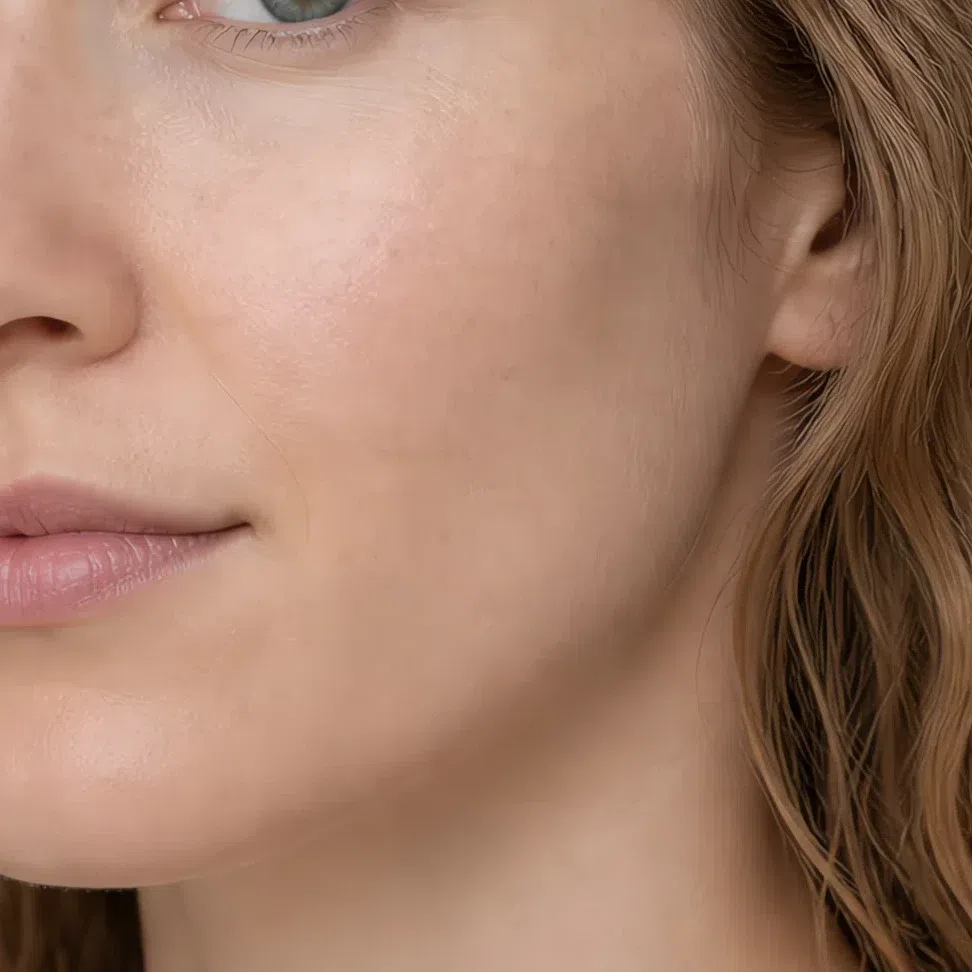
Fair - Foundation Fair - neutral-cool #C9B8A8
- Bronzer Fair - cool taupe #A6968C
- Highlighter Fair - soft pearl #F5EBD8
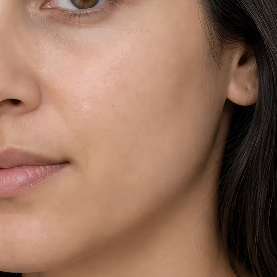
Light - Foundation Light - neutral-cool #B8A99A
- Bronzer Light - cool taupe #8E7A6C
- Highlighter Light - soft pearl #EDD9C0
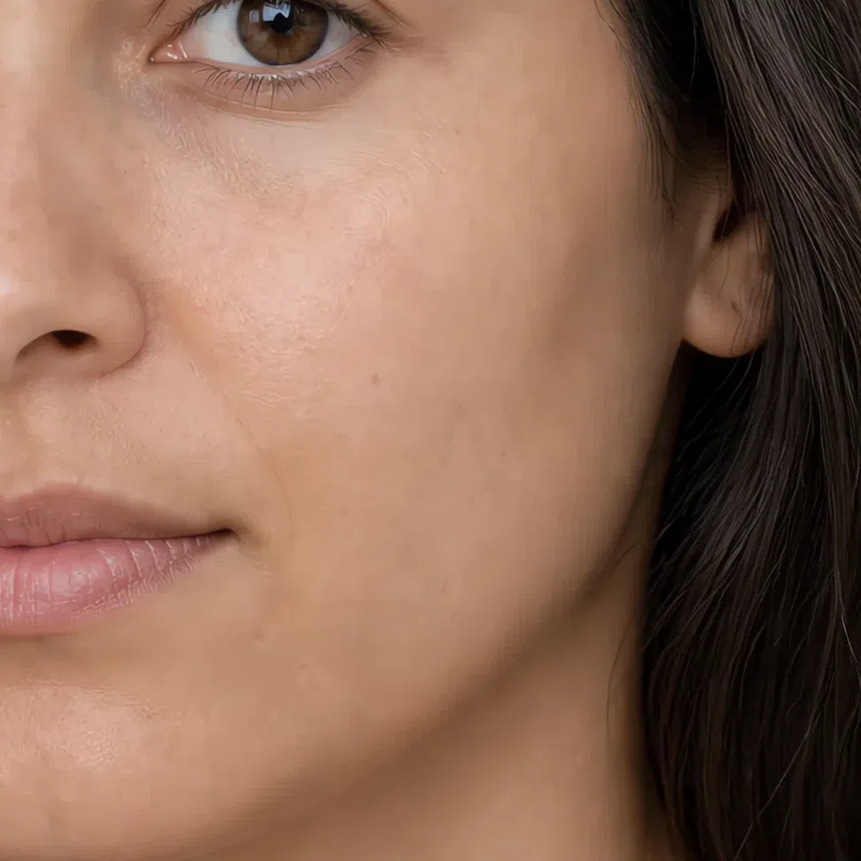
Medium - Foundation Medium - neutral-cool #9A7F68
- Bronzer Medium - cool taupe #6E5648
- Highlighter Medium - soft pearl #D9B593
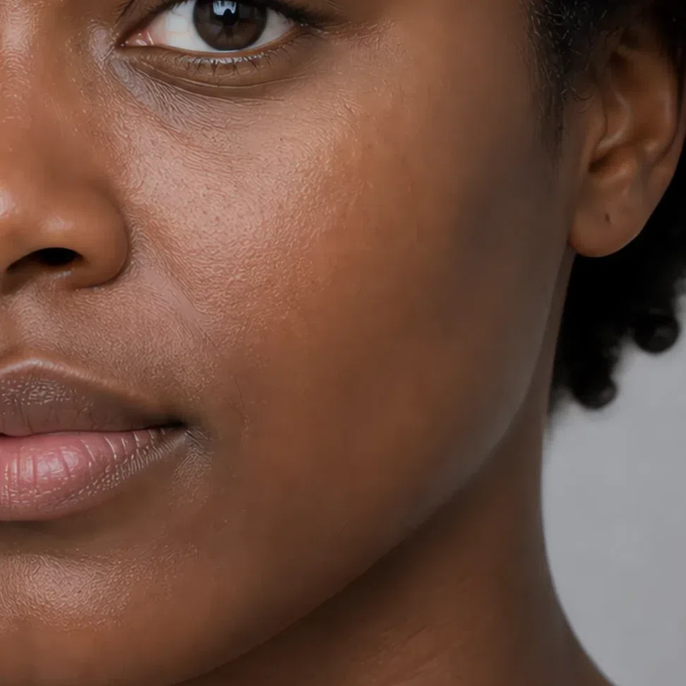
Deep - Foundation Deep - neutral-cool #6B4A38
- Bronzer Deep - cool taupe #4C3428
- Highlighter Deep - soft pearl #B98A63
If you fall between two depths, take the deeper one: a base sitting half a step light reads gray on muted coloring. Foundation, bronzer and highlighter in full →
Coverage is the real decision here, not color. Your skin has very little contrast in it to begin with, and a full-coverage base removes the small variations that are most of the texture you have - the result photographs flat rather than clean. Sheer to medium, pressed in over the middle of the face, left alone toward the edges.
Powder follows the same logic. Muted coloring depends on a little light coming back off the skin, and a full mattifying layer takes that away along with the shine. Set the T-zone if it moves on you, and stop there.
Tip If you can see where the foundation stops, the problem is coverage, not shade.
-
Cheeks
A long sweep, not a round spot
Blush is the first color on the face, and it sets the level everything after it has to live with.
Blush
Take it high on the cheek and drag it back toward the temple in one long diffuse sweep - a round spot on the apple leaves a hard edge, which is the single thing this face cannot carry. Cream sinks into skin and reads as blood, powder sits on top and reads as product, so reach for cream first and use powder only to hold it. Build in two passes and stop once you can no longer see where it begins.
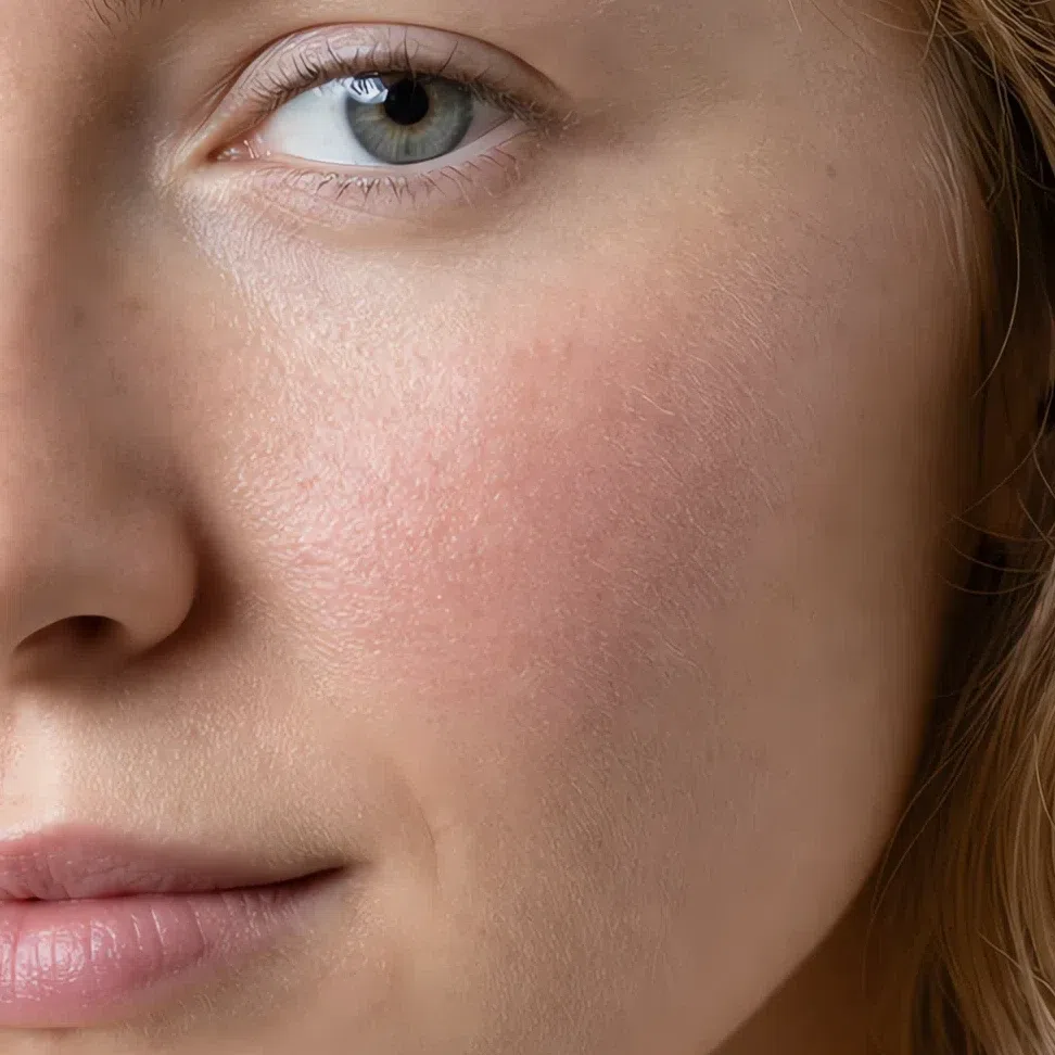
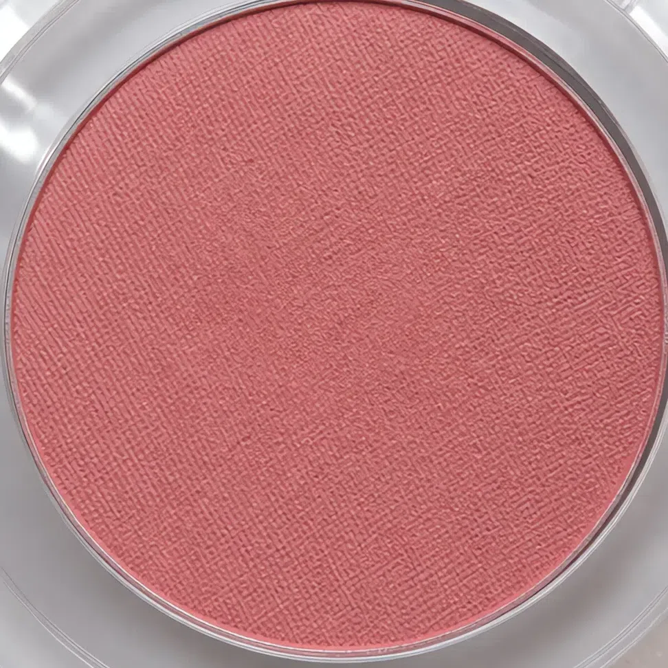
Muted rose #D9A6A6 Fair 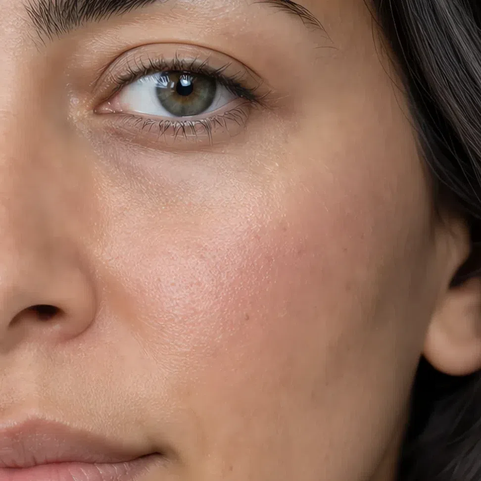
Soft peach-pink #CF9D8E Fair 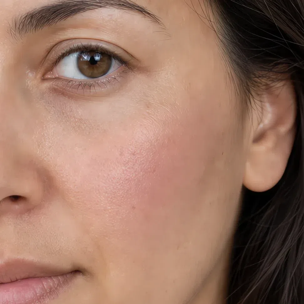
Dusty coral #C08E96 Fair 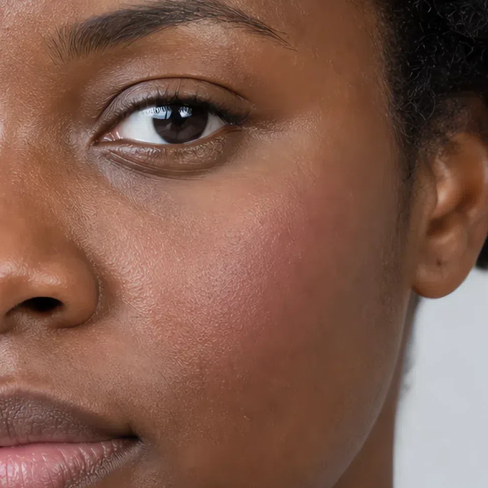
Dusty raspberry #B57F86 Fair Same shade at four depths: Fair · Light · Medium · Deep Tap a step to read its value. The photograph stays as shot.
Tip Bright is the trap, not warm. If it reads as a color rather than a flush, it is too clean for you.
-
Eyes
Two shades, and no hard edges
Brows, lid, lashes - in that order, each one working under the ceiling the one before it set.
Brows
Brows come first, because on this coloring they are usually the darkest thing you will wear and everything after has to sit beneath them. Fill the sparse parts with short strokes following the direction the hair grows, and leave the outline alone - a drawn border is the quickest way to make a soft face look severe. Depth here comes off your hair rather than your complexion, which is why these four do not move with your skin the way the base does.
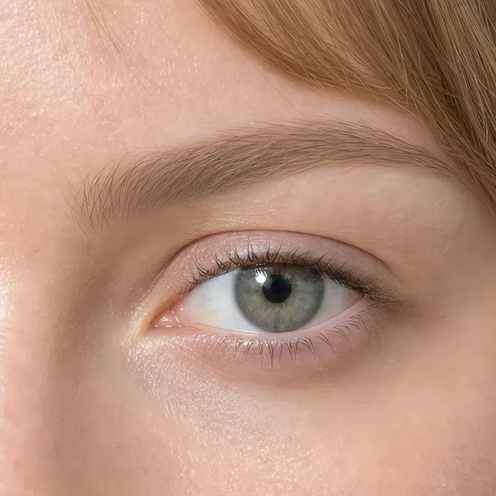
Light brown #A08B76 Fair 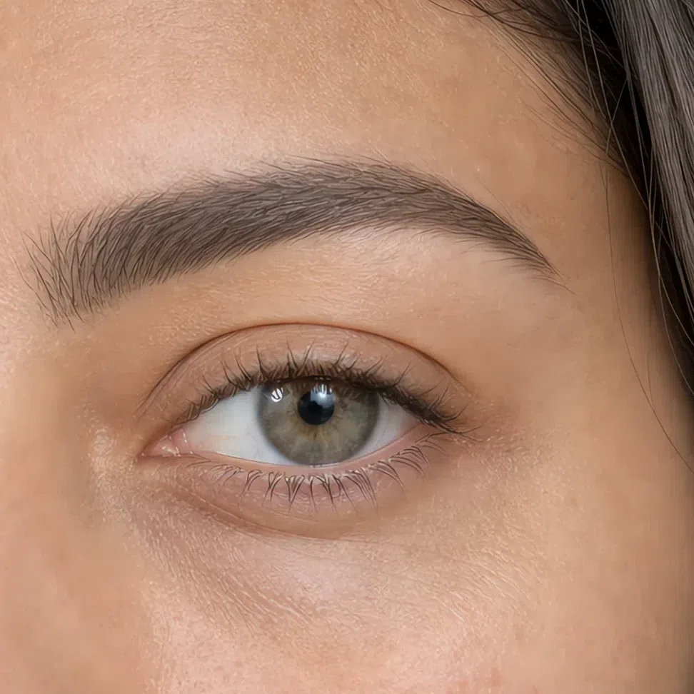
Umber #806F63 Fair 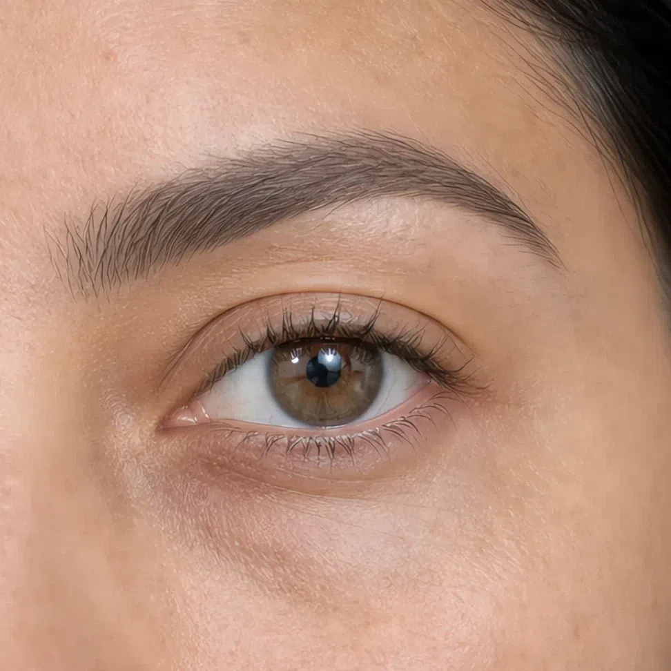
Ash #8E8C88 Fair 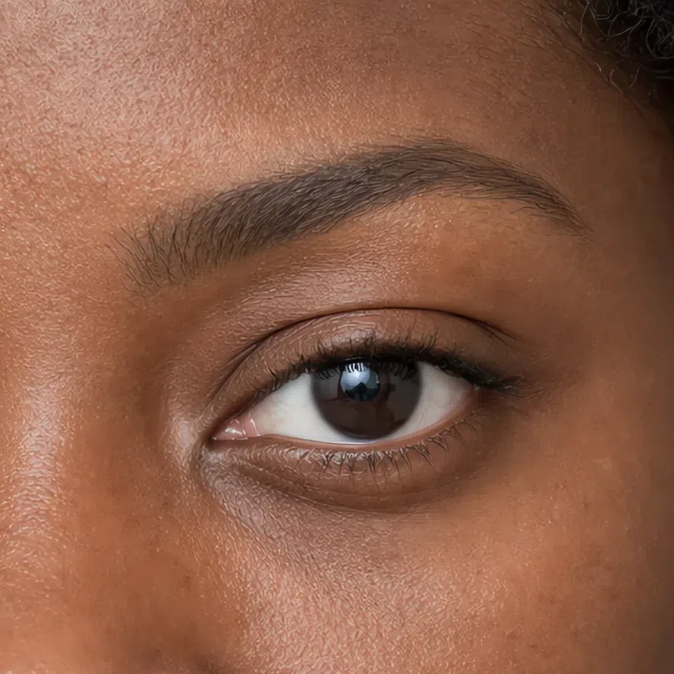
Deep taupe #6A5F54 Fair Same shade at four depths: Fair · Light · Medium · Deep Tap a step to read its value. The photograph stays as shot.
Everyday eyeshadow
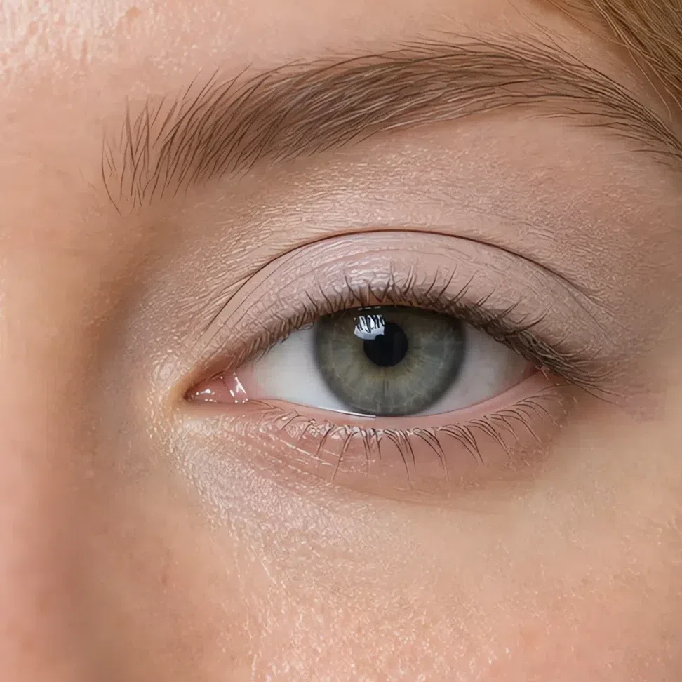
Two shades and no more: one across the whole lid, a deeper one through the outer third and the crease, blended until there is no border between them. A third color is where low-contrast eyes stop looking defined and start looking busy. Any two of these four work together.
Beige-pink #D6C6B9 Fair 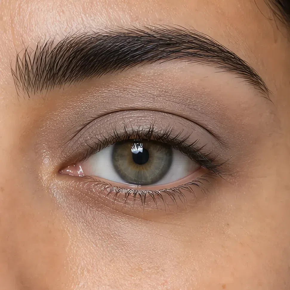
Greige #A89C94 Fair 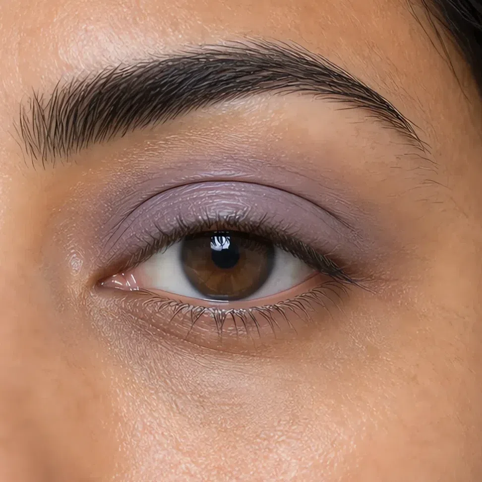
Muted violet #8B7F94 Fair 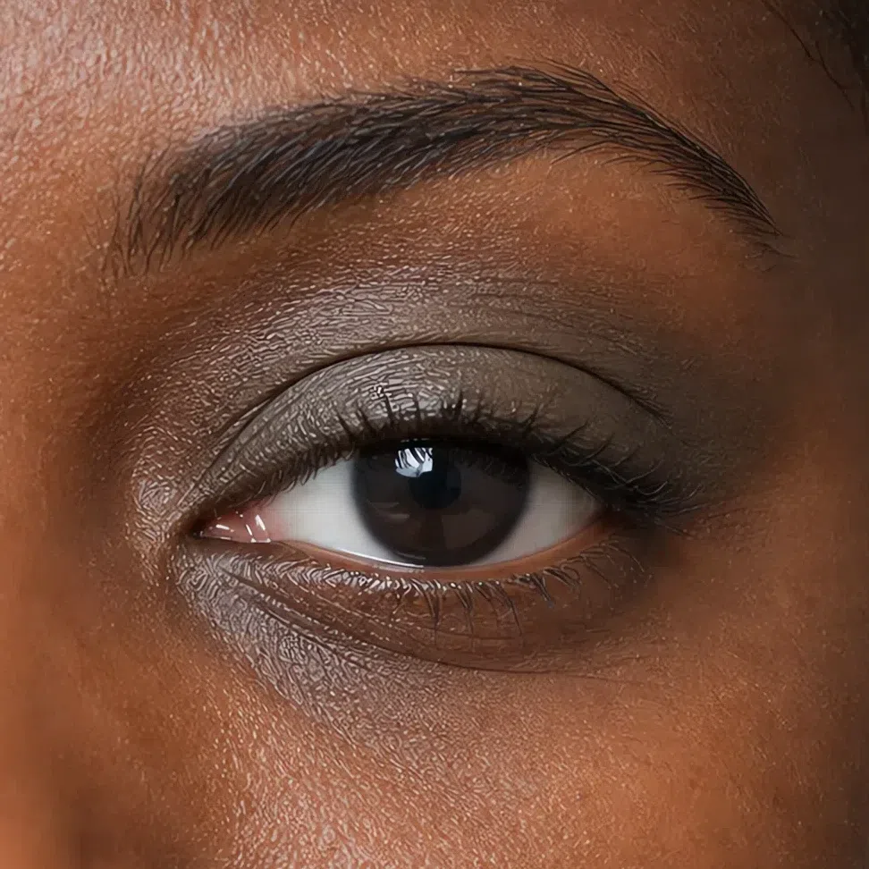
Olive-gray #83866F Fair Same shade at four depths: Fair · Light · Medium · Deep Tap a step to read its value. The photograph stays as shot.
Eyeliner
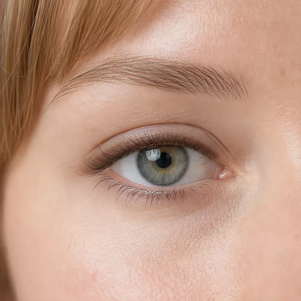
Liner belongs in the lashes rather than above them. Tightline the upper waterline, or draw a soft line and smudge it out before it sets - a wing with a clean edge asks for a contrast level your face does not have. Brown or gray-brown by day; the plum and the soft black carry more weight than a daytime eye needs.
Soft brown #6B5140 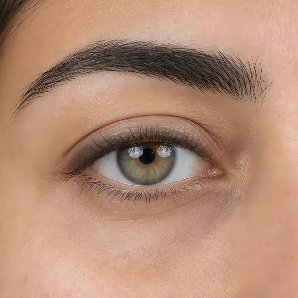
Gray-brown #6E6A68 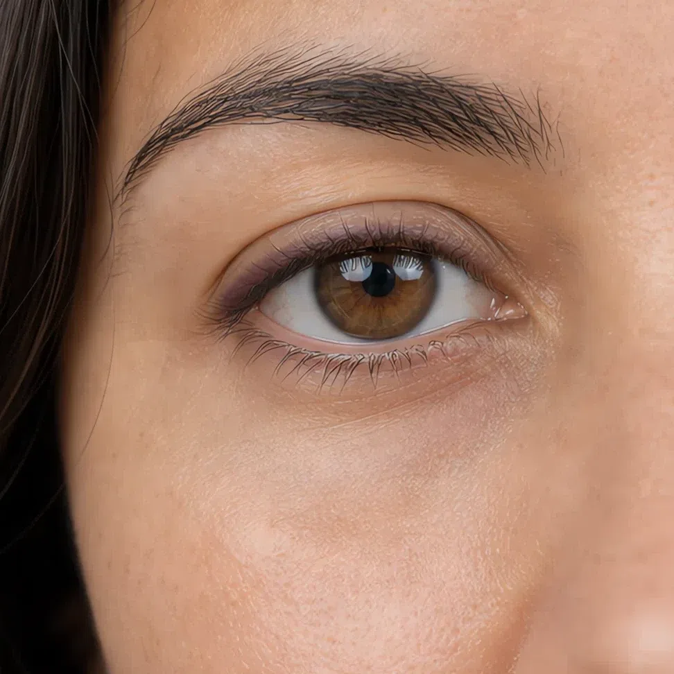
Plum #5C4453 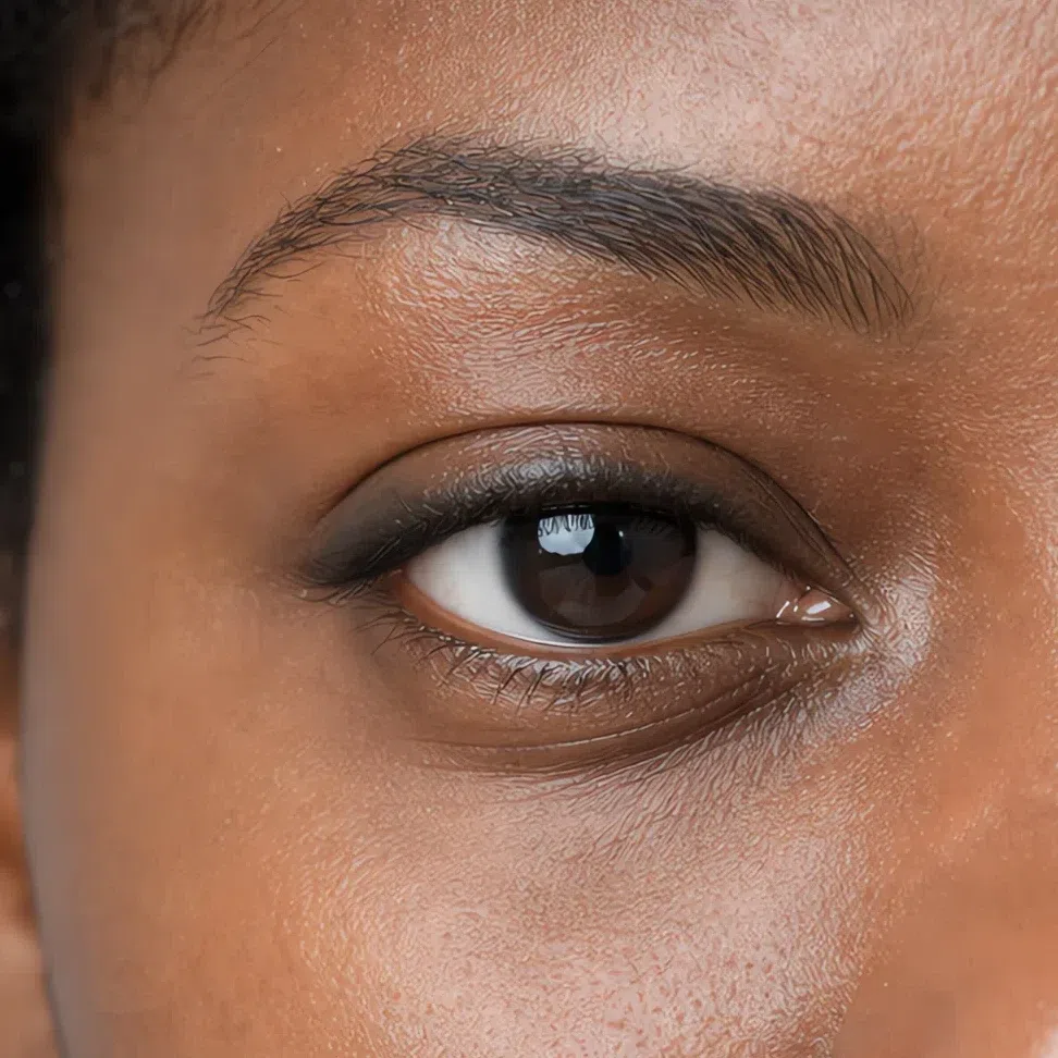
Soft black #2E2E30 Mascara
Mascara does the definition the liner is not doing. Work the brush into the root and wiggle out, one thin coat, a second only on the outer half, and leave the lower lashes bare unless the look genuinely needs the weight.
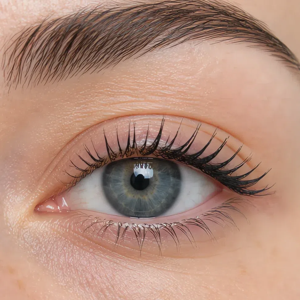
Soft black #2E2E30 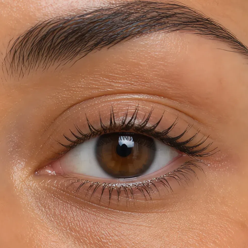
Brown #5A4A42 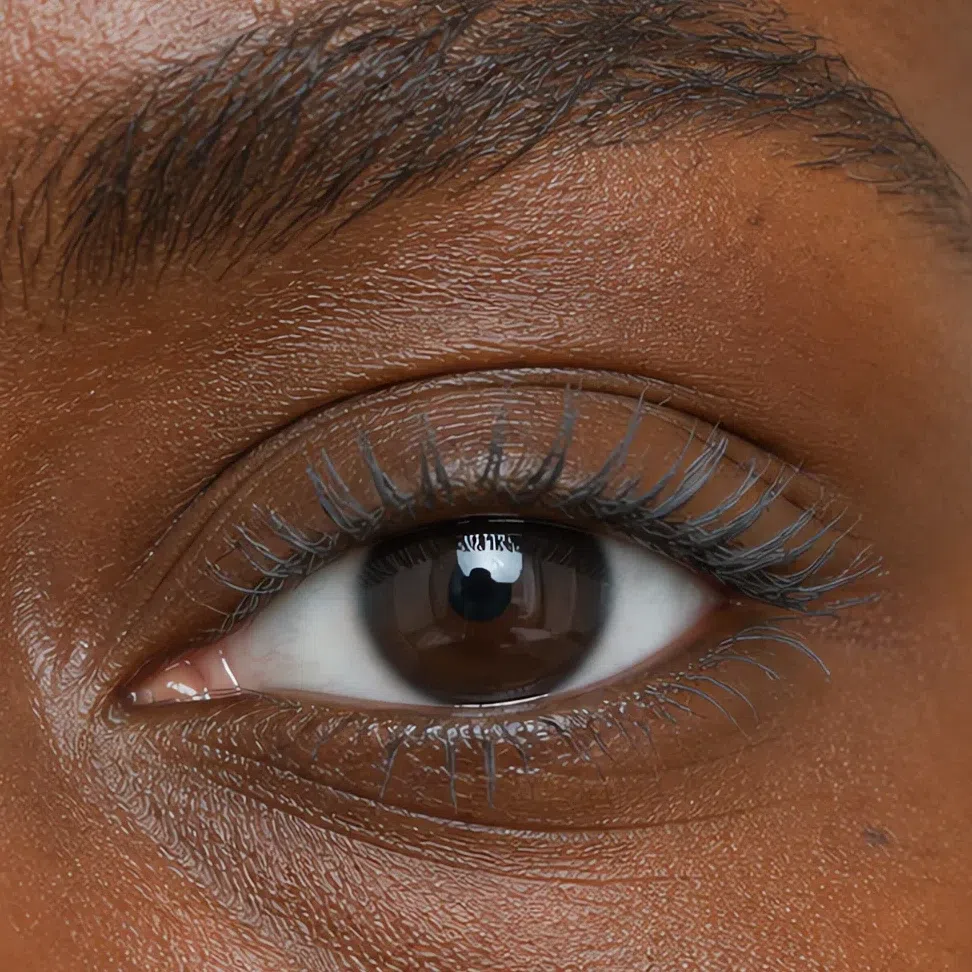
Gray #6E6E70 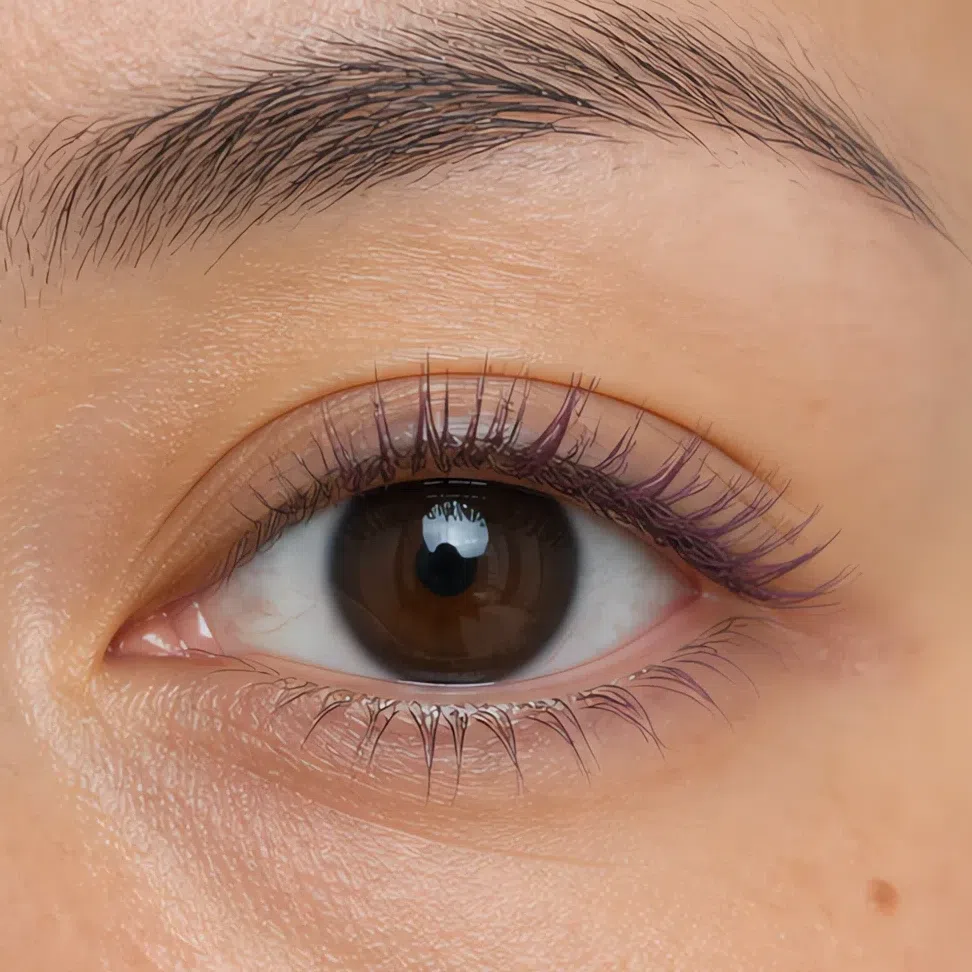
Plum #5C4453 Tip If someone can name what you are wearing on your eyes, it is one shade too many or one edge too sharp.
-
Lips
It should read as your mouth
The last step, and the one most people overshoot.
Nude shades
Apply with a finger rather than straight from the bullet - you get a thinner layer and a soft edge, and the edge is what decides whether it reads as makeup or as you. Skip the liner ring in daylight altogether. If a shade turns you gray it is sitting too light for your depth rather than too muted, so go one step down the ramp before you go warmer.
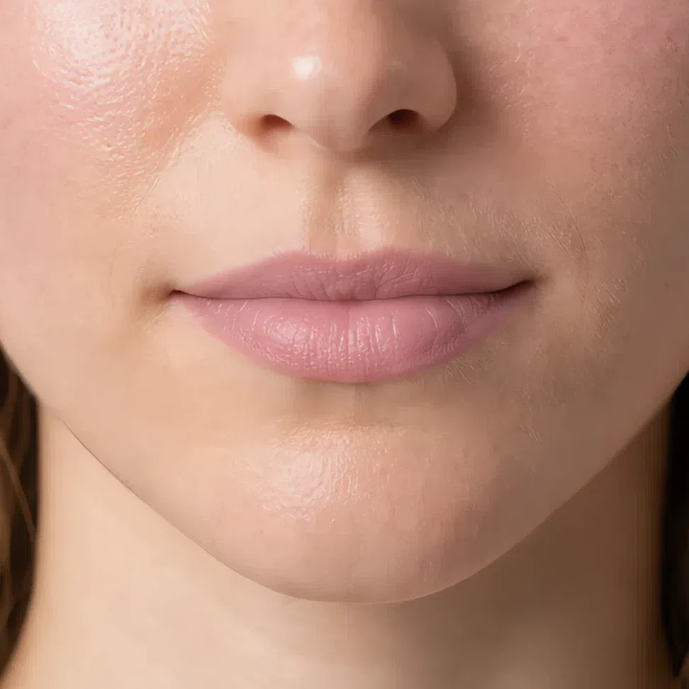
Muted rose #D9A6A6 Fair 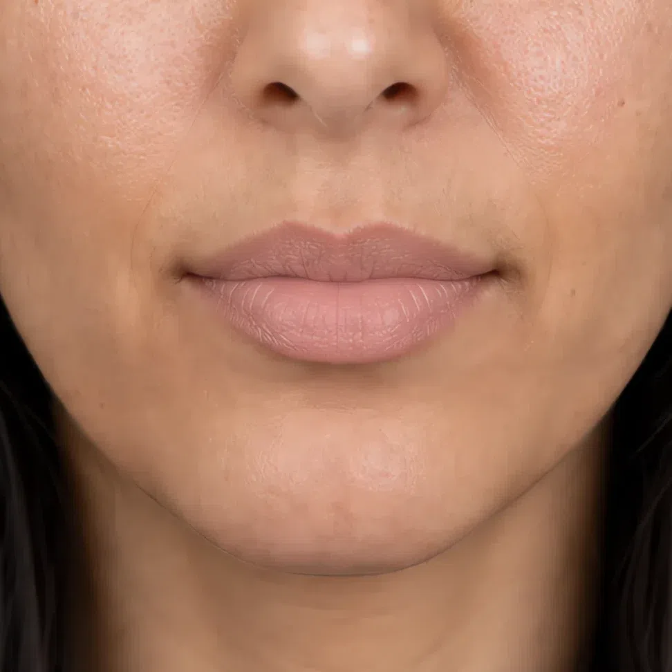
Soft peach-pink #CF9D8E Fair 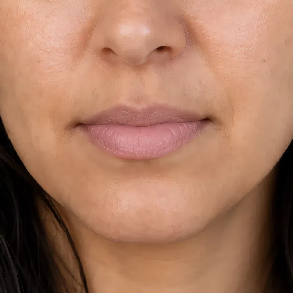
Dusty rose nude #C79A9A Fair 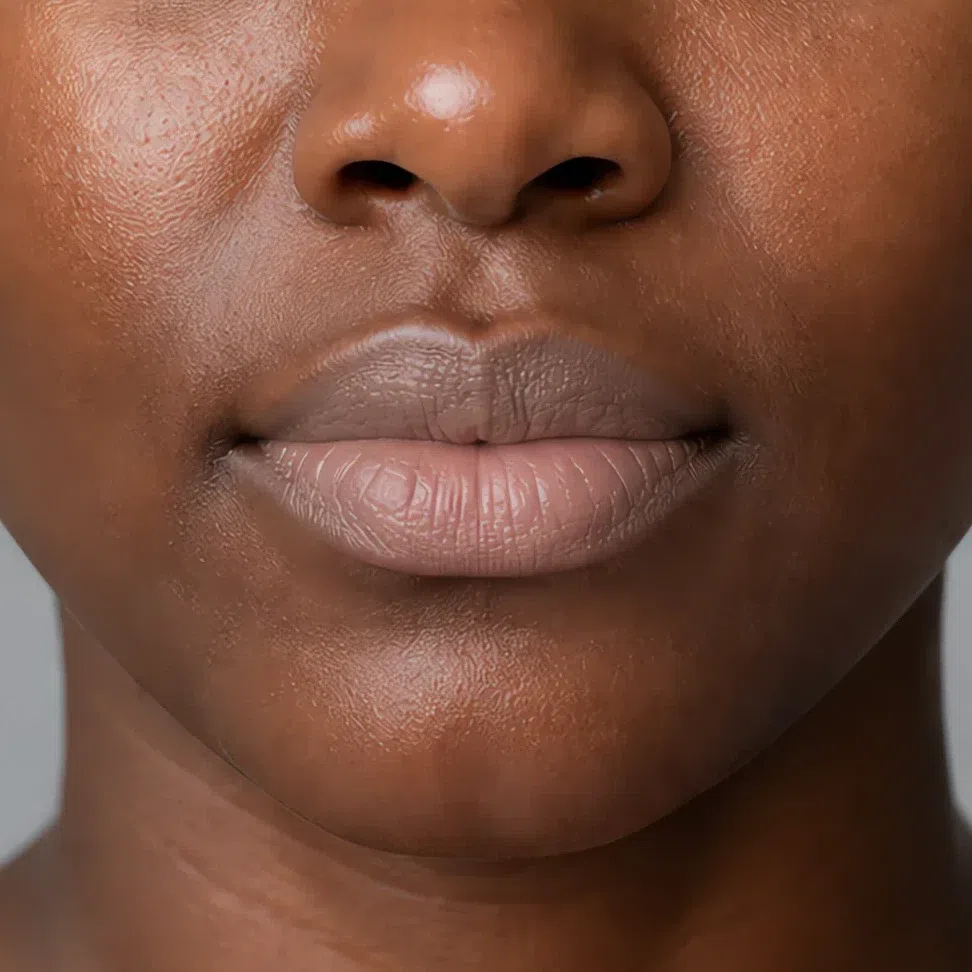
Gray-beige nude #BFA69B Fair Same shade at four depths: Fair · Light · Medium · Deep Tap a step to read its value. The photograph stays as shot.
Tip One thin layer pressed in beats one heavy one - a thick coat sets an edge you will spend the day repairing.
That is the whole daytime face. Which leaves the question everybody asks next: what do you change when the light drops?
Your evening face: what changes, and what must not
Less than you would think, and not in the direction you would guess. Evening is not a different face, it is the same one with two things taken further and a short list of things that have to stay exactly where they are. Below, each of the four depths by day and by evening, the same woman in both frames.
Eyes
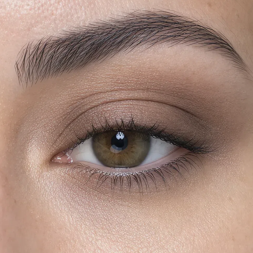
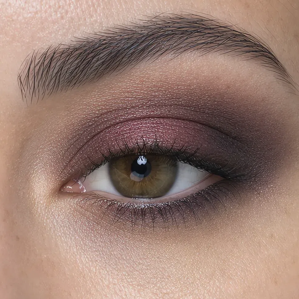
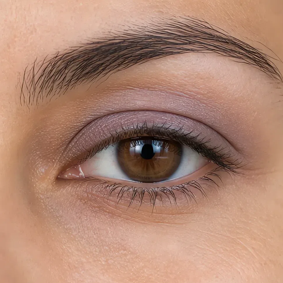
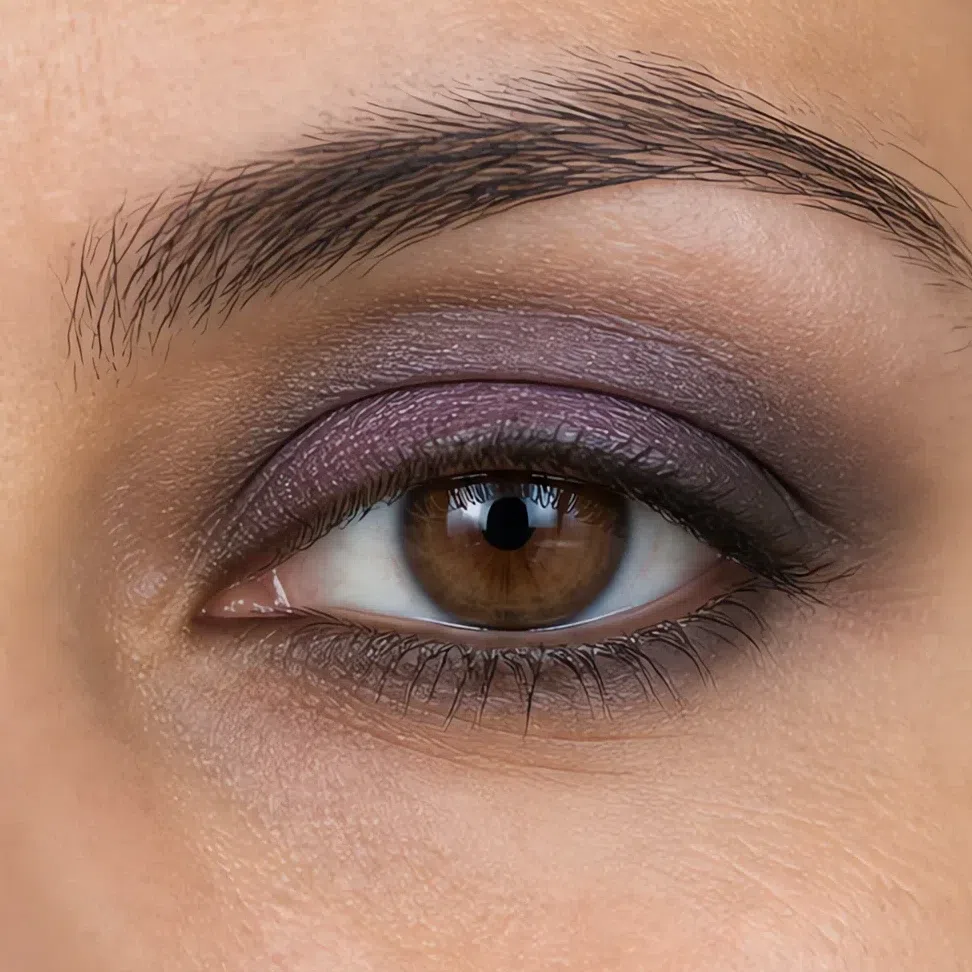
The lid centre does not move. Everything you add goes at the dark end - the crease, the outer corner and the outer half of the lower lash line.
- Wash one shade over the whole lid, edge to edge.
- Take the deeper shade through the crease and into the outer corner.
- Carry it along the outer half of the lower lash line - not the inner half.
- Leave the centre of the lid the lightest point, in a satin finish rather than a shimmer.
- Blend every join until you cannot find an edge with a fingertip.
The rule Extend the range at the dark end, never at the light end. A lid highlight brighter than your own skin is the move that turns depth into contrast.
Ash beige on the lid, pewter through the crease, muted plum in the outer corner. Plum is already your deepest shade - graphite on top of it reads as a bruise.
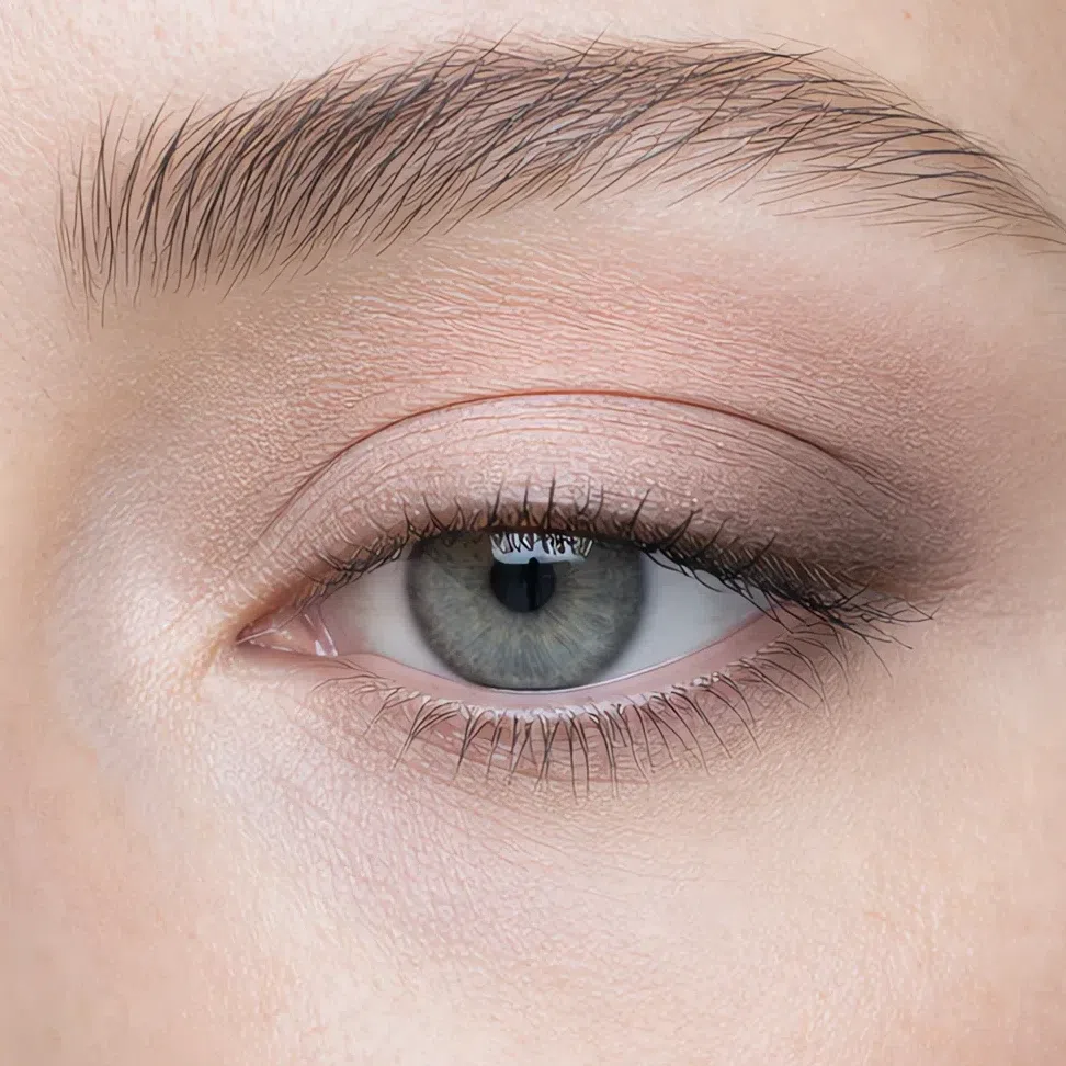
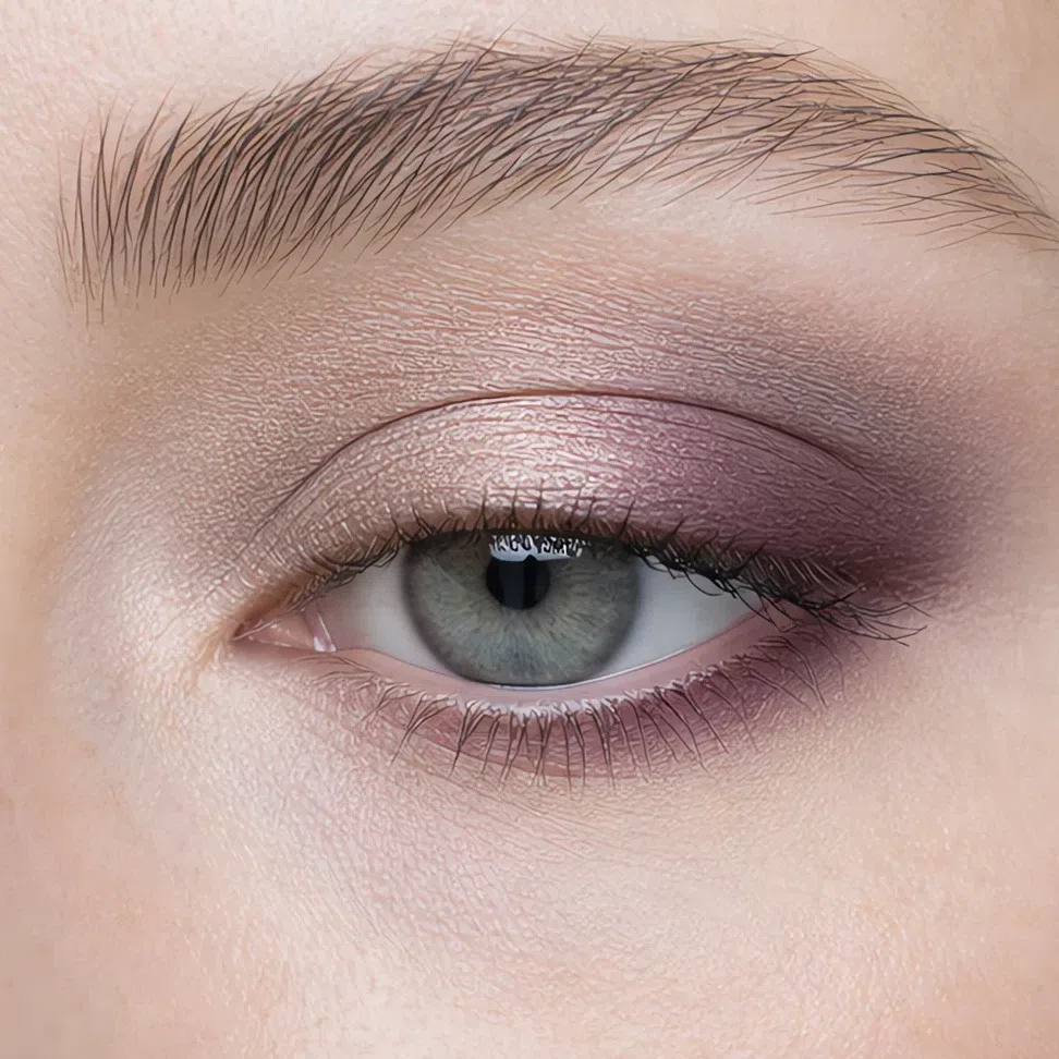 Deepest here
Lightest here
Lower lashes: outer half
Deepest here
Lightest here
Lower lashes: outer half
Muted plum moves onto the lid itself and deep graphite takes the crease and the outer corner.
 Deepest here
Lightest here
Lower lashes: outer half
Deepest here
Lightest here
Lower lashes: outer half
Muted plum on the lid, graphite through the crease and carried further out than it needs to go on lighter skin.
 Deepest here
Lightest here
Lower lashes: outer half
Deepest here
Lightest here
Lower lashes: outer half
Plum is a lid shade on you, not an accent - it will not read as depth against your own. Graphite has to travel further out and further up before it registers at all.
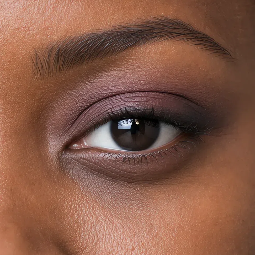
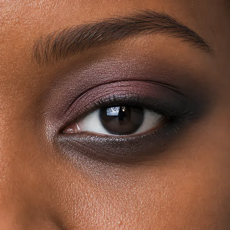 Deepest here
Lightest here
Lower lashes: outer half
Deepest here
Lightest here
Lower lashes: outer half
Lips
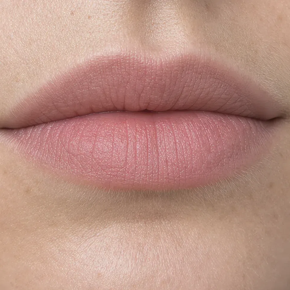
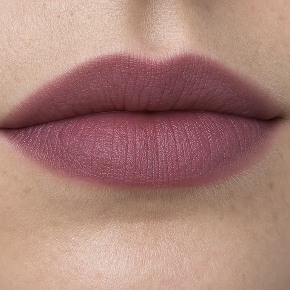
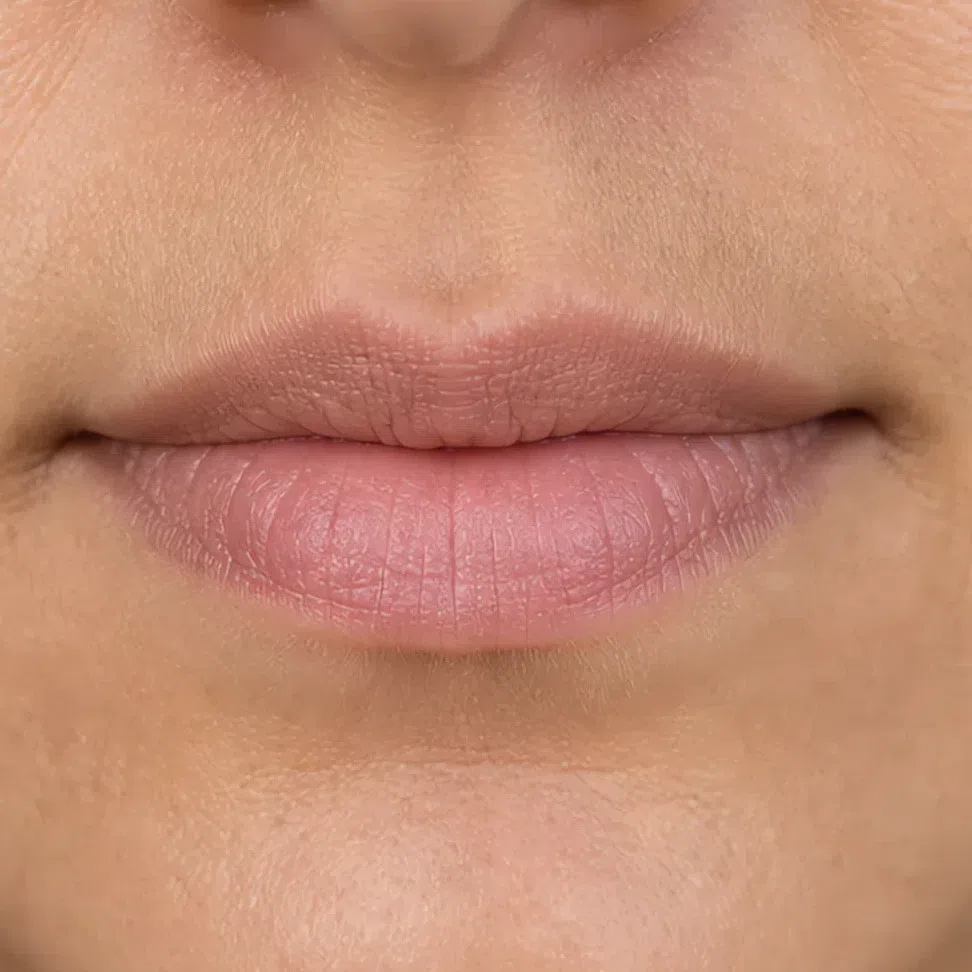
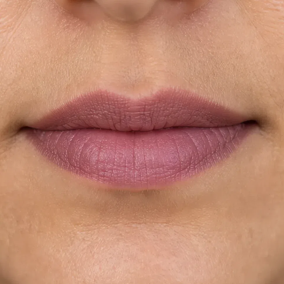
The same rose family, two steps deeper. What does not change is the edge - a deep shade with a drawn outline is the one version of this that will wear you.
- Press the first layer in with a finger rather than straight from the bullet.
- Blot it once.
- Build a second layer through the middle of the lip only.
- Leave the outer edge soft. No liner ring, at any hour.
The rule On this palette a nude and a colored lip are the same shade at different depths. The line between them moves with your skin, not with the hour.
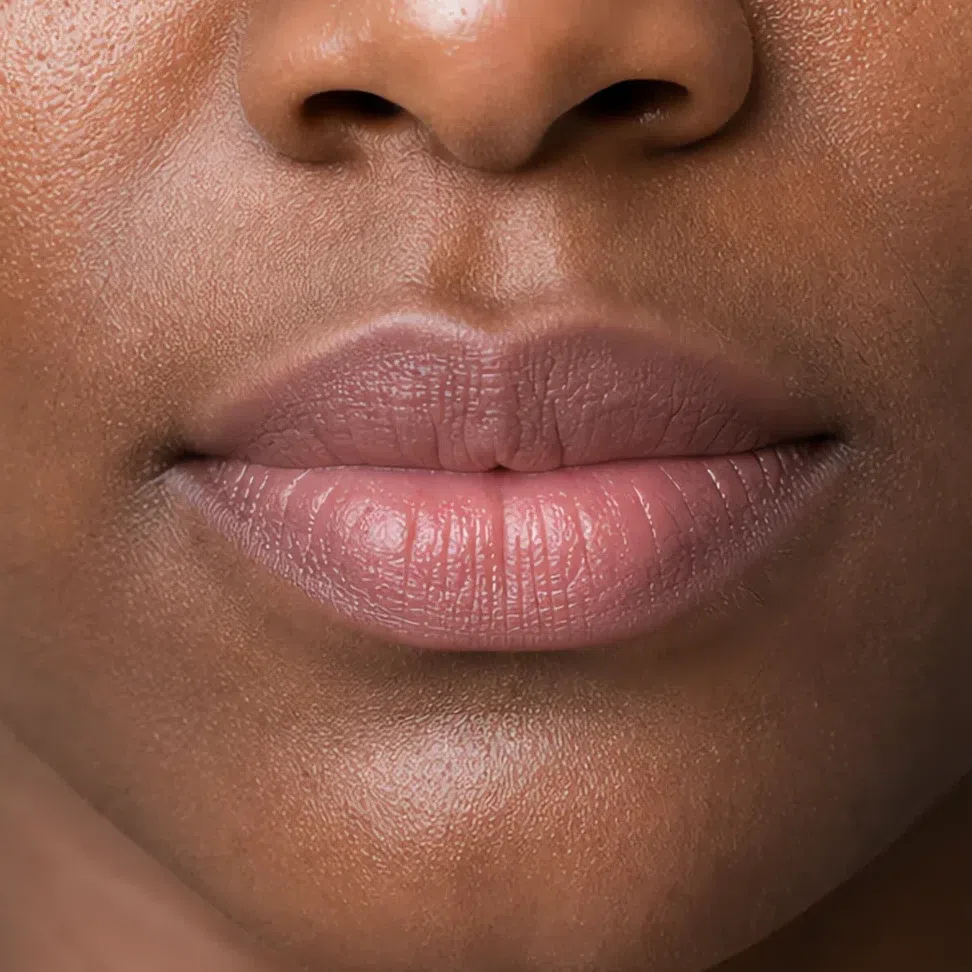
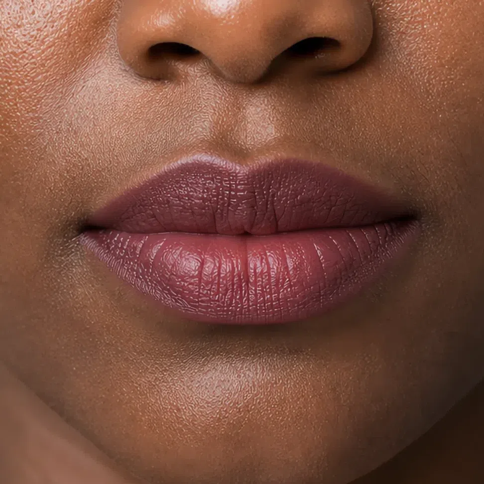
Muted rose by day, dusty raspberry by evening. Muted cherry is the outer limit before the mouth starts wearing you.
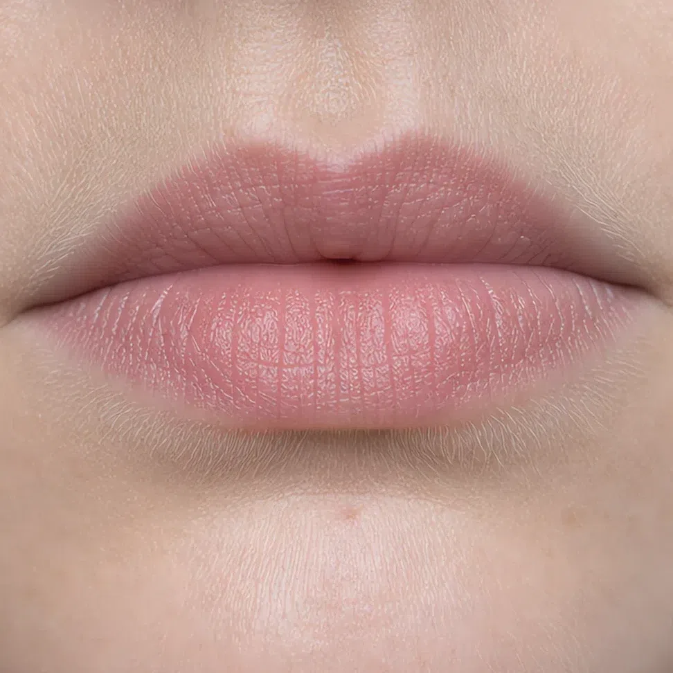
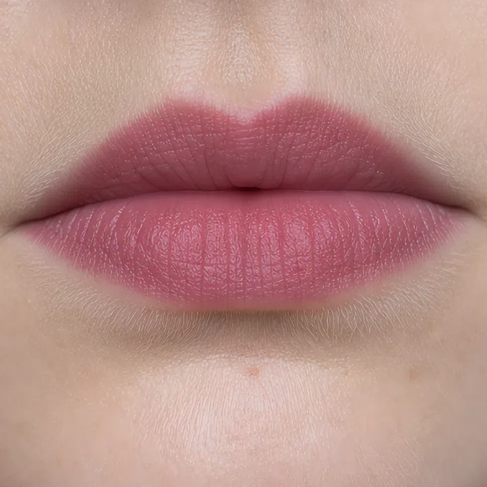 Edge stays soft
Build through the middle
Edge stays soft
Build through the middle
Dusty rose nude by day, muted plum by evening.
 Edge stays soft
Build through the middle
Edge stays soft
Build through the middle
Gray-beige nude by day, muted plum by evening.
 Edge stays soft
Build through the middle
Edge stays soft
Build through the middle
Dusty raspberry reads as a nude on you, so that is your daytime lip. Rosewood and muted plum are the evening ones, and neither lands as dark as it looks in the swatch.
 Edge stays soft
Build through the middle
Edge stays soft
Build through the middle
What must not change
Deeper does not mean sharper. Every line you softened by day stays softened; a liner that still reads crisp at arm's length is the thing that will date the whole look.
Satin and soft metallic, not glitter. Particle sparkle behaves like a contrast step - it throws small points of pure white onto a face that has no pure white anywhere else in it.
No clean color arrives after dark. A muted plum at full depth is an evening lip; a clear red is somebody else's evening lip, and the hour does not change that.
Evening is not the moment to add coverage. Night light is harder than daylight and a flash is harder still, so a heavier base is exactly what turns into a mask in the photographs.
One line to carry out of this section: your evening face is deeper, never louder. And whether it lands that way depends on something that is not the shade at all.
Why the right shade can still look wrong
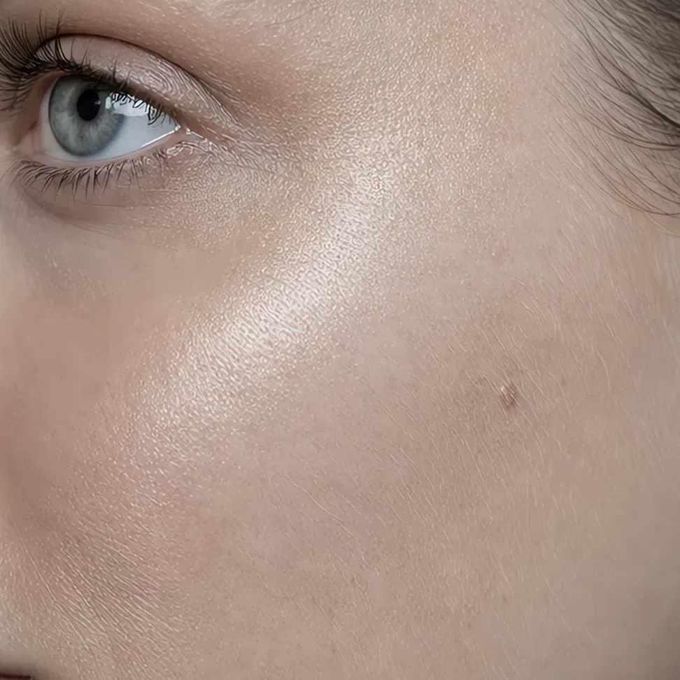
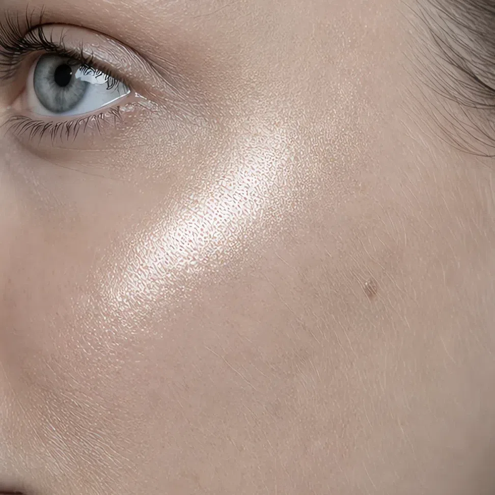
Because a shade is only half a product. Finish is the other half, nobody reads it on the label, and on muted coloring it decides nearly as much as the color does. Below is one lipstick and one mouth, photographed four times. Only the finish changes.
One shade, four finishes
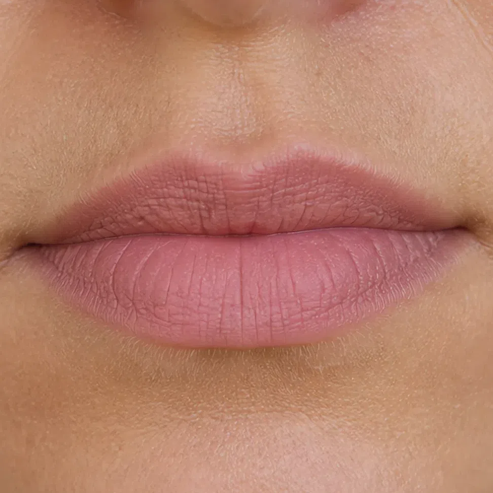
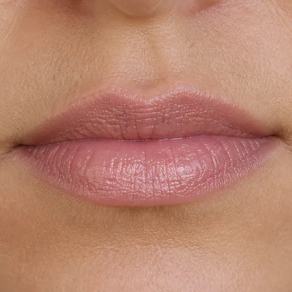
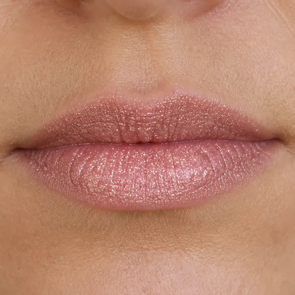
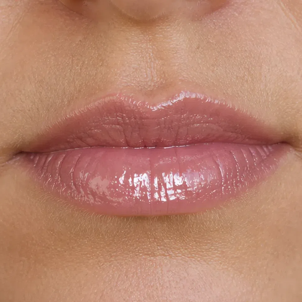
What separates them is the specular highlight - the small, hard reflection a shiny surface throws back. It is white, or near enough, and there is no white anywhere in your coloring. So a highlight behaves exactly like the contrast step this whole page is trying to avoid: it becomes the brightest thing present, and it lands on whatever you put it on.
Matte has none of it. Satin scatters it into a soft band you read as skin. Shimmer breaks it into dozens of small ones. Gloss concentrates it into a single point. That is the whole ranking, and it holds for every product on your face rather than just the lip.
Where finish is hardest to judge
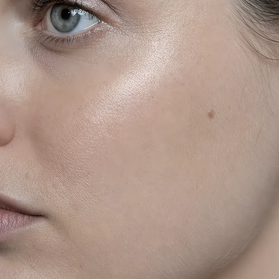
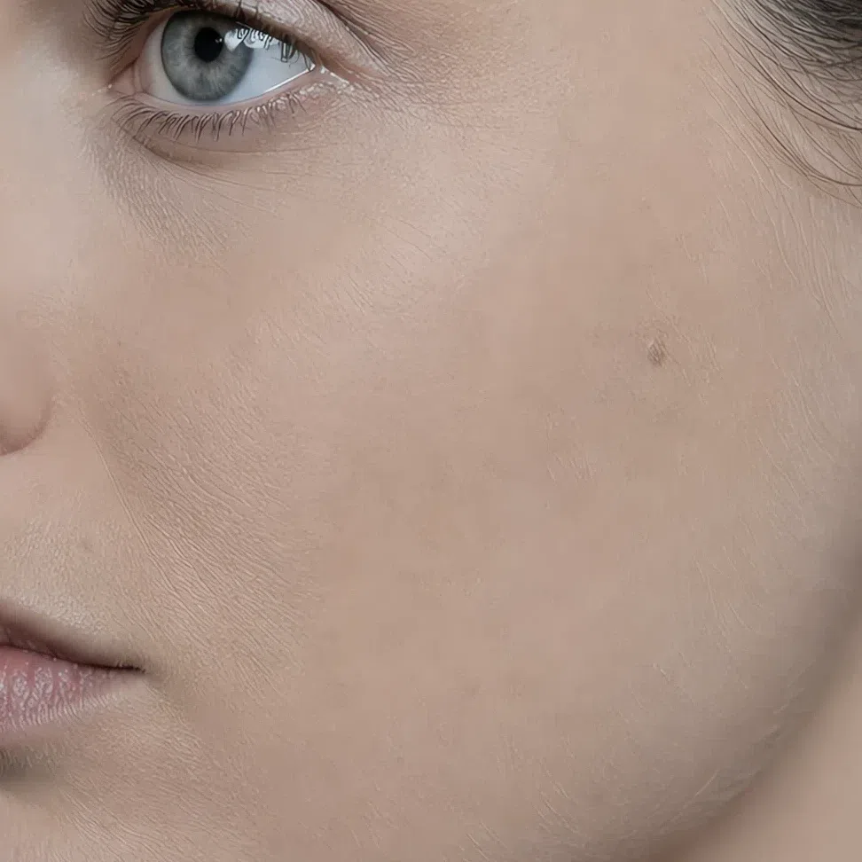
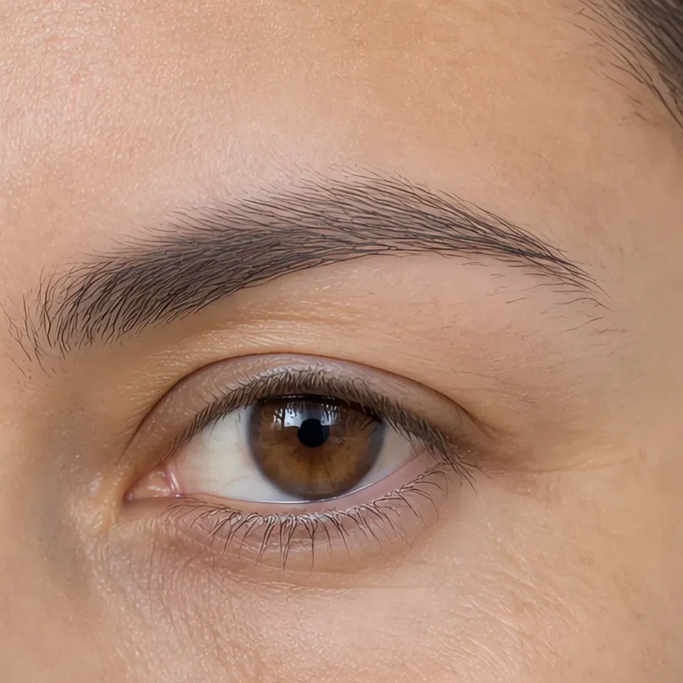
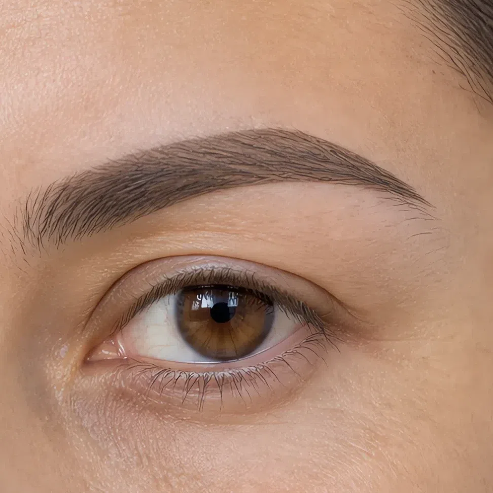
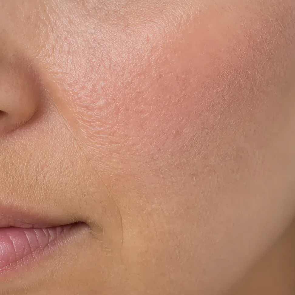
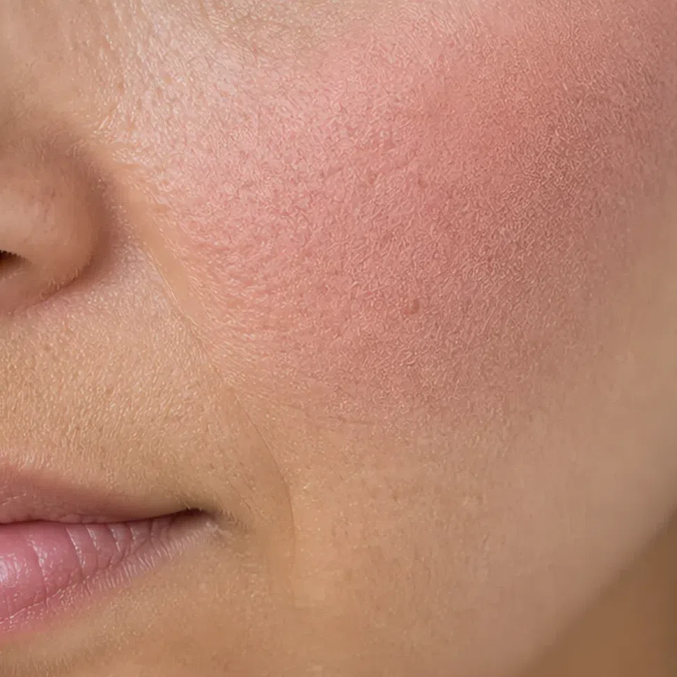
Eyeshadow has a finish choice too - matte by day, satin by evening, glitter never - but it is the one product already photographed twice on this page, in the everyday and evening sections, so it stays in the list below rather than getting a third comparison.
What that means product by product
- Base
- Satin. Not a dewy glass finish, and not full matte either - flat skin loses the small amount of light muted coloring depends on.
- Blush
- Cream over powder. It sits in the skin instead of on it, and there is no edge left to blend away.
- Eyeshadow
- Matte by day, satin by evening. Glitter at no point - the particles are the same problem as gloss, multiplied.
- Brows
- Powder or a soft gel. A waxy pencil leaves a line that also shines, which is two problems in one stroke.
- Lips
- Matte to satin. If you want shine, a sheer balm over a matte shade buys the softness without the hard point.
- Highlighter
- Soft pearl rather than a metallic edge. The same rule as gloss, on a larger surface and higher on the face.
The honest answer is about finish rather than about you. A satin base with powder only where you actually shine holds better on this coloring than a full matte base does - full matte flattens the one thing muted skin has going for it, and by mid-afternoon it has broken unevenly anyway. Set the T-zone, leave the rest, and carry blotting paper instead of more powder.
How to get the right one home
Everything above assumes you can get the shade home, and this is the part the shade lists skip: how to read a label, how to test, and why the test almost everybody runs cannot work.
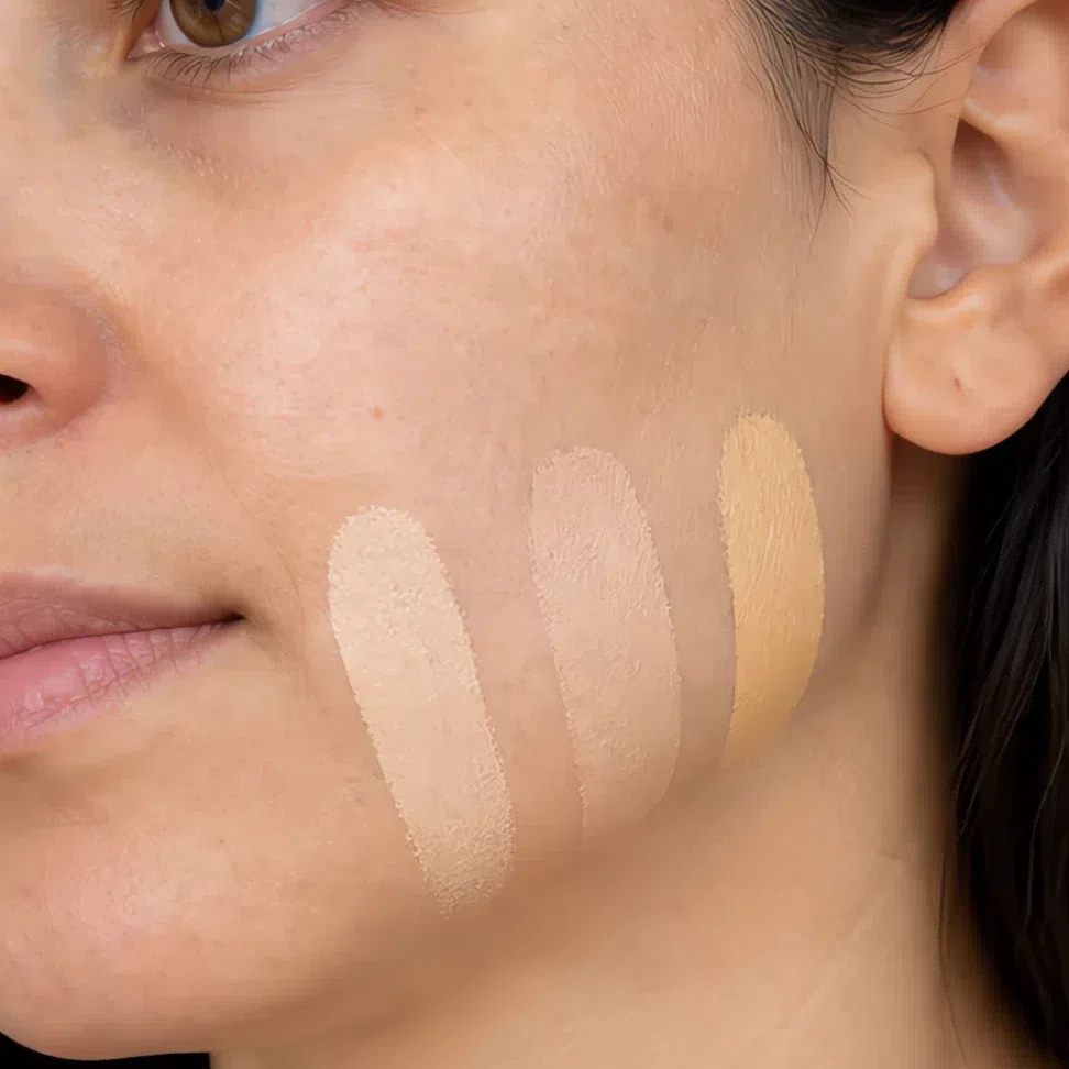
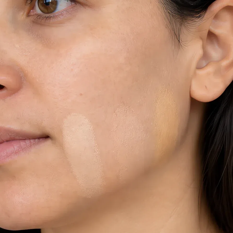
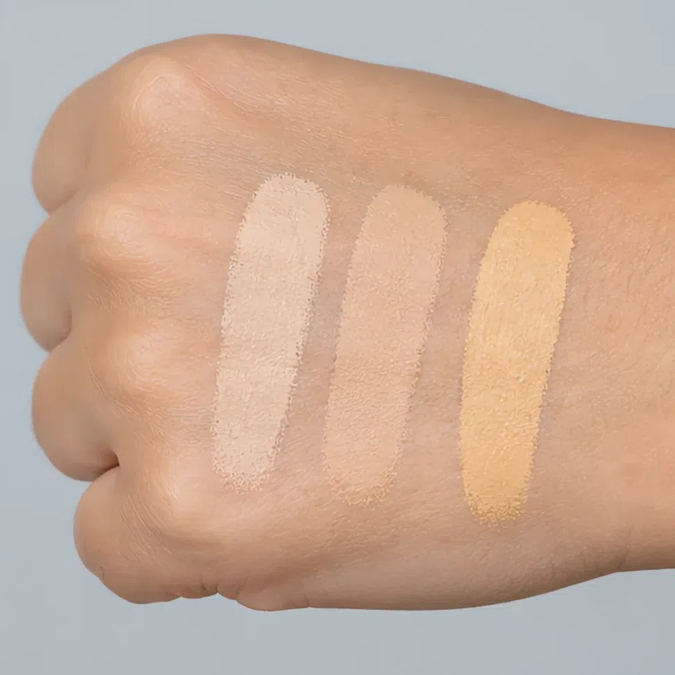
The jaw test
- Put three shades side by side straight across the jaw - not on your arm, not on your hand.
- Blend all three out.
- Go and find a window. Shop lighting is the enemy of this test.
- The right one is the one you cannot find again. Not the one that looks nicest - the one you lose.
Reading a shade name
A name is a hint, not a promise. Brands use these words inconsistently and some of them mean nothing at all. They narrow the shelf; the jaw test decides.
What the finish words on a label actually mean
- Radiant, luminous, glow
- Dewy. Wearable if you set it, and a lot if you do not.
- Satin, natural
- What you are looking for.
- Demi-matte, soft matte
- Also good - matte without going flat.
- Matte, velvet, full coverage
- Flattens you. See the finishes section above.
- Metallic, foil, duochrome
- The gloss problem, in a pan.
Judging a swatch photo online
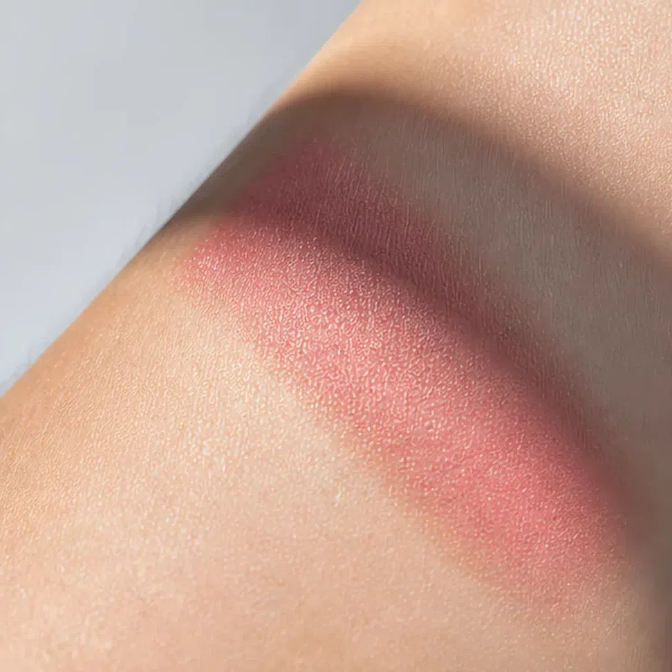
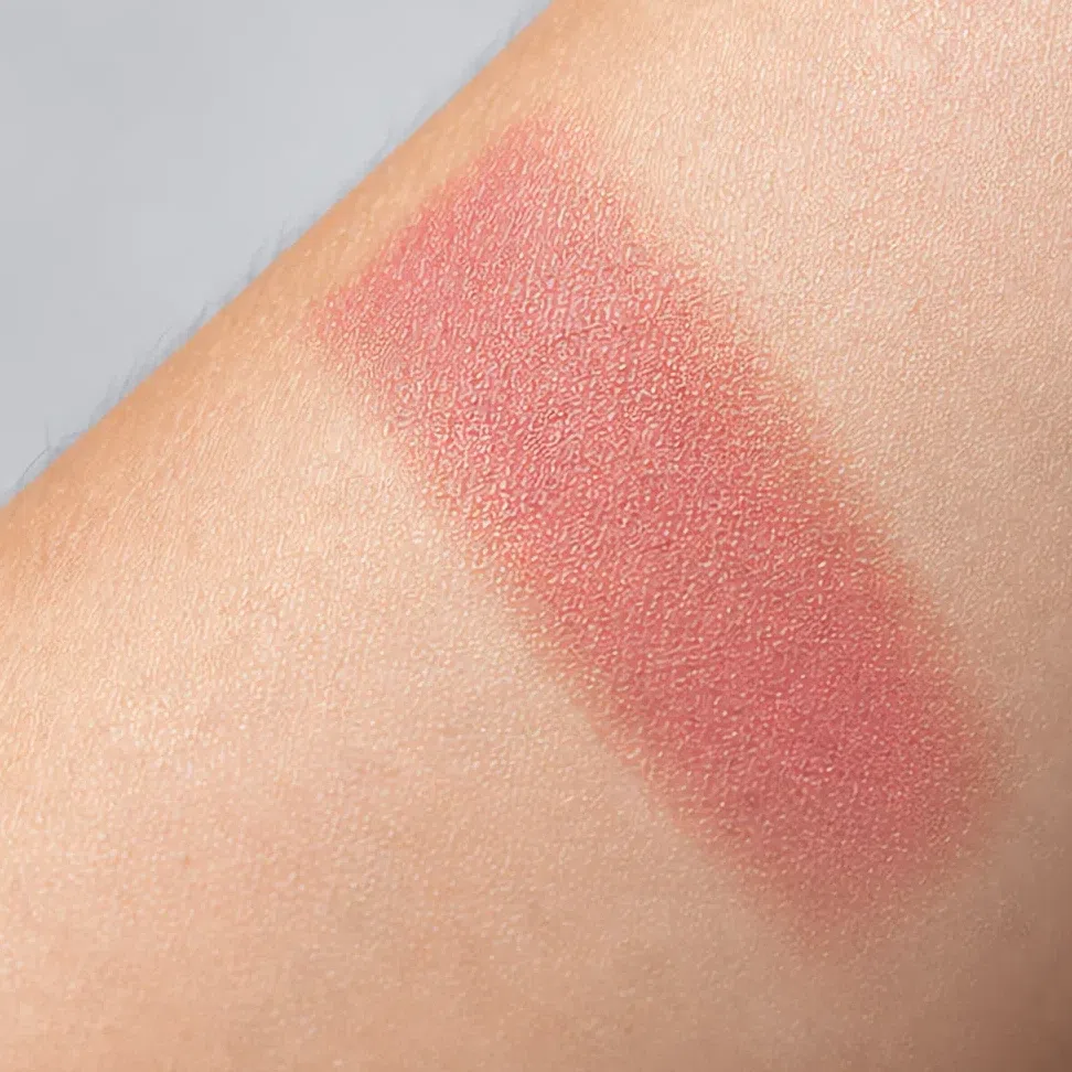
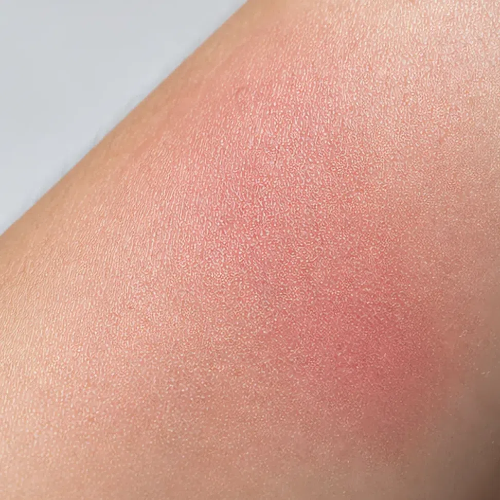
Swatch photos are shot under bright, even, flattering light, and that light lifts a muted shade toward a clean one - a dusty rose photographs as a pink. Two things help. Look for swatches on skin rather than in the pan, and prefer photos that have a shadow somewhere in them: a shade that still looks muted where the light falls off is genuinely muted.
Shade ranges are reformulated and discontinued constantly, a name that is right this year is gone the next, and a recommendation nobody has checked is still a recommendation somebody spends money on. The method above outlasts any list - it works in a shop you have never heard of, on a brand that did not exist when this was written.
When your makeup does not work
You have the shades now, the order they go on in, and how to buy them. This is the section you come back to later: two ways a Soft Summer face goes wrong even with the right products, and then the shades that go wrong whatever you do with them.
Two ways it goes wrong
The makeup wears you
- What it looks like
- People mention your lipstick before they mention you. In a photo the eye goes to the liner, not to the face.
- Why
- The jump between your skin and the product is bigger than any jump your face makes on its own, so the product separates from you instead of reading as part of you.
- Fix
- Keep the shade and drop the intensity: sheer it out, blend until the edge has no border, or move one step lighter. The color was rarely the problem.
It disappears, and reads as tired
- What it looks like
- You put on a full face and look about the same, or slightly flat and washed out.
- Why
- Muting got mistaken for going pale. Shades that sit too close to your own coloring add no definition at all, and a face with no definition photographs as fatigue.
- Fix
- Hold the muting and take the depth further. A grayed plum is every bit as muted as a beige and several steps deeper, and that depth is where your definition comes from.
And the shades that never work
Every shade below fails for one of three reasons, and once you can name which one, you can predict the next one yourself without a list.
Base and glow
- Porcelain pink clean
- Golden beige warm
- Orange-based tan warm
- Silver frost hard
- Intense gold warm
Too pink and the face reads flushed; golden or orange and it argues with the neutral-cool undertone the whole season rests on. Both of them draw the jaw line the shopping section is about.
Cheeks
- Bright raspberry clean
- Coral orange warm
- Fuchsia clean
Each of these arrives at full strength on a face where nothing else does. The cheek stops being part of the face and becomes the headline.
Eyes
- Bright gold warm
- Navy hard
- Clear sky blue clean
- Pure white hard
A fully saturated color asks for a contrast level your face has nowhere to find. Pure white is the most common version of the mistake - in the inner corner and under the brow it is the brightest point on the whole face by a distance.
Lips
- Clear red clean
- Bright coral warm
- Fuchsia clean
- Plum-black hard
The first three are too clean. The last is the opposite mistake and gets made just as often: too dark is still a jump in contrast, and it hardens the mouth rather than defining it.
Why each one fails
- cleanToo clean
- Full saturation, no grey in it. Your coloring has grey in everything, so a clean shade never looks like it came from the same face.
- warmToo warm
- Gold, orange, bronze. Your undertone is neutral-cool, and warmth on top of it reads as sallow rather than as sunny.
- hardToo hard
- Pure white, true black, anything at the far end of the scale. It becomes the brightest or darkest thing on your face, and everything else recedes behind it.
The three tags above are the whole rule. A shade that is none of them is usually wearable even if it never appears on your palette - and a shade that is two of them is not worth trying on. Hexes here are representative examples of each mistake, not measured values from a product.
Your shades, in one block
Everything on this page in one place, so you can stop reading and start shopping. Screenshot it. Where a family shifts with complexion you get all four depths, not just the lightest.
- FFair
- LLight
- MMedium
- DDeep
Base: foundation, blush and glow
- Fair - neutral-cool #C9B8A8
- Light - neutral-cool #B8A99A
- Medium - neutral-cool #9A7F68
- Deep - neutral-cool #6B4A38
- Muted rose
- Soft peach-pink
- Dusty coral
- Dusty raspberry
- Fair - soft pearl #F5EBD8
- Light - soft pearl #EDD9C0
- Medium - soft pearl #D9B593
- Deep - soft pearl #B98A63
- Fair - cool taupe #A6968C
- Light - cool taupe #8E7A6C
- Medium - cool taupe #6E5648
- Deep - cool taupe #4C3428
Eyes: shadow, liner, mascara
- Beige-pink
- Greige
- Muted violet
- Olive-gray
- Ash beige shimmer
- Pewter metallic
- Plum shimmer
- Deep graphite
- Soft brown #6B5140
- Gray-brown #6E6A68
- Plum #5C4453
- Soft black #2E2E30
- Soft black #2E2E30
- Brown #5A4A42
- Gray #6E6E70
- Plum #5C4453
- Light brown
- Umber
- Ash
- Deep taupe
Lips: nudes and color
- Muted rose
- Soft peach-pink
- Dusty rose nude
- Gray-beige nude
- Dusty raspberry
- Muted plum
- Muted cherry
- Rosewood
A family without depth columns is the same on everyone. The interactive ramps, the photographs and the reasoning behind each family live on the full Soft Summer palette. The full Soft Summer palette →
Questions people ask
What makeup looks best on a Soft Summer?
What lip color is best for Soft Summer?
What eyeshadow colors look good on a Soft Summer?
What makeup colors should a Soft Summer avoid?
Can a Soft Summer wear red lipstick?
What MAC lipstick is good for Soft Summer skin?
Does any of this work on deeper skin?
Where this came from
Six sources, and what each one is holding up: that makeup works by changing the contrast of a face and how easily a low-contrast one is overshot; what a flush actually is; why depth and undertone are two different things a base has to match; why a gloss reads as a bright point; and why the shop lamp and the window disagree.
-
Aspects of facial contrast decrease with age and are cues for age perception (opens in a new tab)
Porcheron, Mauger & Russell, PLoS ONE, 2013
Behind the rule in start here - add depth, not contrast. Facial contrast, how much the eyes, brows and mouth stand out from the surrounding skin, is measurable, it is what cosmetics increase, and it is read as a cue for age. A Soft Summer starts with less of it than most faces, so the question on this page is never which color so much as how much contrast to add.
-
Differential effects of makeup on perceived age (opens in a new tab)
Porcheron, Mauger, Soppelsa et al., British Journal of Psychology, 2019
Behind the makeup wears you. In controlled photographs makeup made 40- and 50-year-old women look younger - and made 20-year-old women look older. Adding contrast past the level a face already carries is the mechanism this page keeps describing as a product separating from the person wearing it.
-
Skin blood perfusion and oxygenation colour affect perceived human health (opens in a new tab)
Stephen, Coetzee, Law Smith & Perrett, PLoS ONE, 2009
Behind the cheeks step and the cream-over-powder call. When people are allowed to adjust the color of a face to look healthiest, they add the color of oxygenated blood under the skin. That is what a blush is imitating - which is why a cream that sinks in reads as a flush, a powder sitting on top reads as a product, and a muted rose beats a clean coral on this coloring.
-
Non-invasive measurements of skin pigmentation in situ (opens in a new tab)
Stamatas, Zmudzka, Kollias & Beer, Pigment Cell Research, 2004
Behind the base shades by depth in step 1 and the jaw test. Skin color is two signals: melanin sets how much light is absorbed - the depth - and hemoglobin adds its own, separated out to measure either. A base has to match both, which is why the undertone is fixed by the season and the depth by nobody but your own skin.
-
The dark side of gloss (opens in a new tab)
Kim, Marlow & Anderson, Nature Neuroscience, 2012
Behind the whole of finishes. The visual system reads gloss from specular highlights - and from their dark counterparts - and the percept collapses when they are blurred or misplaced. A gloss lip is a hard highlight; a satin lip is that highlight blurred into a band; a matte lip has none. That is the ranking on the page, and the reason it holds on every product.
-
CIE 13.3-1995: Method of measuring and specifying colour rendering properties of light sources (opens in a new tab)
International Commission on Illumination (CIE), 1995
Behind the jaw test in how to shop. A light source is rated on how faithfully it reveals the colors of the things under it, and shop lighting rates low and warm - which is why a golden base looks right under the counter lamp and wrong at the window, and why the test has to happen at the window.
One honest distinction. The contrast research, the skin biology, the gloss perception and the lighting standard above are sourced; which blush, shadow and lipstick shades belong to a Soft Summer, which one plays which part at each depth, and where the evening ceiling sits are our own analysis, built from the palette on the parent page. No study has been published on any of that, which we would rather state than disguise with a citation.