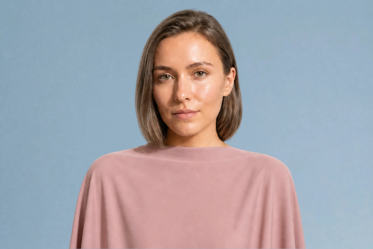
The Soft Summer color palette: your colors, clothes and hair
Soft Summer is the quietest of the three summers - cool coloring with a gray cast over all of it, and almost no contrast between hair, skin and eyes. Below: the full palette, the shades that flatten you, and the Soft Autumn test that settles which one you are.
Try the palette on a Soft Summer
Every shade in the Soft Summer palette is cool and slightly grayed - dusty blue, sage, lavender, muted berry, and a set of neutrals that stand in for black. See what each one does to her skin: the muted shades lift the face, while anything clean and bright flattens it.

What a Soft Summer is, in 30 seconds
Soft Summer - also called Muted Summer - is the most muted of the three summers: a neutral-cool undertone, low contrast, and a light veil over every color. The Soft Summer color palette is built from grayed shades like sage, lavender and dusty rose, and it takes brushed silver far better than yellow gold.
| Skin | Neutral with a cool cast, sometimes slightly gray or olive. Freckles come out ash-brown rather than coppery. |
|---|---|
| Eyes | Gray-blue, gray-green or a muted hazel - the iris reads smoky, and flecked rather than one solid color. |
| Hair | Light to mid brown, always with an ash or mousy undertone, never red or gold. |
| Contrast | Low - skin, hair and eyes sit at the same level of lightness, with no sharp edges between them. |
| Metal | Brushed silver, white gold, antiqued metals. |
Wardrobe base:
Wear with care:
Torn between neighboring subtypes? Soft Autumn is the one Soft Summers are most often mistaken for - checking from a photo will settle it.
How to tell if you're a Soft Summer
A five-minute self-check
Soft Summer is one of the harder subtypes to place. It is neutral-cool in temperature, low in contrast, and its palette looks faintly veiled. If bright colors seem to swallow you, and people describe your coloring as balanced rather than striking, this is probably where you land. Here are the signs, one at a time.
Season is set by undertone and contrast, not by how light your skin is. Soft Summers occur at every depth - the shared traits are a neutral-cool undertone, muted color and low contrast between hair, skin and eyes.
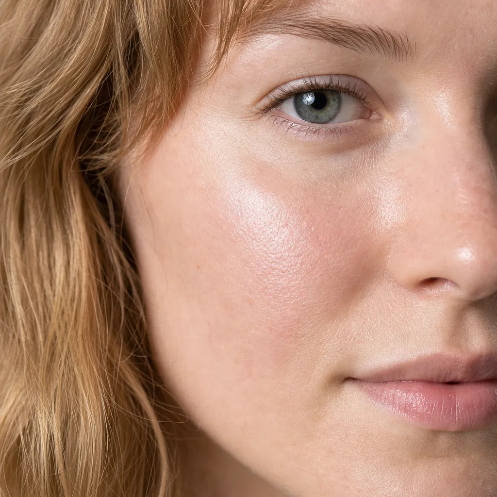
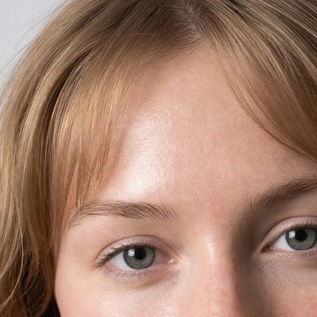
1Skin tone: neutral, with a cool cast
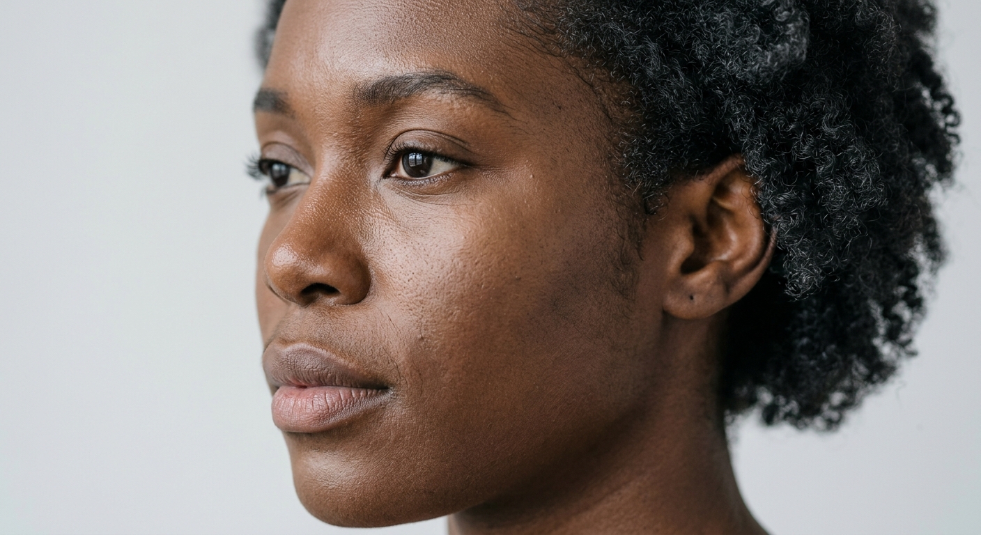
What defines Soft Summer skin is a neutral-cool undertone - often with a faint gray or olive cast - and the fact that it reads soft, with no sharp shifts in color. It occurs at every depth, from fair through deep brown; the undertone is the signal, not the lightness.
At lighter depths it shows as beige, rose-beige or ivory with an ashy edge; at deeper ones as a cool brown with a gray or olive cast rather than a golden or copper one. Freckles, where there are any, come out cool ash-brown rather than ginger or gold. This skin tans reasonably evenly, though it can redden in the first days of sun.
Three quick undertone tests
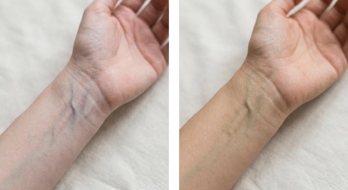
Stand at a window in daylight and turn your wrist face up. Daylight only - a warm bulb adds yellow and a cool LED adds blue, and both will skew the result. Judge the overall color of the veins, not one individual vessel.
- Blue or purple - a cool undertone. That is you, along with the other cool seasons.
- Greenish or olive - a warm undertone: look toward Autumn and Spring.
- Genuinely can't tell - probably neutral, and the next two tests will settle it.
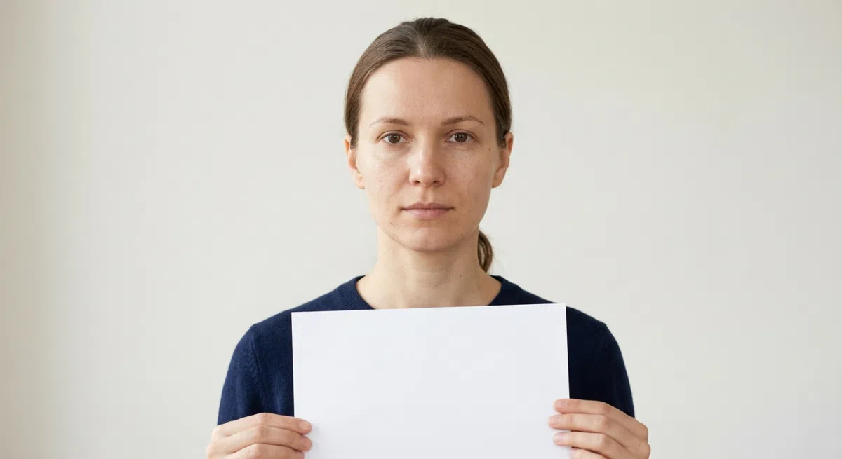
Take your makeup off, push your hair back from your forehead and cheeks, stand at a window and hold a plain white sheet up to your face - the closer to your chin, the clearer it gets. It has to be pure white: cream or ivory paper is warm in itself and will skew the result.
- Skin turns pink or slightly blue - a cool undertone, and your answer.
- A golden or peachy cast appears - a warm undertone.
- Skin looks slightly gray - usually neutral, with a hint of olive.
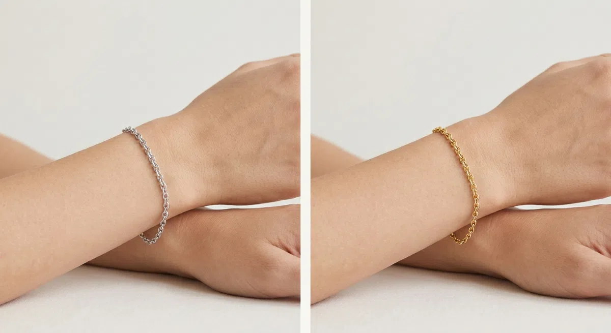
Hold a silver piece against your wrist, then a gold one, one at a time, in daylight, on clean skin with no shimmer cream. Watch the skin beside the metal rather than the metal itself: which of the two makes it look more even and more alive?
- Silver wins - a cool undertone: the skin next to it looks cleaner and more even.
- Gold wins - a warm undertone, and this is not your season.
- Both look fine - neutral. Lean on the first two tests.
That neutrality is the foundation of everything else. The job is not to overpower it with bright or warm shades, but to let it sit.
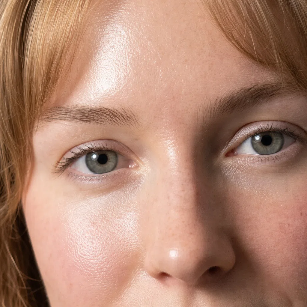
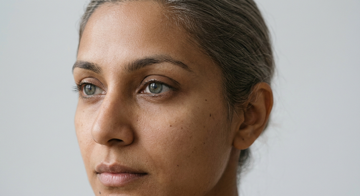
2Eye color: soft and complex
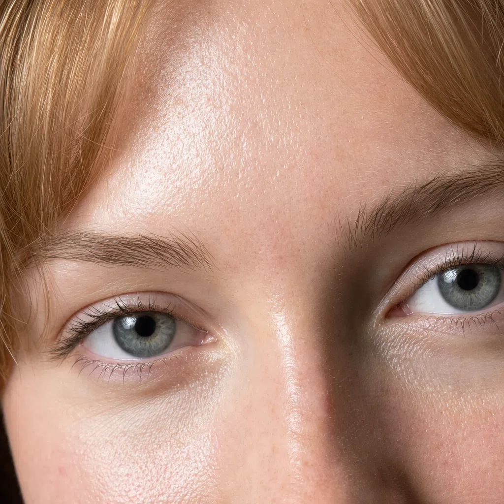
Soft Summer eyes are the opposite of piercing. There is none of the crystal clarity Winter or Spring have - the beauty is in mixed, smoky shades, and the iris is often uneven, flecked with more than one color.
The most common are gray-blue, gray-green, muted hazel, and brown that reads soft and slightly gray rather than warm or glossy. One telling detail: the white of the eye is milky rather than bright white, which lowers the overall contrast further and softens the whole face.
It is why blended, layered colors suit you in clothes and makeup - they echo the palette already in your eyes.
3Hair color: natural ash
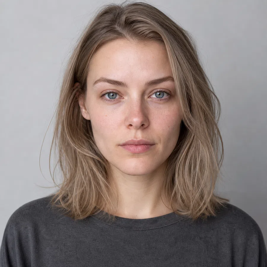
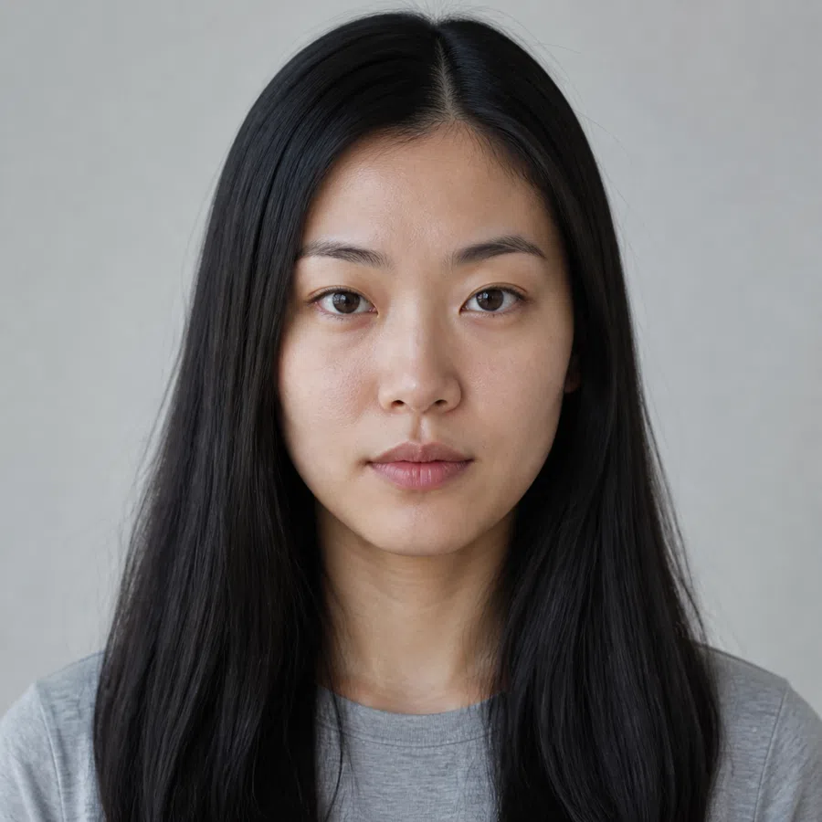
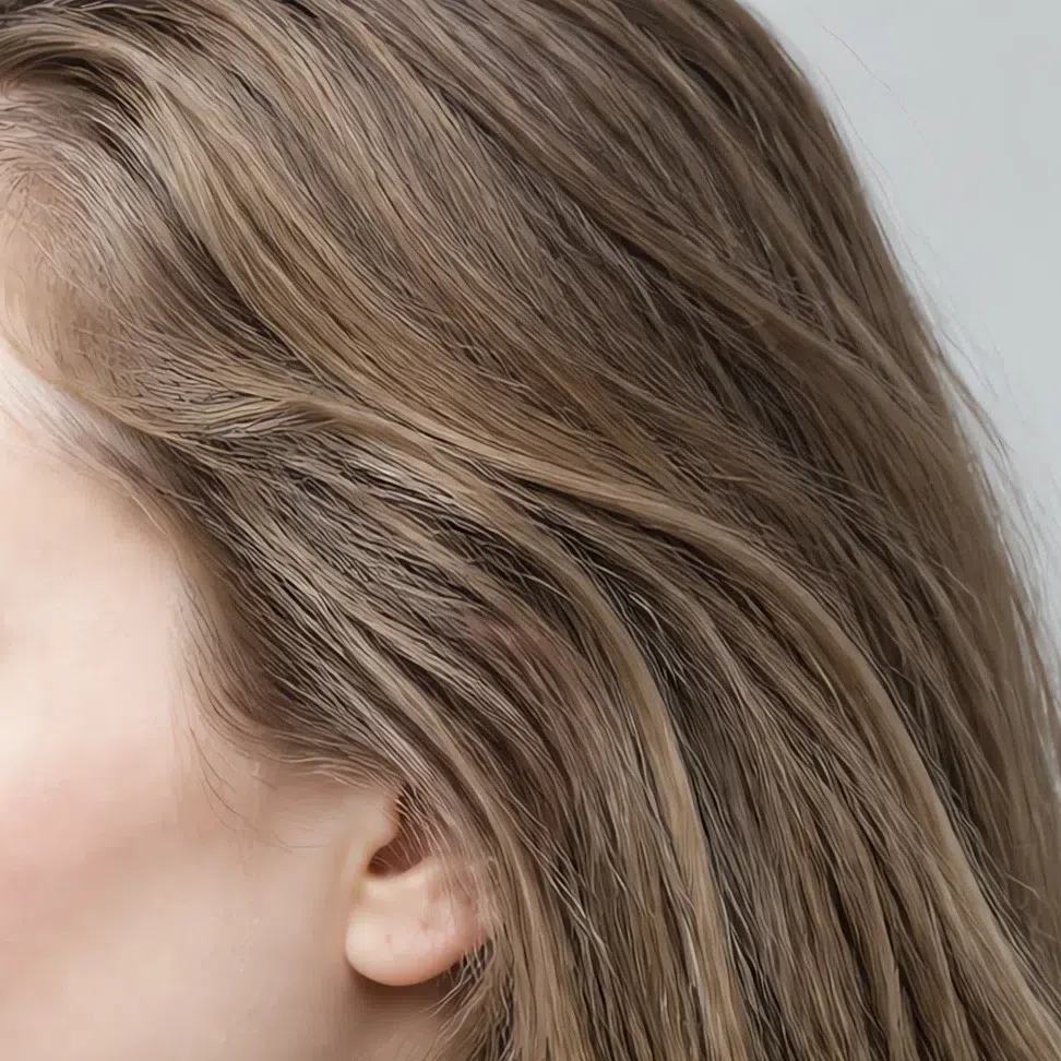
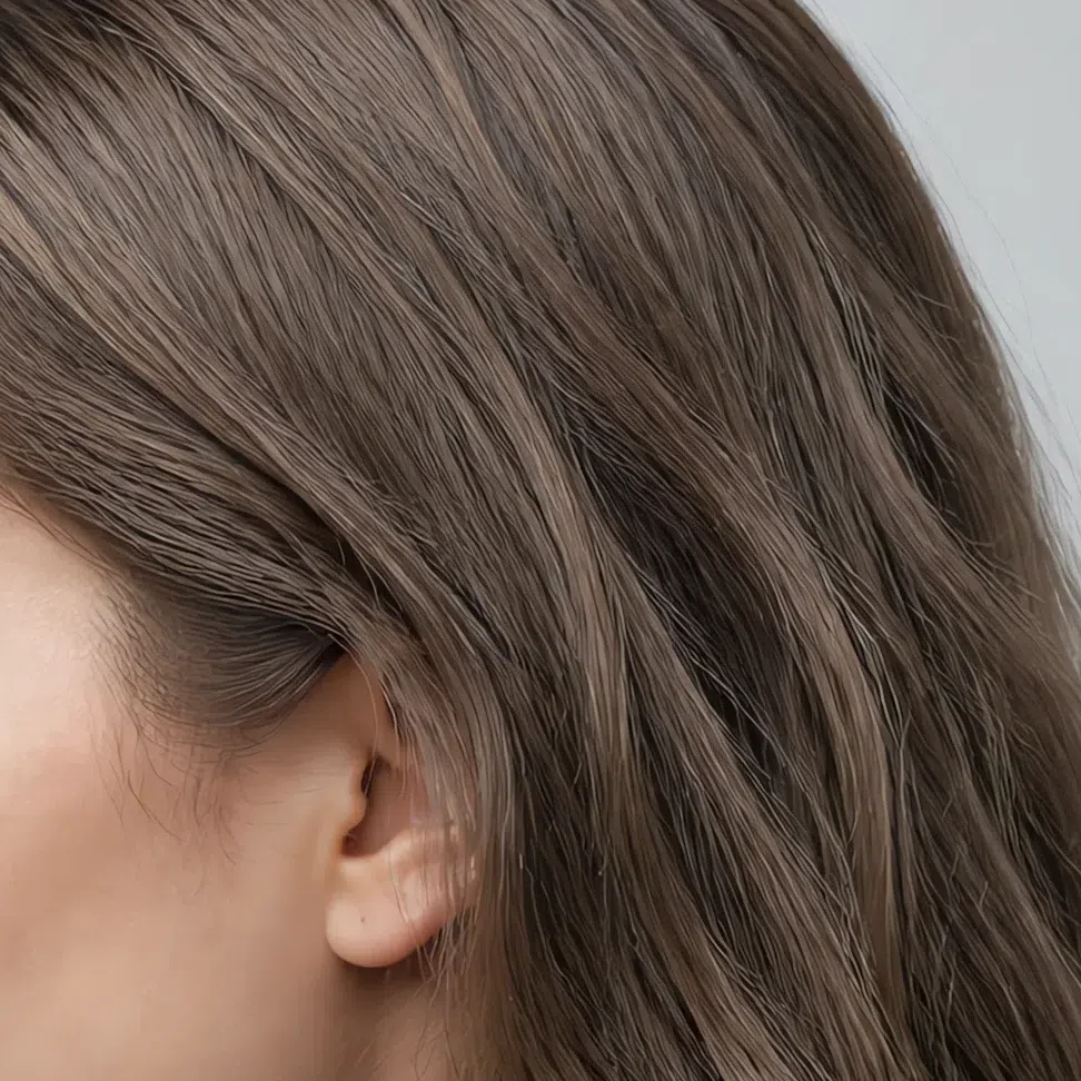
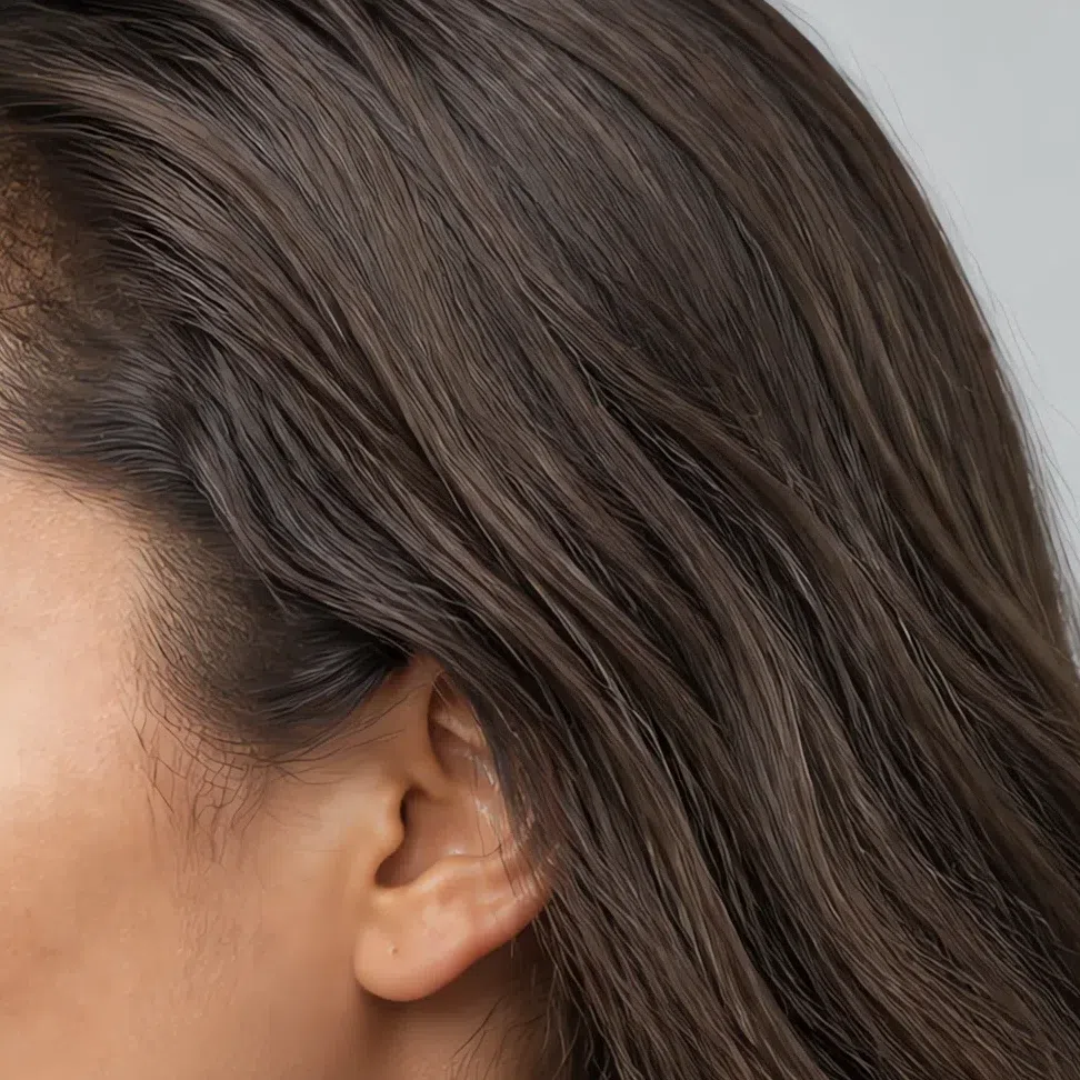
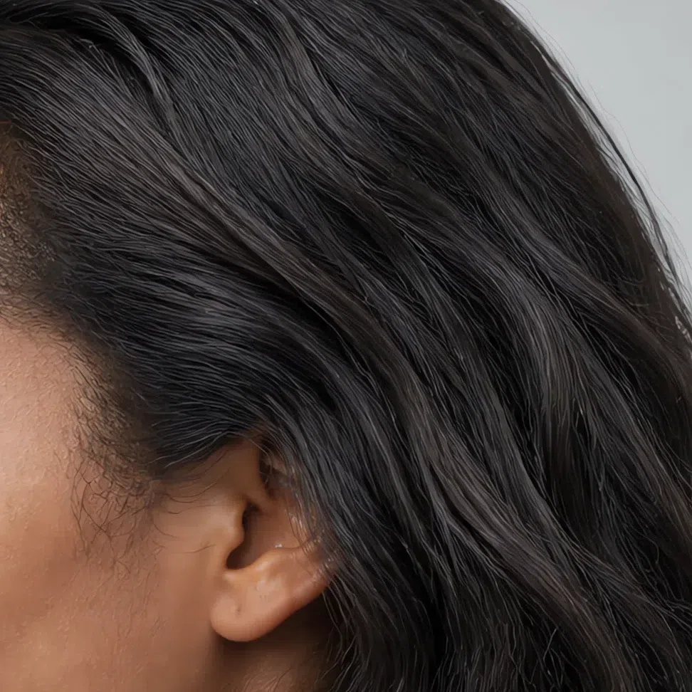
Natural hair color for a Soft Summer is cool-toned at whatever depth it happens to be: ash blonde, mousy brown, cool dark brown, or black with no red or copper in it. The marker is what is missing - no gold, no warmth - rather than any particular shade.
Even when the hair just looks brown or black, up close in daylight it throws silver, ash or a cool beige rather than gold. Texture can be anything - straight, wavy or coiled - and has no bearing on the season.
Knowing your hair runs cool is what keeps you out of trouble at the salon - dyeing warm is the single most aging thing a Soft Summer can do, and the most expensive to undo.


4Contrast: harmony without sharp edges
The key sign of Soft Summer is low contrast. There is no dramatic difference between the color of your skin, your hair and your eyes - all three sit at roughly the same level of lightness, which is what makes the whole face read as gentle and cohesive.
Picture every color in your portrait slightly blended into the next, with no hard borders and nothing shouting. Deep coloring is often lower in contrast than fair coloring, not higher, because dark hair, dark eyes and deeper skin sit close together in lightness. That is why charcoal black and stark white flatten a Soft Summer at any depth.
Your strength is in nuance. Instead of black-and-white pairings, choose tonal ones where the shades run into each other.
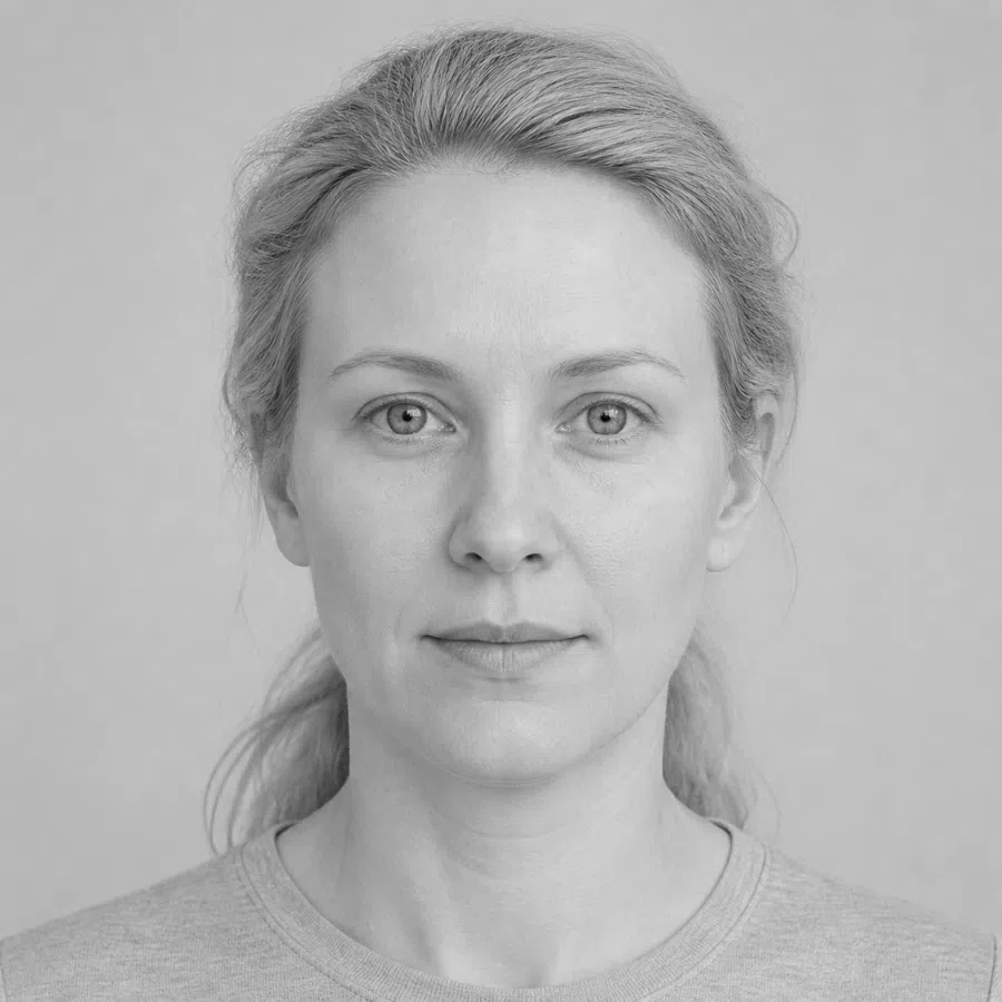
- The black-and-white photo test. Take a photo of yourself with no makeup in daylight, then convert it to black and white. If the face reads as harmonious, with gentle transitions between the grays, and your hair, skin and eyes do not create hard white or black patches - your contrast is low, which is the Soft Summer signature.
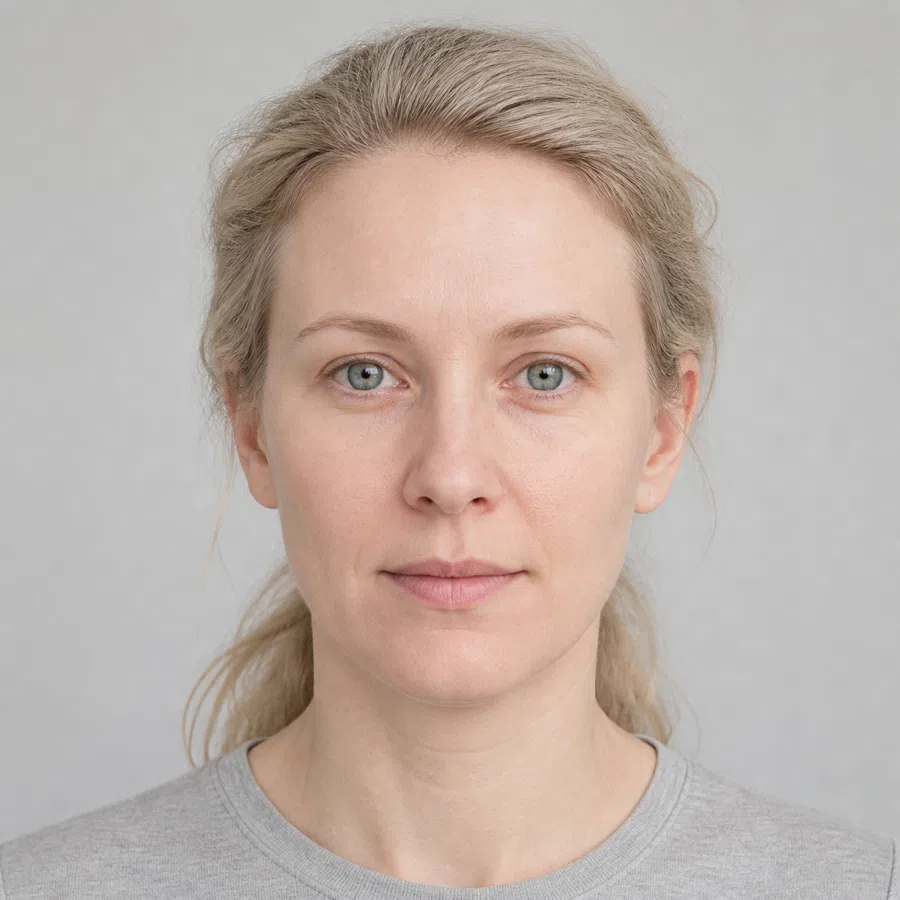


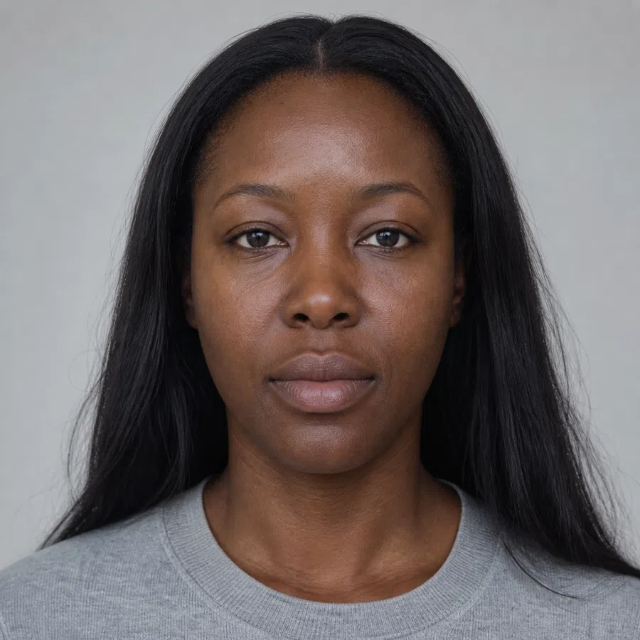
On the left, a Soft Summer shot in daylight. On the right, the identical frame with the color taken away. With hue gone there is only lightness left to judge, and hers turns out to be nearly one tone from hairline to jaw.
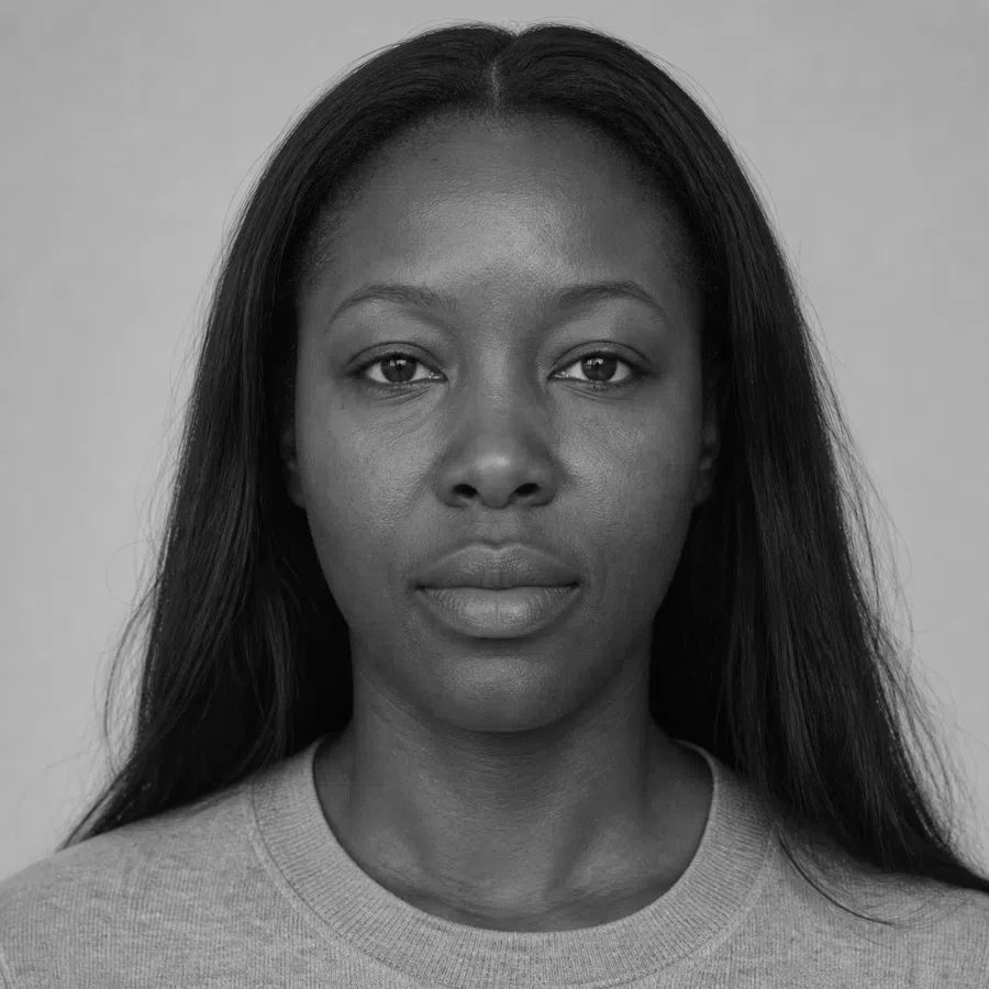

Hair Skin Ramp runs black to white
Take each ramp by itself. Two dots sitting together means every part of the face arrives at a similar tone; two dots pushed apart means something in it cuts. Position on the ramp is depth, distance between the dots is contrast. They are different questions, and the spacing widens a little as coloring deepens, so the spacing is not a score to rank one portrait against another.
5The color test: try the palette on
The most direct way to settle it is to hold fabrics of different colors against your face. Do it without makeup, in good daylight. What you are looking for is which shades make your skin look fresh, even and rested - and which bring out flaws and turn your face a dull gray.
Colors that freshen you
If these make your skin glow and your eyes brighten, you are on the right track:
- Dusty raspberry
- Gray-blue
- Cool lavender
- Muted jade
- Driftwood
- Berry sorbet
Colors that age you
If these put shadows under your eyes and leave your skin dull, it is not your palette:
- Black
- Orange
- Neon fuchsia
- Bright white
- Bright yellow
Soft Summer vs Light Summer vs Cool Summer
Soft Summer, Light Summer and Cool Summer all sit on the same neutral-cool base, which is exactly why these three get mistaken for one another more than any other subtypes in the system. The names are the shortcut: each summer is named for the axis that leads it - softness, lightness, coolness. Get the top row right and the rest of the table falls into place. And if you have been typed a True Summer somewhere else, that is just the older name for Cool Summer - same subtype, same column.
| Soft Summer | Light Summer | Cool Summer | |
|---|---|---|---|
| Leading axis | Softness. Muted first, cool second | Depth. Light before anything else | Temperature. Cool, and obviously so |
| Temperature | Neutral-cool. A trace of warmth is allowed - it just never leads | Neutral-cool, at the light end of it | Cool, with no warm cast anywhere |
| Clarity | Muted, as though a drop of gray went into every color | Medium. Soft, but the color underneath is still clear | Medium - cool and clean rather than dusty |
| Depth | Medium, and the widest range of the three - Soft Summer runs from fair to deep | Light. That is what the name is telling you | Light to medium |
| Contrast | Low. Hair, skin and eyes nearly merge in black and white | Low, and the whole face sits light | Medium. A visible gap between hair and skin, but nothing like a Winter |
| Skin | Neutral with a gray or olive cast, at any complexion depth | Light and fine, with a pink undertone you can actually see | Distinctly cool - pink or rose, never sallow |
| Eyes | Smoky and mixed: gray-blue, gray-green, muted hazel, soft gray-brown | Light and translucent: pale blue, gray, soft green | Clear and defined: blue, gray, cool green |
| Hair | Ash at whatever depth it runs - mousy brown, cool dark brown, black with no red | Light ash blonde, flaxen, light mousy brown | Ash blonde through cool brown, never golden |
| Metals | Matte silver, white gold, antiqued and brushed metals | Bright silver, platinum | Polished silver, platinum, white gold |
Still torn between two columns? Stop comparing details and go back to the top row. Ask what someone meeting you would notice about your coloring first - that it is soft, that it is light, or that it is cool. The answer you do not have to think about is your summer.
What a Soft Summer actually looks like
Skin, eyes and hair in detail
Soft Summer coloring is the definition of restraint. The characteristic that ties all of it together is low contrast between skin, eyes and hair - every color sits close to its neighbor, as if someone had laid a thin veil over the whole face. Nothing is pure, nothing is loud, and nothing has a hard edge. Here is what that looks like trait by trait.
Soft Summer skin: neutral, never obvious
Soft Summer skin has neither the clear pink of a Cool Summer nor the golden glow of the warm seasons. It is neutral to neutral-cool - the quietest skin tone of any subtype, and the hardest to read, which is why this is where most people get stuck. Every complexion depth is represented here, from the very fair to the very deep.
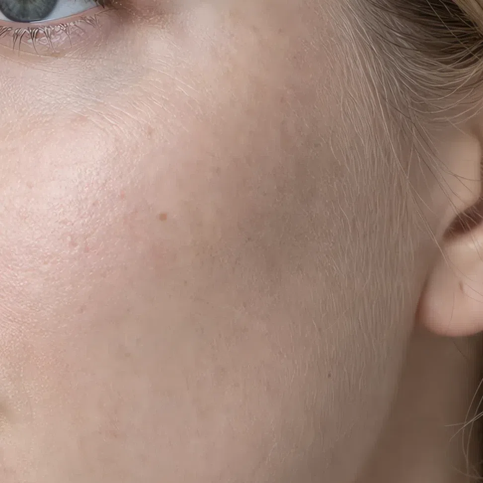
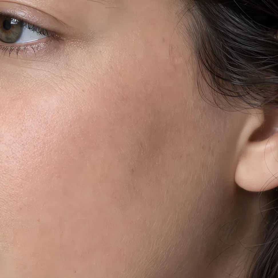
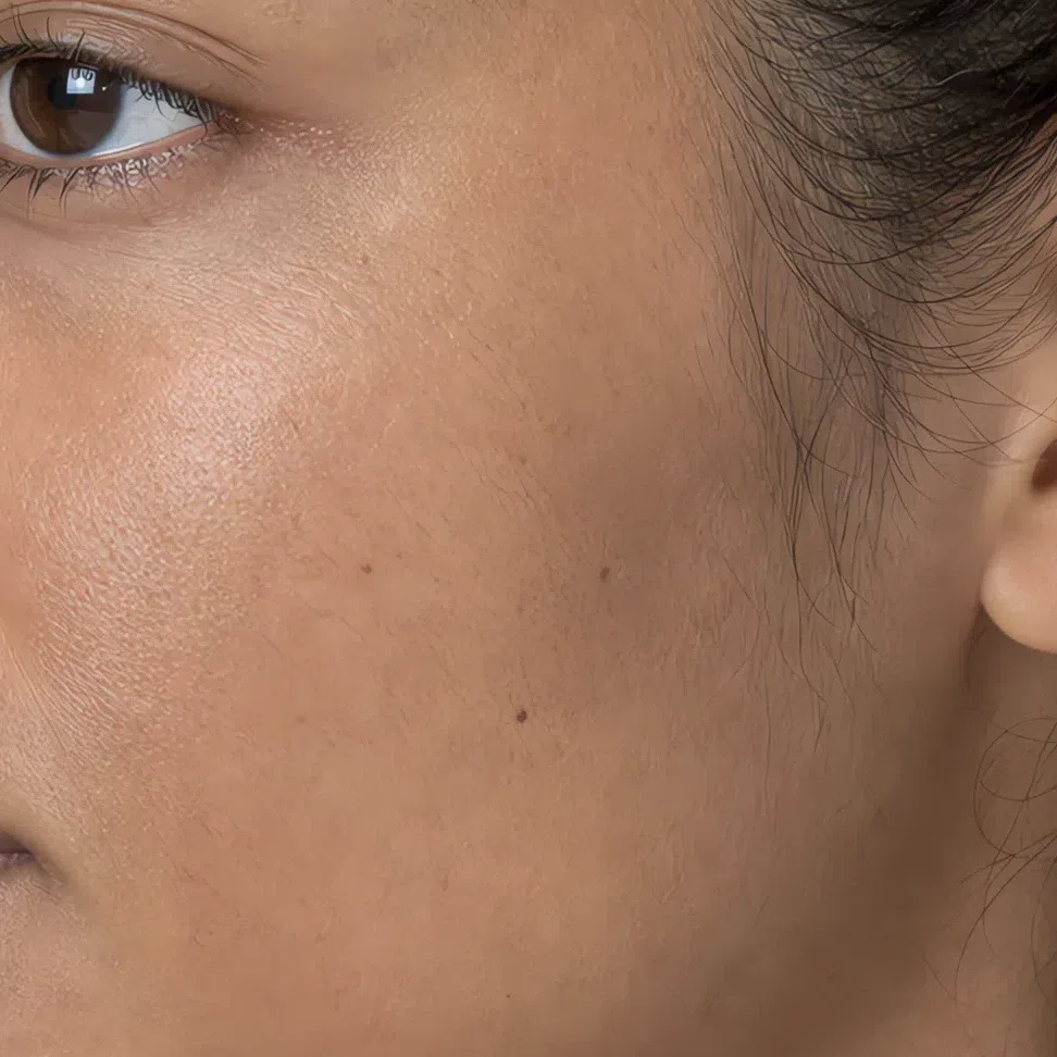
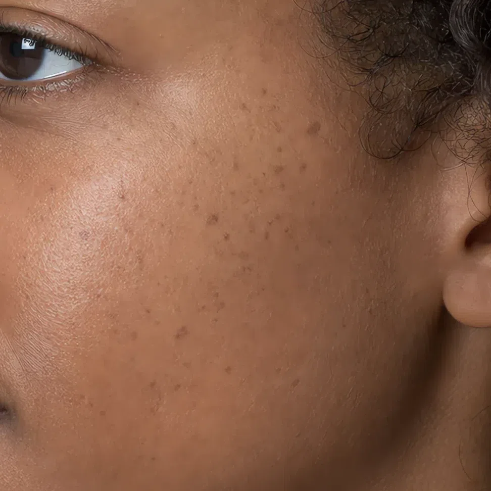
Yes - but it is not warm yellow. It is more of a complex beige or olive cast, and the difference is whether it glows. Hold a sheet of pure white paper next to your face: warm skin goes peachy or golden against it, Soft Summer skin goes grayish, or simply stays neutral. That one test settles it more often than anything else on this page.
It is exactly this neutrality - no strong pink, no gold, no sharp contrast - that makes Soft Summer skin so responsive to muted, complex color in clothing and makeup, and so quick to look tired next to a pure, bright one.
Soft Summer eyes: smoky and hard to name
Soft Summer eyes are never piercing or crystal-clear. Their beauty is in depth and complexity: the iris is usually more than one color, with gray running through all of it. That gray is what produces the misty, slightly veiled look the subtype is known for - and it is why so many Soft Summers cannot say what color their own eyes are.
The four Soft Summer eye colors
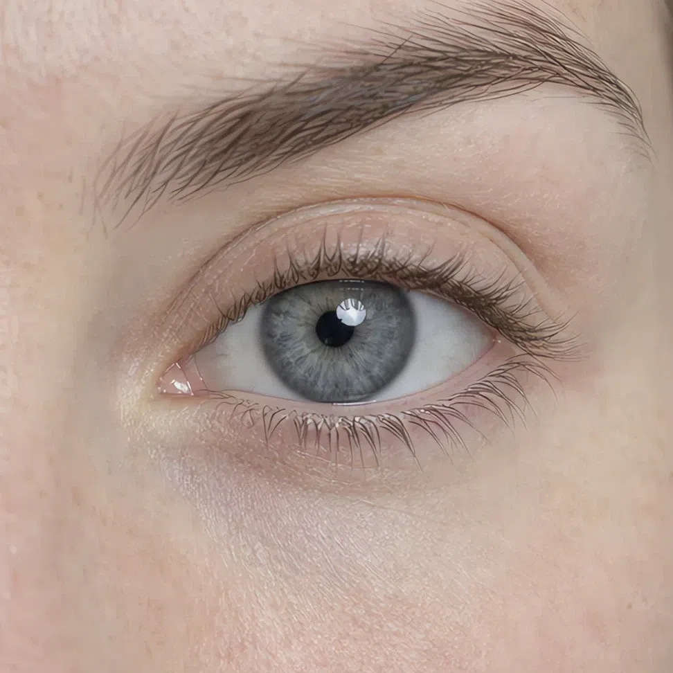
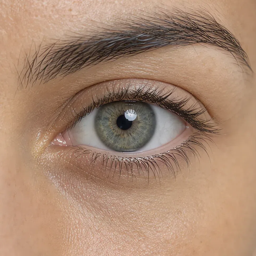
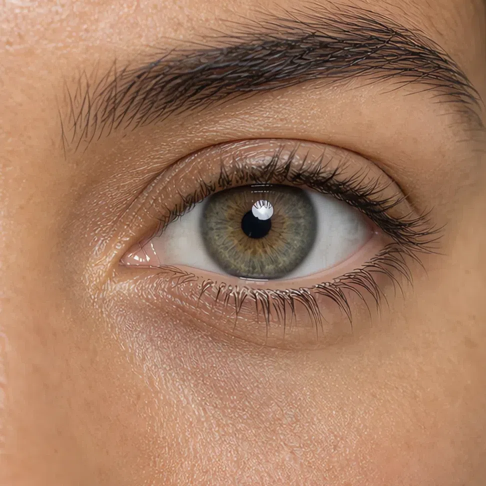
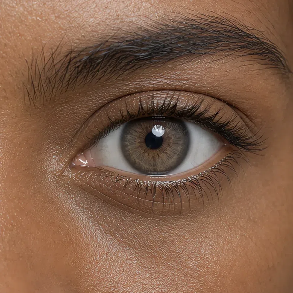
Three tells, whatever color your eyes are
- A soft edge. The boundary between iris and white is blurred, with no hard dark ring around the iris.
- A mixed color. The shade is almost never pure - there is a visible share of gray pigment in it, at any depth.
- A milky white. Even the whites are slightly softened rather than clinical, so there is no bright edge anywhere in the eye to lift the contrast of the face.
Eyes like these are brought out by complex, muted shades rather than bright ones - taupe, gray-green, dusty rose. Those colors echo what is already in the iris instead of competing with it, which is the whole logic of a Soft Summer makeup palette.
Soft Summer hair: ash at every depth
Natural Soft Summer hair is ash-based, whether it is blonde, brown or close to black. The defining feature is an ash or neutral undertone with no golden or red lights - what is absent matters more than the shade itself. Even hair that simply looks brown or black has cool pigment underneath it, and daylight will show you.
The natural range, light to deep
What Soft Summer hair never is
- Golden or red. Natural Soft Summer hair carries no copper, gold or auburn cast. Of the three, this is the one that rules the subtype out fastest.
- Blue-black. Even the deepest Soft Summer hair is a cool dark brown or soft black, not the hard blue-black of a Winter.
- Bright platinum. Natural blonde here always has an ashy, muted base - there is no icy or high-shine blonde in the subtype.
Your natural shade is the reference point for every coloring decision that follows. A Soft Summer who dyes toward gold is not just off-palette - she has raised her own contrast and warmed her undertone in one move, which is why the result reads harsh rather than sunny. Matching the depth you already have, and keeping the tone cool, is what makes color look like it grew there.
The Soft Summer palette, shade by shade
Your colors, worn rather than swatched
Picture a summer morning before the mist burns off, a lavender field going soft at the edges, a lake on an overcast day. That is the register the Soft Summer palette works in. Your coloring does not need loud color to read as striking - it needs complex, muted, cool shades, and it gets overwhelmed by high contrast and pure bright pigment, which flatten a delicate face rather than lift it.
Two rules run through every shade below. The first is softness: there is a drop of gray in all of it, and nothing is fully saturated. The second is neutral-cool temperature - your colors sit on the seam between warm and cool with the cool side winning. Once those two are in your head you can judge a garment on a rack without owning a single swatch card.
Every shade on this page is shown on a Soft Summer model: the clothing is recolored to the exact shade, while her face and hair are left untouched. So what you are judging is not the color in isolation - it is what that color does to a face like yours.
Base colors: the foundation of a Soft Summer wardrobe
A Soft Summer wardrobe is built on complex neutrals - not flat gray or plain beige but their smoky, complicated versions. These are the shades to spend real money on, because they are what your coats, tailoring, trousers, skirts and good knitwear should be. They also do the quiet work of making the softer colors in the next group look deliberate rather than washed out.
Neutral colors: the shades you build on
These six replace the hard neutrals most wardrobes default to. If you take one idea from this section, make it this: black and bright white are not neutrals for you. They are the two highest-contrast shades there are, and nothing drains a Soft Summer face faster in photographs. Can you wear black at all? Yes - in a skirt, in trousers, in a bag. Just not up against your face, where it does all its damage.
How to put the neutrals together
- Go monochrome. Build an outfit from two depths of one shade - slate blue with dusty blue, pewter with soft white. Nothing flatters a Soft Summer more reliably than tonal dressing.
- Taupe with ash rose. The most useful pairing in the palette, and it works as easily at a desk as it does at dinner.
- Pewter with soft white. Reads expensive out of all proportion to what it costs, because both shades are doing the same quiet thing.
- Dark is fine - black is not. Slate blue and pewter are your dark neutrals, and either one near your face beats black every time.
Muted pastels: where the palette comes alive
This is the half of the palette that actually looks like you. These shades are powdery and restrained, but saturated enough to carry an outfit on their own - which makes them the right choice for anything worn near your face: blouses, dresses, sweaters, scarves, tops. The greens here are grayed rather than fresh, and the pinks are dusty rather than clear; that is the difference between a color that suits you and its brighter cousin that does not.
Accent colors: the one strong note that finishes a look
Even the softest coloring needs shades that add movement and give an outfit somewhere to land. For a Soft Summer those are the deeper, more saturated versions of your own palette - not loud, but definite enough to hold attention. Use them for evening, for outerwear, and above all for accessories, where a single strong note does more work than a whole outfit in the same shade ever would.
Deep and saturated shades
These five are your statement colors, and each one is shown here the way you should actually wear it - on a scarf, against a soft white top, rather than covering the whole outfit. Every shade is the palette taken two steps down in lightness rather than up in brightness, which is why they read as rich instead of loud, and why they still sit comfortably next to the quiet neutrals above.
Metals and accessories
Metal is the one accent you wear every day, so it is worth getting right. Soft Summer jewelry wants cool metal with the shine turned down - the finish matters as much as the color, and a high polish will fight your skin even in the correct tone.
Two more rules for accessories
- Choose soft stones. Agate, rose quartz, amethyst, jade and gray-toned pearl all sit inside your palette with no adjusting at all.
- Texture beats shine. Matte, satin and suede finishes on bags and shoes will always sit better on you than patent or high gloss.
Accessories in color: what goes with what
An accent color is a note, not the whole tune. The rule is simple: keep the accent to one thing and let a neutral carry everything else. Below, the same four accessories in four pairings each - tap any pairing to change the color on the photo, and watch what each one does to her face rather than to the accessory.
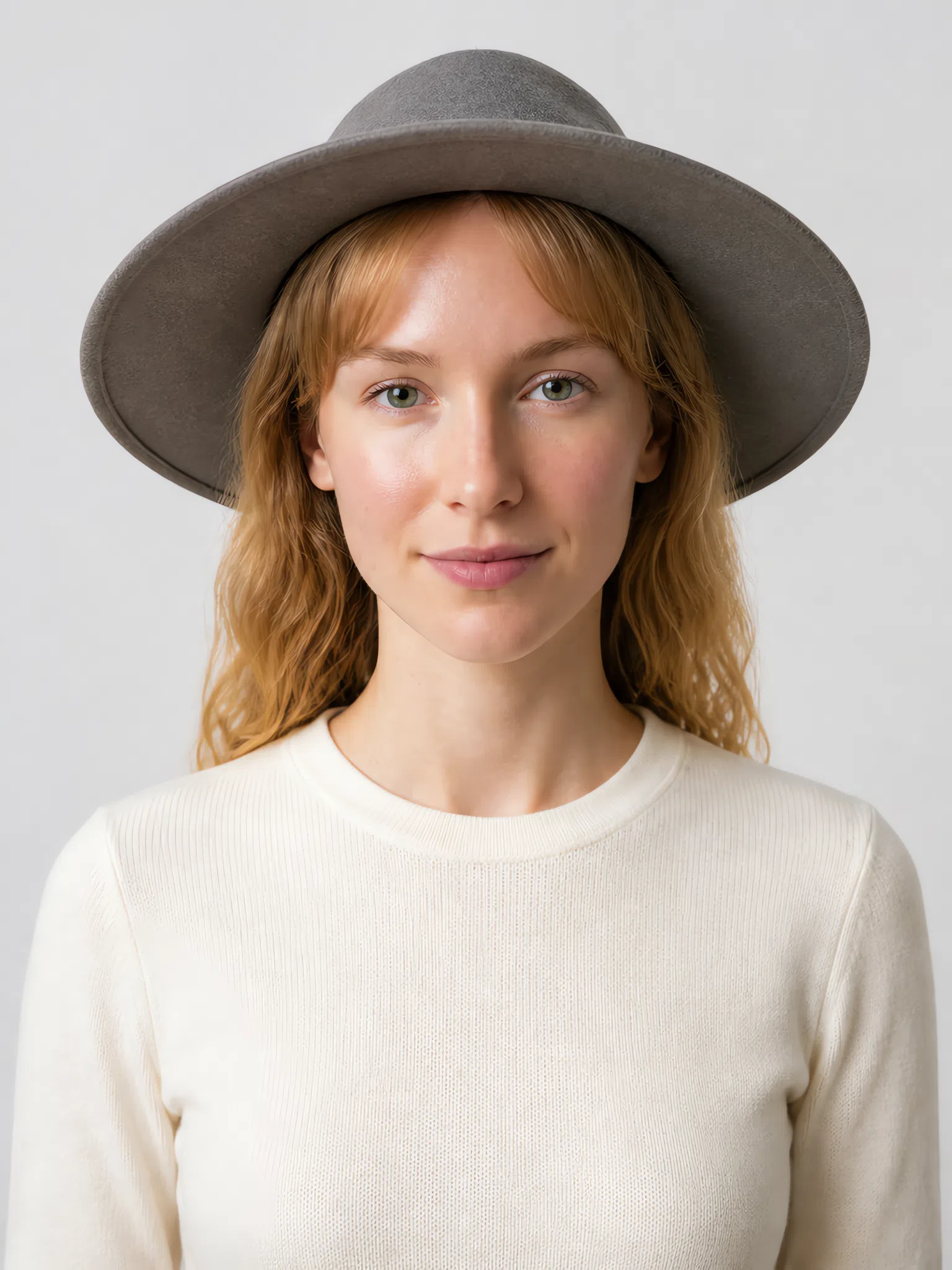
Hat
A hat sits higher than anything else you wear, so its color frames your face from above and does most of its work in profile. Deep shades hold their shape here; pastels tend to disappear into the light.
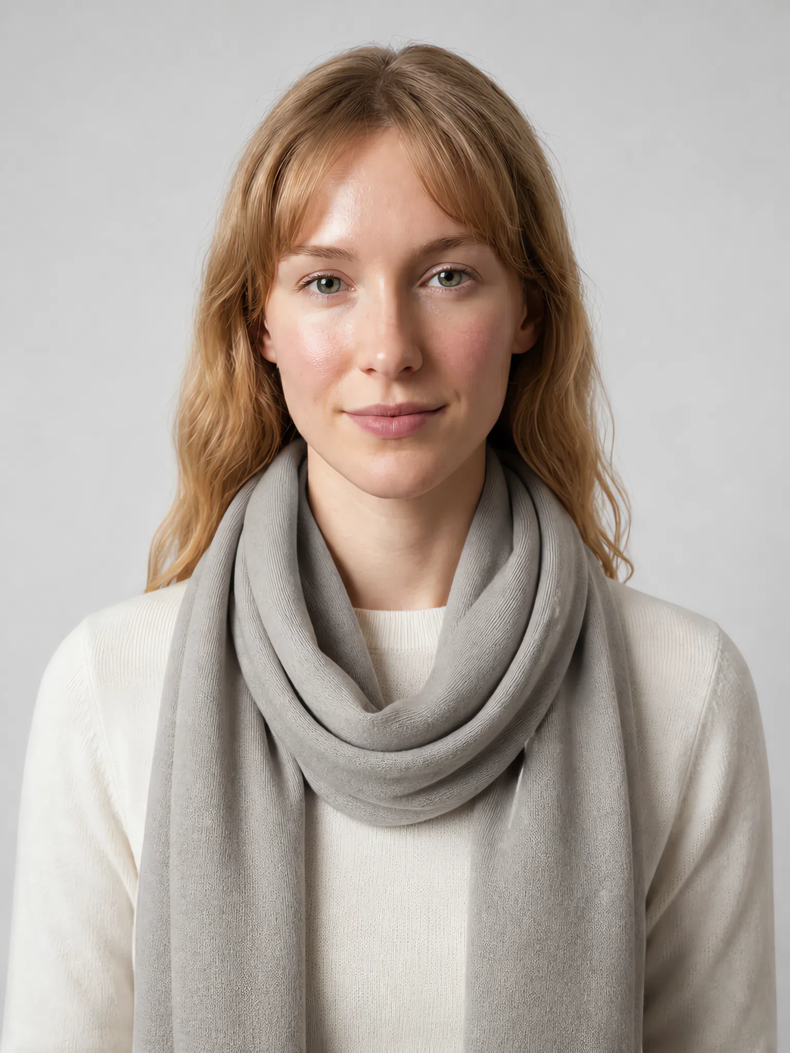
Scarf
A scarf puts color directly against your jaw and throat, which makes it the most powerful accessory you own - and the least forgiving. This is where the muted pastels earn their place.
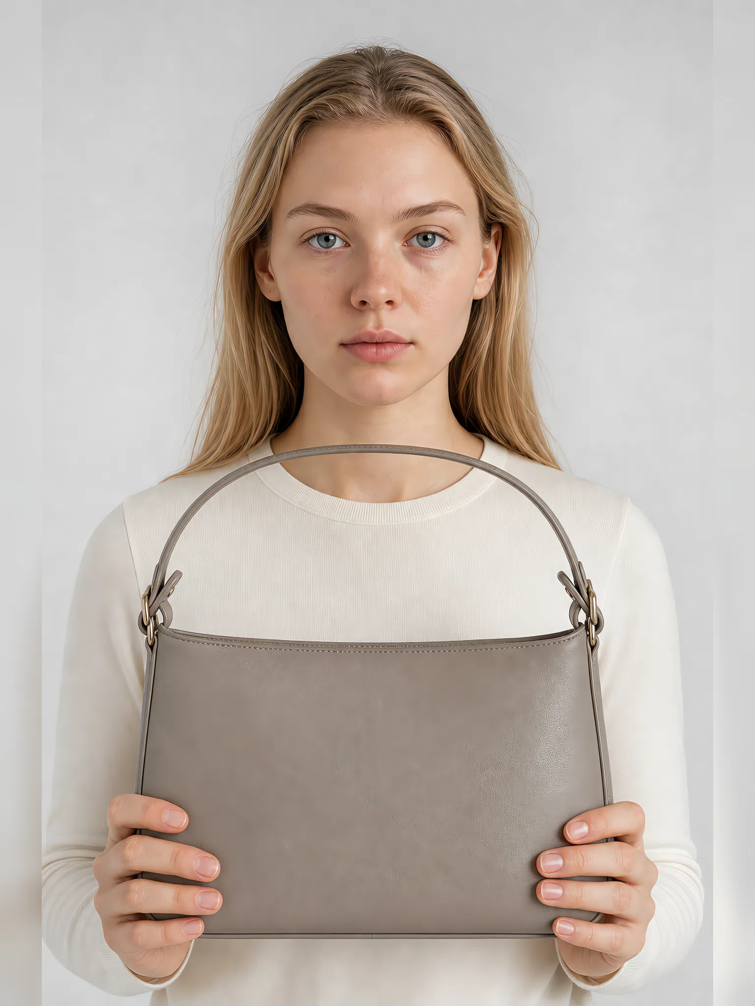
Bag
A bag is the safest place in the whole outfit for a strong color: it is far from your face and it does not have to flatter your skin, only agree with the rest of what you are wearing.

Kerchief
The smallest accent, and the one that changes a plain outfit fastest. Because there is so little of it, a kerchief can carry a deeper shade than you would wear as a whole garment.
Soft Summer colors to avoid
The wrong color does not just look wrong - it makes your skin look dull, pulls out the shadows under your eyes and drags attention away from your face. Two families cause almost all of it for a Soft Summer: colors that are too pure, and colors that are too warm. Both argue with your coloring instead of agreeing with it, and because your coloring is quiet, the color wins every time.
Pure and neon colors
Shades with nothing mixed into them - no gray, no softening, no complexity. They are the exact opposite of how your own coloring is built.
Why these colors do not work
- Contrast overload. Your hair, skin and eyes sit close together in lightness. Drop a pure shade beside them and the gap is bigger than anything on your face can answer, so the garment is what people see first and you are what they see second.
- Saturation mismatch. Every color in your palette has gray in it. Put a fully saturated pigment next to that and it does not make you look richer - your skin reads as drained by comparison, because the pigment now holds all the color in the frame.
- Hard edges. Pure color arrives with a sharp boundary. Soft Summer features blend into one another, so that boundary reads as a seam between you and what you are wearing rather than a line that belongs to the outfit.
Warm and earthy shades
The second family fails for a different reason. Not brightness this time, but temperature.
Why these colors do not work
- The undertone flips. Warm pigment throws yellow back onto neutral-cool skin. The result does not read as sunny - it reads as sallow, and it is most obvious in exactly the places you look at first: under the eyes and around the mouth.
- Redness gets louder. Orange, rust and terracotta pick out any pink already in your skin - a flush, a broken capillary, a healing spot - and promote it to the most visible thing about your face.
- The look goes muddy. Warm and cool in one outfit do not blend - they cancel. Because your own coloring is already low in contrast, there is nothing to hold the two apart, and the whole thing settles into a single murky tone.
Soft Summer color combinations
Knowing your colors is half of it. Knowing how to put two of them together is the half that shows. Soft Summer wants gentle, tonal steps and medium contrast - shades that sit near each other rather than opposite each other. Below are five outfit ideas that already follow that rule, so you can wear them without thinking about it.
Five ready-made outfit formulas
Read each row left to right in the order you would get dressed: the largest piece first, then what goes over or under it, then the accent if there is one.
Quiet authority
Slate blue trousers, a dusty blue silk blouse and a soft white shell underneath. Three shades, one temperature, no hard edge anywhere - the safest thing you can wear to be taken seriously.
Romantic casual
A dusty rose dress under a pewter cardigan or trench. Soft, feminine and completely undemanding - the outfit for a day with no agenda.
Lavender haze
Taupe trousers or a taupe skirt, a light lavender sweater, and a muted berry scarf as the one accent. The most interesting combination on this page, and the one people will remember.
Evening
A plum dress in velvet or satin with matte silver jewelry. Deep and quiet at the same time, which is a harder trick than it looks and one your coloring does effortlessly.
Natural harmony
Cocoa trousers with a sage sweater. Calm, warm-looking without being warm, and the easiest outfit on this list to build out of clothes you already own.
The rule underneath all five: keep the haze. Never pair a muted shade with a pure, bright one - the bright shade wins and the muted one just looks faded next to it. What works instead is monochrome, two depths of a single color, or analogous shades that sit beside each other on the color wheel and inside your own palette.
Soft Summer clothing: building a wardrobe that works
Start with eight pieces
A wardrobe that suits your coloring is not about owning more - it is about owning things that agree with each other and with you. Soft Summer coloring is muted and slightly hazy, so your clothes have to live in that same register: complex, multi-toned shades with no hard contrast. Get that right and you get the soft-glow effect that makes this subtype look expensive without trying.
What to steer around is the reverse: pure bright color, and black-and-white pairings. Both fight the gentleness your face is built on, and both are the default in most shops - which is why a Soft Summer wardrobe usually has to be chosen on purpose rather than accumulated.
The Soft Summer capsule wardrobe: eight pieces to build on
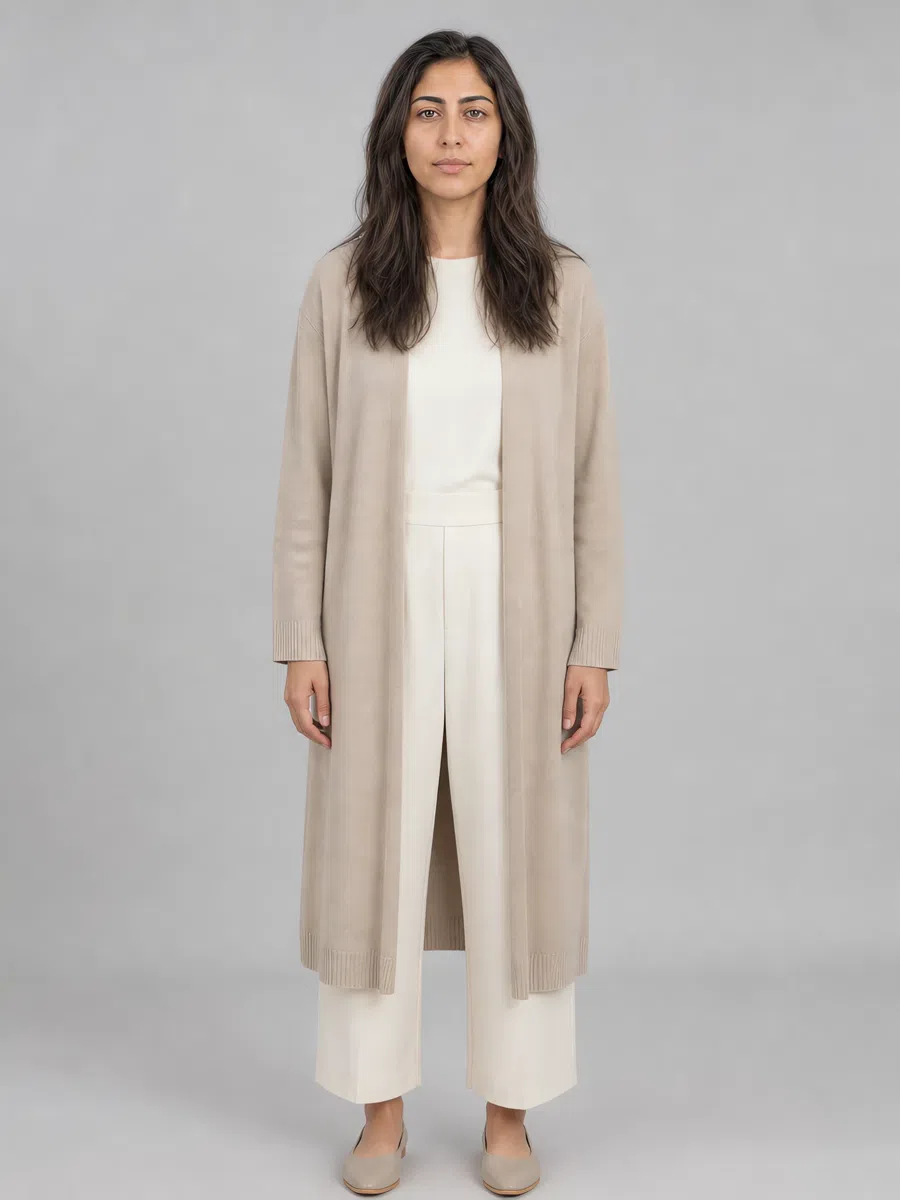
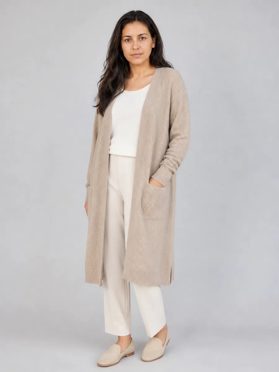
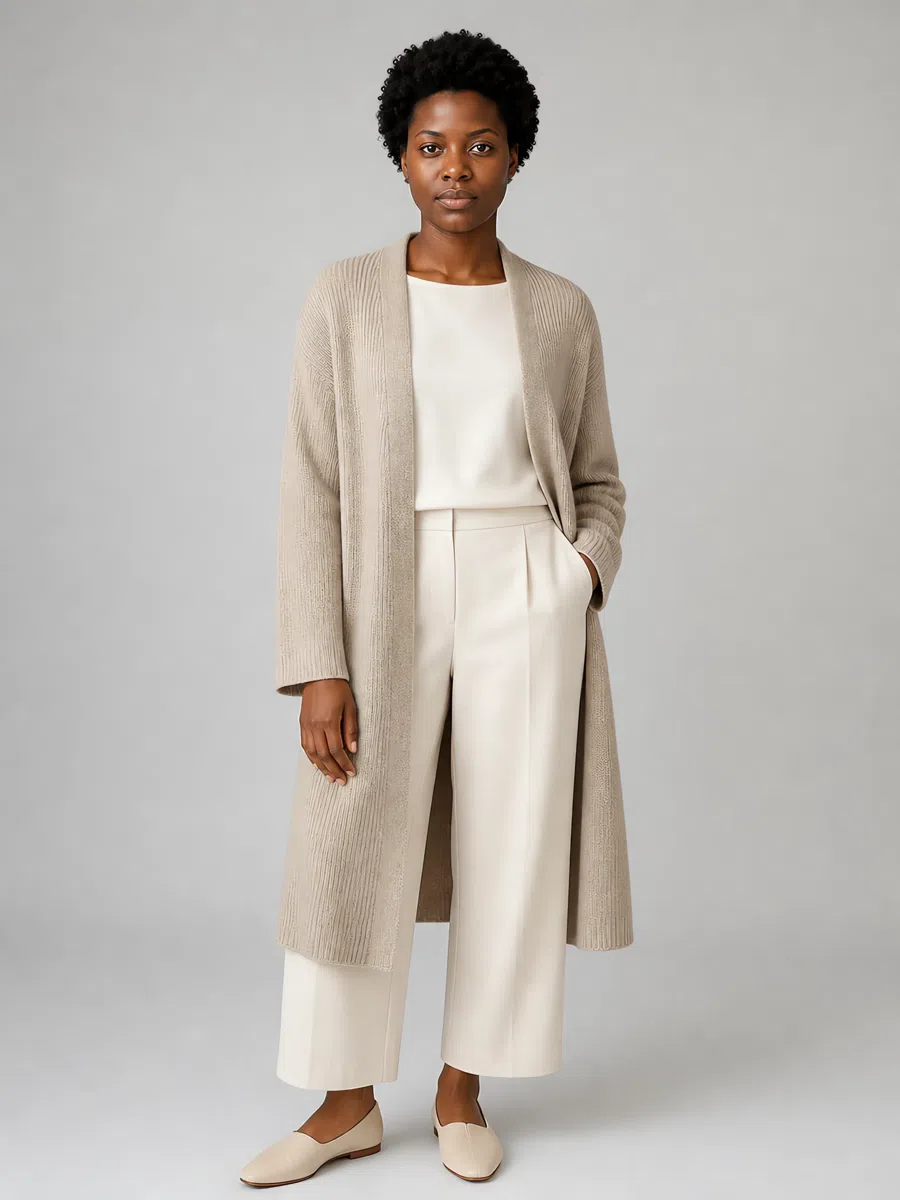
A capsule for this subtype is built on neutral, complex colors that combine with each other without thinking. The base is muted beige, taupe and smoky tones; the interest comes from soft pastel accents on top of it. These eight cover most of what a week asks for - and each one is shown on four complexions, because the palette is set by undertone, not by depth.
This capsule is put together by color - around the Soft Summer palette specifically. How a capsule works in general - how many pieces are enough, how to count the outfits it makes, where to start building one - is a separate subject, and a guide of its own is coming.
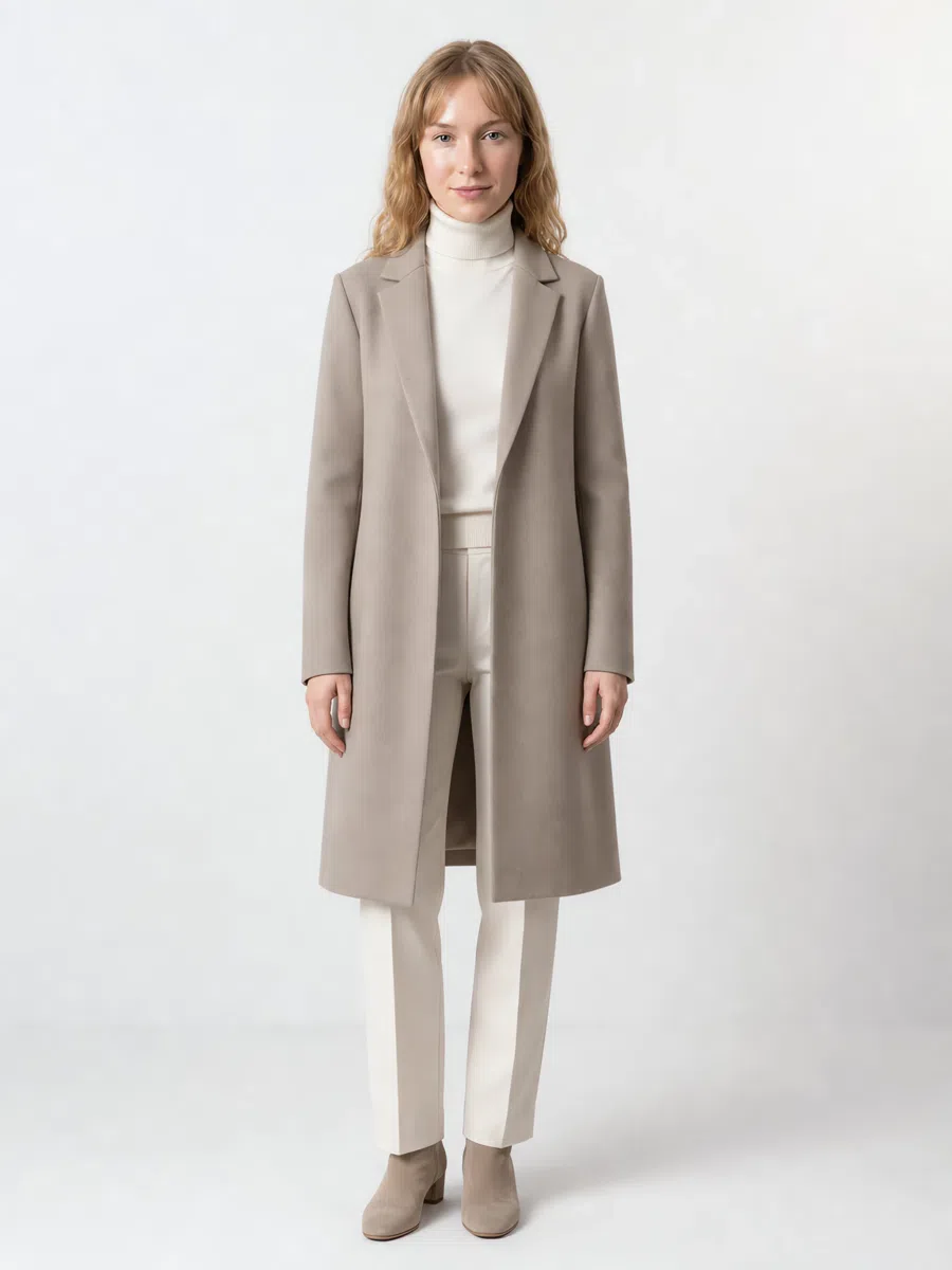
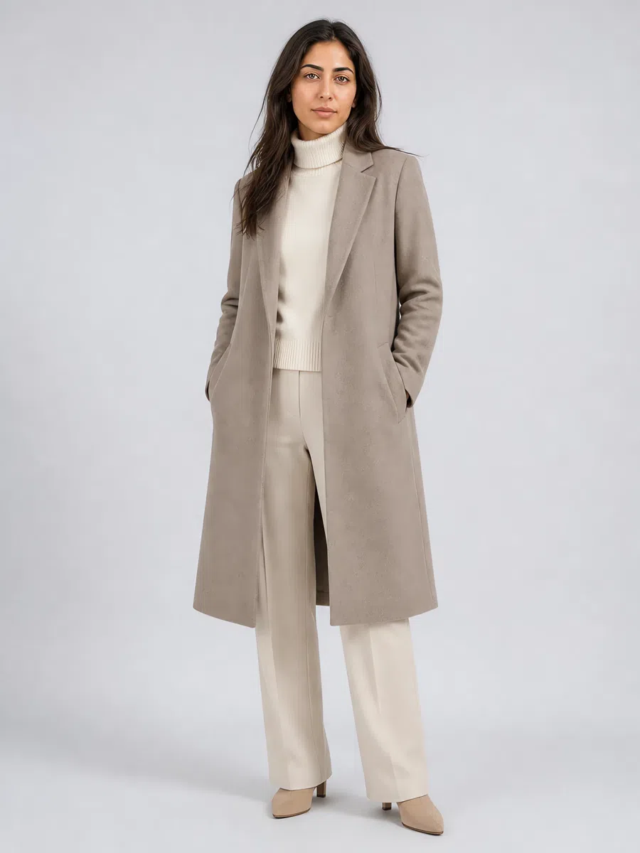
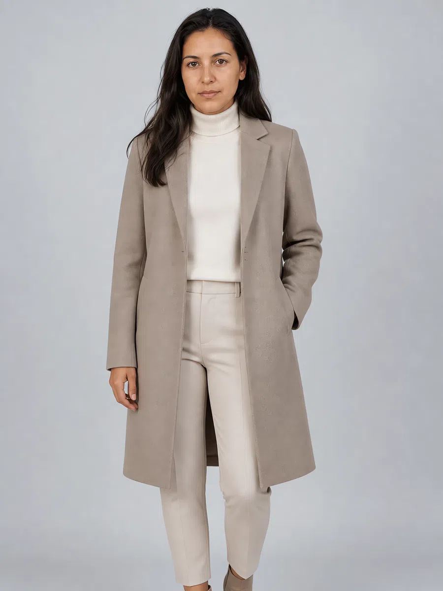
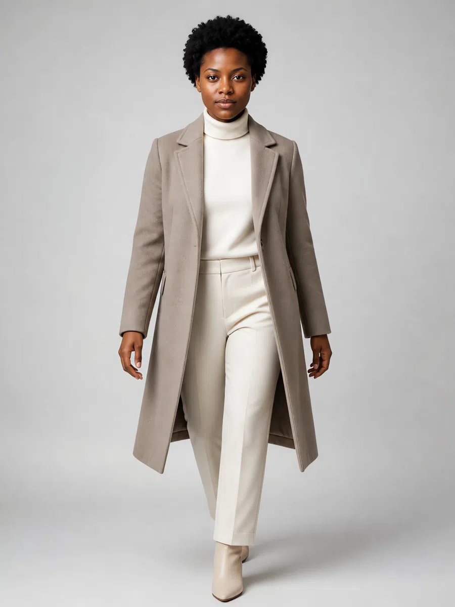
1Camel coat
Not a bright camel - a muted beige-gray. Take a classic cut: straight or lightly fitted, knee-length or midi, in soft wool, cashmere or a blend with a little texture to it. Avoid cold grays and clean beiges alike; the color wants to be complex, with gray underneath.
Tip Wear it over cream knits with dusty pink accessories, and look for matte hardware rather than shiny.
2Cream sweater
Cream or ivory, never white - this is the piece everything else layers onto. Soft merino, cashmere or brushed cotton, in a relaxed or lightly fitted shape rather than a tight one. Turtlenecks, crew necks and V-necks all work.
Tip Pairs with taupe trousers and warm-toned jewelry. The single most useful layering piece you can own.
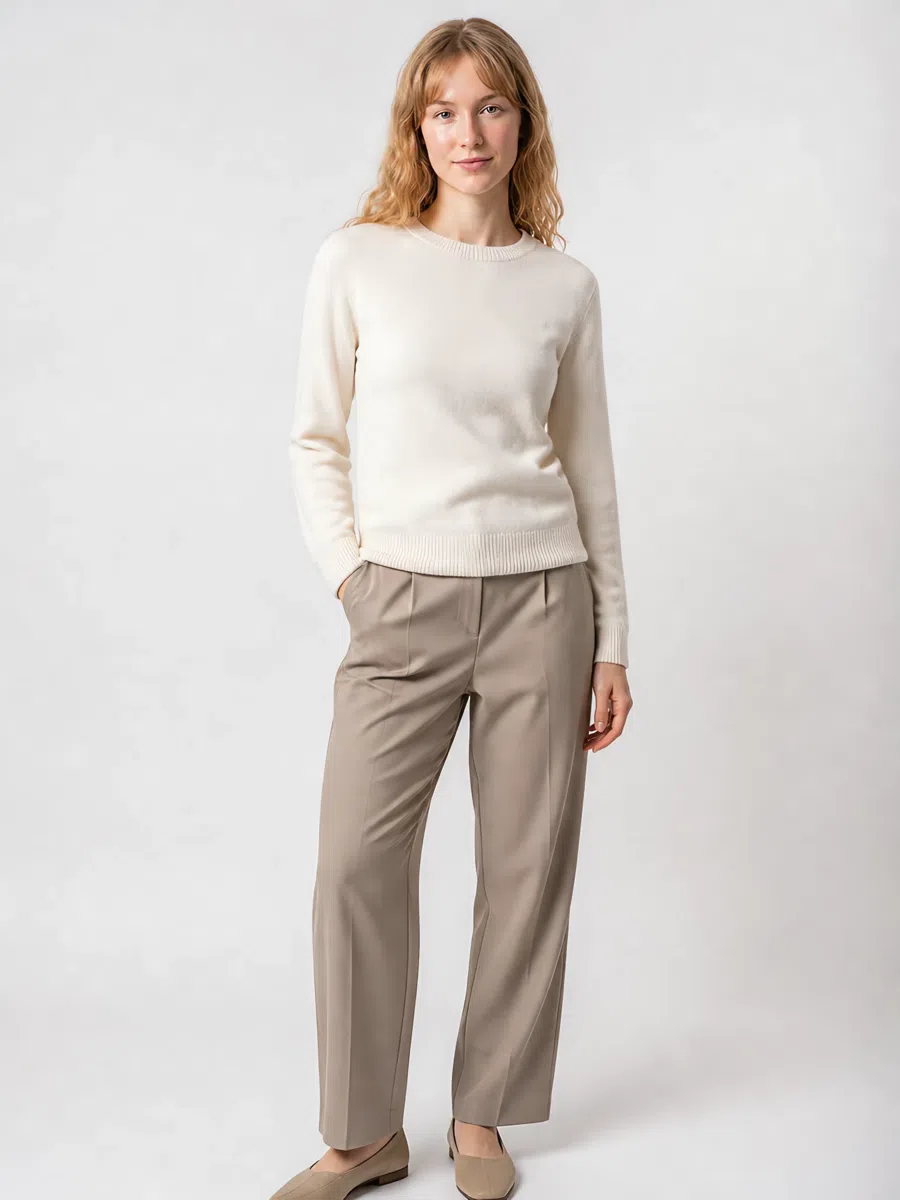
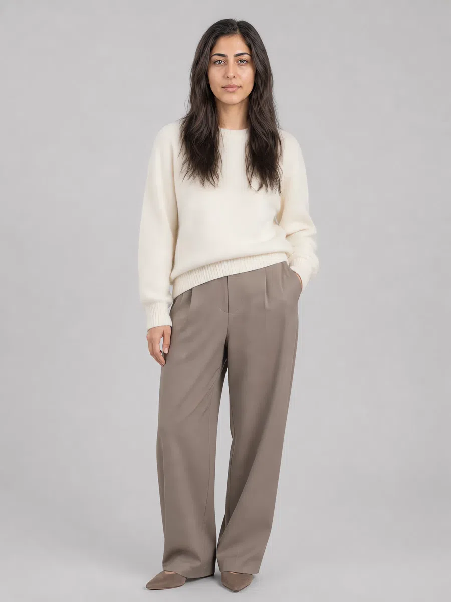
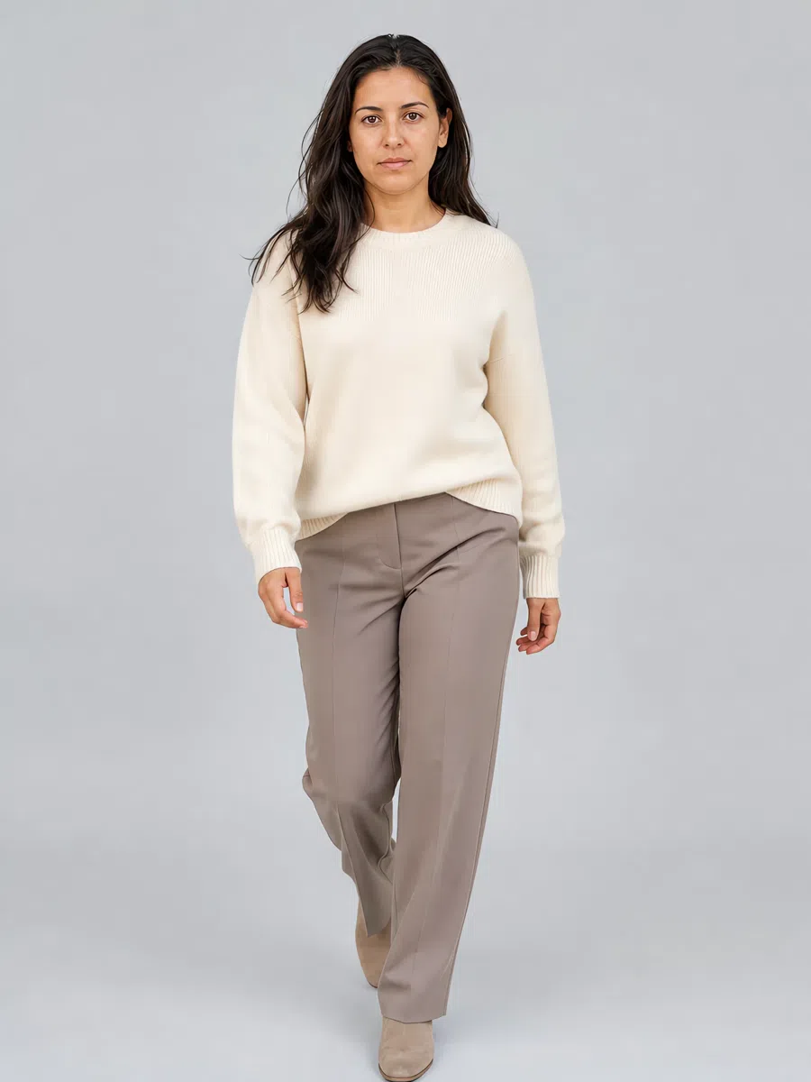
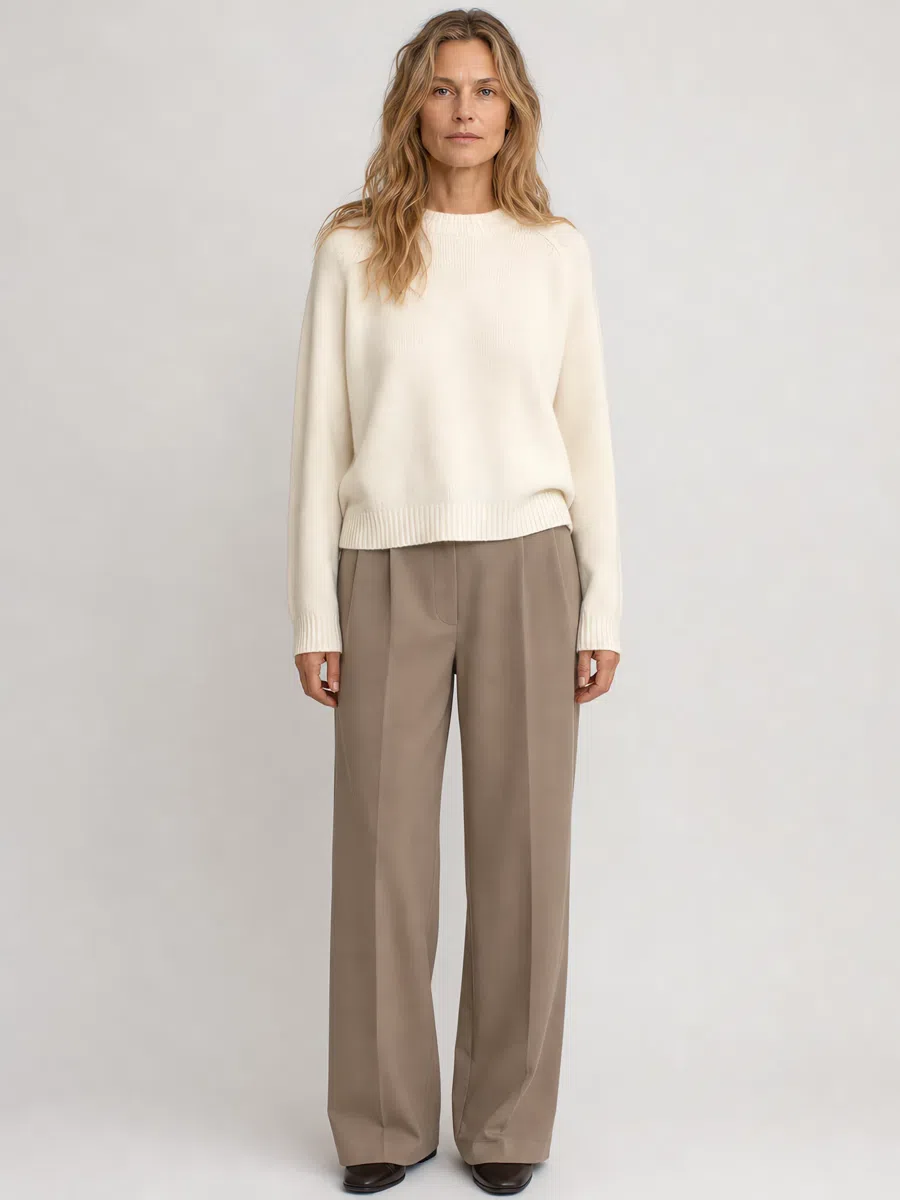
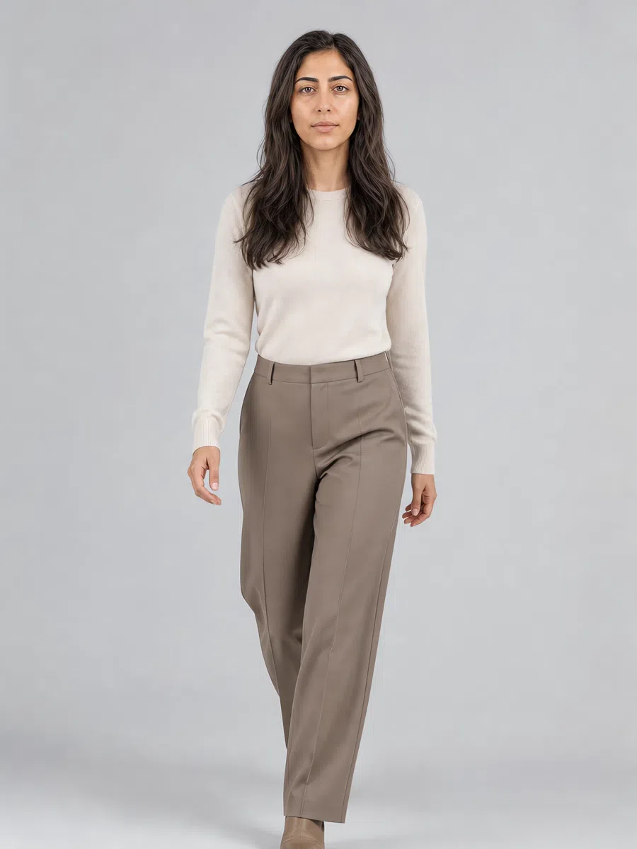
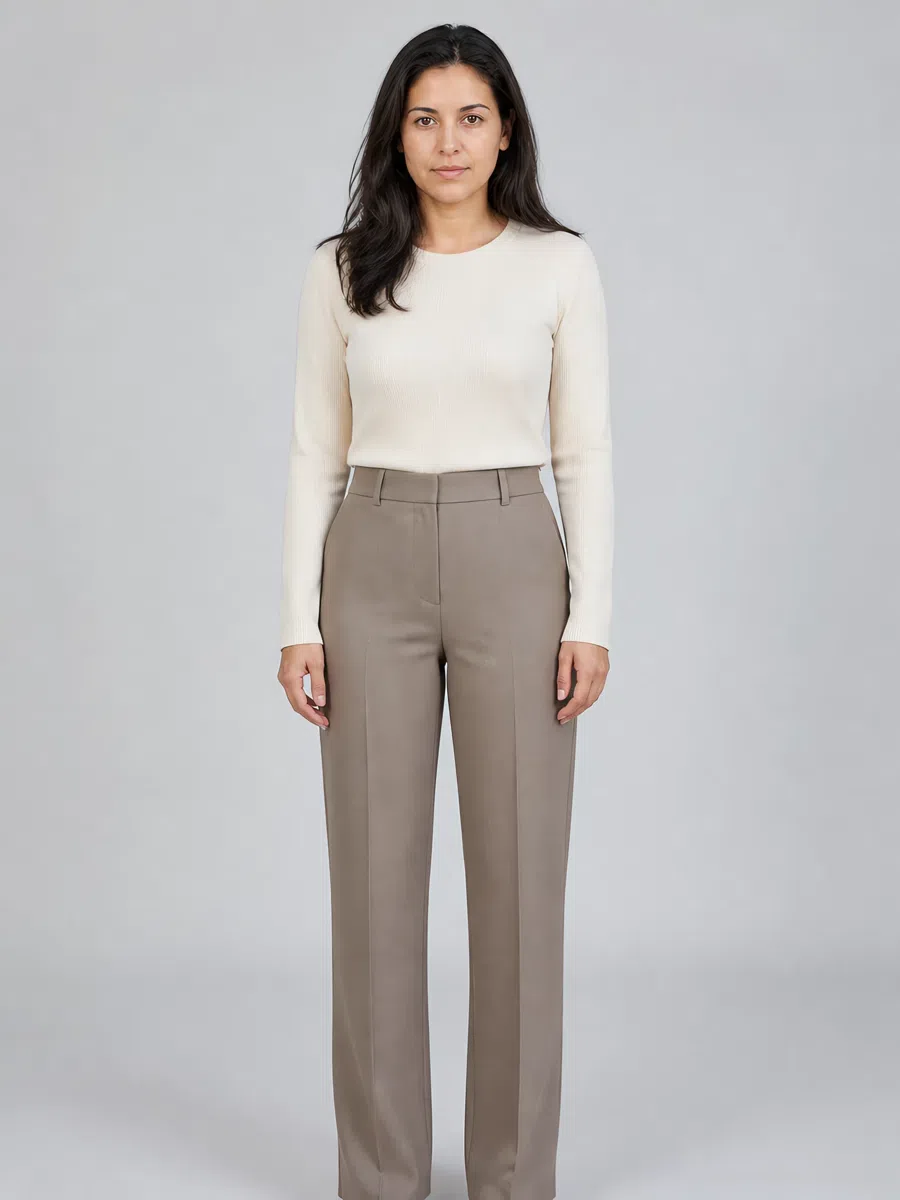
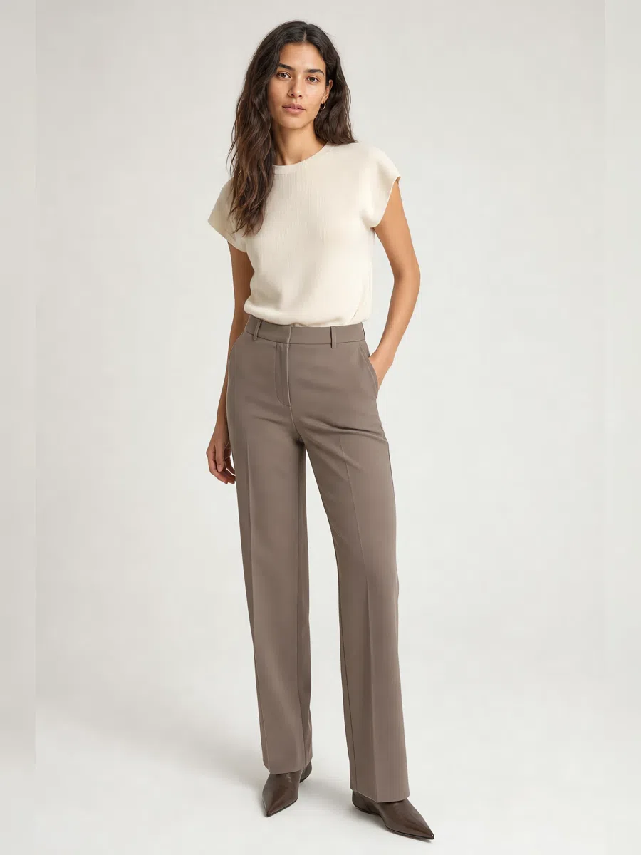
3Taupe trousers
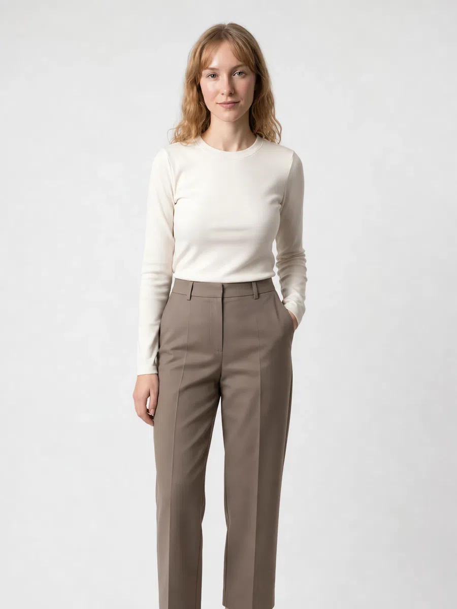
Taupe is the neutral base this whole capsule hangs off. Classic shapes - straight or slightly tapered - in soft wool, tweed or cotton with a little stretch. The color should be neither plain gray nor plain brown but the two mixed, with a smoky cast.
Tip Best under dusty pink or lavender blouses. For the office, take a pressed crease.
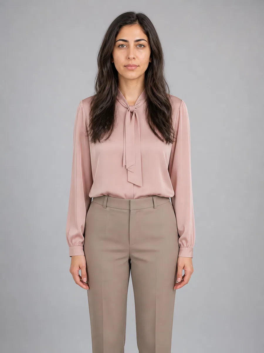
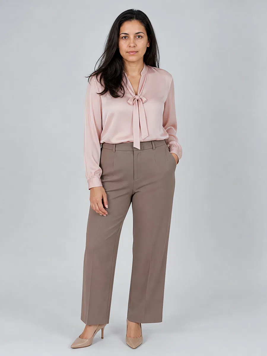
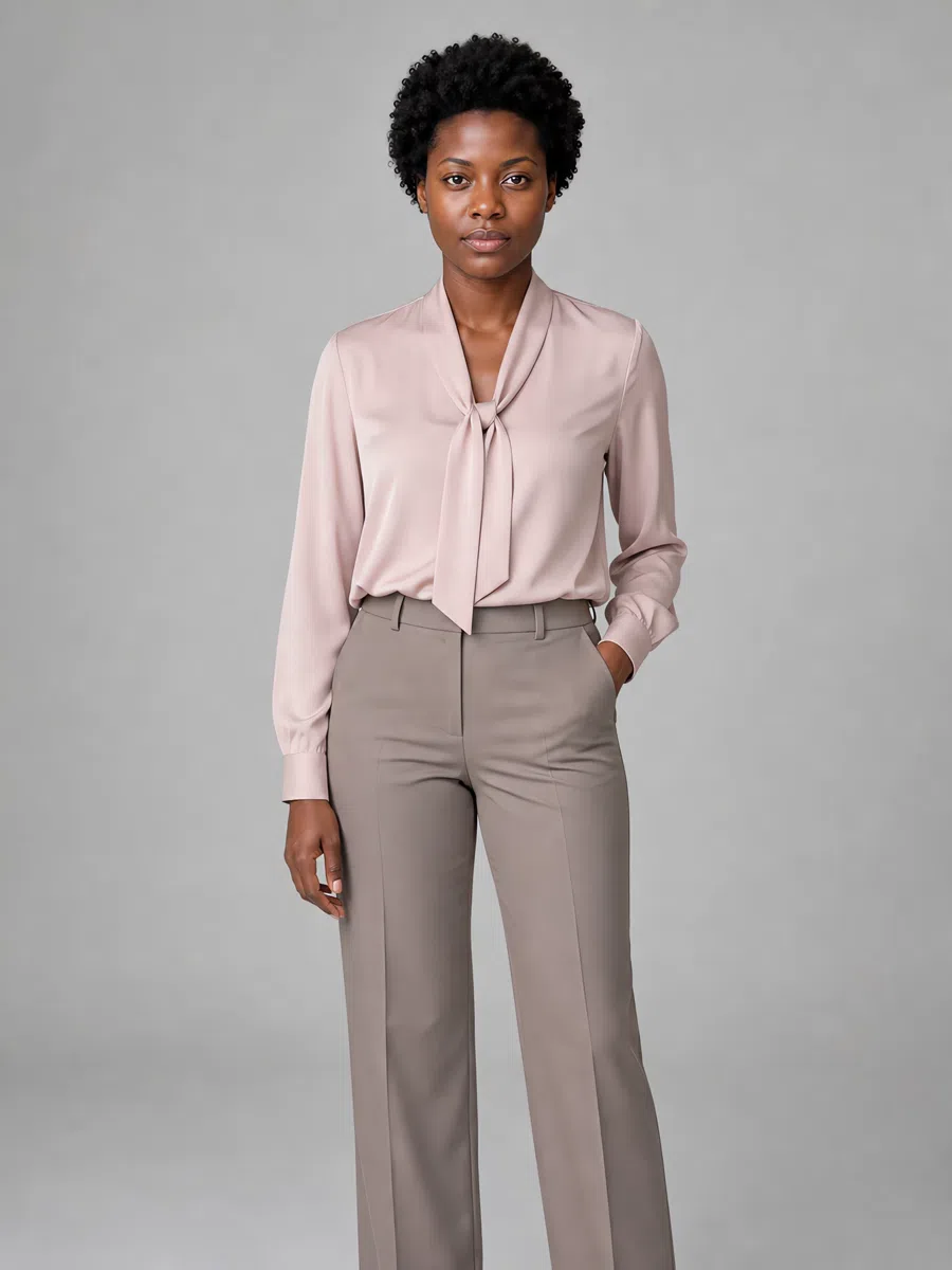
4Dusty pink blouse
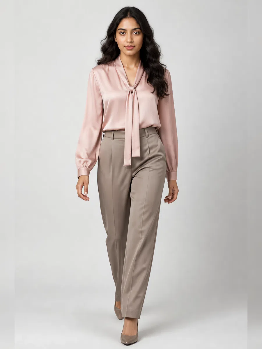
Muted pink with gray in it - the romantic piece of the eight. Silk, satin or soft cotton, and this is the place for detail: ruffles, a tie neck, a fuller sleeve. The color should look powdered rather than bright or icy.
Tip Wear with cream skirts or taupe trousers. Pearl jewelry is made for this one.
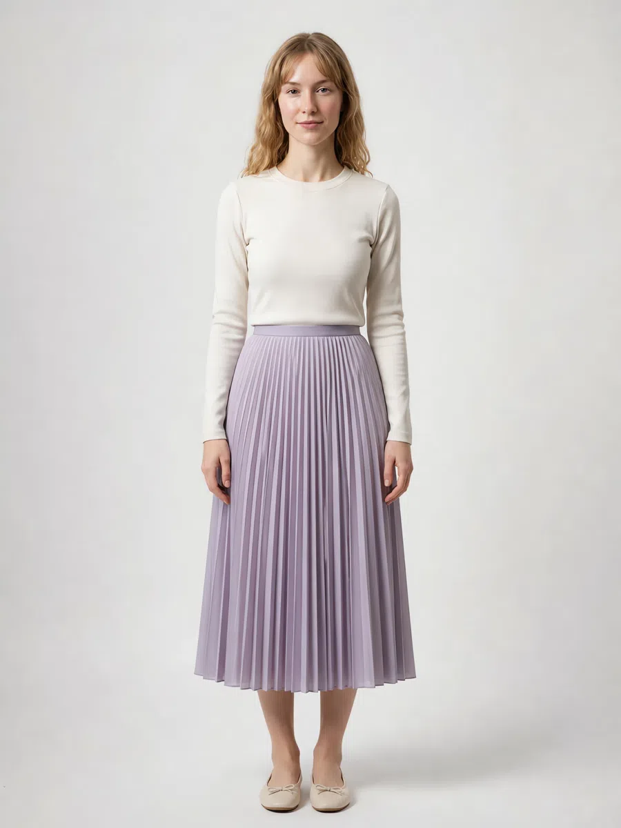
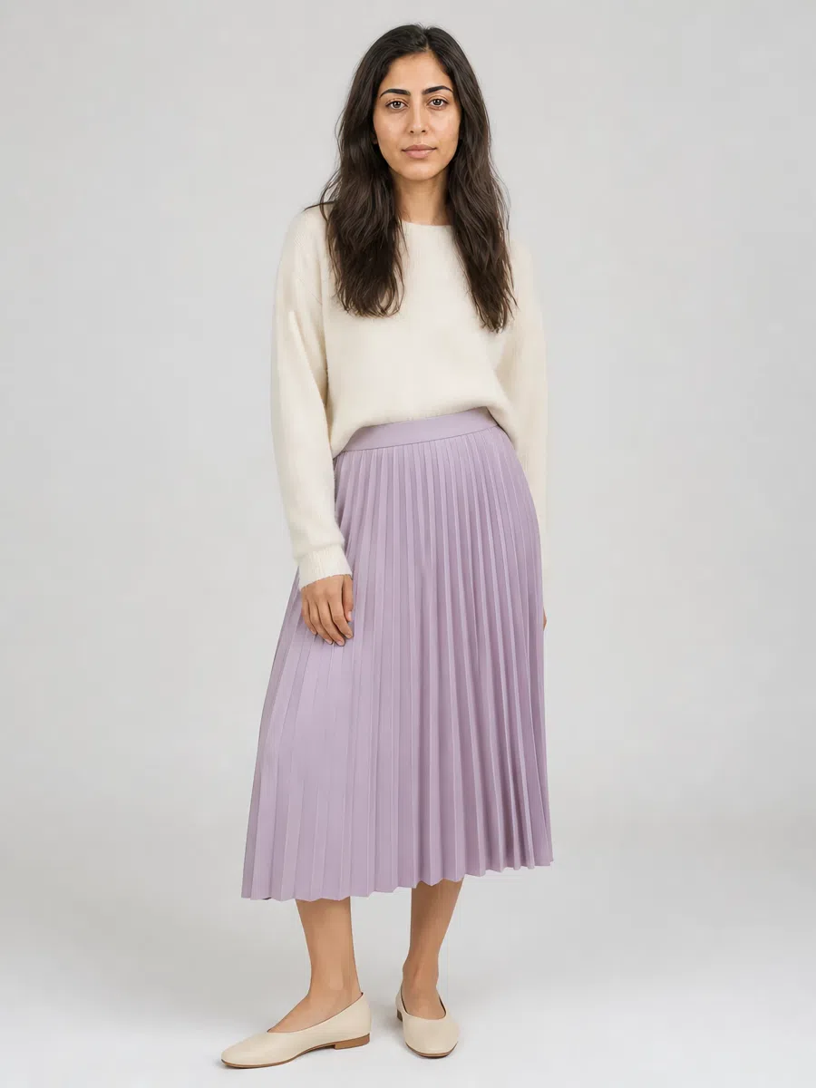
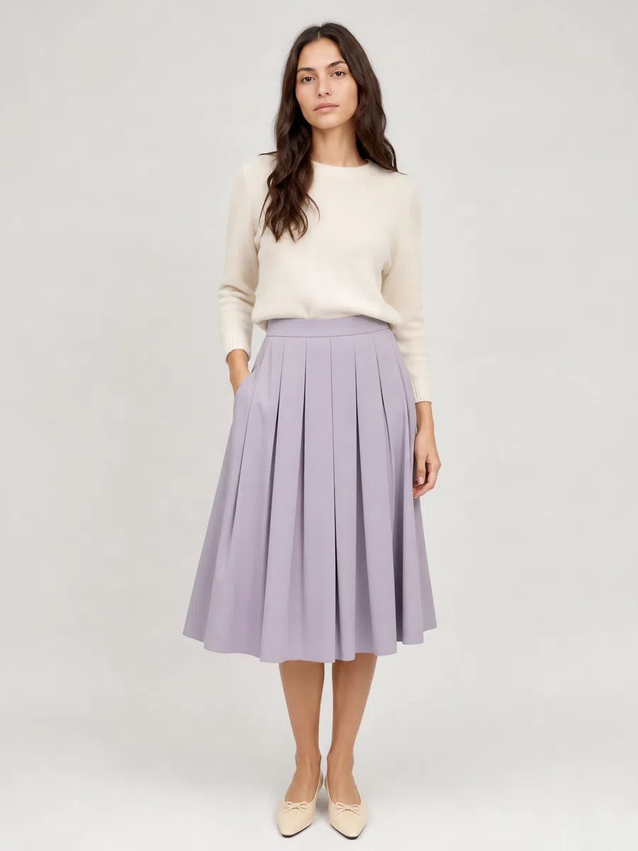
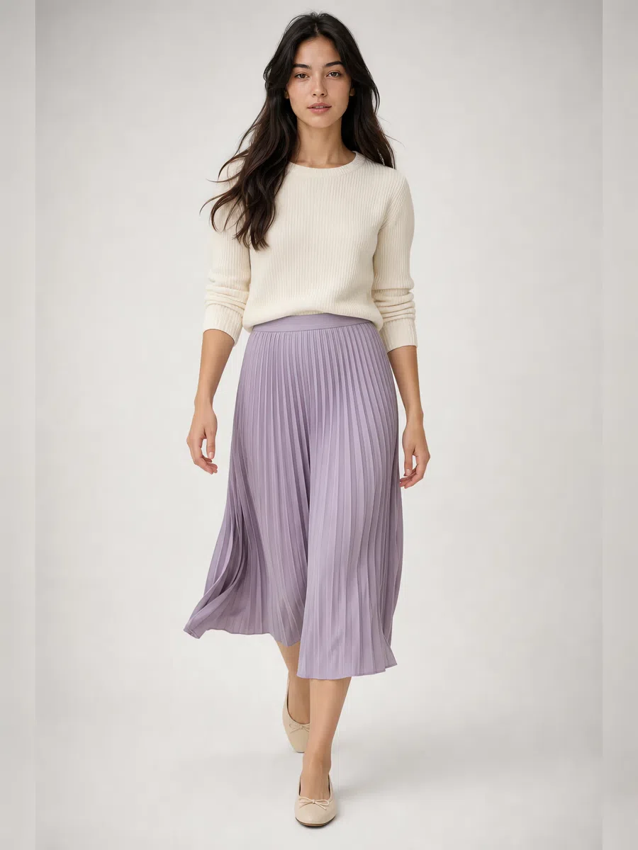
5Lavender midi skirt
Muted lavender is the accent piece. Take an A-line or a pleated shape, mid-calf, in soft cotton, wool or a light tweed. Not bright purple - gray-lilac, with a haze over it.
Tip With a cream sweater and suede boots by day; swap in a silk blouse for evening.
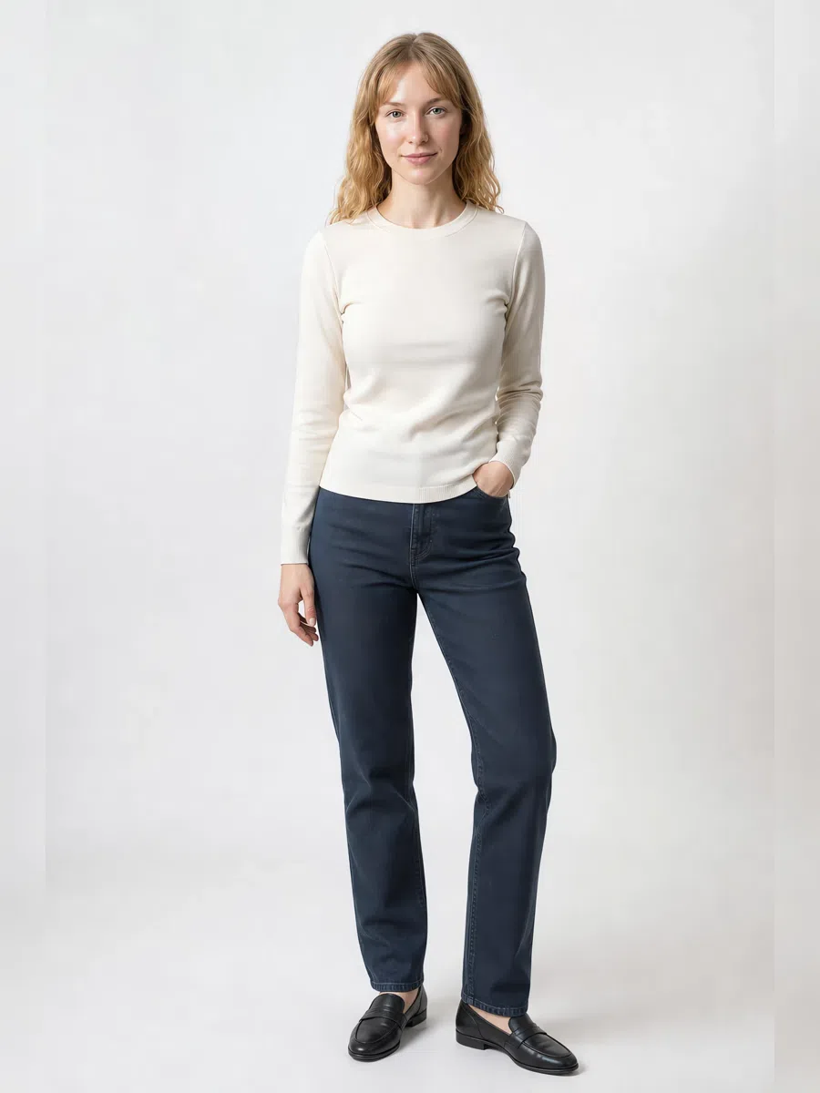
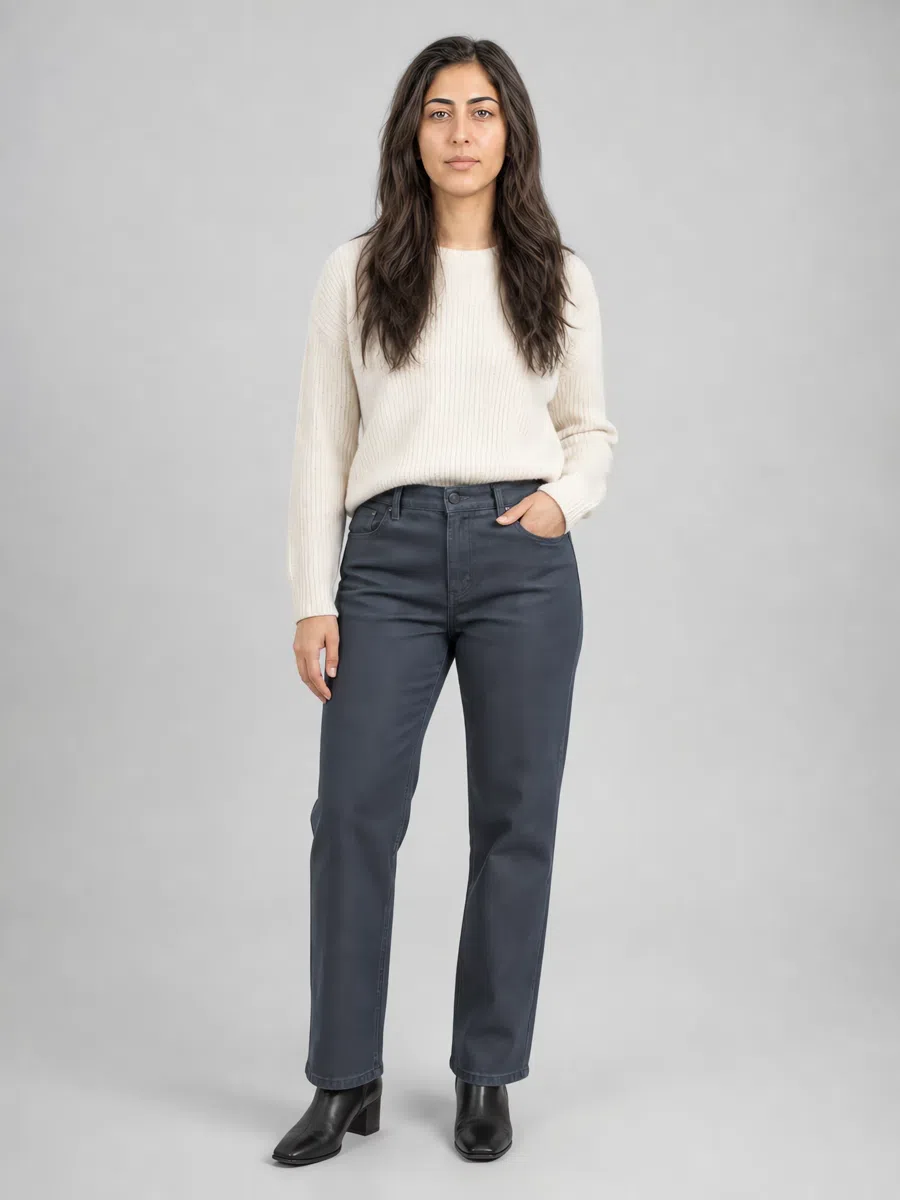
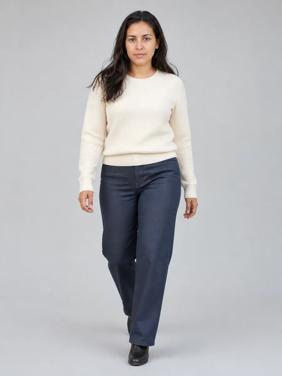
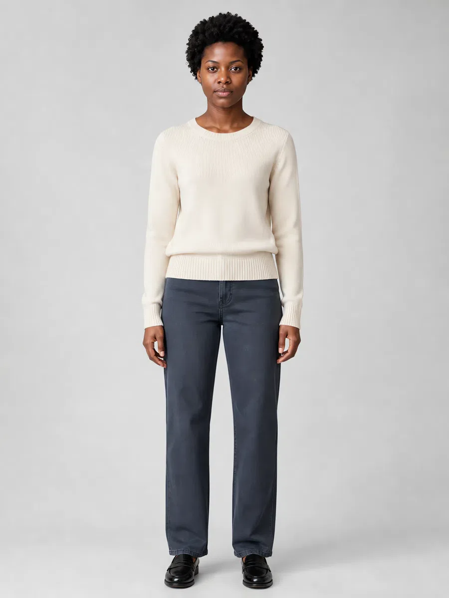
6Dark blue jeans
Not classic bright blue - a muted dark denim with gray underneath. Straight or slightly tapered, without heavy fading or contrast stitching. Firm cotton with a little stretch.
Tip With cream knits and suede boots. Skip light washes and anything acid-bright.
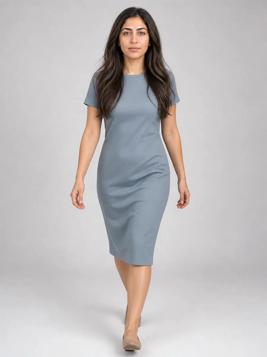
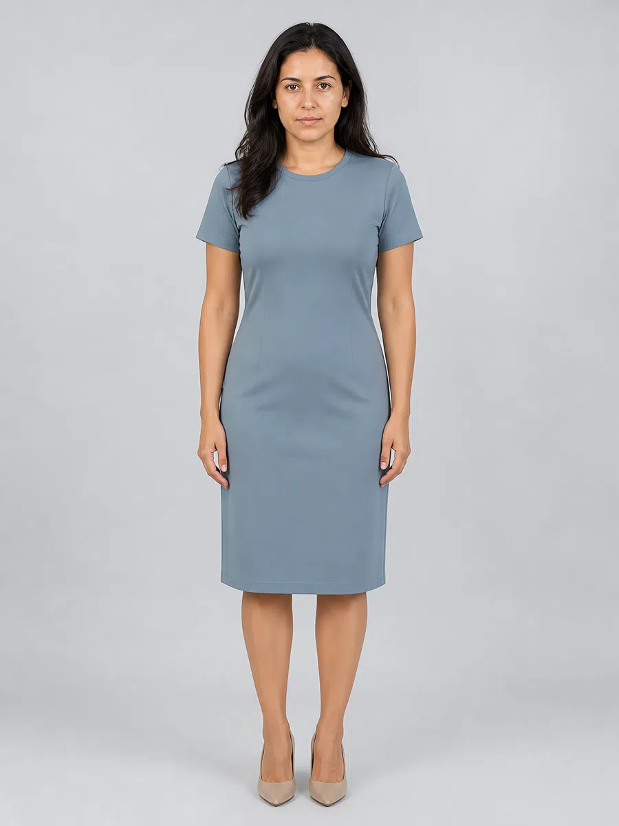
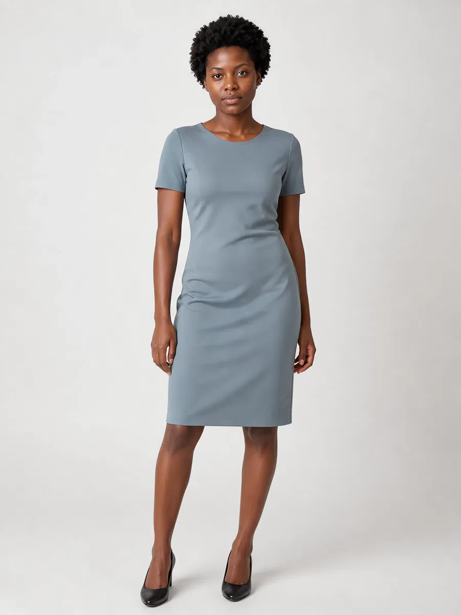
7Sheath dress
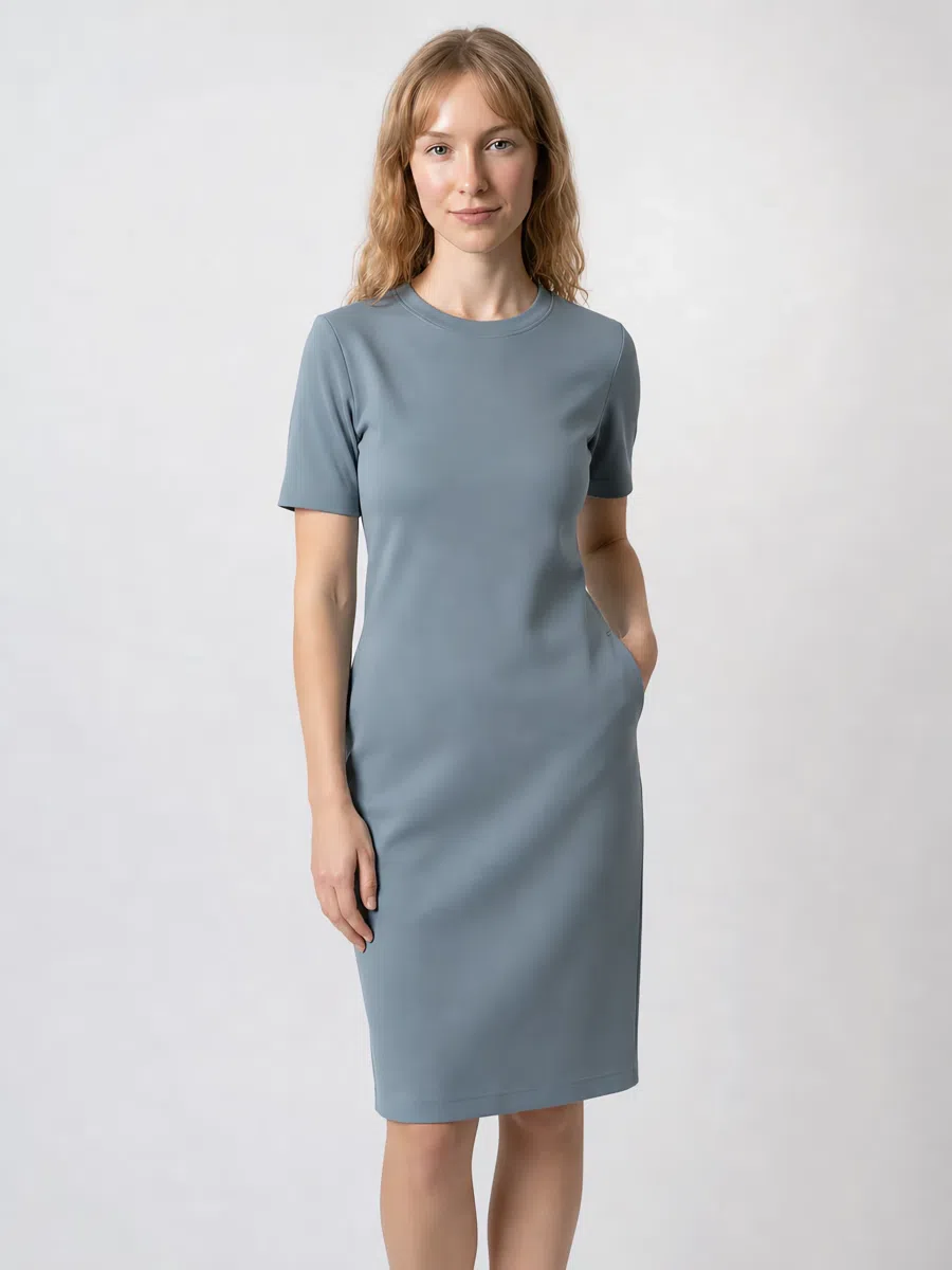
A classic sheath in muted gray-blue. Firm jersey, tweed or stretch cotton, lightly fitted, knee-length. The color should be complex rather than bright blue - dusty, with gray in it.
Tip The office answer. Add a beige jacket and a pearl necklace, and a belt if you want the waist marked.
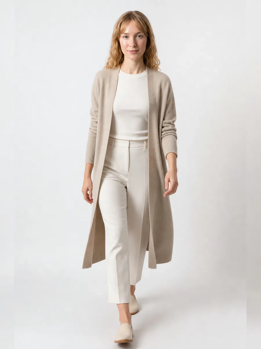
8Beige cardigan
A long cardigan in muted beige with a gray cast. Relaxed cut, soft wool, cashmere or cotton, midi or maxi length - the piece that makes an outfit look layered rather than assembled.
Tip Over dresses, or with jeans and a tee. Belt it when you want more shape.
Five ways to combine them
- Tone on tone. Different depths of one color - an ash rose blouse with taupe trousers. For muted coloring this is the strongest move there is, because the outfit reads as one piece.
- Soft contrast. Take your contrast from lightness, not from brightness: a soft white top over a spruce bottom. Hard pairings like black with white talk over your face.
- Neutral base plus one accent. Build on pewter, taupe and slate blue, then add a single colored thing - a berry scarf, a lavender bag. One accent, not two.
- Analogous harmony. Neighbors on the color wheel - dusty blue, lavender and dusty rose - give you soft transitions with no hard borders anywhere.
- Play texture instead. One color can feel like several: smooth silk against soft cashmere, a fluid skirt under a structured jacket. At low contrast, texture does the job an accent color would do on someone else.
Makeup shades
Foundation, bronzer and highlighter matched to your depth, plus the shade list
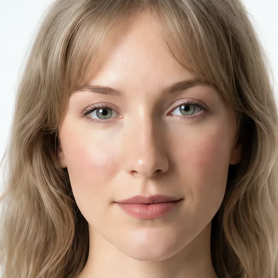
Three products are chosen by your complexion rather than your season, so they are here with the four depths shown. Everything else is a shade list: the family is fixed by your coloring, and which value you take is fixed by how deep your skin is.
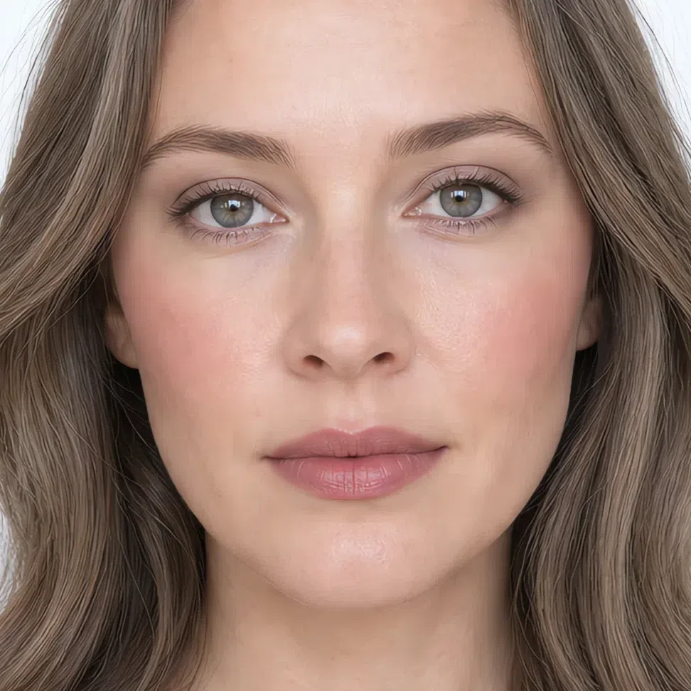
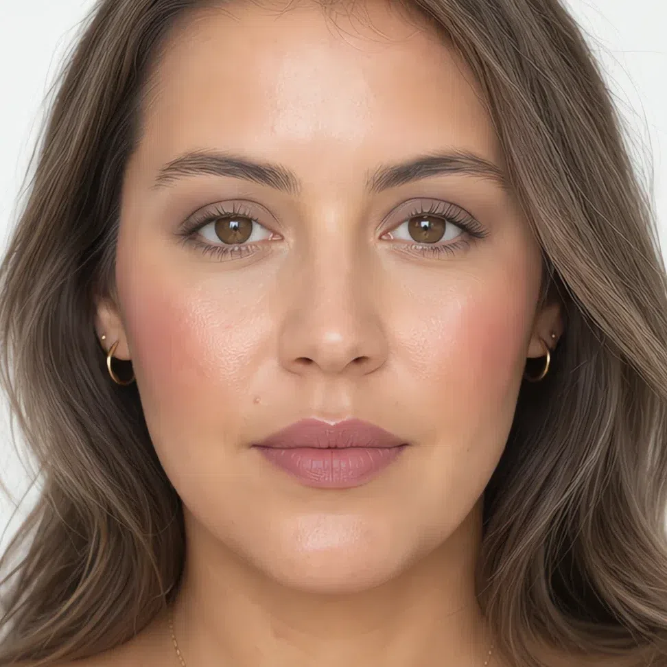
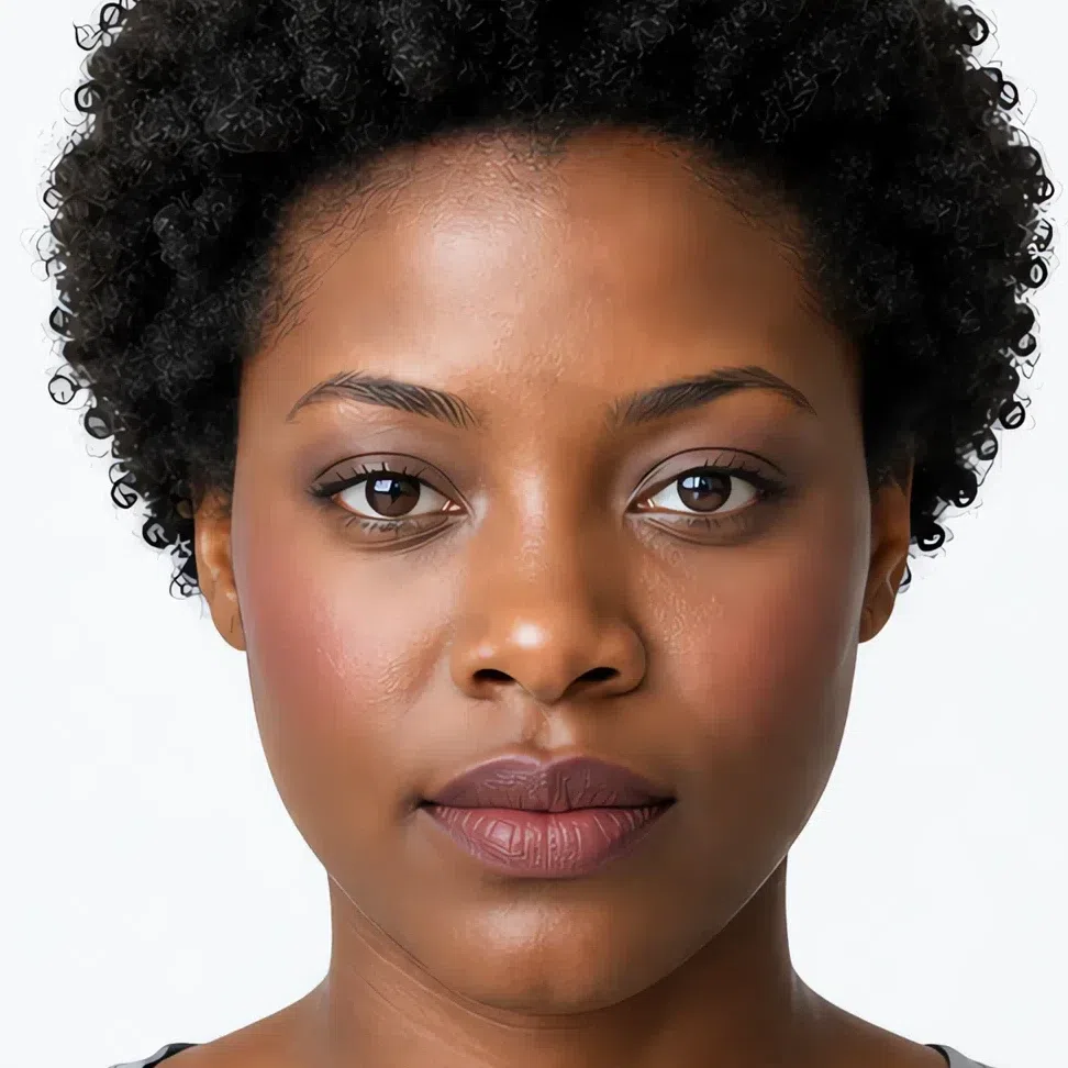
Base: foundation, blush and glow
Your base should be even and natural with a light finish - never a mask. What you are looking for is a neutral to neutral-cool undertone: too pink and the face reads flushed, too olive and it reads sallow. This is the one part of makeup where your complexion decides the answer and your season only narrows it.
Foundation matched to your depth
Neutral-cool at every depth. Warmth is the single most common mismatch on this coloring, and it shows at the jaw before it shows anywhere else.
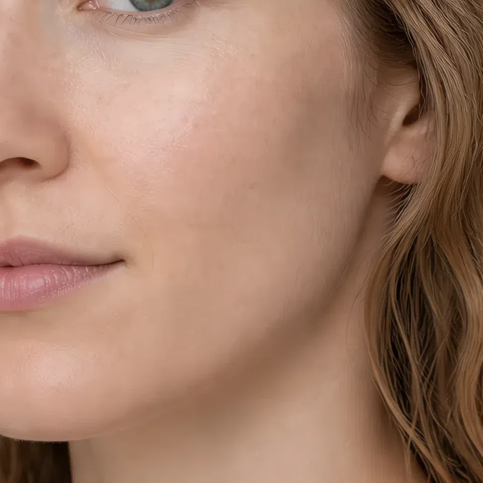
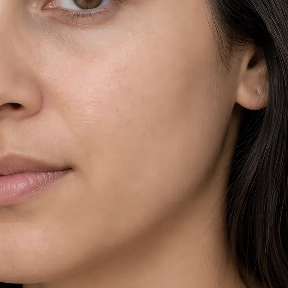
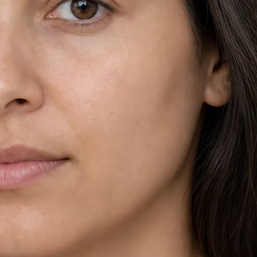
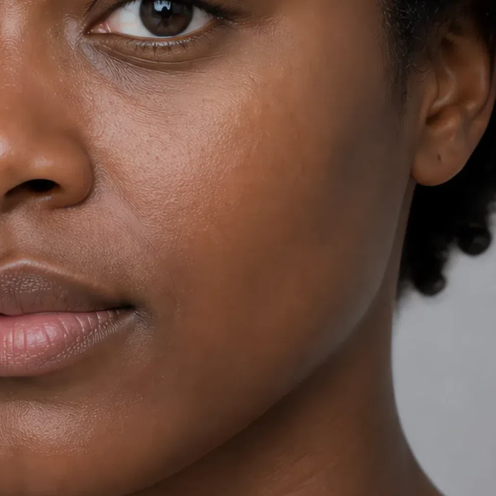
Tip Put three shades along your jaw and check them in daylight. The right one blends into your neck and vanishes; the wrong one draws a line.
Avoid Very pale porcelain shades with a pink cast, and anything with a golden or orange base.
Blush
Muted rose is the everyday one and dusty coral the warmer alternative. The family is fixed by your season; which value you take is fixed by your depth.
- Muted rose #D9A6A6
- Soft peach-pink #CF9D8E
- Dusty coral #C08E96
- Dusty raspberry #B57F86
Highlighter matched to your depth
Champagne and soft pearl rather than gold. A highlighter brighter than your own skin is the one place a muted face reads as contrast.
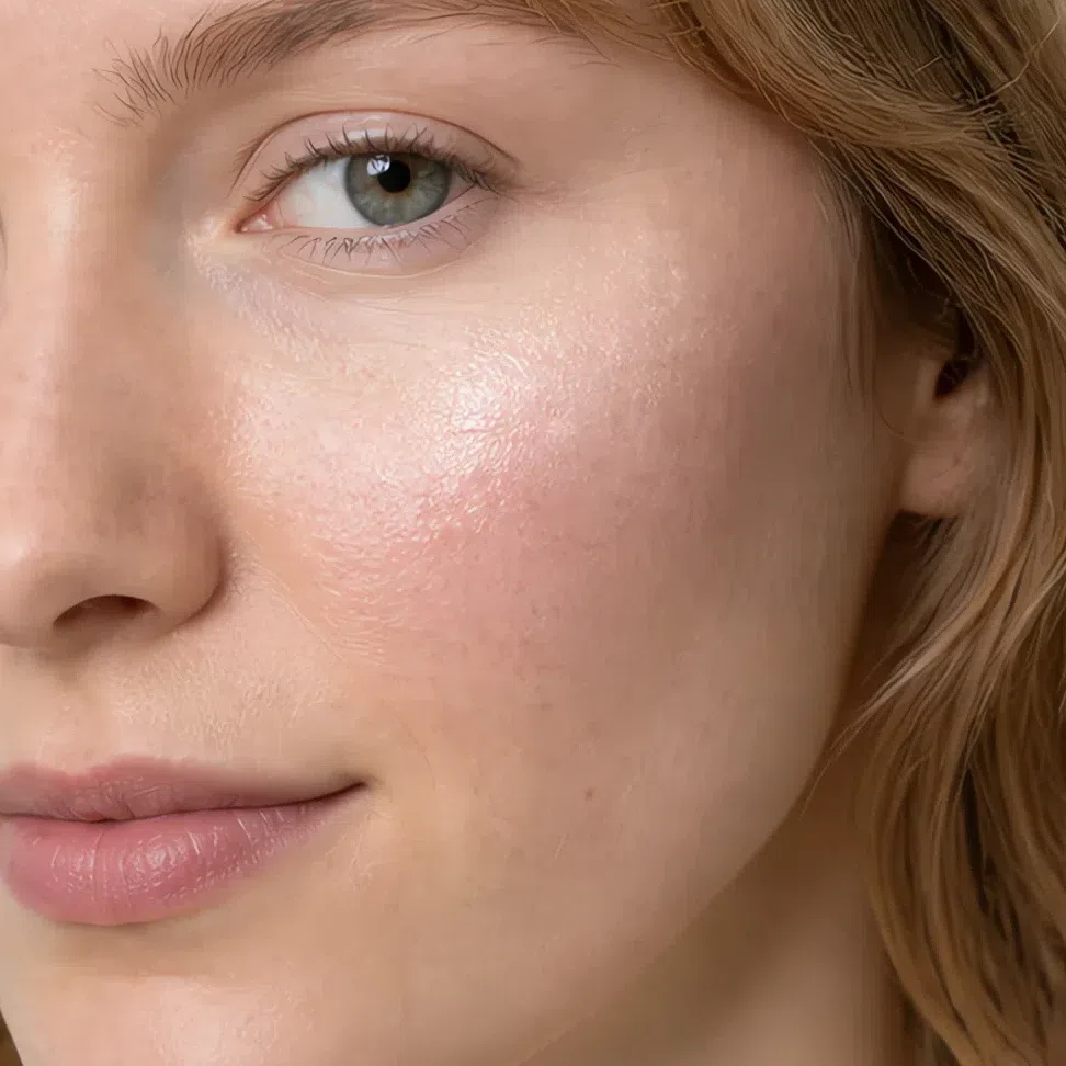
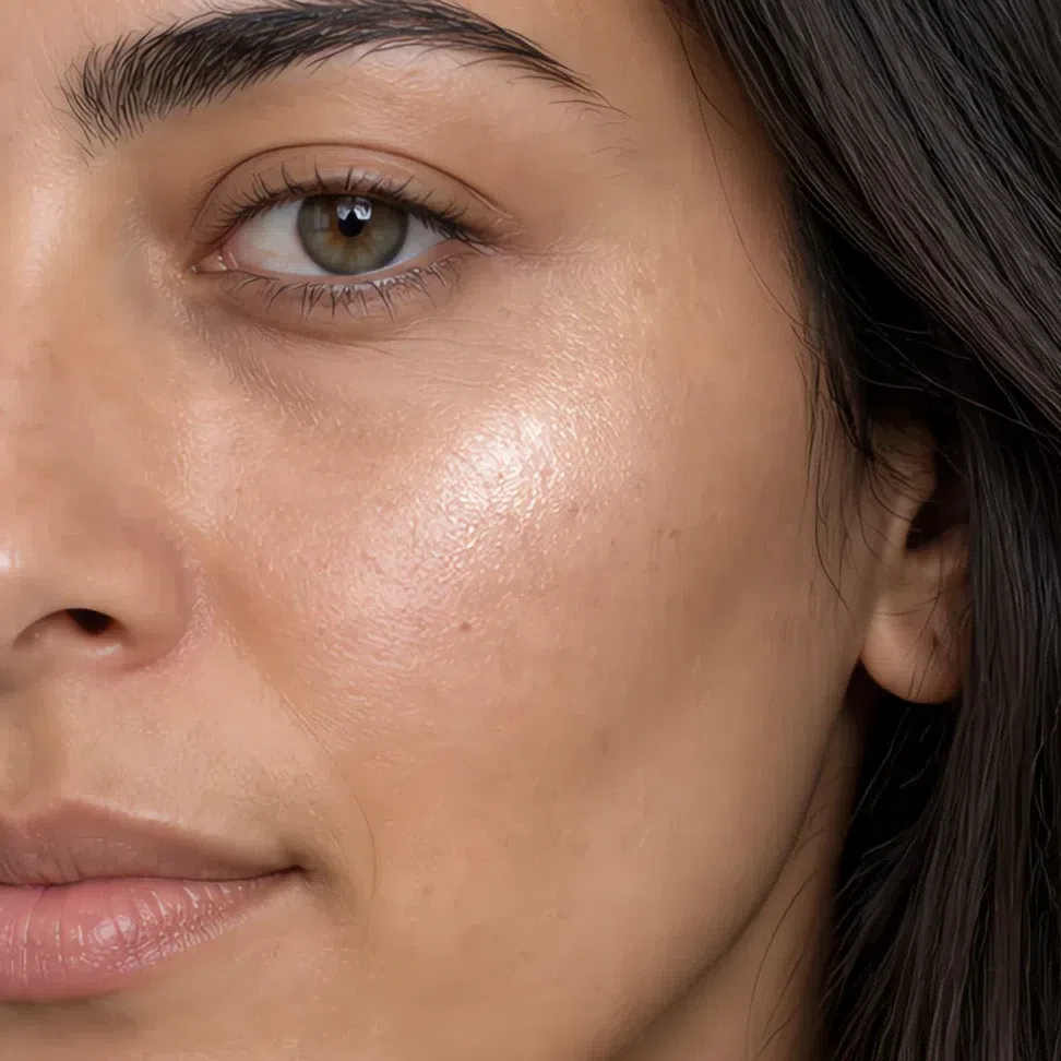
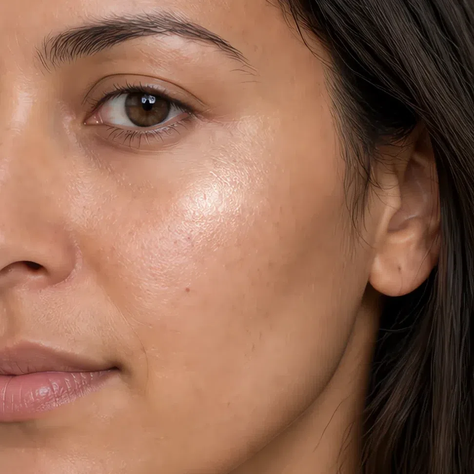
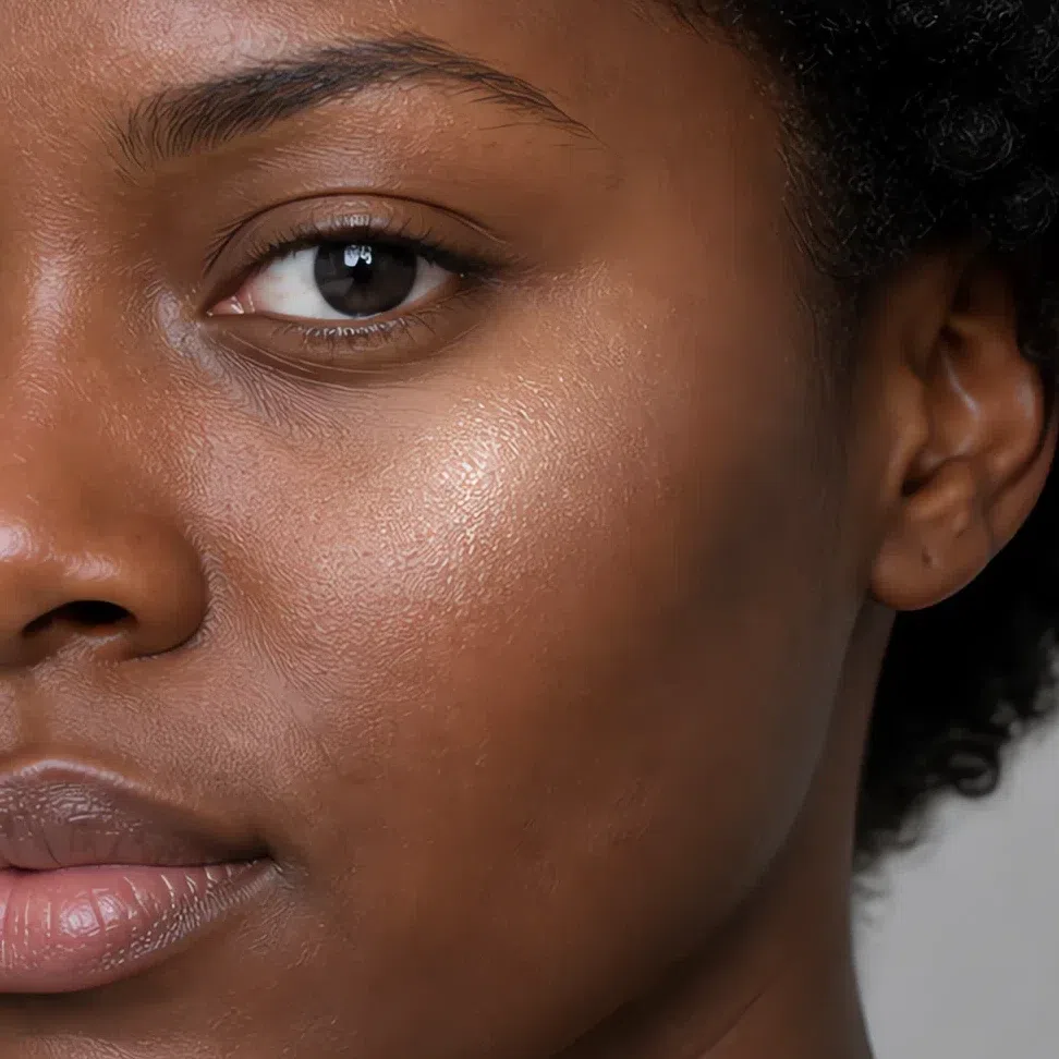
Tip Cheekbones, the bridge of the nose and the cupid's bow. Stop there.
Avoid Cool silver and intense gold. Both of them announce themselves.
Bronzer matched to your depth
Cool taupe-browns used as shadow, not as tan. Orange bronzers sit on top of neutral-cool skin instead of in it.
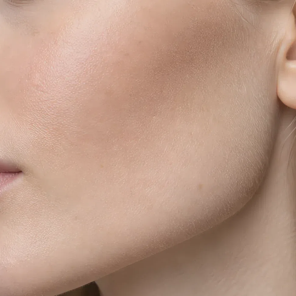
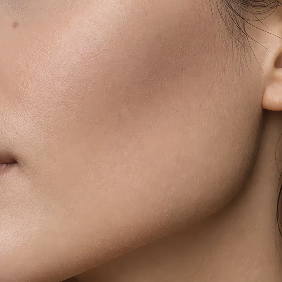
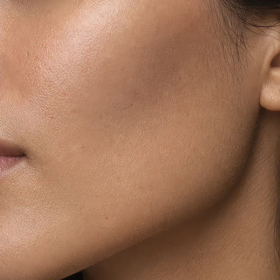
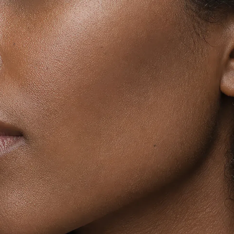
Tip Light sweeps around the perimeter of the face. If it looks like color rather than shadow, it is too warm or too heavy.
Eyes: shadow, liner, mascara
Smoky, muted shades give your eyes depth without hardness. Complex colors with gray in them do the work here: soft browns, plums, olives and dusty roses. The hue family is set by your season; how deep you take it still follows your skin, so the lid shades and the brows carry a depth ramp. Liner and mascara do not - those four shades are the same on everyone.
Everyday eyeshadow
Greyed neutrals a step or two deeper than your lid, plus one muted violet that reads as color without arriving as color.
- Beige-pink #D6C6B9
- Greige #A89C94
- Muted violet #8B7F94
- Olive-gray #83866F
Evening eyeshadow
The same families taken deeper - plum with a satin sheen, and a soft graphite that is the darkest thing your face contains.
- Ash beige shimmer #C3B5A6
- Pewter metallic #8E8C8A
- Plum shimmer #7A5C6E
- Deep graphite #4F4C4E
Eyeliner
Soft brown, gray-brown, plum and soft black. All four are the same on every complexion, because a liner only has to be your darkest.
- Soft brown #6B5140
- Gray-brown #6E6A68
- Plum #5C4453
- Soft black #2E2E30
Mascara
Soft black for most days, plum when you want the lash line to read as color.
- Soft black #2E2E30
- Brown #5A4A42
- Gray #6E6E70
- Plum #5C4453
Brows
A shade at or just under your own hair, never above it.
- Light brown #A08B76
- Umber #806F63
- Ash #8E8C88
- Deep taupe #6A5F54
Lips: nudes and color
Complex, layered shades with gray or brown underneath. The aim is your lips, but better, which means no clean bright color and no high gloss - matte and satin sit better on you. Like blush, the family is fixed by your season and the depth is yours.
Nude shades
Nudes with rose in them rather than beige - a true beige goes chalky against neutral-cool skin.
- Muted rose #D9A6A6
- Soft peach-pink #CF9D8E
- Dusty rose nude #C79A9A
- Gray-beige nude #BFA69B
Colored shades
Dusty raspberry for every day, muted plum and rosewood when you want the mouth to be the color on your face.
- Dusty raspberry #B57F86
- Muted plum #8A6274
- Muted cherry #9C5A60
- Rosewood #A97E78
Hair shades
The colors that work, and the ones that never do
Wondering what to say at the salon, or whether you can go blonde, red or gray? That is a page of its own. Open the hair color page →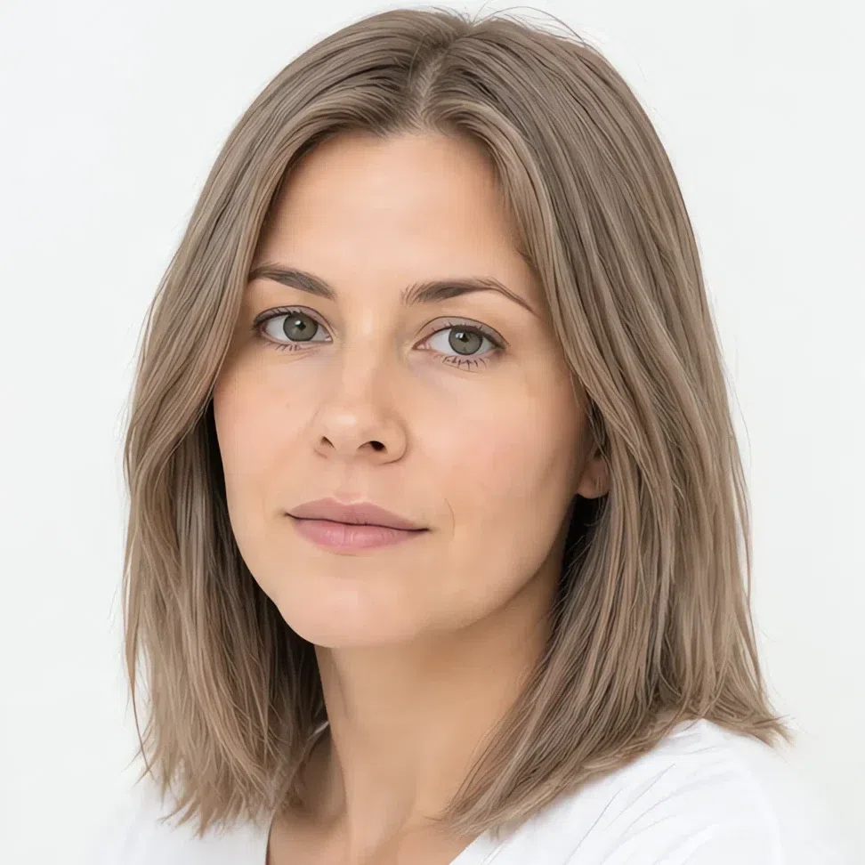
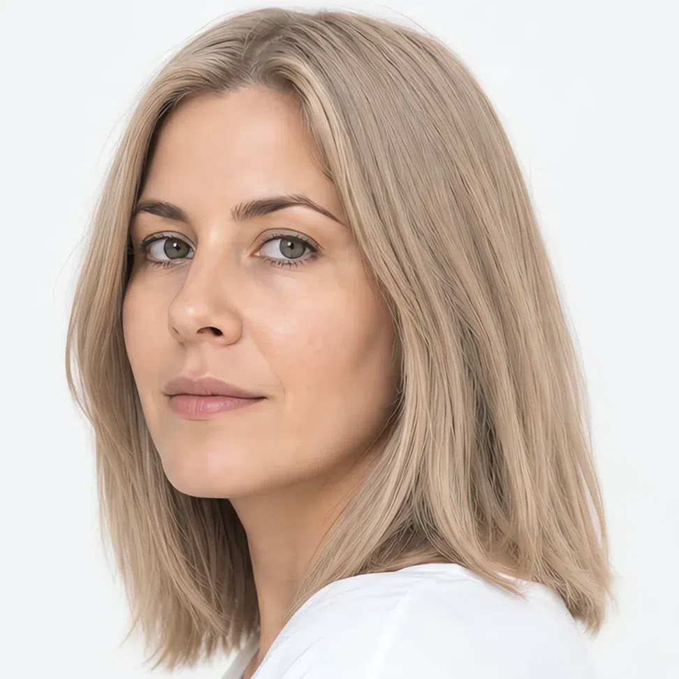
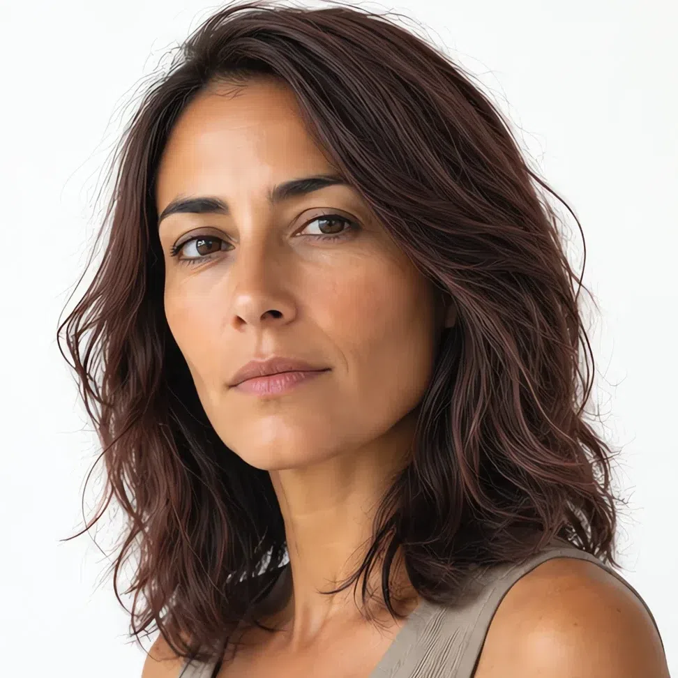

Hair color is not a change of image for a Soft Summer - it is the thing that holds the whole face together. Your coloring is muted and neutral-cool, so the right shade is the one that looks like your own hair, slightly improved: complex, multi-toned and close to your natural depth.
Muted blonde and light brown
The base of the palette is complex, smoky light brown - shades that read as sun-lightened rather than dyed.
Natural, and quietly expensive
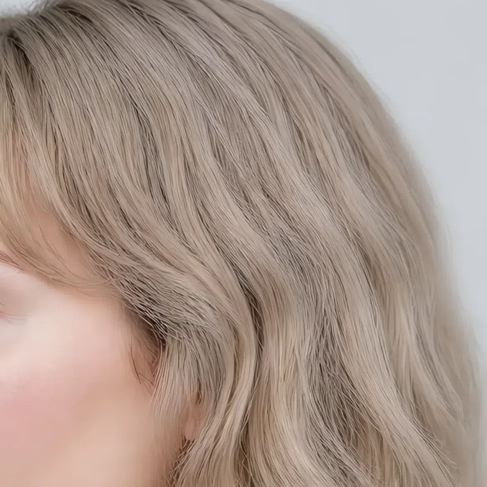
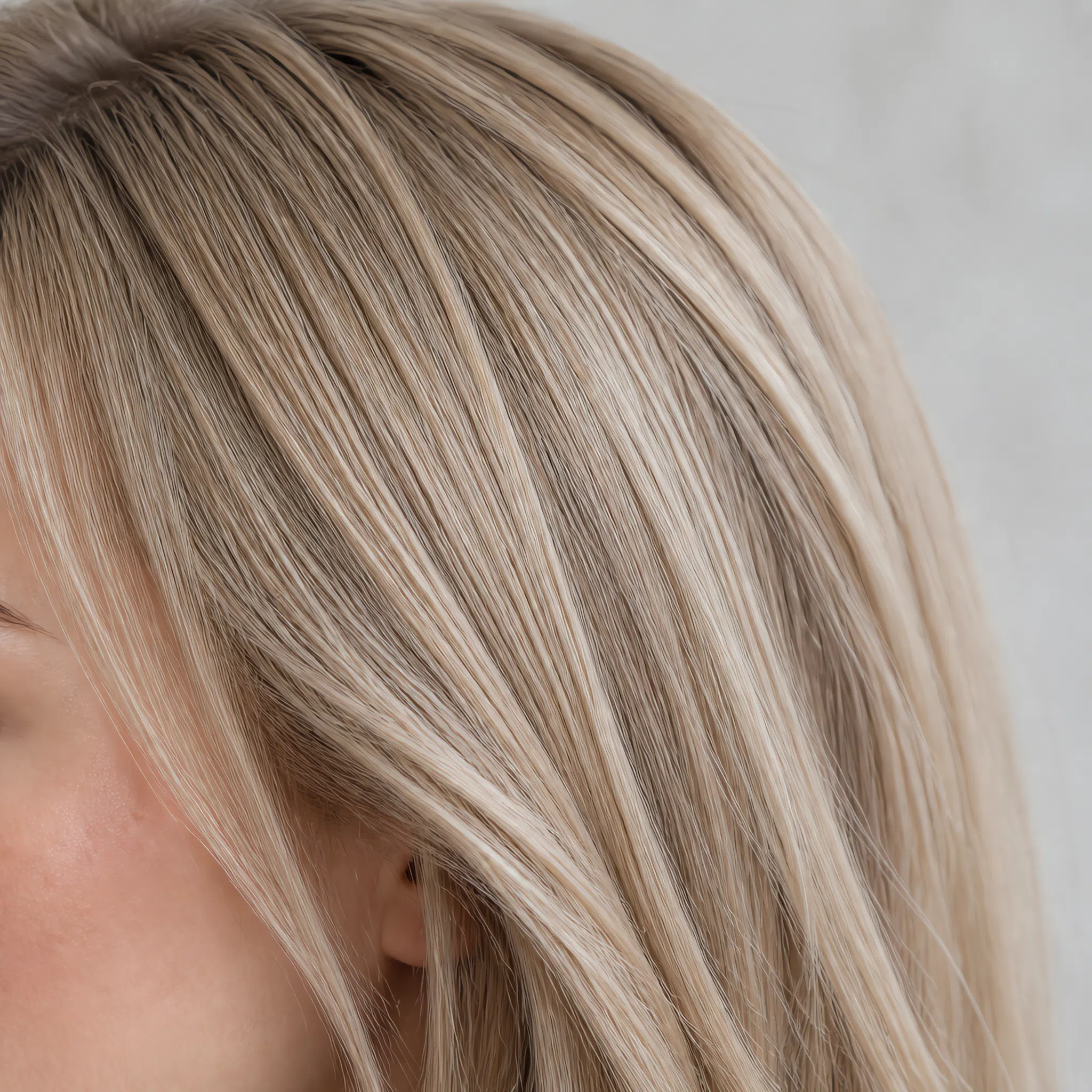
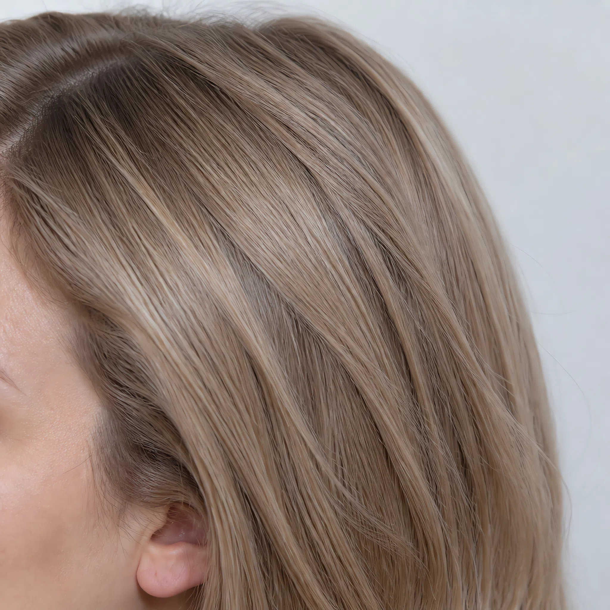
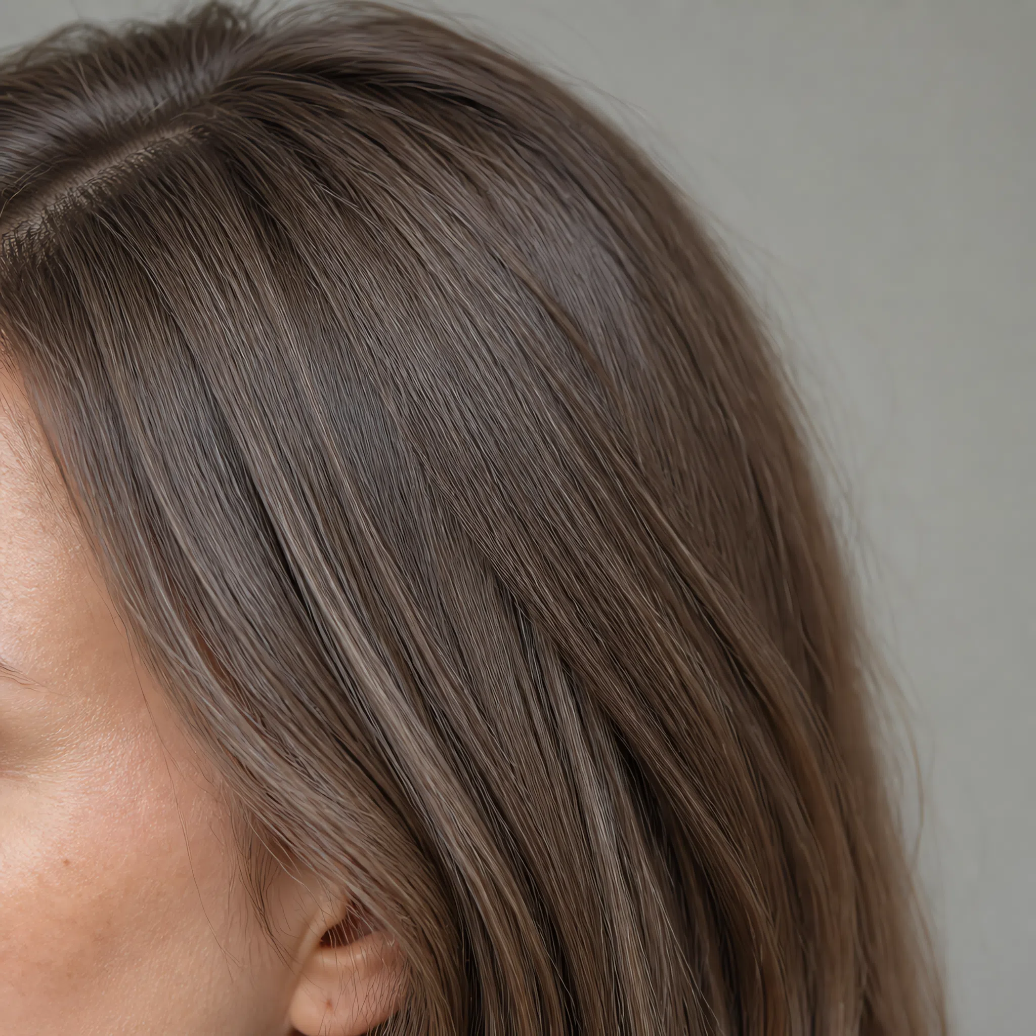
Each strip shows the same tone one level lighter and two levels deeper - the L number is the standard salon level, so you can say it out loud at the chair.
Deeper tones and multi-tonal work
Going darker means going cool and low-contrast. The aim is depth, not sharpness.
Depth without hard edges
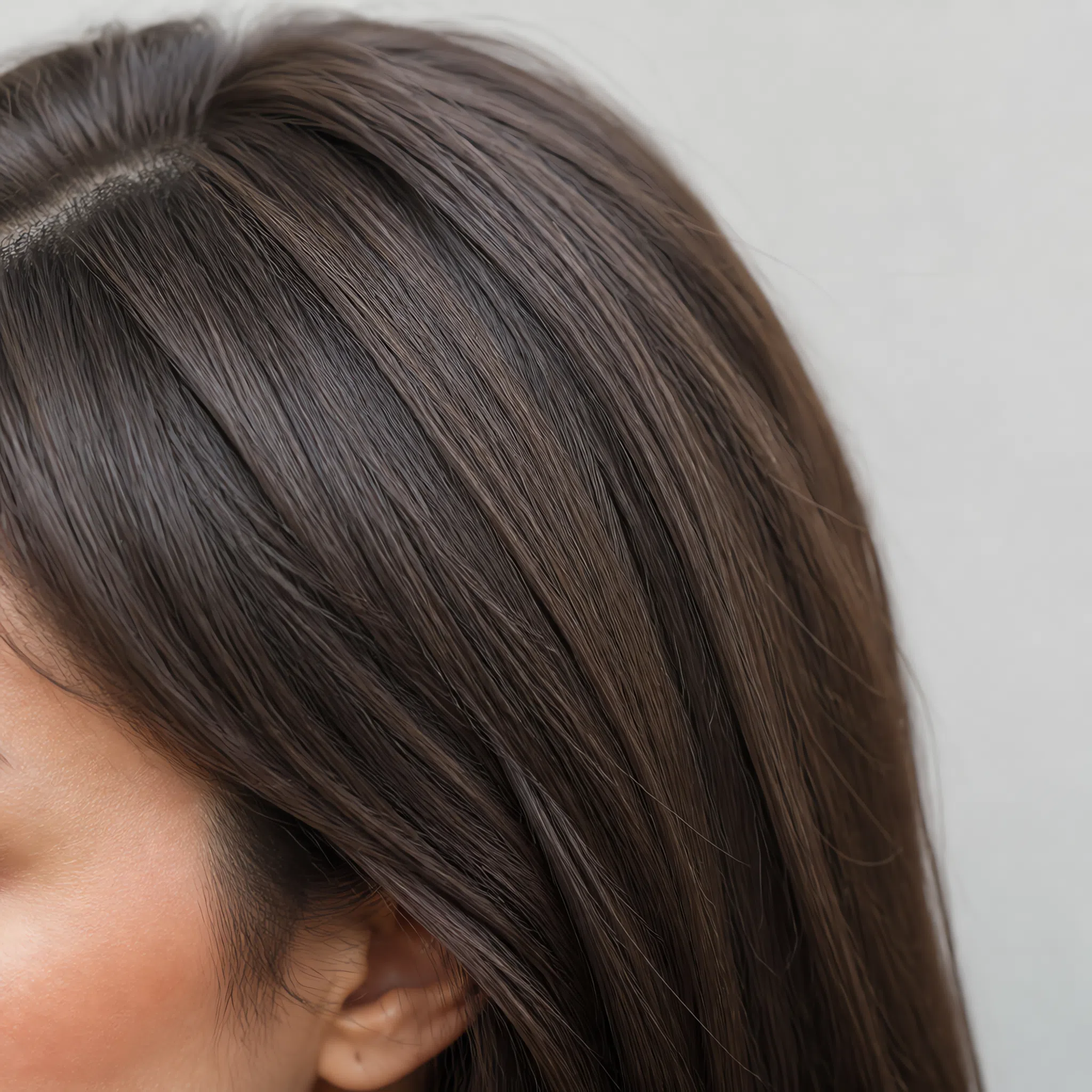
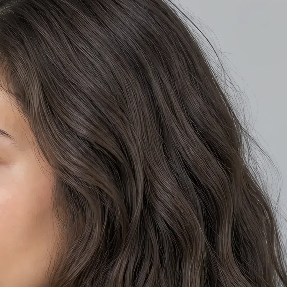
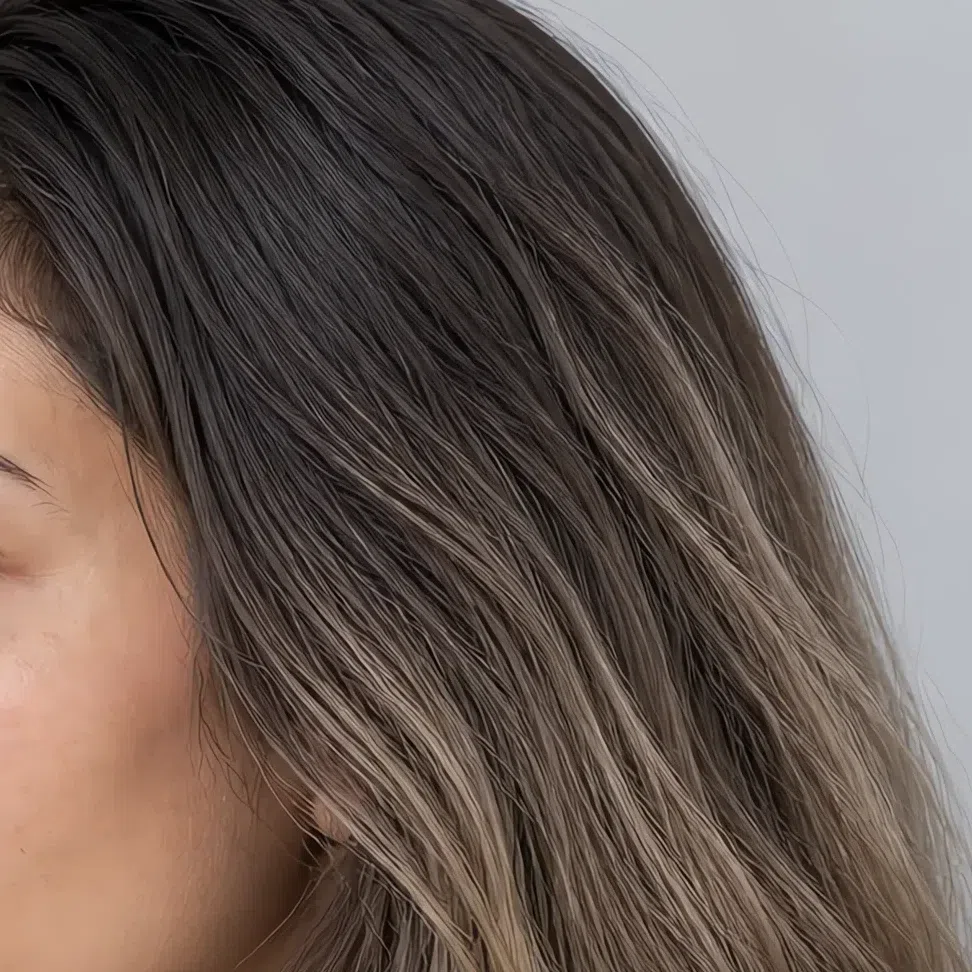
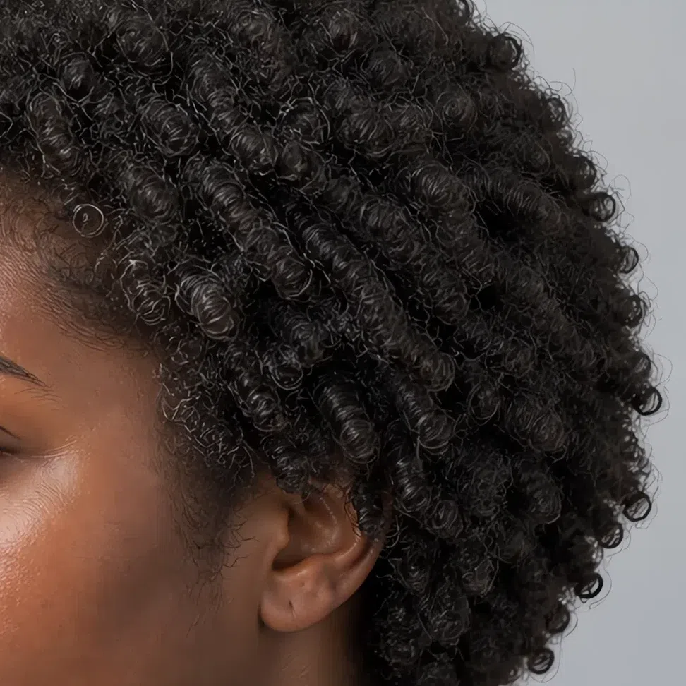
Each strip shows the same tone one level lighter and two levels deeper - the L number is the standard salon level, so you can say it out loud at the chair.
Hair colors to avoid
What is fatal is anything high in contrast, high in brightness, or openly warm - all three fight your muted coloring.
Warm and golden
High-contrast and very dark
Soft Summer vs its neighbors: Cool Summer, Light Summer, Soft Autumn
Where the borders actually run
At a glance the summer subtypes look interchangeable - all cool, all low-contrast, all restrained. The difference is which quality leads. For Soft Summer it is mutedness; for Cool Summer it is coolness; for Light Summer it is lightness. Getting that wrong is the single most common way people end up with a palette that leaves them looking tired.
And one of the borders is not inside summer at all. Soft Autumn shares your mutedness exactly - it differs only in temperature - which makes it the neighbor people confuse you with most often. All four are below.
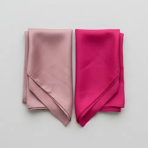
Hold two scarves to your face: dusty rose, and a clean bright fuchsia. Which one freshens you?
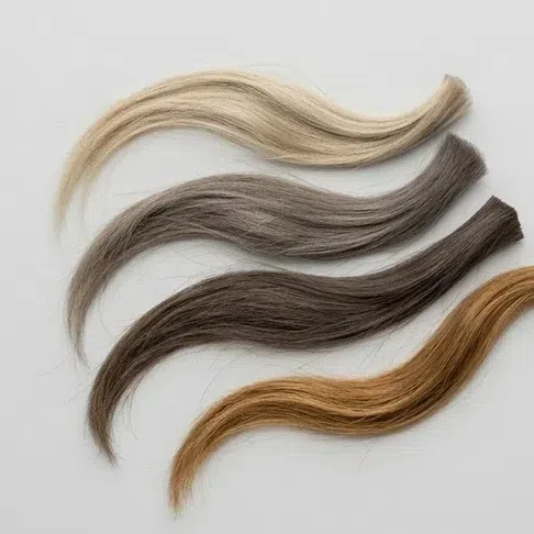
Your natural, undyed hair color
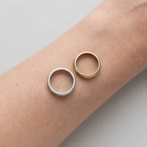
Compare silver and gold against your face in daylight
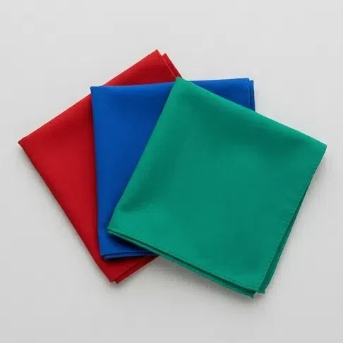
What happens to your face in clean bright color - scarlet, cobalt, emerald?
The signs line up: cool without sharpness, low contrast, and muted beating clean. You are on the right page - start with the palette section above.
Clean cool shades work on you better than dusty ones, and your contrast is more noticeable. That is the signature of Cool Summer.
The full Cool Summer guideLightness is what dominates your coloring: delicate pastels freshen you, and deeper shades weigh you down.
The full Light Summer guideThe mutedness is the same, but the temperature is not: gold suits you better than silver, and warm complex shades beat cool ones.
The full Soft Autumn guideA signs check is a pointer, not a verdict - the borders between subtypes are exactly where people misjudge themselves. Photo analysis is what settles it, because it reads undertone and saturation objectively rather than by eye.
Smoky softness vs crystal coolness
Soft Summer
As muted as it gets - every color reads as though gray went into it. No brightness, only depth and complexity.
Low. Hair, eyes and skin sit in harmony with no sharp step between them.
Complex and grayed: dusty rose, slate blue, olive, cocoa, muted berry. Neutral undertone, no icy edge.
Refined, quiet, a little mysterious. Boho, soft classic, casual.
A misty morning, a landscape at dusk, dried wildflowers, calm sea before rain.
Cool Summer
Moderately muted - cleaner and clearer than Soft Summer. Much less gray; coolness leads instead.
Low to medium, usually higher than Soft Summer. The eyes can be quite bright against skin and hair.
Clean and cool: steel blue, lavender, raspberry sorbet, cool pink. No warmth and no gray mixed in.
Elegant, composed, expensive. Classic, minimal, tailored.
Frosted air, an ice-fed stream, a storm sky, cool-toned gemstones.
Settle it in a minute: Take two lipsticks - a dusty taupe-rose and a classic cool pink. Put one on each side. If the dusty one looks harmonious and the cool pink looks loud and borrowed, you are Soft Summer. If the cool pink is the one that freshens your face, you are closer to Cool Summer.
Muted depth vs airy pastel
Soft Summer
Medium to low, built on mid-depth dusty tones. Shades that are too pale leave you looking washed out.
Low - soft, but not faded. There is real depth here, just no hard steps.
Complex, mid-lightness: gray-green, taupe, denim, vintage rose.
Refined, natural, unhurried. Wants complex texture - suede, linen, cashmere.
An August evening, heather moorland, dried grasses.
Light Summer
Low and watercolor-thin. Lightness is the whole point - every shade looks let down with milk.
Very low - the lightest and least contrasting of the summers. The coloring often gets called delicate.
Cool pastels: sky blue, mint, pale lilac, pearl gray, powder pink.
Soft, romantic, youthful. Suits light flowing fabrics - silk, chiffon, fine cotton.
Morning in a garden in bloom, pearl, mother-of-pearl.
Settle it in a minute: Hold two scarves to your face: a mid gray and a very pale pearl gray. If your face holds the darker, more complex gray without disappearing into it, you are Soft Summer. If it weighs you down and the pale gray makes your skin glow, you are Light Summer.
The same softness, the opposite temperature
Soft Summer
Neutral-cool. Warmth is tolerated but never leads, and gold against the face reads as an intrusion.
Matte silver and white gold. Gold has to be muted and antiqued to work at all.
Gray-based: pewter, taupe with gray in it, slate blue, cocoa with the red removed.
Against pure white the skin reads grayish or simply neutral - never peachy.
Ash at whatever depth it runs. No copper, no gold, ever.
Soft Autumn
Neutral-warm. Same mutedness, opposite lean - and that one flip changes every recommendation on the page.
Soft antiqued gold and bronze. Silver goes flat and lifeless against the skin.
Warm-based: camel, warm taupe, moss, soft chocolate.
Against pure white the skin turns peachy or golden - the clearest single tell between the two.
Golden-brown, soft auburn, warm mid-brown - the warmth is subtle but it is there.
Settle it in a minute: This pair is not separated by softness - you both have it. It is separated by temperature alone. Hold a sheet of plain white paper under your chin in daylight: Soft Summer skin goes gray or stays neutral, Soft Autumn skin goes peachy. If that is still ambiguous, compare matte silver against antiqued gold and take whichever makes the skin look even rather than which you prefer.
Still not certain this is your subtype? Work back through the signs section above, or check yourself against the full color analysis guide. Once the palette is settled, the wardrobe and hair sections on this page are the practical half.
Common questions about Soft Summer
What does it mean to be a Soft Summer?
What colors look best on a Soft Summer?
What are the worst colors for a Soft Summer?
How do I know if I am a Soft Summer?
Can Soft Summers wear navy?
How do I know if I am Soft Summer or Light Summer?
How do I choose foundation as a Soft Summer?
What jewelry suits a Soft Summer?
What hair color suits a Soft Summer?
What is the difference between Soft Summer and Soft Autumn?
What else is Soft Summer called?
Which celebrities are Soft Summer?
What if I got my season wrong?
Where this came from
The sources behind the factual claims on this page - where the four-season system came from, the color vocabulary the palette is built on, and what "low contrast" and "depth" mean as measurements.
-
Color Me Beautiful (opens in a new tab)
Jackson, Ballantine (Internet Archive), 1980
Behind the history in the intro. Color Me Beautiful (1980) is what put seasonal analysis into general use, and it was built on earlier work by Johannes Itten, Belle Northrup and Harriet Tilden McJimsey rather than invented from nothing.
-
A pigment color system and notation (opens in a new tab)
Munsell, The American Journal of Psychology (Internet Archive), 1912
The three axes this page sorts every shade on - temperature, value and chroma - are the axes of a real color-order system. Munsell separates hue from value (how light) and chroma (how saturated), and Soft Summer is defined by low chroma, which is why “muted” is a measurable property here and not a mood.
-
The Art of Color: the subjective experience and objective rationale of color (opens in a new tab)
Itten, Reinhold (Internet Archive), 1961
The contrast idea underneath “low contrast” in the signs. Itten taught color as a set of contrasts - light-dark, warm-cool, saturation - at the Bauhaus, and it is his student Belle Northrup’s warm/cool split that seasonal analysis descends from.
-
Aspects of facial contrast decrease with age and are cues for age perception (opens in a new tab)
Porcheron, Mauger & Russell, PLoS ONE, 2013
And the same idea measured on faces. Facial contrast - how much the eyes, brows and lips stand out from the surrounding skin - can be quantified from a photograph, it varies between people and it changes with age. That is the number a Soft Summer has less of, and the reason the palette stays a step from the skin rather than a leap.
-
Non-invasive measurements of skin pigmentation in situ (opens in a new tab)
Stamatas, Zmudzka, Kollias & Beer, Pigment Cell Research, 2004
Behind the appearance section. Skin depth is set by melanin, the flush by hemoglobin, and the two are measured as separate signals - which is why depth varies independently of undertone, and why this page shows every shade on four complexion depths instead of assuming one.
One honest distinction. The history, the color vocabulary, the contrast research and the skin biology above are sourced; which shades suit a Soft Summer is our own analysis. Seasonal color analysis is a styling framework, not a clinical finding, and no paper anywhere says this palette is correct for you. The test is your own face in daylight.
What is color analysis, how do you find your season, and what are the 12 types?
The main guide covers all of it - the four axes your season is built from, all twelve subtypes side by side, and a free quiz that places you in about a minute.
What is color analysis? For women and men