Cool Summer makeup: your shades, and how to apply them
Cool Summer makeup runs on one setting: blue-based, and clear rather than dusty. Pink where other seasons reach for peach, plum where they reach for bronze, silver where they reach for gold. What follows: sixteen faces at four skin depths, the four products in the order they go on, and a shade list short enough to photograph and take to a counter.
- Four steps, in order
- Four complexions
- Everyday and evening
The order you apply it in
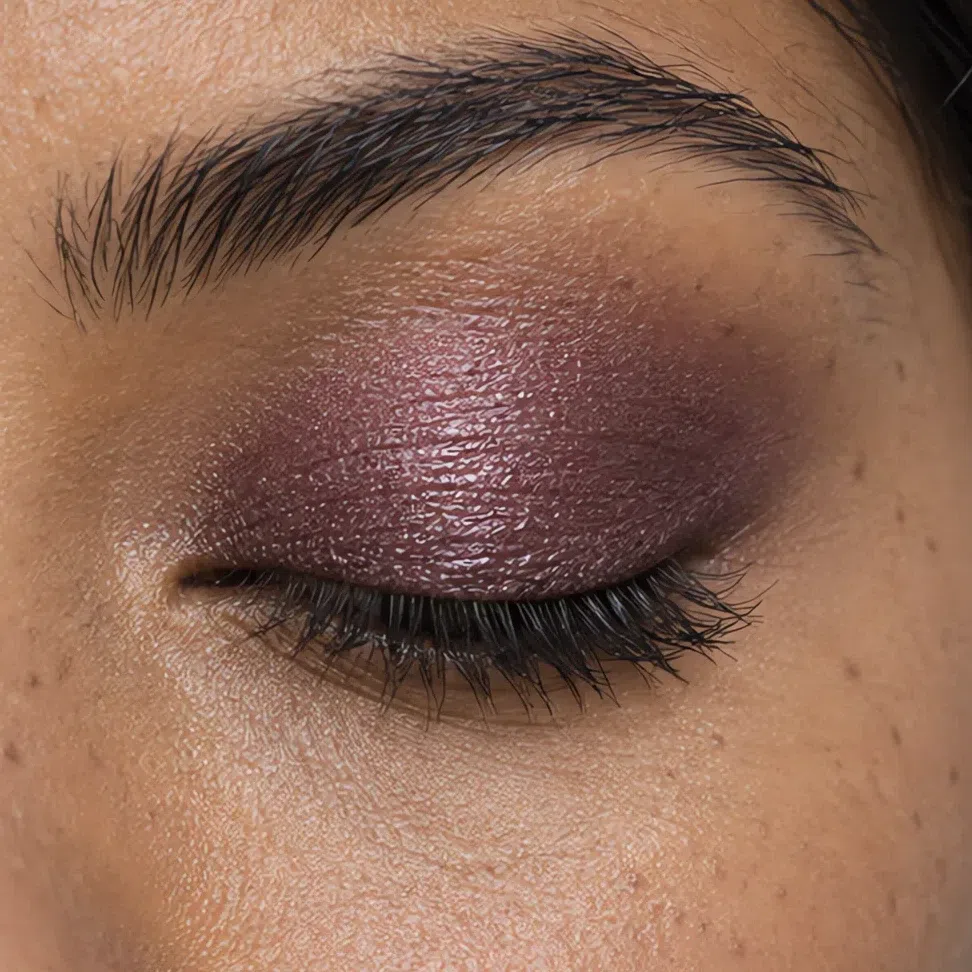

Start here
You are a Cool Summer. Here is what to put on.
Skin, hair and eyes on this coloring all run blue-based, and not one of them carries a trace of gold: ash hair at whatever level it comes in, a pink or plum-rose undertone, eyes that read gray before they read anything else. The step from hair to skin is soft rather than sharp. Those two facts are what everything on this page follows from.
They pull in opposite directions, which is why this is the season people get wrong twice. Temperature is unforgiving - one note of yellow and the face goes sallow. Clarity is not: yours are the clean shades in the summer family, and the advice to soften everything takes away the one thing holding the face up.
Stay blue-based and stay clear: warmth ruins this face, dulling it empties it, and the weight of a winter is not yours to borrow.
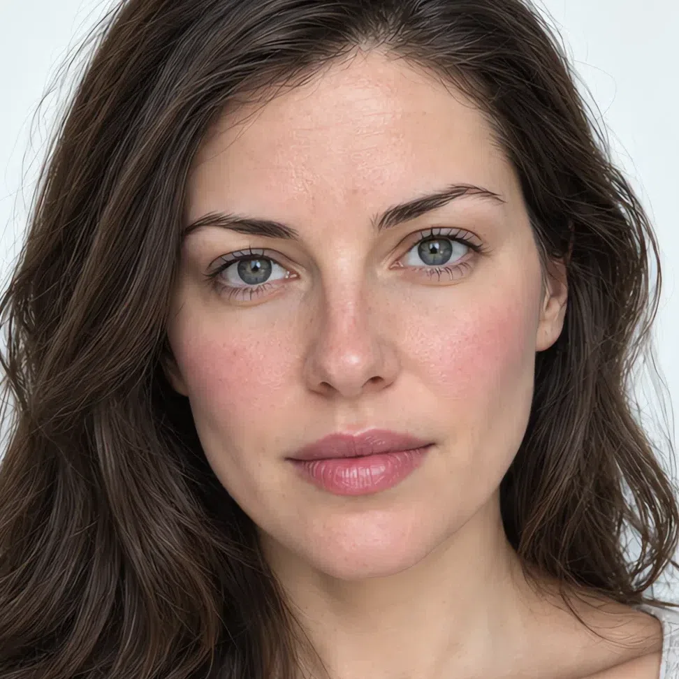
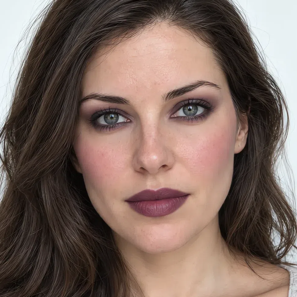
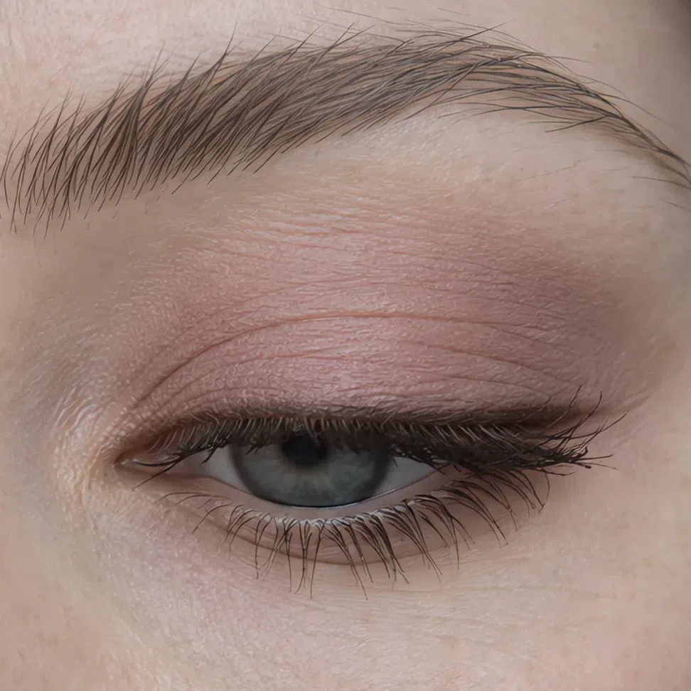
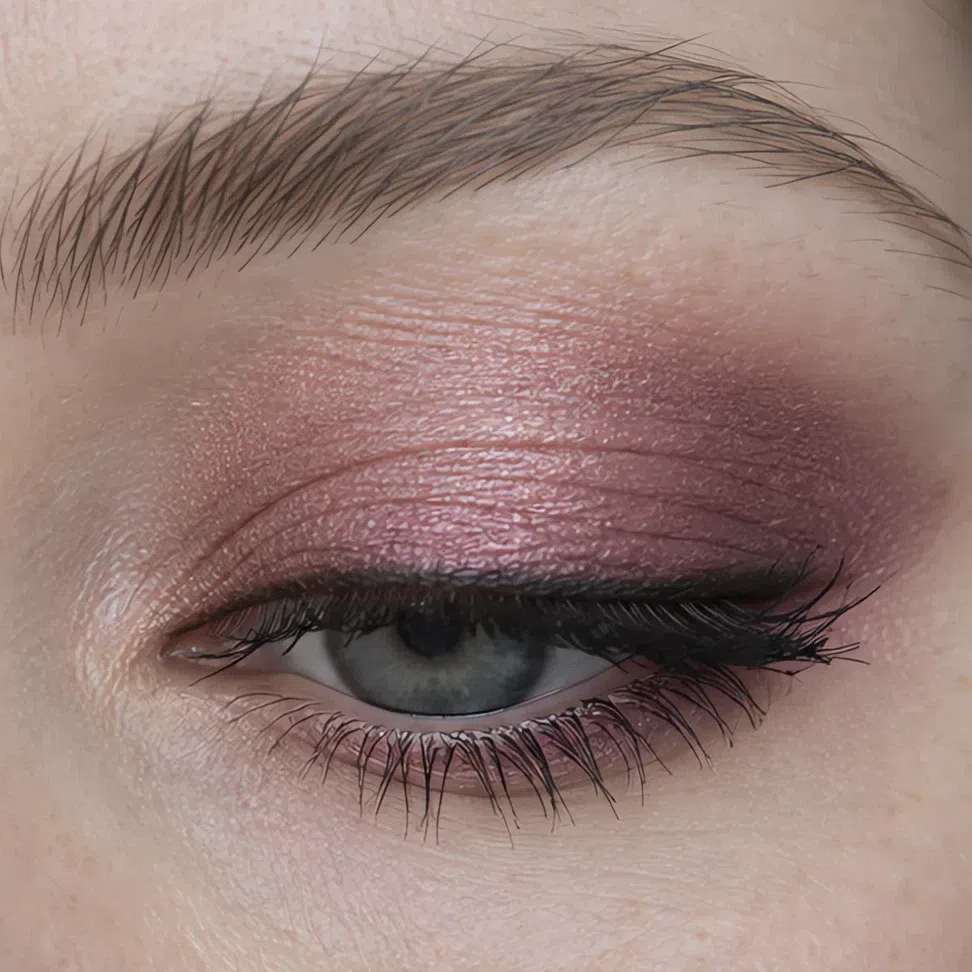
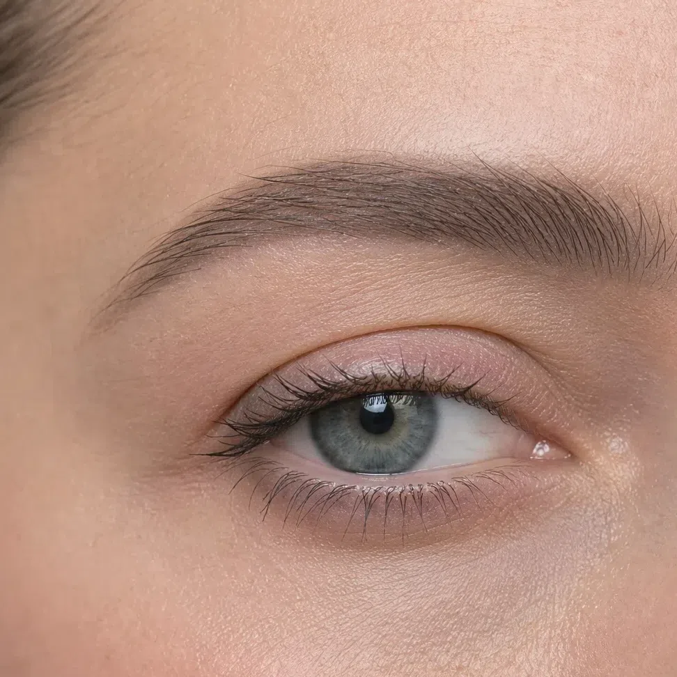
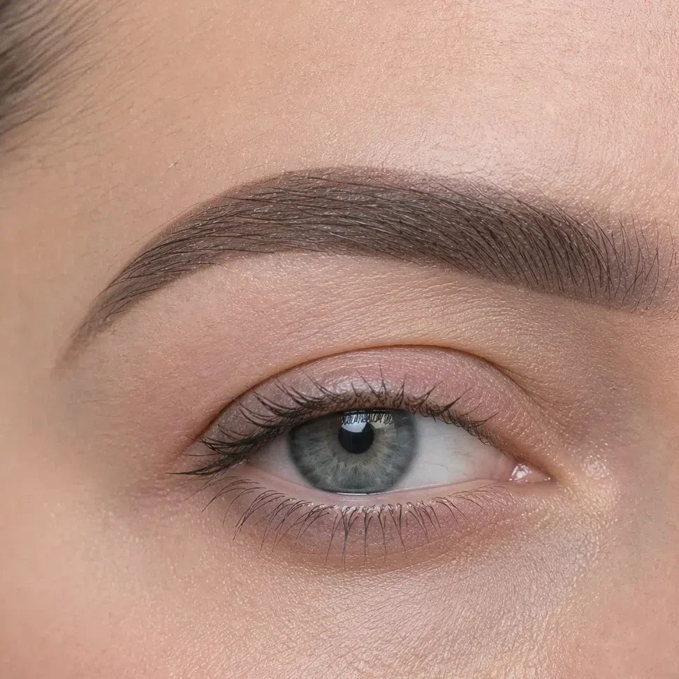
One woman at both ends of her own range, photographed on a medium complexion. The rest of the page is the ground between those two frames, and the section immediately below runs the same four occasions across all four depths.
What is on this page
- Sixteen finished looks Four occasions at four complexions, each card naming the shade on every feature.
- Why these shades The four swaps that carry most of it, set against what a Cool Summer usually owns instead.
- How to build it The four products in application order, and the technique that makes each one sit down rather than sit on top.
- When you need more The two things to take further after dark, and the four that have to stay put.
- How to buy it Reading a label, testing on the jaw, and why the test most people run settles nothing.
- The shade list Every shade on this page in one block. Screenshot it and go.
Sixteen finished looks
Shade names mean very little until they are on somebody, so start here. Sixteen faces: four occasions across four complexions, each card listing what went on which feature. Pick the row closest to your own skin and work along it. The card at the end of each row is the ceiling, the most a Cool Summer will carry, and it sits lower than most of the internet suggests - which turns out to be the good news.
If you have fair skin:
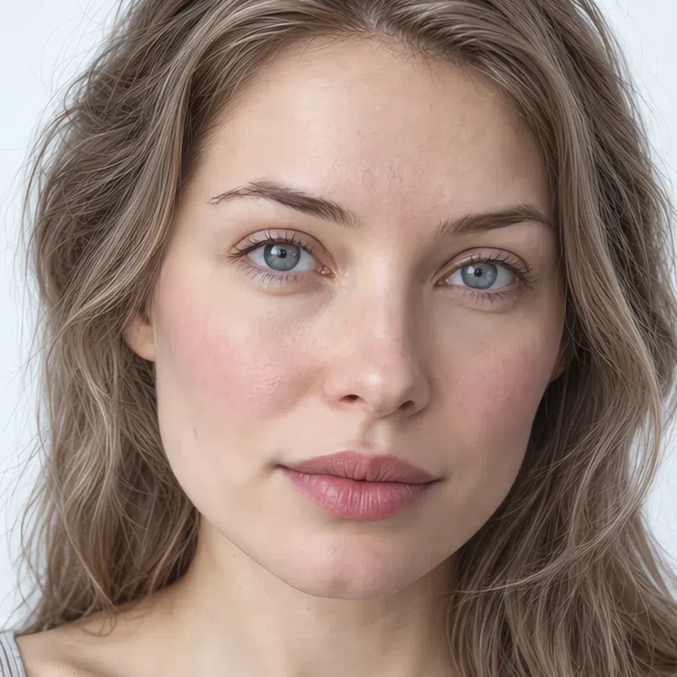
- Base Base - porcelain pink
- Blush Cool pink blush
- Lips Pink nude
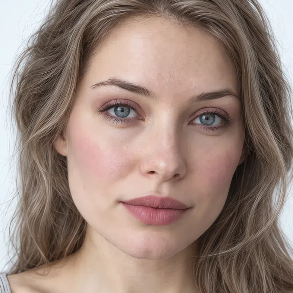
- Base Base - porcelain pink
- Blush Cool pink blush
- Eyes Rose gray lid
- Liner Dark cocoa liner
- Lips Pink nude
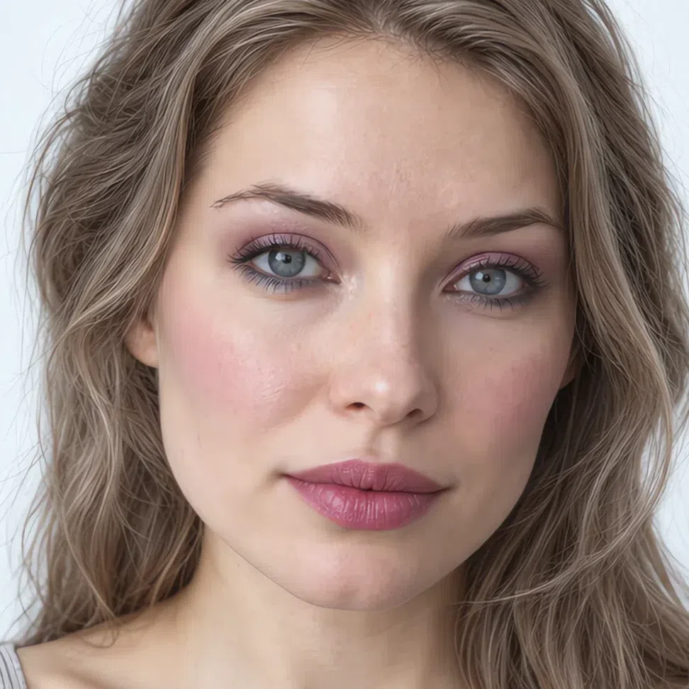
- Base Base - porcelain pink
- Blush Lilac pink blush
- Eyes Rose metallic
- Liner Gray-blue liner
- Lips Berry ice

- Base Base - porcelain pink
- Blush Berry flush
- Eyes Violet brown
- Liner Soft black liner
- Lips Matte fuchsia
If you have light skin:
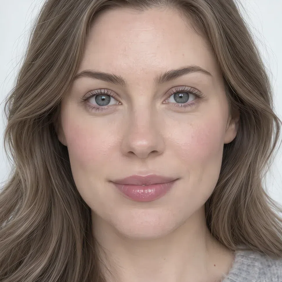
- Base Base - cool olive beige
- Blush Lilac pink blush
- Lips Cool pink lip
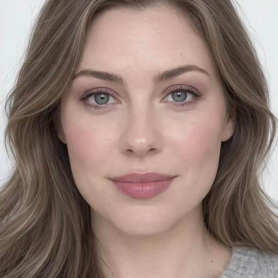
- Base Base - cool olive beige
- Blush Lilac pink blush
- Eyes Pink haze lid
- Liner Dark cocoa liner
- Lips Cool pink lip
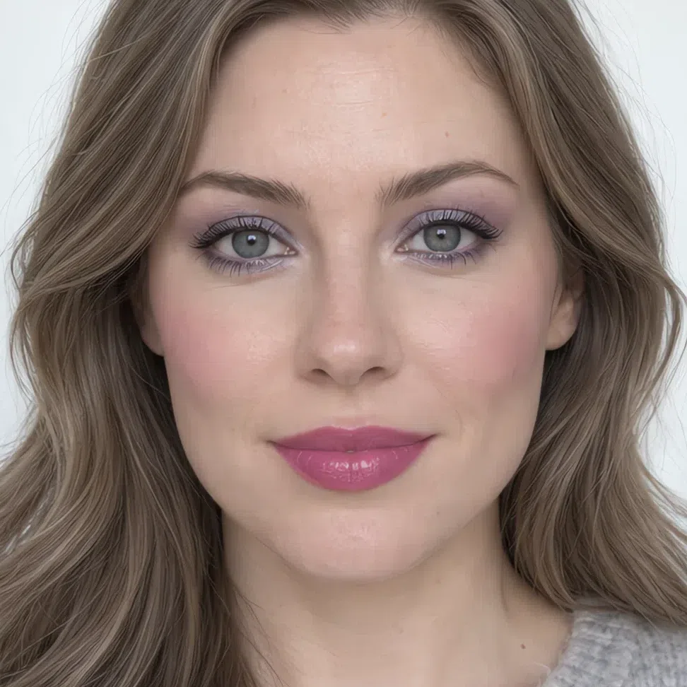
- Base Base - cool olive beige
- Blush Berry flush
- Eyes Moonlit lilac
- Liner Gray-blue liner
- Lips Matte fuchsia
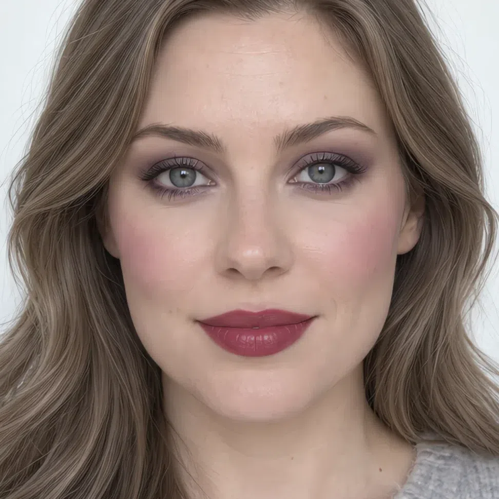
- Base Base - cool olive beige
- Blush Raspberry mousse blush
- Eyes Violet brown
- Liner Soft black liner
- Lips Deep cranberry
If you have medium skin:
- Base Base - soft rose beige
- Blush Berry flush
- Lips Mousse pink
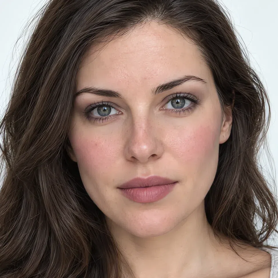
- Base Base - soft rose beige
- Blush Berry flush
- Eyes Smoky taupe lid
- Liner Dark cocoa liner
- Lips Mousse pink
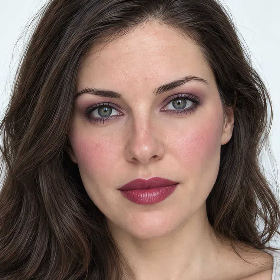
- Base Base - soft rose beige
- Blush Raspberry mousse blush
- Eyes Plum night
- Liner Gray-blue liner
- Lips Deep cranberry
- Base Base - soft rose beige
- Blush Raspberry mousse blush
- Eyes Violet brown
- Liner Soft black liner
- Lips Plum lip
If you have deep skin:
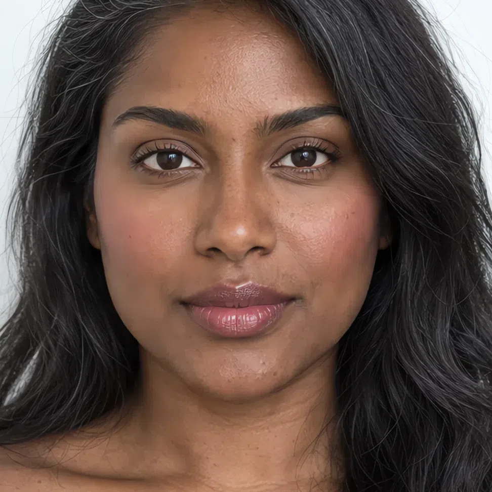
- Base Base - deep plum brown
- Blush Raspberry mousse blush
- Lips Cocoa pink
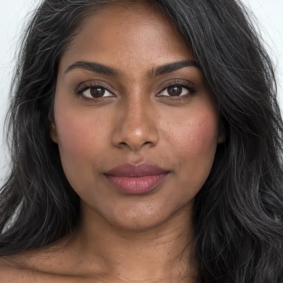
- Base Base - deep plum brown
- Blush Raspberry mousse blush
- Eyes Ash brown lid
- Liner Dark cocoa liner
- Lips Cocoa pink
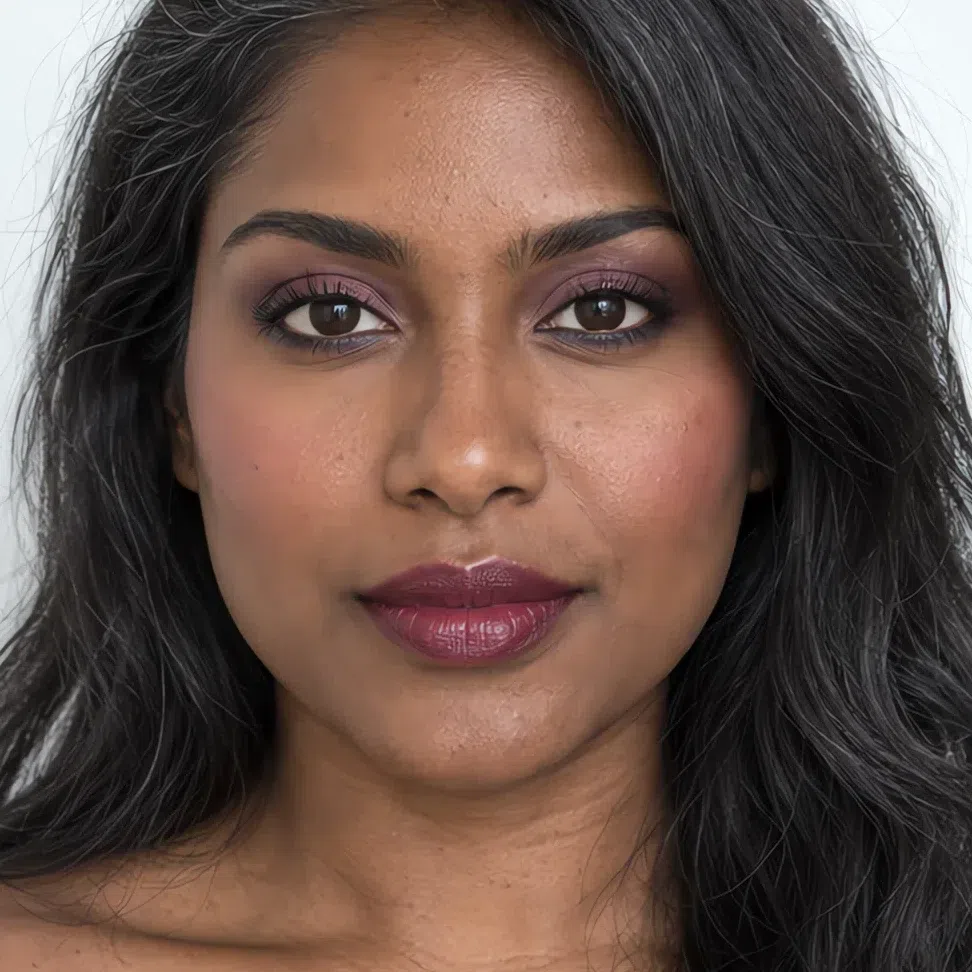
- Base Base - deep plum brown
- Blush Raspberry mousse blush
- Eyes Plum night
- Liner Gray-blue liner
- Lips Deep cranberry
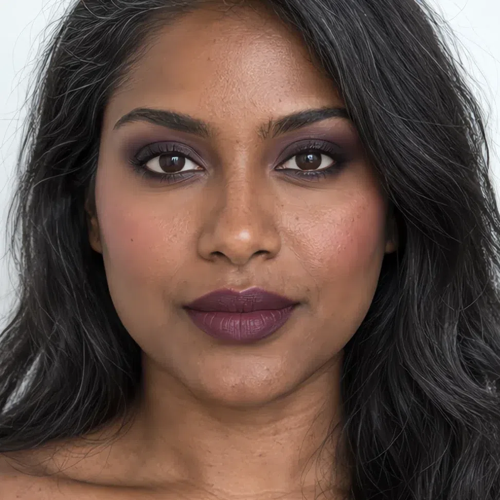
- Base Base - deep plum brown
- Blush Raspberry mousse blush
- Eyes Violet brown
- Liner Soft black liner
- Lips Plum lip
Read down any column: the occasion holds still and the shade names move. A cool pink that passes for a flush on porcelain has stopped registering by the time you reach deep brown, so the name has to change - there is no single correct value here, only a correct position on the row. Which leaves one obvious question, and the next section takes it: why this set of shades rather than the ones already in the bag?
Why these shades, and not the ones you own
Strip those sixteen faces back and a short list of decisions is doing the work. Four of them account for most of it, and each is set here against the shade a Cool Summer tends to already own. Not one of the four is a strawman, and not one is wrong by color family - they miss on temperature, on depth, or on how much gray has been stirred in.
Why these shades and not those
Tap a productYour hair is ash at every level it comes in, from dark blonde to graphite, and ash is never the darkest thing a face can hold. Jet black is, so it arrives with no partner anywhere above it and stops reading as your lash line - it reads as a line someone drew there. Soft black is a shade off it and lands as lashes.
This is the one piece of advice everybody with gray-blue eyes gets handed, and it is why copper is in half the palettes we are asked about: orange is opposite blue, so the iris does jump. It jumps by putting a warm metal on the one coloring with no warmth in it, and the price you pay is the skin around it, which goes sallow while the eye is busy winning.
The over-correction, and the one that arrives after somebody has been told to go softer. It is the right temperature and the wrong clarity: your shades are the clean ones in the summer family, and gray mixed into a pink on skin this clear does not read as understated, it reads as a mark that has been there a few days.
A beige nude is warmer and paler than your own mouth, so it does not decorate the lip, it deletes it. The face loses the feature that was carrying its color and the whole thing drops a step, which then gets blamed on the skin and treated with more base.
One side of this widget moves and the other does not, and that asymmetry is the whole argument. Your shade travels down the column as skin deepens - what is cool pink at the top is raspberry at the bottom - so asking for one correct hex is asking the wrong question; pick yours out of the cheat-sheet. The failure sits still at one value, because warmth, depth and gray are not things your complexion has any say in. Eyeliner makes the point by having nothing to move: soft black is soft black on all four of you. Values printed on the failing side stand for the mistake; they are not lifted off a product.
What links the four is the direction of the error rather than the hue. Every shade in your palette is blue-based and clear, so there is no yellow anywhere on your face and not much gray either. Introduce one of them and it becomes the only thing in the frame - which is how a copper lid and a dusty blush manage to fail for opposite reasons and look equally wrong doing it.
Choosing the shade is the half that can be done from a screen. The other half is where it lands and how much of it is still there at six o'clock, and that is quicker to show in order than to argue about.
How to build it, step by step
So here are those four swaps again, this time in the order they actually go on. The shades are the straightforward half. What follows each one is the technique, which is what keeps a face with a soft step between hair and skin from either vanishing under the product or being annexed by it.
-
Base
Pink underneath, and gone by the jaw
Your base shades, by depth
The season decides the undertone - cool to neutral-cool, pink or rose rather than gold, and a grayed cool olive counts. Only your own skin decides how deep it goes.
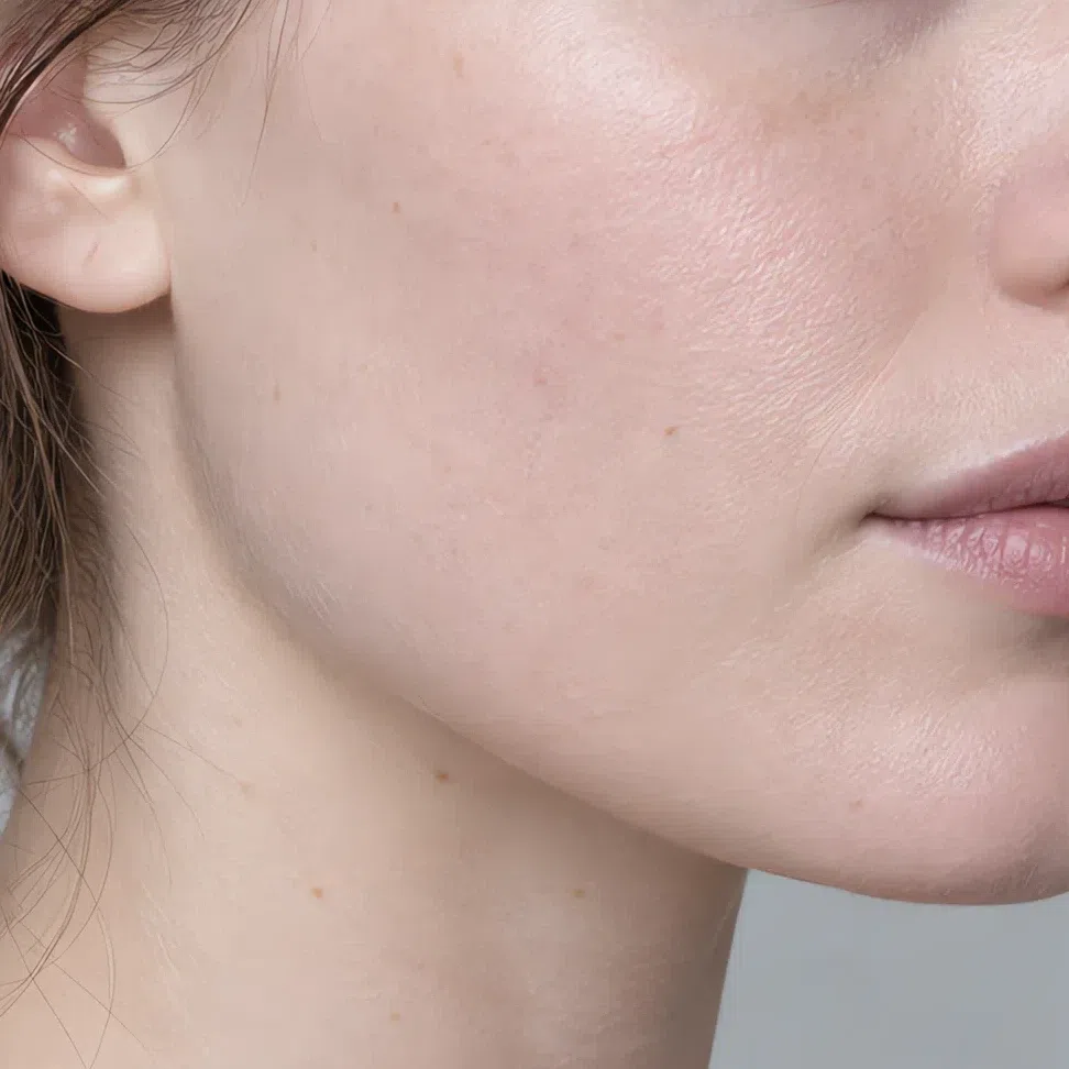
Fair - Foundation Base - porcelain pink #EED6CF
- Bronzer Contour - pale ash taupe #C4AA9D
- Highlighter Glow - pearl white #F3E7E6
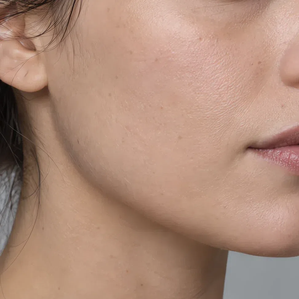
Light - Foundation Base - cool olive beige #D8BFAC
- Bronzer Contour - gray taupe #A98F82
- Highlighter Glow - pink moonlight #EBCFCB
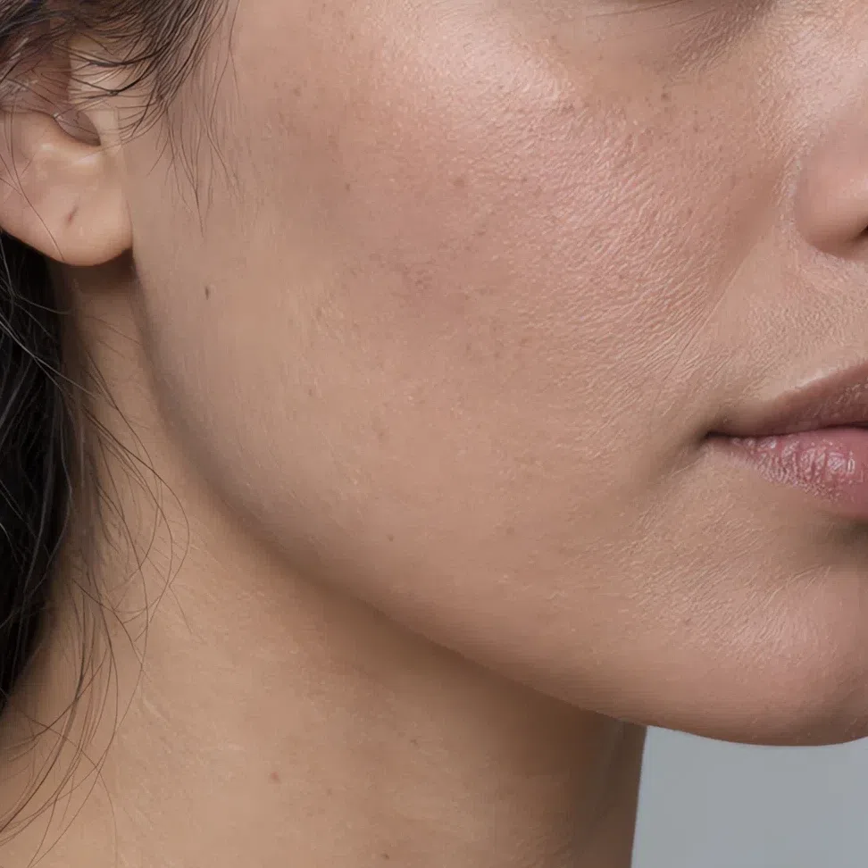
Medium - Foundation Base - soft rose beige #C29A86
- Bronzer Contour - mid ash taupe #8C6D60
- Highlighter Glow - rosy pearl #D9B2AE
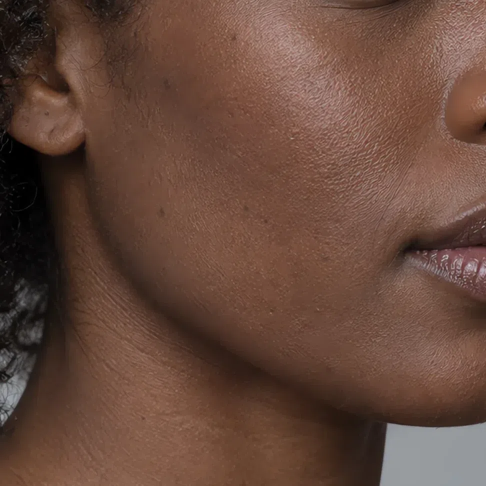
Deep - Foundation Base - deep plum brown #6F4A3F
- Bronzer Contour - deep ash taupe #5E4238
- Highlighter Glow - rose lilac #B98C92
Between two depths, take the lighter one. A base half a step dark stops looking like skin at the jawline first, and on a cool complexion it goes there fast.
Coverage decides more here than shade does. This skin comes up cool pink by itself and that flush is a large share of the color you own - bury it under full coverage and you are left with a flat plane that then needs blush just to look inhabited. Sheer to medium, fingers or a damp sponge, worked into the middle of the face and thinned away to nothing well before the hairline and the jaw.
The other two are placement problems rather than shade problems. Bronzer is a shadow here, not a tan - a cool taupe a step or two under your skin, kept along the top of the cheekbone and worked until you would read it as the light in the room rather than as a product. Highlighter goes on as a narrow satin band, cheekbone and nose bridge only. A fine pearl lifts this complexion; anything with visible particles in it sits on the surface like grit.
Tip Powder only where you actually move - the T-zone, if anywhere. A full mattifying layer takes away the returned light your cheekbones are being drawn with.
-
Cheeks
A flush, not a shape
Blush is the first color to go on and it does more here than anywhere else, because your face already knows how to make this exact color and the job is only to agree with it.
Blush
Cream formula, and it is not a close call: cream goes into the skin and comes back looking like circulation, which is the only impression blush should ever give on this face. A fingertip, high on the bone, one pass feathered back toward the temple. Anything placed as a circle on the apple reads as a doll. Two thin passes maximum, and stop at the point where you notice it as a color.
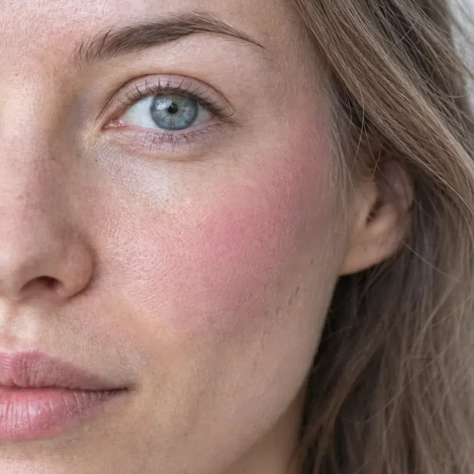
Cool pink blush #E1A3B1 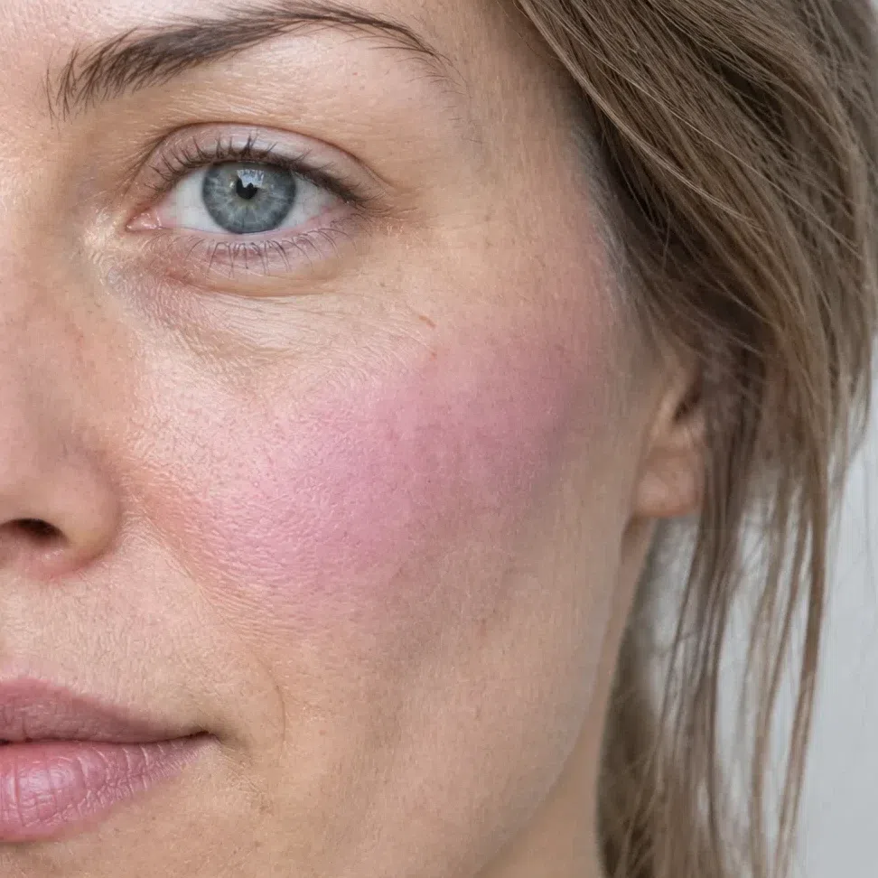
Lilac pink blush #C58EAE 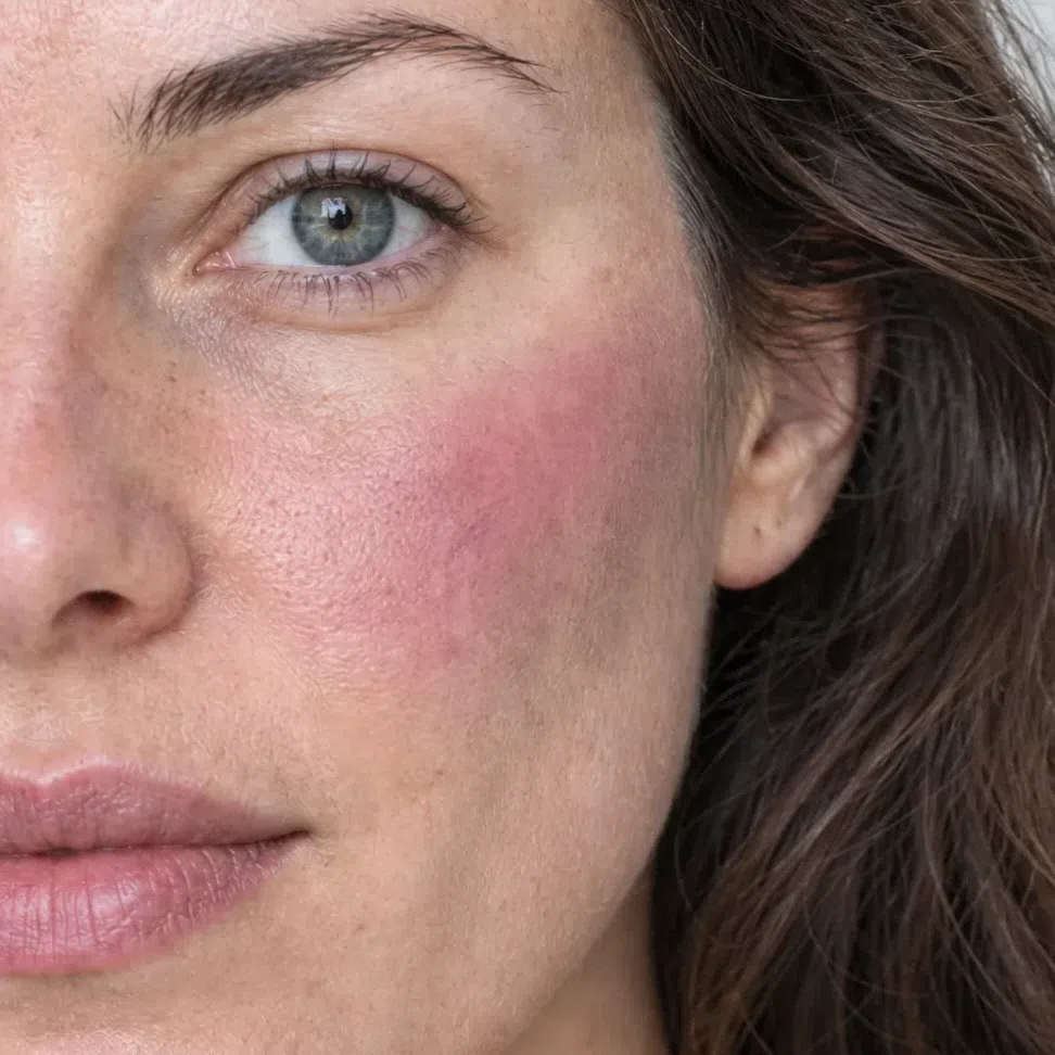
Berry flush #BF7890 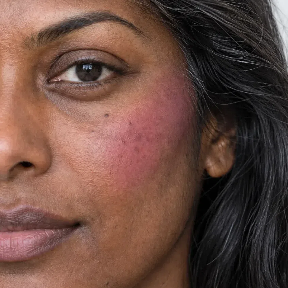
Raspberry mousse blush #AE5A7C Tip Reading as a color rather than a flush is a quantity problem, not a hue problem. Lift half of it with a clean finger before you reach for a different shade.
-
Eyes
Brows, one wash, a smudge, and the lashes
In that order, because each one sets the ceiling for the next. Brows first: they decide how much weight the eye can carry before anything else goes near it.
Brows
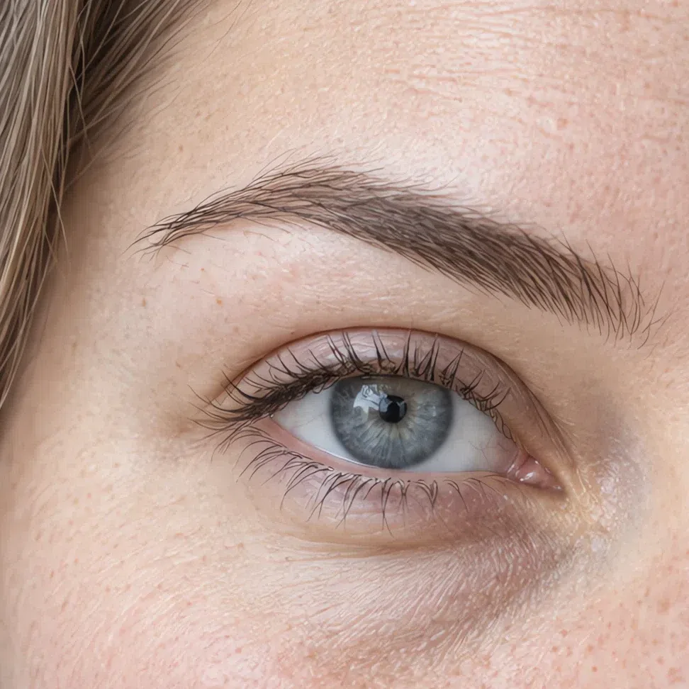
Gaps only. Short strokes in the direction the hair already grows, using a powder or a soft gel a step under your own level and inside the ash family. Brush up, leave the tail feathered. An outline is the heaviest mark available to a face whose own edges are all soft - and a warm brow pencil is far and away the most common reason a Cool Summer looks sallow and cannot work out which product did it.
Dark ash blonde brow #A08F80 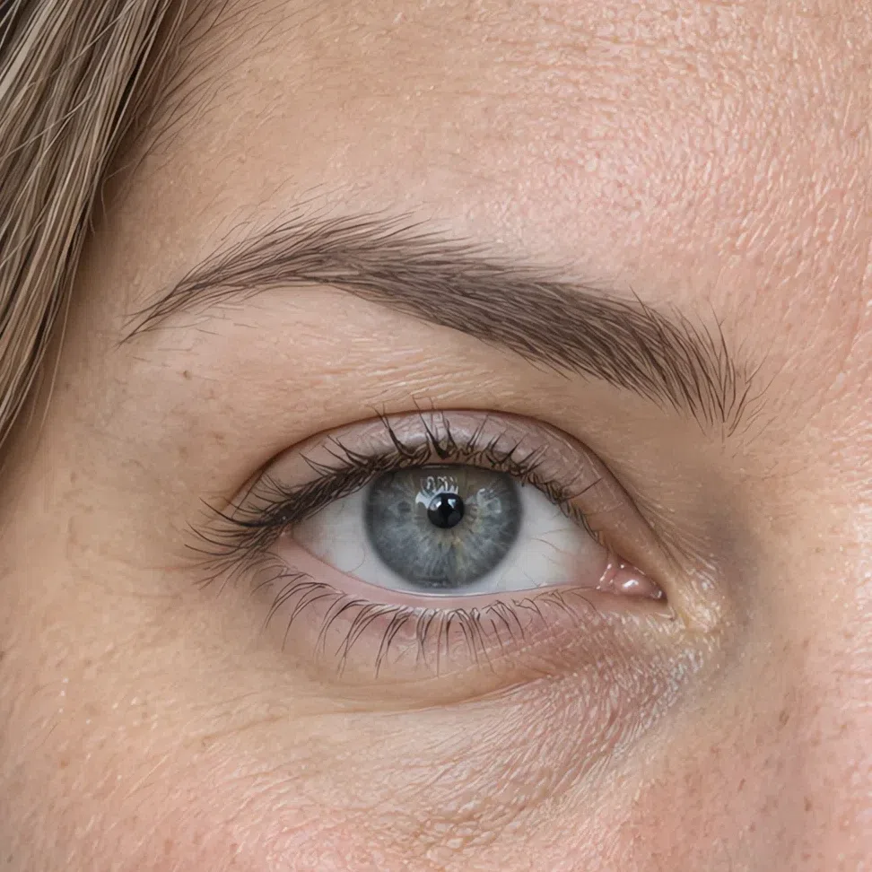
Cool taupe brow #8D7E78 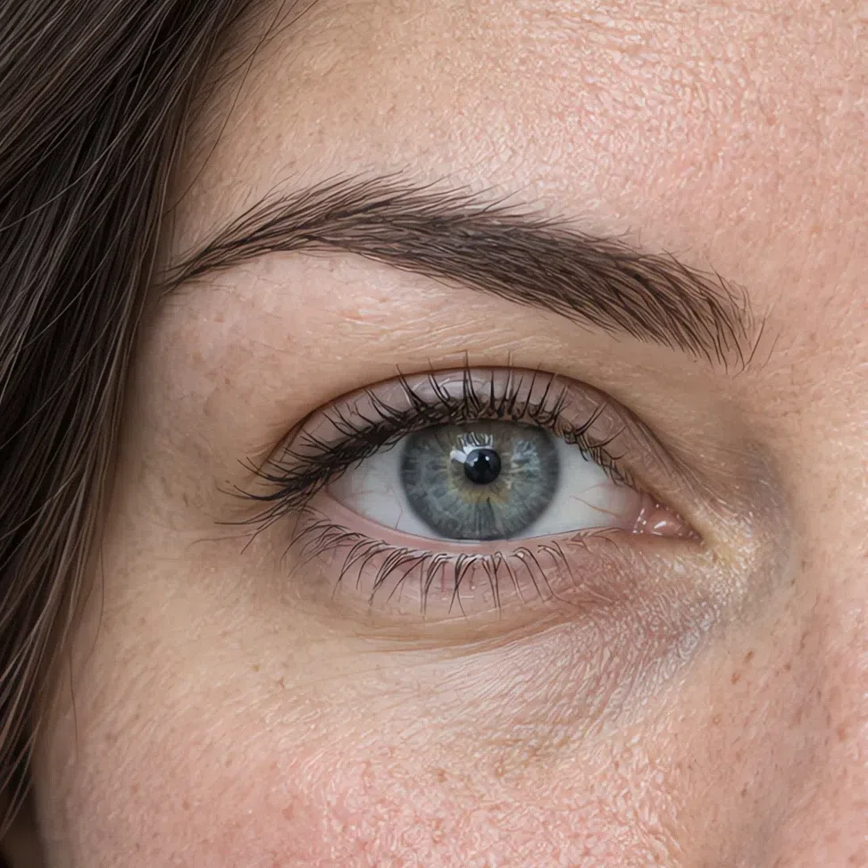
Ash brown brow #76675F 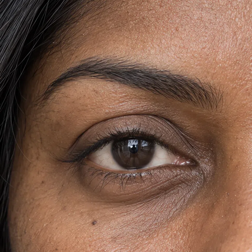
Soft graphite brow #4F4E53 Everyday eyeshadow
One wash, edge to edge, in a matte or satin finish. These four are doing depth rather than color: they put a shadow on the lid so the eye has somewhere to sit, which is the whole daytime job. Take it up to the socket line and stop - the crease work belongs to the evening section.
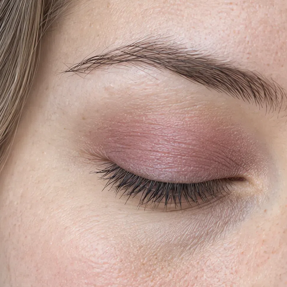
Rose gray lid #CDBBC0 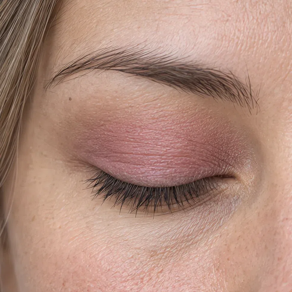
Pink haze lid #D3A9B0 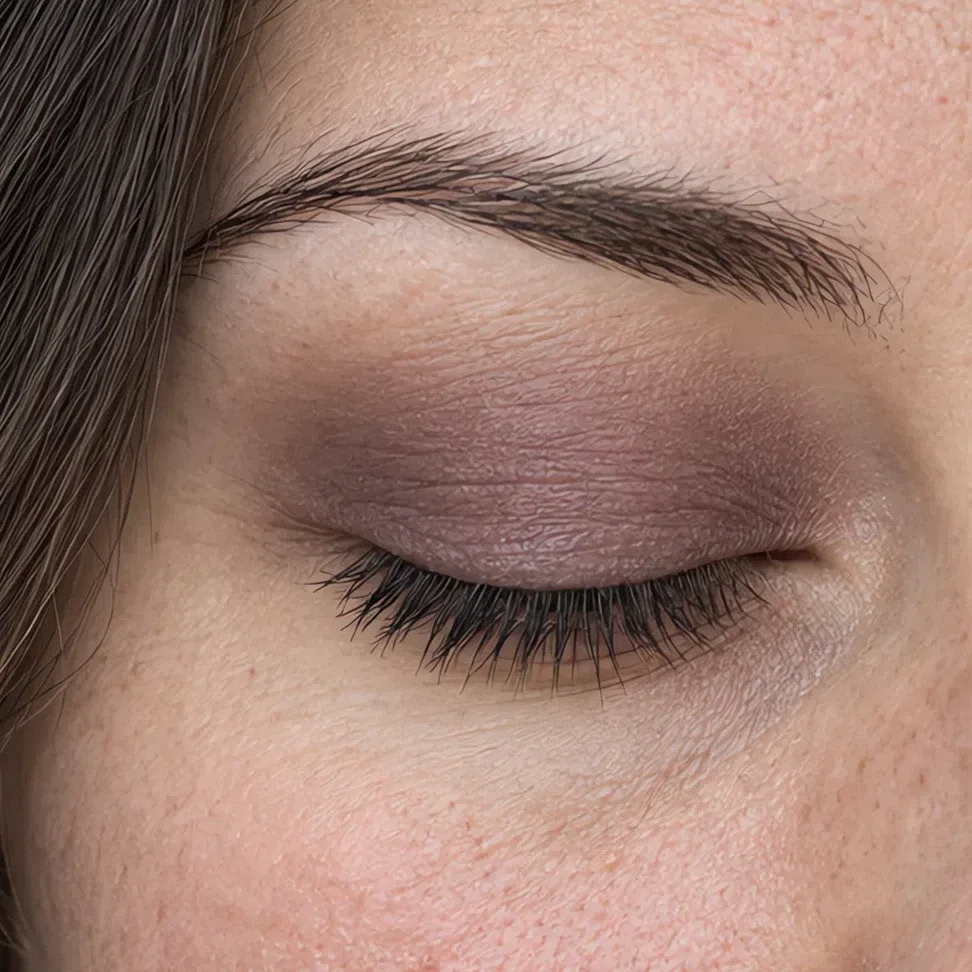
Smoky taupe lid #978886 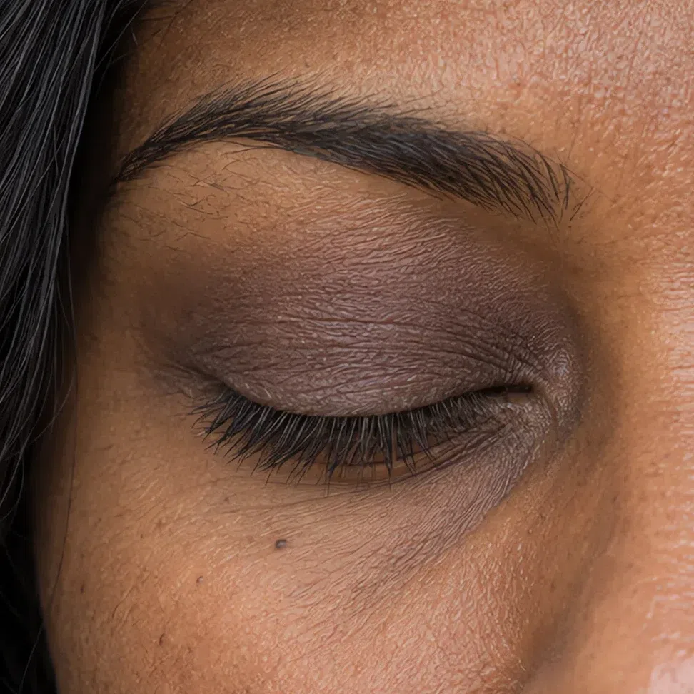
Ash brown lid #7A6964 Eyeliner
Push it into the lash roots rather than drawing a line above them. These four are genuinely the same at every complexion, so choose by how much you want rather than by depth: cocoa is the quietest, soft black the most definite, and the plum and the gray-blue are what you reach for when you want a note of color at the lash line that nobody can name.
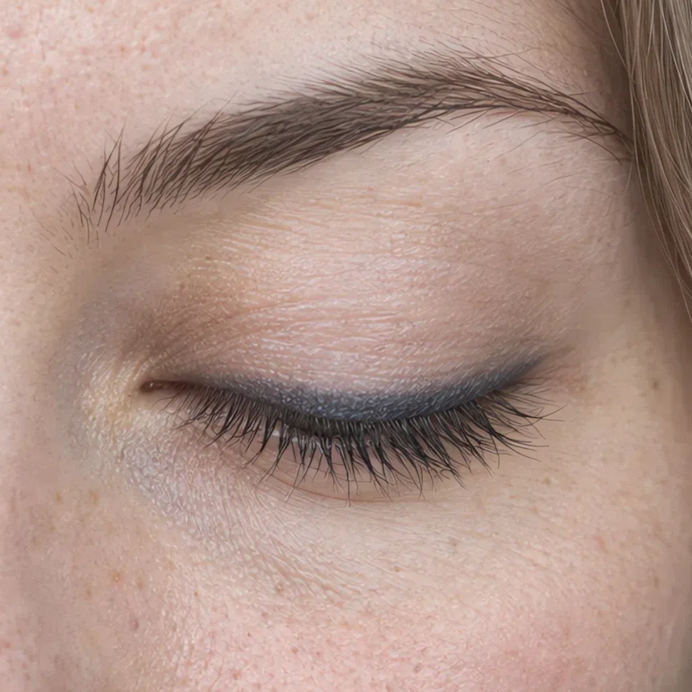
Gray-blue liner #4E5E74 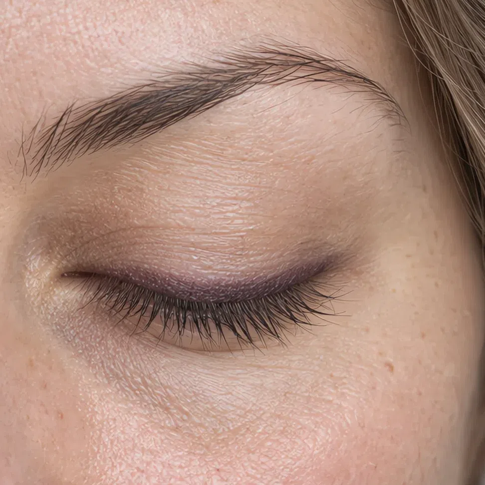
Plum liner #5A3D52 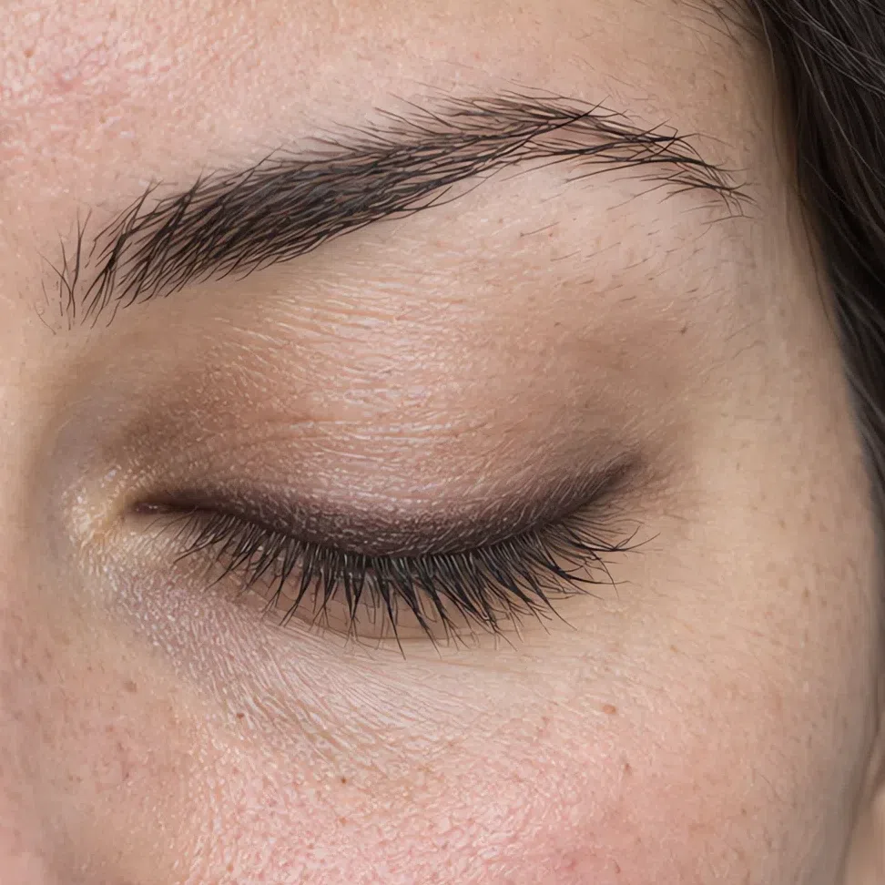
Dark cocoa liner #3F3230 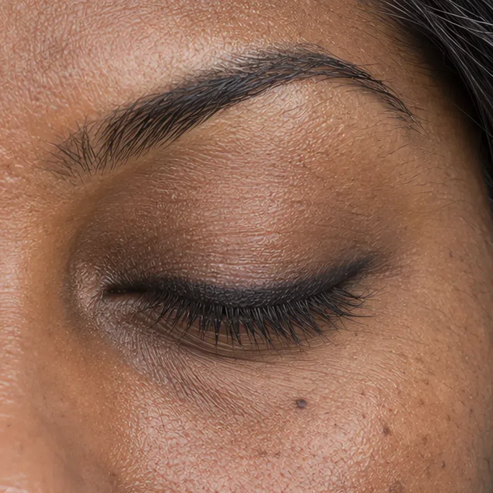
Soft black liner #2F2D32 Mascara
Two coats on the upper lashes, one on the lower, wiped off the wand first so it goes on as lashes and not as spikes. Black works on this coloring and the other three are softer versions of the same decision - the ash brown for daytime, the plum and the graphite when you want the lash line to read as color rather than as a line.
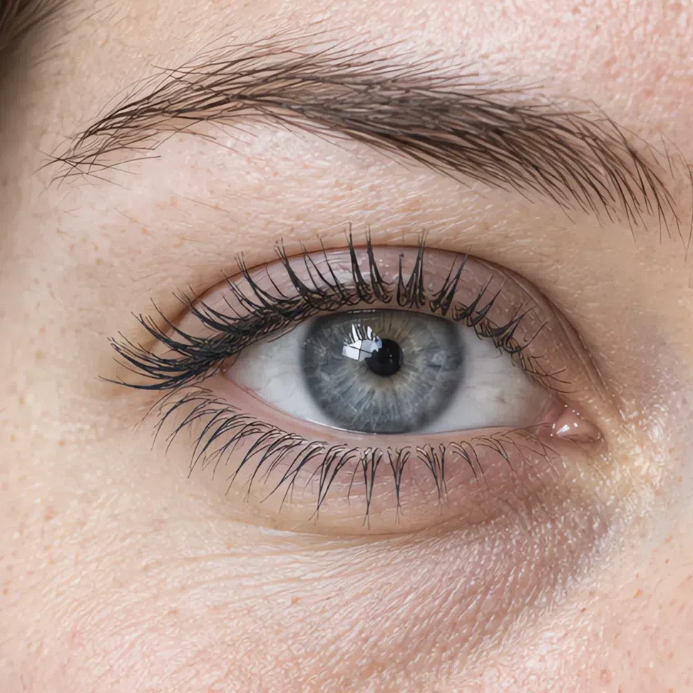
Graphite mascara #3C3E44 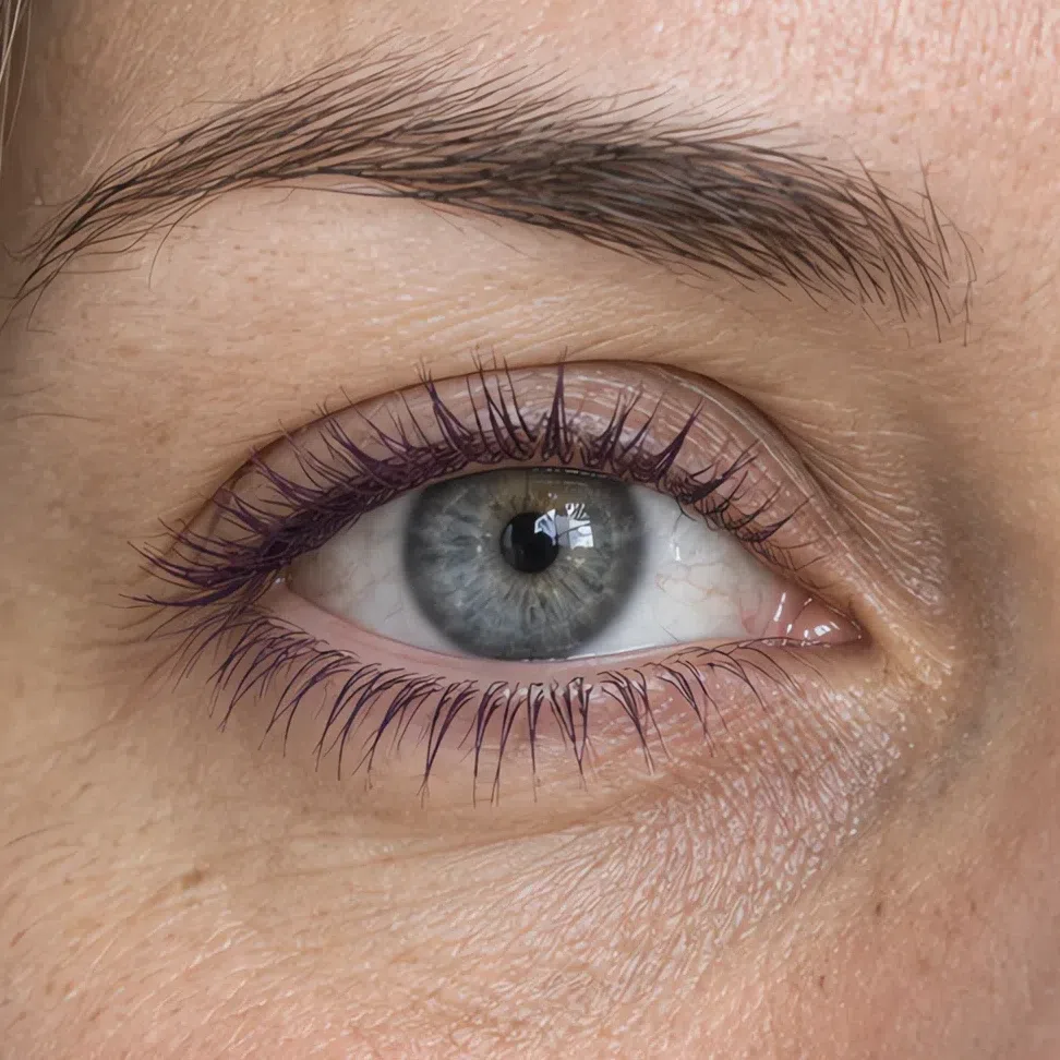
Plum mascara #4B3342 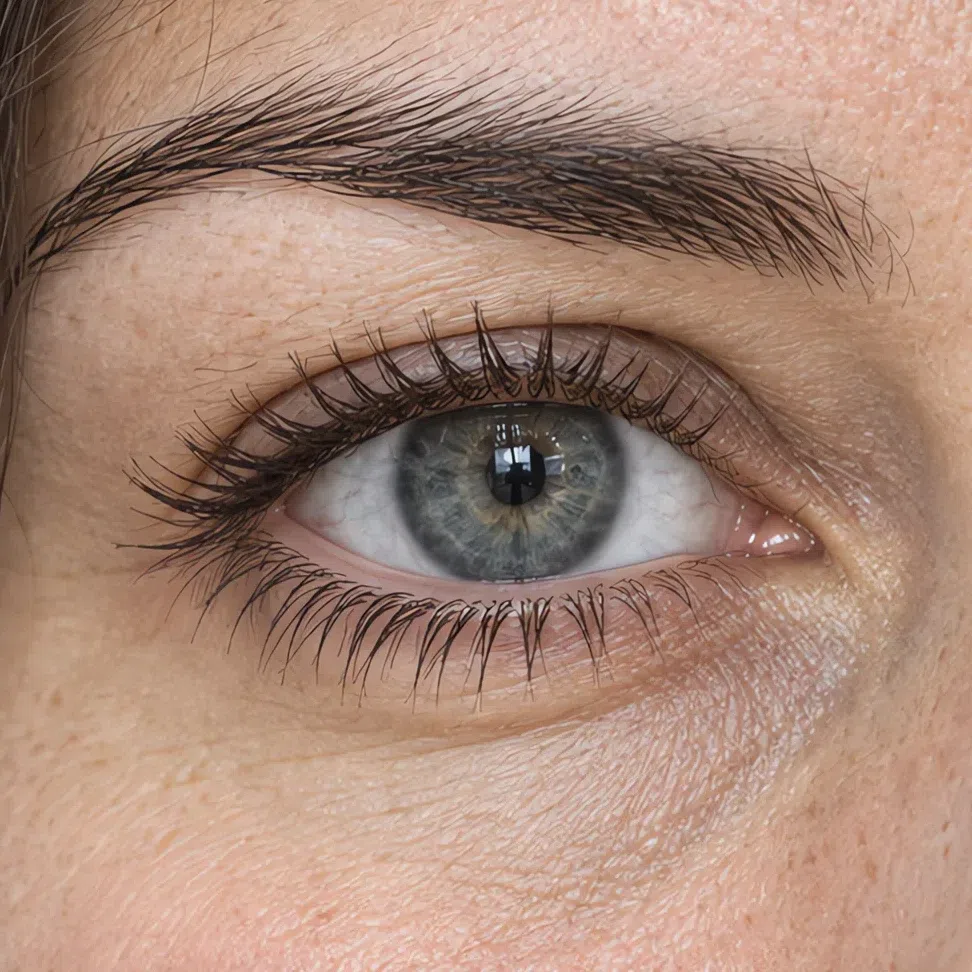
Deep ash brown mascara #3B302C 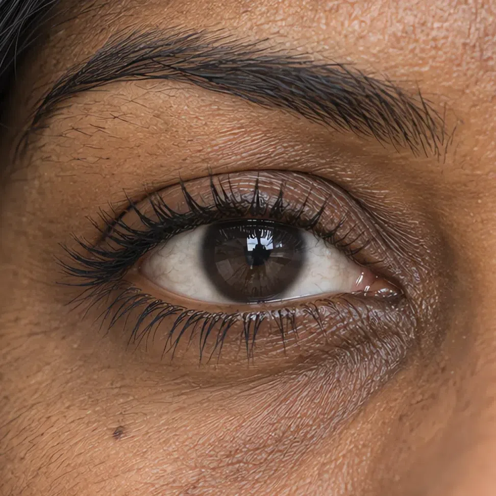
Soft black mascara #27262B Tip If you own one liner, make it the cocoa. Soft black is the one that looks right in the mirror and slightly hard in a photograph, which is the opposite of what you want.
-
Lips
It should read as your own mouth, improved
Your lips carry more natural color than the rest of this coloring does, so a nude here is not about removing color - it is about matching one you already have.
Nude shades
Pink-based, always. A beige nude blanks the lip out and drops the whole face a step, which then gets blamed on the skin. Press the first layer in with a finger, blot, build the second through the middle only, and leave the outer edge soft. The colored shades - the berries and the fuchsia - live in the evening section, because on this palette they are the same family turned up rather than a separate decision.
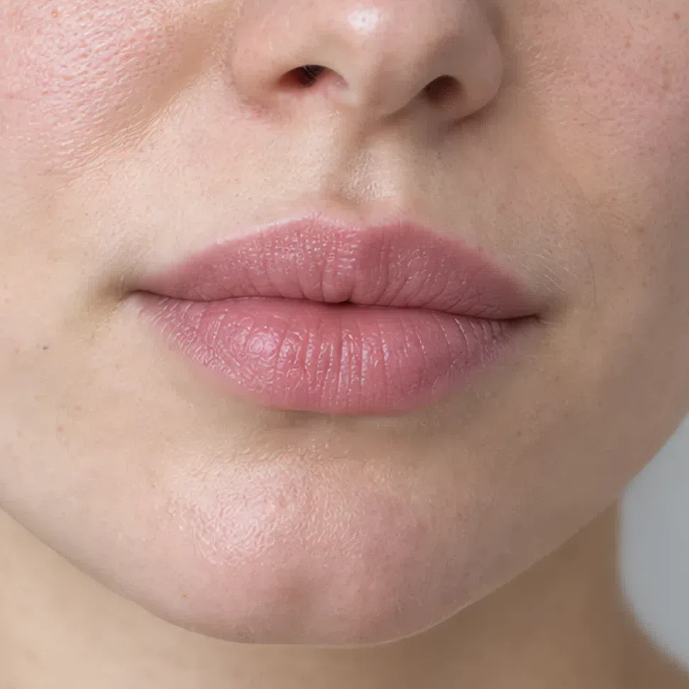
Pink nude #D6A1A6 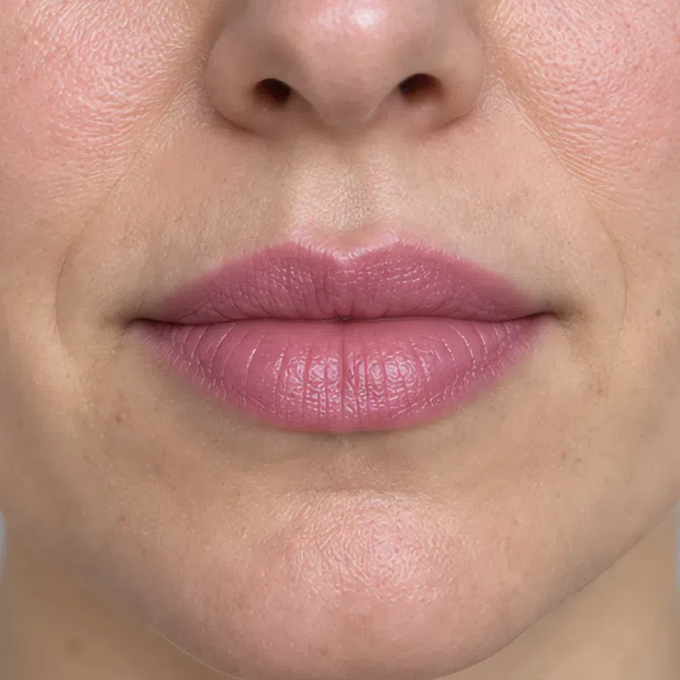
Cool pink lip #D98B9E 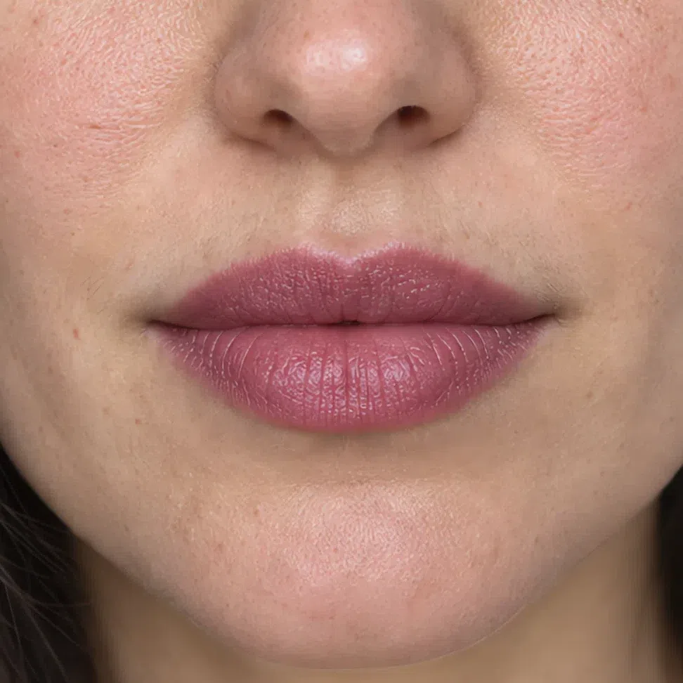
Mousse pink #C27E90 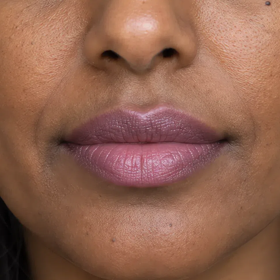
Cocoa pink #A57A78 Tip A balm over any of these four on a bad day gets you most of the way there. This is the one product on the page where the five-minute version is genuinely close to the full one.
That is the daytime face, start to finish. Which leaves the question everyone asks next and almost nobody answers well: what actually changes when the light drops?
Your evening face: what changes, and what must not
Two things move and four hold still, which is a smaller change than the word evening usually implies. This is not a darker face; it is the daytime one taken a step further in the direction it was already pointing, with a short list of things that are not allowed to shift at all. Each depth below, twice, the same woman in both frames.
Eyes
Nothing here gets darker; it gets deeper in the direction it was already going. The pale shade you wore all day stays exactly where it was, across the middle of the lid, and the evening shade turns up only at the outer end - crease, outer corner, the outer half of the lower lashes. You are adding more of the same color, not moving toward black.
- Put the day shade over the whole lid exactly as you already do, edge to edge.
- Walk the evening shade along the crease and down into the outer corner.
- Take it under the outer half of the lower lashes and stop at the halfway point.
- Leave the middle of the lid as the lightest point on the whole eye.
- Tightline rather than lining on top, then work every join until you cannot feel where one shade ends.
The rule Deeper inside the same blue family, with the depth placed at the outer corner. What breaks this face after dark is not depth, it is temperature: a bronze smoke or a hard black at eight in the evening throws away everything the daytime version got right.
Rose gray stays on the lid; rose metallic takes the crease and the outer corner, and that is the entire move. Plum night on porcelain reads as a bruise rather than as an evening.
 Take it deepest here
Keep the center lightest
Lower lashes: outer half only
Take it deepest here
Keep the center lightest
Lower lashes: outer half only
Pink haze holds the lid and moonlit lilac does the crease and the outer corner. The lilac is the one shade in this palette that reads as an actual color on light skin without adding any weight to the eye.
 Take it deepest here
Keep the center lightest
Lower lashes: outer half only
Take it deepest here
Keep the center lightest
Lower lashes: outer half only
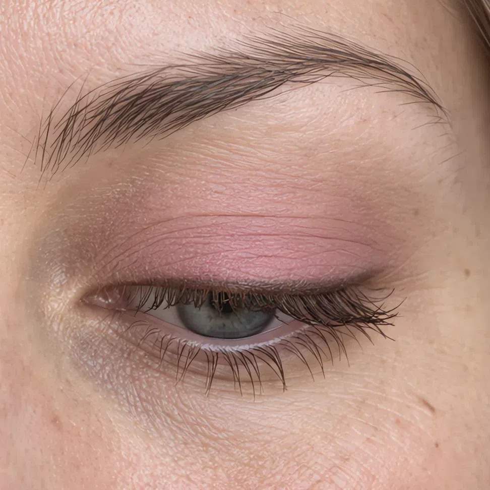
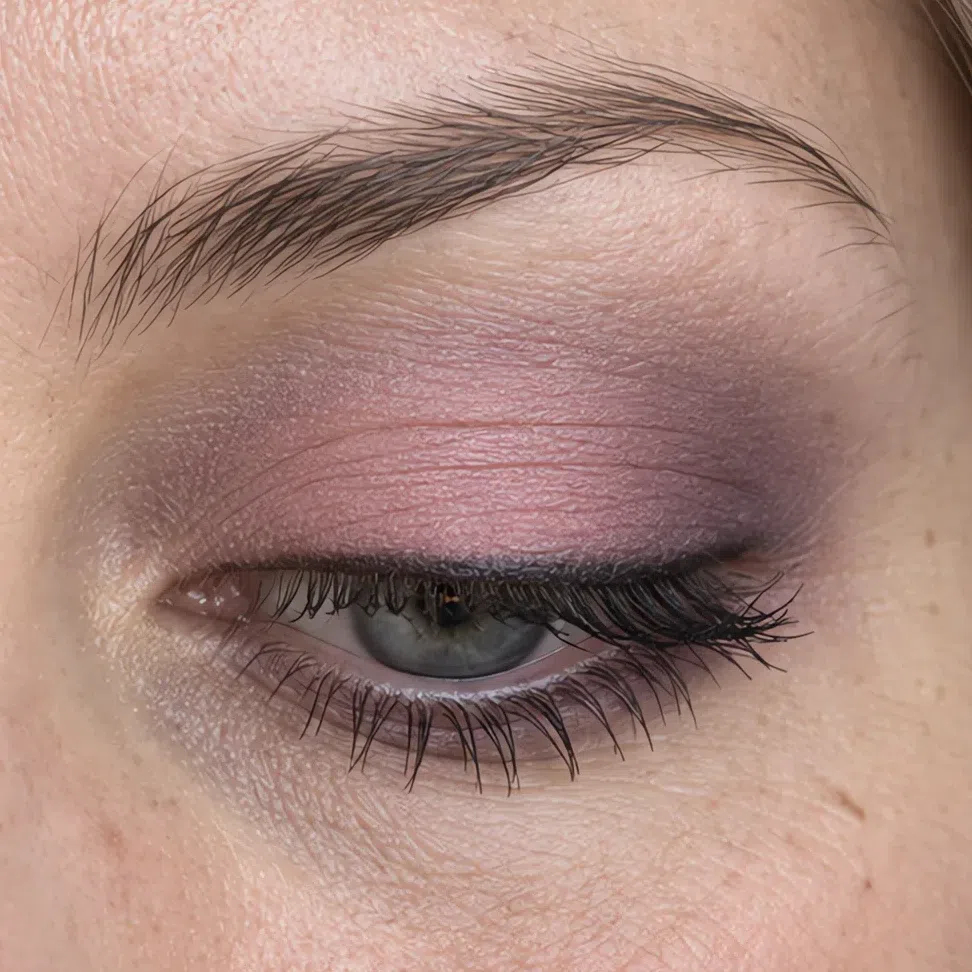
Smoky taupe on the lid, plum night through the crease and out past the corner. This is the first depth where a genuinely dark shadow earns its place, and the first where it is worth owning one.
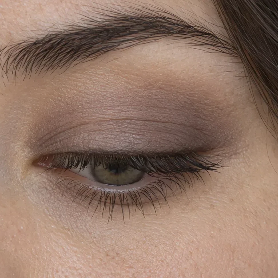
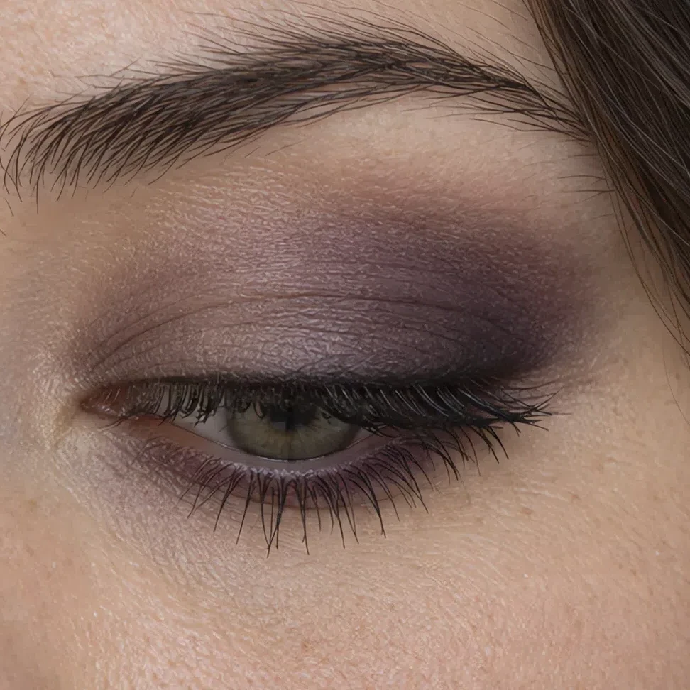 Take it deepest here
Keep the center lightest
Lower lashes: outer half only
Take it deepest here
Keep the center lightest
Lower lashes: outer half only
Ash brown on the lid, violet brown carried the whole way through. The shades one row up stop registering on this skin altogether - what reads as dramatic here would be almost invisible on the fair row.
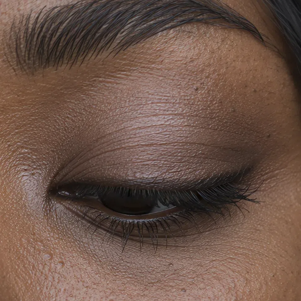
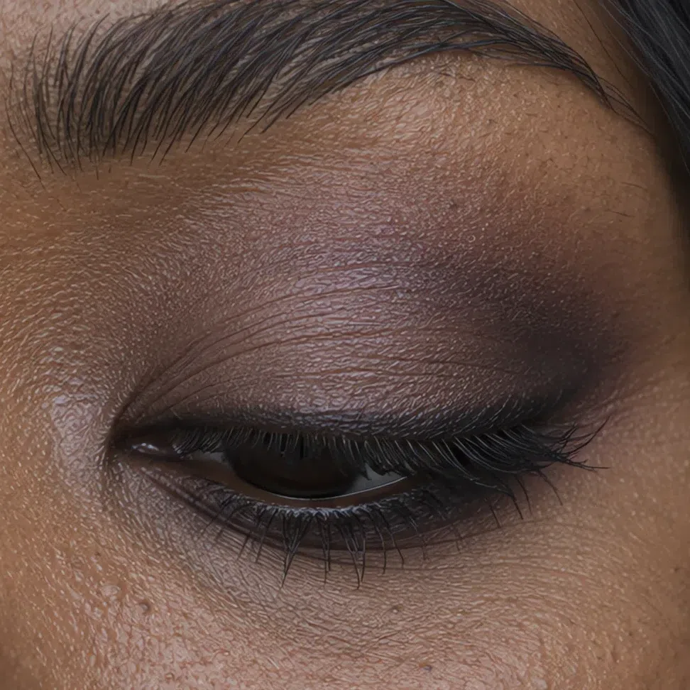 Take it deepest here
Keep the center lightest
Lower lashes: outer half only
Take it deepest here
Keep the center lightest
Lower lashes: outer half only
Lips
One family at two strengths. The nude and the color on this palette are the same blue-based pink turned up or down, so the evening lip is not a separate decision - it is the same decision, louder. What has to survive the change is the edge.
- First layer goes on with a fingertip, not straight off the bullet.
- Blot it once.
- Second layer through the middle of the lip only.
- The outer edge stays soft. No drawn ring, at any hour.
The rule Which nude and which color belong to you is decided by your depth, not by the clock. The hour settles how much of it goes on; the row you are standing in settles which.
Pink nude by day, berry ice after dark. Berry ice is the ceiling before the mouth starts wearing the rest of the face.
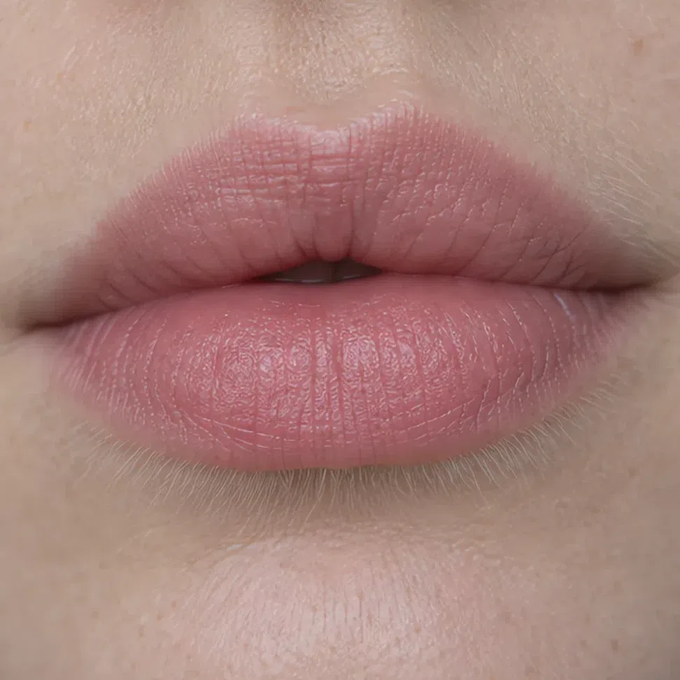
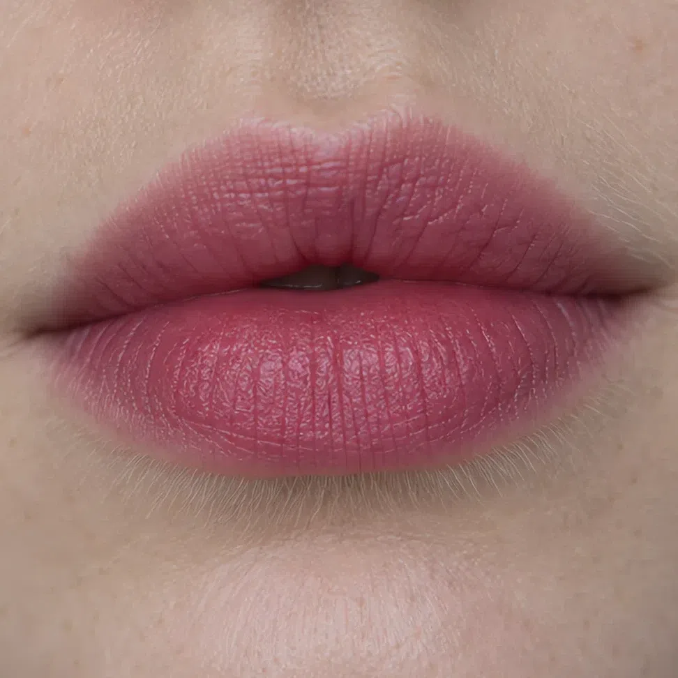 Leave the edge soft
Build through the middle
Leave the edge soft
Build through the middle
Cool pink by day, matte fuchsia after dark - the loudest shade anywhere on this page, and it holds because it is blue-based the whole way down.
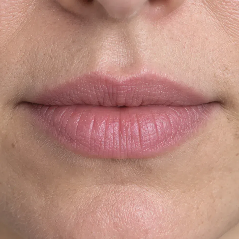
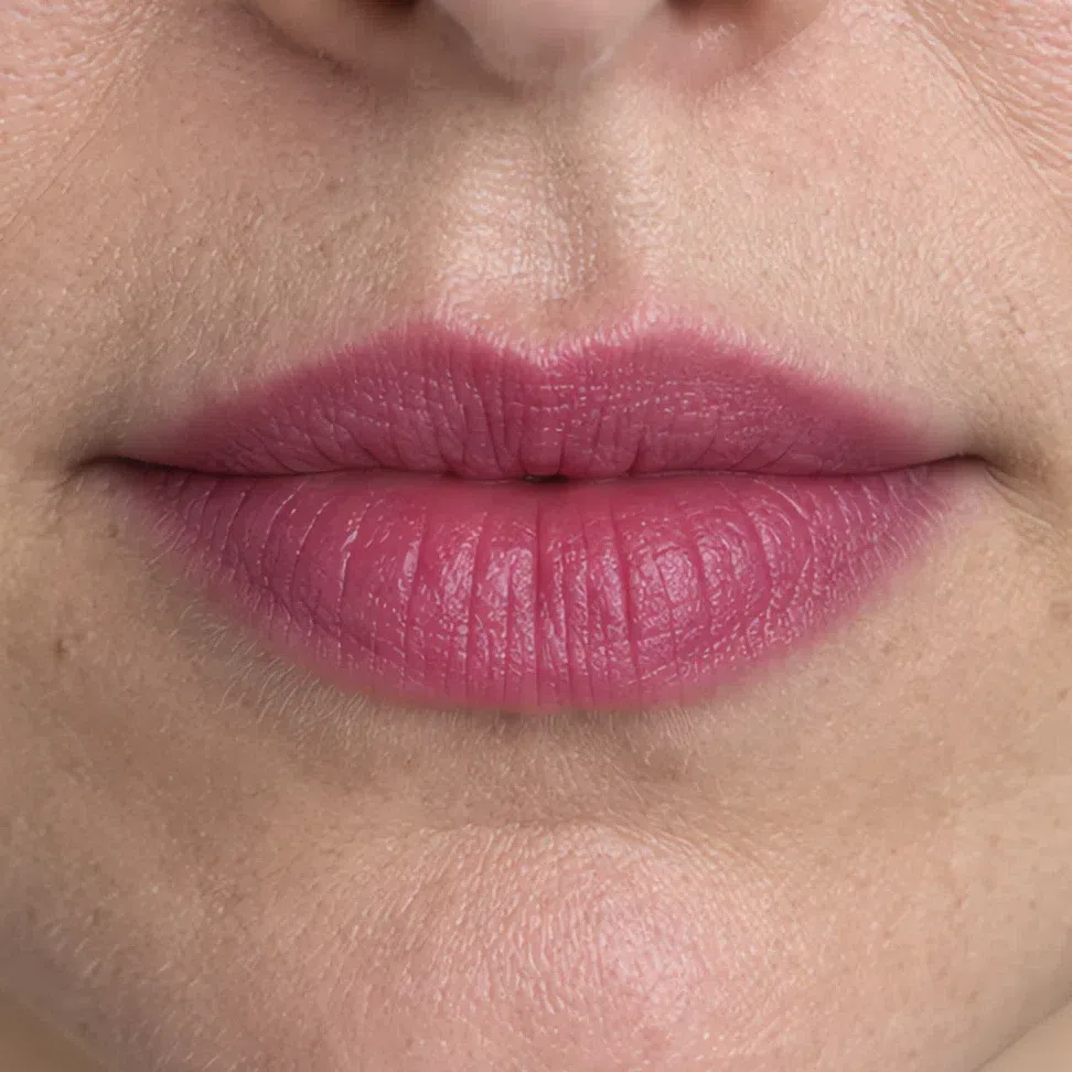 Leave the edge soft
Build through the middle
Leave the edge soft
Build through the middle
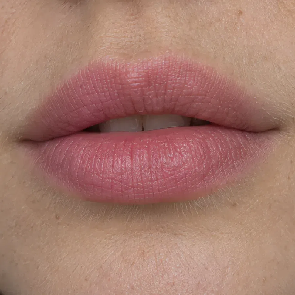
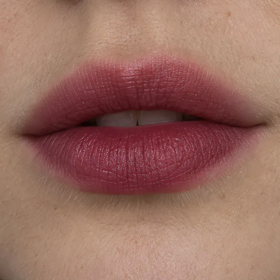
Mousse pink by day, deep cranberry by evening. One family, two saturations, and the jump is smaller than it looks written down.
 Leave the edge soft
Build through the middle
Leave the edge soft
Build through the middle
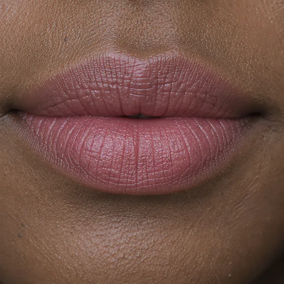
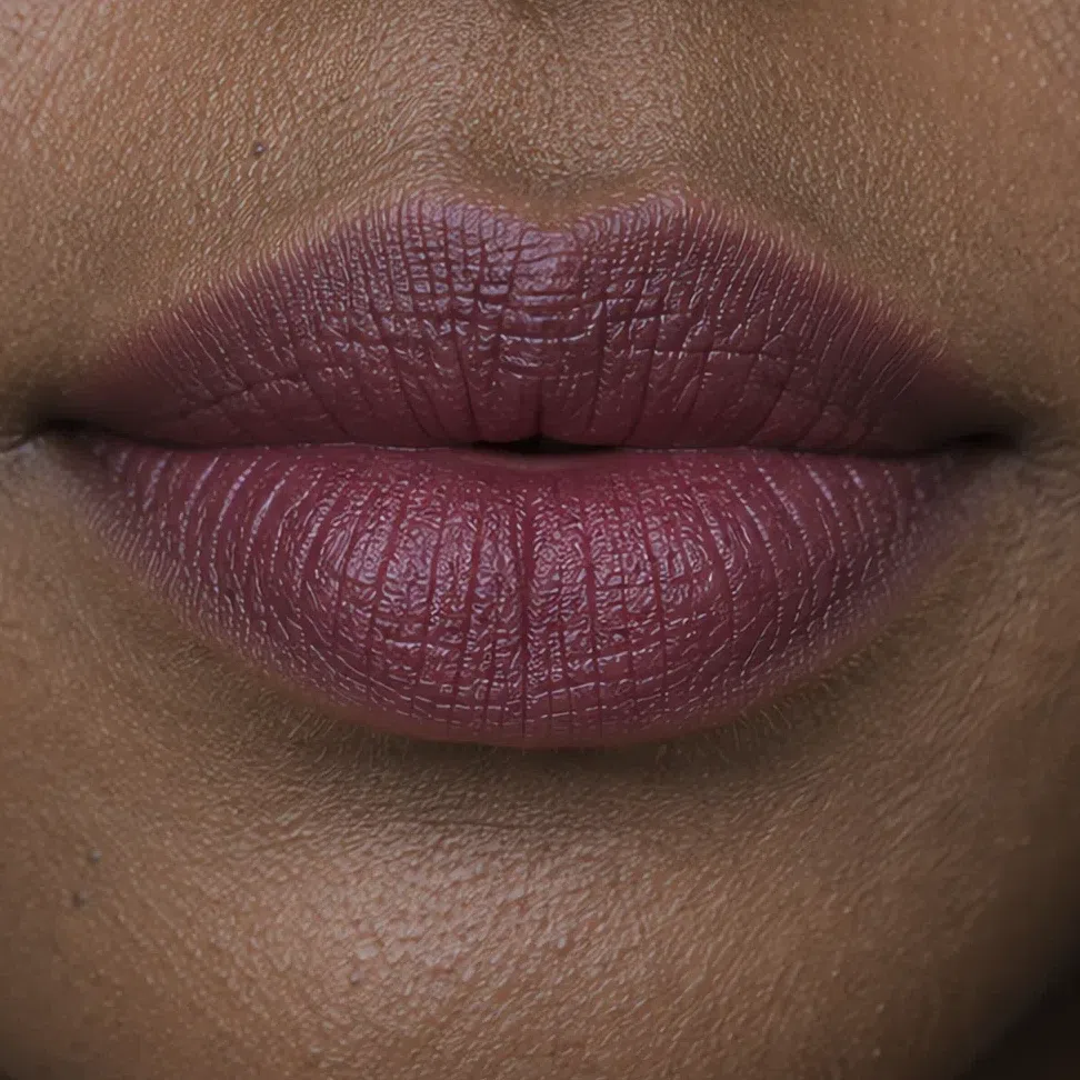
Cocoa pink by day and plum after dark. A plum that would swallow a fair face is an ordinary Tuesday evening here.
 Leave the edge soft
Build through the middle
Leave the edge soft
Build through the middle
What must not change
Deeper is not sharper. Everything you softened at eight in the morning stays softened, and a liner that still reads crisp from across a room is the single detail that ages the whole face.
Satin. Frost grays a clear shade and glitter scatters small white points over a face that has no pure white anywhere in it - the finishes section takes that apart properly.
Nothing muddy arrives after dark. Reaching for a dustier version of your own shade because the light is low is the classic evening error on this coloring, and it is the same over-correction the troubleshooting section tags as dull.
A bad moment to add coverage. Artificial light is less forgiving than daylight and a phone flash is less forgiving again, so the extra layer that goes on for the photographs is the thing the photographs end up being about.
If you take one line out of this section, take that one: deeper, never louder. Whether it actually lands that way turns on something a shade name never tells you.
Why the right shade can still look wrong
Evening turned the shine up, and shine is where a shade you chose correctly can still turn on you. A finish is a second color: the pearl suspended in it has a temperature of its own, and that is almost never printed on the box. One lipstick, one mouth, four photographs - the color underneath is identical in all of them.
One shade, four finishes
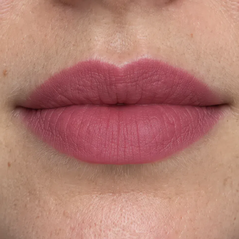
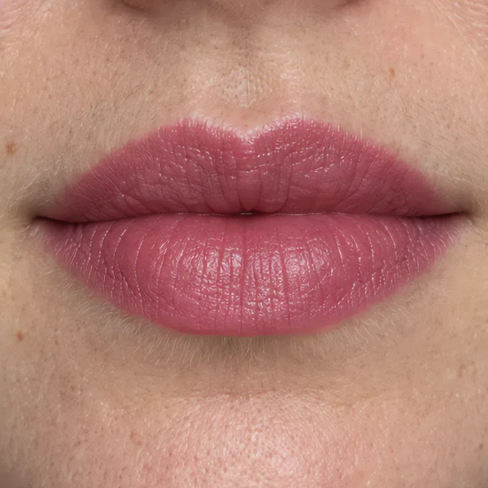
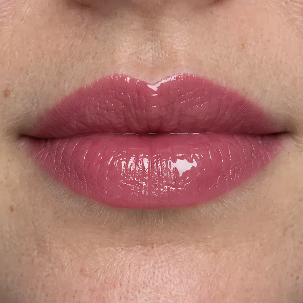
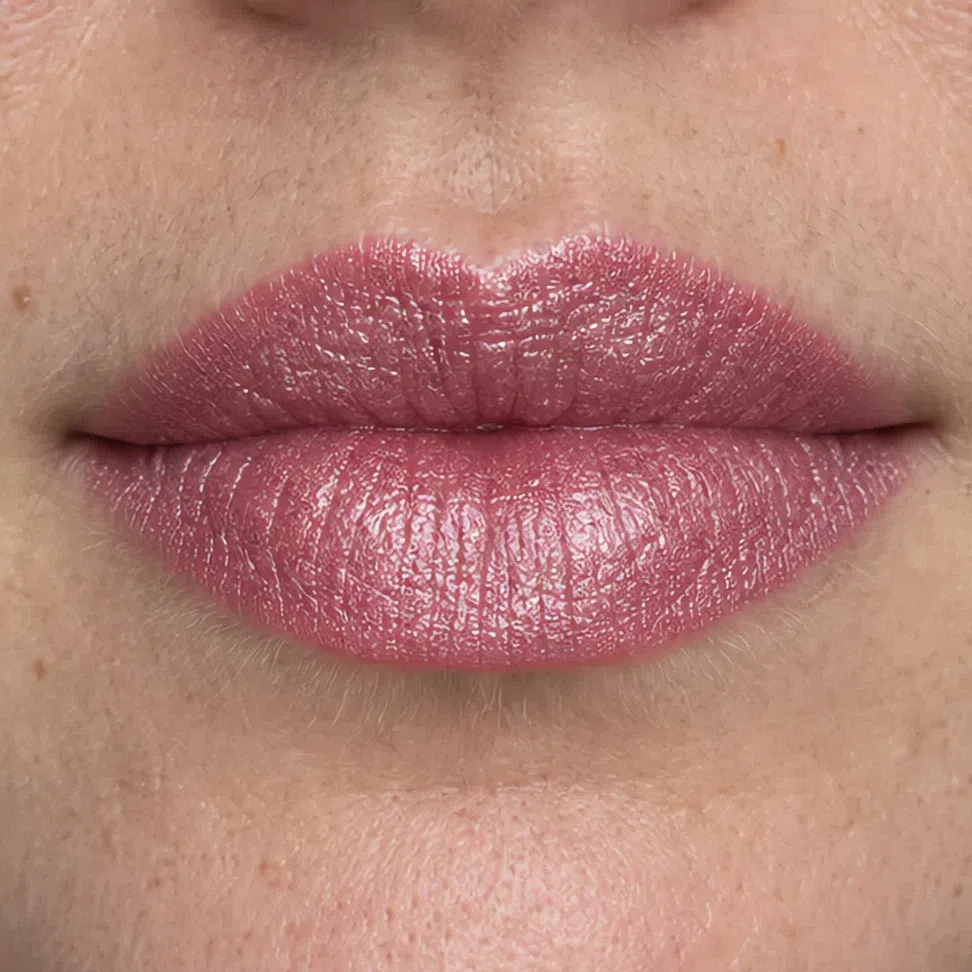
Two things are happening on these four surfaces, and it is the second one that catches people out. The first is the specular highlight, the tight bright reflection a glossy surface bounces straight back. The second is what that reflection is made of. Pearl and glitter are pigment: mica coated to flash gold, bronze, copper or champagne, because those flatter the largest number of faces on any shelf. So a lipstick can be an immaculate blue-pink in the bullet and still throw warm light off your mouth all evening.
Which is why temperature comes first here and size comes second. Yours is the coloring that one note of yellow undoes - the palette page argues that about clothes, and the finish aisle is where it gets broken by accident. Size follows: matte throws nothing back, satin spreads it wide, frost turns it into the color, gloss collects it into a point. Ask the two questions in that order about every tube you own. What temperature is the shine, and how tightly is it packed.
The same two questions, on skin
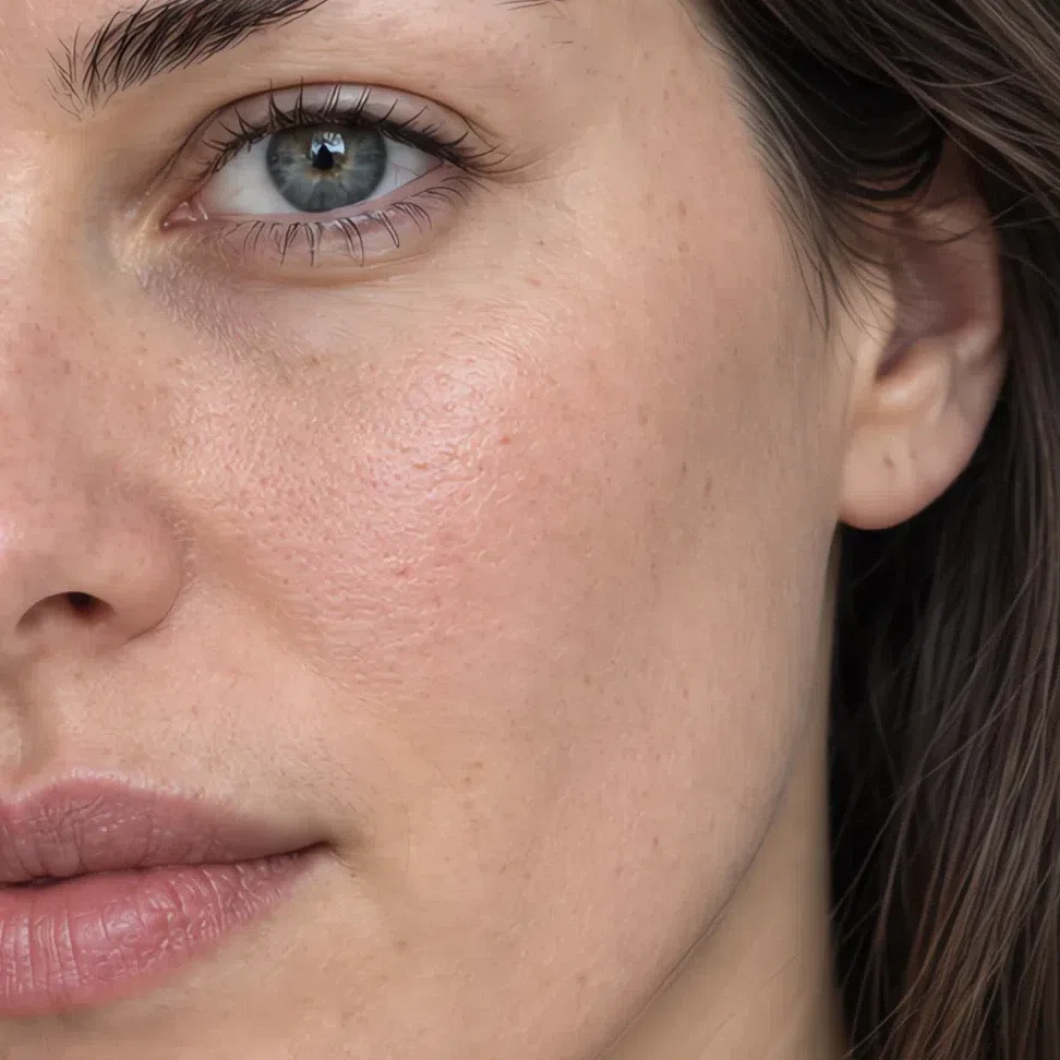
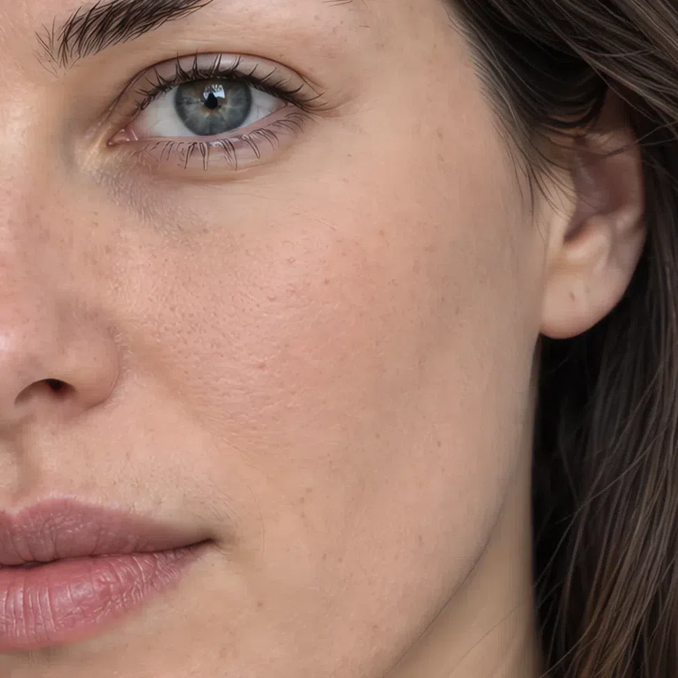
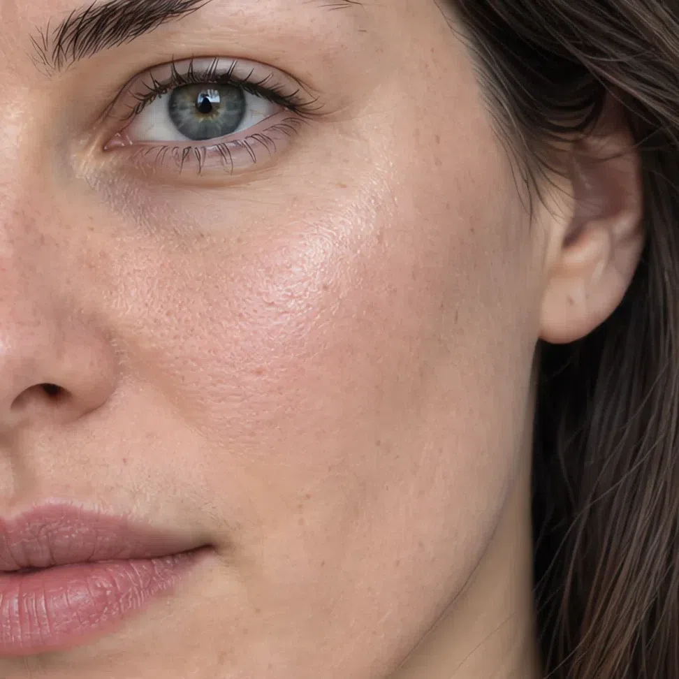
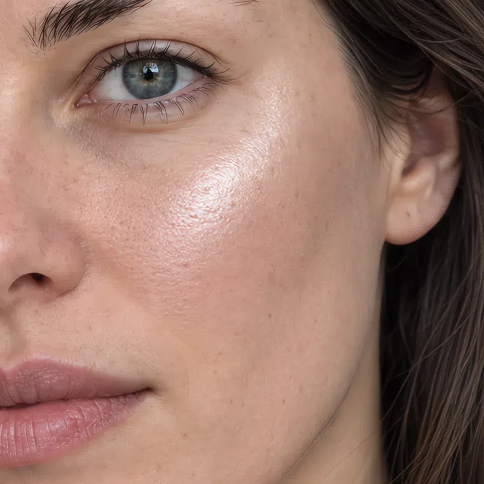
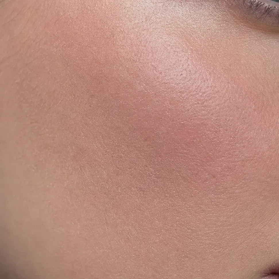
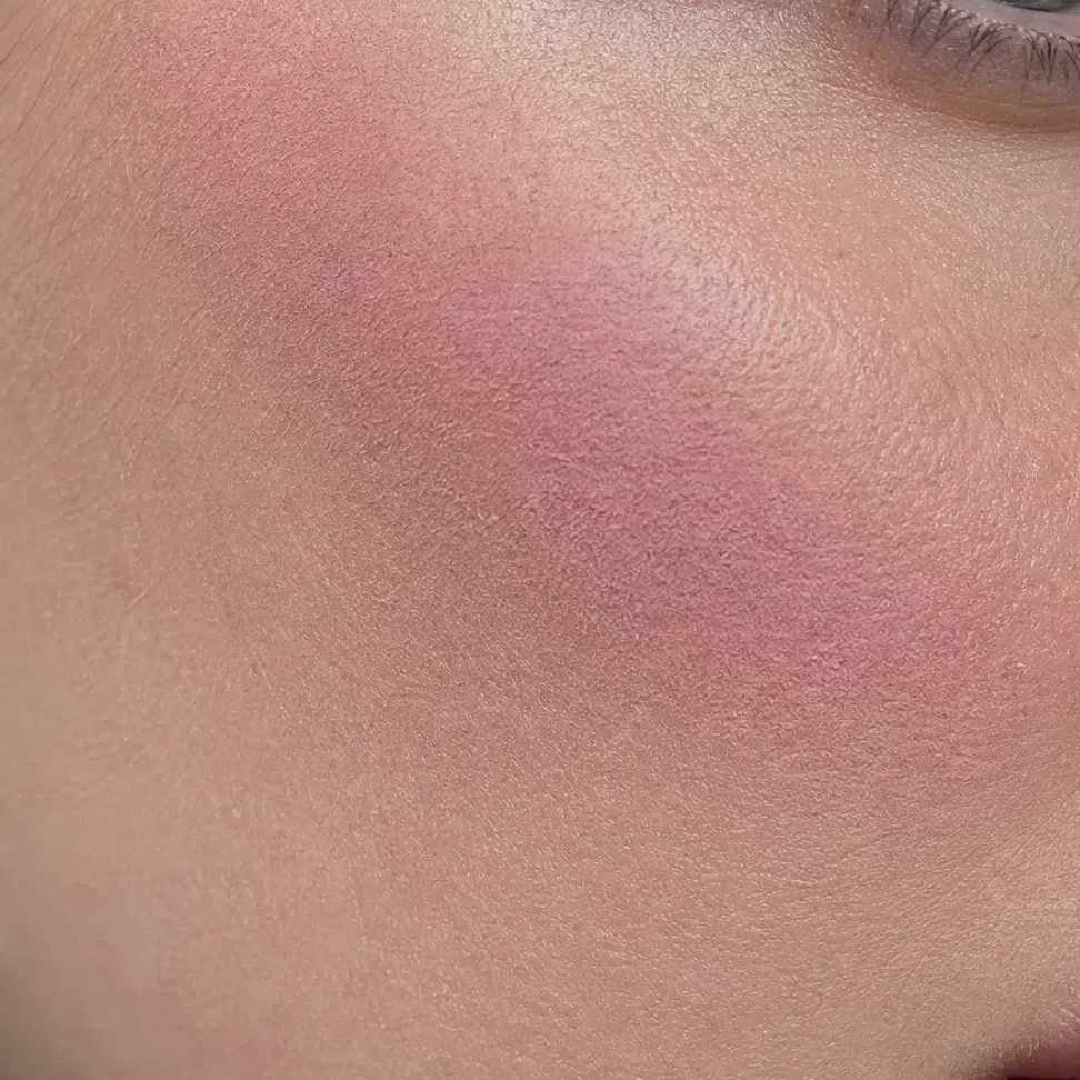
Eyeshadow belongs on this list too - matte or satin in daylight, satin after dark, frost at no point - but it is already photographed twice elsewhere on this page, so it goes into the summary below rather than earning a fifth pair.
What that means, product by product
- Base
- Satin. Glass hands gloss a whole face to work with, and full matte removes the light your cheekbones are drawn by.
- Blush
- Cream, with powder over it only when the day is long. Your skin flushes cool pink by itself; the job is imitation, and cream imitates better.
- Eyeshadow
- Matte or satin in daylight, satin after dark. Frost grays a clear shade, and glitter multiplies the gloss problem across a whole lid.
- Brows
- Powder or a soft gel, inside the ash family. Wax draws a line and then lights it.
- Lips
- Satin, then matte. If you want shine, put a clear balm over a satin shade - you get the softness and none of the gold.
- Highlighter
- Cool pearl: silver, pink, silvery-lilac. Read the shade name rather than the marketing line - champagne and gold are the two that undo whatever the base did.
This is a finish question rather than a skin-type question. Full matte across the whole face is the intuitive answer and the wrong one here: it removes the returned light your face is shaped by, and it breaks in patches by four in the afternoon regardless. Powder the T-zone, leave the cheekbones alone, carry blotting paper instead of a second compact. Before a photograph, take the shine off the nose and forehead only - the shine on top of the cheekbone is the part working for you.
How to get the right one home
Everything above assumes you can get the shade home, and this is the part the shade lists skip: how to read a label, how to test, and why the test almost everybody runs cannot work.
The jaw test
- Three candidates in a row on the jaw, carried down over the join onto the neck. The arm is the wrong color and the hand is worse.
- Blend all three out.
- Find a window. Store lighting leans warm, and warm light is the single condition in which a yellow base passes for yours.
- The one you want is the one you can no longer find. Not the prettiest stripe - the one that has gone.
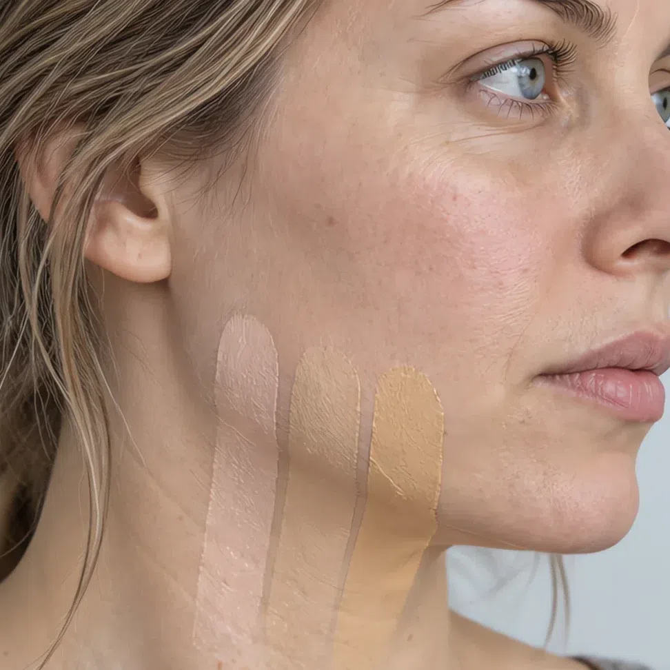
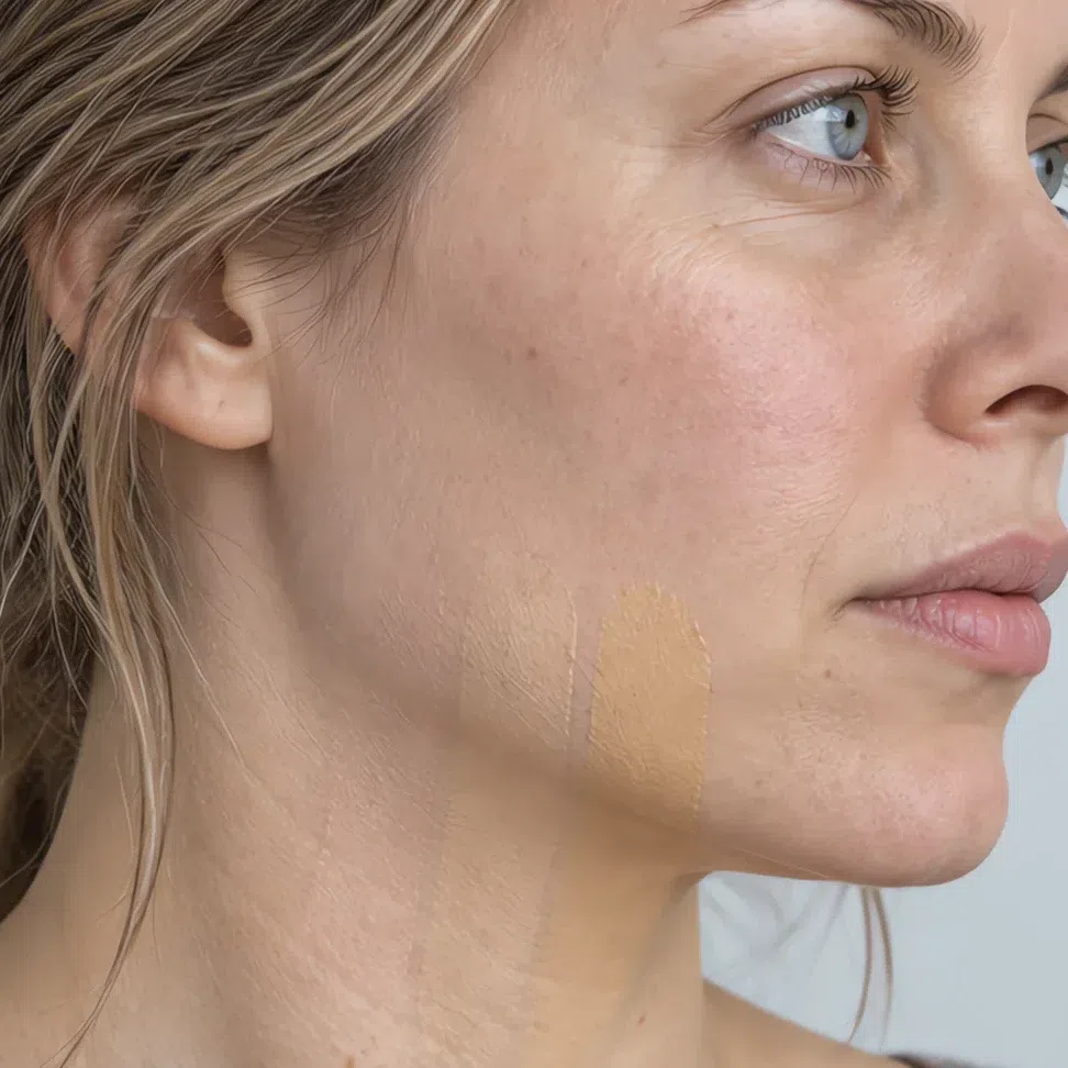
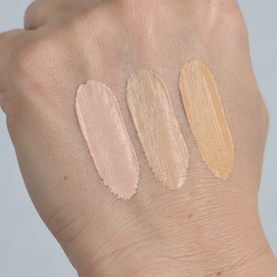
The whole shade grid, and the square that is yours
A foundation range is a grid too - depth down one axis, which way the shade leans across the other. Here is that grid with only Cool Summer marked on it.
The outlined column is the answer top to bottom: one letter, whatever depth you happen to be. A Cool Summer in porcelain and a Cool Summer in deep brown ask for the same undertone and leave with different numbers, which is why the sentence at a counter is your depth plus cool - and never a shade name copied off a poster.
Three honest notes about this chart. First, the cool column holds our values, not anybody’s product: every range mixes its own version of the same letter, and depth numbers do not survive the trip between two brands, so no chart printed anywhere can hand you a shade to order by name. Second, the twelve squares outside your column are illustrations - each is your cool shade at that depth pushed toward that undertone and given the name a shelf would give it, so the wrong prefix is recognizable before it has a chance to prove itself at your jaw. Third, olive earns a caveat here that it would not earn on another season. A grayed, cool olive belongs in your column, and plenty of Cool Summers wear one; what the olive square stands for is the olive that warms up - the kind that turns golden in July and sits yellow on the jawline in any month.
Reading a shade name
Words on a box are a shortlist, not a verdict. Brands use them loosely and a few of them mean nothing at all - a great many shades called cool are neutral, and the occasional mauve is a warm mauve. They tell you what to pick up. The jaw and the window decide the rest.
What the finish words on a label actually mean
- Satin, natural, second-skin
- What you came for.
- Demi-matte, soft matte, blurring
- Also yours - matte that keeps some life in the surface.
- Radiant, luminous, glow
- Dewy, and dewy is gloss over a whole face. Workable if you powder the center; a lot if you do not.
- Metallic, foil, chrome
- A hard edge in a pan. High on the face it reads before your eyes do.
- Frost, pearl-finish, iridescent
- The one to put back. Pearl packed that densely grays a clear shade, which is the whole of what you have.
Judging a swatch photo online
Swatch photography is lit to sell, and selling light is bright, flat and a little warm. That combination does one specific thing to your shades: it drains the blue out of them. A cool rose arrives on screen as a plain pink, a plum arrives as a brown, and a shade you would have worn for years gets scrolled past in half a second. Two habits recover most of it. Prefer swatches on skin over swatches in the pan, and prefer a frame with a shadow somewhere in it - the color where the light drops off is the color that arrives in the post.
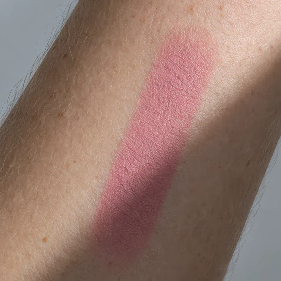
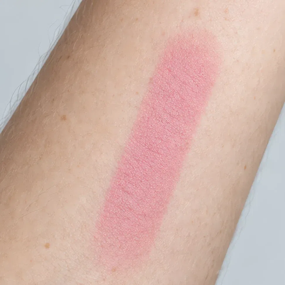
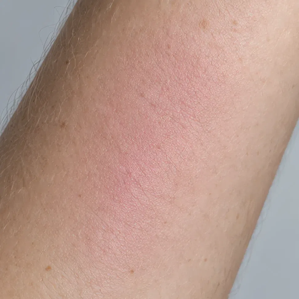
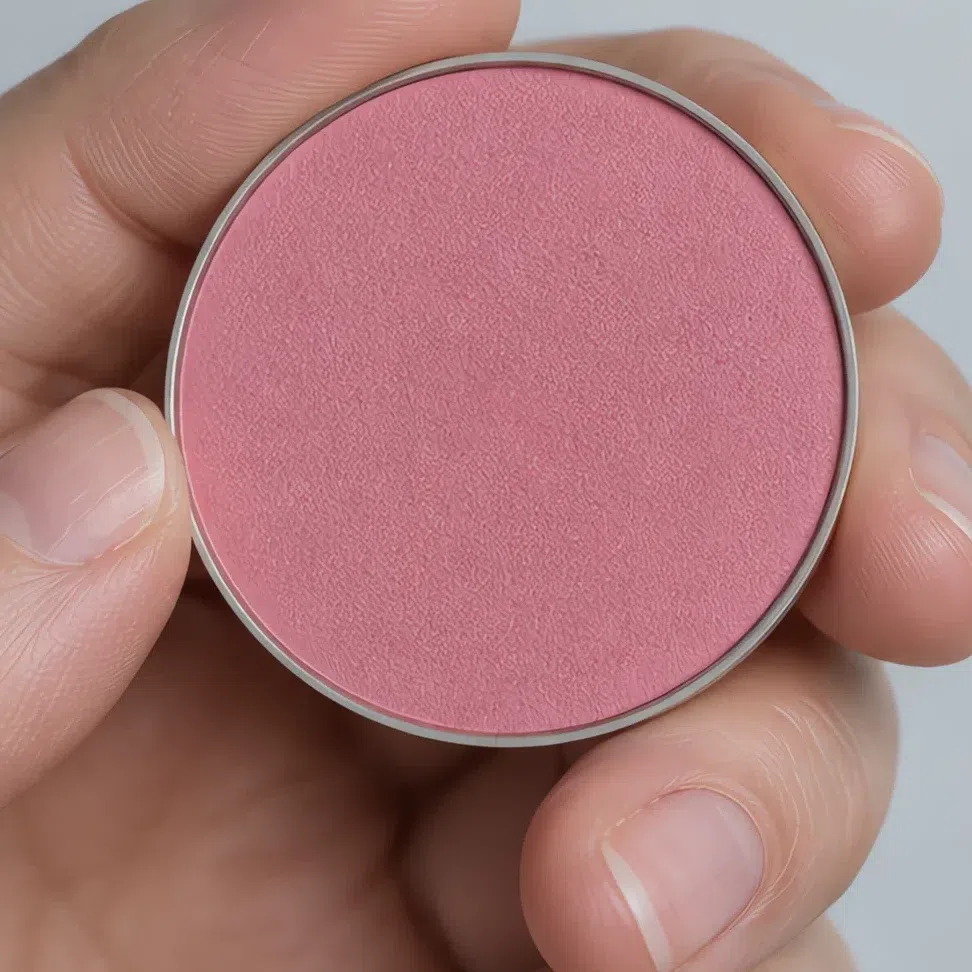
Shade ranges are reformulated, renamed and pulled on a yearly cycle, so a list of products is out of date before it is old - and a recommendation nobody has re-checked is still a recommendation someone spends money on. A hex, a handful of label words and a jaw test travel further than any list can. They work in a shop you have never walked into, on a brand that did not exist when this page was written.
When it does not work
By now you have the shades, the order they go on in, the finish to ask for and a way to get the right one out of a shop. This is the half you come back to later - the evening something is off in the mirror and there is no word for what.
Two ways it goes wrong
Everything has gone slightly dirty
- What it looks like
- The face looks tired within an hour of doing it, and looks tired in photographs immediately. Nothing is obviously wrong. The whole thing reads as makeup that has been on since yesterday, even at nine in the morning.
- Why
- Something warm or something grayed has got in - a base half a step yellow, a dusty blush, a taupe bought because taupe is safe. On blue-based skin both turn to mud, and they do it quietly enough that every individual product survives inspection.
- Fix
- Go cleaner and bluer, rather than softer. Yours is the clear palette in the summer family: a straight cool pink beats a complicated one, and the rose that looks almost too simple in the pan is the one that reads as skin.
It has turned into a costume
- What it looks like
- The lipstick arrives in the room before you do. People compliment the makeup rather than you, and a photograph shows one very dark feature with a face arranged around it.
- Why
- Depth has been overshot, usually on purpose. Cool reads as dramatic, dramatic reads as black liner and a wine lip, and those belong to a winter. Your own contrast is soft to medium, so a genuinely deep product has nothing on your face to answer it.
- Fix
- Take out depth and keep the color. Soft black instead of jet, a berry at half the weight of a wine, blush pressed rather than packed. The temperature was right; the weight was borrowed from a season next door.
And the shades that never work
Every shade below misses for one of three reasons, and the tag on each swatch names which. Learn the three and you stop needing a list - you can hold something up in a shop and say which of the three it is doing.
Base and glow
- Golden beige base warm
- Terracotta bronzer warm
- Champagne gold highlighter warm
- Ashen gray base dull
Base is where this season is lost most often, because a yellow base is the default the industry is built on and a counter will hand you one without being asked. The fourth swatch is the over-correction that follows: gray is not the opposite of yellow, it is a different way of losing the pink.
Cheeks
- Peach blush warm
- Coral blush warm
- Muted mulberry dull
- Deep plum blush heavy
Your cheek makes cool pink on its own, at every depth, and blush only has to agree with it. Peach and coral are colors your circulation cannot produce, so they arrive as pigment. Mulberry is quieter than your own flush, and plum is heavier than it.
Eyes
- Warm gold shimmer warm
- Khaki green warm
- Mushroom taupe dull
- Blackened plum heavy
The lid is small and it is near the iris, so whatever is on it argues with your eye color directly. Gold and khaki win that argument by going warm. Mushroom loses it by going quiet. Blackened plum is the right family at twice the weight the face can carry.
Lips
- Coral lipstick warm
- Brick red warm
- Brown-rose nude dull
- Blackened wine heavy
Lips carry the most color on this face and can take a great deal of it, provided the red underneath is blue. Coral and brick have yellow under theirs. Brown-rose has gray. Blackened wine has the depth of a season you are not.
Why each one fails
- warmToo warm
- Gold, peach, coral, brick, bronze. Your undertone is blue-pink at every depth, and yellow laid over it does not warm the face up - it turns it sallow and puts a border around whatever is wearing it.
- dullToo dull
- The over-correction, and the one that arrives via a bad diagnosis. Gray mixed into a shade belongs to Soft Summer. On you it sits below your own coloring and takes the clarity with it, which is the single thing that makes this season what it is.
- heavyToo heavy
- Jet, wine, blackened anything. Cool gets mistaken for dramatic, and dramatic belongs to the winters. Your hair is ash, your contrast is soft to medium, and a genuinely deep product has nothing here to answer it.
The three tags are the whole of this section; the swatches are only there to show you what each one looks like. Those hexes are representative examples of the mistake rather than measured products, so match on the reason rather than on the square. And if you find yourself reading the dull column and recognizing everything you own, the question is probably not makeup at all - it is whether you are a Cool Summer or a Soft Summer, and the palette pages settle that faster than a shopping trip will.
Your shades, in one block
This is the whole page compressed into something you can hold up in a shop. Screenshot it. Foundation, contour and glow are matched to your own depth, so read down to your row and stop. Blush, the shadows and the lips run light to deep instead: first shade is the fair end of the family, last is the deep end, and you are somewhere along it.
- FFair
- LLight
- MMedium
- DDeep
Base: foundation, contour and glow
- Base - porcelain pink Fair #EED6CF
- Base - cool olive beige Light #D8BFAC
- Base - soft rose beige Medium #C29A86
- Base - deep plum brown Deep #6F4A3F
- Contour - pale ash taupe Fair #C4AA9D
- Contour - gray taupe Light #A98F82
- Contour - mid ash taupe Medium #8C6D60
- Contour - deep ash taupe Deep #5E4238
- Glow - pearl white Fair #F3E7E6
- Glow - pink moonlight Light #EBCFCB
- Glow - rosy pearl Medium #D9B2AE
- Glow - rose lilac Deep #B98C92
- Cool pink blush #E1A3B1
- Lilac pink blush #C58EAE
- Berry flush #BF7890
- Raspberry mousse blush #AE5A7C
Eyes: shadow, liner, mascara, brows
- Rose gray lid #CDBBC0
- Pink haze lid #D3A9B0
- Smoky taupe lid #978886
- Ash brown lid #7A6964
- Rose metallic #B5848E
- Moonlit lilac #A698B4
- Plum night #684A6E
- Violet brown #54404A
- Gray-blue liner #4E5E74
- Plum liner #5A3D52
- Dark cocoa liner #3F3230
- Soft black liner #2F2D32
- Graphite mascara #3C3E44
- Plum mascara #4B3342
- Deep ash brown mascara #3B302C
- Soft black mascara #27262B
- Dark ash blonde brow #A08F80
- Cool taupe brow #8D7E78
- Ash brown brow #76675F
- Soft graphite brow #4F4E53
Lips: nudes and color
- Pink nude #D6A1A6
- Cool pink lip #D98B9E
- Mousse pink #C27E90
- Cocoa pink #A57A78
- Berry ice #B24E72
- Matte fuchsia #B8397A
- Deep cranberry #8E2F4F
- Plum lip #6E3656
Three families here are not a ladder at all. Liner and mascara are the same on everyone - soft black, cocoa, plum and gray-blue are four choices rather than four depths, and any of them works at any complexion. Brows follow your hair rather than your skin: take the one that sits a step under your own level, inside the ash family. Photographs of each base shade on four complexions, and the clothing palette these all come out of, are on the palette page. The full Cool Summer palette →
Questions people ask
What makeup should I wear if I have cool undertones?
What colors should I avoid in a Cool Summer palette?
Can Cool Summers wear black?
What foundation undertone should a Cool Summer use?
What if I am between two skin depths?
How do I know if I am a Cool Summer and not a Soft Summer?
Which brands or products should I buy?
Where this came from
Six sources, and the claim each one is holding up: that facial contrast is measurable and falls with age; that a flush is blood color; that gloss is built out of specular highlights; that skin color is melanin and hemoglobin rather than one variable; that makeup can add years as readily as it removes them; and that two light sources do not render a foundation the same way.
-
Aspects of Facial Contrast Decrease with Age and Are Cues for Age Perception (opens in a new tab)
Porcheron, Mauger & Russell, PLOS ONE, 2013
Standing behind the premise in start here and the jet-black verdict in why these shades. Facial contrast - the difference in lightness and color between a face’s features and the skin framing them - turns out to be measurable, to fall as a face ages, and to work in both directions: raised artificially it made faces read younger, lowered it made them read older. Cool Summer starts with a soft step between hair and skin, so the live question here is how much contrast to add, never how dark to go.
-
Skin Blood Perfusion and Oxygenation Colour Affect Perceived Human Health (opens in a new tab)
Stephen, Coetzee, Law Smith & Perrett, PLOS ONE, 2009
Behind the blush argument in how to build it and the cream-before-powder verdict in finishes. Asked to make a face look as healthy as possible, participants moved it along measured oxygenated and deoxygenated blood-color axes and pushed skin blood color - the oxygenated axis in particular - above its resting level. That is the thing a blush is standing in for.
-
The dark side of gloss (opens in a new tab)
Kim, Marlow & Anderson, Nature Neuroscience, 2012
Behind the mechanism paragraph in finishes. Gloss is not a property the eye reads off a surface directly: it is constructed from image structure, the bright specular highlights and the dark specular lowlights, and perceived gloss falls away when that structure is blurred or pulled out of register. Which is why a finish is a separate decision from a shade rather than a brighter version of it.
-
Non-invasive measurements of skin pigmentation in situ (opens in a new tab)
Stamatas, Zmudzka, Kollias & Beer, Pigment Cell Research, 2004
Behind the undertone columns of the shade chart in how to shop. Every non-invasive measurement of pigmentation rests on melanin absorbing light, and the paper’s point is that hemoglobin in the dermal capillaries absorbs light as well and has to be separated out before either can be read. Skin color is two variables rather than one, which is why depth and undertone sit on separate axes of that chart instead of on a single scale.
-
Differential effects of makeup on perceived age (opens in a new tab)
Russell, Batres, Courrèges et al., British Journal of Psychology, 2019
Behind when it goes wrong and the edges entry in your evening face. Makeup does not move perceived age in one direction. Across the studies it made 40- and especially 50-year-old women look younger, left 30-year-olds unchanged, and made 20-year-old women look older. Adding weight to a face is not a neutral act, and that is the measurable half of the costume problem.
-
CIE 013.3-1995: Method of measuring and specifying colour rendering properties of light sources (opens in a new tab)
International Commission on Illumination (CIE), 1995
Standing behind the step that sends you to a window in how to shop. It sets out how a light source’s effect on the color of objects is measured and rated, from eight test colors plus six further ones that include a complexion sample. Two illuminants do not render the same foundation the same way, and this is the method for saying by how much - which is why the test moves to a window rather than staying under the counter lights.
Two halves here, and they are not the same kind of thing. Contrast, blood color, gloss, pigment and light are published findings, and each note above says which sentence leans on which. The forty-four shades themselves, the Fair-to-Deep ladder, which shade takes which job at each depth and the reading that warmth and dullness fail this face from opposite ends are ours - argued off the parent page’s palette rather than measured, and peer-reviewed by nobody. Six citations sitting at the foot of a page can imply otherwise, which is exactly why this paragraph is here.