
Cool Summer color palette (True Summer): clothing colors to wear and avoid
Cool Summer - True Summer in some systems - is the summer with the most blue in it: nothing warm, nothing deep enough for black, and shades clearer than Soft Summer's. Below: 20 shades to wear, 8 that gray the face, and how to tell you from Soft Summer and Cool Winter.
Twelve Cool Summer shades, one real face
These are the everyday half of the palette: four grays with blue in them, a pinkish beige, a gray-white, and six pastels carrying enough pigment to count as color. Not one of them has a trace of yellow, and on this coloring that is the entire test. Tap through and watch her skin, not the sweater. The right shades leave the pink in her lips pink and pull the blue out of her gray eyes; the darker grays show how much depth she can take before the top starts to lead.

Cool Summer in 30 seconds
Cool Summer, also called True Summer, is the coolest of the three summers: blue-pink all the way through, clearer than its dusty neighbors, and medium in contrast at most. The Cool Summer color palette runs on blue-based shades - rose quartz, hydrangea, iris, raspberry - and silver sits on this skin as if it were cut for it.
| Skin | Pink, blue-pink or porcelain undertone. Any tan comes up ashy, never golden. |
|---|---|
| Eyes | Gray-blue, steel gray or gray-green - soft rather than piercing, no gold flecks. |
| Hair | Ash brown at any depth, dark blonde to near-black, with no red or gold. |
| Contrast | Low to medium - hair sits deeper than skin, but the step between them is soft. |
| Metal | Silver, platinum, white gold. No yellow gold, no rose gold. |
Wardrobe base:
Wear with care:
Temperature decides it. A shade can be fairly deep or fairly clear and still work here; give it one note of yellow and it will not. Still weighing Soft Summer, Light Summer or Cool Winter? The side-by-side checks are further down, and a photo analysis ends the argument.
Are you a Cool Summer? Five ways to know
Ordered from the check that settles most
If people keep telling you blue is your color, if camel makes you look ill and black makes you look severe, you are most likely one of the cool summers - and Cool Summer is the one with nothing warm in it at all. Older systems call it True Summer: the summer in its purest form, with no pull from spring or autumn. The five checks below are ordered by how much each one settles.
Season comes from undertone and contrast, not from how light your skin is - Cool Summer appears on fair, olive, medium and deep complexions alike, and what those faces share is a plainly cool undertone, colors that are soft without being dusty, and a gentle, medium step between hair and skin.
11. Skin: the undertone carries the verdict
On this subtype the skin does most of the deciding, and depth has nothing to do with it. What matters is the direction it leans - and a Cool Summer leans blue.
At any depth the undertone reads plainly cool: pink, blue-pink, rose-beige, or on deep skin a plum-rose that shows most at the lips and across the cheekbones. Olive can turn up, but it is a grayed, cool olive rather than a yellow one. What never turns up is a golden or peachy glow from underneath, and that single absence is what separates this subtype from the other two summers, both of which tolerate a trace of warmth.
The skin is often fine, with small vessels visible around the nose and the cheeks, and it colors readily. Cold air, a glass of wine or a moment of embarrassment brings up a pink flush that can carry a faint lilac note; on deep complexions the same flush reads as a cool darkening across the cheeks rather than as visible red.
In the sun it tends to burn before it browns. When a tan does arrive it goes ashy - gray-olive or cool brown, never bronze - and freckles, where they exist, are ash-gray or gray-brown instead of ginger.
Three ways to check your undertone at home
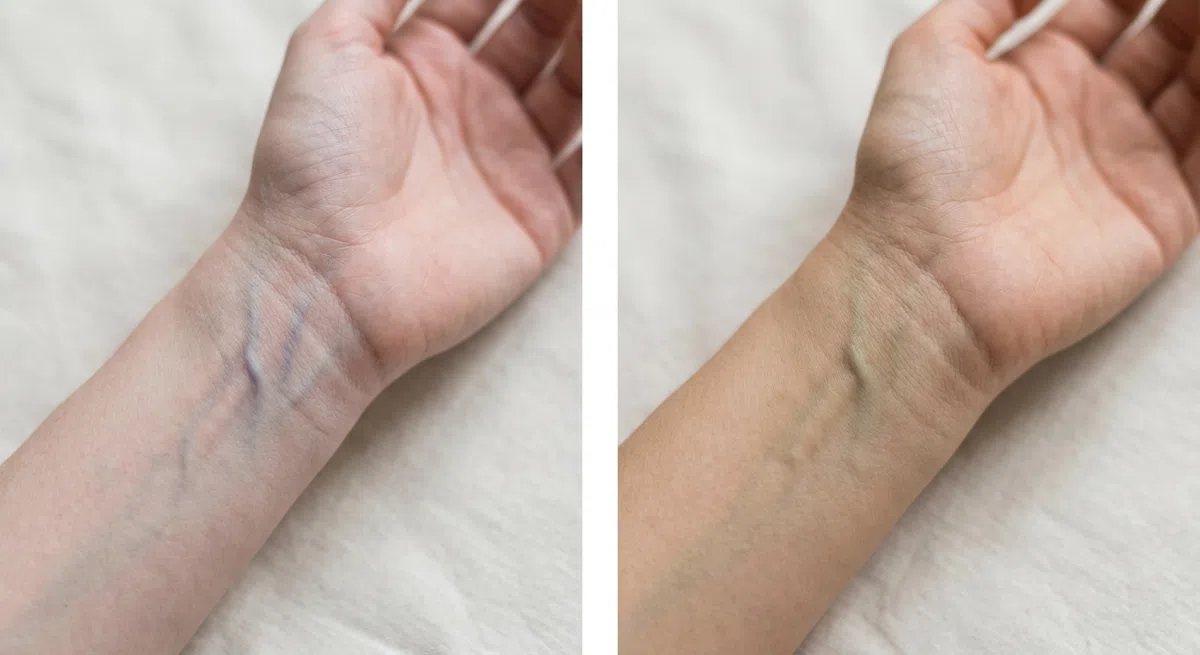
Stand by a window during the day and turn the inside of your wrist toward you. Artificial light corrupts this one - a warm bulb pushes the veins toward green, a cold LED toward blue - so daylight only. Give your eyes a moment, then read the veins as a group, not one vessel at a time.
- Blue or purple - cool undertone. This is the result that points here.
- Green or olive - warm undertone; Spring and Autumn are the seasons to read about.
- No clear answer - probably neutral; tests 2 and 3 will settle it.

Clean face, hair pulled back, daylight. Press ordinary white printer paper flat along the jaw and study the edge where the white meets your skin. The paper must be a true white; ivory and cream stock are warm in their own right and will bias the answer.
- The skin turns pink or faintly blue next to it - cool, and yours.
- A yellow or peach cast shows up - warm undertone.
- The skin looks grayish - usually neutral with an olive note.
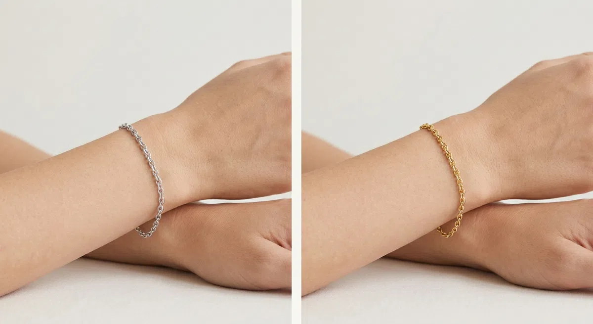
Take two plain pieces with no stones, one silver and one yellow gold. Hold each in turn to the wrist or up near the jaw, keeping your eyes on the skin next to each piece, not on the piece: does it smooth out and look fresher, or do sallowness and under-eye shadows show up?
- Silver, platinum or white gold looks better - cool undertone.
- Yellow gold lights the face up - warm undertone.
- Both look fine - neutral, and that argues against Cool Summer, the one summer led by temperature.
If the paper and the silver both come back cool without any hesitation, keep reading. If they hedge, look at Soft Summer first - this subtype does not hedge.
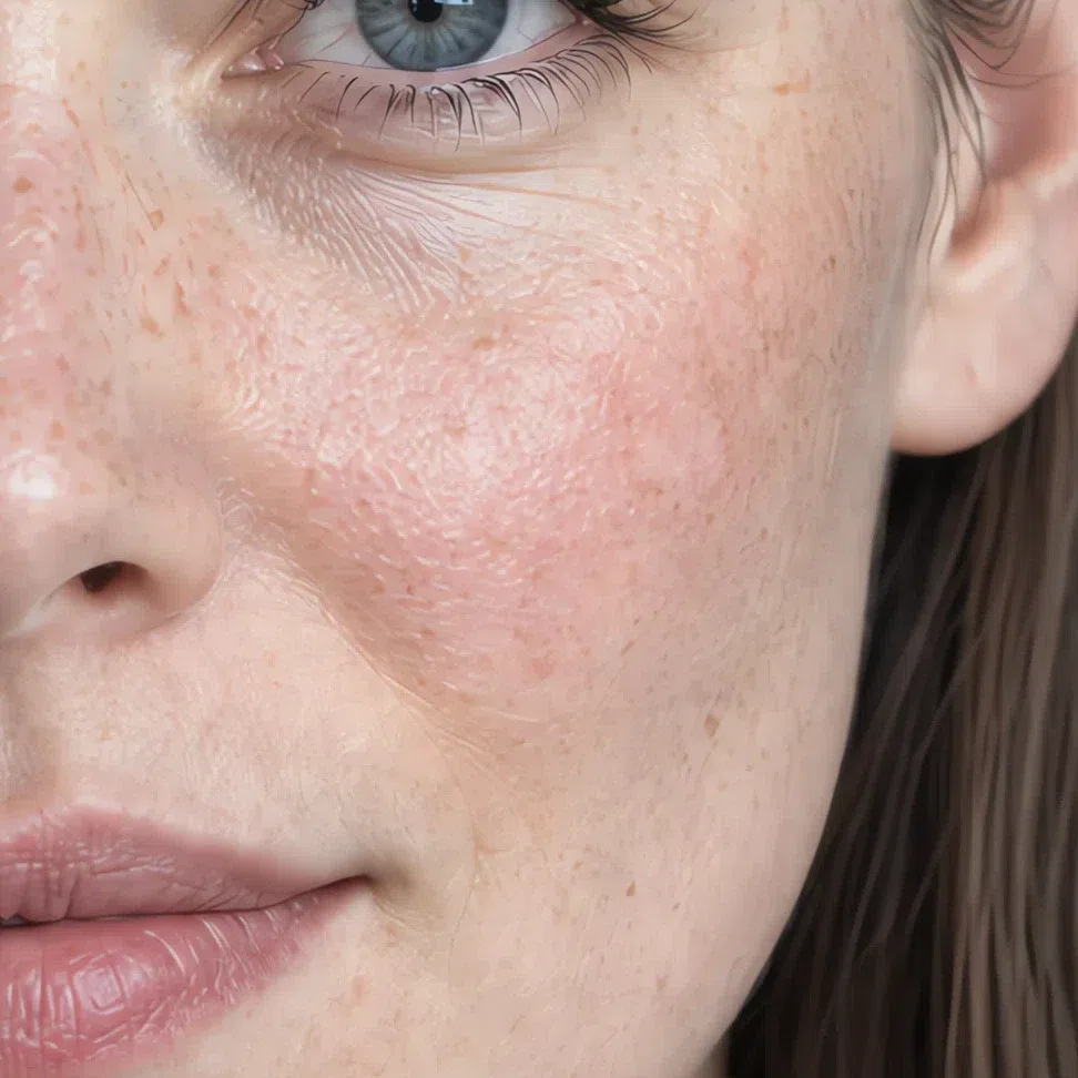
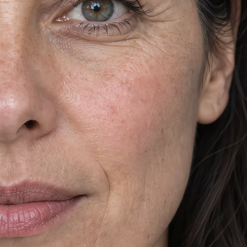


22. Eyes: a clear color, softly focused
A Cool Summer eye has a color you can name, but it never glitters. It is softer than a winter eye and clearer than a Soft Summer one.
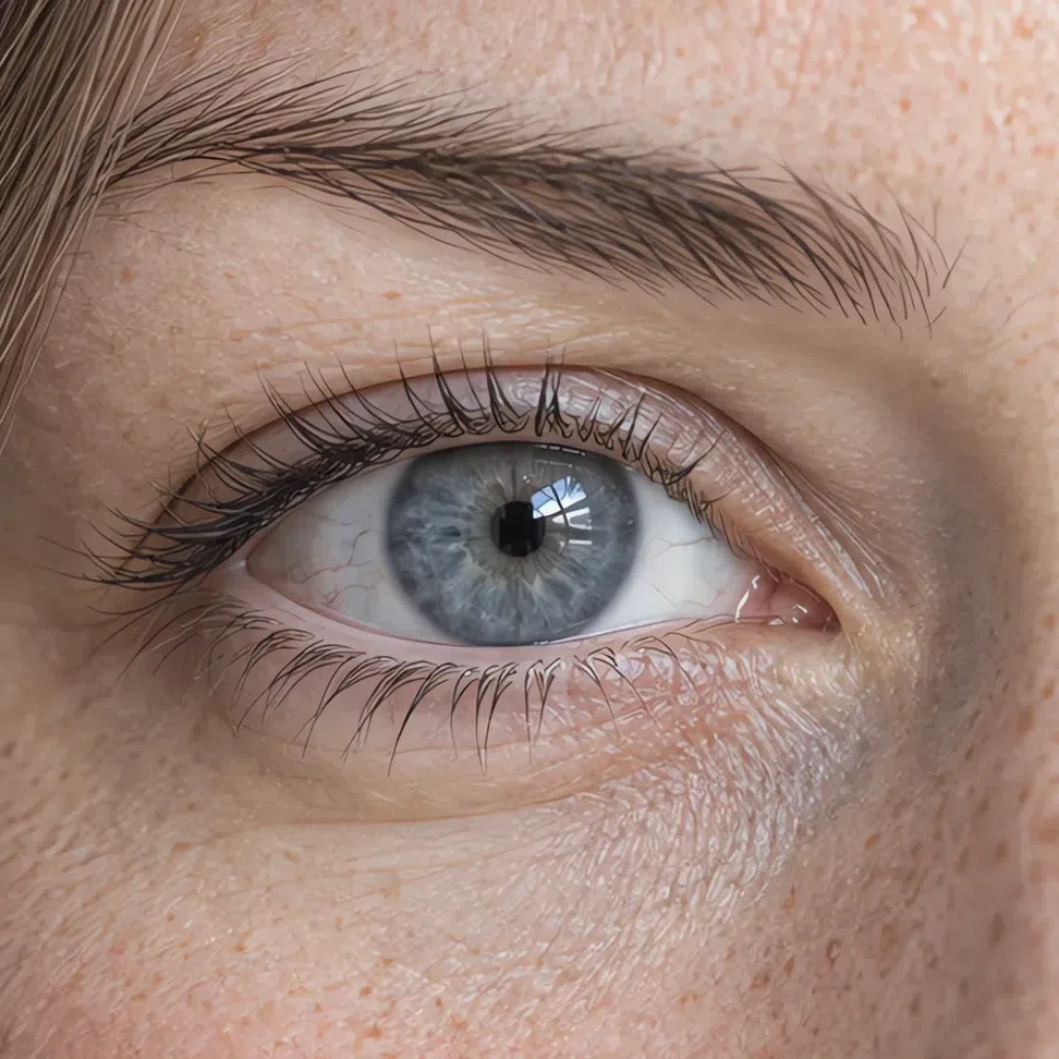
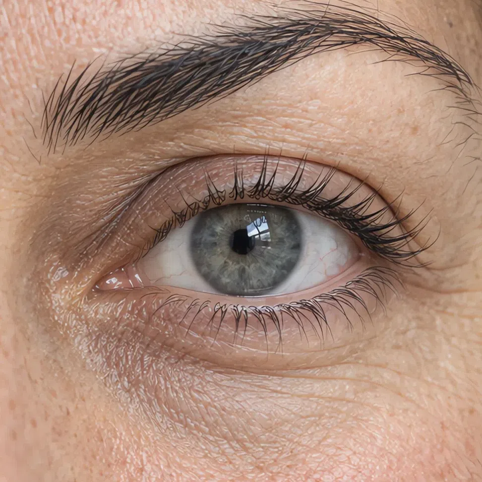
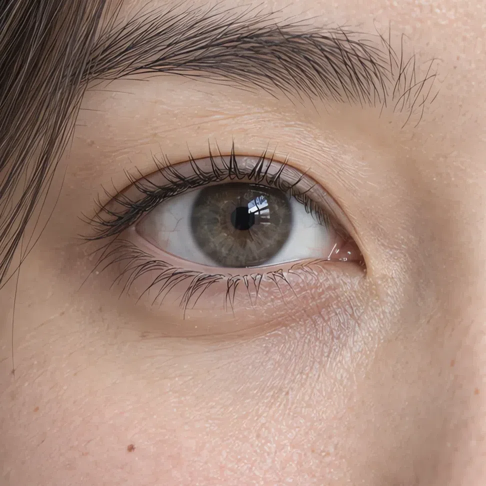
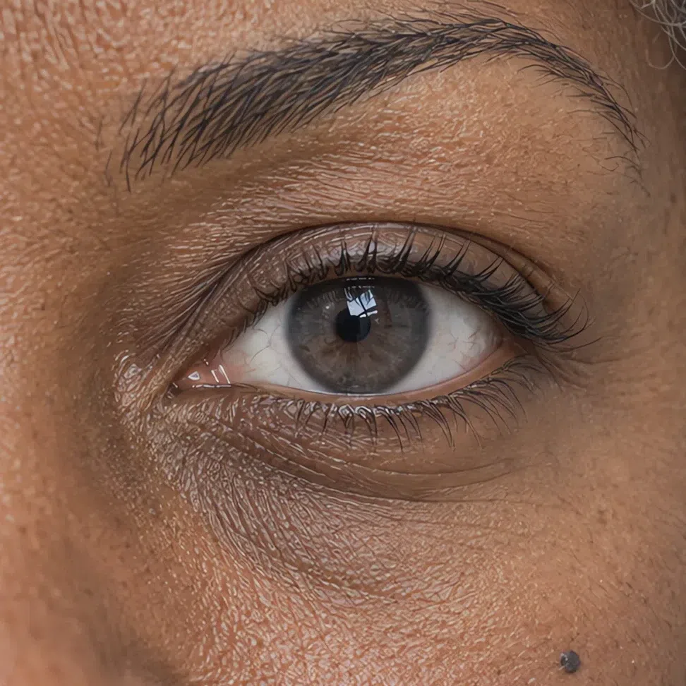
The classic is gray-blue, anywhere from pale to a deep steel. Close behind come a gray-green like a northern sea, a plain steel gray, and denim or storm blues with gray mixed in. The rare fifth is a cool hazel: brown shot through with gray or gray-green, with no gold anywhere in it.
What unites them is what is missing. There are no amber, gold or rust flecks around the pupil, and the outer ring of the iris is soft rather than a crisp dark line. The white of the eye usually reads a little milky rather than bright, so the iris sits against it gently instead of popping - which is exactly the edge a Cool Winter eye has and this one lacks.
Brown eyes can belong here, and people rule themselves out too early. The brown has to be cool - bitter chocolate or a gray taupe, with no amber streaks - and it has to agree with a cool skin and ashy hair. Warm brown with a golden rim is a different season.
Check the area around the pupil for gold. If there is none, and the color is easy to name but hard to call bright, you are looking at a Cool Summer eye.
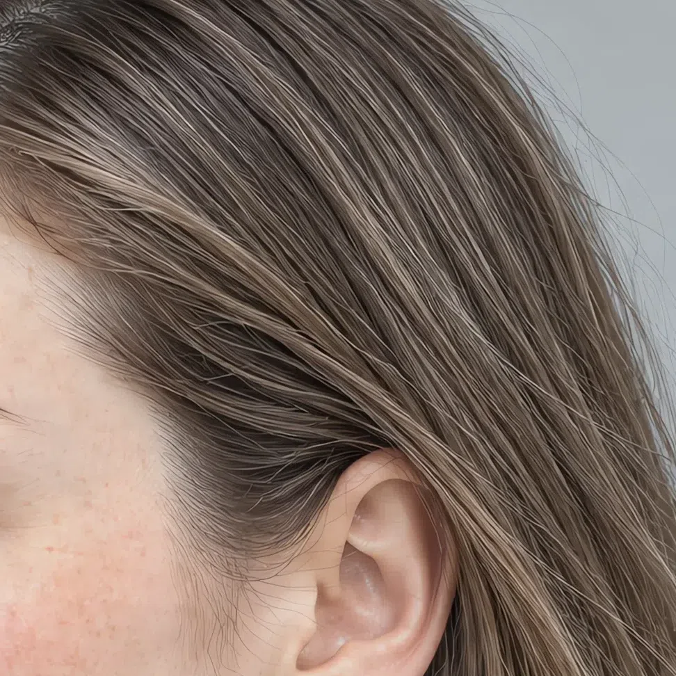
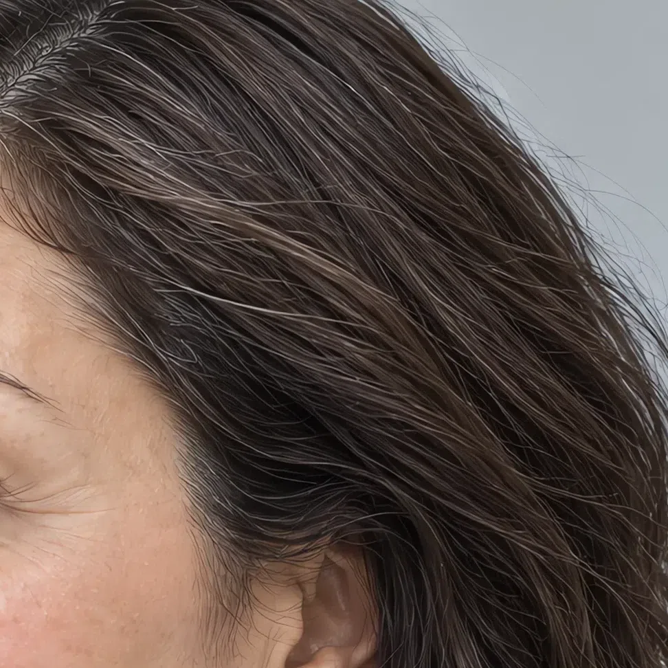
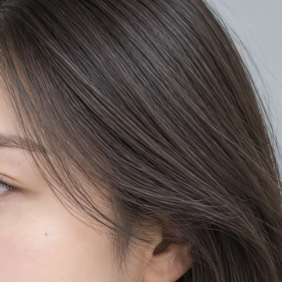
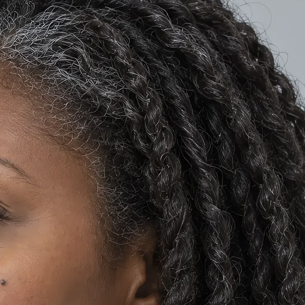
33. Hair: ash, from dark blonde to graphite
Natural hair is the easiest trait to misread, because the quality that decides it is the one its owner tends to like least.
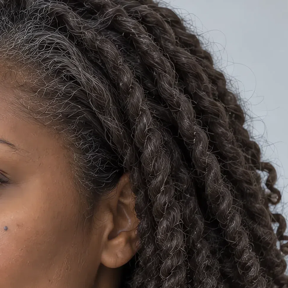
Cool Summer hair is ash at every depth: dark blonde, mid and dark ash brown, a cool chestnut the color of dark chocolate with no red in it, and graphite - near-black, but with gray in it rather than blue. This hair often sits clearly deeper than the skin, which is part of what separates this subtype from Light Summer.
Plenty of Cool Summers dislike their natural color and call it mousy or flat. It only looks flat on its own. Next to cool skin and gray eyes it is the reason the face looks composed - and the reason warm color jobs go so wrong.
Most Cool Summers lose their coloring at the salon. Honey, caramel, copper and warm chocolate are the standard ways to brighten ash hair, and each one parks yellow beside a face that has none of its own. Redness around the nose comes up, the skin looks ruddy, and the new color gets the compliments while the face gets blamed.
Ends that go slightly golden in summer prove nothing: sunlight breaks pigment down in most brown hair. Look at the regrowth at the root instead. If it is cool and ashy there, the ends do not change your season. With age this hair tends to gray well, into a clean silver or steel.
Read the roots, not the ends, and the undertone, not the depth. Ash at any level fits here; red or gold at any level points elsewhere.
44. Contrast: a visible step, never a cliff
Contrast is where Cool Summer parts company with the winters it resembles, and with the paler summer beside it.
Put the three features next to each other and you find a real but gentle step, low to medium overall. The hair is often clearly deeper than the skin, but it lands as dark gray against light rather than black against white. Brows tend to match the hair or sit a shade softer.
Set that beside a Cool Winter, where pale skin meets near-black hair and the face looks drawn in ink. Cool Summer shares the winter temperature but not its edges - which is why pure black and optic white overpower it. They bring a jump in lightness this face cannot match.
Light Summer sits on the other side: hair, skin and eyes all pale and almost merged. Cool Summer has more depth than that, enough to carry storm blue and deep plum, and still keeps every transition smooth.
Medium contrast with soft edges is the Cool Summer signature. If your grayscale selfie looks like a charcoal drawing, test yourself against Cool Winter instead.
- Convert a daylight selfie to black and white. No makeup, hair down around the face. With the color gone only lightness is left, so look at the jump from hair to skin: smooth mid and dark grays with a soft step point here, a hard black edge against pale skin points to winter, and everything melting into pale grays points to Light Summer.




On the left, the porcelain Cool Summer from the strip above in color. On the right, the identical photo with the color stripped out. Strip the hue out and lightness is all that remains - and her ash hair proves to be a dark gray rather than a black, a clear step above the skin but nowhere near the drop a winter shows.



Hair Skin Ramp runs black to white
Read each face on its own ramp. Height on the ramp shows depth; the distance between the two markers shows contrast - and deeper faces get more room below them, so the gap is not a score to compare across the row. Look instead at what each hair turns into: a Cool Summer's ash goes to dark gray, the winter's to true black.
55. The mirror test: fabric under the chin
The simplest check, and the most persuasive: hold a color at your face and let the skin answer.
Take off makeup and sit at a window in daylight. Bring each fabric up under the chin in turn and watch the skin around the eyes, mouth and jaw rather than the fabric. The right colors make the face look rested and even within a second or two; the wrong ones bring up shadows and fatigue just as fast.
Black is the result that surprises people most. On a Cool Summer it reads heavy and severe, deepening every shadow on the face. Gunmetal, Ink, Storm blue or Iris do the same structural job without the weight.
Shades that refresh you
If these even out your skin and clear up your eyes, you are in the right place:
- Rose quartz
- Hydrangea
- Thistle
- Iris
- Cornflower
- Raspberry
Shades that age you
Same light, same distance. If these dull the skin, sharpen the circles under the eyes or make you look unwell, the verdict is confirmed:
- Burnt orange
- Ochre
- Rust brown
- Jet black
- Acid green
Cool Summer vs Light Summer vs Soft Summer
The three summers share a cool base, and that is why people bounce between them. The way out is the naming convention: each summer is named after the axis that leads it, and for Cool Summer that axis is temperature. If an analysis labeled you True Summer, you belong in this same column under its older name.
| Cool Summer | Light Summer | Soft Summer | |
|---|---|---|---|
| Leading axis | Temperature. The coolest summer, with no warmth at all | Lightness. Pale first, cool after that | Softness. Grayed first, cool after that |
| Temperature | Fully cool - blue-pink through and through | Neutral-cool, with a spring lightness to it | Neutral-cool, with an autumn trace in it |
| Depth | Medium - a step or two deeper than Light Summer | Light, with no dark note anywhere | Mid, spanning more depth than either neighbor |
| Clarity | Moderate - colors read clear, not dusty | Soft and airy, a lot of white in each shade | Muted and smoky, gray in every shade |
| Contrast | Low to medium, with a visible but soft step | Very low, everything pale and close | Low, with the face settled at mid depth |
| Skin | Pink, blue-pink or porcelain; cool olive possible | Light, neutral-cool, rosy beige | Neutral beige-gray, often olive |
| Eyes | Gray-blue, steel, gray-green, cool hazel | Light blue, light green, pale gray | Veiled gray-green and hazel, hard to name |
| Hair | Ash at every depth, dark blonde to graphite | Light ash blonde to light mousy brown | Mid to dark mousy brown |
| Metals | Silver, platinum, white gold | Delicate silver, platinum | Brushed silver, rose gold |
Two columns still look equally right? Ignore everything under the first row - the leading axis settles it. For this page the deciding question is blunt: does any warm color at all look good near your face? If the honest answer is never, this is your column.
What a Cool Summer looks like, up close
Skin, eyes and hair up close
Signs above asked whether this is your coloring. This section is the catalogue: the variants that actually turn up inside Cool Summer, so you can recognize yours even when it looks nothing like the textbook example. Every photo shows real texture at macro, across four complexions.
Cool Summer skin: four faces of one undertone
The range runs from porcelain to deep brown, and one thing holds across all of it: the color underneath is blue-based. The four cards below are the four ways that shows up on an ordinary day.
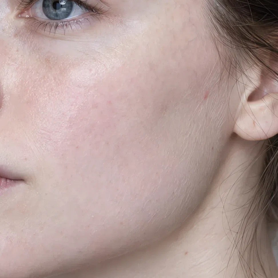
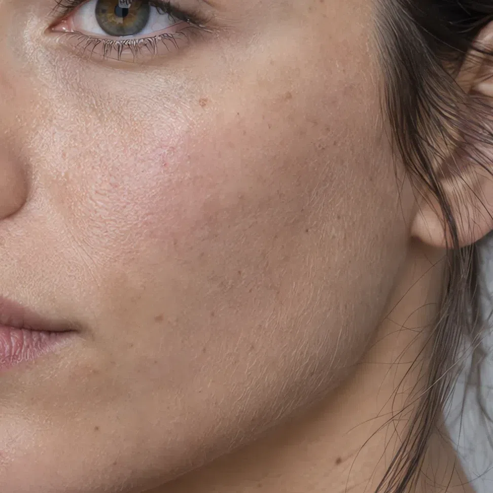
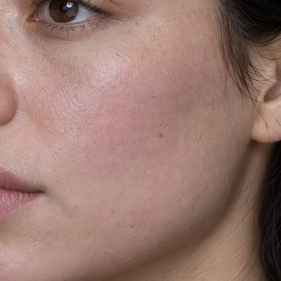

Yes - olive is a depth and a cast, not a temperature. The olive that fits here is grayed and cool, closer to sage than to khaki, and the skin under it still flushes pink. What rules the subtype out is an olive that turns golden in summer and glows next to yellow gold; that is warm olive, and it belongs to autumn.
The practical result shows up first in makeup: a foundation needs a neutral or pink base, because a yellow one sits on this skin like a mask. The makeup section has the shades.
Cool Summer eyes: the five you will meet
Gray-blue is the classic, and the strip above already shows it beside gray-green. Below are the other variants that turn up inside this subtype - including the two brown ones people assume rule them out.
Beyond gray-blue and gray-green
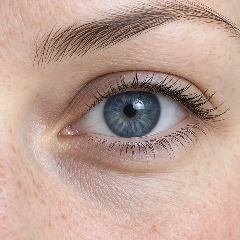
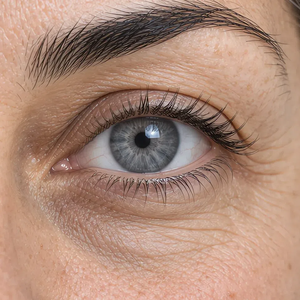
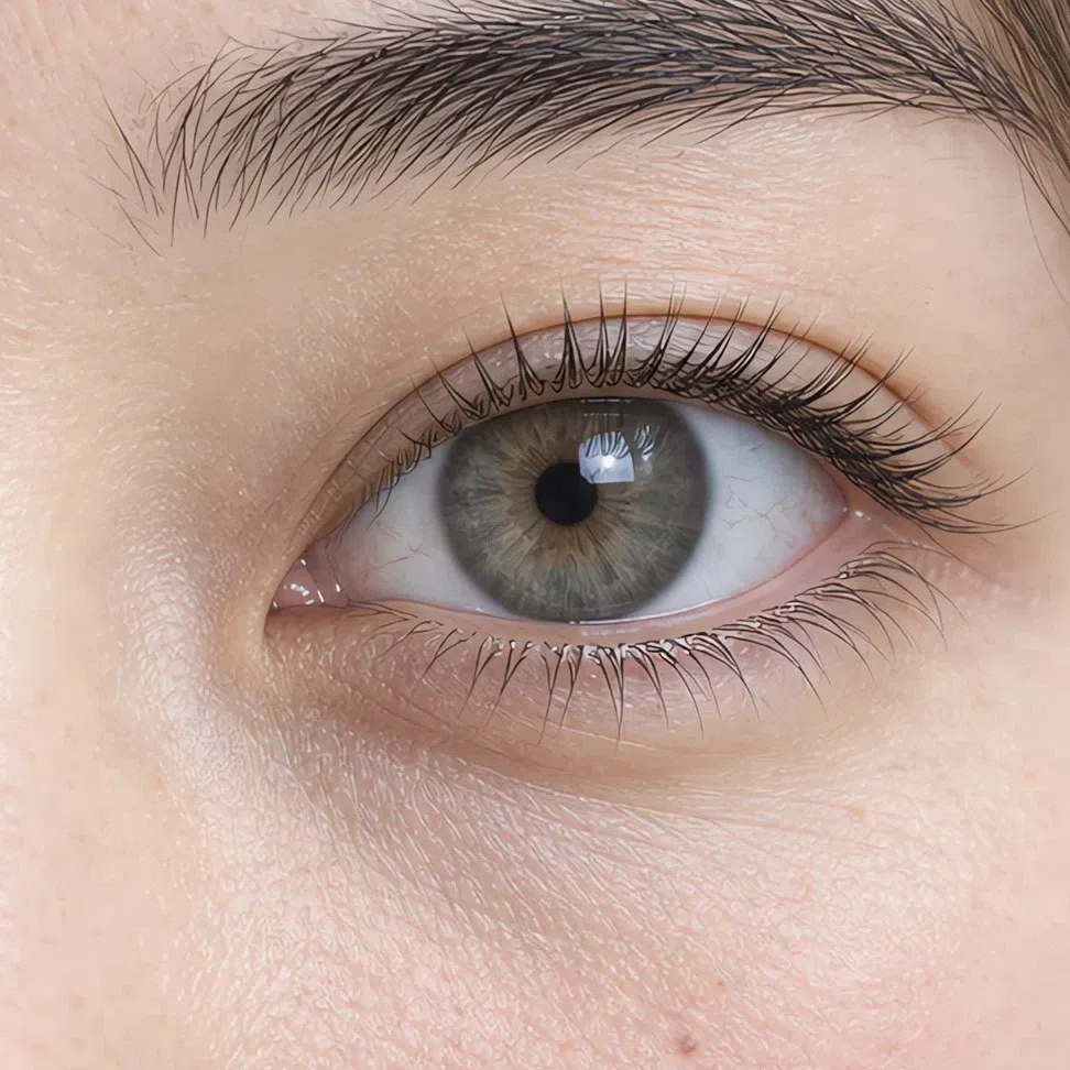
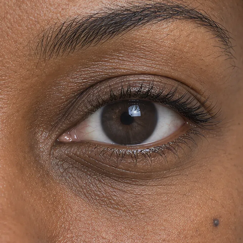
What all five have in common
- The color shifts. The same iris reads bluer, grayer or greener depending on the light and the clothes around it, which is why people describe their own eyes three different ways.
- Nothing in them is warm. However deep the iris runs, the temperature stays the same as the skin - which is exactly why one palette can serve a gray-blue eye and a dark brown one.
Eyes like these come forward beside clear cool color - cornflower, storm blue, iris - and sink beside anything golden, which pulls the eye toward the fabric and leaves the iris looking duller than it is.
Cool Summer hair: the whole natural range
Every natural shade here shares an ash base, and the range is wider than the other summers: light ash brown at one end, graphite near-black at the other, with a silvering stage that usually looks deliberate rather than faded.
Natural shades, light to deep
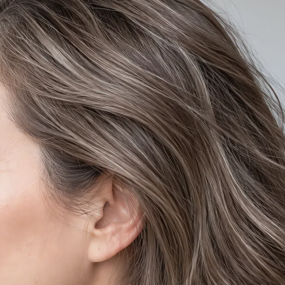
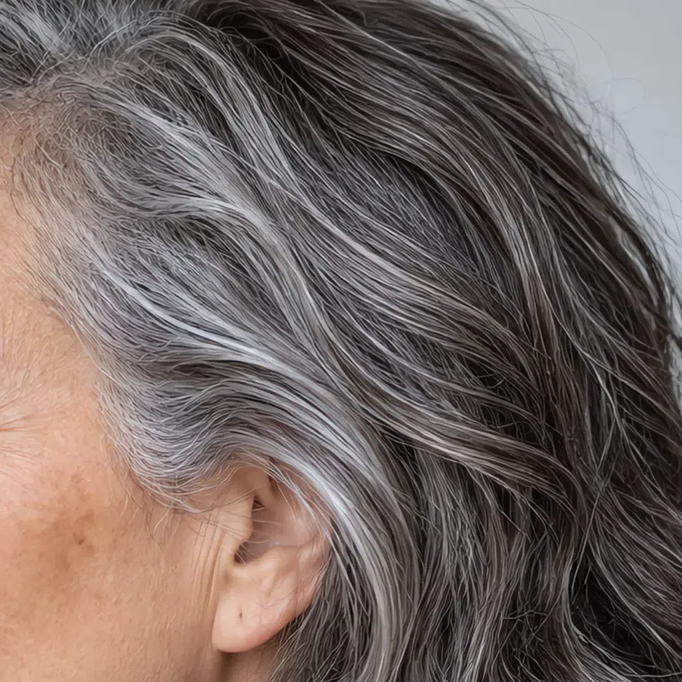
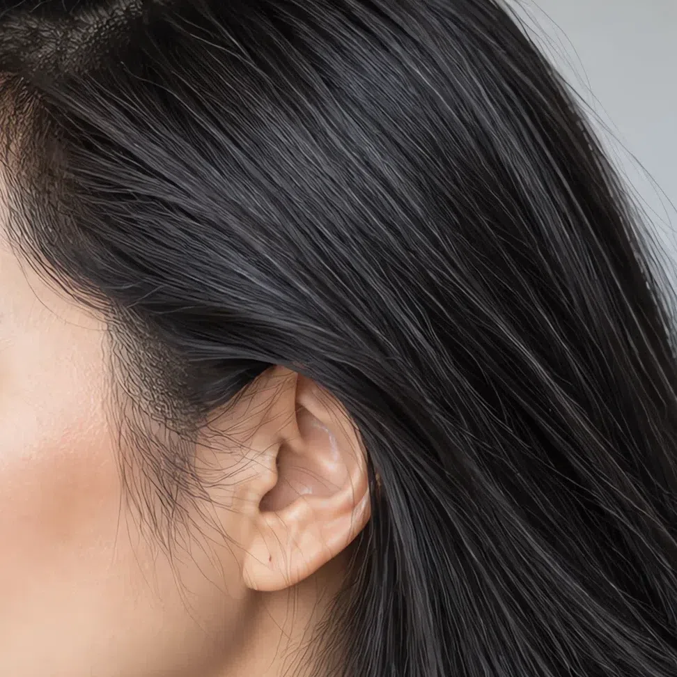
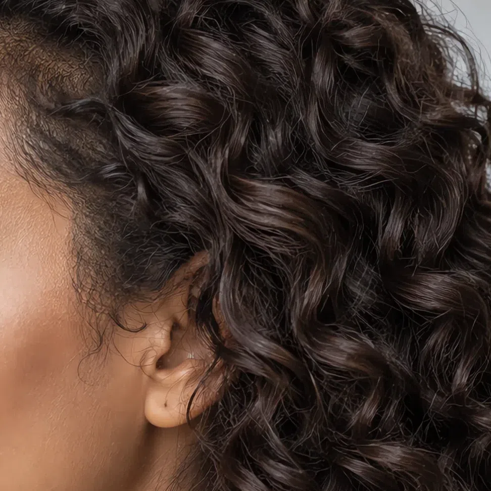
What Cool Summer hair never is
- Red, auburn or copper. Any red in the natural color, however faint, points to a warmer coloring.
- Golden, honey or caramel blonde. Light hair here is ash or beige-gray. Wheat and butter tones belong to spring.
- Warm chocolate or blue-black. A red-lit chestnut is too warm; a glossy blue-black is too stark. The deep end of this range stays soft and gray-toned.
When coloring, stay inside the ash family and near your natural level. Which tones work and what to ask a colorist for is in the hair color section.
Cool Summer palette: 20 shades on one real face
Plus the 8 to avoid, and what to wear instead
The Cool Summer palette is what color looks like with every trace of yellow taken out. Blues lean toward violet, pinks toward raspberry, greens toward the sea and grays toward steel - and none of them is pushed to full strength, because the face they are for tops out at medium contrast.
Two rules sit under all twenty. Cool first: a shade with gold or orange anywhere in it is out, however soft it looks. Clear, not dusty: these shades carry real pigment - clearer than the grayed Soft Summer set, gentler than Cool Winter's jewel tones. Hold both and you can judge a clothing rail without a swatch card.
Each card below is the same photograph of the same Cool Summer, with only her sweater repainted to the hex printed under it - her face, hair and light are untouched. So you are never looking at a color on its own. You are looking at how her skin reacts to it, which is the only thing a palette is for.
Base colors: the Cool Summer wardrobe
Twelve shades for the everyday work - coats, trousers, knitwear, shirts. Buy these in quantity, and the accents further down will look intentional rather than loud.
Neutrals: six to build on
Most wardrobes run on black, charcoal and optic white. Yours runs on these six instead: four blue-cast grays, a pinkish beige and a gray-toned white. Can a Cool Summer wear black? Yes - in trousers, a skirt, boots, a bag. Keep it away from the collar, where it deepens every shadow and flattens the pink in the skin. Up there, Gunmetal by day and Ink by night do the same job without the weight.
How to put the neutrals together
- Build a gradient. Ink with Steel gray, or Gunmetal with Flannel. Two grays a few steps apart look considered rather than dull, and the step between them echoes the medium contrast already in your face.
- Soften with Cameo. A Cameo knit or blouse takes the edge off any gray and makes a strict outfit look touchable. It is the only beige you need.
- Let the neutrals carry the color. Every accent below lands best against one of these six. Roughly four parts neutral to one part color is the proportion that keeps an outfit calm.
Pastels: six with real pigment
These are not sugary pastels. Each carries enough color to register as a choice, which is the difference between a Cool Summer pastel and a Light Summer one. Wear them at the collar: blouses, knits, scarves.
Accent colors: the deeper, clearer half
The accents are what set Cool Summer apart from its neighbors. They go deeper and carry more color - iris, storm blue, mulberry - and they stay cool all the way down.
Five deeper shades, shown on a scarf
An accent painted over a whole sweater turns into the main event, so these five are shown where they work hardest: on a scarf over a Cloud top. On this coloring they can also carry a coat or a dress - Storm blue and Iris are this palette's navy.

Metal and finish
One metal family, and it is not a close call. This coloring is clear enough to carry a polished finish as well as a satin one.
Two rules for jewelry
- Silver, platinum and white gold are one answer. On this skin the three read the same, so the metal a piece comes in is never the deciding factor. Yellow and rose gold both put warmth at the face - the same failure as Golden yellow in the list below.
- Pick gray, pink and blue stones. Pearls with a gray or pink luster, aquamarine, amethyst and sapphire all repeat colors already in the palette, so they read as part of the outfit rather than as decoration added to it.
Where a little color goes a long way
Three shades here earn their place best at small scale. Below, each accessory comes with four pairings, always a neutral top plus a colored accessory, to show how far a small amount of color travels when it is placed well.

Hat
Worn on the head, a hat throws its color down from above and never lies flush against the cheek, so it can take the deepest shades here without arguing with the skin.
Scarf
The strongest accent you can wear, because it lies right against the face. Choose the shade that makes the skin look rested, not only the one you like on the hanger.
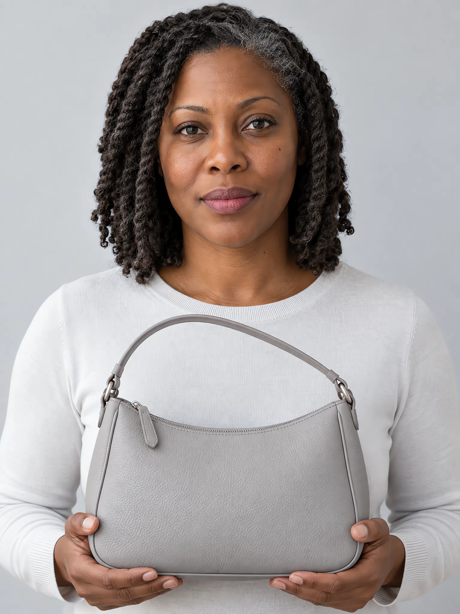
Bag
Carried away from the face and usually leather, which makes it the natural home for the boldest shades in the palette.

Neck scarf
A small patch of color right at the throat. It takes pale and deep shades alike, because the area is too small to take over the face.
Cool Summer colors to avoid
Eight shades in two groups. They fail for different reasons, which is why each group has its own fix - and every card carries the shade to wear instead.
Warm and earthy shades
All four have yellow or orange underneath - the one thing a Cool Summer coloring contains none of.
Why these do not work
- The skin borrows the cast. Fine, cool skin reflects what is held against it. Yellow reflected onto pink reads as sallow, and redness around the nose suddenly shows.
- Softening does not rescue them. A pale peach or a muted camel is no safer than the bright version, because the problem is the direction of the color rather than its strength.
- Each one has a cool twin. Raspberry instead of Burnt orange, Cameo instead of Camel, Mulberry instead of Rust brown, Celadon instead of Golden yellow.
Pure black, optic white and neon
Nothing here is warm. These fail on force: too dark, too white or too saturated for a face that stops at medium contrast.
Why these do not work
- The step is too big. A Cool Summer face runs from medium-light to medium-dark. Black and optic white sit outside that range at either end, so the garment becomes the most contrasting thing in view.
- Neon wins on intensity, not depth. Scarlet and Acid green do not outshine you by being dark. They do it with sheer color, and the eye stops at the fabric.
- Cool is not the same as right. These tempt precisely because black and white read as cool. Cool Summer needs cool and moderate together - the moderation is what a Cool Winter can do without.
Cool Summer color combinations
Everything in this palette shares one temperature, so most pairings work. These five are ready to copy.
Five outfits, biggest piece first
Left to right: the main garment, the piece that pairs with it, and the small accent that pulls it together.
The office classic
A Steel gray suit, a Rose quartz blouse, Iris shoes. The strictest outfit here, softened by one pink right at the face.
Weekend, relaxed
Cameo trousers, a Storm blue sweater, a Celadon scarf. Put together without trying, with the pale green kept at the collar.
After dark
An Ink dress, a Hydrangea wrap, Mulberry on the lips. Dark and quietly dramatic, and never black.
Color on a gray day
Flannel jeans, a Duck egg sweater, a Raspberry bag. The brightest formula of the five, and still calm.
Clean lines
A Cloud shirt, a Cornflower jacket, silver at the ears. The Cool Summer version of the white shirt and blue blazer.
The rule underneath all five: one temperature, a moderate step. Pair a light and a deep shade from the same family, add one accent at most, and let texture - wool, silk, cashmere - supply the rest.
The Cool Summer capsule wardrobe
Eight pieces, every one shown on four complexions
Eight garments that cover most of an ordinary week, each of which goes with every other. The number is not the point. The point is that a wardrobe kept inside 20 cool shades stops producing outfits that match on paper and still look wrong on you.
Every piece is shown on four complexions, from porcelain to deep brown. Undertone and contrast decide this season; skin depth does not, and one model alone would quietly imply otherwise.
Eight Cool Summer pieces that all work together
Put the budget into the neutral pieces, which you will reach for most days and where a thin fabric gives itself away first. The colored pieces can be cheaper and more playful.
Everything here was chosen for its color: this is the Cool Summer palette turned into clothes. The mechanics of capsules as such - the ideal size, the math of outfit counts, the order to shop in - are a separate topic, and this page leaves them alone.
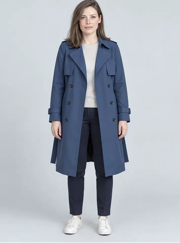
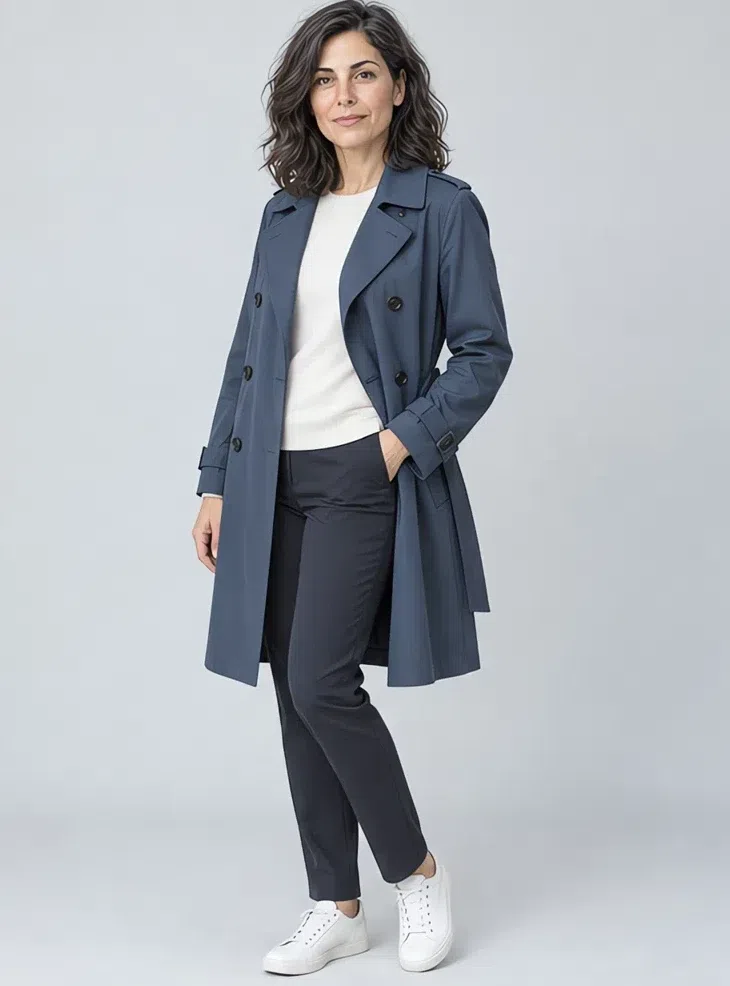
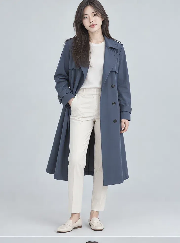
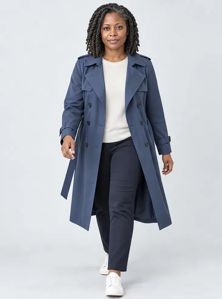
1Storm blue trench coat
A trench that replaces the classic camel one, which puts yellow right under the chin. A deep gray-blue does the same job and flatters instead. Double-breasted with a belt, hardware in silver or covered in fabric. It works over jeans and over dresses alike.
Tip Choose a dense cotton or gabardine: it holds its shape without looking stiff.
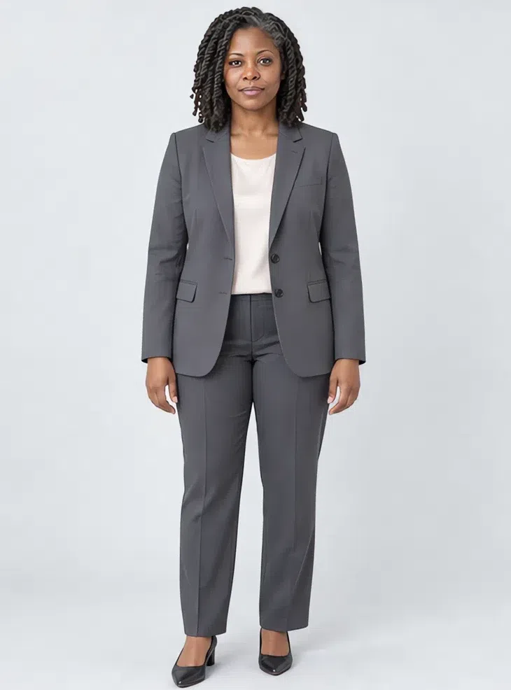
2Gunmetal blazer
This does the job black does elsewhere - it gives an outfit structure - but more quietly. A straight or lightly fitted cut in wool or a wool blend, the base for work outfits and for smart casual with jeans.
Tip Push the sleeves up and wear it over a silk top in one of the palette pastels.



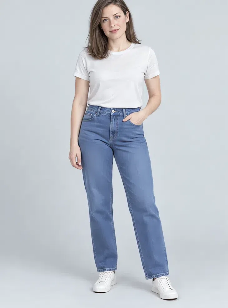
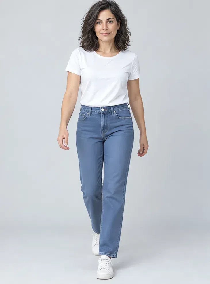
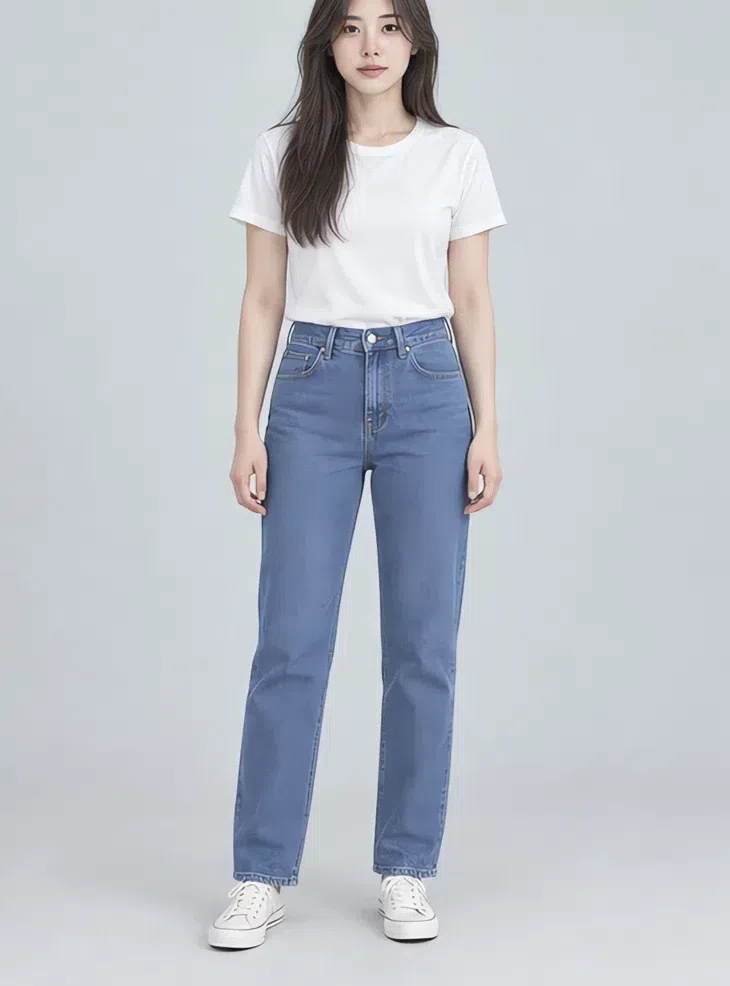
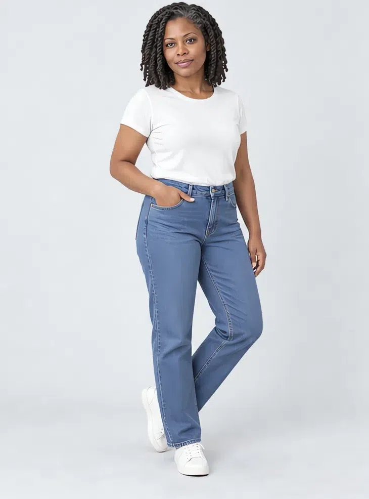
3Cornflower straight jeans
Denim in a clean, even blue with no orange stitching and no warm fading. Straight, mom or skinny - the cut matters far less than keeping the color uniform and cool. It goes from sneakers and a sweater to heels and a silk blouse.
Tip Silver-toned buttons and rivets keep the whole outfit in one temperature.
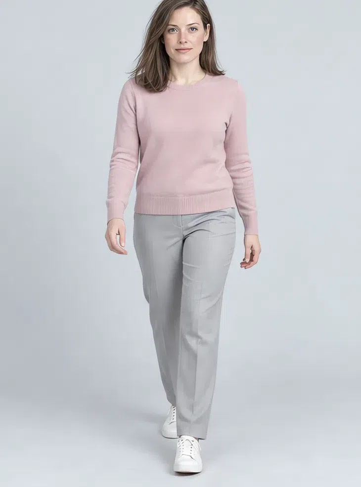
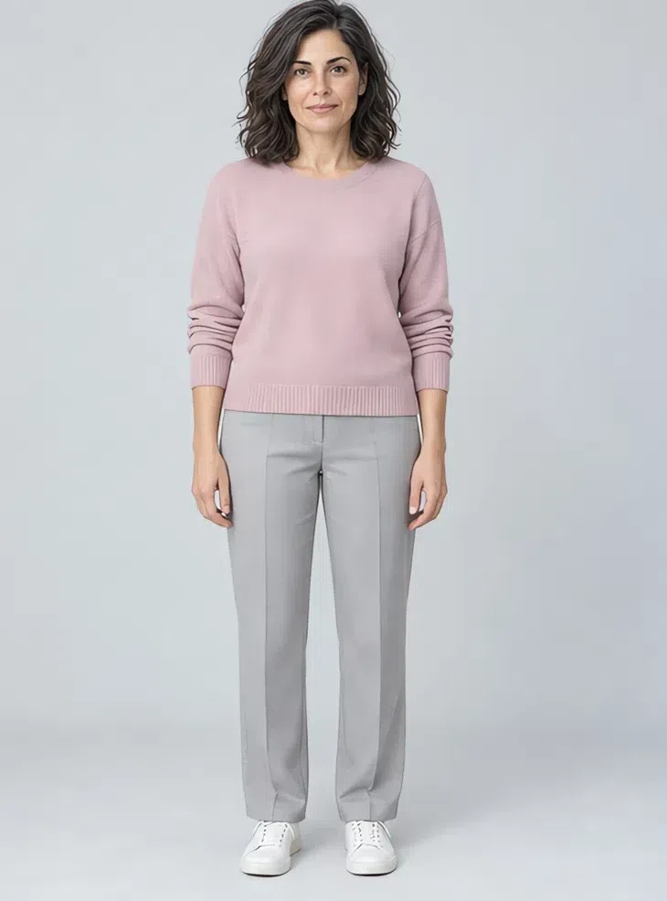
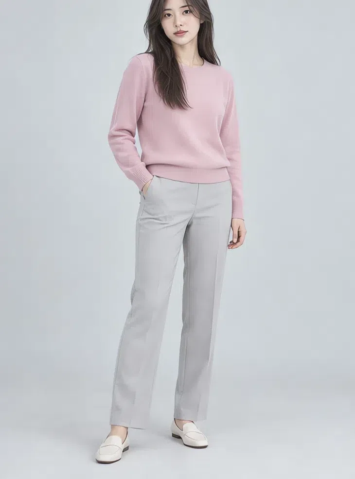
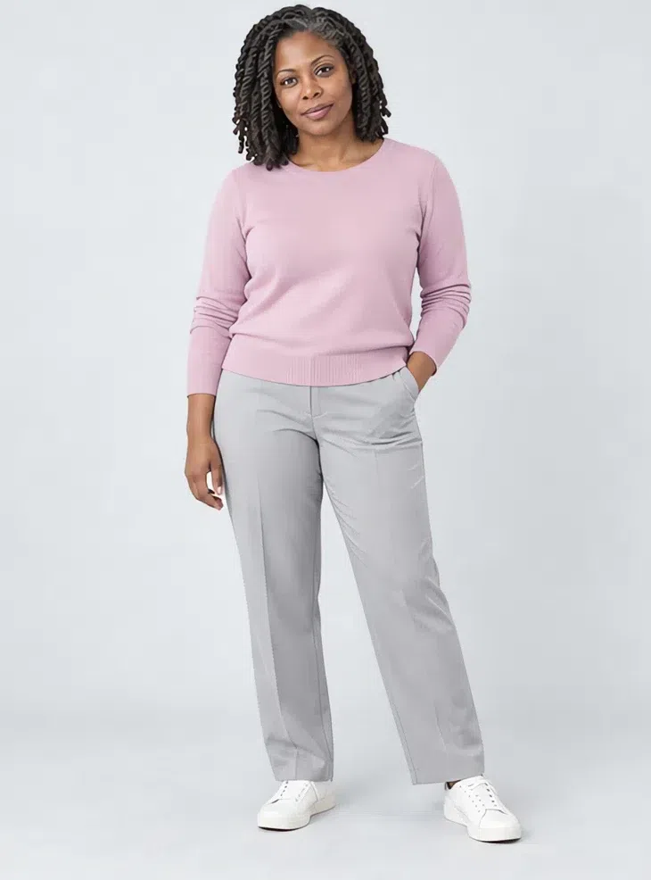
4Rose quartz cashmere sweater
The pink that brings up your natural flush without turning the face red. A classic crew or V-neck, worn over gray trousers, with blue jeans, or layered over a slip dress.
Tip Add fine silver - a thin chain or small studs - to underline the cool note.
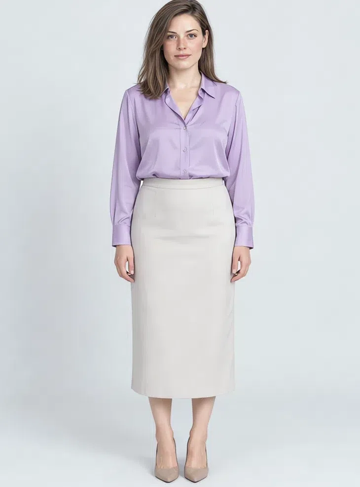
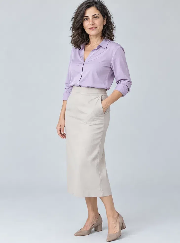
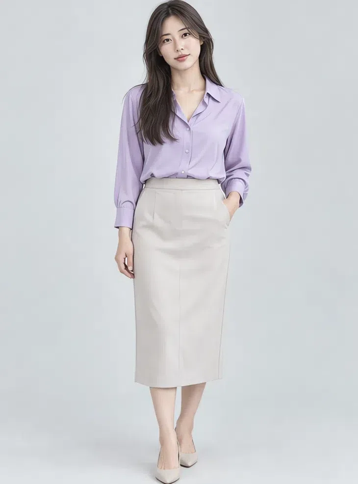
5Thistle silk blouse
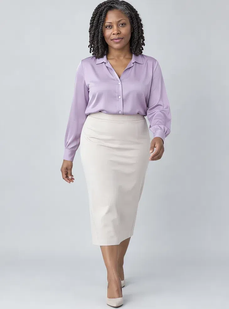
This takes the place of the bright white blouse. A cool lilac, a pale blue or a mint-toned green, in silk or Tencel whose soft sheen lights the skin from below. Under a blazer, with a midi skirt, with jeans.
Tip Natural silk or Tencel drape beautifully and feel good against the skin.
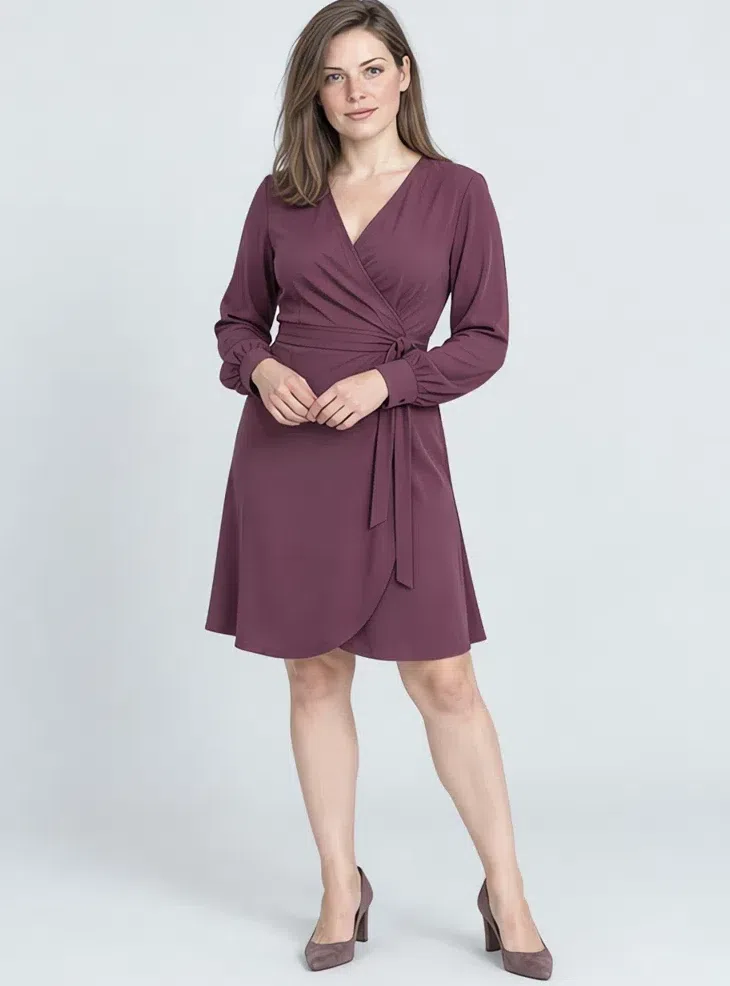
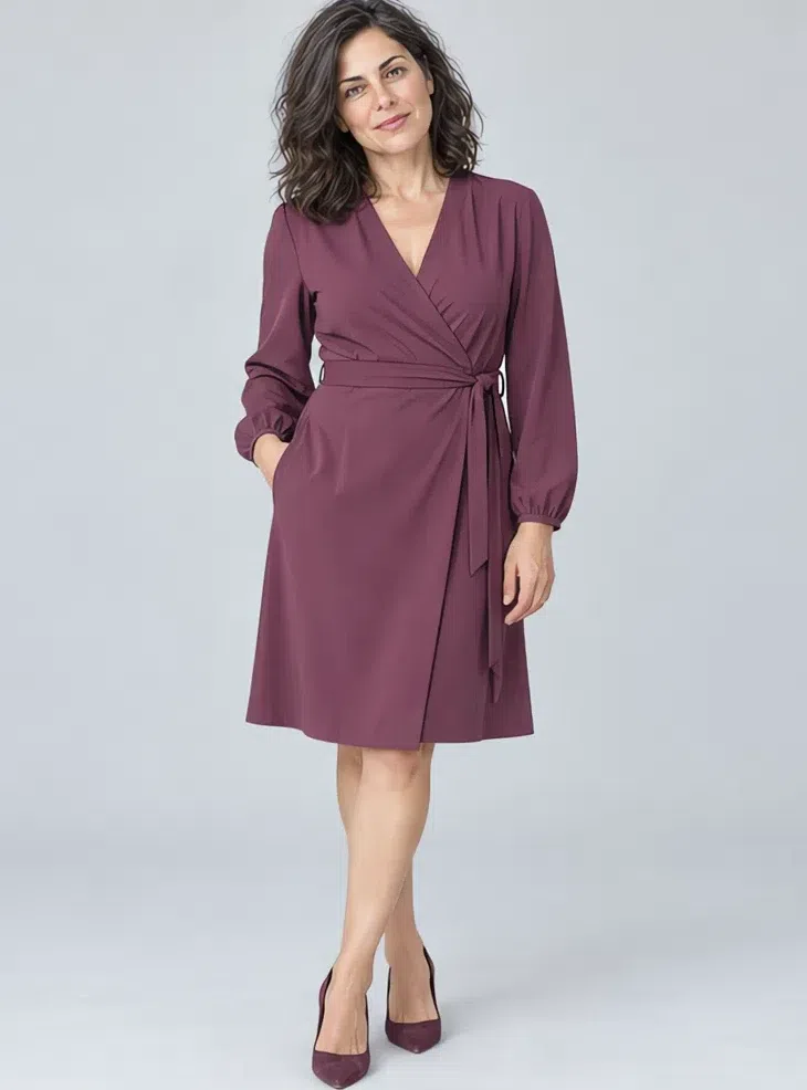
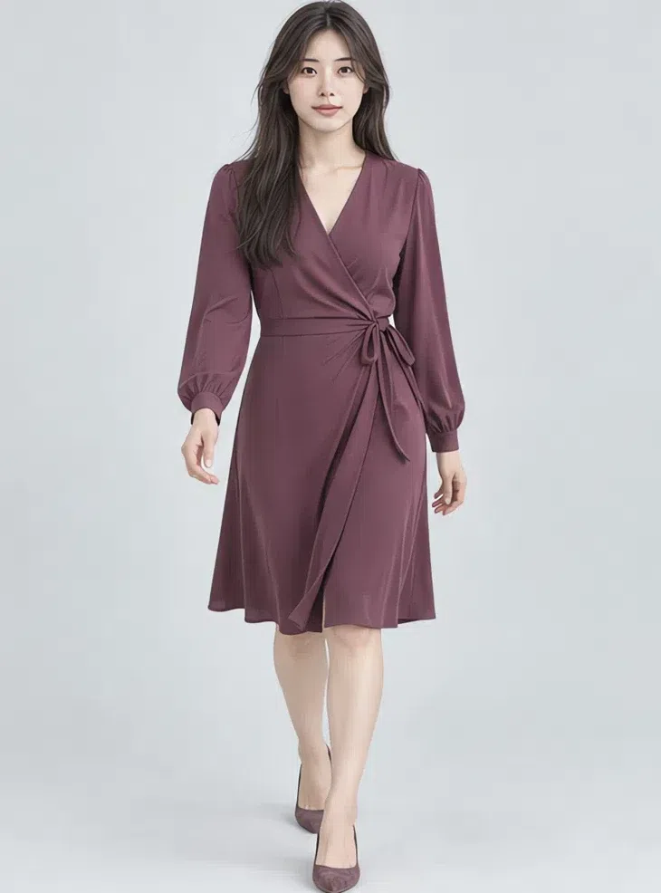
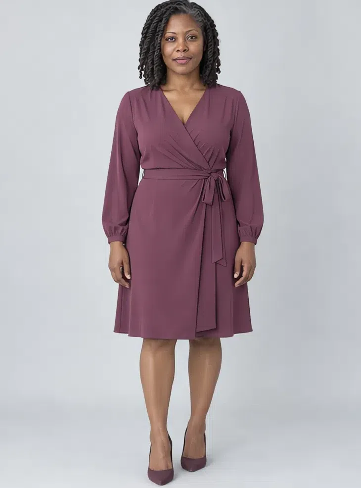
6Mulberry wrap dress
A deep cool berry - or iris, or a deep juniper green - looks expensive and makes the eyes look deeper. Pick the cut for your figure: sheath, A-line or wrap, in crepe or a dense jersey.
Tip Silver jewelry and gray or taupe-toned shoes keep the look from getting heavy.
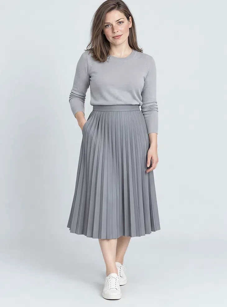
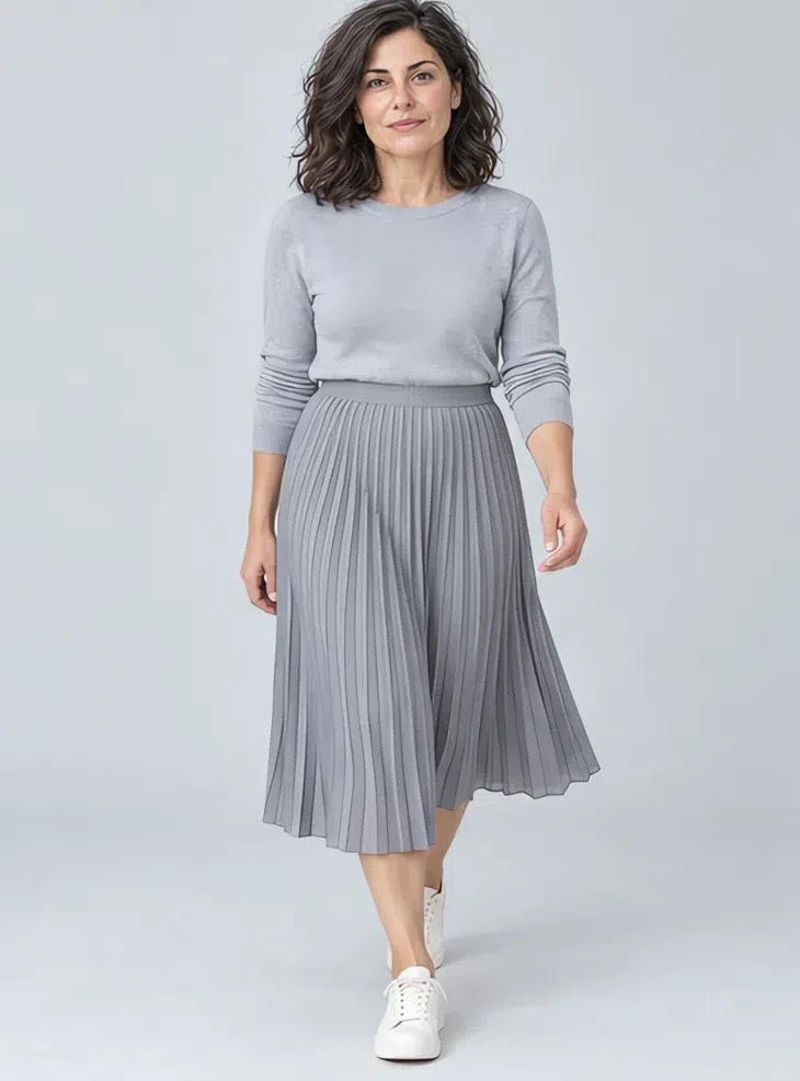
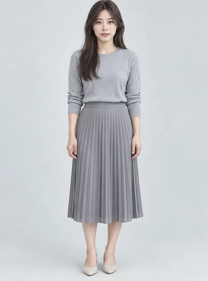
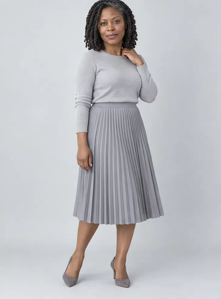
7Steel gray midi skirt
A cool mid gray that goes with every top in the palette. Pleated, satin slip or pencil - it runs from strict to romantic and lengthens the silhouette.
Tip Try tone on tone with textures: smooth satin with a fluffy knit in nearly the same gray.
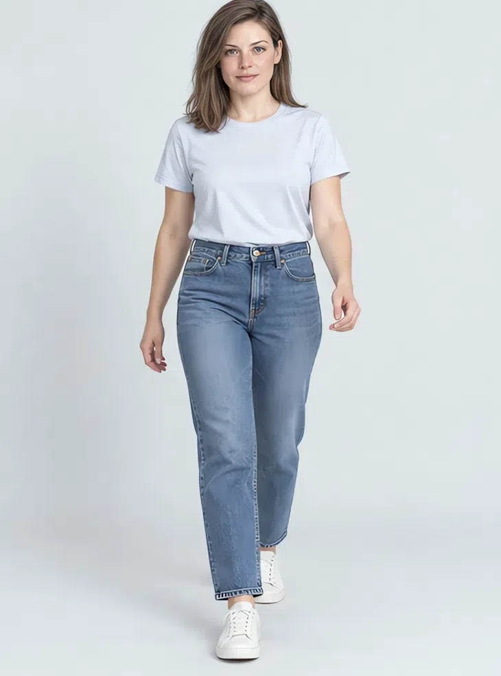
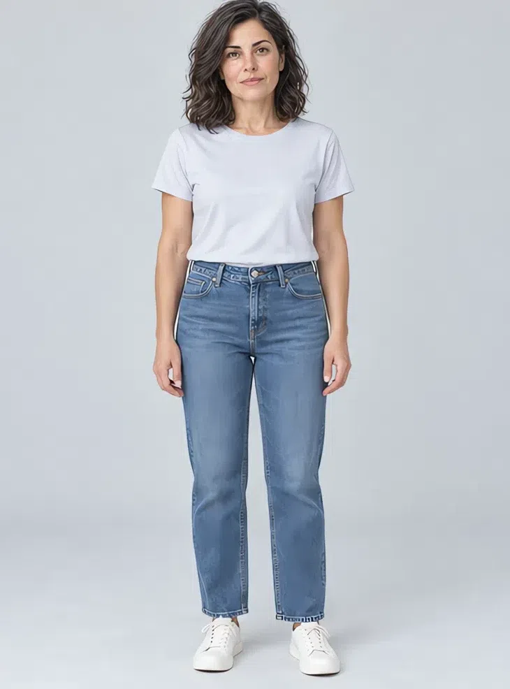
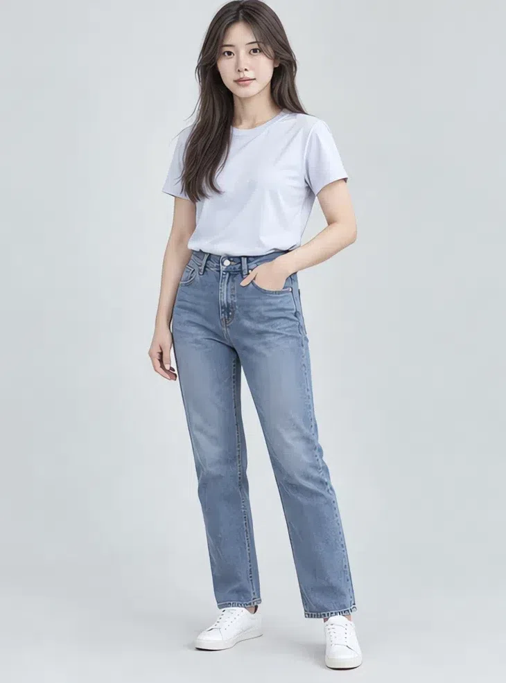
8Cloud cotton tee
The white tee in the white that suits you: soft and a little gray rather than creamy or optic. Heavyweight cotton that holds its shape, as the backdrop for color and silver.
Tip Keep a few necklines: crew, V and a relaxed oversized cut.
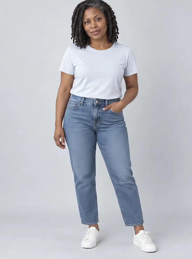
Five ways to combine them
- Monochrome in steps. Several depths of one family: Steel gray trousers under a Gunmetal sweater, or Hydrangea with Storm blue. It looks elegant and lengthens the line.
- Neutral base, one accent. Build on Flannel, Cameo or Storm blue and add a single shade from the palette - a Raspberry scarf or a Thistle bag. Two accents in one outfit start competing.
- Neighbors on the wheel. Hydrangea, Iris and Thistle sit side by side on the color wheel, so they blend into one impression instead of reading as three separate decisions.
- Light at the top, deeper below. A Cloud or Blossom blouse at the face keeps it fresh, while Storm blue or Ink trousers hold the outfit down. This is the medium contrast your coloring can carry and a Light Summer's cannot.
- Mix the textures. One color can still feel varied: smooth silk with soft cashmere, a flowing skirt with a structured jacket. On a palette of close shades, surface does the work contrast would.
Cool Summer makeup colors
The shades, with the base matched to your depth
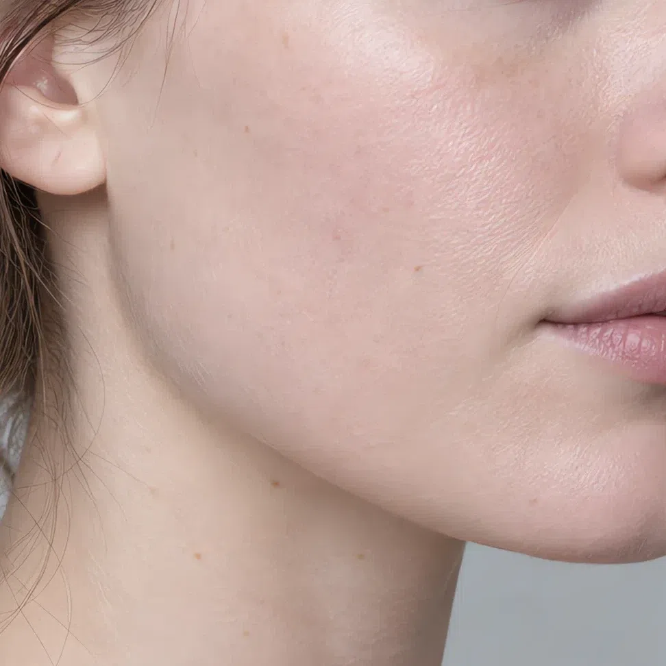
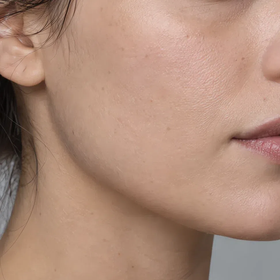
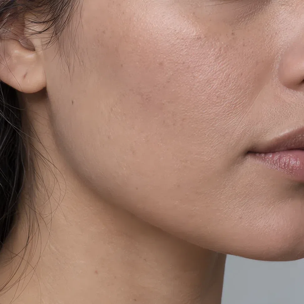
The rule carries straight over from the palette: pink-based, cool, and clear without being loud. The three base products depend on your own depth, so they are shown on four complexions. For blush, eyes and lips, a row of shades is all you need.
Base: foundation, contour and glow
Here the answer depends on you as much as on the season, which is why each product is shown at four depths.
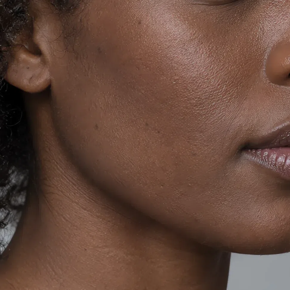
Foundation matched to your depth
Pink-based or neutral at every depth. A yellow base is the classic mistake on this skin - it sits on top like a mask instead of disappearing.
Bronzer matched to your depth
Used as a contour, not a tan: a cool taupe a shade or two darker than the skin it sits on. Warm bronzers read orange on a Cool Summer at any depth.




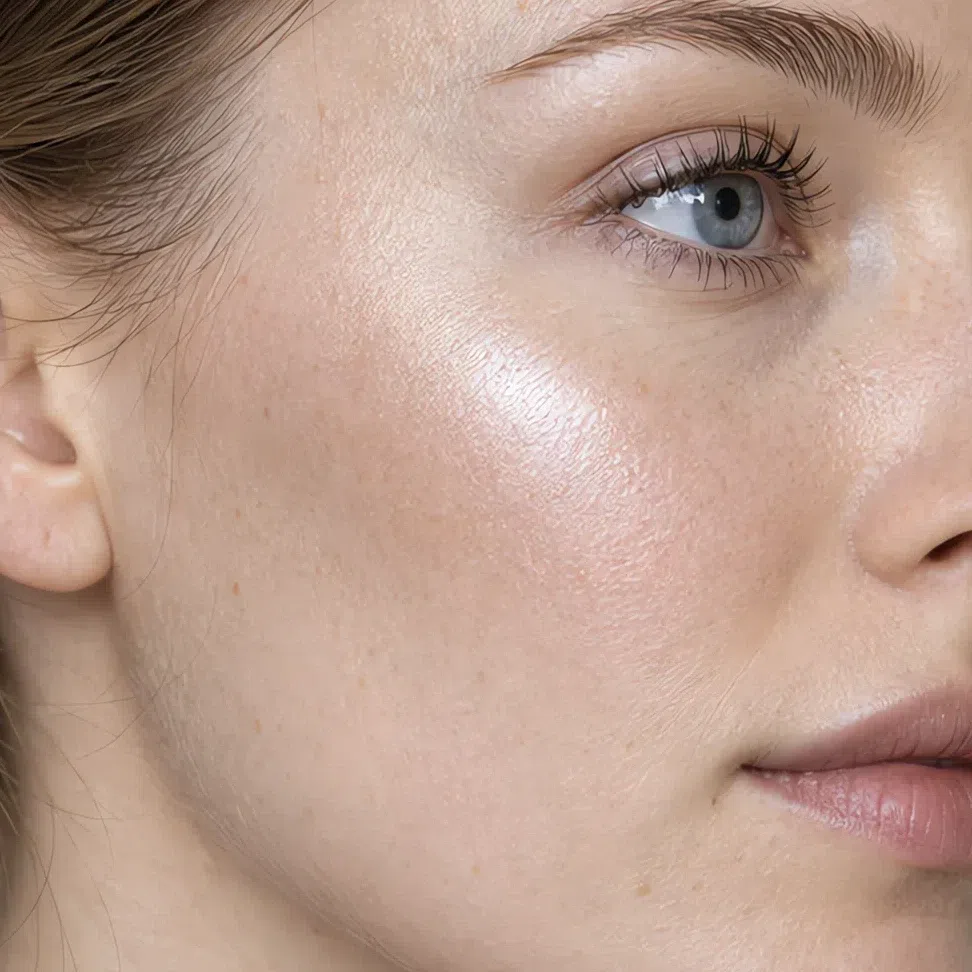
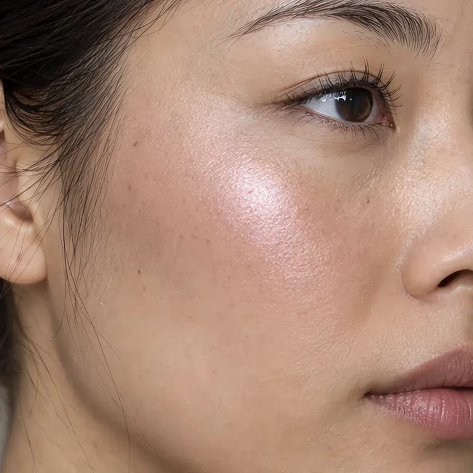
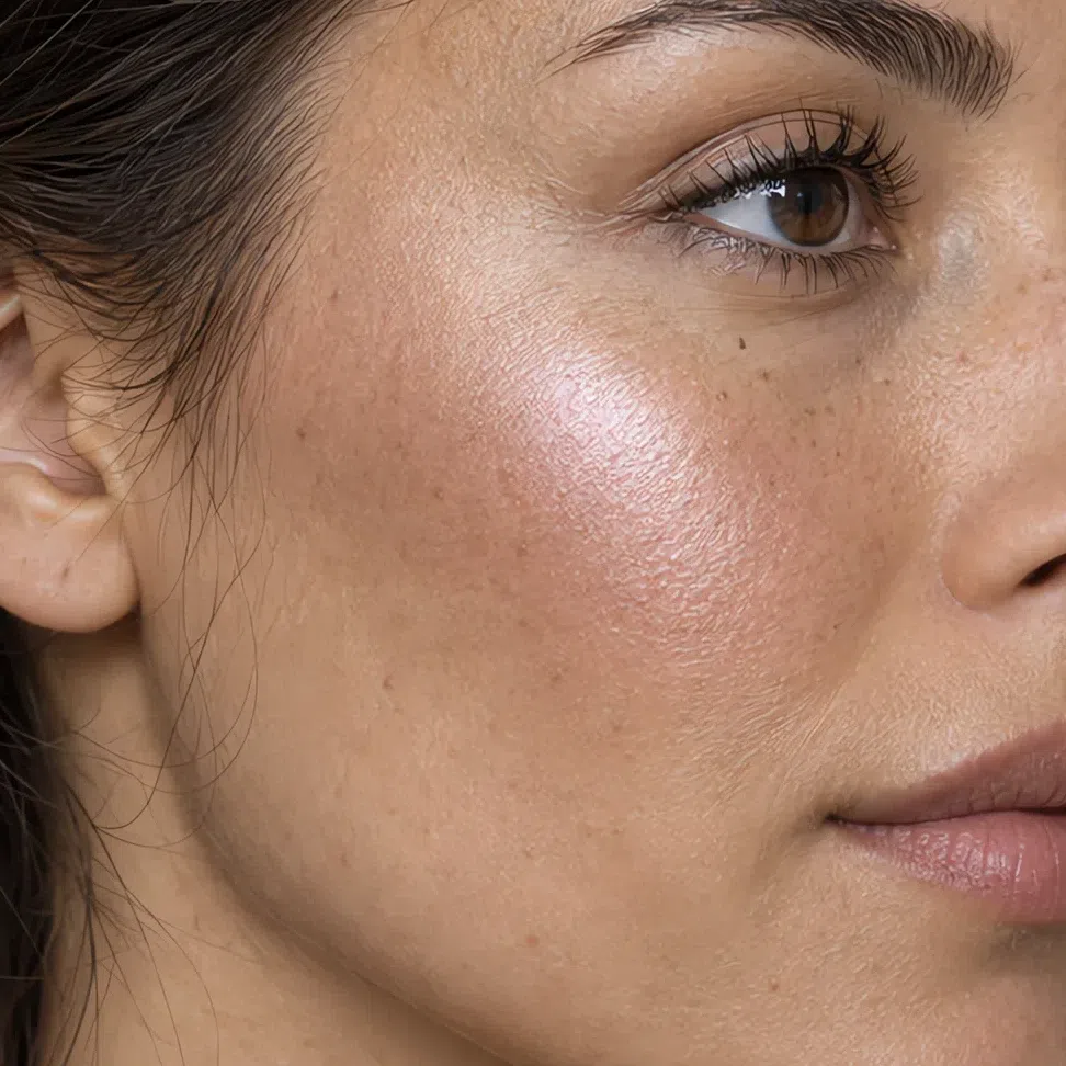
Highlighter matched to your depth
Pearl, pink or silvery-lilac. Gold and bronze highlighters are the ones that make a cool face look dull.
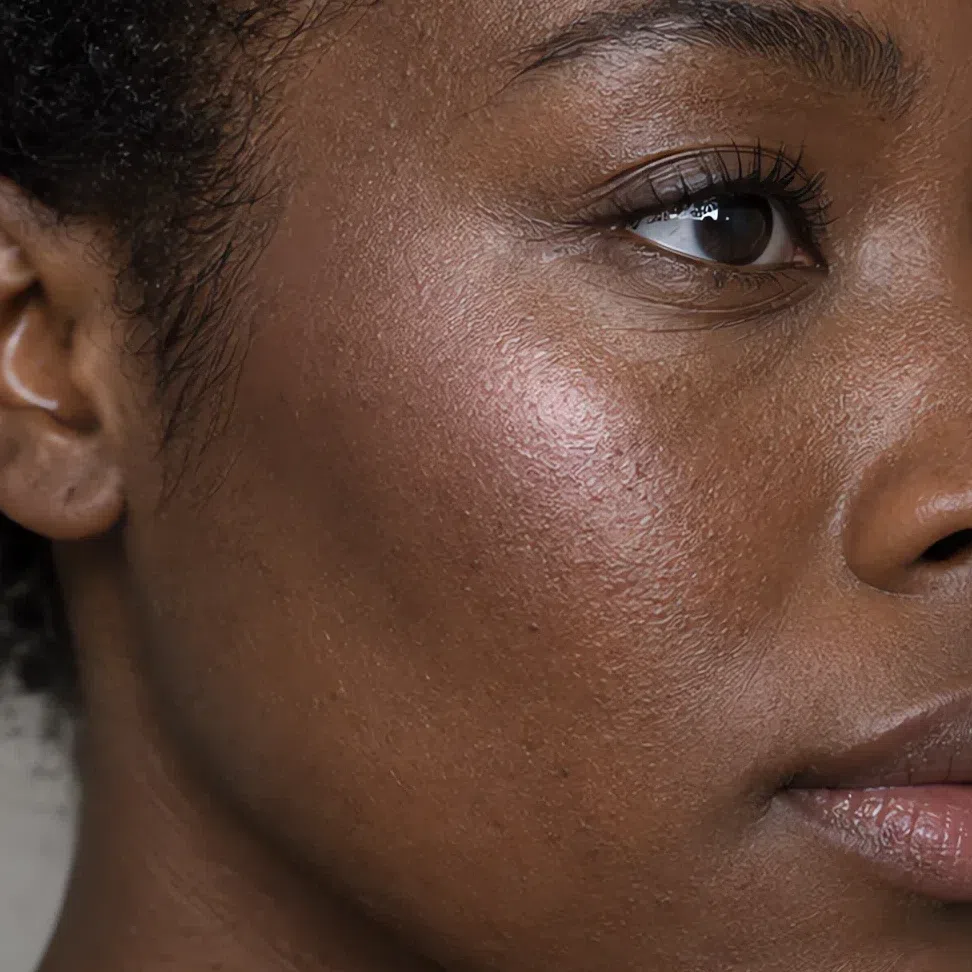
Blush
Cool pink for every day, berry and raspberry when you want more. Peach, coral and orange blush look foreign on this skin.
- Cool pink blush #E1A3B1
- Berry flush #BF7890
- Raspberry mousse blush #AE5A7C
- Lilac pink blush #C58EAE
Eyes: shadow, liner, mascara, brows
Cool neutrals, plums and blue-grays. Gold, copper, warm green and hot pink are the eyeshadows to leave on the shelf.
Everyday eyeshadow
Pink-grays and cool taupes that add depth without a visible color.
- Rose gray lid #CDBBC0
- Pink haze lid #D3A9B0
- Smoky taupe lid #978886
- Ash brown lid #7A6964
Evening eyeshadow
Richer, still cool, with a soft shimmer: rose metallic, lilac, deep plum.
- Rose metallic #B5848E
- Moonlit lilac #A698B4
- Plum night #684A6E
- Violet brown #54404A
Eyeliner
Soft black or dark brown instead of jet black; plum and gray-blue when you want a note of color.
- Soft black liner #2F2D32
- Dark cocoa liner #3F3230
- Plum liner #5A3D52
- Gray-blue liner #4E5E74
Mascara
Black works; dark brown, plum and graphite look softer.
- Soft black mascara #27262B
- Deep ash brown mascara #3B302C
- Plum mascara #4B3342
- Graphite mascara #3C3E44
Brows
Ash and cool taupe, never red or caramel.
- Dark ash blonde brow #A08F80
- Cool taupe brow #8D7E78
- Ash brown brow #76675F
- Soft graphite brow #4F4E53
Lips: nudes and color
The lips can carry the most color on this face, as long as it stays blue-based. Coral, orange, caramel and brick are the ones to skip.
Nude shades
Pink-based nudes for every day. Beige nudes blank out the lips on this skin and make the whole face look paler.
- Pink nude #D6A1A6
- Mousse pink #C27E90
- Cool pink lip #D98B9E
- Cocoa pink #A57A78
Colored shades
Berries, a matte fuchsia and a deep cranberry: saturated but cool, bold without shouting.
- Berry ice #B24E72
- Matte fuchsia #B8397A
- Deep cranberry #8E2F4F
- Plum lip #6E3656
Hair shades
Eight cool shades to ask for, seven to skip
Heading to the salon? What to ask your colorist for, how to keep ash from turning brassy and how to handle gray are on the hair-color page. Open the hair-color guide →



Think moonlight, ash and cool silver. The aim is your own hair made cleaner and a little more polished, never a new color - and every shade below stays cool at its level. Warmth beside this skin pulls up redness first and makes the whole face look tired.
Ash blondes and cool light browns
The most natural range for this subtype - shades that look as if you were born with them.
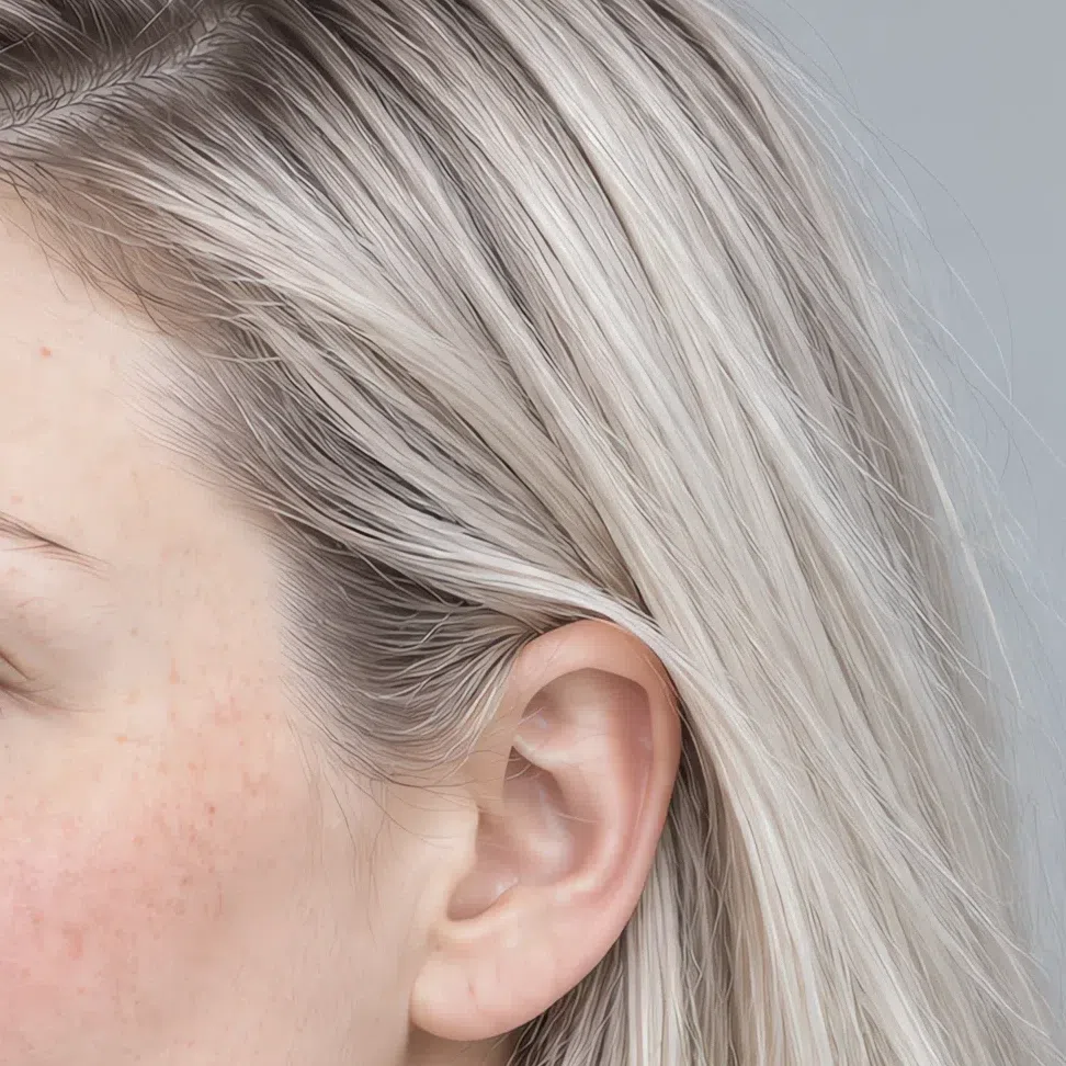
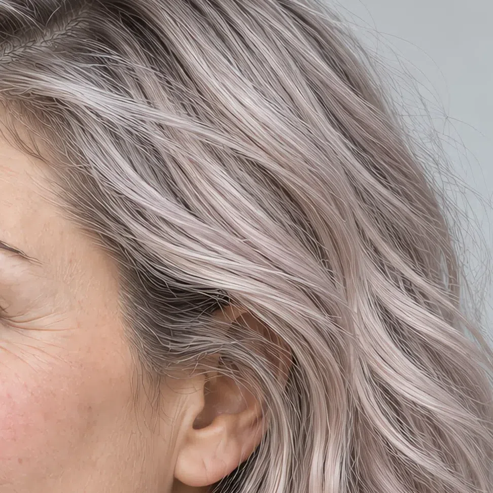
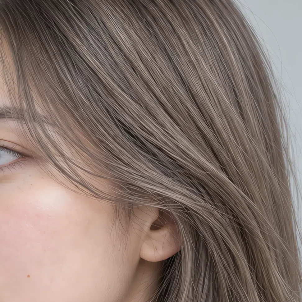
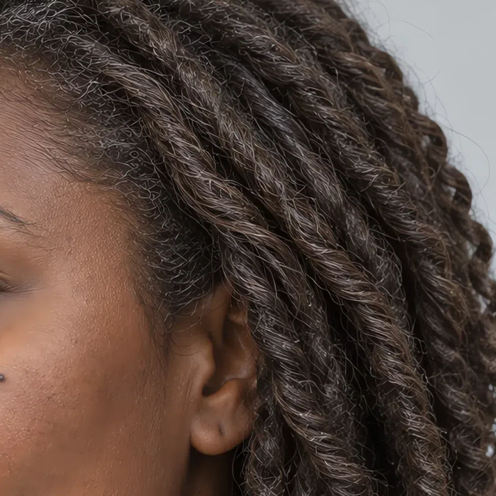
The same shade across levels:
Deep cool tones
Going darker works when the depth comes with ash, graphite or violet in it rather than with black.
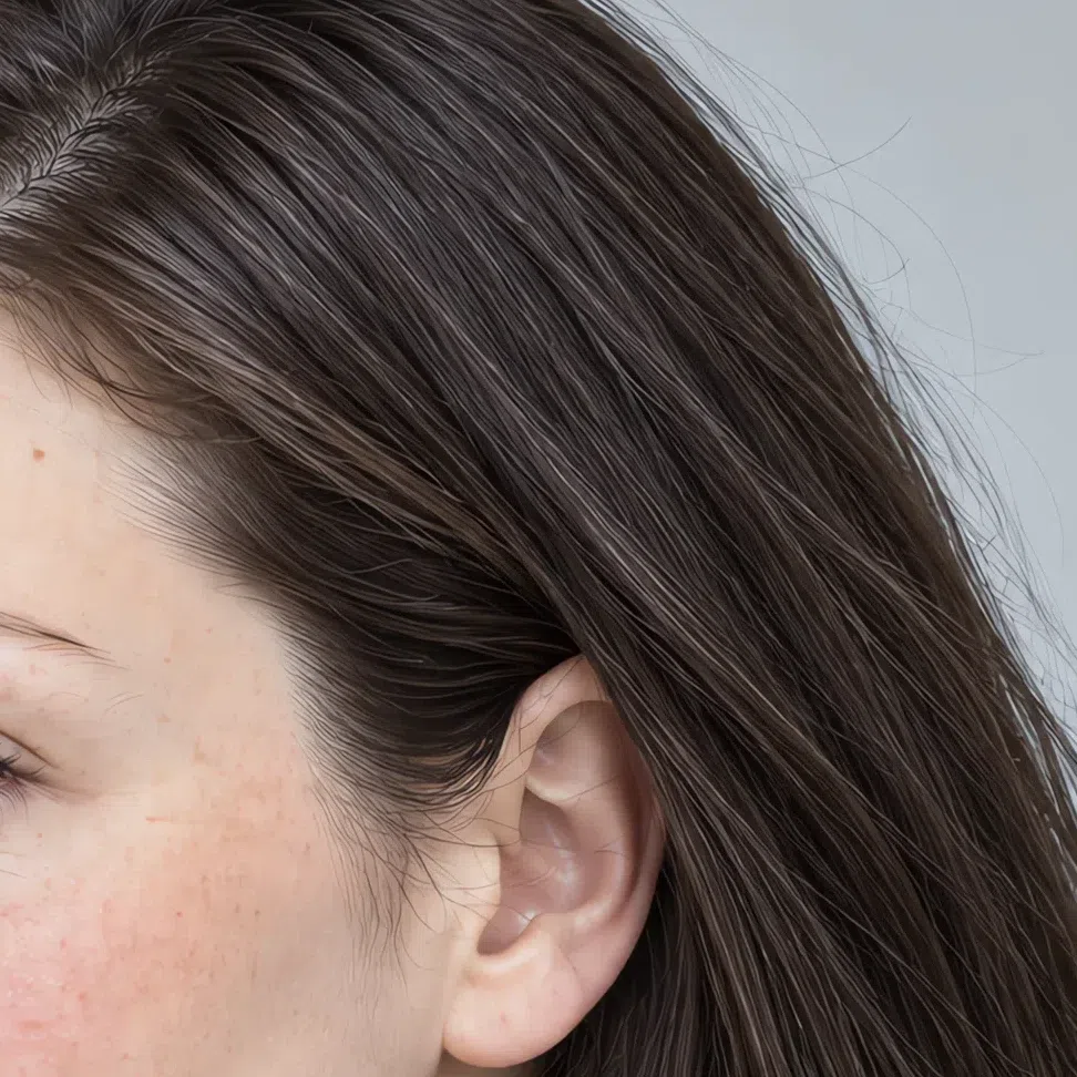
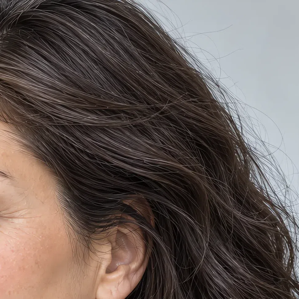
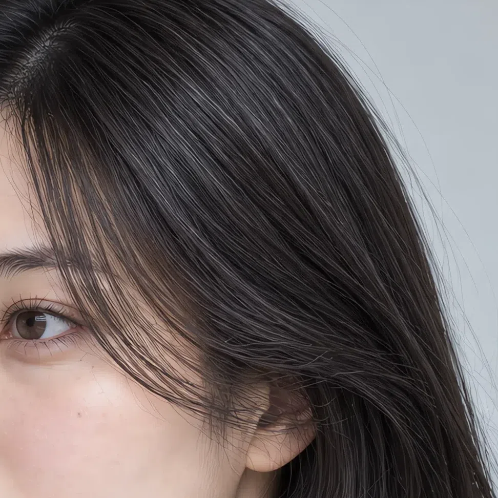
The same shade across levels:
Hair colors to avoid
Seven shades in two groups: warm tones that clash with the skin, and colors too dark or too loud for a soft face.
Warm and golden
Too dark or too bright
Cool Summer, or one of its neighbors?
Three comparisons, each with a test you can run today
All three summers share a cool undertone, but each is led by a different quality. Cool Summer is led by temperature, Light Summer by lightness, Soft Summer by mutedness - and a color that flatters one of them can quietly flatten another.
The confusion that happens most is not inside the season at all. Cool Summer, the True Summer of older systems, is mistaken for Cool Winter more often than for either summer neighbor, so that comparison is below as well.
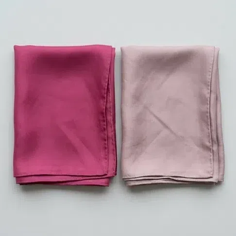
Two scarves at the collar in daylight: a clear raspberry-fuchsia and a soft dusty rose. Which one makes your face look fresher?
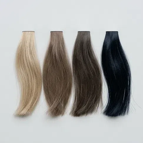
Look at your roots, not at any dye. What is your natural hair color?
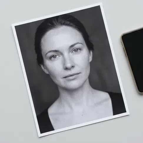
Turn a bare-faced daylight photo of yourself black and white. What do you see?
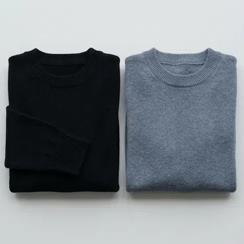
A total black outfit right up to the face. Is that you?
Pure coolness without a veil, and a medium contrast. You are on your page - start with the palette section.
Dusty, grayed shades flatter you more than clear cool ones - that is the Soft Summer signature. Read Soft Summer.
Lightness leads your coloring: pale pastels lift you and deep shades press down. Your page is Light Summer.
Cool with high contrast and at ease in pure black - that is winter coloring. Compare yourself with Cool Winter.
Four answers can point, but they cannot decide - and most mistakes happen right at the edge between two subtypes. When two results both ring true, use the comparisons below to break the tie, or let a photo analysis measure undertone and contrast for you.
Cool Summer vs Soft Summer
Cool Summer
Clear and cool. Every color has a clean blue base with no gray stirred in - brighter and more defined.
Medium. A visible step between hair, eyes and skin; the face is defined rather than blurred.
Berry and ice. Raspberry, Storm blue, Iris, Juniper - shades with a clear voice.
Elegant and composed. Clean lines that never turn severe.
A mountain lake at dawn, a frosted rose, a lilac evening.
Soft Summer
Muted and complex. A gray haze sits in every shade, so nothing reads bright.
Low. Features melt together; the transitions look like watercolor.
Dusty and natural: sage, dusty rose, lavender gray, cocoa, soft denim.
Soft and romantic, with flowing shapes and matte textures.
A misty morning, dried wildflowers, heather moorland.
The test: fuchsia against dusty rose Hold a bright fuchsia scarf under your chin, then a dusty rose one, in daylight and without makeup. A Cool Summer lights up in the fuchsia while the dusty rose leaves her looking pale and tired. A Soft Summer gets the opposite result: the fuchsia looks coarse on her and the dusty rose settles everything. The swap in direction is the whole difference between the two.
Cool Summer vs Light Summer
Cool Summer
Medium to deep. Hair can run from dark blonde to graphite, and depth is part of the look.
Medium. A clear difference between skin, hair and iris.
Rich and cool: Storm blue, Mulberry, Juniper, Steel gray.
Classic and assured - feminine, with some authority to it.
A starry August night, deep cold water, amethyst.
Light Summer
Light, and that leads. Pale skin, light eyes, hair from blonde to light brown.
Low. The whole face is built from light, delicate tones.
Pastel and whitened: pale blue, mint, pearl, a soft pink.
Tender and youthful, with airy fabrics and floating shapes.
Morning dew, apple blossom, pearls.
The test: navy against baby blue Put a deep navy top on, then a soft baby blue one, and compare the face in each. On a Cool Summer the navy brings out the eyes and a certain authority, while the baby blue looks too simple and a little flat. On a Light Summer it flips: the navy crushes her delicacy and the baby blue completes her.
Cool Summer vs Cool Winter
Cool Summer
Softened. Cool colors, but toned down: raspberry instead of scarlet, cornflower instead of cobalt.
Low to medium. Skin, hair and eyes sit close in lightness, with smooth transitions.
Too heavy at the face. Graphite, deep blue or plum do the job instead - Gunmetal, Storm blue, Iris.
Soft and slightly smoky, a milky white and a blurred edge to the iris.
Cool Winter
Clean and icy. Bright colors at full strength: fuchsia, cobalt, emerald.
High. Pale skin against dark hair - a graphic face.
One of her best colors. It sharpens her features instead of swallowing the face.
Bright and piercing, with a crisp dark ring and a clear white.
The test: pure black in daylight This is the confusion that happens most, even more than the summer neighbors. Put on pure black and look at your face by a window. Black gathers a Cool Winter and makes her more striking; on a Cool Summer it drains the face - shadows appear and the skin turns gray. For a second opinion, look at the black-and-white photo from How to tell: a winter shows a hard jump there, a summer smooth steps of gray.
Still torn? Ignore the details and ask which quality leads your face. If it is plainly cool, with a visible but gentle step between hair and skin, this page is yours - even when one or two rows above fit a neighbor better.
Cool Summer questions, answered
What does it mean to be a cool summer?
What makes someone a true summer?
How do you know if you're a cool summer or cool winter?
What colors look best on a cool summer?
What colors to avoid in cool summer?
Can cool summers wear black?
#555B66 by day and Ink #30353F at night carry the same authority and let the face stay in charge.
Can cool summers wear white?
#DFE2EA passes for white at a glance without the glare, and Blossom #F0DCE3 is the pink alternative for blouses and summer dresses.
Can cool summers wear navy?
#3E5577 is the shade to match, and it works right at the collar, in a coat, a suit or a knit.
Should true summer wear gold or silver?
How should a cool summer choose foundation?
What basic wardrobe colors should a cool summer choose?
Can a cool summer have brown eyes?
How is Cool Summer different from Soft Summer?
What if I'm a cool summer but love warm colors?
Does your color season change with age?
Which celebrities are cool summers?
Where this came from
Six sources, and the job each one does here: why the lamp overhead can change your answer, why depth and clarity are two separate measurements, why the vein test gets less reliable as skin deepens, what “medium contrast” means as a quantity, and where the season system came from.
-
Method of measuring and specifying colour rendering properties of light sources (opens in a new tab)
International Commission on Illumination (CIE), CIE 013.3-1995, 1995
Behind the instruction to use daylight, repeated on each undertone check in how to tell. The standard sets out how a lamp is rated on how faithfully it shows the colors of what sits under it, and notes that the method also applies to modified daylight - so a warm bulb, a cold LED and a north-facing window are not interchangeable when the thing you are judging is an undertone.
-
Munsell color system (opens in a new tab)
Wikipedia
Behind the leading-axis argument that runs through vs neighbors. Munsell was the first to separate hue, value and chroma into independent dimensions, which is why depth and clarity can be judged apart from each other - and why Cool Summer differs from Light Summer on one of them and from Soft Summer on the other.
-
Evaluation of skin pigmentation effect on photoplethysmography signals using a vascular finger phantom with tunable optical and mechanical properties (opens in a new tab)
Osorio-Sanchez et al., Journal of Biomedical Optics (Europe PMC), 2025
Behind the warning that a blank vein reading on deep skin proves nothing, in how to tell. The paper measures how more melanin attenuates incident light and reduces how far it penetrates, which limits what any optical reading of the vessels underneath can tell you.
-
Aspects of facial contrast decrease with age and are cues for age perception (opens in a new tab)
Porcheron, Mauger & Russell, PLOS ONE, 2013
Behind two things: calling contrast medium rather than describing a mood, and the FAQ answer on aging. Facial contrast is defined here as the measurable luminance difference between the eyes and lips and the skin around them, and it is shown to fall as people get older - which is why a Cool Summer often moves toward the lighter half of her palette over time.
-
Carole Jackson (opens in a new tab)
Wikipedia
This entry backs the system itself rather than any single claim. Color Me Beautiful (1980) put seasonal color analysis in front of a mass audience, and the teaching behind it runs back through Itten, Northrup and McJimsey.
-
Color analysis (opens in a new tab)
Wikipedia
Behind the naming caution in vs neighbors and the FAQ entry on True Summer. The four seasons and their sub-variants are described here as an approach that varies greatly between schools - so a subtype label from one system, True Summer included, does not automatically mean the same shades in another.
One honest distinction, because it matters. Sourced above: the lighting standard, the two color dimensions, the skin optics and the contrast measurements. Which twenty shades belong to a Cool Summer, that Storm blue is its navy, and where the line falls against Soft Summer and Cool Winter are our own analysis, worked out from the palette on this page. No study establishes those, the schools disagree about where the subtype borders sit, and we would rather write that down than let six citations imply otherwise.
What is color analysis, how do you find your season, and what are the 12 types?
The main guide covers all of it - the four axes your season is built from, all twelve subtypes side by side, and a free quiz that places you in about a minute.
What is color analysis? For women and men