Warm Spring makeup: your shades, and how to wear them
Warm Spring makeup - the True Spring of older color books - is warm and clear together: coral, peach, copper and gold, each one bright rather than dusty. This coloring wears real color, poppy red included; what it cannot wear is gray, blue or black. Below: sixteen finished faces on four skin depths, the products in the order you put them on, and a shade list to screenshot.
- Four steps, in order
- Four complexions
- Everyday and evening
The order you apply it in
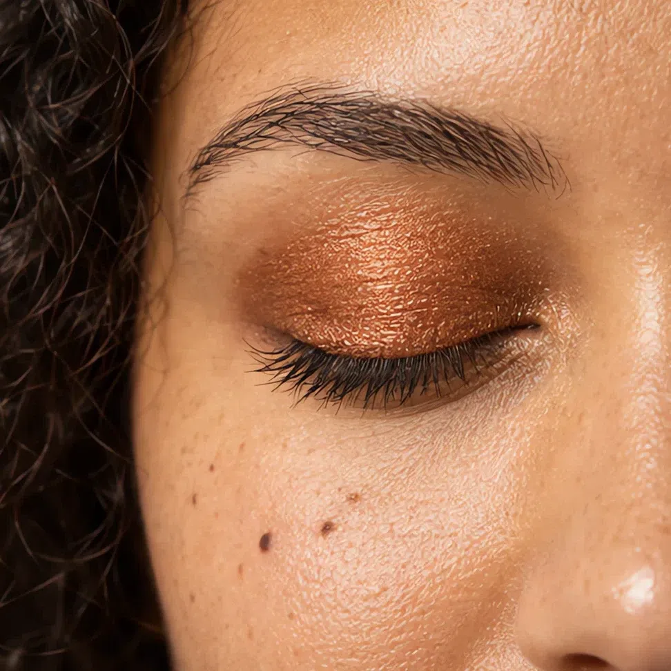
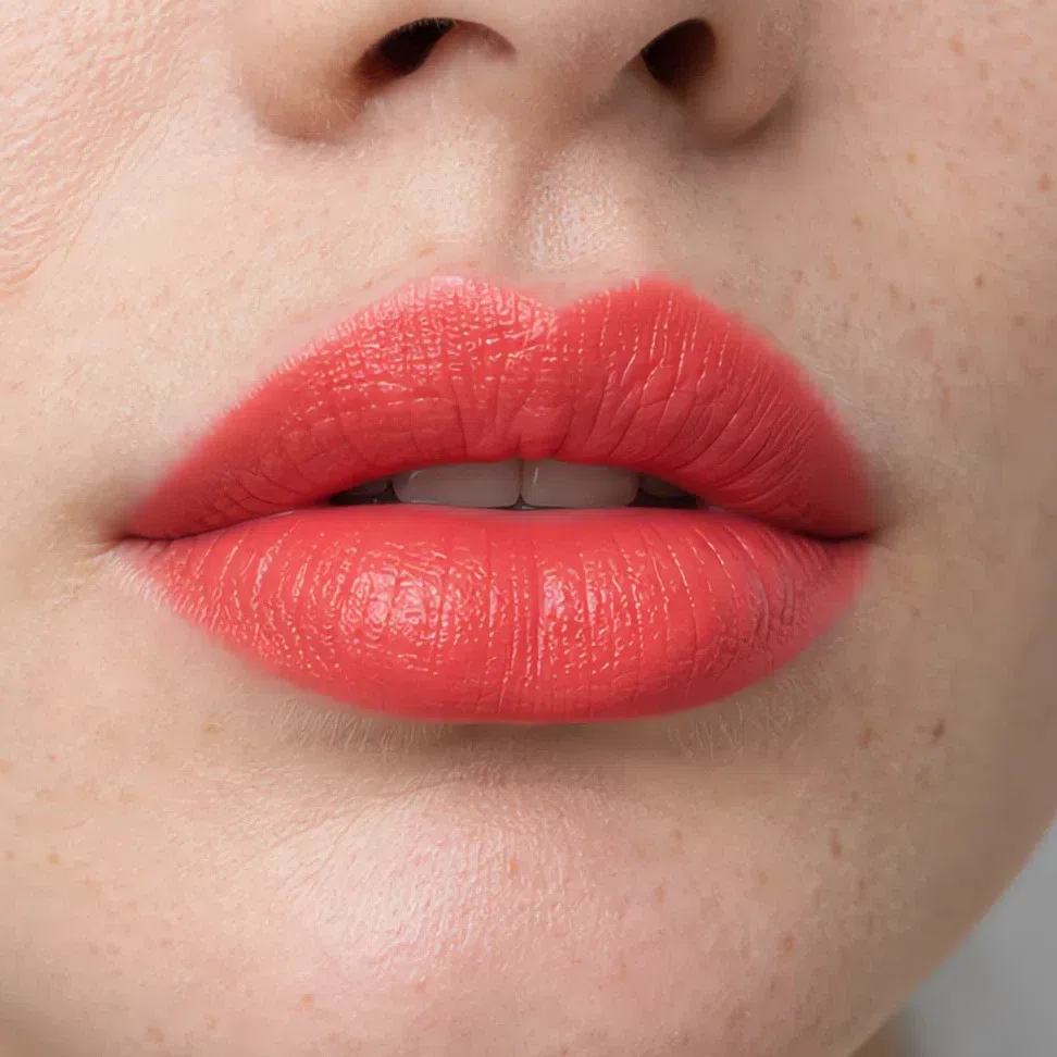
Start here
You are a Warm Spring. Here is what to put on.
Everything follows from one fact: your coloring is warm and clear. Golden or peach skin, hair with gold, copper or chestnut in it, eyes that look bright rather than smoky. There is color all over this face and no gray anywhere, and the contrast sits in the middle - some depth, never a very dark note.
So the shades are warm and clear - coral, peach, copper, gold, turquoise - and they can be stronger than most seasons dare, a poppy red included. The two ways to go wrong are the two ways to take that clarity away: dusty, muted shades that make you look tired, and dark, heavy ones that make you look older.
Keep every shade warm and clear, and let the strength come from color rather than from darkness.


The same woman on a medium complexion, at the two ends of what this coloring carries. The distance between them is all color - nothing got darker. All four complexions are in the next section.
What is on this page
- Sixteen finished looks Four occasions on four complexions, each card naming the shade on every part of the face.
- Why these shades Four swaps, each set against the shade a Warm Spring usually owns instead.
- How to build it The four products in the order they go on, with the technique that keeps them clear.
- When you need more More color, never more darkness: day and evening side by side at each depth.
- How to buy it The jaw test, the label words worth trusting, and the foundation grid with your square on it.
- The shade list Every shade on this page in one block, with hexes, made to be screenshotted.
Sixteen finished looks
Shade names are hard to picture, so the faces come first: four occasions on four complexions, each card listing exactly what went where. Find the row nearest your own skin and read across it. The last card in each row is the most this coloring asks for - bold in color, never dark.
If you have fair skin:
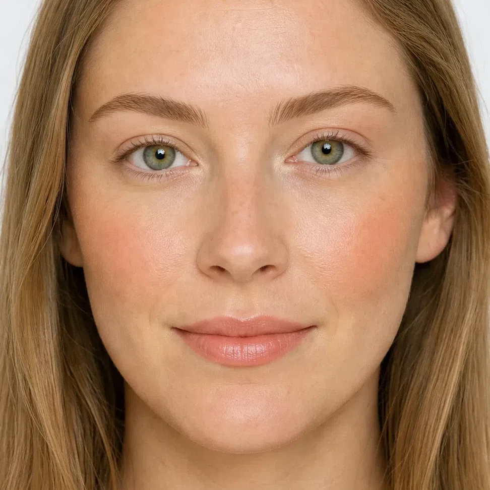
- Base Fair - warm ivory
- Blush Peach flush
- Lips Peach nude
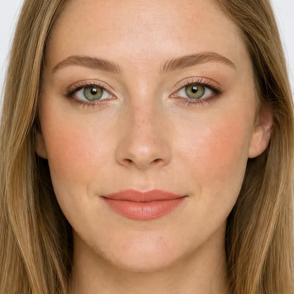
- Base Fair - warm ivory
- Blush Peach flush
- Eyes Champagne shimmer
- Liner Warm chocolate liner
- Lips Peach nude
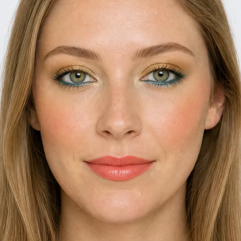
- Base Fair - warm ivory
- Blush Apricot flush
- Eyes Olive lid
- Liner Deep turquoise liner
- Lips Clear coral
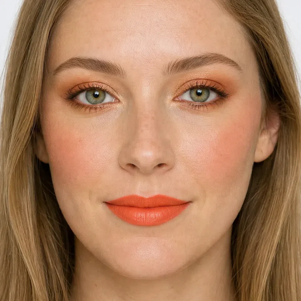
- Base Fair - warm ivory
- Blush Salmon rose
- Eyes Copper lid
- Liner Bronze liner
- Lips Mandarin
If you have light skin:
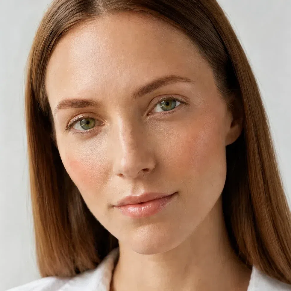
- Base Light - golden sand
- Blush Apricot flush
- Lips Apricot nude
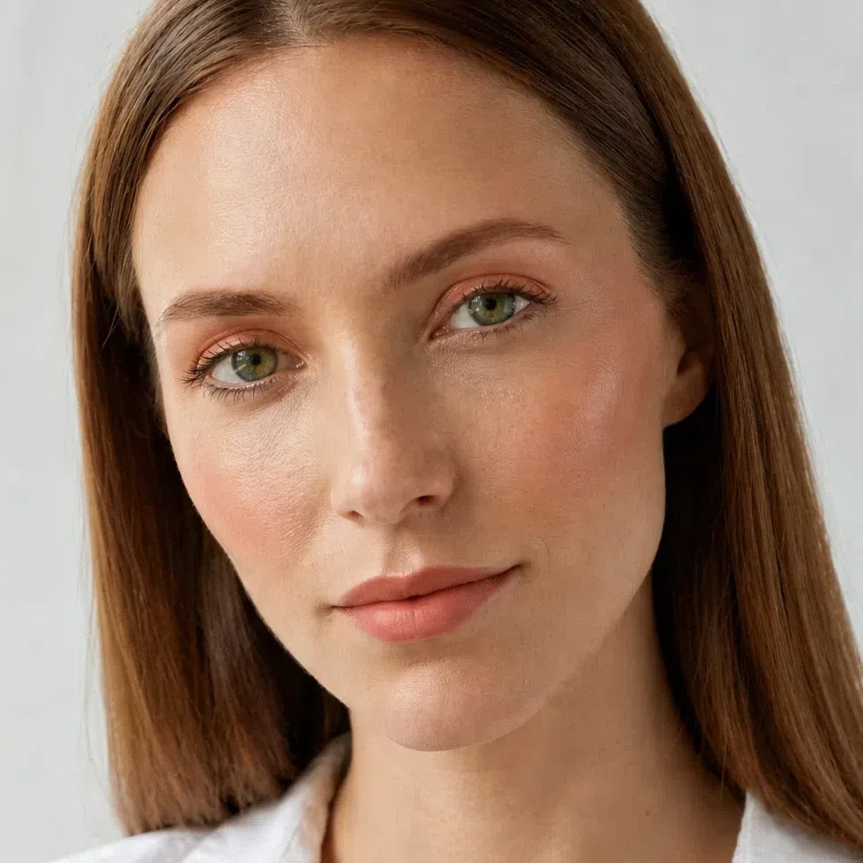
- Base Light - golden sand
- Blush Apricot flush
- Eyes Apricot wash
- Liner Warm chocolate liner
- Lips Apricot nude
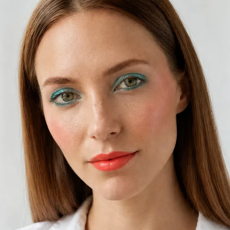
- Base Light - golden sand
- Blush Salmon rose
- Eyes Turquoise lid
- Liner Deep turquoise liner
- Lips Mandarin
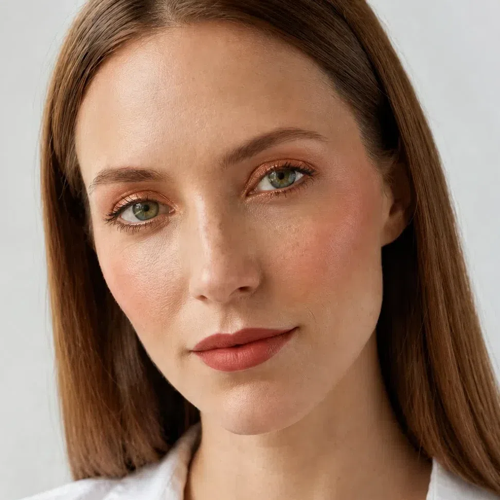
- Base Light - golden sand
- Blush Coral flush
- Eyes Copper lid
- Liner Bronze liner
- Lips Terracotta rose
If you have medium skin:
- Base Medium - honey beige
- Blush Salmon rose
- Lips Salmon nude

- Base Medium - honey beige
- Blush Salmon rose
- Eyes Golden peach
- Liner Warm chocolate liner
- Lips Salmon nude
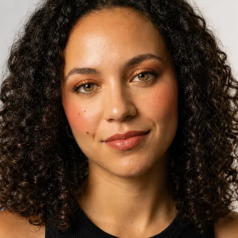
- Base Medium - honey beige
- Blush Coral flush
- Eyes Copper lid
- Liner Olive liner
- Lips Terracotta rose
- Base Medium - honey beige
- Blush Coral flush
- Eyes Bronze smoke
- Liner Bronze liner
- Lips Poppy red
If you have deep skin:

- Base Deep - warm caramel
- Blush Coral flush
- Lips Coral beige nude

- Base Deep - warm caramel
- Blush Coral flush
- Eyes Light camel
- Liner Warm chocolate liner
- Lips Coral beige nude

- Base Deep - warm caramel
- Blush Coral flush
- Eyes Bronze smoke
- Liner Olive liner
- Lips Terracotta rose

- Base Deep - warm caramel
- Blush Coral flush
- Eyes Bronze smoke
- Liner Bronze liner
- Lips Poppy red
Read down a column and the occasion stays fixed while the shade names change. A peach flush that shows on warm ivory has disappeared by the time it reaches deep golden-brown skin, so the name steps toward coral to keep the effect the same. What never changes is the warmth and the clarity - and that is worth explaining, because it is why several things already in your makeup bag are working against you.
Why these shades, and not the ones you own
Take the sixteen faces apart and they come down to four swaps. Each is set out below against the shade a Warm Spring most often already owns - usually a sensible, neutral buy that simply leans the wrong way. Strength is rarely the issue on this coloring. Direction is: warm against cool, clear against dusty.
Why these shades and not those
Tap a productYour darkest features are warm browns - brows, lashes, the ring round the iris - so a black line is the one note on the face with no warmth in it at all. It reads as drawn on rather than grown. Warm chocolate gives the same definition at a depth your own lashes already reach.
Taupe is gray with a little brown in it, and a Warm Spring eye is lit by warm color - hazel, green or bright brown with gold running through it. Next to taupe that gold goes out, and the lid looks shadowed in the tired sense rather than the made-up one.
A warm cheek flushes peach, and the deeper the skin the more coral that flush becomes. Mauve is a muted, cool color your skin cannot make on its own, so instead of a glow it lays a dull film across the widest part of the face - and dullness is exactly what this clear coloring has no room for.
You can wear strong color - a poppy red is on your palette - so the problem with fuchsia is not its strength. It is the blue in it. A blue-based pink next to golden skin makes the skin look yellow by contrast, where a coral or a poppy of the same strength makes it look lit.
Notice which side moves. The shade that works changes name as the skin deepens - champagne on a fair face is a warm camel on a deep one - so no single hex is correct, and yours is in the cheat-sheet. The shade that fails stays put, because it fails on temperature or on dullness, and neither has anything to do with depth. Liner is the exception: warm chocolate works on everyone. The hexes on the failing side stand for the mistake, not for a measured product.
All four failures share a cause, and it is not the color family. It is warmth and clarity taken out: black instead of brown, taupe instead of camel, mauve instead of peach, fuchsia instead of coral. A Warm Spring face is built from clear warm color - your palette has no gray and no dust in it anywhere - so the first cool or muted shade that lands on it is the one thing in the frame that does not belong.
That settles what to buy. The harder half is how much goes on and in what order, which is quicker to show than to explain.
How to build it, step by step
The same swaps, now in the order you put them on. The shade is the easy part; the technique under each step is what decides whether a warm, clear face looks like itself on a good day or like makeup sitting on top.
-
Base
Even, with the warmth left in
Your base shades, by depth
The season sets the undertone - golden, never pink and never ashy. The depth is your own skin and nothing else.
Fair - Foundation Fair - warm ivory #F3E0CE
- Bronzer Fair - golden honey #E8C89B
- Highlighter Fair - warm champagne #F7E8CF
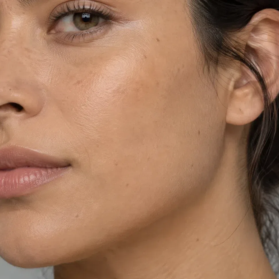
Light - Foundation Light - golden sand #E3BE93
- Bronzer Light - warm caramel #D9A86F
- Highlighter Light - golden glow #EFD59A
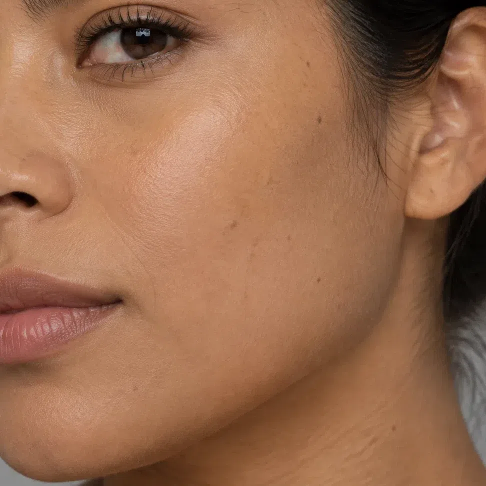
Medium - Foundation Medium - honey beige #DDBB8C
- Bronzer Medium - golden amber #C08A4E
- Highlighter Medium - peach pearl #F7D6BE
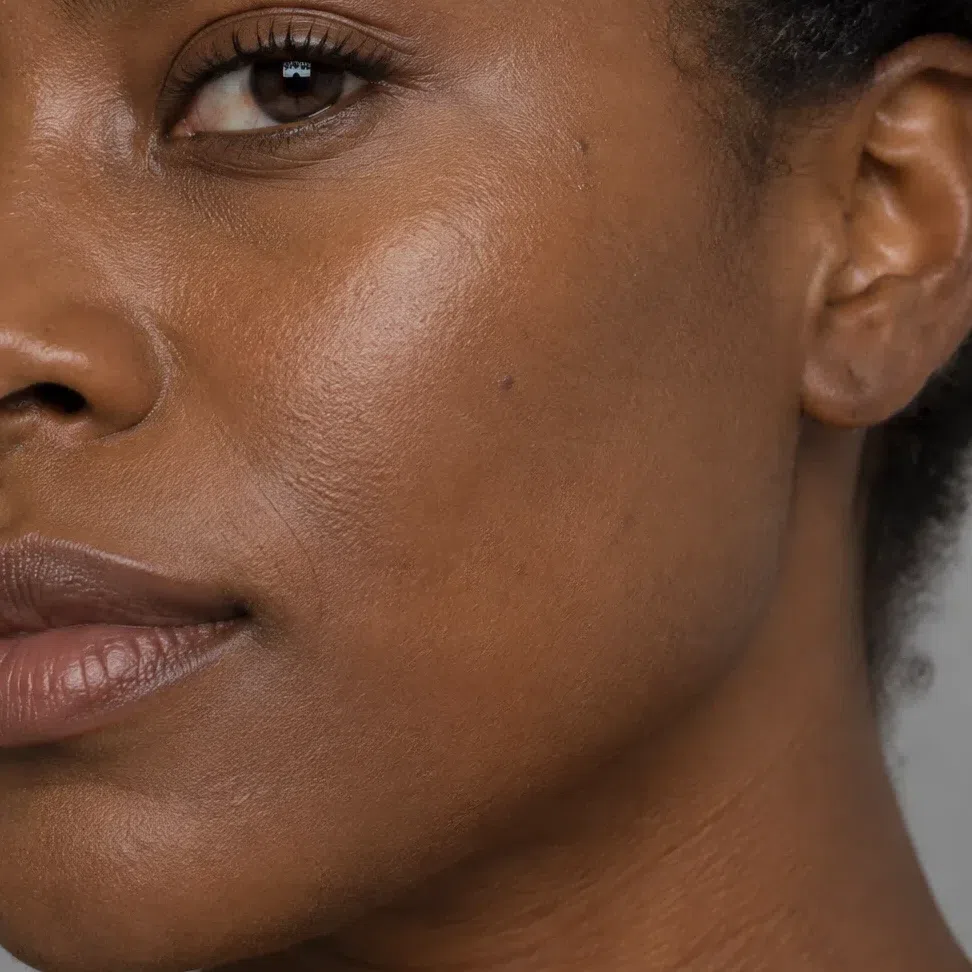
Deep - Foundation Deep - warm caramel #C9A06B
- Bronzer Deep - copper bronze #A46436
- Highlighter Deep - copper gold #E8B98E
Coverage decides more than shade here. Warm Spring skin carries its color in a living way - a golden glow across the cheeks, freckles that come up warm - and that warmth is what the rest of the face answers to. Full coverage flattens it into a mask you then have to paint color back onto. Use a sheer to medium base, pressed in where the tone is uneven and skipped where it already is even.
Bronzer is sunshine, not contour: a golden or copper shade a step under your skin, swept where the sun would land - top of the cheekbones, temples, bridge of the nose - and blended until it has no edge. A gray-brown sculpting powder does the opposite, drawing a cool shadow across a warm face. Highlighter goes on a smaller patch than feels right, and it is warm: champagne, peach pearl or copper gold, so it reads as skin catching light rather than as a silver stripe.
Tip Match at the jaw, in daylight, never on the back of your hand. The right base disappears there; one that is half a step too pink shows as a line you will notice all day.
-
Cheeks
The step that brings the face to life
Blush goes on before the eyes. A warm, clear flush is the quickest way to make this coloring look like itself, and it sets how much the eyes and mouth need afterwards. Cream suits this skin better than powder - it melts in and moves when you smile. Press it on high with two fingers, then pull it back toward the temple until the edge is gone.
Blush
Peach at the fair end, coral at the deep end. Choose the one closest to your own flush, apply half of what you think you need, and check again in daylight.
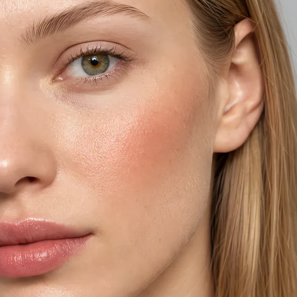
Peach flush #F6B99B 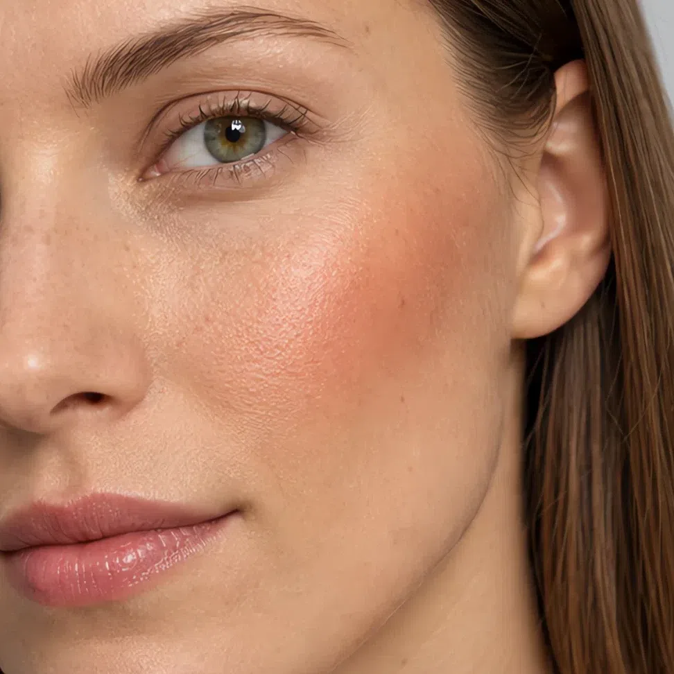
Apricot flush #F2A277 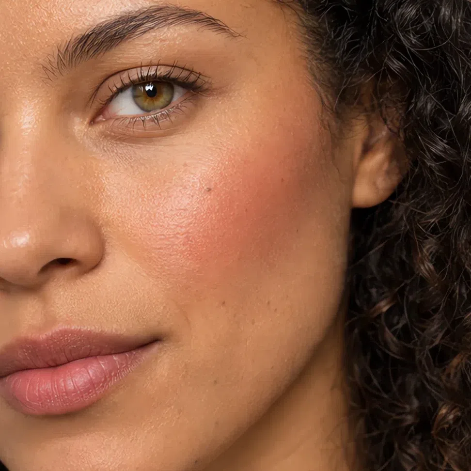
Salmon rose #F09080 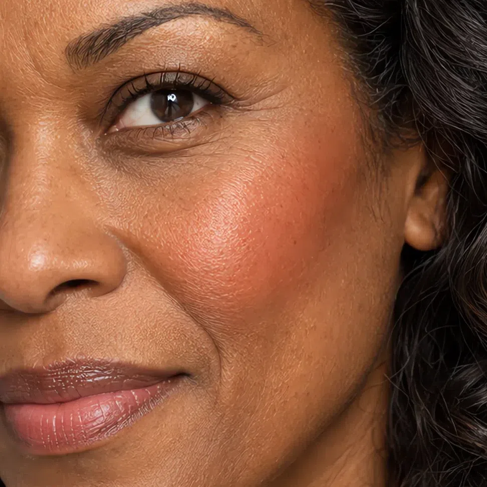
Coral flush #F08A6C Tip If it looks like a color instead of a flush, you used too much rather than the wrong shade. Press a clean finger over the center and lift half of it off.
-
Eyes
Brows, one wash, a warm line, brown lashes
In that order, because each one sets the limit for the next. Brows first: they decide how much the eye can carry. Match them to your hair or a step under, never darker - a brow darker than the hair pulls the face toward an Autumn. Then one wash across the lid, warm chocolate liner pressed into the lash roots rather than drawn along the top, and a brown mascara matched to your own lash root. Black lashes on this coloring become the darkest thing on the face and the eye reads heavy.
Brows
Your hair level or one step under. Short strokes where the brow is sparse, and a light touch at the front - a solid front is what makes brows look drawn on.
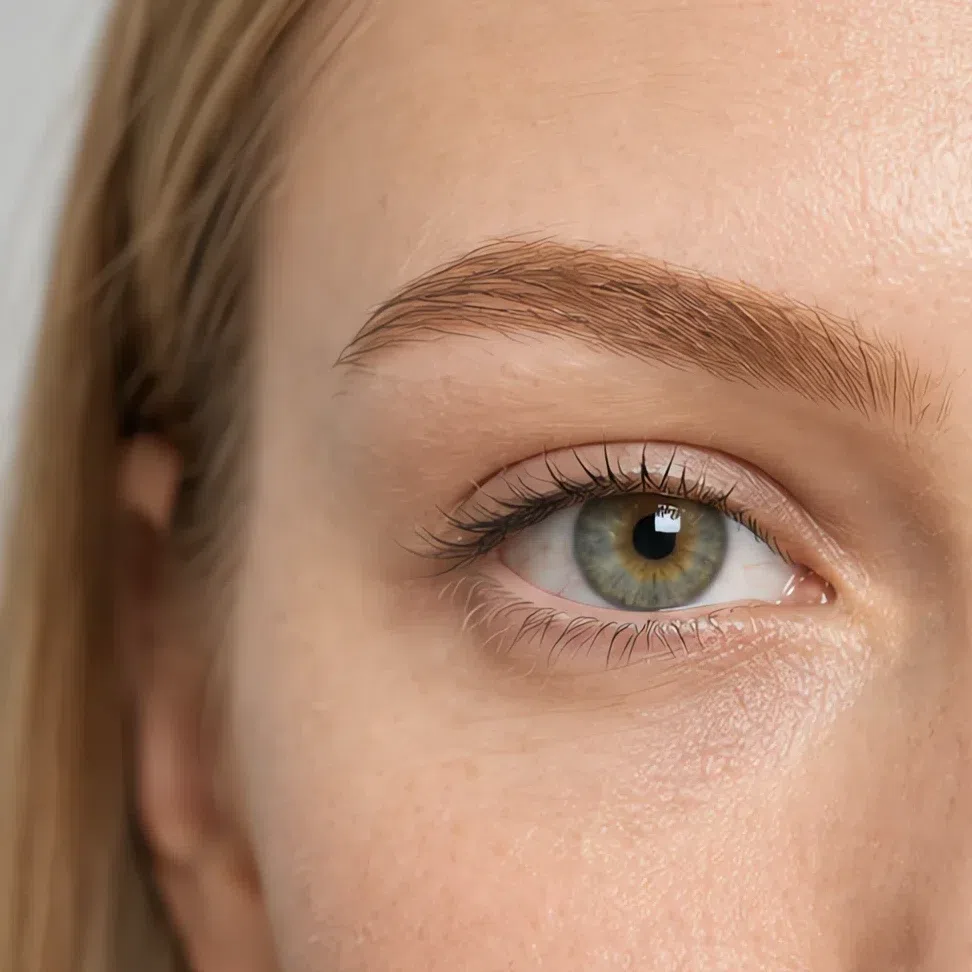
Amber brow #C09258 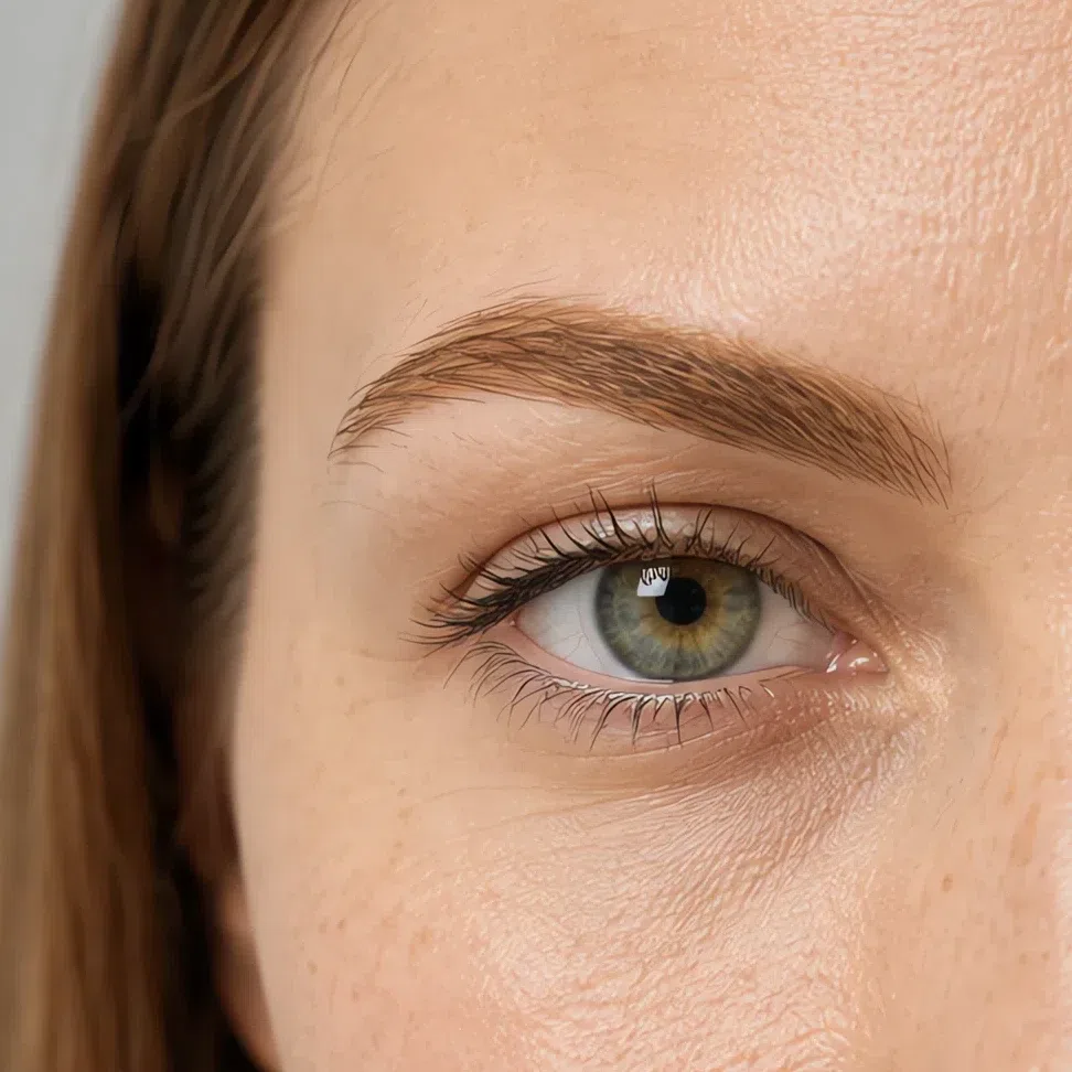
Golden honey brow #B58A5A 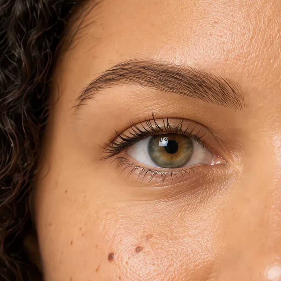
Golden brown brow #A5793F 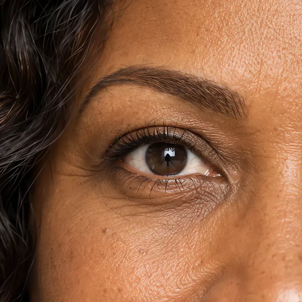
Warm chestnut brow #8E6239 Everyday eyeshadow
One wash over the moving lid, no crease work. By day these stay close to your skin on purpose: they even the lid out and add a little light.
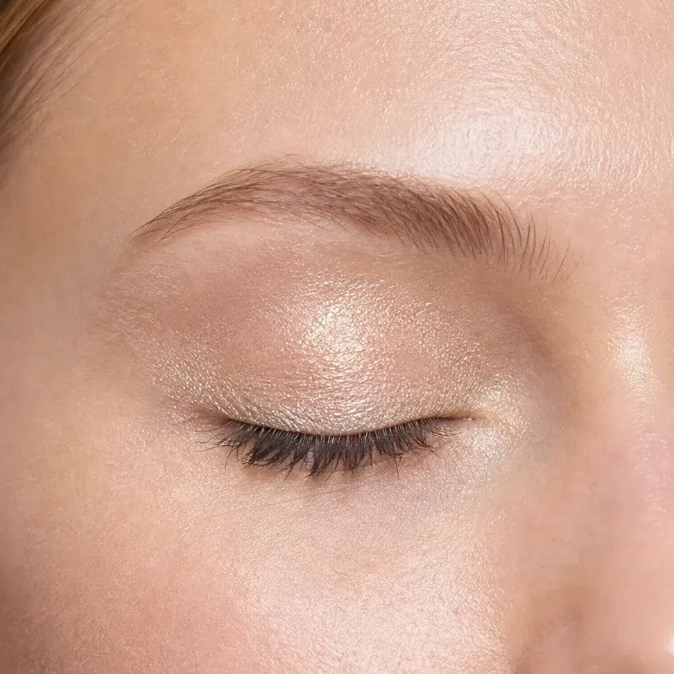
Champagne shimmer #EBD9B8 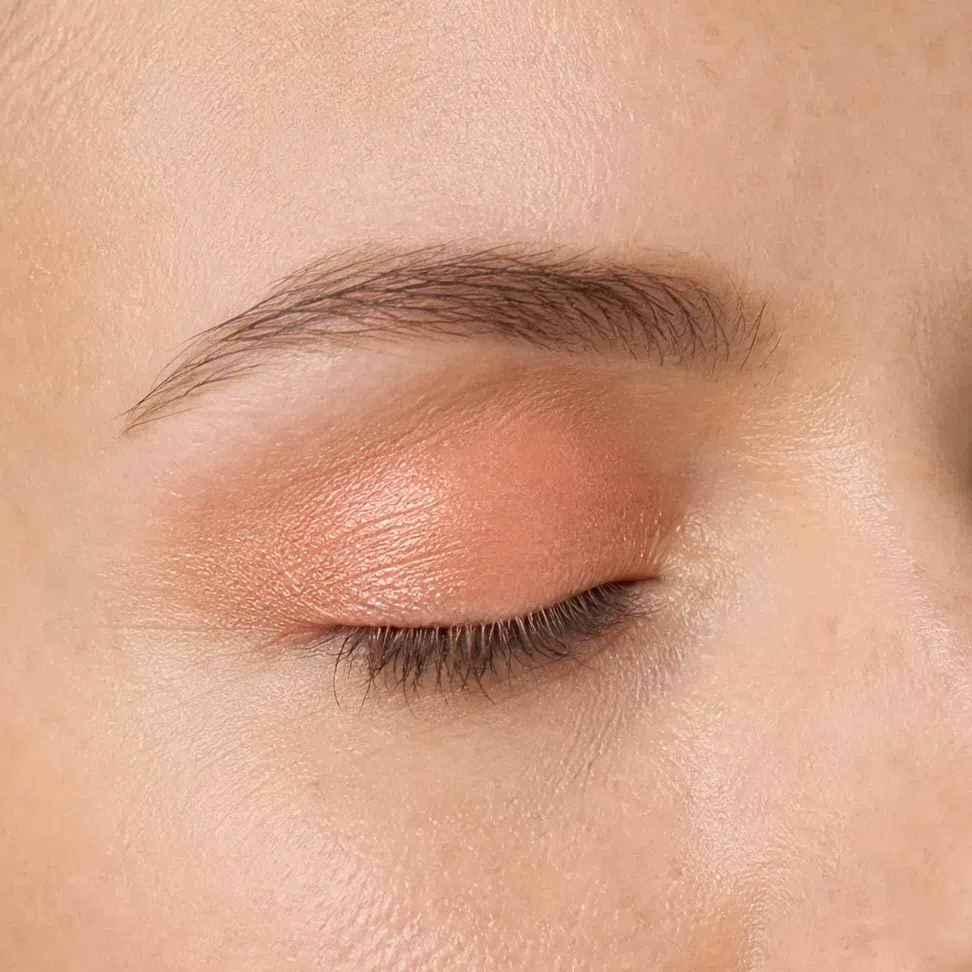
Apricot wash #F0BE94 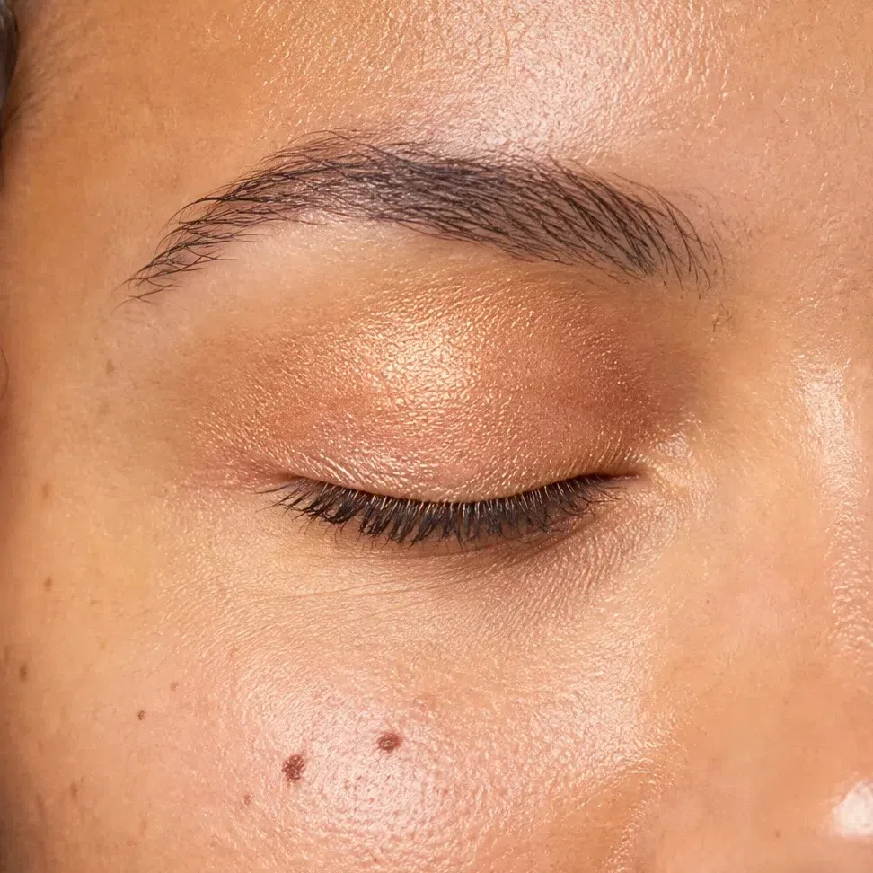
Golden peach #E5B98C 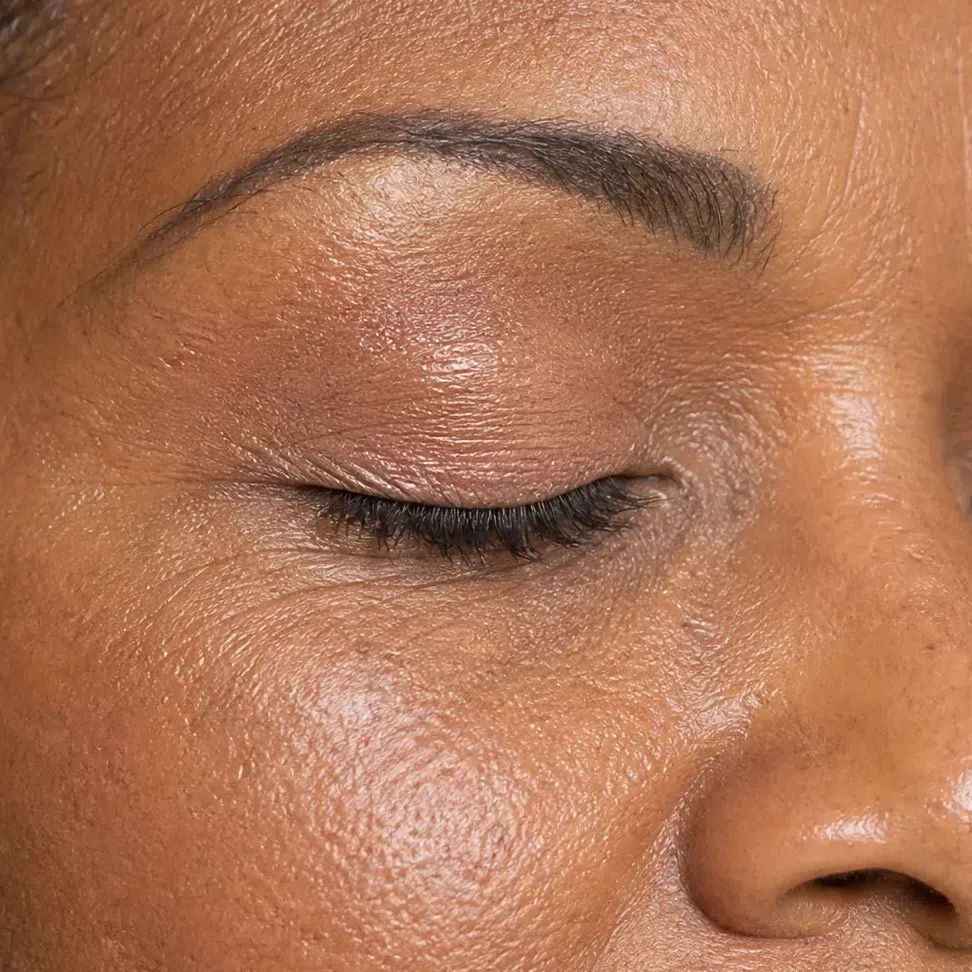
Light camel #D3B48C Eyeliner
Four colors rather than four depths - every one works at any complexion. Warm chocolate is the everyday liner; turquoise and olive are for when the eye should be the color on the face, and bronze is the dressed-up brown.
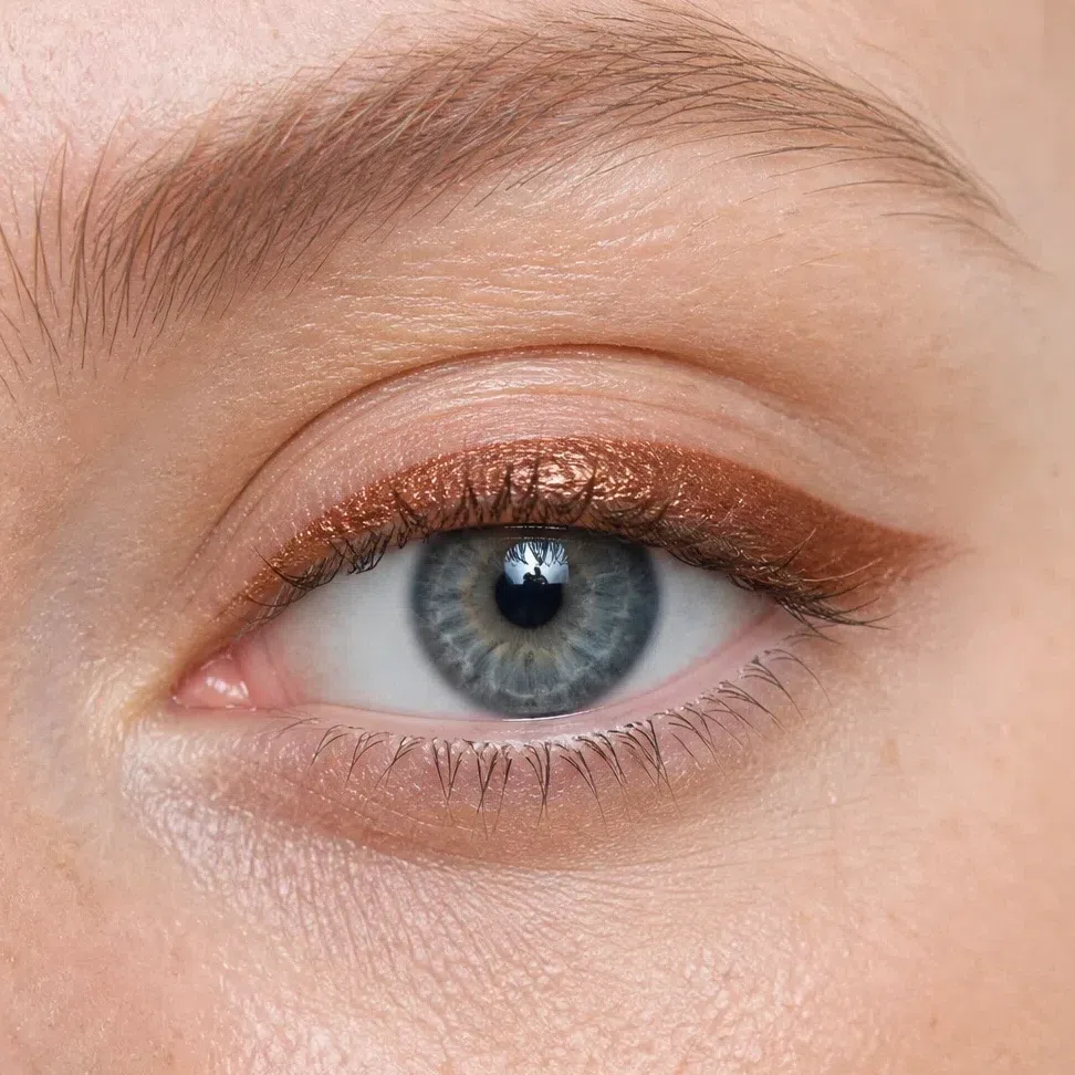
Bronze liner #9C7340 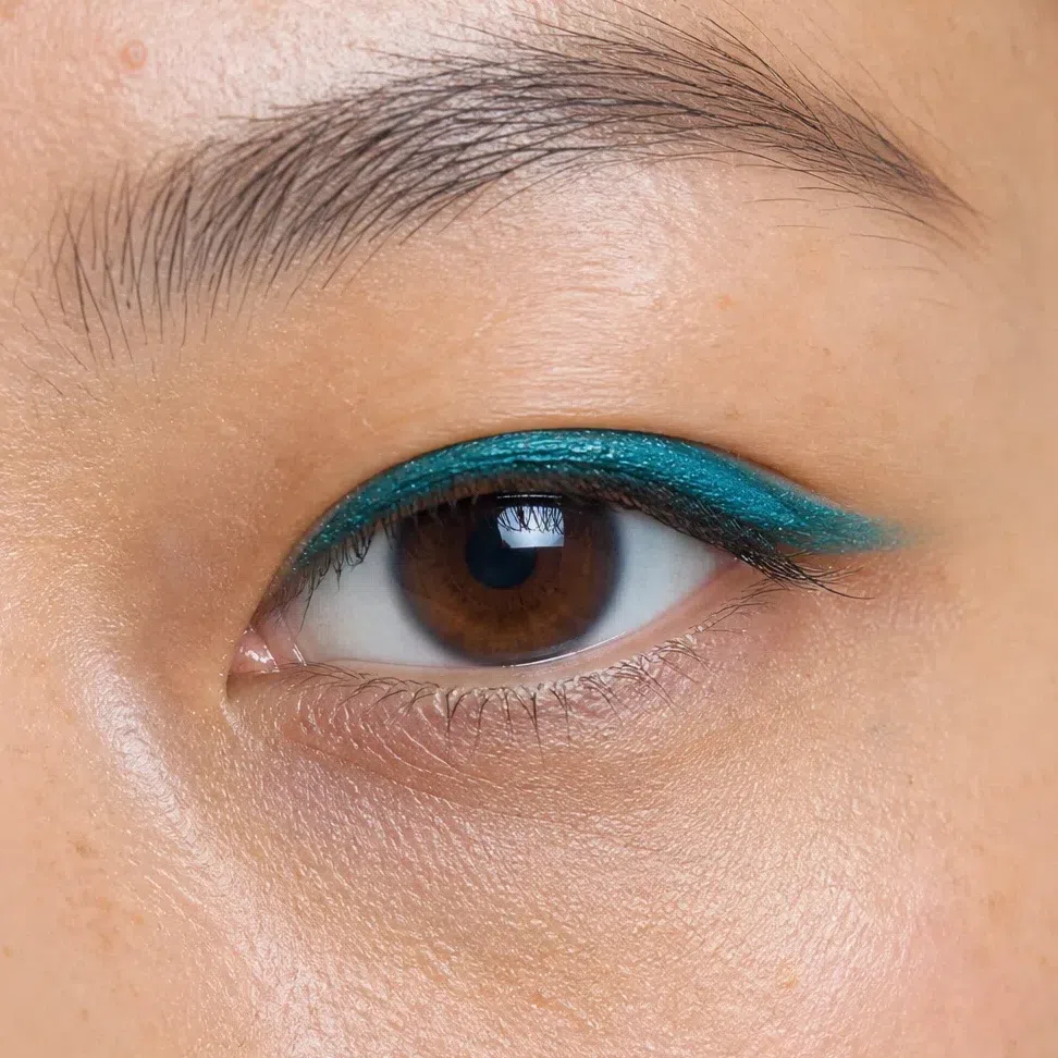
Deep turquoise liner #2F7F76 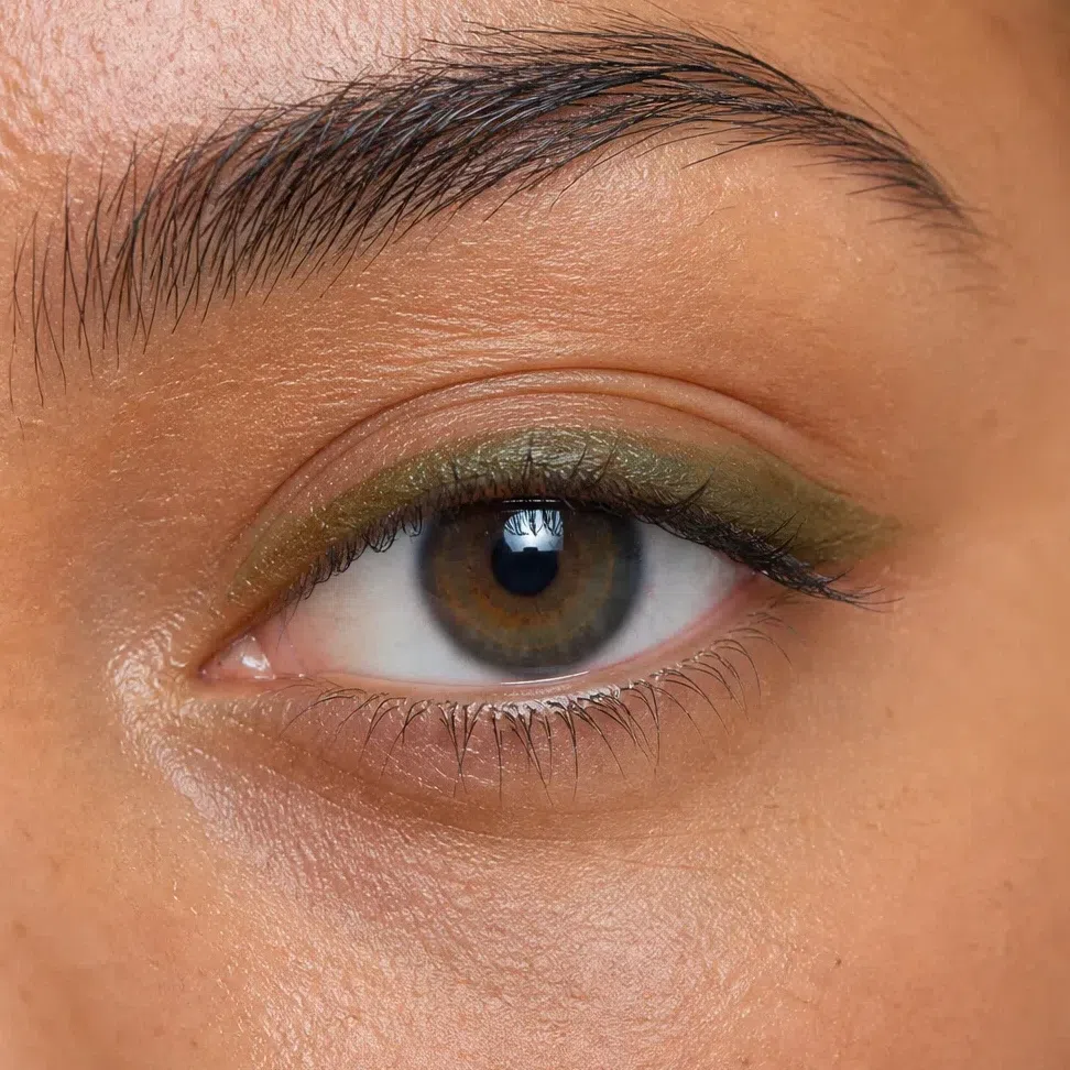
Olive liner #6E7043 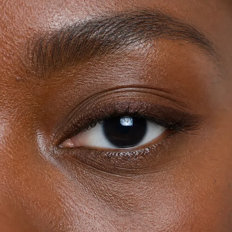
Warm chocolate liner #5B4032 Mascara
Brown, in the shade of your own lash root - copper brown on the fairest, black-brown on the deepest. One coat by day; for more, a second coat on the outer third rather than a darker tube.
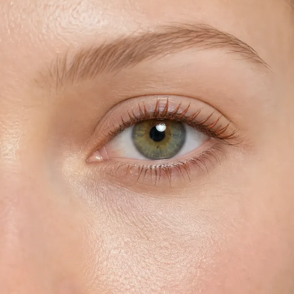
Copper brown mascara #8A5A32 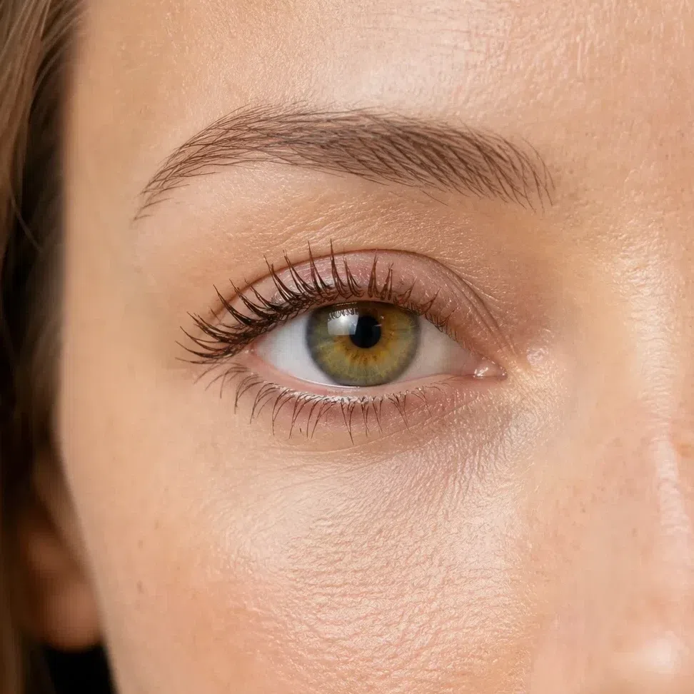
Soft brown mascara #6B4A34 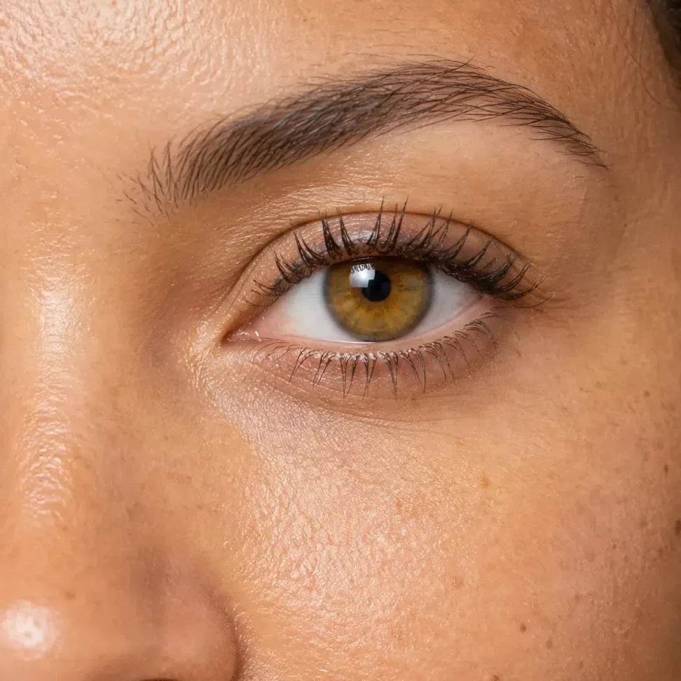
Dark chocolate mascara #4A3225 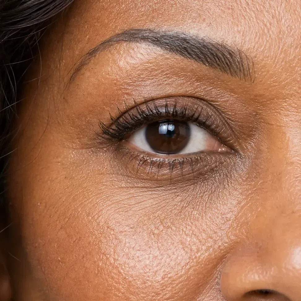
Black-brown mascara #3B2E26 Tip If you only own one liner, make it the warm chocolate. It goes with every other choice on this page and photographs exactly as it looks in the mirror.
-
Lips
Your own mouth, a shade warmer
A Warm Spring nude is a warm one - peach, apricot, salmon, coral beige - chosen by matching your lip, not by covering it. The gray-beige "universal nude" does something specific and bad on this coloring: it puts a cool, flat patch in the middle of a warm face, and the mouth looks switched off. Press it on from the center outward with a finger and stop just inside the edge.
Nude lips
Warm from end to end, peach through coral beige. The right one is about the color of your lip on a good day, half a step brighter.
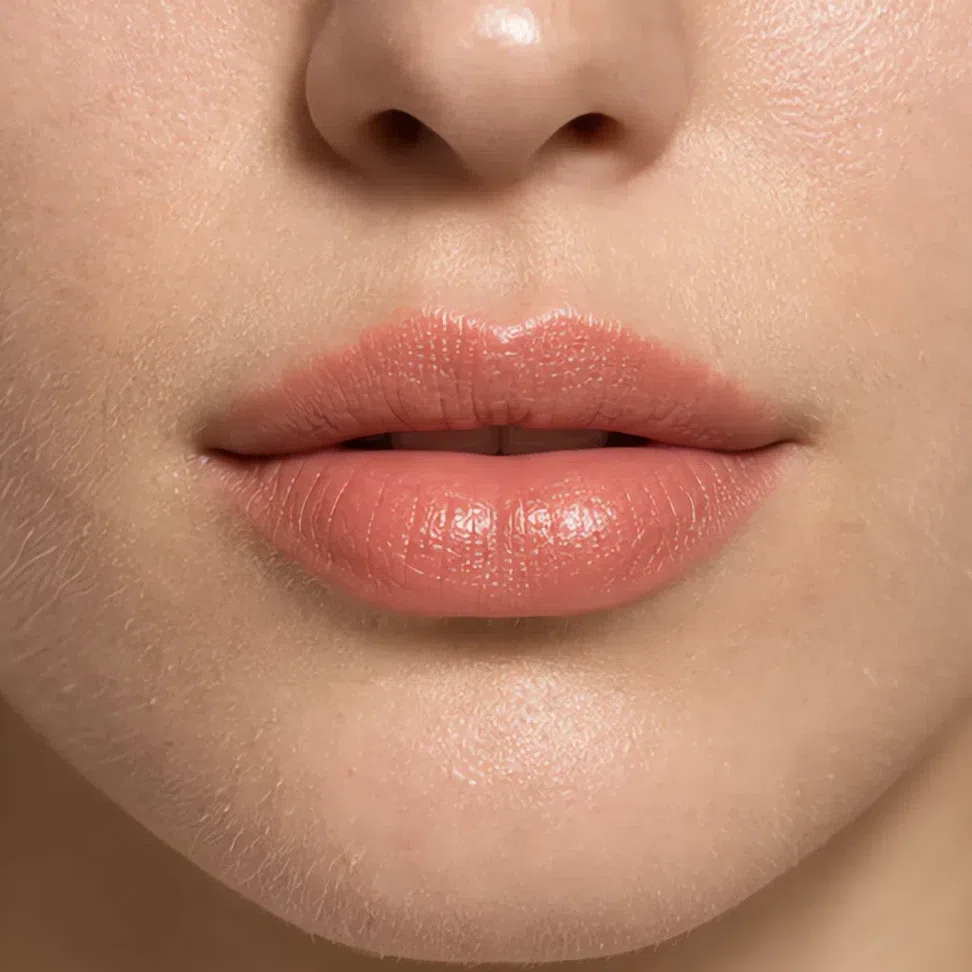
Peach nude #E9A98C 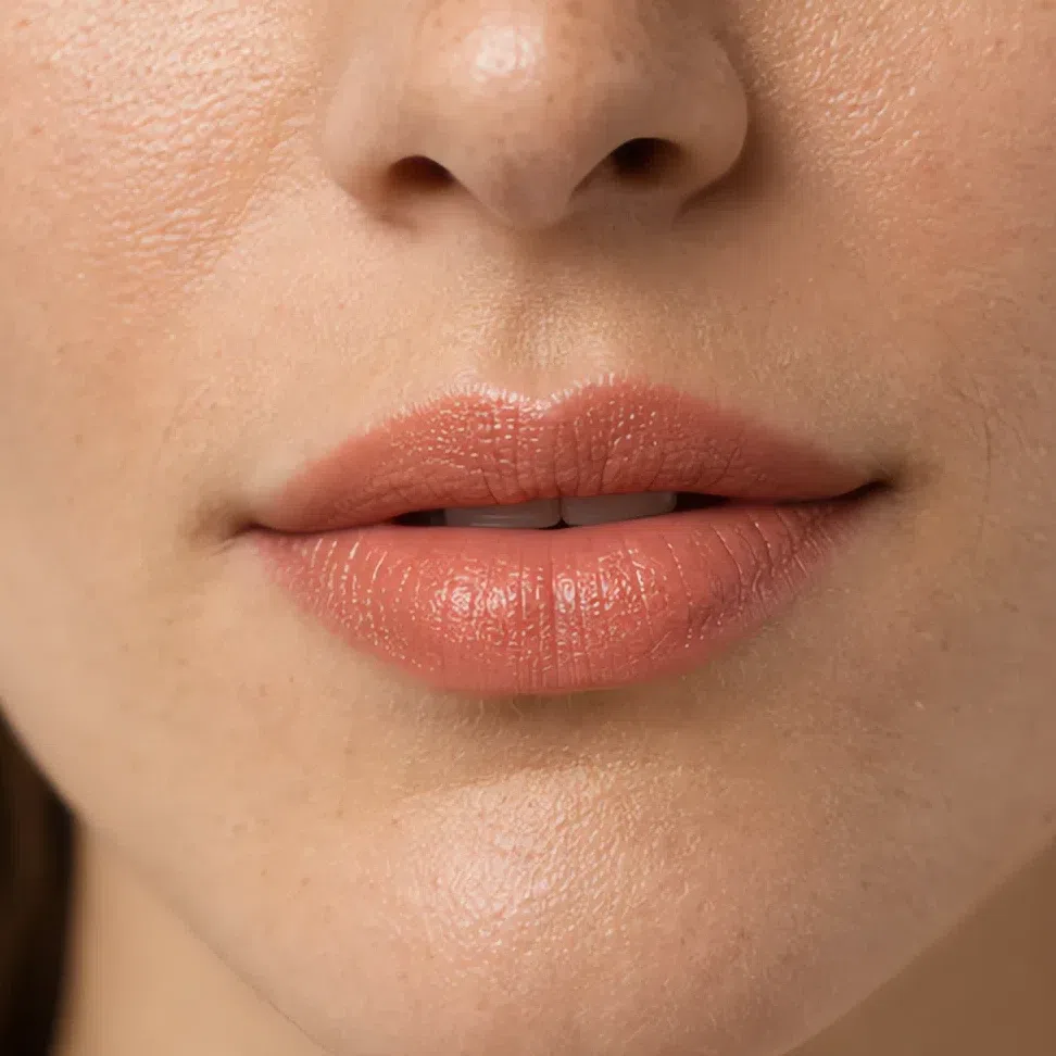
Apricot nude #EDA97E 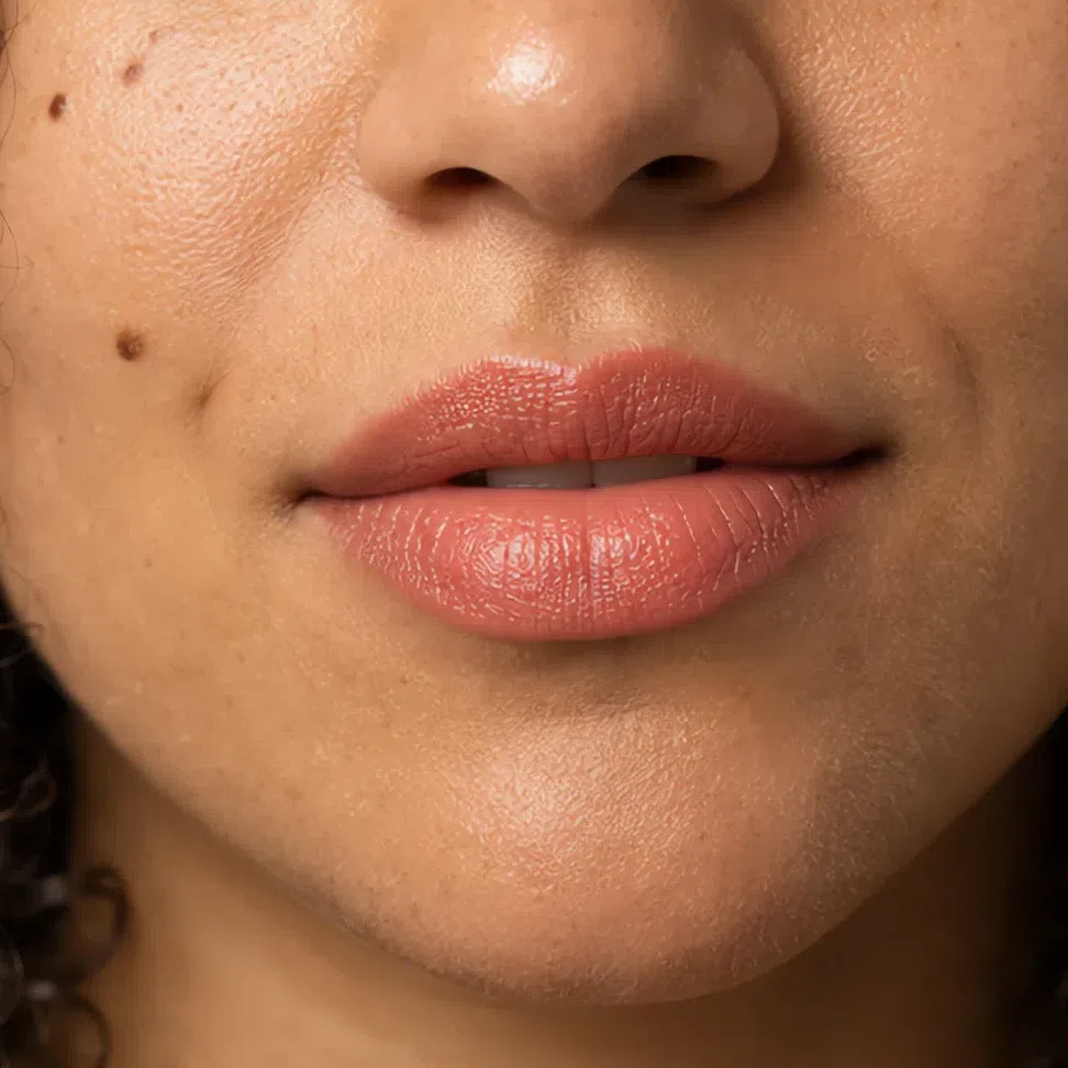
Salmon nude #EC9E8A 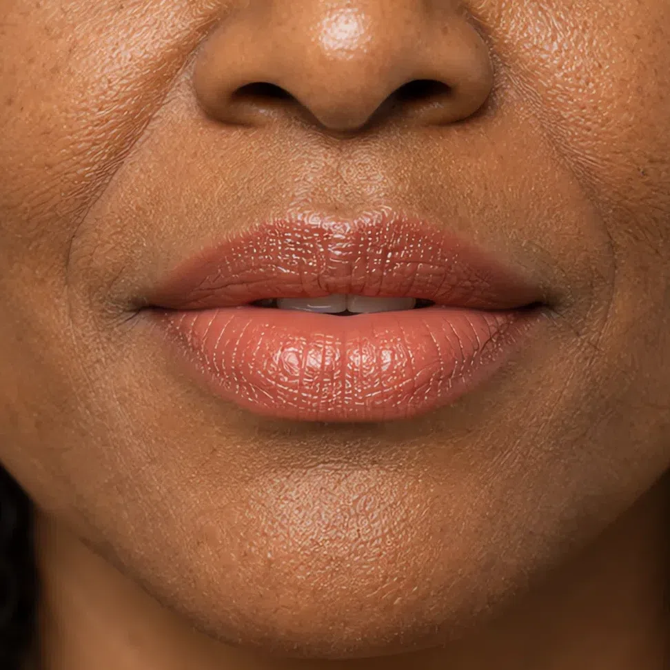
Coral beige nude #DFA189 Tip A clear balm over any of the four gets you most of the way on a lazy day - and adds the shine this coloring wears well.
That is the whole daytime face, in order, and it is a short list. Next, the question most guides answer badly: what actually changes when the light goes down?
Your evening face: what changes, and what must not
Two things change and four stay put - a smaller shift than "evening makeup" usually suggests. It is not a darker face; it is the daytime one pushed further in the direction it already pointed, with a short list of things that must not move. Each depth below twice, the same woman in both frames.
Eyes
The evening move on this coloring is color, not darkness. The day shade stays across the middle of the lid, and a clear evening shade - olive, turquoise, copper or bronze - arrives at the outer end: crease, outer corner, the outer half of the lower lashes.
- Put the day shade over the whole lid, edge to edge, as you already do.
- Walk the evening shade along the crease and down into the outer corner.
- Take it under the outer half of the lower lashes and stop there.
- Keep the middle of the lid as the lightest point on the eye.
- Line inside the lashes rather than on top, then blend every join until you cannot find it.
The rule Brighter and warmer inside the same family, placed at the outer corner. What ruins this face after dark is reaching for depth instead: a charcoal smoke or a black line swaps the color that suits you for a darkness that does not.
Champagne stays across the lid, golden olive takes the crease and the outer corner, and a deep turquoise line sits inside the upper lashes. Olive against green eyes is the trick here: it makes the iris look brighter rather than competing with it.
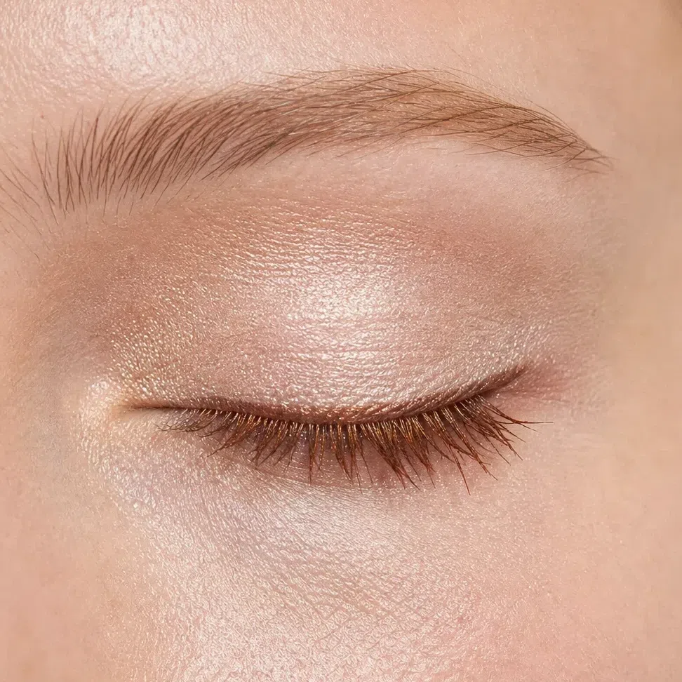
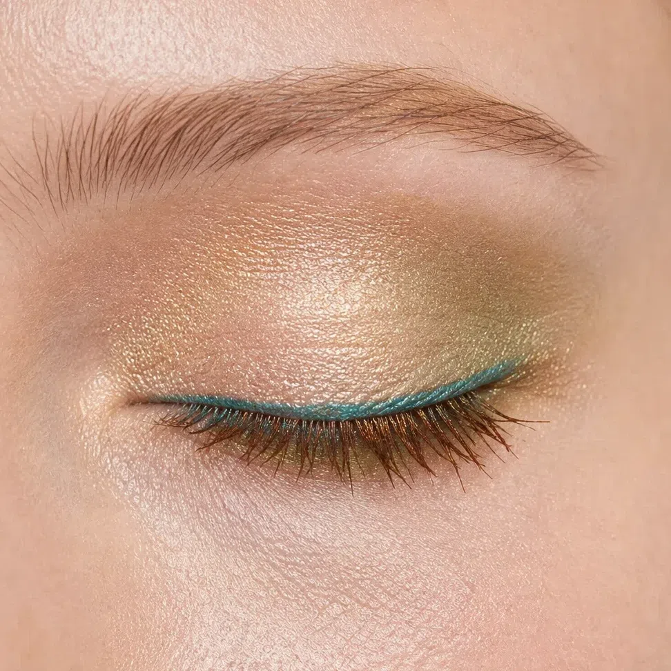 Deepest at the outer corner
Center of the lid stays lightest
Lower lashes: outer half only
Apricot on the lid, clear turquoise through the crease and out past the corner. This is the most Warm Spring color on the list - bright, warm-leaning turquoise that a cooler coloring would wear as teal.
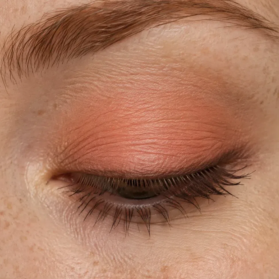
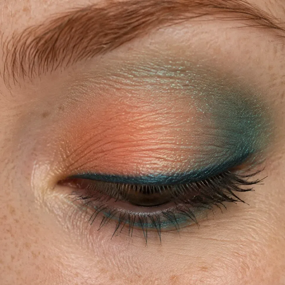 Deepest at the outer corner
Center of the lid stays lightest
Lower lashes: outer half only
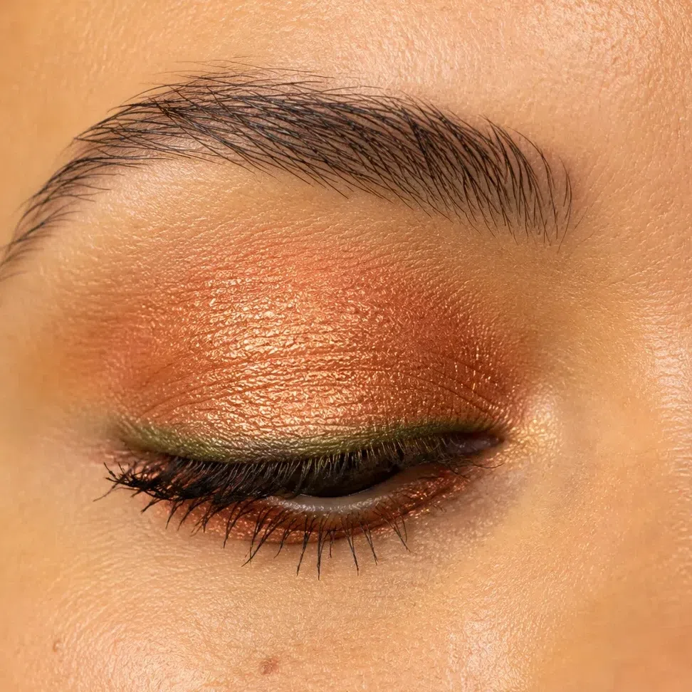
Golden peach on the lid, metallic copper carried through the crease, an olive line along the lashes. Copper has enough pigment to hold on a tan complexion under restaurant light, which the paler shades above do not.
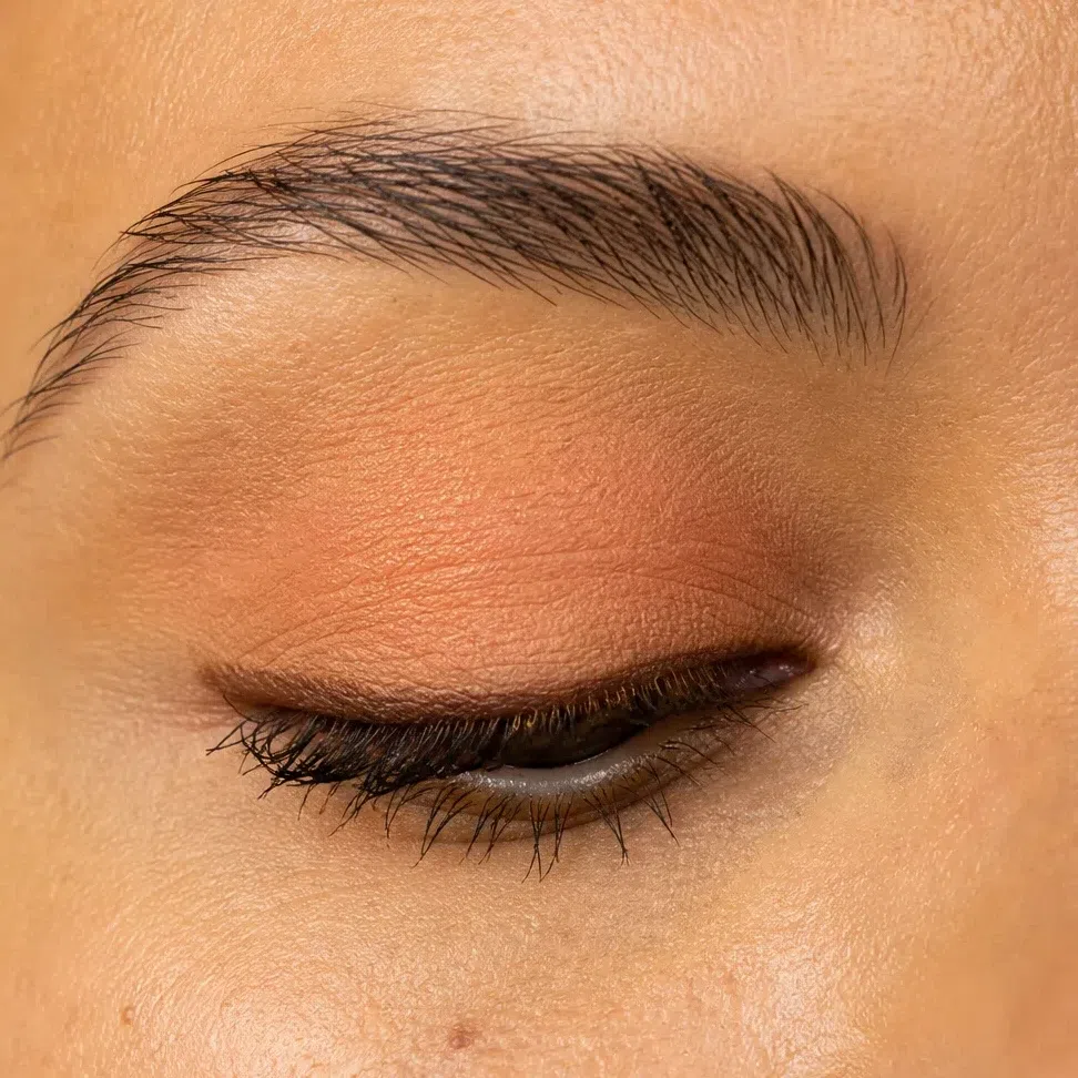
 Deepest at the outer corner
Center of the lid stays lightest
Lower lashes: outer half only
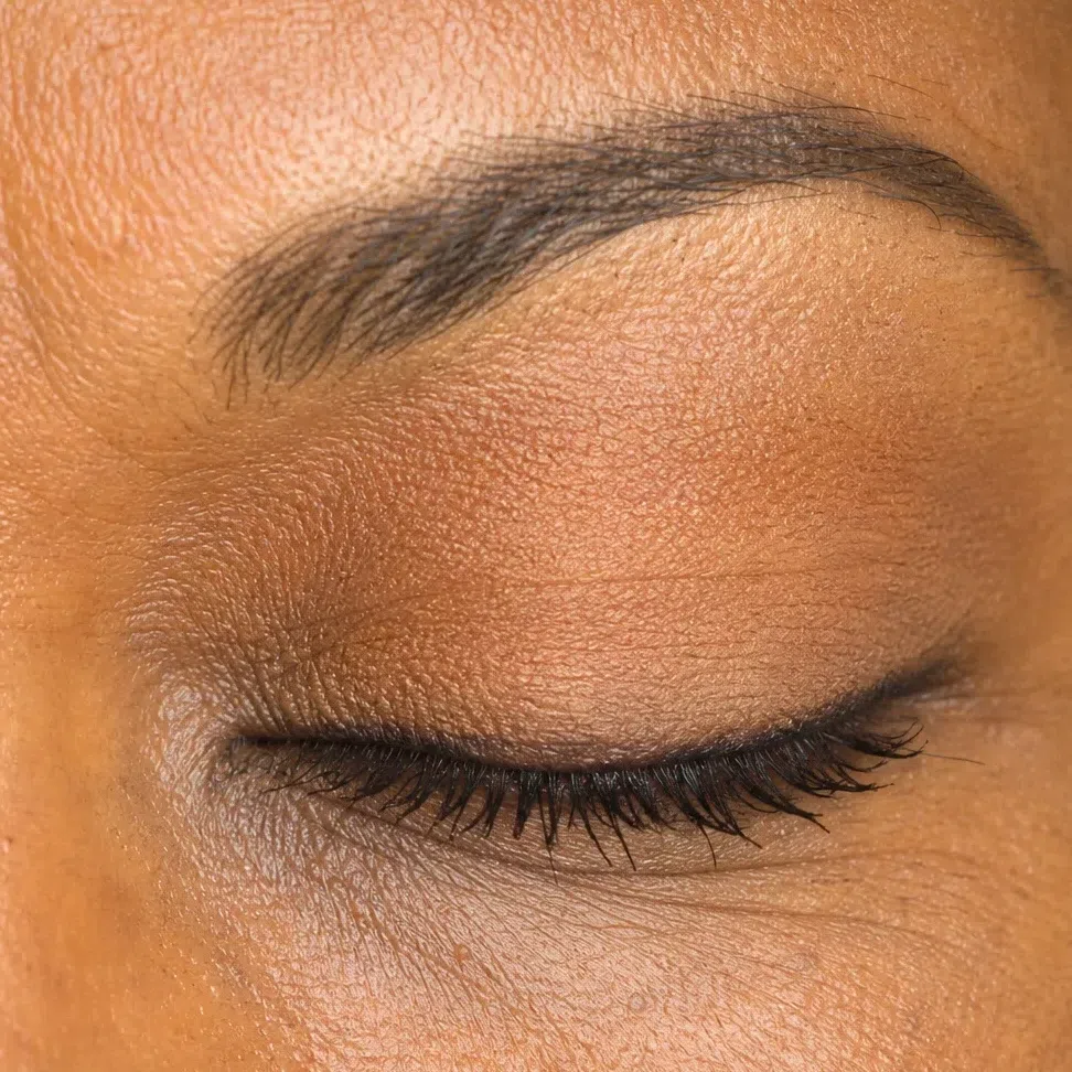
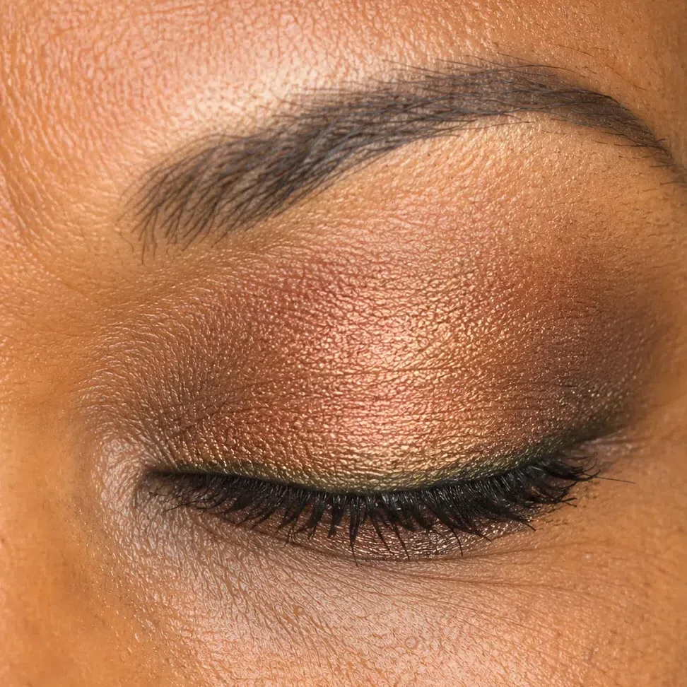
Warm camel on the lid, deep bronze the whole way round the outer corner, olive along the lashes. On deep golden skin bronze does what turquoise does on the light row: it is the color event, in the form this depth shows best.
 Deepest at the outer corner
Center of the lid stays lightest
Lower lashes: outer half only
Lips
The same family at two strengths. The nude and the color on this palette are one warm shade turned down and turned up, so the evening lip is not a new decision - it is the day decision taken further. What has to survive is the soft edge.
- First layer with a fingertip, not straight from the bullet.
- Blot once.
- Second layer through the middle of the lip only.
- Keep the outer edge soft. No drawn line, at any hour.
The rule Your depth decides which nude and which color are yours; the hour decides only how much goes on.
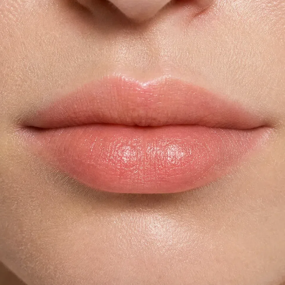
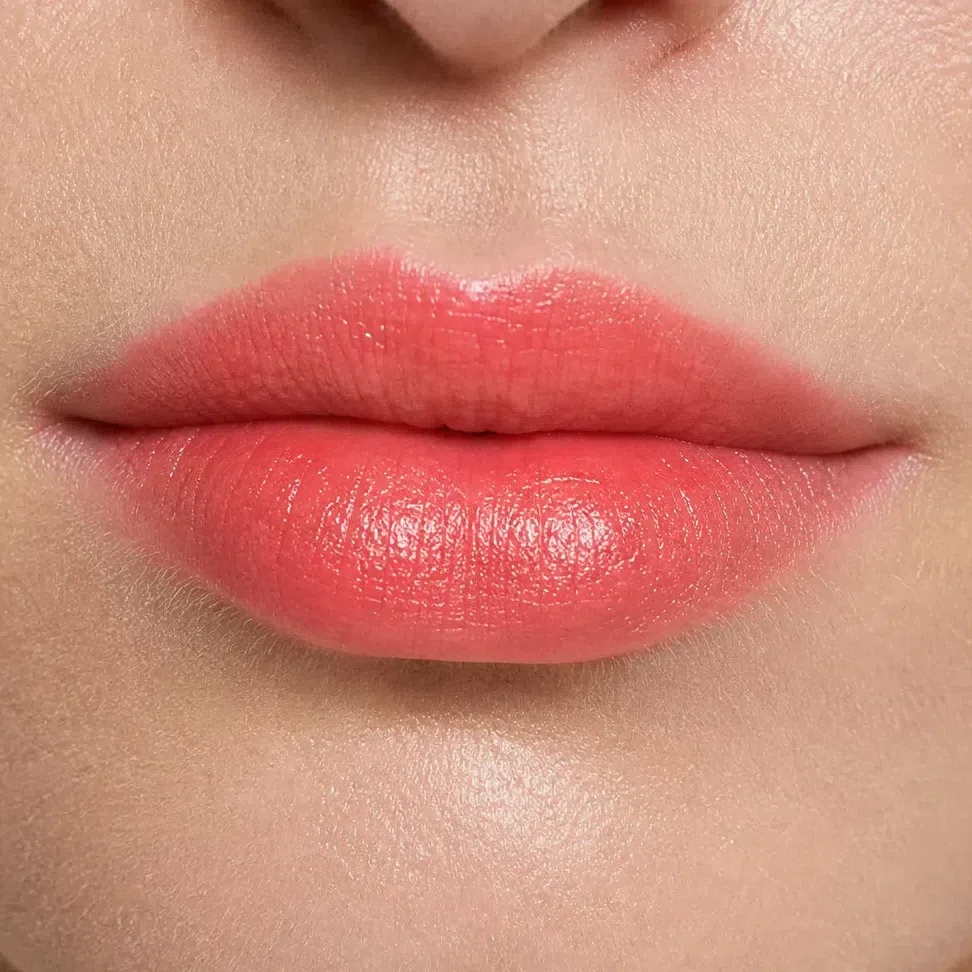
Peach nude by day, clear coral after dark - the signature Warm Spring lip, and the brightest this row needs.
 Leave the corner soft
Build through the middle
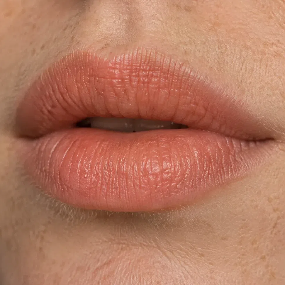
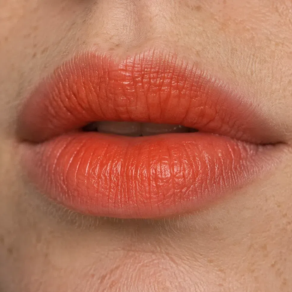
Apricot nude by day, mandarin after dark. Orange lipstick is a real option on this coloring rather than a novelty, and on light warm skin it reads as fresh rather than loud.
 Leave the corner soft
Build through the middle
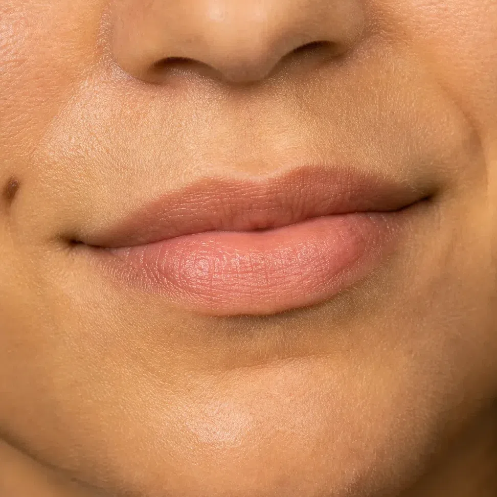
Salmon nude by day, terracotta rose after dark. The rose in it keeps a warm tan complexion from going one note from forehead to chin.
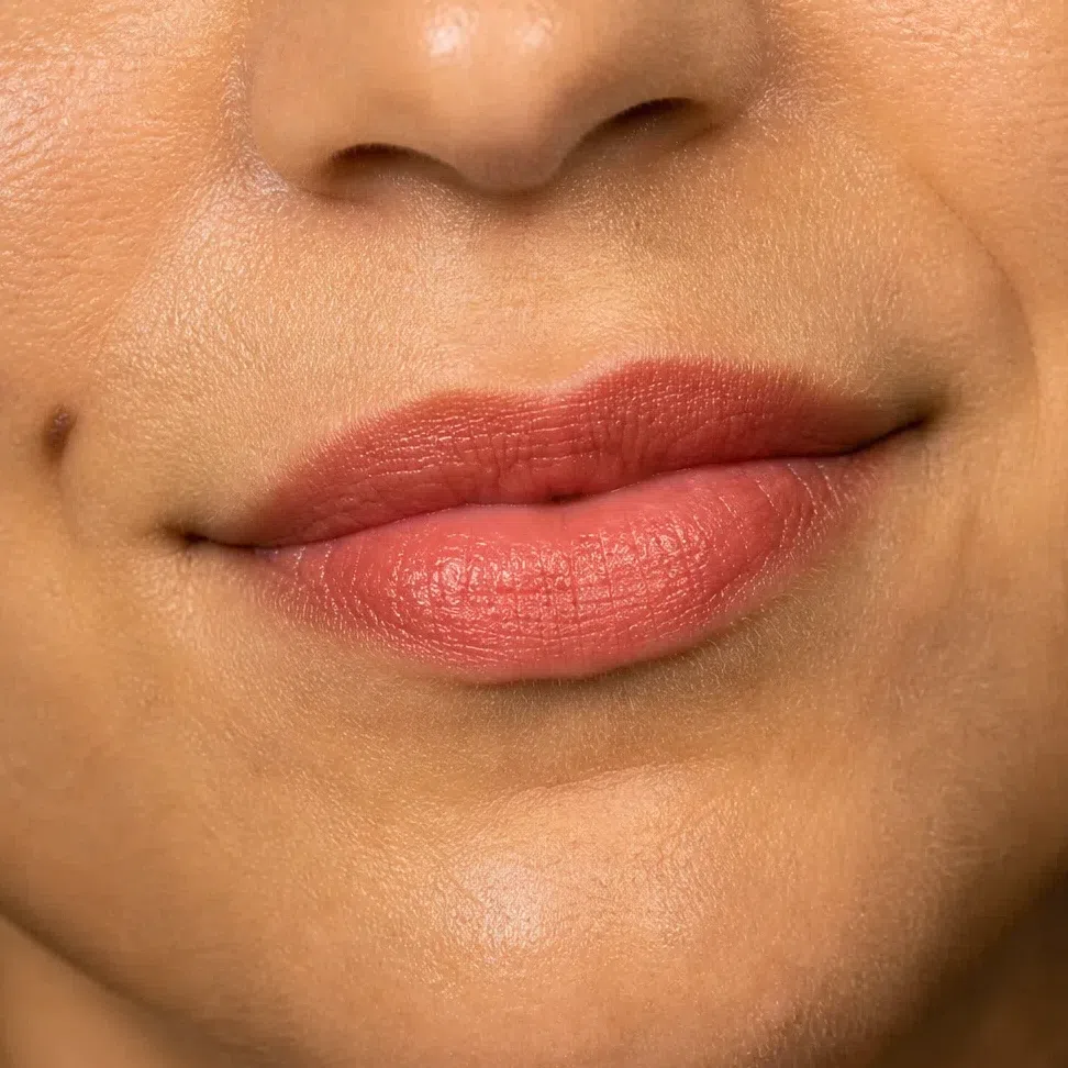 Leave the corner soft
Build through the middle
Coral beige nude by day, terracotta rose after dark - the same evening shade as the row above, landing deeper and richer on this skin. For more, poppy red is on the palette and wears beautifully here.
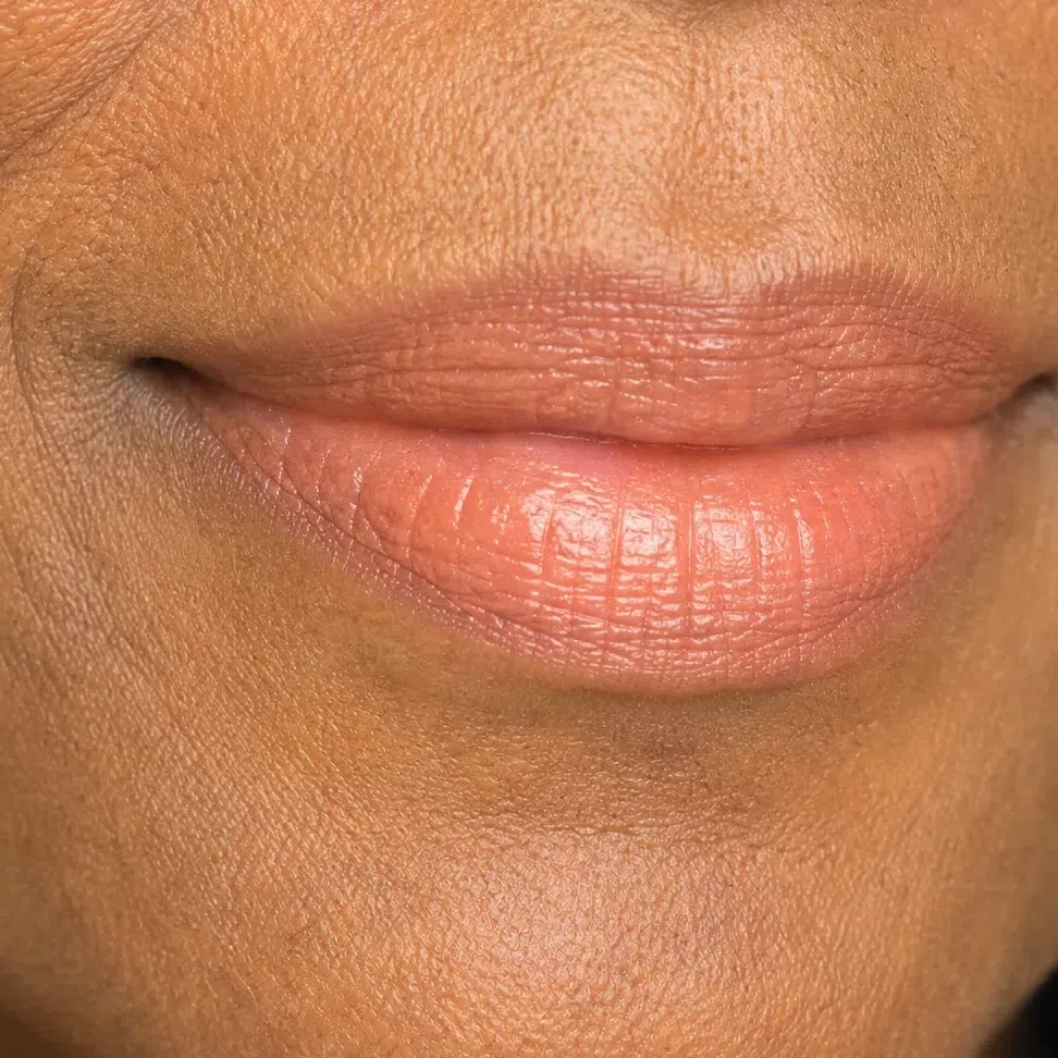
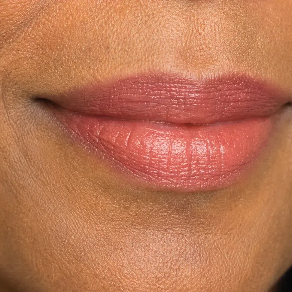 Leave the corner soft
Build through the middle
What must not change
It is the brightest point on the eye in the morning and it still is at night. Everything the evening adds goes around it; cover it and the eye closes up.
Same shade, same place, same amount. Deepening the cheek to match a stronger lip gives you three warm areas competing on one face.
They stay at your hair level. A darker pencil at seven in the evening puts the darkest mark on the face above everything you kept bright.
Not the moment to add coverage. Artificial light and a phone flash are harsher than daylight, and an extra layer for the photographs becomes what the photographs are about.
If you keep one line from this section, keep that one: more color, never more darkness. Whether it lands that way depends on something a shade name never mentions.
Why the right shade can still look wrong
That something is the finish. Every product is half shade and half surface - how much light it sends back - and the surface is the part nobody lists on the packaging. One lipstick, one mouth, four photographs, and the color underneath never changes.
One shade, four finishes
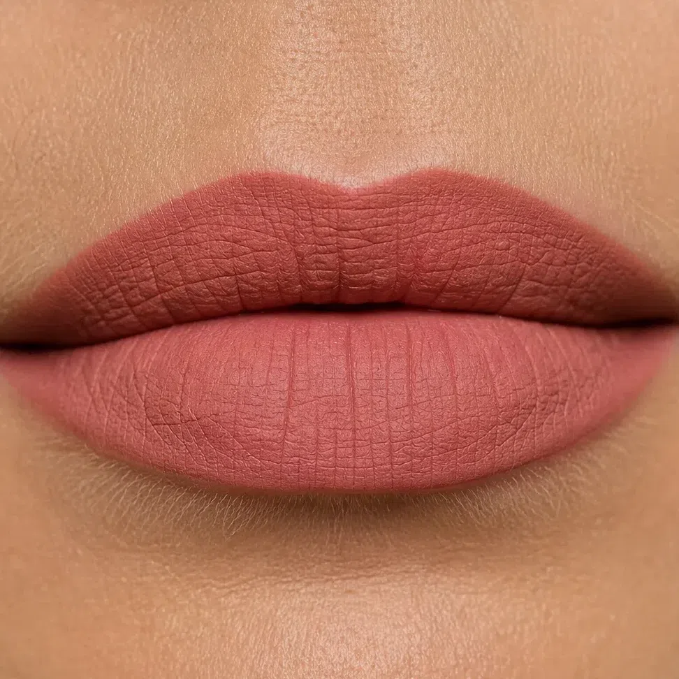
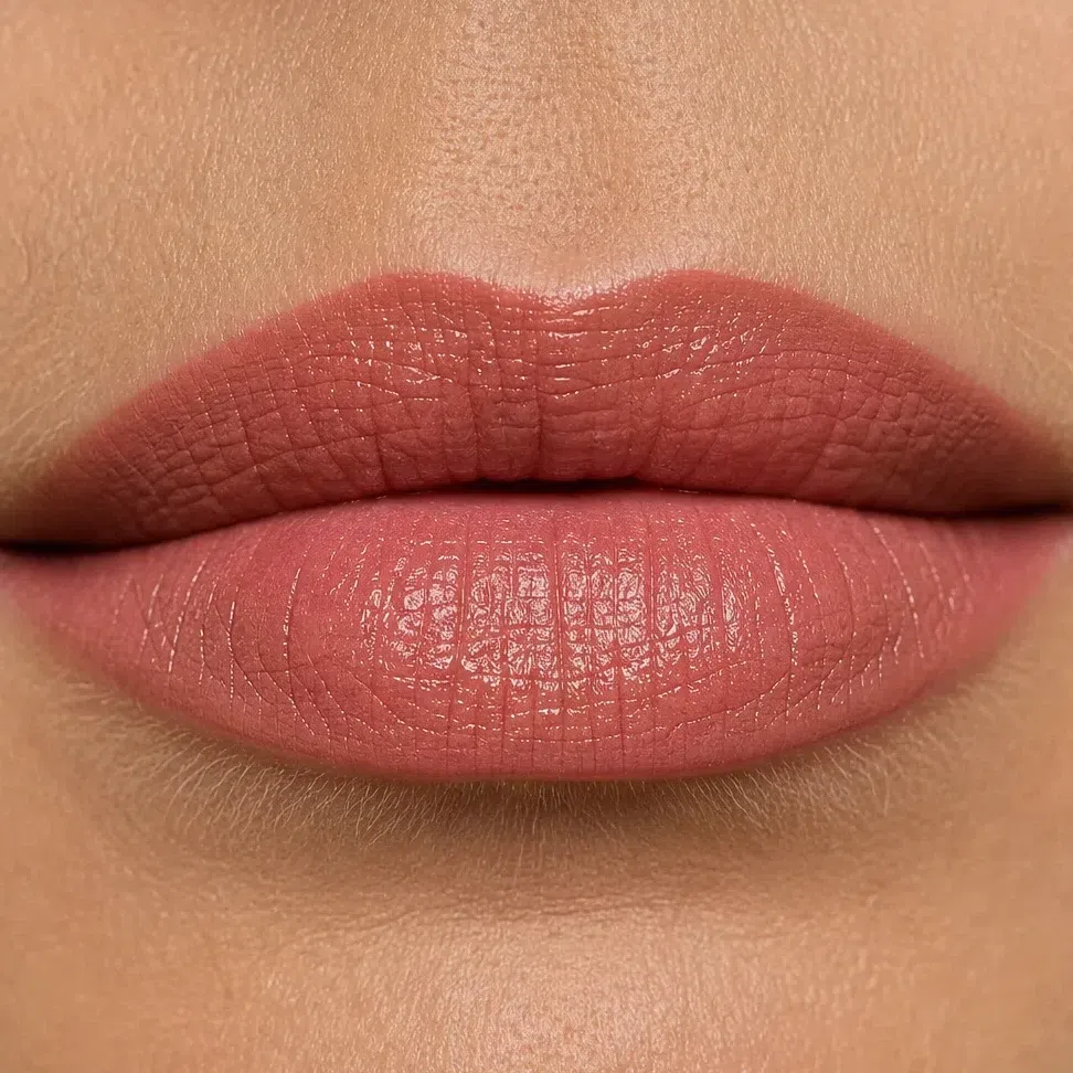
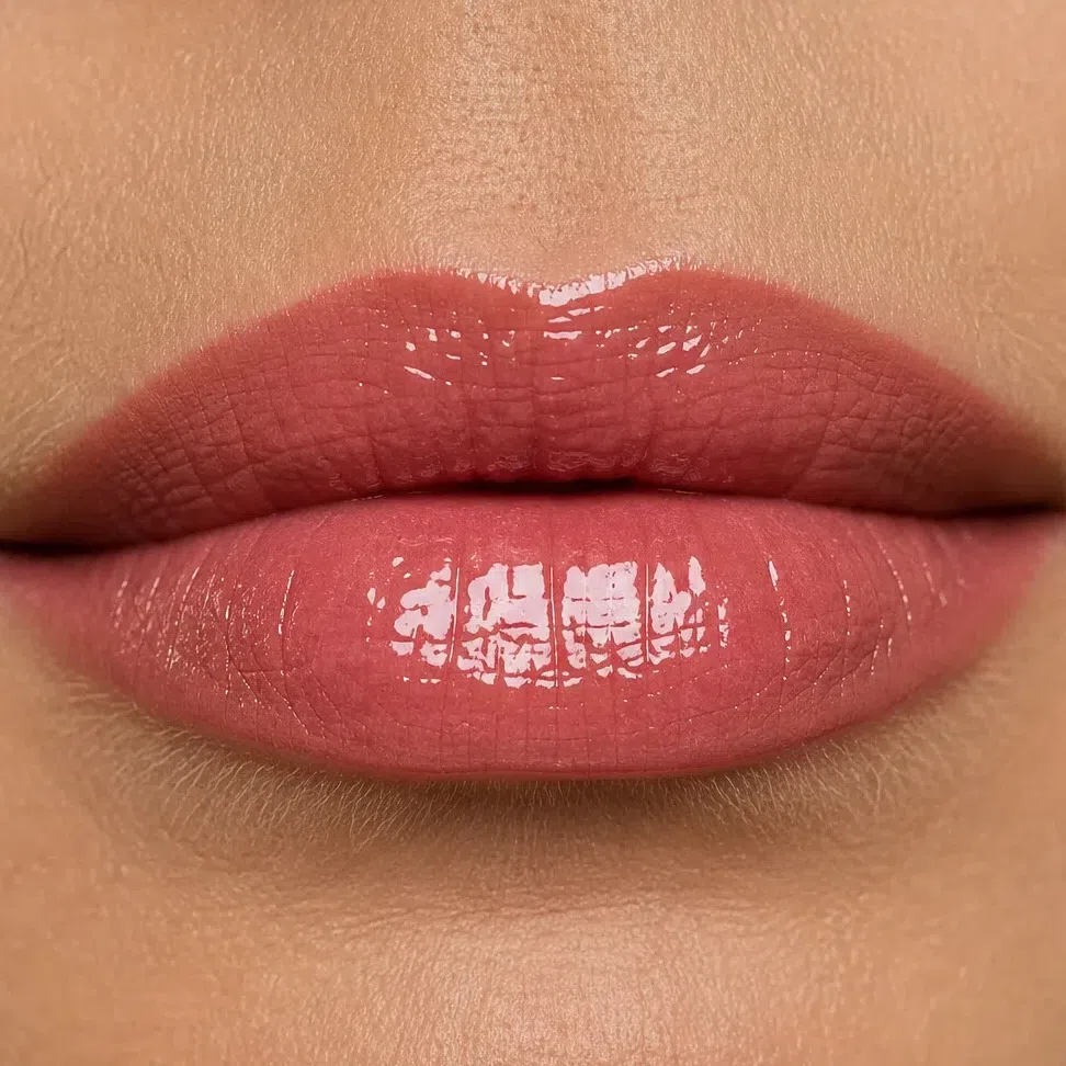
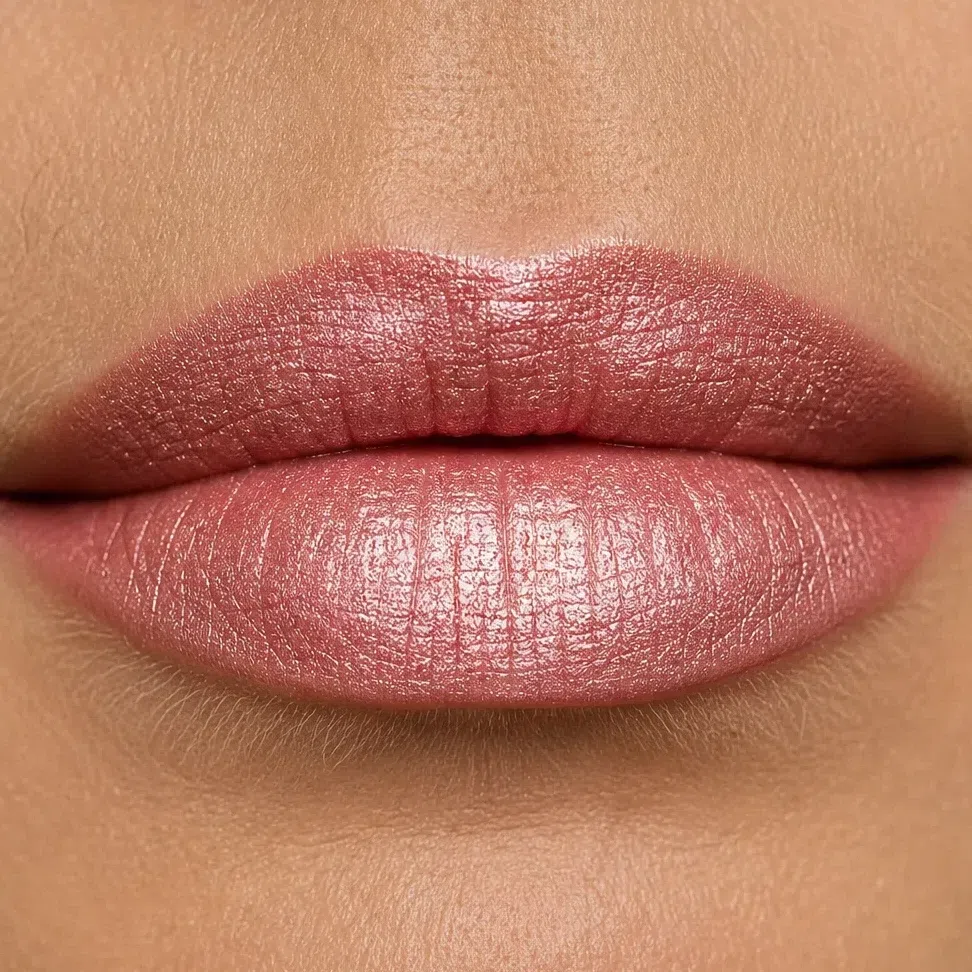
Two things change across those four surfaces. The first is the specular highlight, the bright reflection a smooth surface sends straight back: matte returns none, satin spreads it low and wide, gloss gathers it into a point, and frost turns the whole surface into a reflector.
The second is the one that catches people out. Most finish advice warns that the pearl in a product is coated to flash gold, which fights a cool face - and gold light is your own register, so that warning does not apply to you. What does apply is opacity. Frost and dense pearl are white pigment as much as shine, and white laid over a clear warm shade is what dulls it. So the question to ask a tester is not what color the shimmer is, but how much of the color you can still see through it.
The same question, on skin
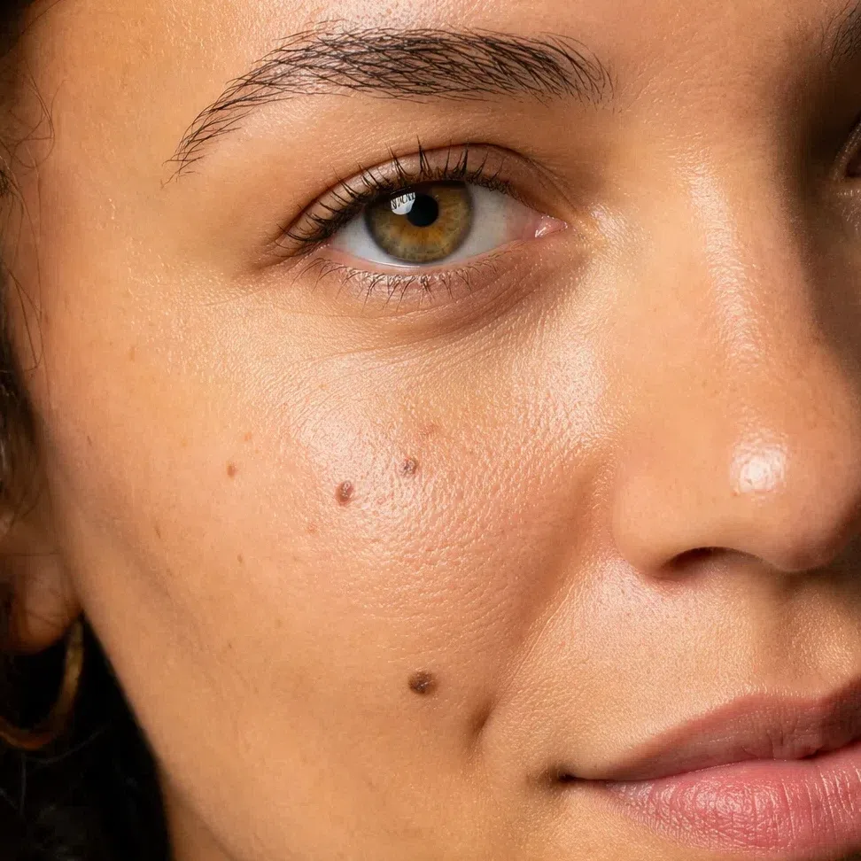
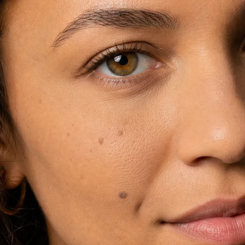
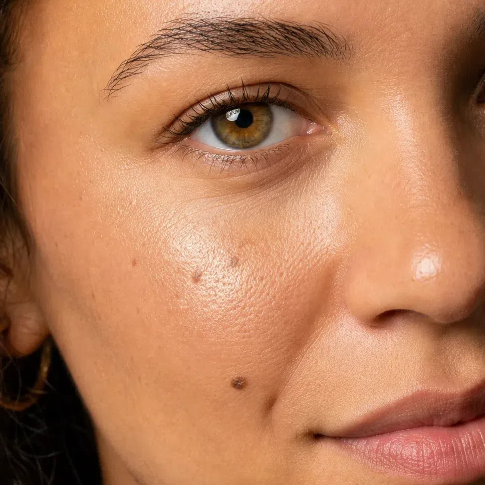
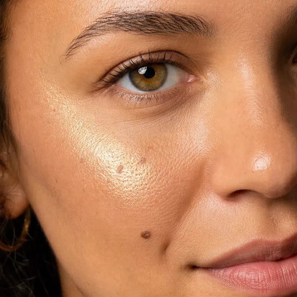
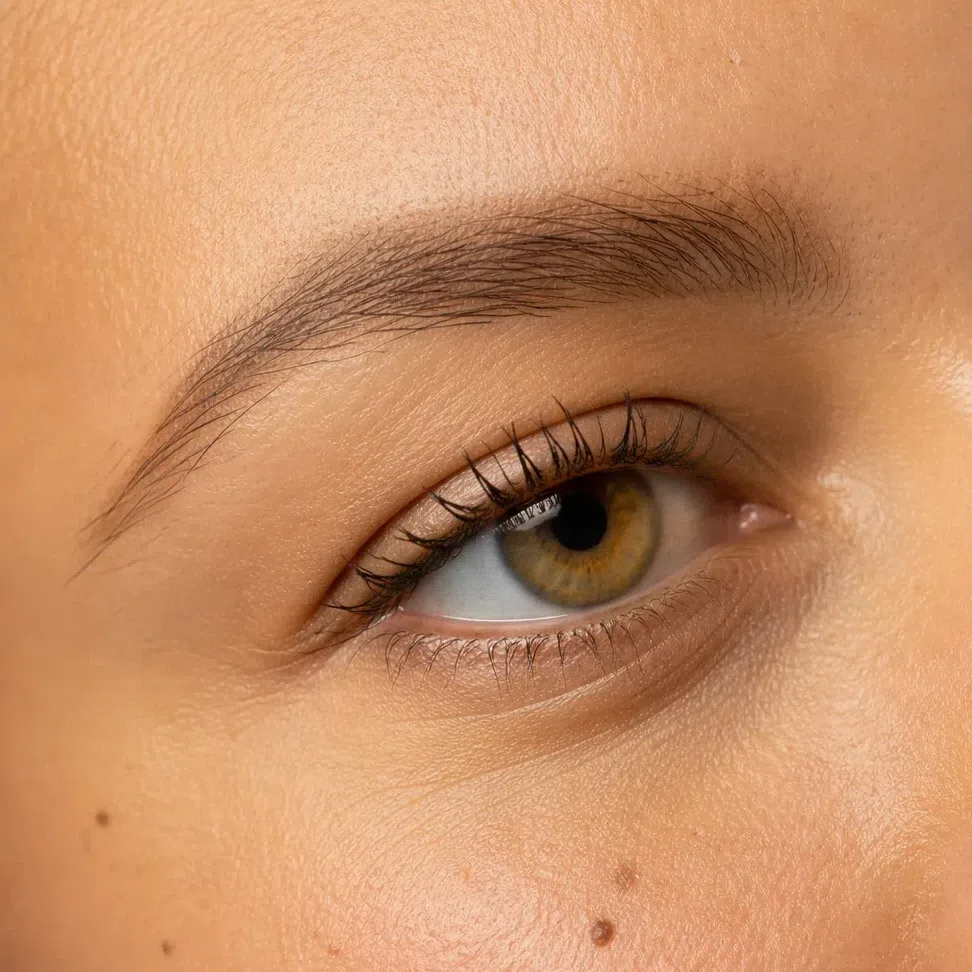
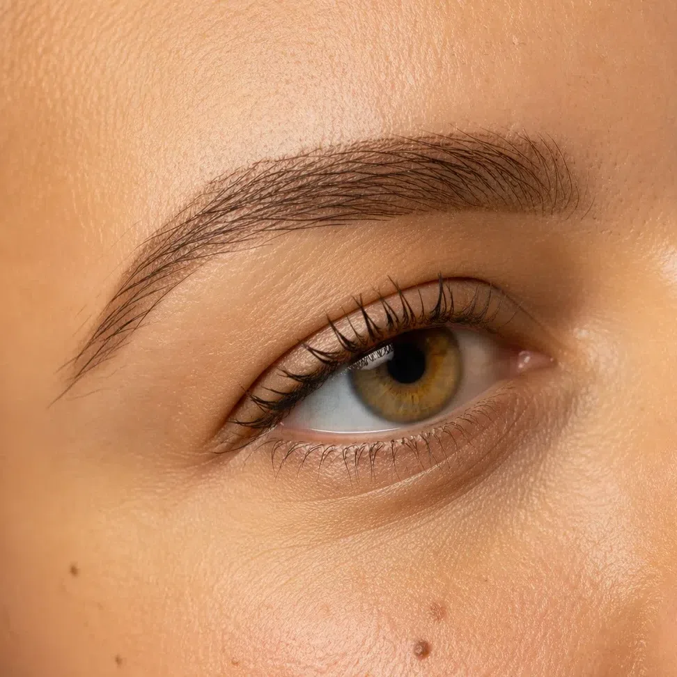
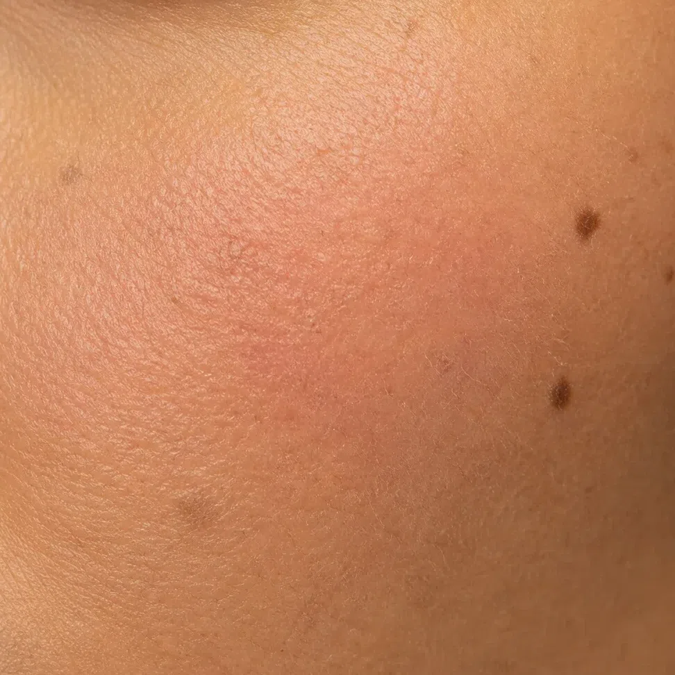
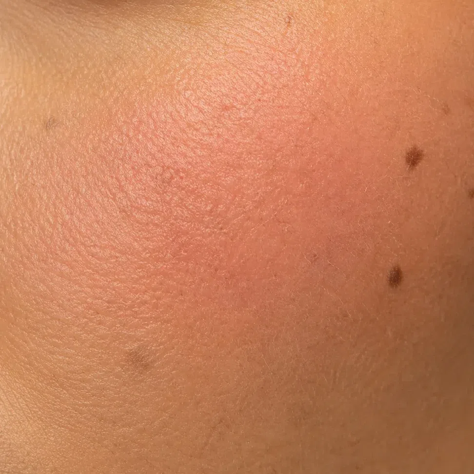
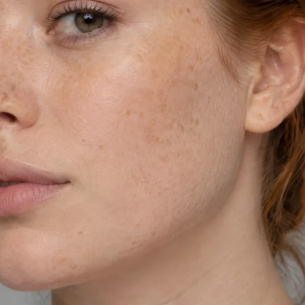
On skin the finish matters differently, because skin has a texture it can either keep or lose. In each pair, the left photograph is the version where skin still looks like skin.
What that means, product by product
- Base
- Satin. Full matte takes out the glow that makes this coloring look like itself.
- Blush
- Cream, with a little powder over it on long days only.
- Eyeshadow
- Satin by day, shimmer and metal at night - copper and bronze are this season at its best. Frost still dulls it.
- Brows
- Powder or a soft gel, amber to warm chestnut. Never a waxy pencil.
- Lips
- Satin by default, gloss for freshness, matte for a strong evening color. Never frost.
- Highlighter
- Warm - champagne, peach pearl, copper gold - on a small area with no edge. Silver turns gray on golden skin.
Oily skin is a finish question more than a skin question. Matte all over is the obvious fix and the wrong one for this coloring: it switches off the glow Warm Spring depends on, and it breaks up by mid-afternoon anyway. Set only the T-zone, leave the cheekbones, and carry blotting papers instead of powder. For photographs, blot the nose and forehead - the light on the cheekbones is on your side.
How to get the right one home
Knowing the shade is half of it; the other half is walking out of a shop with it. How to test, which label words to trust, and why the usual test cannot work.
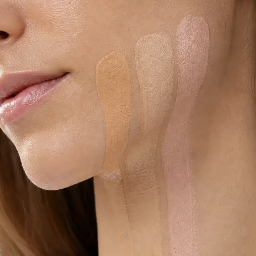
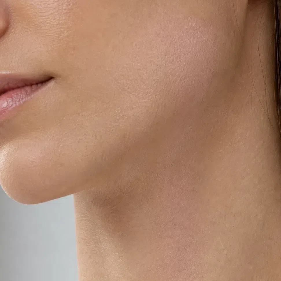
The jaw test
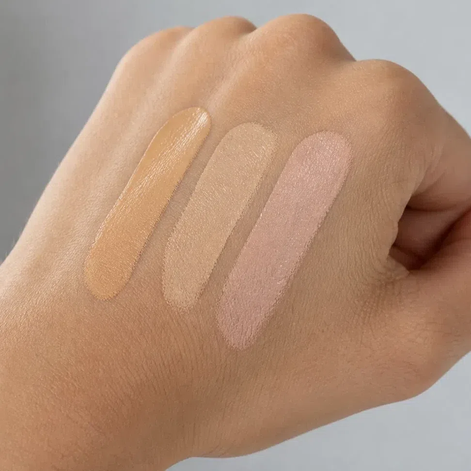
- Draw three candidates side by side along the jaw and down onto the neck. Not the inside of the wrist, and never the back of the hand.
- Blend all three out.
- Walk to a window. Store lights are warm, and under warm light nearly every golden base looks like a match.
- Buy the stripe that has disappeared - not the one that looks nicest, the one you cannot find any more.
The whole shade grid, and the square that is yours
Foundation ranges are a grid too - depth down one side, undertone across the top. This is that grid with just the Warm Spring squares filled in.
The outlined column is the whole answer: one undertone letter, at whatever depth you are. A Warm Spring in warm ivory and one in warm caramel ask for the same letter and a different number - so the request is always your depth plus warm, never a shade name copied from an ad.
Three plain facts about this chart. The warm column holds our values, not any brand's - one letter mixes slightly differently in every range, and depth numbers never carry across brands, so no chart can hand you a shade to order by name. The cool, neutral and olive squares are illustrations, each one your warm shade at that depth pushed toward the other undertone, so you can spot the wrong letter on a shelf. And neutral is a maybe: a neutral that reads golden on you counts as warm, and the jaw test decides.
Reading a shade name
That second list hides two separate mistakes. Ash, cool, mauve and berry are the wrong temperature for golden skin. Dusty, muted and smoky are warm enough but have lost their clarity, and black brings in a depth this face has nothing to answer with. The muted ones are the ones that end up in the basket, because a muted coral still says coral on the lid. Use the label to shortlist; let the jaw and the window decide.
What the finish words on a label actually mean
- Satin, natural, second-skin
- What you came for.
- Radiant, luminous, glow
- Yours too - a Spring wears glow well. Set the center of the face if the day is long.
- Demi-matte, soft matte, blurring
- Fine, but further from you than the label suggests: matte removes the glow this coloring relies on.
- Metallic, foil, chrome
- Warm metal on a lid is one of this season's best looks; high on the cheek it becomes a stripe.
- Frost, pearl-finish, iridescent
- Leave it. Dense pearl is white pigment, and white over a clear warm shade chalks it up.
Judging a swatch photo online
Product photos are lit to sell, and selling light is bright and flat. Flat light flatters exactly the axis a Warm Spring shops on: it adds clarity, so a dusty coral looks clean on screen and a muted peach looks fresh. The shade that arrives is the dustier one. Two habits fix most of this - trust swatches on skin over pans and bullets, and trust a photo with a shadow in it, because the color at the edge of the shadow is the color you will actually wear.
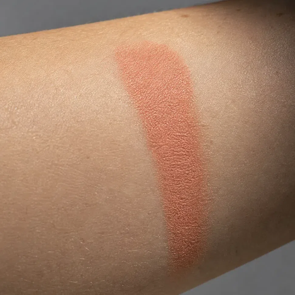
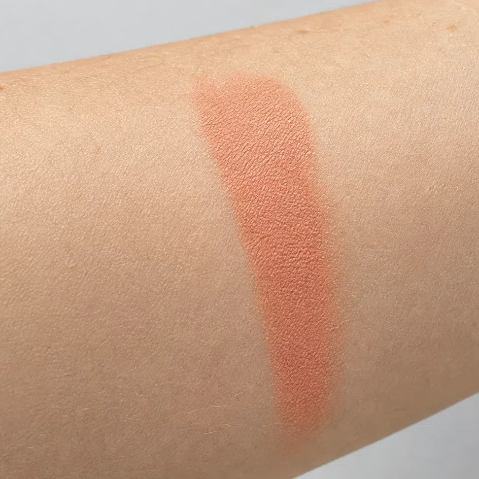
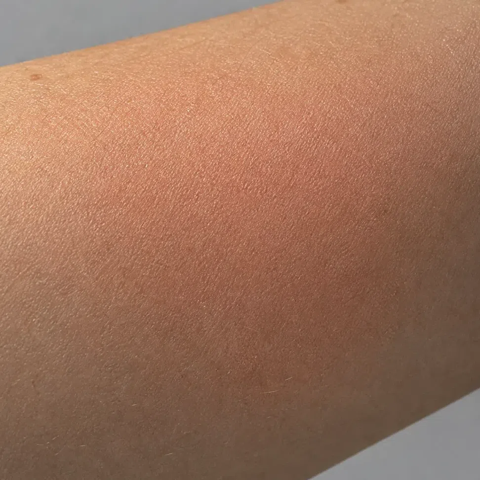
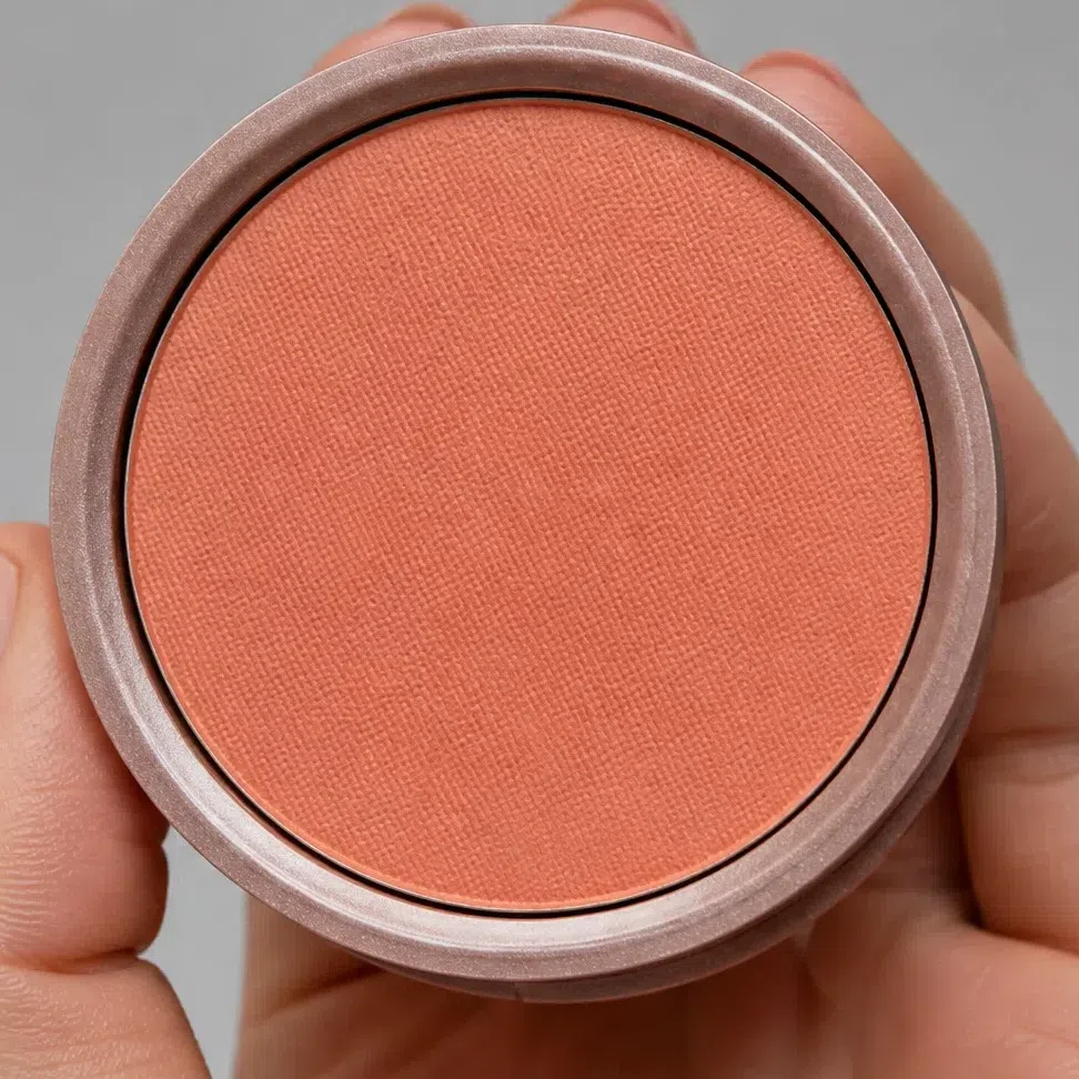
Makeup ranges are reformulated, renamed and discontinued every year, so a product list is out of date almost as soon as it is written - and an unchecked recommendation still costs someone money. A shade name, a few label words and the jaw test last longer: they work in any shop, on brands that did not exist when this page went up.
When it does not work
You have the shades, the order, the finishes and a way to pick the right one in a shop. This part is for later - the evening something looks off in the mirror and you cannot say what.
Two ways it goes wrong
You look dull, not made up
- What it looks like
- Everything is technically in place and the face still looks gray and a little tired - worse in photographs, worse again under office light. It tends to follow a decision to "keep it natural".
- Why
- Something muted or cool has got in: a taupe lid, a dusty rose cheek, a gray-beige nude, a base a shade too pink. Warm Spring coloring is clear and warm, so a dulled shade has nothing in the face to agree with. Each product looks sensible in the pan, which is why it gets bought.
- Fix
- Go clearer and warmer, not softer. Swap the taupe for a golden peach, the dusty rose for a clean coral, the beige nude for an apricot one. It will feel like more makeup. It reads as less, because the face finally looks like itself.
The makeup looks heavy on you
- What it looks like
- The eyes look smaller and sunk in, or the mouth is the first and only thing anyone sees. You look older in photographs than you do in person.
- Why
- Depth borrowed from another season - black liner, charcoal smoke, wine lips, a cocoa contour. Warm Spring sits at medium contrast: there is color in your face but no very dark note, so a genuinely deep product becomes the darkest thing in the frame and pulls everything toward it.
- Fix
- Keep the intensity and lift the depth. Bronze instead of charcoal, warm chocolate instead of black, poppy instead of wine. You can wear strong color - it just has to be bright rather than dark.
And the shades that never work
Every shade below misses for one of three reasons, and the tag on each swatch says which. Learn the three and you will not need the list: you can pick anything up in a shop and tell which of the three it is doing.
Base and glow
- Pink-toned porcelain base cool
- Gray-taupe contour dull
- Silver highlighter cool
- Deep cocoa bronzer heavy
Cheeks
- Cool pink blush cool
- Dusty rose blush dull
- Plum blush heavy
- Muted brick blush dull
Eyes
- Cool taupe shadow dull
- Icy lilac shimmer cool
- Charcoal smoke heavy
- Jet black liner heavy
Lips
- Cool fuchsia cool
- Deep wine heavy
- Gray-beige nude dull
- Blue-based berry cool
Why each one fails
- coolToo cool
- Pink-based, blue-based, silver, icy, lilac. Your undertone is golden at every depth, and blue laid over gold does not calm the face down - it turns the skin sallow by contrast, starting at the jaw, which is the one place you rarely check.
- dullToo dull
- Dusty, smoky, muted, grayed-down - the register of the soft seasons. The temperature can be right and the shade still fail, because it is warm color with the clarity taken out, and clarity is half of what makes this coloring a Spring rather than an Autumn.
- heavyToo heavy
- Black, charcoal, wine, deep plum, cocoa. Warm Spring can carry strong color but not deep color: with no very dark feature to answer it, a blackened shade reads as the only thing in the photograph rather than as depth.
The three tags are the whole point of this section; the swatches only show what each one looks like, and their hexes stand for the mistake rather than for a measured product. If the dull column describes most of your makeup bag, the question may be your season rather than your shopping - a Warm Autumn wears exactly those muted, deeper shades well, and the palette pages settle which you are faster than another purchase will.
Your shades, in one block
Every shade on this page in one place, small enough to screenshot and hold up at a counter. Foundation, bronzer and highlighter are matched to your depth - find your row and you are done. The other families run from light to deep: the first swatch suits the fairest Warm Spring, the last suits the deepest, and yours sits along that line.
Base: foundation, bronzer, glow and blush
- Fair - warm ivory Fair #F3E0CE
- Light - golden sand Light #E3BE93
- Medium - honey beige Medium #DDBB8C
- Deep - warm caramel Deep #C9A06B
- Fair - golden honey Fair #E8C89B
- Light - warm caramel Light #D9A86F
- Medium - golden amber Medium #C08A4E
- Deep - copper bronze Deep #A46436
- Fair - warm champagne Fair #F7E8CF
- Light - golden glow Light #EFD59A
- Medium - peach pearl Medium #F7D6BE
- Deep - copper gold Deep #E8B98E
- Peach flush #F6B99B
- Apricot flush #F2A277
- Salmon rose #F09080
- Coral flush #F08A6C
Eyes: shadow, liner, mascara, brows
- Champagne shimmer #EBD9B8
- Apricot wash #F0BE94
- Golden peach #E5B98C
- Light camel #D3B48C
- Olive lid #8A9A4B
- Turquoise lid #3E9B8F
- Copper lid #B87333
- Bronze smoke #A97142
- Bronze liner #9C7340
- Deep turquoise liner #2F7F76
- Olive liner #6E7043
- Warm chocolate liner #5B4032
- Copper brown mascara #8A5A32
- Soft brown mascara #6B4A34
- Dark chocolate mascara #4A3225
- Black-brown mascara #3B2E26
- Amber brow #C09258
- Golden honey brow #B58A5A
- Golden brown brow #A5793F
- Warm chestnut brow #8E6239
Lips: nudes and color
- Peach nude #E9A98C
- Apricot nude #EDA97E
- Salmon nude #EC9E8A
- Coral beige nude #DFA189
- Clear coral #F8735C
- Mandarin #E8703A
- Terracotta rose #C96F5E
- Poppy red #DE4B39
Not every family here is a ladder. Eyeliner is four colors, not four depths - bronze, deep turquoise, olive and warm chocolate suit every complexion, and warm chocolate is the daily one for everybody. Brows follow your hair, not your skin: pick the shade at your hair level or one below, never above. Mascara is a ladder, but you match it to the root of your own lashes. The base shades on four real complexions, and the clothing palette behind all of this, are on the palette page. The full Warm Spring palette →
Questions people ask
What makeup colors look best on a Warm Spring?
What is the best lipstick color for a Warm Spring?
What makeup colors should a Warm Spring avoid?
Is Warm Spring makeup the same as True Spring makeup?
Warm Spring or Bright Spring makeup - what is the difference?
What if I am between two of the four depths?
Which brands make Warm Spring makeup?
Where this came from
Six sources and what each one holds up: that makeup works by changing facial contrast, and that too much of it ages a face; what a flush is and why it comes up peach on golden skin; why depth and undertone are separate things a base has to match; why shine reads as light rather than color; and why the shop lamp and the window disagree about a warm base.
-
Aspects of facial contrast decrease with age and are cues for age perception (opens in a new tab)
Porcheron, Mauger & Russell, PLoS ONE, 2013
Behind the idea the page is built on. Facial contrast - how far the eyes, brows and mouth stand out from the skin - is measurable, it is what makeup increases, and it is read as a cue for age. Warm Spring sits at medium contrast: there is real color in the face, but no very dark feature. That is why this page lets you wear strong color and still keeps black and wine off the list - intensity adds light, depth adds contrast the face has nothing to answer with.
-
Differential effects of makeup on perceived age (opens in a new tab)
Russell, Batres, Courrèges et al., British Journal of Psychology, 2019
Behind the makeup looks heavy on you. In controlled photographs makeup made women in their forties and fifties look younger and women of twenty look older. Contrast pushed past what a face already carries reads as age - the mechanism behind charcoal and black liner sinking the eye on this coloring, and why the fix there is lighter depth rather than a different shade.
-
Skin blood perfusion and oxygenation colour affect perceived human health (opens in a new tab)
Stephen, Coetzee, Law Smith & Perrett, PLoS ONE, 2009
Behind the cheeks step and the cream-over-powder call. Asked to make a face look healthiest, people add the color of oxygenated blood under the skin. Blush imitates that flush, which is why a cream that sinks in reads as color from inside and a powder reads as a layer - and why the flush golden skin makes runs peach toward coral, so a dusty mauve is a color the cheek could never produce.
-
Non-invasive measurements of skin pigmentation in situ (opens in a new tab)
Stamatas, Zmudzka, Kollias & Beer, Pigment Cell Research, 2004
Behind the two axes of the shade grid. Skin color is two signals: melanin sets the depth - the row you are in - and hemoglobin adds its own, and the two have to be separated to measure either. A base has to match both at once, which is why every shade finder is a grid and not a line, and why a golden base can be right in undertone and still wrong in depth.
-
The dark side of gloss (opens in a new tab)
Kim, Marlow & Anderson, Nature Neuroscience, 2012
Behind finishes. The eye reads gloss from specular highlights and their dark counterparts, and the effect collapses when those are blurred. A shine lip is a hard highlight, satin is that highlight spread into a band, matte has none. On a clear coloring shine is a yes rather than a compromise: it adds light without adding pigment, and a frost - which scatters the light into a chalky film - is the finish that dulls it.
-
CIE 13.3-1995: Method of measuring and specifying colour rendering properties of light sources (opens in a new tab)
International Commission on Illumination (CIE), 1995
Behind the jaw test in how to shop. Light sources are rated on how faithfully they render the colors under them, and shop lighting is warm and rates low. For a warm season that flatters the wrong way: under a counter lamp almost any golden base looks like yours, and some of them stop looking that way at the window. So the test belongs at the window.
One honest distinction. The contrast research, the skin biology, the gloss perception and the lighting standard above are sourced; which shades belong to a Warm Spring, which of them suits which depth, and where the line between strong and heavy sits for this coloring are our own analysis, built from the palette on the parent page. No study covers any of that, and we would rather say so than borrow a citation that does not.