
Warm Spring color palette: the True Spring shades, and the ones that dull you
Warm Spring - True Spring in the older naming - is the spring that leads with gold rather than lightness: golden or peach skin, gold or copper in the hair, warm sparks in the eyes. Below: all 17 shades, the 9 that drain the face, and the test that tells you apart from Warm Autumn.
Try these colors on a Warm Spring face
Everything in this set is warm and clear at the same time - color with sunlight in it rather than gray or black mixed through. Four neutrals hold the wardrobe together, six pale shades are the ones that sit closest to the face, and the last two are accents this coloring carries at full strength without being swallowed by them. Click through and watch her jaw and the skin under her eyes rather than the fabric: a shade that belongs here leaves that skin golden and even, while a cold or dusty one lays a flat gray over it.

Warm Spring in 30 seconds
Warm Spring - True Spring under the older naming - runs decisively warm, keeps every color clear and sunlit instead of deepened or dusted, and sits at a medium contrast that reads easily without ever cutting. The Warm Spring color palette is the sunlit half of the season - coral, apricot, clear turquoise, young green, gold - and a warm metal at the ear does what silver cannot do here.
| Skin | Golden-peach undertone, lit from within; tans to light honey, freckles come up ginger. |
|---|---|
| Eyes | Clear and light-filled - amber, warm green, turquoise or light hazel, gold at the pupil. |
| Hair | Golden blonde, honey, light warm chestnut or natural copper - gold pigment at every depth. |
| Contrast | Medium - readable between hair and skin, but nothing in the face cuts hard. |
| Metal | Yellow gold first, then light bronze and copper; rose gold when gold feels loud. |
Wardrobe base:
Wear with care:
Warmth alone will not place you, because Warm Autumn is warm too. The separator is clarity and depth: these colors look sunlit, an autumn's look deepened and dusted. Unsure between this and Warm Autumn, or between the three springs? A photo decides it.
Am I a Warm Spring? Five ways to check
Five checks you can run at a window
Warm Spring is seldom mistaken for a cool season - the gold in the skin is too obvious for that. It gets lost one step sideways instead, into Warm Autumn, because the usual warm-or-cool question returns the same answer for both. What separates them is clarity and depth rather than temperature: a spring's colors look as though sunlight had been mixed into them, an autumn's as though pigment and dust had. The five checks below run in the order that rules out the most, and the last one takes the autumn question head on.
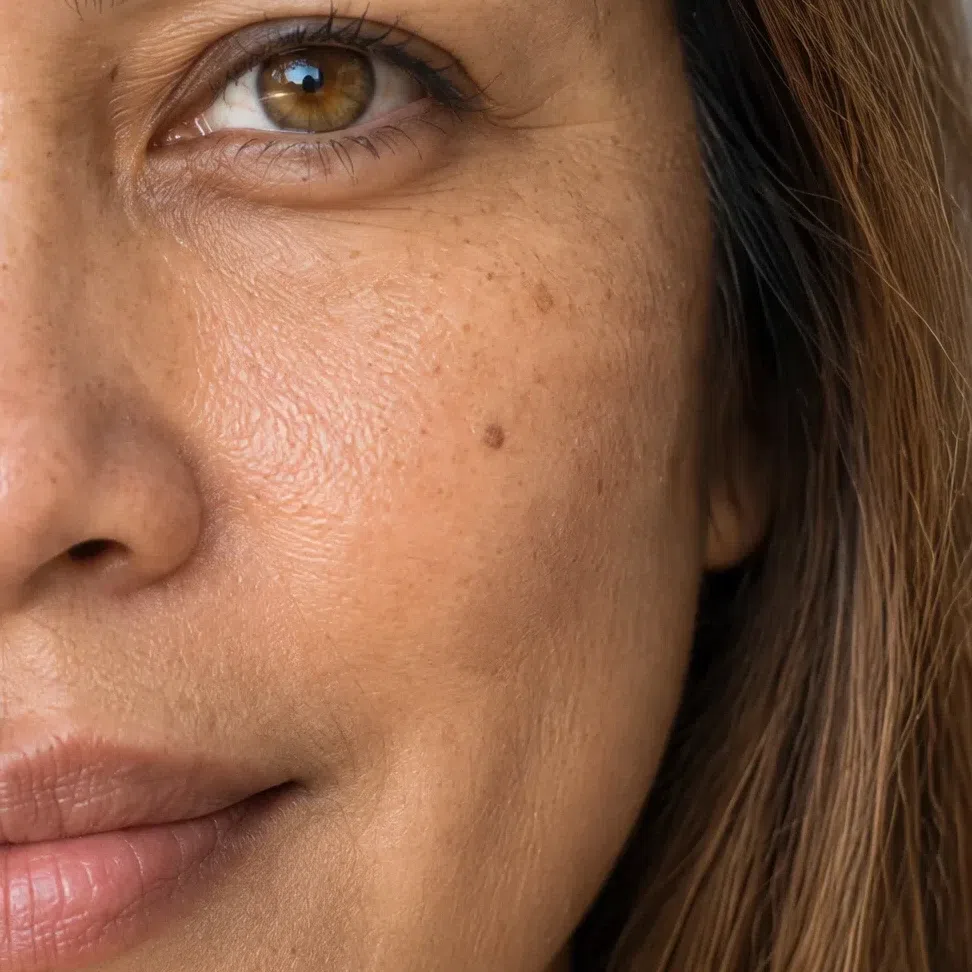
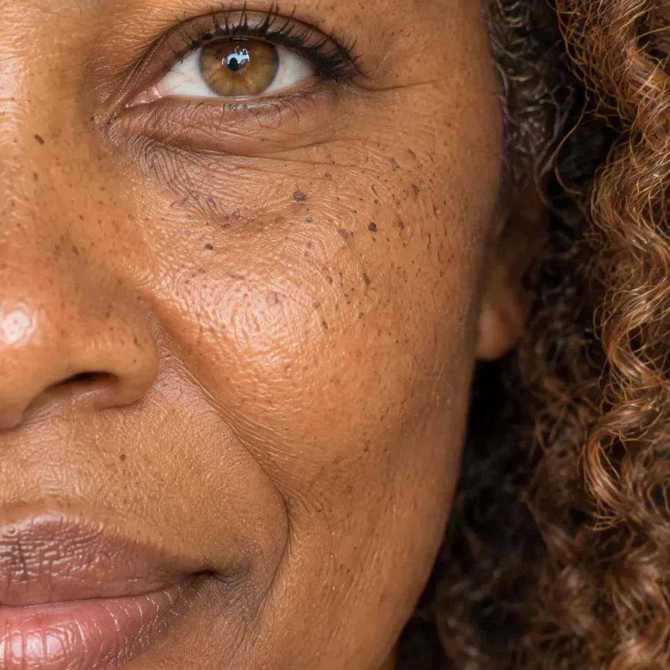
Undertone and contrast set the season, not the depth of your skin - Warm Springs run from translucent fair to deep brown, holding one golden undertone, one clear cast and one medium contrast between them.
11. Skin: gold underneath, whatever the depth on top
Depth is the wrong place to begin. What decides this season is the color sitting underneath - and on a Warm Spring that color is gold, on ivory skin and on deep brown skin alike.
The undertone is golden, peach or light apricot, and the skin above it looks translucent, as though lit from behind. It is not the dense matte finish of an autumn and it is not the cool porcelain of a winter. The depth itself is unconstrained: lightness and undertone are independent properties, and confusing the two is the commonest route to the wrong season.
Two quick contradictions are worth knowing before you run the tests, because either one on its own is usually enough to send you elsewhere: freckles that come up gray rather than ginger, and a bare-skin flush that is pink-lilac rather than peach. Neither belongs to a golden undertone. The full range of this skin - its shades, how it behaves in sun, what its freckles and flush actually look like at four depths - is catalogued in the next section.
Three checks for the undertone
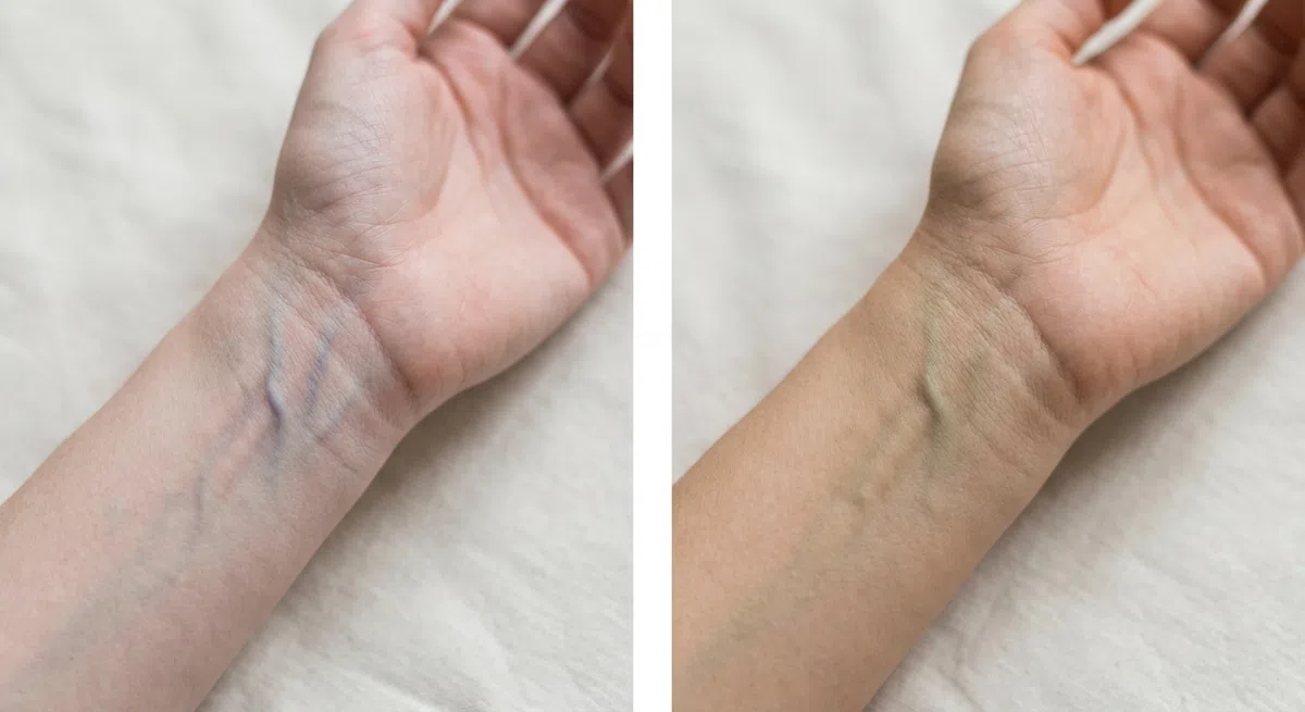
Daylight only, and turn the underside of a wrist upward. Bulbs throw yellow into this and cold LEDs throw blue, so an answer found under either is worthless. Judge the vessels as a group - one vein that runs bluer than its neighbors proves nothing.
- Green or olive - a warm undertone, which keeps Warm Spring and the other warm seasons in play.
- Blue or violet - cool, and the springs drop out entirely.
- Nothing decisive - probably neutral. The next two tests carry more weight anyway.

Makeup off, hair back off the face, daylight from a window. Bring ordinary copier paper up against the jaw - it has to be properly white, because anything cream or ivory carries its own warmth and will simply tell you what you hoped. Give the border between paper and skin a second or two of attention; the rest of the face is a distraction.
- A golden or peach cast comes up - warm, and the Warm Spring answer.
- The skin turns pink or bluish - a cool undertone.
- Everything goes flat and grayish - a neutral undertone, and often an olive one.
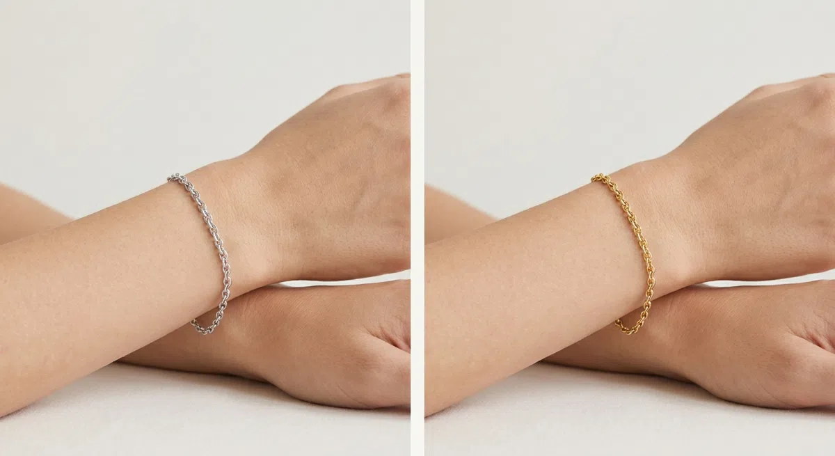
Two plain pieces, no stones - one yellow gold, one silver - held against the wrist one after the other. Ignore the shine entirely and read the skin next to it: does it settle and lift, or does a yellow cast come up with shadow under the eyes?
- Gold wins - the skin looks lit from underneath. Light bronze and copper do the same job here.
- Silver wins - the face looks fresher beside it, which is a cool undertone.
- Neither clearly wins - neutral, and temperature will not be the axis that decides your season.
Once the paper and the gold both come back warm, every cool season is off the table. All that remains is which warm season you are, and that is settled on clarity in block 4.
22. Eyes: clear, and lit from inside
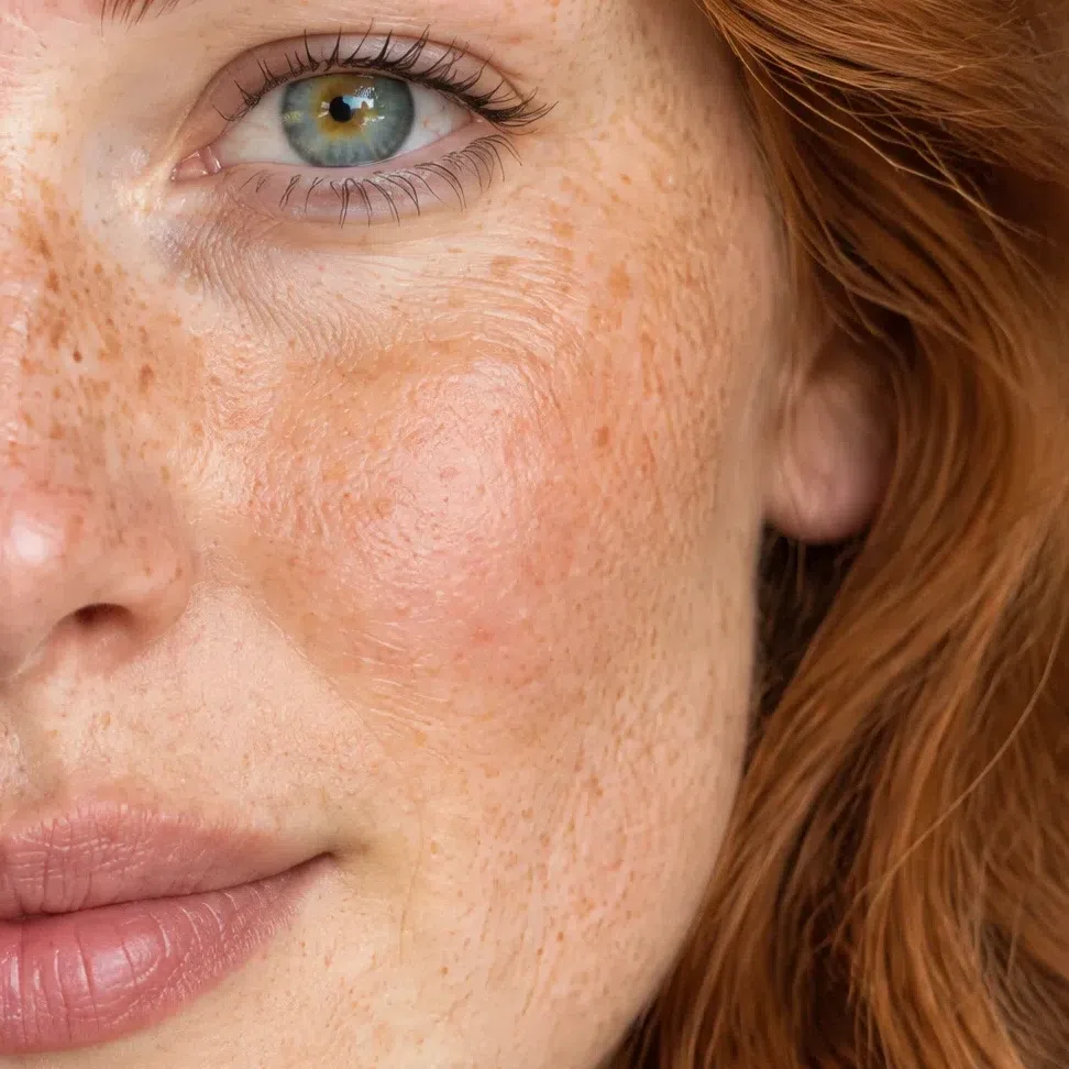
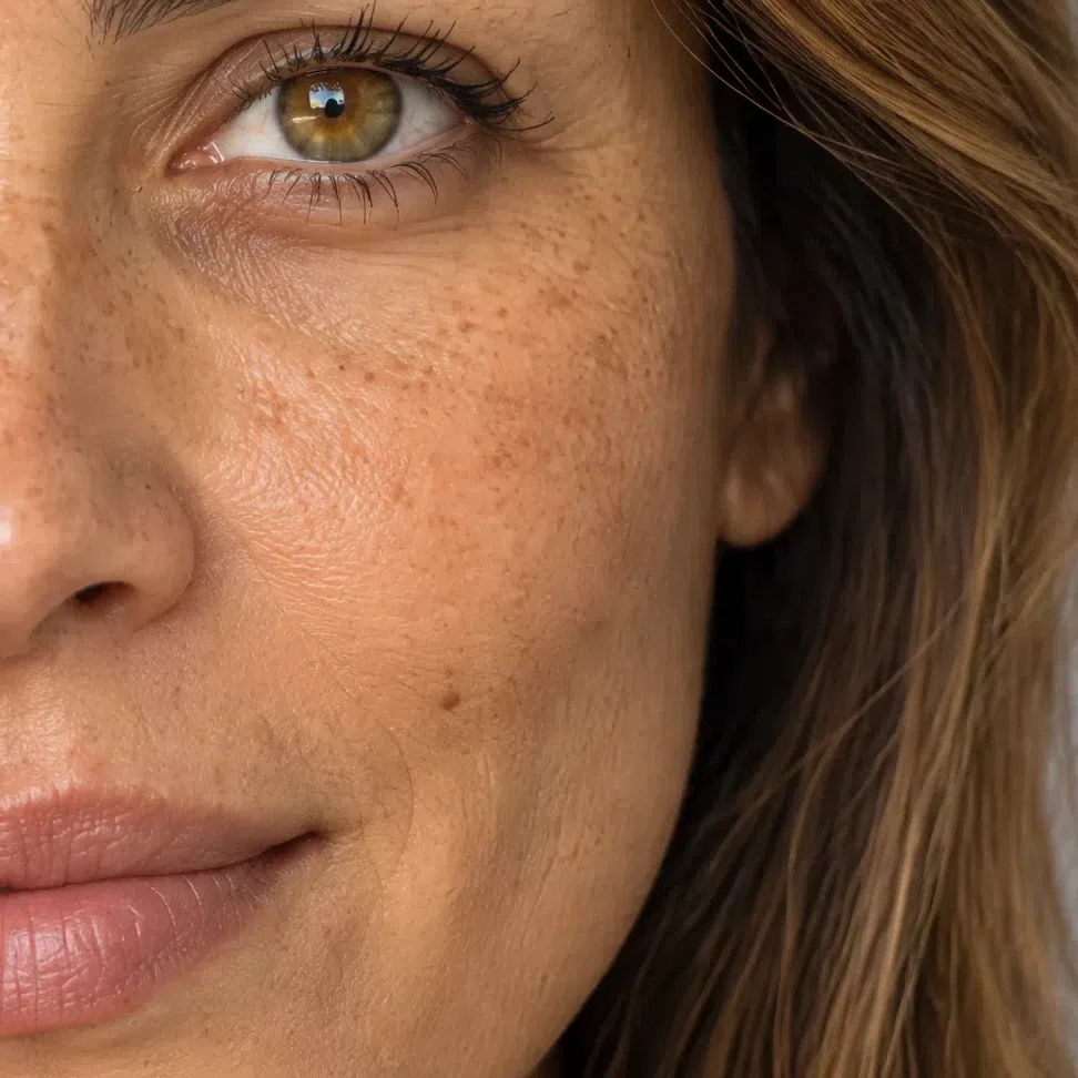
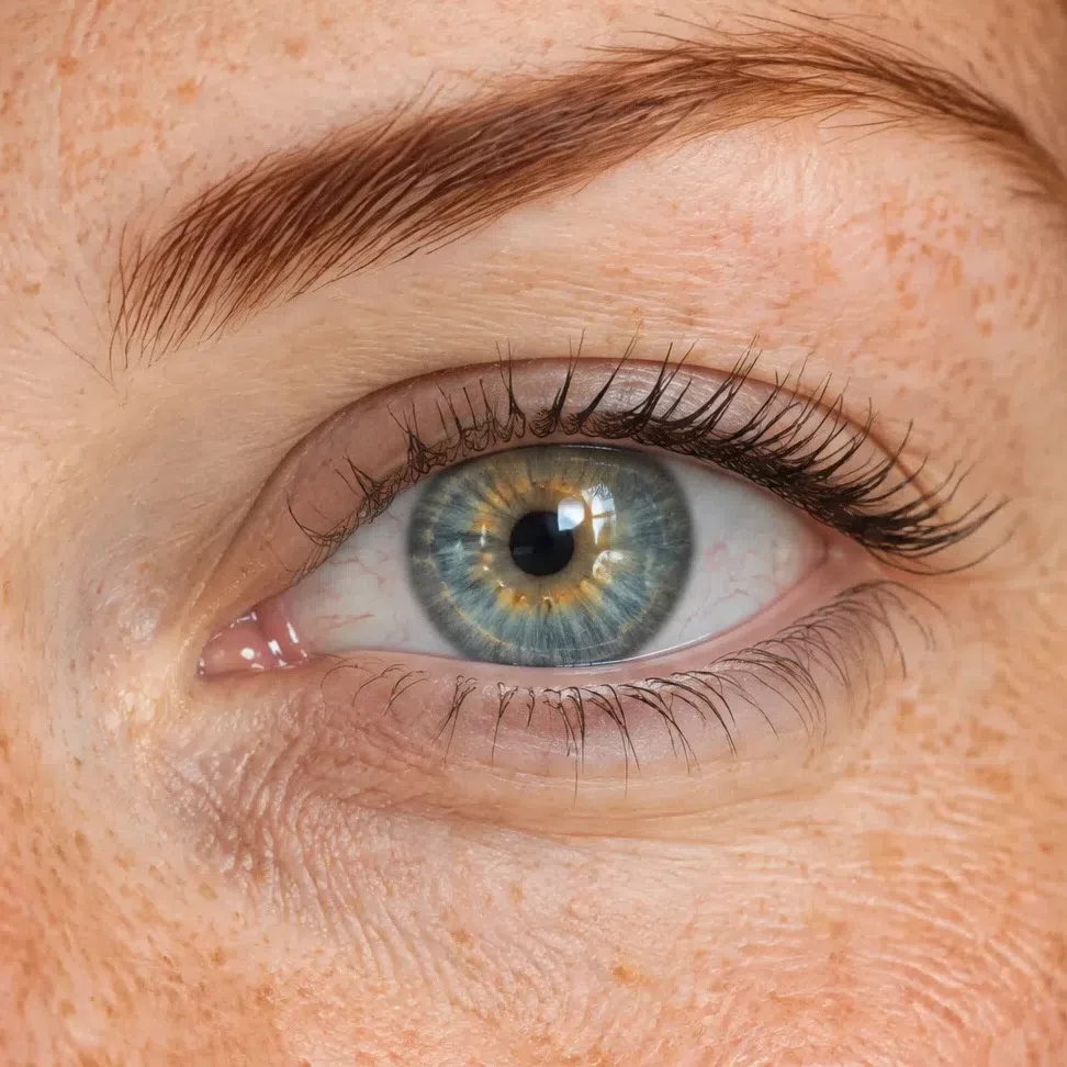
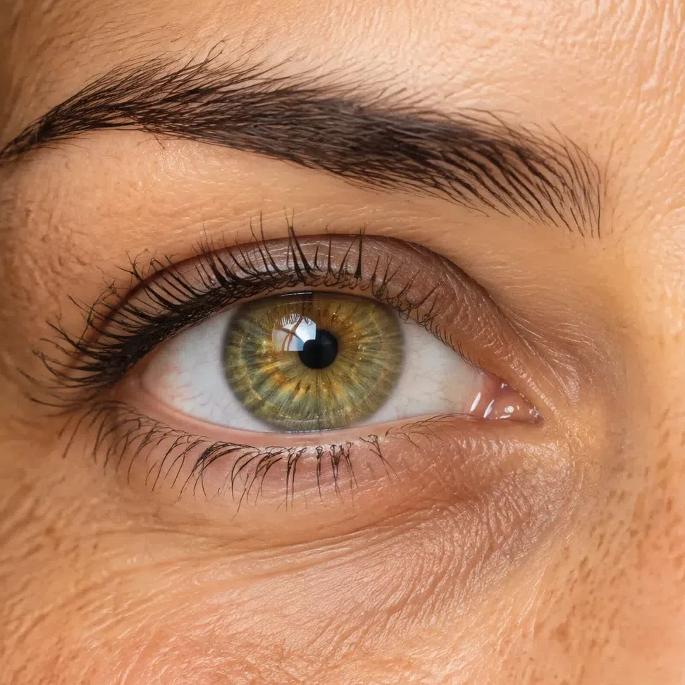
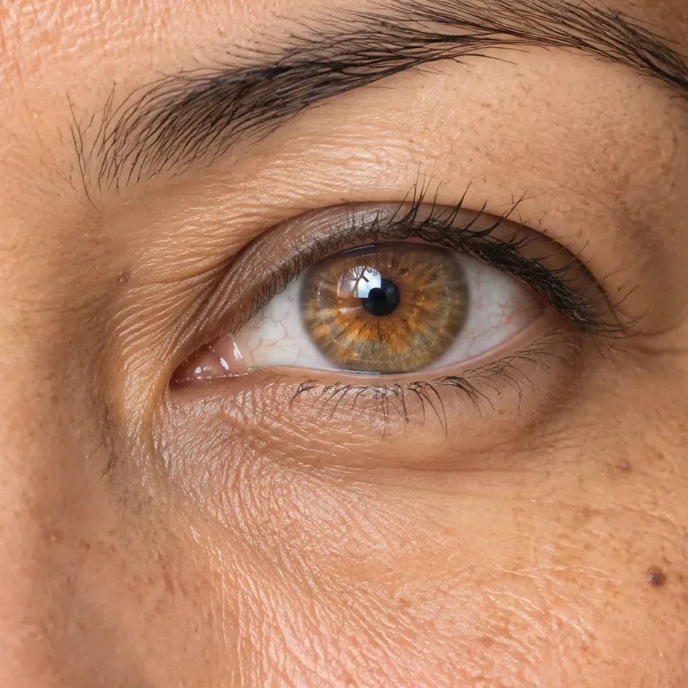
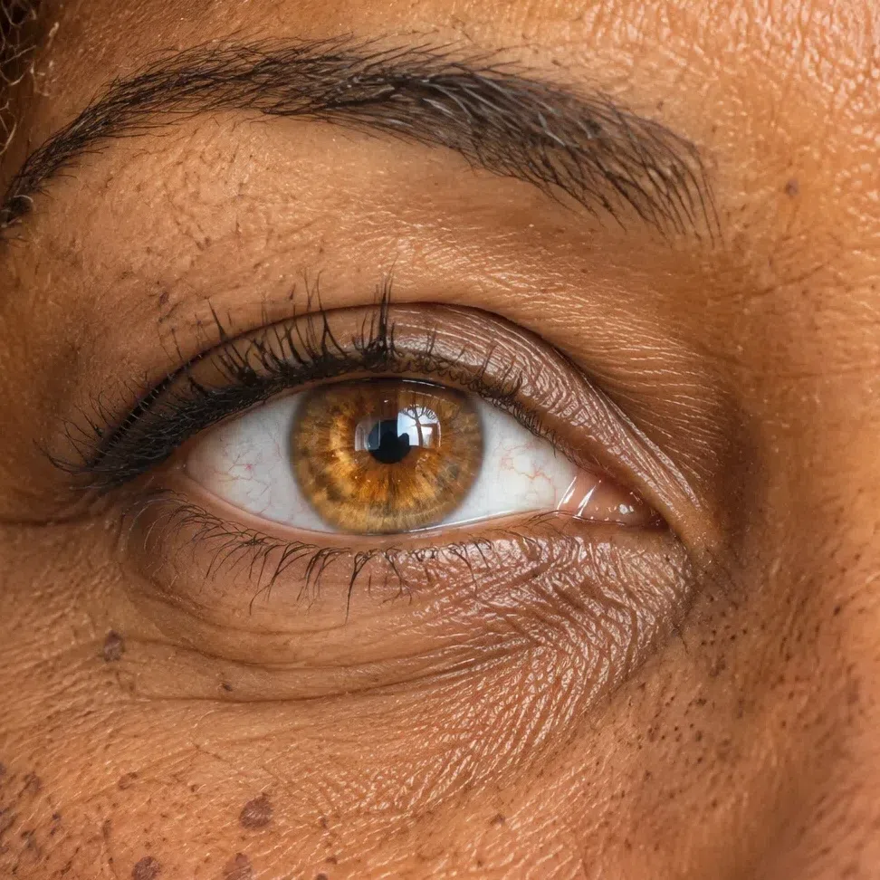
Warm Spring eyes are light-filled rather than light-colored. The iris looks as though a lamp sat behind it, whichever color it happens to be.
There are nearly always warm sparks gathered around the pupil - gold, amber or ginger. Those sparks are the most useful thing on this page to look for, because they survive at every eye color and every complexion depth, where the color name does not.
The outer edge of the iris is soft. A hard graphic dark ring drawn around it belongs to a winter; here the color fades out into the white rather than being outlined against it.
Four descriptions cover most Warm Springs: a clear blue-green or turquoise, a warm green flecked with olive and gold, a light hazel that runs golden-amber at the pupil and green at the rim, and a warm amber or golden brown. A light blue with a green note also fits. A steel or icy blue does not.
Brown eyes are no disqualifier, provided they are light and warm - golden brown, hazel, amber. A dense dark brown that reads almost black, with a cool cast to it, is winter or deep autumn territory instead.
Two things decide it, and neither is the color: warm sparks at the pupil, and an outer edge that fades rather than cuts.
33. Hair: a gold or ginger pigment at every level
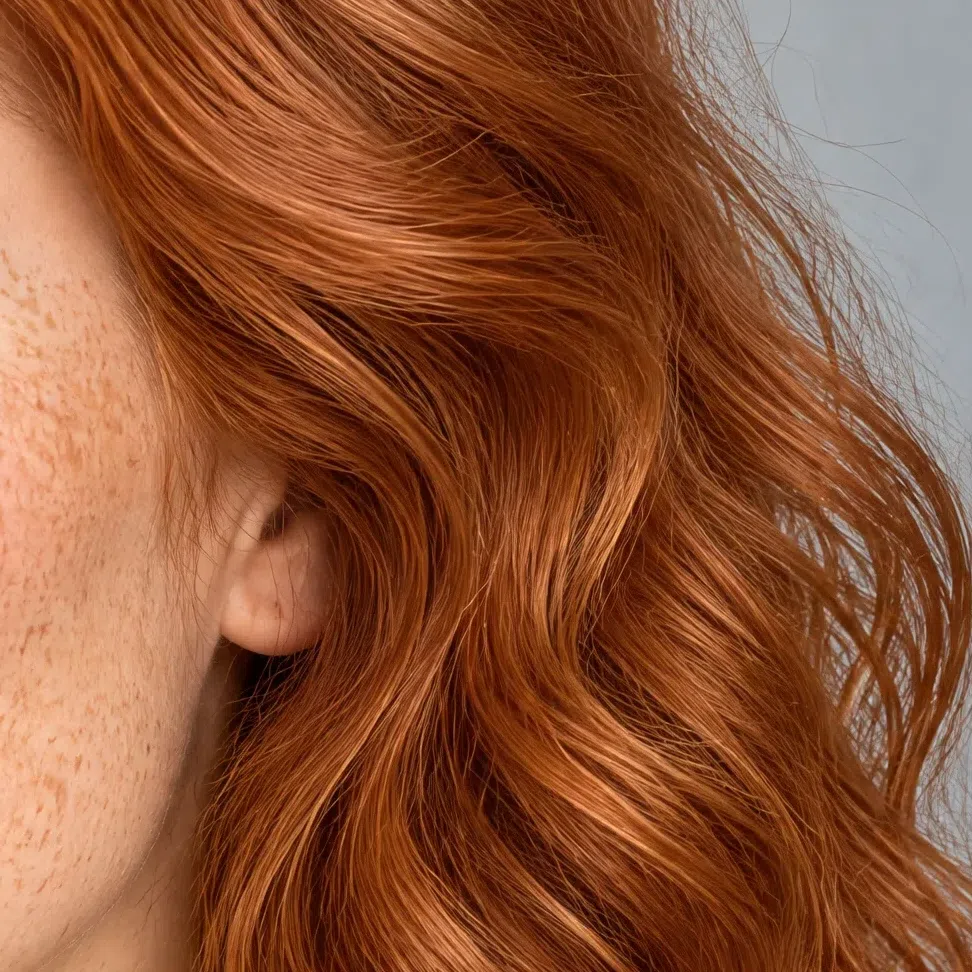
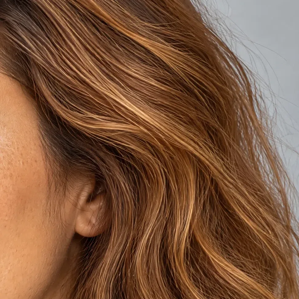
Depth varies widely inside this season. The pigment does not - it is warm every time, and sunlight is where it admits it.
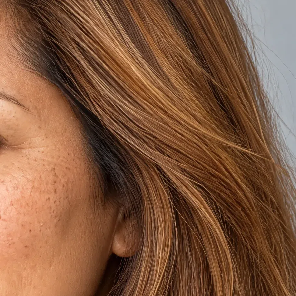
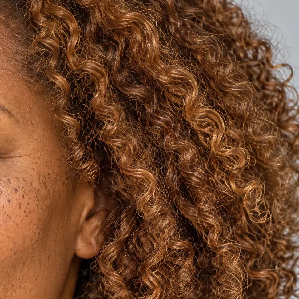
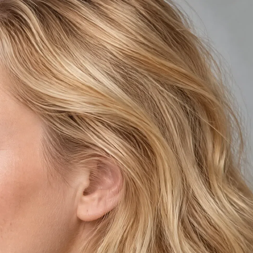
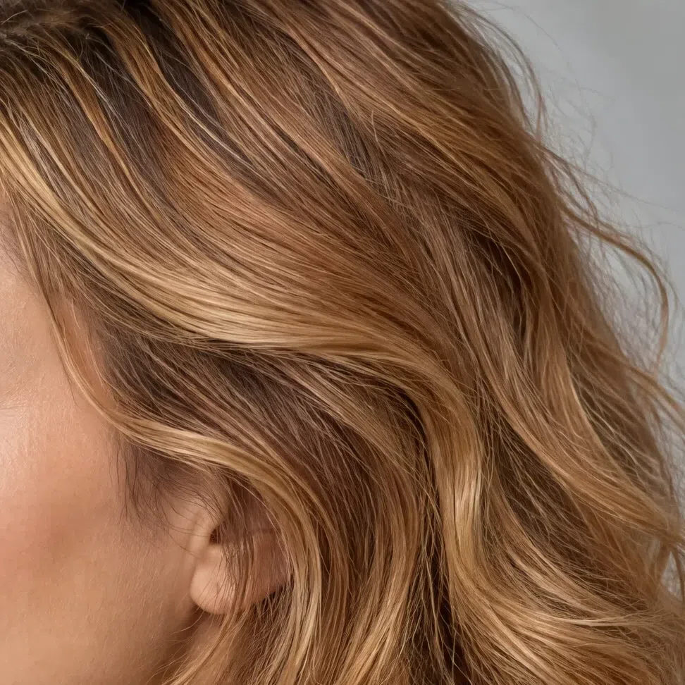
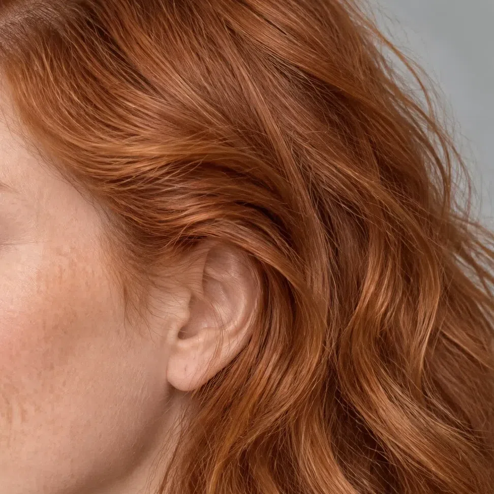
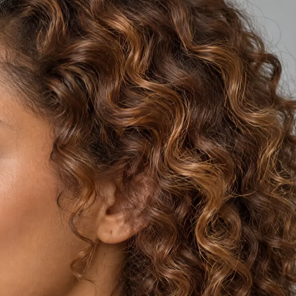
Natural Warm Spring hair runs golden or wheat blonde, honey and caramel, light warm chestnut with a gold sheen, and natural copper red. In daylight it lifts and throws copper, which is the quickest separation from the ash tones of a summer: those go gray-beige in the same light.
What does not occur here is weight. Near-black hair, a deep muted chestnut, dark chocolate, burgundy-wood - all of them outbalance the rest of the face, and all of them are autumn or winter depths. The deepest natural shade this season reaches is a light warm chestnut, and that shade is the one most often filed as Warm Autumn by mistake.
Texture decides nothing. Fine and straight, thick and waving, or tight coils - none of it changes the answer, which is why the strip below holds the same gold across four very different heads.
If your hair is colored, read the roots or a childhood photograph instead. And one thing worth knowing before the next appointment: ash formulas fight this coloring. The face grays underneath them and the color turns brassy within weeks, because the warm pigment below keeps pushing back up through it.
The level is not the test - the sheen is. Copper in sunlight belongs here; gray-beige in that same light does not.
44. Contrast: medium, and readable
The hair sits a clear step or two away from the skin, the eyes stay bright, and none of it cuts. That middle setting is a real finding, not a hedge.
Contrast is the difference in lightness between hair, skin and eyes. On a Warm Spring it lands in the middle: the hair is usually lighter than people expect, the skin is clear, the eyes are bright, and the steps between the three are visible without being sharp.
That places the season between two neighbors. A winter face is drawn in hard lines; a soft summer blurs into a single tone. This does neither - you can name three separate tones and none of them is dramatic against the others.
The comparison that matters, though, is Warm Autumn, and contrast alone will not make it: both sit near the middle. What differs is the quality of the color. A spring's tones stay clear and sunlit; an autumn's are deepened and dusted, as if pigment had been added rather than light. That is the clarity axis, and it is the one this page turns on.
Medium contrast rules out both extremes but not Warm Autumn. Take that question to the drape test below.
- Photograph yourself in daylight, bare-faced, then strip the color out of the picture. A Warm Spring resolves into grays that are plainly different from one another yet neighbors on the scale. Hair or brows dropping almost to black against the skin sends you to Bright Spring or a winter; a face that melts into one single gray sends you to a summer.
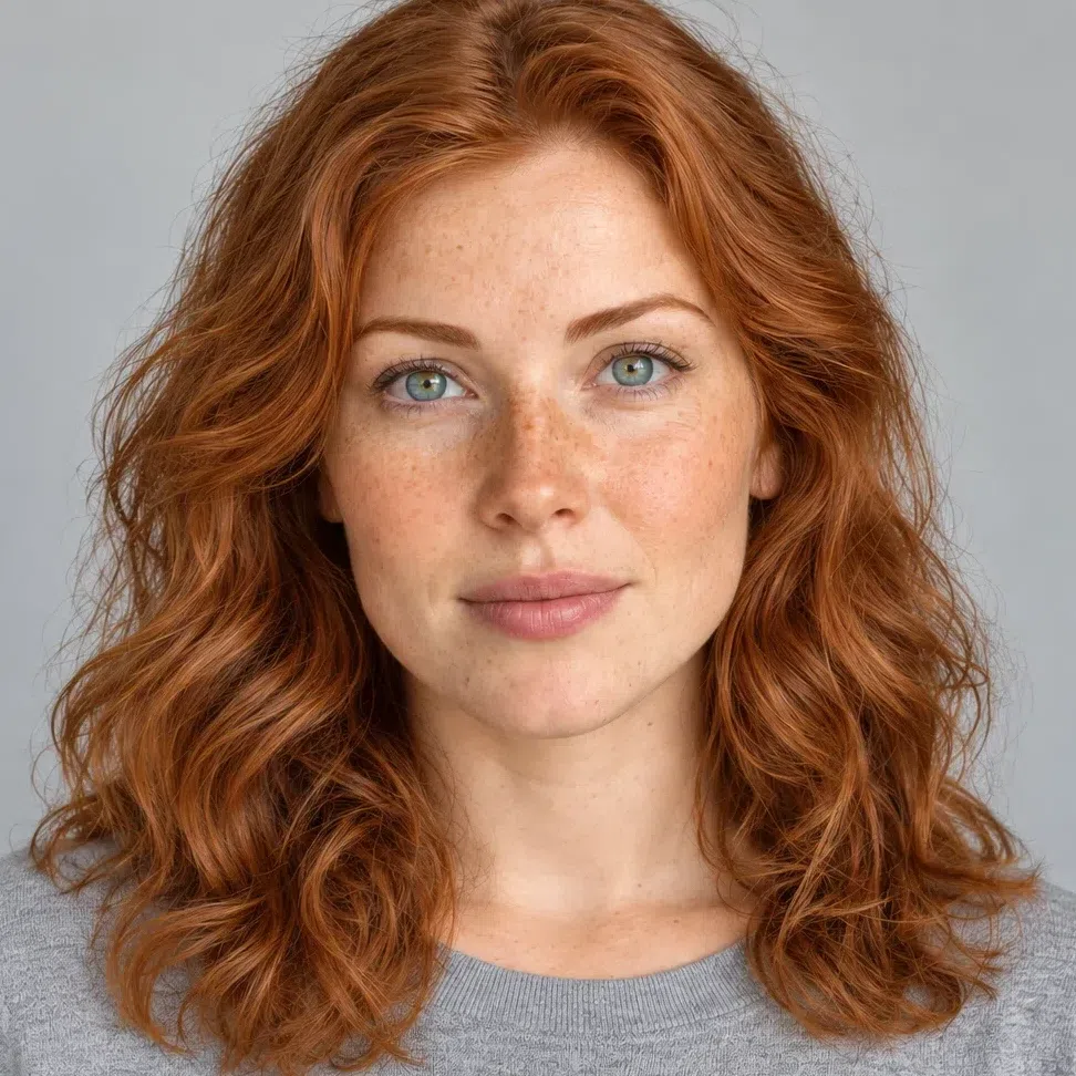
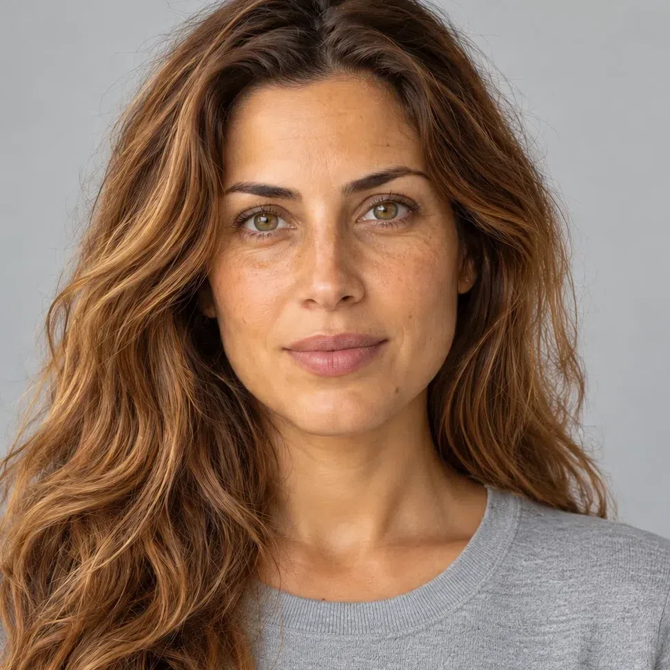


A Warm Spring in color on the left. On the right sits that same shot with its hue stripped away, so lightness becomes the only property left to compare - and her hair turns out to sit a short way beneath her skin rather than a long way.
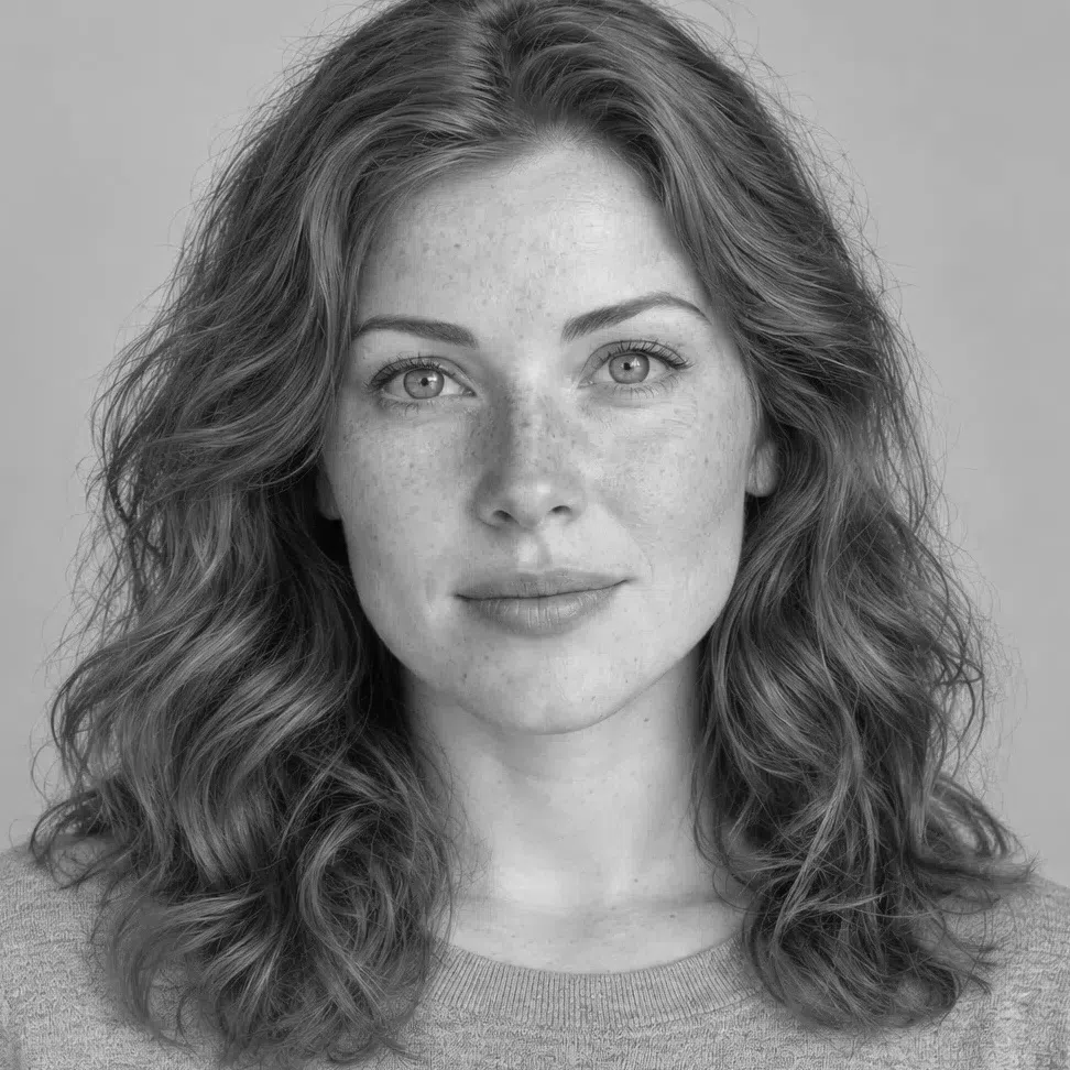


Hair Skin Ramp runs black to white
Read the distance between the two markers, not the height they sit at. Height on the ramp is depth; the distance between hair and skin is contrast, and that distance is not a score to rank faces by. Notice what the deep Warm Spring does: her hair lands at almost the same height as the Winter's, and she is still nothing like the Winter, because her skin comes down to meet it. The Winter's does not - her skin stays up at the light end while her hair drops to the floor.
55. The drape test: put the colors against your face
The most direct check here, and the one that settles the autumn question. Hold each color up in daylight without makeup, and watch your face rather than the fabric.
Black is the one shade this test cannot show you honestly. Photographed against skin it stops reading as cloth and turns into a flat patch, so judge it on a real garment at a mirror instead - and if you want the depth without the drain, a warm dark brown or bitter chocolate does the same job.
Shades that switch the face on
If these even out the skin, lift the shadows and bring the eyes forward, you are in the right place:
- Nectarine
- Grapefruit
- Primrose
- Celery
- Capri
- Eggshell
- Tan
- Camellia
Shades that drain it
If these gray the skin, settle shadows under the eyes and make the whole face look tired, they are not yours:
- Deep magenta
- Cold gray
- Lilac
- Blue-gray
- Jet black
Warm Spring vs Light Spring vs Bright Spring
All three springs are warm and all three are clear, so the season is rarely the hard part - the subtype is. Each one is named for the property that leads it, and that is the row to read first. (If you have met this coloring as True Spring, that is the same subtype under the older twelve-season labels.)
| Warm Spring | Light Spring | Bright Spring | |
|---|---|---|---|
| Leading axis | Warmth - gold runs through everything | Lightness - every color looks diluted | Saturation - color at full volume |
| Temperature | Decidedly warm | Warm, but gently so | Warm with a neutral shift |
| Depth | Medium-light, and free to tan | Very light throughout | Light to medium, deeper than it looks |
| Clarity | Clear and sunlit | Clear but watered down | Clear to the point of ringing |
| Contrast | Medium, readable, never cut | Low - everything sits close | High - the face is drawn in steps |
| Skin | Golden to apricot, tans evenly | Ivory to porcelain, burns easily | Clear and bright, often high color |
| Eyes | Amber, warm green, blue-green, hazel | Pale aqua, light blue, soft hazel | Vivid blue, green or topaz, sharply set |
| Hair | Golden blonde to copper and warm chestnut | Wheat, flaxen, pale golden blonde | Warm but noticeably darker, for the contrast |
| Metals | Yellow gold, light bronze, copper | Soft gold, rose gold | Bright polished gold, high shine |
If two columns still look equally right after all nine rows, do not settle it on the details - go back to the leading axis. The question is which single property you would name first about your own face: its warmth, its lightness, or its brightness. Whichever one that is names your subtype.
What Warm Spring coloring looks like up close
The three traits, photographed at four depths
No season is a single face. The checks above settle whether you belong in this one; this part shows how much room there is once you do - the skin in four states, the four eye colors, the four natural hair levels, every card photographed on a different complexion. Matching one exactly would be unusual. Falling somewhere within the spread is what actually matters.
Warm Spring skin: gold under the surface, at any depth
One thing runs beneath every version of this complexion - a golden, peach or light apricot cast. At the fair end it is a warmth you could point at and name; at the deep end it stops being a tint and becomes a copper glow across the cheekbone.
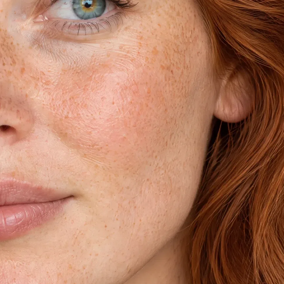
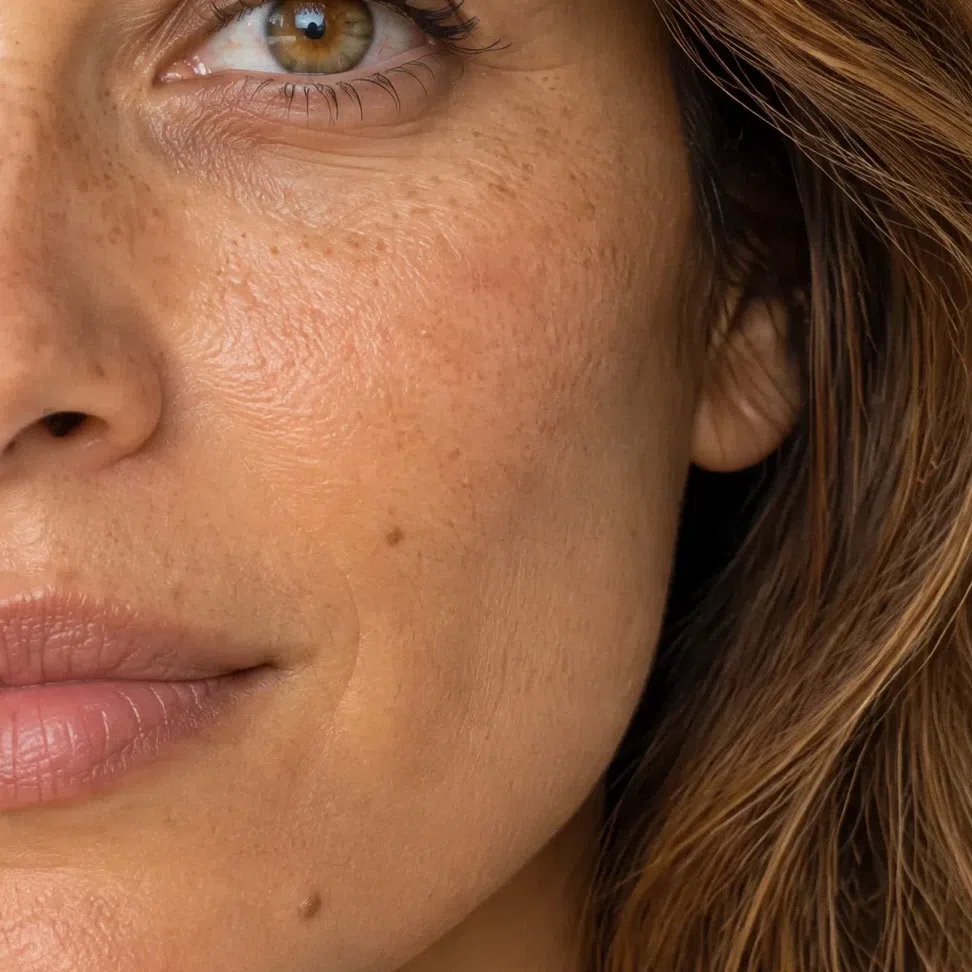
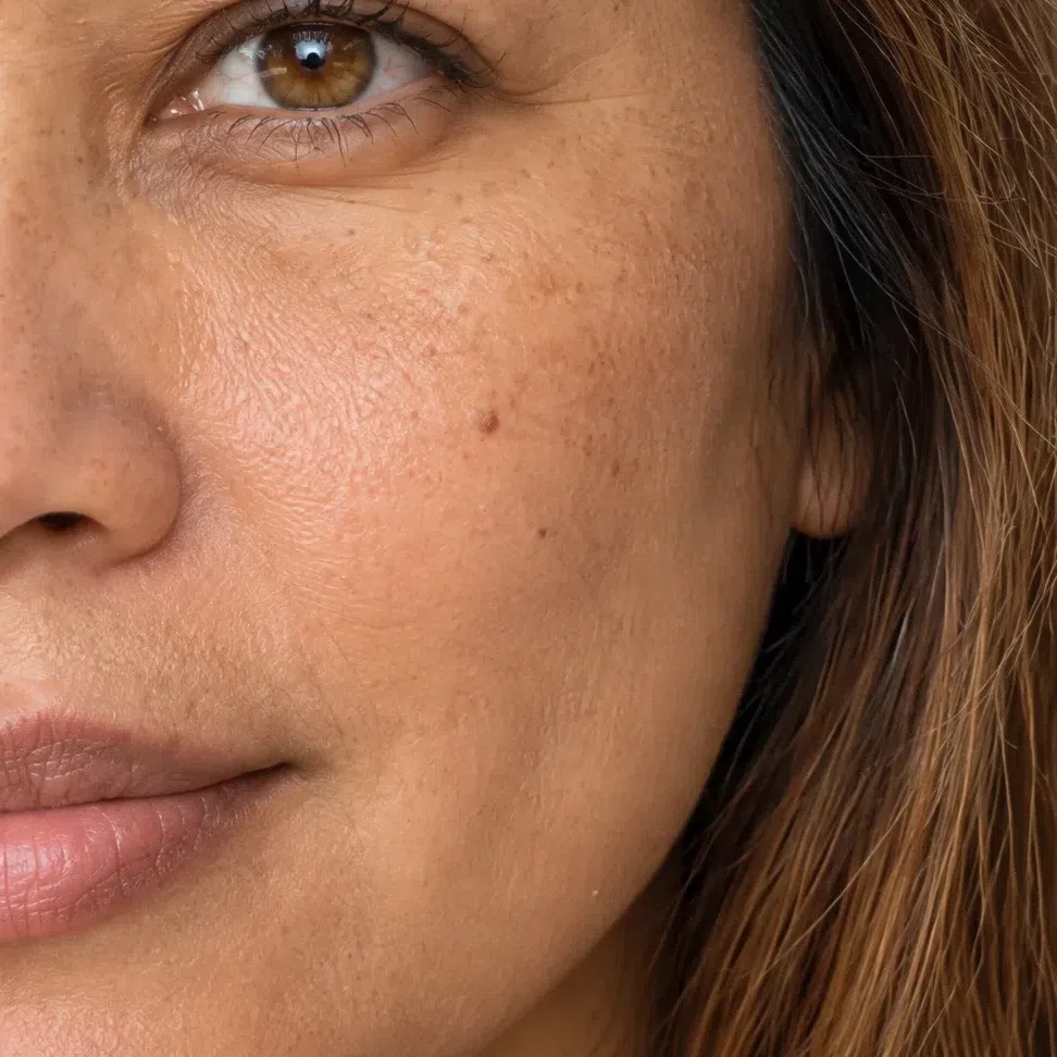

Put a cream fabric and a pure white one against a bare face in daylight, one after the other. The cream evens the skin out and freshens it; the pure white pulls yellow forward and leaves the face looking dull. On a cool coloring those two results trade places exactly.
Depth and undertone are separate properties, and most mis-sorting happens where the two get welded together. The four cheeks above run from translucent to deep brown and carry the same gold. It is the undertone that decides the palette; the complexion decides nothing about it.
Warm Spring eyes: four warm scenarios
Four descriptions cover nearly everybody here. They disagree about hue and agree about everything else - the color is easy to name, the iris looks lit, and there is something warm sitting near the pupil.
The four eye colors
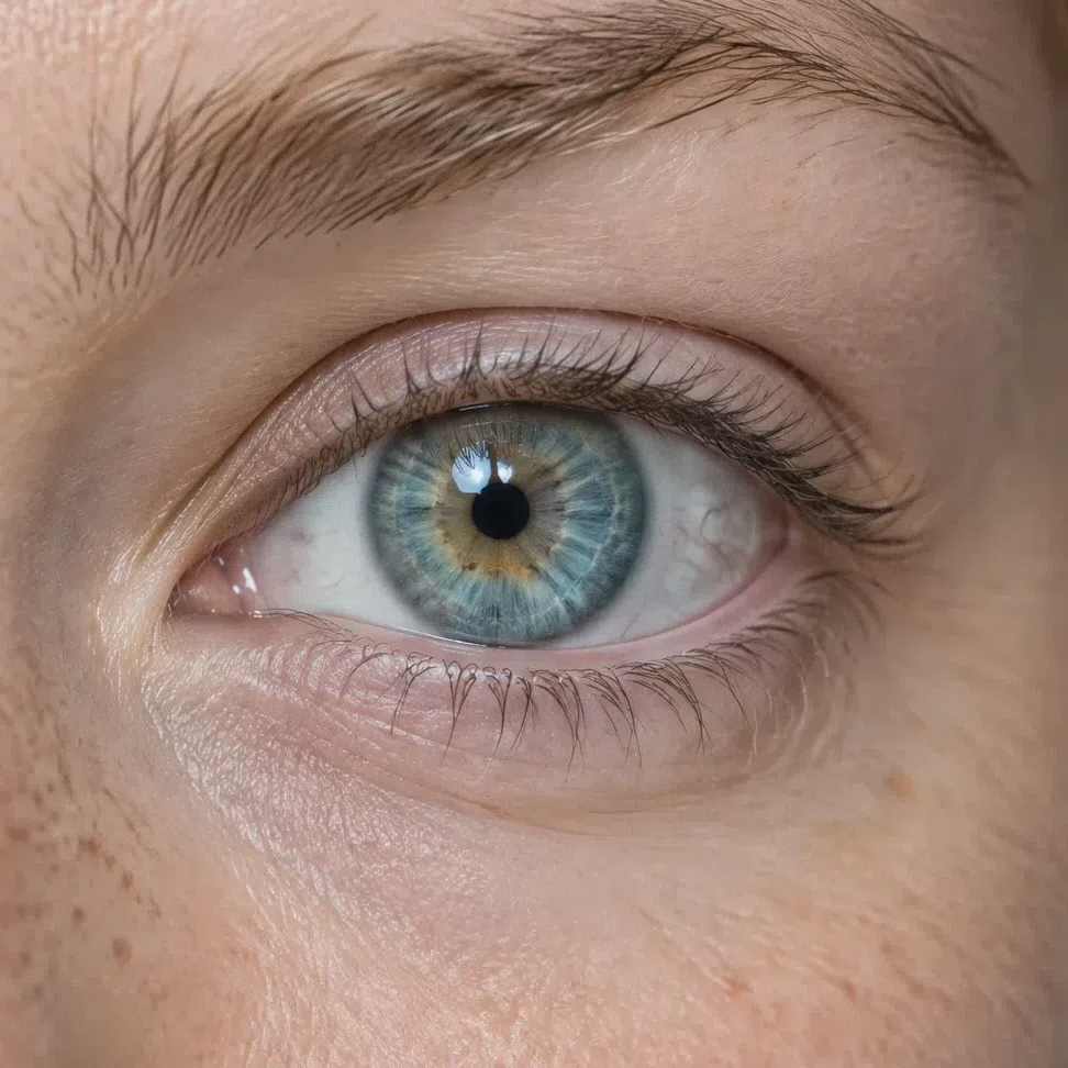
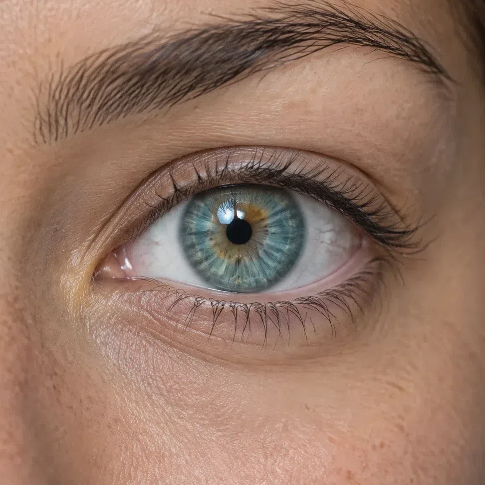
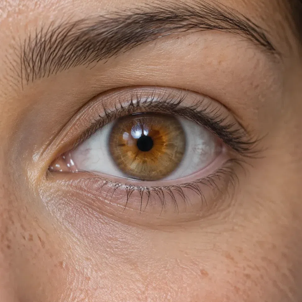
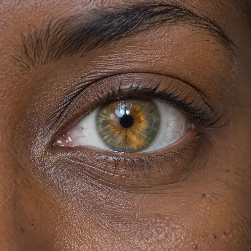
What the four have in common
- Gold at the middle. Warm flecks or rays ring the pupil in nearly every case, and they hold true regardless of hue or complexion - which makes them a better thing to look for than the color itself.
- Transparency. The iris reads as lit rather than solid. You appear to be looking into it rather than at it.
- A soft outer edge. The rim blurs out into the white instead of being drawn against it. A hard dark ring there is a winter trait.
The iris also sets a ceiling for makeup. Anything denser or darker than the eye begins competing with it, which is the reason the shades further down this page stay in the same clear register.
Warm Spring hair: one pigment, four levels
Level travels a long way inside this season; pigment does not travel at all. It is gold or ginger from the lightest shade to the deepest, and daylight is where it admits as much.
The four natural shades
What Warm Spring hair never is
- Ash or mousy. Anything cool, gray or silvered is out. The face goes gray underneath it, and that whole register belongs to the summers.
- Near-black. Nothing else in this coloring carries weight like that, so hair that does will outbalance the face on its own.
- Deep muted chestnut. Dark chocolate and burgundy-wood are warm, which is exactly what makes them tempting - but they are dusty and deep where this season is clear and lifted. That is autumn.
Texture has no bearing on any of it. Straight, waving or coiled, the answer does not move; only the pigment does. Which of these four a dye can genuinely reproduce, and how to brief a colorist, comes up in the hair color section below.
The Warm Spring palette, shade by shade
17 to wear, 9 to avoid, each one shown on skin
Seventeen shades to wear, sorted the way you would actually shop: four neutrals holding the structure, six lighter ones for everything worn at the face, and seven accents for when something has to carry.
Then the nine that fight this coloring, each one paired with its replacement, and five combinations worth copying as they stand.
These are photographs, not swatches. The same woman appears on every card; the only thing that changes between them is the hex her knit has been repainted with, and her face and hair are left exactly alone. So the question each card answers is not what the shade looks like - it is what happens to her when she puts it on.
Base colors: the Warm Spring wardrobe foundation
Ten shades do the everyday work - four neutrals holding the structure, six lighter ones for everything worn at the face. The accents come after, and there are fewer of them than you would expect.
Neutrals: the four the wardrobe stands on
These are the coats, the trousers, the skirts - the things bought once and worn with everything. Not one of them is black or gray, and that is the whole difference from a winter wardrobe: this base is held up by warm light neutrals instead. Is black off the table? Not entirely, and a flat ban is less useful than the real rule. Below the shoulders it is fine - a boot, a bag, a pair of tailored trousers sits nowhere near the skin that has to cope with it. At collar height it is a different garment: it lays the hardest edge available against a face assembled entirely out of soft ones. Put Tan or a bitter-chocolate brown there instead and the depth survives without the drain.
How to put the four together
- Your black-and-white. Eggshell with Tan is the version of that pairing you can actually wear - the same clean contrast, none of the hardness.
- Stack them for a monochrome. Almond, Putty and Tan stepped light to dark read expensive precisely because nothing interrupts them.
- Then break it with one thing. A neutral base plus a single bright - Grapefruit, Capri, Primrose - is the formula this palette is built for.
- Everyday softness. Almond under Nectarine is the quiet combination that does most of the work in a real week.
Light shades: the six for collar height
Spring pastels are never dusty. They are light but clean, as though each one had been lit from behind rather than mixed with gray, and that distinction is the single thing separating them from a summer's version of the same colors. These are the blouses, the knitwear, the shirt under the coat - everything that sits at the collar where the skin can see it. The Warm Spring pink is Camellia and the Warm Spring green is Celery, if you have been searching for those by name.
Accent colors: brightness without weight
Seven shades with energy in them, plus the metals and the places to put a bright so it reads as an accent rather than as the whole idea.
The seven with some volume
Warm Spring accents are warm and clear at once. They are allowed to be saturated - this is not a muted season - but never dark and never dusted. Five of them carry a coat or a dress; two are the bright ones, and those work best in smaller doses. Each one below is painted onto the scarf instead of the whole knit, for a reason worth stating: a shade that covers every inch of you has stopped accenting anything and simply become what you are wearing.
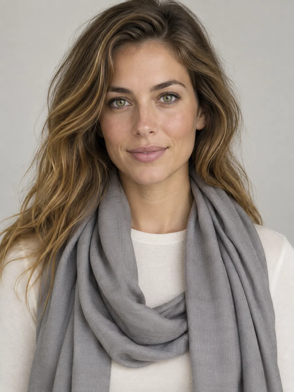
Metal and finish
Warm metals only, and this is one of the least ambiguous calls in the whole system - silver flattens the warmth straight out of the face. All three below are shown as gradients because a metal is never one flat tone; that is what makes it read as metal.
Where to put the warmth
- Jewelry. Yellow gold first, then bronze and copper, with rose gold as the quieter option. Silver is the one metal to leave alone.
- Bags and shoes. Warm beige, cognac and light leathers instead of black - Almond and Tan are the shades to shop by.
- Scarves at the neck. This is the one accessory that behaves like a drape test, so it only ever gets shades from your own side of the page.
- Stones. Amber, topaz, coral and turquoise. All four are warm and all four are clear, which is the pattern rather than a list to memorize.
Where a bright can go: four accessories, four pairings each
Distance from the face is the variable nobody mentions. Tap a pairing and it repaints the knit and the accessory separately, which lets you watch the same shade behave differently depending on where it sits. A hat gets away with things a kerchief cannot.
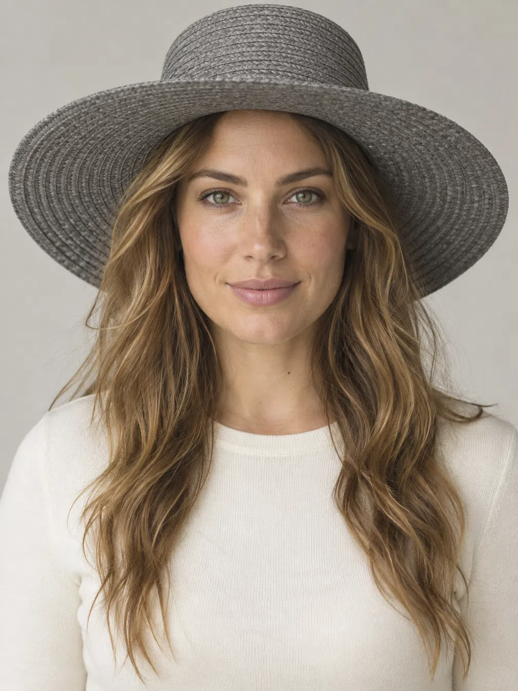
Hat
A hat is the only thing you put on that never touches the skin it has to flatter, and that permission is what lets the loudest shades on this page work up there.
Scarf
A scarf lies directly under the face and behaves exactly like the drape test above it, so take only what freshens you.
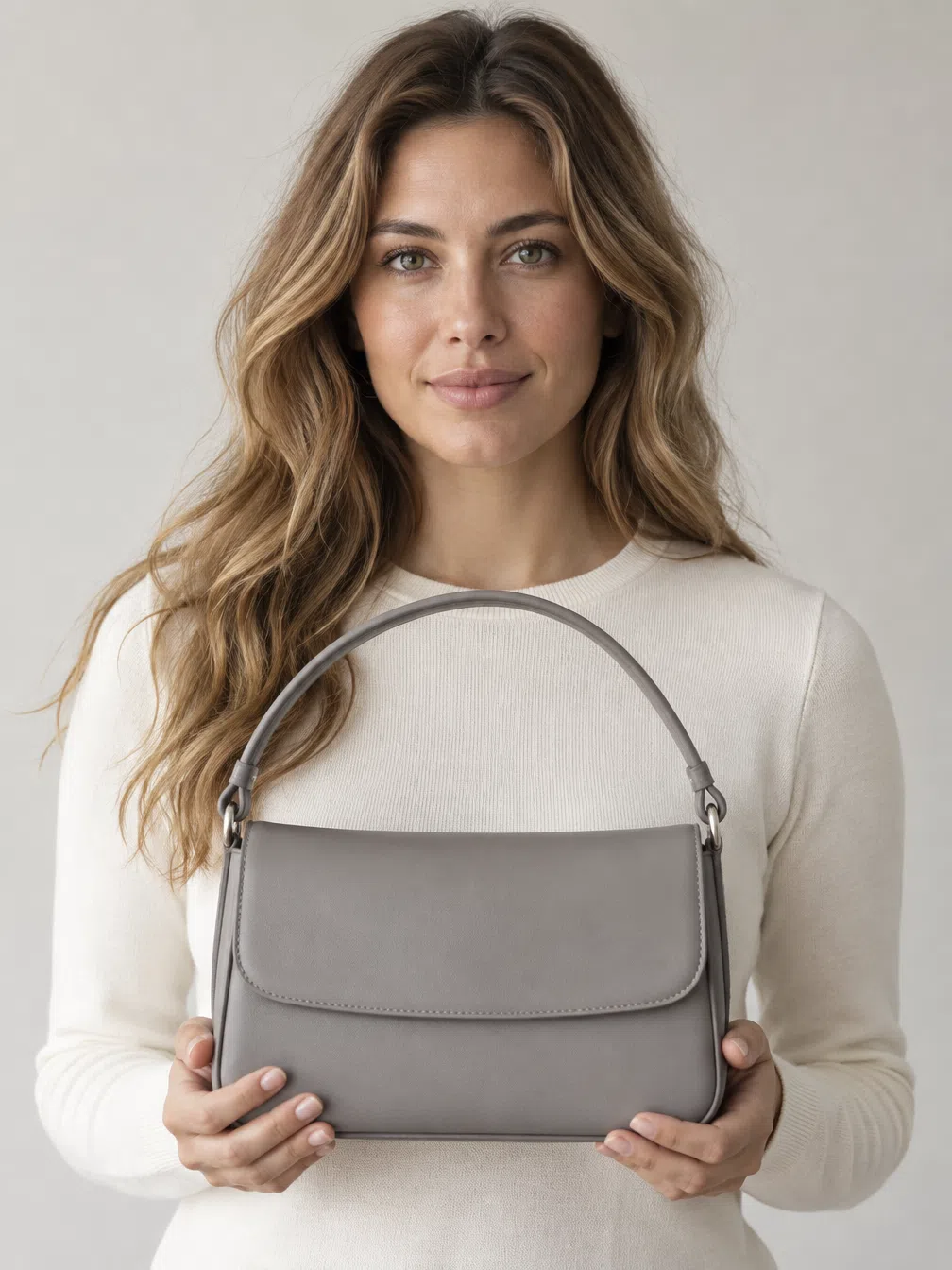
Bag
A bag is the safest place on the body for a bright: it is far from the face and it changes more often than clothes do.

Neck scarf
Closer to the face than any other accessory. Warm and clear shades only here - a cold knot at the throat pulls gray into the skin immediately.
Warm Spring colors to avoid
Nine shades, in the three groups the Russian original sorts them into. Each one fights the golden undertone in its own way, and each card carries what to wear instead. Every replacement below is a shade from this page, not a compromise.
Cold and ashy
The largest group and the one people own the most of already, because these are the shades every basics aisle is full of.
Why this group does not work
- They are on the wrong side of neutral. Every one of these carries a blue or violet base, and a blue base under a golden undertone produces the flat masked look people describe as being washed out.
- The face ends up supplying the warmth. With a cold shade at the collar, the one warm thing left in the frame is you - so your skin stops reading as skin and starts reading as a tint.
- They do not fail loudly. Nothing here looks wrong on the hanger, which is why these are the shades that quietly accumulate in a wardrobe.
Dark and cold
Not a temperature problem so much as a weight problem: these are heavy in a way nothing in this coloring is.
Why this group does not work
- The step has no counterpart above it. Nothing in this coloring is dark, so a dark garment opens a gap in lightness that the face cannot answer - and attention settles on the cloth.
- Depth lands as tiredness, not gravity. Added weight on a light coloring collects in the hollows - under-eye, jawline - instead of reading as anything authoritative.
- Warmth alone does not rescue them. A warm navy is still navy. Depth is the failing property in this group, which is why the fix is a lighter shade rather than a warmer one.
Acid and muddy earth
Two opposite mistakes that land in the same place - one too electric to be natural, the others too dusty to be clear.
Why this group does not work
- Clarity is not the same as loudness. This coloring reads clear, so people reach for neon on the theory that brighter is clearer. Neon is saturation without light in it, and it turns warm skin waxy.
- Dust is the opposite failure. A muted earth tone removes exactly the property the season is built on. The shade survives; the face goes flat behind it.
- Both end up louder than you. Whether by voltage or by mud, everything in this group finishes ahead of the person wearing it, which is the one thing an accent must never do.
Warm Spring color combinations
Five combinations assembled from the shades above, each chip row running in dressing order.
Five to copy
Most of them are two neutrals plus one bright. Learn that shape and the five stop being outfits to copy and become a method.
The everyday one
Eggshell and Almond with Grapefruit arriving in a blouse or a scarf. Two warm neutrals and a single bright, which is the whole palette in miniature.
Quiet at work
Tan trousers, a Vanilla shirt, Seafoam somewhere above. The turquoise adds clarity without arguing with the base.
Warm weather
Almond with Celery and gold at the wrist. Fresh green plus warm metal is the most seasonal thing this palette does.
Evening, bolder
Cinnabar on an Eggshell base with Tan to ground it. A warm red on a light base, which is how this coloring does drama.
Contrast by hue
Nectarine against Viridian, gold between them. The contrast here is between colors rather than between light and dark, and that is exactly how a spring should be bright.
The rule underneath all five: contrast by color, not by darkness. A winter gets drama from light against black; you get it from Nectarine against Viridian, at more or less the same lightness. One cold item will undo a whole outfit, and a warm metal will hold together two shades that look like they should not go together.
Warm Spring clothes: building the wardrobe
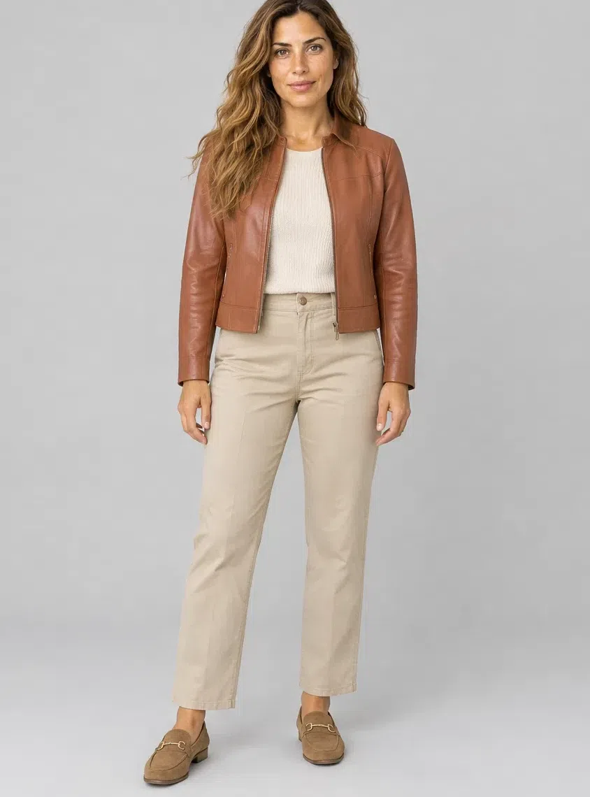
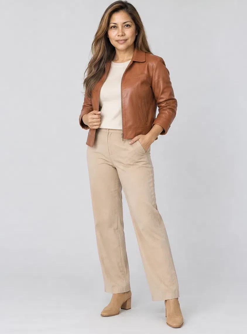
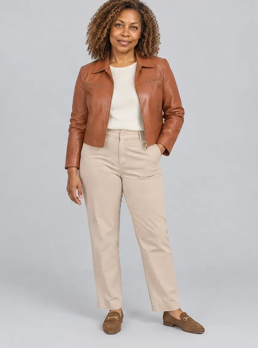
Eight pieces, shown at four complexion depths
A palette becomes useful at the point where it stops being swatches and starts being garments. What follows is the shortest set that still covers a real week - outerwear, knitwear, something with color at the face, two ways to cover the legs, a dress, a print and a jacket with some weight.
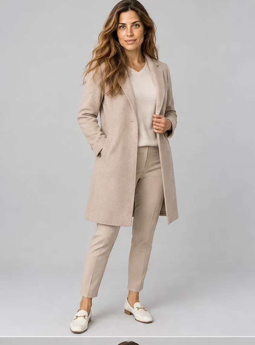
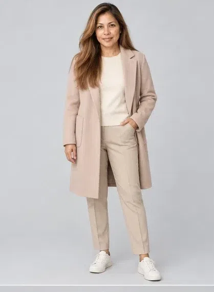
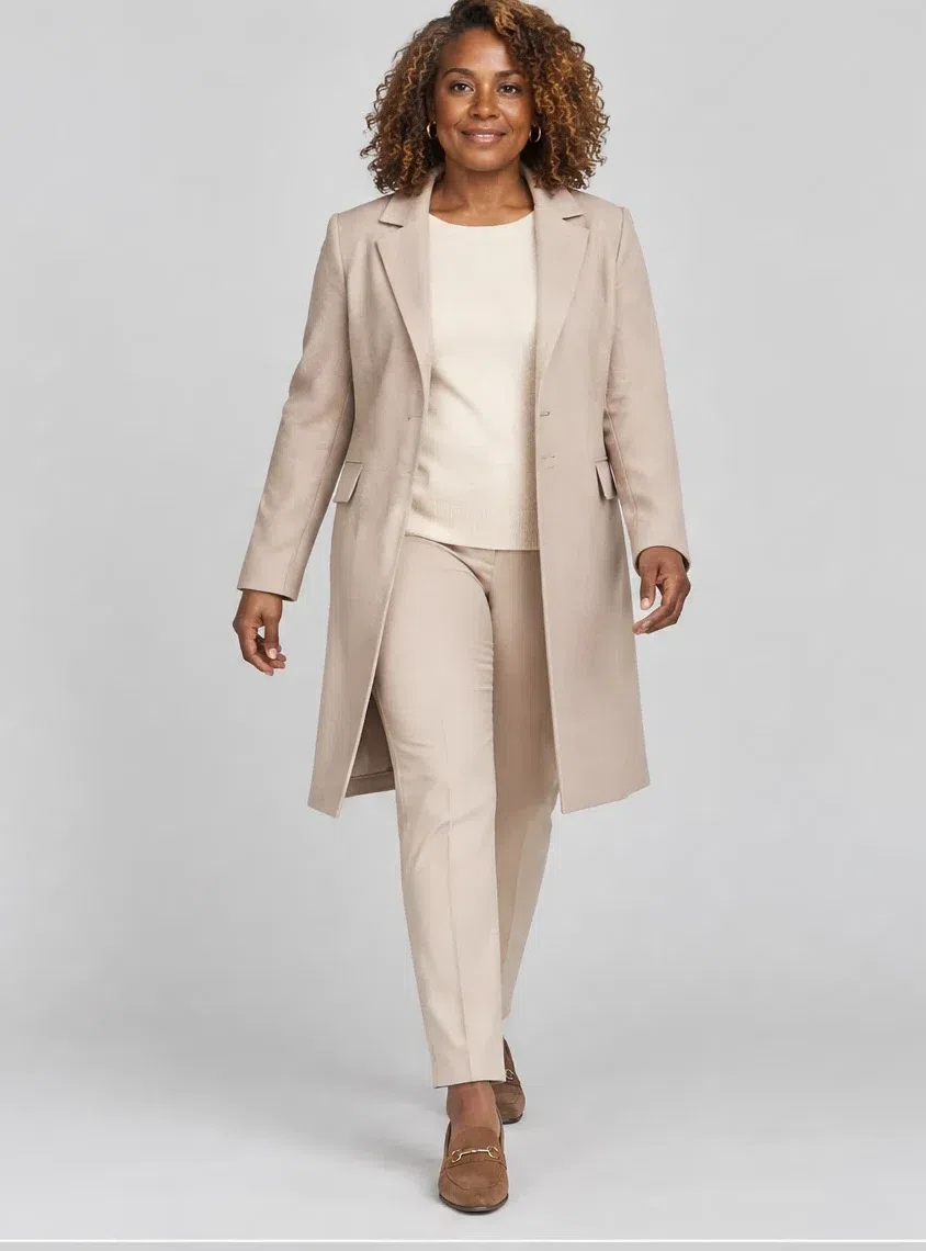
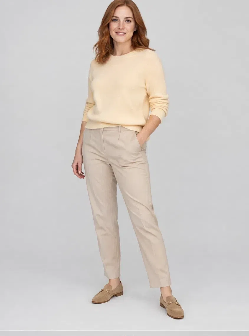
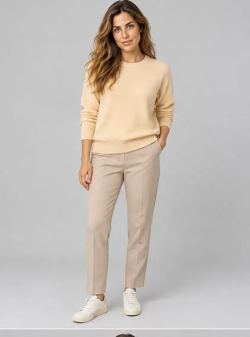
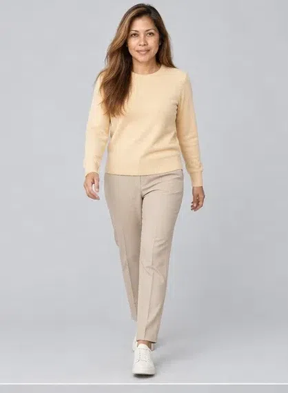
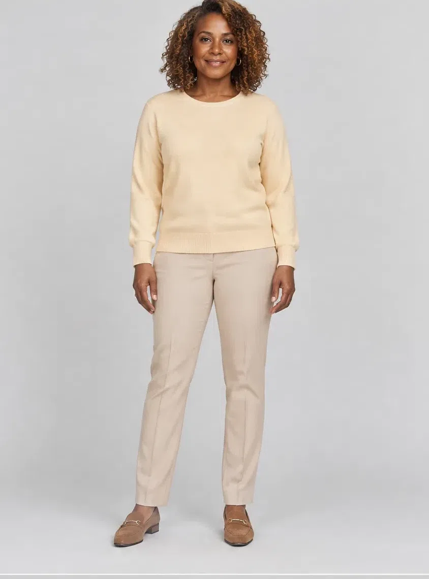
Four different Warm Springs wear each piece, rather than one woman standing in for all of them. Between those four photographs the garment itself does not change at all - only who is in it.
The Warm Spring capsule: eight pieces
Eight garments that combine with each other in almost every direction, chosen so that the palette above turns into things you can actually buy. All eight appear at four complexion depths, since a set that only holds together on one of them is not a capsule at all - it is a styling.
The thread running through all eight is color - this is the Warm Spring palette rewritten as garments. The capsule as a method, though - the minimum that will do, how many outfits a given set yields, what to acquire first - belongs to a different discussion and this page does not open it.
1Almond wool coat
Whatever goes underneath has to answer to the coat, which is why it is the first thing to buy rather than the last. Warm mid beige, ending at the knee, either a clean column or lightly shaped through the waist, in a cloth with some give to it - cashmere, a fine wool, a weighty cotton. The gray-leaning beiges marketed as the sensible neutral are the ones to walk past: on golden skin they look less like restraint and more like grime.
Tip Gold buttons or gold hardware are worth looking for. On a coat this quiet they are the only warm detail, and they tie it to everything else you own.
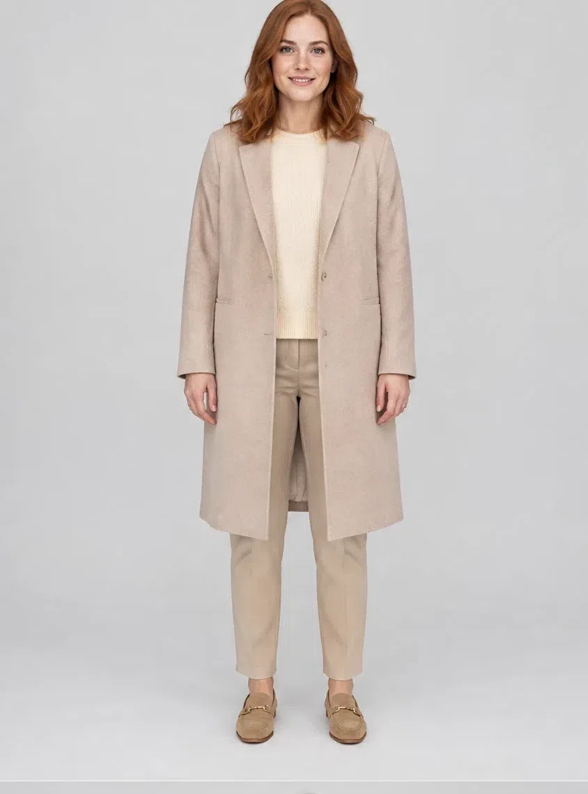
2Vanilla cashmere sweater
The soft cream knit is the piece that does the most work in a cold month, because it sits right at the face and lifts it. Relaxed but not shapeless, in a fine yarn - cashmere, mohair, a thin merino. It goes under the coat, over the dress, and with every trouser here.
Tip A V-neck lengthens the neck and reads as more formal; a crew or a soft roll neck is the weekend version of the same sweater.
3Grapefruit silk top
One piece in the capsule exists purely to bring color to the face, and this is it. A fluid silk shell in the palette's headline coral, worn under the coat or on its own. If you own nothing bright yet, own this before anything else bright.
Tip Tuck it into the Putty trousers and the whole outfit is finished without an accessory. That is the test of an accent that actually fits.
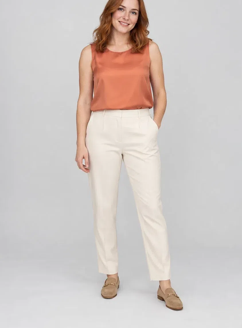
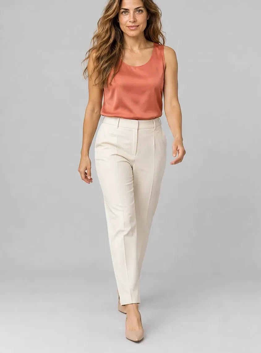
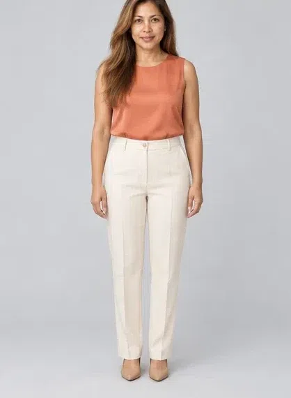
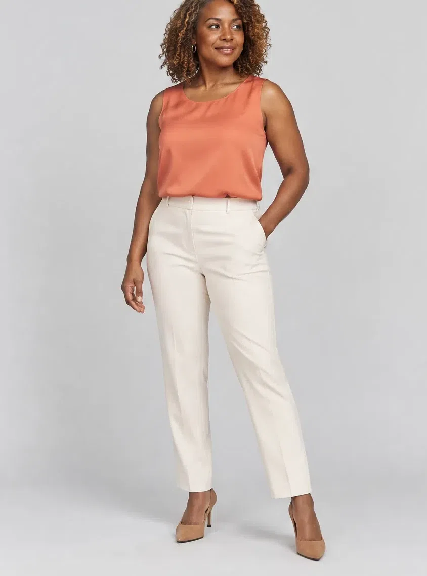
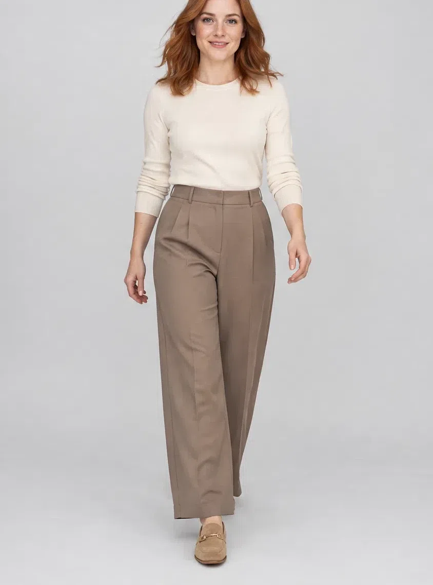
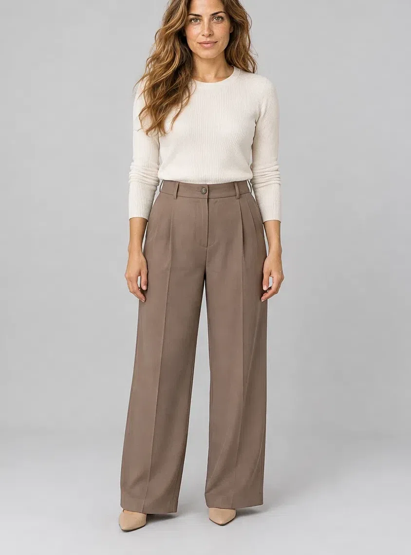
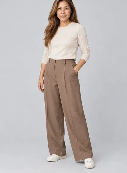
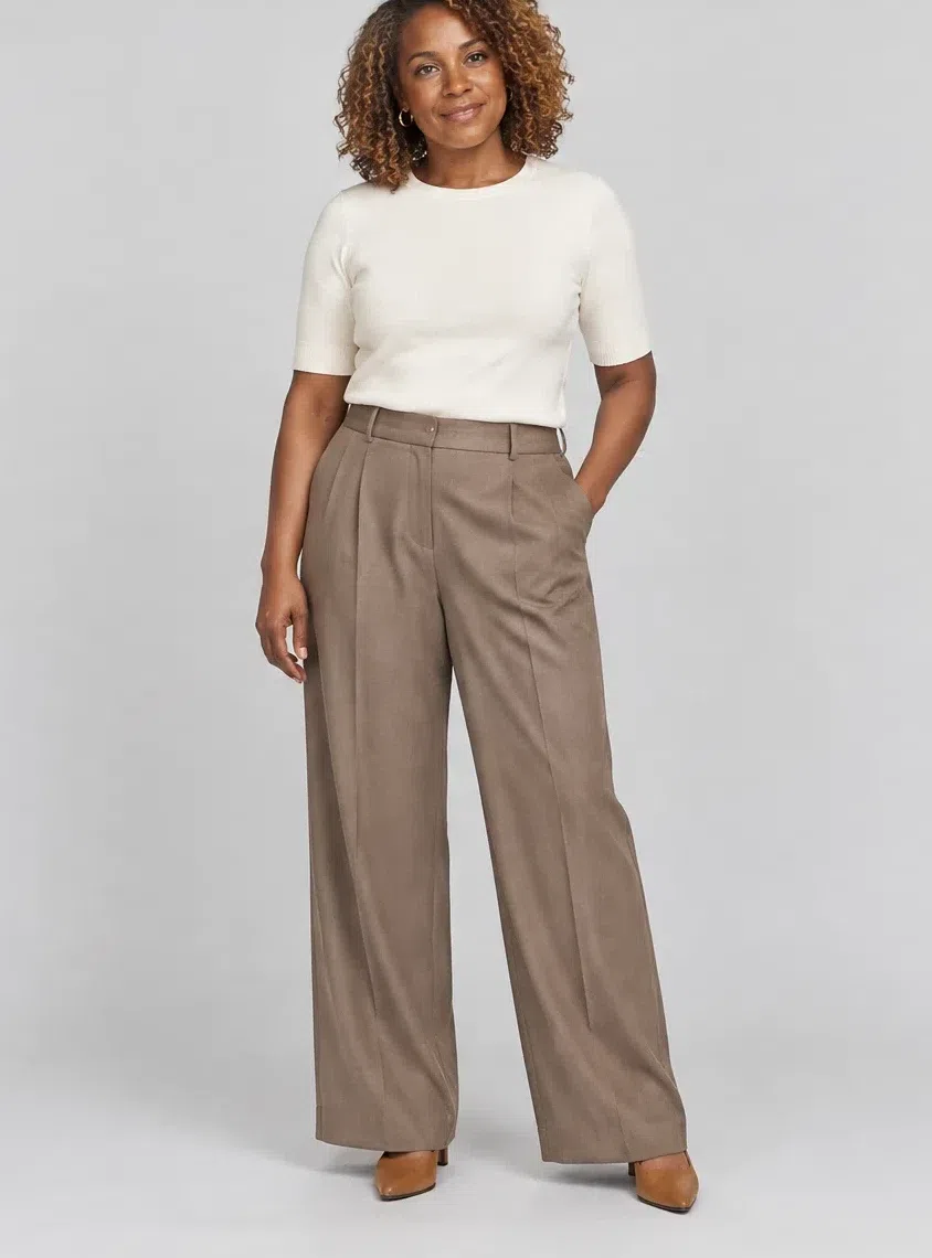
4Putty tailored trousers
A trouser that does a gray's job with no gray anywhere in it. Cut wide or cut straight, pressed, in something heavy enough to fall properly - wool crepe, a dense viscose, linen once it warms up. Nothing else in the capsule is this formal, and nothing else here carries even a trace of coolness.
Tip On denim: a warm light wash, ecru or stone will sit beside all of this happily. Deep indigo will not, for the same reason Midnight navy is on the avoid list.
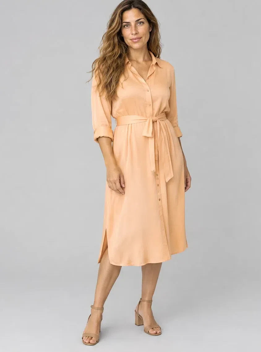
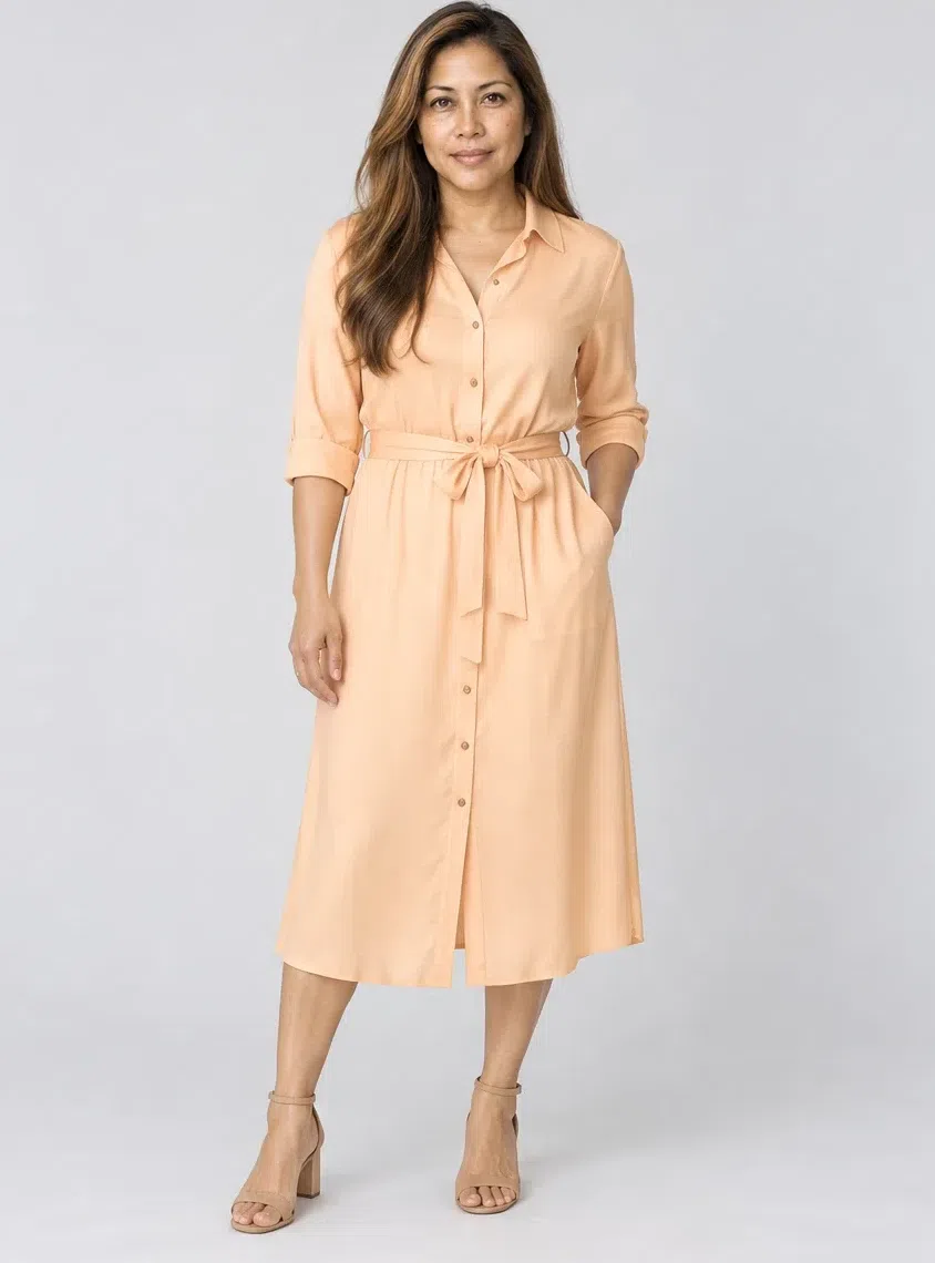
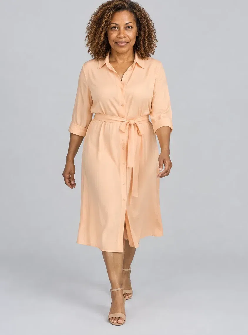
5Nectarine silk shirt dress
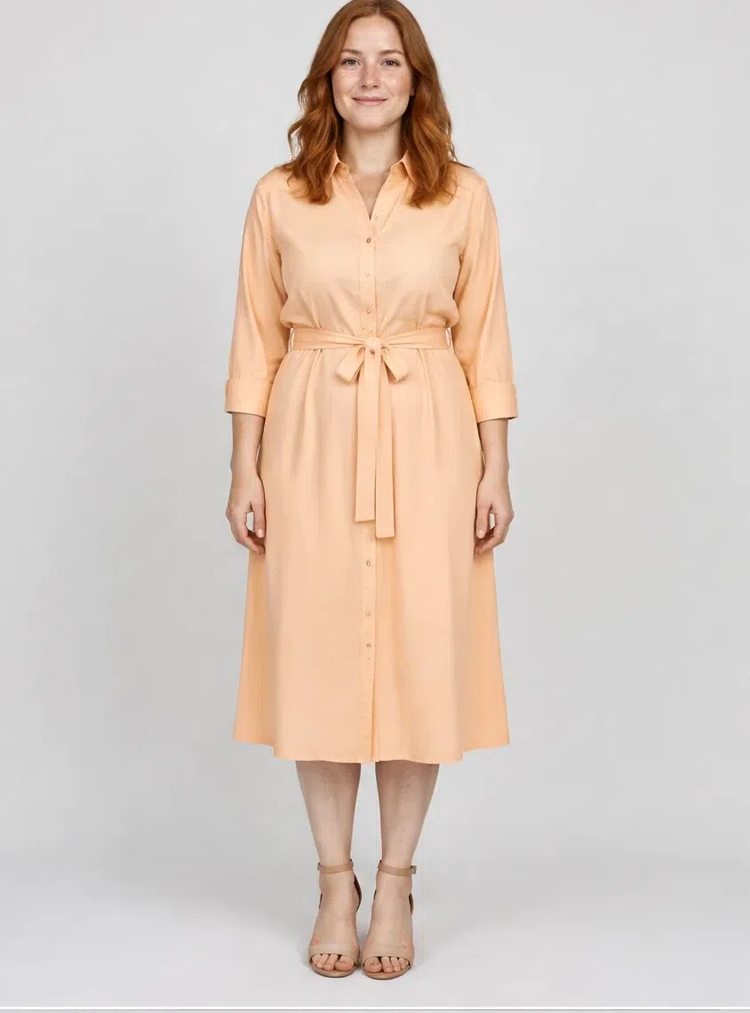
One dress that covers a working week and a warm evening both. Belted, cut to mid-calf, in silk or a fine viscose that moves. The pale peach is the shade that repeats what the skin is already doing, which is why it looks like less effort than it is.
Tip Belt it and it is smart; leave it open over the Capri shirt and trousers and it becomes a light summer coat.
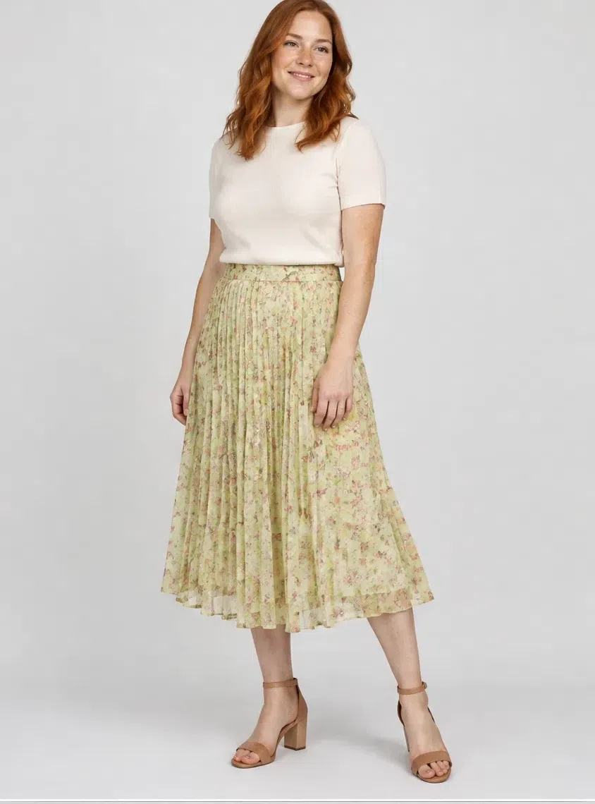
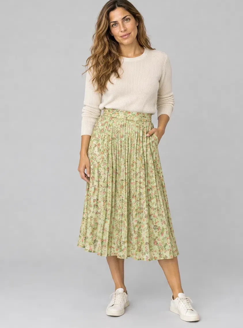
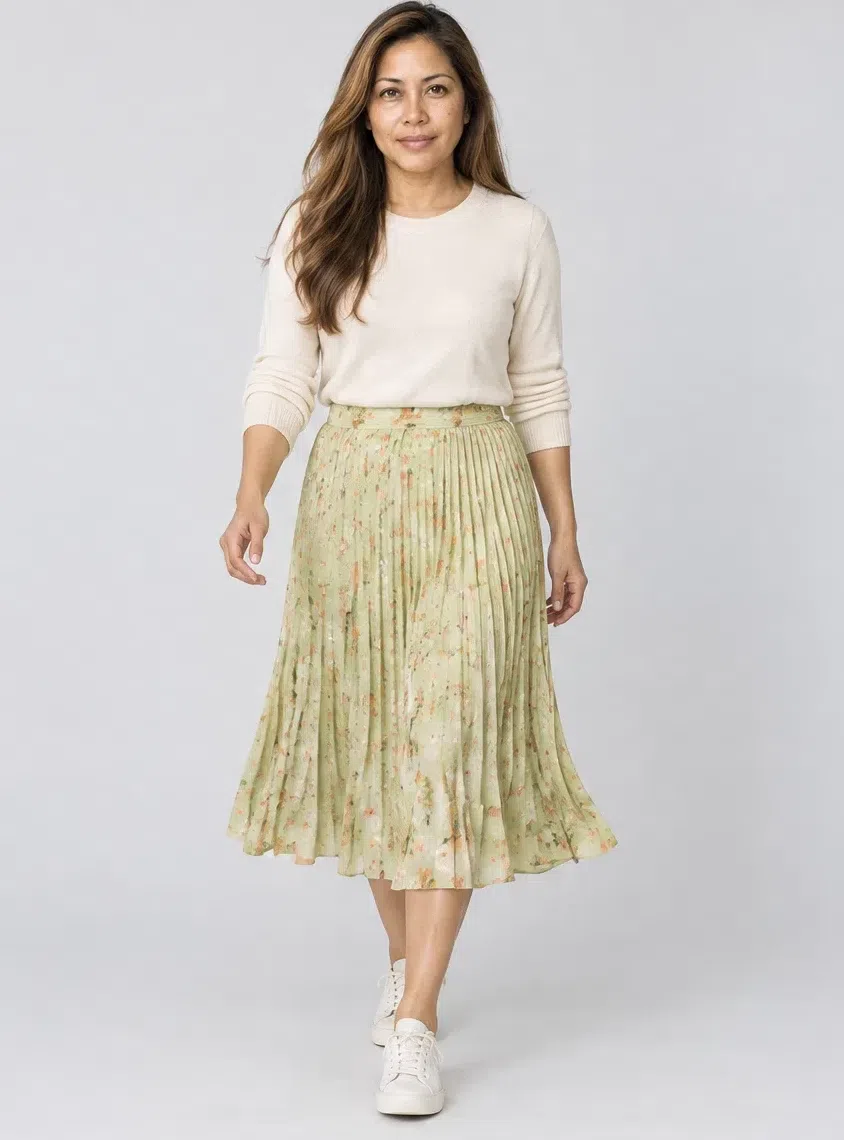
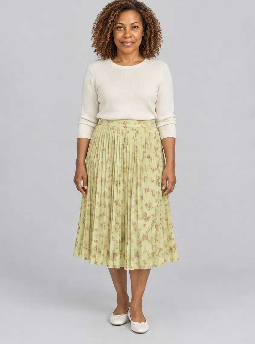
6Celery floral midi skirt
Print belongs in the capsule, and it belongs here rather than at the face. A pleated midi on a fresh green ground with a small-scale floral on it - the scale matters more than the flowers, because a large bold print fights a coloring this clear rather than joining it.
Tip Keep the print's own colors inside the palette. A floral that smuggles in a cold pink or a dusty lilac undoes the skirt from two meters away.
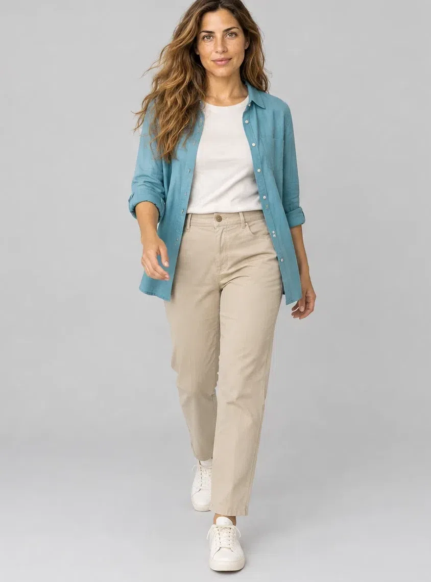
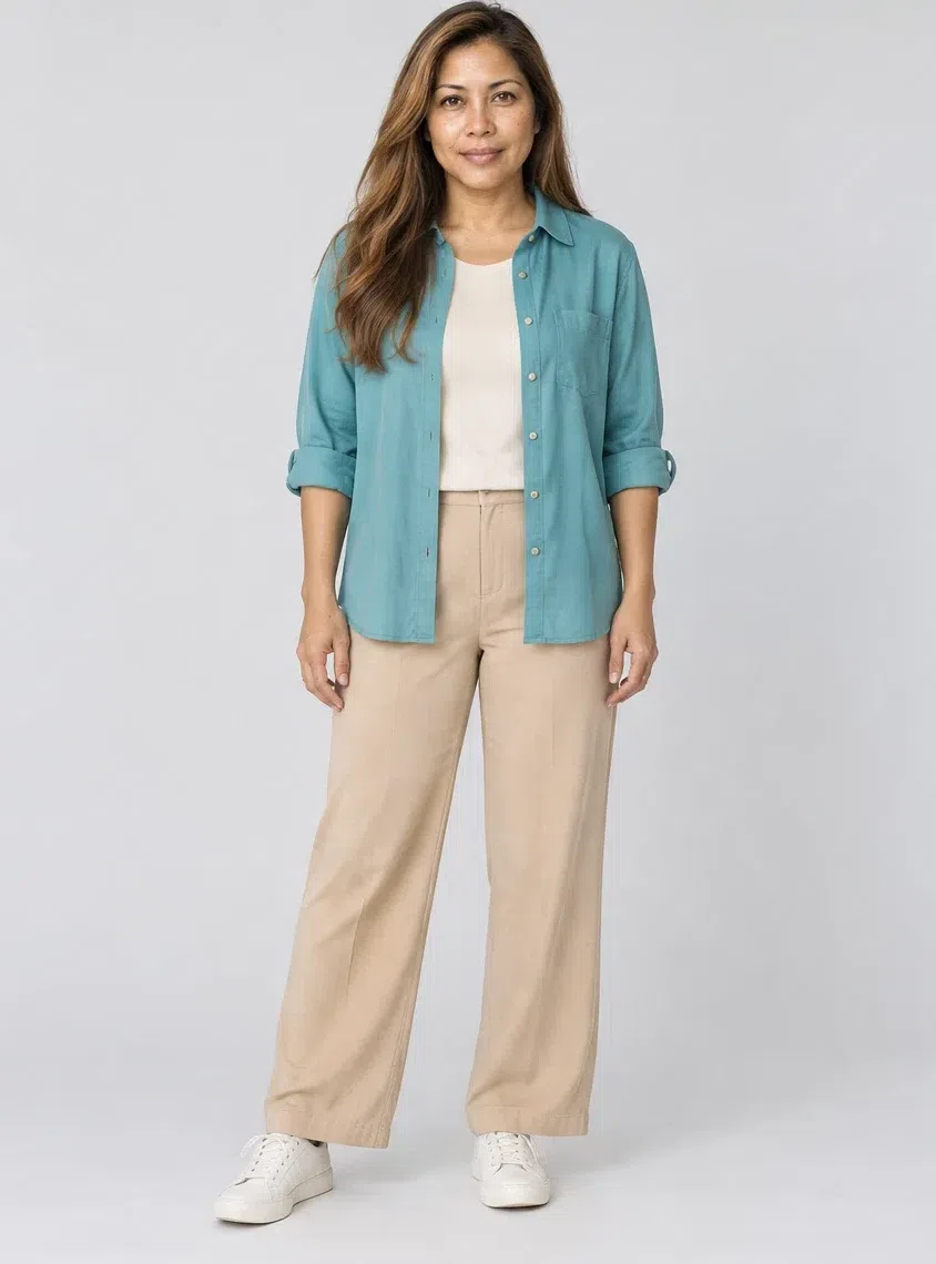
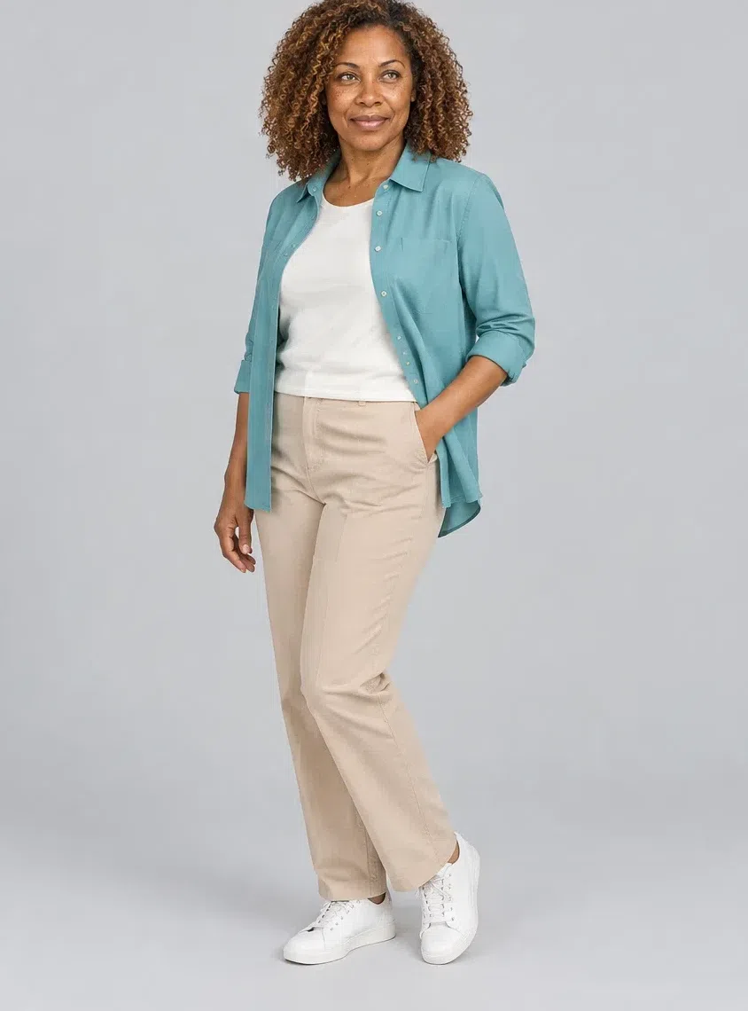
7Capri cotton shirt
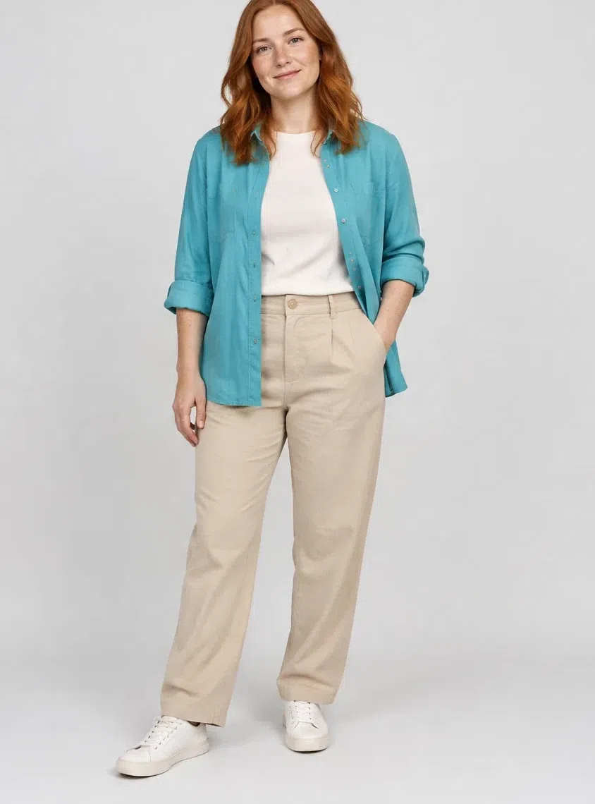
The layering shirt, in the clearest turquoise the palette has. Worn open over a tee, buttoned under a knit, or on its own with the trousers. It is the piece that proves the point about clarity: nothing here is dusty, and next to this shirt a muted teal looks like it has been left in the sun.
Tip This is also the easiest way to test yourself against Warm Autumn. If a clear turquoise lifts you and a muted one flattens you, you are on the right page.
8Chestnut leather jacket
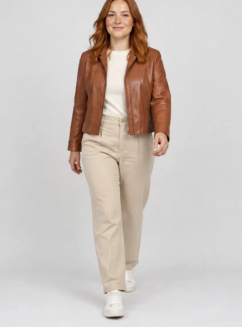
The piece with some weight to it. A cropped soft leather in warm red-brown - the most autumnal shade the palette holds, bought a step lighter than instinct suggests so it stays inside the season. It hardens up the softest outfits here, which is exactly what a capsule needs one thing to do.
Tip Warm brown leather replaces black leather across the whole wardrobe: this jacket, the belt, the boots, the bag.
Five ways to put them together
- Tone on tone. A Vanilla sweater, Almond trousers and a Tan coat - three warm neutrals a step apart from each other, and the least effortful thing in the capsule.
- Soft contrast, not hard. Eggshell against Tan gives you the black-and-white effect at a distance your face can actually answer. Nothing here needs to touch black to look deliberate.
- Neutral base, one accent. Two quiet things and one loud one. Grapefruit does it most often, Capri and Cinnabar when you want the loud thing to be less predictable.
- Neighbors on the wheel. Nectarine with Camellia, or Celery with Seafoam: shades that sit next to each other stay quiet together and let the face do the talking.
- Let texture carry it. When everything is one family, the interest has to come from the cloth - a linen against a silk, a ribbed knit against a smooth trouser. That is how a monochrome avoids looking flat.
Makeup shades
Three products chosen by depth, and the rest as a shade list
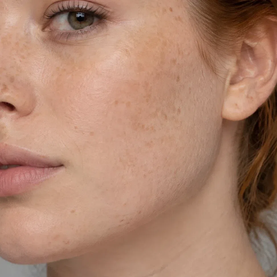
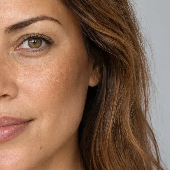
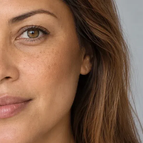
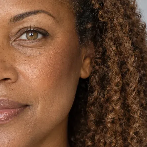
Three of these depend on how deep your skin is rather than on which season you are, so all four depths appear for each. After that it is a list: the season decides the family a shade belongs to, and your own depth decides which value of it ends up in the bag.
Base: foundation, blush and glow
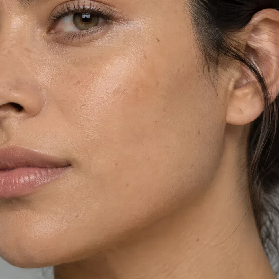
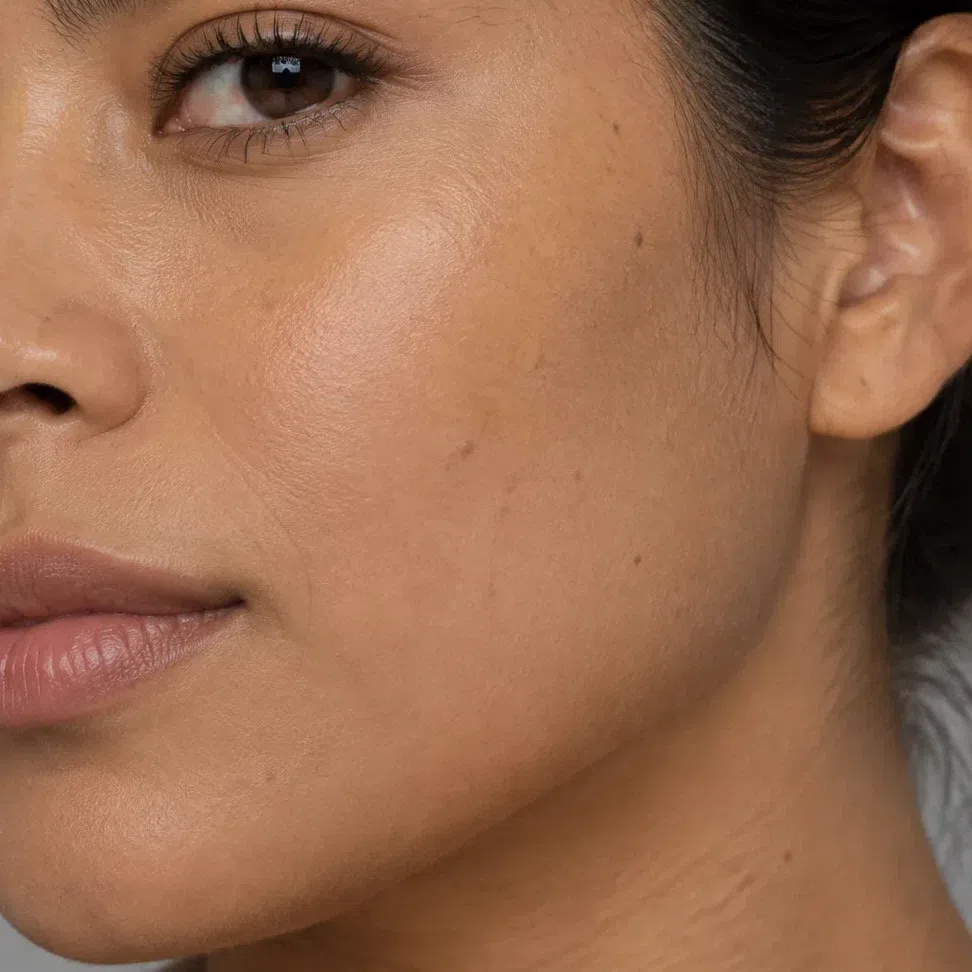
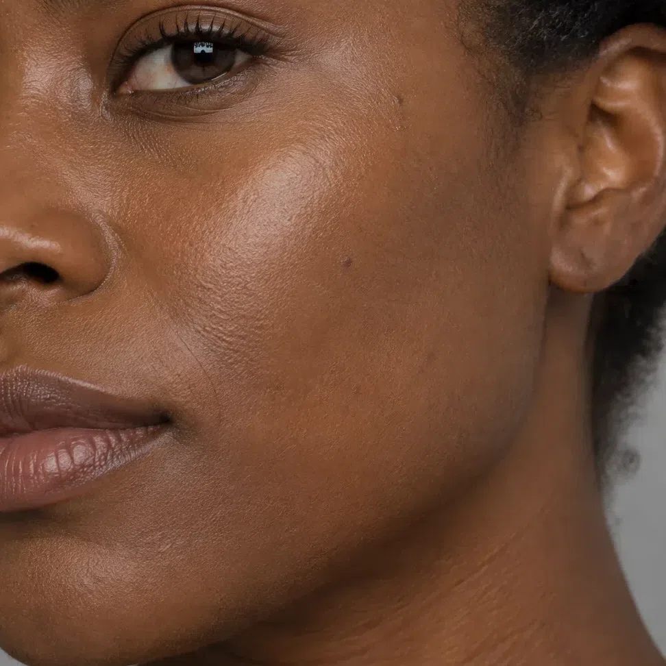
Foundation matched to your depth
Warm or golden at every depth. A base labelled cool, rosy or neutral-cool is the mismatch that happens most often on this coloring, and the jawline is where you will catch it first - a faint gray band that nothing blends away.
Blush
Peach, coral and apricot. The family is set by your coloring; which value you take is set by your depth.
- Peach flush #F6B99B
- Coral flush #F08A6C
- Apricot flush #F2A277
- Salmon rose #F09080
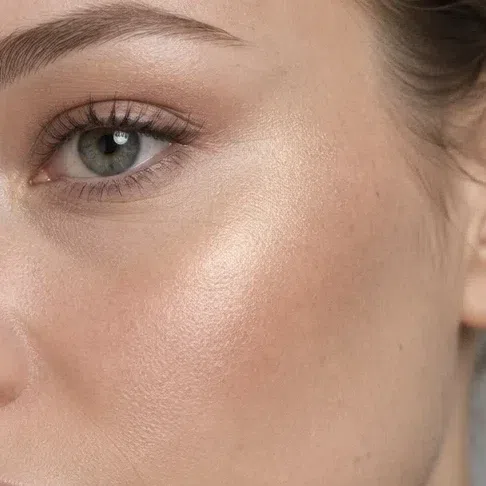
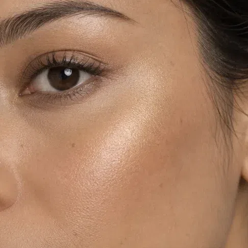
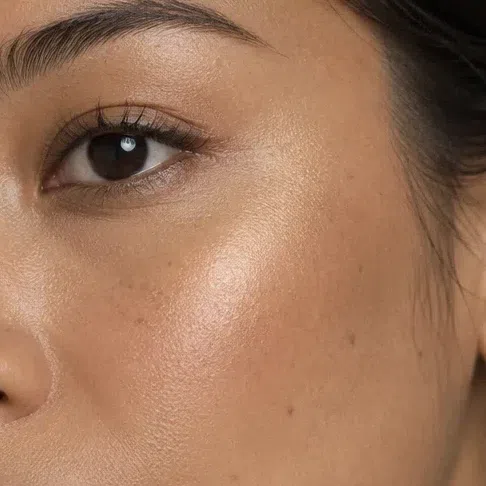
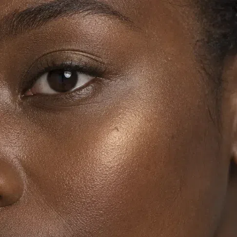
Highlighter matched to your depth
Gold rather than silver, at all four depths. Champagne, warm gold, peach pearl and copper-gold all belong; an icy or pink-silver glow sits on this skin like something borrowed.
Bronzer matched to your depth
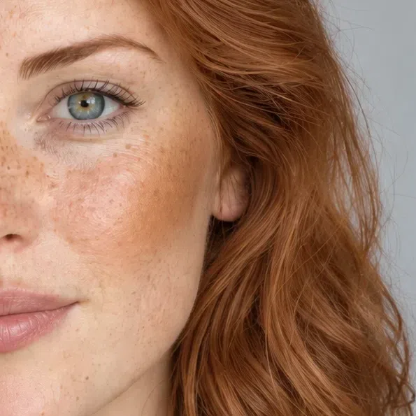
Light and golden, a step or two below your own depth. Bronzer here is standing in for sun rather than for shadow, which is why the gray-brown sculpting shades read as grime on this skin.
Eyes: shadow, liner, mascara
Everyday eyeshadow
Warm neutrals with gold in them rather than beige-grays.
- Champagne shimmer #EBD9B8
- Golden peach #E5B98C
- Light camel #D3B48C
- Apricot wash #F0BE94
Evening eyeshadow
This is where the palette's own accents move onto the lid - bronze, turquoise, copper, olive.
- Bronze smoke #A97142
- Turquoise lid #3E9B8F
- Copper lid #B87333
- Olive lid #8A9A4B
Eyeliner
Warm browns and colored liners. Black is the one to leave alone - it outweighs a light iris.
- Warm chocolate liner #5B4032
- Bronze liner #9C7340
- Olive liner #6E7043
- Deep turquoise liner #2F7F76
Mascara
Brown in four depths. Even the deepest stops short of true black.
- Soft brown mascara #6B4A34
- Dark chocolate mascara #4A3225
- Copper brown mascara #8A5A32
- Black-brown mascara #3B2E26
Brows
Match the warmth, not the depth - a brow a shade warmer than your hair reads natural, a cool taupe reads drawn on.
- Golden brown brow #A5793F
- Amber brow #C09258
- Warm chestnut brow #8E6239
- Golden honey brow #B58A5A
Lips: nudes and color
Nude lips
Peach and apricot nudes, not beige-pink ones. A cool my-lips-but-better nude drains this face.
- Peach nude #E9A98C
- Coral beige nude #DFA189
- Apricot nude #EDA97E
- Salmon nude #EC9E8A
Colored lips
Reds with orange underneath them. A blue-based red is the loudest wrong note available on this coloring.
- Clear coral #F8735C
- Poppy red #DE4B39
- Mandarin #E8703A
- Terracotta rose #C96F5E
Hair shades
Which shades belong to this coloring, and which never will
For a Warm Spring, hair color is less a change of look than the thing holding the rest of the face together. The pigment underneath is gold or ginger either way, so a shade lands well when it reads as your own hair on a better day - warm, multi-tonal, and rarely more than a level or two from where it began.
Golden blondes and light copper
The light end: wheaten gold through to a clear strawberry ginger.
Bright, golden and clean
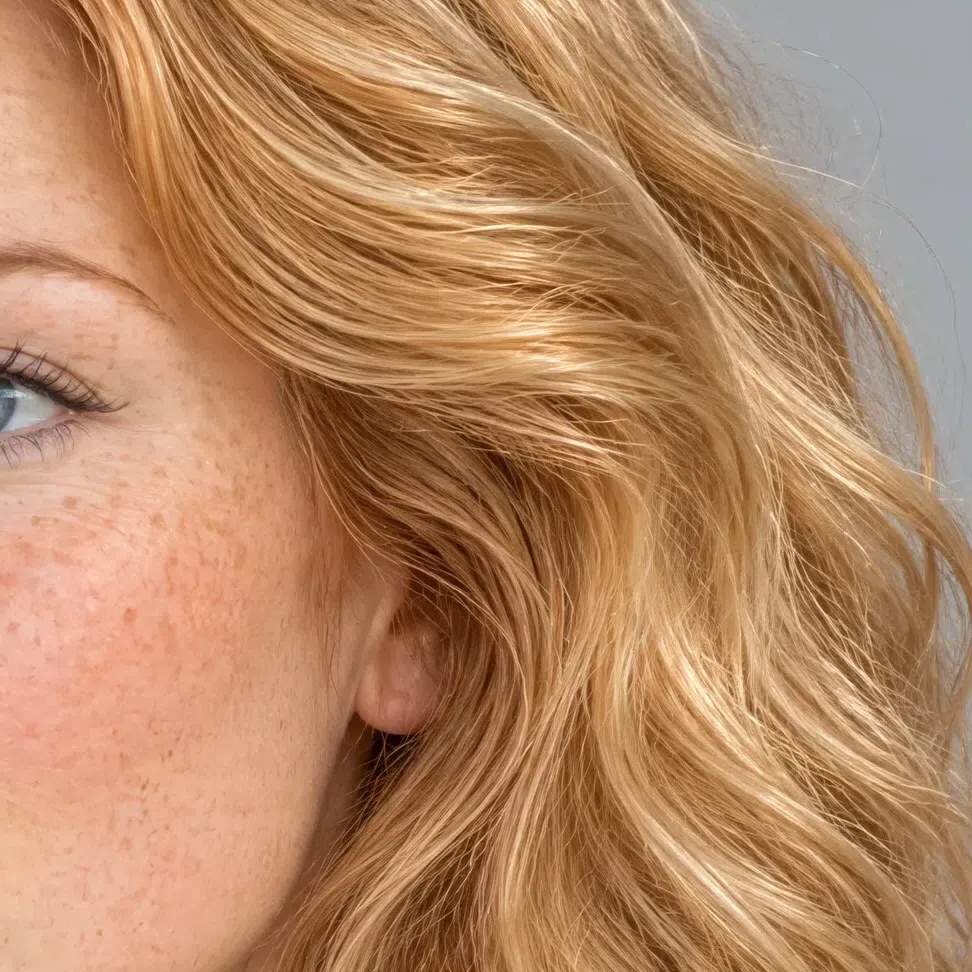
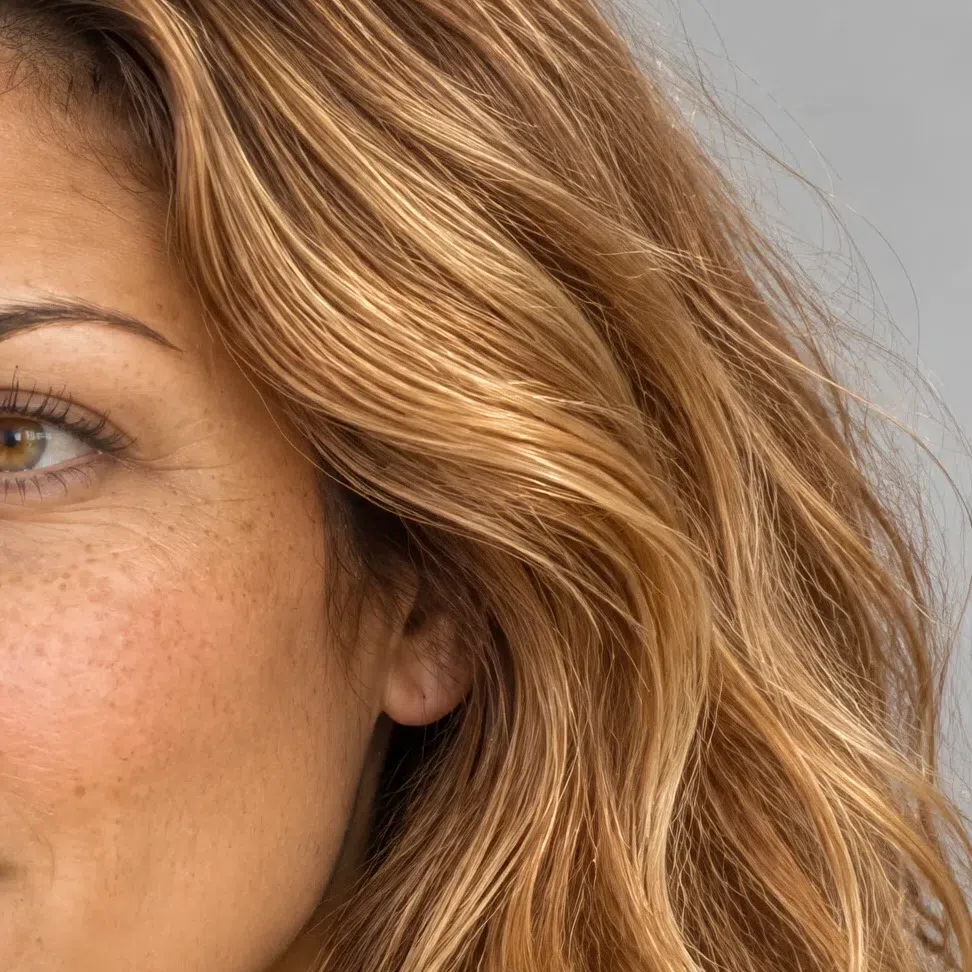
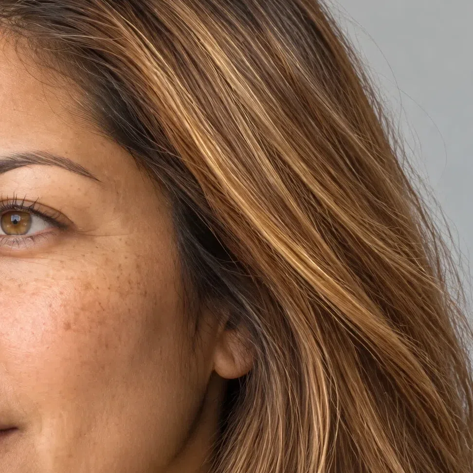
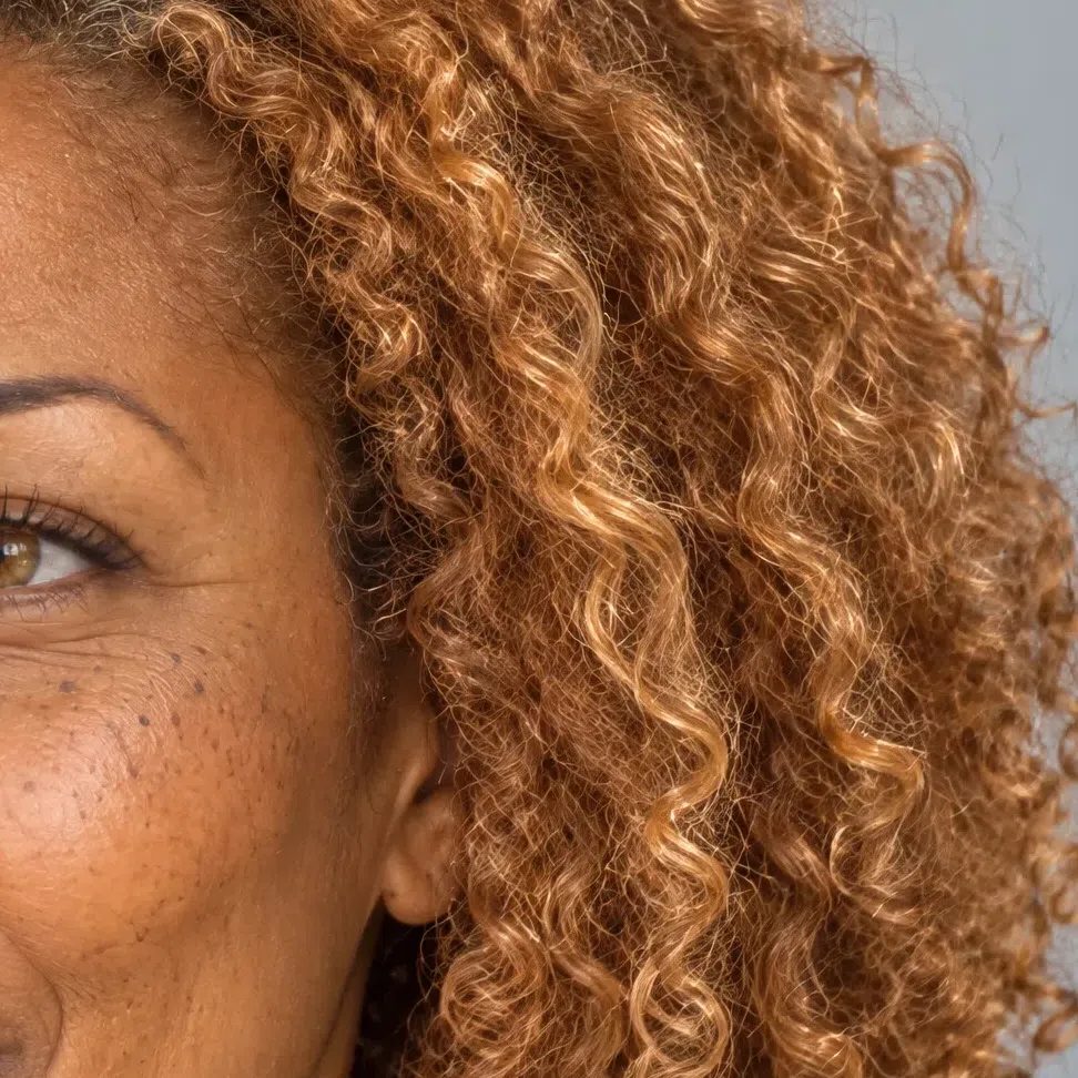
Every strip starts a level above the shade and runs two below it. Those L numbers are the salon scale, so they are worth quoting directly at the appointment.
Copper and warm brown
The deep end, which on this coloring stops at a warm mid brown.
Warm depth, never heavy
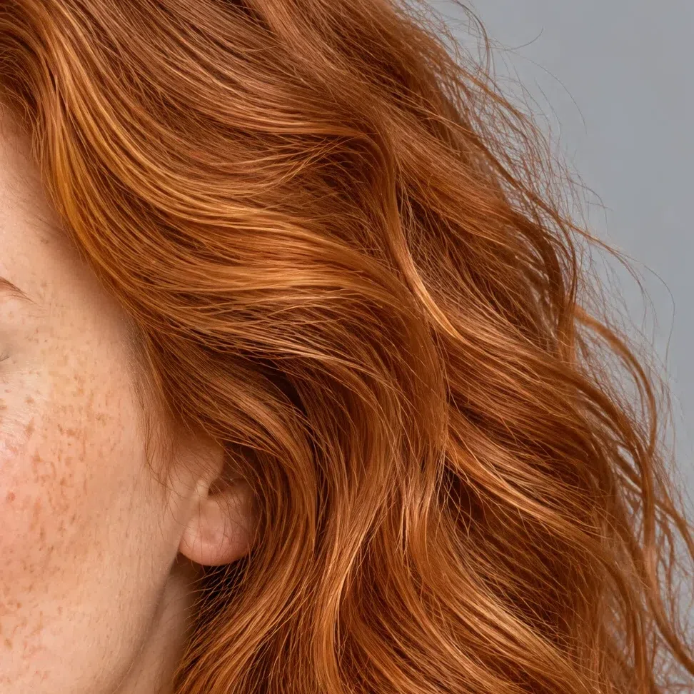
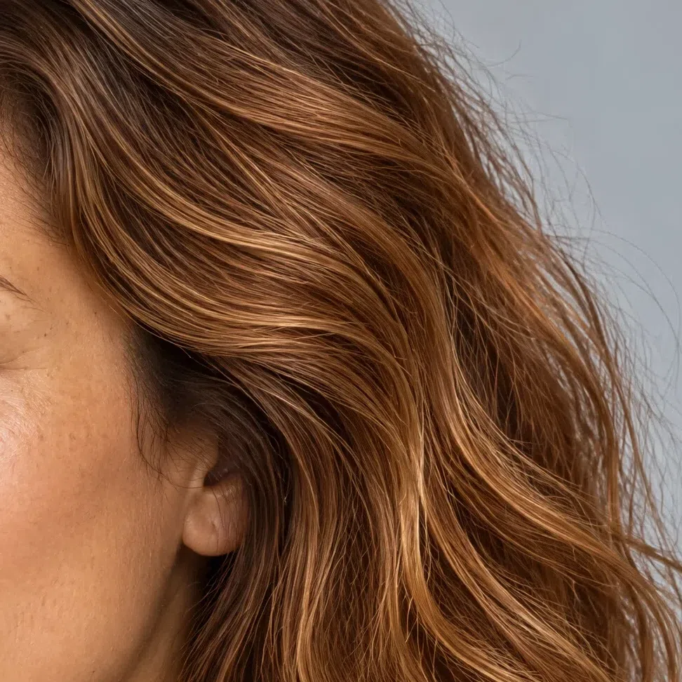
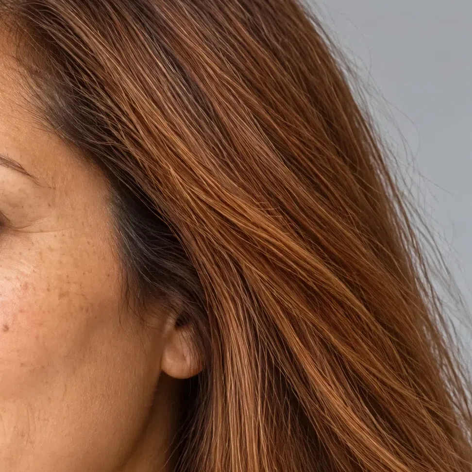
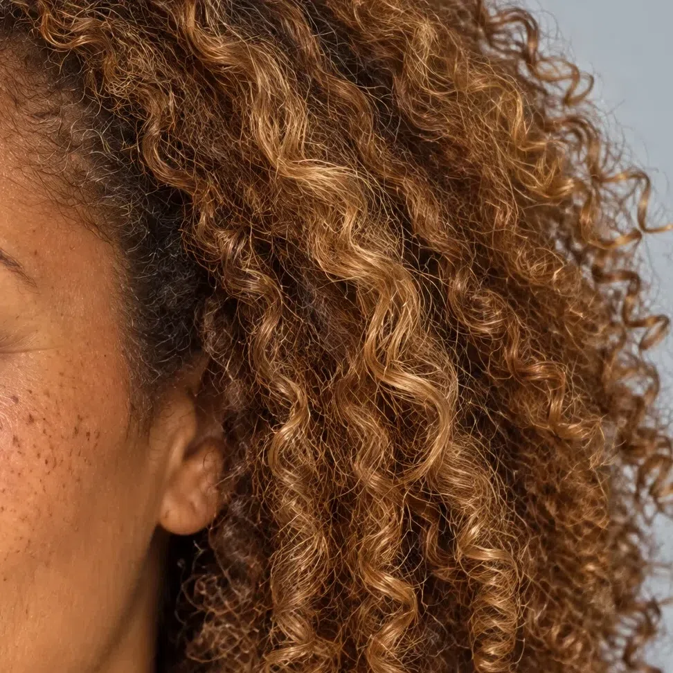
Every strip starts a level above the shade and runs two below it. Those L numbers are the salon scale, so they are worth quoting directly at the appointment.
Hair colors to avoid
Cool pigment is the common thread. Ash, pearl, silver and every blue-based dark do the same thing from different directions.
Cool pigment, in any form
Warm Spring vs the subtypes it gets confused with
Three neighbors, and the one physical test that settles each
One quality sits in front of the others on any given coloring, and it is the thing the subtype takes its name from. Here that quality is warmth. On Bright Spring it is saturation, on Light Spring lightness, on Warm Autumn depth. Two colorings can overlap almost completely and still belong to different subtypes purely because of which quality is doing the leading.
Warm Autumn is the expensive mistake of the four. Ask whether you are warm or cool and both of you say warm, so the question that normally does all the work here does none of it, and something else has to decide.
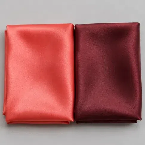
Hold a clear coral to your face, then a deep burgundy. Which one switches the face on?
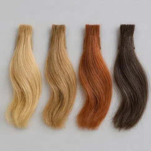
Your natural hair color, before any dye:
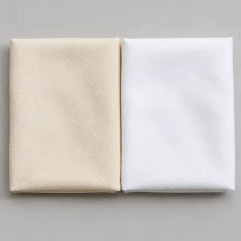
Cream or optic white - which suits you better?
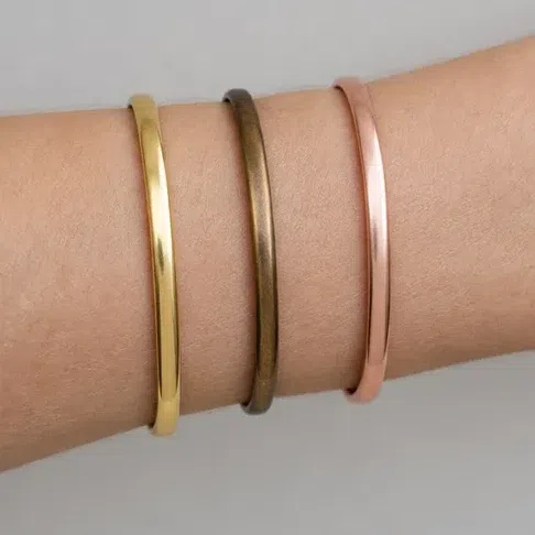
Gold or bronze at the face?
Warmth arriving with clarity, which is this page. The palette is where to begin.
Same temperature, deeper and dustier colors. If muted and dark shades collect your face rather than weighing it down, your guide is Warm Autumn.
Warm is not the property doing the work for you - saturation is. Head for Bright Spring.
Lightness leads and full-strength color overwhelms you. The page you want is Light Spring.
Four questions cannot settle a season, and they are not meant to. Treat this as a direction to check rather than a verdict - the borders between neighboring subtypes are exactly where people misplace themselves, and they are the reason a photograph beats a questionnaire.
Warm Spring vs Bright Spring
Warm Spring
Warmth. Gold runs through the skin, the hair and the iris, and nothing here is neutral-leaning.
Middling and sunlit. Strong enough to carry a full coral, nowhere near neon.
Grapefruit, Nectarine, Primrose, Capri - warm, and clear rather than deep.
Medium. Hair a readable step or two from the skin, nothing in the face cutting hard.
Sunlight rather than spotlight - a face that looks lit rather than drawn.
Bright Spring
Saturation. Color at full volume is what the face answers to, and warmth comes second.
Maximum. The colors nearly buzz; anything softened looks like it has been left out in the rain.
Scarlet, electric turquoise, pure yellow, a warm fuchsia.
High. The face is drawn in distinct steps rather than gradients.
Ring and snap - a face with an edge on it.
The test: soft coral, then pure scarlet Take a muted coral to the mirror first, then a scarlet with nothing softened about it. A Warm Spring is freshened by the coral and finds the scarlet shouting over her - the color arrives before the face does. A Bright Spring is the other way round: the coral leaves her looking slightly switched off, and the scarlet is the thing that makes her eyes come forward. Both of you are warm, so nothing in this test is about temperature at all.
Warm Spring vs Light Spring
Warm Spring
Warmth. Gold runs through the skin, the hair and the iris, and nothing here is neutral-leaning.
Middling and sunlit. Strong enough to carry a full coral, nowhere near neon.
Grapefruit, Nectarine, Primrose, Capri - warm, and clear rather than deep.
Medium. Hair a readable step or two from the skin, nothing in the face cutting hard.
Sunlight rather than spotlight - a face that looks lit rather than drawn.
Light Spring
Lightness. Every color looks as though it had been let down with water, and warmth follows behind.
Low. A saturated shade takes over rather than joining in.
Very pale skin that burns before it tans; wheat and flaxen hair.
Low. Skin, hair and eyes sit close enough together to blur.
Watercolor - the whole face pitched a few steps up the scale.
The test: wear the coral at full strength Put on a saturated coral - a blouse, a scarf, something with real area to it - and look at who is in charge. A Warm Spring holds it: the color sits there and the face stays the subject. On a Light Spring the same coral starts wearing her, and the instinct is immediate - you want it two shades paler. That instinct is the answer. Both of you are warm and both look well in peach; what separates you is how much color you can carry before it takes over.
Warm Spring vs Warm Autumn
Warm Spring
Warmth. Gold runs through the skin, the hair and the iris, and nothing here is neutral-leaning.
Middling and sunlit. Strong enough to carry a full coral, nowhere near neon.
Grapefruit, Nectarine, Primrose, Capri - warm, and clear rather than deep.
Medium. Hair a readable step or two from the skin, nothing in the face cutting hard.
Sunlight rather than spotlight - a face that looks lit rather than drawn.
Warm Autumn
Depth. Warm as well, but the warmth arrives loaded rather than lit.
Muted. Every shade reads as though a little dust had settled on it.
Burgundy, dark terracotta, olive, mustard, forest.
Antiqued gold, dark bronze, aged copper rather than anything polished.
Late autumn light - deep, earthy and slow.
The test: burgundy under the chin This is the pair the warm-or-cool question cannot separate, because you both answer warm. Use burgundy instead. Hold a deep muted burgundy right under your chin in daylight, then a clear coral in its place. A Warm Spring is flattened by the burgundy - the face gets heavier and the eyes go quiet - and lifted by the coral. A Warm Autumn reads the same two colors in reverse: the burgundy gathers her features up and looks expensive on her, and the clear coral is the one that looks like it belongs to somebody else. Nothing about the skin's undertone is being tested here; the whole difference is clarity against depth.
If two of them still read as equally true after you have run the tests, the details are no longer helping. Return to the leading quality instead: pick the one word you would reach for first about your own face - warm, bright, light or deep - and let it choose the page for you.
Warm Spring: common questions
How do I know if I'm a warm spring?
What does "warm spring" mean?
What skin tone is warm spring?
What colors complement a warm Spring skin tone?
What is the color palette for a warm spring?
What colors should I avoid when wearing warm Spring colors?
Should warm Spring wear silver or gold?
What color hair should a warm spring have?
What is the best lipstick color for a warm spring?
Is Warm Spring the same as True Spring?
How is Warm Spring different from Warm Autumn?
Can a Warm Spring wear black?
Can a Warm Spring have brown eyes?
Can my coloring change with age?
What foundation undertone should a Warm Spring look for?
Which celebrities are Warm Springs?
What if I decide I got my season wrong?
Sources
Four of the claims on this page are facts about light and skin rather than judgments about color, and those are the ones that can carry a citation. Each note below names the sentence on this page the source stands behind. Every one was opened and read while this page was written.
-
Color analysis (art) (opens in a new tab)
Wikipedia, 2026
Backs the historical claim only: that the seasonal framework began with Johannes Itten linking what he called subjective colors to the four seasons. It is the origin of the system this page uses, and it also shows why no citation is offered for where the subtype boundaries fall – that lineage runs through art education, not measurement.
-
Human skin color (opens in a new tab)
Wikipedia, 2026
Stands behind the warning attached to the wrist-vein check in the five checks. The page states that light skin’s color is governed largely by the bluish-white connective tissue beneath the dermis and by hemoglobin in the dermal veins, while melanin is the main determinant on darker skin – which is why that test reads bluer than it should on very fair skin and often cannot be read at all on deep skin.
-
Color temperature (opens in a new tab)
Wikipedia, 2026
Supports the instruction to run every drape and paper test in daylight. The page’s correlated-color-temperature table puts standard incandescent lamps near 2,400 K and soft-white LED and fluorescent lamps between 2,700 and 3,000 K, well away from daylight – so the light you judge under shifts the answer before your skin has any say in it.
-
Color rendering index (opens in a new tab)
Wikipedia, 2026
The second half of the same instruction. CRI is defined here as a measure of how faithfully a light source reveals the colors of objects compared with a natural or standard source, which means two lamps can sit at the same color temperature and still render a shade differently. Matching the bulb is not enough – judge by a window or not at all.
Nothing above is offered as evidence for which shades suit a Warm Spring. The palette, the subtype boundaries, the metal and makeup calls and the burgundy test that separates this coloring from Warm Autumn are our own judgments, arrived at by drape-testing rather than by publication. Different schools of color analysis divide the seasons differently and none of them is a standard.
What is color analysis, how do you find your season, and what are the 12 types?
The main guide covers all of it - the four axes your season is built from, all twelve subtypes side by side, and a free quiz that places you in about a minute.
What is color analysis? For women and men