
Bright Spring color palette (Clear Spring): best and worst colors to wear
Bright Spring is the most saturated of the springs: warm, clear skin, eyes that are the brightest thing in the face, and color worn at full strength. Dusty shades, not loud ones, are what flatten it. Below: 20 shades to wear, 11 to avoid, and how to tell you from Bright Winter.
See the Bright Spring palette on a real face
These twelve sit closest to the face: six warm neutrals, four light shades, then two accents at full strength. The last two are the ones to stop on. A coral that loud usually takes over a picture, and here it does the opposite - the face comes forward and the eyes lift with it. That is the argument this whole season rests on: what puts a Bright Spring out is a dusty shade, not a strong one. Watch the skin along her jaw and under her eyes as you go, not the top.
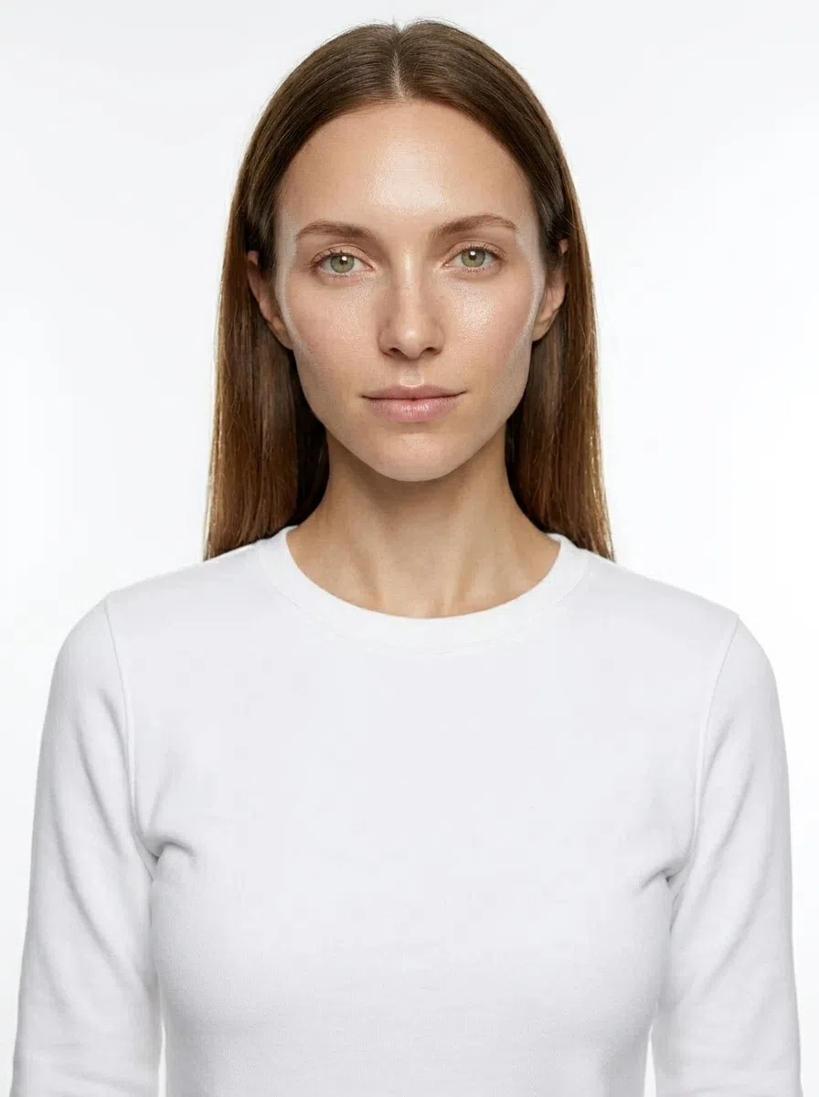
Bright Spring in 30 seconds
Bright Spring is warm, exceptionally clear and more contrasted than any other spring - and it is the clarity that leads, with warmth only second. The Bright Spring color palette is built from color at full strength: coral, tomato red, turquoise, new-leaf green. What puts this face out is not a loud shade. It is a dusty one.
| Skin | Light, warm and clear, golden or peach underneath; takes a golden tan easily. |
|---|---|
| Eyes | Bright and see-through - turquoise, green, topaz, clear blue; whites very light. |
| Hair | Golden blond, copper-gold or warm chestnut with gold running in it. Never ash. |
| Contrast | Medium to high, and visible - but warm, without the hard edge winter has. |
| Metal | Yellow gold, polished rather than brushed; rose gold once the skin has tanned. |
Wardrobe base:
Careful with:
One thing to carry away: given two versions of the same color, take the cleaner one every time. Not sure this is you rather than Bright Winter, Warm Spring or Light Spring? A photo analysis settles it.
Am I a Bright Spring? The five checks
Run them in this order - it eliminates the most, fastest
Most people who turn out to be Bright Spring have spent years being advised to tone it down. The advice is kindly meant and it is backwards: on this coloring a soft, complicated shade is what drains the face, and a clean strong one is what pulls it together. Saturation is the signal here, and warmth is the second reading rather than the first. The checks below start with undertone, because that is what separates this from Bright Winter - the one other season that wears color at this volume.
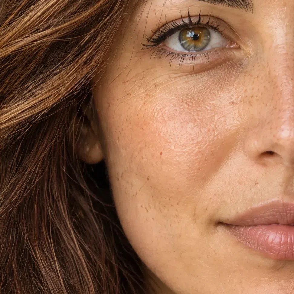
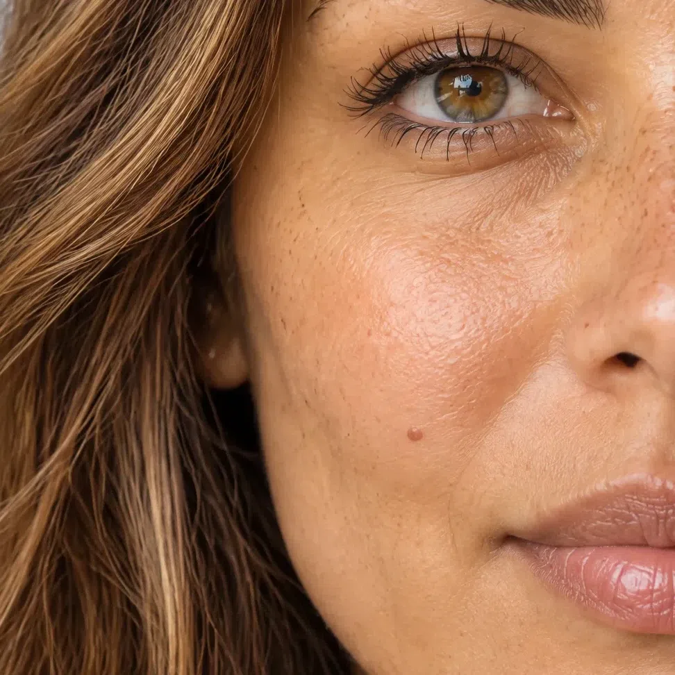
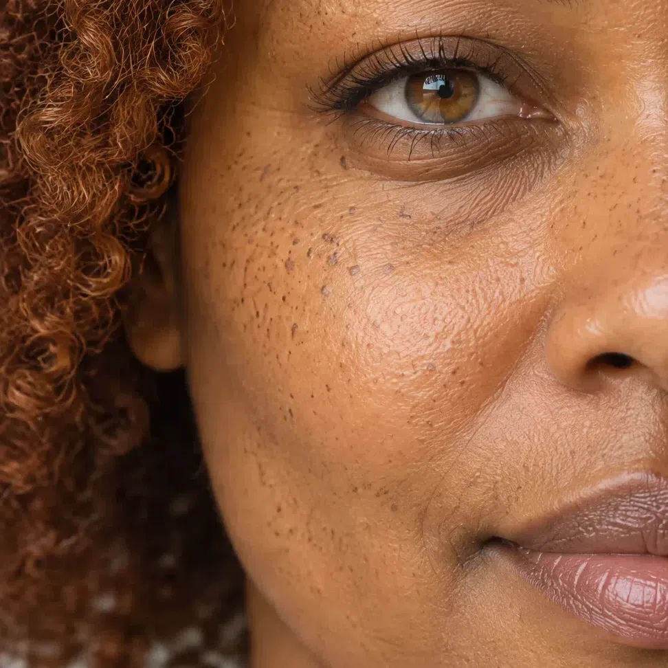
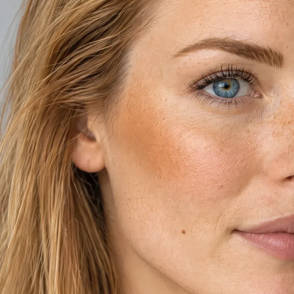
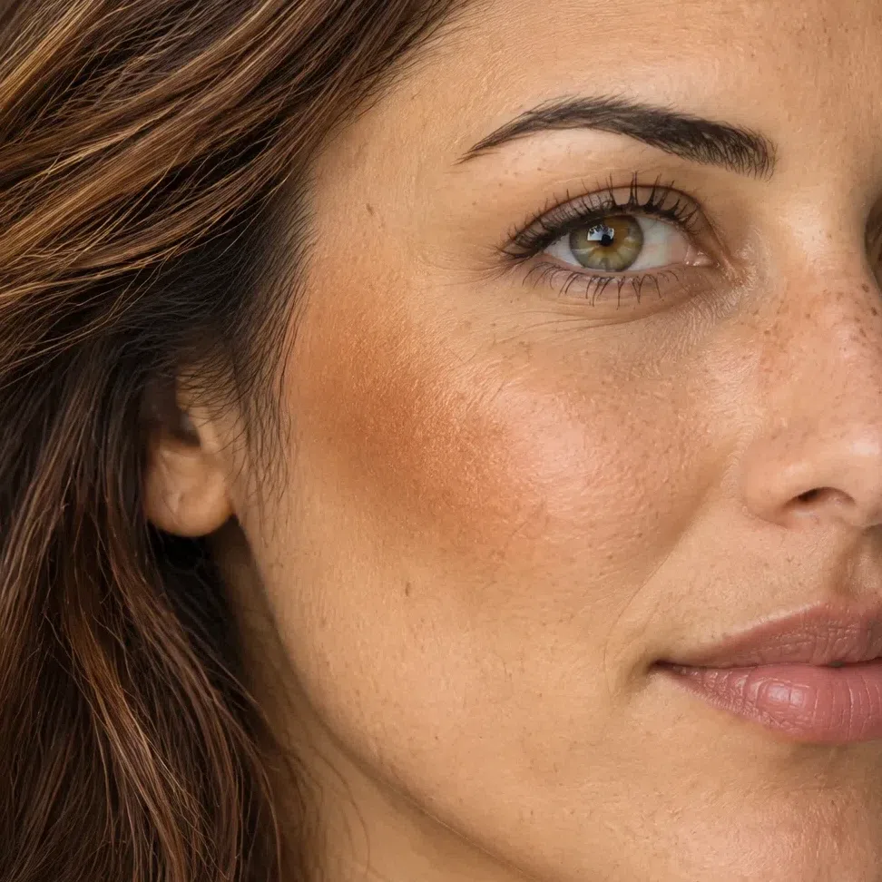
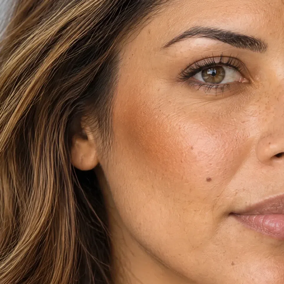
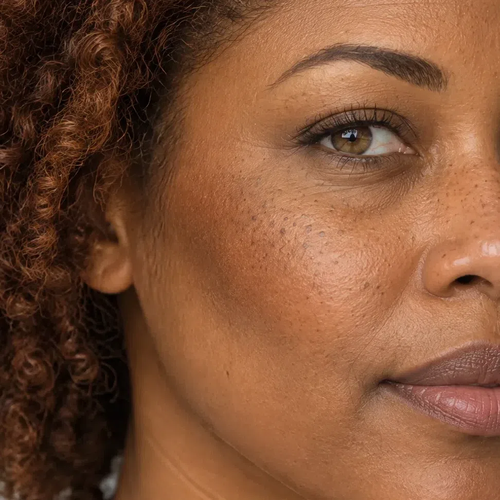
What fixes a season is undertone and contrast, not how pale you are. You will find this coloring on porcelain and on deep brown alike, and what the four faces below have in common is a warm golden cast, color that stays pure instead of dusty, and features that sit a clear step apart.
11. Skin: warm underneath, and never muddy
How pale you are settles nothing. What sits under the surface settles a great deal - and here it is warm, and it is clean.
Whatever the depth, what sits beneath the surface is golden or peach, and it holds a clarity to it: the color looks pure, as though something were lit behind it, instead of being veiled over with gray. Golden or ginger freckles are common right across the range of depths, and the flush that comes with cold air or a glass of wine arrives coral rather than rose.
What this skin does not do, in honest daylight, is look sallow or dusty. That cast belongs to the seasons two doors down, and ruling it out first saves more time than anything else here.
Three ways to read your undertone
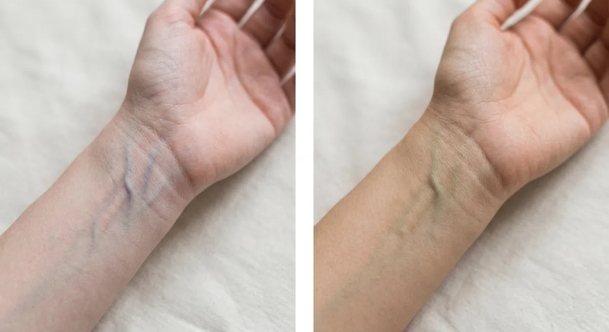
Turn your wrist up at a window in the middle of the day. Incandescent light lays yellow over everything and a cold LED lays blue, so neither one counts. Read the overall color of the vessels, not the one that happens to show best.
- Green or olive - warm undertone, which keeps Bright Spring on the table.
- Blue or violet - cool, and Bright Winter becomes the likelier answer.
- Nothing obvious - neutral. Then saturation decides it, not temperature.

Face washed, hair back, daylight from a window. Hold ordinary white copier paper flat to the jawline and watch the seam where the two meet rather than your whole face. Cream or recycled stock carries warmth of its own and will skew what you see.
- Golden or peach lift - warm undertone. This is the reading you want.
- Pink or bluish - cool undertone; the springs are out.
- Grayish - usually neutral with an olive nuance.
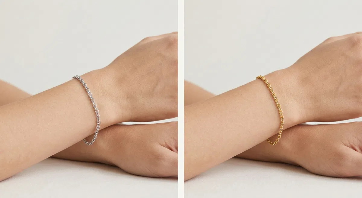
Take one piece in yellow gold and one in silver to a window and hold them up one after the other. Judge your own face next to each metal, not the two metals against one another.
- Gold warms the face and the skin lifts - warm undertone.
- Silver sharpens the features instead - cool undertone.
- Barely any difference - neutral; go by saturation instead.
If daylight leaves your skin looking dusty or gray-cast, no amount of gold in the freckles makes this your season.
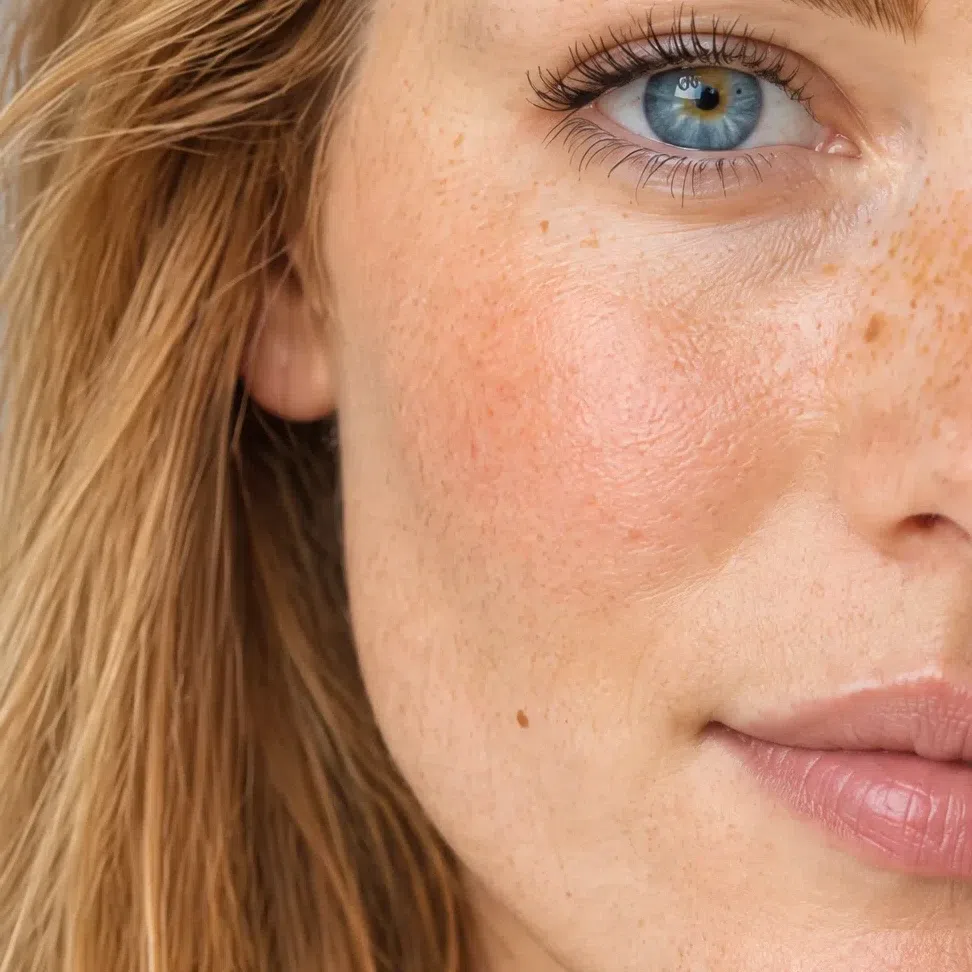
22. Eyes: usually the brightest thing in the face
On most colorings the eyes are one feature among several. Here they are what people mention first, and they are doing most of the work.
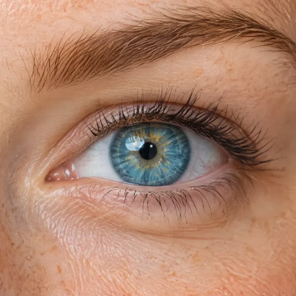
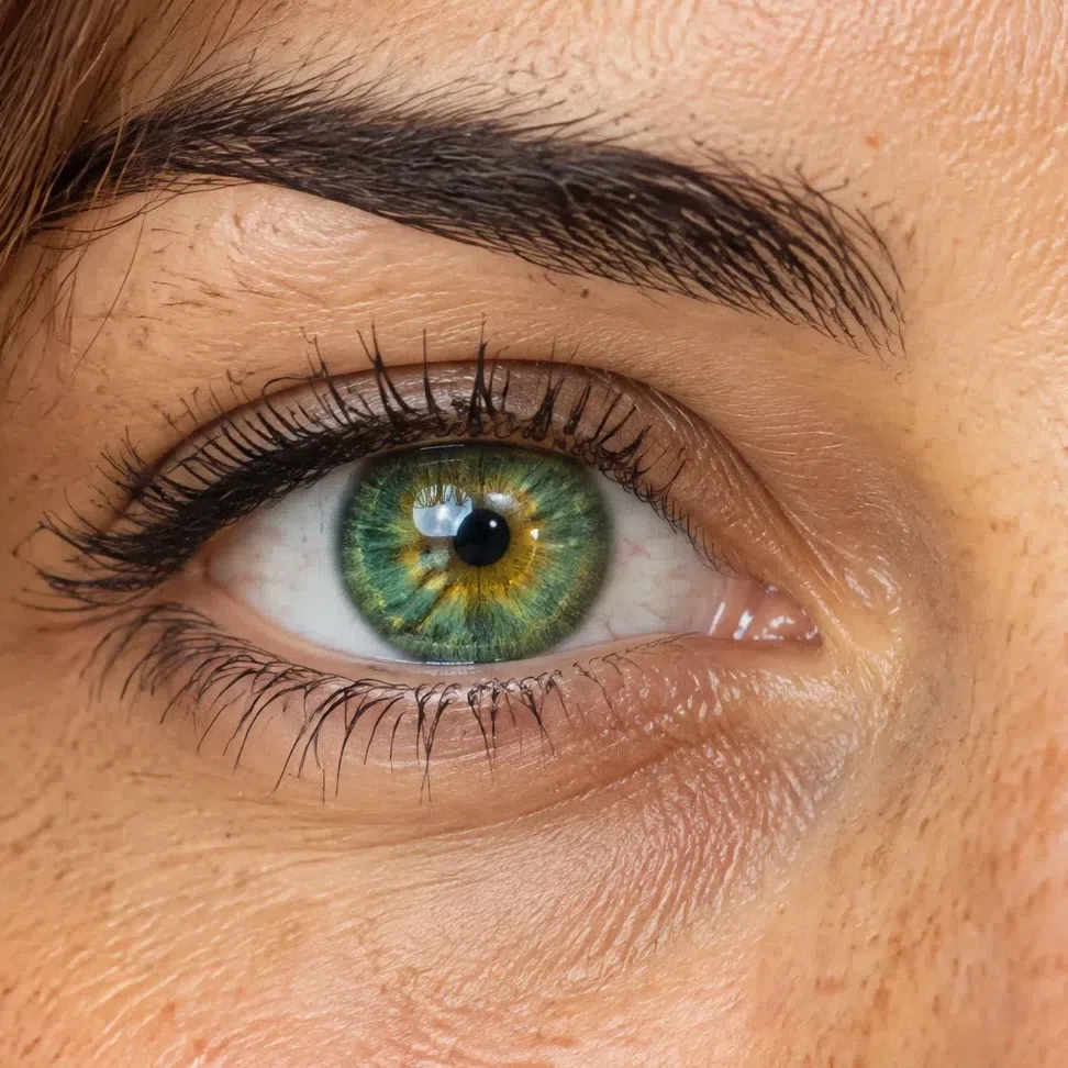
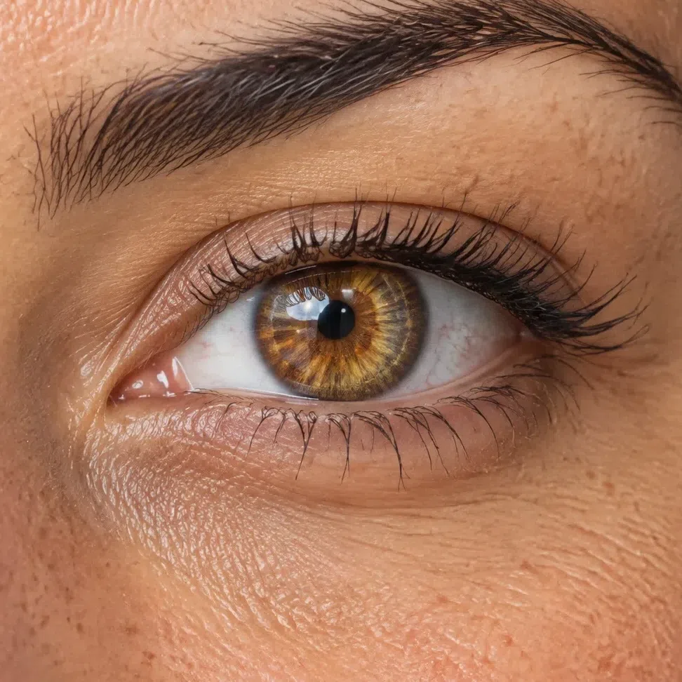
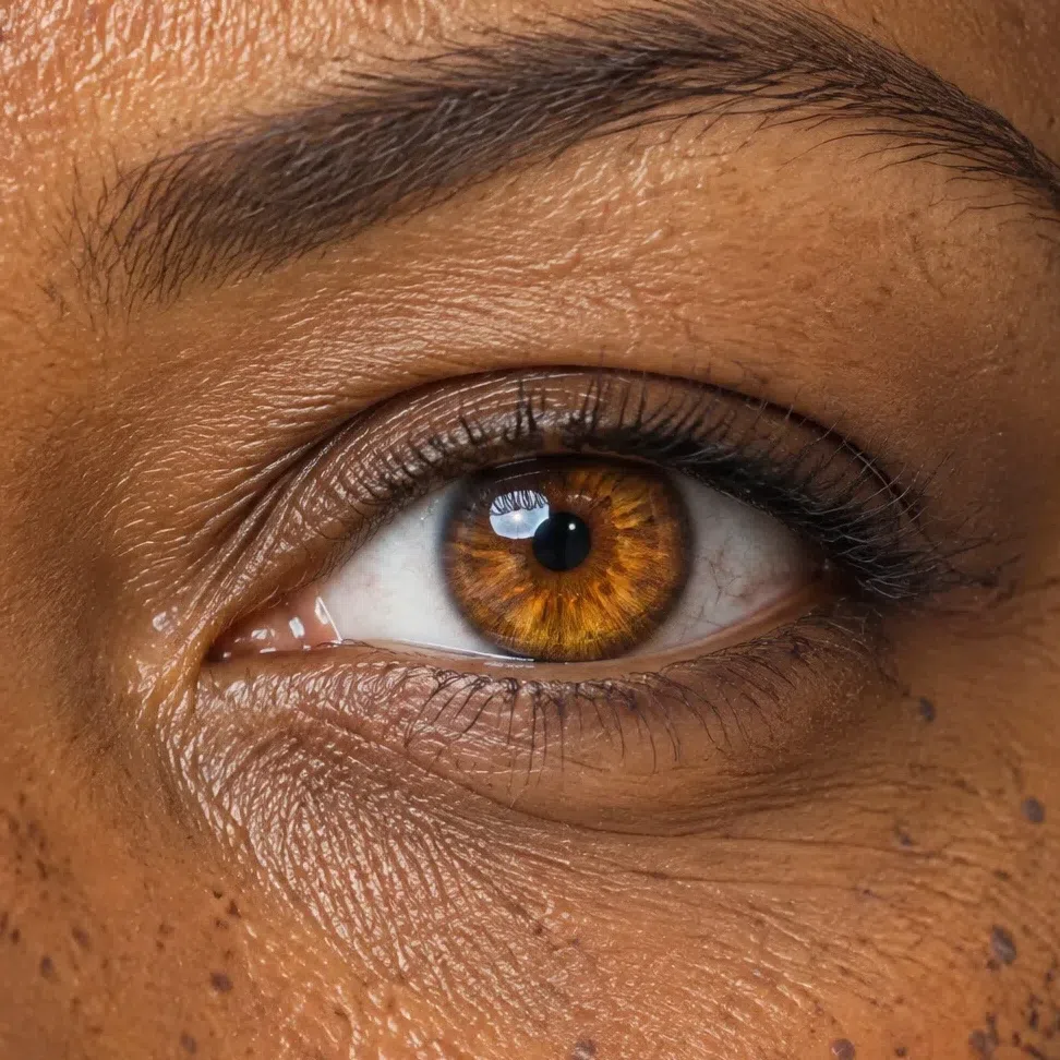
The iris is clear and strong: a color you can name in one word without hedging. Turquoise, bright green, topaz, a piercing blue. The pattern inside it is easy to see, there are usually gold or amber flecks near the pupil, and the edge of the iris is often ringed a shade darker, which makes the whole eye read as though it had been outlined.
The white around it is genuinely light - not the milky, faintly gray white of a muted season - and that is half of why the color looks as strong as it does. The four macros below run from fair to deep and the iris stays vivid at every one of them.
Dark brown eyes are possible and less common. When they belong here they are clean brown with obvious gold or honey lit through them, never a flat brown with a swampy or gray cast behind it, and the face around them still carries the warmth and the clarity.
A color you can name in one word, ringed darker at the rim, sitting in a genuinely white white. That combination is the strongest single sign on this page.
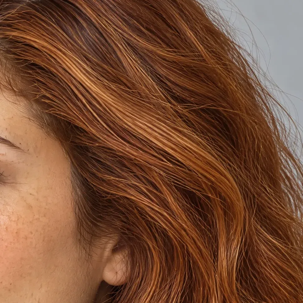
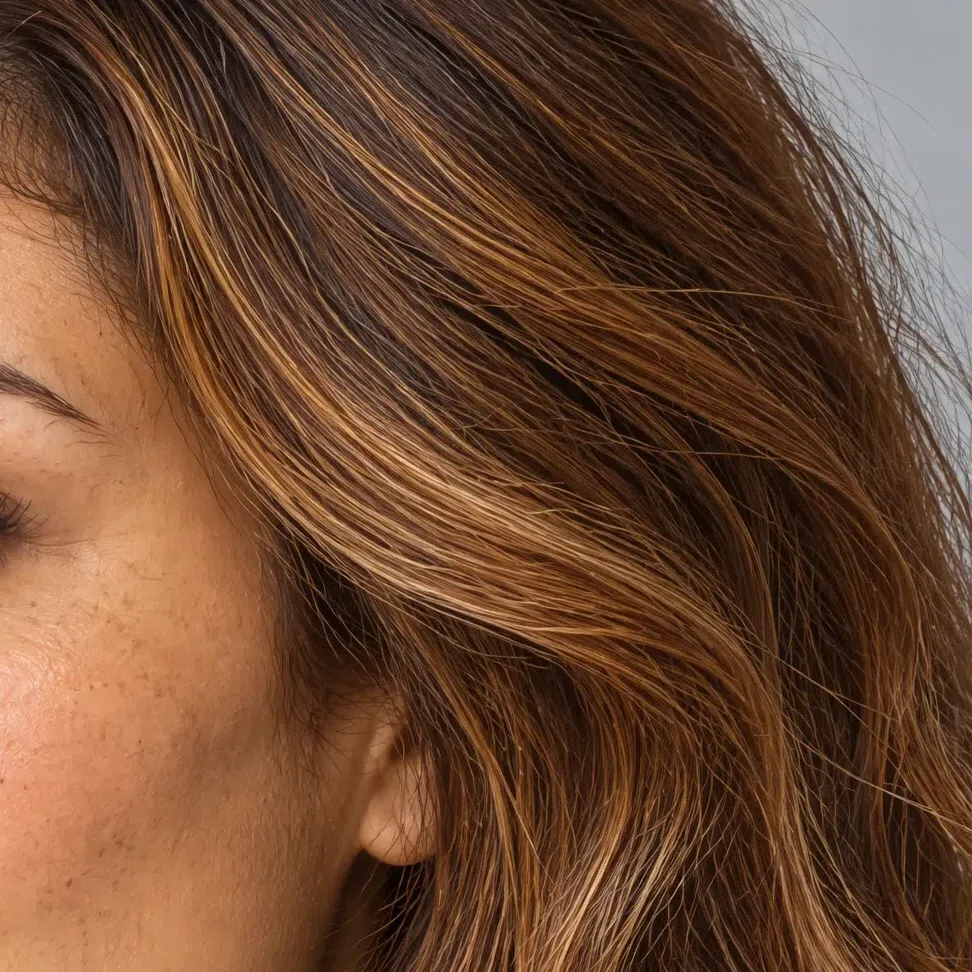
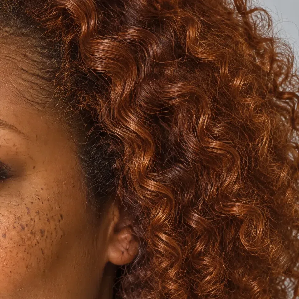
33. Hair: hold it to a window and something warm comes up
The depth varies enormously. The pigment underneath does not.
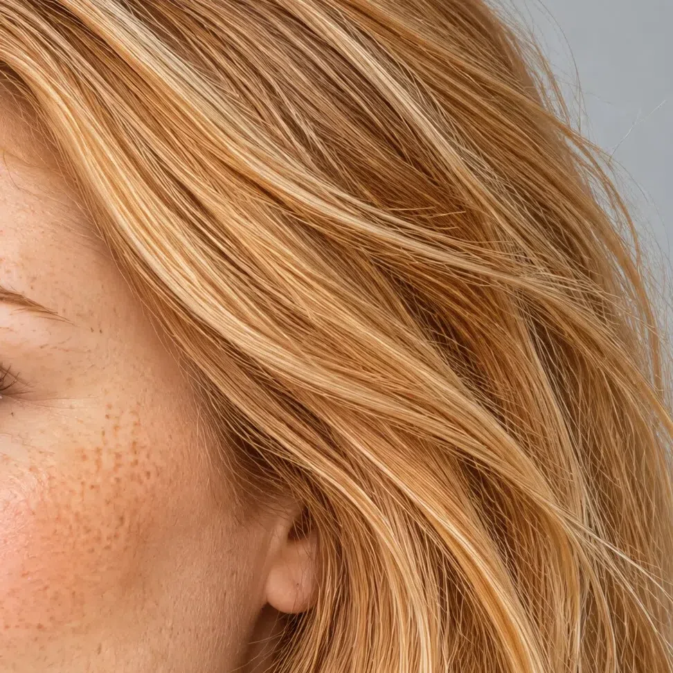
Indoors this hair can pass for plain blonde or plain brown. Take it to a window and gold, copper or ginger lifts out of it - a sheen with a color to it rather than a flat shine. The range runs from bright golden blonde through copper and warm chestnut to a deep red-brown, and the warm base survives all the way down.
Hair this warm also tends to move: fine strand-to-strand variation, lighter through the ends where the sun has been at it, so it reads as several tones rather than one.
Ash is the thing that settles it. An ashy, mushroom or smoky cast rules this season out no matter how bright the eyes are, and it is also the most common way people end up in the wrong column after a salon visit - a cool-toned gloss over warm hair reads as a summer for as long as it lasts.
No gold, copper or ginger anywhere in daylight means no spring, whatever the rest of the face is doing.
44. Contrast: real, and warm with it
Hair, brows and eyes each land a clear step stronger than the skin, so the features draw themselves instead of blurring together.
Light golden skin, hair several shades deeper, and an iris bright enough to hold its own against both - that spread is why this coloring can wear a shade at full volume and not be swallowed by it. Brows are usually defined and carry the hair color rather than fading out of it.
It is the step that separates this from the two springs beside it. A Light Spring has everything on one level and a Warm Spring keeps it gentle; neither face has a jump in it. If nothing in yours stands apart from anything else, you are on a neighbor's page.
What this is not is winter contrast. That one is cold and cut hard - black hair, an almost blue-white eye. Here the same distance is covered in gold, copper and clear color, which is why black itself still goes wrong: it adds a harder edge than anything the face actually owns, and the garment starts to look stronger than the person in it.
A visible step in grayscale plus gold in the hair in daylight - both, not one. High contrast on its own is just as true of Bright Winter.
- Stand at a window with a clean face, take a picture, convert it to gray. Look for a visible step between hair and skin, with the brows and lashes on the hair side of it. Everything collapsing into one gray points at Light or Warm Spring; hair dropping almost to black points at a winter.
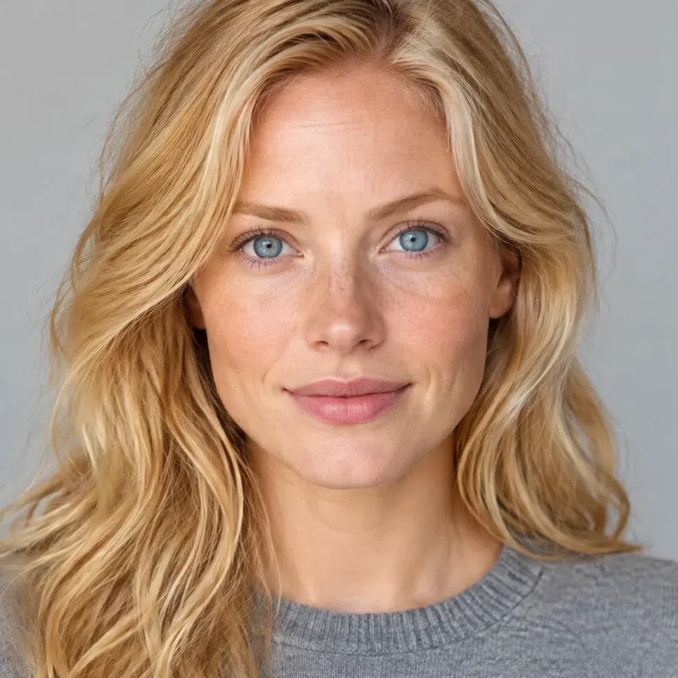
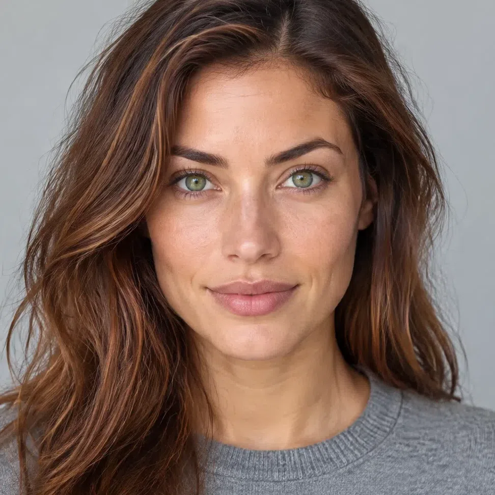
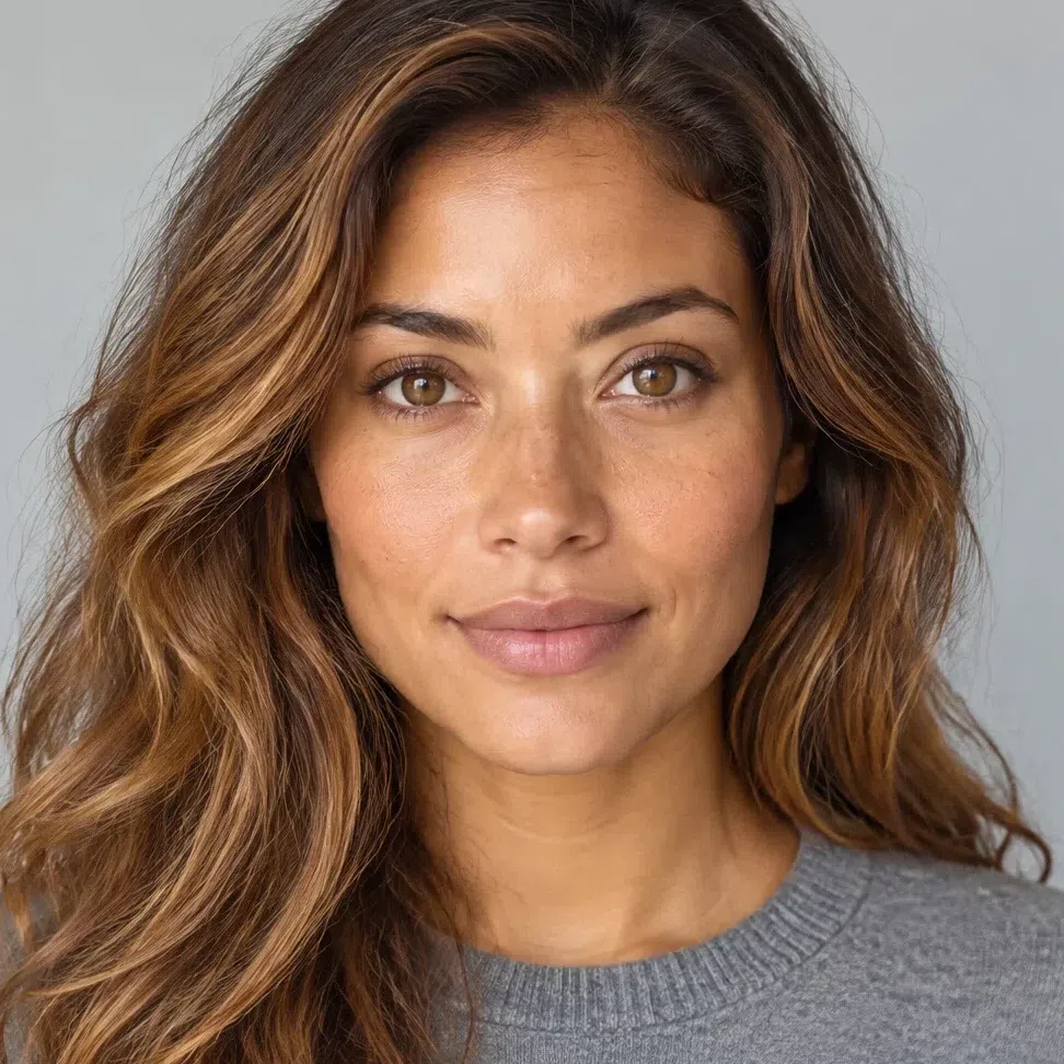
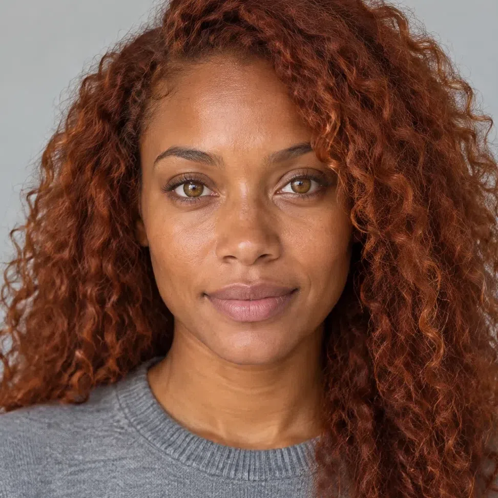
Here she is as photographed, and beside her the identical frame with the hue removed. Only lightness survives that, which leaves one thing to compare - and the distance between her hair and her face is suddenly hard to miss.
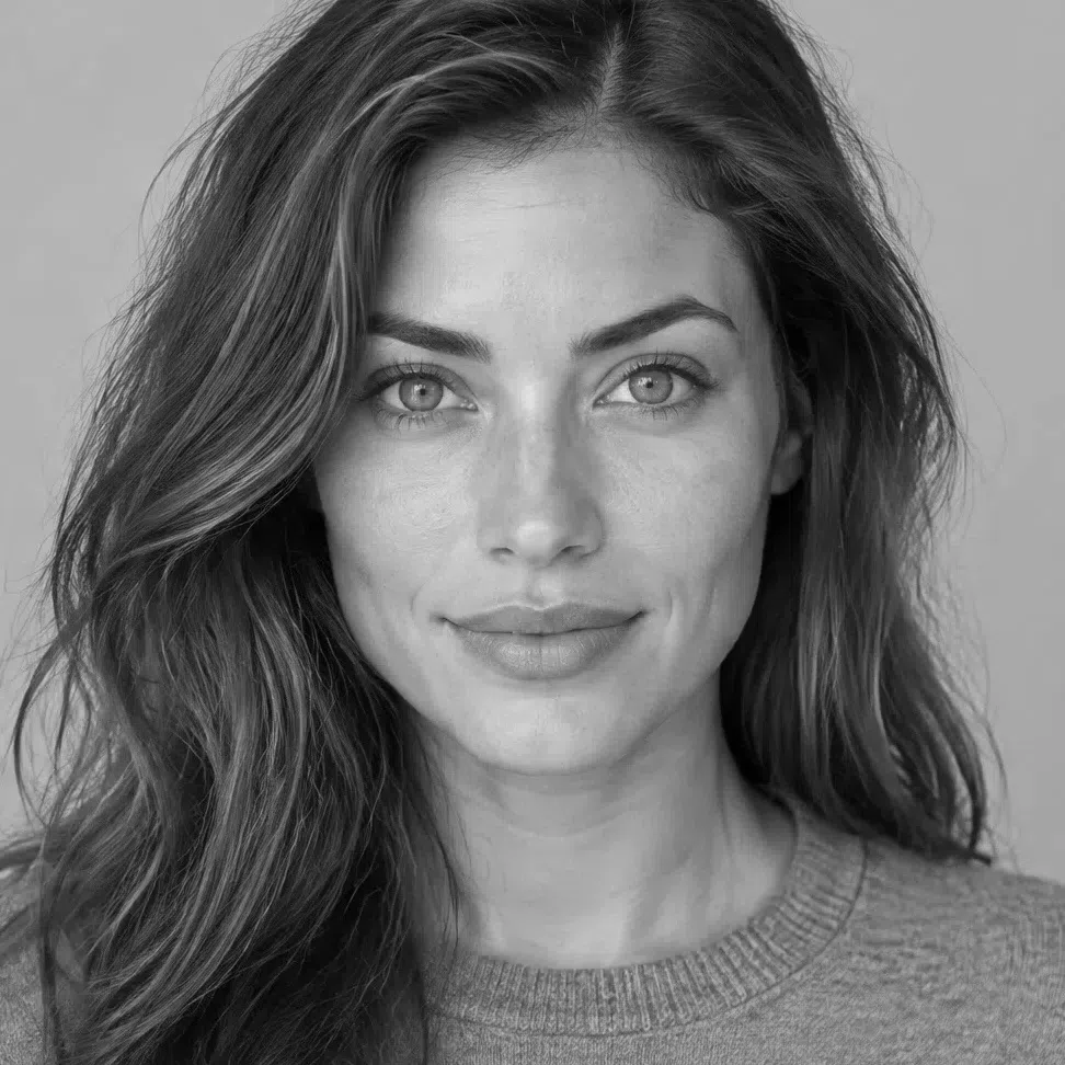
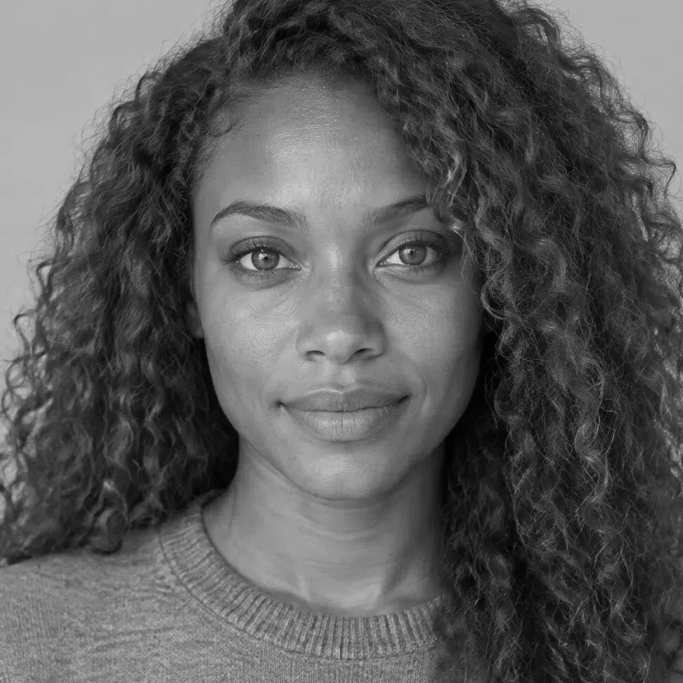

Hair Skin Ramp runs black to white
What matters is the distance between the two dots, not how high up they sit. Height is depth; distance is contrast - and the distance is not a score you can hold against another face. The deep portrait starts far lower and keeps its two dots just as far apart, which is why both women belong here, while the Light Spring shares the warmth and has barely any distance at all.
55. The fabric test: what happens at the collar
Four checks in and the answer is usually clear. This is the one that makes it obvious to anyone standing next to you.
Daylight, no makeup, a mirror, and whatever fabric is to hand - a scarf, a tee, a towel. Hold each one under your chin and watch the skin, not the cloth. The right shade evens the face out and brings the eyes up; the wrong one settles a shadow under the jaw and pulls the color out of the mouth.
Run the two rows below against each other and the pattern shows up quickly. The shades that work are not the safe ones - they are the loud ones, and the shades that fail are mostly the quiet, expensive-looking ones a shop assistant would hand you first.
Shades that switch the face on
If these clear the skin, take the tiredness out from under the eyes and make the iris read stronger, you are in the right column:
- Coral flame
- Peacock
- Dandelion
- Leaf green
- Hibiscus
- Ivory
Shades that put it out
Note that only two of these are dark. The other three are simply muted, and they do more damage here than the black does:
- Dusty pink
- Muted sage
- Slate gray
- Oxblood
- Jet black
Bright Spring vs Light Spring vs Warm Spring
The three springs share a warm undertone and clean color, which is why one person gets typed as all three in a year. The names are the way out: each spring is named for whichever axis dominates it, and here that axis is saturation. Naming note - some systems call this one Clear Spring, and Warm Spring True Spring; the columns are the same either way.
| Bright Spring | Light Spring | Warm Spring | |
|---|---|---|---|
| Leading axis | Saturation. Strength of color before anything else | Lightness. Pale before anything else | Warmth. Gold before anything else |
| Temperature | Warm with a neutral edge - the coolest-leaning of the three | Warm, softened toward neutral by its summer neighbor | Unambiguously warm, and the warmest here |
| Depth | Light to medium skin, with room for genuinely deep hair | Light throughout, nothing dark anywhere | Light to medium, sitting in the middle |
| Clarity | Maximum - color that rings and holds its full strength | Clean but diluted, as though light had been stirred in | Clean and rich, a step down from full strength |
| Contrast | Medium to high - a visible step between the features | Low - everything on one level | Low to medium - present, and gentle |
| Skin | Ivory through deep brown, always golden and always clear | Peach or warm ivory, staying pale | Plainly golden: golden beige through honey |
| Eyes | Vivid and outlined: turquoise, bright green, topaz | Light and watercolor: blue, aqua, soft green | Warm and deeper: hazel, green, light brown |
| Hair | Golden blonde through auburn, the pigment obvious | Golden, honey or strawberry, light at every point | Honey, copper, chestnut, red - rich rather than bright |
| Metals | Polished yellow gold, worn big, with bright stones | Pale yellow gold and rose gold, worn fine | Rich yellow gold, often matte or brushed |
Two columns still look equal? Stop reading down the table and go back to the first row. Ask what a stranger would notice about your coloring in one sentence - that it is vivid, that it is pale, or that it is golden. The first of those is this page.
What Bright Spring coloring looks like up close
Twelve photographs, four complexions, one coloring
There is no single Bright Spring face. The section above settles whether you belong here at all; this one is about how much variation the label actually covers. Twelve photographs - four cheeks, four irises, four natural hair colors, each on a different complexion. None of them has to look like you. Falling somewhere among them does.
Bright Spring skin: four places the gold shows
Four everyday situations where the undertone stops being a theory and turns into something you can point at.
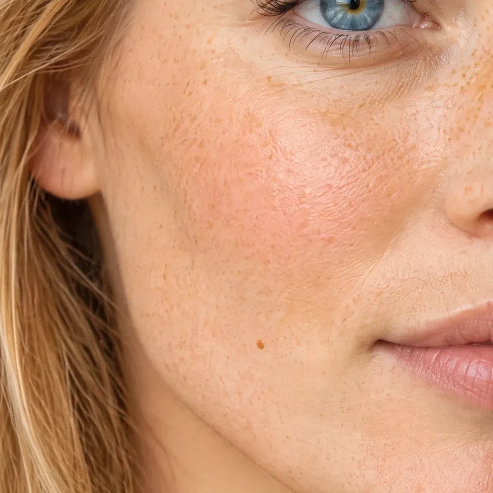
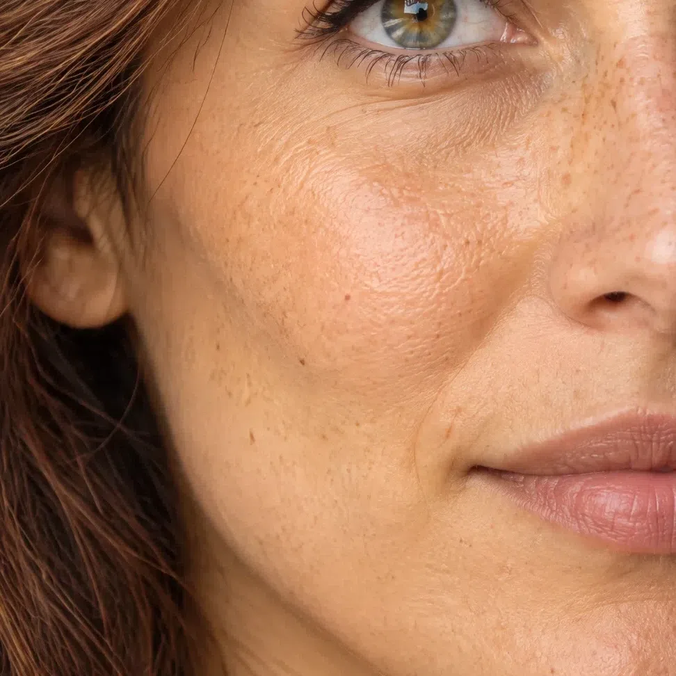
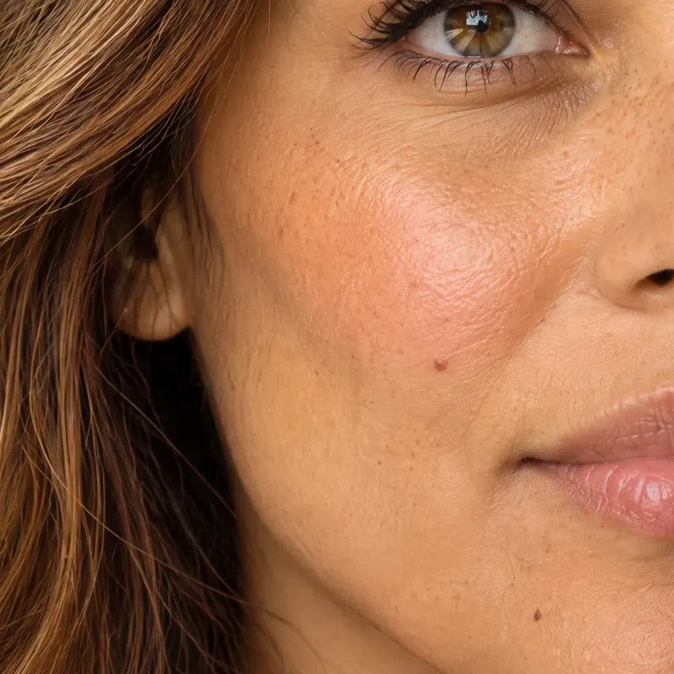
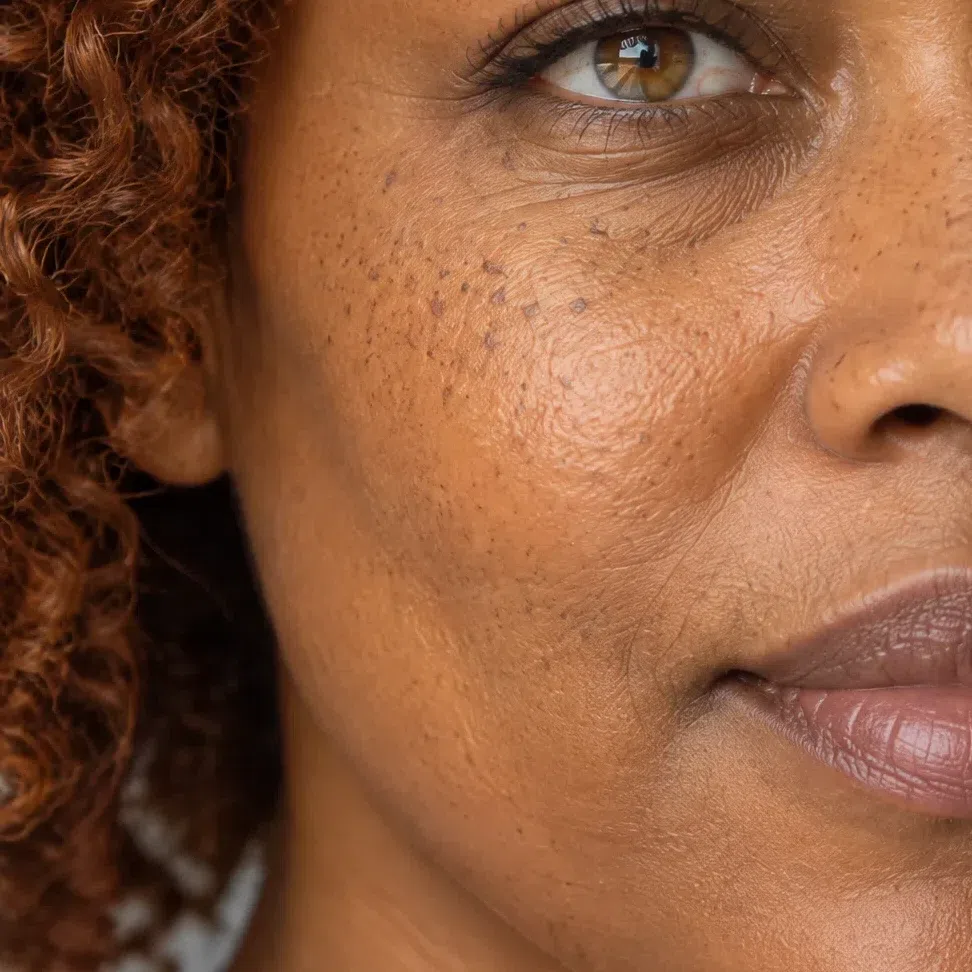
Yes, and it happens often. This season is a statement about the strength of your coloring, not the toughness of your skin - plenty of Bright Springs burn first and only pick up honey afterwards. What would genuinely rule you out is skin that turns gray or sallow rather than pink.
One thing worth taking into a shop: this complexion tends to run normal to dry rather than oily or coarse-pored. A heavy matte base never quite settles into it and ends up looking like a layer instead of like skin - a texture problem rather than a shade problem, and one that almost always gets blamed on the shade.
Bright Spring eyes: four colors, none of them muddied
These are not four depths of one color. They are four different colors, and the thing they have in common is what has been left out of all of them.
The four iris colors
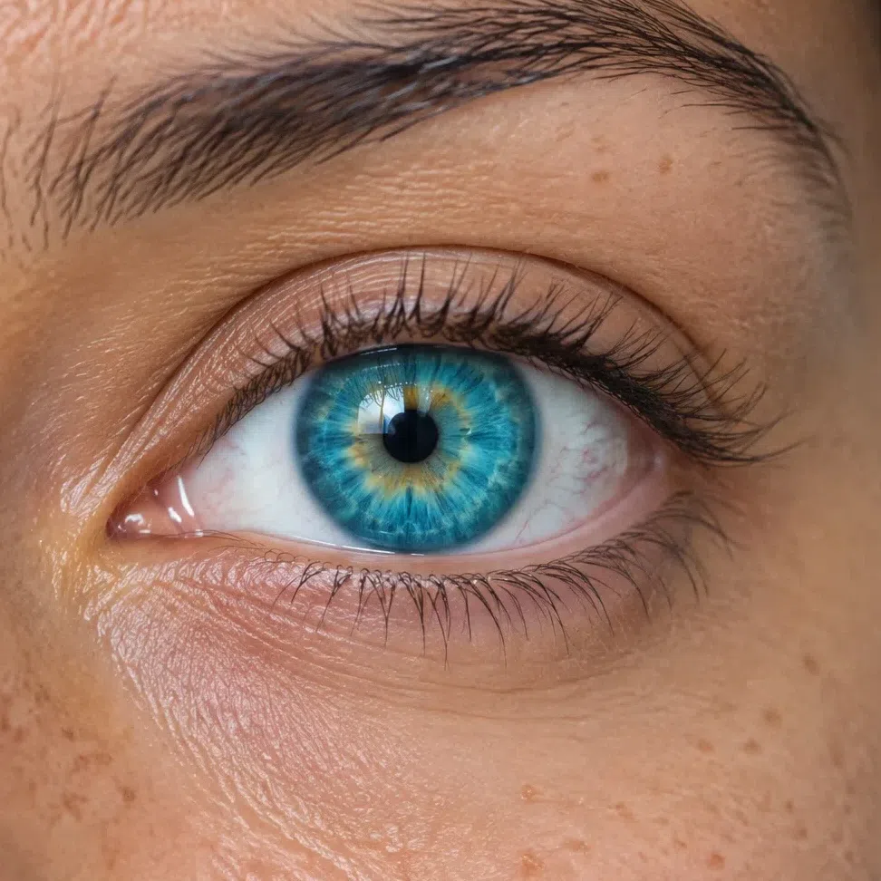
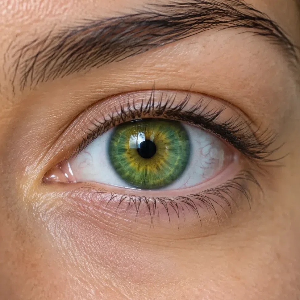
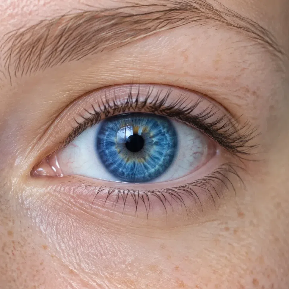
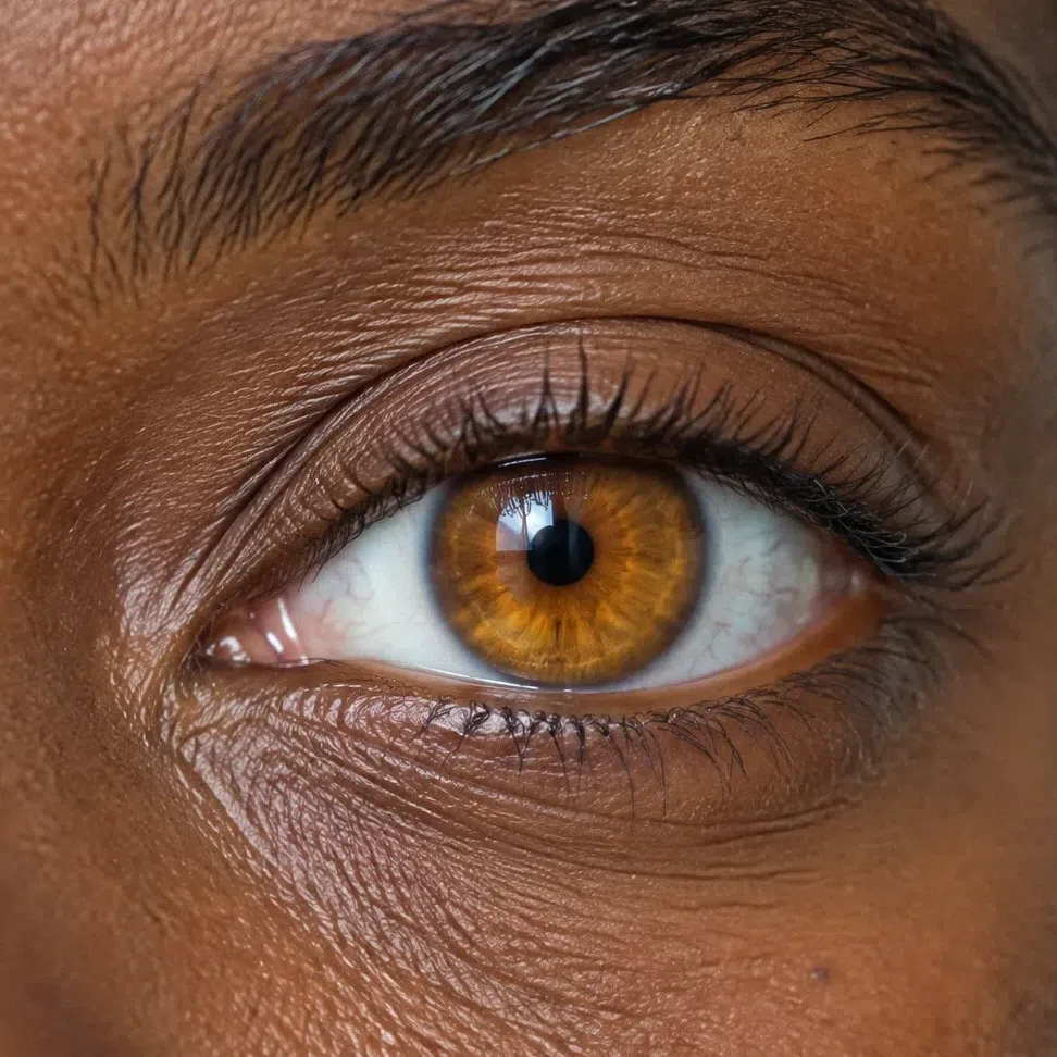
Four colors, one omission: there is no gray stirred into any of them. That is also why these eyes are so easy to spoil - put a muted shade near the face and the iris drops to the same register as everything else, which is the one thing it was never doing.
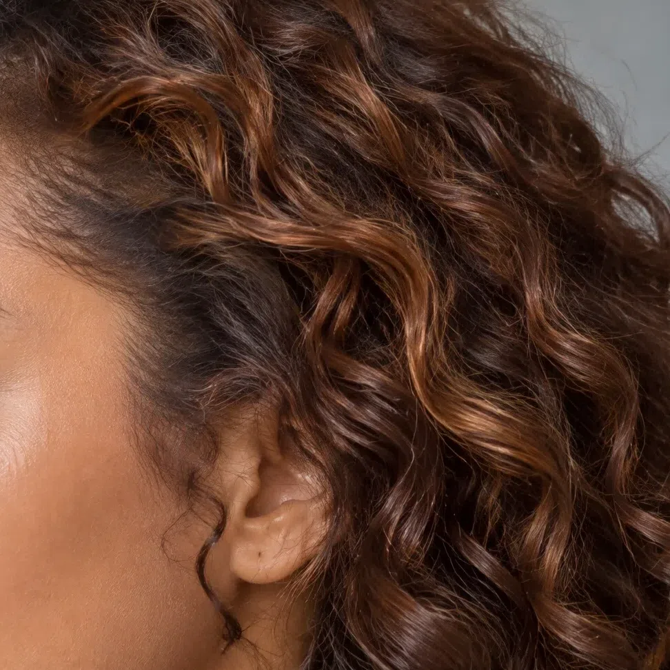
Bright Spring hair: one pigment, four depths
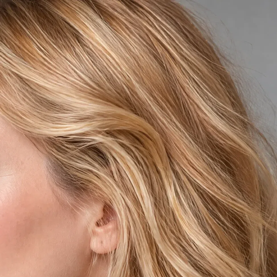
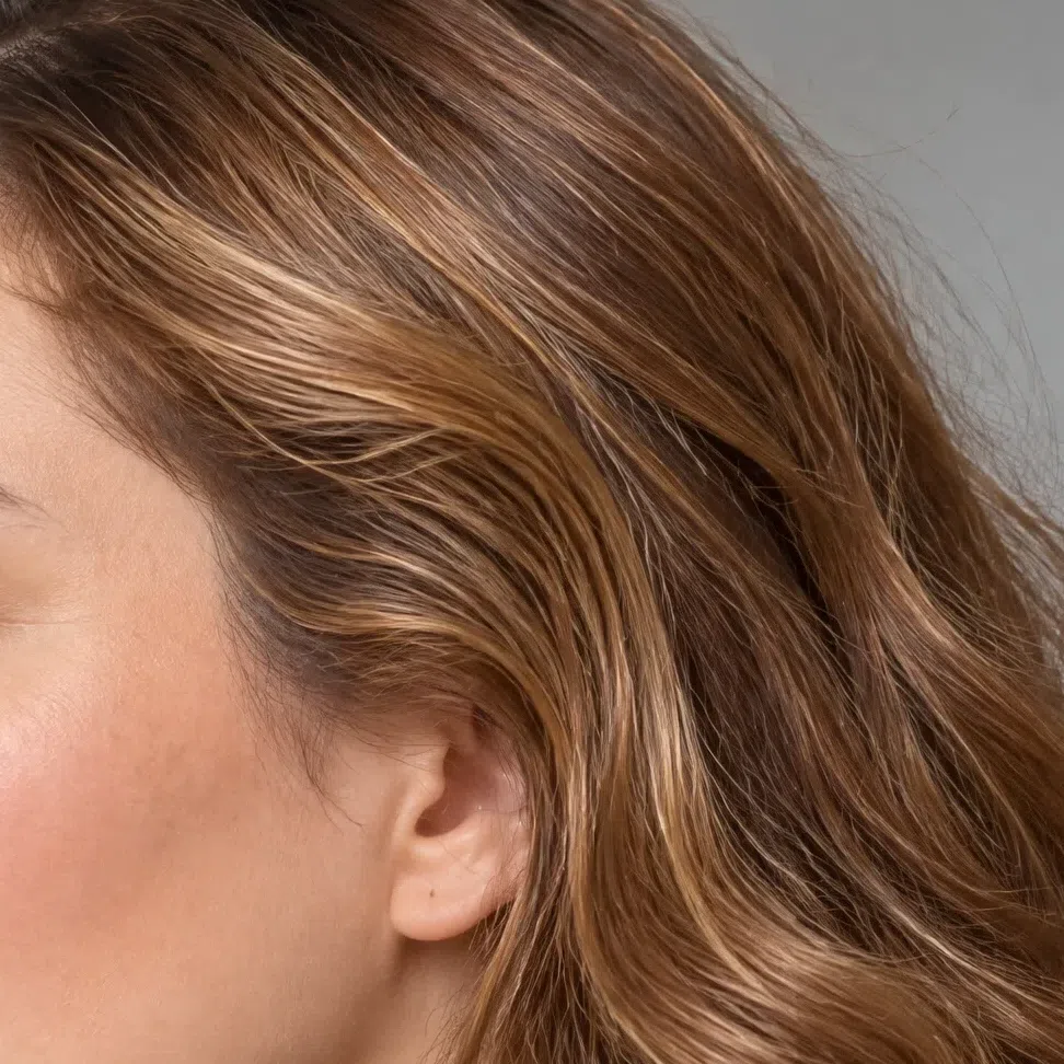
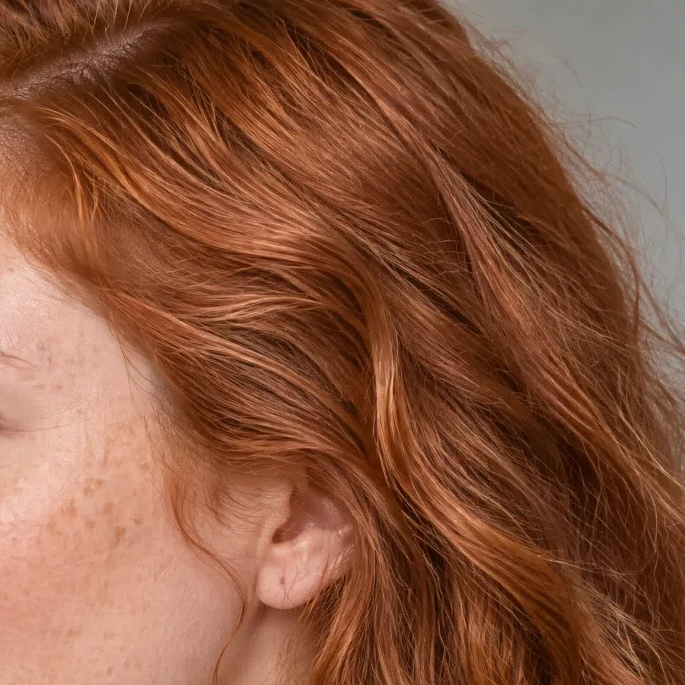
The level travels a long way, from wheat blonde down to a deep chestnut. The warmth survives the whole descent, and that is the part that matters.
The natural range, light to deep
What Bright Spring hair never is
- Ash or mousy. A gray or silvery cast at any level is out. Cool hair like that reads as a summer, and mistaking it is the commonest way people land in the wrong season.
- Blue-black. Natural hair here stops at a warm dark chestnut. Anything colder or deeper than that is pointing at a winter.
- Platinum. A cold near-white blonde fights the warmth in the skin and leaves the face looking drained beside it.
- Flat or dulled. Whatever the depth, this hair looks alive in daylight. A matte, one-note finish with no shift in it does not belong to this season.
One thing holds across all four: a warm base, and lights that move when the light does. Whatever you do on top of it, that base is the part to protect - everything else about a color appointment is negotiable.
The Bright Spring palette: 20 shades on a real face
What each one does to warm, clear skin
Late May at midday, not April: coral, tangerine, warm turquoise, the green of leaves that have just opened. What every shade here has in it is light; what none of them has in it is gray. They are strong without being heavy, because the strength comes from purity rather than depth.
Three rules run under all 20. Clear: given two versions of a color, the cleaner one is yours, every time. Warm: gold sits under the whole palette, the blues and the pinks included. Full strength: the volume that overwhelms most people is the volume that settles your face. And the trap, once: muted is what costs you here, never bright.
These are photographs rather than swatches. One Bright Spring model, her top repainted to whichever hex is printed under the card while every other pixel stays where it was. The comparison is therefore never between shades - it is between what each one does once there is a face above it.
Base colors: what the wardrobe is built from
The quiet half, and it is not the boring half. These are warm and clean rather than gray, which is what lets them sit under an accent without arguing with it.
Neutrals: the six the wardrobe rests on
These stand in for black, charcoal and optic white, which is what most wardrobes are actually built from. So never black? Not quite - it is fine anywhere below the waist: trousers, a skirt, boots, a bag. Where it fails is at your collar. Up there it turns into the strongest thing in the frame and takes over the job your own coloring was doing. Anywhere near the face, start with these instead.
How to put the six together
- Stack the warm ones light to dark. Ivory, Wheat and Camel in one outfit - sand-colored trousers, a cream shirt, the camel coat over both - reads expensive without a single color in it.
- Let them be the ground and nothing more. Wheat trousers or a Camel skirt exist so a Coral flame top has somewhere to stand. The neutral holds the outfit together and the accent takes every bit of the attention - that is the whole arrangement, in one sentence.
- Marine is your navy and it does the anchoring. Marine with Ivory is the crisp version of a dark suit: the contrast a business outfit needs, minus the weight black puts on the face.
- Keep the brown for hardware. Cognac in shoes, a belt and a bag strap does everything black usually does down there, and it agrees with the gold in your skin rather than cutting against it.
The four light shades, for right at the face
Everything in the palette turned down rather than grayed out. These are the ones to reach for when a full-strength accent is more than the day wants - a blouse, a knit, anything that sits under your chin all afternoon. Note what is missing: not one of them is dusty. Diluted with light is fine here; diluted with gray is the other list.
Accent colors: the reason this coloring exists
Ten shades at full saturation, the metals that belong with them, and four accessories to try the pairings on. Most people are told to stay away from this end of a palette. On this coloring it is the end that works.
The ten at full strength
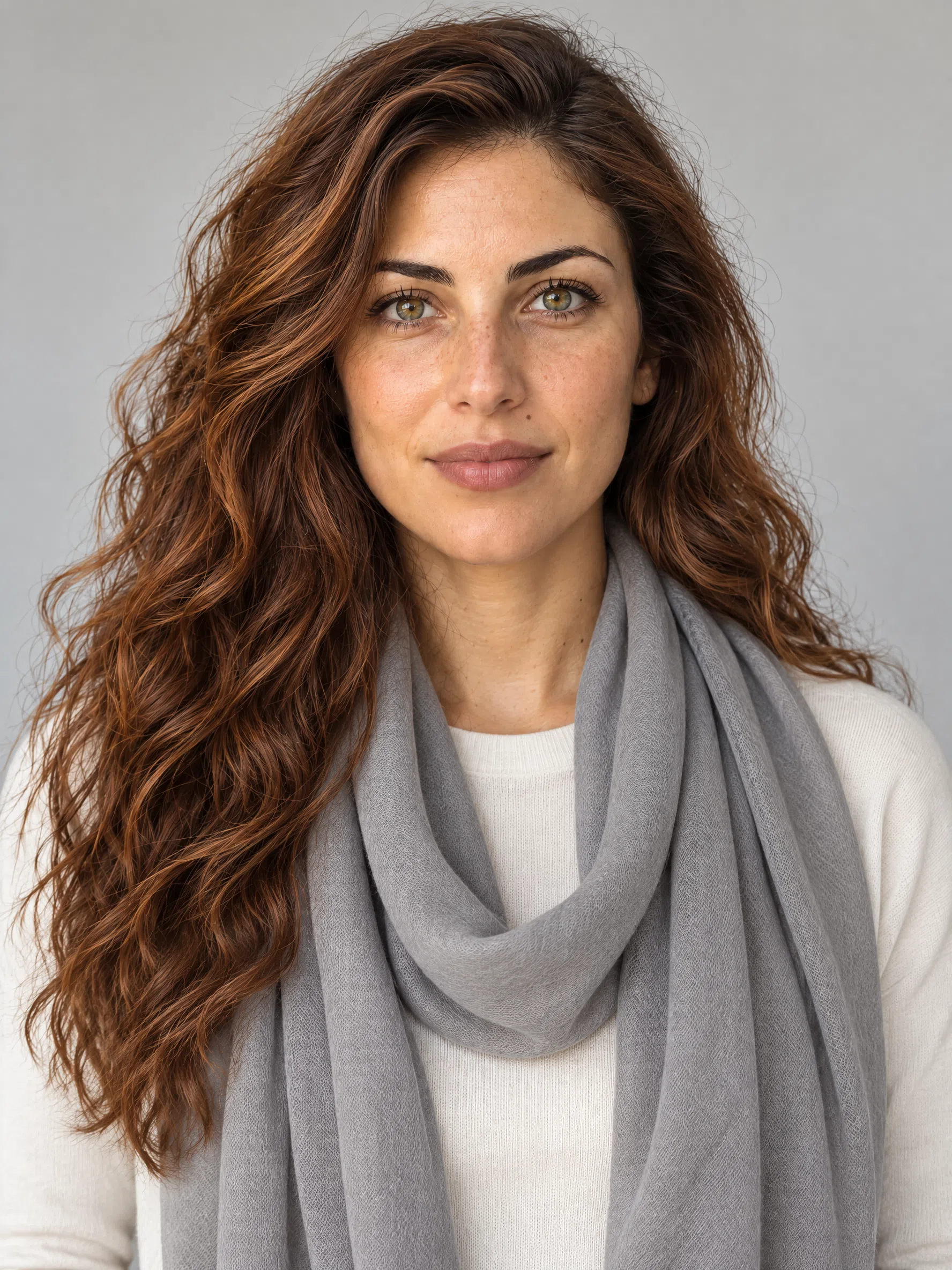
Shown on a scarf over a pale knit, because that is roughly the dose that belongs beside your face on an ordinary day. Not because they are too much - this is the one coloring that can take them - but because at sweater scale one of these has stopped being a detail and turned into the entire outfit. Further down, at skirt or coat size, wear them as large as you like.
Metal and finish
Two metals, and no real contest between them. Warm metal echoes gold the skin already has; cold metal argues with it, and the skin loses that argument. Beyond temperature there is one instruction: go bigger than feels sensible. Against this much natural color a fine chain simply disappears.
Stones and enamel
- Turquoise, coral and bright enamel. The stones that belong here are the ones that behave like your accents: clear, saturated and warm. Large turquoise earrings or a coral collar do more for this face than anything discreet.
- One strong piece beats three small ones. Scale is the point. A single wide cuff or one big pair of earrings reads as deliberate; the same weight of gold split into three delicate pieces reads as nothing at all.
Small doses: what a hat, a scarf, a bag and a kerchief can each get away with
Tap a pairing: the knit takes a neutral and the accessory takes a color, both in the same move. Distance is the rule underneath it: a piece hanging well clear of your face can carry more color than one at your throat, which is why the hat and the bag draw the loudest shades here.
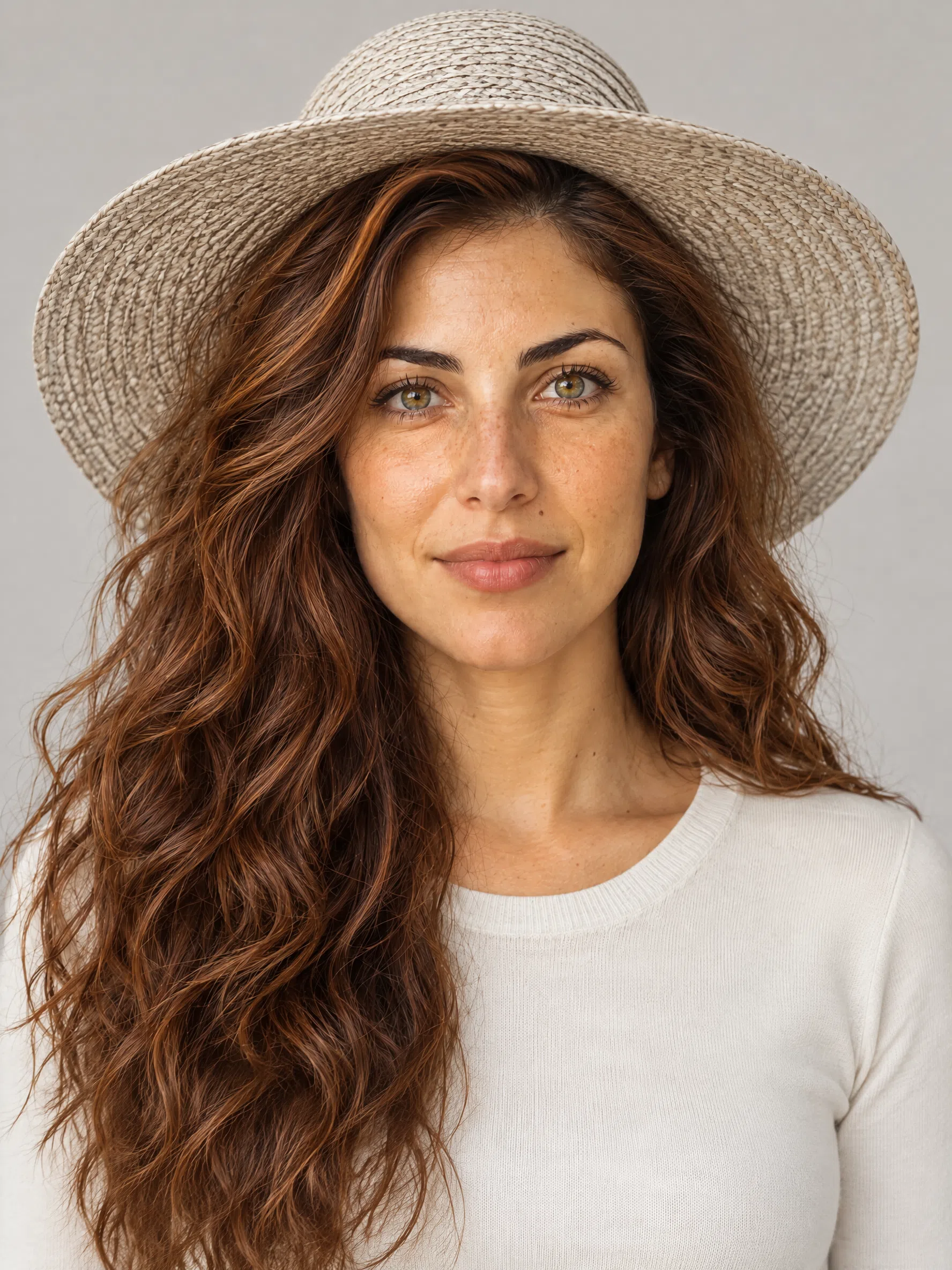
Hat
Nothing sits further from your skin than a hat, which makes it the right home for the loudest shades here - whatever is up there cannot reach your face.
Scarf
A scarf sits right at the face and works as a second source of color after your skin. The lighter half of the palette is easier here: it freshens without pulling attention off the eyes.
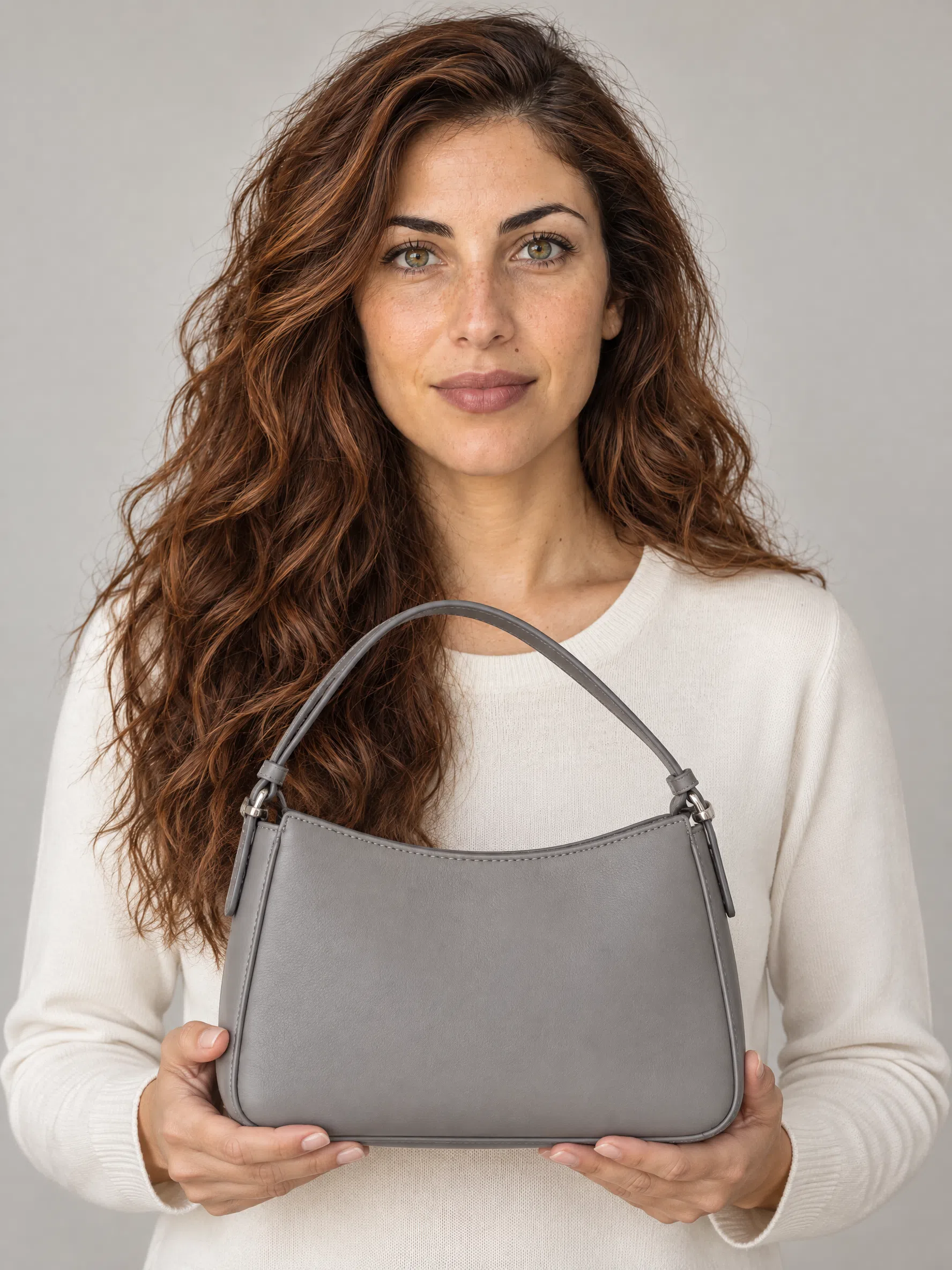
Bag
The most saturated thing you own is safest here. A bag hangs well away from the face and alters nothing about the way the skin reads.
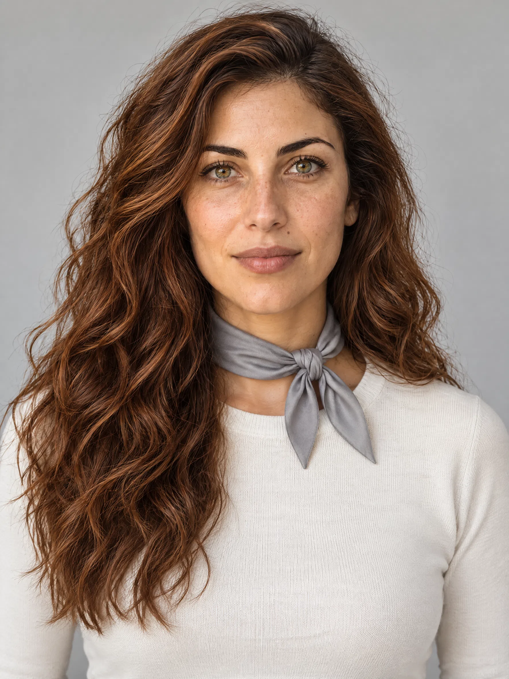
Neck scarf
A kerchief is closer to your face than anything else here, which on this coloring is an advantage rather than a risk. Clean strong color at the throat is what the whole face is built to take.
Colors to skip, and what to wear instead
11 shades in 3 groups, each one with a replacement from the palette above. Read the groups rather than the list: each one fails for a reason of its own, and once you know which reason applies you can rule on a shade that appears on no list anywhere.
Dusty and muted shades
The list that surprises people, and the one that matters most. These are not dark and several of them are expensive-looking. They are simply diluted with gray, and there is no gray in your face for them to meet.
Why these do not work
- Your face has no gray to answer them with. A muted shade is a color mixed with gray. Put one beside skin that carries none and the gray is the only thing with nothing to echo it, so it settles on the face instead.
- Muting flattens the one axis you win on. Everything else about this coloring can be matched by a neighbor. Saturation cannot. A dusty shade quietly removes the property the whole season is named after.
- It reads as faded rather than soft. On a muted coloring these look refined. Here the eye reads them as fabric that has been washed too many times, and it transfers that reading to the person wearing it.
Cold, icy and steely shades
Bright is not enough on its own. Each of these is clean and strong, and each one is built on blue where your skin is built on gold.
Why these do not work
- Blue under the color fights gold in the skin. Two opposite undertones in one frame and the eye picks a winner. It is never the face.
- They bring redness forward. A cool cast makes any pink in the skin more visible - broken capillaries, a healing spot, the flush after a walk. Warm shades bury the same thing.
- The gray under the cool ones doubles the damage. Three of these four are cool AND muted. They fail on temperature first and then fail again on saturation, which is why they look worse than either group alone.
Black and the heavy darks
Less catastrophic here than on the lighter springs - your contrast can carry more weight than theirs. Still wrong, and for a reason worth knowing.
Why these do not work
- The garment outweighs the person. Your own darkest element is a warm chestnut. Put true black beside it and the fabric is the heaviest thing in the frame, so that is where the eye stops.
- Weight is not the same as strength. These get chosen because they feel strong, and this coloring genuinely does want strength. But black is strong through darkness and you are strong through saturation - swap one for the other and the effect inverts.
- You can carry it, which is the trap. A Bright Spring wears black better than a Light or Warm Spring does, so it never looks like a disaster. It looks slightly tired, every time, and that is harder to notice than an obvious mistake.
Putting them together
Five outfits built only from shades above, in the order you would actually get dressed.
Five combinations that already work
Each row is written the way you would actually put it on - the large piece, then the layer, then whatever is carrying the color.
Noon sun
An Ivory dress or shirt with one Coral flame piece against it. The simplest pairing on the page and the one to try first if nothing else here is obvious.
Tropical duo
Peacock and Dandelion together - a turquoise knit, a yellow bag. It is a bold pairing and almost no other coloring can hold it, which is exactly why it is here.
Warm classic
A Camel skirt with a Chili sweater. The everyday working outfit: one neutral doing the structure, one red doing all the talking.
New growth
Leaf green, Ivory and Marine in one outfit - green trousers, an ivory shirt, a navy jacket. Three shades, not one of them muted, and it still reads as normal clothing.
Watermelon note
Hibiscus against Wheat: a pink top over sand-colored trousers. This is your version of fuchsia with gray, and it is the better-looking of the two by a distance.
The rule the five are examples of: one neutral to build on, one shade at full strength, and nothing in between hedging. Contrast pairs are easier for you than for almost anyone, so both halves of a pair can run at full volume - what does not work is turning one of them halfway down.
The Bright Spring capsule: eight pieces
Warm neutrals underneath, clean color on top
Here the palette leaves the page and becomes a closet. The base is the warm neutrals - Camel, Wheat, Ivory - and over them go the shades that do the actual work: Coral flame, Peacock, Dandelion. Eight pieces, chosen so that no two of them fight.
All eight appear on four different complexions, fair through deep, because this season is set by undertone and saturation rather than by how light the skin is. One model in all thirty-two photographs would quietly argue the opposite.
Eight pieces that cover most of a year
Four neutrals to build on and four pieces carrying color, which is roughly the ratio that works for a coloring this saturated. Under each garment: the shades to look for, with the hex, so a photograph in a shop listing can be checked against something.
Every one of the eight is here on a color decision: this is the Bright Spring palette turned into clothes. How capsules work in the abstract - the smallest number of pieces that still dresses you, and the order to buy them in - belongs to a different page than this one.
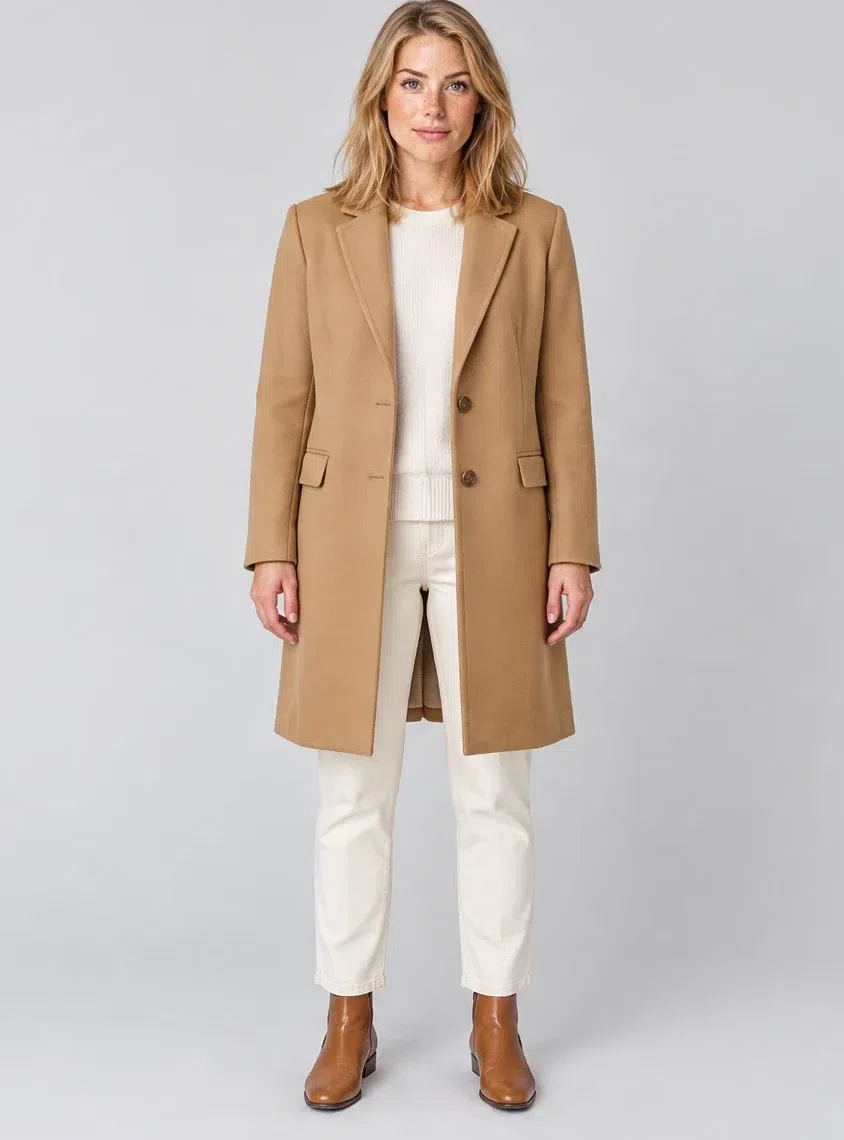
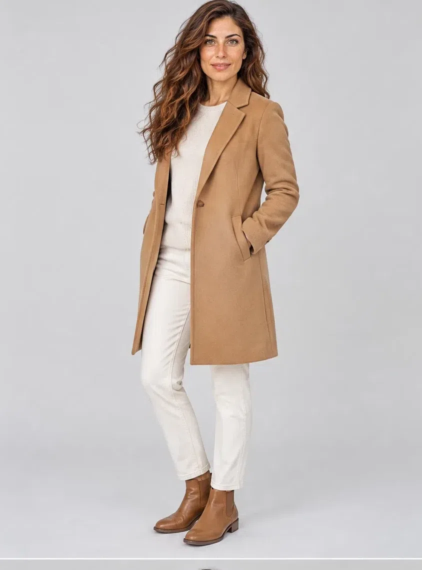
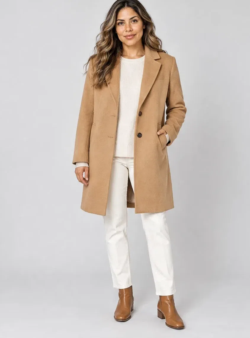
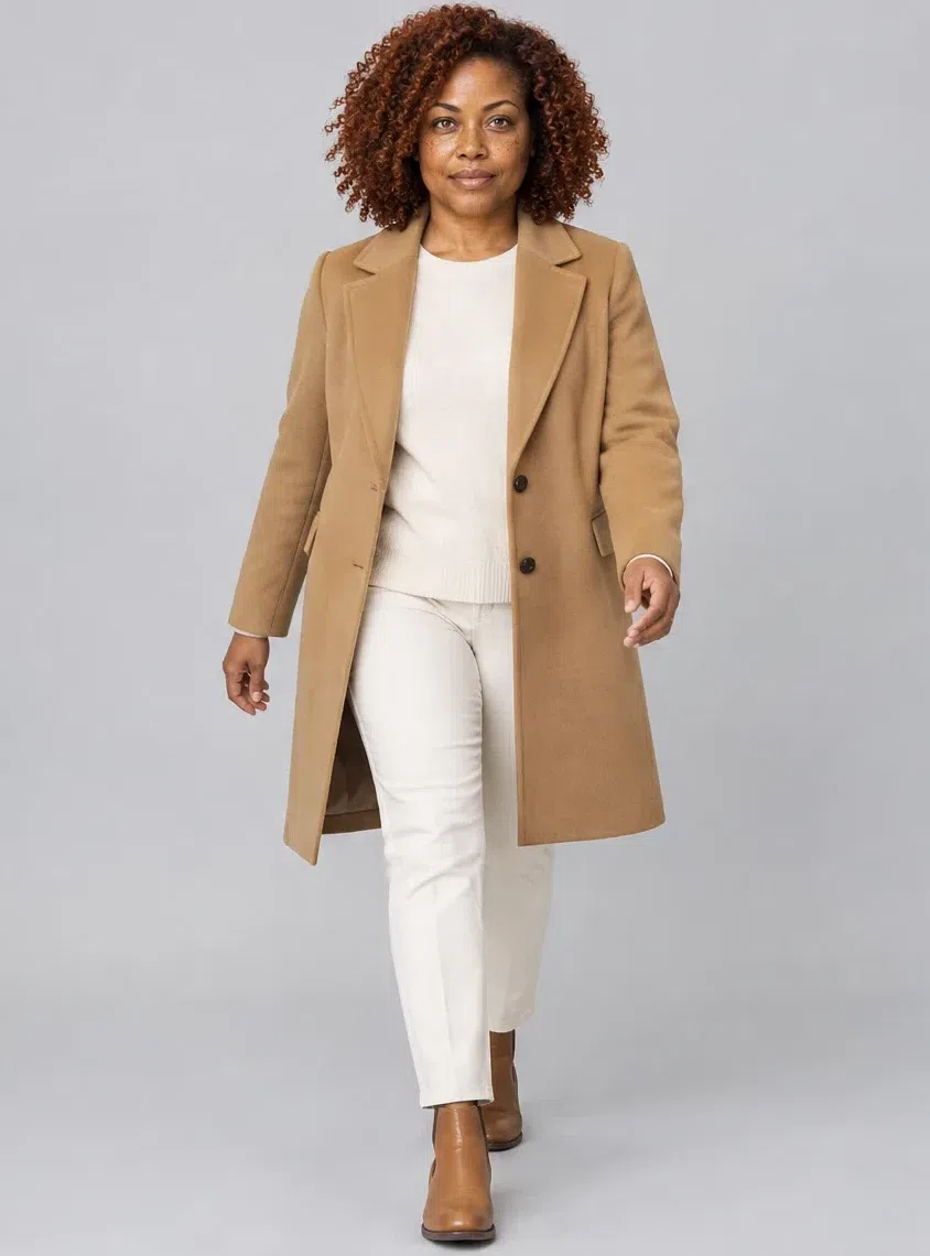
1Camel wool coat
Whatever goes under it has to agree with it, which makes this the piece to settle first. To the knee, cut straight or with a light shape, in soft wool, cashmere or a good tweed. Skip the gray-beiges sold as the safe neutral - beside golden skin they turn the complexion grubby, and safe is not what this coloring is short of.
Tip Gold hardware and a Coral flame scarf, and it carries every outfit you own from March to November.
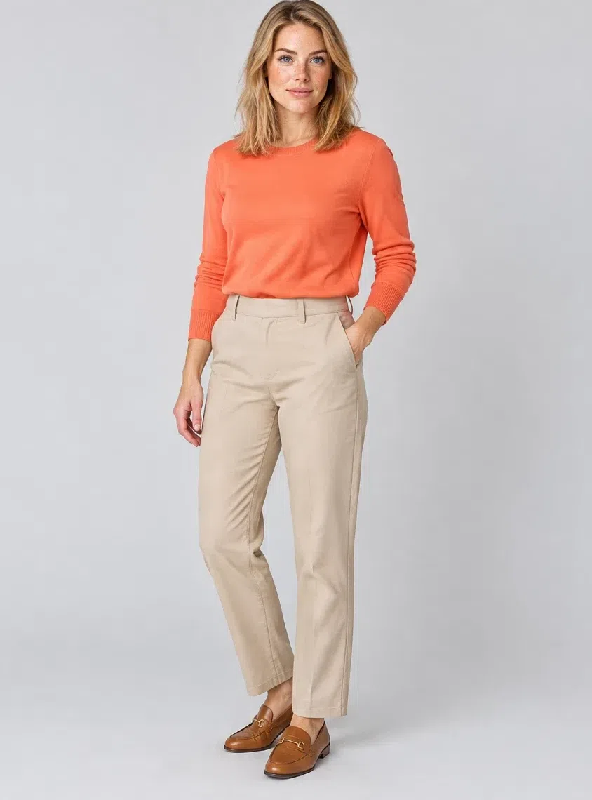
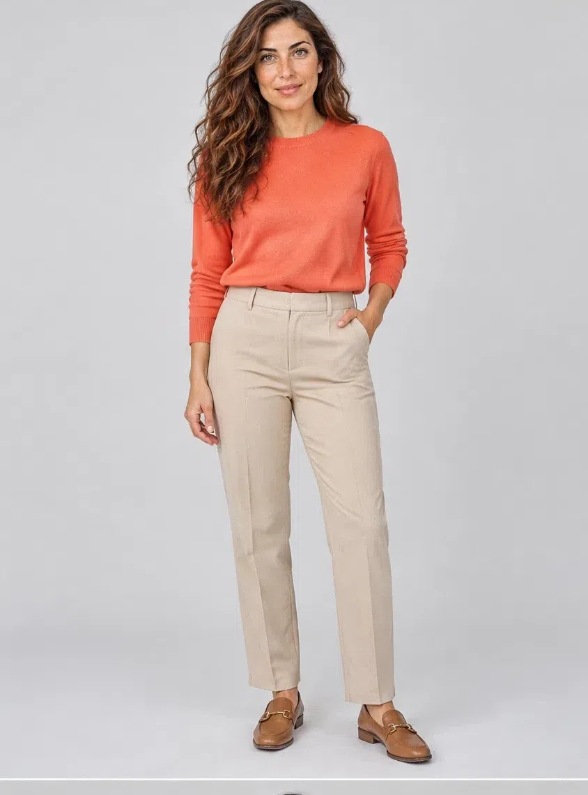
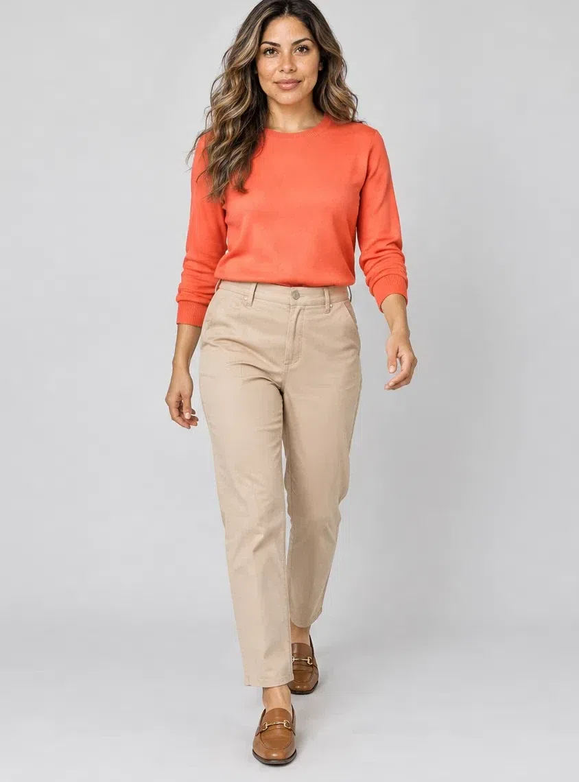
2Coral flame merino sweater
If one garment in this list is non-negotiable it is this one. Fine merino, cashmere or a cotton-silk blend, fitted or loose - the cut is yours to choose and the color is not. It has to arrive at full saturation, because a coral that has been toned down for general use is exactly the shade that does nothing here.
Tip Over Wheat trousers or a Camel skirt: loud at the collar, quiet from the waist down.
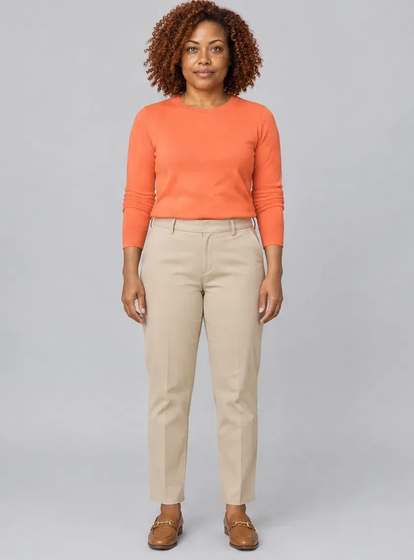
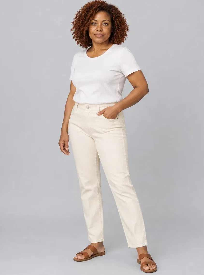
3Ivory straight-leg jeans
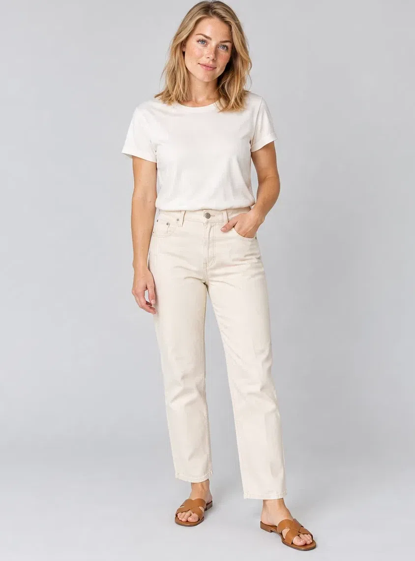
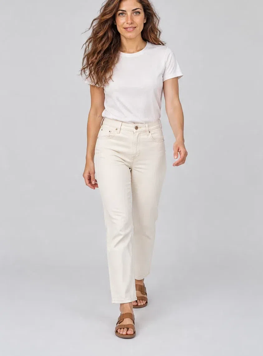
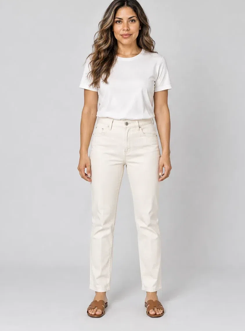
White denim with warmth in it, which in practice means buying ivory or cream rather than white. Straight or lightly tapered, nothing distressed. The cold blue-white version is the one every shop stocks and the one that puts a hard line across your hips.
Tip The most useful base in the list: every accent above pairs with it, and Camel finishes it.
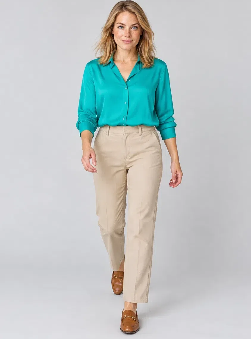
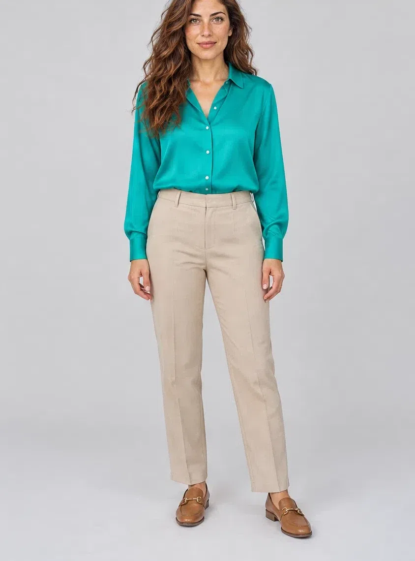
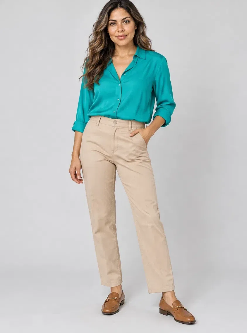
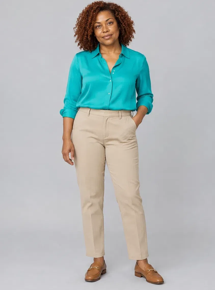
4Peacock silk blouse
Whatever color your eyes happen to be, this is the garment that flatters them most. Silk, chiffon or fine cotton, cut loose and shirt-like or fitted with some detail at the front. Full-strength turquoise is hard to find and worth the hunt; the watered-down version is everywhere and is not the same garment.
Tip With Wheat trousers and big gold earrings it is an office outfit that is not a gray one.
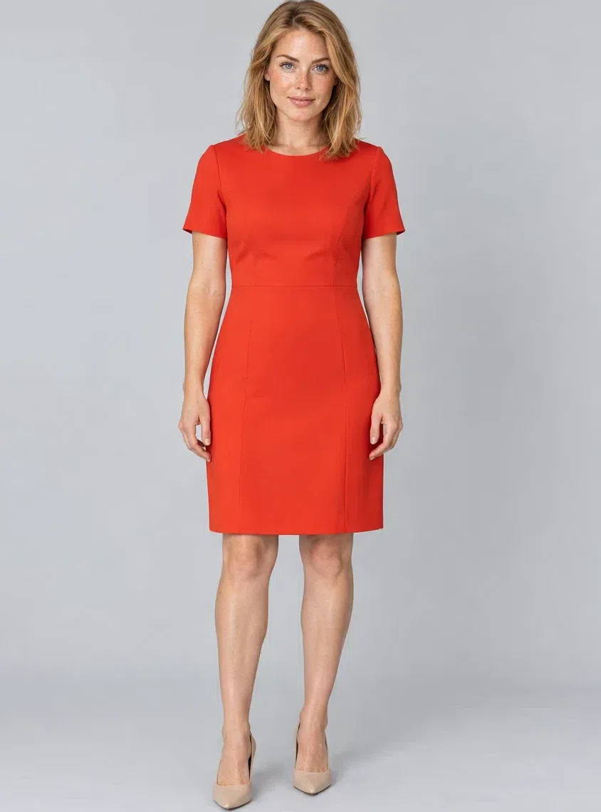
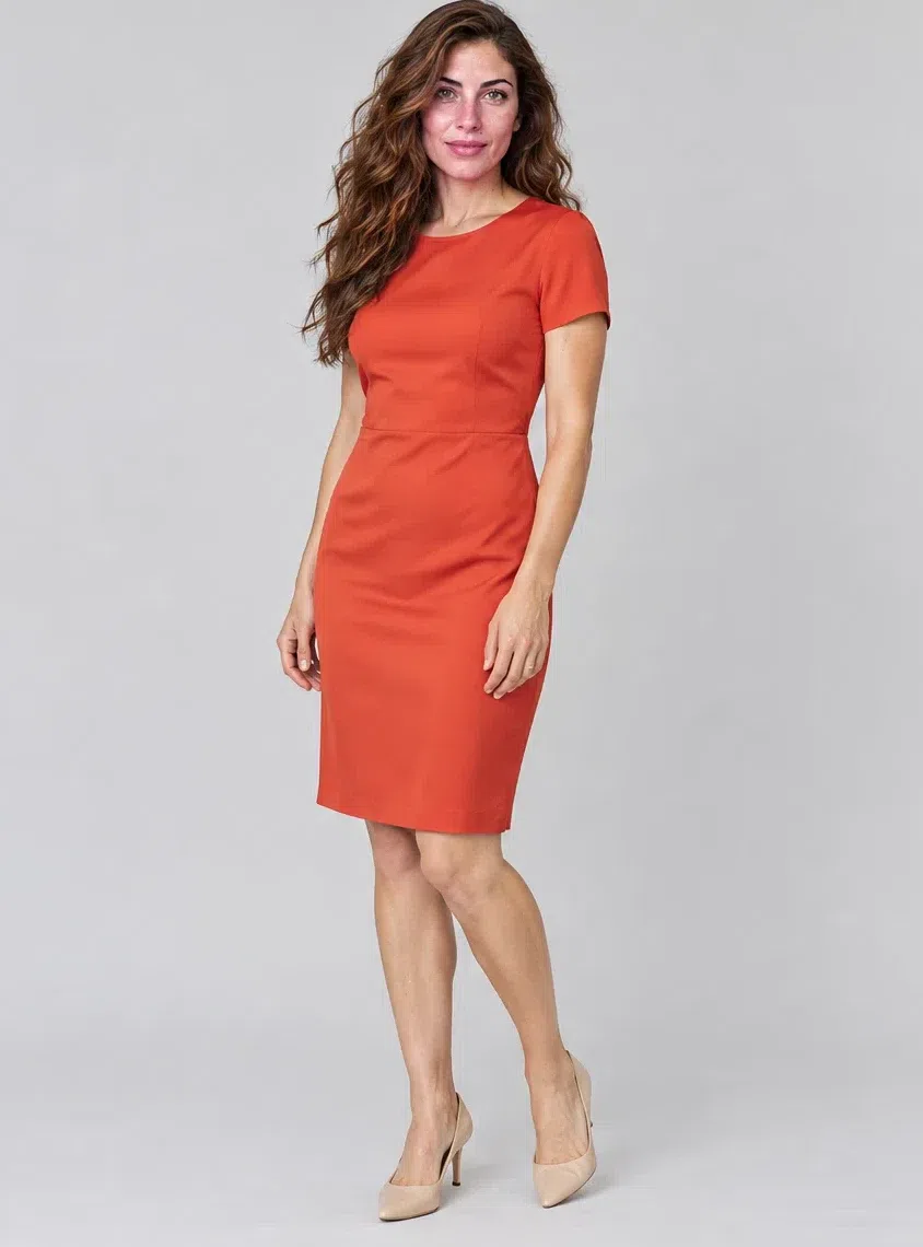
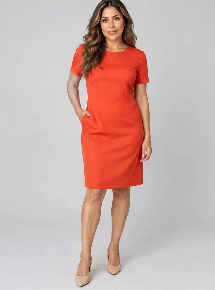
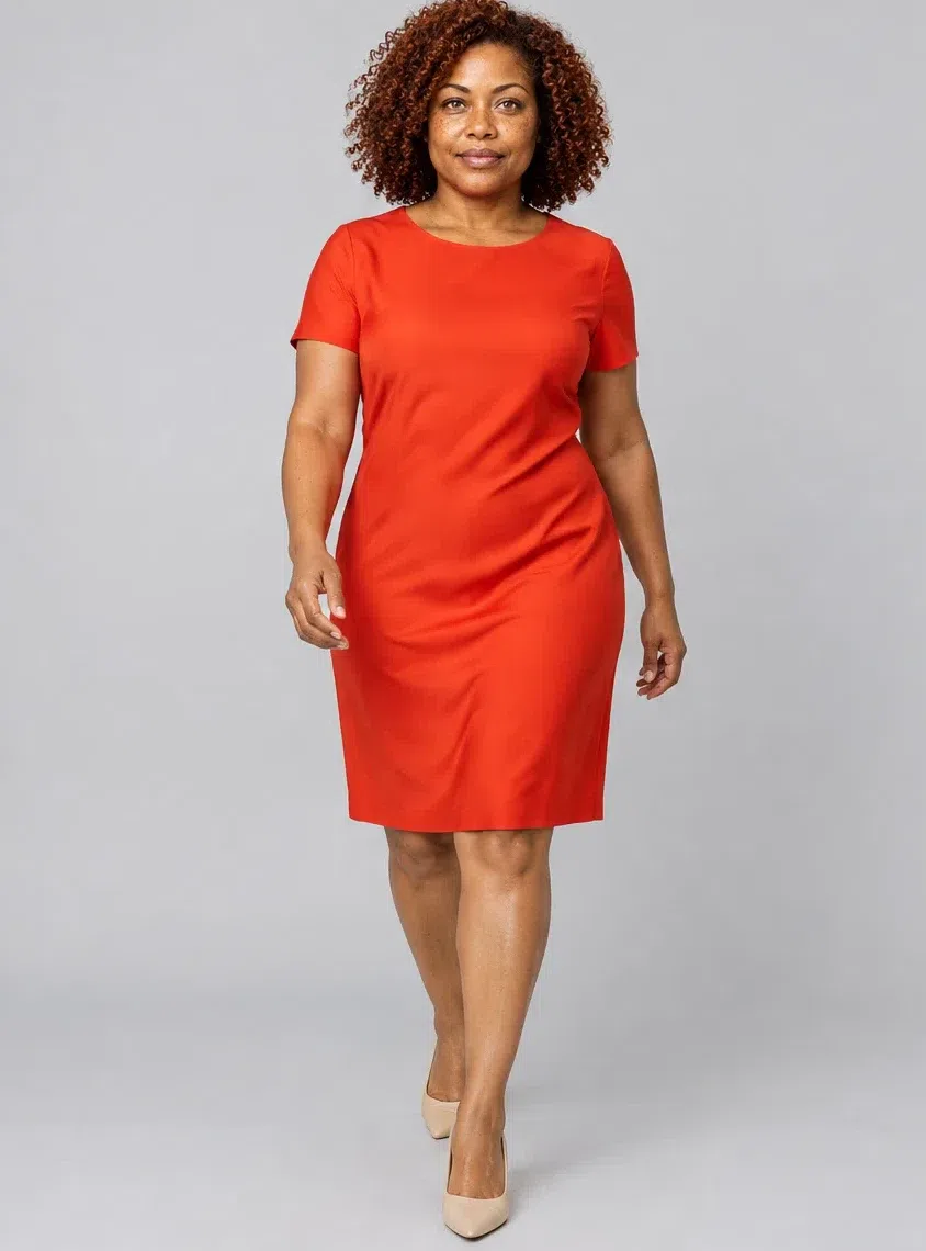
5Chili sheath dress
One dress that covers a desk, a dinner and a wedding. Fluid silk, satin or a cotton with some stretch, cut close but not tight, knee length. A warm ringing red rather than a wine or a blue-red - the difference is obvious the moment both are held up together.
Tip Nude or tan shoes rather than black ones; black at the foot re-weights the whole outfit.
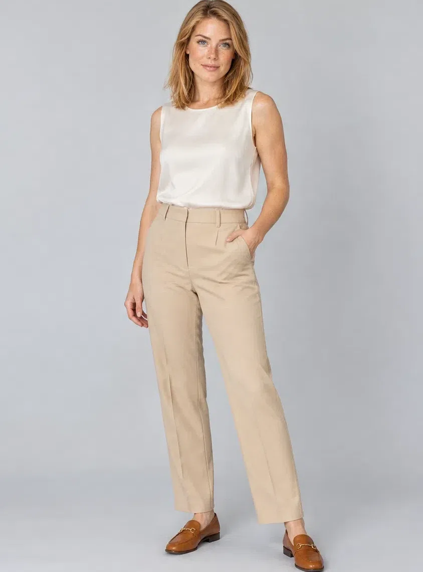
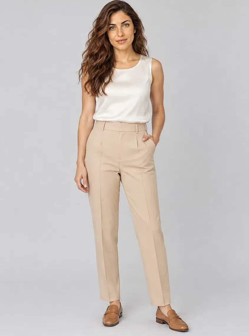
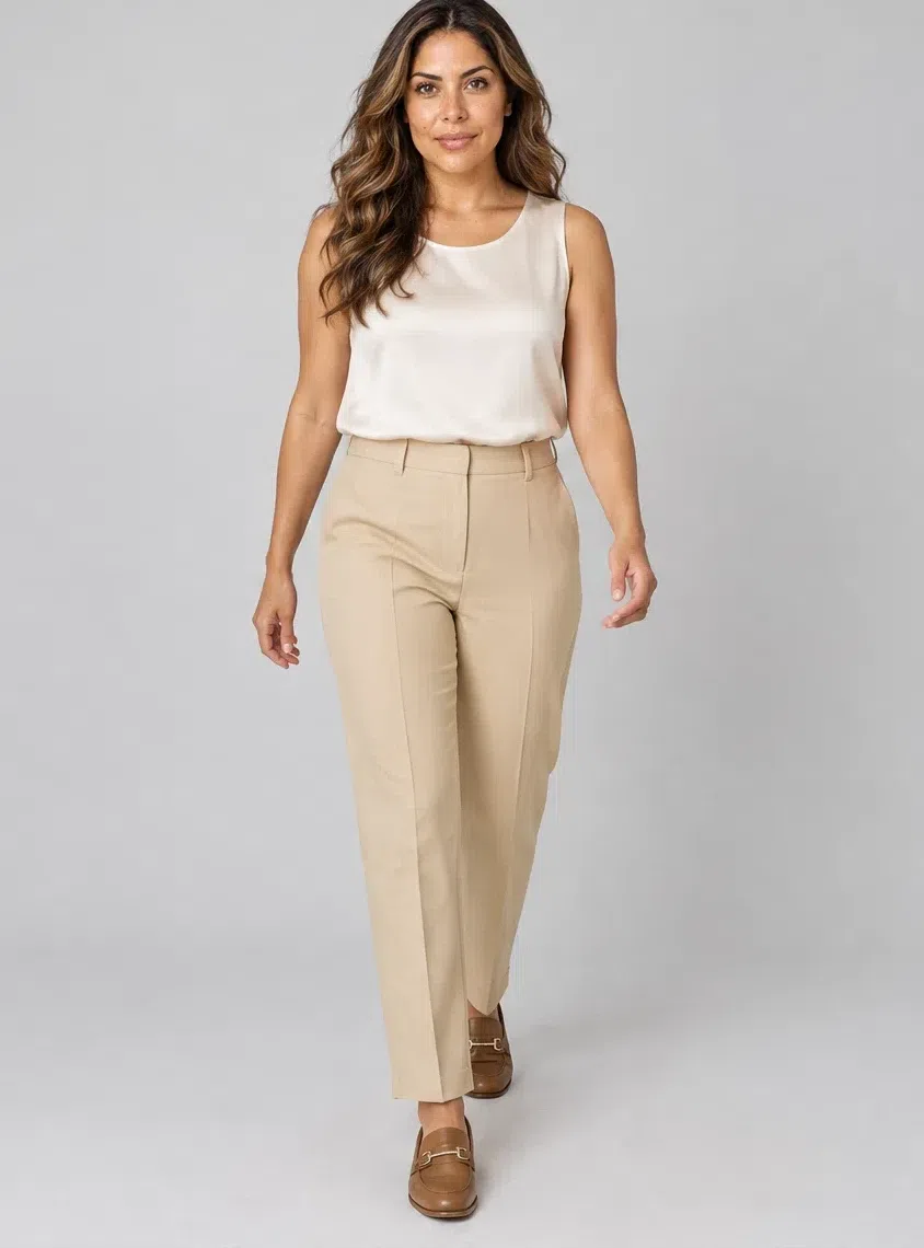
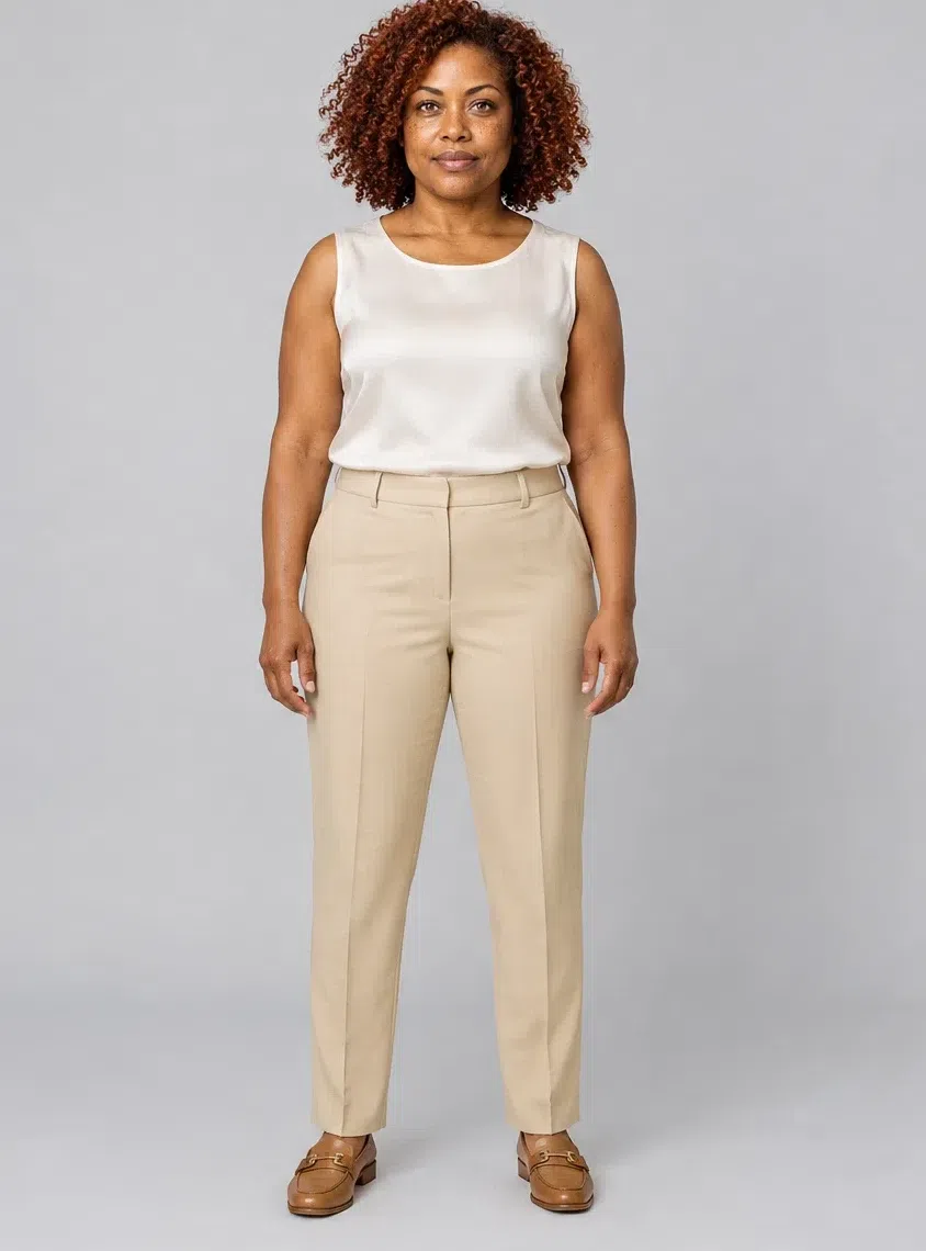
6Wheat tailored trousers
The workhorse. Straight or slightly flared, pressed, in wool, tweed or a structured cotton. This is the shade that lets a Peacock blouse or a Coral flame knit be the only thing anyone remembers about the outfit.
Tip Two pairs if the budget allows - one Wheat, one Camel - and the top half never repeats.
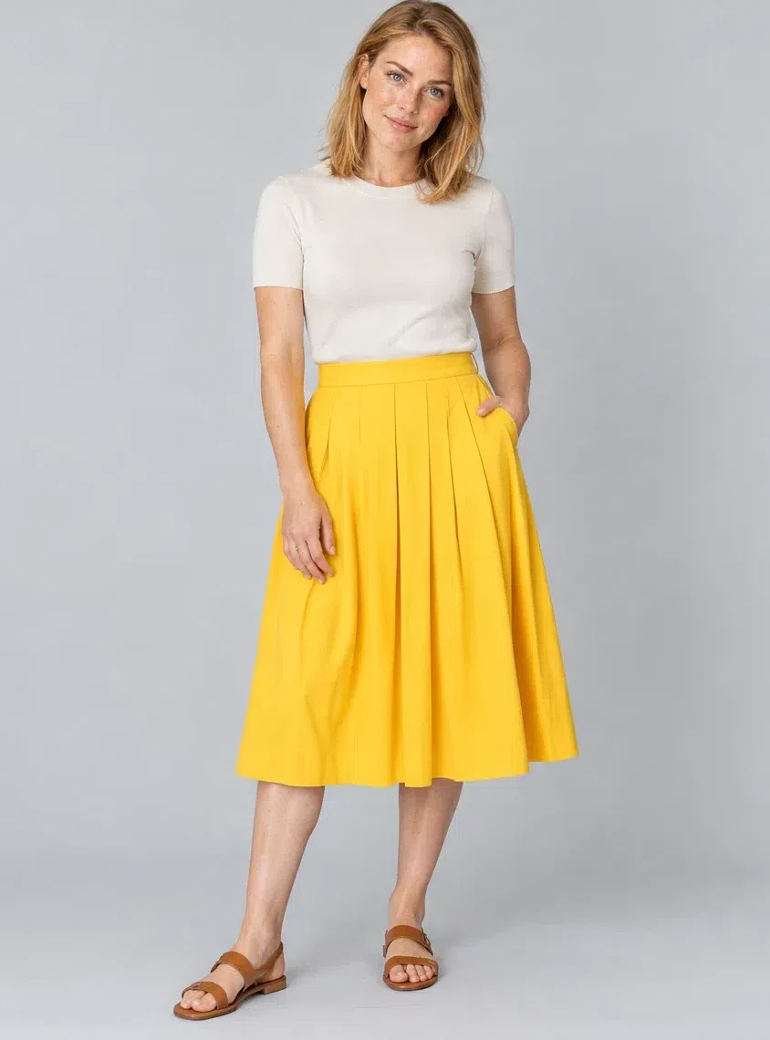
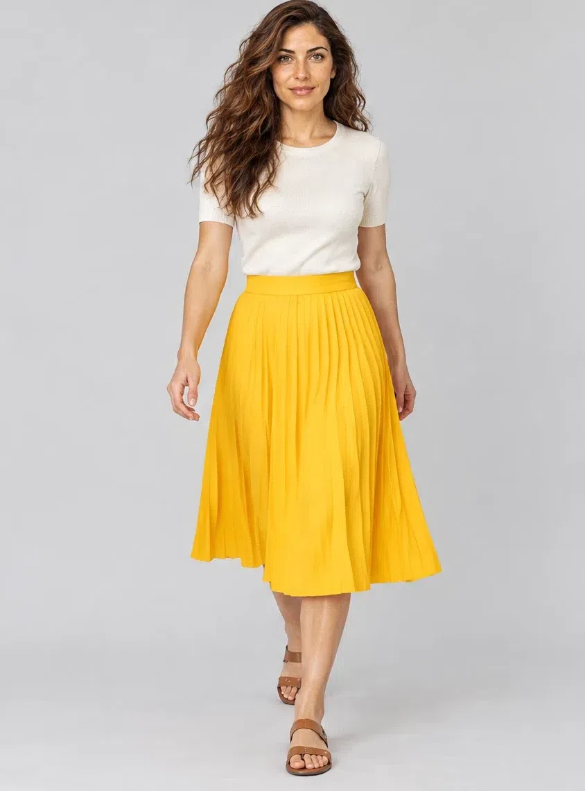
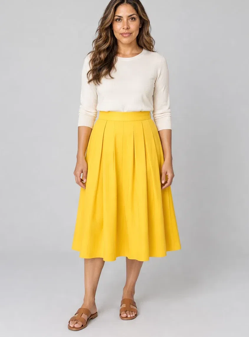
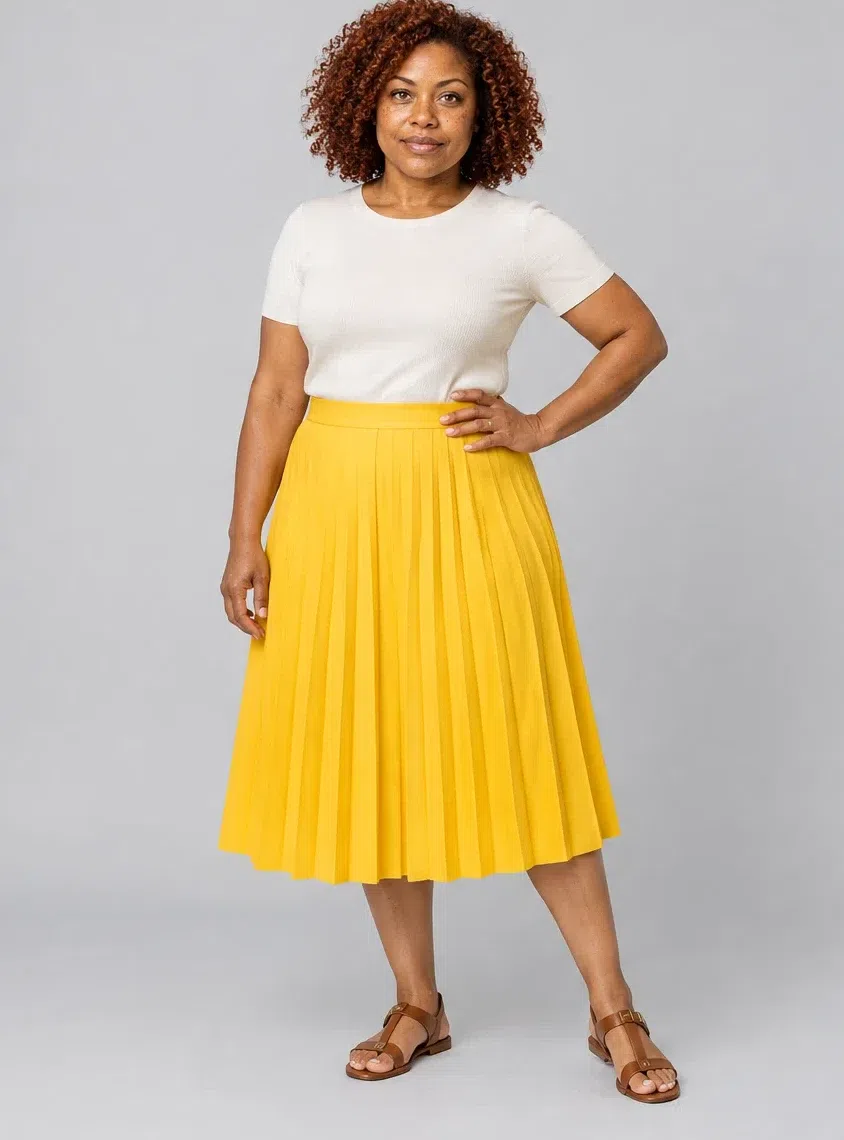
7Dandelion pleated midi skirt
The piece most people would not buy for themselves, and the one this coloring is built for. Pleated or A-line, linen or cotton in summer and wool in winter. Clean sunlit yellow - leave mustard to the autumns, where its dullness is a feature rather than a problem.
Tip Keep the top half plain: Ivory or Wheat, so the skirt is unambiguously the event.
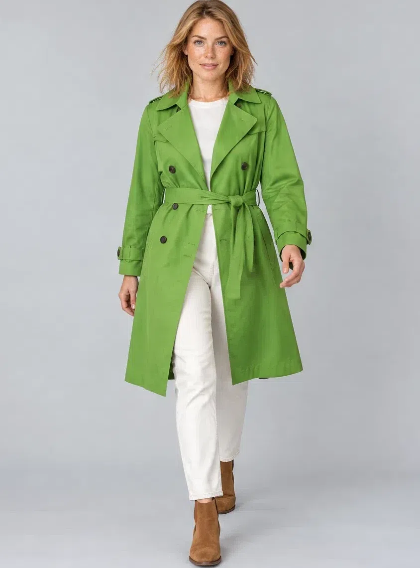
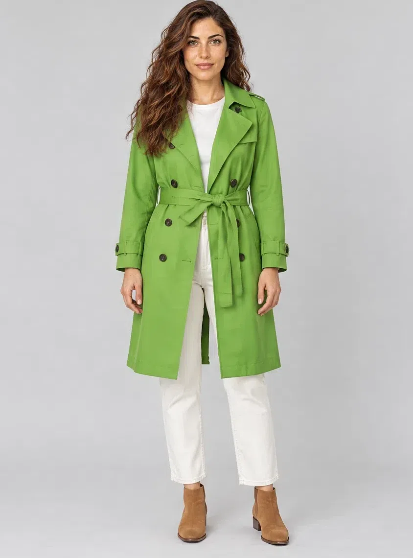
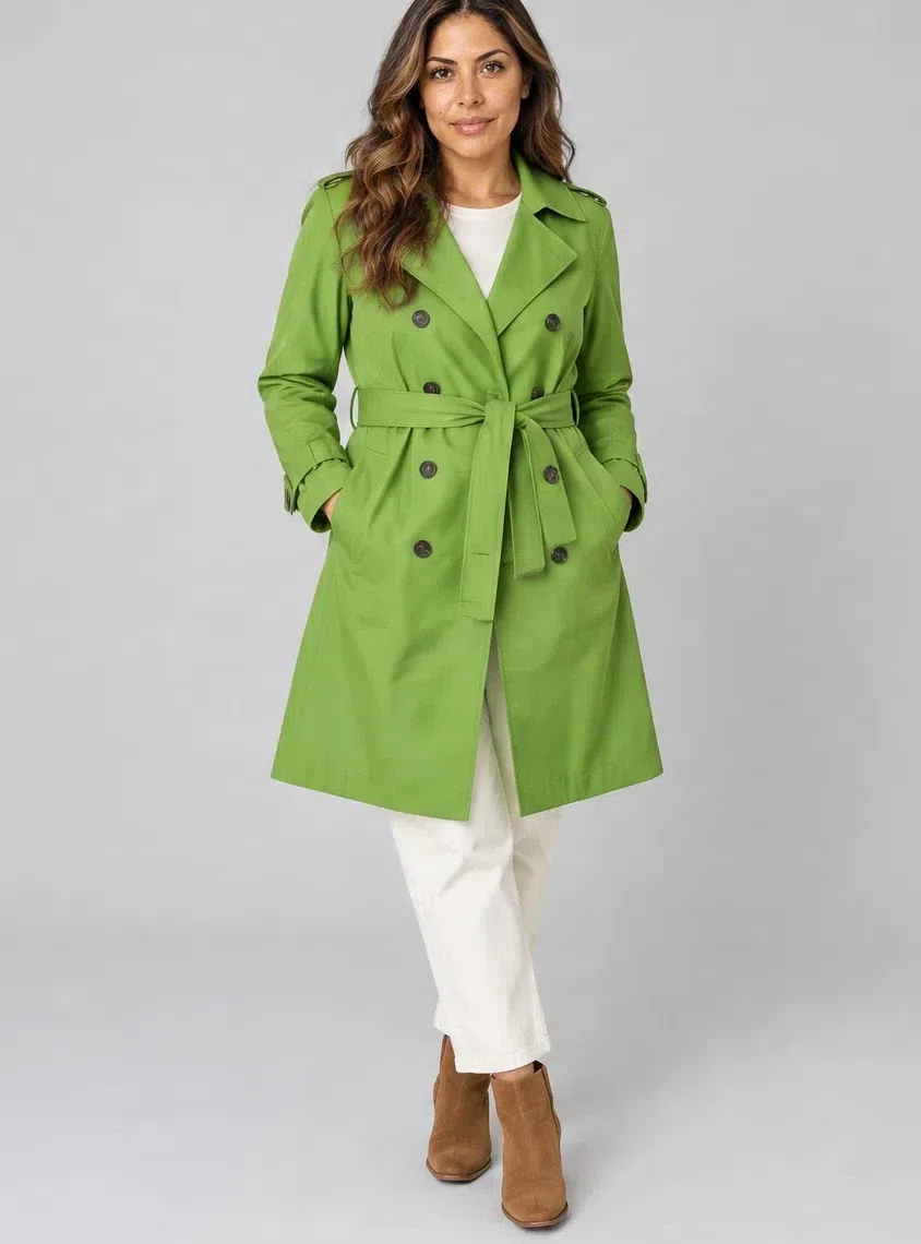
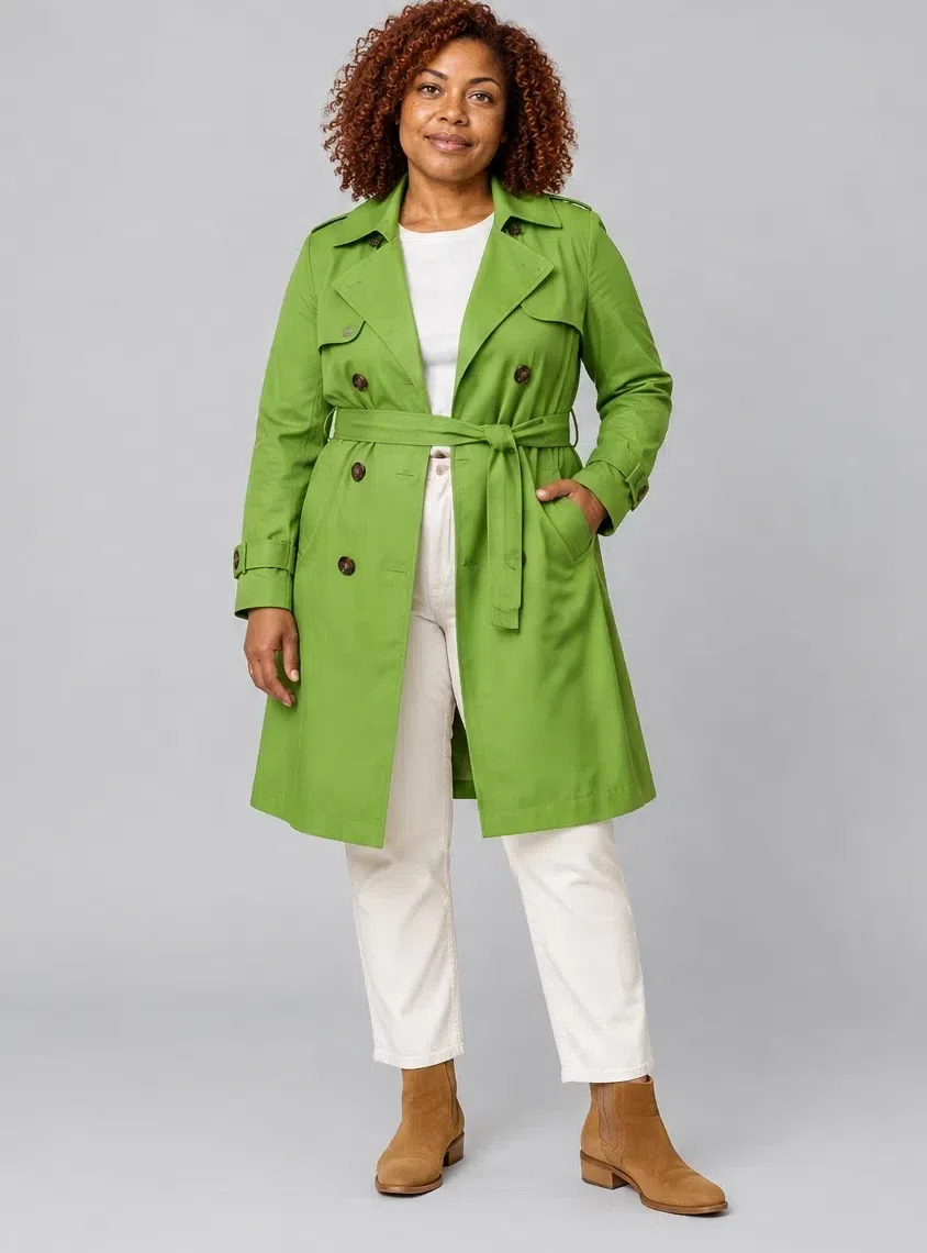
8Leaf green cotton trench
A trench in a color, which is rarer than it should be. Classic belted cut, cotton or gabardine, in the green of new leaves or something near Lime. Olive and khaki are the obvious trench colors and both are muted, so beside them the face goes out.
Tip Over the Ivory jeans with the Coral flame sweater: the whole capsule in one outfit.
Five ways to put them together
- Tone on tone. Ivory, Wheat and Camel stacked in one outfit: three neutrals a step apart, and nothing in it competing for attention.
- Neutral base, one loud accent. A Coral flame knit over Wheat trousers. The color goes at the collar where it can reach your face, and everything below the waist stays out of the way.
- Contrast pairs, both at full volume. Peacock with Dandelion. On most colorings that reads as fancy dress; here both halves are clean and equally saturated, so it reads as bold. Turning one of them down is what would spoil it.
- Analogous, around the color wheel. Dandelion, Lime and Peacock sit next to each other in hue, so an outfit built from them moves without ever jumping. Good for print, good for a scarf.
- Let texture do the rest. Structured against soft - tweed with silk, wool with cotton. Keep the surfaces smooth though: the flatter the weave, the cleaner the color reads, and clean is the whole brief.
Makeup shades
Three products picked by complexion, and a shade list for everything else
Three of these are chosen by complexion instead of by season, so they appear at four depths. Everything after them is a shade list: the coloring settles which family, and your own depth settles which value inside it. One rule covers the whole section, and it is the same one the palette runs on - take the cleaner version of any shade, and let the temperature stay warm even when the saturation goes up.
Base: foundation, blush and glow
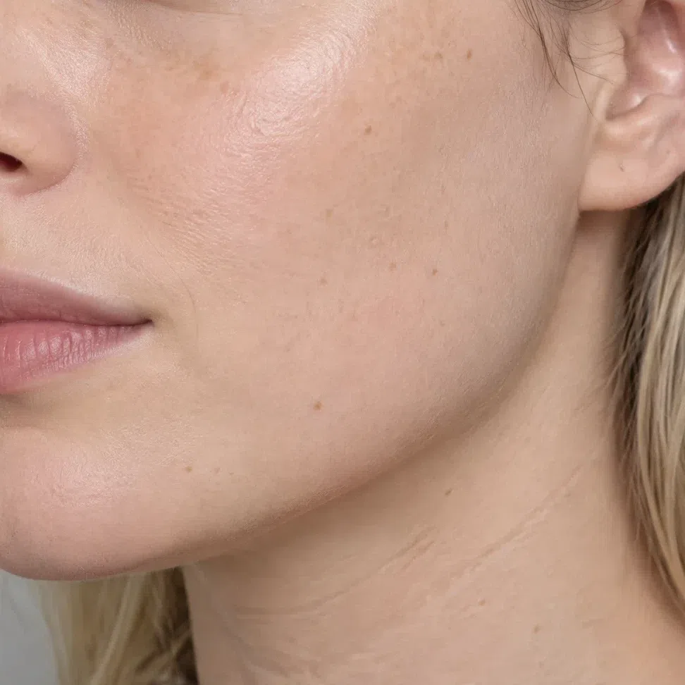
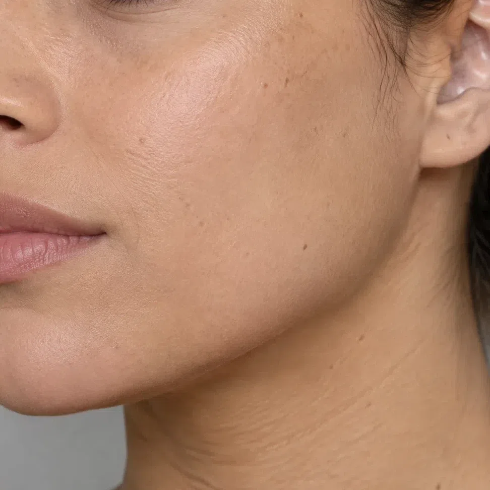
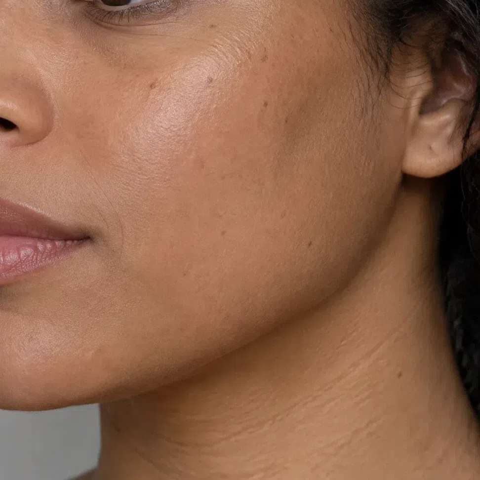
Foundation matched to your depth
Warm at every depth - golden or peach underneath, never pink and never olive. Match it at the jaw rather than the wrist: the face on this coloring runs noticeably warmer than the inner arm, and a wrist match lands pink.
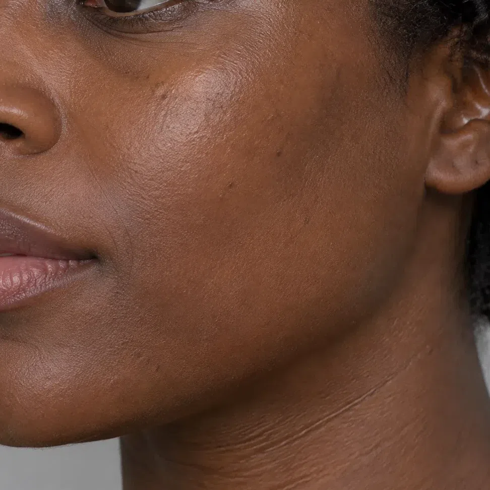
Blush
Coral and watermelon, which is simply the flush this face already produces. Cold fuchsia and lilac are the standing mistake - they cover the natural color instead of repeating it.
- Coral flame #FF6B4A
- Hibiscus #FF4F7B
- Peach glow #F79A5B
- Apricot #FFB27A
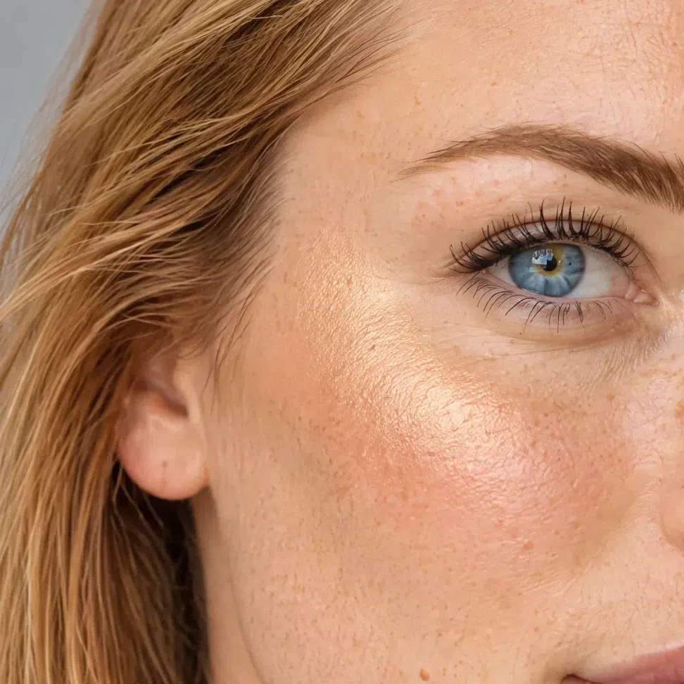
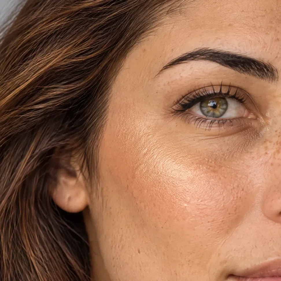
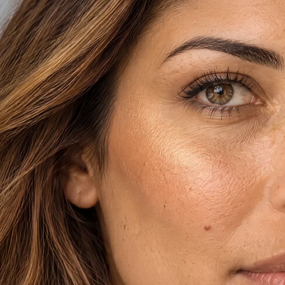
Highlighter matched to your depth
Warm glow only - gold, peach or champagne. Silver and pearl-cool leave a gray film on this skin instead of light, and it shows up first in a flash photograph.

Bronzer matched to your depth
Golden-honey, and here for warmth rather than for sculpting. The gray-brown contour palettes read as dirt on warm skin rather than as shadow.
Eyes: shadow, liner, mascara
Everyday eyeshadow
The warm half of neutral: champagne, peach, golden beige. Any shade sold as a cool beige reads straight as gray on this face.
- Champagne #F2DFC2
- Apricot #FFB27A
- Sand gold #DCC094
- Apricot cream #E89A55
Evening eyeshadow
Full color, and this is the rare coloring that gains from it. Raise the saturation and leave the temperature alone - a muted "complex" shade spoils the look faster than the brightest clean one.
- Peacock #00BFB3
- Leaf green #6FBF3B
- Copper #B5651D
- Crocus #8B5FD9
Eyeliner
Warm brown and copper do what black does with less weight. Turquoise and green are everyday options here rather than an experiment.
- Cocoa liner #6B4423
- Copper liner #A65A2A
- Turquoise liner #00A79D
- Green liner #4E9B2E
Mascara
Brown and brown-black sit more naturally than charcoal: lashes here usually finish warm at the tip, and a blue-black cuts that off at the lash line.
- Dark brown #4A3423
- Golden brown #6E4B25
- Copper brown #9A5324
- Brown-black #2E2620
Brows
One or two levels deeper than your roots, and warm. Ash and graphite pencils are the most visible error on this coloring - the brow goes gray and reads as drawn on against golden hair.
- Golden blond brow #A9814E
- Caramel brow #9A6B3C
- Copper brow #8A5330
- Chestnut brow #6B4229
Lips: nudes and color
Nude shades
Peach and coral nudes rather than pink-beige ones. A cool nude on this mouth reads as absence rather than as a color.
- Peach nude #F0A98A
- Coral nude #E4796B
- Amber nude #DE9052
- Rosewood nude #C98A93
Colored shades
The palette accents, worn on the mouth. Each one is already on this page, which is the shortest possible answer to what lipstick suits you.
- Coral flame #FF6B4A
- Chili #E63A21
- Hibiscus #FF4F7B
- Tangerine #FF8A2B
Hair shades
What belongs on this head, and what puts it out
Hair color sets the ceiling on the contrast this whole face is built on, so it moves more here than it does on a softer coloring. What suits you reads as your own hair with the light turned up on it: warm at the root, clean in tone, and gold, copper or ginger surfacing the moment you step outdoors.
Light and luminous
Clean warm blondes and light browns, with no ash anywhere in them.
Sun-lit rather than bleached
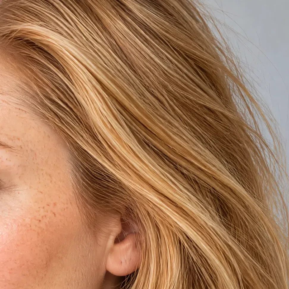
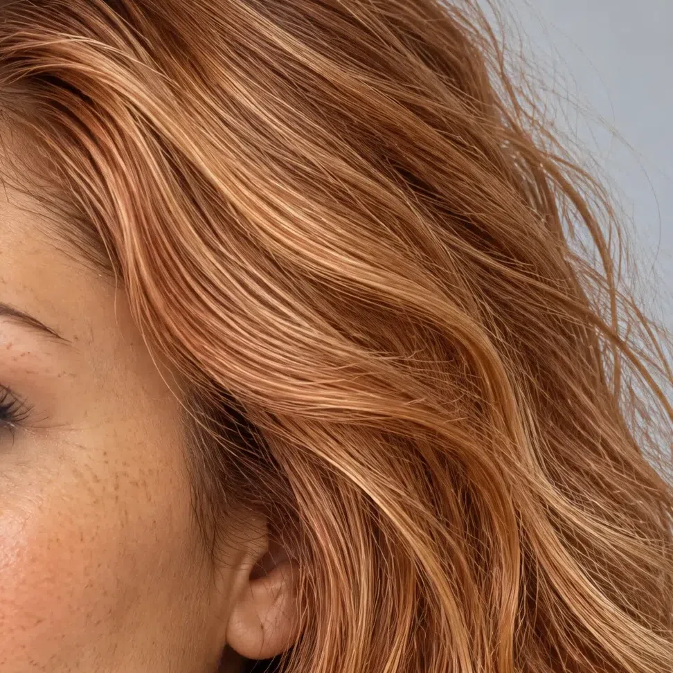
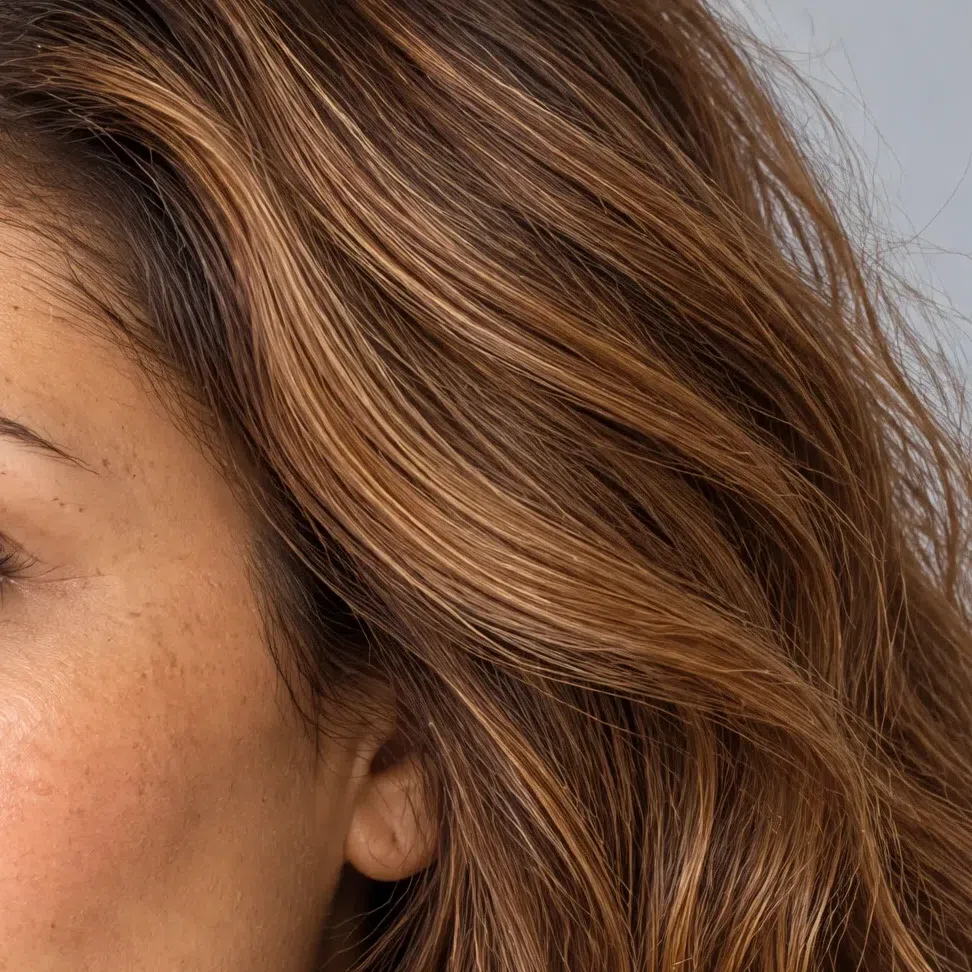
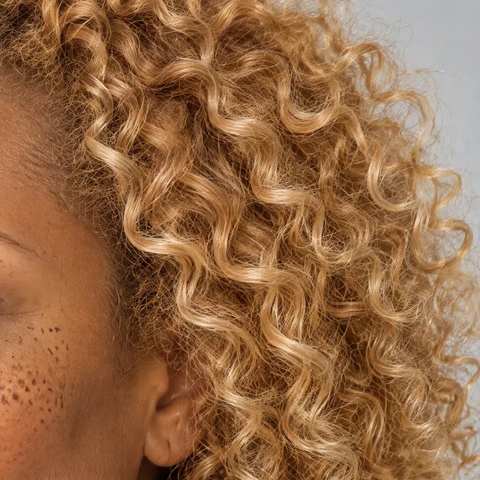
One level up and two down from each tone. That L number is the salon level every colorist uses, so it is something you can say out loud in the chair.
Copper, chestnut and amber
The saturated half, and where the "bright" half of the name earns itself. These are the shades that make green and blue eyes jump, so they are worth the nerve.
Full color, nothing muted
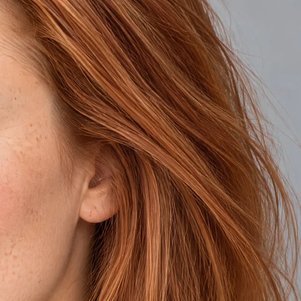
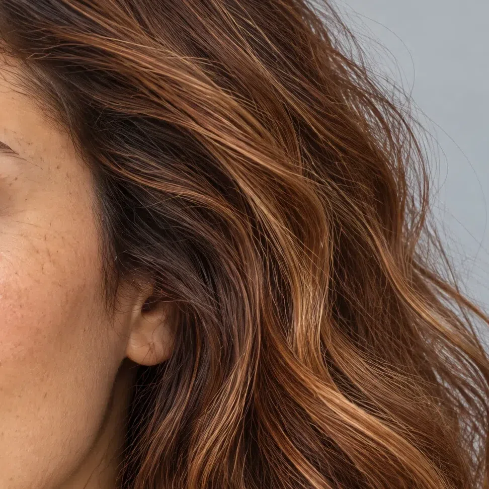
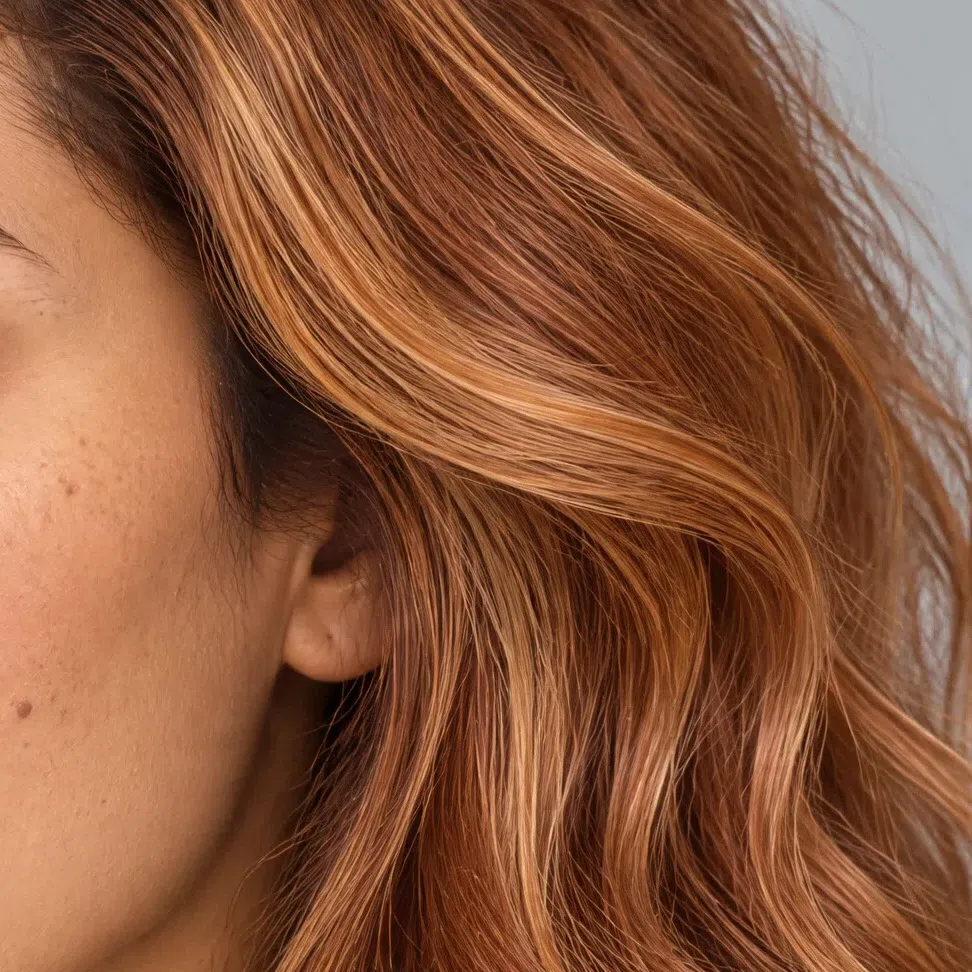
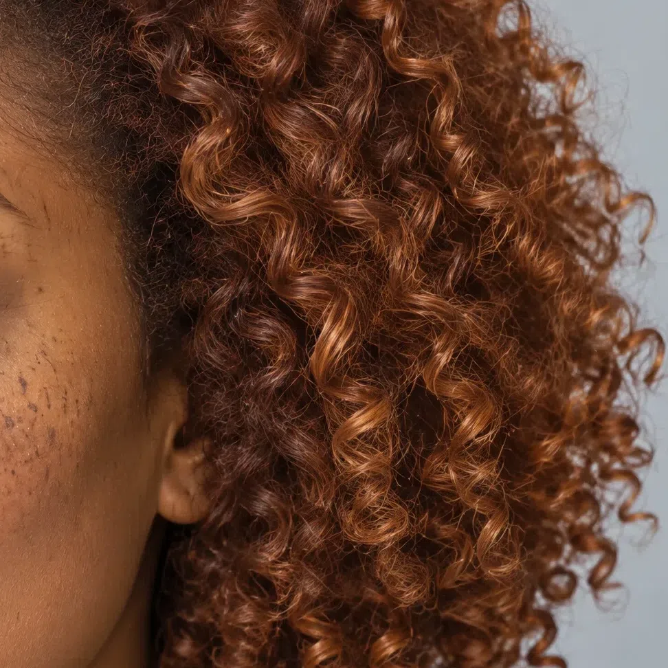
One level up and two down from each tone. That L number is the salon level every colorist uses, so it is something you can say out loud in the chair.
Hair colors to avoid
Two families, one problem each. The first is cold where you are warm, and it turns the skin gray-green rather than merely looking wrong. The second is muted where you are clear, which eats the contrast the whole face is built on and leaves it flat.
Cold and ashy
Muted and heavy
Bright Spring, or one of its neighbors?
Three confusions, and a physical test for each
Three types get mistaken for this one, and each mistake has a different cause. Within the season it comes down to which property runs the show: gold for Warm Spring, lightness for Light Spring, sheer strength of color for you. The nastiest mix-up is not a spring at all.
Bright Winter is as bright as you are and as clean as you are, so the check everyone reaches for - is this shade clear or muted - tells you nothing whatsoever. Only temperature separates the two, which is why that comparison comes first.
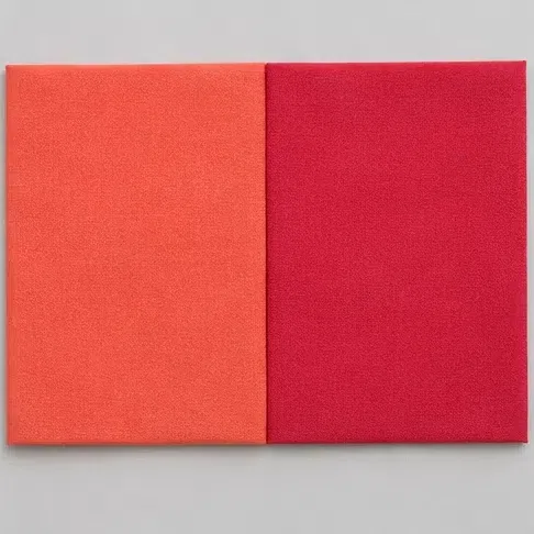
Hold a warm coral under your chin, then a clean cold red. Which one leaves your face looking cleaner?
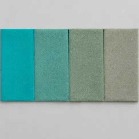
How much color can you actually take right next to your face?
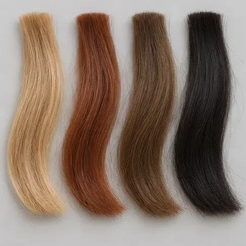
Look at your natural hair next to your bare skin. What is the step between them?
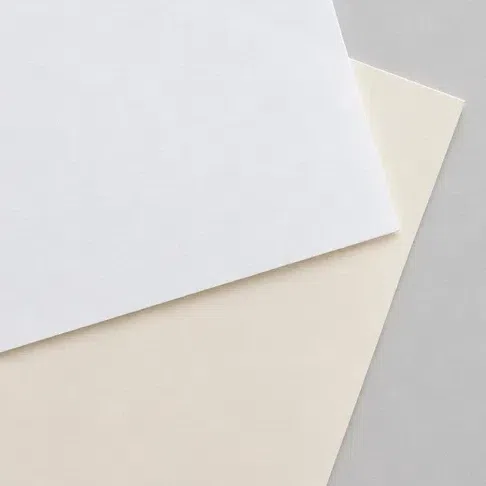
Put a sheet of pure white paper beside your bare face. What happens?
Warmth carried at full saturation - this is your page. Start at the palette and work down from there.
Same temperature, different leader. Warmth itself runs the show rather than strength, so the clean loud shades talk over you while the golden-softened ones fit. Your guide: Warm Spring.
Lightness is doing the work rather than strength: pale shades gather your face and dense ones argue with it. See Light Spring.
The same volume of color, on the other side of the temperature line. Clean red and magenta gather your face, while coral and gold lay yellow over the skin. Your page: Bright Winter.
Four questions point; they do not rule. Landing between two answers usually means you live near a border, and the three comparisons underneath are built for precisely that.
Bright Spring vs Bright Winter
Bright Spring
Warm. Gold or peach sits under the skin, the freckles come up ginger and the flush arrives coral.
Warm at every level: golden blonde through copper to a red-brown chestnut, and gold lifts out of it in daylight.
Clean and warm. Coral flame, Peacock, Dandelion, Leaf green - every one with yellow somewhere underneath it.
Ivory. Optic white draws a cold line under the chin.
Polished yellow gold, and silver reads as a mistake.
Bright Winter
Cool. Porcelain, rose or blue-based olive, with no gold anywhere in it.
Cool and deep: dark brown to blue-black, ash at every level and never a copper glint.
Clean and cold. True red, fuchsia, emerald, icy blue - equally loud, and blue underneath instead of yellow.
Optic white, the whiter the better.
Silver and platinum.
Settle it in two minutes Saturation is useless here - you both wear color at full volume, which is why the usual clear-or-muted question decides nothing. Take a warm coral lipstick and a clean blue-red one of the same intensity and put each on in daylight. One will make the whites of your eyes look brighter and your skin look lit; the other will drop a faint gray over the skin around your mouth. Whichever does the second thing is not your temperature. This test is unusually decisive, because nothing else separates these two.
Bright Spring vs Warm Spring
Bright Spring
Saturation. Strength of color first; the warmth is the second thing you notice about it.
Visible. Light skin, and brows and eyes a clear step stronger.
Ringing and clean: Coral flame, Chili, Peacock.
Muting. Terracotta and ocher pull the face down.
Bright yellow gold, worn big rather than fine.
Warm Spring
Warmth itself. Gold before anything else; strength comes second.
Soft. Everything in the face sits at roughly one depth.
Warm and slightly softened: caramel, ocher, warm khaki.
Too much volume. A ringing shade talks over the face.
Matte gold, brass, copper.
Settle it in two minutes Find a terracotta and a full-strength clean coral, and hold each one up in turn. If the terracotta dulls you and the coral gathers the face, you are on the right page. If the coral feels like shouting and the terracotta feels like yours, that is a Warm Spring, and the difference is which property leads rather than whether you are warm at all - you both are.
Bright Spring vs Light Spring
Bright Spring
Maximum. Color that stays dense and rings.
The palette reaches full depth - Marine and Cognac are yours.
Coral flame, Chili, Dandelion, Peacock.
A pale pastel gets lost standing next to you.
Medium to high, and you can see it in a grayscale photo.
Light Spring
Moderate. The color is clean but has light stirred into it.
The whole palette sits in the light half, nothing dark anywhere.
Peach, cream, soft mint, pale aquamarine.
A dense saturated shade outweighs the face wearing it.
Low. Nothing in the face stands away from anything else.
Settle it in two minutes One shade decides this: a tomato red. Hold it up and watch. If it gathers your face and your eyes come forward, you belong here. If your face seems to recede behind it and you find yourself wanting something lighter, look at Light Spring instead. This is the argument sitting behind the phrase people type as "light bright spring" - two neighboring palettes, separated by strength rather than by temperature.
Still caught between two? Go back to whichever quality runs first. If a stranger would call your coloring vivid before calling it warm, this page is the right one. Want the whole season instead? Begin at the Spring overview, or at the color analysis guide.
Bright Spring: the questions people actually ask
How do you know if you are a bright Spring?
What undertone is bright spring?
What are the worst colors for a bright Spring?
Can Bright Spring wear black?
What hair color would look good in a bright Spring?
What is the rarest season in color analysis?
Is "clear spring" the same as "bright spring"?
How is Bright Spring different from Bright Winter?
How is Bright Spring different from Warm Spring?
What clothing colors suit a Bright Spring?
What lipstick colors should a Bright Spring wear?
What foundation should a Bright Spring look for?
What jewelry and metals suit a Bright Spring?
What if Bright Spring colors feel too bright to wear?
What should a Bright Spring capsule wardrobe start with?
Which celebrities are Bright Springs?
Where this came from
The pages behind the factual claims on this one - what sets skin color, why the light you judge in changes the answer, and where the season system itself came from.
-
Carole Jackson (opens in a new tab)
Wikipedia
Provenance rather than a finding: the twelve-subtype scheme this page sits inside descends from the four-season system Jackson popularized, which the article traces back through Johannes Itten to two American dress-design teachers, Belle Northrup and Harriet Tilden McJimsey. It is the dependency every page on this site rests on.
-
Human skin color (opens in a new tab)
Wikipedia
Behind two things in the how-to-tell section: that skin color is set by melanin plus the hemoglobin circulating in the dermis, and the caveat on the vein test that deep skin often shows no readable vein color at all - the vessels are visible only through skin light enough to see into.
-
Color temperature (opens in a new tab)
Wikipedia
Behind the insistence on daylight in each of the three undertone tests. Daylight sits near 6,500 K, a standard incandescent lamp at 2,400 K and a warm-white LED at 3,000 K, so each lamp lays a cast of its own across the skin before you have judged anything.
-
Relative luminance (opens in a new tab)
Wikipedia
Behind the grayscale demonstration sitting inside the contrast block. Stripping hue from a photograph leaves relative luminance, one value weighted for human vision, which is the quantity the two markers on that ramp are placed by.
One distinction worth making plainly. The optics and the history above are sourced; which twenty shades suit a Bright Spring, where the border with Bright Winter falls, and every hair and makeup call on this page are ours - reasoned from the palette itself rather than from anything linked here. No study exists on any of it, and naming that plainly beats letting four links imply otherwise.
What is color analysis, how do you find your season, and what are the 12 types?
The main guide covers all of it - the four axes your season is built from, all twelve subtypes side by side, and a free quiz that places you in about a minute.
What is color analysis? For women and men