
Light Spring color palette: your shades, what to skip, and how to wear them
Light Spring is the palest of the three springs: warm, golden-peach coloring with skin, hair and eyes sitting pale and close together, and colors that look mixed with light. Below: all 22 shades, the 9 that dim you, and how to tell yourself apart from Light Summer.
Try the Light Spring colors on a real face
Everything in this set is warm, light and clean at once - colors that look as if daylight had been mixed into them, never gray or black. The neutrals run from ivory to camel, the pastels stay almost as pale as her skin, and three brighter accents at the end show how much color she can actually carry. Tap through them and watch the skin around her mouth and eyes rather than the top: the right shade leaves it golden and even, where anything cold or heavy would gray it over.
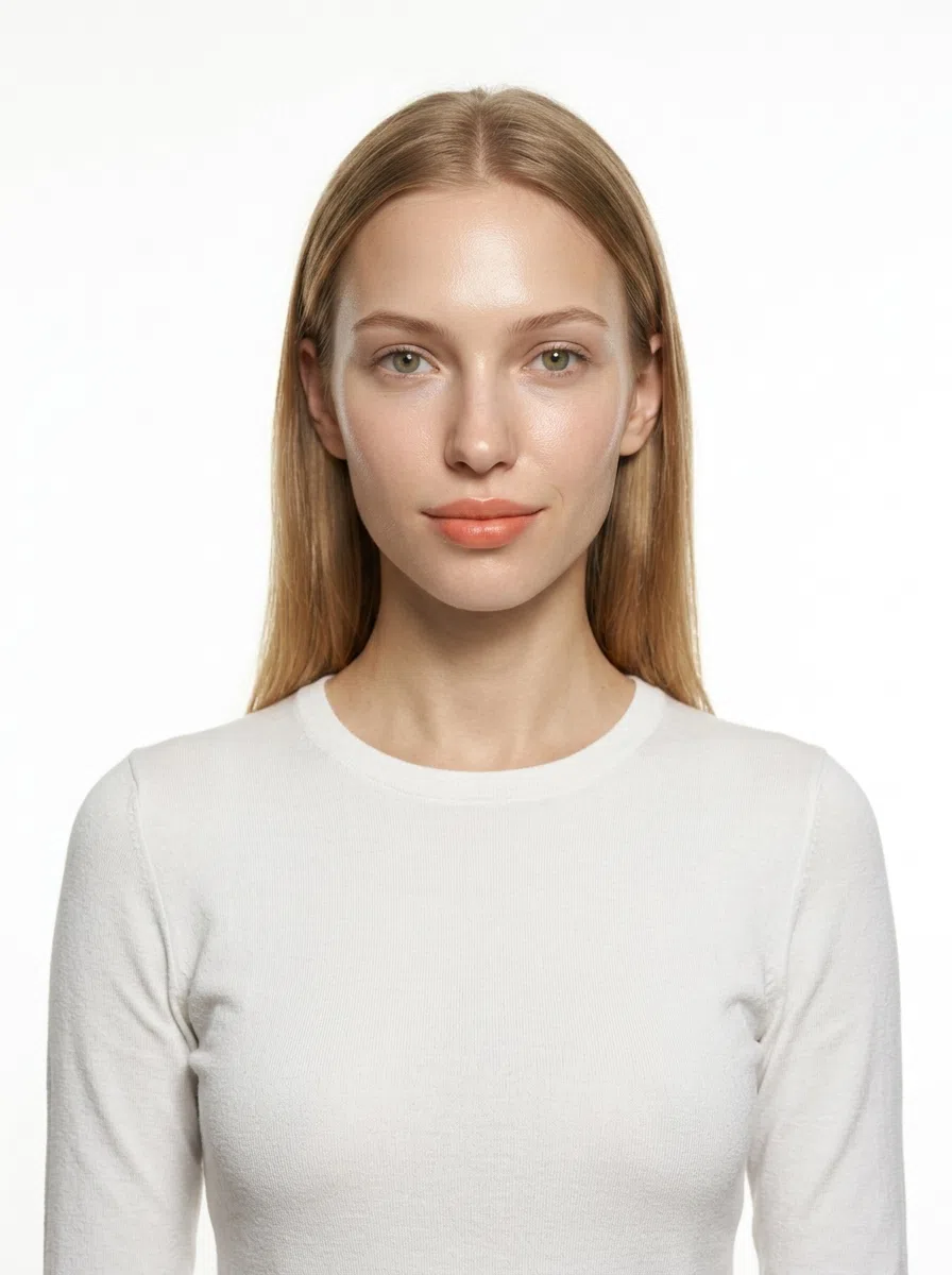
Light Spring in 30 seconds
Light Spring is warm, clear and low in contrast, and above all it is light - skin, hair and eyes blend into one pale, sunlit tone with nothing dark anywhere. The Light Spring color palette keeps to the fresh end of the season - ivory, peach, spearmint, coral - and yellow gold warms this skin where silver chills it.
| Skin | Very fair and fine, peach or ivory with a golden undertone; freckles come up golden. |
|---|---|
| Eyes | Light and clear - blue, green, aqua or soft hazel, often gold at the pupil. |
| Hair | Golden, honey or strawberry blond through light golden brown - warm at every level. |
| Contrast | Low - brows and lashes stay light, close to the hair color. |
| Metal | Yellow gold first, then rose gold and light satin bronze - fine, never chunky. |
Wardrobe base:
Wear with care:
Warmth and lightness have to arrive together: a warm shade that runs deep or dusty is as wrong here as a cold one. Torn between this and Light Summer, Warm Spring or Bright Spring? A photo decides it.
How to know if you are a Light Spring
Five signs, and what each one tells you
Light Spring gets misfiled more than almost any other season. The coloring is pale and gentle, so the first guess tends to be a summer - and summer pastels do look fine on it, just slightly flat. What gives it away is warmth that is light rather than rich: peach where a summer shows pink, gold where a summer shows ash, eyes that look clear instead of smoky. The five checks below start with the one that rules out the most.
Season follows undertone and contrast, not how light or dark your skin is. There are Light Springs at every depth from porcelain to deep brown, and the common thread is a golden-peach undertone, a clear rather than dusty cast, and features that sit near one another in lightness.
11. Skin: warm underneath, and clear
The first question is never how pale you are. It is what color sits under the surface - and on this coloring the answer is always warm.
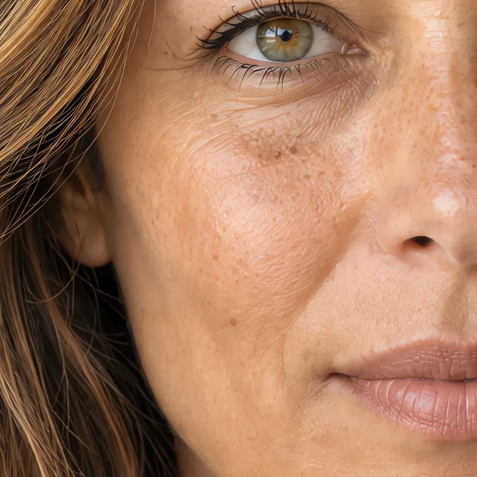
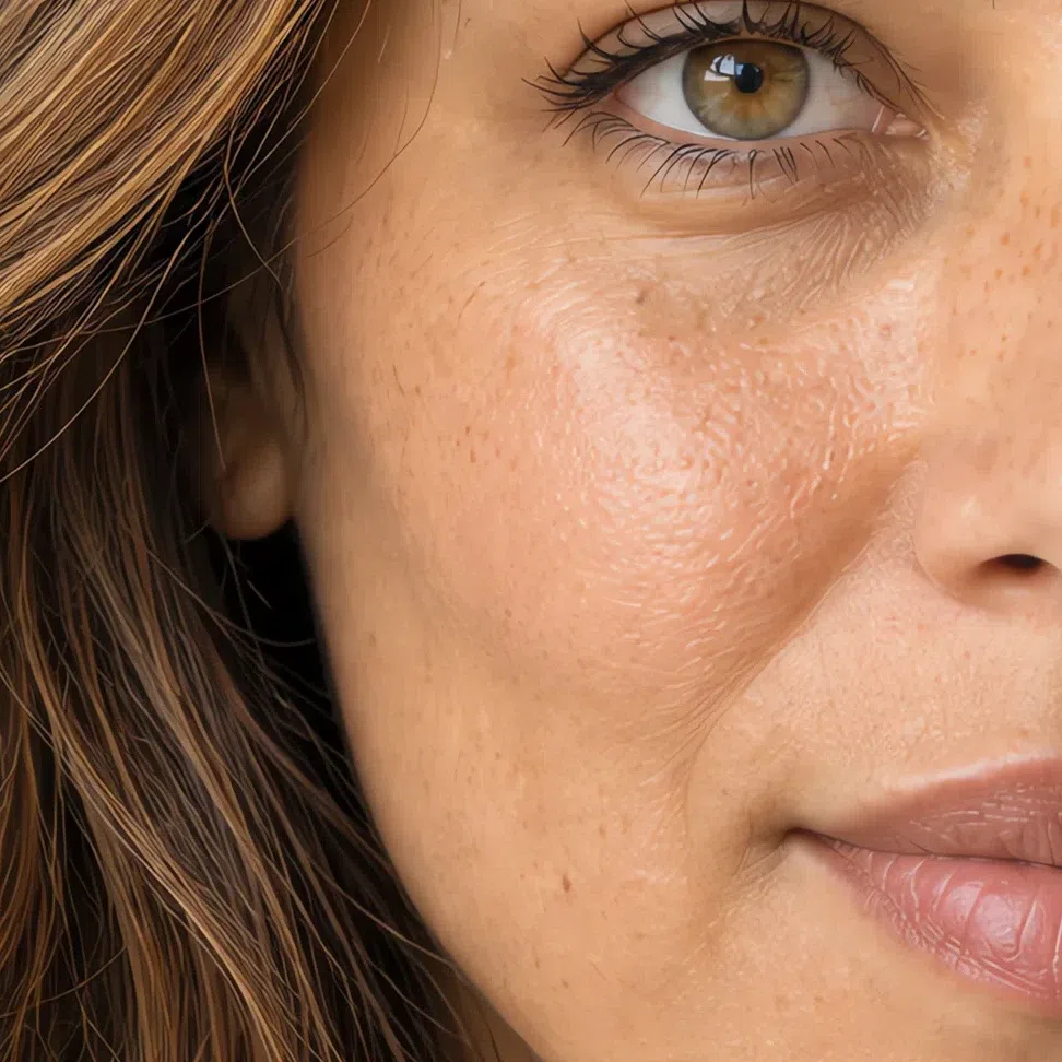
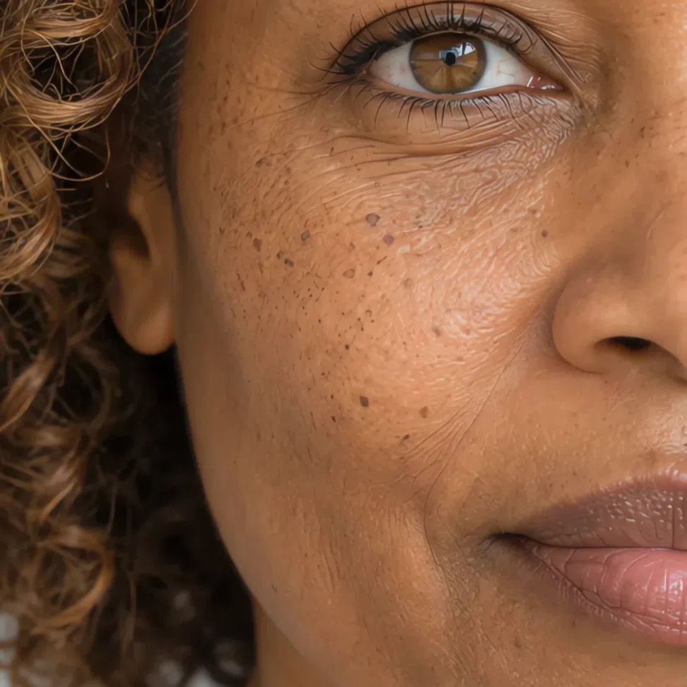
At any depth this skin reads golden, peach or warm ivory underneath, never pink-blue and never gray. It has a clarity to it, a freshness that looks lit from inside, and on the fairest complexions it can be thin enough to look almost translucent. What it does not look, in decent daylight, is ashy or sallow.
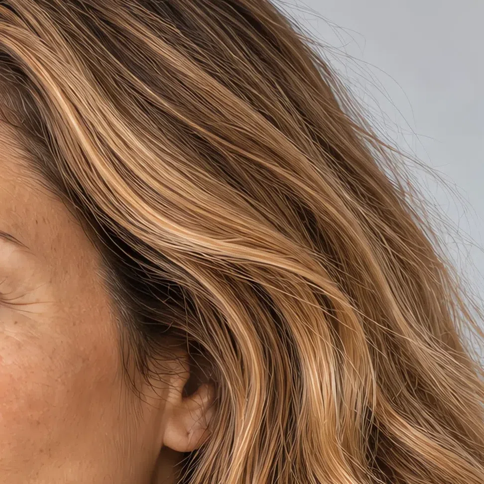
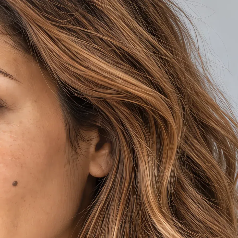
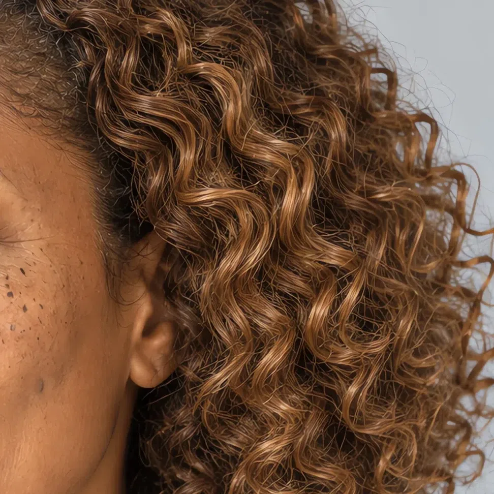
Freckles, flush and the way the skin takes the sun all carry the same golden signature, and the close-ups in the next section show each one. For now the undertone is the thing to settle, and the three tests below settle it.
Three ways to read your undertone
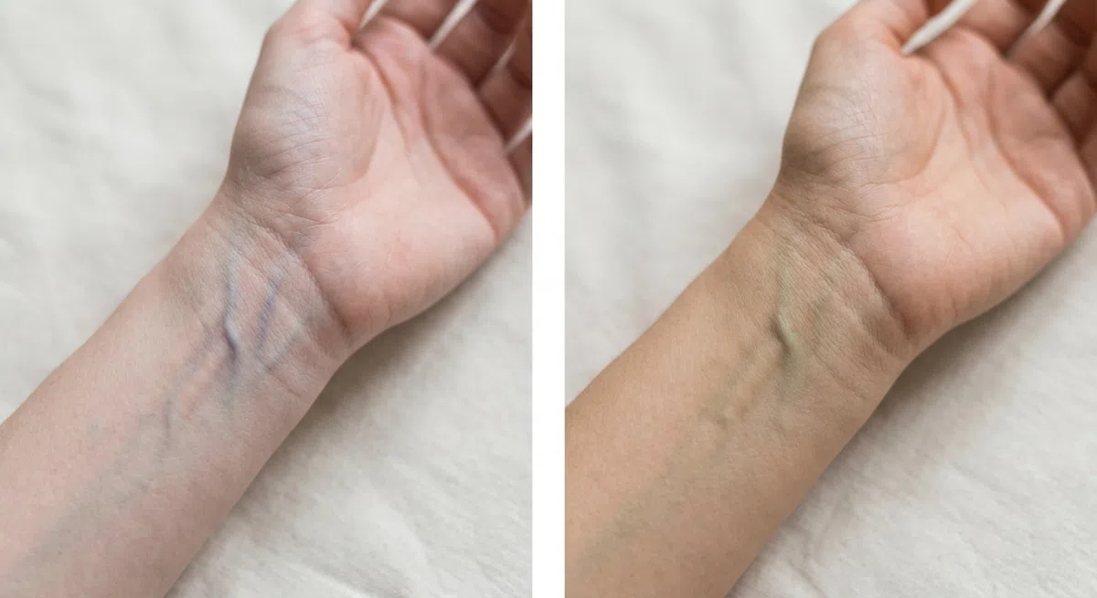
Hold the inside of your wrist up to a window during the day. Lamp light pushes the answer toward yellow and a cold LED toward blue, so neither counts. Look at the color of the veins overall, never at one vessel.
- Green or olive - a warm undertone: Light Spring, or another warm season.
- Blue or violet - cool, which points toward Light Summer instead.
- No clear answer - likely neutral. Let the next two tests decide.

Clean face, hair pulled back, daylight from a window. Hold a sheet of plain white printer paper against your jaw and look at the line where paper meets skin rather than at your whole face. Cream paper is warm in its own right and tips the result.
- A golden or peach cast shows - warm, and the Light Spring result.
- The skin turns pink or bluish - cool; Light Summer is the likelier fit.
- The skin goes grayish - usually neutral, often with an olive note.
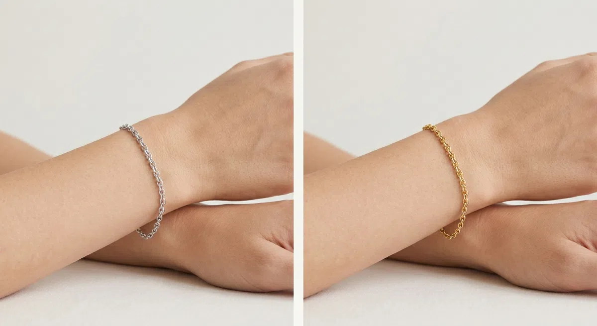
Take one yellow-gold piece and one silver one and hold each by your face at a daylit window, in turn. Compare your face beside each, not the two pieces with each other.
- Gold wins - the skin looks lighter and warmer beside it. Pale yellow and rose gold are yours.
- Silver wins - the face looks fresher with it: a cool undertone.
- Hardly any difference - neutral, which is common among the light seasons.
When the paper and the gold both say warm, the cool seasons are off the table. What is left to settle is which spring you are - or whether a soft autumn fits better.
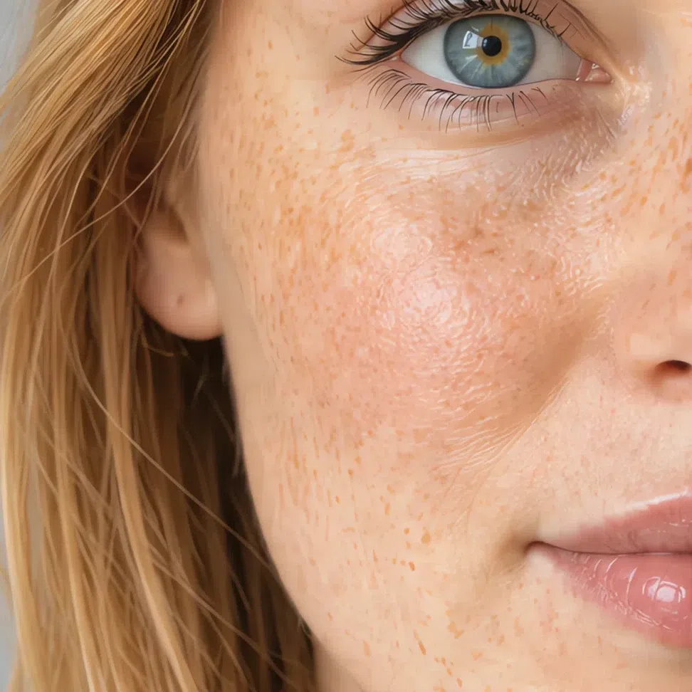
22. Eyes: light, clear, and flecked with gold
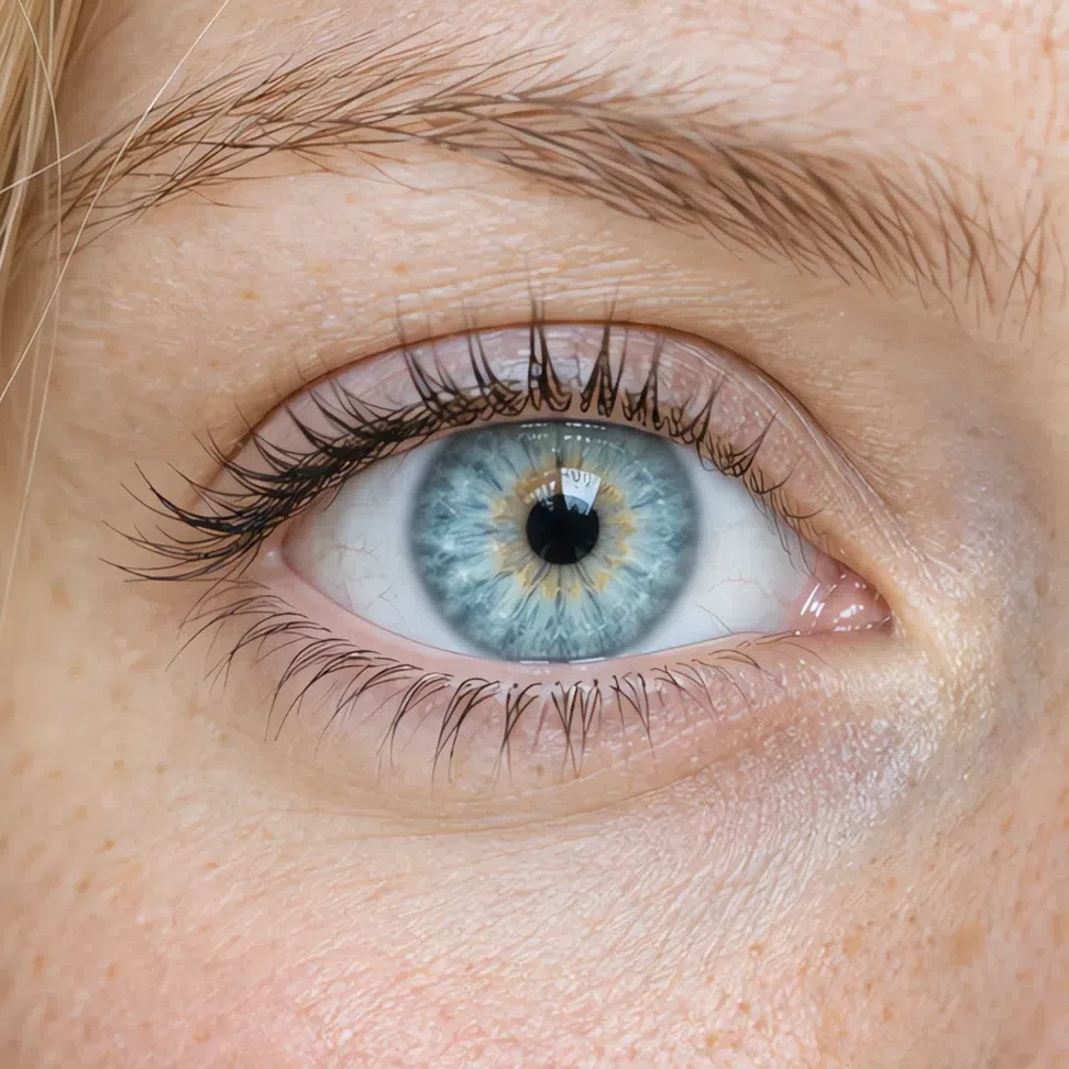
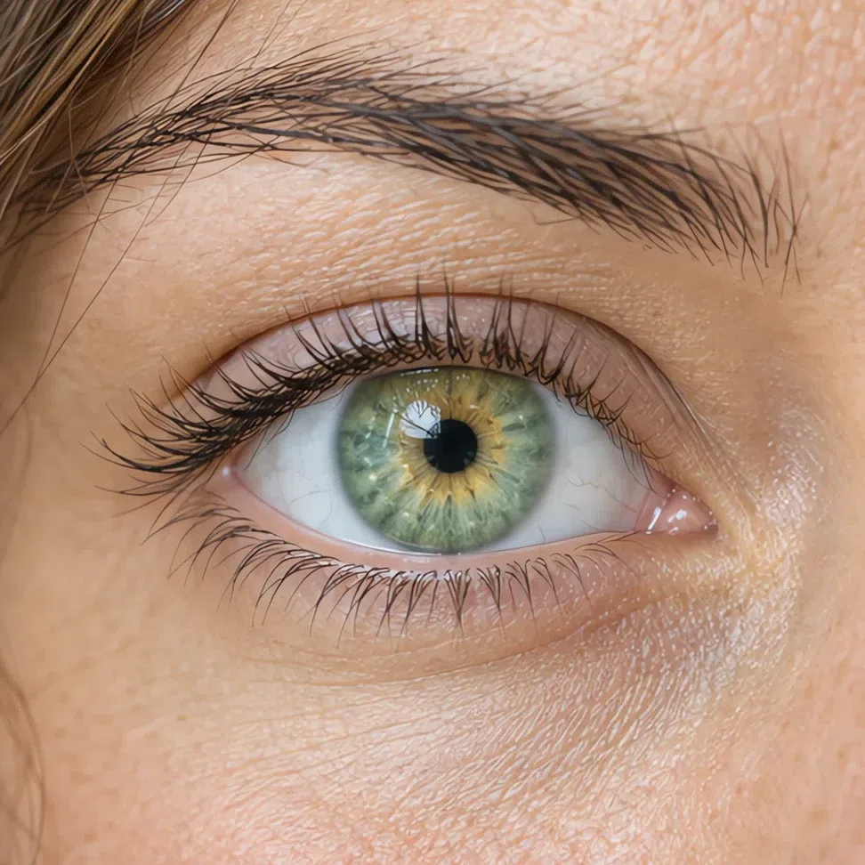
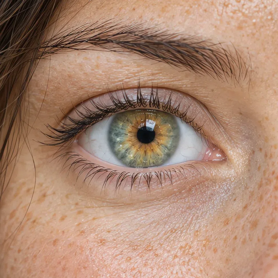
Light Spring eyes are always light and always clear - color you could almost see through, never muddied.
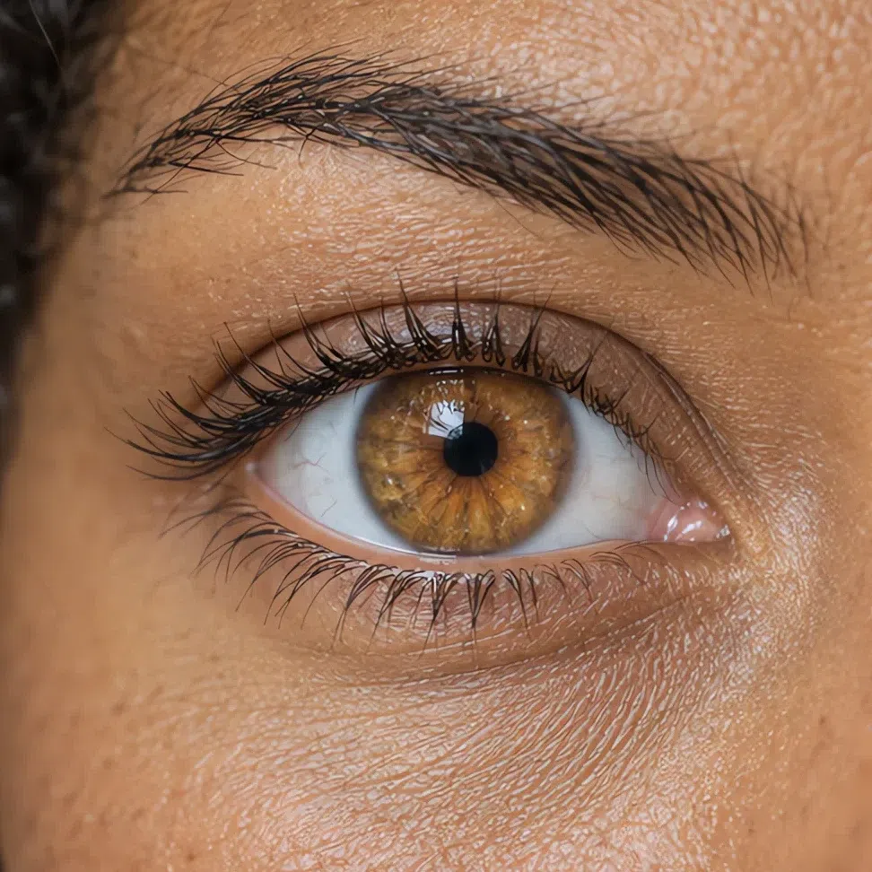
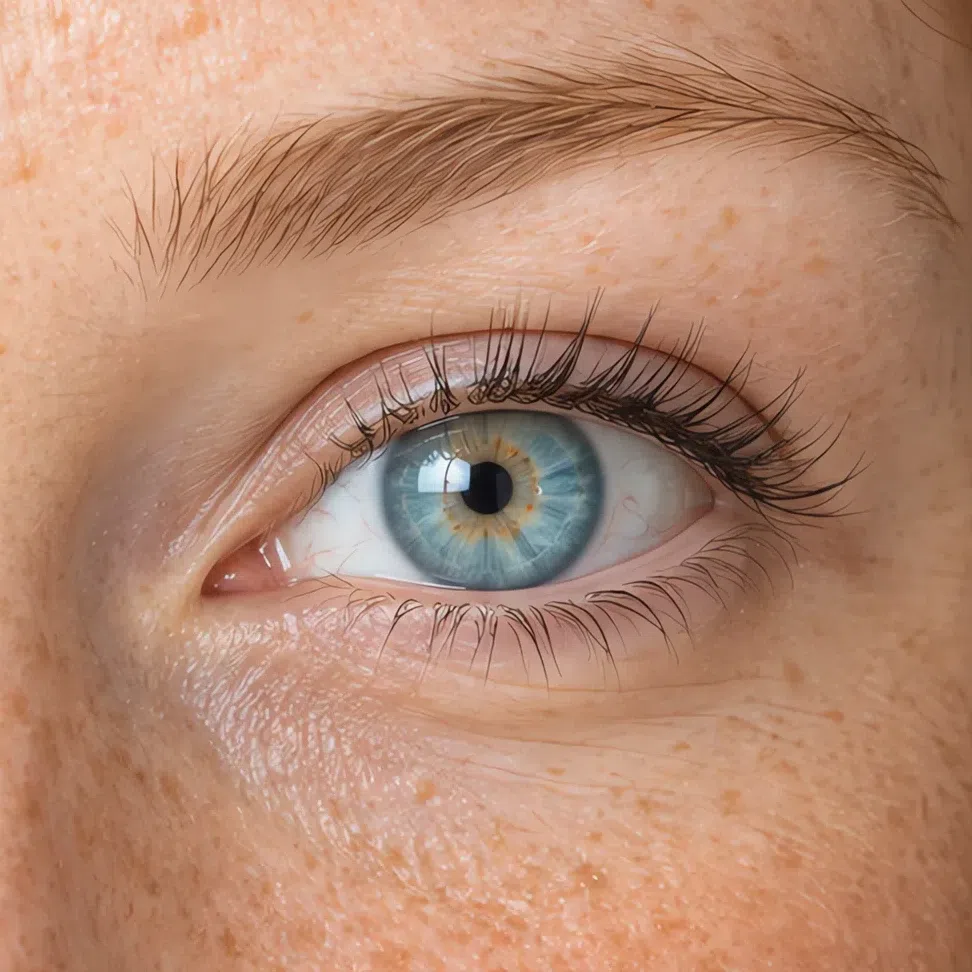
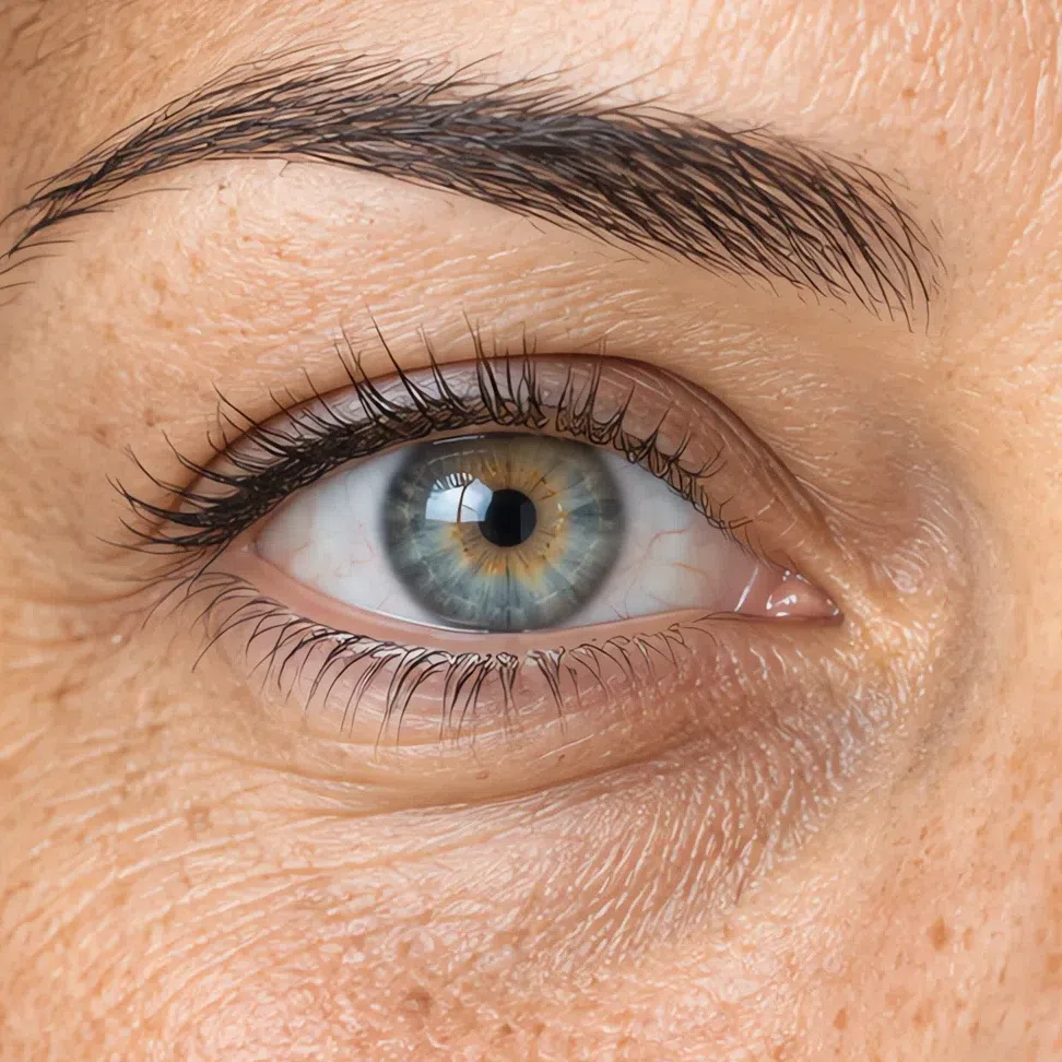
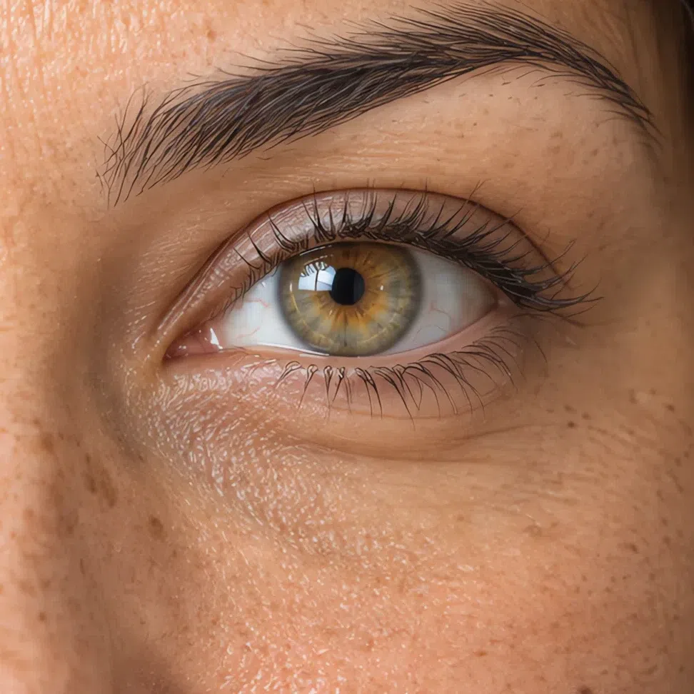
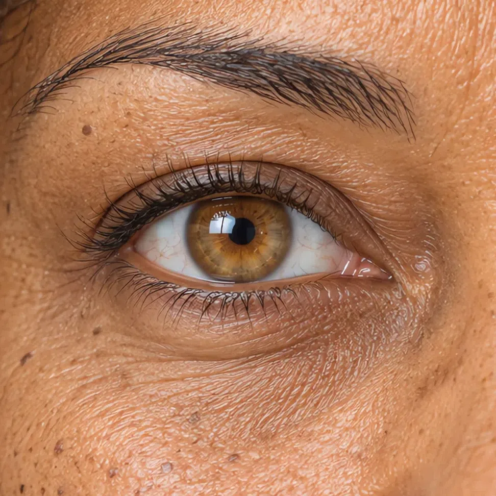
Expect light blue, aqua, light green, or a gray-blue or gray-green with gold at the pupil: flecks, a ring, or fine rays of warm yellow running outward. Brown is rare here, and when it does appear it is light - honey, amber or a golden hazel.
Think watercolor rather than oil paint. These eyes have none of a Winter's depth or drama and none of a summer's smoky haze; the color is bright and easy to name. The iris meets the white softly instead of being outlined by a dark ring, and the white itself is clean, which is why even a vivid eye stays gentle in this face.
Gray-blue eyes do not make you a summer. Look closely in daylight. In a Light Spring the gray-blue carries a warm yellow or golden flicker around the pupil; in a Light Summer the same color is steel-cool all the way through.
Check the pupil, not the iris. A glint of gold around it puts a light eye in spring, whatever the main color is.
33. Hair: gold in it at every depth
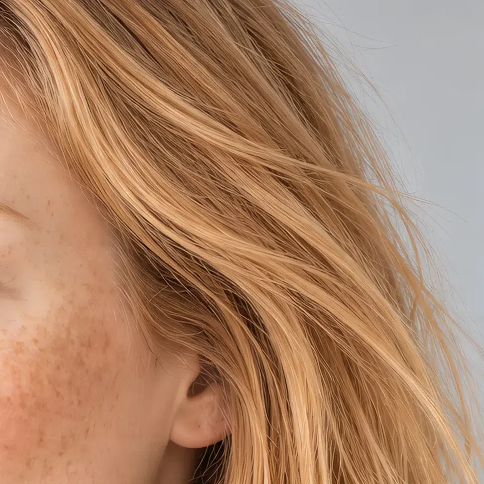
Natural hair runs from a light golden blonde to a light golden brown, and there is always a warm, sunny pigment in it.
Golden blonde in its wheat and flax versions, honey blonde, strawberry blonde, and at the deep end a light golden chestnut with a gold or ginger shine: that is the whole range. Even hair that looks like plain dark blonde indoors turns up honey, wheat or straw highlights in the sun.
It is often fine, straight or loosely wavy, and it sun-lightens easily into natural streaks. On deeper complexions the rule holds lower down the scale - a warm brown with real gold in it, clearly lighter than espresso.
Light brown hair is where people put themselves in the wrong season. Stand in bright daylight: gold, honey and wheat reflections mean spring, while a silvery, ashy or mousy cast with no warmth at all means Light Summer.
The salon trap here runs the opposite way from a summer's. Ash toners and icy platinum get sold as the cure for brassiness, and on this coloring they strip out the one warm note the whole face is built around - the hair ends up cool and the skin next to it looks sallow. Ask for a warm blonde, kept within a level or two of your own.
Look for the glint, not the level: any depth that shows gold in sunlight qualifies, and no depth with ash in it does.
44. Contrast: low, and pitched high
Skin, hair and eyes share nearly one level of lightness, so nothing in the face is drawn in hard lines.
Picture very fair skin, light golden hair and light blue eyes: nothing jumps forward and nothing is much darker than its neighbors. Brows and lashes are usually light too, in tone with the hair, which takes away the last hard edge a face can have.
This is where Light Spring parts company with Bright Spring, its vivid neighbor. A Bright Spring can pair fair skin with dark hair or startlingly saturated eyes; a Light Spring has no pairing like that anywhere in the face.
It is also why black and the other heavy darks go so wrong here. A dark garment adds a step of contrast the face has nothing to answer with, so the clothes register first and the face looks tired above them.
A near-black patch in your grayscale photo - hair, brows, lashes or iris - rules out Light Spring, however warm your undertone came out.
- Take a daylight photo without makeup and switch it to black and white. If skin, hair and eyes turn into grays that sit close together, your contrast is low. If the hair or eyes look nearly black against pale skin, it is high - and Bright Spring or a winter becomes the likelier answer.
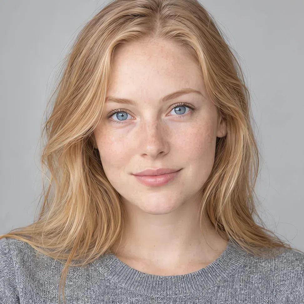
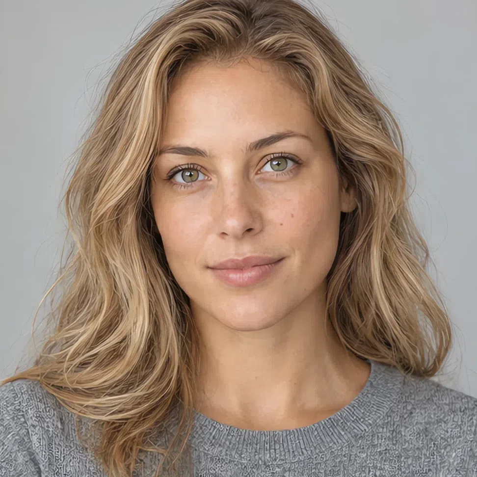
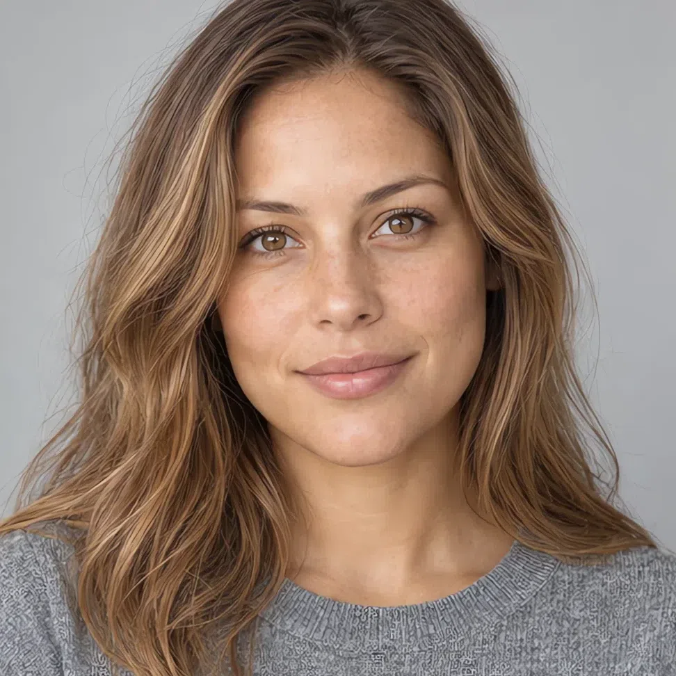
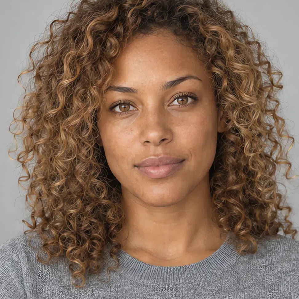
On the left, a Light Spring in color; on the right, the same photograph with the color removed. With the hue gone, lightness is all that remains to compare - and her hair sits only a short way below her skin on that scale.

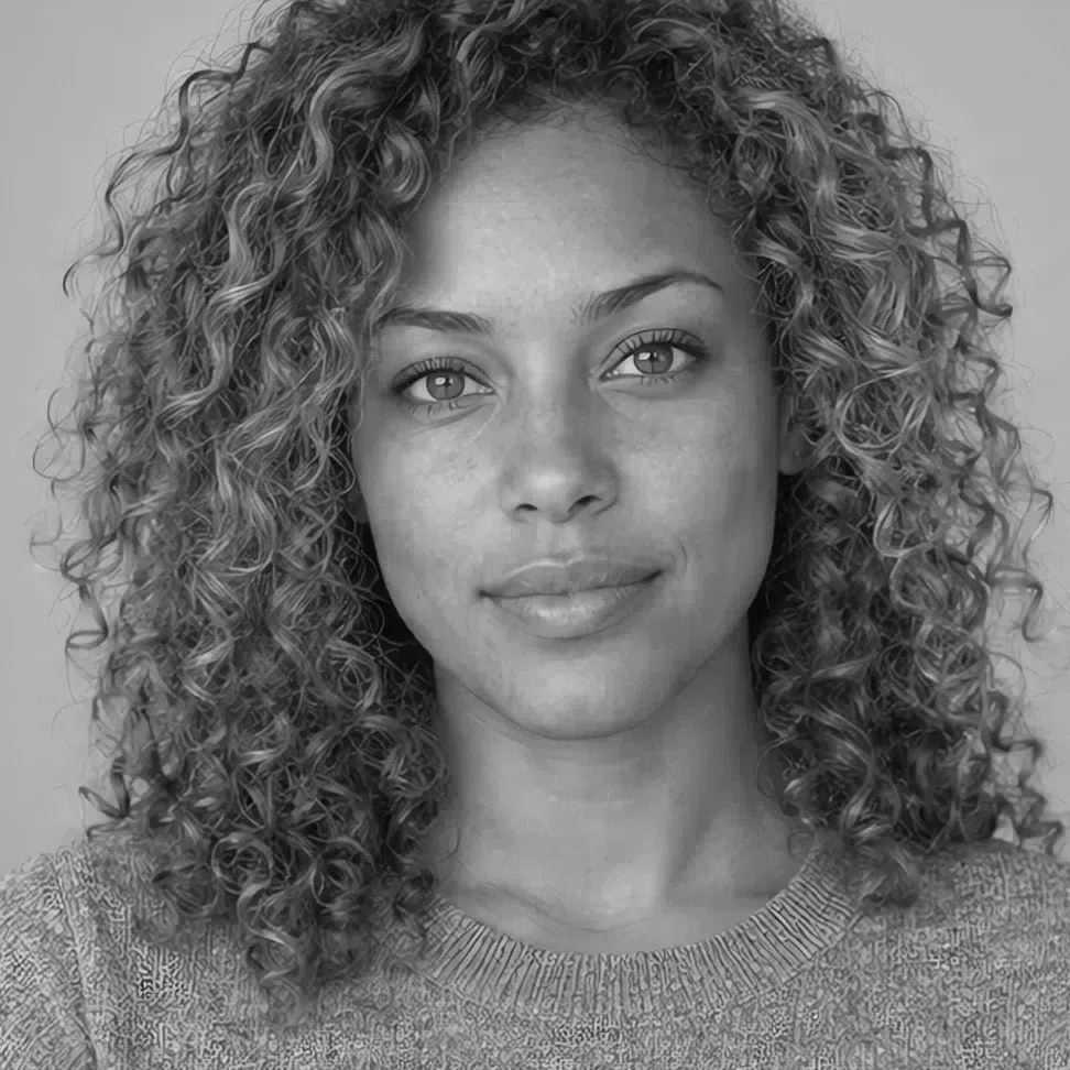

Hair Skin Ramp runs black to white
Compare the gap between the two markers, not where they sit. Where a face lands on the ramp is its depth; how far apart its hair and skin land is its contrast, and the width of that gap is no ranking between faces. The deep Light Spring sits lower than the fair one and keeps the same narrow gap, which is why both belong to this season - while the Winter's hair drops almost to the black end.
55. The drape test: hold the colors to your face
The most direct check there is. Bring the right and the wrong colors up to your face one at a time, and watch the face instead of the fabric.
Mirror, daylight, bare skin. Give each shade a second or two under the chin and trust your first read of the skin around your eyes and mouth.
If black seems to suit you, take that seriously rather than explaining it away. It is the hardest color there is for this coloring - on a genuine Light Spring it looks tired and heavy - so a face that carries it well is more likely a Bright Spring or a winter.
Shades that brighten you
If these make the skin glow, smooth away tiredness and bring your eyes forward, Light Spring is the likely answer:
- Peach sorbet
- Butter
- Spearmint
- Pistachio
- Apple blossom
- Coral
Shades that age you
If these leave the face pale or gray, with shadows settling under the eyes, they are not in your palette:
- Jet black
- Bordeaux
- Midnight
- Optic white
- Magenta
Light Spring vs Warm Spring vs Bright Spring
All three springs are warm and clear, which is why the same person gets typed as each of them at different times. The way through is the names: each spring takes its name from whichever axis dominates it, and yours is lightness, with warmth second and clarity third. Naming note - some systems call Warm Spring True Spring and Bright Spring Clear Spring; the columns are the same.
| Light Spring | Warm Spring | Bright Spring | |
|---|---|---|---|
| Leading axis | Lightness. Pale first, warm second | Warmth. Golden before anything else | Clarity. Vivid, saturated color first |
| Temperature | Warm, eased slightly toward neutral by its summer neighbor | Fully warm - the warmest of the three | Warm, with a neutral edge borrowed from winter |
| Depth | Light, all the way through | Light to medium | Light to medium, with room for dark hair |
| Clarity | Clear but diluted, as if light were mixed in | Clear and rich, mid saturation | The most saturated spring - color that rings |
| Contrast | Low - hair, skin and eyes on one level | Low to medium | Medium to high - features stand apart |
| Skin | Light peach or warm ivory; golden undertone at any depth | Plainly golden - golden beige through honey | Porcelain to light beige, sometimes close to neutral |
| Eyes | Light and clear: blue, aqua, green, gray-green with gold | Warm: green, hazel, light brown, turquoise | Bright and jewel-like: blue, green, topaz |
| Hair | Light golden blonde to light golden brown | Honey, golden brown, light chestnut, red | Golden blonde to mid chestnut with a warm sheen |
| Metals | Pale yellow gold, rose gold | Rich yellow gold | Yellow gold with bright stones |
Still between two columns? Ignore everything under the first row. Ask what people notice first about your coloring - that it is light, that it is golden, or that it is vivid. The first answer is this page; the other two are its neighbors, and each gets a full comparison further down.
What Light Spring coloring looks like up close
Skin, eyes and hair, across four complexions
Light Spring is a range, not one face. The checks above ask whether you belong in it; this part shows how wide it runs - four versions of the skin, four eye colors and four natural hair shades, each photographed on a different complexion. If yours does not match a card exactly, that is expected. What counts is landing inside the range.
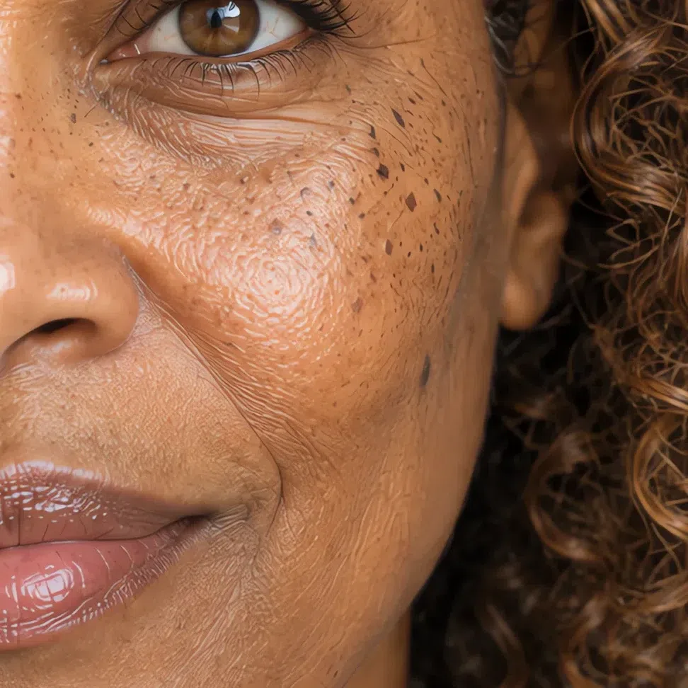
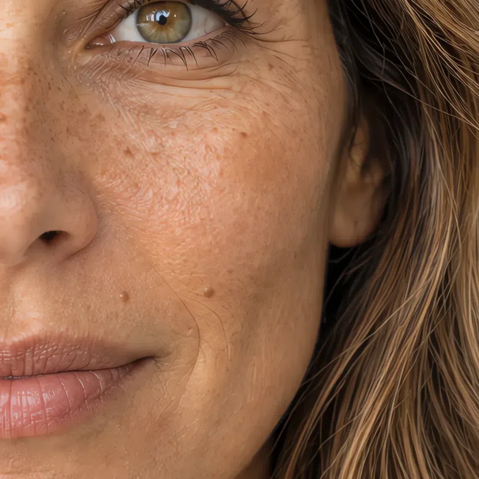
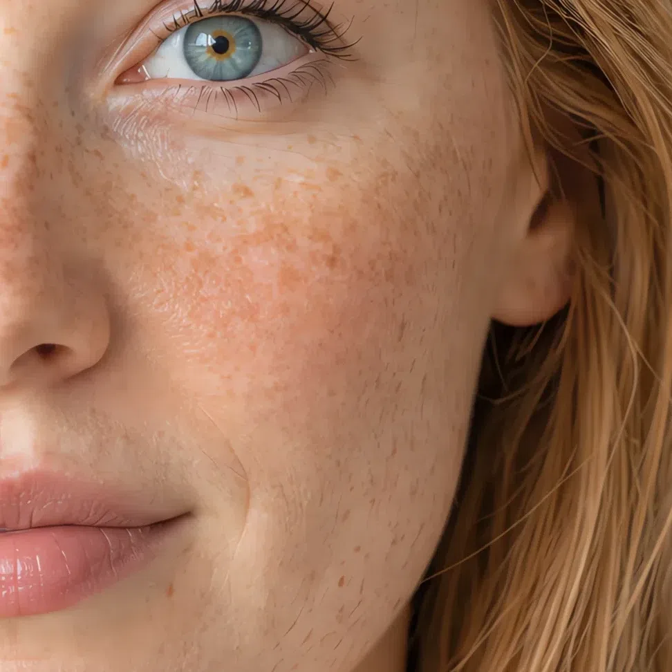
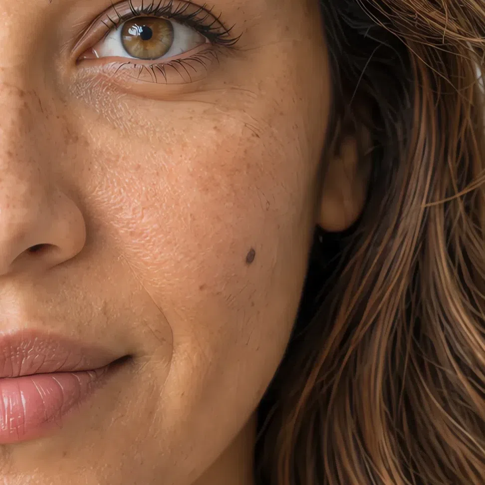
Light Spring skin: golden-lit and quick to burn
Under every shade of this skin sits the same thing - a warm cast of gold, peach or cream. On the fairest version it can look close to see-through; on the deepest it shows as a glow more than a tint.
Sometimes. The strict rule says this subtype never carries olive, and an olive that reads green or gray does point elsewhere - most often Soft Autumn. But many light olive complexions carry more gold than green, and those can sit here when the rest agrees: light golden hair, clear light eyes, low contrast. If the skin turns muddy beside Peach sorbet instead of lifting, look at Soft Autumn first.
Texture is usually normal or leaning dry and only rarely oily - worth knowing before you pick a foundation finish, which the makeup section below takes up.
Light Spring eyes: four clear shades
Four colors cover nearly everyone with this coloring. They differ in hue and agree on everything else: light, transparent, and warm enough somewhere to catch the light.
The four Light Spring eye colors
What these eyes do next to color
- Clean color wakes them up. Turquoise, Azure and Spearmint pull the blue and the green forward, and the iris looks brighter than it did a moment before.
- Heavy color swallows them. Beside black or Midnight a light eye loses its color first - it goes gray and small well before the skin shows any change.
The eyes also set the ceiling for makeup. Anything darker or denser than the iris competes with it, which is why liner and shadow later on stay in the same light, clear register.
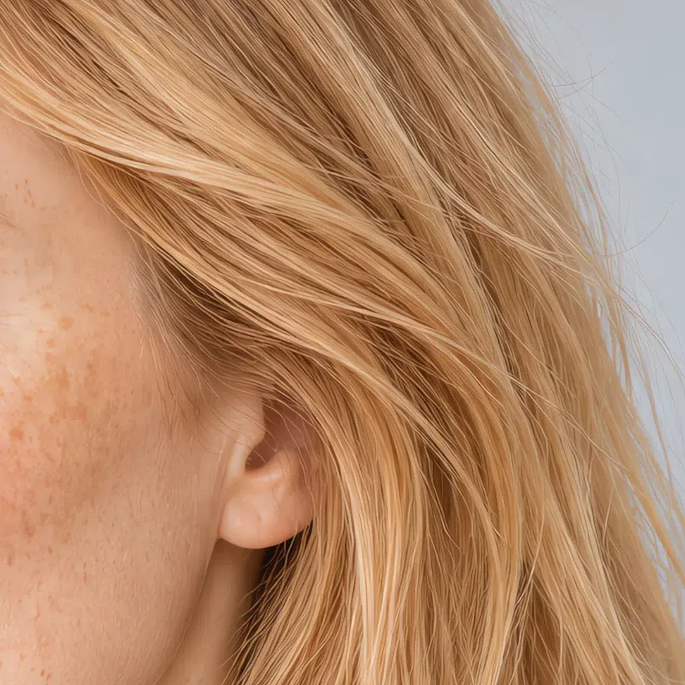
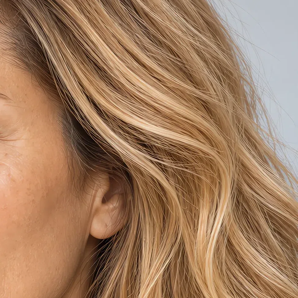
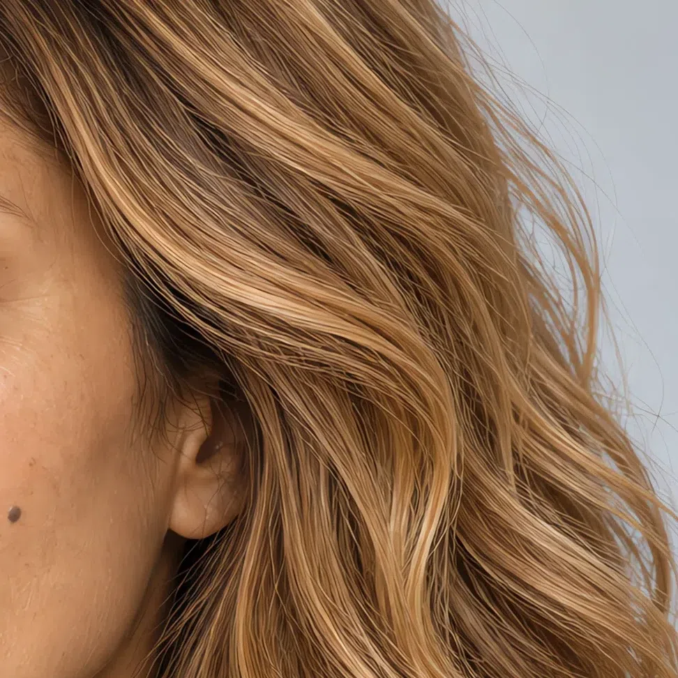
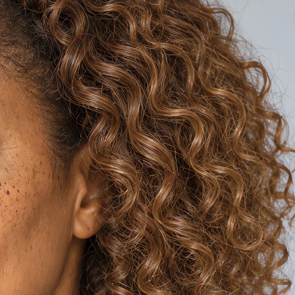
Light Spring hair: golden, from blonde to light chestnut
Four natural shades, one pigment. The level moves from very light down to a light golden brown, and the gold stays in it the whole way.
The natural range, light to deep
What Light Spring hair never is
- Ash or platinum. Any cool, gray or silvery note is out. That register belongs to the summers.
- Black or dark chestnut. Nothing else in this coloring is dark, and hair that is breaks the harmony at once.
- Deep copper or burgundy red. Saturated coppers and aubergine reds are autumn territory. A spring's red is strawberry - light and golden.
Which of these you can reproduce with dye, and which coloring techniques suit light warm hair, is covered in the hair color section further down.
The Light Spring palette: 22 shades on a real face
What each one does to warm, light skin
Think of the first warm week of May: peach blossom, new leaves, a sky that has just cleared, sunlight on shallow water. That is the register here - colors that look as though light was mixed into them, never gray and never black. They are pale without being washed out, because each one holds on to its warmth and its clarity.
Three rules run under all twenty-two. Light: the deepest shade you wear is a mid brown, and it lives in your shoes. Warm: every shade leans toward yellow rather than blue, the blues included. Clean: nothing dusty, nothing muddied - the moment a color looks grayed, it has left this palette. One trap is worth naming up front: pure white is colder than your skin, so ivory takes its place everywhere.
Every card below is a photograph, not a swatch. It is one Light Spring model with only her top recolored to the hex printed under it - face and hair untouched - so what you are comparing is not the color itself but what it does to her face.
Base colors: the Light Spring wardrobe foundation
Fourteen shades do the structural work: coats, trousers, knitwear, the shirts you end up buying twice. All of them are light and warm, a canvas for the brighter accents rather than competition for them - and black and cool gray have no place in this layer.
Neutrals: the six to build on
These replace black, charcoal and optic white, the defaults most wardrobes run on. Does that mean no black, ever? Not quite - below the waist it is fine: a skirt, trousers, a bag, shoes if you must. Keep it away from your face, where it becomes the heaviest thing in view. For anything near the collar, start here instead.
How to put the six together
- Build a monochrome in beiges. Ivory, Wheat and Camel stacked light to dark - a Wheat skirt, an Ivory shirt, a Camel coat - looks polished without a single color in it.
- Use them as the ground for color. Wheat trousers or a Wheat skirt make the backdrop for a Coral blouse or a Spearmint sweater. The neutral carries the outfit; the color gets the attention.
- Keep the lightest one at the top. Whatever you combine, put Ivory or Wheat nearest the face and let Tan and Camel sit lower down. The pale end of the palette belongs at the collar.
Pastels: the eight that go nearest your face
The heart of the palette. These are the shades that make most people look washed out and make you look rested, because they sit in the same light, warm register as your own skin. Your Light Spring pink is here, and so are both of your greens.
Accent colors: eight shades with some energy
Even the gentlest coloring needs something for the eye to land on. These are the palette at full strength - more saturated, and still clean and warm. Use them in doses: a top, a dress, a bag or a pair of shoes, but not all of them at once, or they talk over a delicate face.
The eight brighter shades
Shown on a scarf over an Ivory top, because that is roughly how much of each belongs near your face. A whole sweater in one of these is no longer a note of color; it is the entire look. Lower down - a skirt, a bag, a coat lining - you can take them at full size.
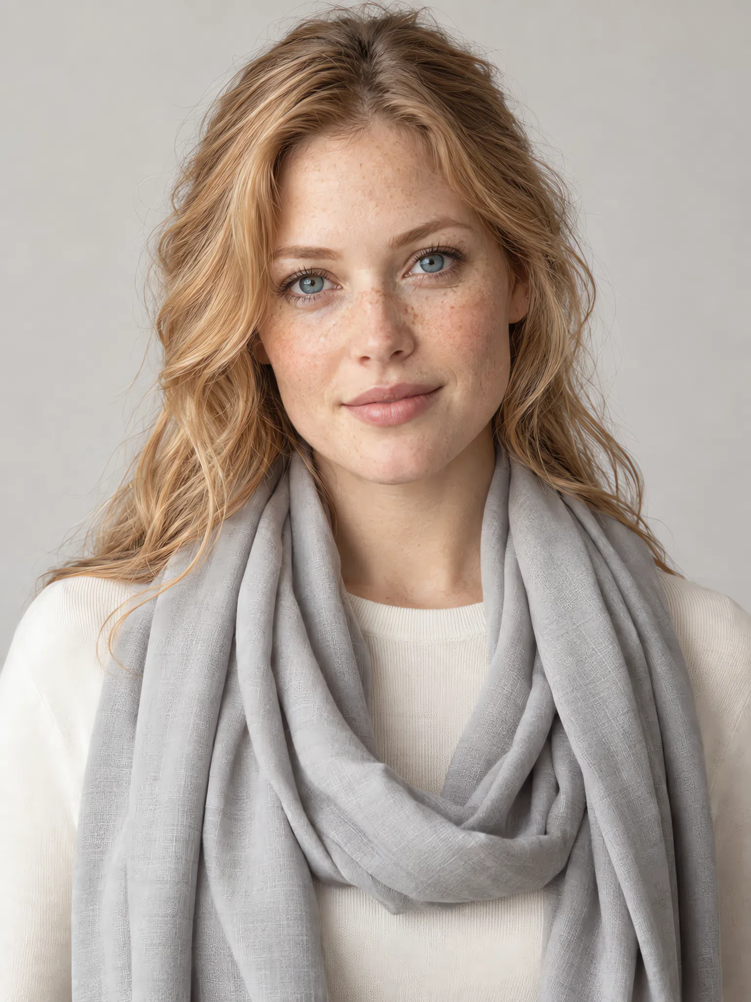
Metal and finish
Three metals, and one clear first choice. Warm metal repeats the gold that is already in your skin, where cold metal argues with it. Keep pieces fine: a heavy chain or a chunky cuff outweighs a light face.
Stones and small leather
- Turquoise, coral and light amber are your stones. All three repeat colors from the palette itself. Set them in Yellow gold or Rose gold rather than silver.
- Bags and shoes in the light shades. A Wheat, Peach sorbet or Spearmint bag finishes an outfit without adding weight. Save Tan for shoes and belts.
- Prints should speak your colors. A scarf printed in the palette's own shades ties any outfit back to your face - the quickest fix for a top in the wrong color.
Color in small doses: hat, scarf, bag and neck scarf
Tap a pairing and two things change at once: a neutral on the knit and a color on the accessory. The further an accessory sits from the face, the stronger a shade it can carry - the hat and the bag take the brightest, the scarf and the neck scarf the softest.
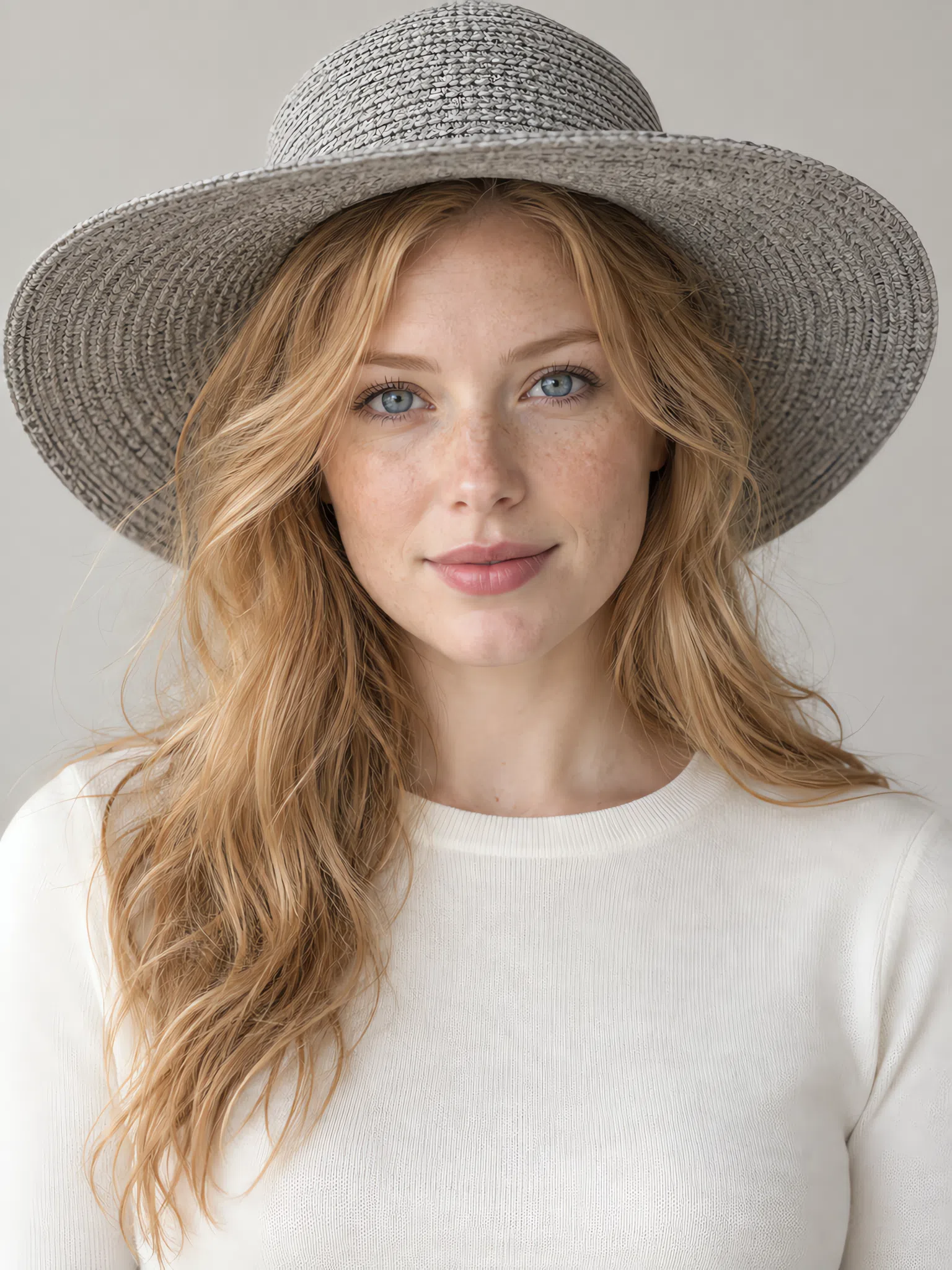
Hat
A hat keeps its color furthest from your face, so this is where the most saturated shades in the palette belong.
Scarf
A scarf lies right against the face, so only shades that genuinely suit you work here - the lightest and warmest of the palette.
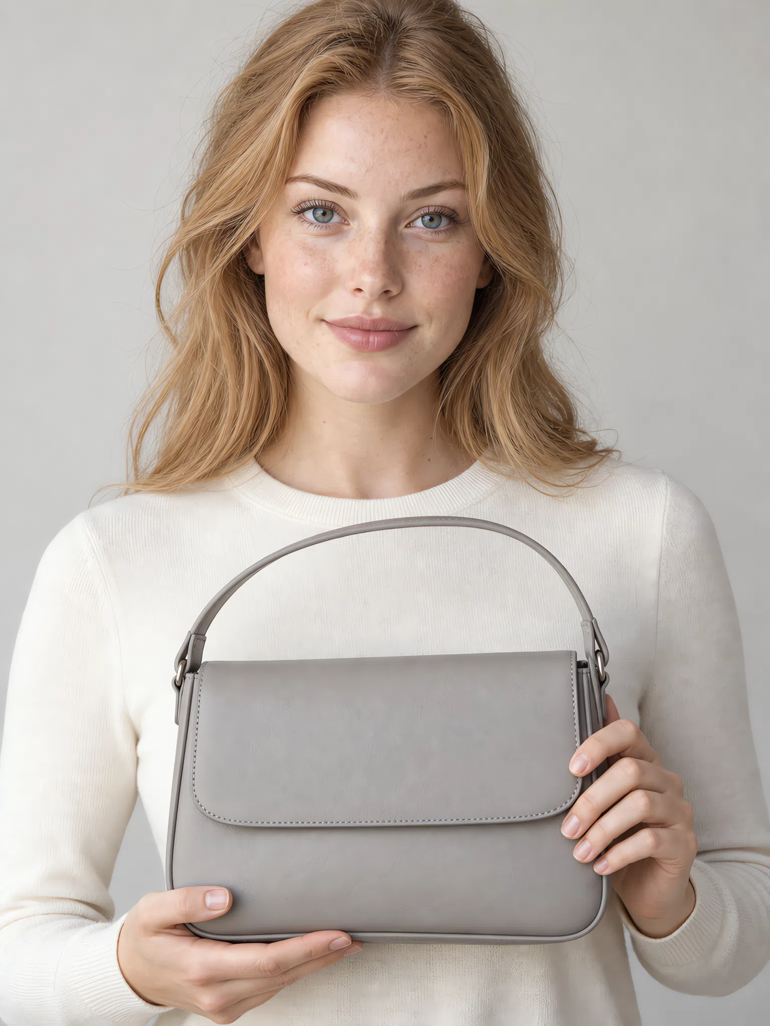
Bag
The safest place for strong color. It sits far from the face and never touches what your skin tone is doing.

Neck scarf
After your own skin, this is the color closest to your face. Choose soft, light shades rather than the loudest ones.
Light Spring colors to avoid
Nine shades in three groups, and each group fails for its own reason - which matters, because the fix differs too. Every card carries the palette shade to reach for instead. What they share is that each one takes away something this coloring runs on: its lightness, its warmth or its clarity.
Black and heavy darks
Nothing in your face is dark, so a dark garment has nothing to answer it.
Why these do not work
- The step is too big. Hair, skin and eyes sit on nearly one level of lightness. A dark garment adds a step far larger than anything in your face, and the eye stops on the fabric.
- Every shadow gets deeper. Once the darkest thing in view is under your chin, each shadow on the face reads darker by comparison - under the eyes, beside the nose, at the corners of the mouth.
- Charcoal fails twice. It is dark, and it is cold. That is why its swap is a warm gray, Fawn, rather than simply a lighter gray.
Cold and icy shades
These carry blue underneath and your skin carries gold, so the two argue.
Why these do not work
- Lightness is not the problem. Optic white is as light as anything in your palette and it still fails. What breaks it is the blue inside it, not the amount of color.
- Your skin takes the opposite cast. Cold color held against golden skin pushes that skin toward yellow, and the natural peach flush begins to read as redness.
- Each one has a warm twin. Ivory for white, Apple blossom for pink, Yellow gold for silver - the same role at the right temperature.
Dusty and muted colors
Two of these three are warm, which proves this palette is not only about warmth.
Why these do not work
- Gray takes the glow. A grayed or earthy shade has had its clarity knocked out, and next to it the skin loses the light it seems to give off.
- Complexity reads as fatigue. Mixed, muddied colors look sophisticated on a soft coloring. On a clear one they look tired, because nothing muted in the face is there to echo them.
- Keep the hue, clean it up. Want a green? Kiwi is olive with the dust removed. A brown? Camel. A deep red? Coral does the job at the right lightness.
Light Spring color combinations
Knowing your colors is half the job; the other half is putting them together. Five combinations you can copy exactly, from a working day to a weekend.
Five outfits to copy
Each row runs in dressing order: the largest piece first, then the layer over it, then the detail that brings the color.
Fresh breeze
Wheat trousers, a Spearmint blouse and a Camel trench on top. The everyday working combination.
Ivory and coral
An Ivory dress with Coral shoes and a Coral bag - the simplest of the bright combinations.
Spring meadow
A Camel skirt, a Kiwi top and a Dandelion scarf. Bold and outdoorsy, and it only works because all three are warm.
Soft pastel
Fawn trousers, a Peach sorbet knit and a Bluebell scarf - gentle and romantic, with no shade arguing with the face.
Clear sky
An Azure shirt over Ivory trousers. The most refreshing pair in the palette, and one that suits every Light Spring.
Under all five sits one working rule: 60/30/10 - about sixty percent neutral, thirty percent pastel and ten percent accent. Pair neighbors on the color wheel, such as Peach sorbet with Dandelion, and give each outfit a single step of lightness - Ivory against Coral - so it never goes flat.
The Light Spring capsule wardrobe
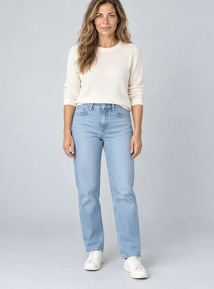
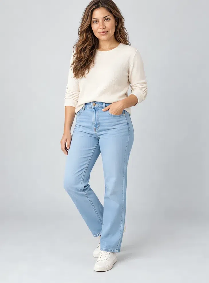
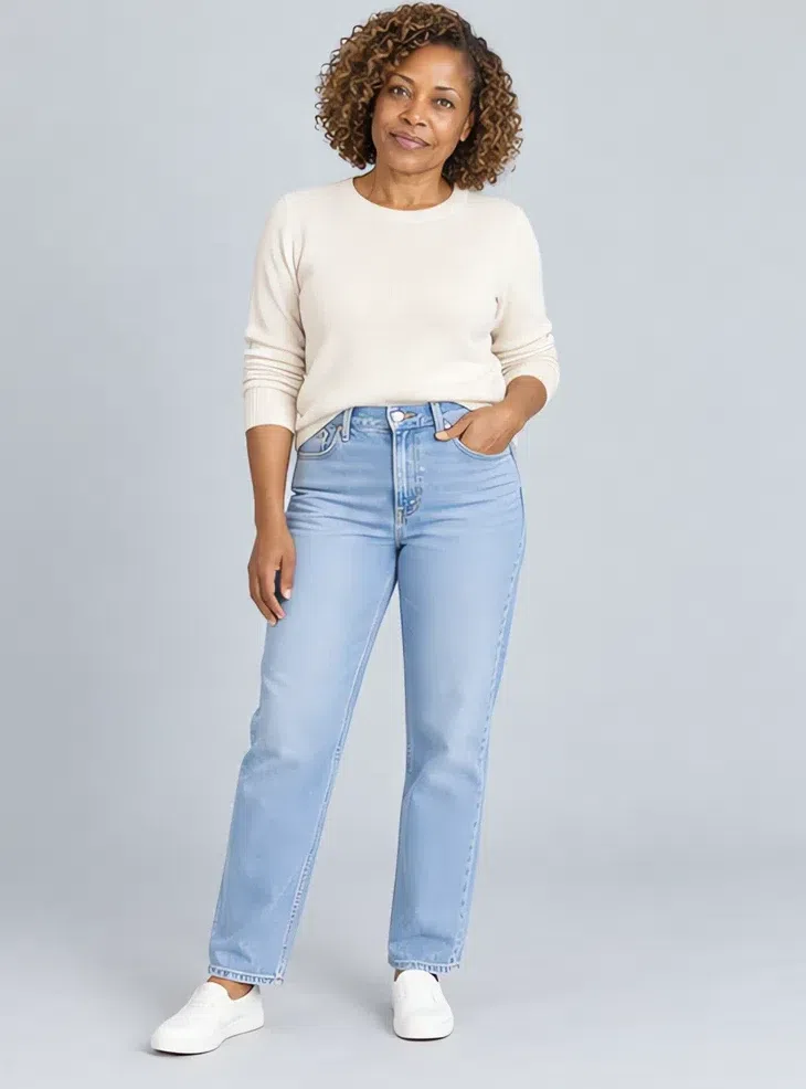
Eight pieces, each shown at four skin depths
The capsule is where the palette stops being a list and becomes a closet. Its base is the warm neutrals - Camel, Ivory, Wheat - and on top of them go the colors that do the most for this coloring: Coral, a fresh turquoise-mint and Peach sorbet. Eight pieces, and any two of them work together.
Each piece is photographed on four complexions, fair to deep, because the palette follows undertone and contrast rather than skin depth - one model in every photo would hint at the opposite.
Eight pieces for a Light Spring capsule wardrobe
Spend on the neutrals and have fun with the colors. The coat, the sweater and the trousers are what you reach for four days out of five, and they are where cheap fabric shows first.
What ties these eight together is color: they are the Light Spring palette turned into clothes. The general mechanics of a capsule - the minimum number of pieces, the arithmetic of outfits, the order to buy in - are a separate subject, which this page does not cover.
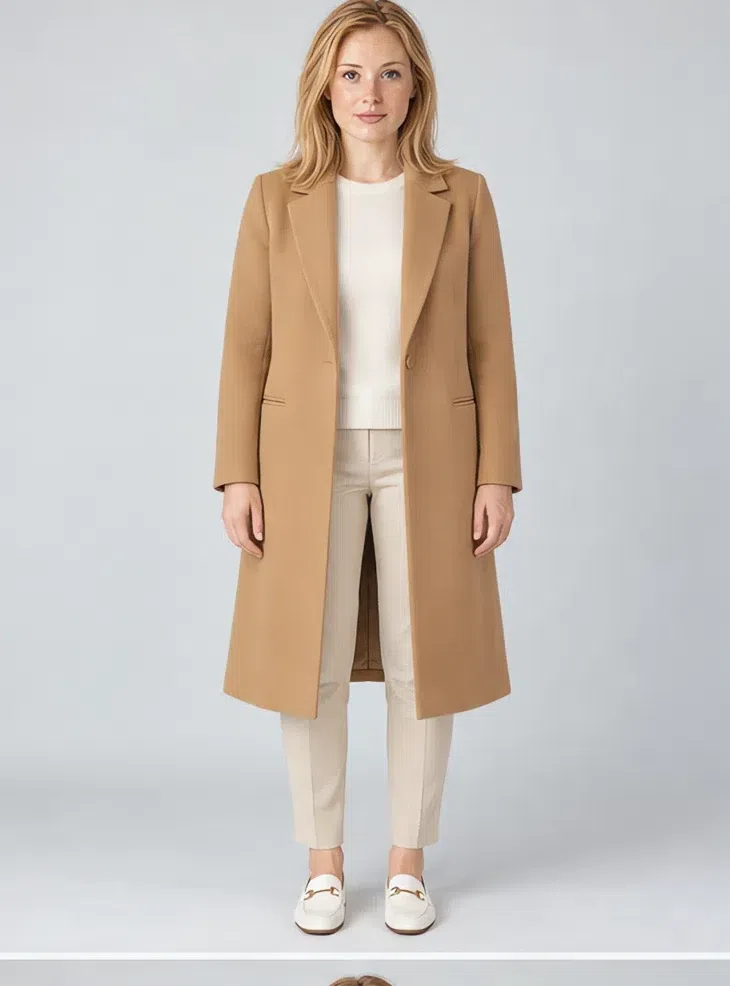
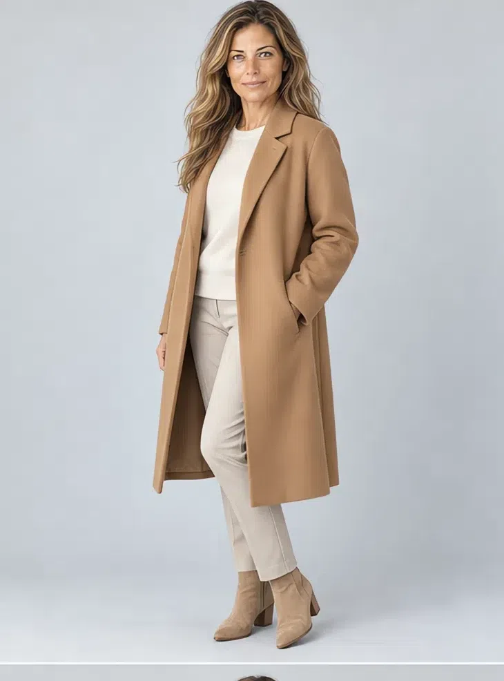
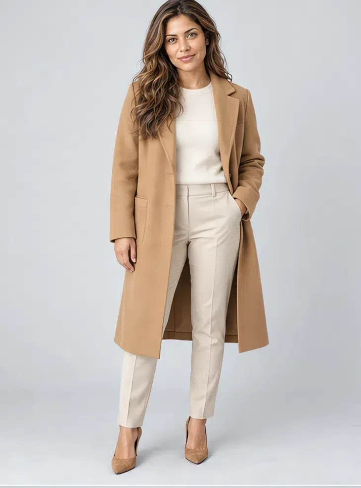
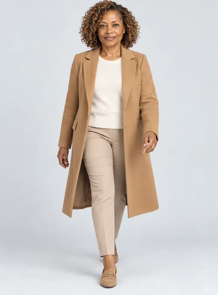
1Camel wool coat
The coat sets the terms for everything under it, so start here. Warm camel or a golden beige, knee length, straight or lightly fitted, in something soft - cashmere, fine wool, good cotton. Pass on the gray-beiges sold as a safe neutral: next to golden skin they make the complexion look grubby.
Tip Add gold jewelry and a Peach sorbet scarf, and it carries every spring and autumn outfit you own.
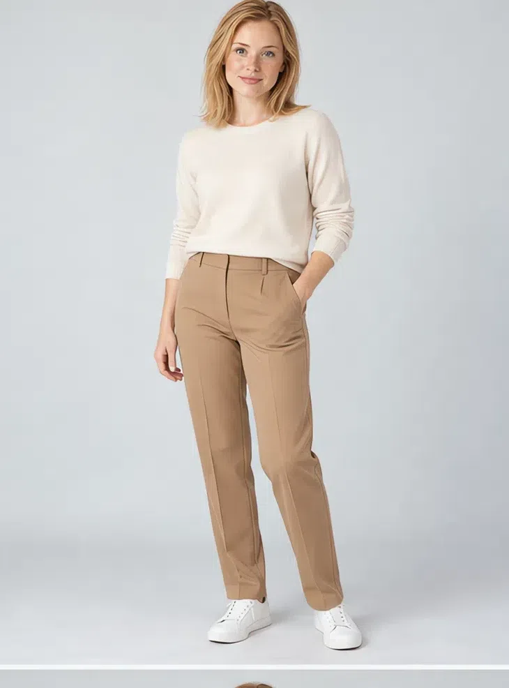
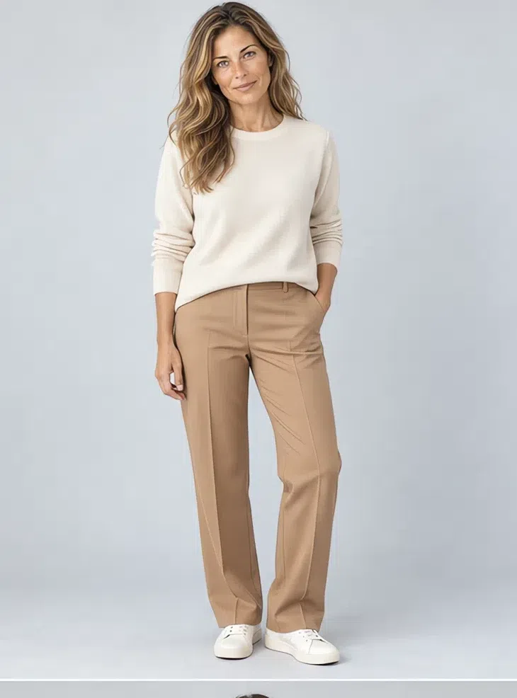
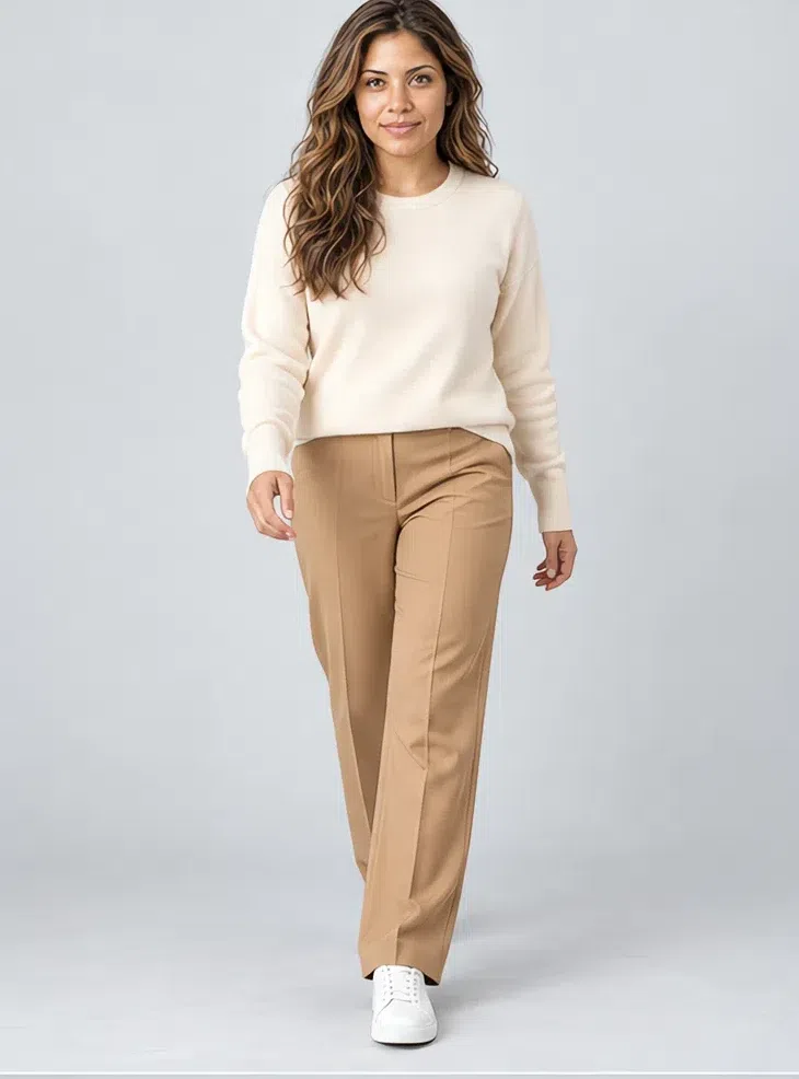
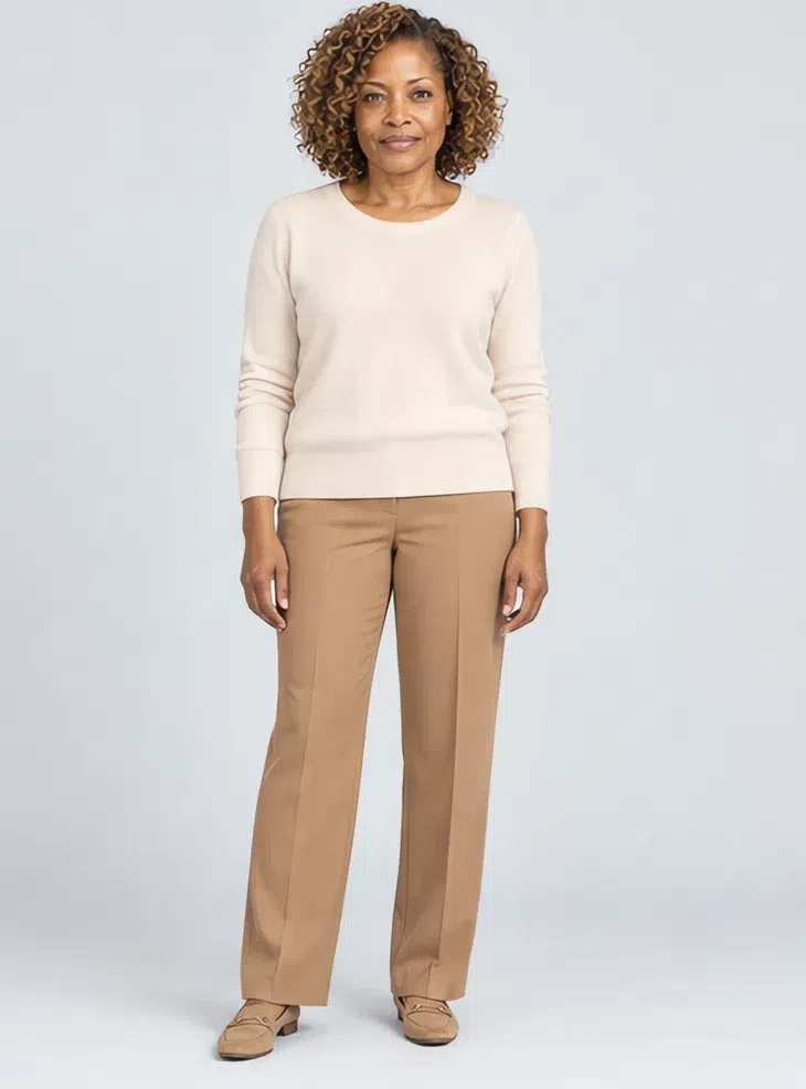
2Ivory cashmere sweater
An ivory or cream knit for cool days, in fine cashmere, mohair, or cotton with a little stretch to hold its shape. Relaxed but not oversized - a light frame disappears inside bulk. It goes with every skirt and trouser in the palette.
Tip Wear it over Spearmint trousers or with Pale denim when you want one fresh note.
3Coral silk blouse
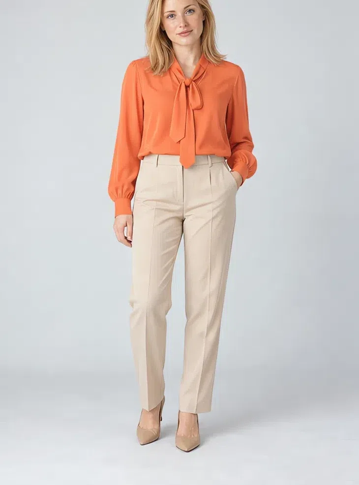
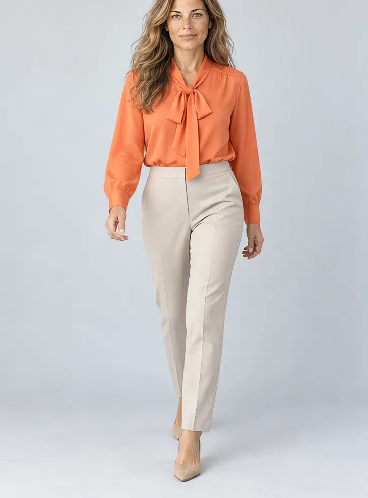
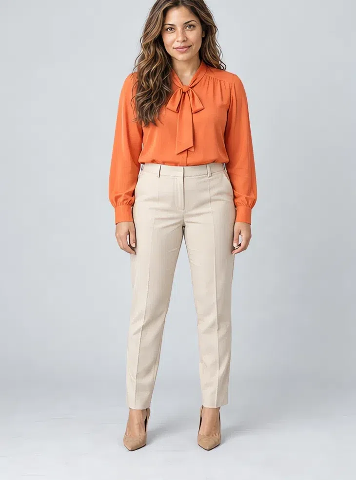
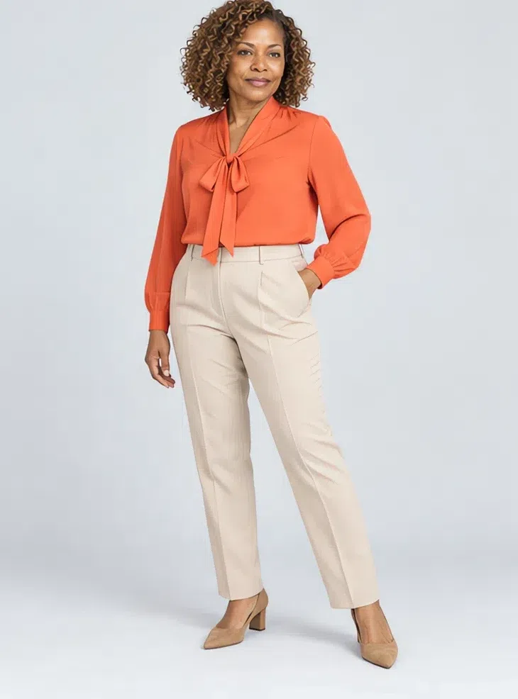
Your main accent piece. Silk, satin or a crisp cotton, and the one garment here that can take a romantic detail - a bow at the throat, a ruffle, a fuller sleeve. The warm pink-orange lifts the face and brightens the eyes. With neutral trousers it is office wear; with jeans, it is the weekend.
Tip Keep the cut classic for work and save the bow and ruffles for the evening.
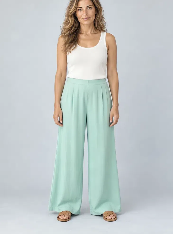
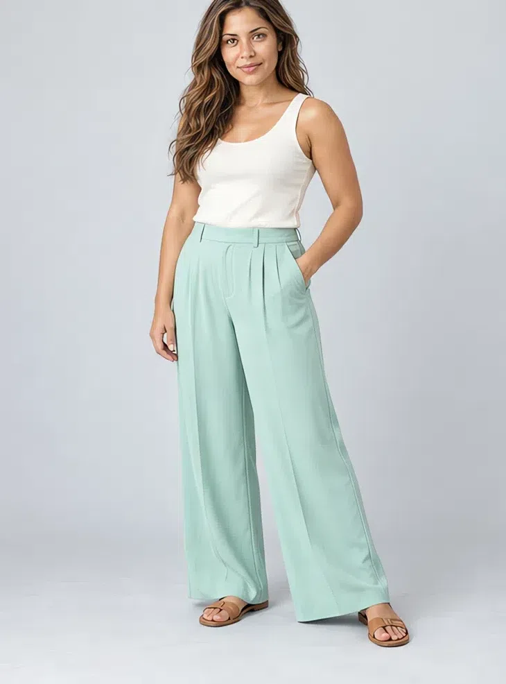
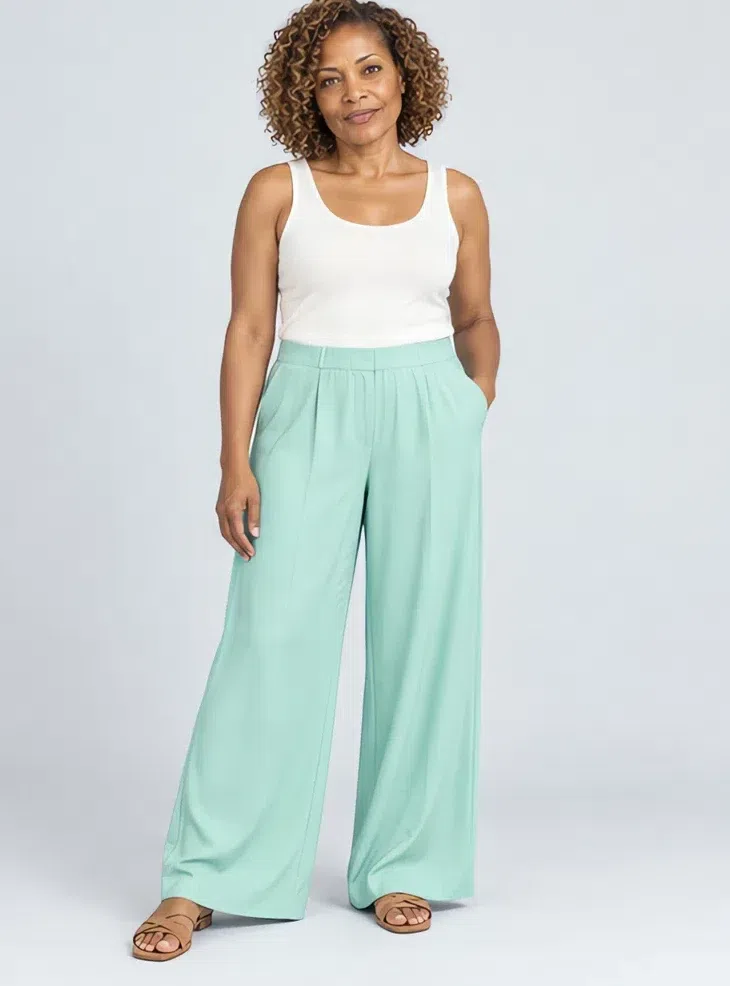
4Spearmint wide-leg trousers
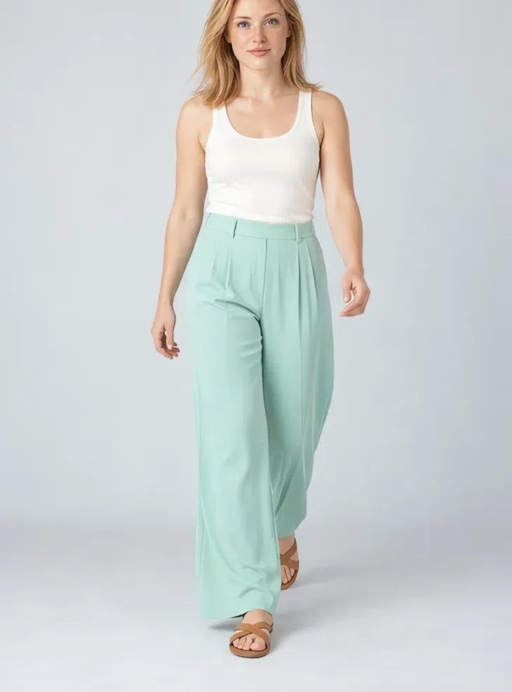
Fresh color below the waist, where it can be as light as you like. Fluid fabrics - viscose, silk, fine linen - in a straight or wide cut. They sit easily under Ivory, Wheat and Peach sorbet tops, and they are at their best in spring and summer.
Tip A Wheat blazer makes them office-ready; an Ivory tank takes them to the beach.
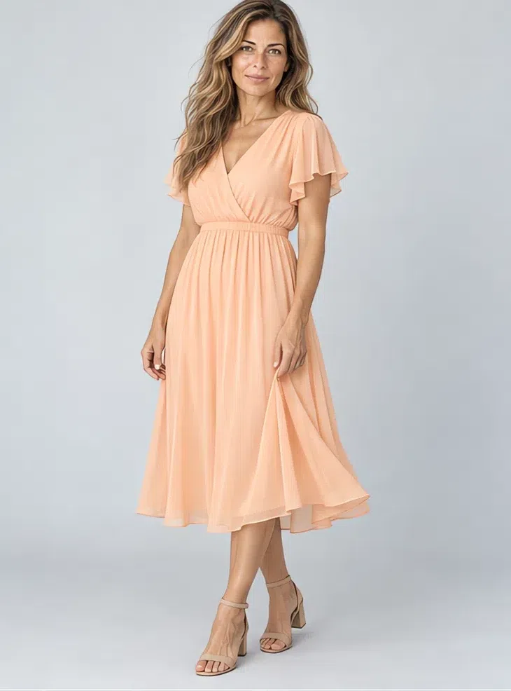
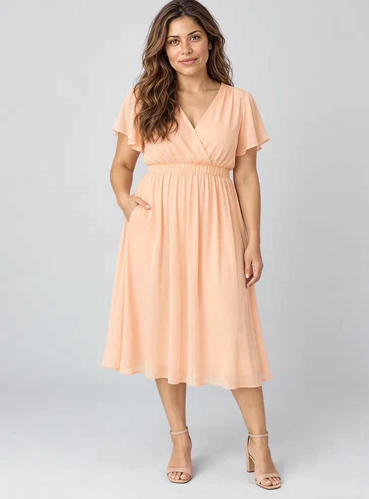
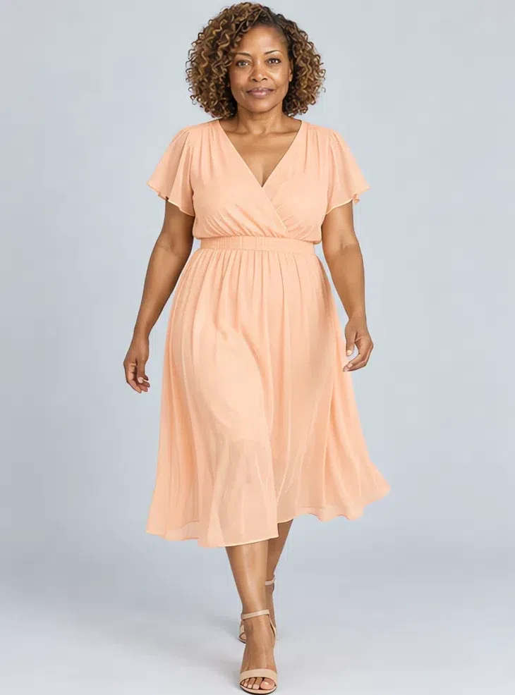
5Peach sorbet chiffon dress
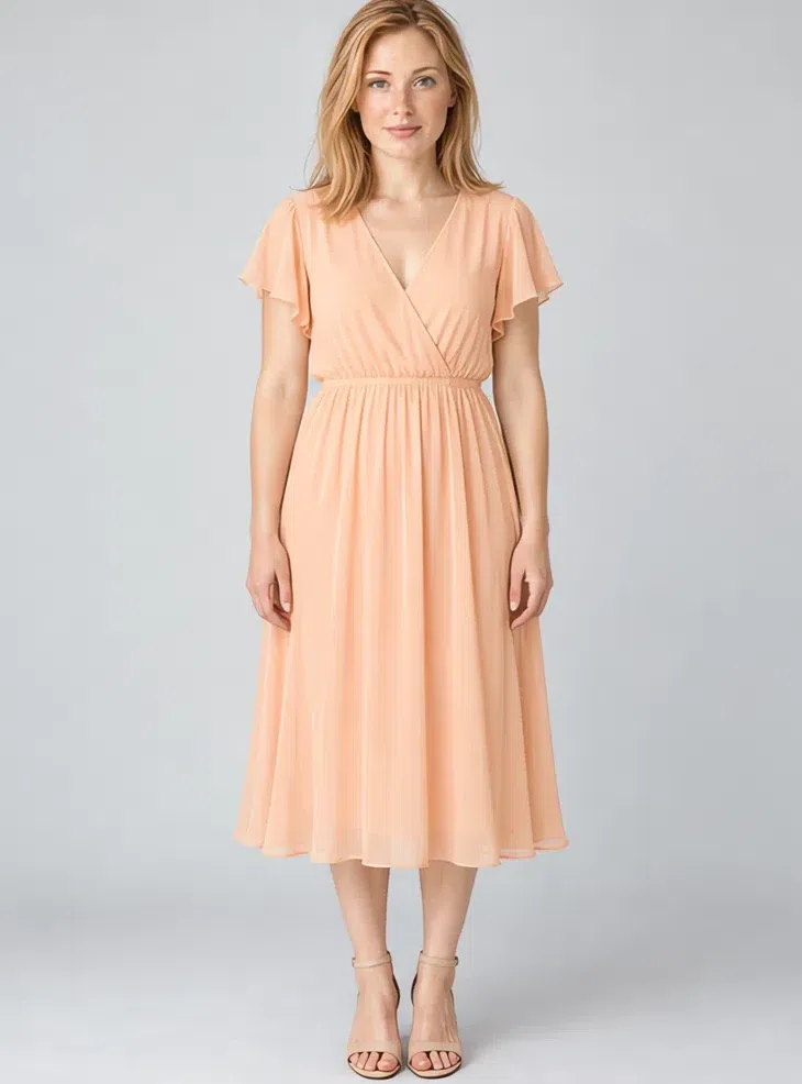
The warm-weather piece. Chiffon, silk or cotton, plain or with a small floral print, loose or lightly fitted, at midi or maxi length. Peach does for the skin what blush does, which is why this dress looks good on days when nothing else will.
Tip A straw hat and a woven bag finish it for summer.
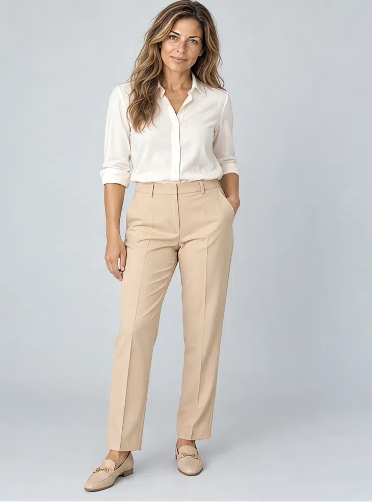
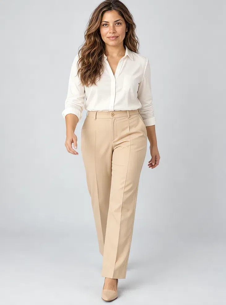
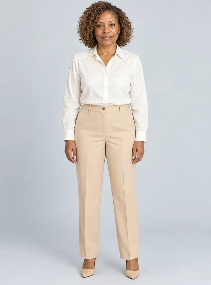
6Wheat tailored trousers
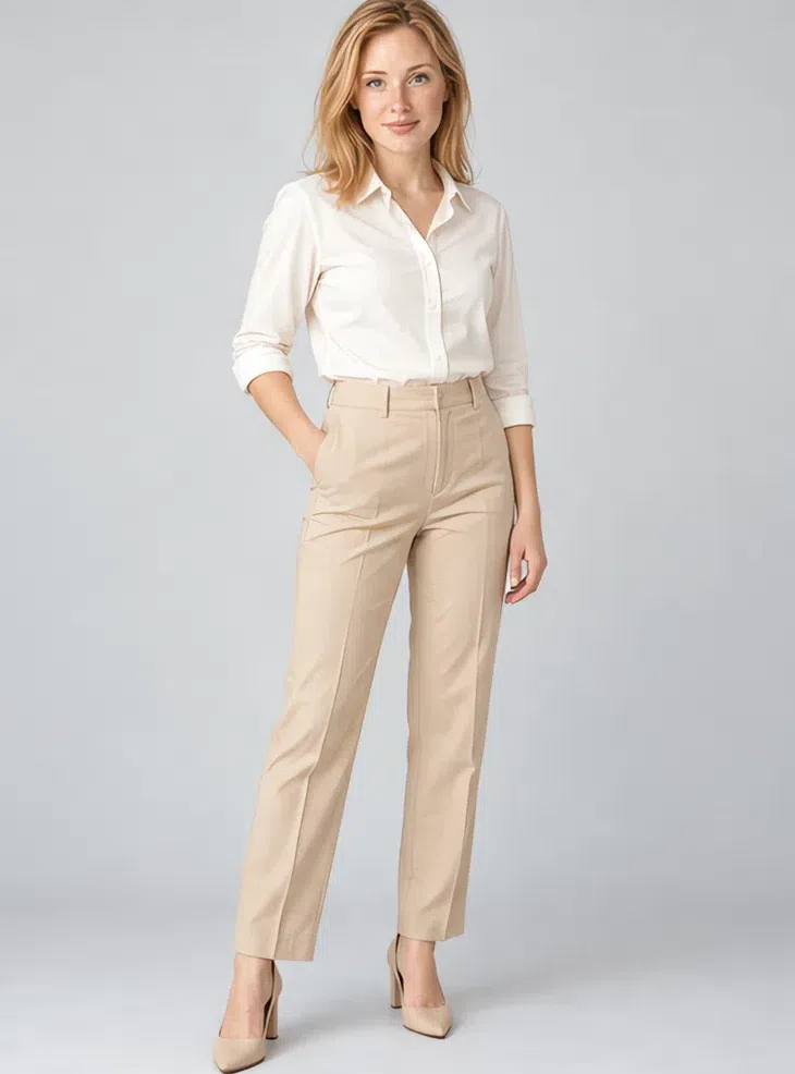
The backbone of a working wardrobe. Wool with cashmere, twill or good cotton, straight or slightly tapered. Nearly every blouse and knit in the palette sits comfortably on top of them.
Tip For the office: an Ivory blouse and the Turquoise blazer.
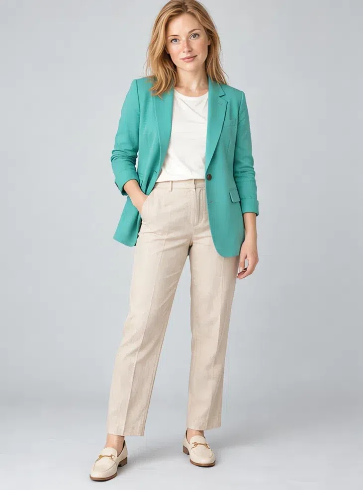
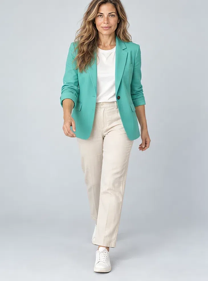
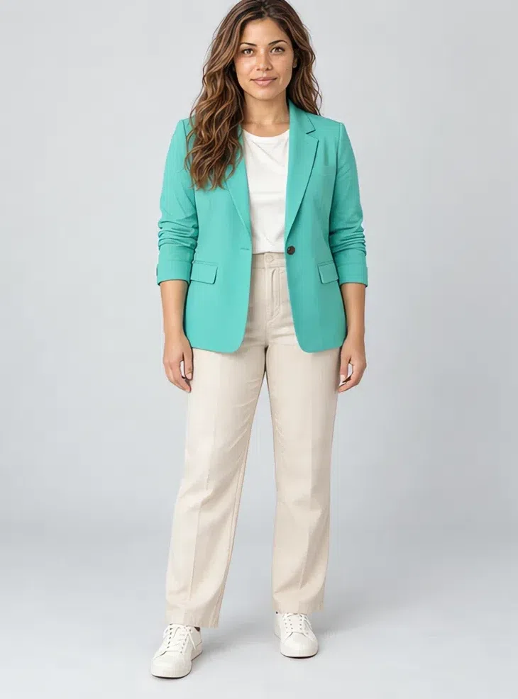
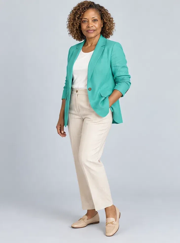
7Turquoise linen blazer
A structured blazer in clear turquoise refreshes a work wardrobe more than another neutral jacket ever will. Fitted, in cotton or linen with enough body to hold its shape. It goes over Ivory, Wheat or Coral.
Tip Throw it over the shoulders of a plain dress for an easy weekend look.
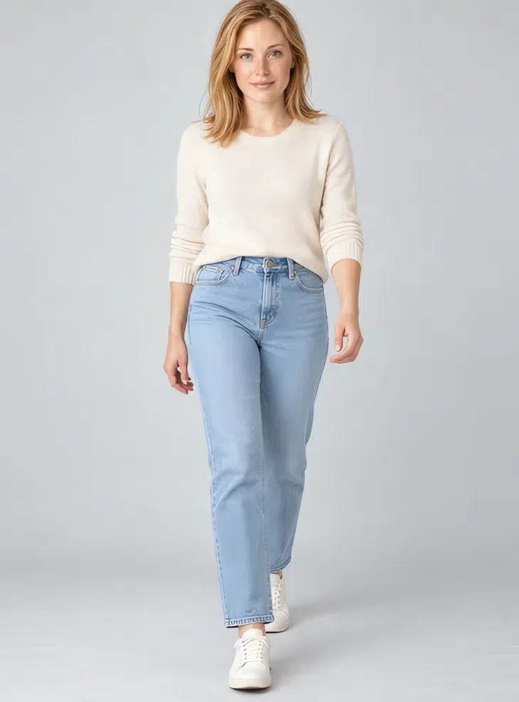
8Pale denim jeans
Clean light-blue denim with no gray wash, no heavy fading and no indigo depth. A straight leg in a crisp finish looks polished; distressing and dark rinses belong to other palettes. Every top in this capsule works with them.
Tip Tuck an Ivory knit in at the front and add Tan loafers - the whole outfit stays in one light register.
Five ways to combine them
- Tone on tone. An Ivory sweater, Wheat trousers and a Camel coat: three neutrals a step apart, calm and put together.
- Neutral base, one accent. A Wheat base under a Coral blouse or the Turquoise blazer - mostly neutral, with one strong note carrying the outfit.
- Light over light. Pale denim or an Ivory skirt with a Peach sorbet top keeps the whole outfit in the high register, which reads fresh rather than washed out.
- Texture instead of print. Silk against cotton, cashmere against soft suede. Surface variety keeps a light outfit from going flat.
- Shift with the seasons. More Turquoise and Spearmint in summer, more Camel and Ivory in winter - the palette stays put while the balance moves.
Light Spring makeup colors
The shades, product by product
Every shade below is warm, light and clear, organized by product so the list works at a counter.
Three products depend on your own depth more than on the season, so those are shown on four complexions. The rest are a four-shade reference each.
Base: foundation, bronzer, glow and blush
The first three shift with your depth, so match them in person; blush follows the season.
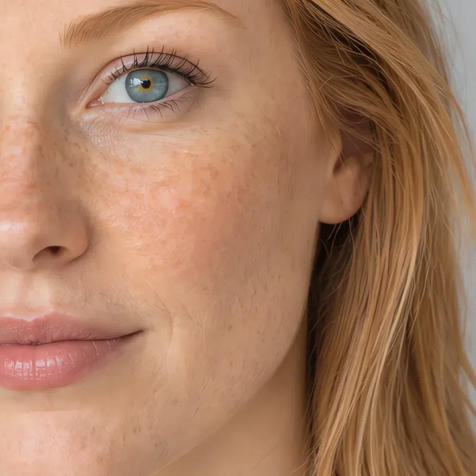
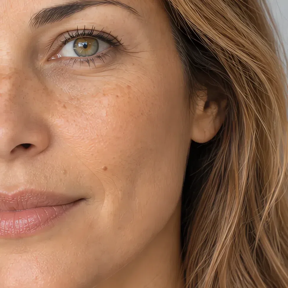
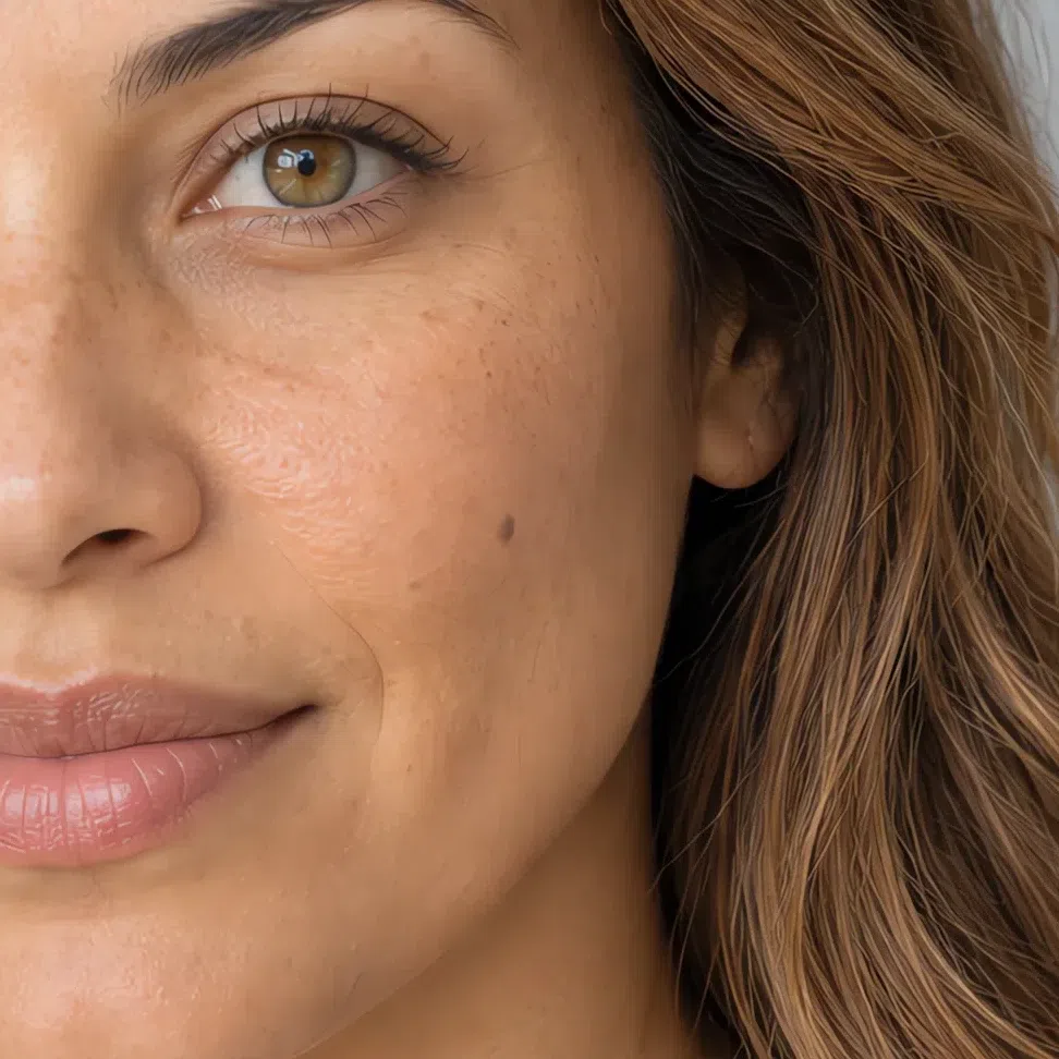
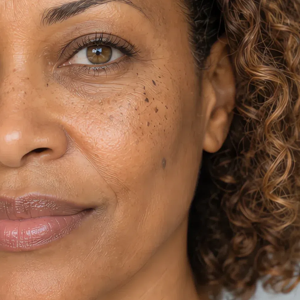
Foundation matched to your depth
At every depth the undertone stays warm - golden, peach or honey. A pink or ashy base is the usual mistake on this coloring, and it grays the skin at the jaw first.
Tip In daylight, a good match simply disappears at the jawline.
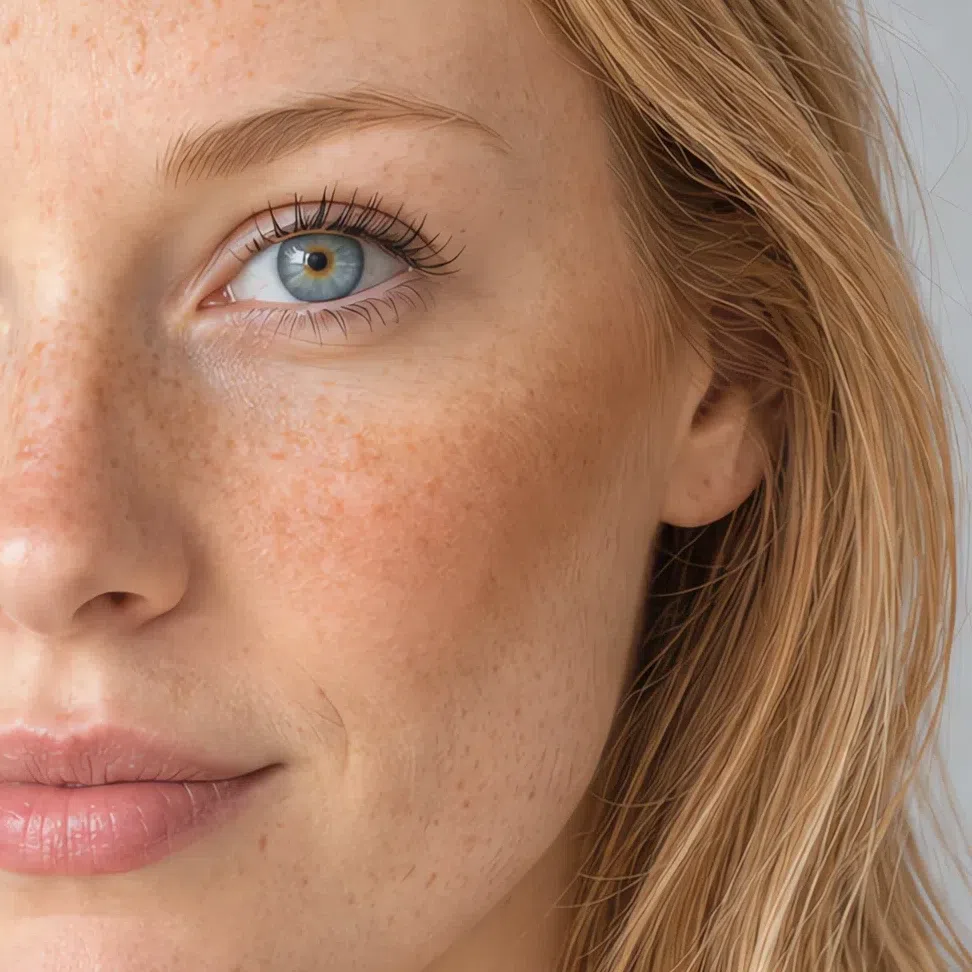
Bronzer matched to your depth
A touch of sun rather than a contour: golden-peach in family, and only a step deeper than your own skin.
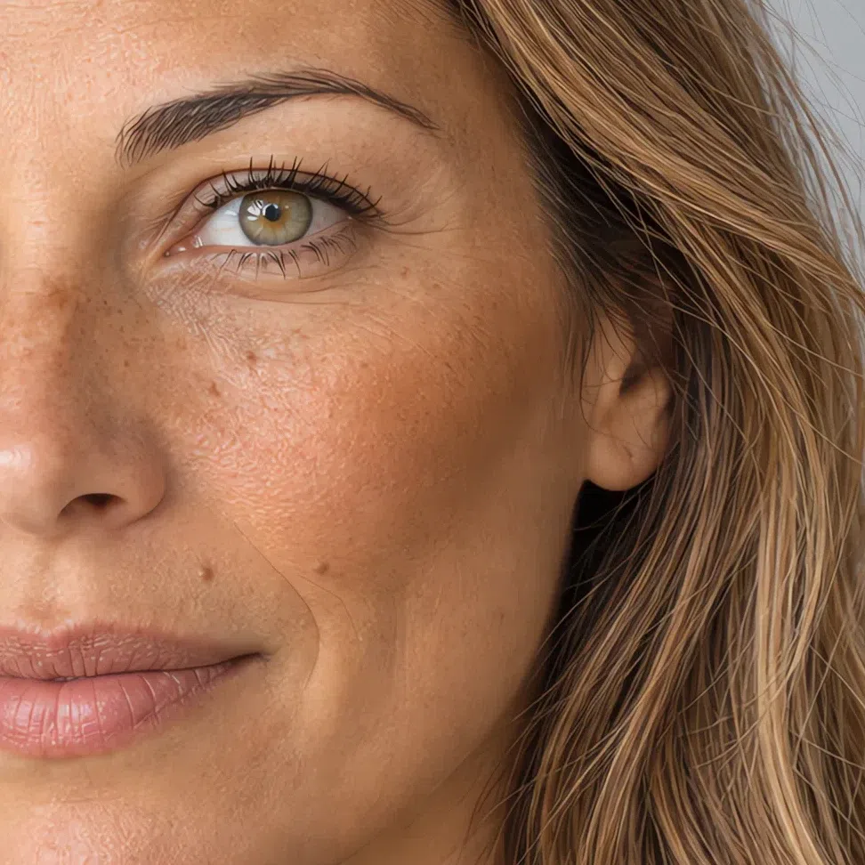
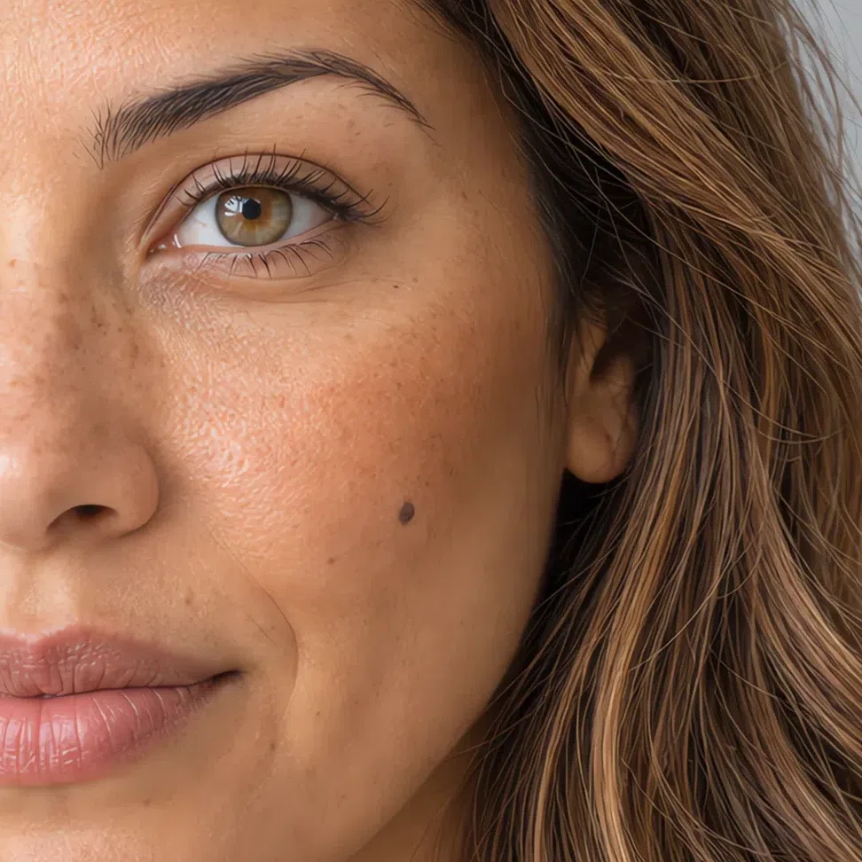
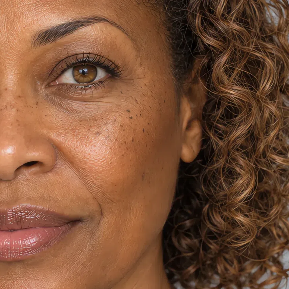
Avoid Taupe and gray-brown contour shades, which read as a smudge on golden skin.
Highlighter matched to your depth
Warm light rather than cold sparkle - peach, champagne and soft gold.
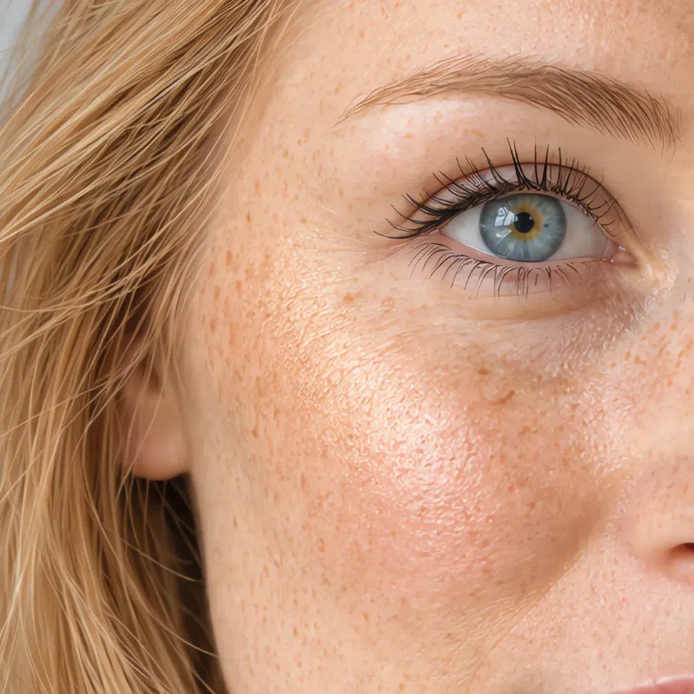
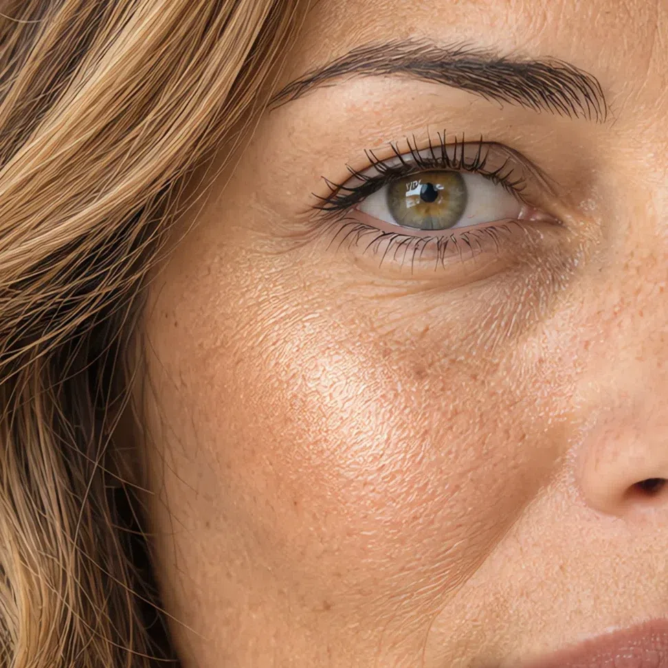
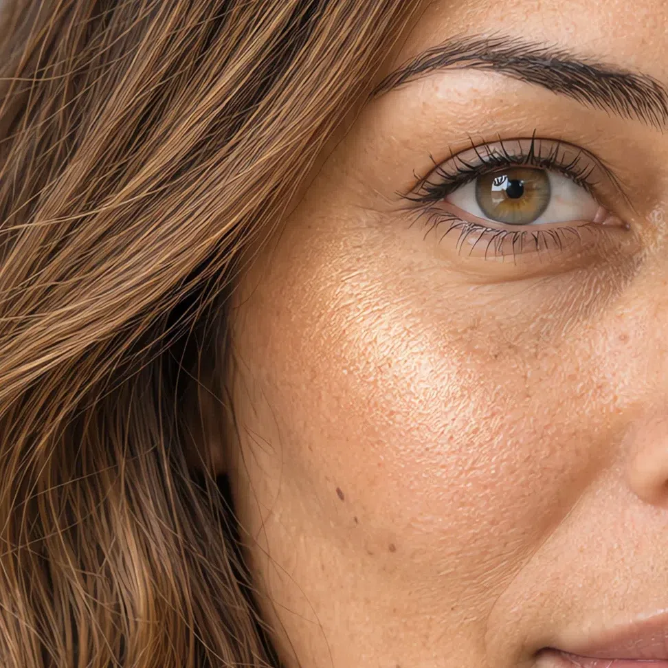
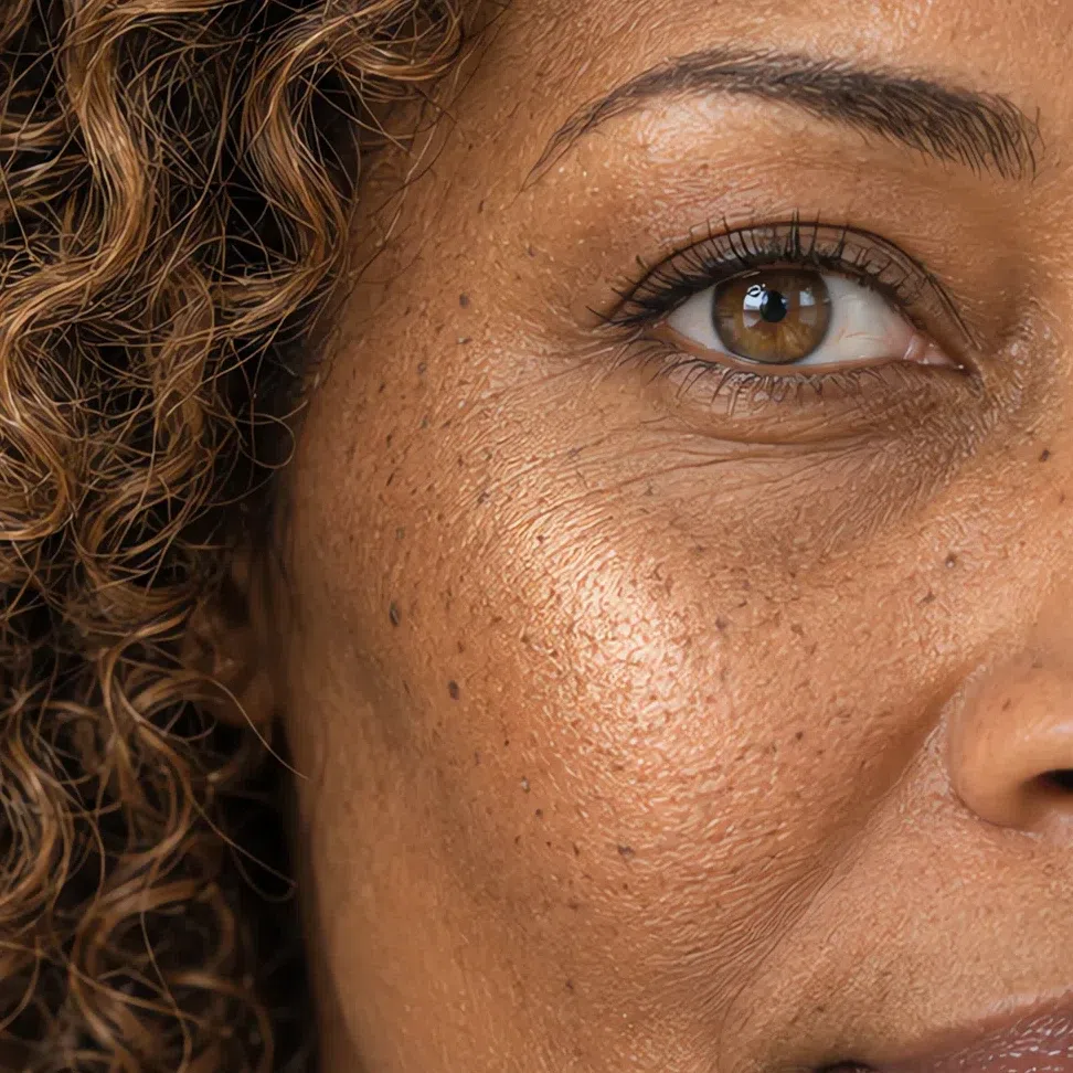
Avoid Icy silver and lilac highlighters.
Blush
Peach, apricot and warm coral - the same family as the flush your cheeks already have.
- Peach blush #F6BFA0
- Coral blush #F5A98F
- Apricot blush #F3B282
- Blossom pink blush #F2B7AE
Eyes: shadow, liner, mascara, brows
Light and warm across the board. These eyes are clear and bright, and heavy dark products close them down.
Everyday eyeshadow
Champagne, peach and sand, each only a step deeper than your lid.
- Champagne #EFE0C6
- Peach wash #F5C9A8
- Wheat #E4CFAE
- Buttercream #F2DFA8
Evening eyeshadow
More saturated and still warm: aquamarine, golden olive, copper.
- Aquamarine #86CFC2
- Golden olive #B6A55E
- Copper peach #D79A72
- Papaya #F0A070
Eyeliner
Warm brown, bronze, olive or peacock. Black is the one to leave out.
- Warm brown liner #8B6244
- Bronze liner #9C7340
- Olive liner #6E7043
- Peacock liner #3E9E92
Mascara
Brown and golden brown. Classic black usually reads too hard on lashes this light.
- Soft brown mascara #6B4A34
- Golden brown mascara #7A5730
- Bronze brown mascara #6E4E33
- Deep brown mascara #4A3424
Brows
Golden rather than ash, and no deeper than your hair.
- Golden blonde brow #B99664
- Wheat brow #C7A97A
- Light caramel brow #B08A5F
- Honey brown brow #98704A
Lips: nudes and color
Warm-based at every strength. A peach nude and a clean coral both belong to you; a cool mauve or a berry does not.
Nude shades
Peach- and apricot-based, never beige-gray - a gray nude erases the mouth on warm skin.
- Peach nude #E9A98C
- Cream pink nude #E7AFA0
- Apricot nude #EDA97E
- Salmon nude #EC9E8A
Colored shades
The palette's own accents, worn on the mouth: clean coral, a warm watermelon pink, salmon and poppy red.
- Coral #FF7F50
- Geranium #F76C7B
- Salmon #F88874
- Poppy #E8674C
Hair shades
Golden shades to ask for, cold and dark ones to skip
The aim is your own hair, a little brighter - never a new identity. Every shade below keeps a clear, golden warmth at its own level, because ash or real darkness beside this skin strips out the glow the whole coloring runs on.
Golden and sunny blondes
The heart of it: clean, bright, warm blondes, as a single color or as soft babylights.
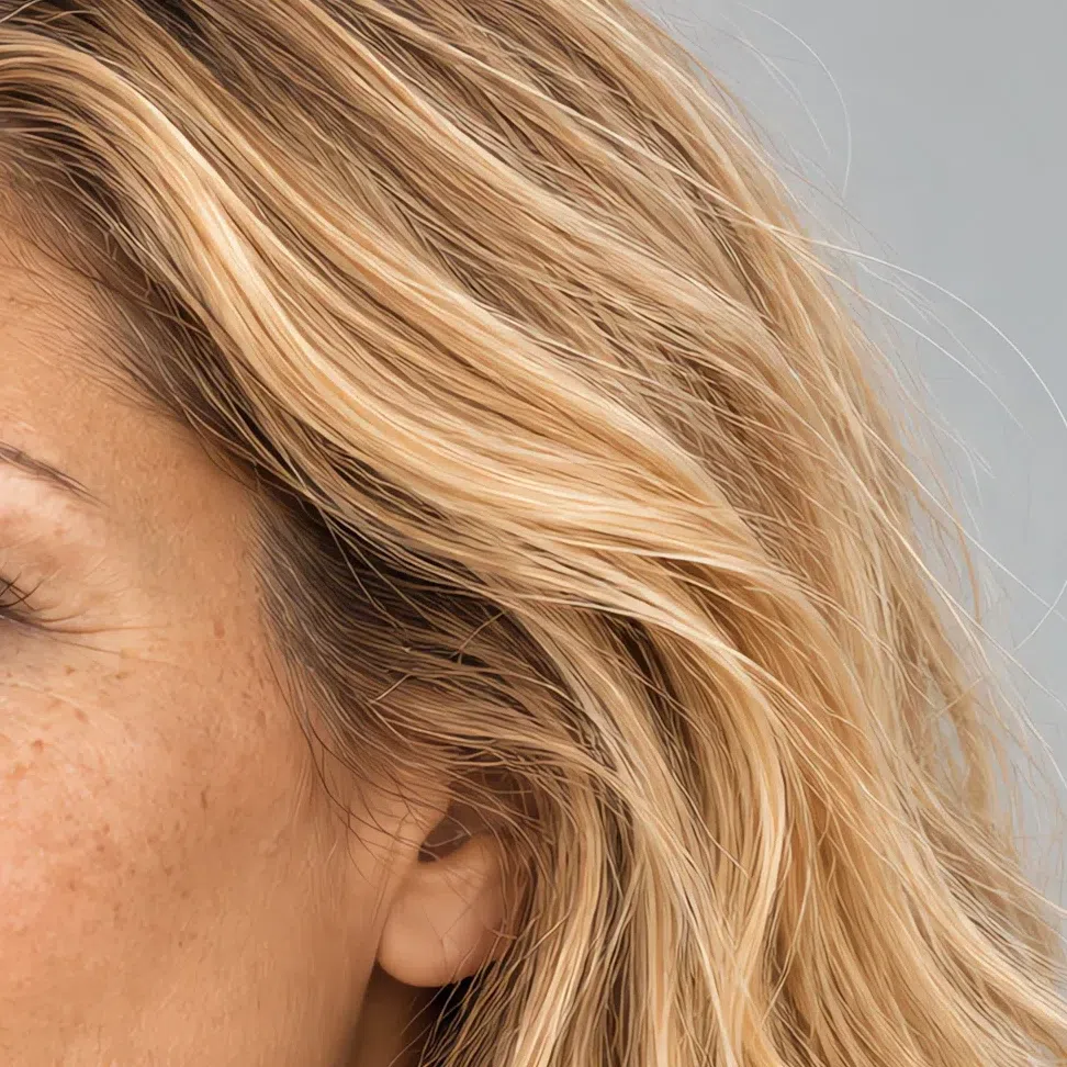
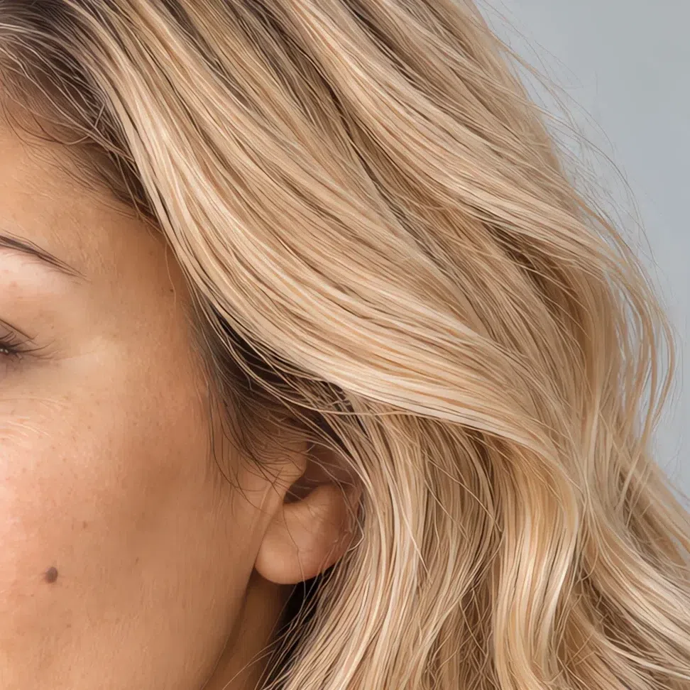
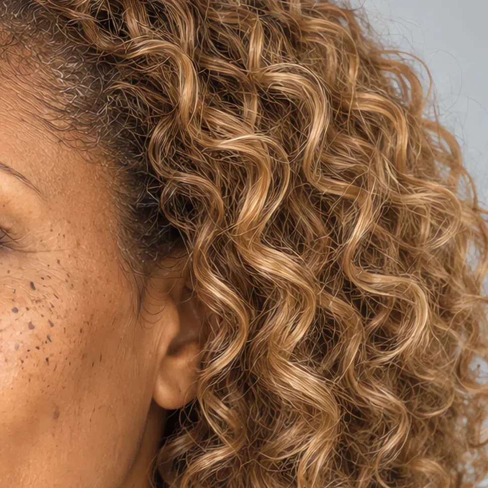
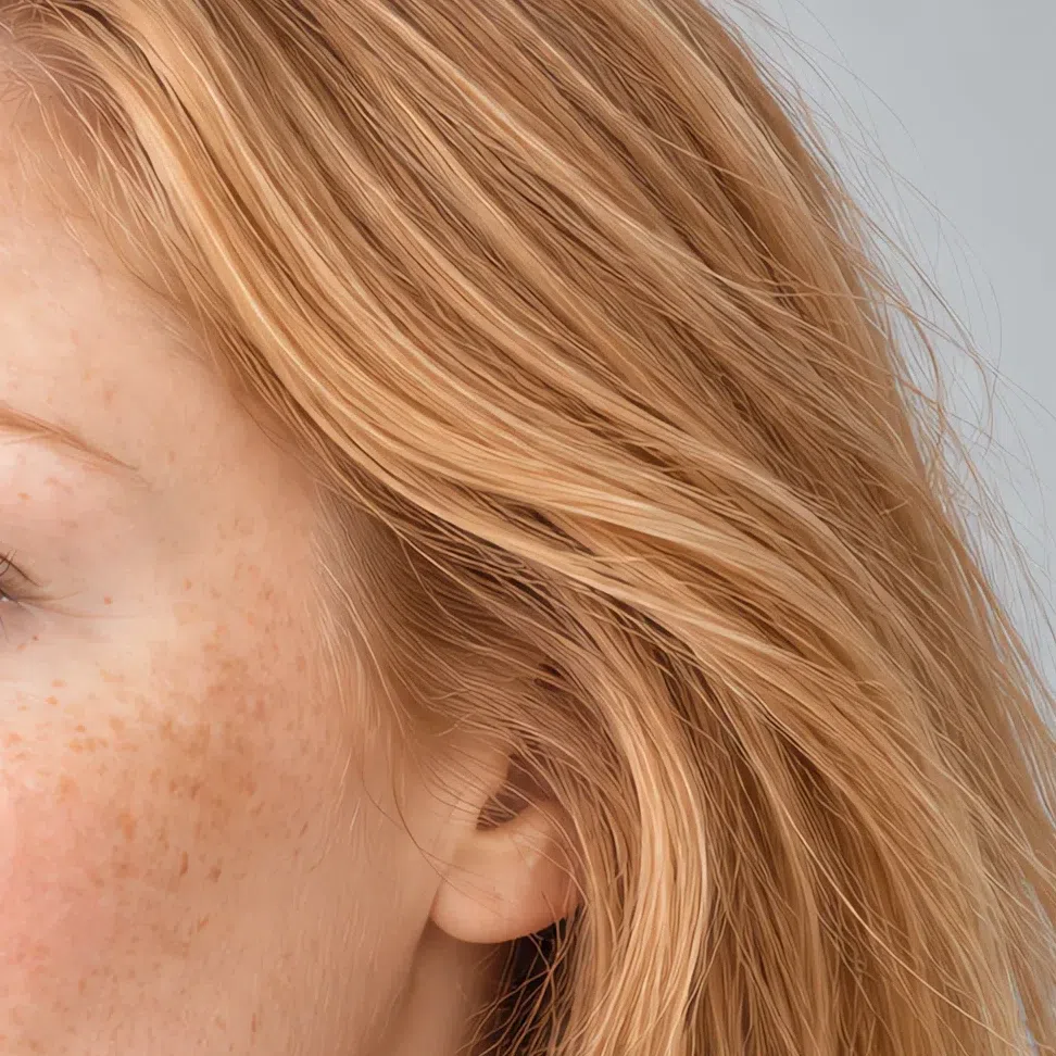
The same shade across four levels:
Warm light browns and caramel
Depth and body without going dark - golden notes only, never ash.
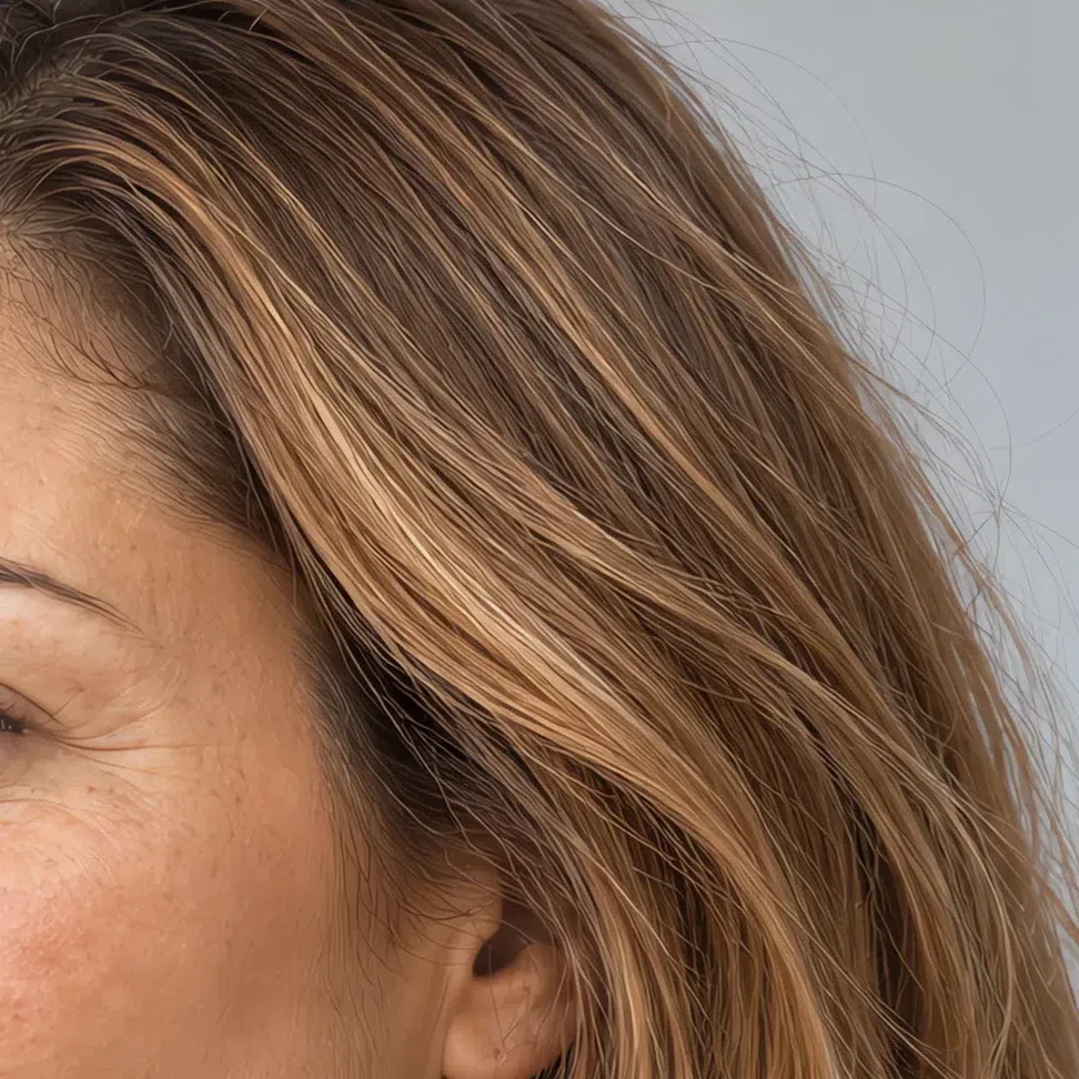
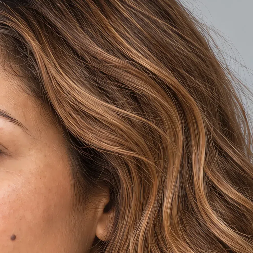
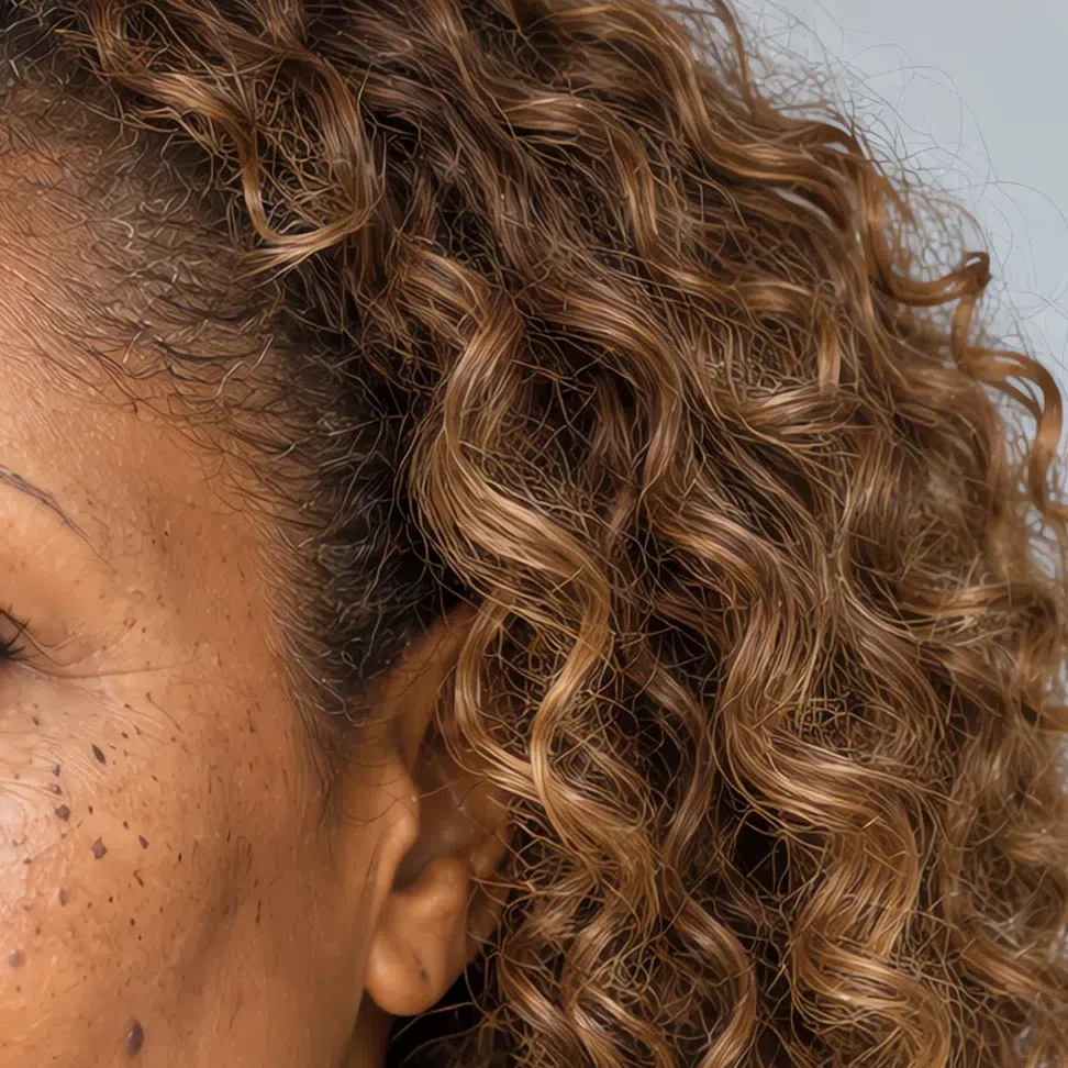
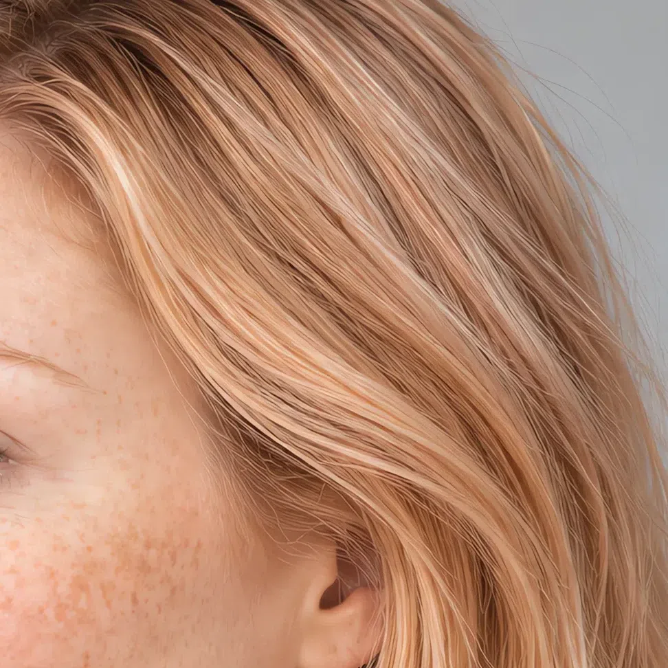
The same shade across four levels:
Hair colors to avoid
Eight shades in two groups: too cold on one side, too dark or too loud on the other.
Cold and ashy
Dark and saturated
Light Spring, or one of its neighbors?
A four-question check, then three side-by-side comparisons
Light Spring gets mixed up with three other types, and each mix-up has its own cause. Inside the season the argument is about strength - Warm Spring is more golden, Bright Spring is louder. But the most frequent mistake is not a spring at all: it is Light Summer.
What leads is what names each type. Light Spring leads on lightness, with warmth close behind; Light Summer shares that lightness and flips the temperature; Warm Spring leads on warmth; Bright Spring leads on clarity at full volume. Find the quality that leads you, and the details below fall into place.
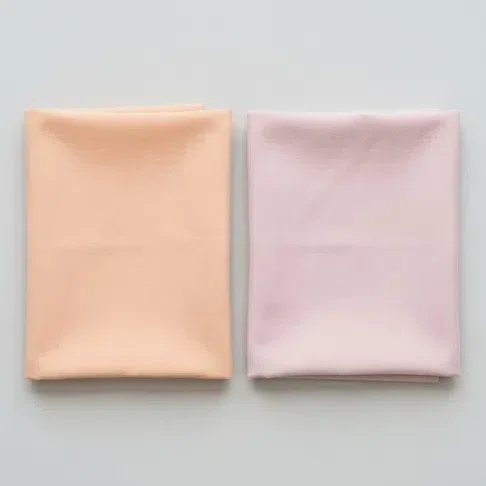
Hold a warm peach under your chin, then a cool powder rose of the same lightness. Which one leaves your face fresher?
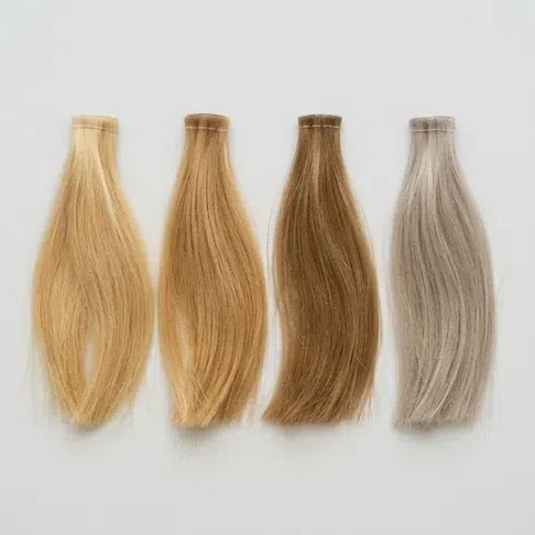
Leave out anything a colorist has done. What is your natural hair color?
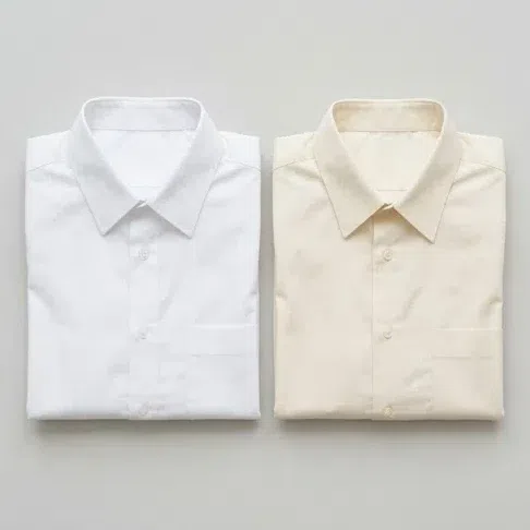
A crisp pure white shirt at the collar - how does it look?
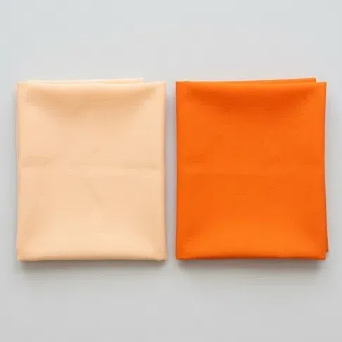
How much color can you wear right next to your face?
Lightness first, warmth right behind it - you are on the right page. Head for the palette and work from there.
Just as light, but cool underneath: muted, cool shades freshen you and warm ones yellow the skin a little. Read Light Summer.
Warmth leads you rather than lightness, and you can carry richer golden colors than this palette offers. Warm Spring is the closer fit.
You need clean, ringing color rather than softness - pastels dim you. See Bright Spring.
A short quiz points; it does not decide. If you landed between two results you are probably near a border, and the side-by-side comparisons below are built for exactly that case.
Light Spring vs Light Summer
Light Spring
Warm. The skin leans peach or ivory, and gold shows up in the freckles and the flush.
Light with gold in it: wheat, honey or strawberry blonde, brighter again after a summer outside.
Light and clean. Peach sorbet, Spearmint, Coral, Butter - every one with yellow somewhere underneath.
Warm whites only. Ivory, cream, the color of baked milk.
Pale yellow gold and rose gold.
Light Summer
Cool. Pinkish skin, sometimes with a faint ashy cast.
Light with ash in it: fair brown with no gold and a silvery sheen.
Light and slightly dusty. Powder rose, lavender, soft blue.
Pure white works. What looks harsh on you looks crisp on her.
Silver and white gold.
The test: peach, then powder rose Both colors are light, so lightness tells you nothing here - which is exactly why this pair is useful. Hold a warm peach to your face in daylight, then a cool powder rose. Watch the skin around your mouth and under your eyes: next to one it looks golden and lit, next to the other merely even and cool. Expect the difference to be quiet. Cool light colors do not ruin a Light Spring, they just dim her a little, and that is why the two types get confused for years - the mistake never shouts, it only takes a bit of freshness every day.
Light Spring vs Warm Spring
Light Spring
Lightness. Warmth is there, but it comes second.
Low. Colors look diluted with light, like watercolor.
Low. Skin, hair and eyes sit on almost one tone.
Pale and fresh. Peach sorbet, Spearmint, Butter, Azure.
Too much saturation. A strong color talks over the face.
Warm Spring
Warmth. Golden before anything else.
Medium. Juicier, more golden color.
Medium, noticeably more than yours.
Rich and golden. Grass green, tomato red, turquoise, egg-yolk yellow.
Too little. A pale color leaves her face looking blank.
The test: a strong orange Put a saturated orange next to your face, then a soft peach. If the orange looks rude - it grabs the attention and leaves your face behind it - while the peach freshens you, you are a Light Spring. A Warm Spring comes alive in the orange and looks slightly washed out in the peach.
Light Spring vs Bright Spring
Light Spring
Low, and watercolor-soft.
Low. Sharp combinations make you look simpler, not stronger.
Vanilla, pistachio, light coral - Butter, Pistachio and Guava in this palette.
Light coral and peach.
Fresh and gentle.
Bright Spring
The highest of the springs - clean, vibrating color.
High, the strongest among the spring types.
Lime, pure red, emerald, cobalt.
Bright, all the way to watermelon and scarlet.
Vivid and striking.
The test: fuchsia against light coral Try a bright fuchsia, then a light coral. If the fuchsia seems to live separately from your face while the coral adds freshness, you are a Light Spring. One naming note while you are here: when a system talks about a Clear Spring, it means Bright Spring, not you.
Still between two? Go back to what leads. If the first thing people notice about your coloring is that it is light, and the gold only shows up close, this page is yours. For the season as a whole, start from the Spring overview or the color analysis guide.
Light Spring, answered
What does it mean to be a light spring?
How do you tell if you are a light spring?
What colors can a light spring wear?
What colors to avoid as a light spring?
Should a light spring wear gold or silver?
Can a light spring wear black?
Why does white look wrong on a light spring?
What hair color is best for a light spring?
What makeup should a light spring wear?
How is light spring different from light summer?
What is the difference between light spring and warm spring?
Is light spring the same as clear spring?
What prints suit a light spring?
What if my natural hair color does not match the light spring description?
Can you be a light spring with dark skin?
Which celebrities are considered light spring?
Where this came from
Five sources, each holding up one claim above: why the lamp overhead changes your answer, why light and clear are measured separately, what actually makes skin its color, how contrast is quantified, and where the season idea began.
-
Color analysis (opens in a new tab)
Wikipedia
This entry stands behind no single sentence; it is where the framework itself comes from. The warm-and-cool split this whole site runs on is old and documented: Robert Dorr sorted complexions into a cool blue-undertone key and a warm yellow-undertone key, Johannes Itten taught color types at the Bauhaus, and Carole Jackson’s Color Me Beautiful (1980) took the four-season method to a mass audience. What the article does not describe is a twelve-subtype grid with a Light Spring in it - see the closing note.
-
A Pigment Color System and Notation (opens in a new tab)
Munsell, The American Journal of Psychology (Internet Archive), 1912
Behind the two axes this page keeps apart. In Munsell’s notation every color carries a value and a chroma as separate coordinates: one says how pale it sits, the other how much pigment is in it. That is why the palette can call a shade light and clean at once, and why Light Spring differs from Bright Spring on chroma while sharing a hue family with it.
-
Color rendering index (opens in a new tab)
Wikipedia
Behind one instruction that every undertone test in how to tell carries: run it in daylight. Light sources are scored on how faithfully they show color against a daylight reference, and incandescent lamps behave as black bodies while LEDs have their own spectra - which is the measured reason a warm bulb pushes your answer yellow and a cold LED pushes it blue.
-
Aspects of Facial Contrast Decrease with Age and Are Cues for Age Perception (opens in a new tab)
Porcheron, Mauger & Russell, PLOS ONE, 2013
Behind every use of the word contrast on this page, and behind the black-and-white demonstration in how to tell. Facial contrast - the luminance gap between a feature and the skin bordering it - is a number that can be pulled off a photograph rather than a matter of impression - which is what makes “low contrast” a check you can run on yourself instead of a matter of taste.
-
Human skin color (opens in a new tab)
Wikipedia
Behind the undertone argument in the signs and in detail. Skin color is mostly melanin, and on light skin the hemoglobin circulating in the dermis shows through as well - two pigments at different depths. That is why an undertone is read as a cast under the surface rather than as the surface color, and why the same test has to be read differently at different complexion depths.
One honest distinction. Sourced above: the daylight condition, the pair of color dimensions, what pigments make skin its color, and the contrast measurements; which 22 shades belong to a Light Spring, where the border with Light Summer falls, and the call that yellow gold beats silver here are our own analysis, built on the palette above. The twelve-subtype grid is not a standard either - schools draw those lines differently - saying so plainly beats letting five real citations suggest that the palette itself was peer-reviewed.
What is color analysis, how do you find your season, and what are the 12 types?
The main guide covers all of it - the four axes your season is built from, all twelve subtypes side by side, and a free quiz that places you in about a minute.
What is color analysis? For women and men