
Cool Winter color palette (True Winter)
Cool Winter is the coldest of the 12 color seasons: blue-pink undertone, no gold, crisp contrast. Below are its 20 shades to wear and the 9 to avoid.
How cold colors change a Cool Winter face
Five neutrals, six saturated base colors and one clean red - the shades that sit right under the chin. Each one has blue at its core: the grays lean steely, the black carries no brown, the red leans toward pink rather than orange. On this coloring that is what keeps the skin even. Compare Optic white with Jet black to see how much contrast she holds, then Petrol with Midnight navy to see a dark shade stay crisp on her instead of heavy.

Cool Winter in 30 seconds
Cool Winter, called True Winter in some systems, is the winter led by temperature: cold through and through, clean rather than dusty, and medium to high in contrast. Its two sister winters lean neutral-cool; this one has no neutral lean at all. The Cool Winter color palette is black, pure white, steely grays and jewel colors - sapphire, cerise, jewel green - and silver takes the place of gold in every piece of jewelry.
| Skin | Pink or bluish undertone at any depth, porcelain to deep brown. Never golden, never olive. |
|---|---|
| Eyes | Clear and cold: sapphire, steel gray, cool green or black-brown against bright whites. |
| Hair | Blue-black, dark ash brown or cool chestnut, graying to clean silver. |
| Contrast | Medium to high, with crisp edges between hair, skin and eyes. |
| Metal | Silver, platinum and white gold. Not yellow gold, bronze or copper. |
Wardrobe base:
Careful with:
The rule to keep: when a color comes in a warm version and a cold one, yours is the cold one, at full clarity. Still deciding between this and Cool Summer, Deep Winter or Bright Winter? Each comparison is near the end of the page, and a photo analysis settles it.
Is it Cool Winter? Five ways to check
Undertone first - here it is the whole story
Cool Winter is coldness in its purest form: an icy undertone that runs through skin, eyes and hair alike. If warm, golden and peachy shades make you look tired while clean cool ones light up your face, you are probably in the right place. Temperature is the leading trait, so settle it first, then confirm it with eyes, hair, contrast and a fabric test - all doable at home by a window.
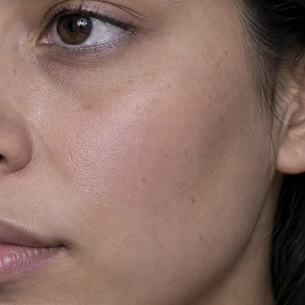
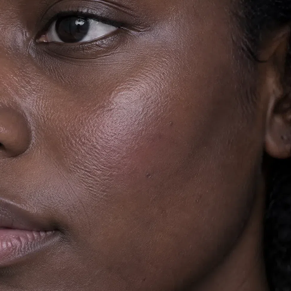
Undertone and contrast set your season, skin depth does not. Cool Winters are porcelain, beige, beige-brown and deep brown, and the four women below have the same three things in common: a cold undertone with no gold or olive, clear rather than muted coloring, and crisp contrast between their features.
11. Skin: cold undertone, any depth
Skin is the strongest single clue to a Cool Winter, and paleness is not part of it. What counts is the tone beneath the surface color.
The undertone here is plainly cold - pink, rose or faintly blue on light skin, a cool rosy beige in the middle of the range, and a blue-red cast deep inside dark brown skin. The other two winters can look slightly neutral or carry an olive note; this one does not. There is no gold in it, no peach, and no green-olive cast at any complexion depth.
The surface usually looks dense and even. Freckles are uncommon, and when they appear they are ash or gray-brown rather than ginger. Sun is not kind to it: light skin burns and reddens first, and darker skin tans to a cool nut-brown with none of the bronze glow an autumn picks up.
Three undertone checks you can do at home
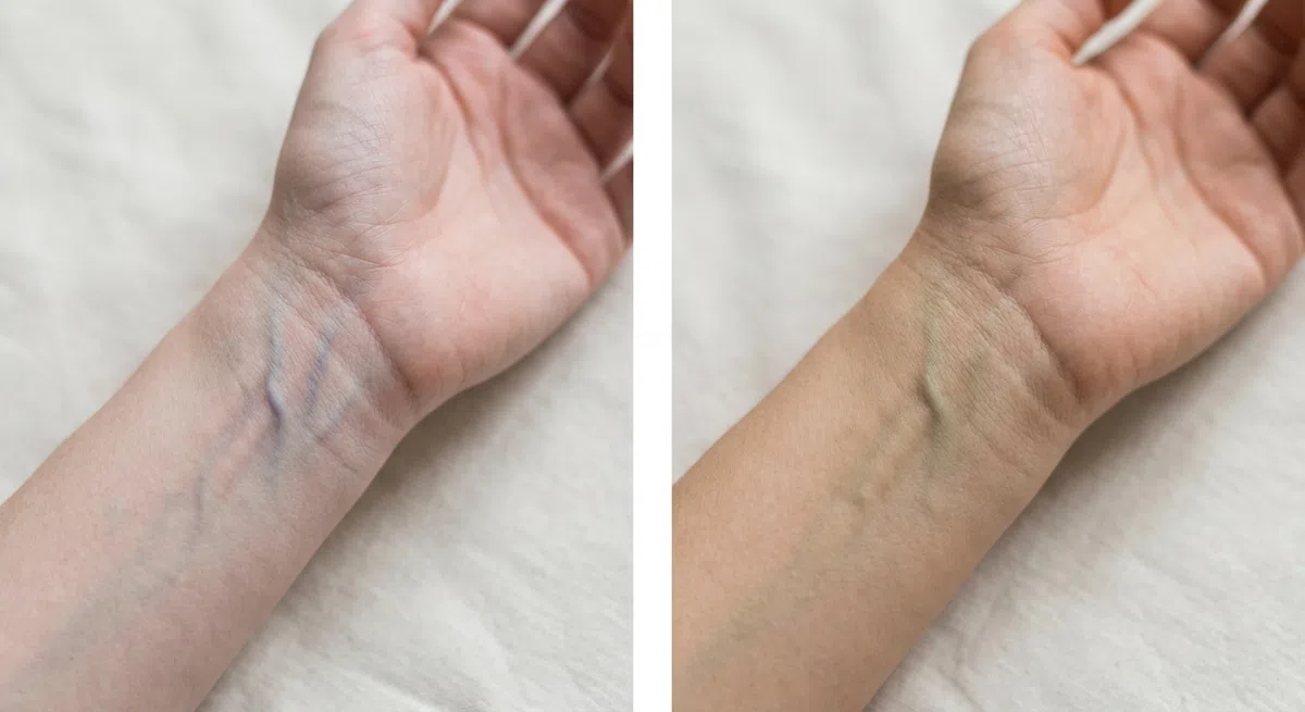
Find a daylit window and turn your wrist palm-up. Indoor bulbs distort the answer - warm ones push the veins green, cold LEDs push them blue - so skip this in artificial light. Give your eyes a moment and read the overall color of the network, not one prominent vein.
- Blue or purple - a cool undertone, which is where Cool Winter lives.
- Greenish or olive - a warm undertone, pointing toward spring or autumn.
- Hard to say - likely neutral. The two checks below will settle it.

Wash off makeup, pin your hair back and face a window. Raise a clean sheet of white paper close under your chin and look only at the edge where the white sheet touches the skin. The paper has to be truly white: ivory or cream stock carries its own warmth and tilts the result.
- The skin turns rosy or bluish beside it - a cold undertone, the Cool Winter reading.
- A golden or peachy tint shows up - a warm undertone.
- A gray, slightly olive cast appears - most often a neutral undertone, which rules this subtype out.
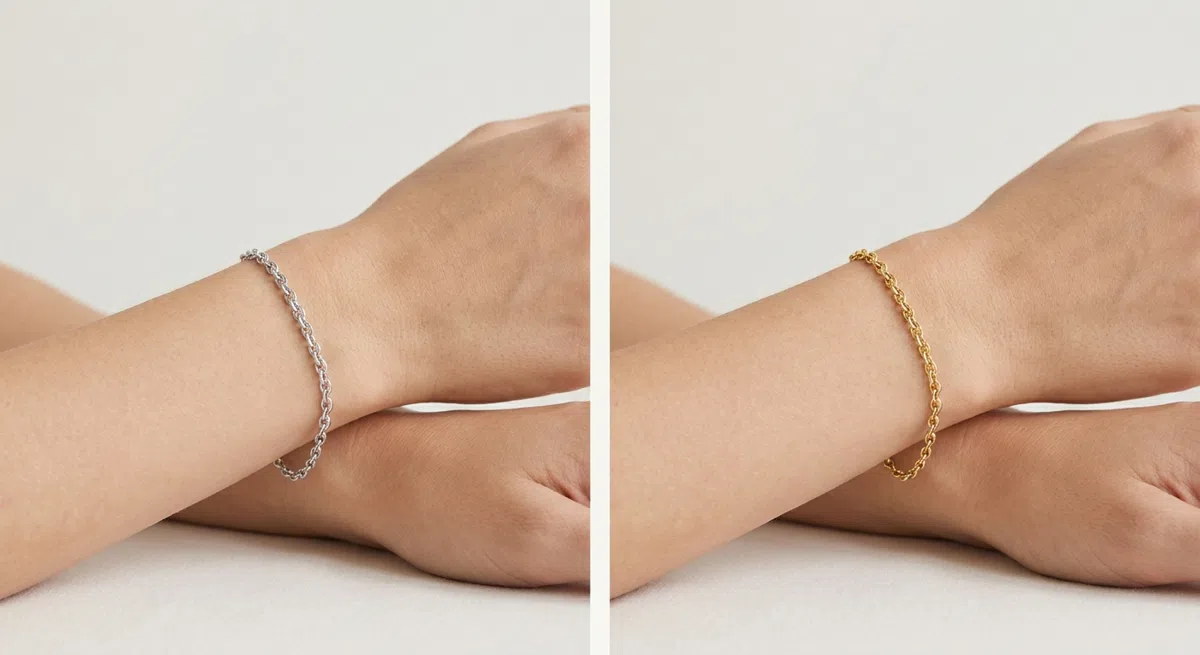
Find a silver piece and a yellow-gold piece without stones, close in shape and width. Bring one, then the other, up beside the face and watch the nearby skin: does it look smoother and fresher, or do yellowness and under-eye shadow come forward?
- Silver, platinum or white gold flatter - the skin looks clearer. A cool coloring.
- Yellow gold or bronze flatter - the face seems lit from within. A warm coloring.
- Both look fine - a neutral undertone, and temperature is not your leading trait.
Cold undertone with no olive and no gold, at whatever depth your skin happens to be, is the first box ticked. If gold keeps winning the metal test, this is not your page.
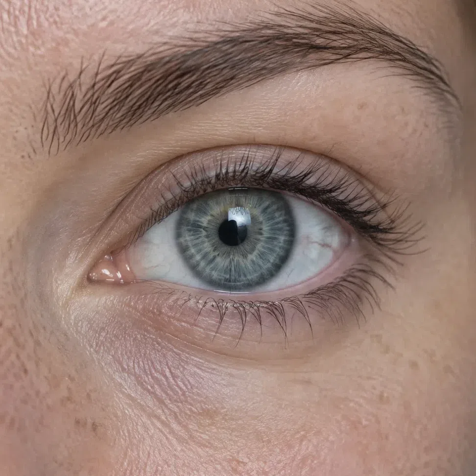
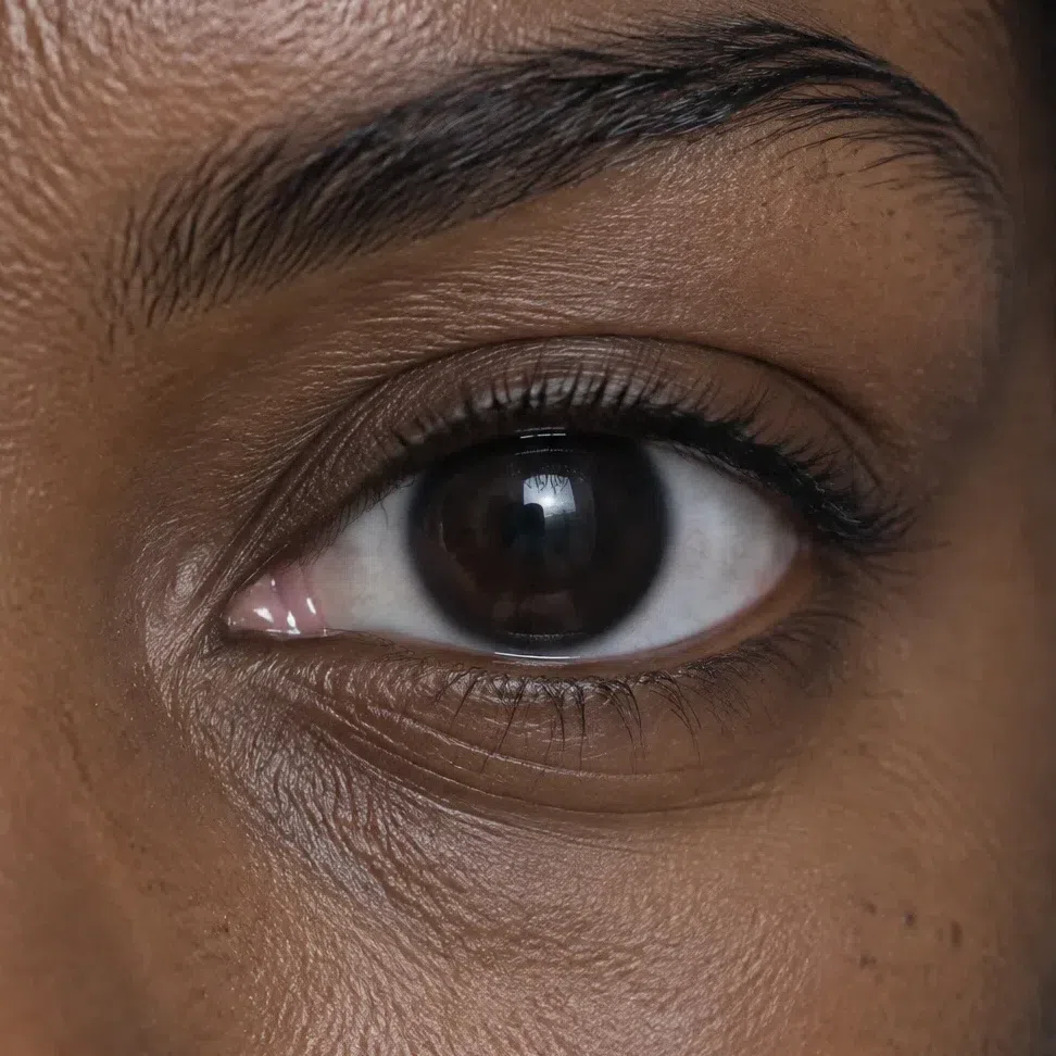
22. Eyes: clear, cold and sharply ringed
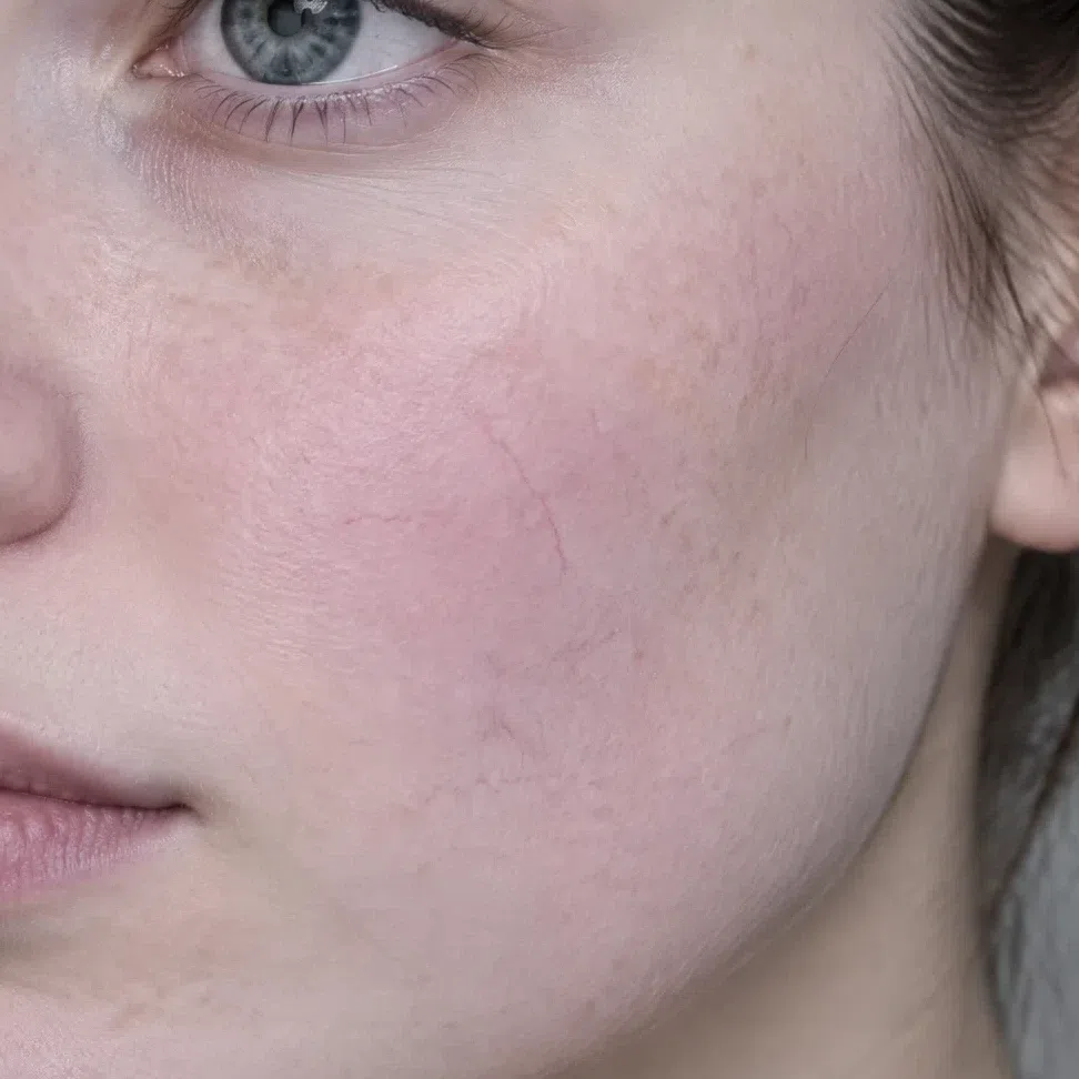
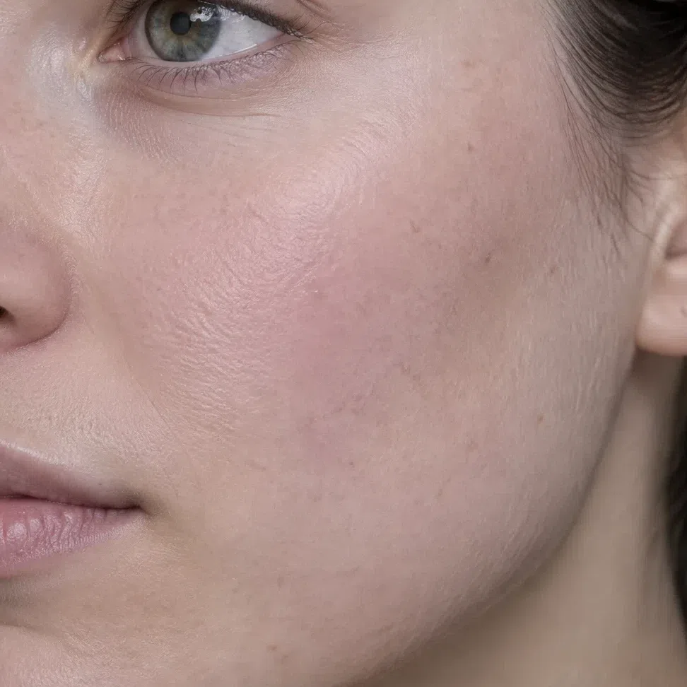
Cool Winter eyes look clean. Whatever the color, it reads pure, and the white around it is bright enough to make the gaze feel direct.
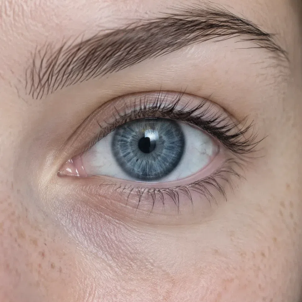
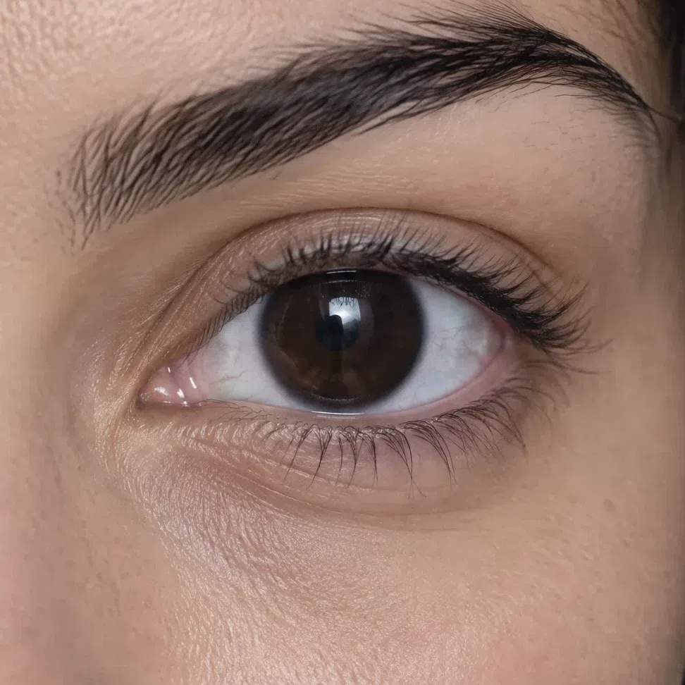
Four colors turn up most: saturated blue or sapphire, sometimes leaning violet; steel gray, gray-blue or a plain cool gray; dark brown or black with no warm lights; and a cool green with gray or blue in it. The iris is usually edged by a dark, well-defined limbal ring, which adds depth.
What is missing matters as much. There are no gold sparks near the pupil, no honey or amber patches and no warm hazel mottling - the flecks that often show up in Deep Winter eyes.
Brown eyes do qualify. The brown just has to be cold: bitter chocolate, espresso, black-brown. A brown with cognac, copper or golden threads in it belongs to a warmer coloring.
Any eye color can work if it is clear and holds no gold. Warm flecks around the pupil are the thing to rule out, not dark eyes.
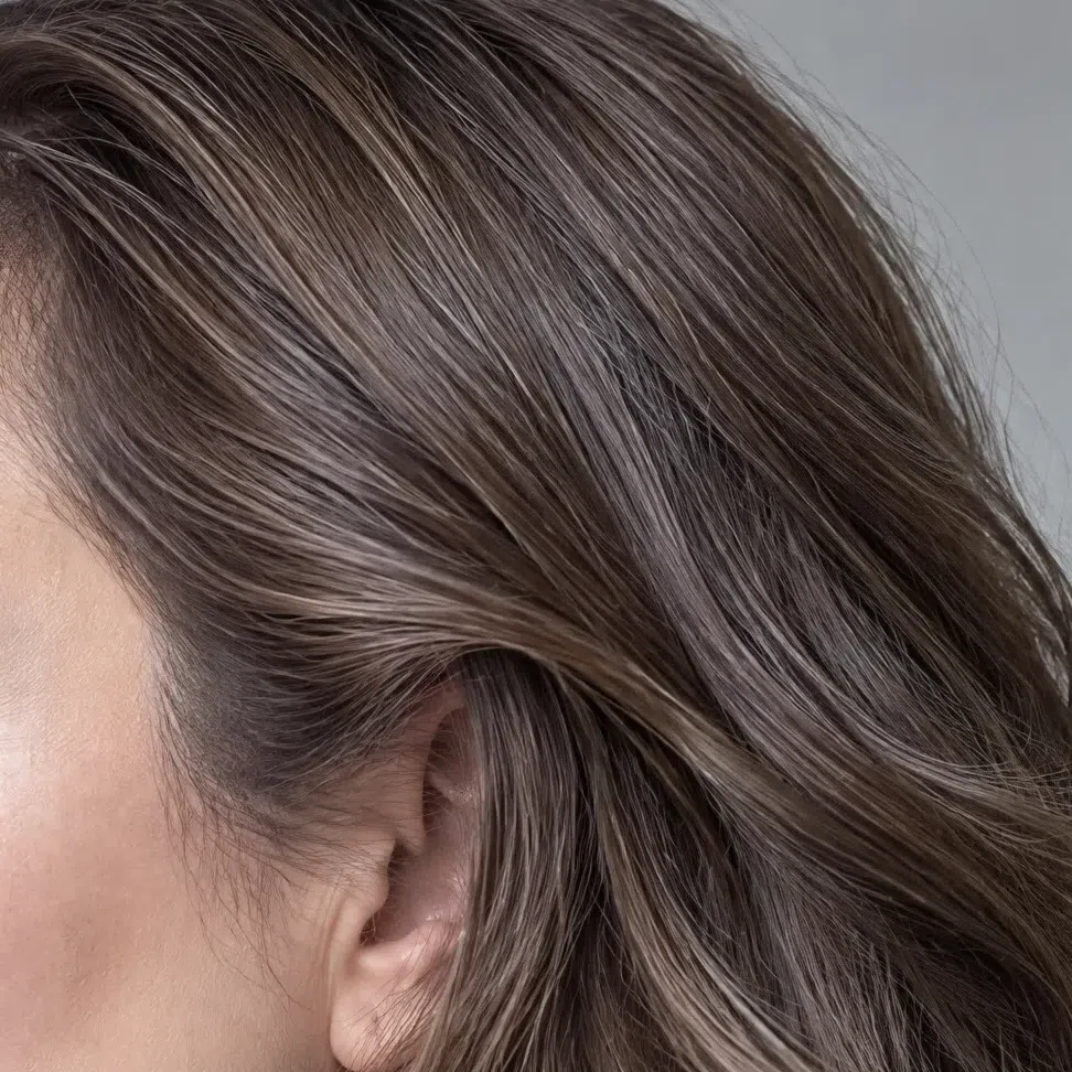
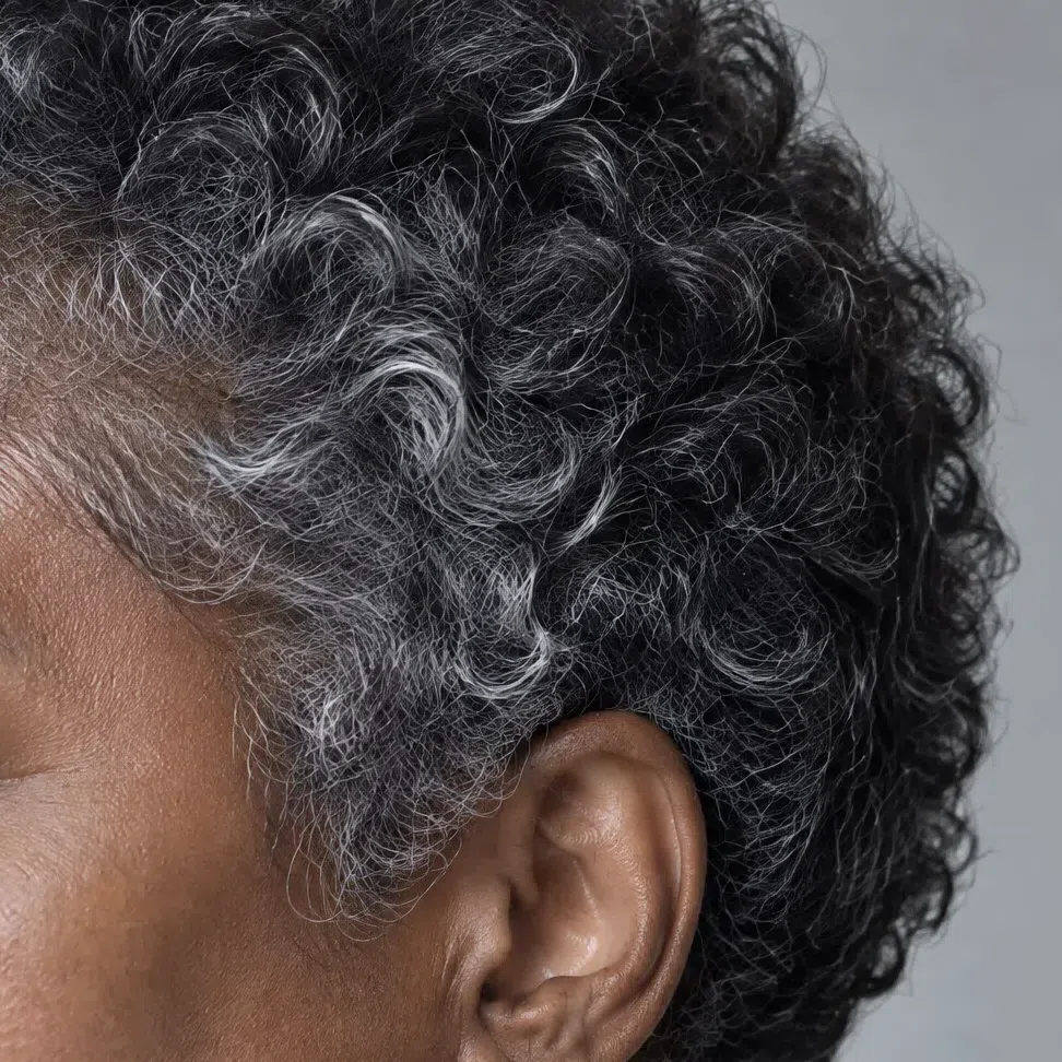
33. Hair: ash and blue-black, never copper
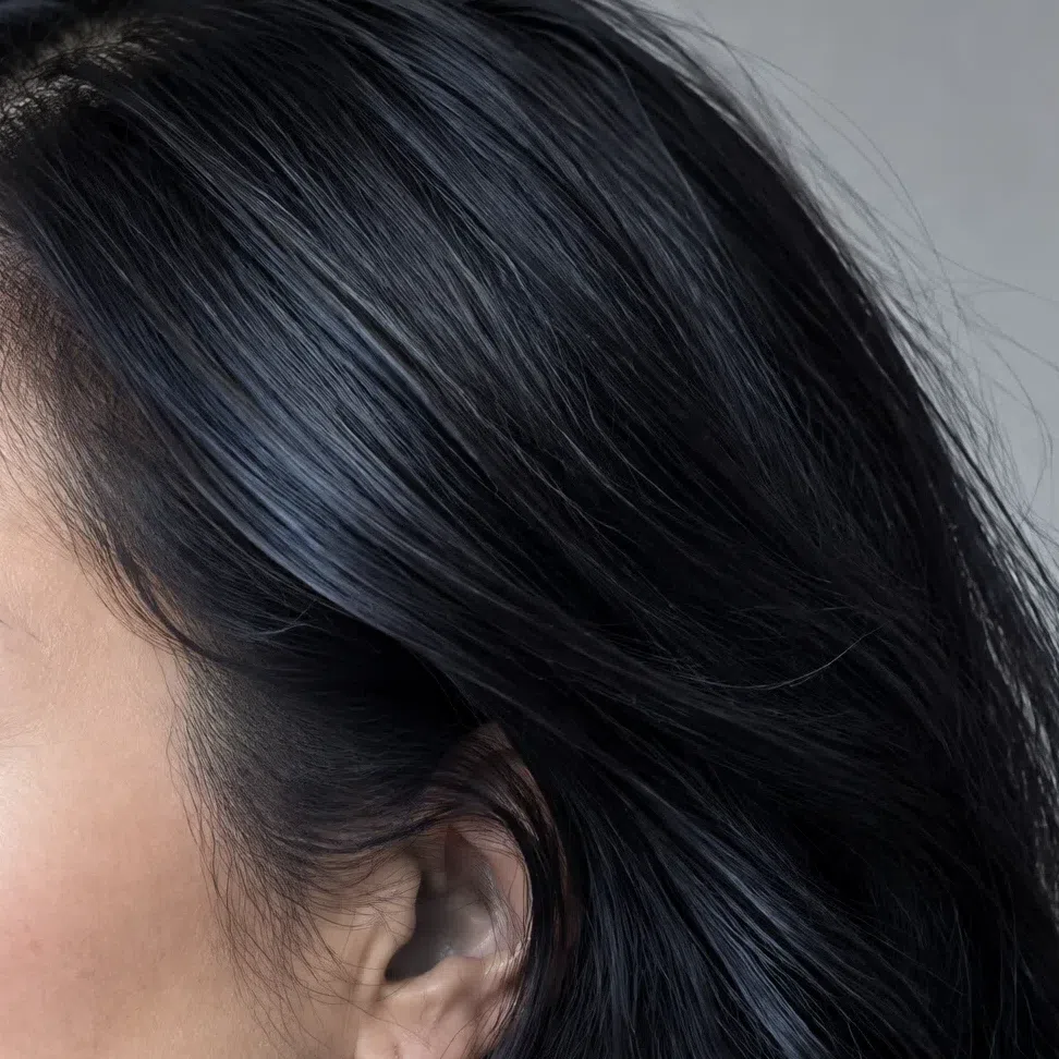
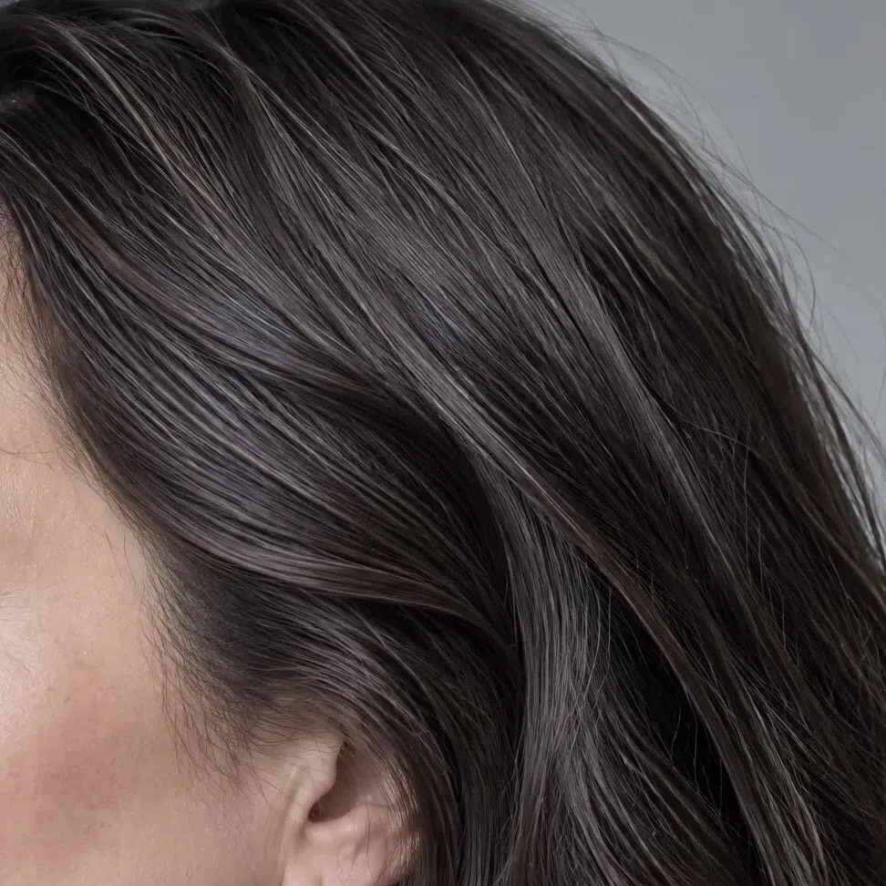
Natural Cool Winter hair runs from medium to very dark, and at every depth it has no red and no golden light.
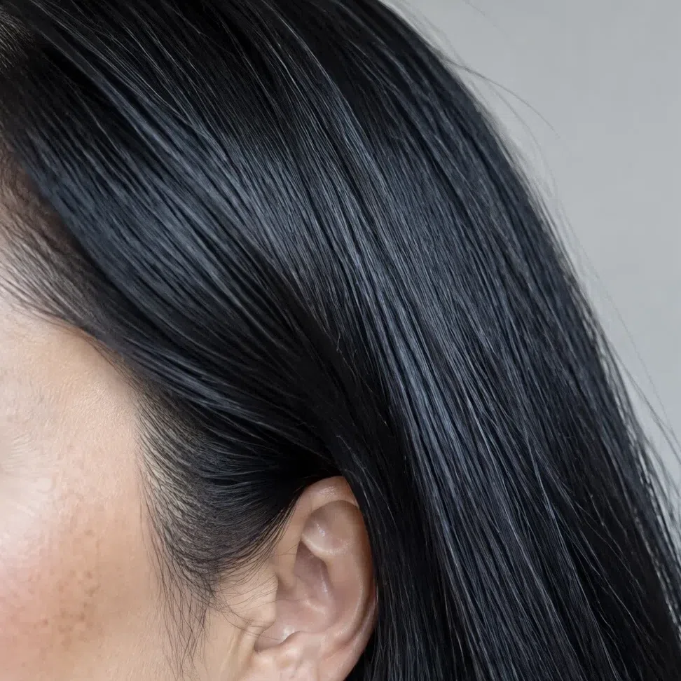
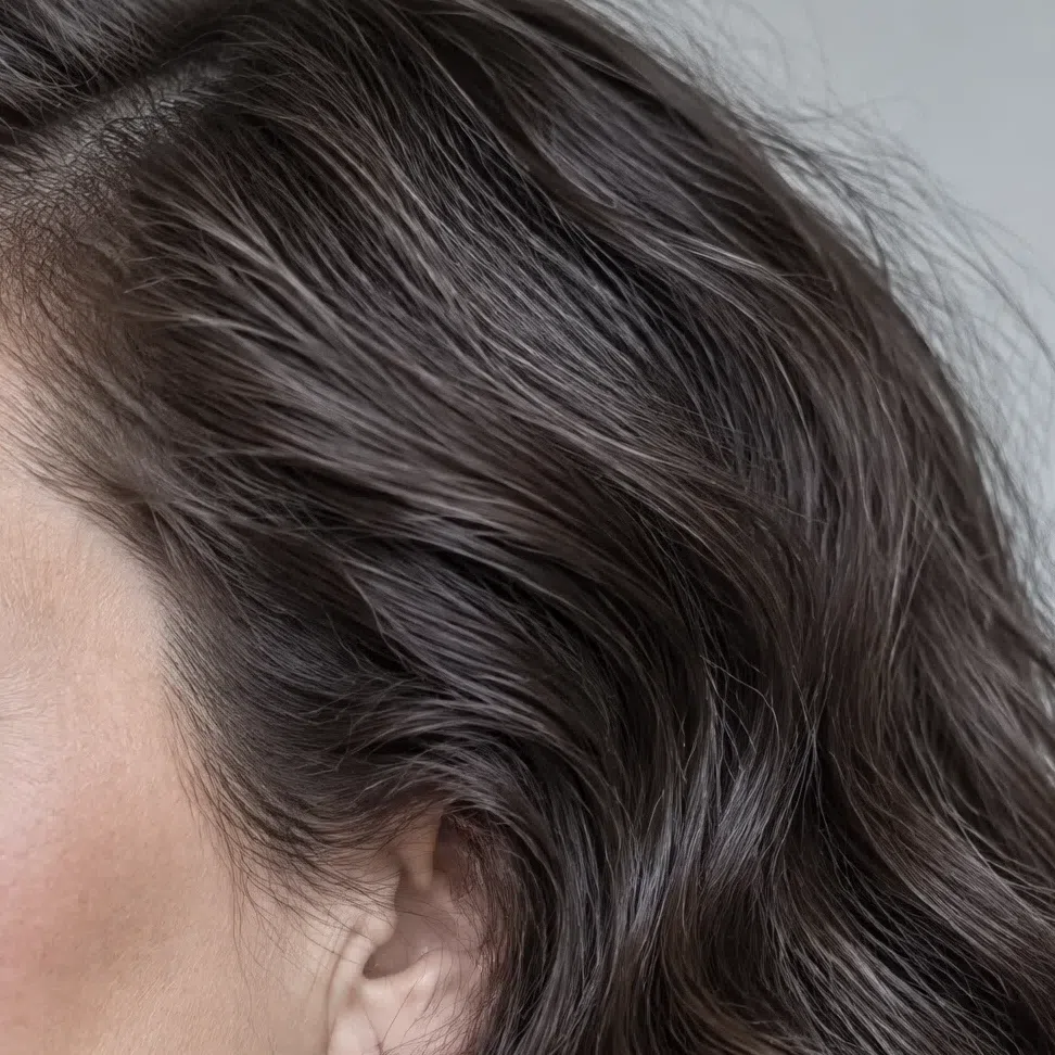
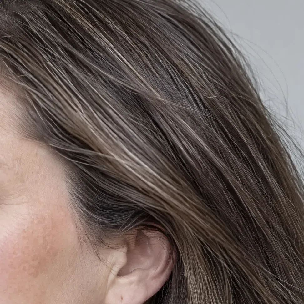
The classic shades are blue-black like a raven's wing, dark ash brown (the most common), and a medium chestnut with an ashy cast. The chestnut version has the least contrast and is the one most often mistaken for Cool Summer. A natural ash or platinum blonde is possible but rare. In strong sun the hair may look a touch lighter; it never looks warm.
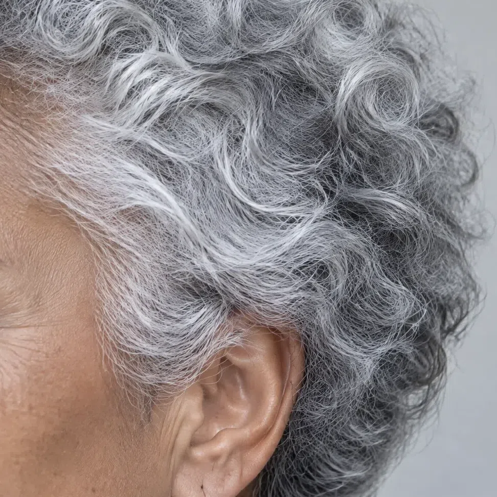
Graying is a gift here. The white comes in clean and silvery with no yellowing, and it stays inside the palette, so there is no color reason to cover it.
If you have dyed your hair warm for years, check the regrowth at the roots or old childhood photos. Your brows help too: on this coloring they are usually a cool gray-brown or black. A caramel gloss or honey balayage from the salon can make a Cool Winter look warm in photos until it grows out.
Look at your hair in direct sun. Ash, blue or silver in the light keeps you here; copper or gold showing through sends you to a warmer season.
44. Contrast: medium to high, always crisp
Contrast means how far apart skin, hair and eyes sit in lightness. A Cool Winter usually sits in the medium-to-high band, and even at medium the edges stay sharp.
The textbook version is pale porcelain skin under blue-black hair. It is not the only one: light beige skin with cool chestnut hair gives a medium contrast that is still unmistakably clean, and on deep skin the contrast moves into the whites of the eyes, the brows and any silver in the hair.
What separates this subtype from its sister winters is not the amount of contrast but what drives it. On a Deep Winter it is the darkness of hair and eyes; on a Bright Winter the pull comes from saturation. Here it is the cold: every tone in the face shares the same icy undertone, and that shared coldness is what makes the face read clear and composed rather than dramatic.
Cold undertone plus clean, visible contrast is a winter. The contrast being held together by coldness rather than by depth or brightness is what makes it this winter.
- Photograph your bare face in daylight, then view the shot in grayscale. If skin, hair and eyes separate at once, your contrast is high. If they sit closer together but you can still tell them apart without effort, it is medium. If they blur into one gray, a softer season fits better.

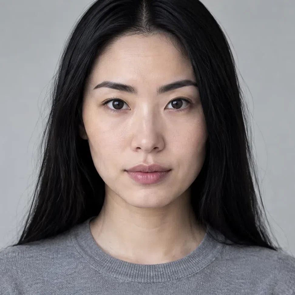
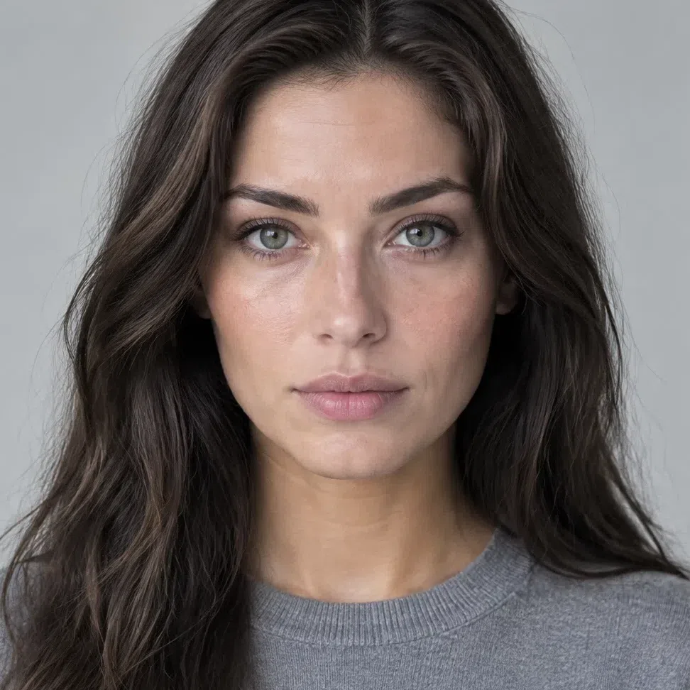

Left: the porcelain Cool Winter from the strip above, exactly as photographed. Right: the same shot with all color stripped out. Only lightness is left, and it shows her blue-black hair dropping close to black while her skin stays near the top of the scale.



Hair Skin Ramp runs black to white
Read each ramp on its own. How high the pair sits tells you depth; the gap between the markers tells you contrast - and a darker face simply has less room above it, so do not score faces against each other by the spacing. The deep Cool Winter's skin lands halfway down, yet her hair still sits at black. The Cool Summer shares the cold undertone, but her hair stops short of black and her face reads softer in gray.
55. The fabric test: see it happen
The most convincing check is also the simplest: hold colors under your face and watch what they do.
Remove makeup, sit near a window in daylight and drape pieces of fabric in different colors just below the chin, one after another. Look at your skin, not at the cloth. A right shade makes the complexion smooth, the eyes brighter and the face look rested. A wrong one deepens the under-eye shadows and turns the skin sallow or grayish.
Expect the loud colors to win. Clean, saturated shades that seem too much in a shop tend to look natural on a Cool Winter, while soft, muted and warm ones - the ones sold as easy to wear - quietly take the life out of the face.
Colors that refresh a Cool Winter
When these smooth the complexion and sharpen the eyes, the palette on this page is yours:
- Optic white
- Jet black
- Cerise
- Delphinium
- Jewel green
- Ice pink
- Ice lemon
- Silver
Colors that dull a Cool Winter
If these yellow the skin, bring out shadows or blur your features, they sit outside your coloring - every one of them is warm:
- Mustard
- Olive drab
- Terracotta
- Warm beige
Cool Winter vs Deep Winter vs Bright Winter
The three winters share a cool base and noticeable contrast, so the same face often gets typed as more than one. Each is named for the trait that dominates it, and for Cool Winter that trait is temperature. On names: Cool Winter is widely called True Winter, Deep Winter also goes by Dark Winter, and Bright Winter by Clear Winter.
| Cool Winter | Deep Winter | Bright Winter | |
|---|---|---|---|
| Leading axis | Temperature. Cold before anything else | Depth. Darkness leads, cool follows | Clarity. Maximum brightness leads |
| Temperature | Entirely cold - the leading trait | Neutral-cool | Neutral-cool |
| Depth | Medium to dark hair, skin at any depth | Dark hair and dark eyes throughout | Usually dark hair against lighter skin |
| Clarity | Medium to high, clean and frosty | High, rich and deep | Very high, pure and glowing |
| Contrast | Medium to high, crisp at every level | High, weighted toward dark features | Very high, with eyes that stand out on their own |
| Skin | Clearly cool: bluish, pink or porcelain, never olive | Often neutral or olive, sometimes cool | Neutral, often translucent and light |
| Eyes | Clear cold colors: blue, gray, cool brown, black | Very dark: black, deep brown, dark hazel | Jewel-bright: vivid blue, violet, emerald green |
| Hair | Ash tones from chestnut to black, no red | Very dark and rich: dark chestnut to black | Mostly dark brown or black for contrast |
| Metals | Silver, platinum, white gold | Silver and platinum; a muted gold can pass | Silver, platinum, high-shine metals |
If two columns still describe you equally well, stop reading the detail and return to the leading-axis row. Cold, dark or vivid - pick the word that describes your coloring first. If "cold" came to mind before the others, stay on this page.
What Cool Winter looks like: the range
Twelve close-ups across four complexions
Cool Winter is not one face but a spread. The base is always icy, yet skin can be porcelain or deep brown, hair anything from ash chestnut to raven black, eyes steel gray to near black. The five checks above compare you with other seasons; the cards below show the variety inside this one, so you can place yourself within it.
Cool Winter skin: one cold base, four tells
Complexion depth swings widely on this subtype, from almost see-through to deep brown. What stays put is the cold base, and it gives itself away in four ordinary situations.
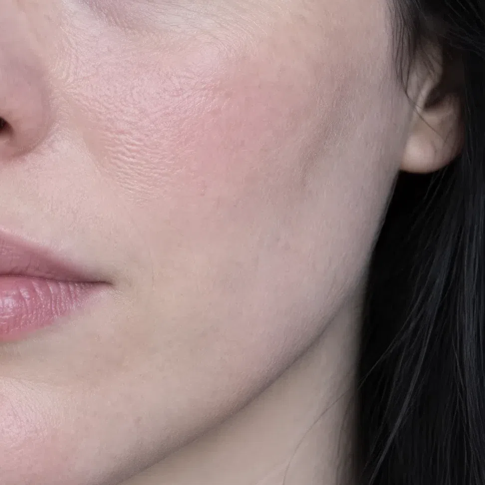
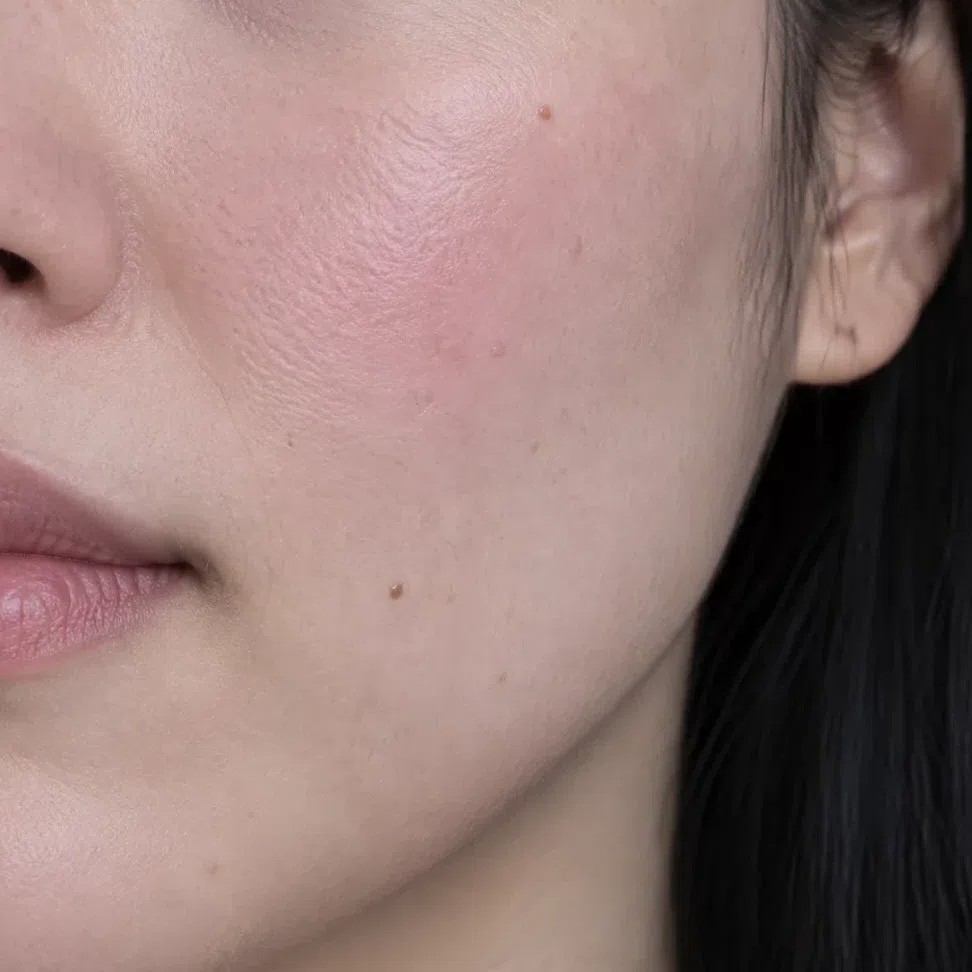
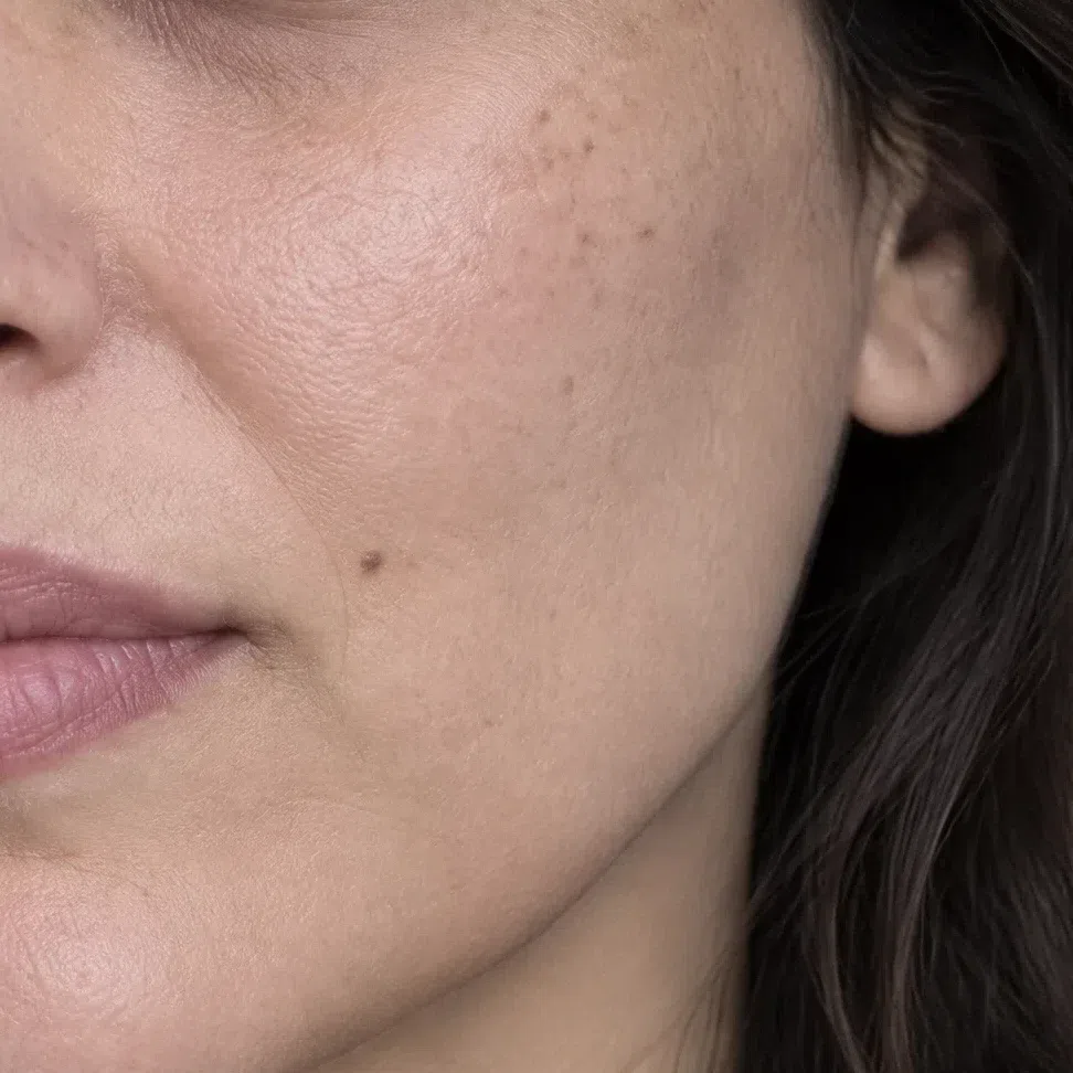
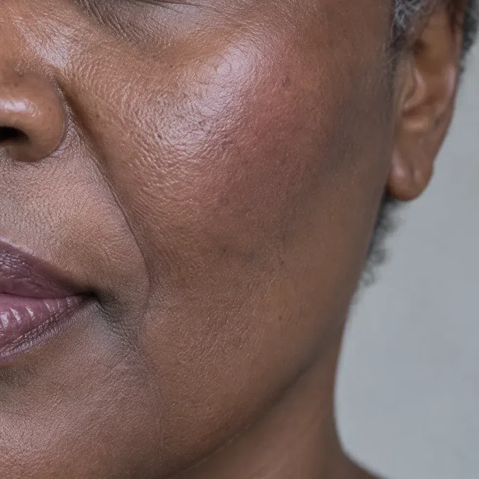
Hold two pieces of fabric under a bare face by a window - one brilliant optical white, one milky or creamy beige. On a Cool Winter the stark white makes the skin look luminous, and the beige turns it dull and tired within seconds. If the cream flatters you more, look at a warmer or softer season.
Everything else on this page follows from that cold base: it is why icy pastels and jewel colors sit easily on the skin, and why camel, peach and gold near the face bring out sallowness.
Cool Winter eyes: four cold colors
Four eye colors recur on this subtype. They look nothing alike at first glance, yet each is pure, outlined and cold.
The four iris colors
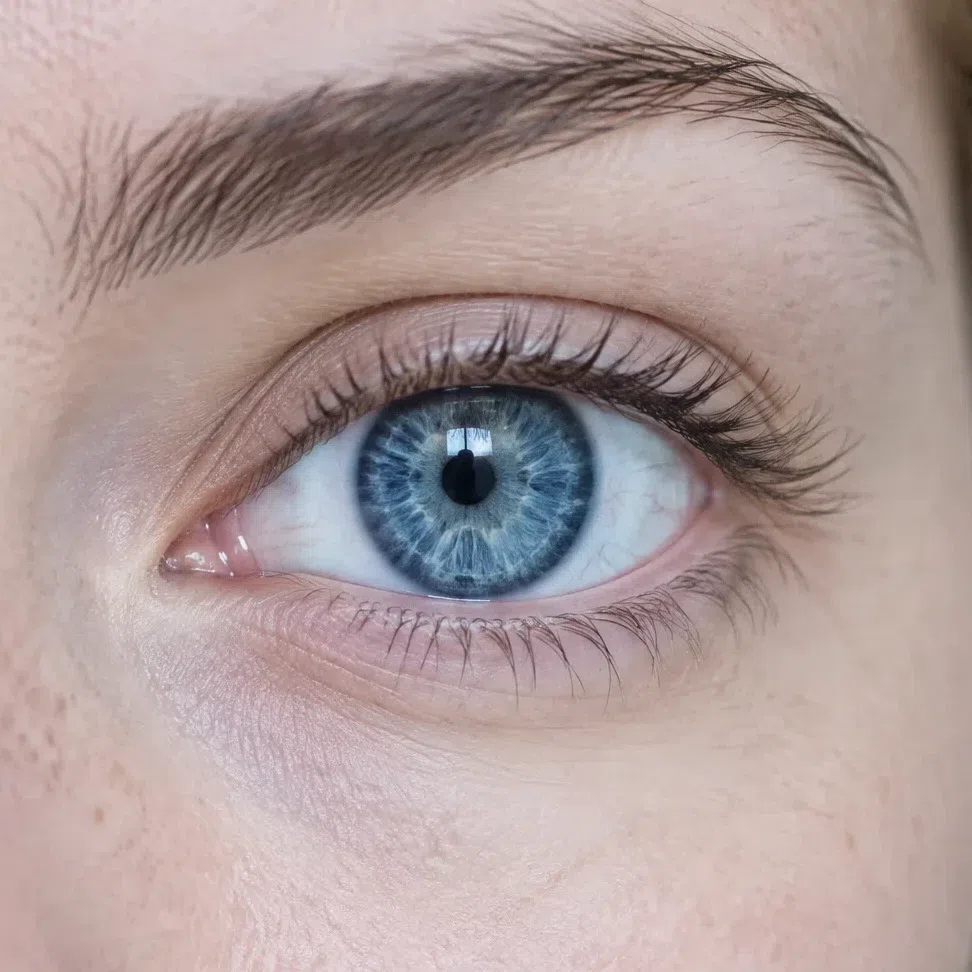
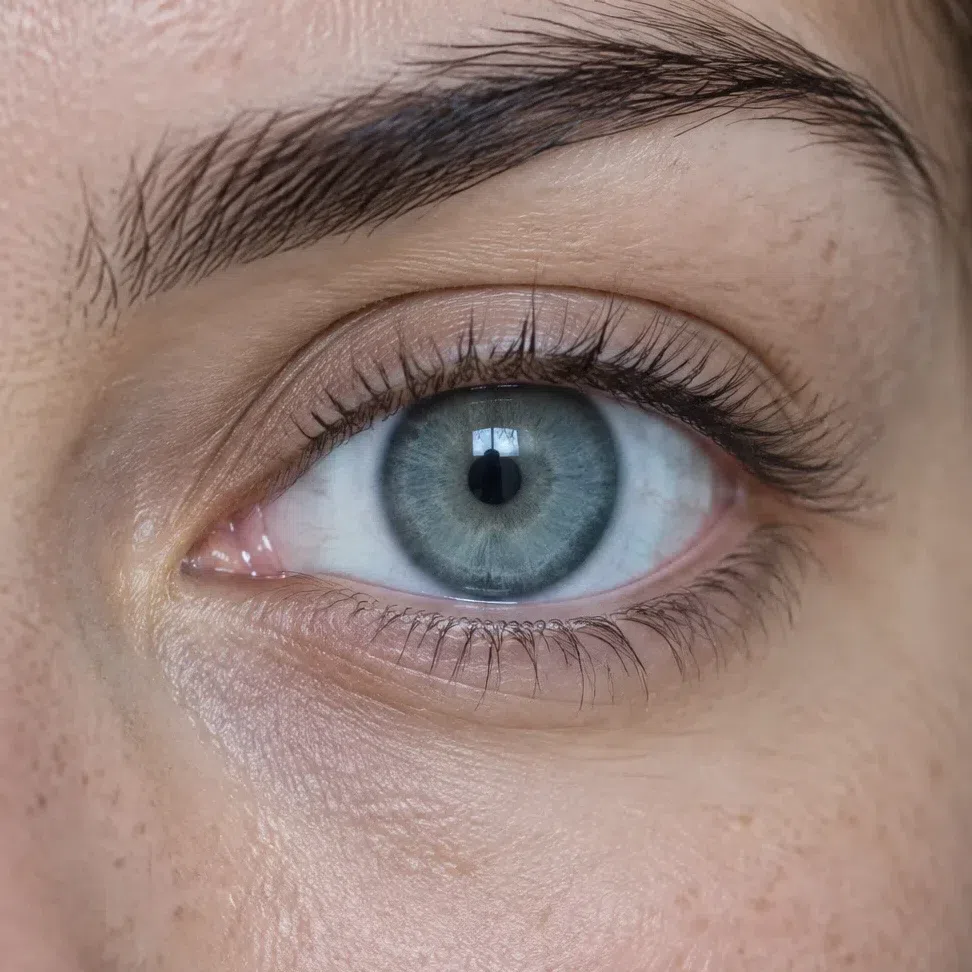
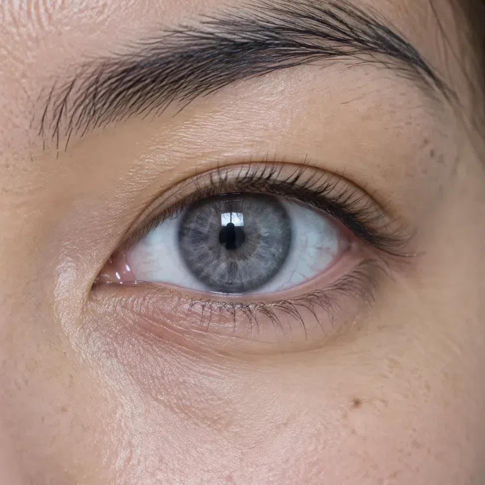
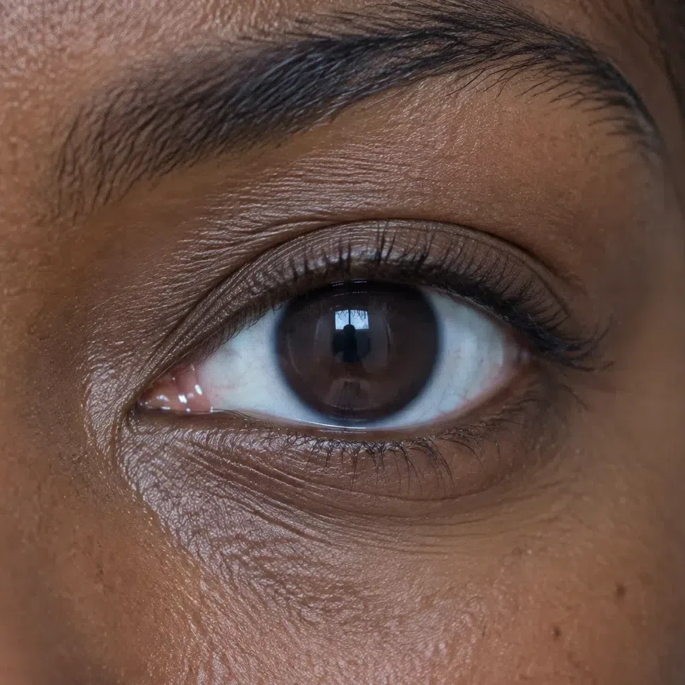
What all four have in common
- Brilliant whites. Often a stark, snowy white, which sets up the contrast with the iris.
- No warmth at all. Not a single gold, honey or nutty speck in the iris.
- A dark outline. A defined rim around the iris that makes the eye look deeper and more vivid.
Whichever of the four you have, silver jewelry and clean jewel colors near the face echo its shine; khaki, camel and mustard dull it.
Cool Winter hair: four cold pigments
Saturation varies a lot from one Cool Winter head of hair to the next. The tone does not: ashy, with no redness. Sunlight is the honest test, because that is where hidden warmth turns coppery.
The natural range, darkest to silver
What Cool Winter hair never is
- Sun-gilded. Summer light does not pull out copper, gold or ginger strands.
- Warm brown. Milk chocolate, caramel and cognac browns belong to warmer colorings.
- Honey or wheat blonde. Any golden or warm blonde is ruled out. The rare natural blonde here is ash or platinum.
Texture does not matter - poker-straight, wavy or tightly coiled all qualify. Only the pigment decides. Coloring advice is in the hair color section.
The Cool Winter palette: 20 shades, each worn by the same model
What each color does to cold, high-contrast coloring
The Cool Winter palette is built on clean, saturated colors with a blue base - the colors of ice, a winter sky and cut gemstones. They underline the natural contrast between skin, hair and eyes instead of competing with it.
One principle decides every shade below: avoid warm, muted and blurred. Those shades make the face look grubby, hide its natural clarity and leave it lifeless. What you are after is color as clear as crystal.
Every card is a photograph of the same Cool Winter model, and nothing changes between cards except her top, painted to the hex printed below. Face and hair stay as photographed - so the thing to judge is her skin, not the swatch.
Base colors: the Cool Winter wardrobe foundation
Buy outerwear, suits, trousers and skirts in these. They form the backdrop for the coloring and the starting point for every combination further down.
Neutrals: five cold foundations
Black, white and three grays, every one leaning blue. Can a Cool Winter wear black? Absolutely, even at the collar - black and white is this coloring's native pairing. The one caveat is age: some women find pure black harsher over the years, and Midnight navy or Graphite keep the contrast with a softer edge. Buy coats, suits, trousers and skirts in these five.
How to combine the neutrals
- Black and white. Jet black with Optic white is the classic high-contrast duo, equally right for an evening dress and a business suit.
- Graphite and white. Swap the black for Graphite and the pair turns gentler without losing its punch - an easy daily uniform.
- Grays on grays. Graphite, Slate gray and Petrol layered together make a monochrome look with real depth, because each gray carries a different amount of blue.
- A backdrop for color. Any of the five works as a quiet stage for one clear shade from the accents below.
Rich base shades: six colors to build on
Saturated and cold, and strong enough to be the main piece rather than the detail - a coat, a dress, a monochrome suit. This is where the Cool Winter greens live: Forest green and Teal, plus a red, Garnet, that stays blue-based at evening depth.
Can a wardrobe run on these?
- Yes - in monochrome or with a neutral. A Royal purple suit on its own, or a Midnight navy coat over a Petrol knit, both look intentional. Add one accent if you want more energy, and keep everything else quiet.
Statement colors, icy pastels, metals and accessories
Clear statement shades, the light end of the palette, the three cold metals, and four accessories to recolor yourself.
Statement colors: six at full strength
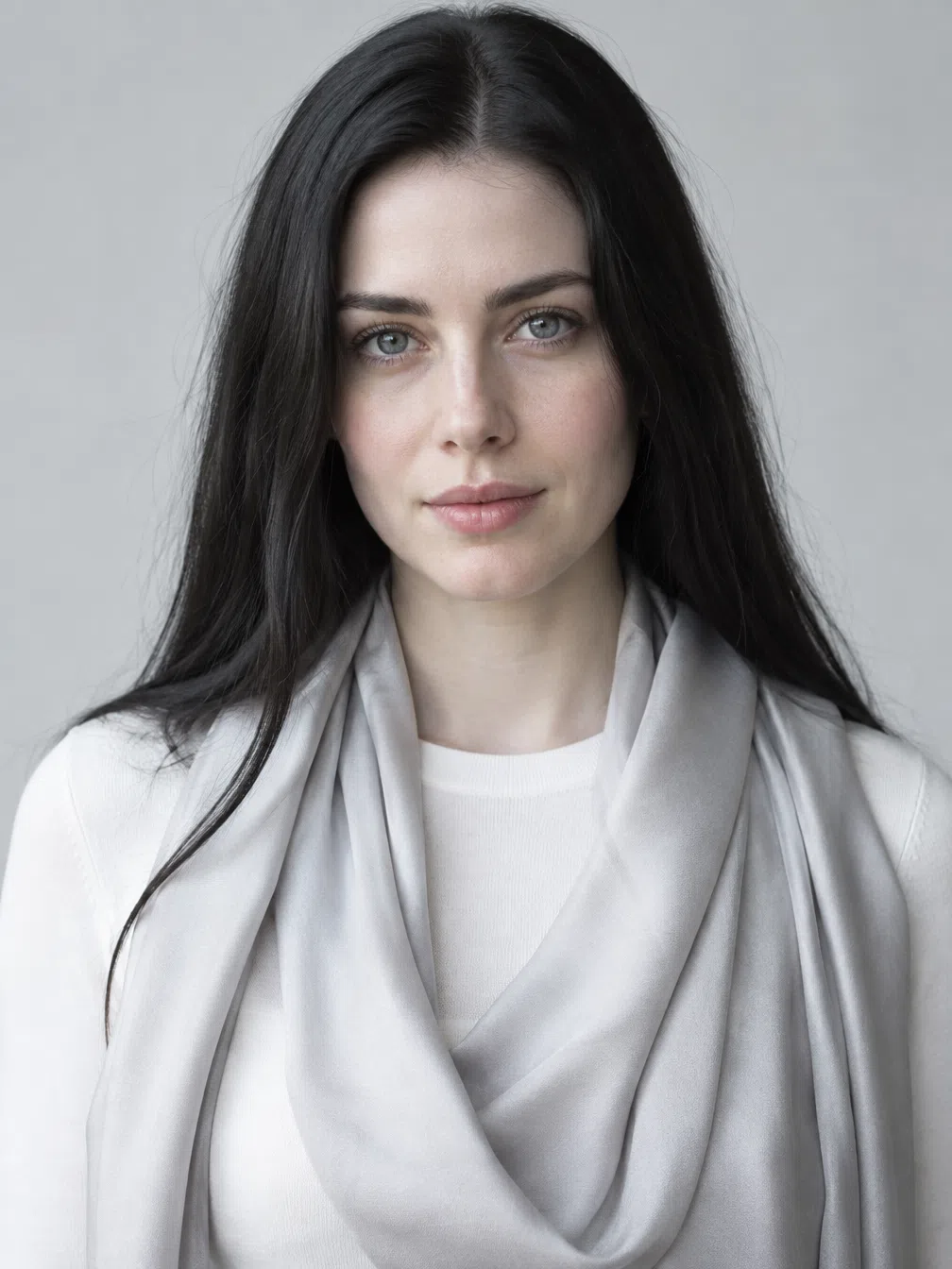
Shown on a scarf over a graphite knit, because an accent works as a detail and that is about the right dose. These are clear, saturated and cold - the shades most seasons cannot hold near the face. Your bright Cool Winter pink is Cerise, your reds are Crimson and Garnet, and your blues run from Delphinium to Sapphire.
Icy pastels: the light end
Pastels are allowed here on one condition: they have to be icy. These three are light but stay cold and clean, so they sit next to dark hair without washing the face out. Pair them with a dark neutral to keep the edge, or wear them head to toe in summer.
Which pastels are not icy?
- Anything with yellow in it. Peach, butter, warm beige and apricot pastels read soft on other seasons and sallow on this one. The test is simple: an icy pastel looks like it was mixed with white and a drop of blue.
Metals and jewelry
Silver first, then white gold and platinum. All three are cold and bright, and they echo the blue undertone rather than fighting it.
Stones, and the metals to skip
- Sapphire, emerald, amethyst. Cold, transparent stones behave like the statement colors above and look natural in a silver setting.
- Yellow gold. Clashes with the cold undertone and brings out yellow in the skin. Keep it for other colorings.
- Bronze and copper. A warm metallic shine that argues with the whole palette.
Accessories: tap a pairing
Each pairing repaints two pieces together - a neutral goes on the sweater, a color on the accessory. Watch how much brighter a shade can go the further it hangs from the face.
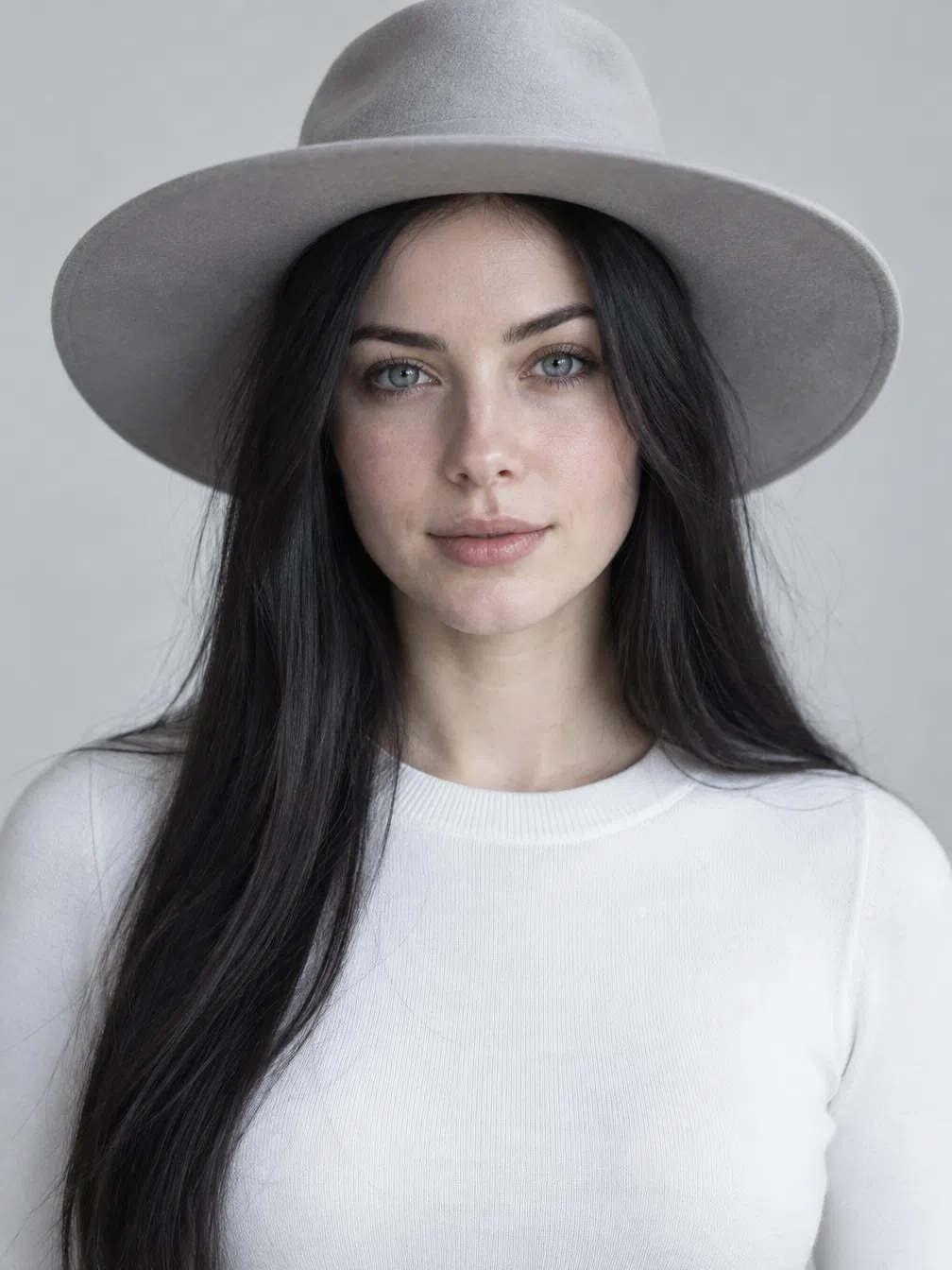
Hat
A hat keeps color well away from the face, so the deepest and brightest shades cannot argue with the skin.
Scarf
A scarf sits right under the chin and behaves like a drape test: choose the shade that freshens you, not just the one you like.
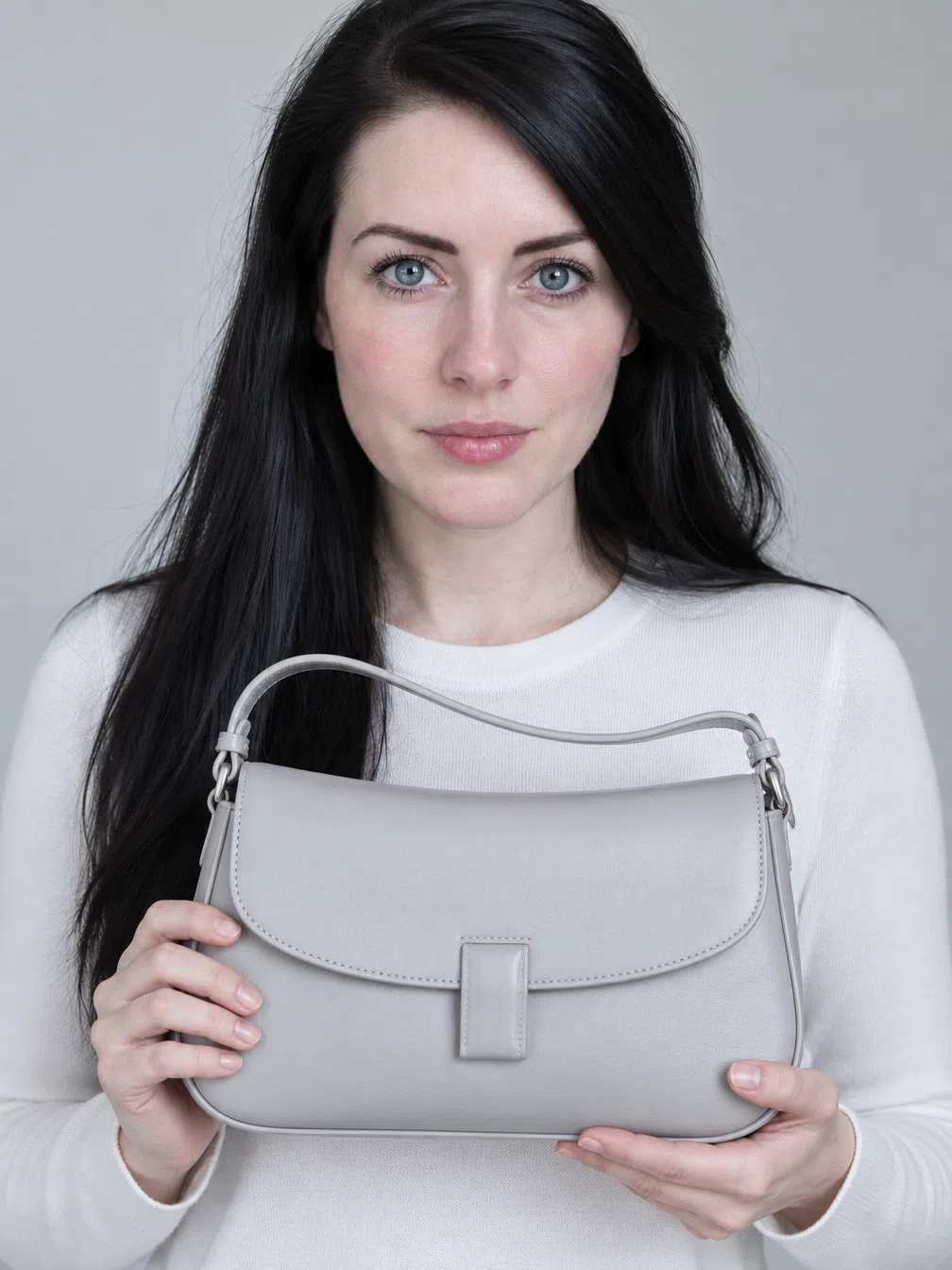
Bag
The safest place for a bold spot of color - away from the face and easy to change more often than clothes.

Neck scarf
Closer to the skin than anything else you wear. Only clean, cold shades here; a warm knot pulls yellow into the face at once.
Colors to avoid, each with its replacement
9 shades split into 2 groups, and every one points to a palette color to use instead. Learn why each group fails and you can judge a color that appears on no list.
Warm and earthy shades
Browns, golds and beiges with yellow or orange built into them. Several have a perfectly good depth for this coloring; the pigment is what disqualifies them.
Why these colors do not work
- Gold pigment has nothing to answer to. A cold skin carries no golden layer, so the yellow in these shades is not echoed - it simply shows up on the face as sallowness or a gray film.
- Brown dulls the blue in the eyes. Steel, blue and cool-brown eyes lose their clarity next to earth tones, because the warm brown pulls the iris color toward mud.
- The color seems to hang apart from you. Put an earthy shade near a Cool Winter face and the garment and the woman look like two separate photographs.
Warm pastels and hazy tones
Light, warm and soft - the colors sold as easy to wear. The trouble here is less the temperature than the haze: they sit too close to the skin and blur the crisp edges this coloring runs on.
Why these colors do not work
- They lower the contrast. Light warm tints land close to the skin in lightness, so hair and eyes become the only defined things in the frame and the face looks unfinished.
- Haze reads as tiredness. A soft, sun-washed shade next to a crisp face takes the brightness out of the eye whites and makes shadows more visible.
- Sweet is not the same as icy. Cool Winter can wear pastels, but only ones that look frozen rather than sunlit. These are the sunlit kind.
Cool Winter color combinations
Five ready-made outfits using only the shades above.
Five outfit formulas
Shades are listed in dressing order, the biggest piece first.
Absolute classic
A Jet black suit or dress, an Optic white blouse, and Crimson on the bag, the shoes or the lips. For the meeting and the evening where you want to look flawless.
Easy modern
Graphite trousers and knit, Cerise on a scarf or a detail, and a touch of Sky blue as a second accent. Contemporary and wearable every day.
Cold nautical
A Midnight navy jacket over a Teal top - a crisp, fresh take on navy for the office and for travel.
Regal evening
Royal purple with Forest green, anchored by a black shoe or bag. Deep, saturated and made for an occasion.
Color lover
A Petrol base with a Vivid violet piece on top. Complex and confident, for days when a neutral feels like too little.
The rule behind all five: keep light against dark, or a quiet base against one clear color. When two shades land at the same depth and the same softness, the outfit goes flat on this face - that is the moment to swap one for black or white.
The Cool Winter capsule wardrobe: eight pieces
Clean lines, strong contrast, cold color
A Cool Winter wardrobe runs on the same thing the face does - drama and contrast - so it rewards clear shapes and intense color and punishes sun-warmed, dusty ones. Jet black, Optic white and Midnight navy hold it together; Crimson, Forest green and Royal purple give it energy. The eight pieces below combine with each other from a board meeting to a dinner.
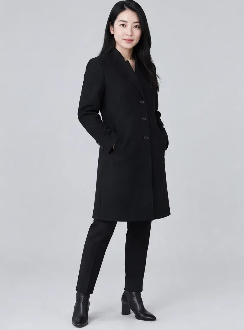
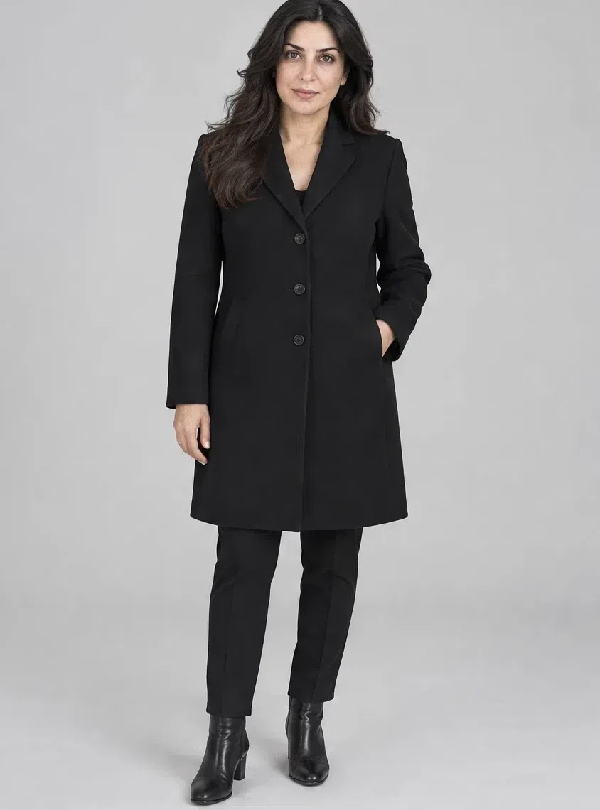
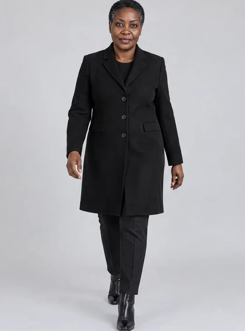
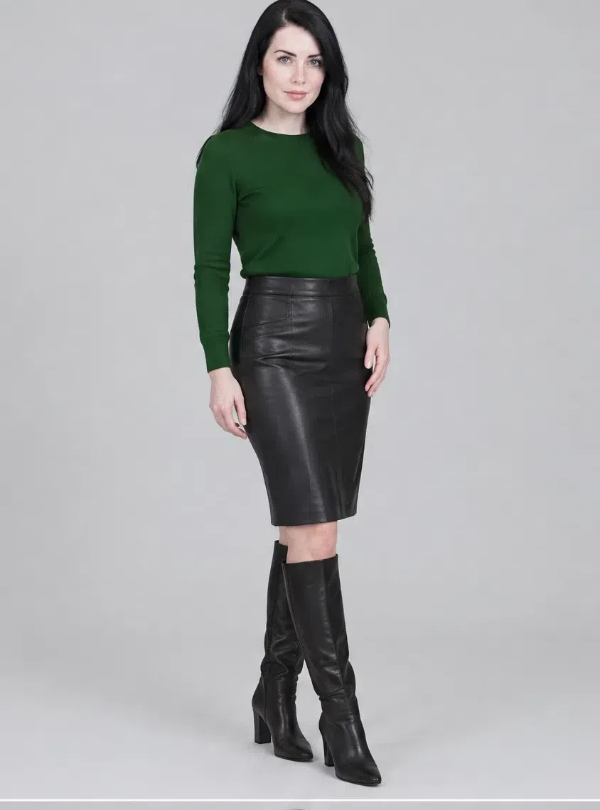
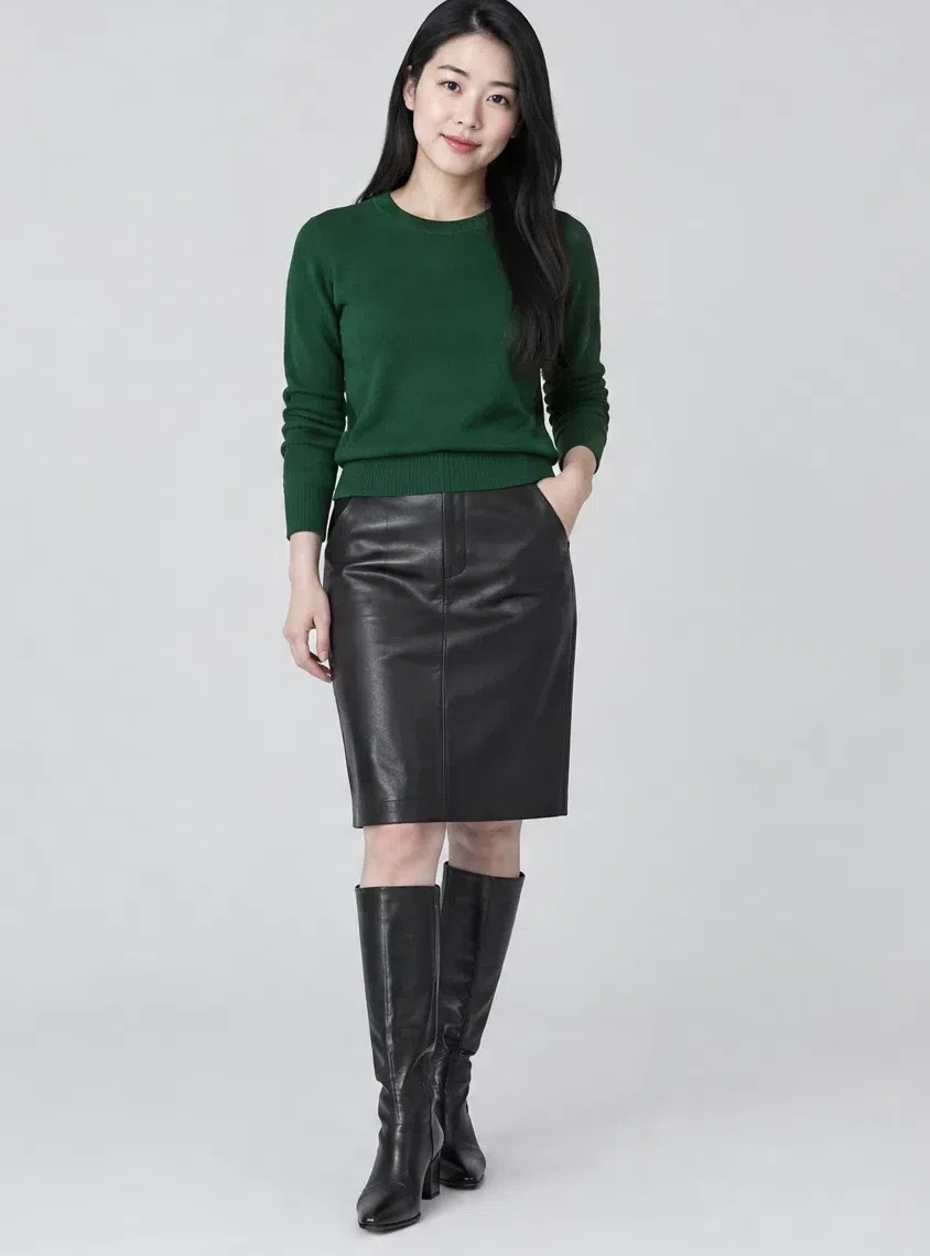
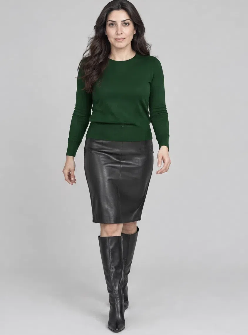
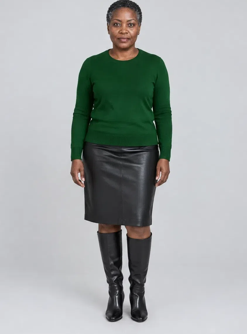
Every piece is photographed on four women across the full range of complexion depth, because Cool Winter coloring spans every depth from porcelain to espresso. One model alone would suggest the capsule only works on one kind of skin.
Eight Cool Winter pieces that work together
Three foundations, a suit, and four pieces that carry the color, all with a crisp silhouette. Each one lists the shades to shop for with their hex codes, so you can hold a product photo up against them.
These pieces are chosen for their color - to match the Cool Winter palette. How a capsule works in general, from how many items you need to where to start, is its own topic.
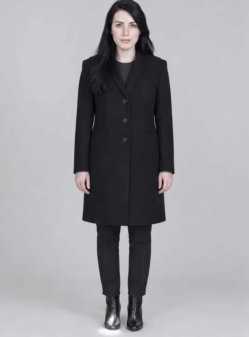
1Jet black wool coat
A straight coat in dense wool is the foundation of a winter wardrobe. Knee length or a little below, with defined shoulders and nothing fussy in the cut. Cold black against the skin gives this coloring its full contrast, and the same coat goes over a suit, an evening dress or jeans without looking out of place.
Tip Add red leather gloves and a cashmere scarf in a cold shade - the coat is the stage, the gloves are the accent.
2Optic white silk blouse
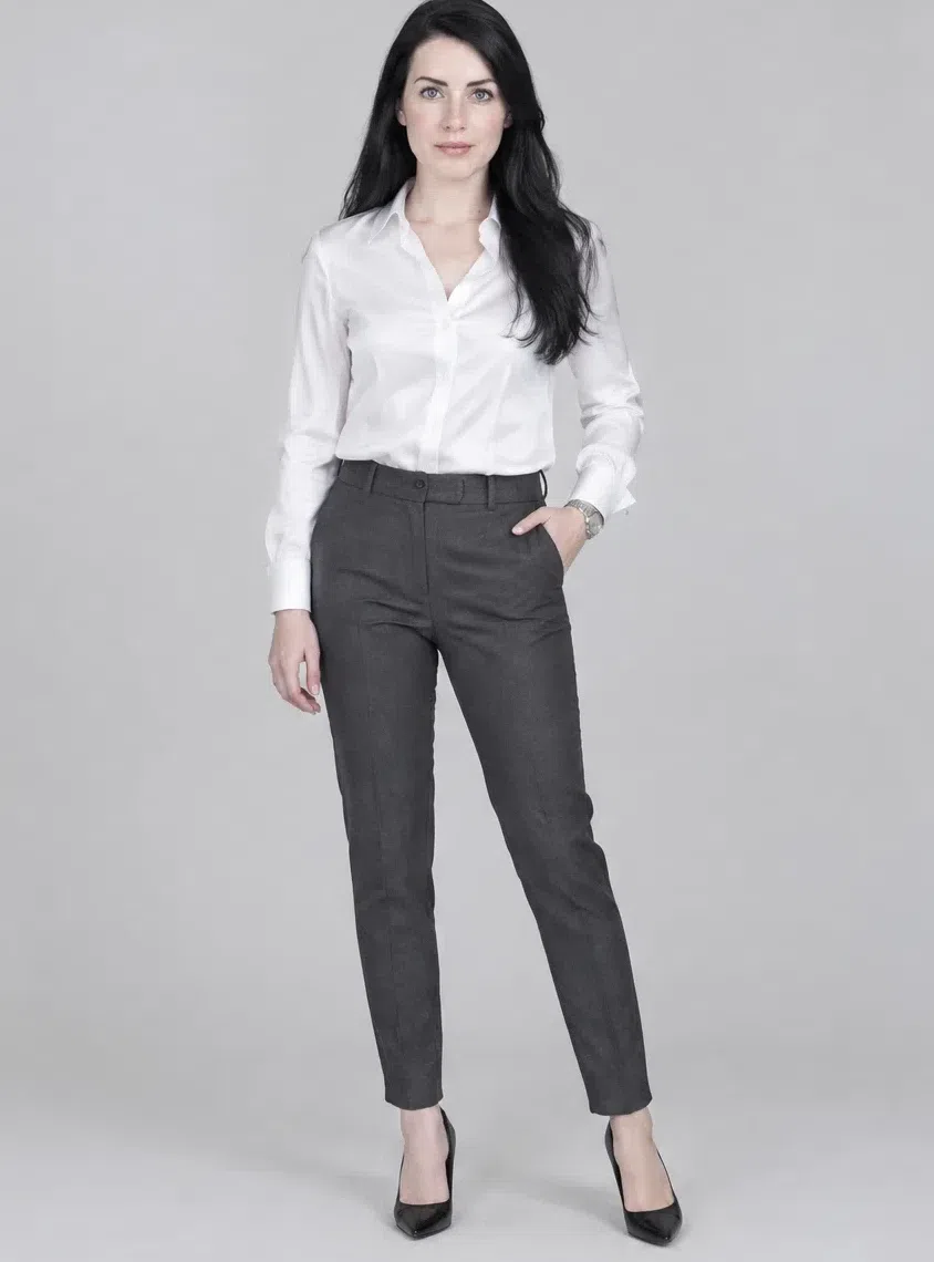
Pure white in heavy silk or satin, for the office and for evening. A sharp pointed collar or a neat drape keeps the lines crisp. Next to black and navy it lights the face up, and it works under tailoring, with pencil skirts or under a tuxedo jacket. For a softer version, the icy pastels make the same shape just as wearable.
Tip For work, choose French cuffs - they look deliberate with a silver watch.
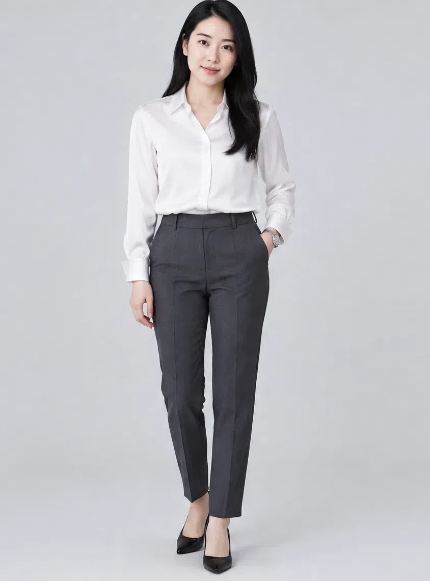
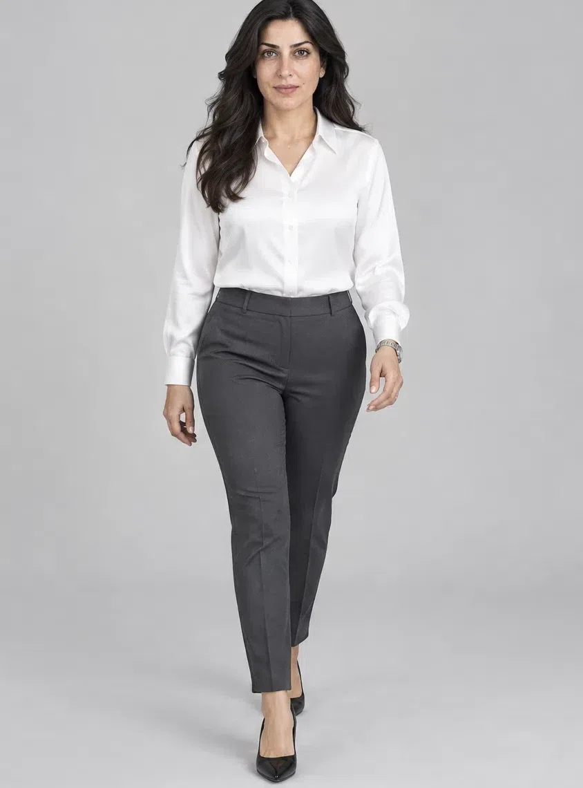
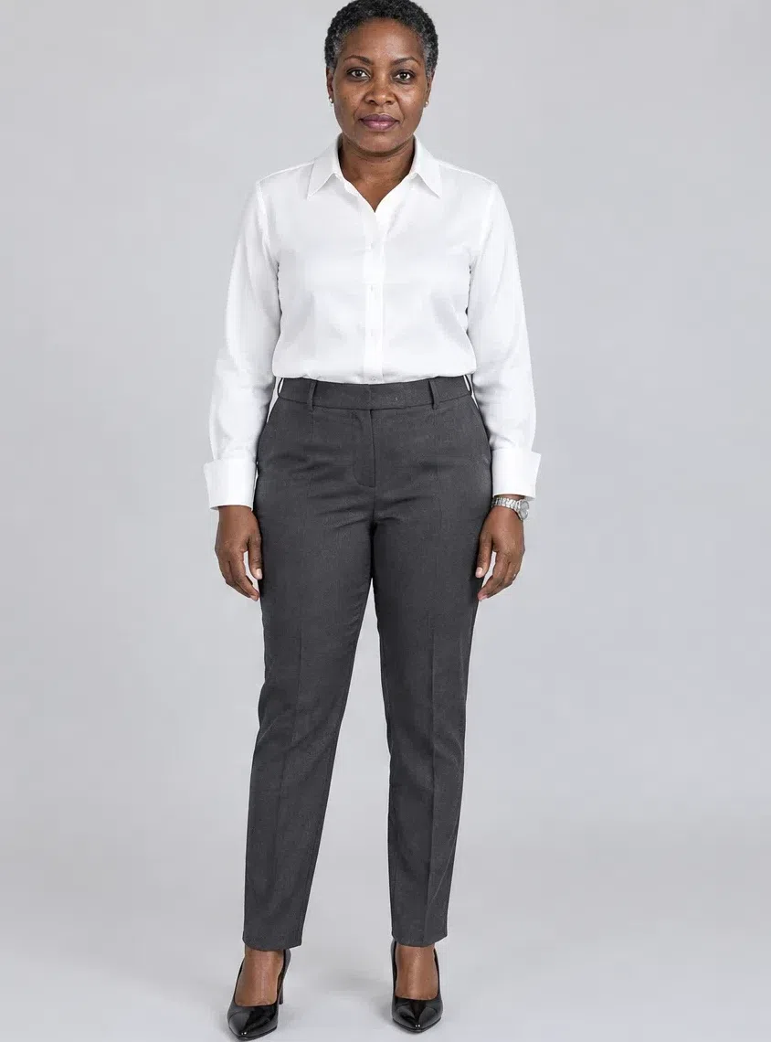
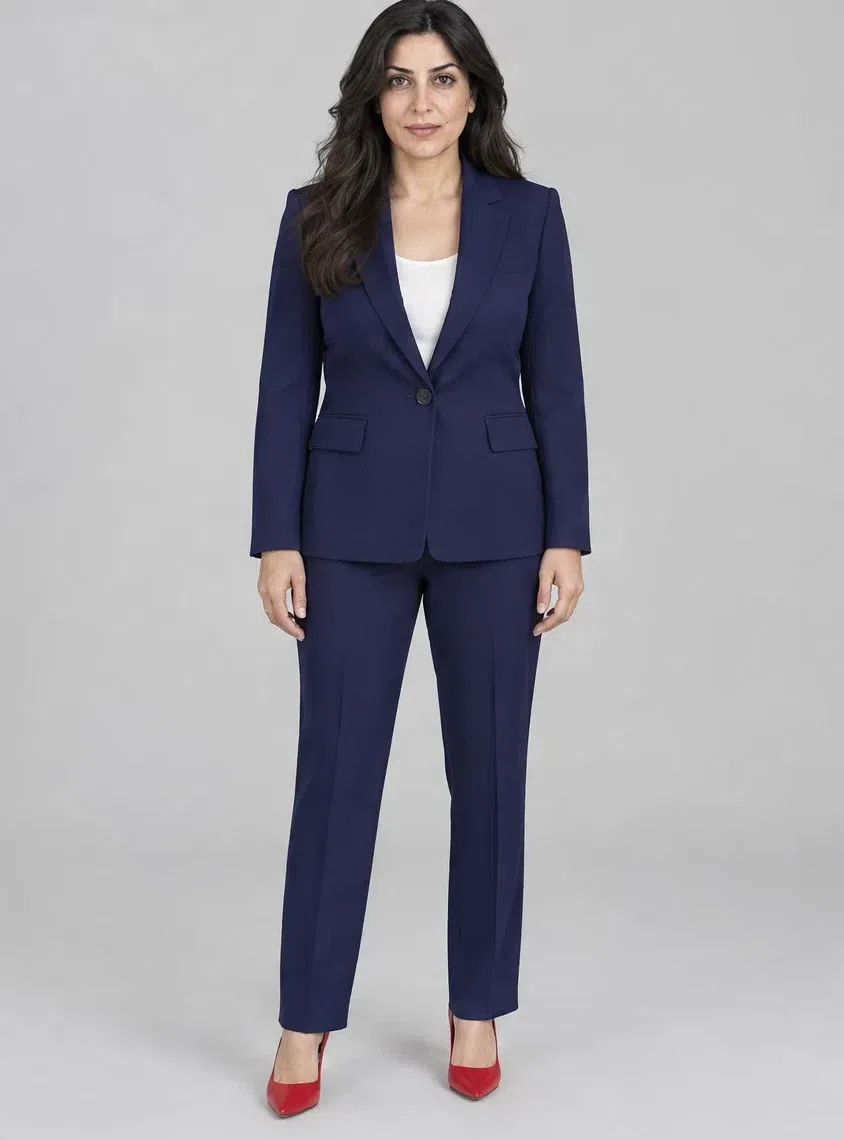
3Midnight navy trouser suit
Saturated deep navy is the office alternative to black: every bit as formal, a degree less severe. Choose a fitted jacket with clear shoulders and straight trousers with a pressed crease, in a dense cloth with a slight sheen. Wear the two halves together or split them across the rest of the capsule.
Tip Pair it with the Optic white blouse and a red pump for one sharp point of color.



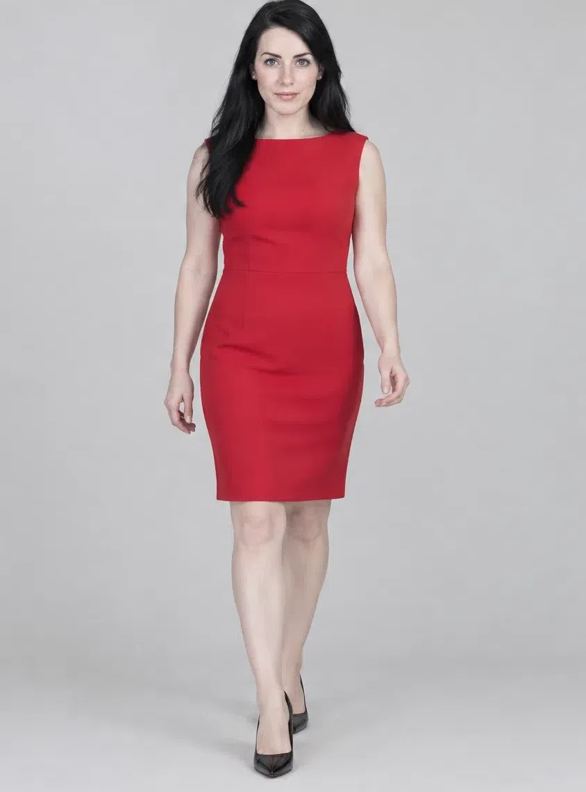
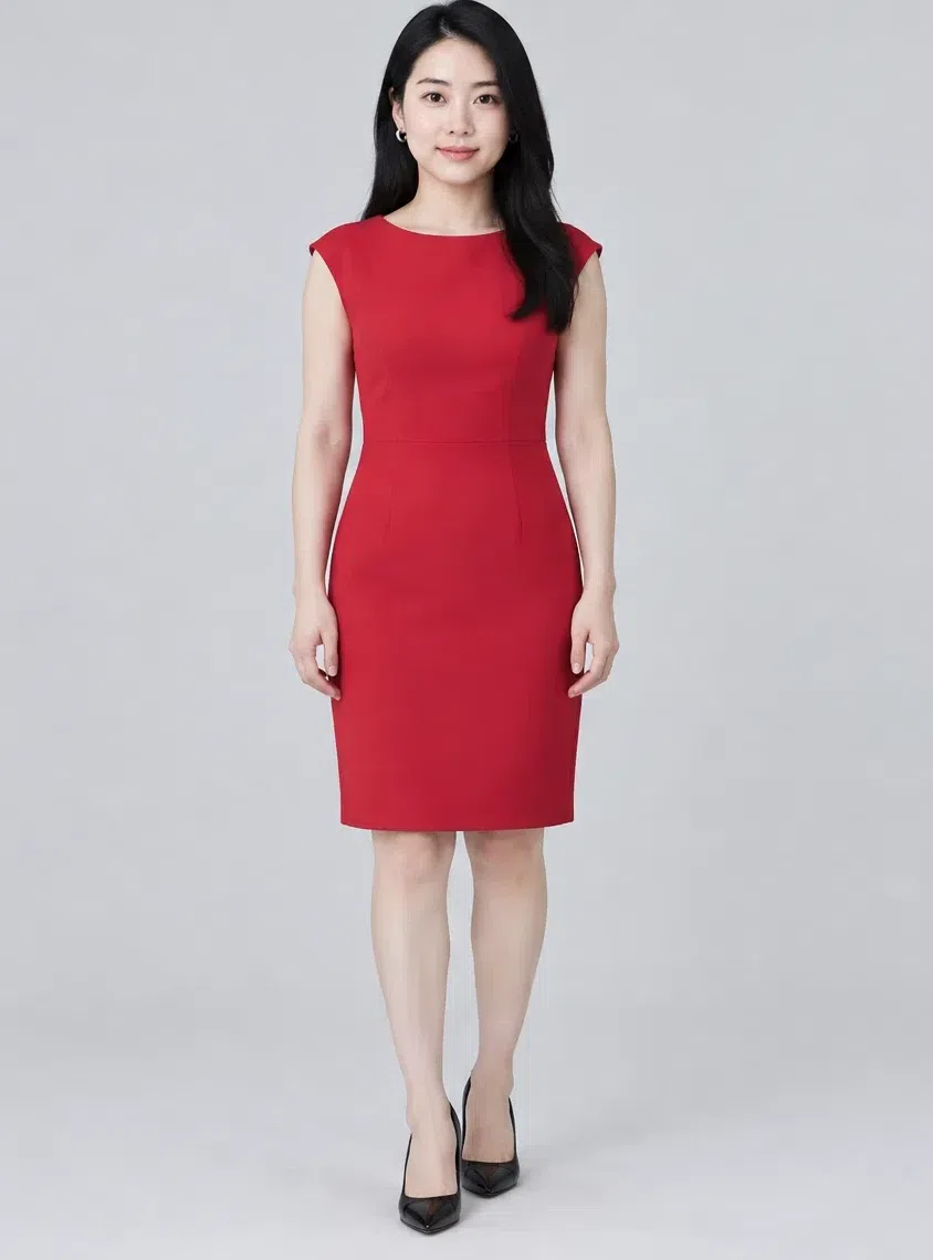
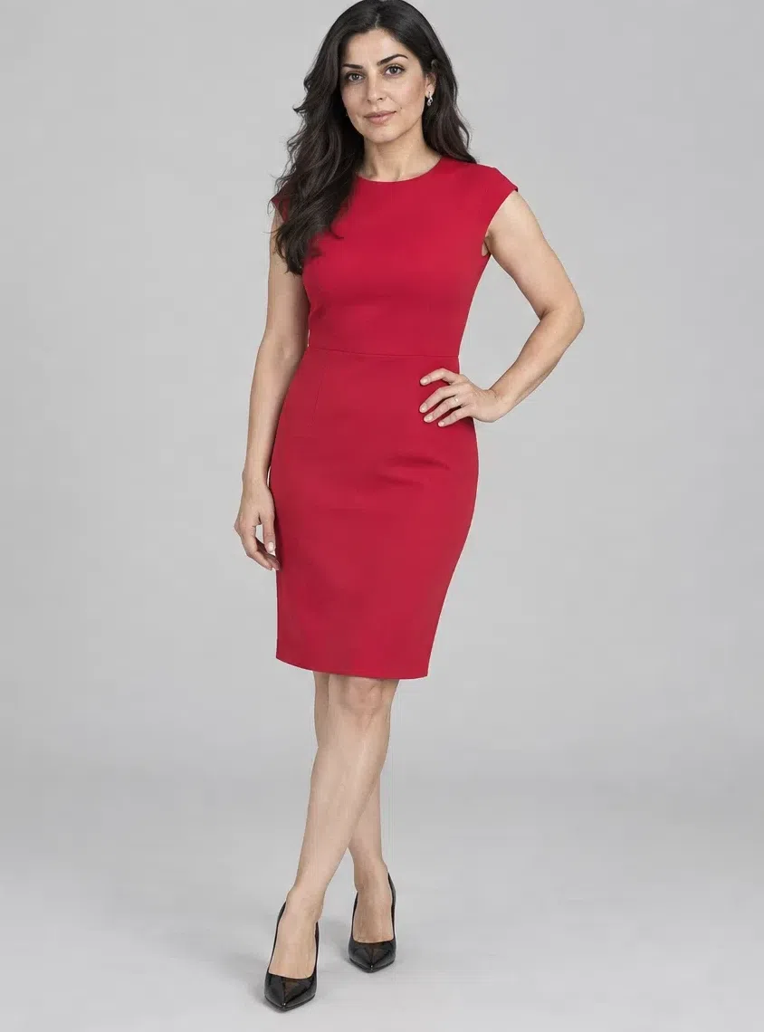
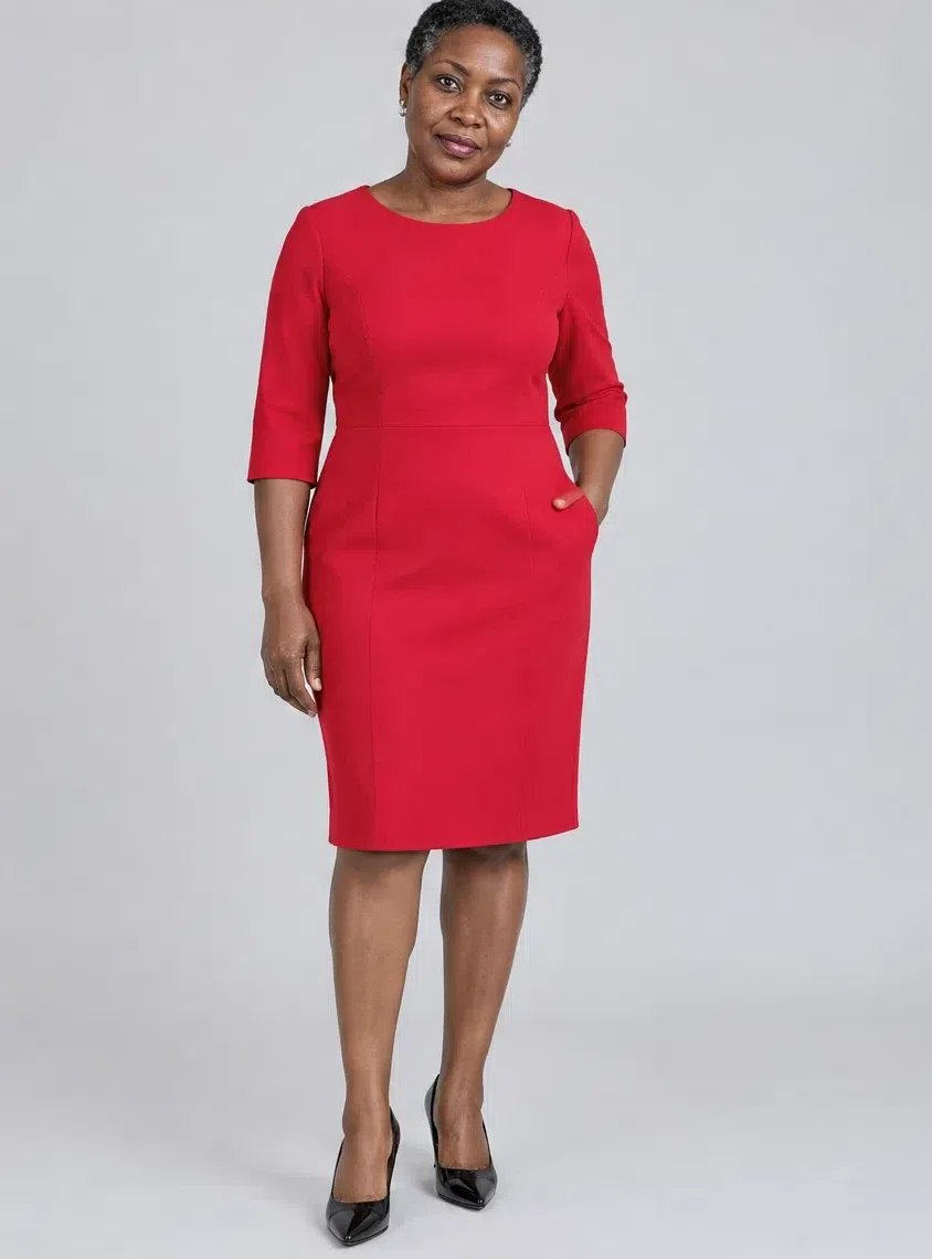
4Crimson sheath dress
A saturated red in a straight cut, for important meetings and evenings out. Keep the red cold - crimson, cherry, ruby - and the fabric dense enough to hold its shape. Knee length or just above. A dress this strong needs no complicated accessories; it is the outfit.
Tip For evening, add black patent shoes and minimal silver jewelry, and nothing else.
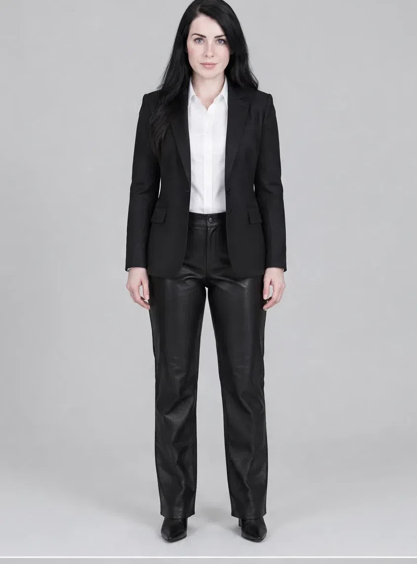
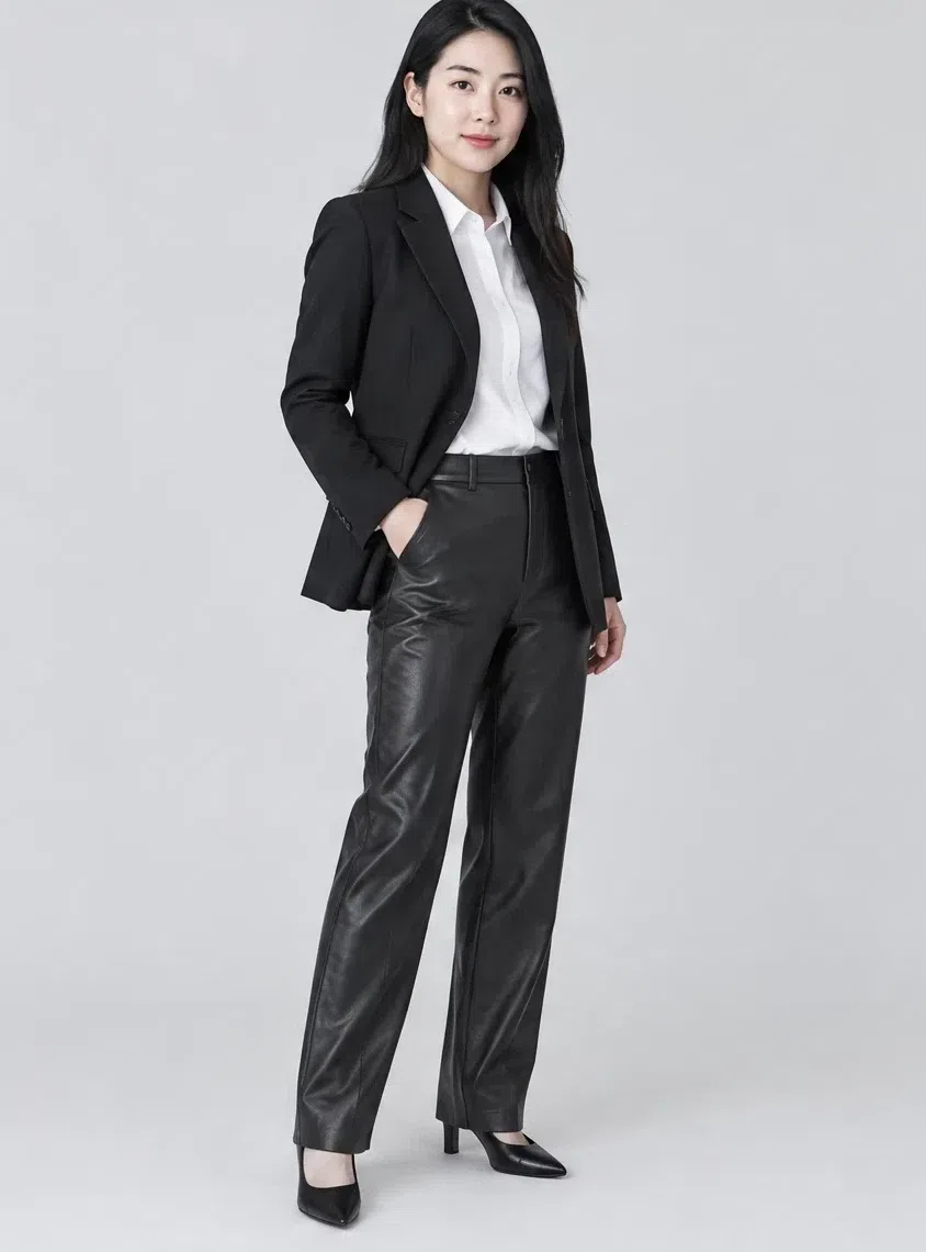
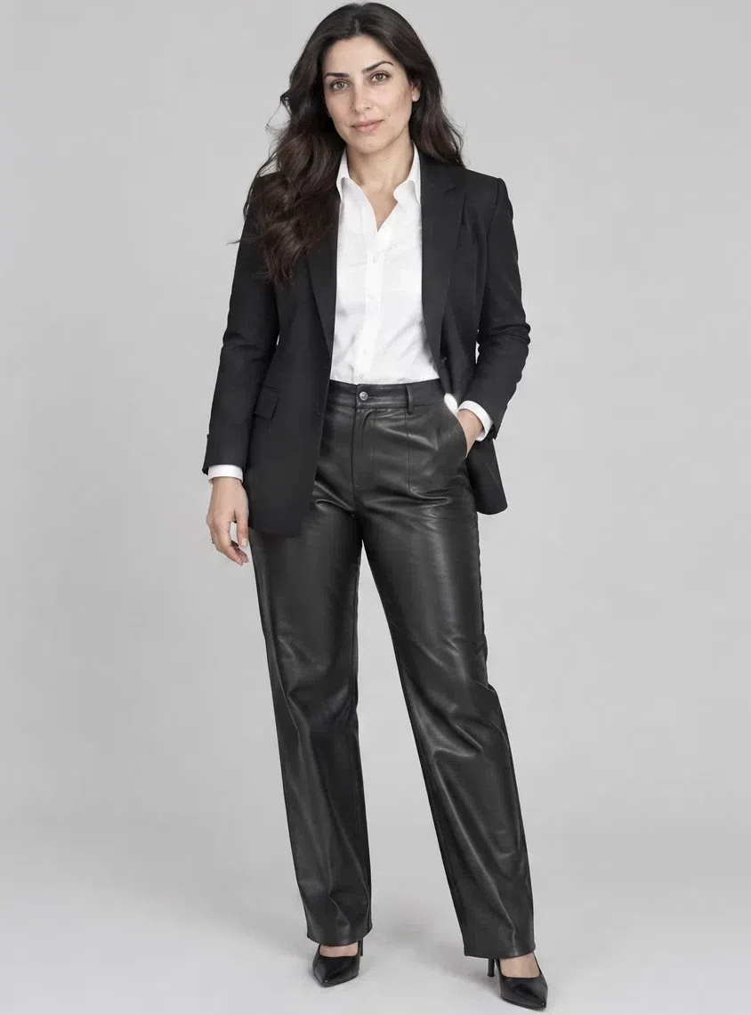
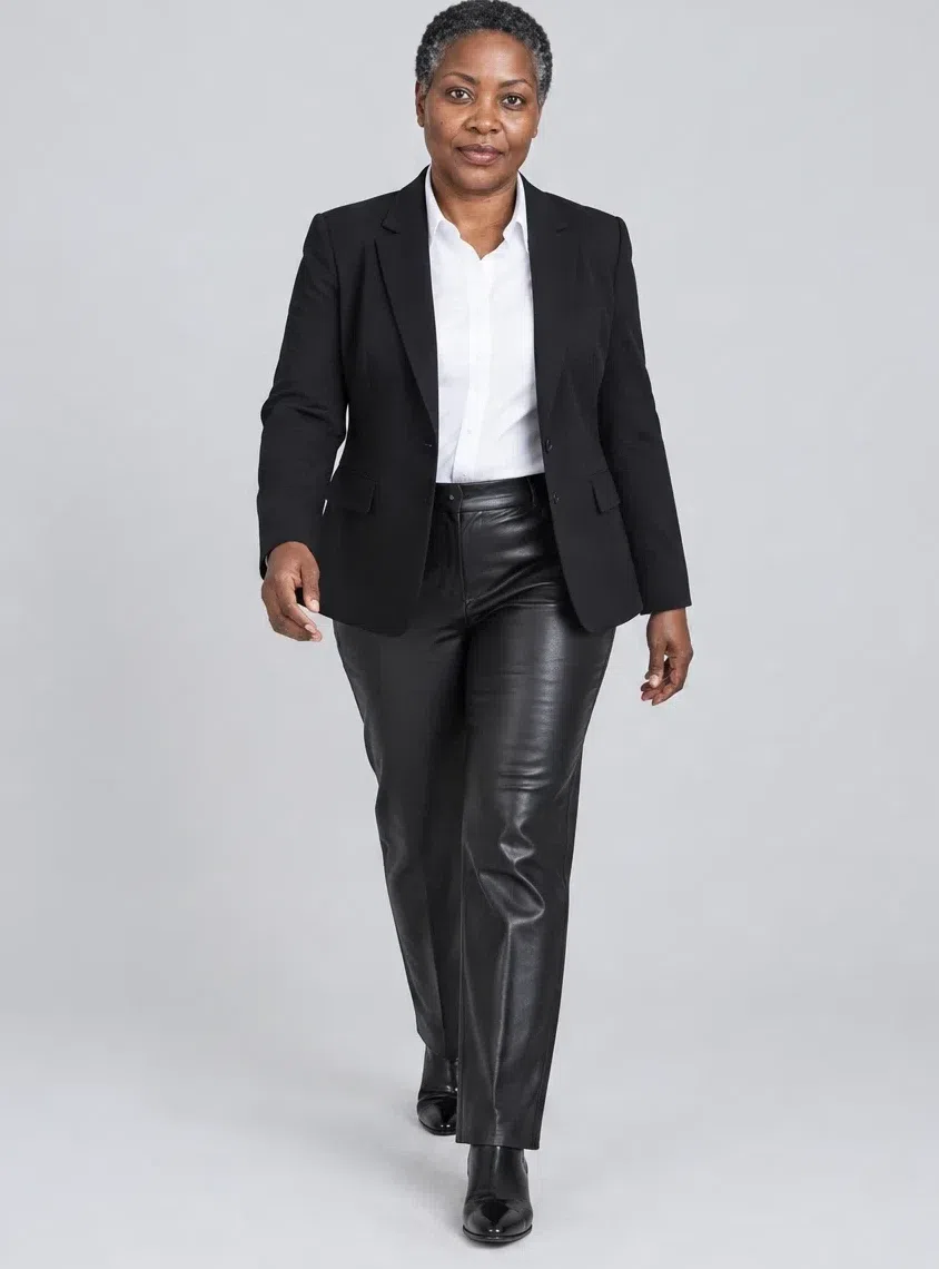
5Jet black leather trousers
Straight or slightly tapered leather trousers add an edge the rest of the capsule does not have. Matte or patent finish both work. They pair with a chunky knit, a silk blouse or a strict blazer, and the mix of polish and rebellion suits the coloring's natural drama.
Tip Wear them with a white shirt and a black blazer for smart casual that still looks sharp.
6Forest green cashmere sweater
Deep cold green in good cashmere, the knit to own for the colder months. Fitted or straight, with no extra detail. The green reads as a jewel rather than an earth tone on this coloring, and it combines neatly with black, navy and white.
Tip Wear it with a black leather skirt and boots for a city outfit with color in the middle of it.
7Jet black and white check pencil skirt
A pencil skirt in a bold graphic check - black on white, or navy on white - brings movement to a business wardrobe. Knee length, worn with solid blouses and turtlenecks. The geometry repeats the structure in the face itself, which is why a crisp check suits this coloring and a blurry one does not.
Tip Add a black turtleneck and one red accessory, and the check has a color to play against.
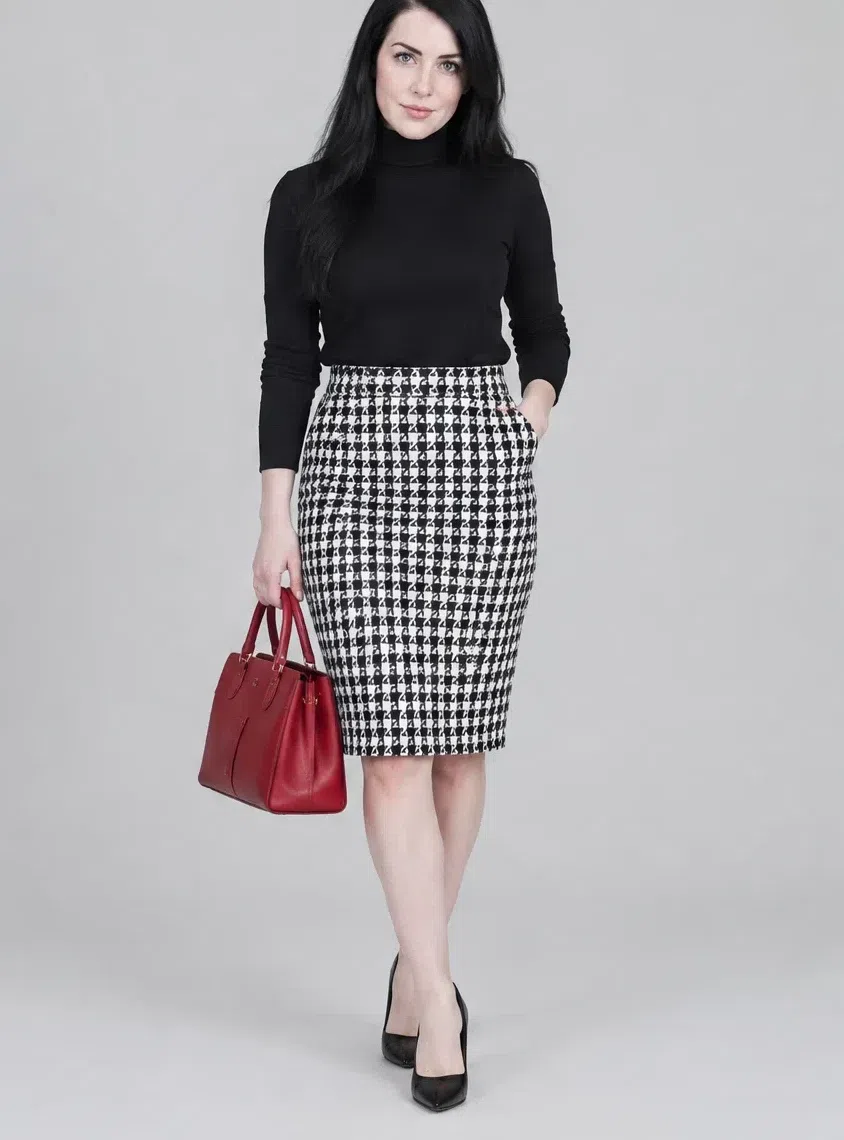
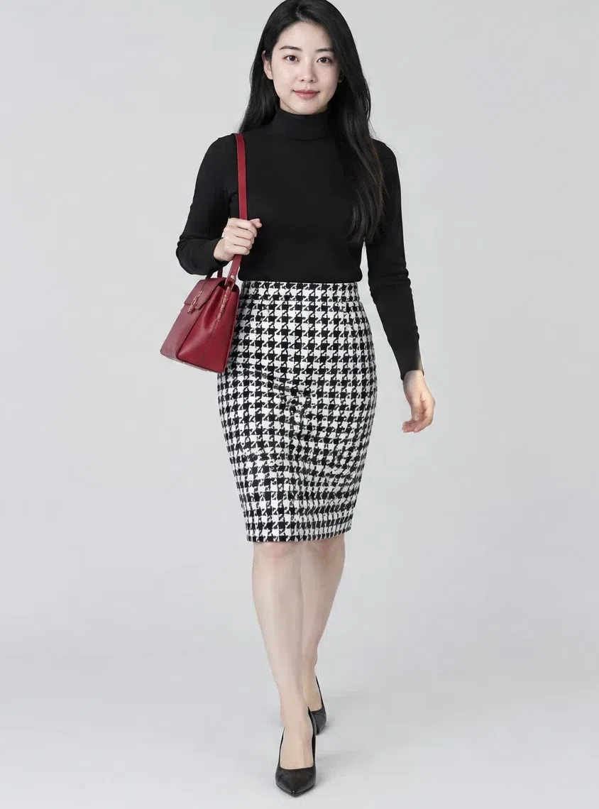
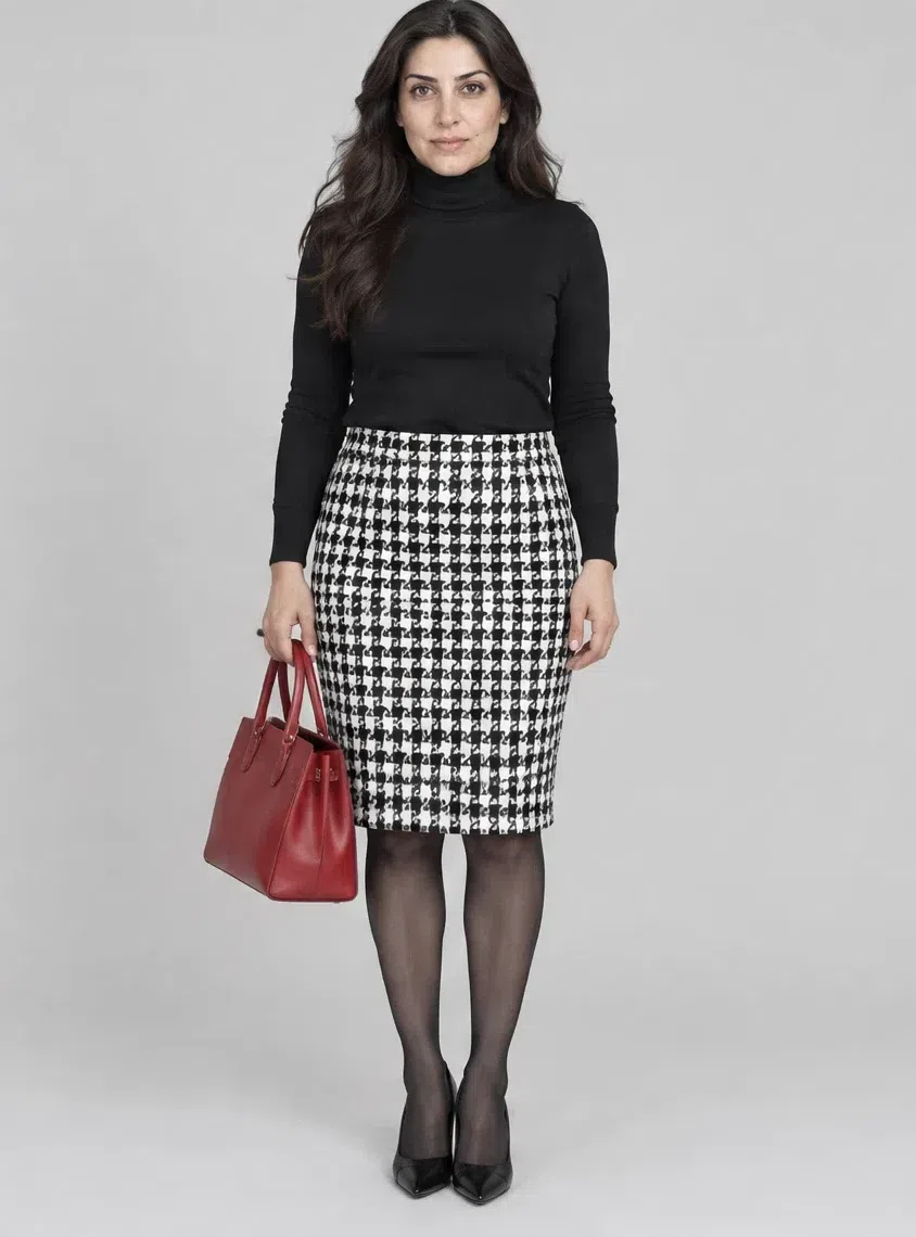

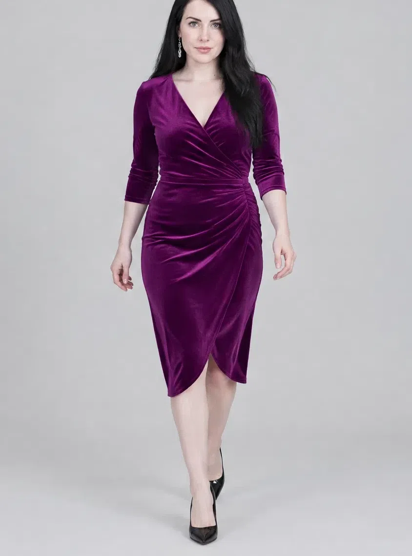
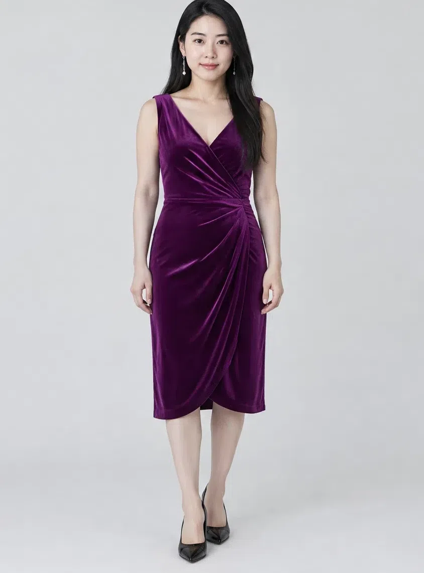
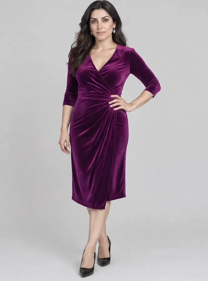
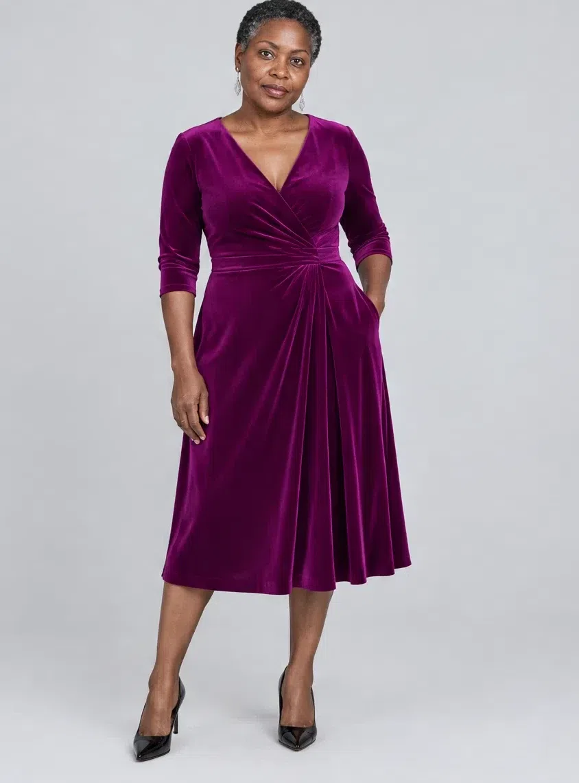
8Royal purple velvet evening dress
A saturated purple or plum for special occasions. Keep the purple cold: anywhere from icy lavender to deep amethyst works, warm aubergine-brown does not. Fitted or softly draped, and ideally in a fabric with light in it - velvet, satin or brocade all flatter this coloring.
Tip Off-the-shoulder or a V neckline frames the face; silver drop earrings finish it.
Five ways to combine the capsule
- All black, plus one color. A Jet black outfit head to toe, then a Crimson bag or a Blue topaz scarf. One saturated point against black is the most dramatic trick this palette has.
- White on top, black below. The Optic white blouse over the Jet black leather trousers. It repeats the contrast already in your coloring, so it never looks severe.
- Color blocking, two or three shades. Pair saturated palette colors directly: Forest green with Royal purple, Sapphire with Cerise. Clean jewel shades side by side look deliberate rather than loud.
- A graphic print with one solid accent. The check skirt with a Crimson accessory, or a black-and-white geometric dress with a Cerise earring. Let the print stay black and white and give the color a single job.
- Mix matte with shine. Silk with leather, velvet with satin. Dense, smooth and lustrous surfaces carry cold colors best; fleece, loose jersey, rough linen and mohair soften the lines this coloring depends on.
Makeup shades
A quick reference - the full makeup guide is its own page
Cool Winter makeup has one job: keep everything cold. A golden foundation, a peach blush or an orange bronzer pulls the face toward yellow and softens the contrast this coloring is built on. Below are the core shades; placement, finishes and complete looks belong to the dedicated makeup page.
Base: foundation and blush
Foundation
Look for Cool or Neutral labels with a pink or slightly gray base. Check it on the jawline in daylight: the right shade vanishes, a golden one shows as a yellow stripe. Sculpt with a cool taupe instead of a bronzer.
- Fair - cool porcelain #F2E2E0
- Light - rose beige #EBD3CE
- Medium - cool walnut #C0977E
- Deep - cool mocha #6E4B42
Blush
Cool pink through berry, placed high on the cheekbone. Peach and coral blush are the classic mistake here. Highlighter stays cold too: silver, platinum or pink pearl.
- Cool pink blush #E1A3B1
- Raspberry blush #D2436E
- Plum blush #9E4F72
- Berry blush #B03060
Eyes
Eyeshadow
Cold grays, taupes and blues for definition rather than a lot of color. Black liner and black mascara are safe on this contrast; brows go graphite or cool dark brown.
- Cool taupe lid #8E8177
- Slate gray #7E8A94
- Graphite #4A4A50
- Midnight #1B2A4A
Lips
Everyday nudes
A Cool Winter nude is a muted pink or plum, never beige-peach, which erases the lips.
- Cool pink nude #D98BA0
- Rose beige nude #C99BA0
- Plum nude #9E6C7E
- Raspberry nude #B85C7A
Statement lips
The place this coloring can go all the way. A blue-based red also makes teeth look whiter; an orange red does the opposite.
- Crimson #DC143C
- Cerise #D9007F
- Cherry #8C1C3A
- Deep plum lip #6B2350
Hair color shades
Which dyes keep the coloring cold - the full guide is its own page
Coloring a Cool Winter works when it protects the contrast and the cold temperature rather than muffling them. Deep cool shades are the natural fit, and this is also one of the few subtypes that can carry icy platinum. The shades below are the short list; levels, salon language and upkeep live on the hair-color page.
Shades that suit
Deep and cold
Light and bold
Hair colors to avoid
Anything warm or muddy works against a cold undertone and blurs the contrast.
Skip these
- Golden and honey blondes, wheat blonde. The yellow pigment turns the skin sallow.
- Copper and fiery red. The strongest clash there is with a cold complexion.
- Caramel and warm chestnut. They make the face look faded and tired.
- Dirty blonde and golden light brown. Too soft and too warm to hold the contrast.
Cool Winter, or a lookalike?
Three near neighbors, and a two-minute check for each
Cool Winter gets confused in two directions. Inside the season, with Bright and Deep Winter, where brightness and depth compete with cold for the lead: cold leads Cool Winter, brightness leads Bright Winter, depth leads Deep Winter.
Across the season line sits the most common and least obvious mix-up - Cool Summer. Both colorings are cold, so the usual warm-or-cool check says nothing. What separates them is intensity: a winter carries pure saturated color and strong contrast, a summer lives in muted, slightly smoky shades. That comparison comes first.
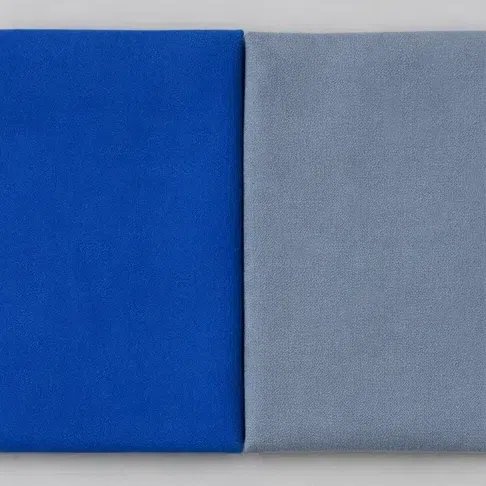
Hold a clear sapphire blue under your chin, then a smoky gray-blue. Which one pulls your face into focus?
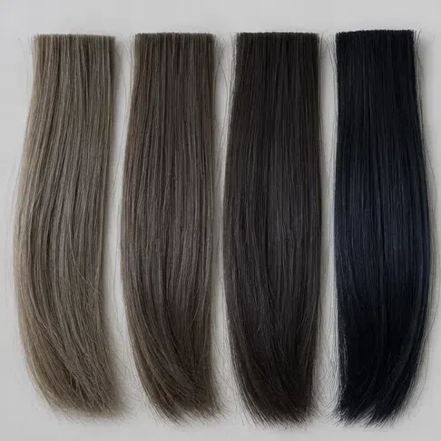
What is your natural hair color?
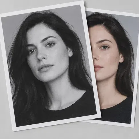
Convert a bare-faced portrait to grayscale. What shows up?
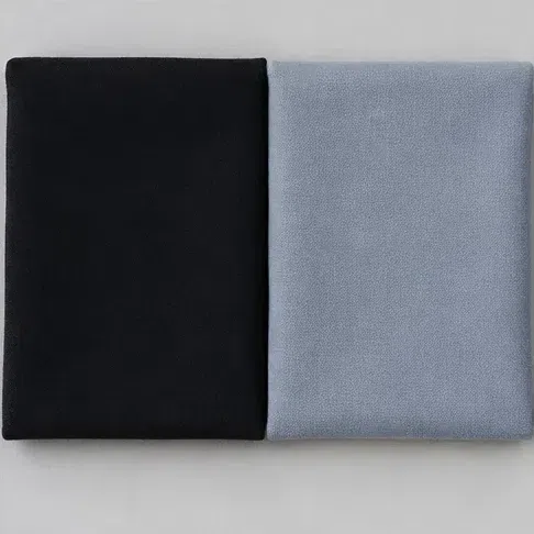
Is pure cold black right up against your face your color?
Your answers point here: pure cold color at high contrast. Start with the palette.
The temperature matches, but your coloring is softer: clean saturated shades compete with your face, and muted ones help it.
Read the Cool Summer pageThe cold is there, but depth leads rather than icy clarity.
Read the Deep Winter pageCold alone is not enough for you - you need maximum brightness and glow.
Read the Bright Winter pageTreat the result as a direction, not a diagnosis. People misjudge themselves most often right at the border between two subtypes, and the comparisons below are written for exactly that border.
Cool Winter vs Cool Summer
Cool Winter
Clear and pure. Holds full-strength color without being overwhelmed.
Medium to high, with sharp edges between hair, skin and eyes.
Sapphire, Cerise, Crimson, Jet black, Optic white.
True black and pure white at the collar.
Crisp and graphic, like frost on glass.
Cool Summer
Softened. Colors look best with a faint haze of gray in them.
Low to medium, with gentler steps between the features.
Raspberry, cornflower, rose quartz, steel gray.
Soft grays and navy instead of black and stark white.
Soft and cool, like an overcast summer sky.
Settle it in two minutes Temperature cannot split these two, since both are cold - so test intensity. Hold a clear sapphire fabric under your chin by a window, then a smoky gray-blue. Watch your skin and what grabs attention, not the cloth. If the sapphire pulls your features together and the smoky blue flattens your face, you are a Cool Winter. If the sapphire wears you and the smoky blue leaves your skin smoother and rested, read the Cool Summer page.
Cool Winter vs Bright Winter
Cool Winter
Bright, but filtered through frost. Cold leads.
High: light skin, dark hair, cold eyes.
Cerise, Delphinium, Sapphire, Optic white, silver.
Elegant, reserved, a little aristocratic.
A still, frozen lake in clear light.
Bright Winter
Maximum: juicy, clean colors that almost glow. Brightness leads.
Extremely high, often with jewel-bright eyes.
Shocking pink, lime, electric blue, pure yellow.
Bold, dynamic and attention-grabbing.
Neon on a night street.
Settle it in two minutes Hold up a fuchsia, then a neon Barbie pink. If the fuchsia freshens you and the neon feels like too much, you are a Cool Winter. If your eyes light up only with the neon, Bright Winter fits better.
Cool Winter vs Deep Winter
Cool Winter
Clean and cold, free of both warmth and haze.
High, anchored by the lightness of the skin.
Crimson, Delphinium, jewel green, silver.
Poised and restrained.
Snow under a blue sky.
Deep Winter
Deep and saturated - dark shades that look expensive. Depth leads.
High, weighted toward dark hair and eyes.
Burgundy, dark plum, spruce green, aubergine.
Luxurious and a little mysterious.
Candlelight and velvet.
Settle it in two minutes Compare pure black with a deep burgundy at the face. Black works on both, so watch the burgundy: if it opens your face up, Deep Winter is likely. If it looks heavy next to your icy coloring, you are a Cool Winter.
Still torn? Return to the leading quality. When cold is the first word people reach for about your coloring, ahead of dark or bright, you belong on this page. For the wider picture, start at the color analysis guide.
Cool Winter questions, answered
What does it mean to be a cool winter?
Is a cool Winter a true Winter?
How do I tell if I'm a true winter?
What are some cool Winter undertones?
What colors look best on cool Winters?
What are the best colors for a true winter look?
What colors should cool winter not wear?
Can true Winters wear black?
What is the best hair color for a cool Winter?
What are the differences between Bright Winter and True Winter?
What are the four types of winter?
What celebrity is a cool winter?
How is Cool Winter different from Cool Summer?
What is the difference between Cool Winter and Deep Winter?
Can Cool Winter wear beige?
Is Cool Winter silver or gold?
What if I love a piece that is not in the Cool Winter palette?
Where this came from
Sources for the few statements on this page that are facts rather than judgment: where the season system comes from, why room light and deep skin change the undertone tests, what grayscale shows, and how facial contrast changes with age.
-
Carole Jackson (opens in a new tab)
Wikipedia
The provenance of the season system this page is built on. Jackson’s Color Me Beautiful made it popular, and the article traces the teaching back through Johannes Itten to Belle Northrup and Harriet Tilden McJimsey. Cool Winter is one of the twelve subtypes that refine it.
-
Color analysis (art) (opens in a new tab)
Wikipedia
Behind the FAQ answers on True Winter as another name and on how many winters there are. The article describes seasons with sub-variants whose approach “can vary greatly among different schools of thought” - which is why the same subtype carries different labels.
-
Color temperature (opens in a new tab)
Wikipedia
Behind the daylight rule in the vein test and the fabric check in how to tell. Its table puts daylight near 5,500-6,500 K against roughly 2,400 K for a standard incandescent bulb, so room lighting shifts color before you judge anything.
-
Human skin color (opens in a new tab)
Wikipedia
Behind the caveat on the vein test: veins show clearly on very fair skin and are often hidden on deep skin. The article credits hemoglobin in the dermis for much of the color of light skin, and melanin as the main determinant in darker skin.
-
Relative luminance (opens in a new tab)
Wikipedia
Qualifies the grayscale ramps in the contrast step of how to tell. Converting a photo to gray stores one weighted value per pixel, luma, and the article notes luma still shifts a little with hue and saturation - so the ramp approximates lightness rather than measuring it.
-
Aspects of Facial Contrast Decrease with Age and Are Cues for Age Perception (opens in a new tab)
Porcheron, Mauger & Russell, PLOS ONE, 2013
Behind one general fact only: in a large sample of adult women, the contrast between facial features and the surrounding skin fell with age. It is the background to the FAQ caveat that pure black can start to feel harsher over the years; the study does not test clothing.
Plainly put: the system’s history, the lighting and skin facts, and the aging finding above are sourced. The twenty Cool Winter shades, the nine to avoid, the line drawn against Cool Summer, and every makeup, hair and jewelry call are our own analysis - no study covers them, and none of these links should be read as if it did.
What is color analysis, how do you find your season, and what are the 12 types?
The main guide covers all of it - the four axes your season is built from, all twelve subtypes side by side, and a free quiz that places you in about a minute.
What is color analysis? For women and men