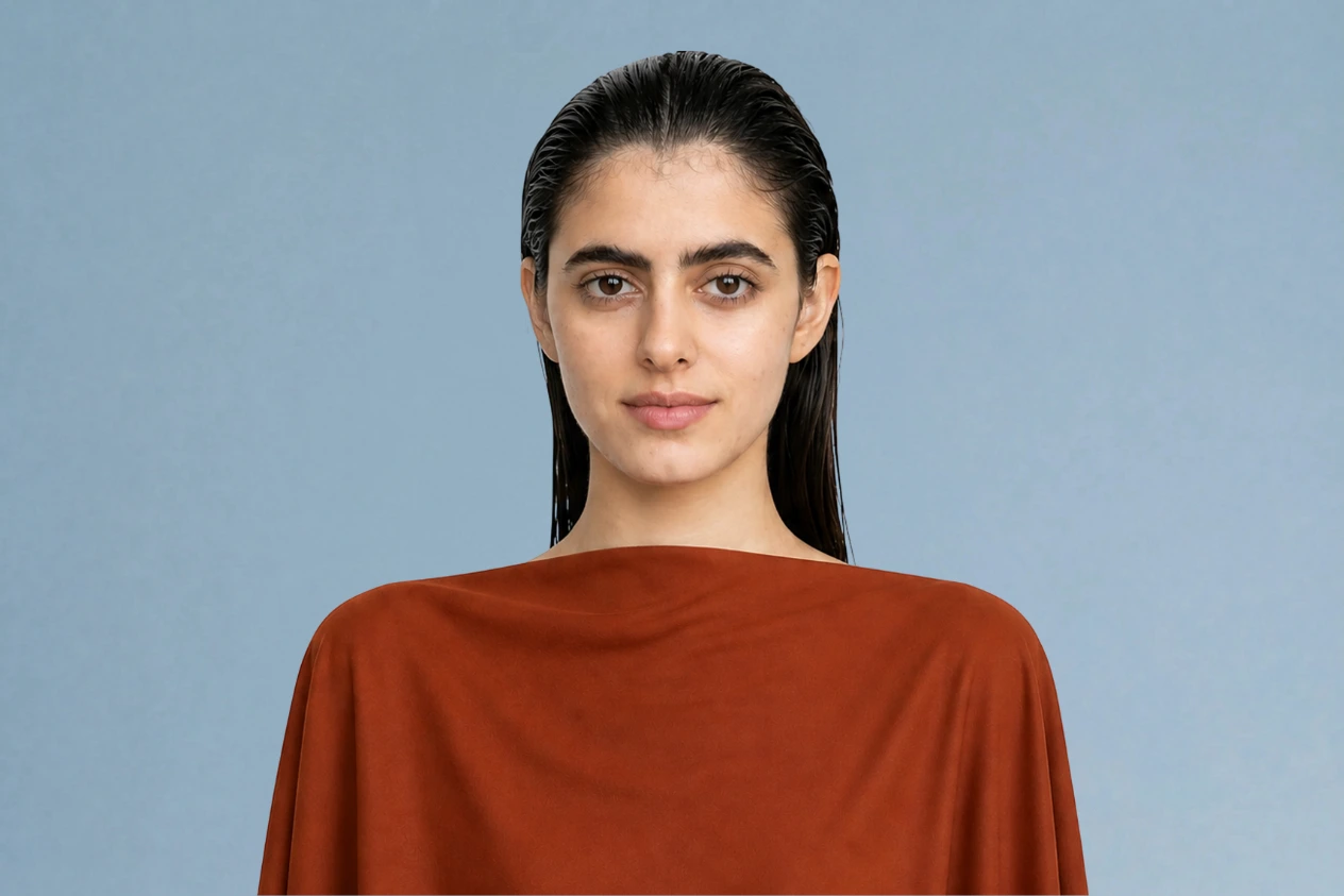
Deep Autumn color palette (Dark Autumn): what to wear and what to avoid
The deepest of the three autumns: warm golden or olive skin under dark hair and dark eyes, with almost a winter's depth. Below are its 17 shades, the 11 that gray the face, and the gold-against-plum test that tells it apart from Deep Winter.
See the Deep Autumn shades on a real face
Nothing in this set is pale, and nothing is icy. Five neutrals run from Ecru down to Dark chocolate, six rich bases carry most of the color in the wardrobe, and Tomato is the one bright accent. Each shade is dense and warm, shadowed but never grayed, which puts it at the same weight as her dark hair and brows. Switch between them and watch the skin under her eyes: a shade from this palette keeps it warm and smooth, while an icy or washed-out one lets gray shadows come through.
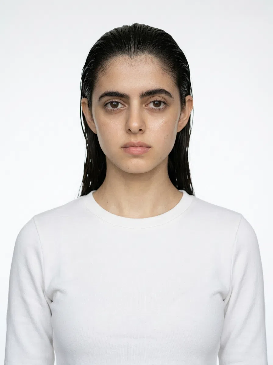
Deep Autumn in 30 seconds
Deep Autumn runs warm underneath, rich rather than muted or bright, and holds more contrast than any other autumn, because its hair and eyes are dark enough to border on winter. The palette sits at the darkest end of the season - Dark chocolate, Olive, Merlot, Mallard and the spice shades - with gold at the ear where silver would go dull.
| Skin | Golden or olive undertone, dense rather than translucent; tans to a deep bronze. |
|---|---|
| Eyes | Dark brown, deep hazel or marsh green, flecked with gold around the pupil. |
| Hair | Chestnut, dark chocolate or mahogany, showing warm copper in sunlight, never ash. |
| Contrast | Medium to high, but warm - dark features with no icy edge. |
| Metal | Antique gold first, then bronze and copper; silver and platinum look borrowed. |
Build on:
Keep away from the face:
Dark hair and dark eyes do not make you a winter. Deep Winter is just as dark but cool, and what places you here is the warmth running through that depth. Torn between this and Deep Winter, Warm Autumn or Soft Autumn? The comparison further down covers all three, and a photo settles it.
Am I a Deep Autumn? How to tell from your own face
Five checks, from the undertone out to the drape test
Nobody doubts that a Deep Autumn is dark. The question is which dark season. Deep Winter has the same depth of hair and eyes, which is why those two get swapped more than any other pair, and depth cannot separate them - only temperature can. So the checks start with the undertone, look for warmth inside the dark eyes, hair and contrast, and finish with the drape test, which puts the question to your face directly.
Your season comes from undertone and contrast, never from how pale or deep your complexion is - Deep Autumns run from warm ivory to deep brown, and what they share is a golden or olive undertone, rich rather than muted color, and a warm medium-to-high contrast.
11. Skin: warm and dense, at any depth
Start underneath. Depth tells you little here, because Deep Autumn skin runs from warm ivory to deep brown - the undertone beneath it is golden, olive or bronze every time.
What sets this skin apart from a spring's is density. It looks even, velvety and opaque rather than translucent, as if light stops at the surface instead of passing into it. What sets it apart from a winter's is the undertone: even at its lightest there is no pink-blue or porcelain cast, and at its deepest no ashy blue-gray one.
Two signs point away from this season before you run a single test: freckles that are gray or ash-brown instead of reddish-brown or gold, and a bare-skin flush that goes cool pink instead of a warm peach-brown. The next section shows what this skin looks like at four depths, in the sun and when it flushes.
Three checks for the undertone
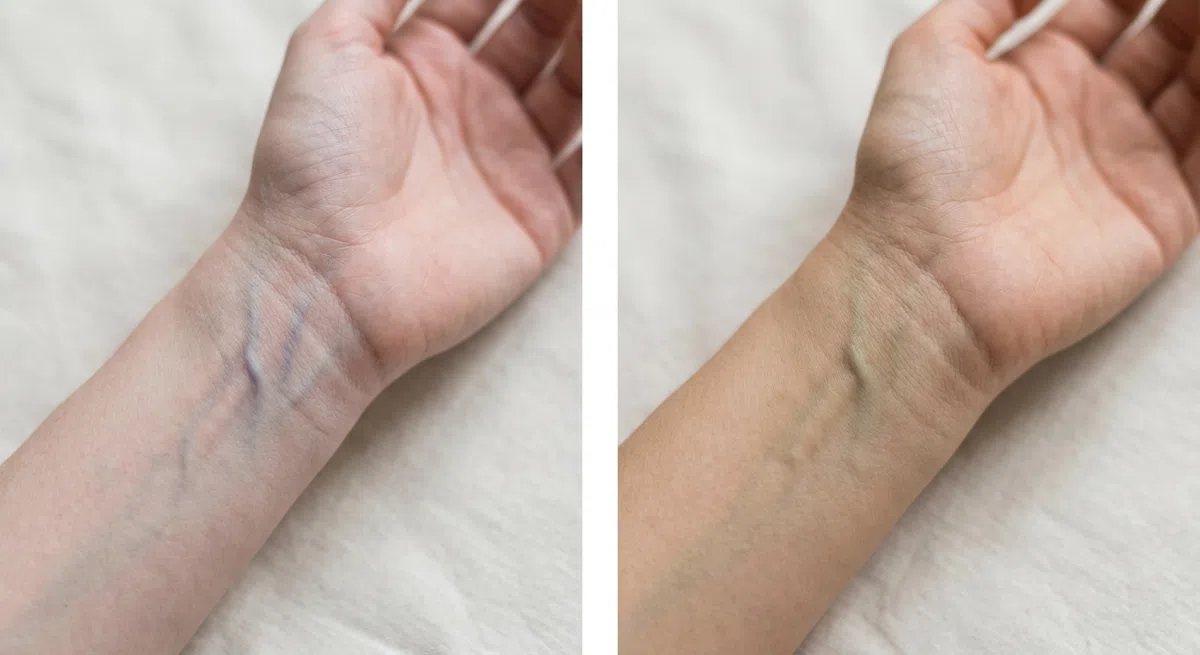
Stand at a window in the daytime and turn your wrist palm-up. It has to be daylight: incandescent light pushes everything yellow and cool LEDs push it blue, so either will mislead you. Wait a few seconds, then read the vessels as a group, ignoring any single one that stands out.
- Greenish or olive - warm. Deep Autumn and the other warm seasons stay in the running.
- Blue or purple - cool, so look at the summers and winters instead.
- Hard to call either way - probably neutral, so let tests 2 and 3 decide.
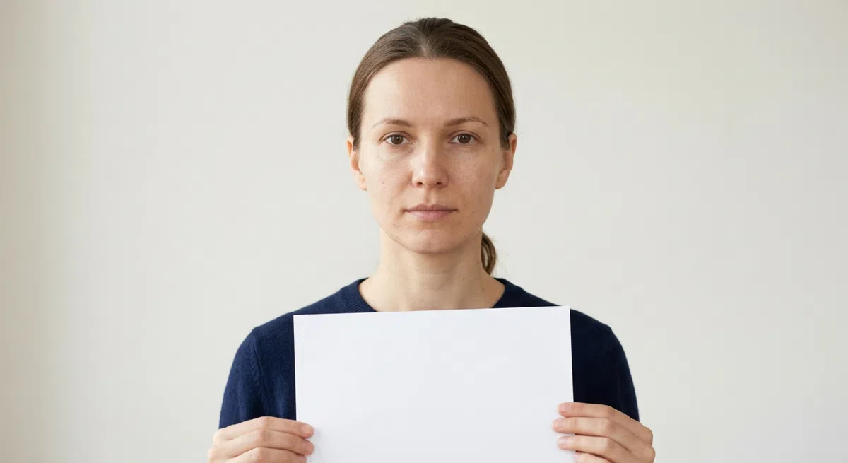
Clean face, hair pulled back from the cheeks, window light. Slide an ordinary sheet of printer paper up under your chin. It must be genuinely white, because off-white stock brings its own warmth and skews what you see. Then study the edge where the white touches your skin, not your face as a whole.
- Your skin looks golden or peachy next to it - warm, and consistent with Deep Autumn.
- Your skin shifts pink or bluish - a cool undertone.
- Your skin looks a little gray - usually neutral with an olive note, which is common at the olive end of this season.
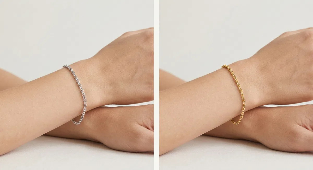
Take two simple pieces with no stones, one yellow gold and one silver, and hold each to your wrist or near your face in turn. Watch the skin, not the metal: does it clear and brighten, or do a sallow tint and dark circles show up?
- Gold, bronze or copper makes the face look lit from inside - a warm undertone.
- Silver, platinum or white gold makes the skin look more even - a cool undertone.
- You see no real difference - neutral, so something other than warmth will decide your season.
Warm on the paper and warm with the gold: that rules out the winters, Deep Winter included. The remaining question is which warm season, and blocks 3 and 4 settle it on depth.
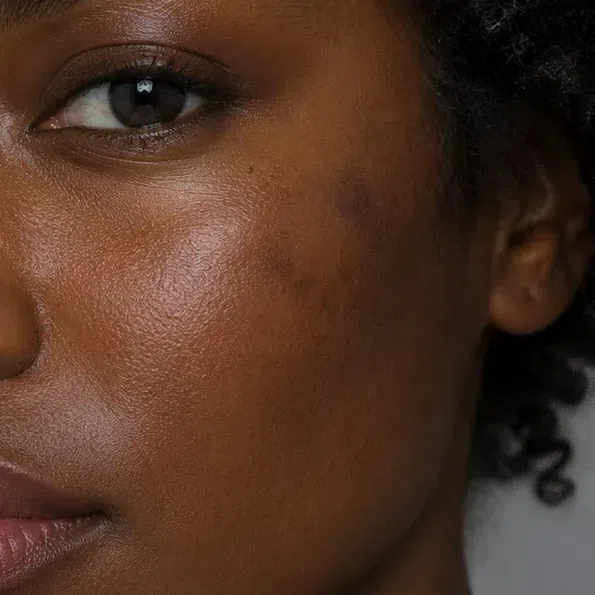
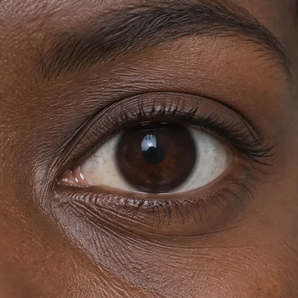
22. Eyes: dark, warm and flecked with gold
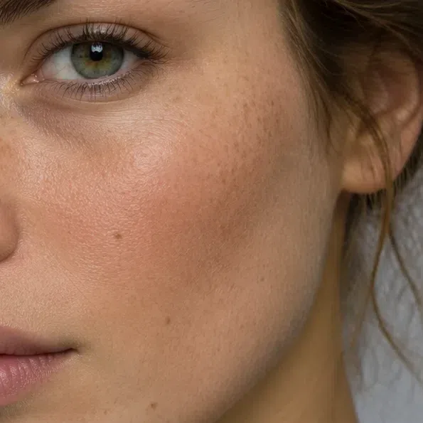
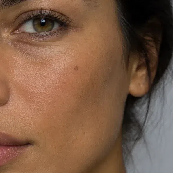
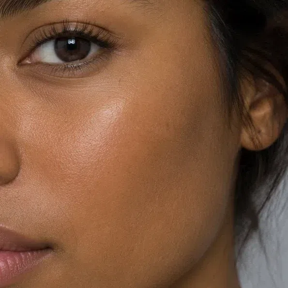
Deep Autumn eyes are dark and saturated, never watery, pale or icy. What gives the season away is the warmth inside that darkness.
Most are dark brown, some close to black; the rest are a deep hazel, a dark olive or marsh green, or a rich cognac. Look closely and the iris is rarely one flat color: gold, honey or ginger flecks gather around the pupil, and they are what makes the eyes read warm rather than merely dark.
The whites help more than people expect. On a Deep Autumn they tend to be a soft, slightly creamy white rather than the bright blue-white of a winter, so the dark iris sits against them without a sharp, cold edge. It is a quiet sign, and a useful one, because hair and eyes can be equally dark on both seasons.
Light, clear eyes - pale blue, bright aqua, light hazel - point elsewhere, usually to a spring or a summer. If yours are dark but look steely, with no warm flecks anywhere, take Deep Winter seriously.
Darkness is not the test. Warm flecks and a soft, creamy white are, and both point here rather than to Deep Winter.
33. Hair: dark, with copper hiding in it
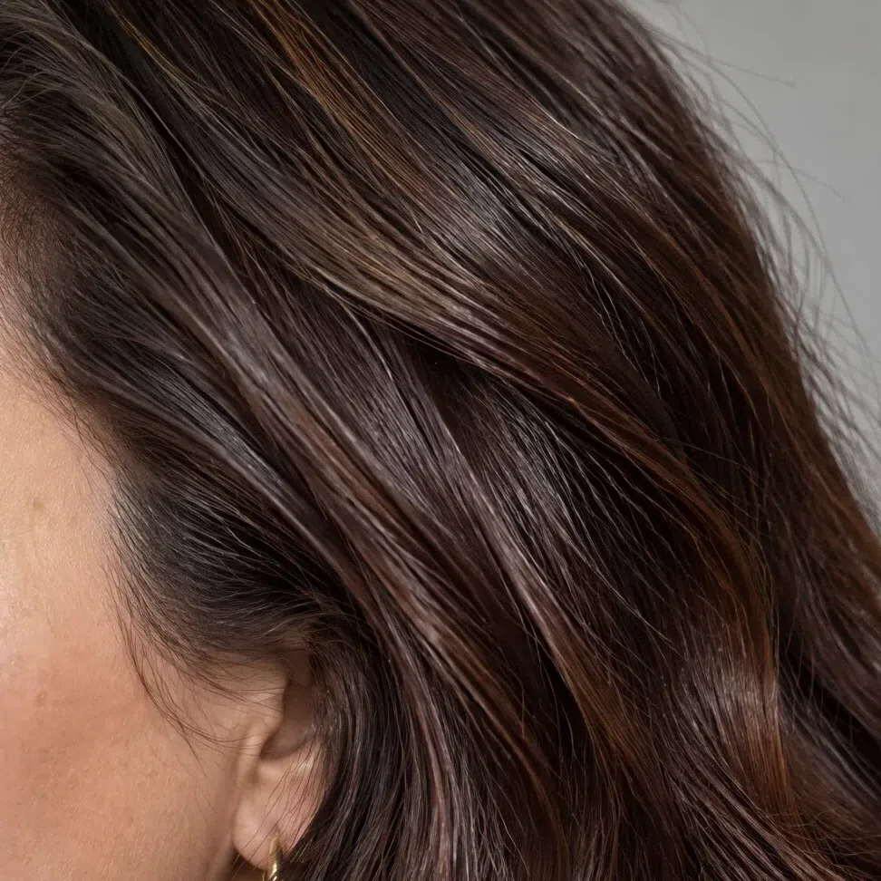
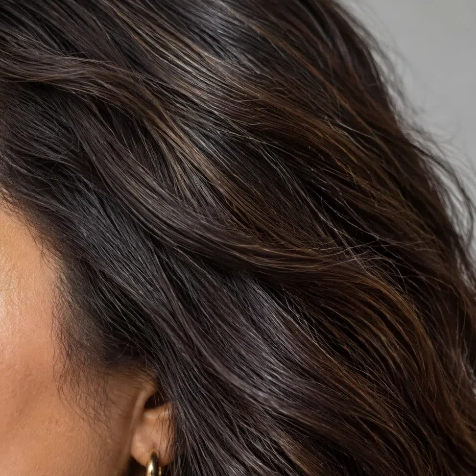
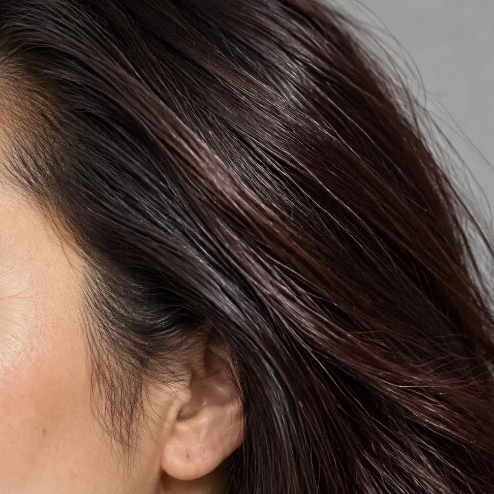
Natural Deep Autumn hair is always dark and dense, from medium chestnut down to deep chocolate. What it never is, is cold.
The range covers chestnut, dark chocolate, coffee and espresso, and auburn or mahogany. Ash and mousy tones do not turn up. Even hair that looks nearly black indoors shows copper, bronze or red-brown in direct sun - step outside with a mirror, or find a photo taken in daylight, and that glint is your answer.
The glint is also the quickest way to tell this hair from a Deep Winter's. Winter near-black stays blue-black or neutral in the same light, with no red coming through it.
Texture decides nothing: straight, wavy and coiled hair can all be Deep Autumn. Dyed hair? Judge your roots, or a photo from before you started coloring. And before your next salon visit, know that cool ash shades rarely hold on this coloring - the warm pigment underneath pushes back through, and within weeks the color turns brassy or muddy.
Look for red in the sunlight. Dark hair with a copper glint belongs here; dark hair that stays blue-black does not.
44. Contrast: strong, but never icy
Deep Autumn has more contrast than any other autumn, with dark hair and eyes standing well apart from the skin. The effect is still rich rather than stark, because every tone in the face is warm.
Contrast is a measure of how much lighter or darker hair, skin and eyes are than one another. On this season it runs from medium to high: chocolate hair against warm beige skin, espresso against olive. That is what separates this season from Soft Autumn, whose features sit close together, and from Warm Autumn, whose contrast is gentler.
It is also why contrast cannot settle the Deep Winter question. Both seasons put dark features against lighter skin, and in black and white the two can look much alike. The difference is temperature - a winter face looks sharp and frosty, a Deep Autumn deep and warm - so take that question back to block 1 and forward to the drape test.
Strong contrast narrows it to the deep seasons. It cannot tell you which one - temperature does that.
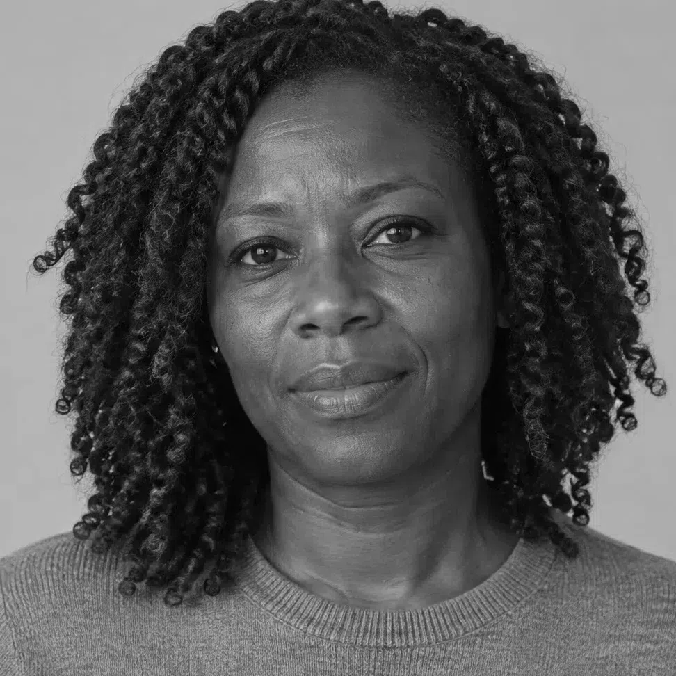
- Take a daylight photo of your bare face and turn it grayscale. A Deep Autumn shows a clear, strong step between hair and skin, even though the transitions stay soft. If everything merges into one gray, look at Soft Autumn; if the step is small and the whole face feels warm, Warm Autumn is the likelier fit.
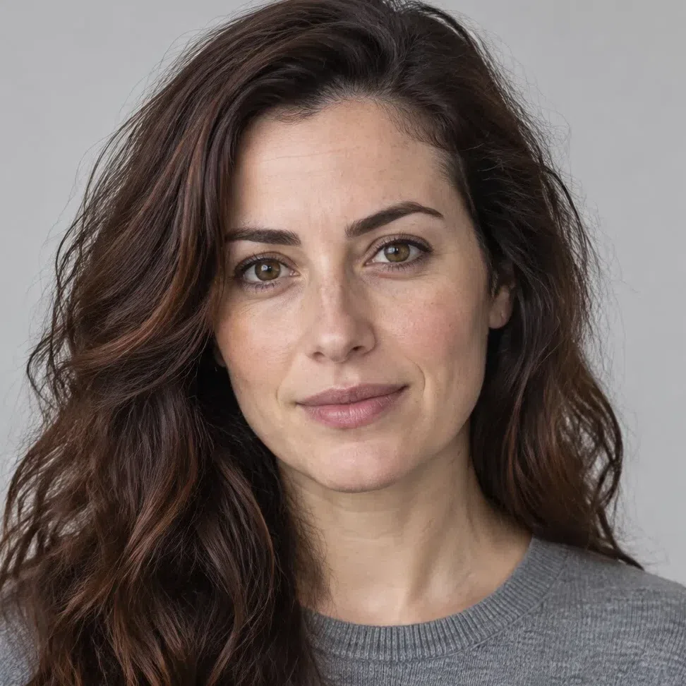
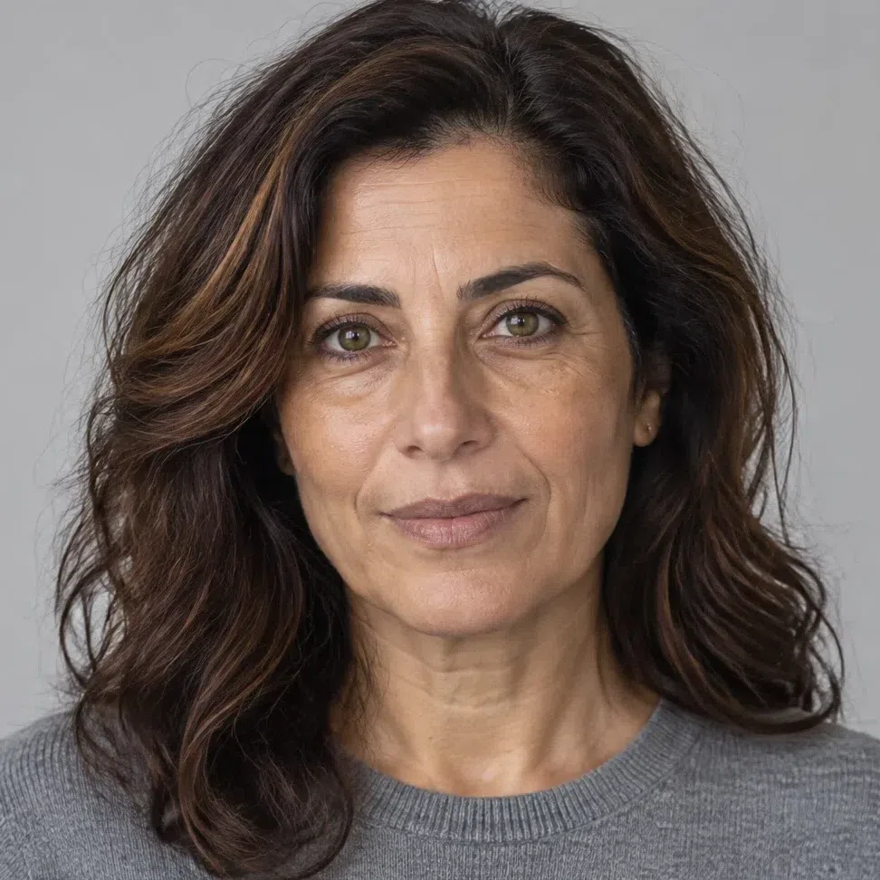

Left: a Deep Autumn in color. Right: the identical photo with the hue taken out, so only lightness is left to compare - and her chocolate hair drops a long way below her skin, even though nothing about her face looks harsh in color.


Hair Skin Ramp runs black to white
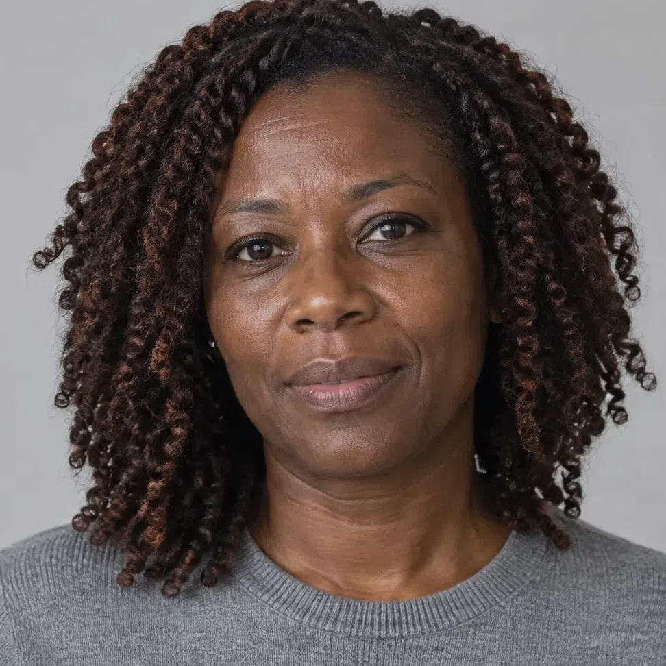
Height on the ramp shows how deep a face is; the gap between the two markers shows its contrast, and that gap describes one face rather than grading people against each other. Now compare the fair Deep Autumn with the Winter: in gray, her span is as wide as the Winter's, if anything wider. That is the honest result, and it is why this test places you among the deep seasons without choosing between them. In color, the Winter's black hair looks cold and the Autumn's chocolate looks warm - and a black-and-white photo erases exactly that difference.
55. The drape test: fabric under your chin
The most direct check, and the one that answers the Deep Winter question. Stand in daylight without makeup, hold each color under your chin, and watch your skin rather than the fabric.
Many Deep Autumns are sure black suits them, and it is still on the list below: a hard, cold black flattens this warmth and can leave the skin looking sallow. A swatch on a screen cannot show that fairly, since black against skin reads as a patch rather than cloth, so try a real black top at a mirror. If it drains you, Dark chocolate or a warm green-black gives you the same depth without the drop.
Colors that refresh a Deep Autumn
If these even out your skin, clear your eyes and make you look rested, you are on the right page:
- Olive
- Terracotta
- Curry
- Merlot
- Currant
- Mallard
Colors that age a Deep Autumn
Same light, same test. If these leave your skin dull and put shadows beneath your eyes, leave them on the rack:
- Fuchsia
- Baby blue
- Lavender mist
- Ice pink
- Jet black
Deep Autumn vs Warm Autumn vs Soft Autumn
All three autumns share a warm undertone, so the real question is the subtype. Every autumn subtype is named after the trait that dominates it, which makes that first row the one to read. (Dark Autumn is this same subtype under its other name.)
| Deep Autumn | Warm Autumn | Soft Autumn | |
|---|---|---|---|
| Leading axis | Depth - dark and rich | Warmth - gold at full strength | Softness - color with gray mixed in |
| Temperature | Warm, leaning neutral | Strongly warm | Warm-neutral, close to neutral |
| Depth | Deep - the darkest autumn | Medium | Light to medium |
| Clarity | Rich and saturated, shadowed | Clear and golden | Muted and dusty |
| Contrast | Medium to high | Low to medium | Very low |
| Skin | Golden, olive or bronze; dense | Peach, gold or ivory; often freckled | Neutral beige, sometimes a hint of pink |
| Eyes | Dark brown, deep hazel, dark green | Bright brown, green, hazel, turquoise | Soft light brown, gray-green, hazel |
| Hair | Dark chestnut, chocolate, espresso | Copper, red, golden chestnut | Light chestnut, dark blonde, golden sheen |
| Metals | Antique gold, bronze, copper | Bright yellow gold, copper | Matte or rose gold, bronze |
If two columns still seem equally right after every row, stop comparing details. Ask which word describes your face first - deep, warm or soft - and that word is your subtype.
Deep Autumn coloring, feature by feature
Skin, eyes and hair, each shown on four complexions
The checks above tell you whether you are a Deep Autumn. This part maps how wide the season runs - what its skin does in the sun, which eye colors turn up and how dark the hair gets - with every card shot on a different woman. Warm Autumn is defined by its warmth and Soft Autumn by its softness; this season is defined by how deep and saturated its coloring is. Matching one card exactly is not the point - landing somewhere in the spread is.
Deep Autumn skin: warm, even and rarely flushed
The common thread is a golden, olive or bronze undertone under skin that looks solid and even. Across the whole range, from light beige to deep brown, the surface reads velvety and the natural flush is faint or missing.
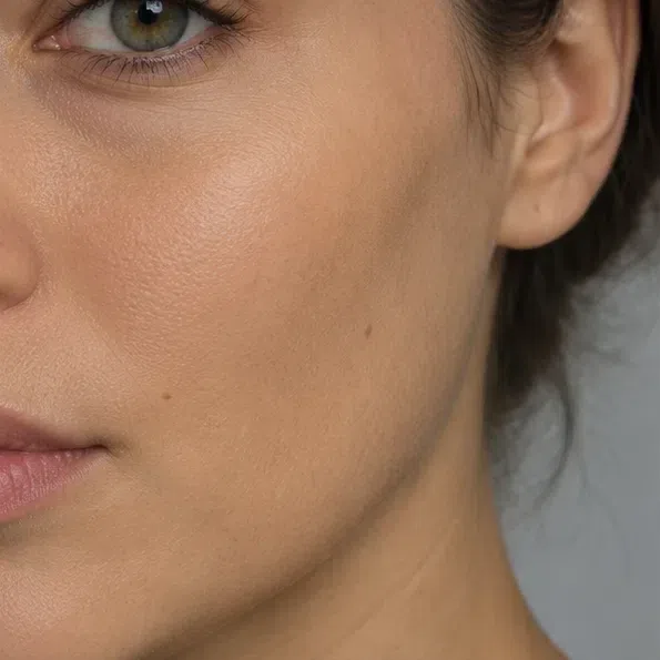
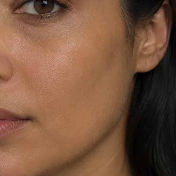
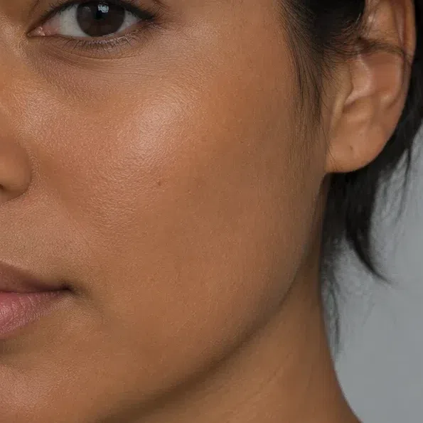
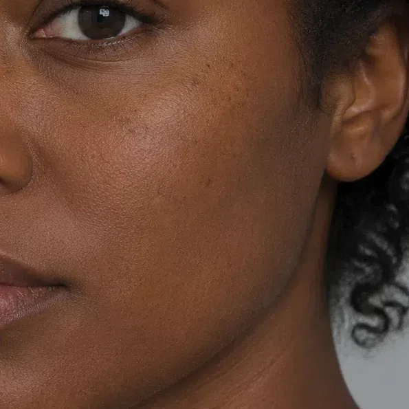
Yes. In this season most of the depth lives in the hair and eyes, not in the complexion. A fair Deep Autumn pairs warm ivory or light beige skin with dark chocolate or chestnut hair and dark eyes. What she does not have is pink, porcelain or freckled-translucent skin - that combination points to a summer or a spring.
The finish is worth knowing when you shop for foundation: a formula built on a golden or olive base disappears into this skin, while a pink-based one sits on top of it. The makeup section further down names shades for all four depths.
Deep Autumn eyes: four earthy colors
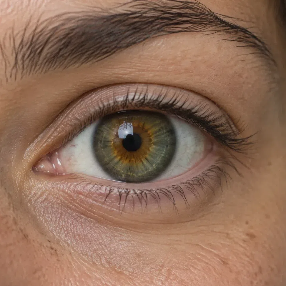
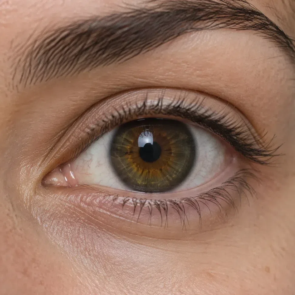
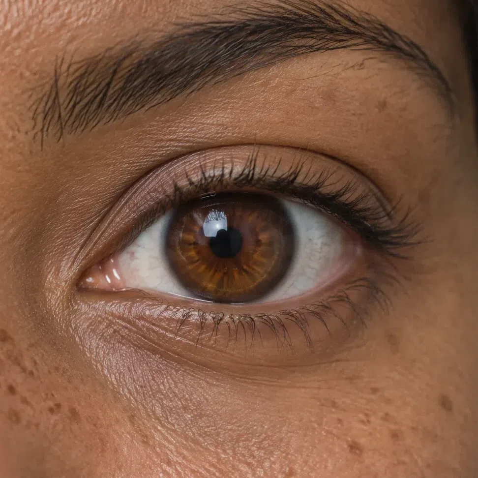
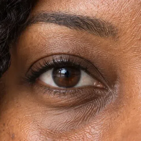
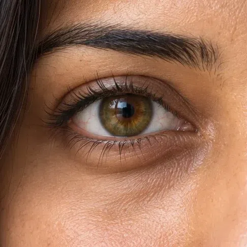
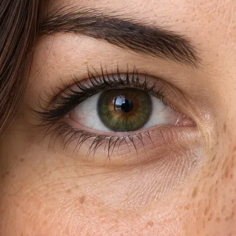
Four colors cover almost everyone in this season, and all four come out of the same earthy range - bark, moss, soil. They are deep enough to anchor the face, and the color is spread unevenly through the iris rather than laid on flat.
The four eye colors
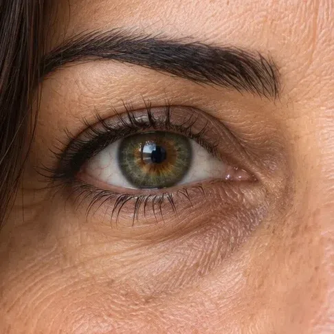
What the four share
- A watercolor edge. Where iris meets white, the color blurs like wet paint rather than stopping at a crisp dark line.
- Rays near the pupil. Thin gold, amber or copper lines show up in all four colors, most clearly in daylight.
- One warm picture. The iris does not jump out against the skin. It sits in the face as part of the same earthy scheme as the hair.
Eye color also decides how far makeup can go before it competes. Earthy, bronze and wine tones deepen these eyes; the makeup section below shows which ones and where.
Deep Autumn hair: four natural shades, all of them dark
Every natural shade in this season is saturated. Even at its lightest it never looks pale or faded, and the hair itself tends to be thick and healthy-looking, whether it grows straight, wavy or curly.
The four natural shades
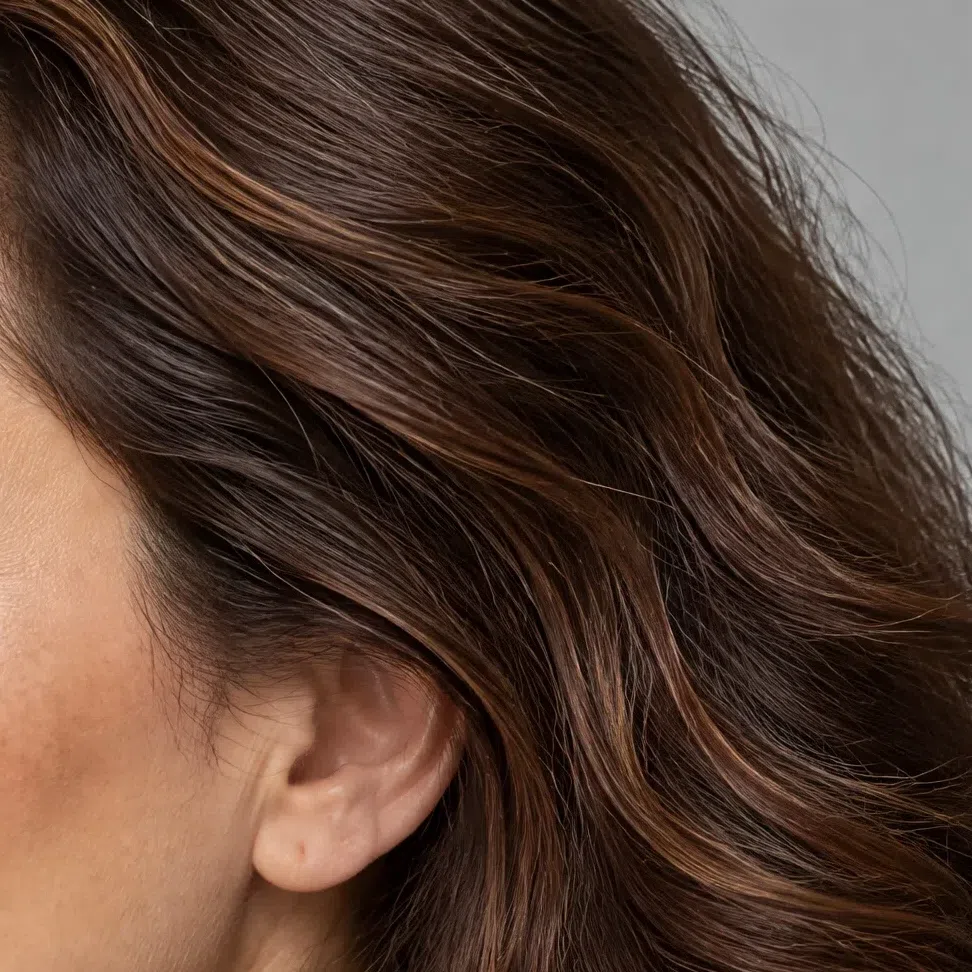
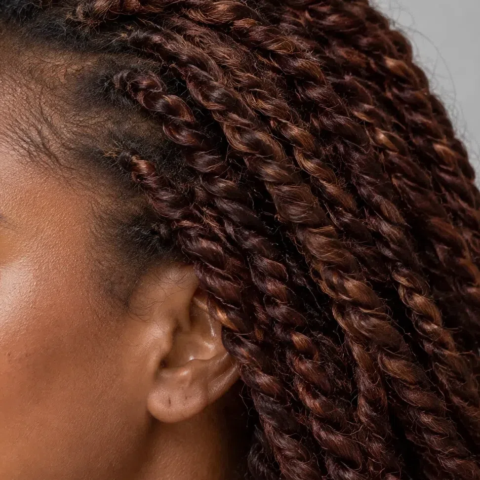
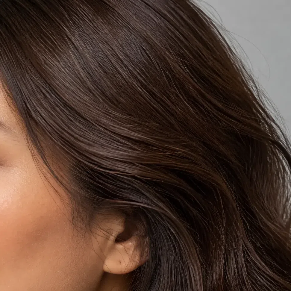
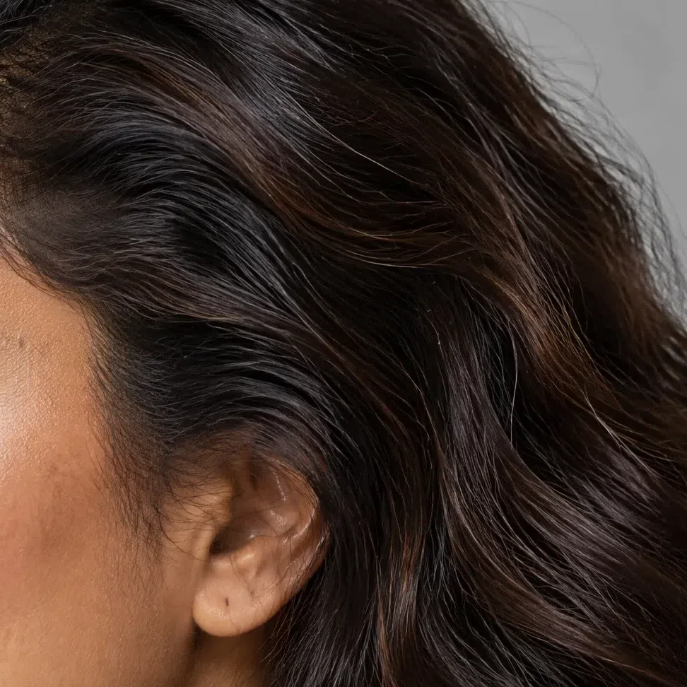
What Deep Autumn hair never is
- Ashy. No gray, smoky or silvered tones. They take the life out of this face.
- Light blonde. Natural hair stops at a dark blonde-brown, and bleached blonde fights everything else about the coloring.
- Blue-black. True jet black with a cold sheen is winter territory.
- Carrot red. Fiery orange-red is Warm Autumn's. The reds of this season are deep and built on brown.
Because the natural color is already rich, most Deep Autumns look best when dye stays close to it. The hair color section below covers which shades to ask for and which to pass on.
Deep Autumn palette: every shade, worn
17 to wear, 11 to avoid, each one shown on a face
Seventeen wearable shades in three tiers. Five neutrals cover coats, suits and trousers; six rich bases bring in color at a volume you can wear every day; six accents are for when an outfit needs a lift.
Below those sit the eleven shades that work against a Deep Autumn, each with a replacement, and then five finished outfits.
Each card is one photograph of one woman whose top has been repainted, while her skin, hair and features stay exactly as shot. What you are judging on a card is the effect on her face, never the swatch on its own.
Base colors: the Deep Autumn wardrobe
Eleven shades do the everyday work: five neutrals that hold the structure, and six rich bases deep enough to wear the way other people wear gray or navy.
Neutrals: the five you build on
Coats, trousers, suits, good knitwear - the pieces you buy once and wear for years. The range runs from Ecru down to Dark chocolate, and none of it is black, gray or stark white. Can a Deep Autumn wear black? Yes, below the collarbone. Trousers, a skirt, boots or a bag in black are fine, because there is no skin beside them for the black to flatten. At the collar, switch to Dark chocolate: it gives the same depth and looks as though it came from your own hair.
How to combine the neutrals
- Tone on tone. Camel, Mocha and Dark chocolate worn light to dark look deliberate and polished, because nothing interrupts the line.
- A neutral plus one accent. Olive trousers with a Tomato sweater: the neutral handles the background so the bright can do its job.
- Texture instead of color. An Ecru silk blouse, a Camel wool cardigan and a Dark chocolate leather skirt stay interesting without a single accent.
Rich bases: color that still behaves like a base
More color than the neutrals, and still restrained. Wear any of these as the main shade of an outfit or as the second one beside a neutral. The Deep Autumn green is Hunter green, with Olive on the earthy side of it and Malachite on the bright side. Deep Autumn pink runs through Terracotta and Cranberry: in this season pinks are clay and berry, never baby or icy.
Accent colors: the spice in the wardrobe
Six brighter shades, the metals that go with them, and the places a bright can sit so it reads as an accent instead of the whole outfit.
Six accents
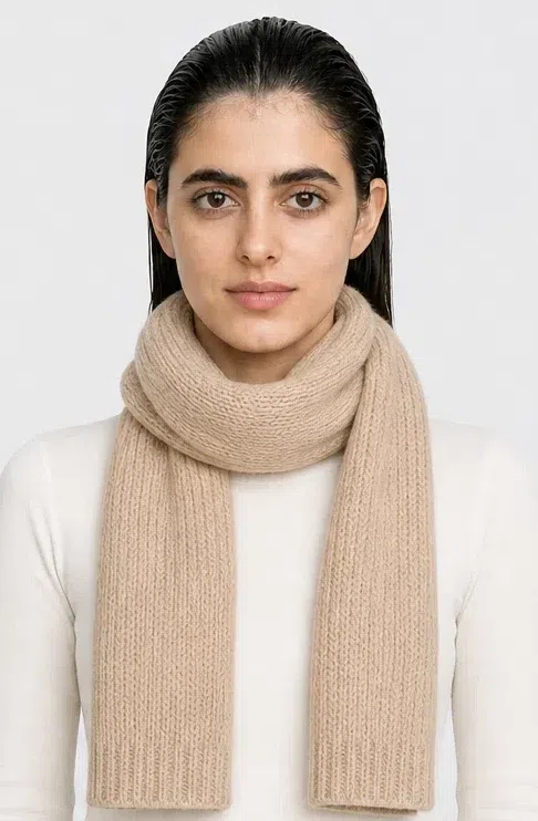
These are the shades that make an outfit memorable. Use them for blouses, tops, dresses and accessories, or as the only bright thing in a neutral outfit. Each card paints the accent onto the scarf and keeps the knit pale, because a bright that covers you from collar to waist has stopped being an accent - it has become the outfit.
Metals, stones and materials
Warm metals only. Silver and platinum sit on this skin like something borrowed. The discs below are shaded rather than flat, since a metal reads by its shine.
Where the warmth goes
- Jewelry. Antique gold leads; bronze and copper follow. A brushed or softly worn finish suits this coloring better than high polish.
- Hardware. Gold-tone buckles, zips and clasps on bags and jackets rather than chrome.
- Stones. Jasper, carnelian, tiger's eye and amber: warm, deep and a little earthy, which is the pattern to shop by.
- Materials. Wood, leather and suede in Whiskey, Camel and Dark chocolate do for this season what patent and steel do for a winter.
Four accessories, four pairings each
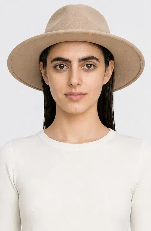
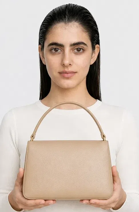
How far a color sits from your face changes what it can get away with. Tap a pairing to repaint the top and the accessory separately, then compare the same kind of shade at the crown, at the collar and at the hip.
Hat
A hat keeps color away from the skin, so the deepest shades on the page can go up there without competing with your face.
Scarf
A scarf lies right under the face, so only shades that refresh you belong there. Keep the deepest accents for the base and bring warm light up to the face.
Bag
The freest spot of all. Below the shoulders a bag can carry contrast that would look too sharp at the face.
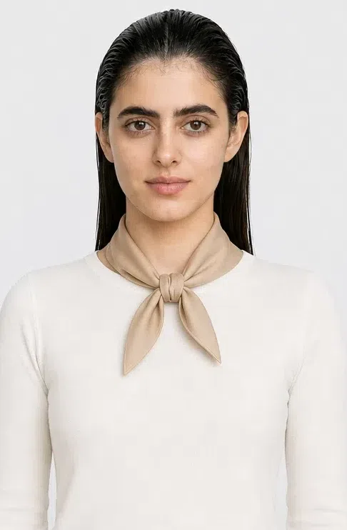
Neck scarf
The closest point to the face. Only warmer, lighter shades here - they bounce light up onto the skin like a reflector.
Deep Autumn colors to avoid
Eleven shades in three groups. Some leave the skin dull, others make it look gray or tired, and every card offers a replacement taken from the shades above.
Cold and icy
Each of these carries a clear blue or gray base, and that base clashes with a golden undertone.
Why these fail
- They argue with the undertone. A blue base beside golden skin reads as a mismatch, and the eye resolves it by seeing the skin as yellow or gray.
- They bring flaws forward. On warm skin, cool shades emphasize redness, under-eye shadows and uneven tone instead of smoothing them.
- Darkening them does not help. The problem is temperature, not lightness. A cold shade stays wrong even in a deep version, which is why Mallard works and Cerulean does not.
Pale and washed out
This coloring needs depth and saturation. Faded pastels do not clash with it so much as disappear on it.
Why these fail
- The features outweigh them. Dark hair and dark eyes are heavier than any pastel, so the garment looks bleached and the face above it looks drawn.
- There is nothing to reflect. A pastel carries too little color to bounce any back onto the skin, so the natural warmth goes unanswered.
- Muted is not the same as pale. A softened color can still carry weight; a pale one cannot. This group fails on lightness, so the cure is more depth rather than more warmth.
Stark and electric
Pure black and dazzling white make a harsher contrast than this face needs, and neon shades look artificial against it.
Why these fail
- They overshoot the contrast. This coloring already carries strong contrast of its own. Pure black and pure white push it past rich and into harsh.
- They are too simple. Unmixed, flat colors make a face whose appeal is layered warmth look plain by comparison.
- Nothing in nature matches them. Neon has no counterpart anywhere in skin, hair or eyes, so it looks pasted on rather than worn.
Deep Autumn color combinations
Five ready formulas built from this palette. Read each chip row left to right, in dressing order.
Five to copy
Two are three-shade outfits and three are pairs. Treat them as starting points rather than uniforms.
Olive, Curry and Ecru
The casual one: Olive trousers or a skirt, an Ecru sweater, and Curry in a scarf or a bag. Cozy, easy and unmistakably autumn.
Dark chocolate and Merlot
Rich and expensive-looking for work or evening: a Dark chocolate suit with a Merlot blouse, or a Merlot dress with dark brown accessories.
Hunter green, Camel and gold
For an occasion: a Camel coat over a Hunter green dress, finished with Antique gold jewelry.
Mallard and Terracotta
A bolder pairing for creative days: a Mallard sweater with a Terracotta skirt, or the other way round. Bright contrast that still holds together.
Currant and Turmeric
Built on contrast: Currant as the backdrop and Turmeric as the one bright note, as in a Currant coat with an orange silk kerchief.
The proportion underneath all five is 60 / 30 / 10: sixty percent base color, thirty percent a second shade, ten percent accent. A Dark chocolate suit, an Ecru blouse and a Cranberry belt is the whole method in a single outfit.
Deep Autumn clothes: building the wardrobe
Eight pieces, each shown on four complexions
For a Deep Autumn, clothes are a way to echo the depth and warmth already in the face. That means rich colors, dense natural fabrics and silhouettes with some structure, rather than anything flimsy, frosty or neon.
The set below is the shortest one that still covers a real week: a coat, a knit, two ways to cover the legs, two dresses, a jacket and a piece with some edge. Four different women wear every piece, so you can see it on your own depth.
The Deep Autumn capsule: eight pieces
Eight pieces, every one of them cut from the palette above and able to pair with nearly all of the others. Four women of different depths wear each piece, since a set that only flatters one skin tone is really just an outfit.
Color is the thread through all eight - the Deep Autumn palette, cut into cloth. How big a capsule should be, how many outfits a set produces and what to buy first are separate questions, and this section does not try to answer them.
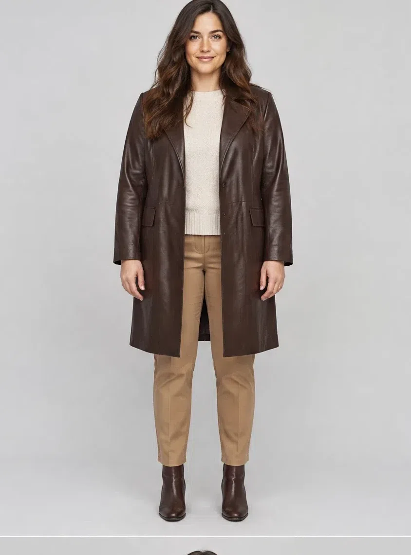
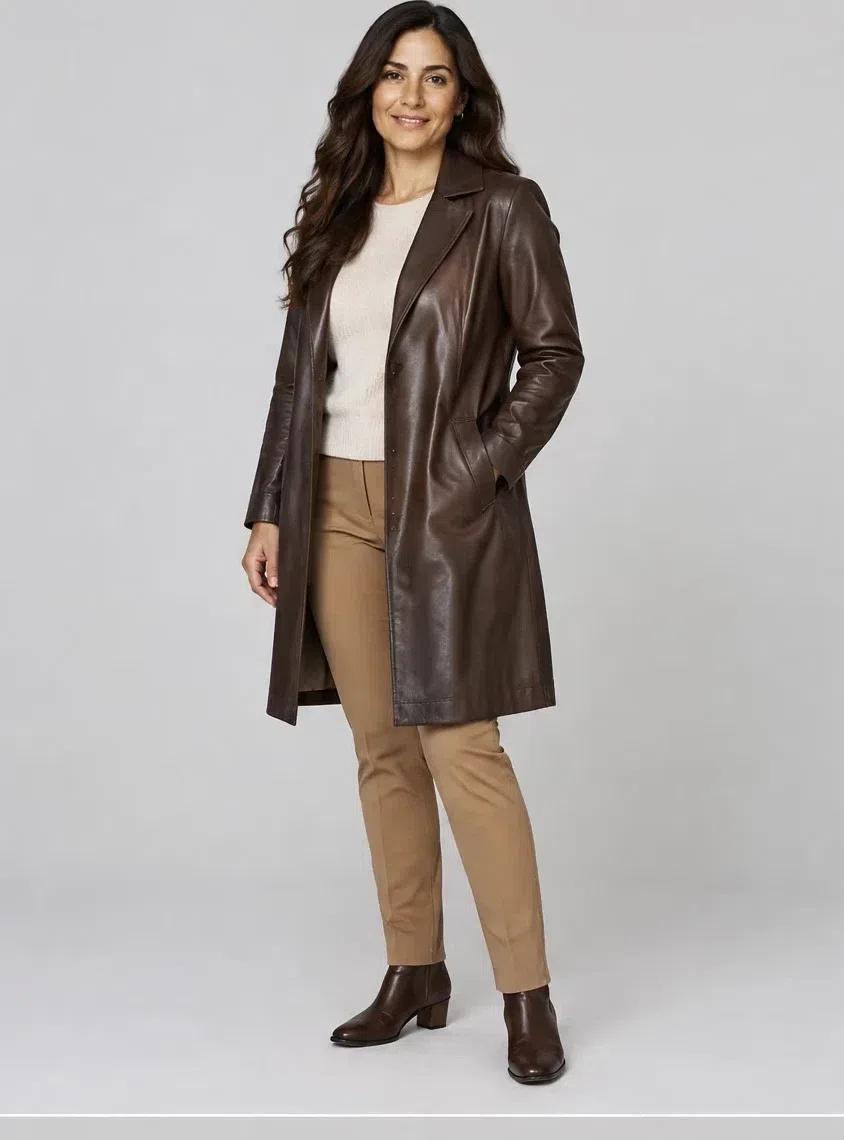
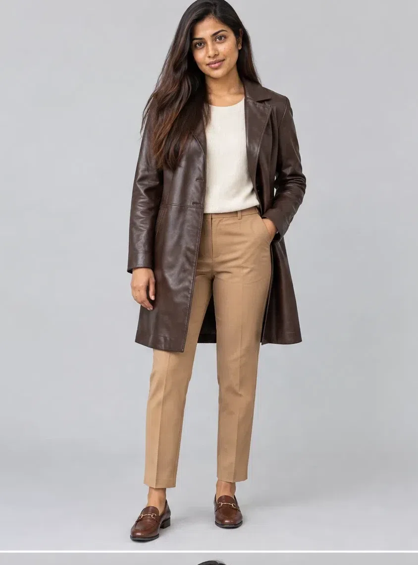
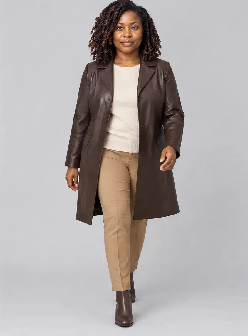
1Dark chocolate leather coat
The outerwear piece, and the one that sets the tone for everything under it. Soft leather in a deep chocolate brown, straight or lightly shaped at the waist, ending around the knee. It goes with denim and wool trousers, and it is smart enough to throw over an evening dress. Where most wardrobes reach for black leather, this does the same job and matches your hair instead of fighting your skin.
Tip Gold-tone buttons and a bag in the same brown leather finish it; anything chrome looks out of place against it.
2Merlot cashmere sweater
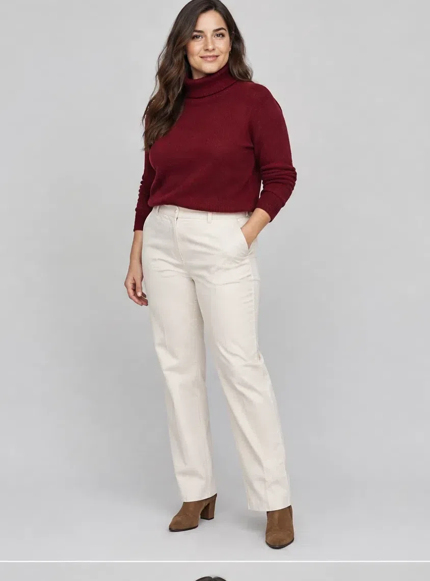
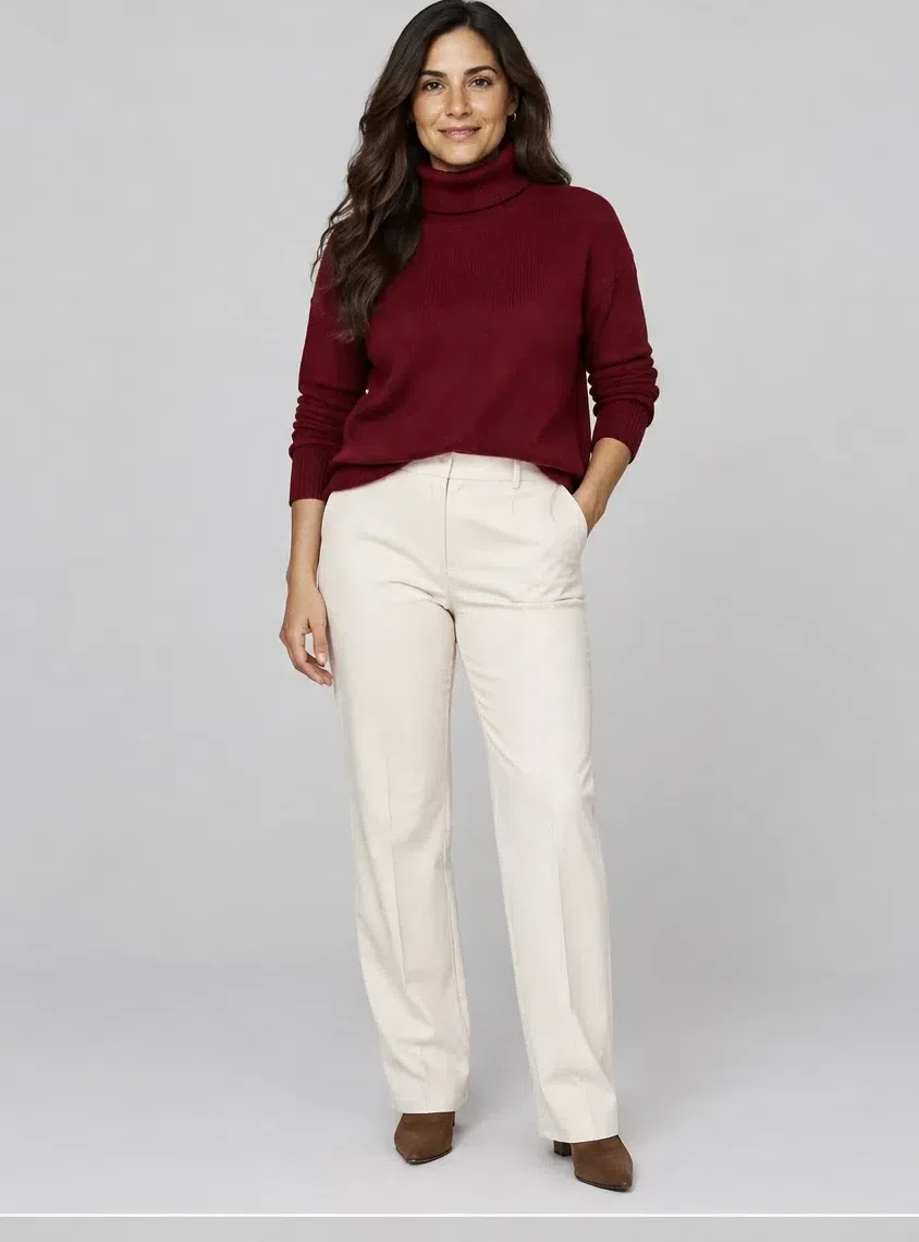
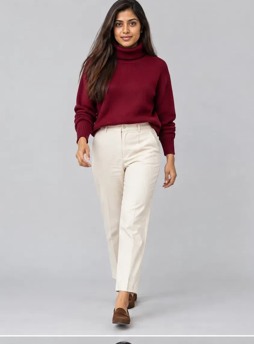
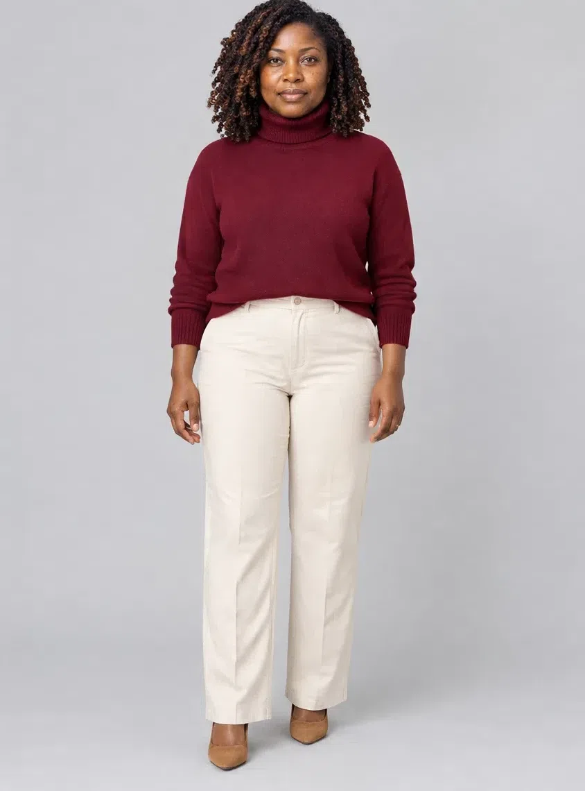
The cold-weather essential. A relaxed or gently fitted cashmere knit with a high neck, in the wine red that warms the skin and deepens dark eyes. It sits against the face all day, which is exactly where a rich shade earns its keep.
Tip Pair it with the leather trousers or with dark denim, and add gold at the ear rather than silver.
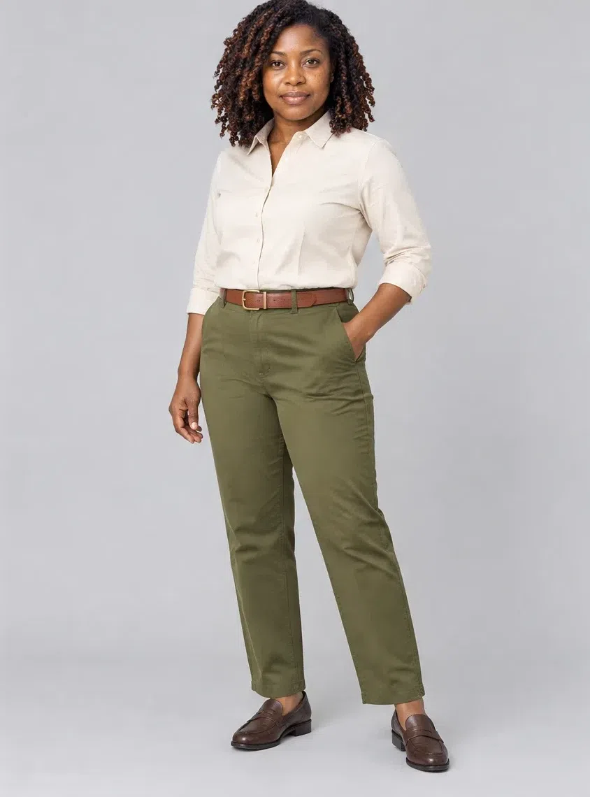
3Olive cotton chinos
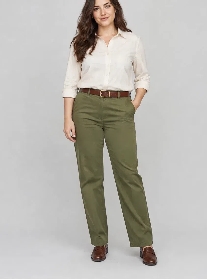
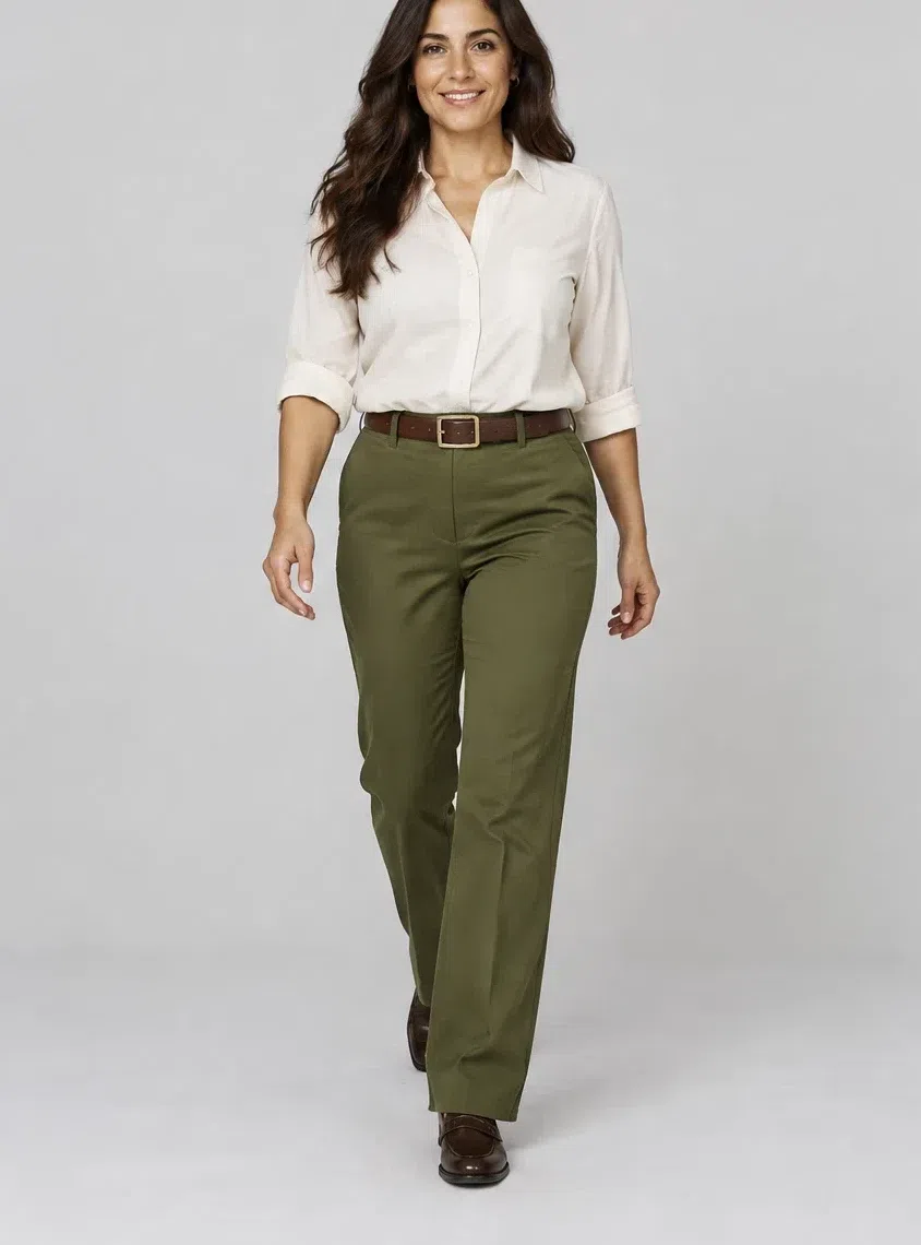
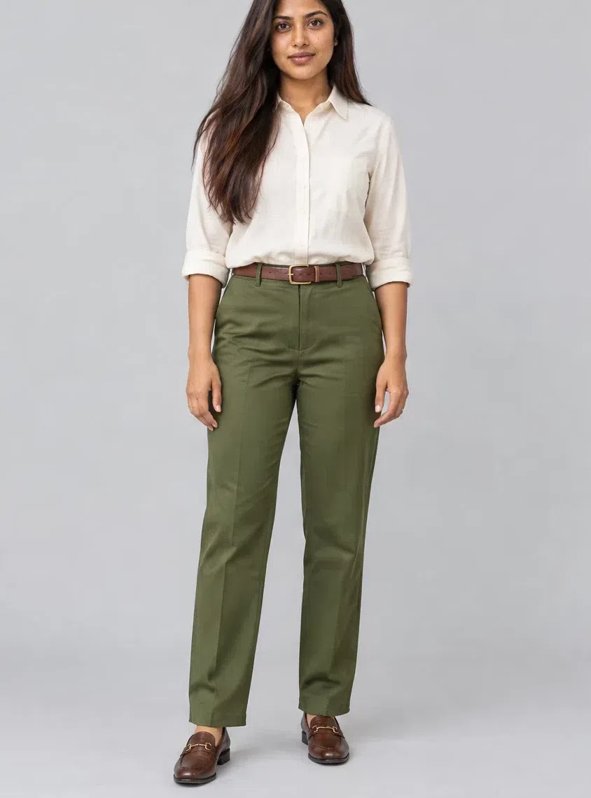
The everyday trouser. Straight-cut, in a heavy cotton that holds its shape. The earthy green works for the office and the weekend alike, and it partners with every neutral here as well as with Merlot and Curry.
Tip For work, add an Ecru blouse and the tweed jacket; for the weekend, the Merlot sweater is all it needs.
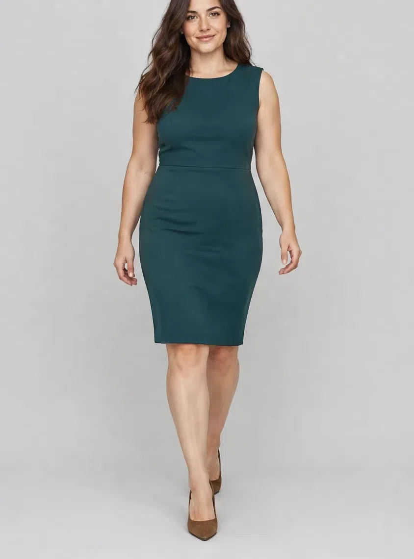
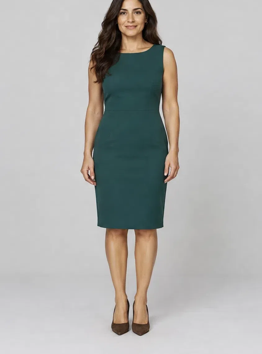
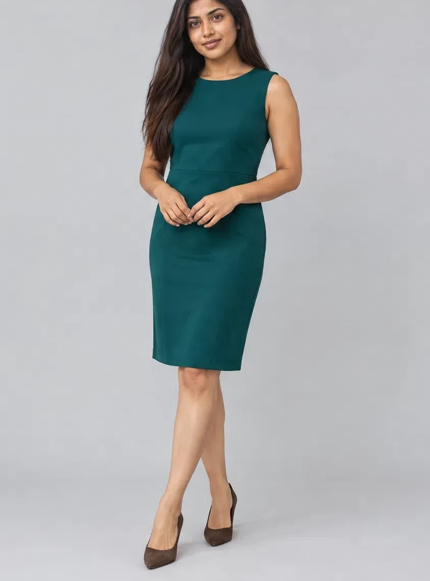
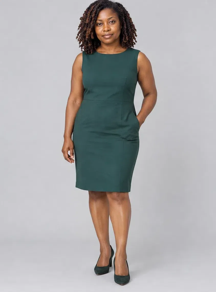
4Mallard sheath dress
The dress for meetings and evenings out. Fitted, knee-length, in a dense crepe or a thick jersey. The deep blue-green is the one cool-reading shade this coloring wears, and in a clean sheath shape it looks quietly expensive.
Tip A natural leather belt and a clutch in a rich shade are enough - Paprika or Whiskey both work.
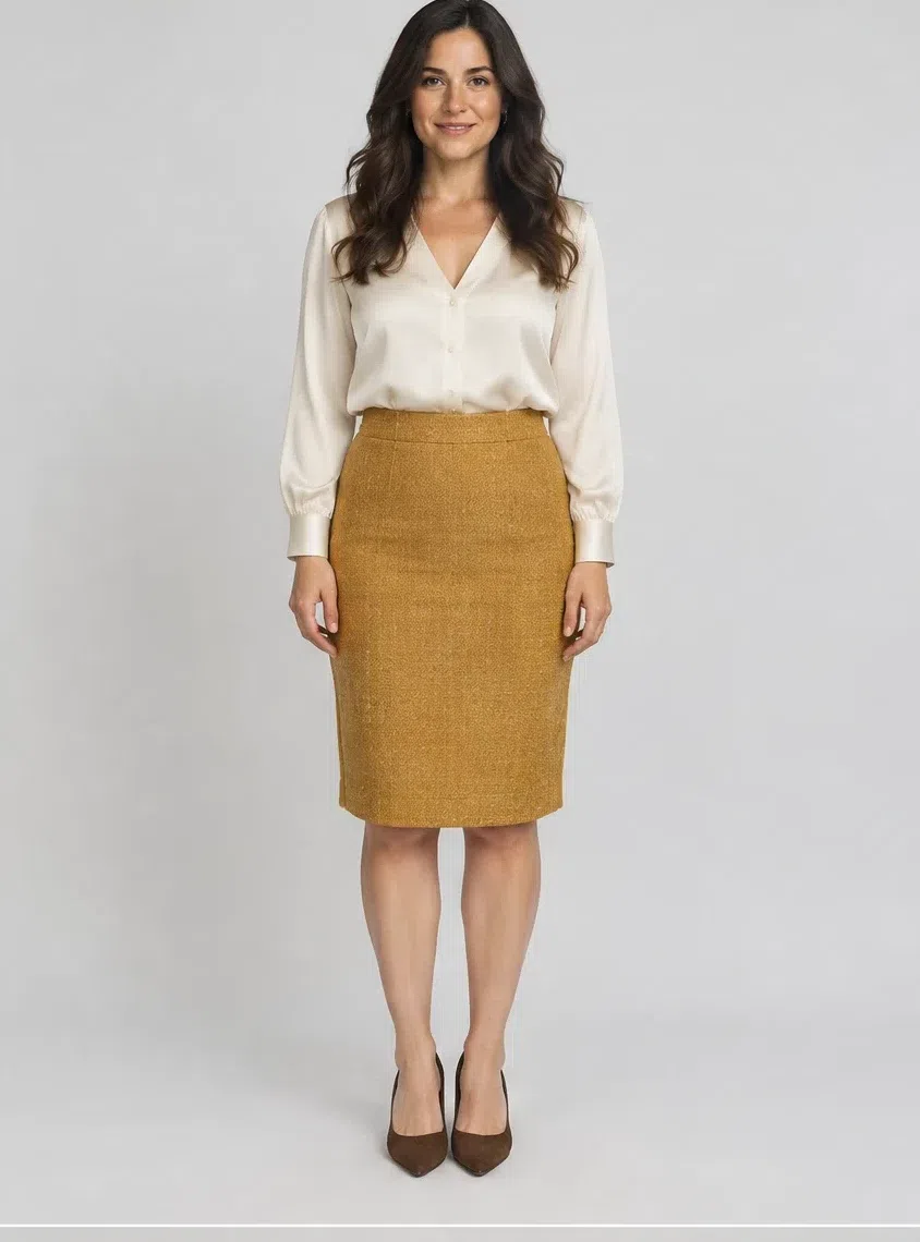
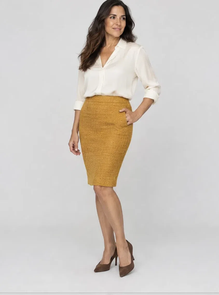
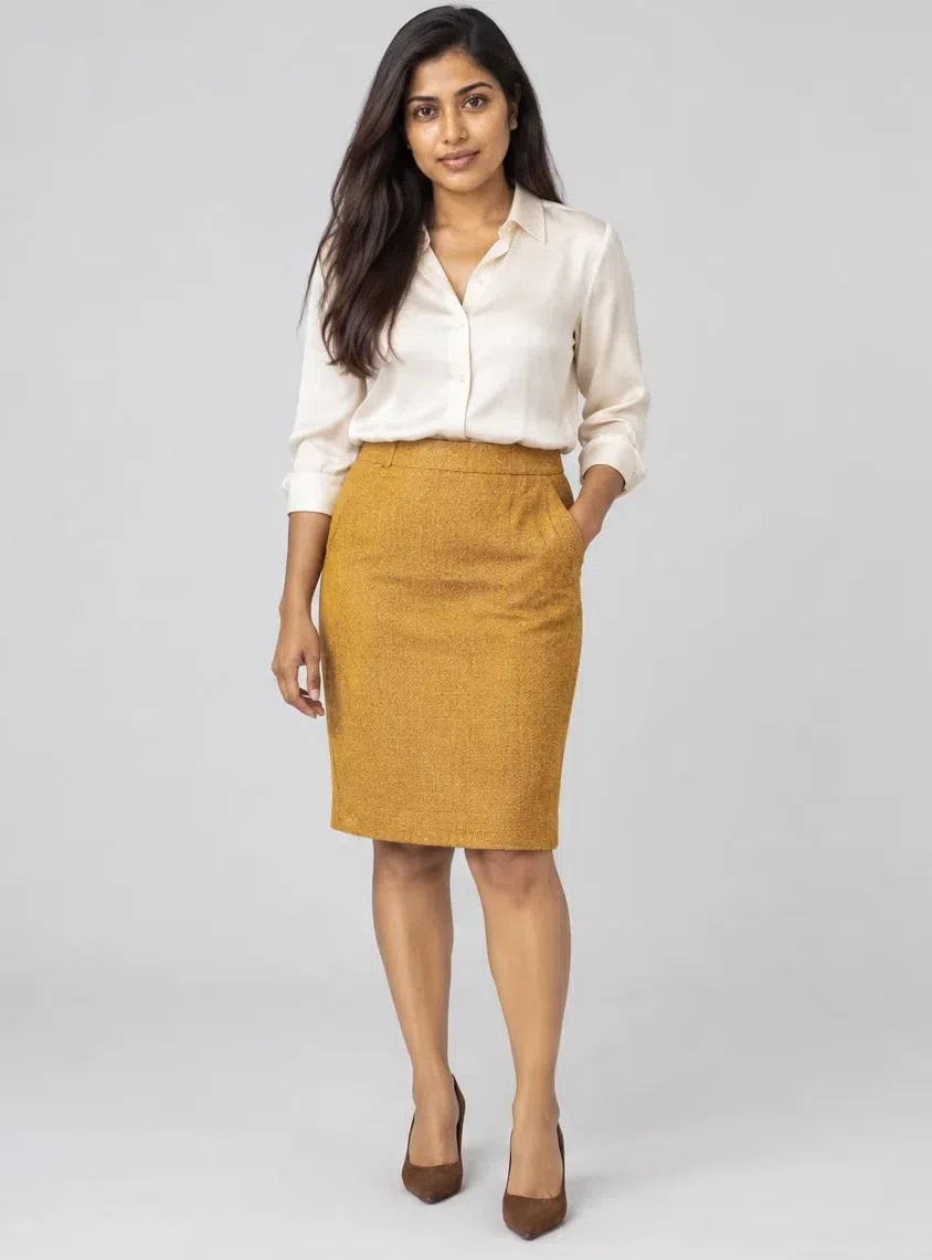
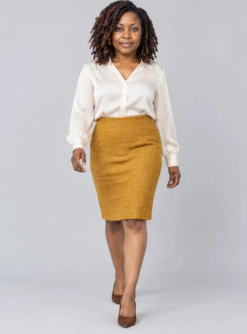
5Curry tweed pencil skirt
The piece that brings warmth to a neutral outfit. A knee-length pencil skirt in tweed or heavy cotton, in the spiced yellow that belongs to this palette rather than a bright lemon. Beige, brown and olive tops all sit easily above it.
Tip Wear it with an Ecru silk blouse and brown suede pumps and the outfit is done.
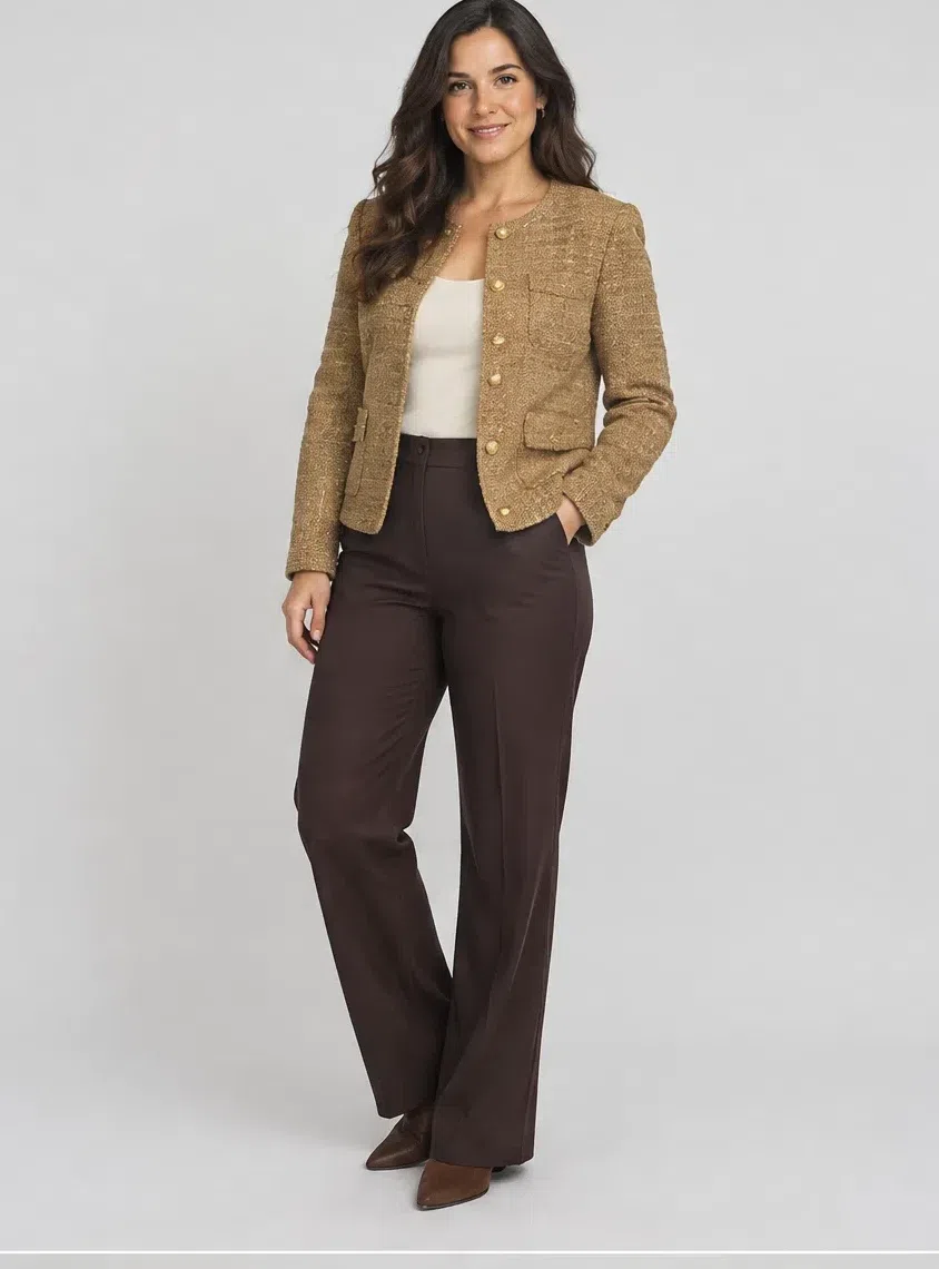
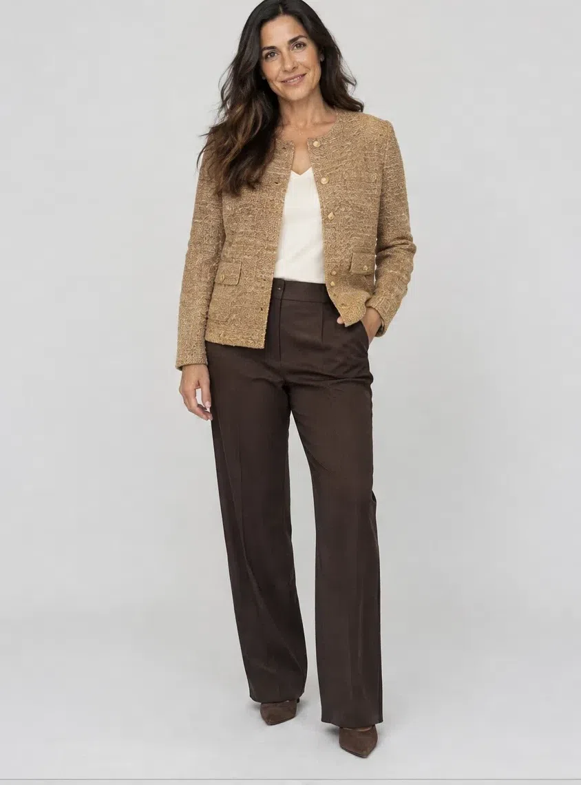
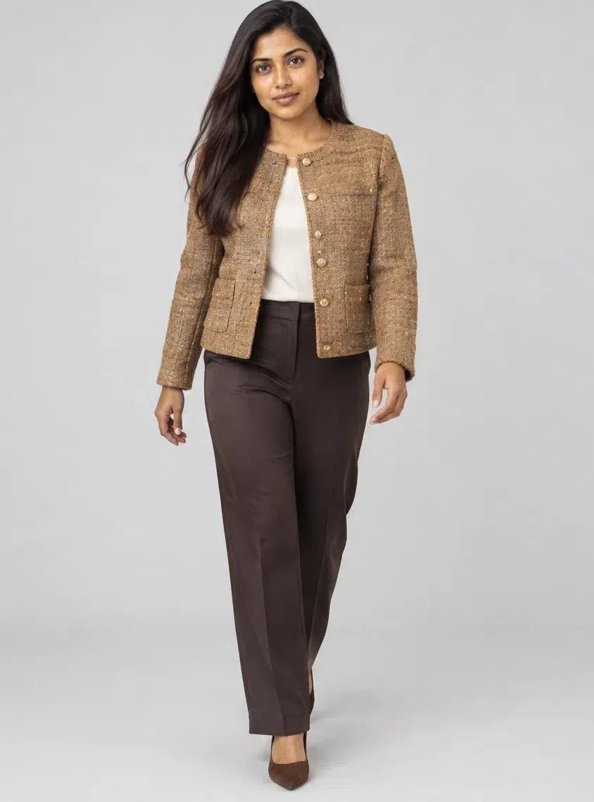
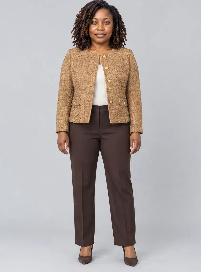
6Camel tweed jacket
A classic that carries a lot of outfits. Choose a warm beige tweed with no gray in the weave; flecks of brown, wine or olive in the cloth add texture and tie it to the rest of the capsule. It works over trousers, skirts and jeans alike.
Tip Look for gold-tone buttons and a cloth with some visible texture - boucle or a nubby tweed rather than a flat suiting fabric.
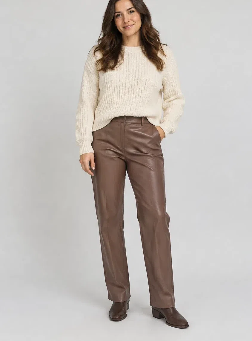
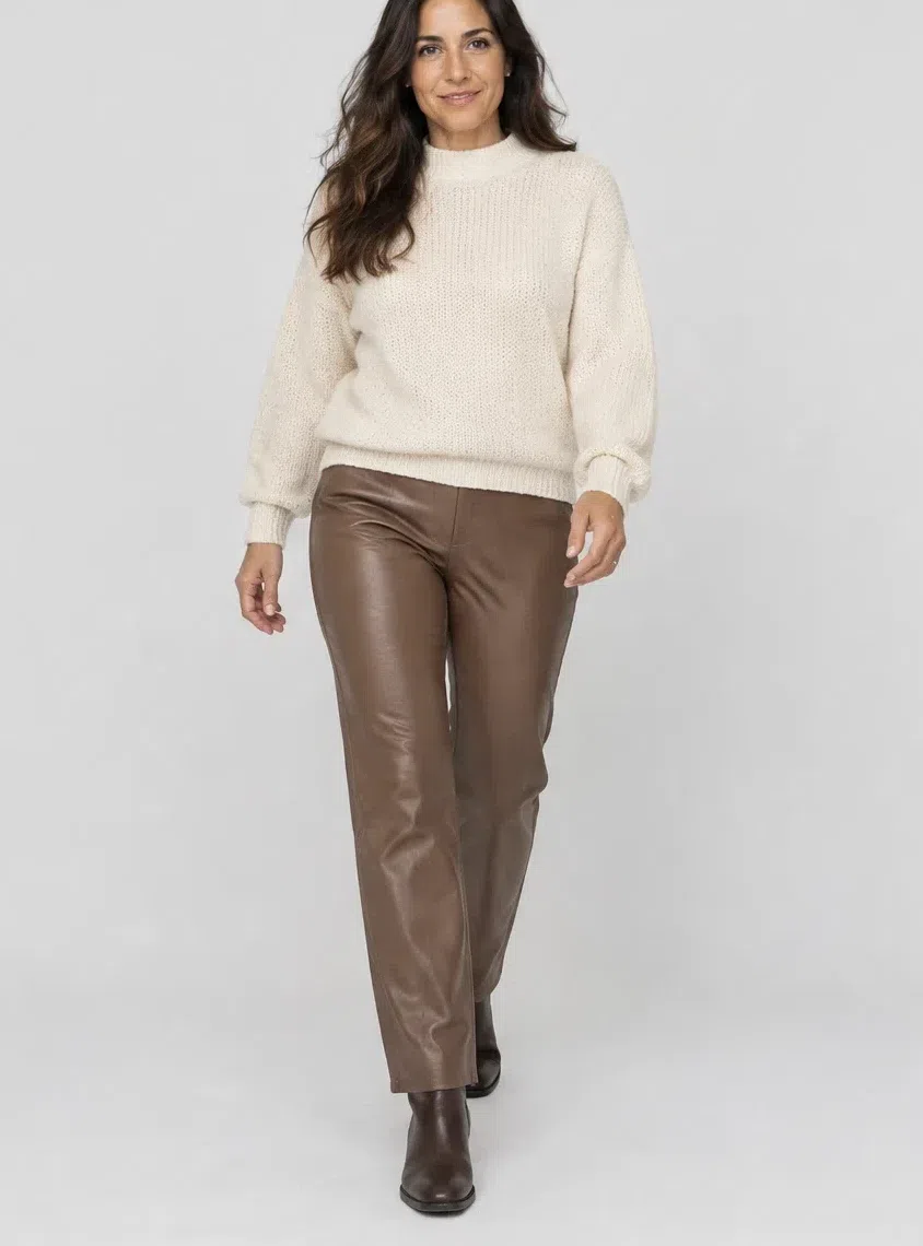
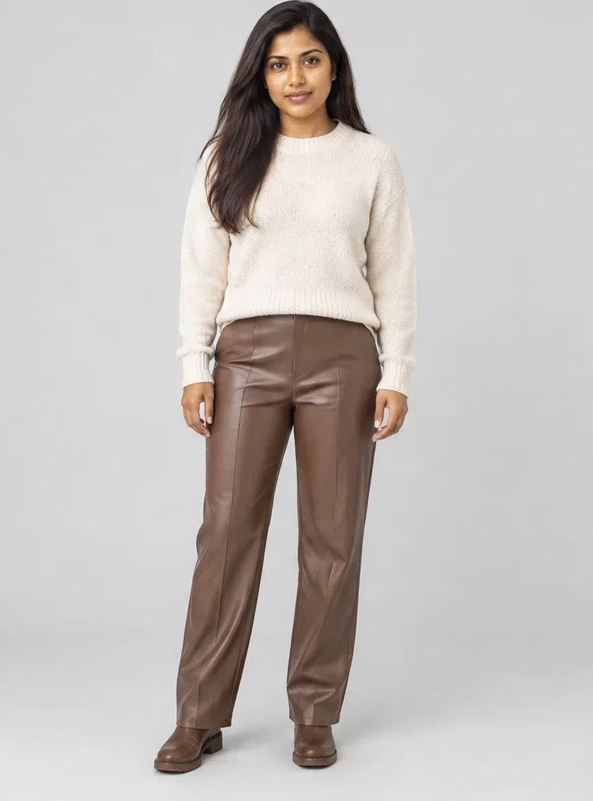
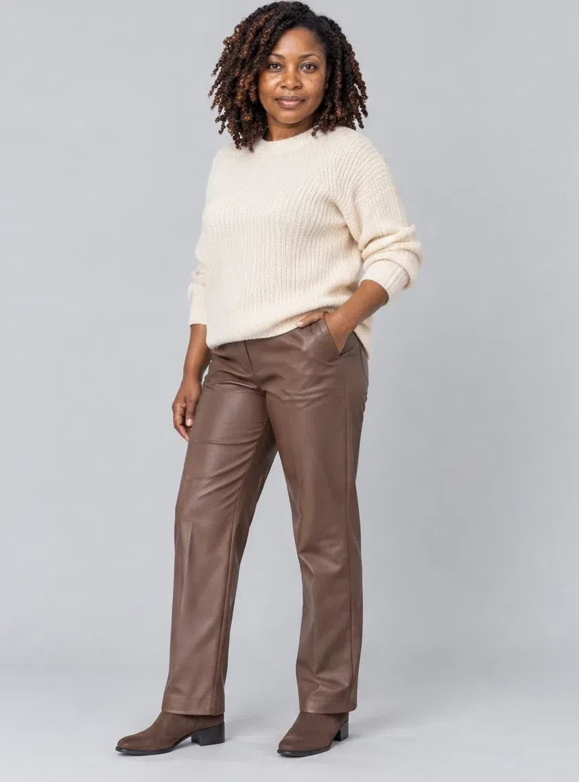
7Mocha leather trousers
The piece with edge. Straight or slightly tapered, in soft leather a shade lighter than the coat, so the two can be worn together without looking like a suit. They turn a simple knit into an outfit.
Tip Chunky knits and flat boots make them relaxed; a silk blouse and heels make them evening.
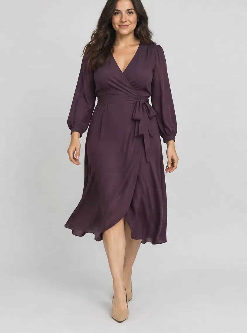
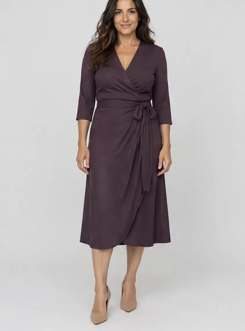
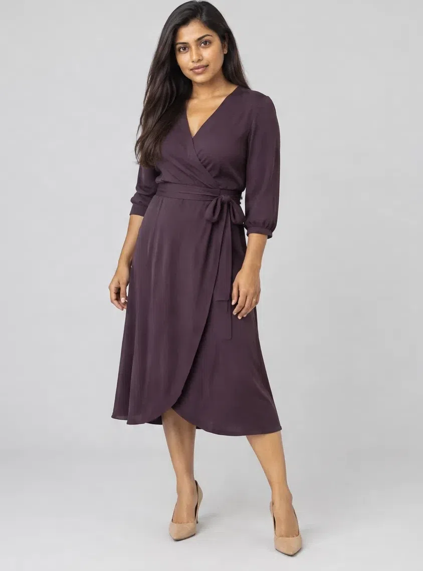
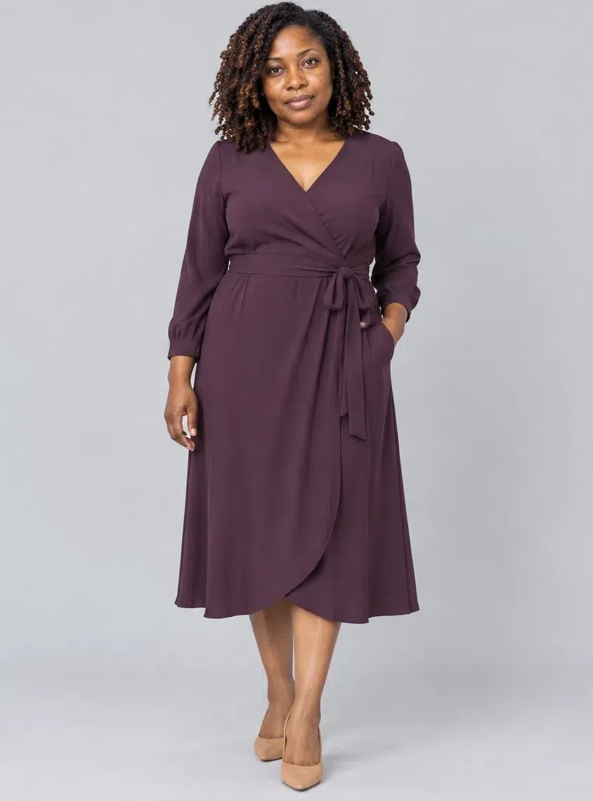
8Currant wrap dress
The dress that covers work, dates and evenings. The wrap shape defines the waist, and the deep reddish purple gives depth without reading as black. A fluid crepe or a soft jersey drapes best.
Tip Add gold jewelry and nude heels; a Camel coat over it is the daytime version.
Five ways to put them together
- Pair dark with bright. The richest outfits here put a deep shade next to a livelier one: Dark chocolate with Curry, Merlot with Olive.
- Warm contrast, not stark. Set a light neutral against something saturated - Camel with Currant, Ecru with Mallard - and you get contrast without the hardness of black and white.
- Neutral base, one accent. Two neutrals and one bright is the easiest formula in the capsule. Tomato or Saffron does it best.
- Let texture carry it. Leather with cashmere, tweed with silk, suede with a chunky knit. This coloring suits dense, tactile cloth - tweed, boucle, suede, velvet - and looks less at home in shiny cold satin, flimsy chiffon or cheap synthetic knits.
- Build in layers. A jacket over a dress, a sweater over a blouse, a belt at the waist: layering gives these deep shades the depth they are made for.
Makeup shades
Base products by skin depth, then eyes and lips by shade
Foundation, bronzer and highlighter change with the depth of the complexion, so all three are photographed on four women. The eye and lip rows that follow are shade families: the season fixes the family, and your skin decides whether you reach for its lighter or deeper end.
Base: foundation, bronzer and glow
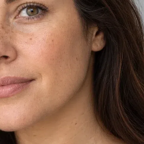
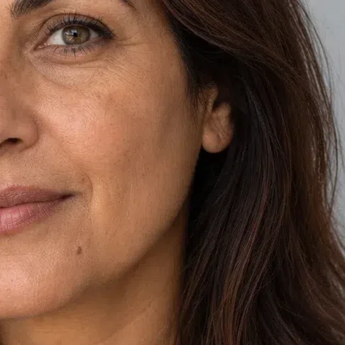
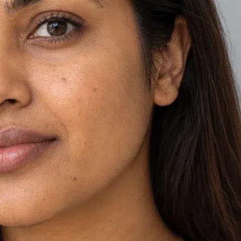
Foundation matched to your depth
Golden or olive at every depth. Pink-based and cool beige formulas are the ones that leave a gray or rosy mask on this skin.
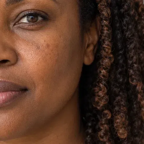
Bronzer matched to your depth
A warm golden brown, one or two steps below your own skin. On this coloring it often does a better job than blush.
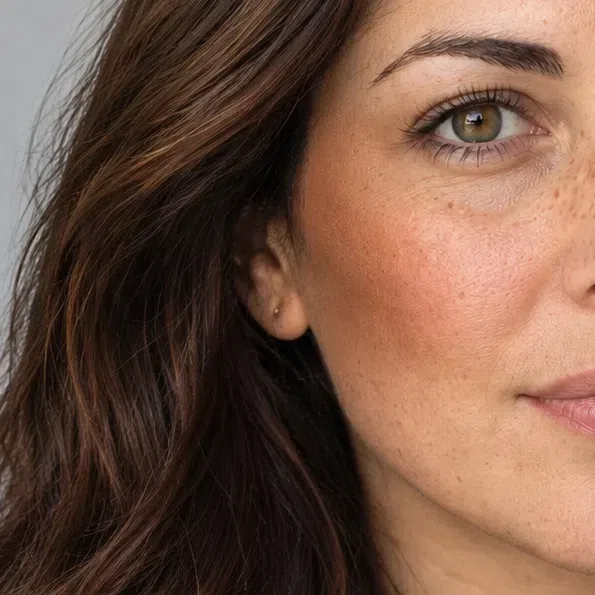
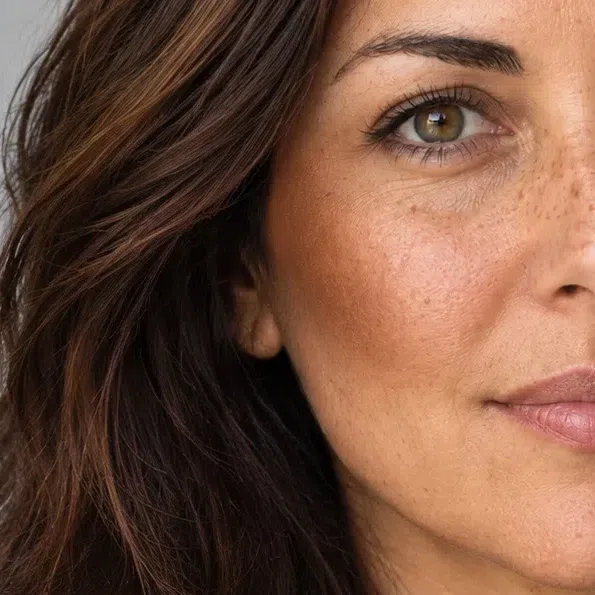
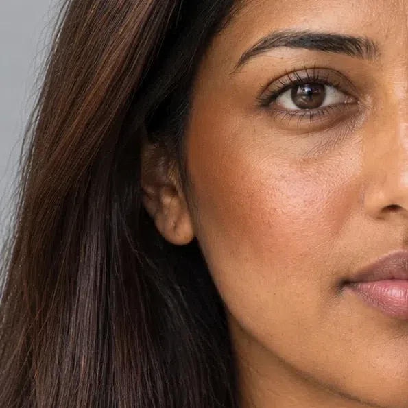
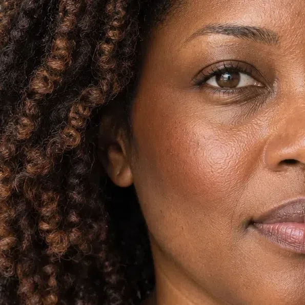
Highlighter matched to your depth
Champagne, old gold, apricot or bronze. Silver and icy-blue glows turn the sheen ashy.
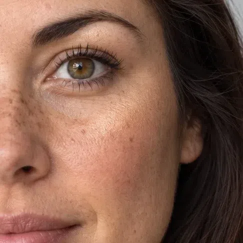
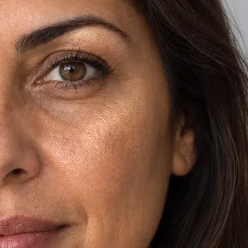
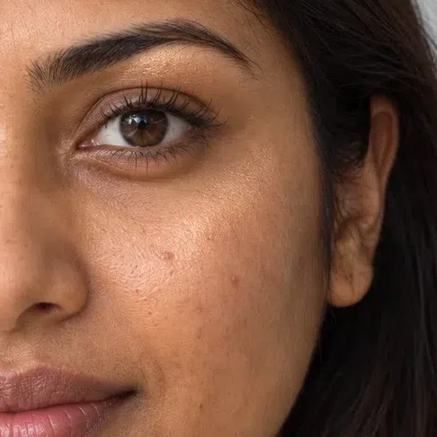
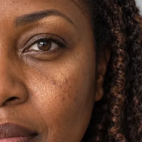
Blush
Terracotta, burnt peach and brick. Cool pinks and fuchsia look painted on.
- Terracotta blush #C9714F
- Burnt peach #D98A62
- Brick rose #B35D52
- Copper blush #C07A44
Eyes: shadow, liner, mascara, brows
Everyday eyeshadow
Earthy neutrals with gold in them.
- Warm taupe lid #8C7463
- Golden bronze lid #A7803F
- Camel lid #C49A6C
- Olive khaki lid #7F7A4A
Evening eyeshadow
Deeper and richer: chocolate, forest green, aubergine, rusted copper.
- Chocolate smoke #634433
- Forest lid #3B4F33
- Aubergine lid #4E2E43
- Copper rust lid #A2522B
Eyeliner
Espresso, plum, bronze and dark olive by day; black is fine at night.
- Espresso liner #352620
- Plum liner #5A3D52
- Bronze liner #9C7340
- Dark olive liner #4F5234
Mascara
Black suits this contrast; dark brown is the softer daytime choice.
- Black mascara #1C1817
- Black-brown mascara #3B2E26
- Deep brown mascara #4A3424
- Plum brown mascara #4B3036
Brows
Warm brown, dark chocolate or auburn - never an ash-brown pencil.
- Warm brown brow #7A5A42
- Dark chocolate brow #5A4332
- Auburn brow #7B4632
Lips: nudes and color
Nude lips
Caramel, clay and cinnamon nudes rather than beige-pink ones.
- Caramel nude #B9805E
- Terracotta nude #B8705A
- Cinnamon lip #9C5B45
- Muted brick #9A5345
Colored lips
Brick, wine, rust and spiced plum. Blue-reds and fuchsia fight the undertone.
- Brick red #9E3B2C
- Wine lip #7A2233
- Rust orange lip #B5502B
- Spiced plum #6E3445
Hair shades
Which dye shades suit a Deep Autumn, and which to skip
The goal with a Deep Autumn is to deepen what is already there, not to cover it. The shades that work read as your own dark hair with more gloss and warmth; cold, pale or unnatural shades gray the skin or wash the face out.
Deep chocolate shades
The base of the range, and the easiest place to start.
Deep, glossy and warm
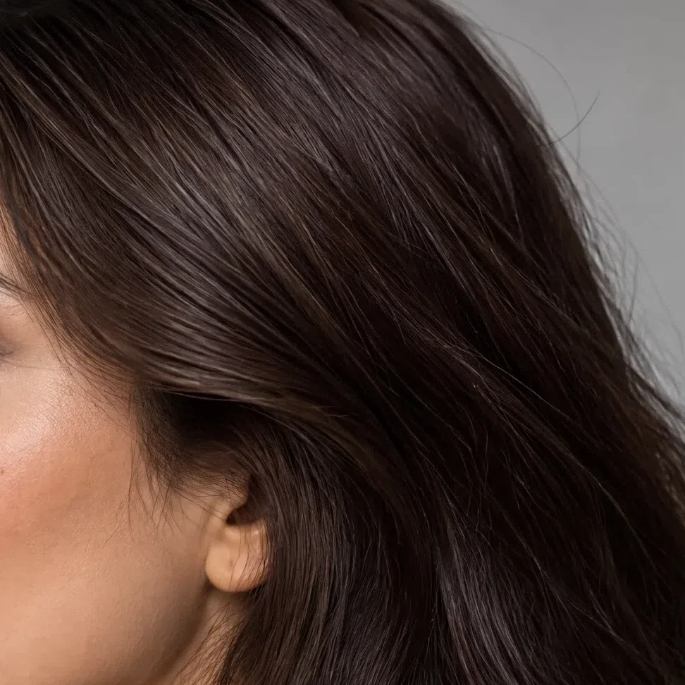
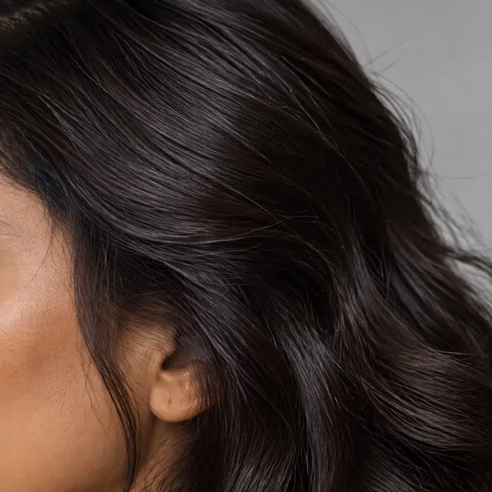
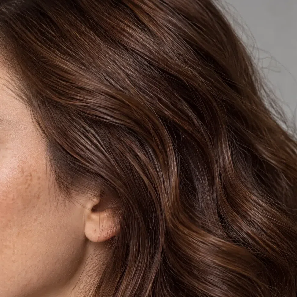
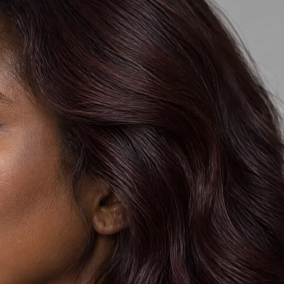
Every strip goes from one level lighter than the named shade down to two levels deeper. L numbers follow the salon level scale - quote them to your colorist.
Spiced and copper accents
For balayage, highlights or a warmer all-over shade - deep and earthy, never fiery.
Spice and copper, kept deep
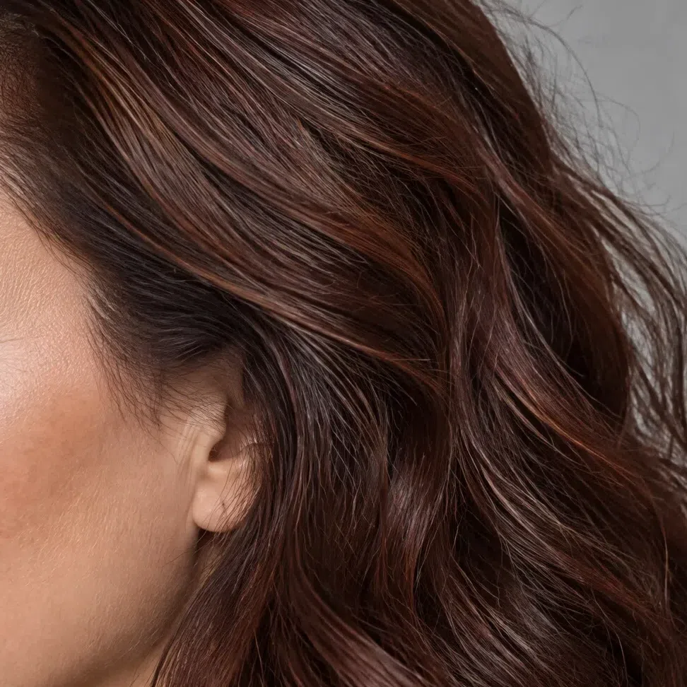
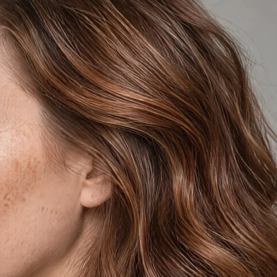
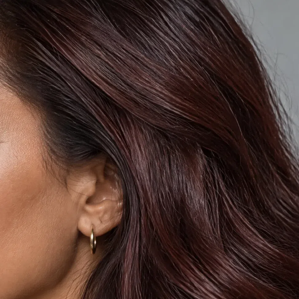
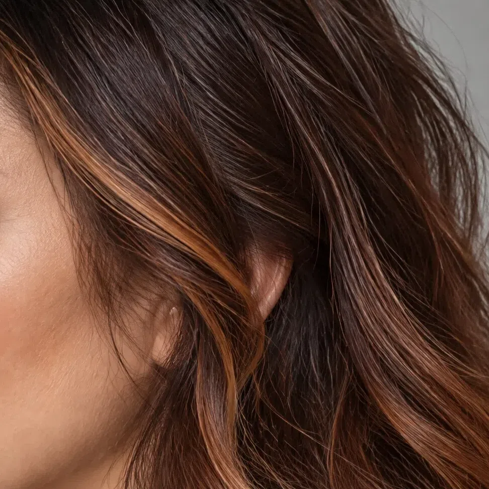
Every strip goes from one level lighter than the named shade down to two levels deeper. L numbers follow the salon level scale - quote them to your colorist.
Hair colors to avoid
Ash, platinum, blue-black and steel fight the warm undertone; golden, wheat and honey blondes are too light for this contrast; rose gold and fantasy shades bring in cold pigment.
Cold, pale or artificial
Deep Autumn vs Deep Winter, Warm Autumn and Soft Autumn
Answer four quick questions, then settle each close call with a physical test
Each subtype is led by one quality, and that quality is the one it is named for. For Deep Autumn it is depth, for Warm Autumn warmth, for Soft Autumn softness. Deep Winter is led by depth as well - on a cold base - which is exactly why it causes the most trouble.
Deep Autumn gets swapped with Deep Winter more often than with either autumn neighbor. Darkness cannot decide between them, because both have it; the undertone has to, so that comparison comes first.
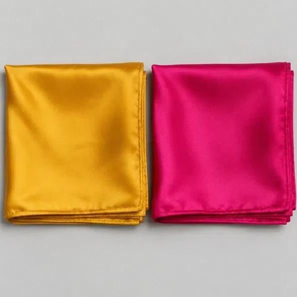
Hold two kerchiefs to your face in daylight: a mustard yellow and a cold fuchsia. Which one freshens you?
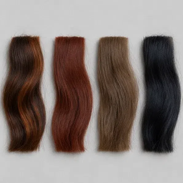
The hair color you were born with, or your roots today:
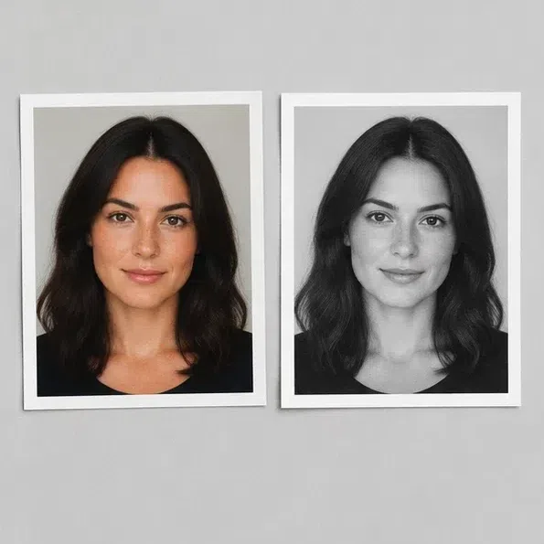
Convert a makeup-free selfie to grayscale. How does the face read?
Cold pure black next to your face - is it yours?
Depth and warmth together - you are on the right page. The palette is the place to start.
Warmth leads for you more than depth: golden and spiced shades do more than dark ones.
Go to Warm AutumnSoftness is your leading quality, not depth: saturated colors fight your face, while muted ones settle it.
Go to Soft AutumnYou have the depth, but your undertone reads cool - that puts you in winter.
Go to Deep WinterFour answers give you a lean, not a diagnosis. The subtypes blur into each other at their edges, and those edges are exactly where people talk themselves into the wrong one - run the tests below before you settle.
Deep Autumn vs Deep Winter
Deep Autumn
Warm, leaning neutral. Gold, olive or bronze underneath the skin.
Dense and even, and warm at every depth, with whites of the eyes that look soft rather than stark.
Spiced and earthy: Terracotta, Curry, Hunter green, Whiskey.
Antique gold, bronze, copper. Silver looks borrowed.
Deep and warm - like candlelight rather than frost.
Deep Winter
Cool, leaning neutral. Rosy, blue-red or gray-olive underneath.
Clear and cool at every depth, with bright blue-white whites of the eyes.
Jewel tones and cold darks: ink violet, bottle green, cobalt, black.
Silver, platinum, white gold. Yellow gold looks brassy.
Sharp and cool - like frost under streetlights.
The test: warm gold against cold plum Darkness will not tell you apart - you both carry it well - so take the question to temperature. By a window, drape a bronze-gold scarf around your neck, and after it a cold, bluish plum of about the same depth, and watch the skin next to the fabric rather than the fabric. On a Deep Autumn the gold warms the face and brings it to life, while the cold plum pulls up grayness and shadows. A Deep Winter reads the pair the other way round: the gold turns her skin yellow and flat, and the plum makes her features crisper.
Deep Autumn vs Warm Autumn
Deep Autumn
Rich and deep. Colors with shadow in them and weight to them, but no gray haze.
Medium to high. Dark hair and eyes clearly set against skin that can be light or deep.
Merlot, Currant, Olive, Dark chocolate, Blackberry, Mallard - dark, warm and complex.
Luxurious and a little dramatic. Bohemian touches and costly natural fabrics.
A forest at dusk, a velvet southern night, a spice market, red wine.
Warm Autumn
Bright and warm. The warmest, most golden colors, with nothing cold or dark mixed in.
Low to medium. Warmth runs through everything and there are no sharp jumps; freckles are common.
Spicy and golden: terracotta, pumpkin, rust, mustard, tomato red, orange.
Natural, cozy and friendly. Country, folk and safari, soft cashmere and corduroy.
A park in golden autumn, a pumpkin harvest, honeycomb, fox fur.
The test: two lipsticks, one mouth Put a deep wine or plum lipstick on one half of your lips and a warm terracotta or brick on the other, then look in daylight. A Deep Autumn face comes alive on the deep side; the terracotta half looks pleasant but slightly thin. A Warm Autumn glows on the clear terracotta half, and the wine side looks heavy on her. Temperature is the same on both halves, so whatever you see is depth.
Deep Autumn vs Soft Autumn
Deep Autumn
Rich and deep. Colors with shadow in them and weight to them, but no gray haze.
Medium to high. Dark hair and eyes clearly set against skin that can be light or deep.
Merlot, Currant, Olive, Dark chocolate, Blackberry, Mallard - dark, warm and complex.
Luxurious and a little dramatic. Bohemian touches and costly natural fabrics.
A forest at dusk, a velvet southern night, a spice market, red wine.
Soft Autumn
Muted. Colors that look as though gray pigment had been mixed in - complex and dusty. Softness leads.
Very low. Soft features, no hard edges; hair, eyes and skin sit in one key.
Complex and dusty: moss, gray-green, dusty rose, khaki, camel, cafe au lait.
Elegant, relaxed and refined. Minimalism, casual layers.
A misty morning, dry grass in a field, a cashmere throw, old photographs.
The test: wine cloth beside khaki Hold a deep wine-colored fabric to your face, then a khaki or a dusty rose. A Deep Autumn holds the wine easily - it even needs that depth, and the muted khaki looks drab against her. A Soft Autumn disappears behind the wine and comes into focus next to the khaki or the dusty rose. Both of you are warm; the difference is how much saturation and contrast your face can carry.
If two profiles still fit equally well, go back to leading qualities. Of deep, warm, soft and cool, one describes you before the others do - and that one names your page more reliably than any single swatch.
Deep Autumn: common questions
How do you tell if you are a Deep Autumn?
What is a Deep Autumn skin tone?
What colors look good on Deep Autumns?
What are the worst colors for a Deep Autumn?
Does Dark Autumn look better in gold or silver?
What is the difference between Dark Autumn and Deep Winter?
Is Dark Autumn the same as Deep Autumn?
Can a Deep Autumn wear black?
Can a Deep Autumn wear navy?
What hair color is best for a Deep Autumn?
What foundation undertone should a Deep Autumn look for?
What prints and patterns suit a Deep Autumn?
What if I love a color that isn't in my palette?
Which celebrities are Deep Autumns?
What is the rarest season in color analysis?
Can Deep Autumn coloring change with age?
Where this came from
Five sources, each holding up a factual claim above: where the seasons came from, why a shade can be deep and rich at once, how facial contrast is measured, why the light you test under matters, and why veins are harder to read on deeper skin.
-
Color Me Beautiful (opens in a new tab)
Carole Jackson, Ballantine Books, 1987
Behind the season names in the intro and the FAQ. The book sorts coloring into four seasons and describes autumn as stronger colors with orange and gold undertones. The Deep, or Dark, Autumn subtype is a later subdivision that the book itself does not contain.
-
A Pigment Color System and Notation (opens in a new tab)
Munsell, The American Journal of Psychology (Internet Archive), 1912
Behind the Depth and Clarity rows of the comparison table in how to tell, and the Soft Autumn comparison in vs neighbors. Munsell classifies every color by three separate dimensions - value, hue and chroma - which is why a shade can be dark and saturated at once, as this palette is, or dark and muted.
-
Aspects of Facial Contrast Decrease with Age and Are Cues for Age Perception (opens in a new tab)
Porcheron, Mauger & Russell, PLoS ONE, 2013
Supports the contrast check and its grayscale demo in how to tell, plus the answer about age in the FAQ. The paper treats facial contrast as the luminance difference between the eyes or lips and the surrounding skin, and finds it decreases with age, in photographs of women aged 20 to 70.
-
Method of measuring and specifying colour rendering properties of light sources (opens in a new tab)
CIE, 1995
Supports the daylight rule attached to each undertone and drape test in how to tell. The standard method rates a light source by the color shifts it causes in test objects - so the lamp you stand under changes how both the fabric and your skin look.
-
Non-invasive measurements of skin pigmentation in situ (opens in a new tab)
Stamatas, Zmudzka, Kollias & Beer, Pigment Cell Research, 2004
Supports the warning, in the first undertone test in how to tell, that veins are hard to see on deeper skin. The abstract explains that melanin absorbs light and that blood in the small vessels of the dermis absorbs it too - two pigments filtering the same light, only one of which a vein check reads.
One honest distinction. The origin of the seasons, the three dimensions of color, how facial contrast is measured, why the light source matters and what gives skin its color are sourced above; the seventeen shades, the eleven to avoid, the gold-against-plum test and the border drawn between Deep Autumn and Deep Winter are our own analysis. No study shows that Merlot flatters anyone - the evidence for that is your own face by a window.
What is color analysis, how do you find your season, and what are the 12 types?
The main guide covers all of it - the four axes your season is built from, all twelve subtypes side by side, and a free quiz that places you in about a minute.
What is color analysis? For women and men