Deep Winter makeup: cool, deep shades and how to wear them
Deep Winter makeup - Dark Winter, in the older naming - is contrast turned into color: crimson, magenta, merlot, emerald, sapphire and true black, all of it cool and clear. It is the one coloring that wears a full red lip and black liner as its everyday face, and the thing it cannot carry is warmth. Below: four women, four occasions each, the products in application order, and all 44 shades in one list.
- Four steps, in order
- Four complexions
- Everyday and evening
The order you apply it in
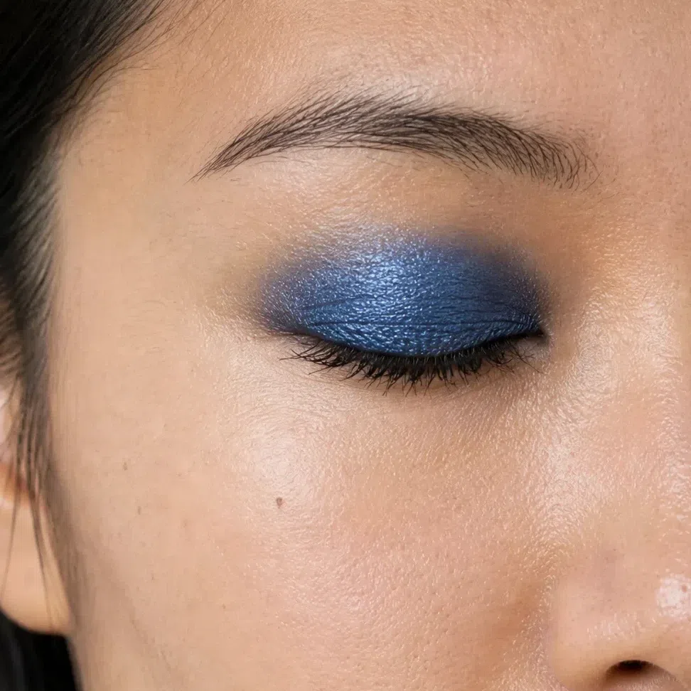
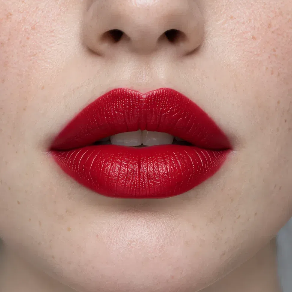
Start here
You are a Deep Winter. Here is what to put on.
One fact drives everything below: your coloring is cool and very high in contrast. Skin from porcelain to deep brown with no gold in it, hair from near-black to black, and dark eyes - or gray-green ones against black hair - with bright, clear whites. No other coloring has this much distance between its lightest and darkest parts.
So the shades are the palette’s jewels and cool darks worn on the face - crimson, magenta, merlot, blackberry, emerald, sapphire, black - and a strong version of them is the everyday one. There are two ways to go wrong. Warm makeup - bronze, peach, gold - turns the skin sallow. Soft makeup - beige nudes, brown liner - makes the face look washed out next to its own hair.
Keep every shade cool, and match the contrast your hair and eyes already have.
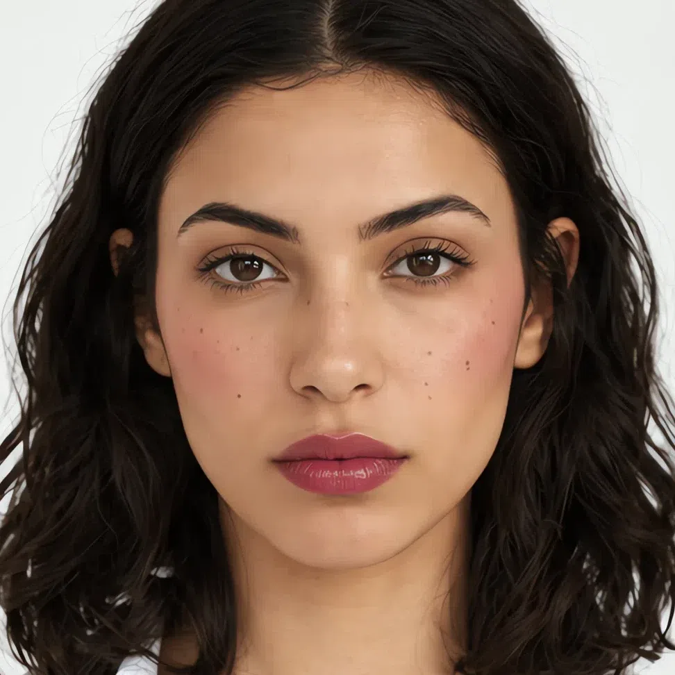
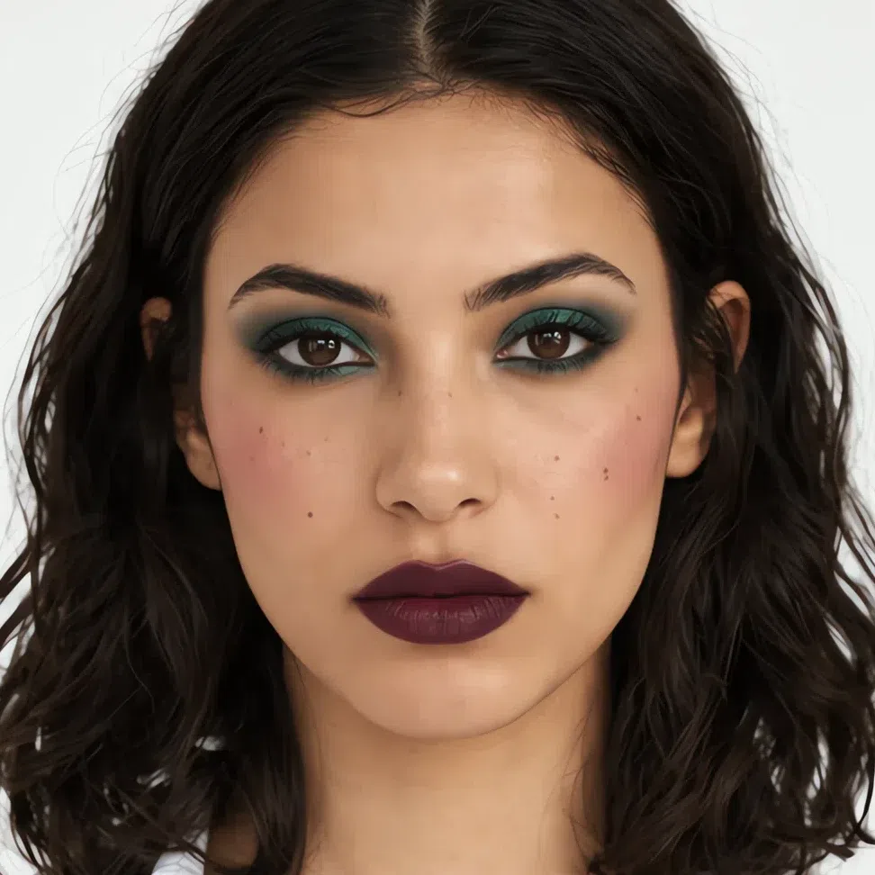
One medium-skinned woman at both ends of what this coloring carries. Between the two photographs the color gets deeper and more jewel-like; it never gets warmer. The other three complexions follow.
What is on this page
- Sixteen finished looks Sixteen faces, from the quickest to the most dressed-up, with every shade named on each card.
- Why these shades Four swaps, each set against the warm or soft version most Deep Winters already own.
- How to build it Base, cheeks, eyes, lips - the order, and how strong each one should be on this coloring.
- When you need more Jewel tones and full reds: day and evening side by side at each depth.
- How to buy it A jaw test for warmth, the label words that hide a golden base, and your square on the foundation grid.
- The shade list All 44 shades with hexes on one screen.
Sixteen finished looks
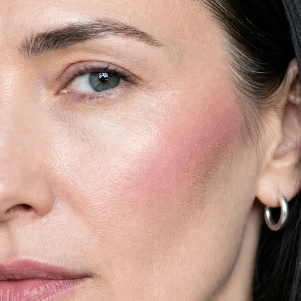
Sixteen photographs before any more theory: four women, four occasions each, and a card under every photo listing lid, cheek and lip. Start from the woman closest to your skin. Her last card is as far as this coloring goes - a jewel-toned eye and a merlot or blackberry mouth.
If you have fair skin:
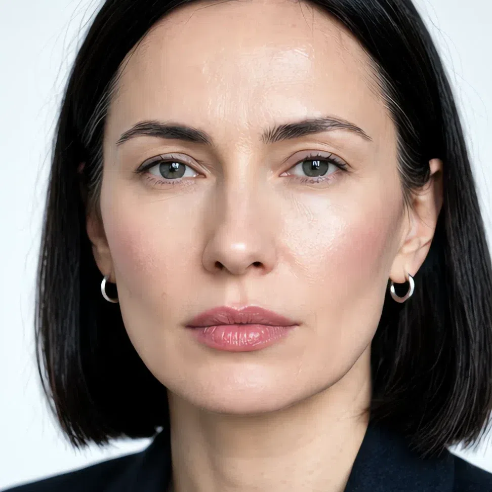
- Base Fair - porcelain ivory
- Blush Cool rose blush
- Lips Rosy mauve
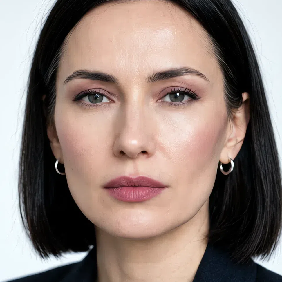
- Base Fair - porcelain ivory
- Blush Cool rose blush
- Eyes Rosy mauve
- Liner Jet black
- Lips Rosy mauve
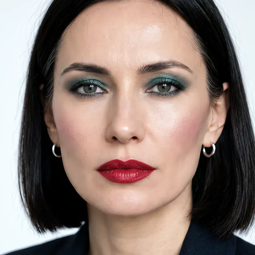
- Base Fair - porcelain ivory
- Blush Plum stain
- Eyes Emerald shimmer
- Liner Jet black
- Lips Crimson
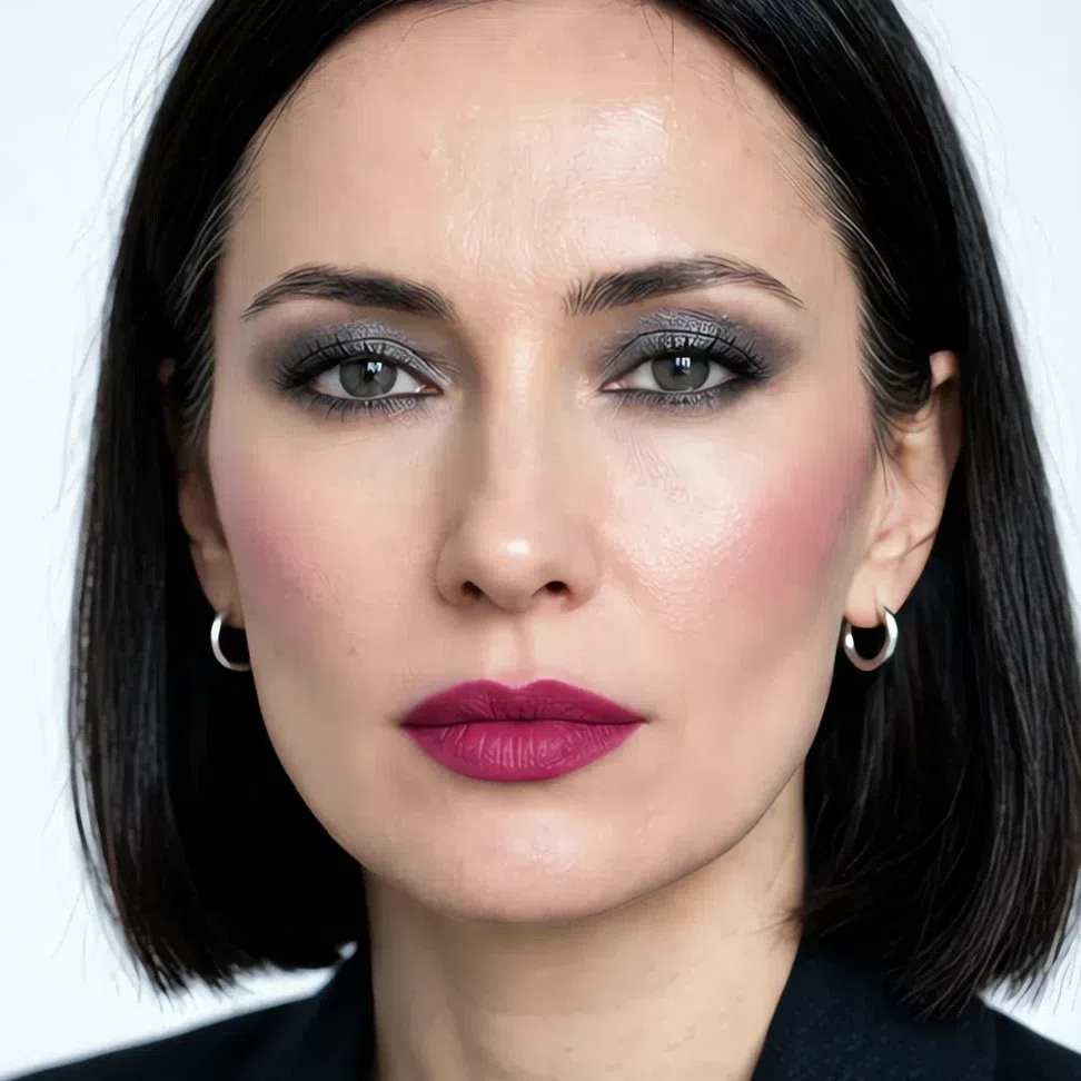
- Base Fair - porcelain ivory
- Blush Raspberry
- Eyes Silver smoke
- Liner Jet black
- Lips Magenta
If you have light skin:

- Base Light - cool sand
- Blush Plum stain
- Lips Lilac nude

- Base Light - cool sand
- Blush Plum stain
- Eyes Taupe shadow
- Liner Jet black
- Lips Lilac nude
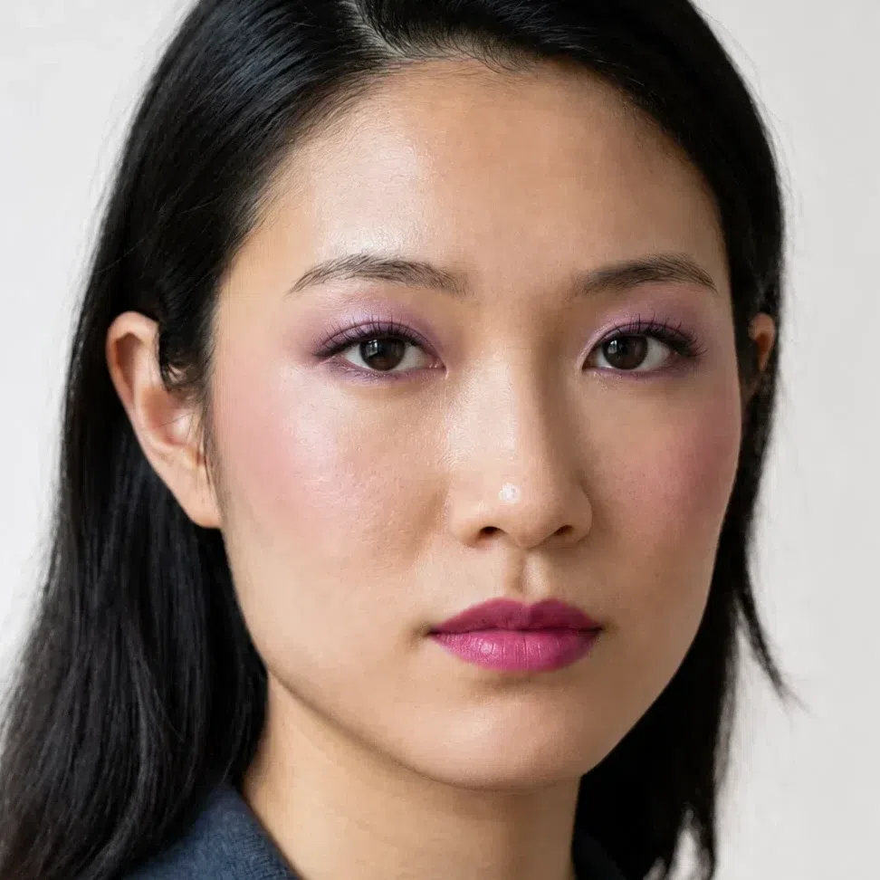
- Base Light - cool sand
- Blush Raspberry
- Eyes Amethyst shimmer
- Liner Plum ink
- Lips Magenta
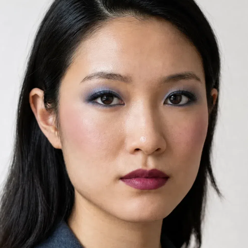
- Base Light - cool sand
- Blush Cranberry
- Eyes Sapphire metallic
- Liner Midnight
- Lips Merlot
If you have medium skin:
- Base Medium - neutral tan
- Blush Raspberry
- Lips Berry tint
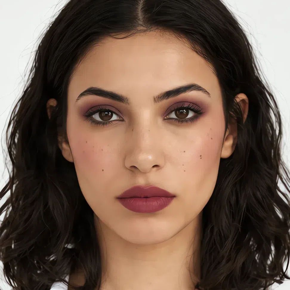
- Base Medium - neutral tan
- Blush Raspberry
- Eyes Matte plum
- Liner Jet black
- Lips Berry tint
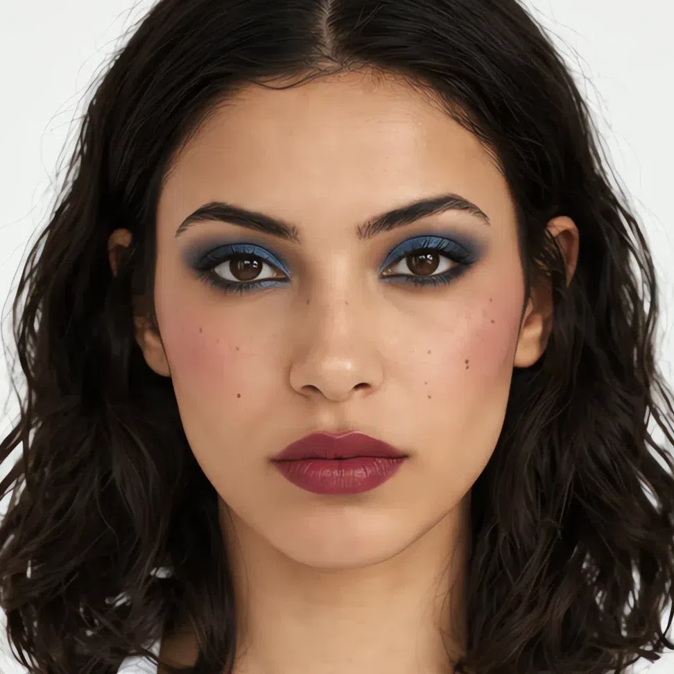
- Base Medium - neutral tan
- Blush Cranberry
- Eyes Sapphire metallic
- Liner Midnight
- Lips Merlot
- Base Medium - neutral tan
- Blush Cranberry
- Eyes Emerald shimmer
- Liner Jet black
- Lips Blackberry
If you have deep skin:
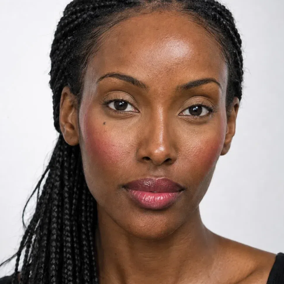
- Base Deep - cool espresso
- Blush Cranberry
- Lips Raspberry
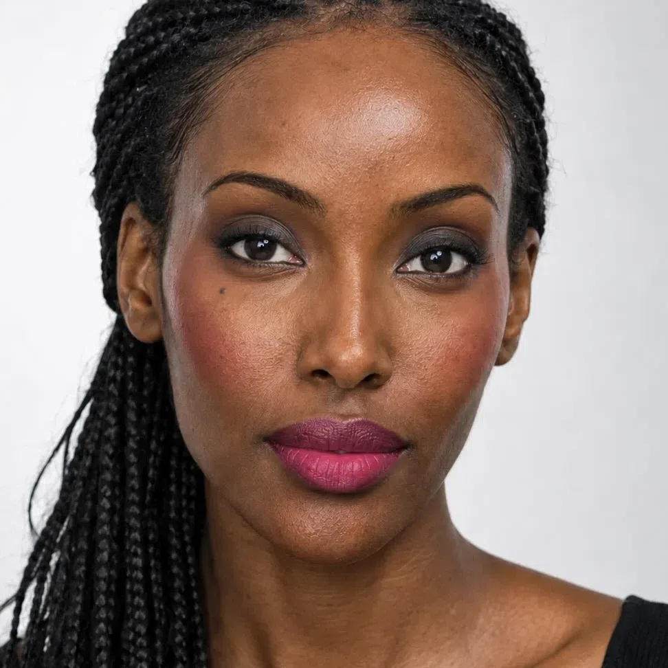
- Base Deep - cool espresso
- Blush Cranberry
- Eyes Graphite
- Liner Jet black
- Lips Raspberry
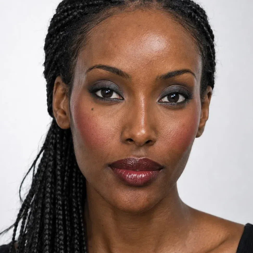
- Base Deep - cool espresso
- Blush Cranberry
- Eyes Silver smoke
- Liner Jet black
- Lips Merlot
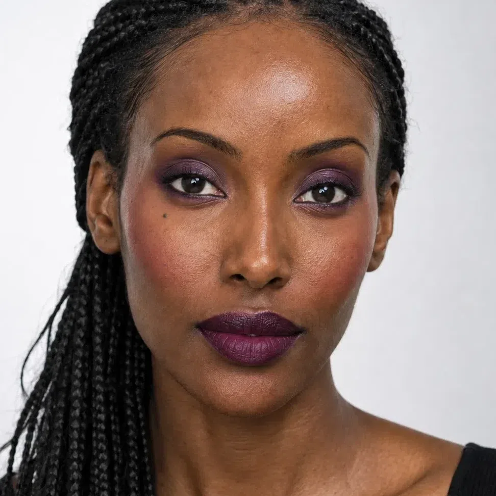
- Base Deep - cool espresso
- Blush Cranberry
- Eyes Amethyst shimmer
- Liner Plum ink
- Lips Blackberry
Down each column the occasion is fixed and the shade names change. A cool rose that shows clearly on porcelain skin barely registers on deep brown skin, so the deeper the complexion the deeper the shade - cool rose, plum stain, raspberry, cranberry - for the same effect. The temperature never moves, which is why the peach and bronze in most makeup bags fight this face.
Why these shades, and not the ones you own
Break the sixteen faces down and four swaps are doing the work. Each is below, set against what a Deep Winter tends to own already: the brown liner, the bronze palette, the peach blush, the beige nude. All four were chosen to look soft and natural, and on this face all four miss the same way.
Why these shades and not those
Tap a productBrown liner is sold as the gentle everyday choice. Next to near-black hair and dark eyes it reads faded, like a line that has half worn off by noon. This is the one coloring that looks more natural in true black than in brown.
Bronze and gold fill the best-selling neutral palettes. On cool skin they read yellow, and around a dark, cool eye they look muddy rather than warm. A mauve, taupe or graphite is just as neutral, in the temperature this face already has.
This skin flushes rose or berry. Peach and coral sit on it as an orange patch and pull the whole cheek toward sallow. A cool rose or a raspberry of the same strength looks like your own color.
A beige nude is the default "safe" lip, and on a face with this much contrast it is the least safe thing in the bag: the mouth vanishes and the skin looks pale. Even the Deep Winter nude is a rosy mauve or a berry tint.
The right shade deepens with the skin - cool rose on a porcelain cheek, cranberry on a deep one - so one hex cannot serve every Deep Winter; the cheat-sheet lists yours. The wrong shade never moves, because it fails on temperature and softness, and every Deep Winter has cool skin and dark, clear features. Liner is fixed at black on all four. The swatches on the failing side illustrate the mistake and are not measured products.
What the four mistakes share is warmth and softness. A Deep Winter face is built from contrast: cool skin against dark hair and eyes that are nearly black, with no gold in any of it. Your palette works the same way - jewel tones, cool reds, black and white - so a shade that is golden or gently blurred lowers the contrast the whole face depends on.
So much for what to buy. The order it goes on, and how much of each, is easier to see than to read.
How to build it, step by step
The swaps above, now in the order they go on. The shade gets you half the way; the other half is how it is applied, and that decides whether strong, cool color looks like your own contrast or like a mask.
-
Base
Clear, cool skin as the backdrop
Your base shades, by depth
The season sets the undertone - neutral to cool, with no gold in it. Your own skin sets the depth.
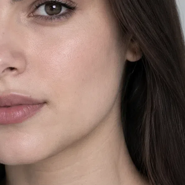
Fair - Foundation Fair - porcelain ivory #EDDCCB
- Bronzer Fair - soft taupe #A8958A
- Highlighter Fair - icy silver #E3E6EC
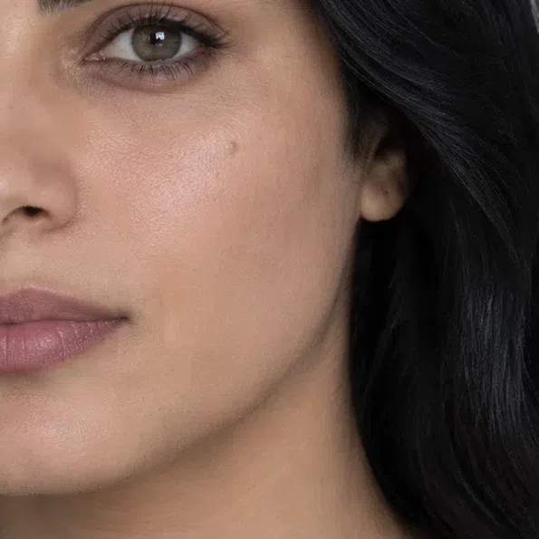
Light - Foundation Light - cool sand #CBAE92
- Bronzer Light - cool taupe #8C7566
- Highlighter Light - pink pearl #F0D9DC
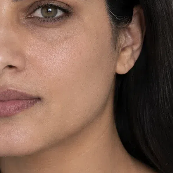
Medium - Foundation Medium - neutral tan #A88763
- Bronzer Medium - gray-brown #7A6A5E
- Highlighter Medium - cool champagne #EDE0CE
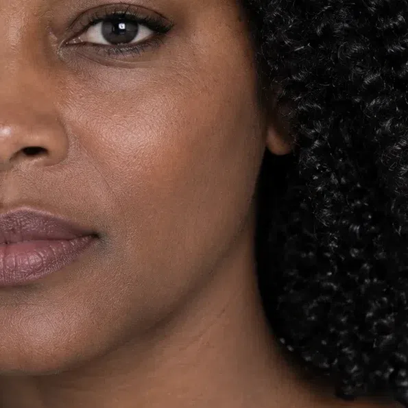
Deep - Foundation Deep - cool espresso #5E4336
- Bronzer Deep - cocoa taupe #4E3E36
- Highlighter Deep - rose-plum pearl #C79AAE
A Deep Winter face works on contrast, and the base is the pale or deep ground everything else stands on. Keep it clear and even rather than warm: a neutral-cool foundation pressed into the center of the face, blended out to nothing at the hairline. A golden base is the most common mistake here, and it makes the skin look yellow next to black hair.
Skip the bronzer and use a cool taupe contour instead - under the cheekbone and along the jaw, blended until it reads as shadow rather than color. It adds shape without adding a tan this coloring does not have. Highlighter is silver, pink pearl or cool champagne, on the top of the cheekbone only.
Tip If the base looks right indoors and yellow in daylight, it is too warm. Try the next shade over in the cool column, at the same depth.
-
Cheeks
A cool flush, and a bit more than you think
Blush goes on before the eyes. This face flushes rose or berry, and it takes a clearer, stronger blush than most before the color shows next to dark hair. Cream melts in and stays clear; press it on the apples, then blend up toward the temple.
Blush
Cool rose on the fairest cheek, cranberry on the deepest, each step deeper and cooler than the last. Choose the one closest to your own flush, and check it from a step back.
Cool rose blush #D08094 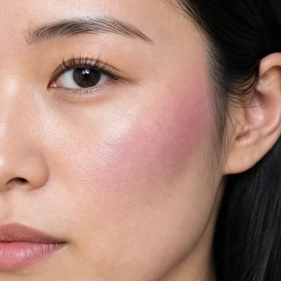
Plum stain #9C6480 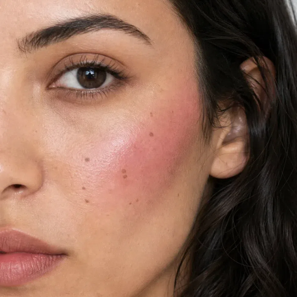
Raspberry #B24A6E 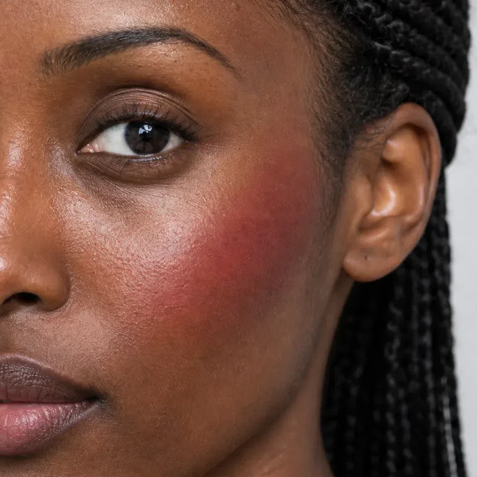
Cranberry #A33050 Tip If the blush disappears by lunchtime, it was too soft, not too little. Go one step deeper on the ladder.
-
Eyes
Defined brows, a cool lid, a black line
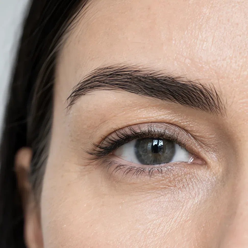
Brows first: brush them up and fill gaps in a cool shade near your own - ash or graphite, never red-brown. Then one cool shade across the lid, from rosy mauve on fair skin to graphite on deep. Then black liner pressed into the lash roots and the blackest mascara you can find. On this coloring that is the natural version, not the dramatic one.
Brows
Four cool shades, picked to match the hair, not the skin. Short strokes in the gaps, a light touch at the inner end.
Taupe brown brow #6B5A50 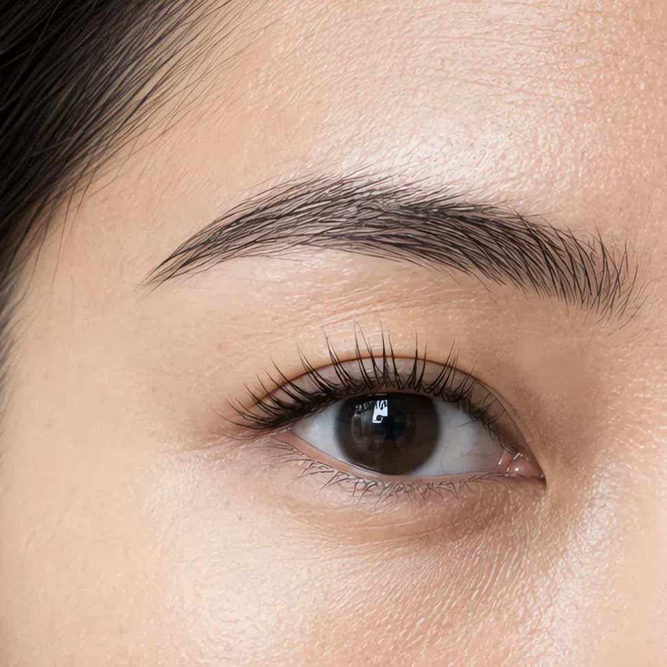
Cool ash brow #574A44 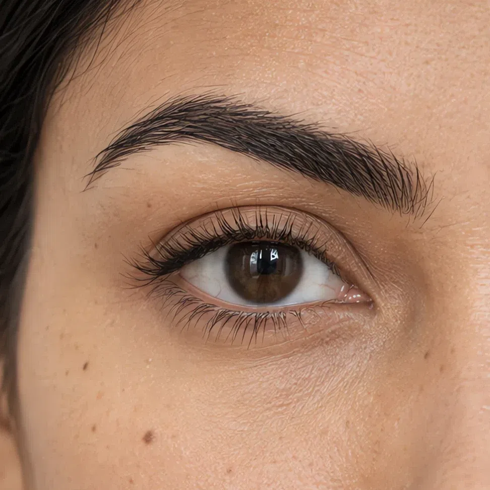
Cool espresso #3E2A25 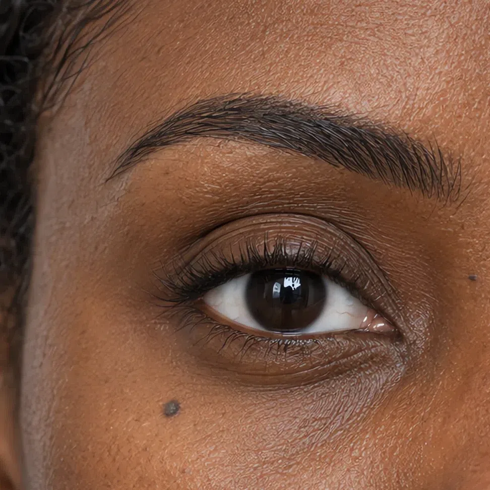
Dark graphite brow #2A2A30 Everyday eyeshadow
A single shade over the mobile lid, softened up to the crease line. Mauve and plum deepen dark eyes; graphite sharpens light ones.
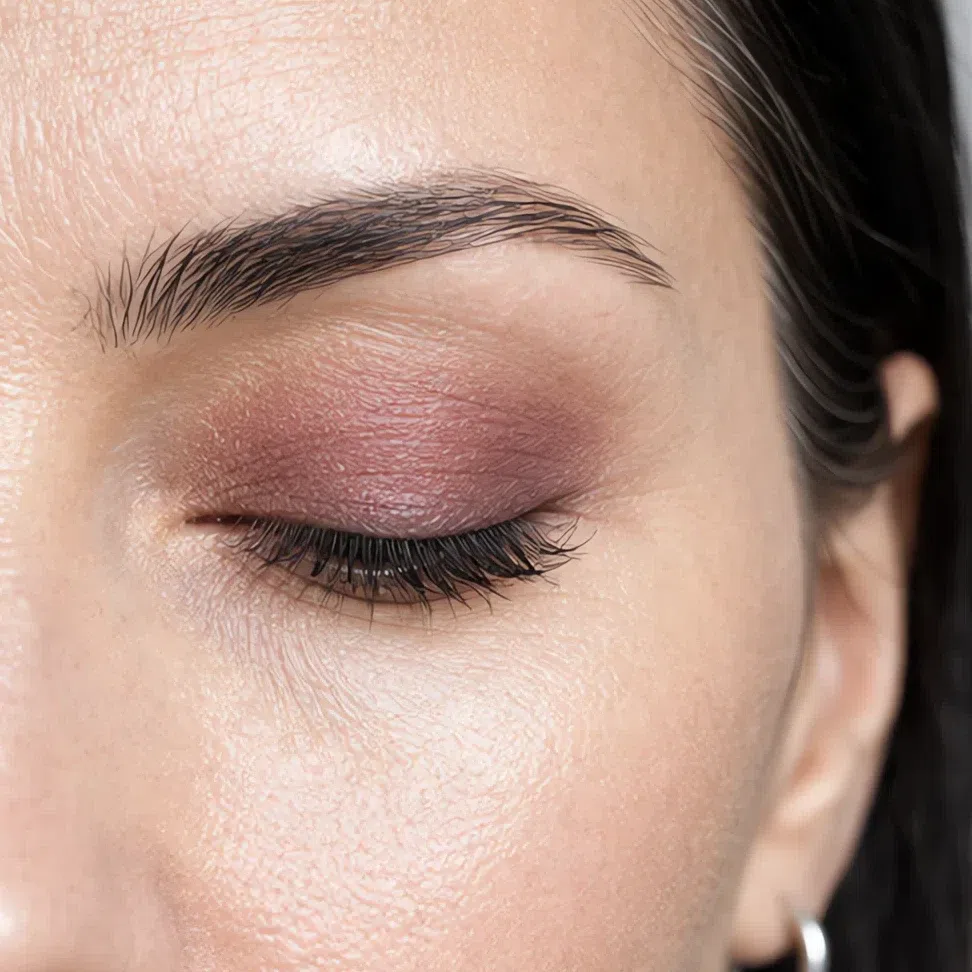
Rosy mauve #B98F94 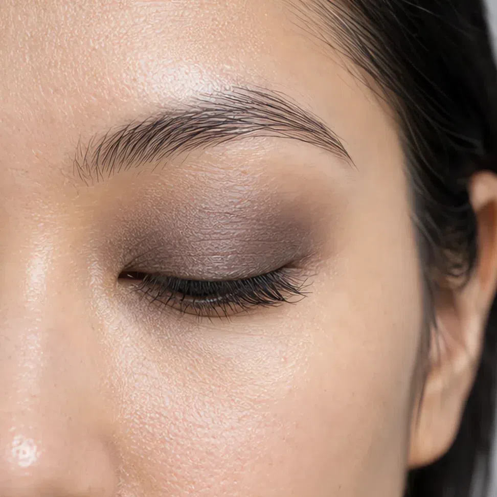
Taupe shadow #8E8177 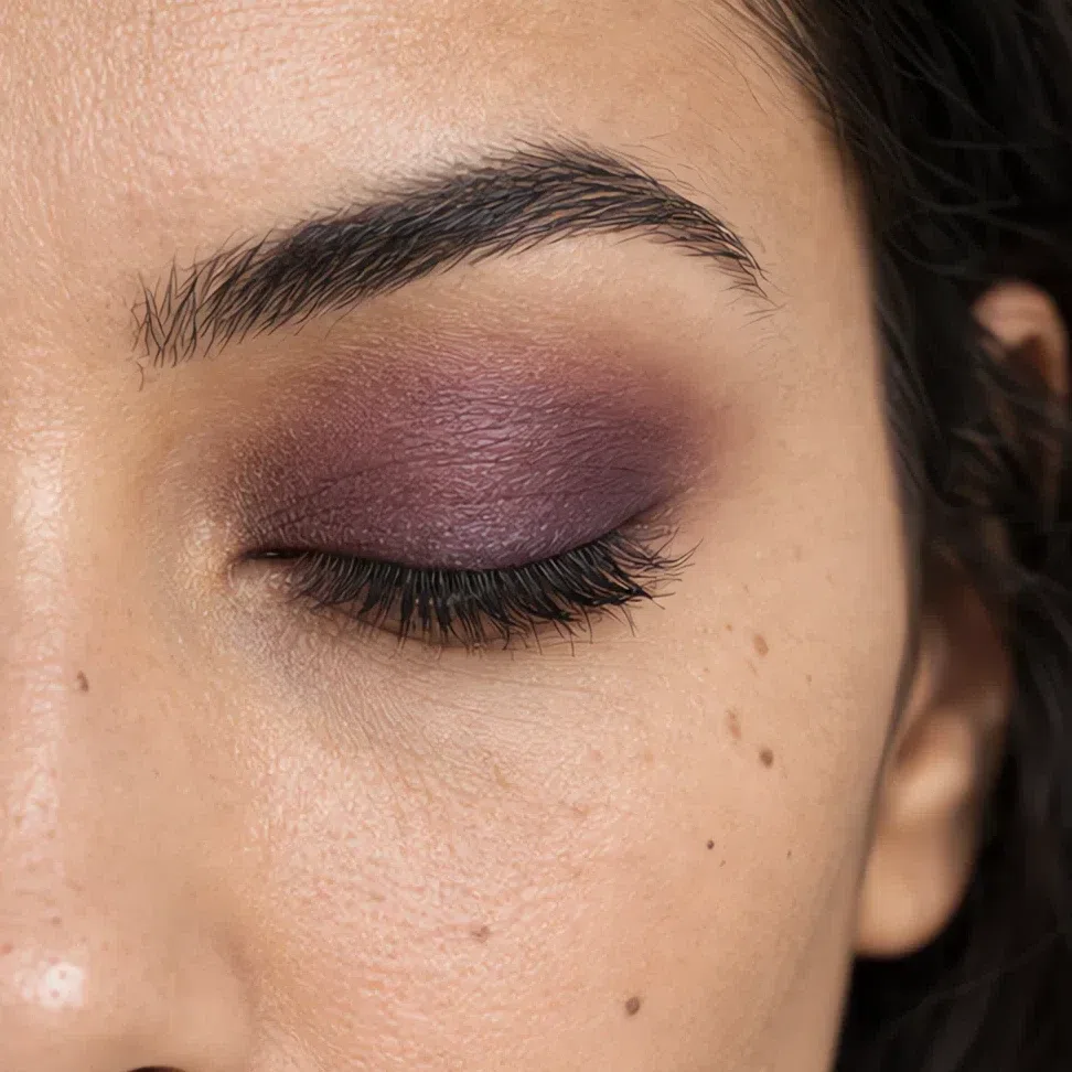
Matte plum #6B4A5E 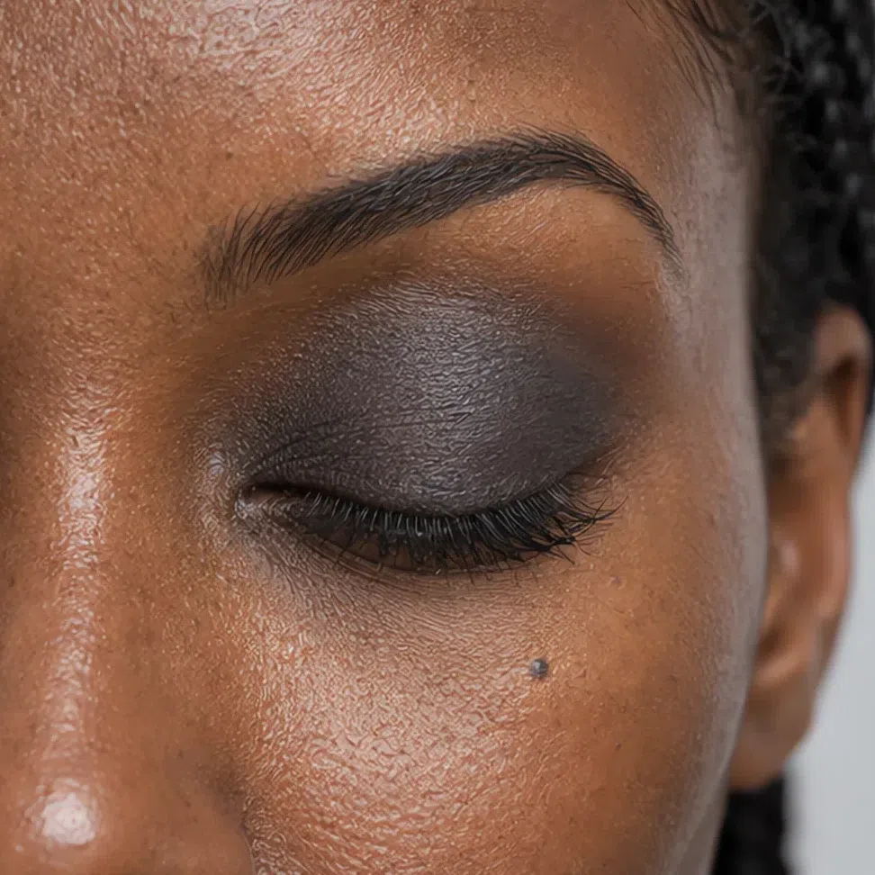
Graphite #4A4A50 Eyeliner
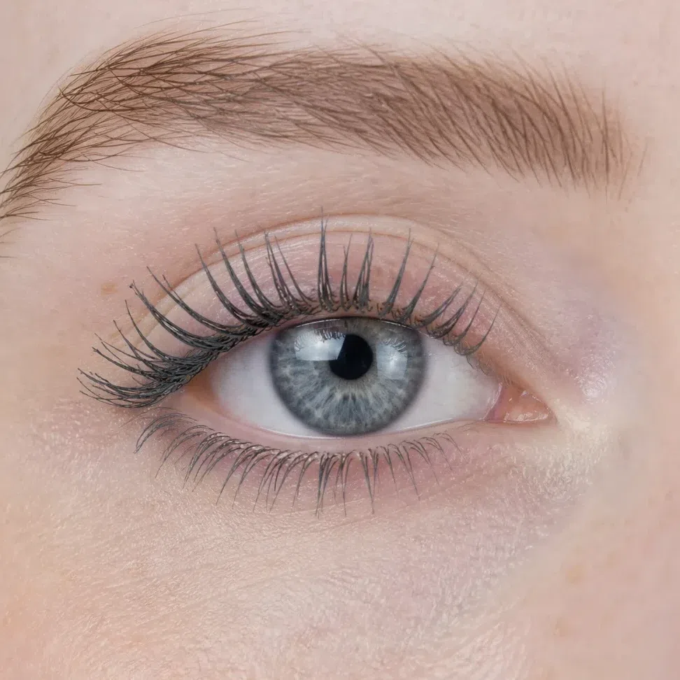
Colors, not depths - any complexion can wear any of the four. Jet black is the daily line; midnight, plum ink and graphite are the gentler options that still read as dark.
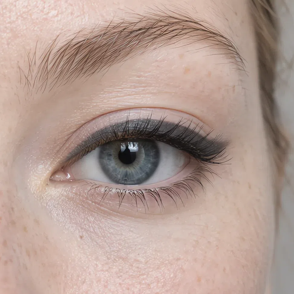
Graphite #4A4A50 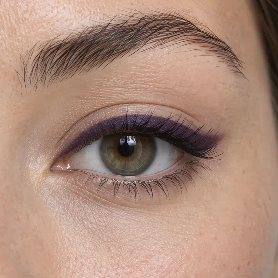
Plum ink #4C2B44 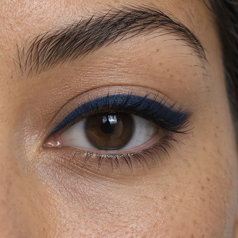
Midnight #1B2A4A 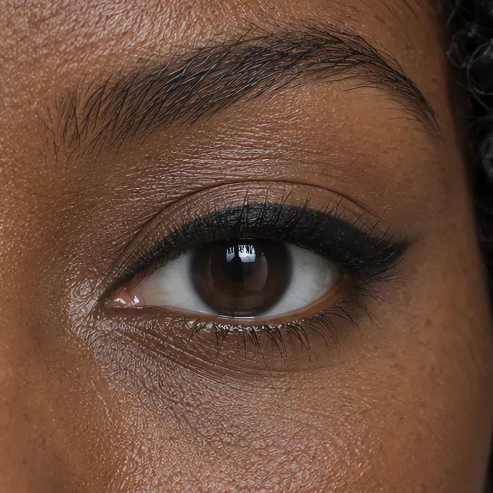
Jet black #141414 Mascara
Jet black on everyone - brown looks faded against this much natural depth. Navy and plum are for evenings when the lashes should add color.
Graphite #4A4A50 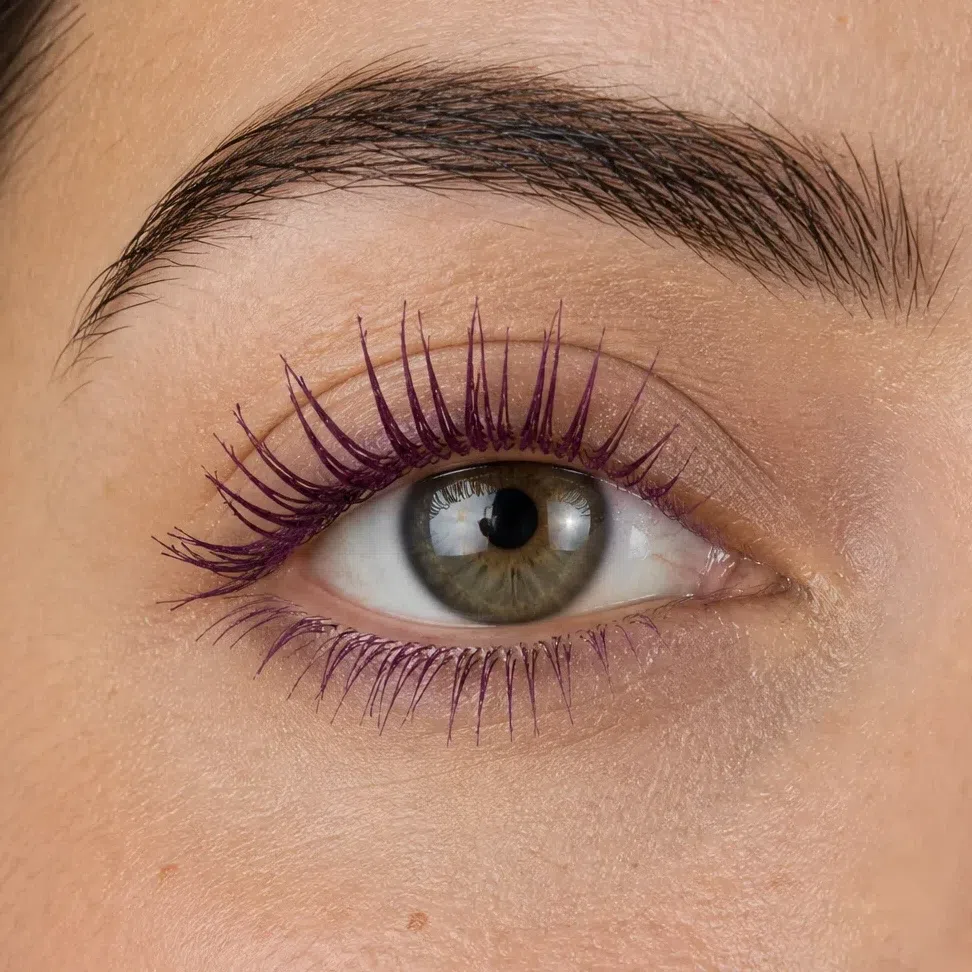
Plum ink #4C2B44 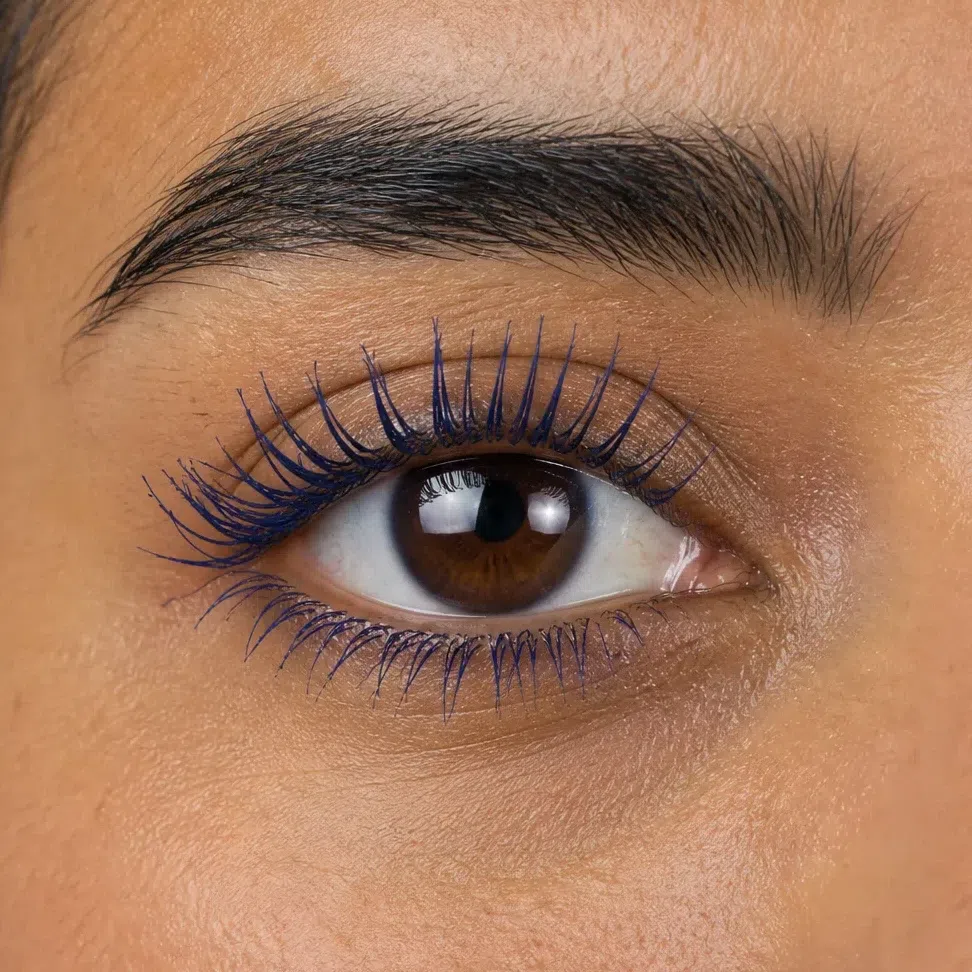
Midnight #1B2A4A 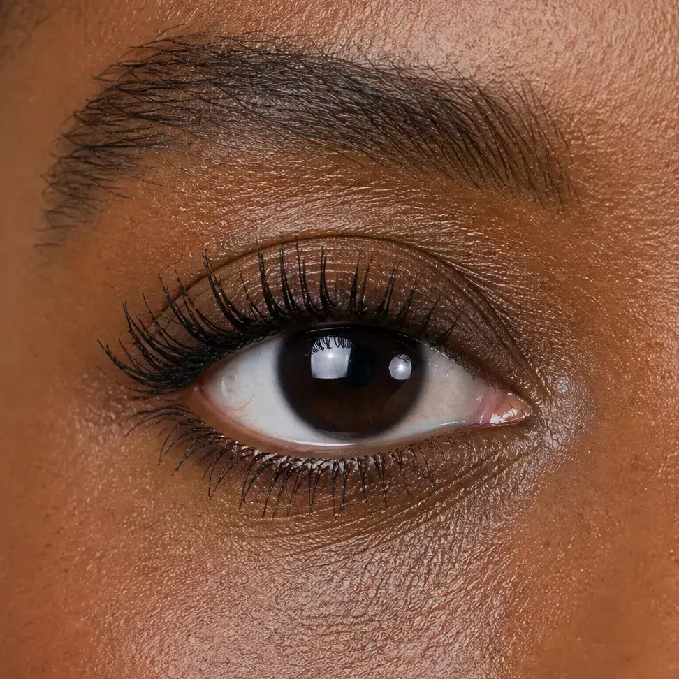
Jet black #141414 Tip If you own one liner, make it a true black pencil. It is the product this coloring needs least of an excuse to wear.
-
Lips
A nude with berry in it
The Deep Winter nude is a rosy mauve, a lilac, a sheer berry or a raspberry - a shade that looks colorful in the tube and quiet on the mouth. Beige and peach nudes wash this face out. Apply straight from the bullet or tap on with a finger; a clean edge suits this coloring more than a blurred one.
Nude lips
Rosy mauve at the fair end, raspberry at the deep end. The right one looks like your lips, only clearer.
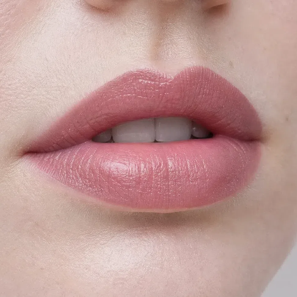
Rosy mauve #B98F94 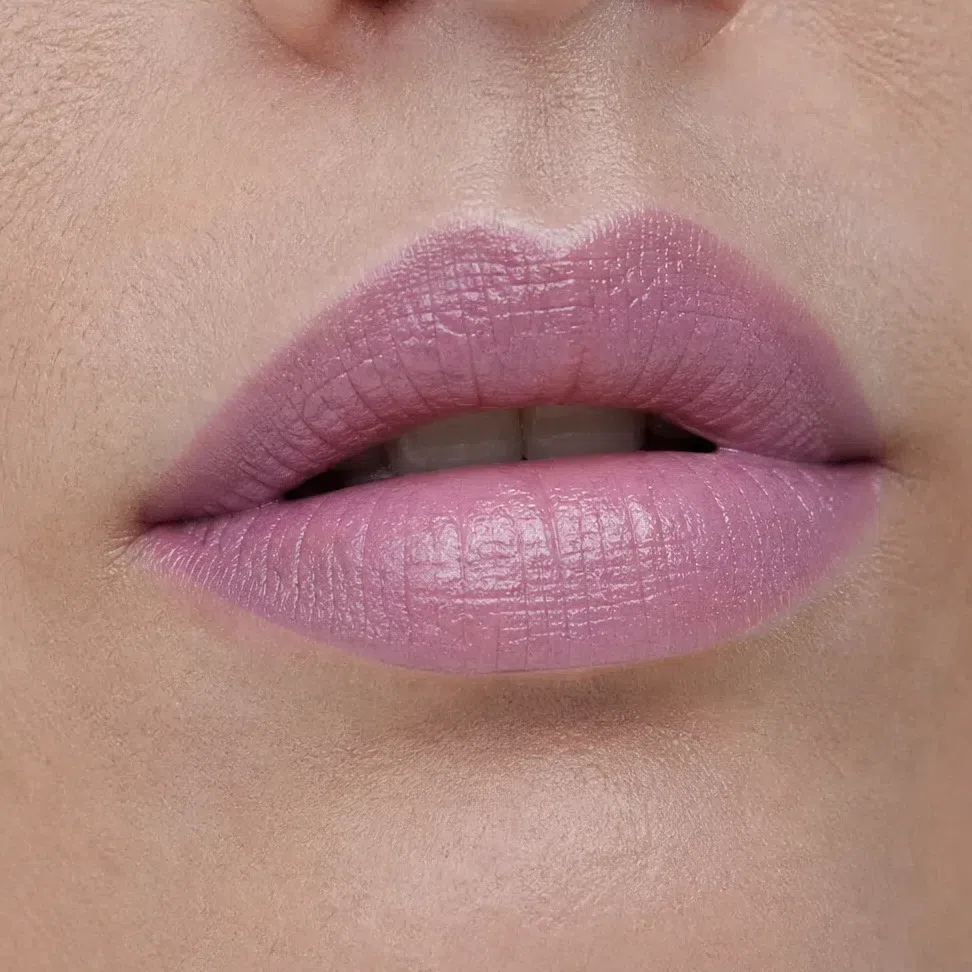
Lilac nude #A87C9E 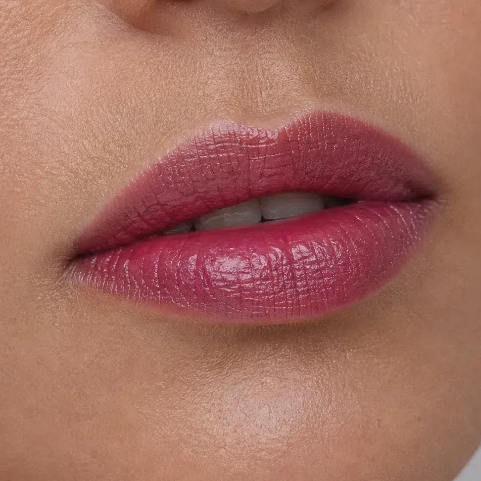
Berry tint #BE6A86 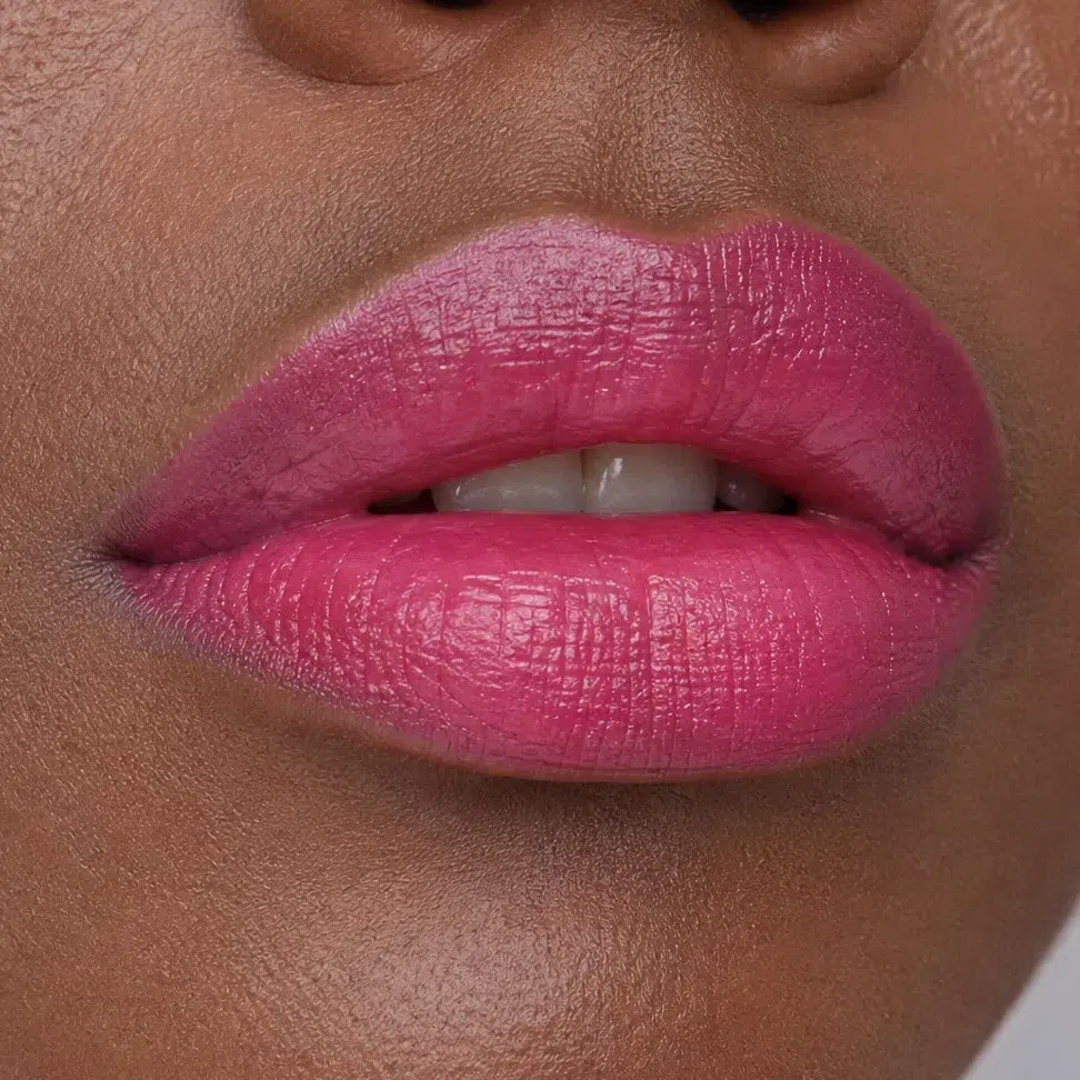
Raspberry #B24A6E Tip A clear gloss over any of these works on this coloring, day or night.
That is the whole day face, and it already has more contrast than most people wear. The evening version is where this coloring really comes into its own.
Your evening face: what changes, and what must not
Deep Winter is the coloring evening makeup was designed around, and still only two things change: a jewel tone takes the outer eye, and the lip goes from a berry nude to a full red, magenta or wine. The rest stays as it was in the morning. Each depth is shown twice, the same woman in both frames.
Eyes
At night this coloring moves into jewel tones. The day shade holds the center of the lid, and one of emerald, amethyst, sapphire or silver smoke takes the outer third - crease, corner and the outer lower lashes.
- Keep the day shade across the lid.
- Press the jewel shade into the crease and over the outer third.
- Sweep a little along the outer half of the lower lash line and stop.
- Let the center of the lid keep the day shade, so the eye stays open.
- Line the upper lash roots in black, navy or plum and soften the joins.
The rule Deeper and brighter, never warmer. A bronze or copper smoke is the one evening eye that fights this face; the cool version of the same depth - silver, graphite, plum - is the one that belongs to it.
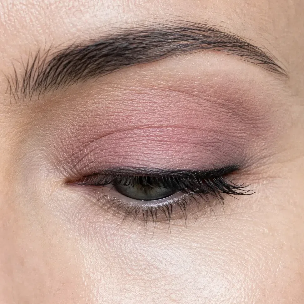
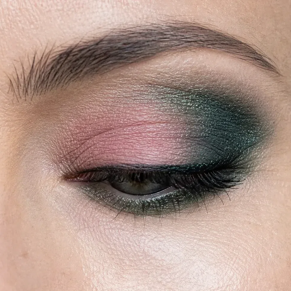
Rosy mauve on the lid, emerald shimmer through the crease and out to the corner, black in the lashes. Emerald beside gray-green eyes makes them look greener, and on porcelain skin under black hair it looks deliberate rather than loud.
 Deepest at the outer corner
Center of the lid stays lightest
Lower lashes: outer half only
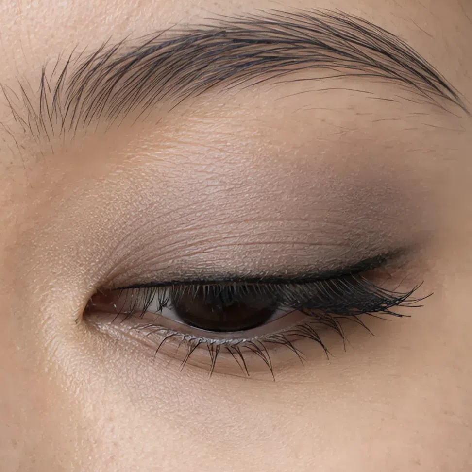
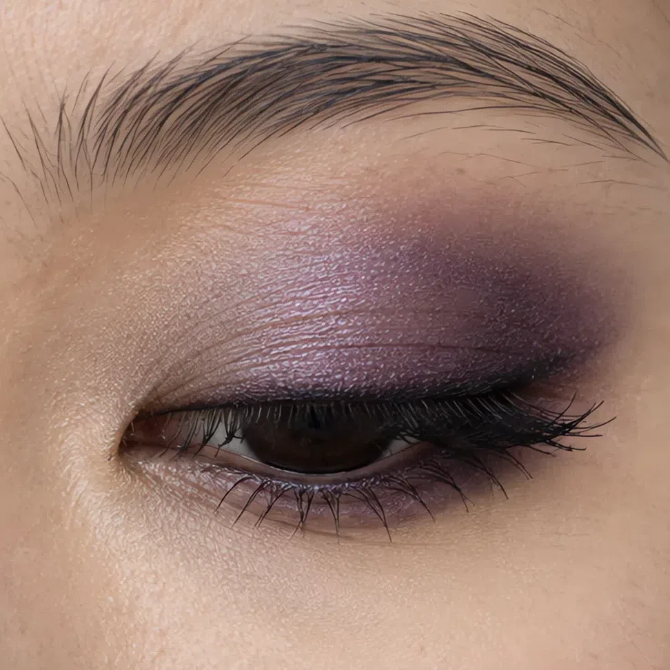
Cool taupe on the lid, amethyst through the crease and past the corner, a plum line along the lashes. Violet makes dark brown eyes look richer and almost black at the center.
 Deepest at the outer corner
Center of the lid stays lightest
Lower lashes: outer half only
Matte plum on the lid, sapphire round the outer corner, a midnight line underneath. Blue and plum together keep the eye deep without turning it gray, and the navy line reads as black from a step away.
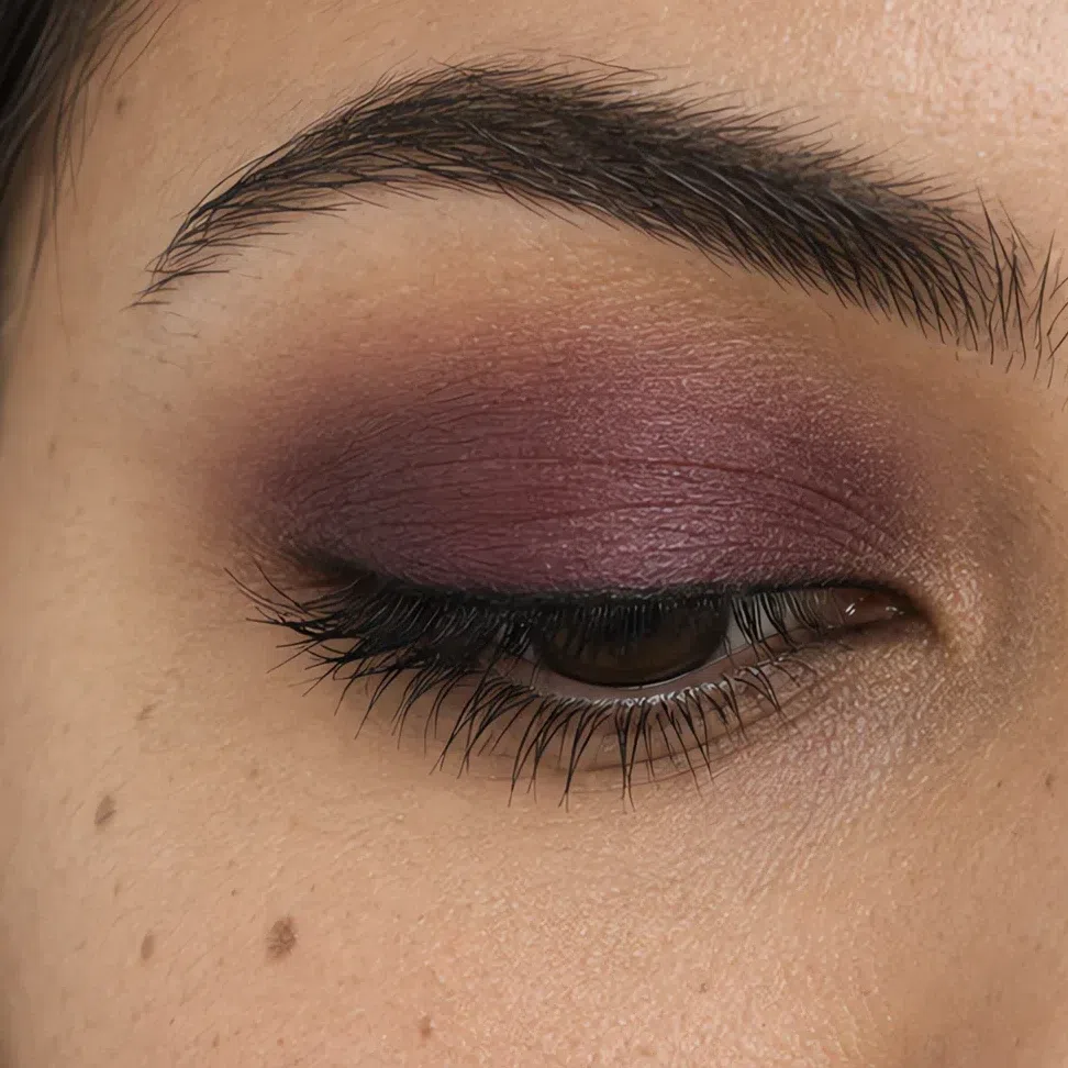
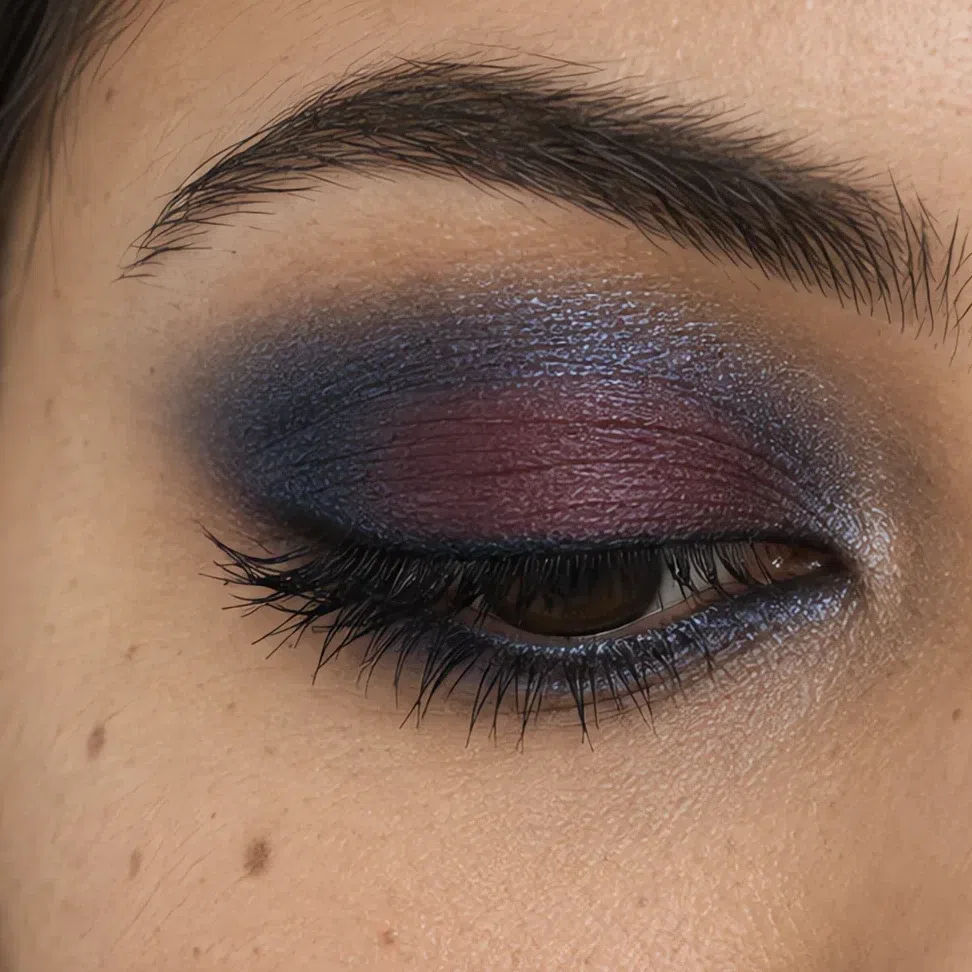 Deepest at the outer corner
Center of the lid stays lightest
Lower lashes: outer half only
Graphite on the lid, silver smoke carried out to the corner, black in the lash line. On deep cool skin a silver-gray shimmer catches the light the way a matte black smoke never does, so the eye stays bright.
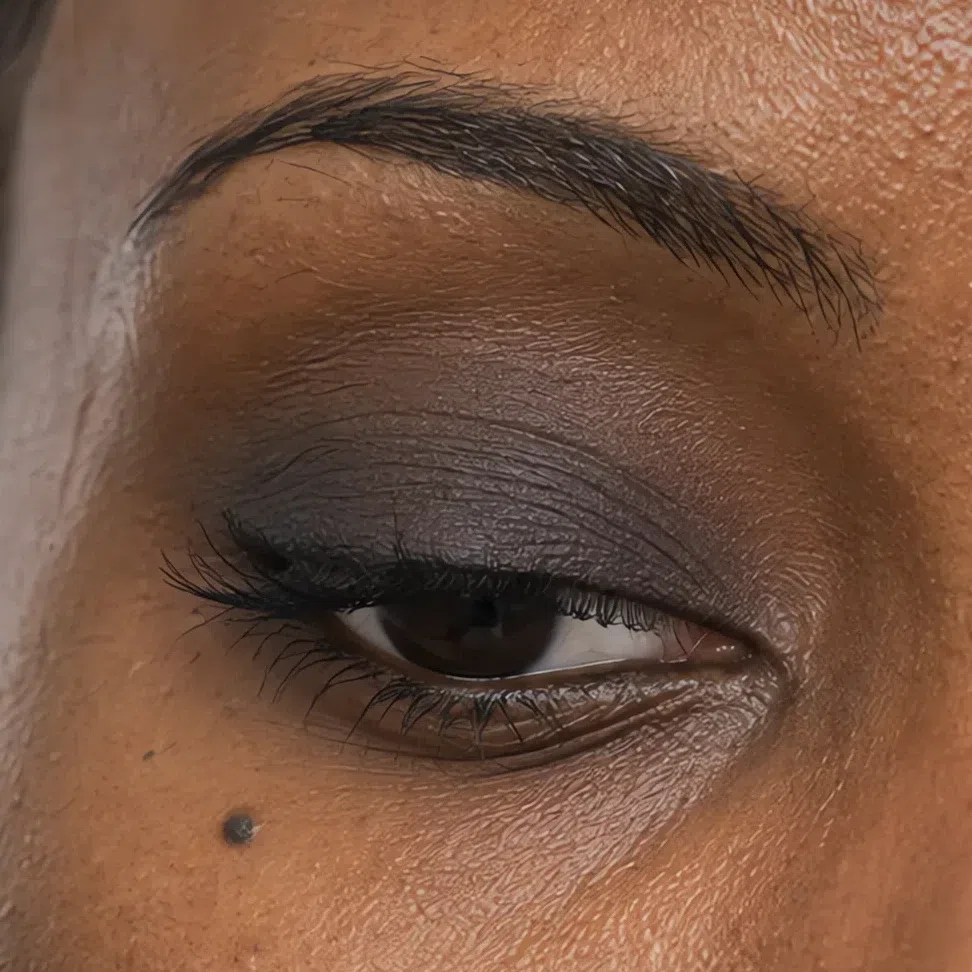
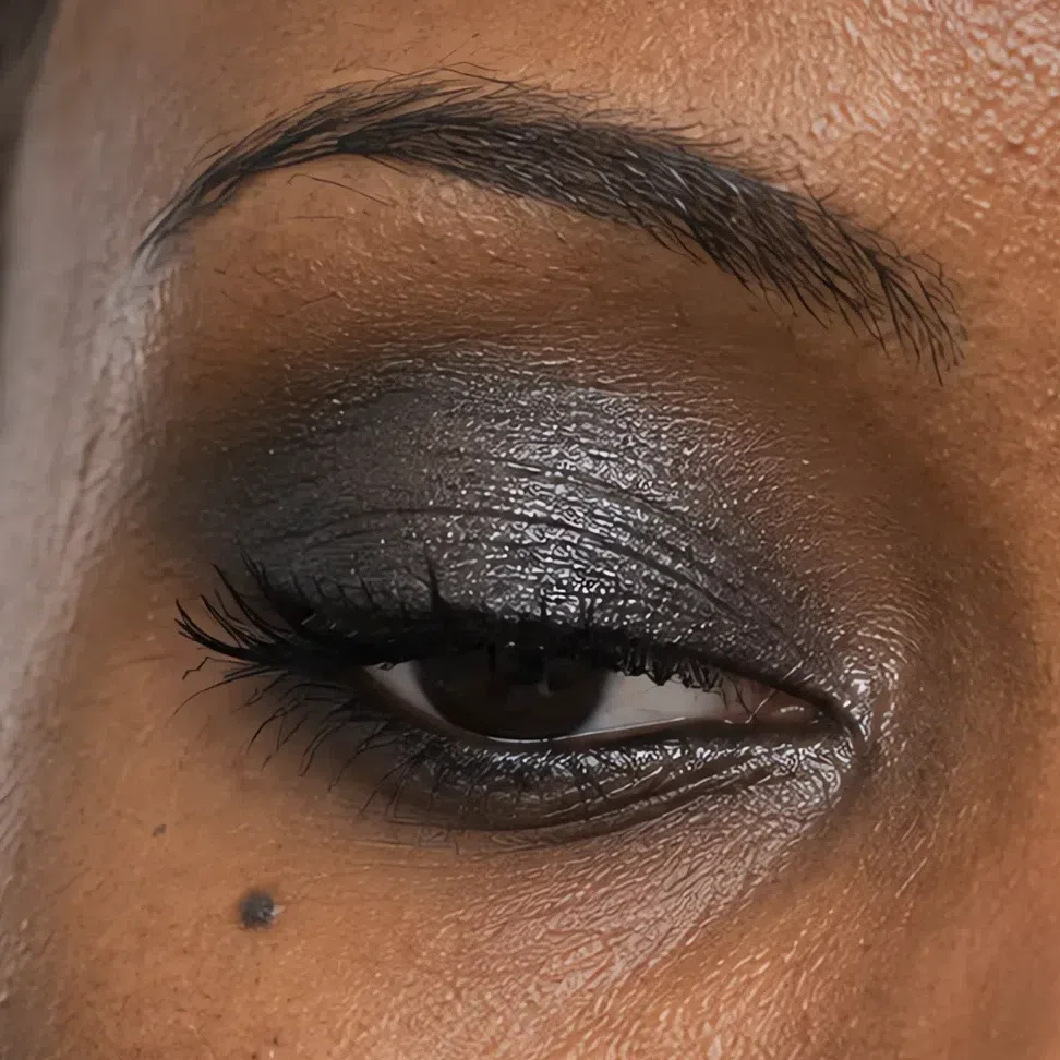 Deepest at the outer corner
Center of the lid stays lightest
Lower lashes: outer half only
Lips
The day nude and the evening lip come from one cool family - rosy mauve to crimson, berry to merlot - so choosing the evening shade is mostly choosing its strength. This coloring can wear a full red at night without the red taking over.
- Press the first layer in with a fingertip or brush.
- Blot once.
- Build the second layer through the center of the mouth, then define the edge if you like.
- A crisp line suits this coloring - just keep it on your own lip line.
The rule Your depth chooses the shade; the hour only decides how strong it goes.
Rosy mauve by day, crimson after dark. A true blue-red on fair skin under black hair is the classic Deep Winter evening face, and it needs almost nothing else.
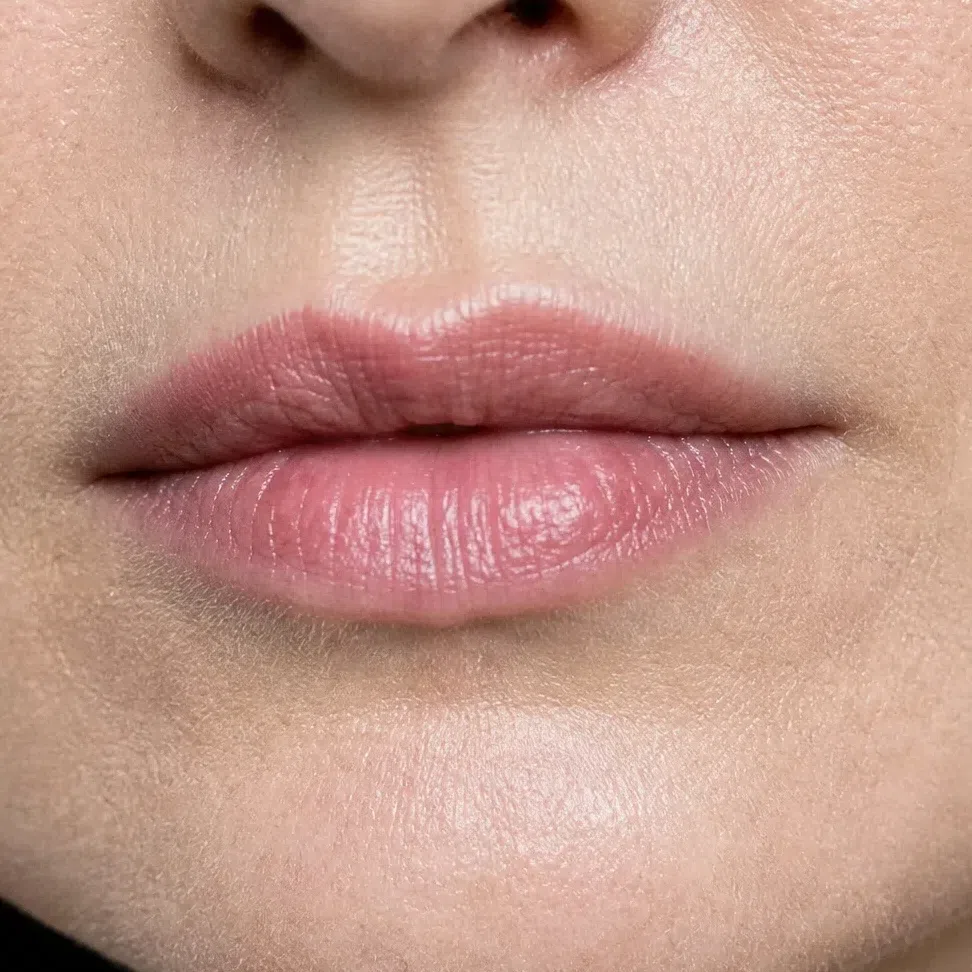
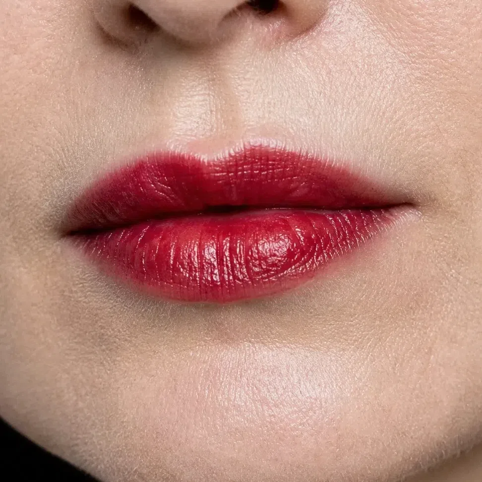 Leave the corner soft
Build through the middle
Lilac nude by day, magenta after dark. Clear pink-purple is a color this coloring carries better than almost any other.
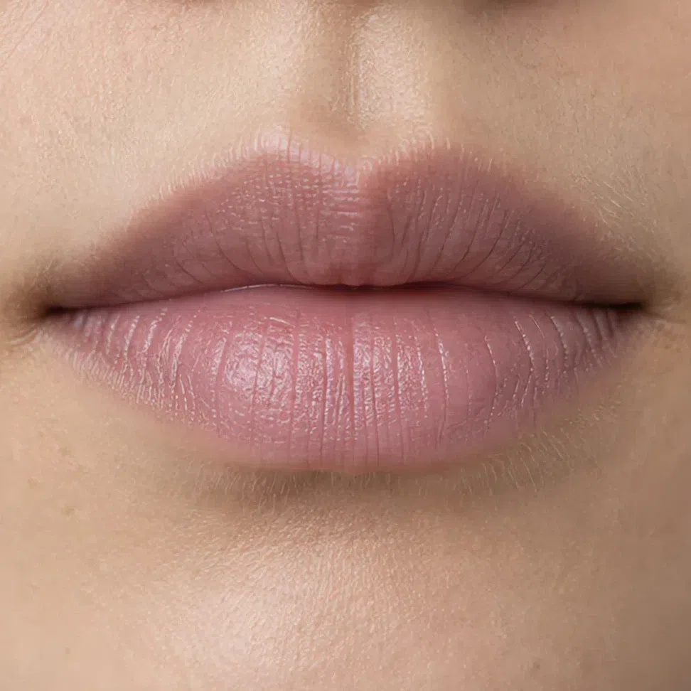
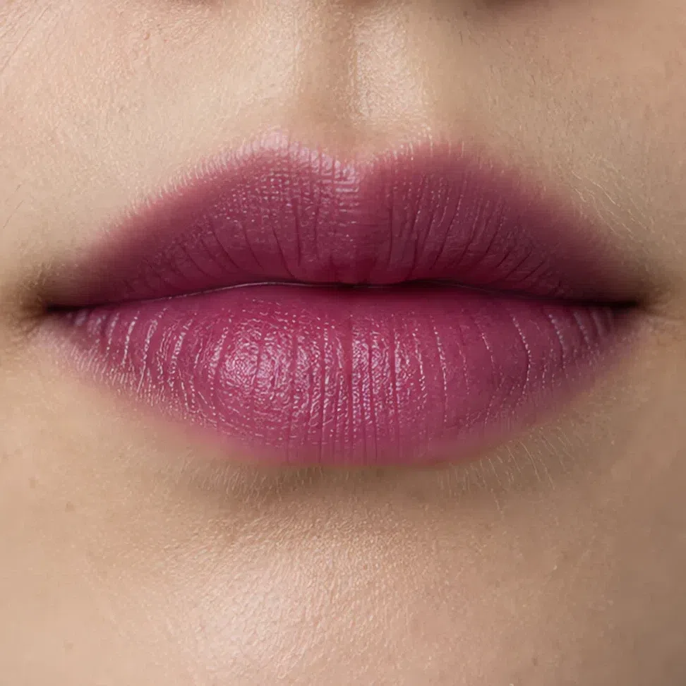 Leave the corner soft
Build through the middle
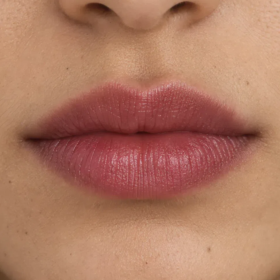
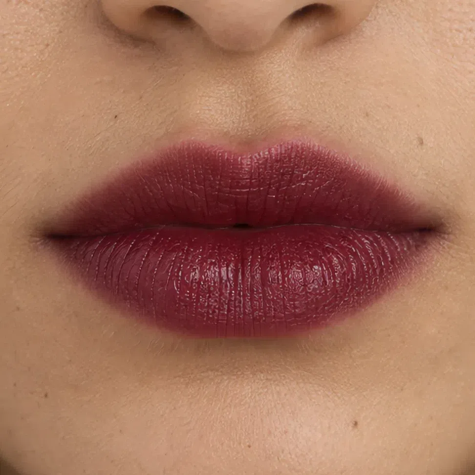
Berry tint by day, merlot after dark. A deep wine keeps the mouth strong without competing with a sapphire eye.
 Leave the corner soft
Build through the middle
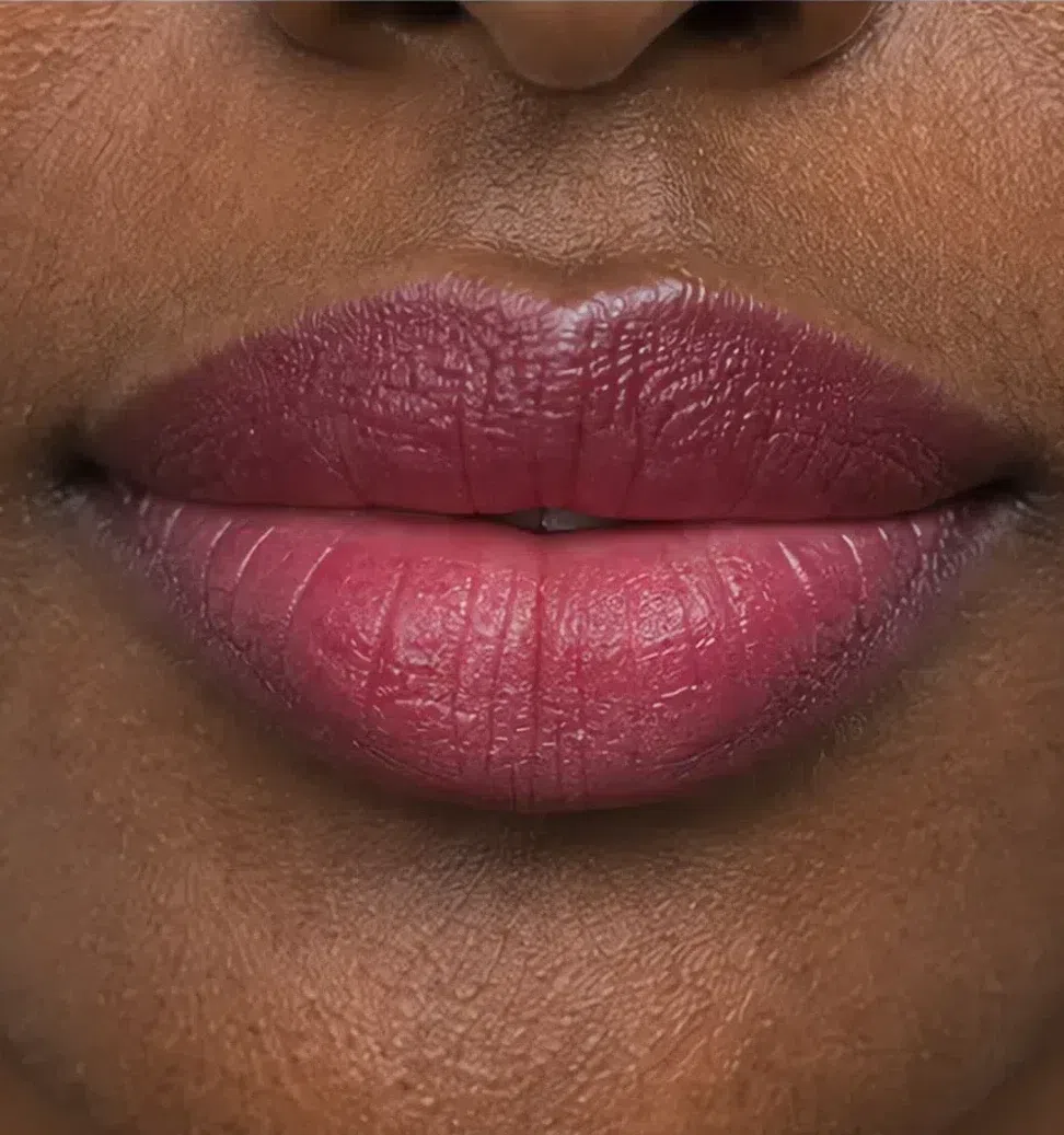
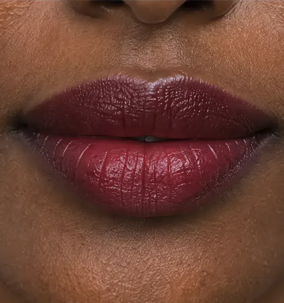
Raspberry by day, merlot after dark. For the biggest evening, blackberry at the end of the ladder is darker still and wears beautifully on deep cool skin.
 Leave the corner soft
Build through the middle
What must not change
It keeps the day shade. A jewel color edge to edge closes the eye instead of framing it.
Same shade, same amount. A strong lip plus a stronger cheek makes the face look painted.
Already dark and defined; darkening them further for the evening makes them the first thing people see.
Skip the extra powder. Flash turns a heavily powdered cool base gray, and the glow is what keeps a red lip looking fresh.
The short version: at night go deeper and brighter, never warmer. Whether a product does that depends partly on its color and partly on a detail the label hardly mentions.
Why the right shade can still look wrong
Often the finish. Every lipstick, shadow and base is a color plus a surface, and the surface - how much light comes off it, and whether that light is clear, white or gold - is almost never printed on the box. Below: one red, one mouth, four finishes.
One shade, four finishes
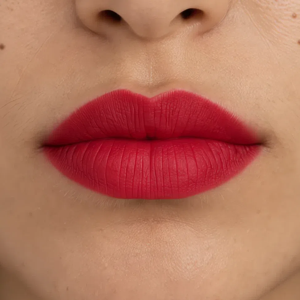
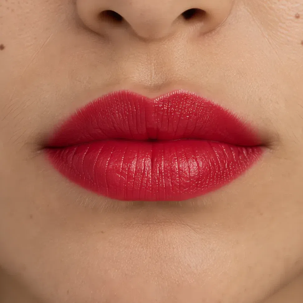
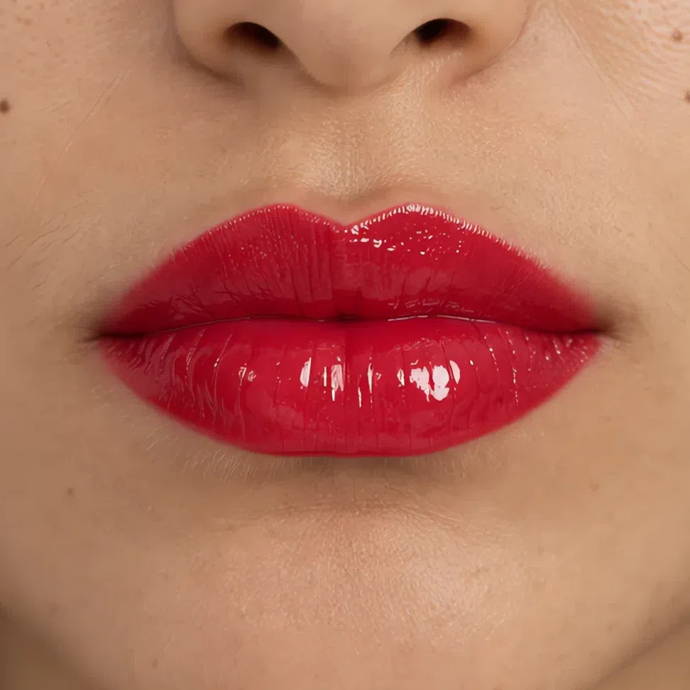
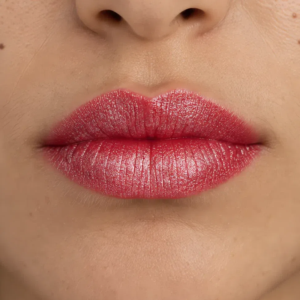
Two things change across those photographs. One is the specular highlight, the bright reflection off a smooth surface: matte returns none, satin spreads it softly, gloss concentrates it into a sharp point, and frost makes the whole lip shine.
The other is what the shine is made of, and on a Deep Winter it decides the verdict. A clear gloss adds light and nothing else, which suits a coloring defined by clarity. Silver and jewel-toned metallics are cool all the way through, so they belong here too. White pearl and gold shimmer are the problems: the first pales a deep shade, the second warms it. In a shop, check the flash under a lamp - silver or clear is yours, gold is not.
The same question, on skin
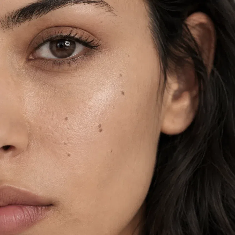
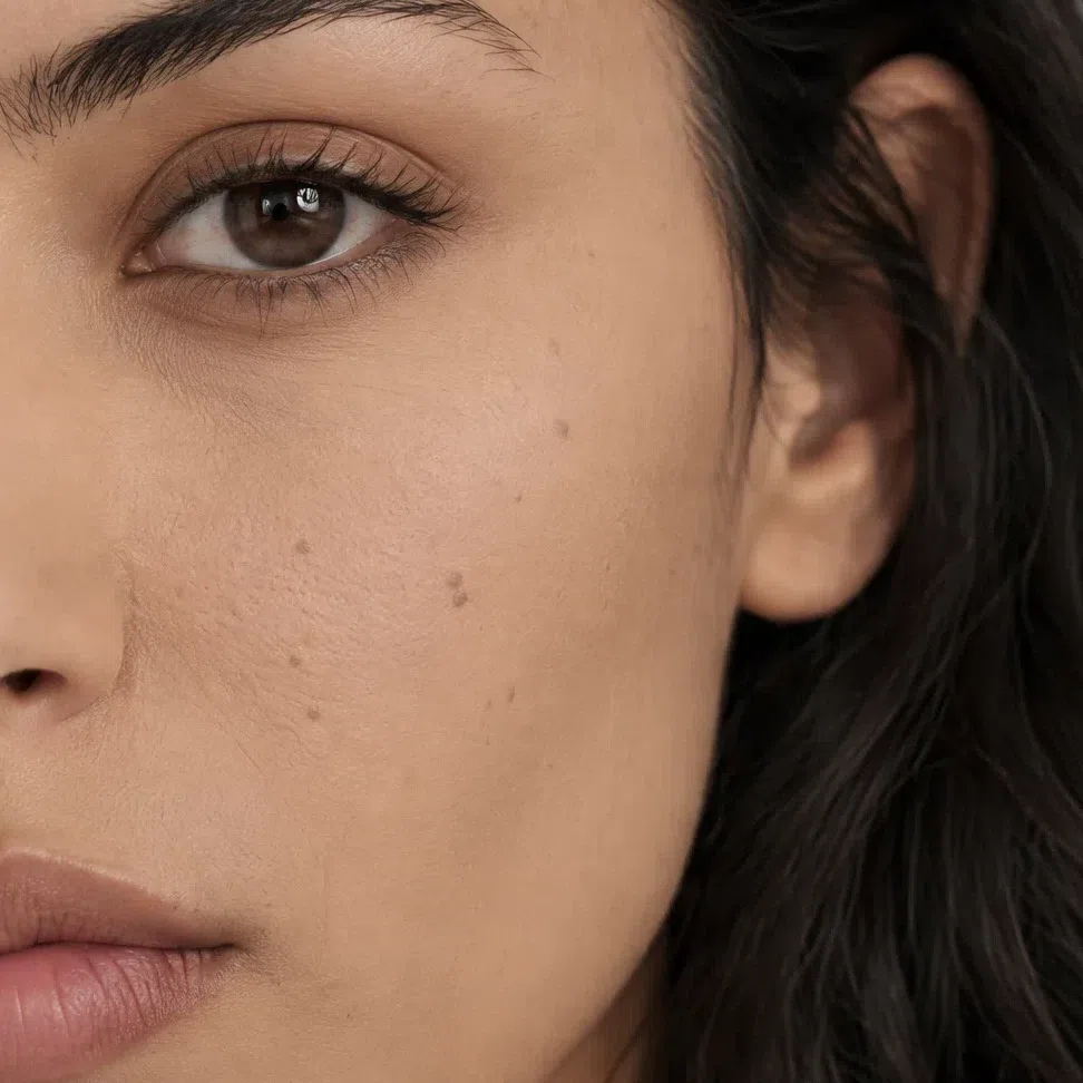
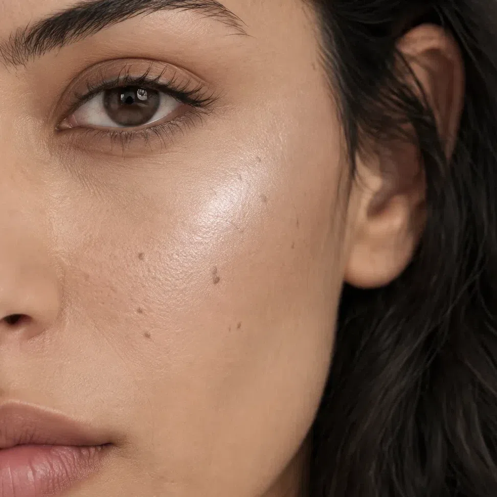
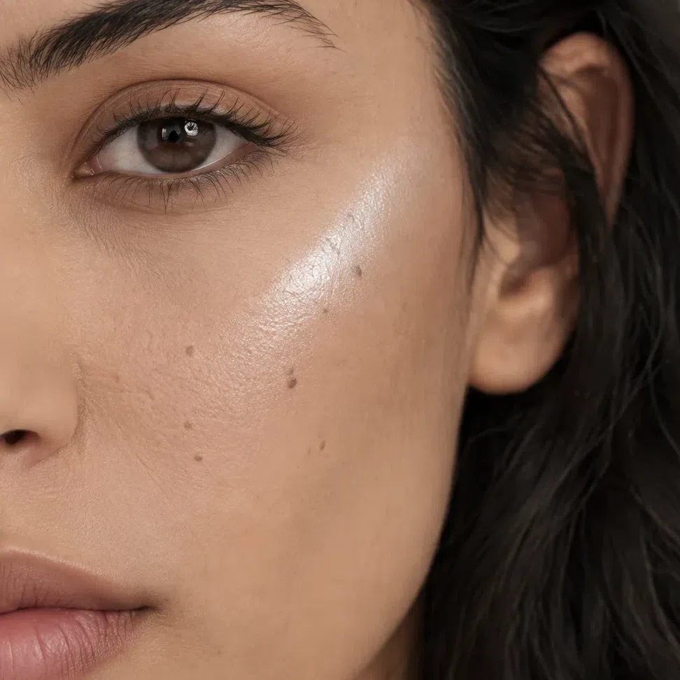
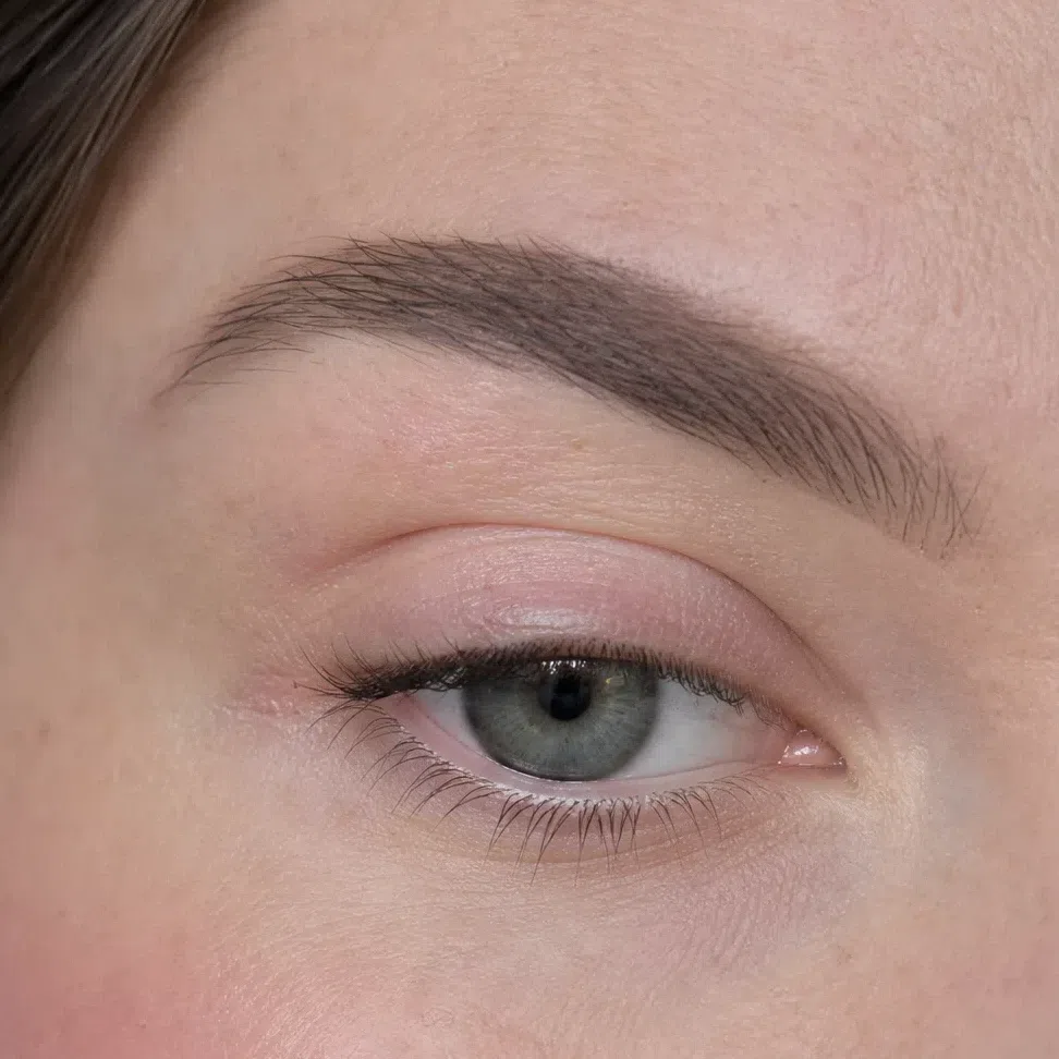
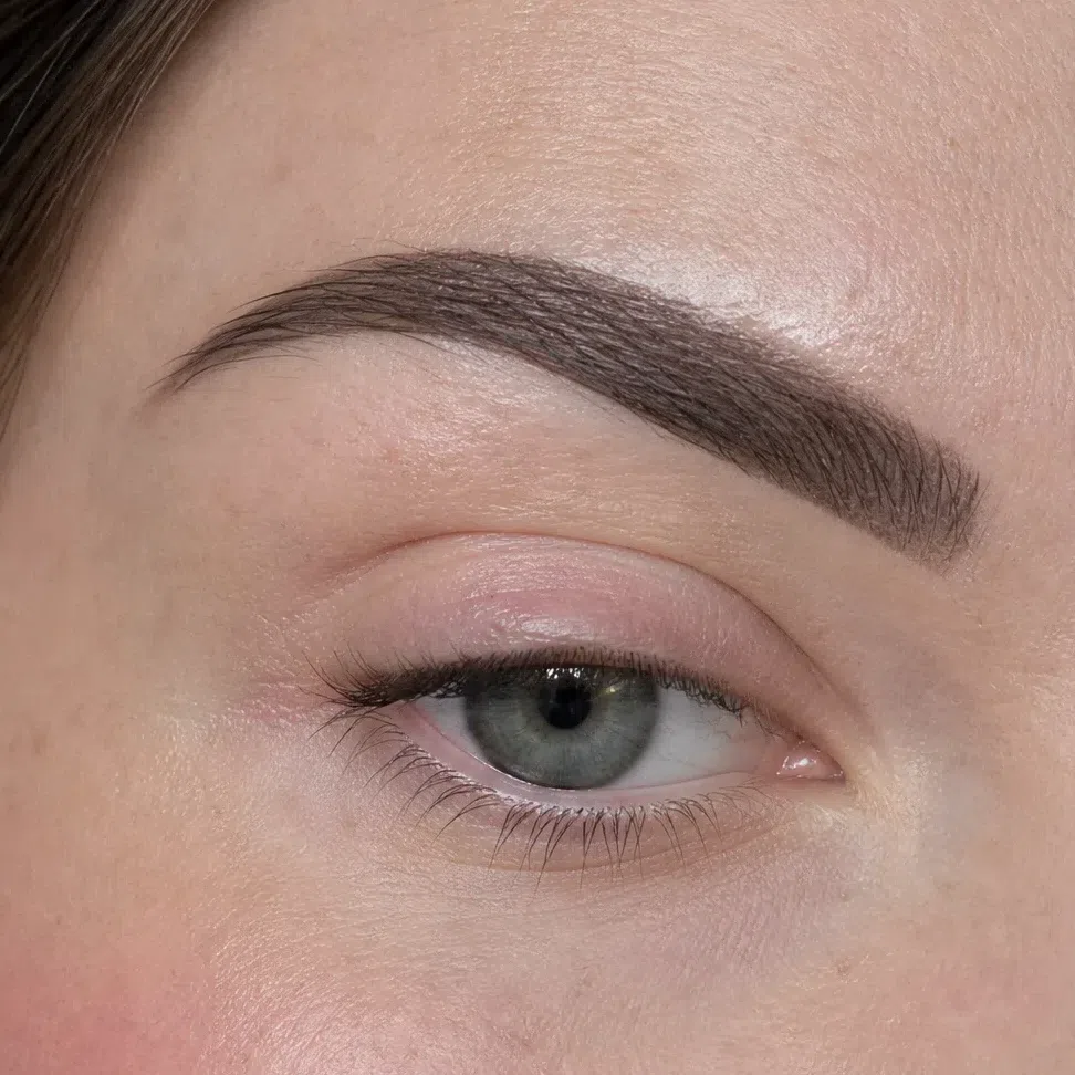
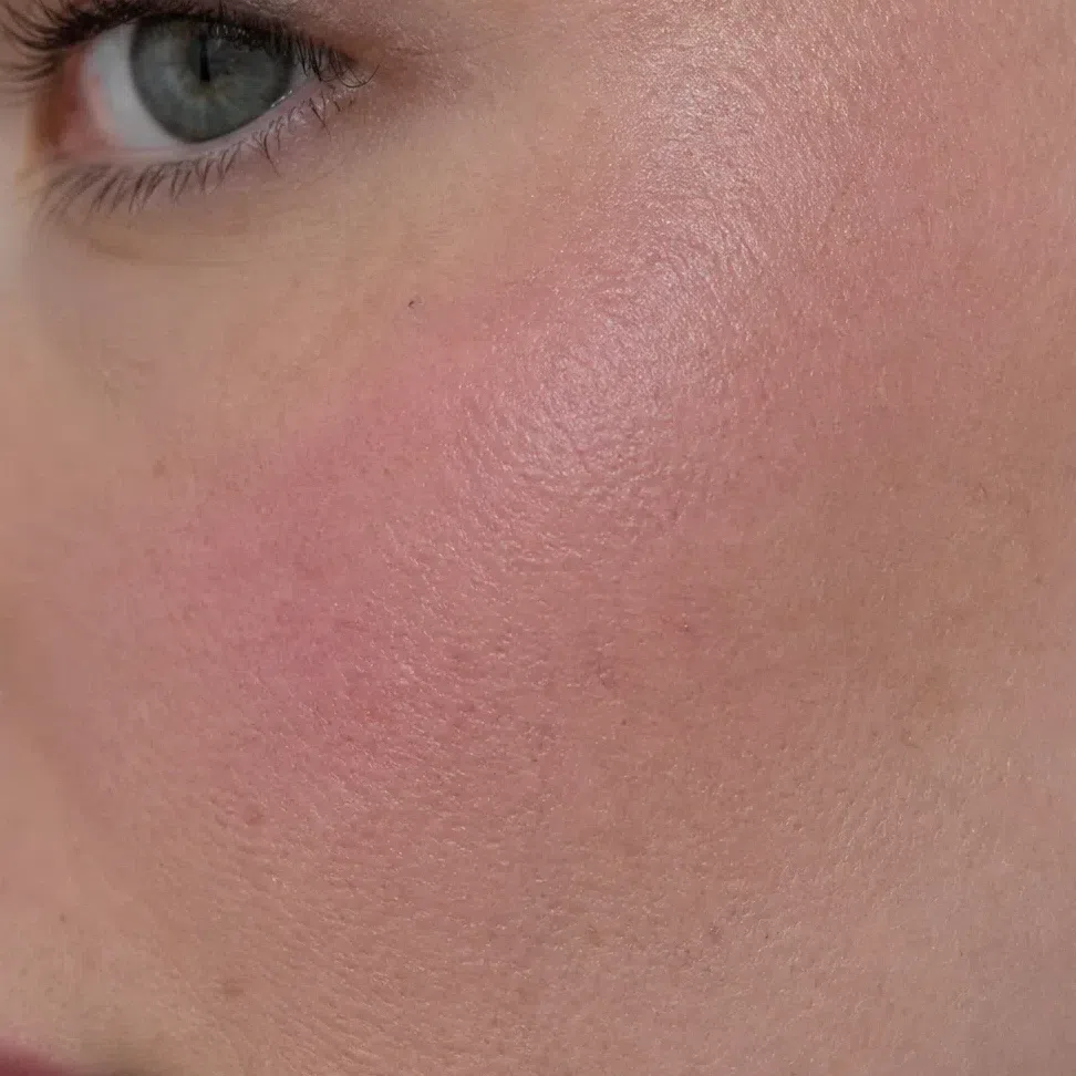
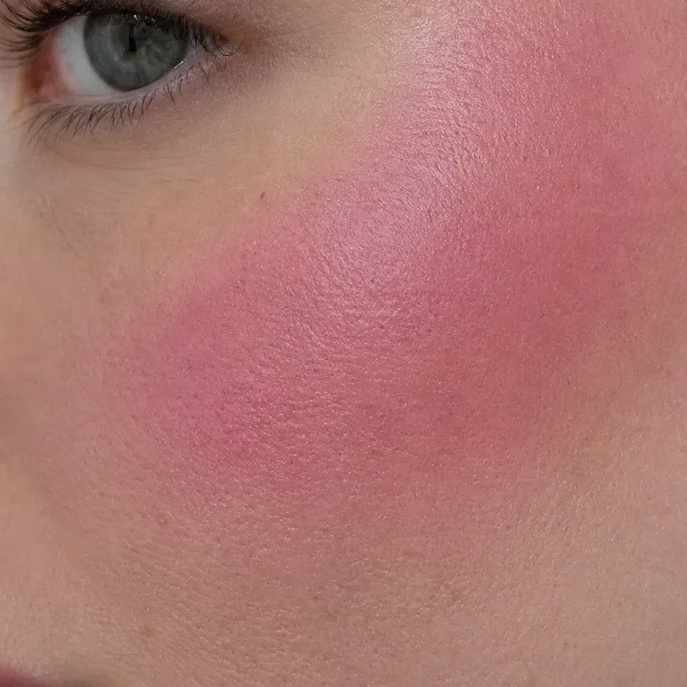
On a cheek a finish has more to do than on a lip, because skin has a texture of its own. In every pair, the photo on the left keeps it.
What that means, product by product
- Base
- Satin or natural, neutral-cool. Matte only where you shine.
- Blush
- Cream in rose, raspberry or cranberry; powder only on top of it.
- Eyeshadow
- Matte and satin by day; emerald, sapphire, amethyst and silver metallics at night. Skip gold and copper shimmer.
- Brows
- Powder or tinted gel in a cool shade matched to your hair. No waxy pencil.
- Lips
- Matte, satin or clear gloss - all three work. Never frost.
- Highlighter
- Silver, pink pearl or cool champagne, blended to no edge. Gold reads yellow.
Mattify the center of the face and stop there. A cool-toned setting powder on the forehead, nose and chin, the cheekbones left alone, and blotting papers during the day. Full matte everywhere takes away the clarity that makes the strong colors on this page look easy rather than harsh.
How to get the right one home
None of the shades above help unless the one you buy matches them. This part is the practical half: a test that works, the label words that give a warm product away, and why the swatch on the back of your hand proves nothing.
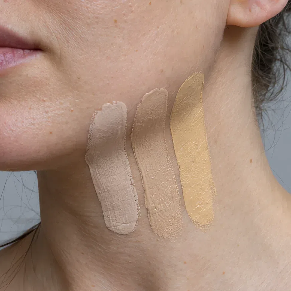
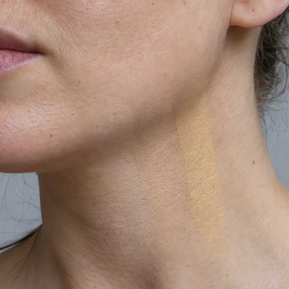
The jaw test
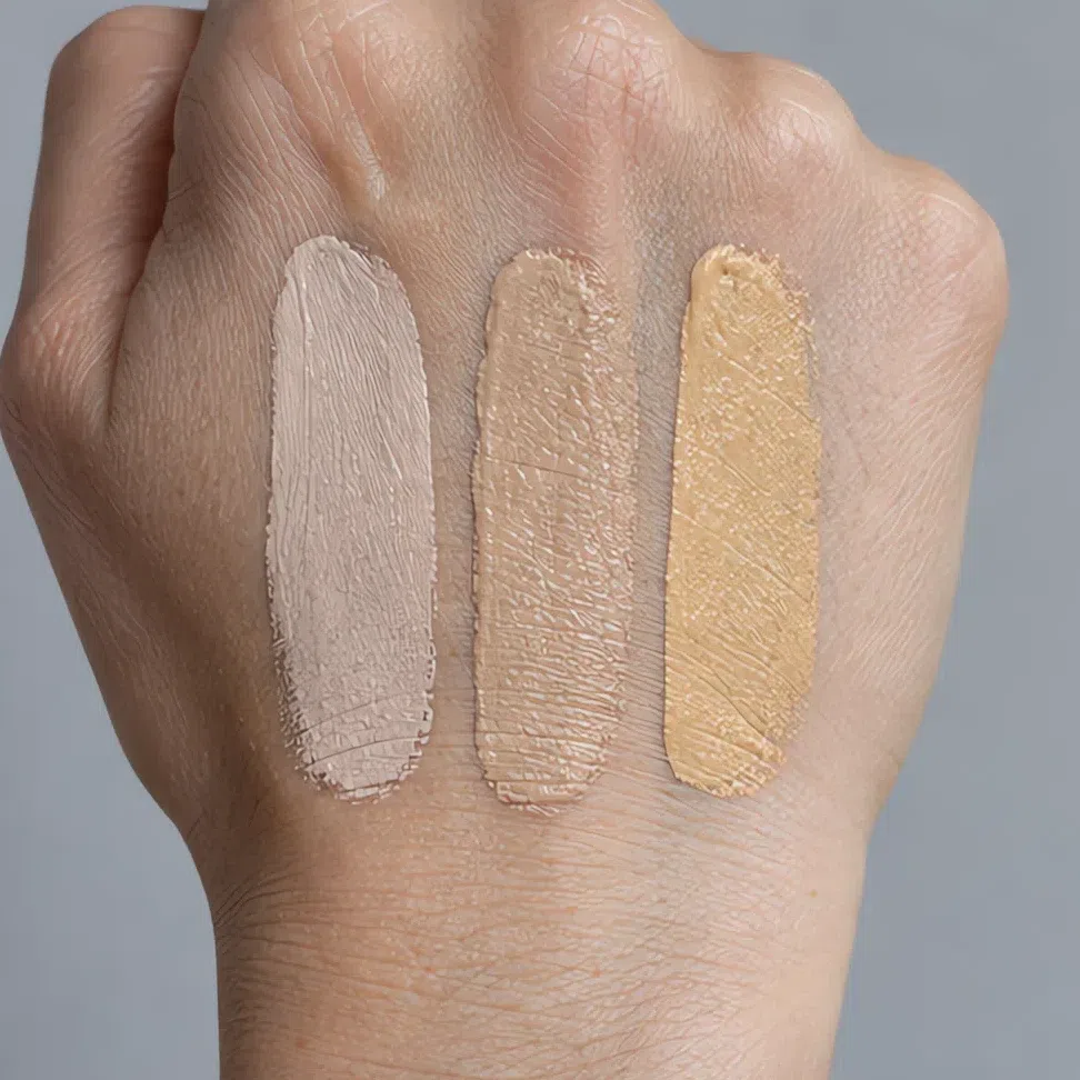
- Three candidate stripes, from the jawline down onto the neck. The wrist and the hand tell you nothing.
- Blend all three.
- Go to a window. Warm store light makes a golden base look neutral on cool skin.
- Buy the one that has gone - not the prettiest stripe, the one you cannot find.
Where you sit on the foundation grid
Behind every foundation shelf is a grid - depth from top to bottom, undertone from left to right - even when the display hides it. Here it is with only the Deep Winter squares outlined, on the cool side.
Whatever your depth, you ask for the same thing: a cool letter, at your own number. A porcelain Deep Winter and an espresso one want the same letter; only the number changes, so skip the shade names from campaigns and ask for your depth, cool.
Read the chart for what it is. The cool squares are this site’s values, not a brand’s; each range mixes its letters slightly differently and no depth number carries across brands, so the chart cannot hand you a shade to order unseen. The neutral, olive and golden squares are illustrations - your cool shade pushed warmer and named the way a shelf would name it. Neutral is the one maybe: many Deep Winters wear a neutral-cool base well, and the jaw test decides.
Reading a shade name
For a Deep Winter the trap is not the obviously warm words - most people skip "terracotta" without thinking. It is the soft defaults: natural, nude, beige, sand. In most ranges those lean golden, because golden is what the industry treats as neutral. Treat them as a question and let the jaw answer it. The words that carry coolness are the jewels and the berries: ruby, plum, wine, berry.
What the finish words on a label actually mean
- Satin, natural, second-skin
- The everyday answer for the base.
- Gloss, vinyl, lacquer
- Clear shine suits this coloring - on a crimson or a berry it looks crisp, not wet.
- Radiant, luminous, glow
- Check the flash: silver or pink pearl is yours, a golden glow is not.
- Metallic, foil, chrome
- Silver, sapphire or emerald foil on the lid is an evening signature; gold or copper foil is not.
- Frost, pearl-finish, iridescent
- Put it back. White pearl makes a deep color chalky.
Judging a swatch photo online
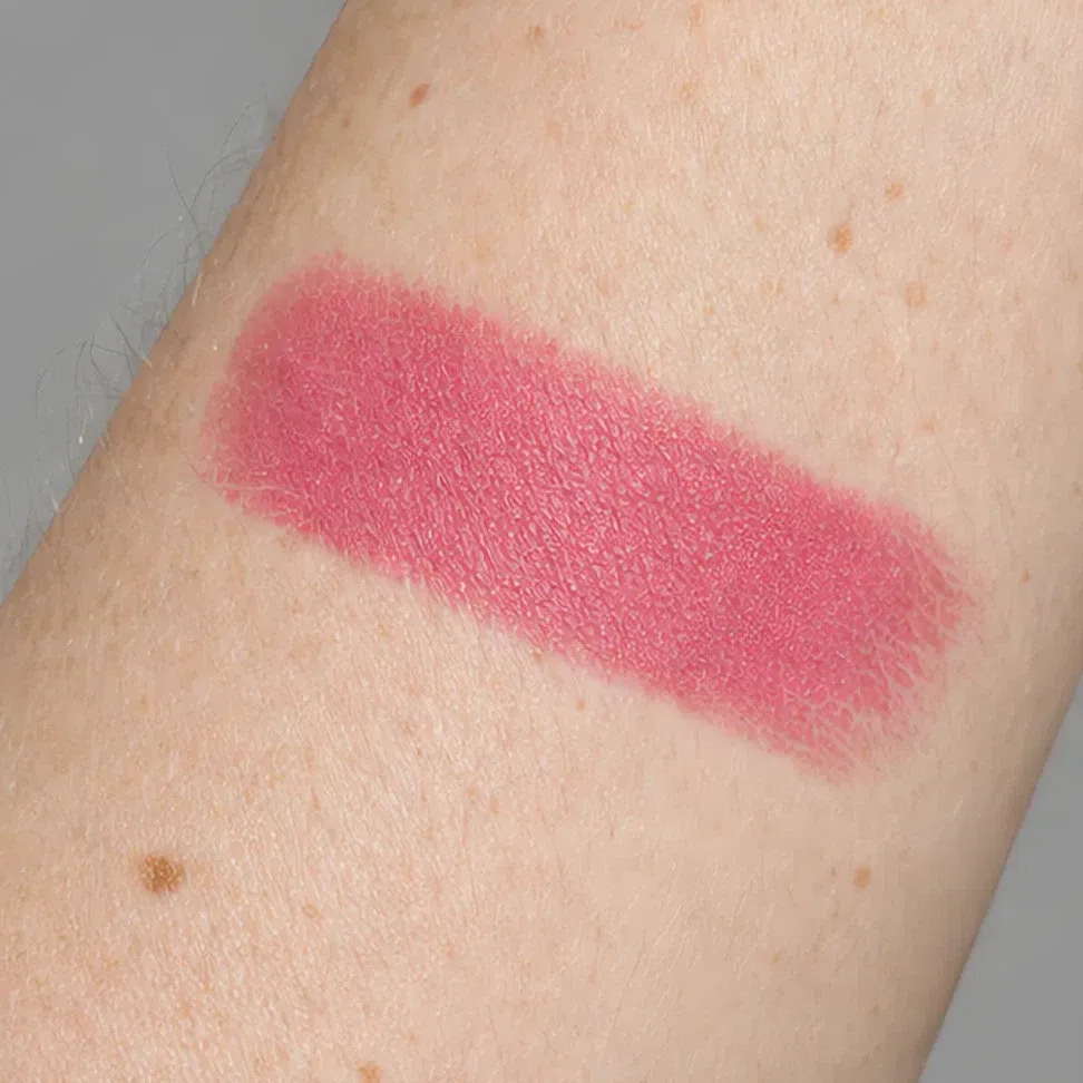
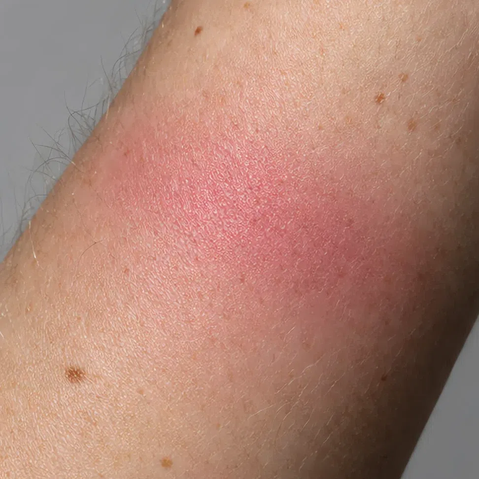
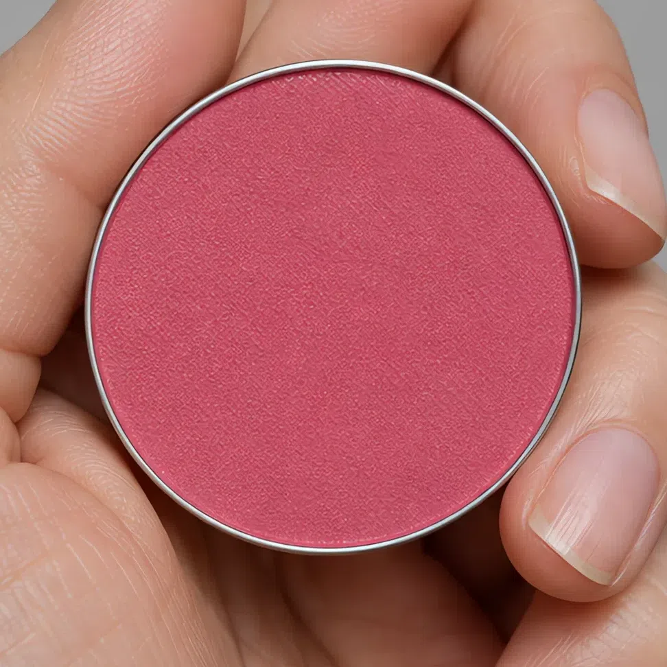
Product photos are lit bright, even and slightly warm, and that shifts exactly what a Deep Winter shops on: cool shades look softer than they are, warm ones look neutral, and a berry and a brick can pass for cousins. Prefer a swatch on skin to one in a pan, and a photo with a shadow across it to a flat one - the undertone shows where the light drops off.
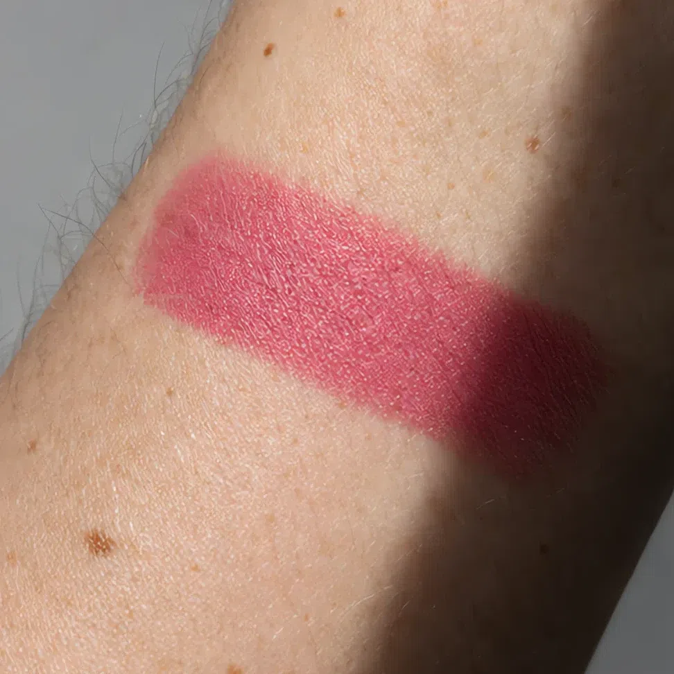
Lines are reformulated, renamed and discontinued every season, so a product list goes stale within months and each stale pick is money a reader spends. The hexes, the label words and the jaw test do not go out of date, and they work on brands launched after this page.
When it does not work
The shades, the order, the finishes and the shopping are covered. This is the troubleshooting part, for the day the face in the mirror looks wrong and you cannot point to the product that did it.
Two ways it goes wrong
You look sallow, or yellow-gray
- What it looks like
- The skin looks yellowish around the mouth and grayish under the eyes, and your teeth look less white than usual. The effect is strongest in daylight and in photos.
- Why
- Warmth has crept in: a golden foundation, an orange bronzer, a gold highlighter, a peach cheek, a copper lid. Cool skin next to golden makeup does not look warmer - it looks yellower by comparison, and the dark eyes and hair turn the difference up.
- Fix
- Cool it down, one product at a time, starting with the base. A neutral-cool foundation, a taupe contour instead of bronzer, silver or pink pearl instead of gold, rose instead of peach. The face should look clear, not sun-kissed.
You look washed out and tired
- What it looks like
- Everything is on and it barely shows. The face looks paler than it is, the mouth fades into it, and your hair and eyes are the only strong things in the picture.
- Why
- The makeup is pitched too light and too soft for this much contrast: a beige nude, a pastel pink cheek, a champagne lid, a brown liner. A Deep Winter face has near-black features, and makeup far lighter than them reads as nothing.
- Fix
- Go deeper and clearer, not warmer. A rosy mauve or berry tint instead of beige, raspberry on the cheek, graphite or plum on the lid, black liner. It looks strong in the pan and simply like you once it is on.
And the shades that never work
Every swatch below misses for one of three reasons, written on its tag. Understand the three and the list is no longer necessary: any product you pick up will show which of them it is making.
Base and glow
- Yellow-golden base warm
- Base a shade too light pale
- Orange bronzer warm
- Gold highlighter warm
Cheeks
- Peach blush warm
- Coral blush warm
- Pastel baby pink pale
- Dusty mauve-brown dull
Eyes
- Copper shimmer warm
- Brown liner warm
- Soft khaki dull
- Pale champagne-beige lid pale
Lips
- Beige nude pale
- Orange-red warm
- Muted brick dull
- Peachy-pink gloss pale
Why each one fails
- warmToo warm
- Golden, orange, peach, coral, copper, bronze. The most common miss on this coloring, because warm makeup is what most ranges treat as neutral. On cool skin it reads yellow.
- paleToo pale
- Beige nudes, pastels, champagne, anything "barely there". Against near-black hair and eyes, makeup this light does not look natural; it looks like the face has lost its color.
- dullToo muted
- Dusty mauve-brown, khaki, muted brick. This coloring is clear as well as deep, and a grayed or dusty shade looks tired next to eyes this bright.
The tags carry the section; each swatch just shows a mistake, and its hex is an example rather than a measured product. If the warm swatches suit you better than this page predicts, read Deep Autumn, the warm neighbor at the same depth. If the soft, muted ones do, look at Soft Summer.
Your shades, in one block
Every one of the 44 shades on a single screen, ready to screenshot for the makeup counter. Foundation, contour and highlighter are chosen by depth: pick your row and stop. The rest run from the fairest Deep Winter at the left end of each row to the deepest at the right, and your shade is somewhere between.
Base: foundation, bronzer, glow and blush
- Fair - porcelain ivory Fair #EDDCCB
- Light - cool sand Light #CBAE92
- Medium - neutral tan Medium #A88763
- Deep - cool espresso Deep #5E4336
- Fair - soft taupe Fair #A8958A
- Light - cool taupe Light #8C7566
- Medium - gray-brown Medium #7A6A5E
- Deep - cocoa taupe Deep #4E3E36
- Fair - icy silver Fair #E3E6EC
- Light - pink pearl Light #F0D9DC
- Medium - cool champagne Medium #EDE0CE
- Deep - rose-plum pearl Deep #C79AAE
- Cool rose blush #D08094
- Plum stain #9C6480
- Raspberry #B24A6E
- Cranberry #A33050
Eyes: shadow, liner, mascara, brows
- Rosy mauve #B98F94
- Taupe shadow #8E8177
- Matte plum #6B4A5E
- Graphite #4A4A50
- Emerald shimmer #1F6B52
- Amethyst shimmer #6B4A8C
- Sapphire metallic #24457F
- Silver smoke #3A3A42
- Graphite #4A4A50
- Plum ink #4C2B44
- Midnight #1B2A4A
- Jet black #141414
- Graphite #4A4A50
- Plum ink #4C2B44
- Midnight #1B2A4A
- Jet black #141414
- Taupe brown brow #6B5A50
- Cool ash brow #574A44
- Cool espresso #3E2A25
- Dark graphite brow #2A2A30
Lips: nudes and color
- Rosy mauve #B98F94
- Lilac nude #A87C9E
- Berry tint #BE6A86
- Raspberry #B24A6E
- Crimson #DC143C
- Magenta #D10056
- Merlot #800020
- Blackberry #582141
Three rows are colors rather than depths. Eyeliner and mascara each come in graphite, plum ink, midnight and jet black, and any complexion can wear any of them; jet black is the everyday pick for both. Brows track the hair, not the skin - take the cool shade nearest your own brows, taupe brown to dark graphite. The contour shades are cool taupes, not bronzers. For the base on four real faces and the clothing colors behind this list, go to the palette page. The full Deep Winter palette →
Questions people ask
What is the best makeup for a Deep Winter?
What lipstick colors suit a Deep Winter?
What is the best blush for a Deep Winter?
Is Dark Winter makeup the same as Deep Winter makeup?
What does natural makeup look like on a Deep Winter?
Should a Deep Winter wear silver or gold highlighter?
Deep Winter or Deep Autumn makeup - what is the difference?
What makeup should a Deep Winter avoid?
Which brands make Deep Winter makeup?
Where this came from
Six sources and what each one supports: that makeup works through facial contrast and that the right amount depends on the face; what a flush is; why depth and undertone are separate things a base must match; how gloss is seen; and why store lighting hides a golden foundation.
-
Aspects of facial contrast decrease with age and are cues for age perception (opens in a new tab)
Porcheron, Mauger & Russell, PLoS ONE, 2013
Behind the idea this page rests on. Facial contrast - how far the eyes, brows and mouth stand out from the skin - can be measured, makeup raises it, and people read it as a cue to age. A Deep Winter face has the highest natural contrast of any coloring. That is why a black line and a crimson lip look natural here, and why a beige nude, which lowers contrast, makes the face look tired.
-
Differential effects of makeup on perceived age (opens in a new tab)
Russell, Batres, Courrèges et al., British Journal of Psychology, 2019
Behind you look washed out and tired and its mirror image. In controlled photographs, makeup made women in their forties and fifties look younger and women of twenty look older. The contrast a face carries is the yardstick: this coloring needs more than most before it reads as made up, and less than that reads as pale.
-
Skin blood perfusion and oxygenation colour affect perceived human health (opens in a new tab)
Stephen, Coetzee, Law Smith & Perrett, PLoS ONE, 2009
Behind the cheeks step. Asked to make a face look as healthy as possible, people add the color of oxygenated blood under the skin. On cool skin that flush is rose or berry, which is why raspberry and cranberry read as color from inside and a peach or coral reads as an orange patch.
-
Non-invasive measurements of skin pigmentation in situ (opens in a new tab)
Stamatas, Zmudzka, Kollias & Beer, Pigment Cell Research, 2004
Behind the two axes of the shade grid. Skin color carries two signals: melanin sets the depth - your row - and hemoglobin adds its own, and the two have to be separated to measure either. That is why a cool undertone is a column you pick, and why a darker golden shade never fixes a yellow cast.
-
The dark side of gloss (opens in a new tab)
Kim, Marlow & Anderson, Nature Neuroscience, 2012
Behind finishes. We read gloss from specular highlights and their dark counterparts, and the effect disappears when they are blurred. A clear coloring suits a crisp highlight: gloss and metallic lids add brightness without muddying the color, while a blurring powder does the opposite.
-
CIE 13.3-1995: Method of measuring and specifying colour rendering properties of light sources (opens in a new tab)
International Commission on Illumination (CIE), 1995
Behind the jaw test in how to shop. Light sources are rated on how faithfully they render the colors under them, and shop lighting rates low. Warm store light makes a golden foundation look neutral on cool skin, so the test belongs at a window.
Where the line falls. The contrast research, the skin biology, the gloss perception and the lighting standard above are sourced. Which shades belong to a Deep Winter, which suits which depth, and where strong turns into harsh for this coloring are our own analysis, built from the palette on the parent page. No study covers that, and we would rather say so than borrow a citation that does not.