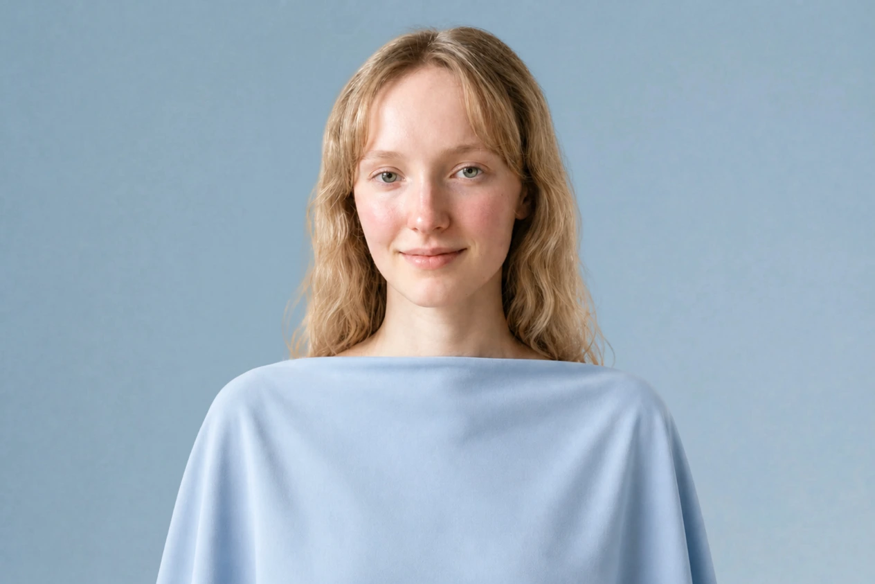
Light Summer color palette: the shades, the clothes, the hair color
Of the three summers, Light Summer is the one that runs on lightness. Hair, skin and eyes all sit high on the value scale and close together, so depth and vividness both arrive as intruders. Below: the whole palette, the shades that wash you out, and the two checks that separate you from Light Spring and Soft Summer.
See the Light Summer palette on a real face
Every shade here is light before it is anything else, and cool second. The neutrals stand in for black without ever going dark, the pastels sit almost as light as her skin, and one mid blue does the job a deep shade does on other seasons. Tap each circle and keep your eye on her skin, not on the top: pale shades hand her back her own coloring, while anything carrying weight takes over the frame and leaves her drained above it.

Light Summer in 30 seconds
Light Summer is the lightest of the three summers, and lightness is the whole point: cool in temperature, soft in saturation, and low enough in contrast that hair, skin and eyes read as one gentle wash. The Light Summer color palette never leaves the pale end - chalk, heather, peony, powder blue - and silver settles on this skin where gold argues with it.
| Skin | Very light and porcelain, cool pink undertone. Burns rather than tans; freckles come up ashy. |
|---|---|
| Eyes | Light blue, gray-green or plain gray - watercolor irises with a soft, unringed edge. |
| Hair | Light ash blond through mousy mid brown, ashy at every level, never gold. |
| Contrast | Very low - every feature sits high on the value scale, close to its neighbors. |
| Metal | Silver, platinum, white gold - and if gold, only the palest champagne. |
Wardrobe base:
Wear with care:
Lightness is the requirement, not softness - a shade can be perfectly muted and still sit too deep for this face. If Soft Summer or Light Spring is still on the table, a photo settles it in a minute.
How to know if Light Summer is your season
Five signs, and how to read each one
Most people arrive here by elimination. Pastels get compliments, black feels like it is wearing you rather than the other way round, and every shade sold as a universal bright seems to take the room over. Light Summer is what that pattern usually means: a cool coloring pitched high on the value scale, with no dark note anywhere in it. Below are five checks, ordered so the ones that settle the most come first.
The word light describes the palette and the contrast, not the depth of your skin - Light Summers occur at every complexion depth, and what they share is a cool undertone, plus hair, eyes and skin that stay close together near the top of their own range.
11. Skin: cool underneath, and quick to flush
Skin is where this season is won or lost, and the question is never how pale it is - it is what color is running underneath.
Whatever its depth, this complexion reads cool or neutral-cool: pink, rose-beige or rosy-taupe under the surface rather than gold, bronze or warm peach. The finish is matte and fine, and it tends to look even until something disturbs it.
Then it flushes, and it flushes fast - a change of temperature, a flight of stairs, a moment of embarrassment. The color that comes up is pink, never a warm apricot, and on deeper skin it shows as a deepening across the cheeks and nose rather than as visible redness.
Sun tends to give this skin color reluctantly and irritation readily. Freckles and small marks, where they appear, come up ashy or gray-brown rather than coppery - which is a more reliable tell than the freckles themselves, because plenty of seasons freckle.
Three ways to read your undertone
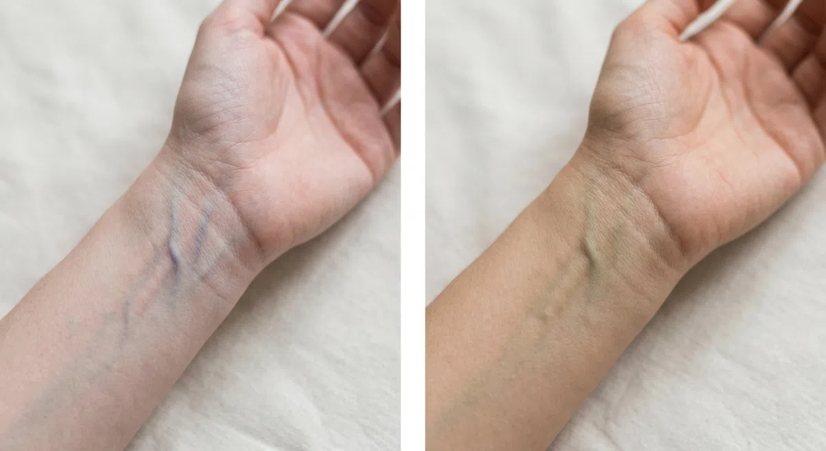
Turn your forearm over at a window and look at the inside of the wrist. Do it in daylight - an incandescent bulb tints the answer yellow, a cold LED tints it blue. Read the vessels as a group; any single one of them tells you nothing.
- Blue or violet - a cool undertone, which is this season and the other cool ones.
- Green or olive - warm. Autumn and Spring are where to look instead.
- Honestly cannot tell - probably neutral, and the two tests below will decide it.

Take off makeup, push your hair back off the face, and at a window bring a clean sheet of paper up under the chin. It has to be a true white - cream or ivory stock is warm on its own account and will hand you the wrong answer.
- Skin turns pink, rosy or faintly blue - cool, and this is the result you are looking for.
- A gold or peach cast appears - warm undertone.
- Skin flattens toward gray - usually neutral, often with a slight olive note.
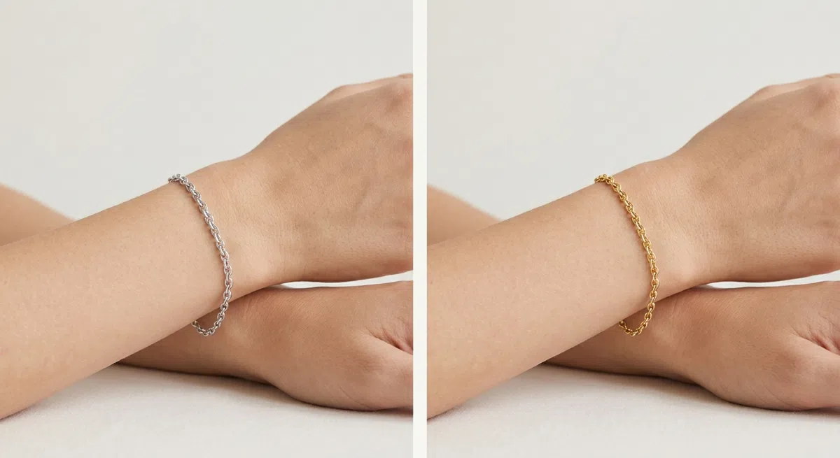
Lay a silver piece against bare skin, then a gold one, one after the other in daylight, on skin with no shimmer product on it. Watch what happens to the skin next to each piece rather than to the piece, and ask which one leaves it looking more even.
- Silver wins - cool. The skin next to it looks clearer and more even.
- Gold wins - warm, and this is not your season.
- Both look fine - neutral. Go with what the first two tests said.
If the paper and the metal agree on cool, you are done with Autumn and Spring. Everything left on this page is about which of the cool seasons you are.
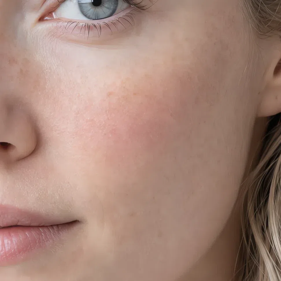
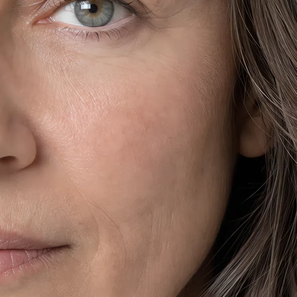
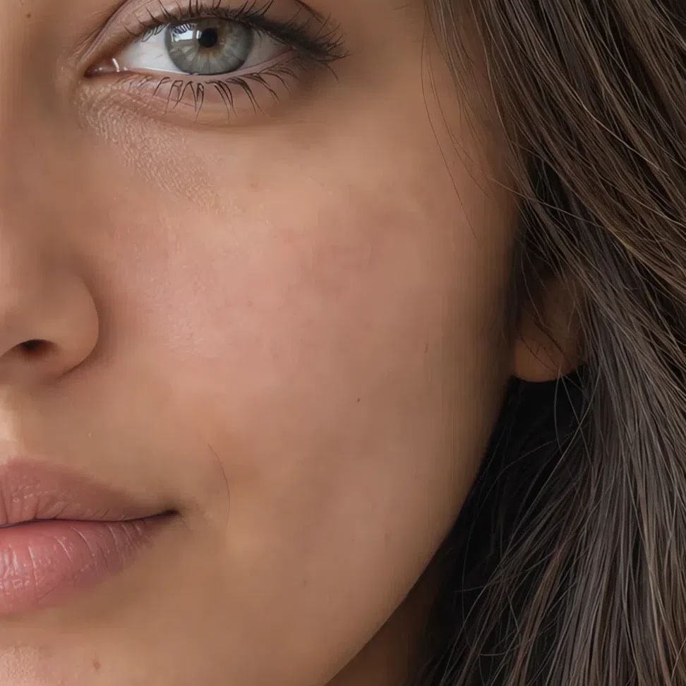
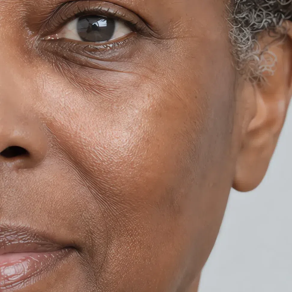
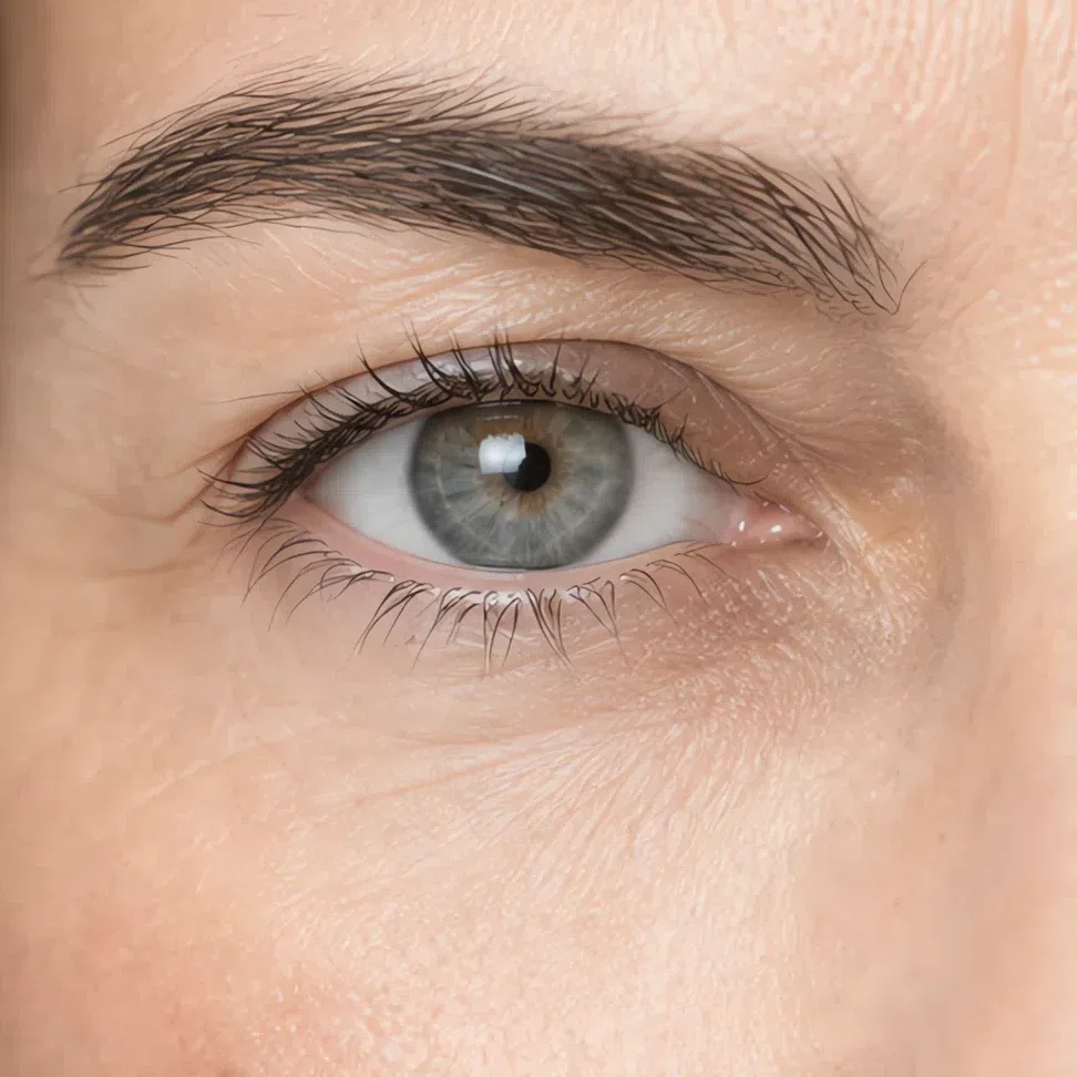
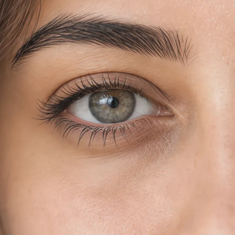
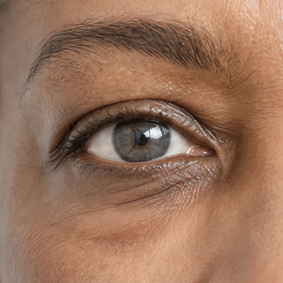
22. Eyes: light, and painted in watercolor
These eyes are never dark and never piercing. Whatever the color, it arrives softened.
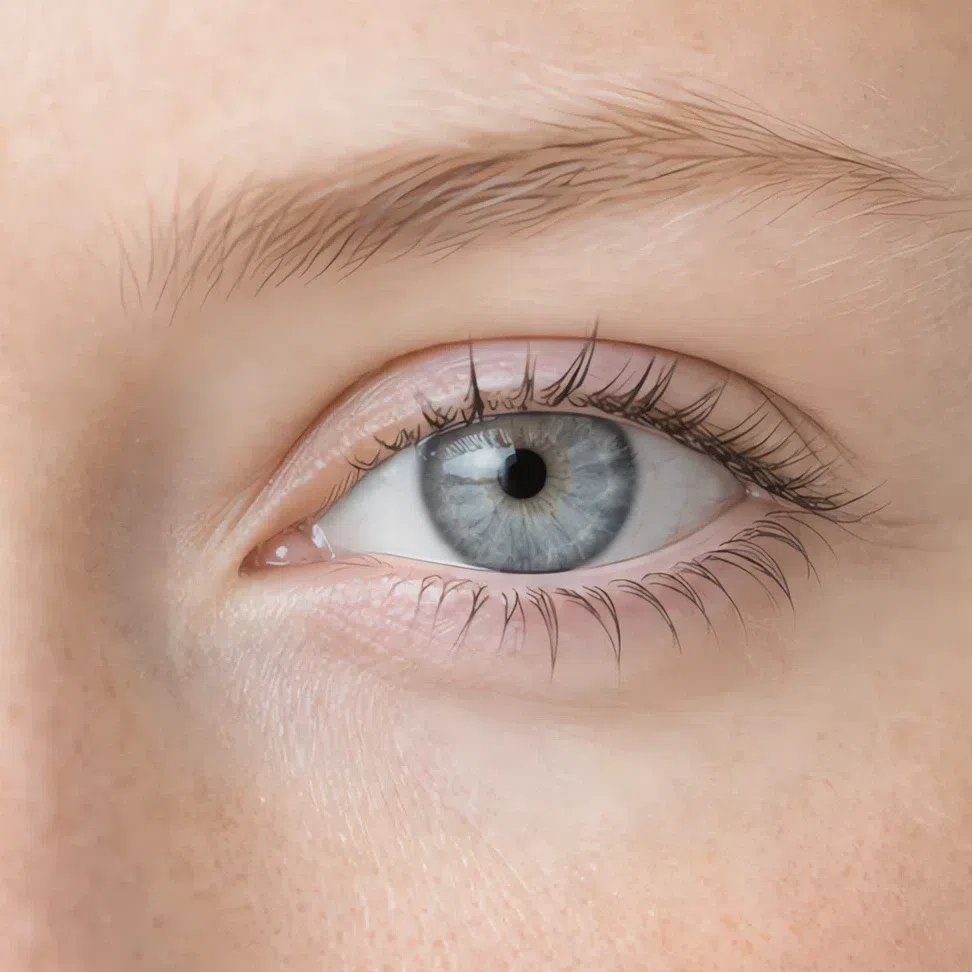
The usual range is gray-blue, watery green, plain light gray and a cool gray-hazel. What they have in common is not the hue but the handling: the pattern in the iris is blurred rather than spoked, and the ring around its outer edge is soft or missing entirely, so the color fades into the white instead of stopping at a line.
The white itself is worth a look. On this coloring it reads slightly milky rather than clinically bright, which is part of why the whole eye seems veiled. The gaze that results is calm and a little distant - it has none of the glitter a Spring eye has, and none of a Winter's edge.
One more habit: the color moves. The same eye reads gray against one top and green against another, and that instability is itself a sign. A stable, saturated eye color that holds no matter what you wear belongs to a clearer season.
Light brown eyes are possible here, and they are the case people get wrong. They work only when the brown is light and carries a gray or ashy cast, with no golden flecks firing in it.
Ask whether your eye color is easy to name. If you have to hedge - greyish, greenish, depends on the day - that hedge is the diagnosis.
33. Hair: ash at every level, and light for its depth
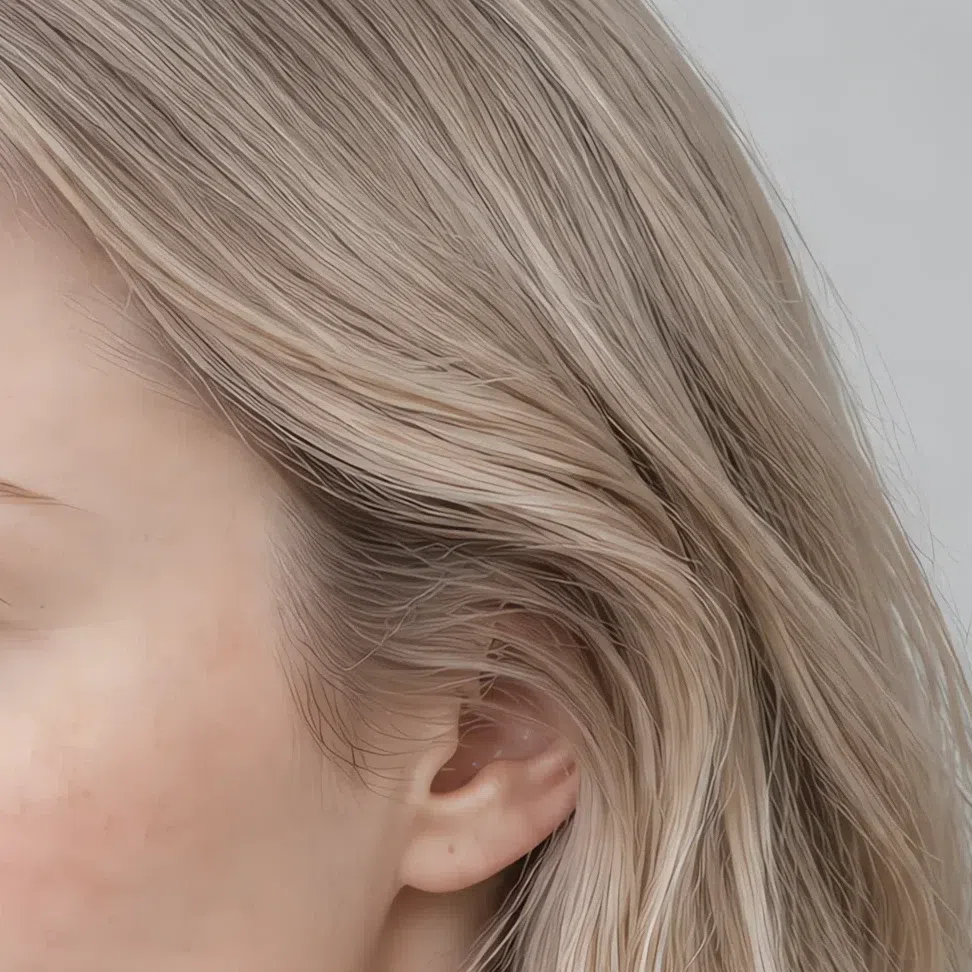
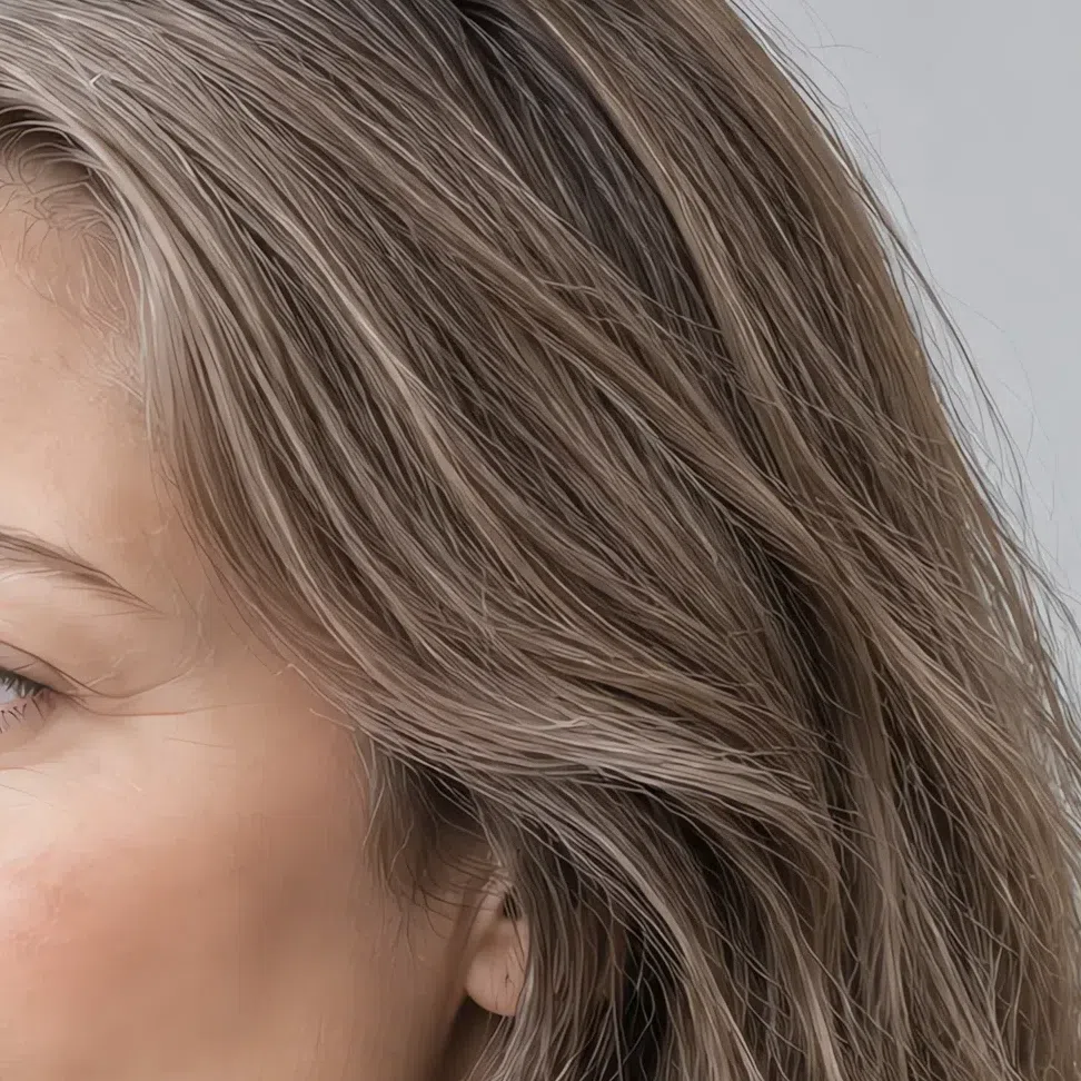
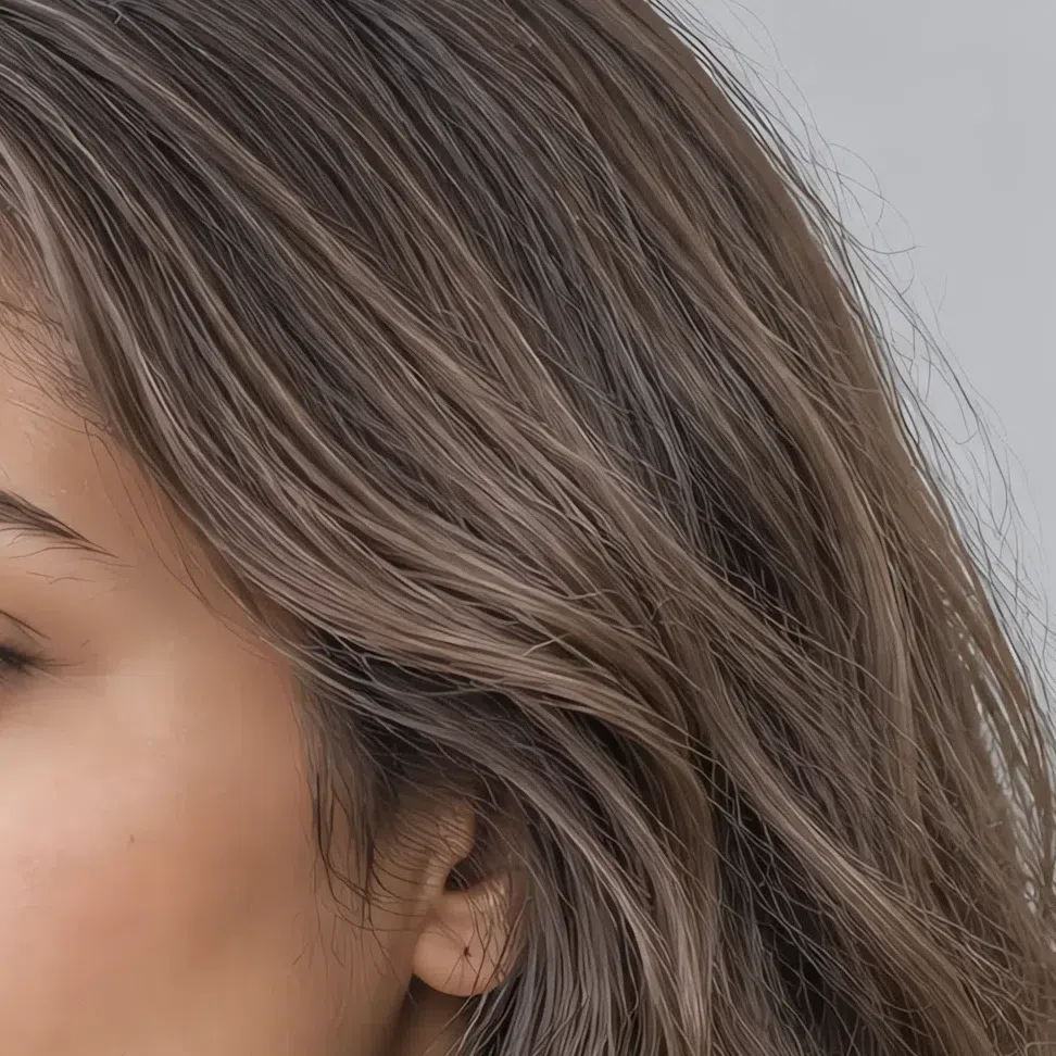
Natural hair here runs from a light ash blonde to a mid mousy brown, and the pigment underneath it is cool at every point on that range.
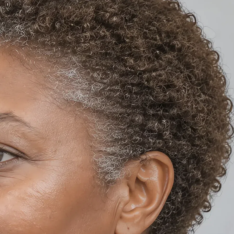
The shade most people report is the one they apologise for: mousy. A brown with no red and no gold in it, often dismissed as drab, which is the single most common natural Light Summer color and the one the palette is built to flatter. At deeper complexions the same rule holds a step or two down - a cool brown that stays clearly short of black.
Texture is frequently fine and dense at once. In summer it lifts to a wheat or sand tone, and the lifted pieces stay cool - that is the tell, because hair that goes brassy or coppery in the sun was carrying warm pigment all along.
The salon is where this season is most often lost. Honey, caramel, copper and toffee are the shades a colorist reaches for to make mousy hair look expensive, and every one of them puts warmth beside a face that has none. The result is a head of hair that looks well done and a complexion that looks tired, and because the two changed at once the blame usually lands on the wrong one. Ask for cool, ashy and no more than two levels away from where you started.
Going quite dark blonde or light brown as an adult after being nearly white-blonde as a child is ordinary here. Depth changes with age; the cool pigment underneath does not, and it is the pigment that decides the season.
Judge the undertone, not the level. Ash at any depth belongs here; warmth at any depth does not.
44. Contrast: everything at nearly the same level
This is the sign that separates Light Summer from the seasons it gets confused with, and it is about relationships rather than colors.
Put hair, skin and eyes side by side and there is no step between them. Nothing in the face is much darker than anything else, so the features flow into one another instead of being drawn against each other. Brows and lashes join in - typically only a shade or so deeper than the hair, which removes the last hard line a face can have.
That is the mechanism behind everything the palette asks of you. A very dark or very saturated garment introduces a level of contrast your face has nowhere to answer, so the eye reads the clothing first and the person second. Beside it the face looks drained and every shadow on it looks deeper.
It also explains the compliment pattern. Nuance and half-tones look deliberate on you because they match a face already built out of them.
If the grayscale photo has a genuinely dark area in it - hair, brows, lashes - you are looking at a deeper season, however cool your undertone turned out to be.
- Turn a photo of yourself grayscale. Take one in daylight with no makeup, then drop the color out of it. Read the extremes: if there is no near-white patch and no near-black patch, and the whole image sits in a narrow band of mid and light grays, your contrast is low. Light Summer sits in that band with the band itself pushed high - light grays rather than middle ones.

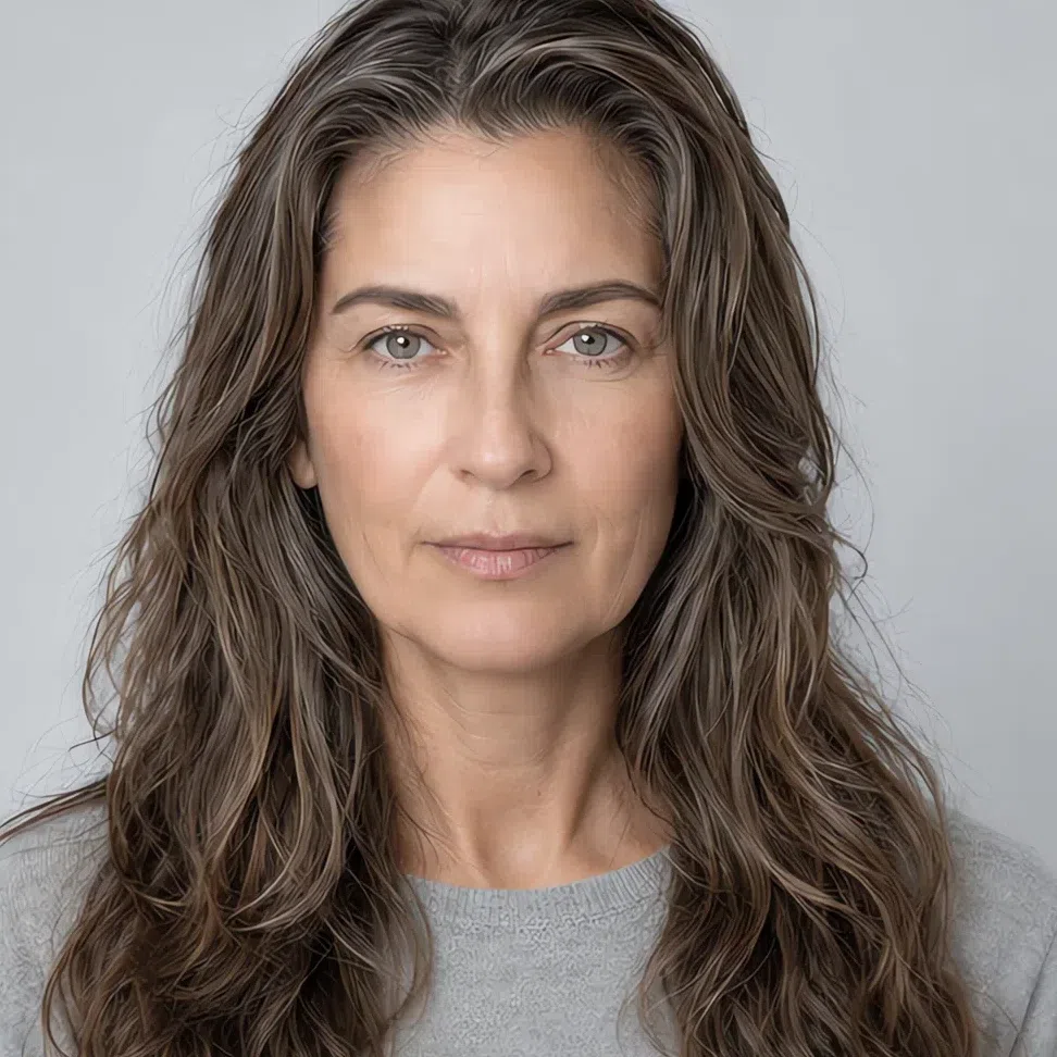
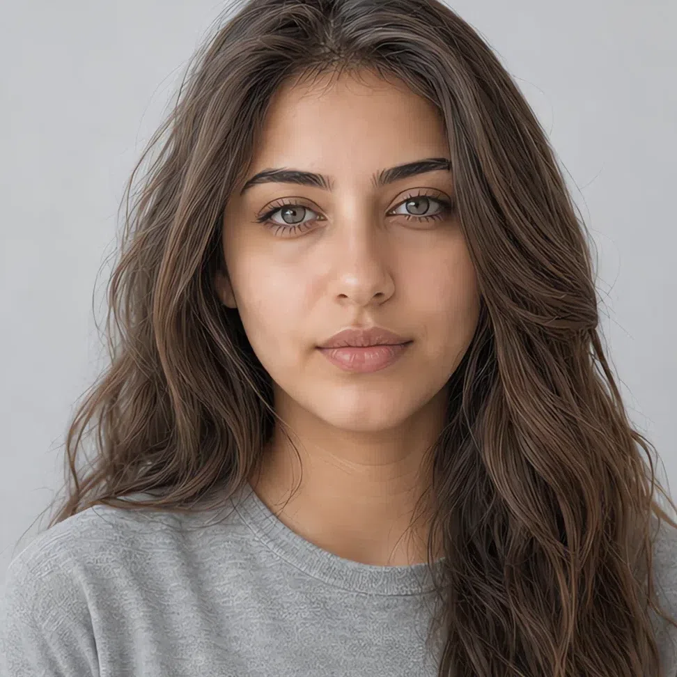

Left is a Light Summer in color; on the right is the same photograph with the color dropped out. Once it is gray, the only thing left to compare is lightness - and the hair, the skin and the eyes turn out to be almost the same lightness.



Hair Skin Ramp runs black to white
Read each ramp on its own: two dots close together is a face built out of neighboring tones, two dots far apart is a face with a hard edge in it. Where the pair sits is how deep the coloring is; how far apart they sit is contrast - which is why the deep portrait belongs in the same season as the fair one. Do not compare the spacing on one ramp against another as a score: deeper coloring has more room below it, so the spacing naturally opens up a little with depth.
55. The fabric test: hold the colors up
The fastest check of all, and the one that needs no theory: put the color next to your face and watch what happens to the face.
Do it bare-faced at a window, with the fabric up under the chin. Look at the skin under your eyes and along the jaw rather than at the garment, and give each shade only a second or two - the first impression is the honest one.
Shades that lift you
If your skin looks clearer and your eyes come forward, you are in the right register:
- Powder blue
- Peony
- Wisteria
- Mint
- Heather
- Mallow
Shades that flatten you
If shadows appear under the eyes and the skin goes dull or patchy, this is the wrong end:
- Jet black
- Optic white
- Burnt orange
- Vermilion
- Sienna
Light Summer vs Cool Summer vs Soft Summer
All three summers share a cool base, which is why they swap places on people so often. The way out is the name itself: every summer is named after the one axis that leads it, and for you that axis is lightness. Get the leading axis right and the rows beneath it stop arguing. One naming note - a report that calls you a True Summer means Cool Summer; it is the older label for the same column.
| Light Summer | Cool Summer | Soft Summer | |
|---|---|---|---|
| Leading axis | Lightness. Light first, cool second | Temperature. Cool first, and unmistakably | Softness. Muted first, cool second |
| Temperature | Cool, and pitched at the pale end of cool | Cool with nothing warm anywhere in it | Neutral-cool. Warmth is tolerated in it but never leads |
| Depth | Light - the name is not being subtle about it | Light through medium | Mid depth, and the broadest span of the three |
| Clarity | Soft, but the color underneath stays readable | Clean and cool rather than dusty | Muted, as though gray had been stirred into everything |
| Contrast | Very low, and the whole face sits high on the scale | Moderate - a visible step from hair to skin, well short of a Winter | Low, with the face sitting at mid depth |
| Skin | Cool or neutral-cool with a pink or rosy-taupe cast, at any depth | Cool and obvious about it - pink or rose, never sallow | Neutral, with gray or olive laid over the top |
| Eyes | Light and veiled: gray-blue, watery green, light gray, cool gray-hazel | Cooler and better defined: blue, gray, cool green | Smoky and hard to name - gray, green and soft brown mixed together |
| Hair | Light ash blonde to mid mousy brown - ash, and light for its depth | Mid to dark with a pronounced ash cast | Ash at whatever depth it runs, up to a brown-black with no red |
| Metals | Silver, platinum, white gold - and gold only at its palest | Cool metals only | Brushed silver and antiqued finishes |
Two columns still level? Ignore the detail rows and go back to the top one. Depth is easier to judge than temperature: photograph yourself in gray daylight and ask whether the face reads light overall. If it does, this column is yours even when a couple of the rows below fit a neighbor better.
What a Light Summer actually looks like
Skin, eyes and hair up close
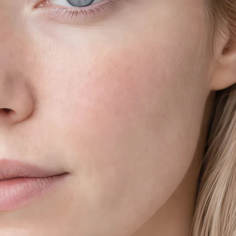
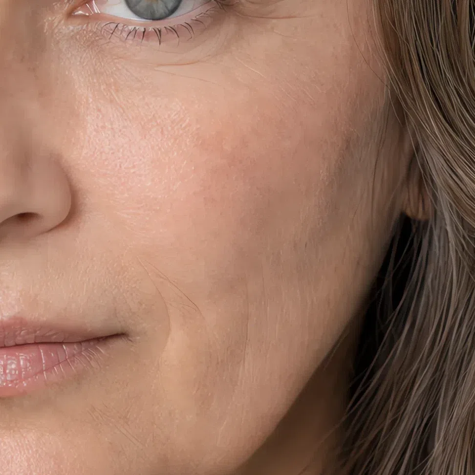
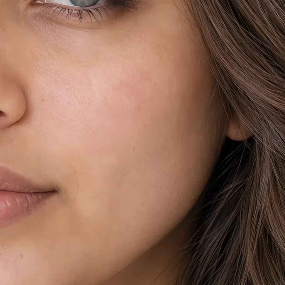
This coloring is light and quiet at the same time. Skin, eyes and hair each sit high for the person they belong to, and not one of them carries a strong pigment - so the face reads as a single soft, cool wash instead of three separate features. Below is what that looks like at macro, across four complexions.
Light Summer skin: fine, cool and easily flushed
The surface is fine and matte, and the color under it is cool or neutral-cool at every depth this subtype comes in. What makes it recognizable is not paleness - it is that the skin has no metal in it. Nothing glows, nothing bronzes, and a flush arrives before a tan does.
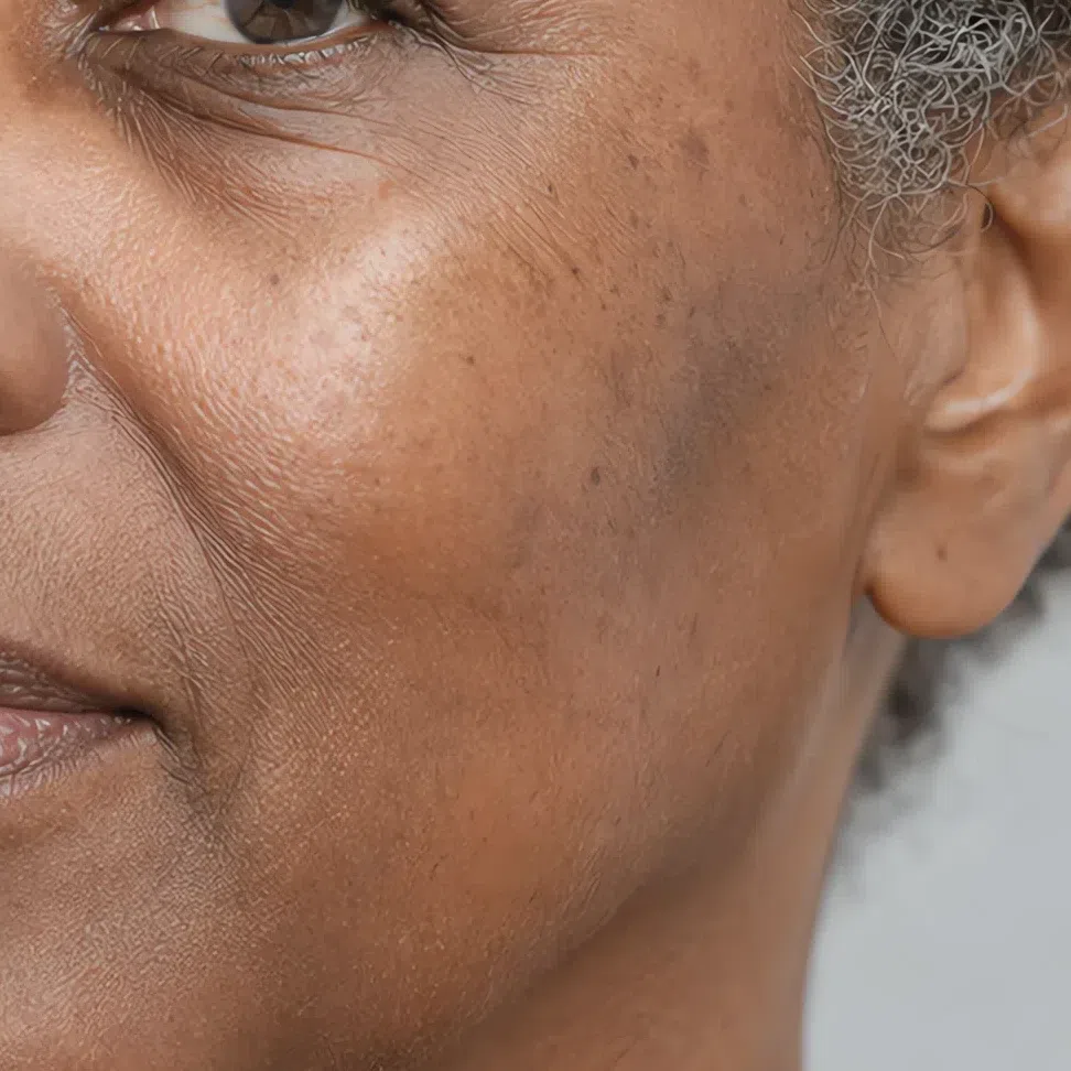
No, and this is the objection this trait raises most often. What matters is the color the tan lands on, not whether one appears. A Light Summer tan is a light neutral beige that fades within weeks; a warm season's is golden or coppery and holds. If you tan easily, deeply and to a color with gold in it, look at Spring and Autumn instead.
One practical consequence: because the skin is fine and quick to redden, it shows whatever you put beside it. That is the same property that makes the palette work so hard on this subtype - a wrong shade is not merely unflattering here, it is visible within seconds.
Light Summer eyes: light, and never quite one color
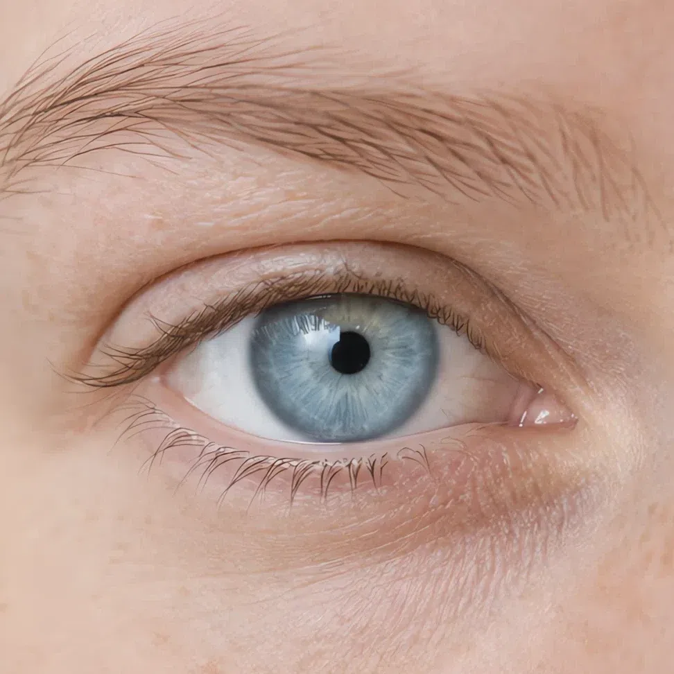
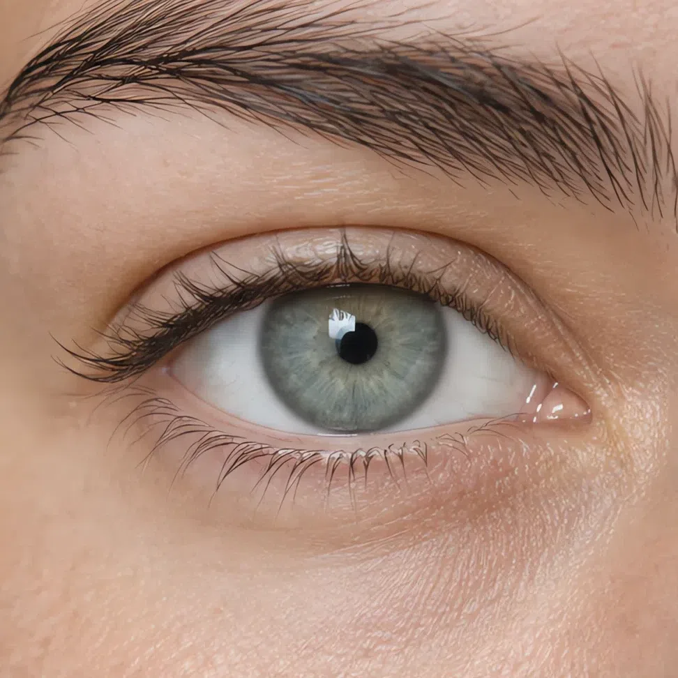
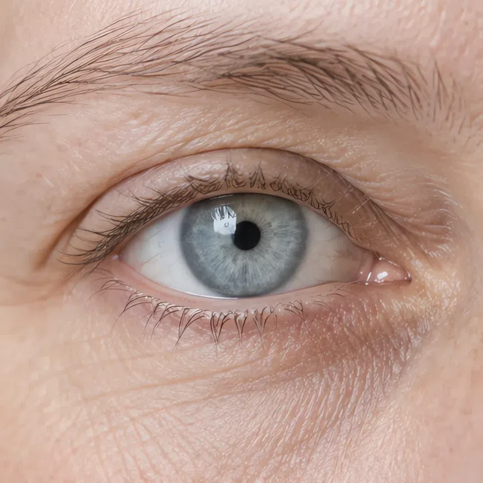
Four shades cover almost everyone in this subtype, and the differences between them matter less than what they share. All four are light, all four are cool, and all four look as though a little gray was mixed in before they were painted.
The four Light Summer eye colors
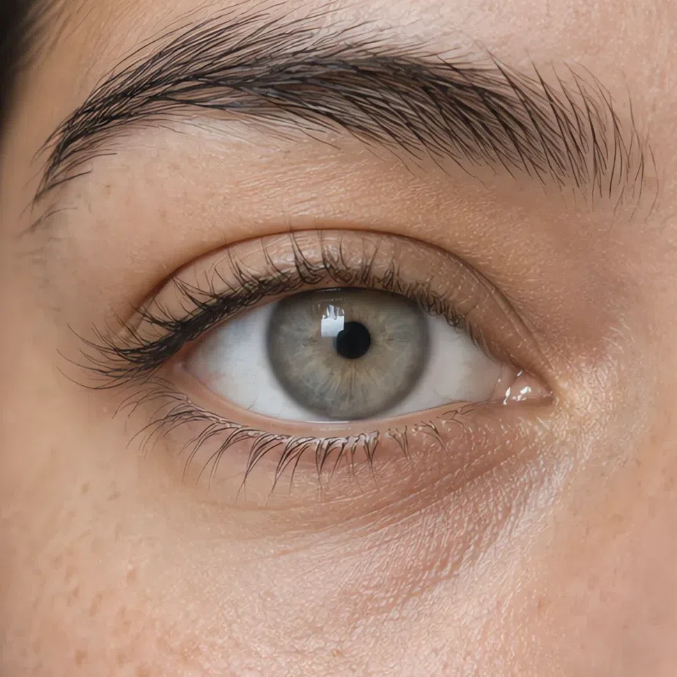
Two things that hold whichever shade you have
- It is light for the face. The iris is never the darkest thing in the picture. On a Light Summer the eyes belong to the same pale register as the skin and the hair.
- It moves. The color reads differently against different clothes and in different light. A shade that stays put no matter what you put beside it is a clearer season's eye.
Eyes this light are lifted by shades that meet them where they are - powder blue, mint, wisteria - and closed down by anything that outguns them. Put a saturated jewel shade beside a pale iris and the fabric wins.
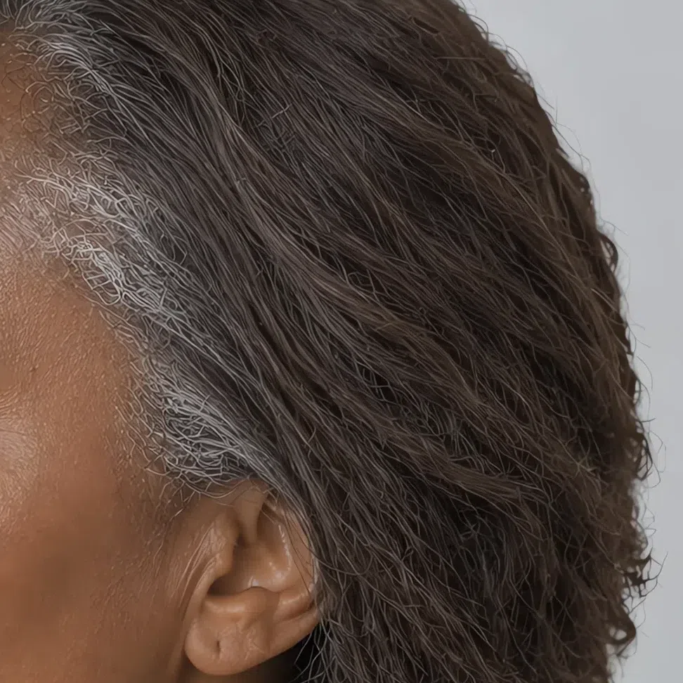
Light Summer hair: ash from root to tip
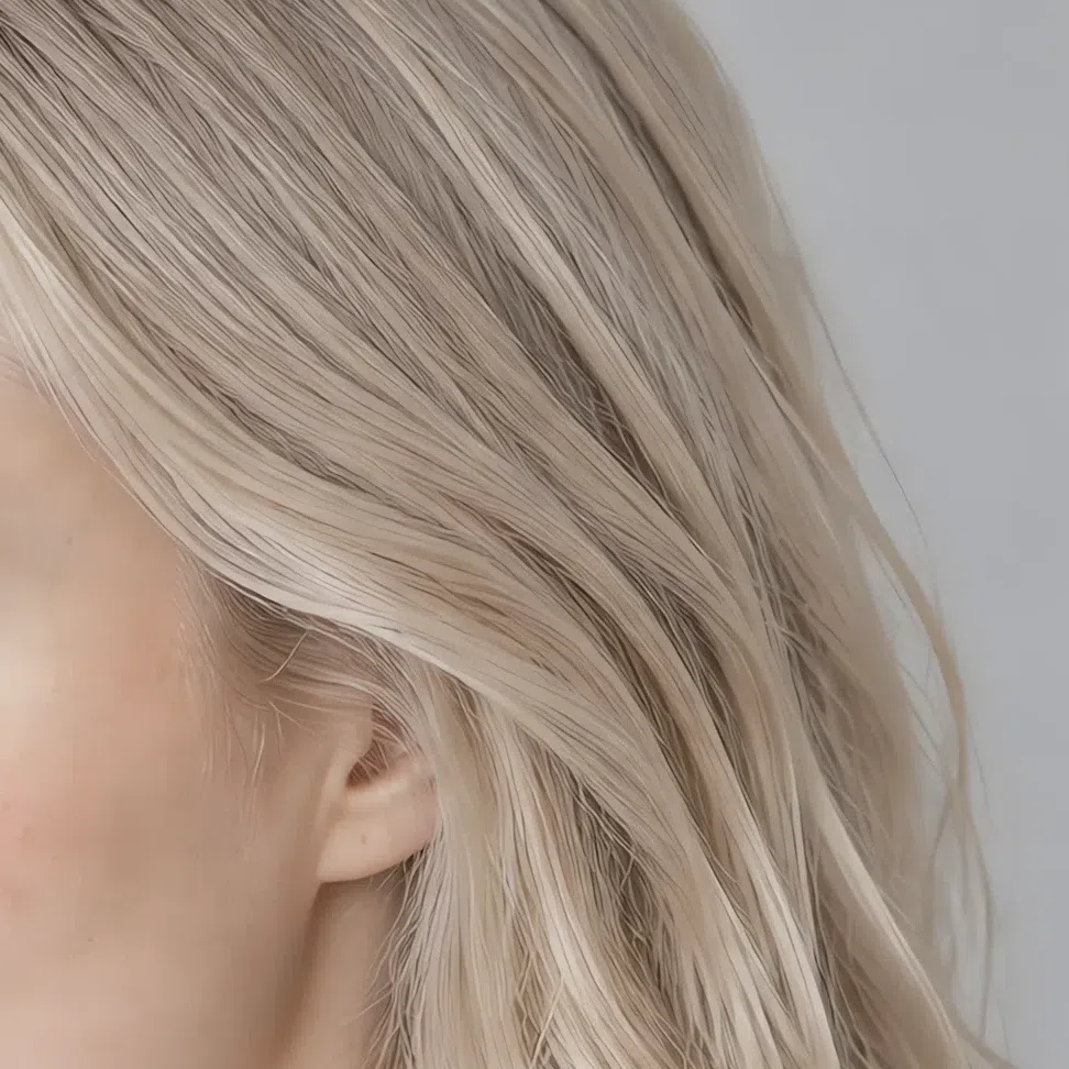
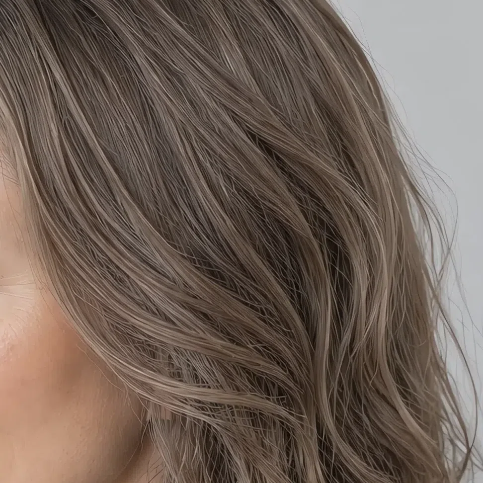
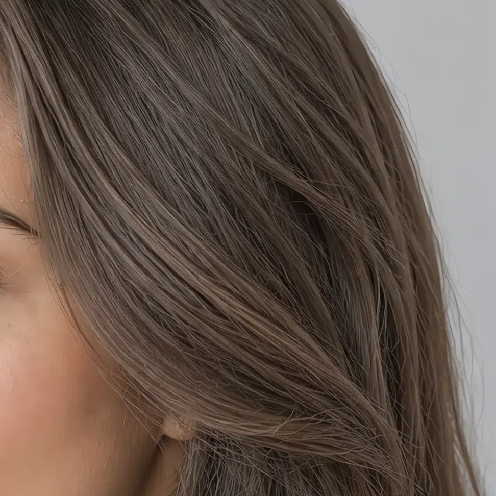
The natural range runs from a light ash blonde down to a cool medium-dark brown, and the pigment underneath does not change across it. What shifts is the level; what stays is the ash.
The natural range, light to deep
What Light Summer hair never is
- Golden, honey or copper. There is no warm pigment in this hair at any level. Of everything on this page, a genuine gold cast is what rules the subtype out fastest.
- Black. The range stops at a cool medium-dark brown. Hair that reads black, or blue-black, belongs to a Winter however cool the skin beside it is.
- High-contrast against the face. Even the deepest shade here stays close to its owner's skin. Hair that cuts hard against the complexion is describing a different subtype.
Whatever level you landed on is the anchor everything downstream is measured from. Two levels either side of it and cool is the safe range; the further you travel from it, the more work the rest of the palette has to do to keep up.
The Light Summer palette, shade by shade
Nineteen shades, and what each one does to a face
Think of a chalk cliff in haze, a hydrangea going over, the sky an hour before it rains. That is the register this palette works in. It is not a set of pale colors so much as a set of colors that have all been lifted toward the light end and cooled, and the discipline is keeping them there.
Two rules run under all nineteen. The first is lightness: nothing here is deep, and the darkest shade on the whole page is a mid blue. The second is cool temperature - pink, gray and violet underneath rather than gold. Hold those two and you can judge a rail without carrying a swatch card.
Read the cards as photographs, not as swatches. Every one of them is a single portrait whose top has been repainted to the hex printed beneath it, with the face, the hair and the lighting left exactly as they were. The question a card answers is therefore never how the shade looks on its own. It is what happens to a face like yours when the shade arrives next to it.
Base colors: what a Light Summer wardrobe is built on
These eleven do the structural work - the coats, the trousers, the knitwear, the shirts you own in three colors. They are also the shades that decide whether the accents later read as deliberate or as loud.
Neutrals: the five to buy in quantity
Every wardrobe defaults to black, charcoal and optic white. Yours cannot, and these five are the replacements. So is black off the table entirely? Not at all - wear it on a skirt, on trousers, on a bag, on a shoe. Keep it out of the eighteen inches closest to your face, where it grays the complexion and deepens the shadow under the eyes. When the instinct says black, reach for Heather.
How to put the five together
- Stay inside one family. Pebble trousers under a Heather knit, or Chalk over Dove gray. Nothing in the outfit has to be decided, and monochrome in near-shades lengthens the line.
- Use them as the ground, not the event. The neutrals are the canvas; a Peony scarf or a Wisteria bag is the event. Eighty percent base, twenty percent color is about right here.
- Let texture carry the interest. Cashmere, brushed wool, washed linen. A palette this quiet gets its depth from surface rather than from contrast, and a flat cotton monochrome will look unfinished where a textured one looks expensive.
Pastels: the six that go nearest your face
This is the group other seasons cannot wear and you can. On most people these shades drain; on you they behave like a continuation of your own coloring, which is exactly why they read as flattering rather than as washed out. Blouses, knitwear, anything at the collar.
Accent colors: eight shades with something to say
Accents here are not bright. They are the same palette taken a few steps deeper and given a little more pigment - enough to register as a choice, never enough to take over. Note where the darkest of them lands: a mid blue. That is the ceiling.
The six deeper shades
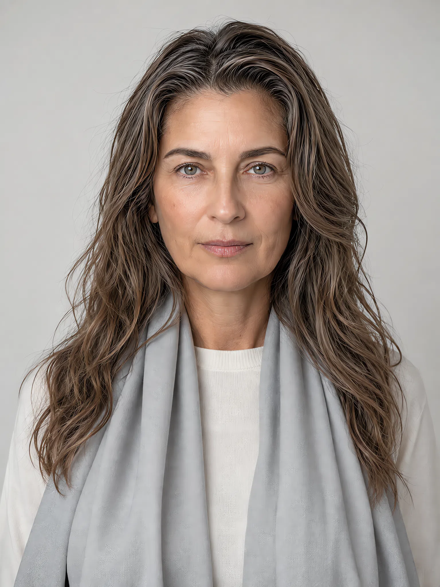
Shown on a scarf rather than on the whole top, and that is the point. Spread one of these across a whole jumper and it is no longer an accent, it is the outfit. All six want to arrive in a small quantity, near the face, against a neutral.
Metal and finish
Two metals, and the first one is not a close call. Finish matters as much as color: a mirror polish throws a highlight brighter than anything on your face, so brushed, satin and matte all sit better than high shine.
Two rules for jewelry
- Silver first, and platinum and white gold count as silver. On this coloring the three cool metals are interchangeable - buy whichever the piece happens to be. Bright gold is the one to leave: it is in the avoid list below, and it is there for the same reason Ochre is.
- If it must be gold, make it the palest one. Champagne gold is the single warm metal that behaves, and only at that paleness. Anything with real yellow in it drops a warm cast onto a face that has none.
Wearing a shade small: four accessories, four pairings apiece
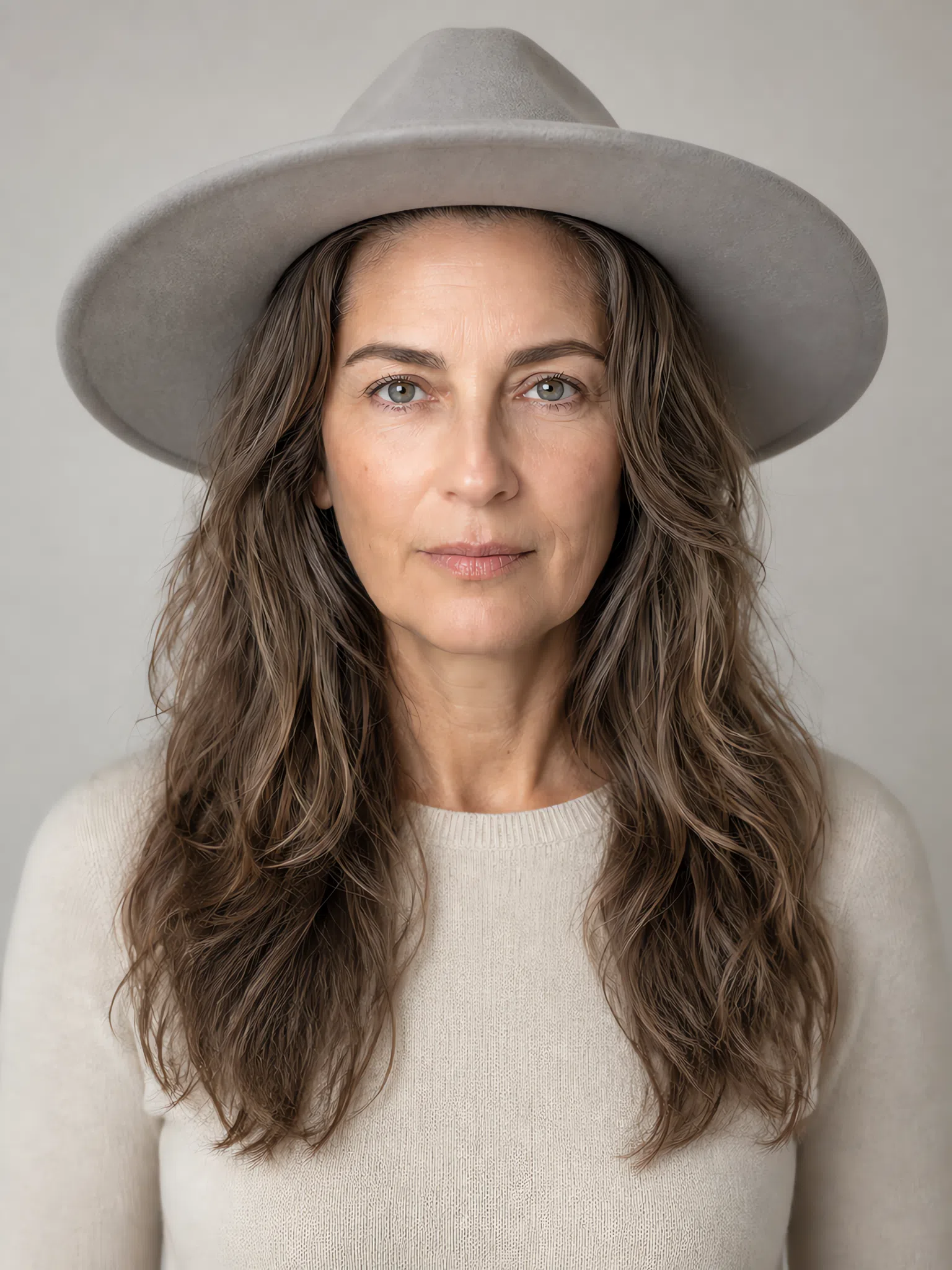
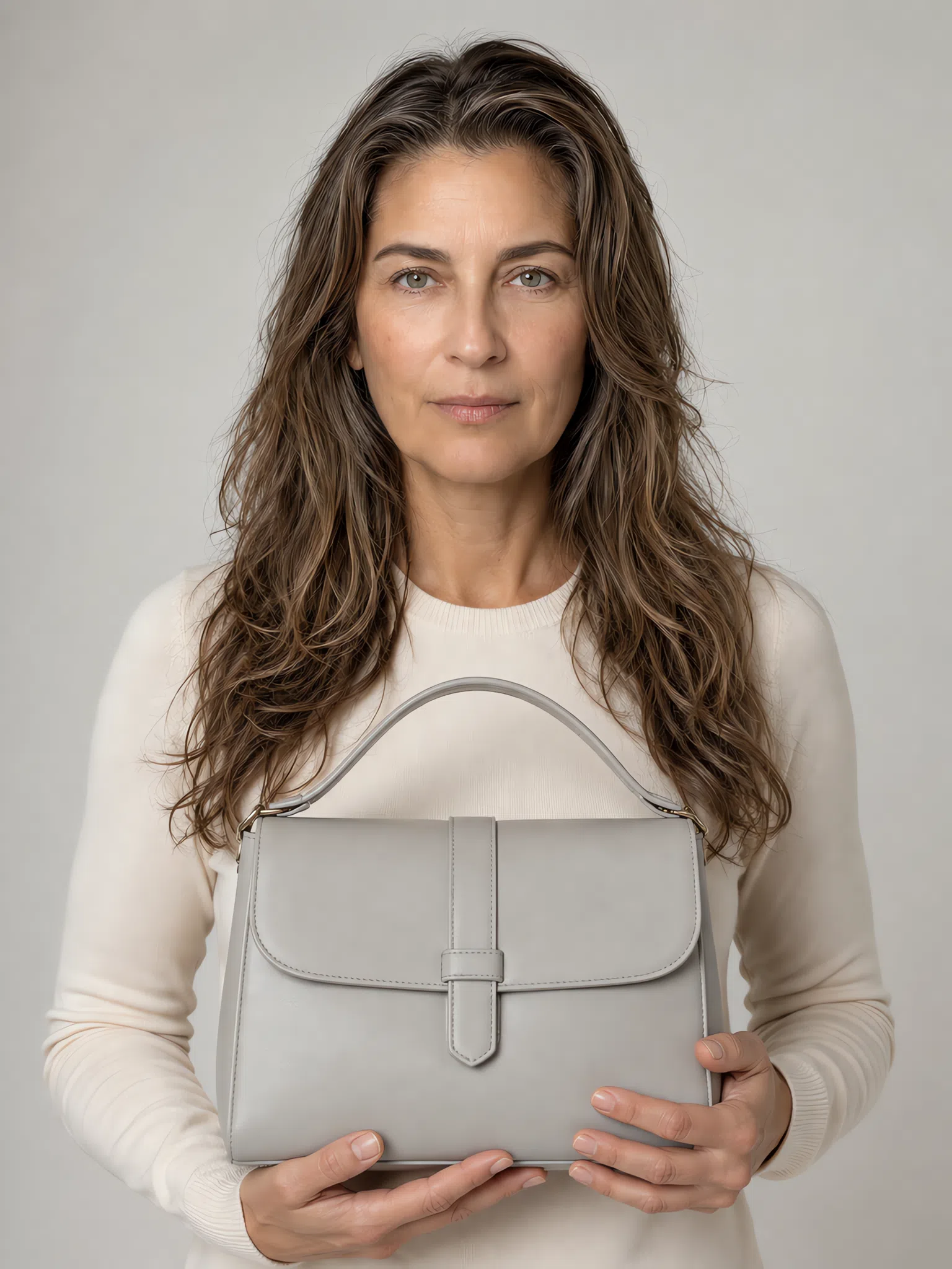
Two shades in this palette exist mainly at this scale - too light to carry a whole garment, exactly right on a bag, a scarf or a pair of earrings. Then the 80/20 rule made literal: every shot puts a neutral on the top and the color on the accessory, so you can see how little color it takes to change an outfit when the color is working near the face.
Hat
A hat is judged from a distance and sits above the face rather than beside it, so its color arrives bounced rather than direct. That is why it carries the deeper end of the palette better than a top.
Scarf
The highest-leverage accessory you own, because it puts the color exactly where it is judged. A scarf in the right shade rescues a top in the wrong one.
Bag
Furthest from the face and the safest place to spend on a shade you love but cannot wear at the collar. A bag can be a step deeper than anything else in the outfit.
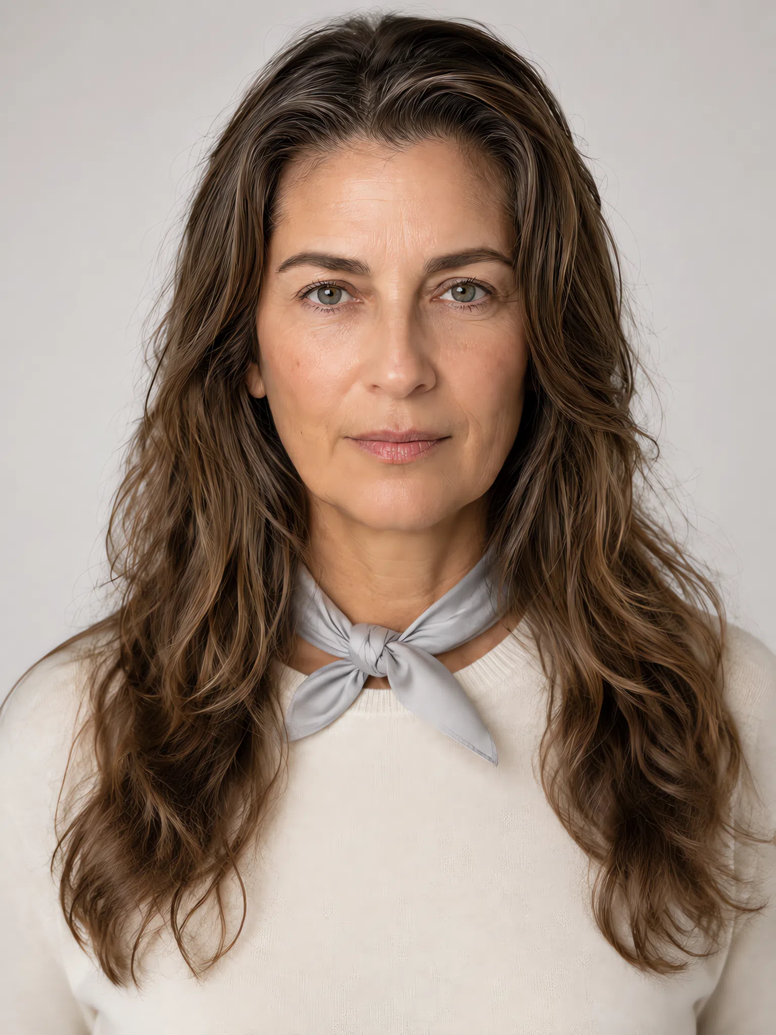
Neck scarf
The smallest quantity of color on this page, and the clearest demonstration of the rule: a few square inches at the throat changes the face more than a whole coat does.
Light Summer colors to avoid
Eight shades, in two groups, and the two fail for different reasons - which matters, because the fix is different too. Each card carries the shade to reach for instead.
Warm and earthy shades
Everything in this group has yellow or orange running underneath it, and your skin has neither.
Why these do not work
- It is a temperature mismatch, not a brightness one. You can wear these shades at any lightness and they still fail, because the problem is the yellow underneath rather than how much of it there is. That is why a pale peach is no safer here than a full terracotta.
- Your skin borrows the cast. Fine, cool skin picks up whatever is held against it. A warm fabric lends its yellow to the complexion, and yellow on a pink-based skin is what people describe as looking tired.
- The fix is a cool version of the same idea. If you want a brown, take Rose brown. If you want warmth near the face, Linen is the one shade that gives it without the cast.
Hard darks, optic white and bright color
Nothing in this group is the wrong temperature. They fail on force - either too dark, too light or too saturated for a face built entirely out of half-steps.
Why these do not work
- The problem is the size of the step. Hair, skin and eyes on a Light Summer sit within a few tones of one another. A black or a pure white edge is a jump far larger than any your face contains, and the eye reads the jump instead of the person.
- Saturation is the same argument on a second axis. A neon or a pure red beats you on intensity rather than on depth, but the outcome is identical: the fabric holds the attention and never hands it up to the face.
- You lose nothing by swapping them. Heather does everything black was doing structurally, Chalk does it for white, and Watermelon gives you a red that reads as red without the shouting.
Light Summer color combinations
The palette works on nuance, so the best outfits are built from shades that sit close together rather than from contrast. Five you can copy exactly.
Five outfits, in the order you put them on
Read each row left to right: the biggest piece first, then what goes over it, then the part that carries the color.
Cool and collected
Heather blazer, Mint shirt, Wisteria earrings. A whole office outfit inside one narrow band of tone, and the softness is what makes it read as considered rather than as safe.
Chalk with one bright note
A Chalk dress, a Pebble belt, and Watermelon at the shoe or the bag. The neutral does the work and a single accent decides the mood.
The soft romantic
Peony cardigan over a Powder blue skirt. Two pastels of almost identical weight - the combination people expect to look insipid and which on you does not.
Quiet monochrome
Eucalyptus knit, Dove gray trousers, Frost blue scarf. Three cool shades descending by one step each. Best outfit here for a long day.
Travel uniform
Denim jacket, Linen tee, Lagoon bracelet or scarf. The only formula here carrying any weight at all - and note where that weight tops out: a mid blue.
What the five have in common is the rule underneath them: keep the steps small. Shades within a couple of tones of each other, one accent at most, and the interest coming from texture and cut rather than from contrast. Watercolor prints and low-contrast stripes belong to you for exactly the same reason.
The Light Summer capsule wardrobe
Eight pieces, and what each one is doing
Eight garments that between them handle the great majority of an ordinary week, picked so that any one of them goes with any other. The point is not the number - it is that a wardrobe built inside 19 shades stops producing outfits that technically match and still look wrong.
Each piece is shown on four complexions rather than one. The palette is not a function of how light your skin is, and a capsule photographed on a single model quietly suggests it is.
Eight pieces to build on
Buy the neutrals in good fabric and the colors in whatever you like - the neutrals are what you will wear four days a week, and they are the ones a cheap fibre shows on.
Everything here is chosen by color, which is to say it is the Light Summer palette made wearable. Capsule theory proper - the arithmetic of how small a wardrobe can go, which piece to buy first, how to count what it produces - is a different question, and this page leaves it alone.
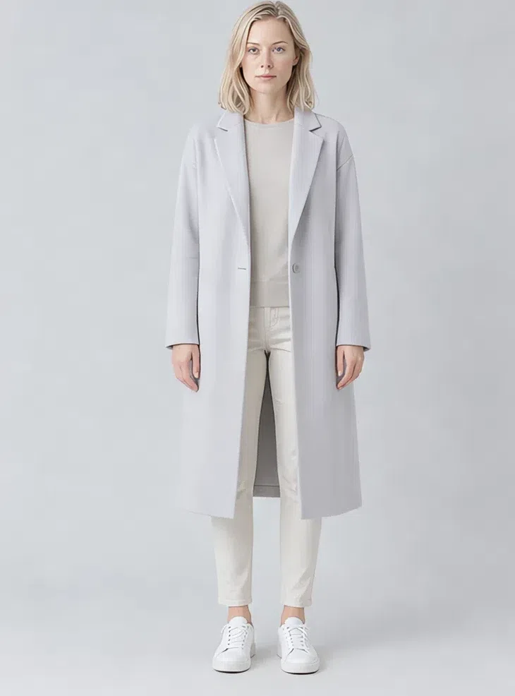
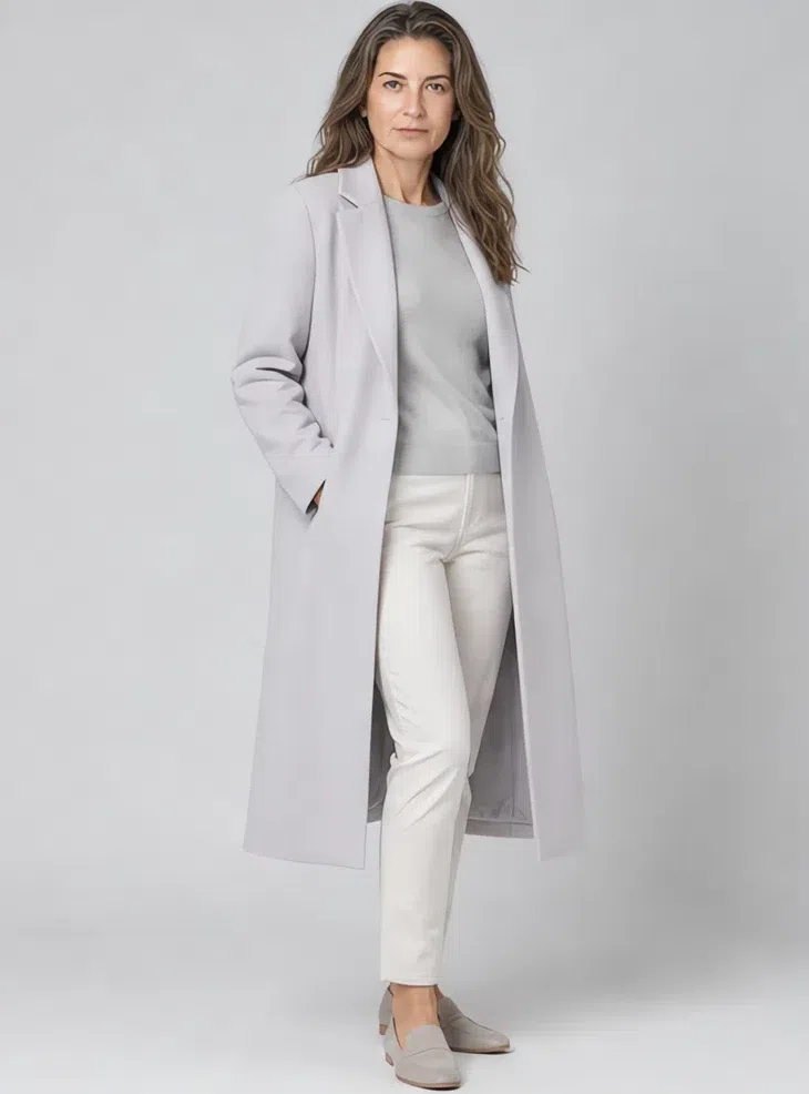
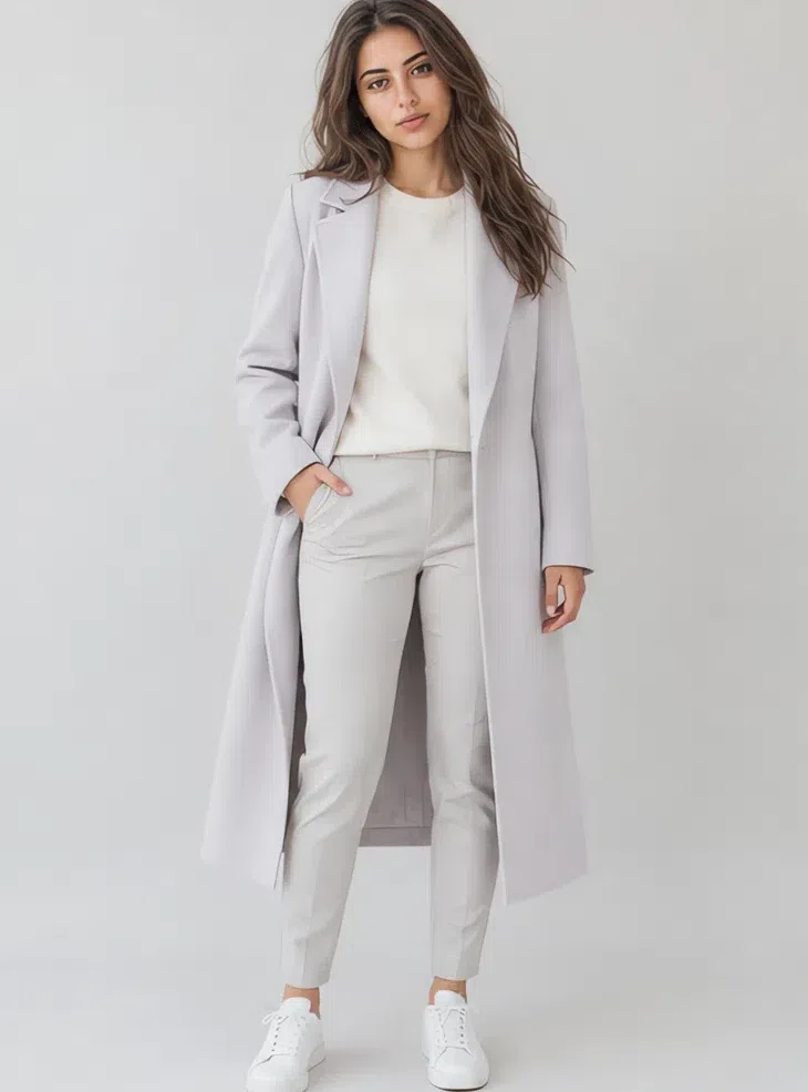
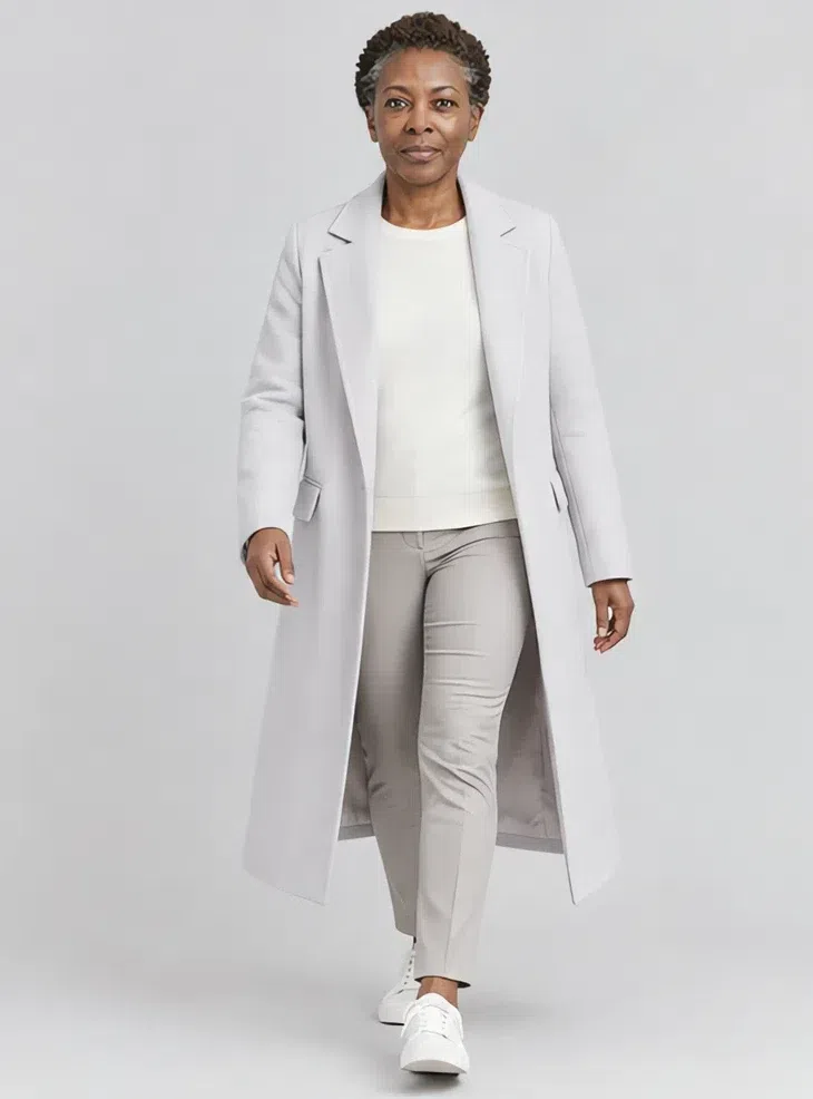
1Heather wool coat
The coat decides what everything under it has to live with, so this is the piece to get right first. Straight cut, knee or midi, in a wool with the weave still showing. Heather is what to buy on the day the instinct says charcoal - it does the same structural job and leaves your face the lightest thing in the outfit.
Tip Worn open over a pale knit it is already a whole outfit. Look for buttons with a brushed finish, and put a neutral shoe under it instead of a black one.
2Pebble tailored trousers
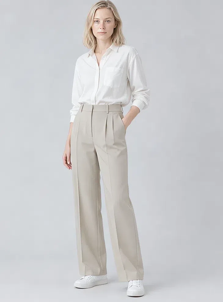
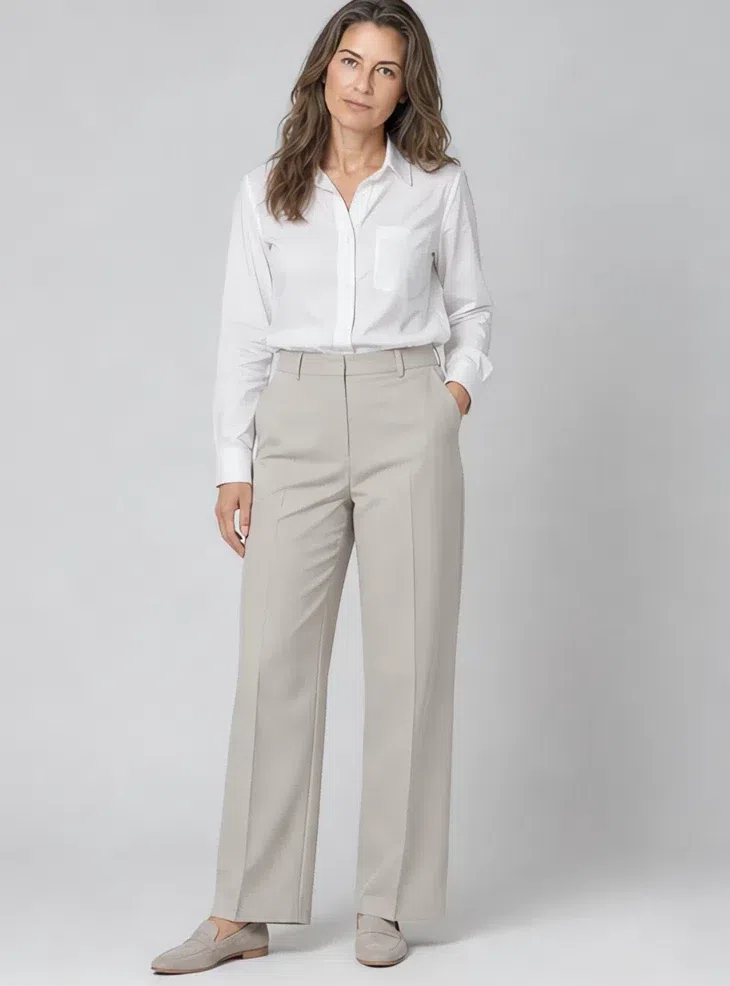
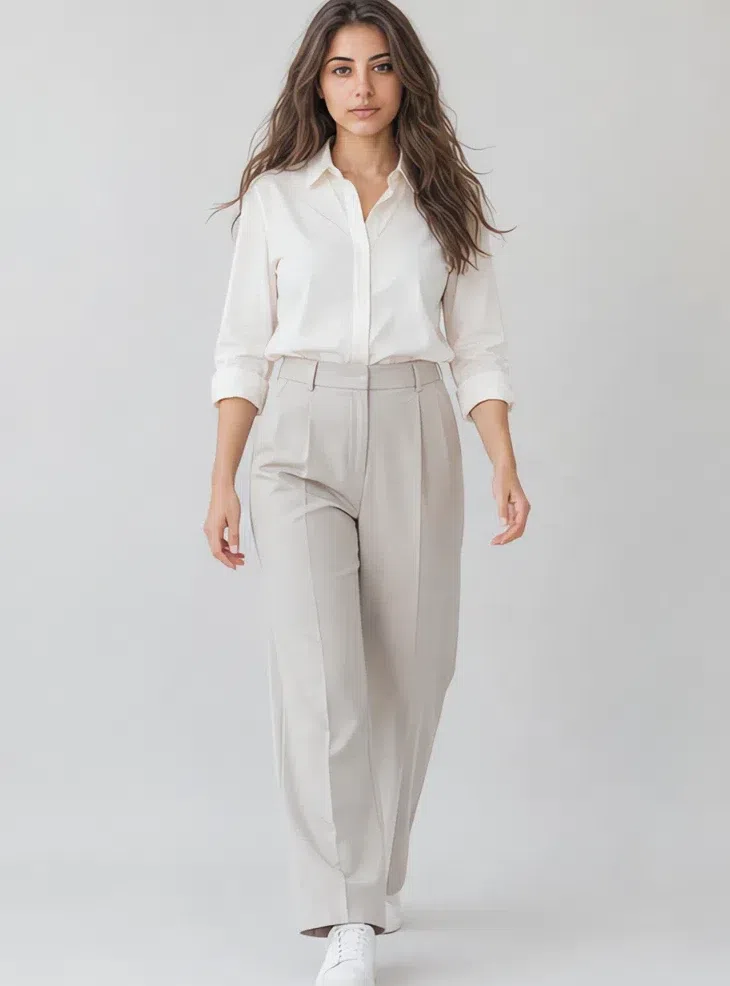
The trouser that goes with everything else on this page. A cool greige rather than a warm beige, which is the difference between looking rested and looking sallow. Wide or straight, pressed, in a fabric with a little weight so it hangs rather than clings.
Tip If you own one pair of good trousers, this is the color. Take it up to Chalk for summer and down to Dove gray for winter.
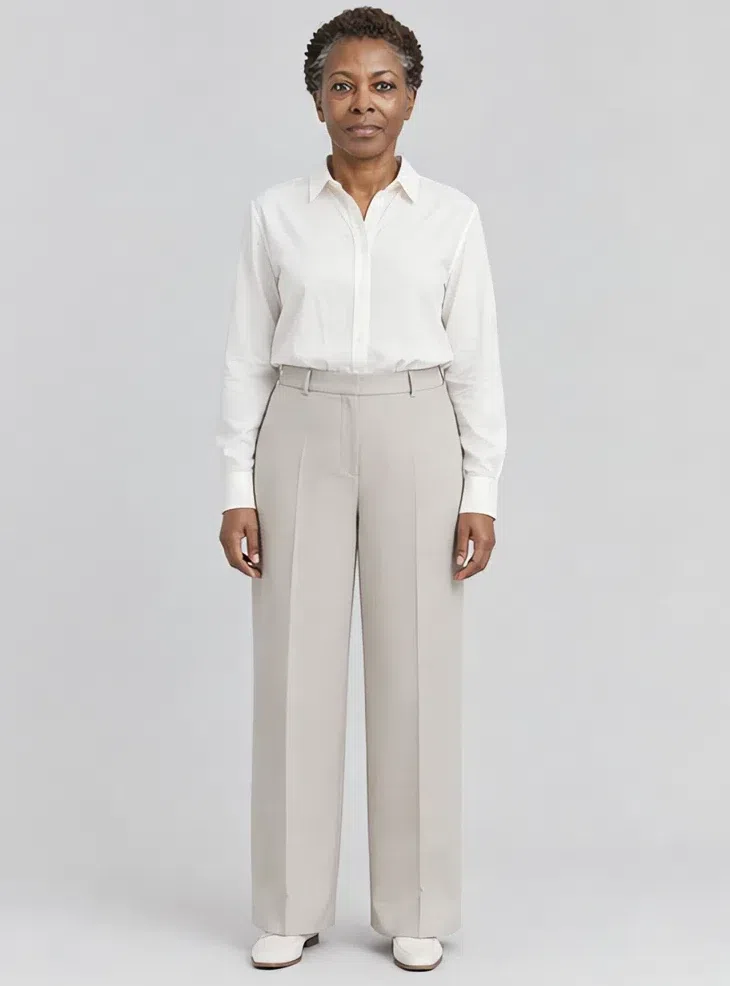
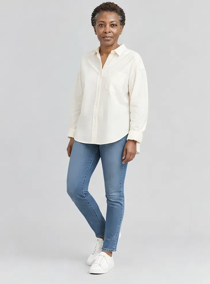
3Chalk cotton shirt
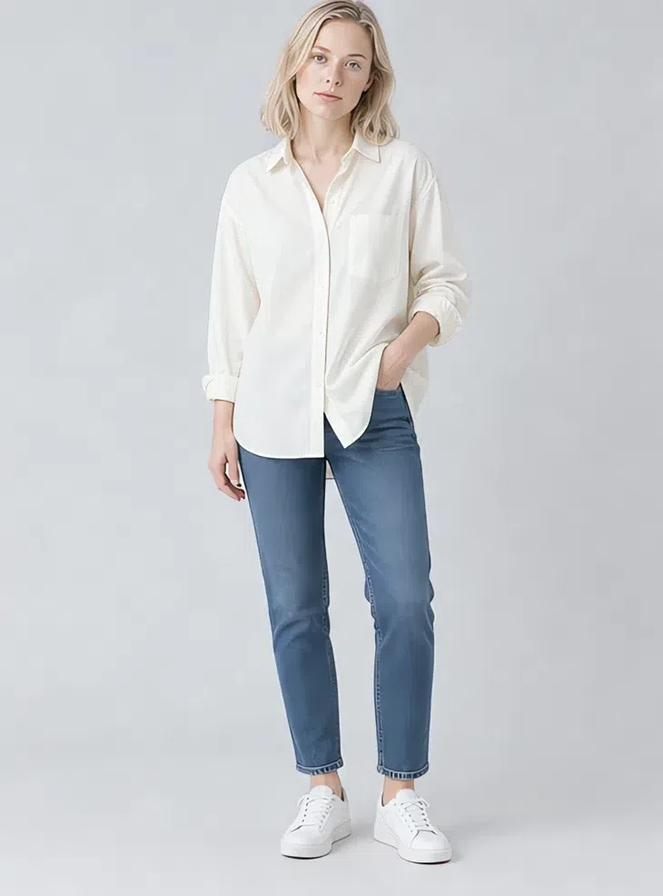
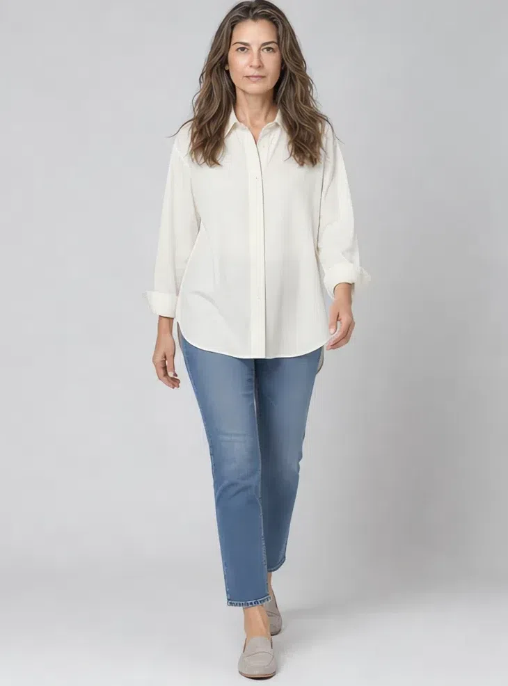
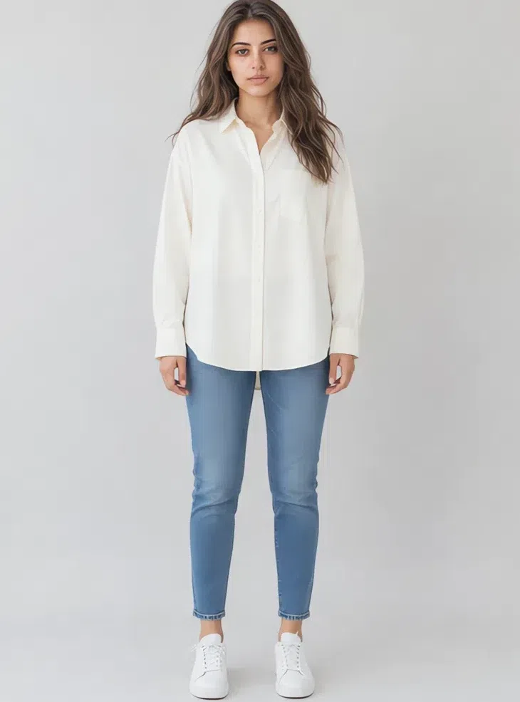
Your white shirt, and the reason it is Chalk and not optic white: pure white next to this skin bleaches it and drains the lips. Oversized, crisp, worn loose or half-tucked. It is the single most useful thing in the capsule because it sits directly against the face.
Tip Over mid-blue denim it is the outfit you will wear most. Roll the sleeves - the forearm breaks up an otherwise flat block of pale.
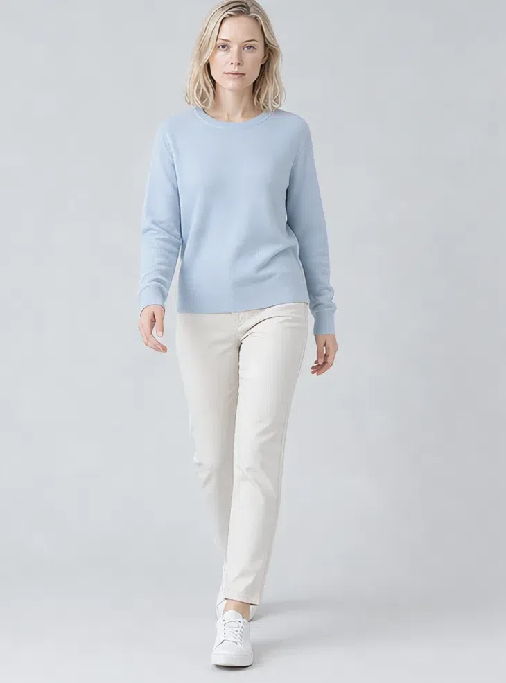
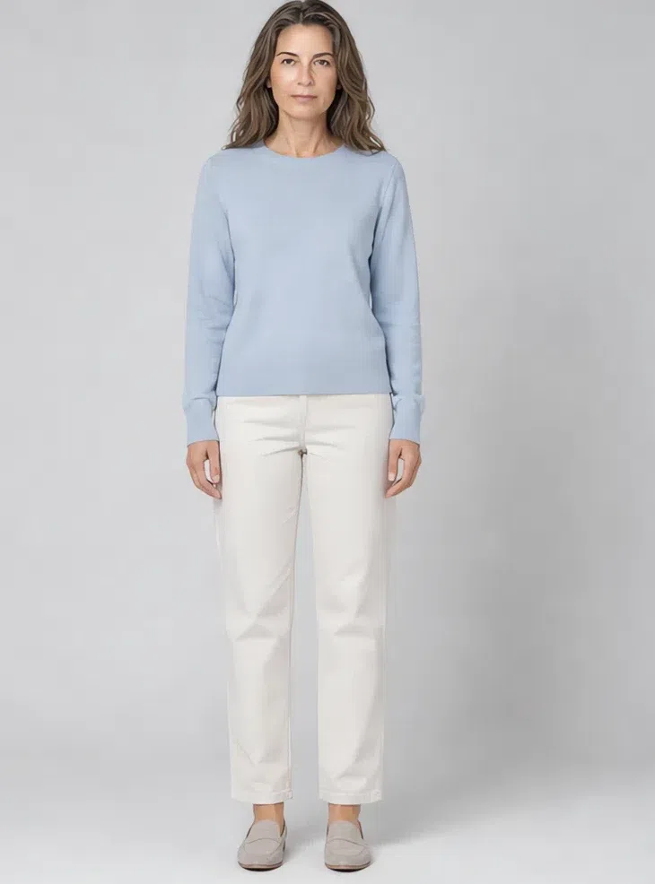
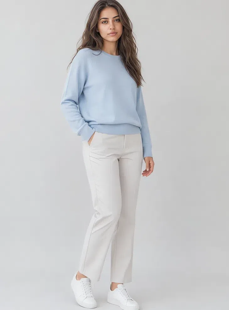
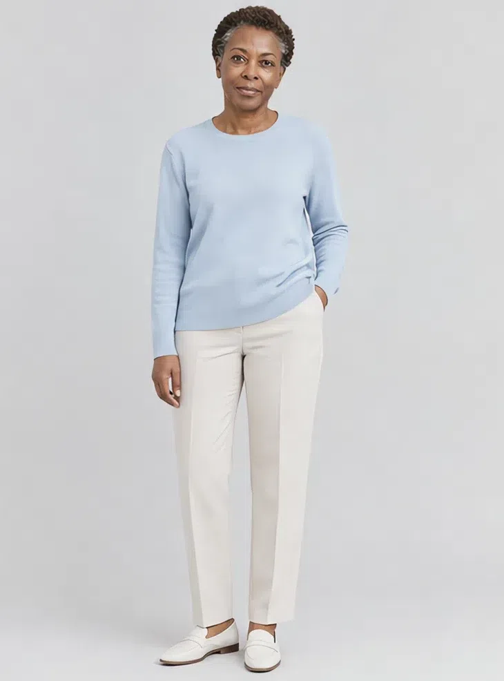
4Powder blue knit sweater
The safest shade on the whole palette, in the piece that touches your face most hours of the year. A soft round neck in fine merino or cashmere - the fibre matters here, because a flat cotton knit in a pale color reads cheap where a soft one reads expensive.
Tip The one to reach for on a tired day. It does more for the eyes than any makeup in the section below.
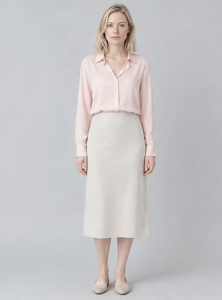
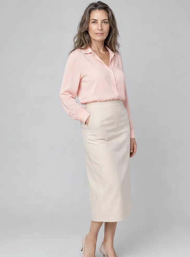
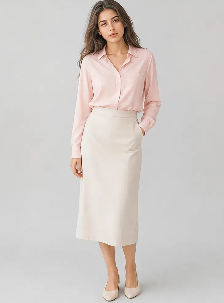
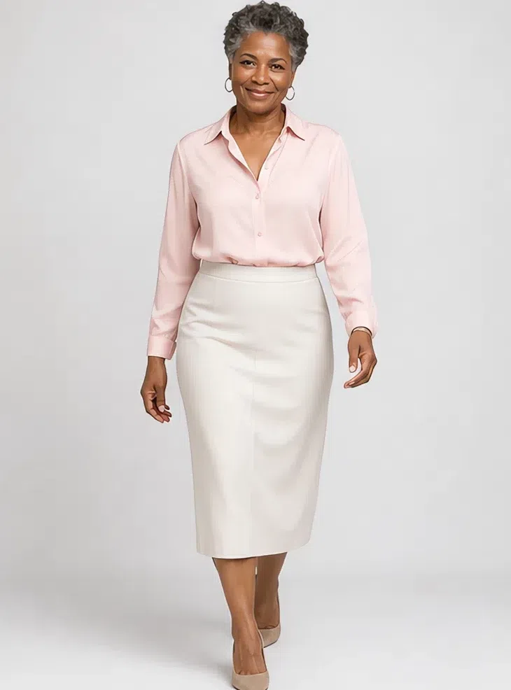
5Peony silk blouse
Pink at the collar is the shade people are most surprised by and the one that flatters fastest, because it sits a step off your own skin tone rather than competing with it. Fluid silk with a soft collar, tucked or half-tucked.
Tip Under the Heather coat it is a whole cool outfit. If pink feels like too much, Mallow does the same work a shade quieter.
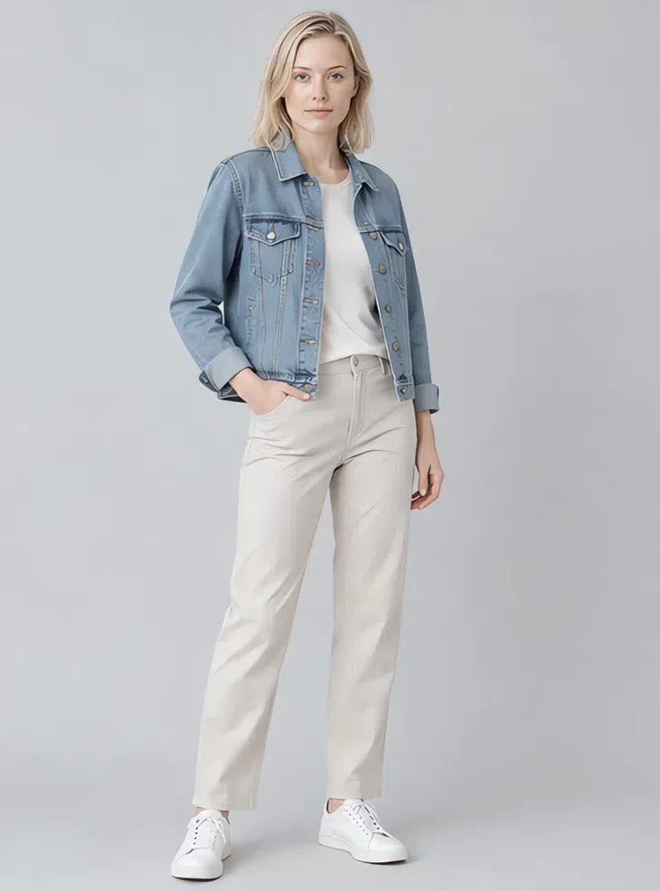
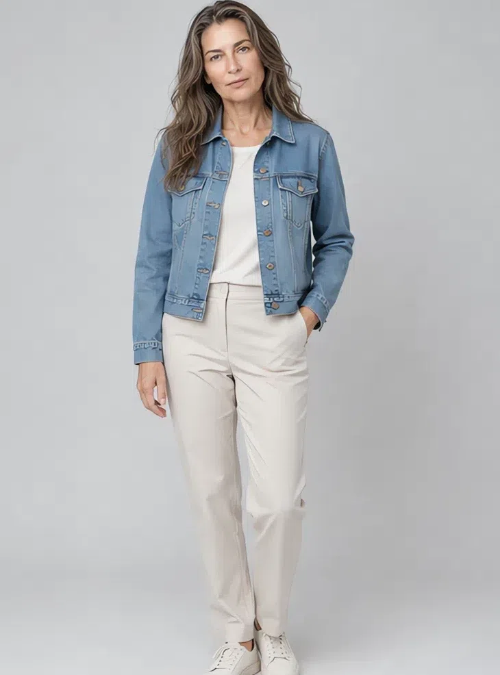
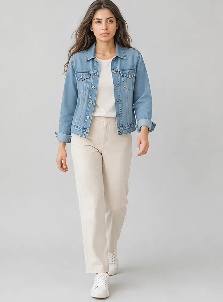
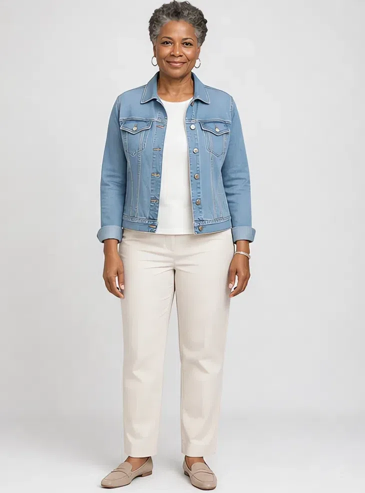
6Denim jacket
The one genuinely deep thing in the capsule, and note where deep tops out for you: a mid blue. A classic cut in a mid indigo with no black in the wash, worn open. Anything darker starts doing to your face what black does.
Tip Over the Chalk shirt or the Peony blouse. Keep the wash mid - a black-rinse denim is a different garment and not one of yours.
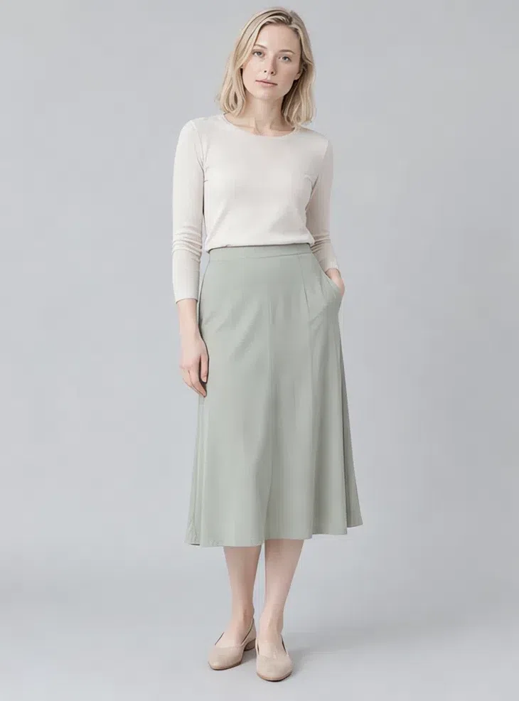
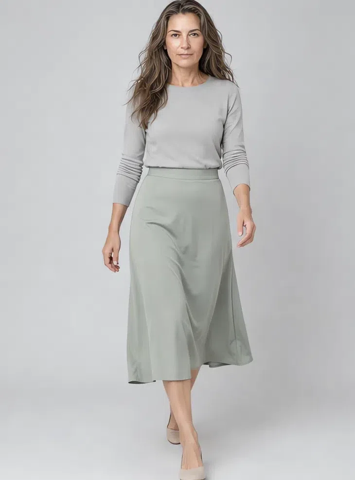
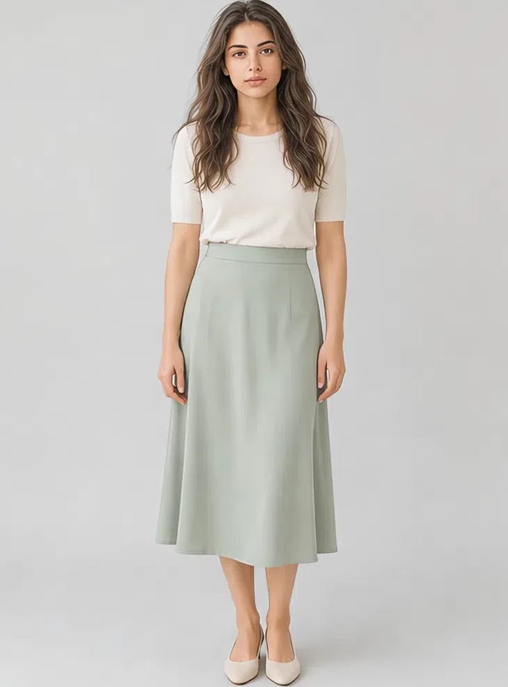
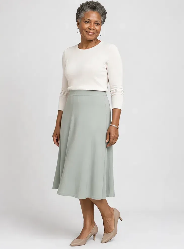
7Eucalyptus midi skirt
The quietest green you own, in the piece that carries color best below the waist. Fluid, falling below the knee, in something with drape. Green this muted behaves as a neutral and will go with every top in this list.
Tip With a fine knit tucked in it is an office outfit; with the Chalk shirt loose over it, a weekend one.
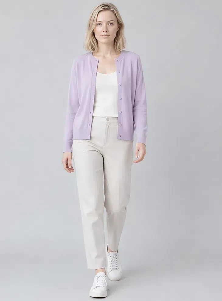
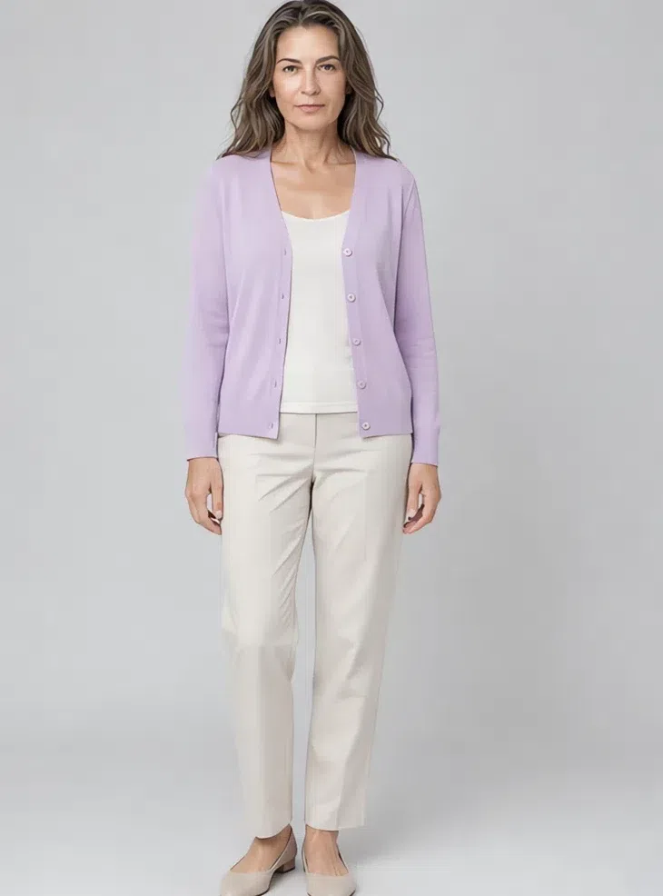
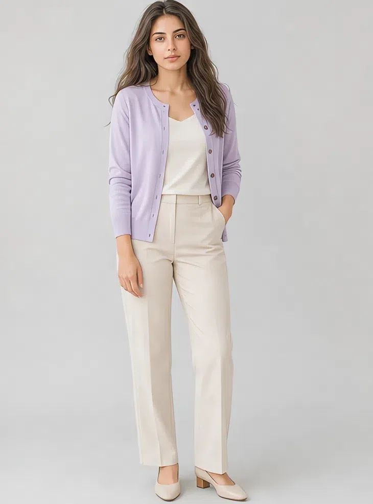
8Wisteria fine-knit cardigan
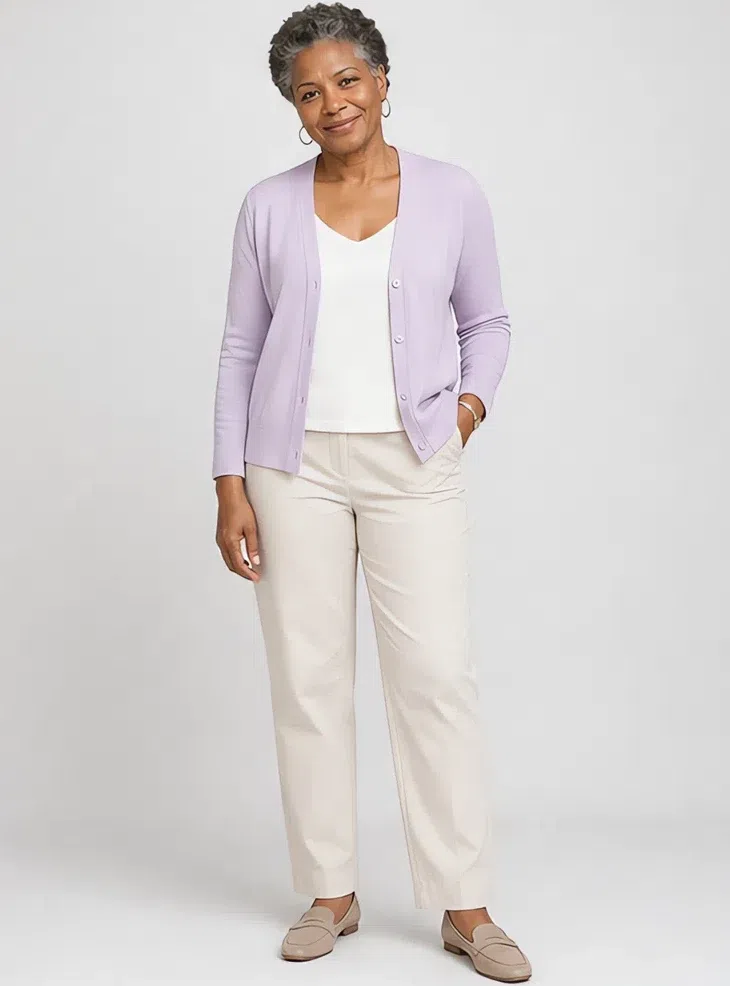
The piece that does the most for the least effort, because a soft lilac next to the face lifts the eyes on any of the four complexions here. Fine gauge, buttoned, worn open over a pale shell.
Tip Over the Peony blouse for the softest combination in the capsule. Silver buttons rather than gold, and keep the gauge fine - a chunky knit in this shade goes twee.
Five ways to combine them
- Stay in one family. Two shades from the same corner of the palette always work: Pebble with Heather, Chalk with Frost blue. On a low-contrast face this reads as deliberate where a hard pairing reads as a mistake.
- Keep the step small. When you do want contrast, move one or two steps, not five. Dove gray under Chalk is contrast enough to see; Dove gray under black is a step your face cannot match.
- Neutral base, one color. Four fifths of the outfit in Pebble, Heather or Chalk, and the remaining fifth carrying a single shade - Peony, Wisteria, Watermelon. Two accents in one outfit start arguing.
- Neighbors on the wheel. Powder blue with Wisteria, Mint with Eucalyptus. Colors that sit beside each other blend into one impression rather than reading as two decisions.
- Let texture do the contrast. A palette this close together needs surface to stop it going flat. Silk against brushed wool, a fine knit against washed linen - same shade, different hand, and the outfit stops looking like one piece of fabric.
Light Summer makeup colors
The shades, matched to your depth
Makeup on this coloring fails in one direction far more often than the other: it is too much. A face built out of half-steps needs products that behave like half-steps too - cool, light, and a little grayed.
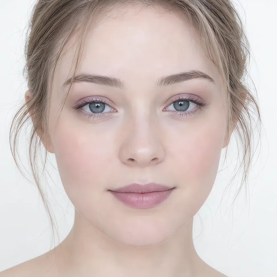
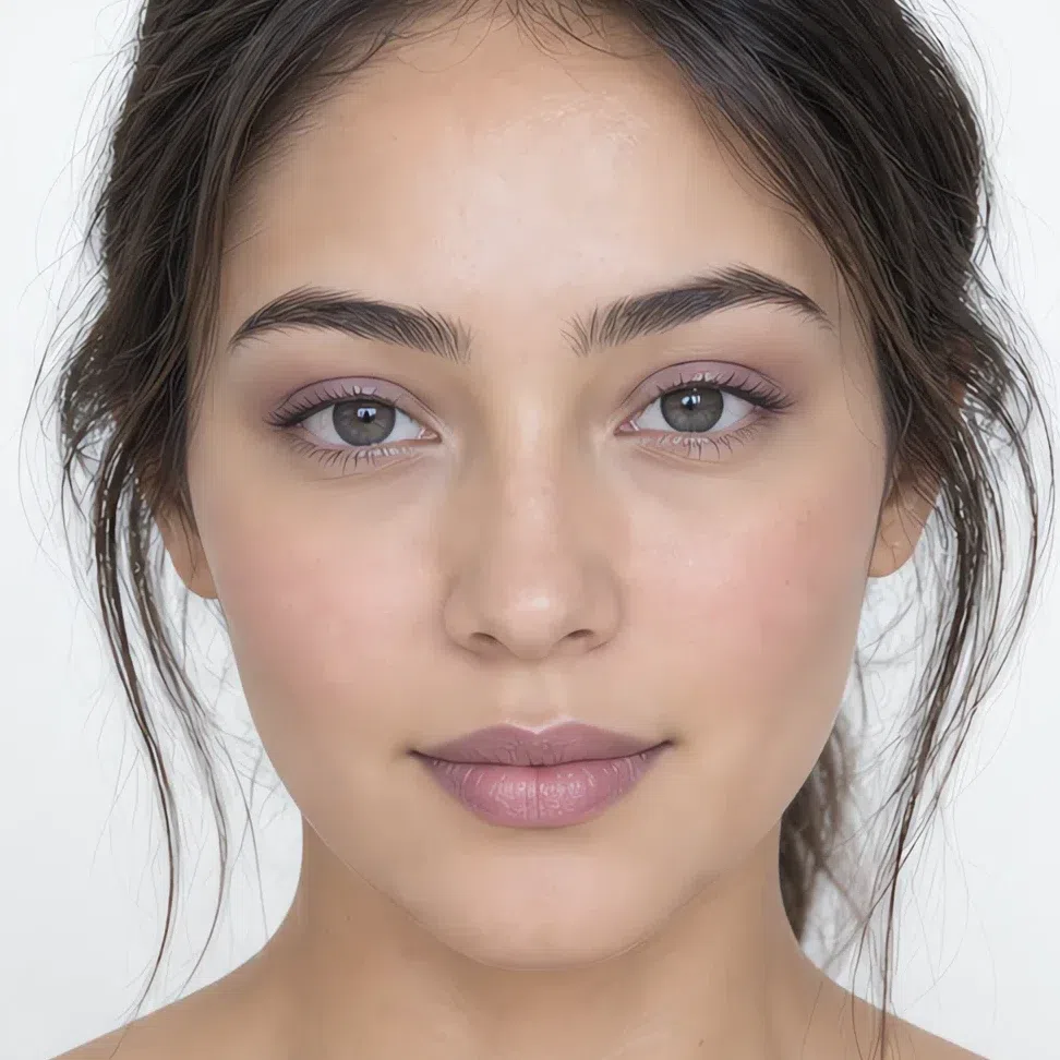
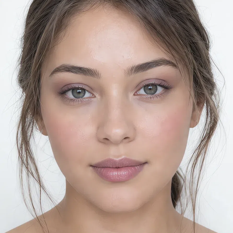
Below are the shades. The three products where your own complexion decides the answer are shown on four depths; the rest are a reference list.
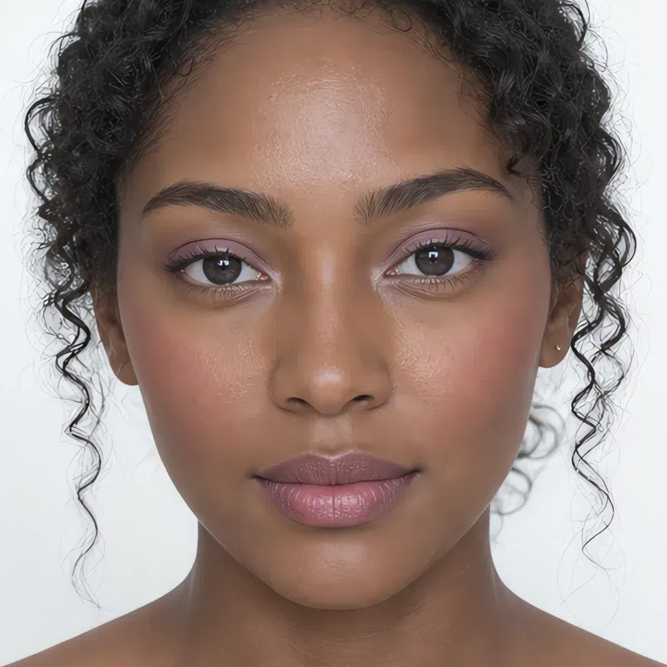
Base: foundation, bronzer and glow
These three are the ones worth getting right in person, because the shade that works is a function of your own depth rather than of the season alone.
Foundation matched to your depth
Whatever your depth, the undertone stays cool or neutral-cool. Reaching for a warm base is the error that happens most here, and it shows up at the jawline first.
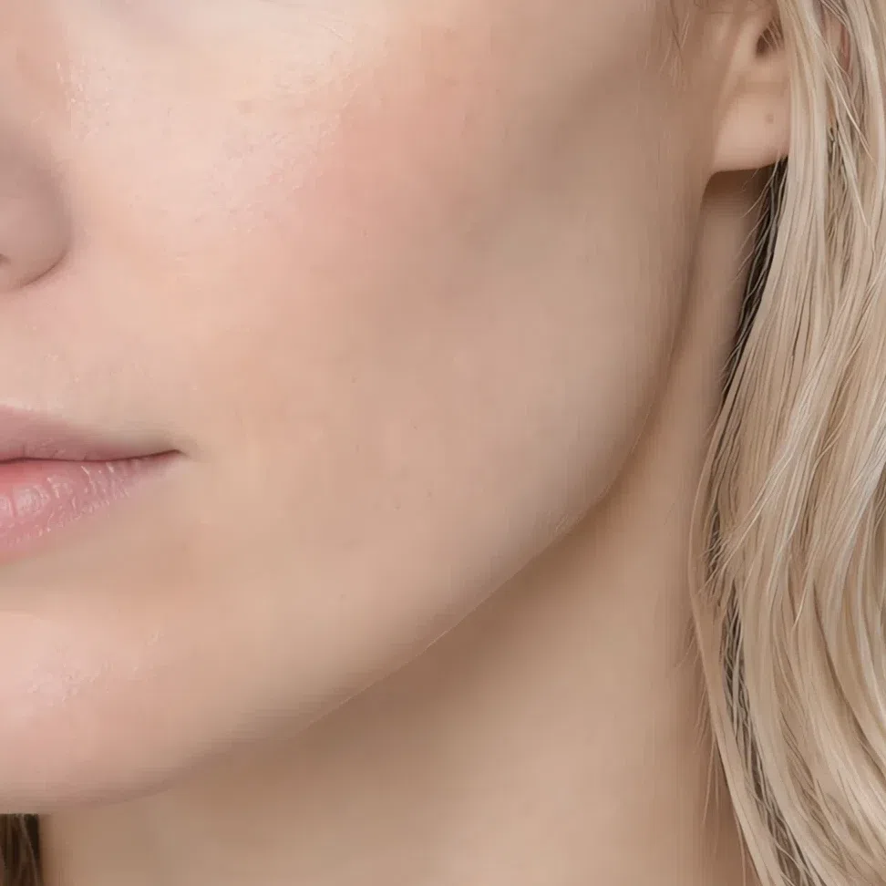
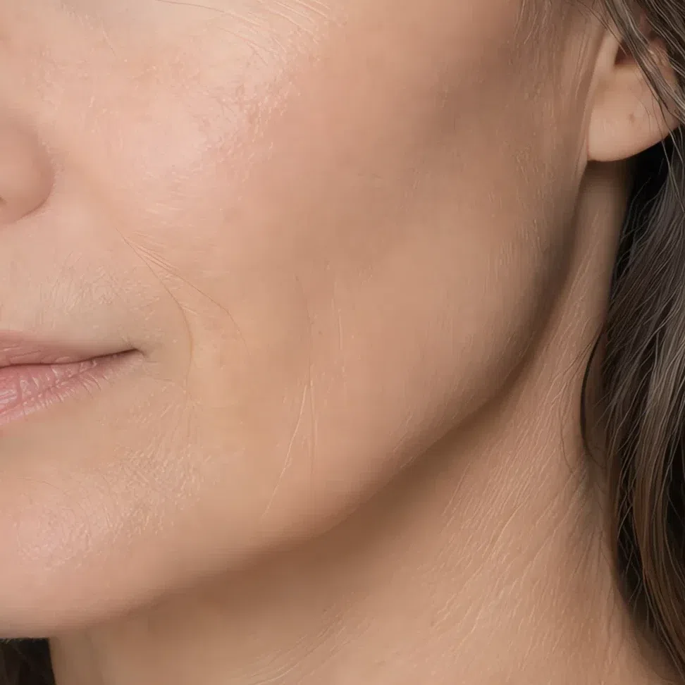
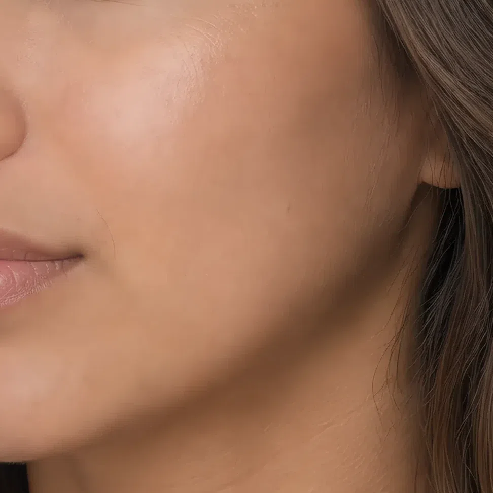
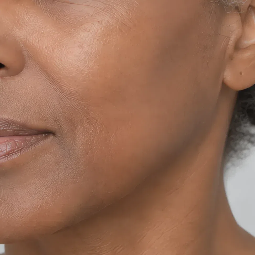
Tip Test three shades along the jaw in daylight and pick the one you stop being able to see.
Bronzer matched to your depth
A shadow rather than a tan. One or two steps deeper than your own skin and cool-taupe in family - anything orange reads as a stripe on a face this light.
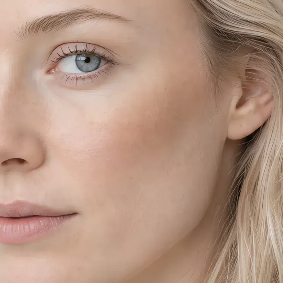
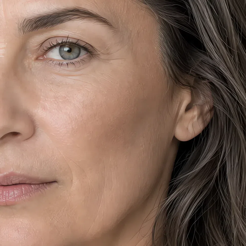
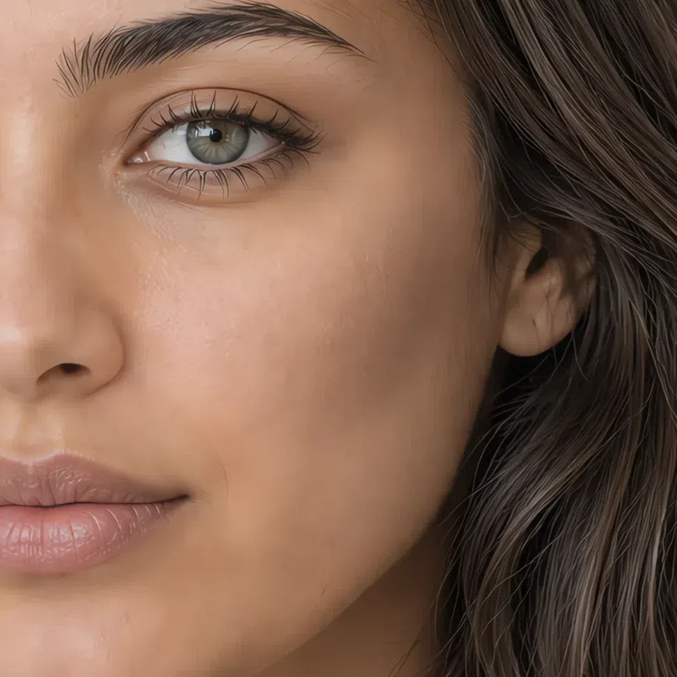

Tip Matte, and high on the cheekbone rather than under it.
Avoid Anything with an orange or copper base.
Highlighter matched to your depth
Satin, not glitter. A pearl finish lifts this skin where a sparkle sits on top of it and reads as texture.
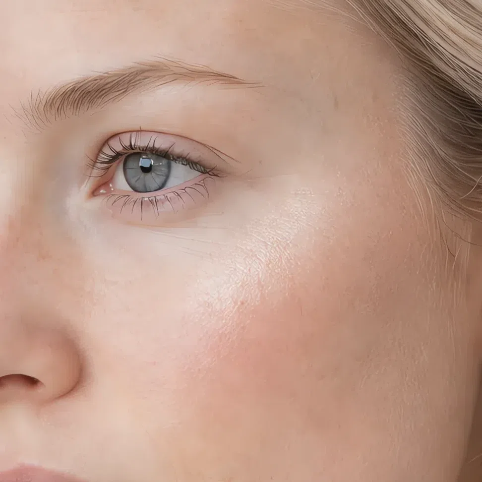
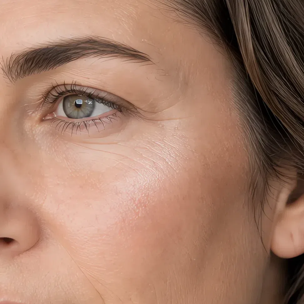
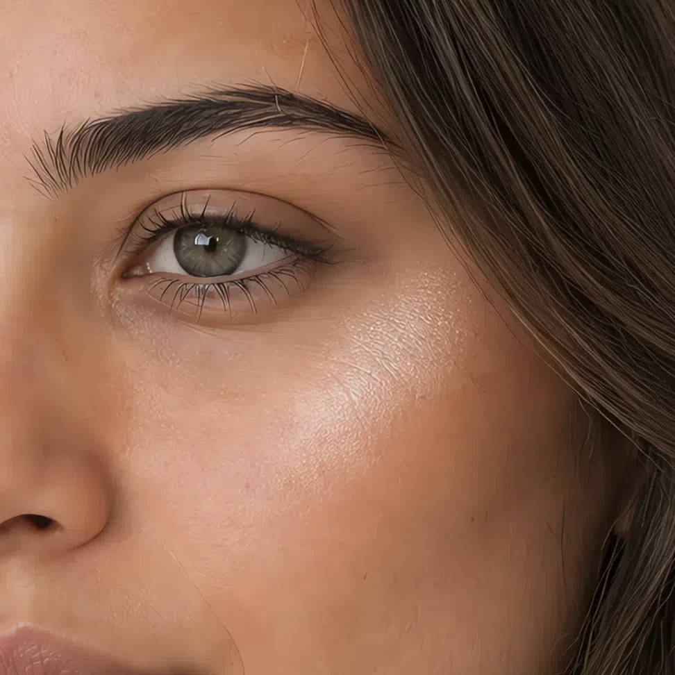
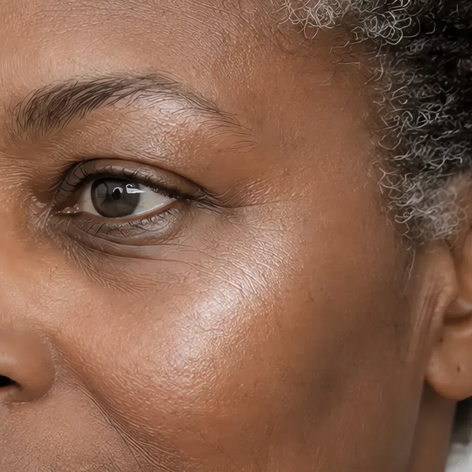
Tip A narrow band on the top of the cheekbone is enough.
Avoid Gold and bronze shimmer, and anything with visible glitter in it.
Blush
Cool rose for every day, soft berry when you want more. The season decides the family it comes from; your own depth decides how deep to go inside it.
- Petal rose #EFC3C6
- Cool rose #E0A3A8
- Soft berry #C98A96
- Muted plum rose #A96C7C
Eyes: shadow, liner, mascara
Every shade here is light and grayed. The eye on this coloring is already soft-edged, and products that try to sharpen it fight the face.
Everyday eyeshadow
Cool neutrals a shade or two off your own lid.
- Oyster #E4D8D2
- Pale taupe #C9B9B2
- Lilac gray #B7ADBC
- Soft mink #9A8B87
Evening eyeshadow
The same family taken deeper. Depth here comes from a grayed shade, never from a black one.
- Smoke lilac #8C7F94
- Storm gray #767A85
- Cool plum #7A5F70
- Deep slate #5B5F6B
Eyeliner
Gray, taupe and cool brown. Black is the single most common overcorrection on this face.
- Soft charcoal #5A5C63
- Cool taupe liner #7C6E68
- Slate blue liner #5D6B7C
- Deep plum liner #5E4757
Mascara
Brown-black or a cool gray-brown by day, and true black kept for evening if at all.
- Gray brown #6B625E
- Soft brown black #4A4644
- Cool navy #3E4A5C
- Plum brown #584349
Brows
One shade cooler and no more than a shade deeper than your hair. Ash, never warm.
- Ash blonde brow #B7A794
- Light ash brow #9C8B7C
- Mid ash brow #7A6A5E
- Cool deep brow #584C46
Lips: nudes and color
Lips are where this coloring can take the most color, provided the shade stays cool. A pink-based red belongs to you in a way a warm coral never will.
Nude shades
A nude here is pink-based rather than beige-based - a beige nude erases the mouth on a cool face.
- Rose nude #E0B4B0
- Pink beige nude #D3A399
- Mauve nude #BC8E90
- Cocoa rose nude #9C6E68
Colored shades
Cool pinks, soft berries and a blue-based red. Every one of them stays a step short of fully saturated.
- Peony pink #E79FAE
- Cool raspberry #C56C86
- Soft berry lip #A85A72
- Blue-based red #B5455A
Hair shades
Eight to ask for, seven to walk past
Going to a salon? What to ask for, how to keep the tone from turning brassy and what to do about gray are all on the hair-color page. Open the hair-color guide →

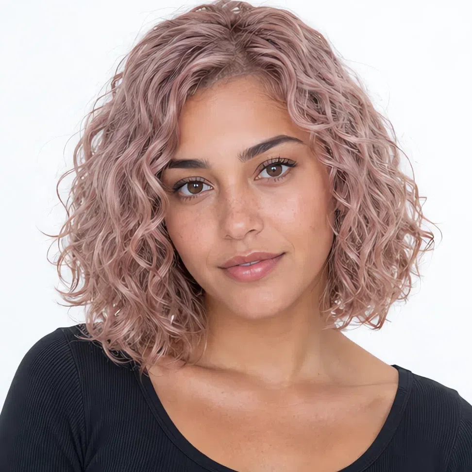
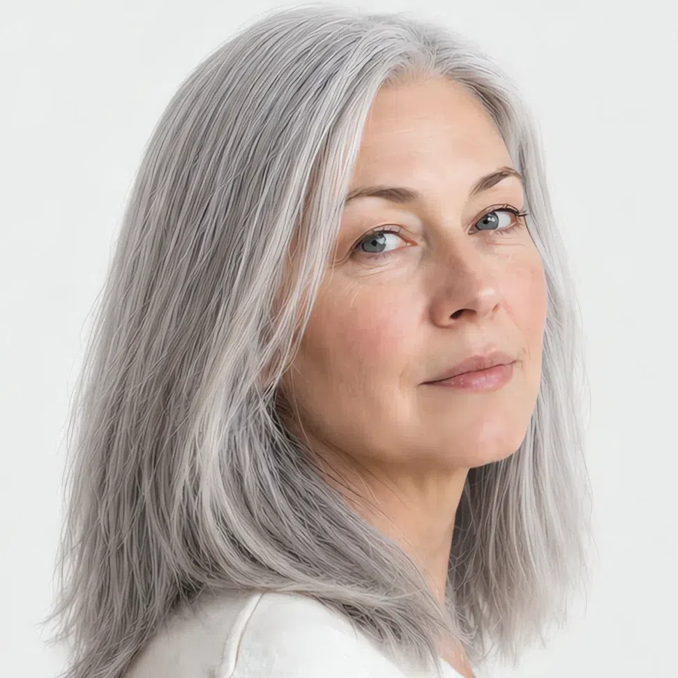
The goal with this coloring is not a new head of hair - it is your own hair, slightly improved. Every shade below stays cool and ashy at its own level, because a warm tone next to this skin brings out redness first and dullness second.
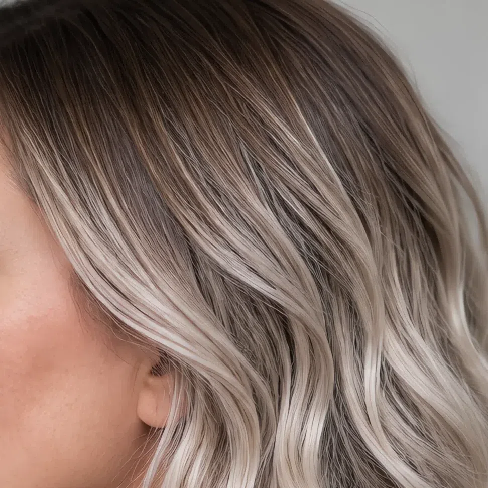
Muted blonde and light brown
The lightest end, and where this subtype is most at home. Cool variants only - the difference between an ash blonde and a golden one is the whole argument.
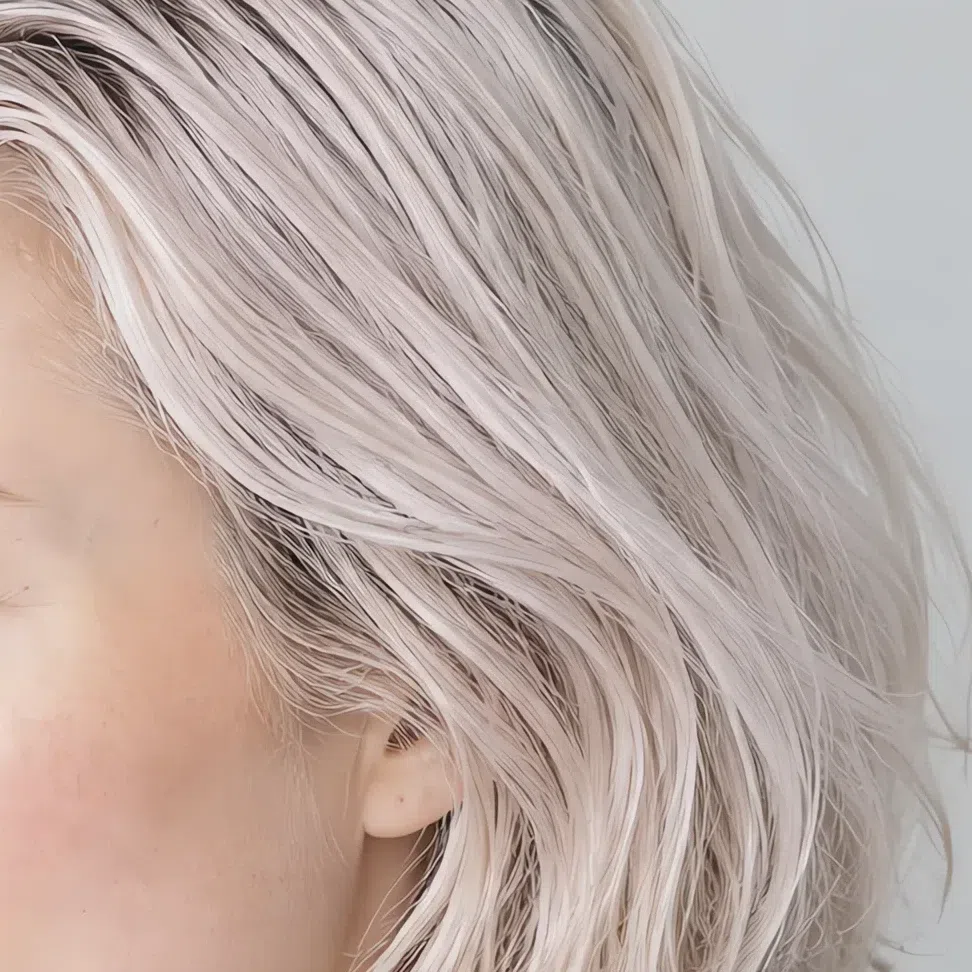
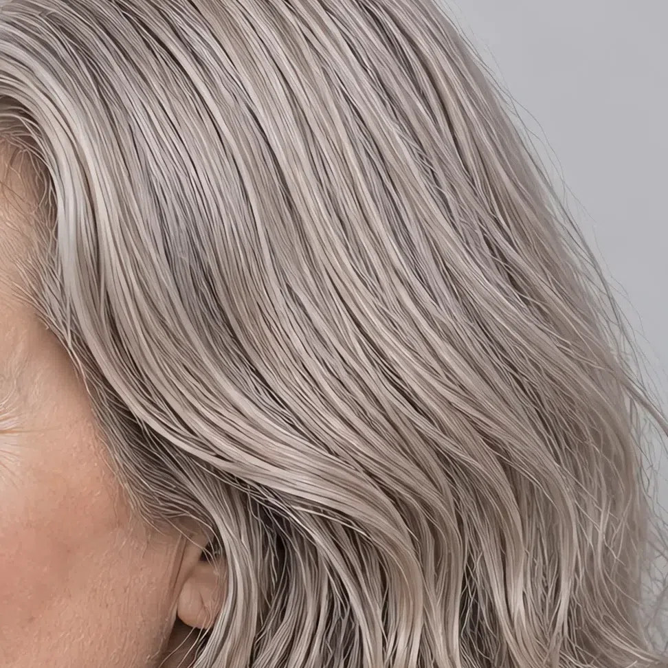
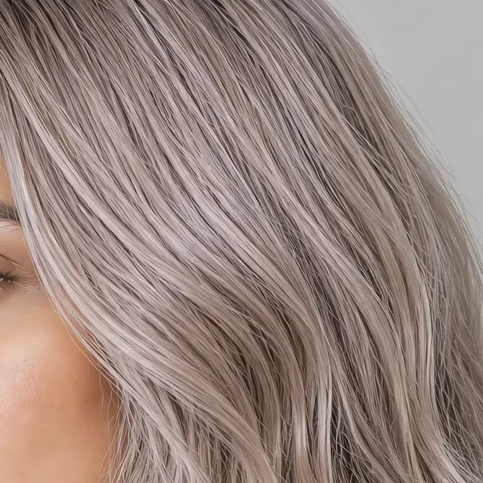
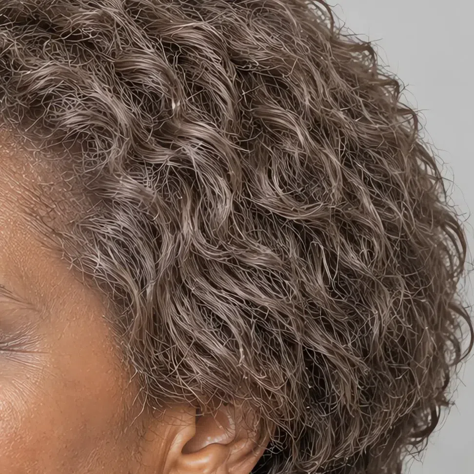
The same shade across four levels:
Deeper tones and multi-tonal work
Depth is available to you, but it arrives through ash rather than through darkness.
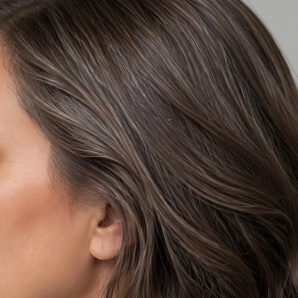
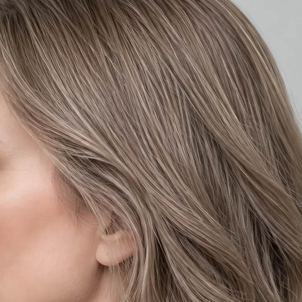
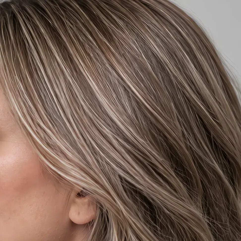
The same shade across four levels:
Hair colors to avoid
Seven shades, and they fail in two different ways - one group is too warm, the other too dark.
Warm and golden
Too dark and too contrasted
Light Summer, or one of its neighbors?
Three head-to-heads, and a test you can run for each
Almost nobody arrives at this subtype cleanly. Three others sit close enough to be mistaken for it, and each one differs on exactly one axis - which is good news, because it means each confusion has a single question that settles it.
Every subtype is named for the quality that leads it. Light Summer leads on lightness, Cool Summer on temperature, Soft Summer on mutedness, Light Spring on lightness again but from the warm side. Work out which quality leads you and the rest stops mattering.
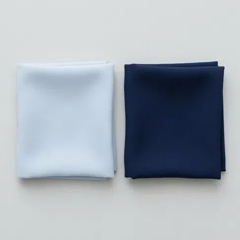
Two blue scarves, both held under your chin in daylight - a pale hazy blue and a deep navy. Which one leaves your face looking like itself?
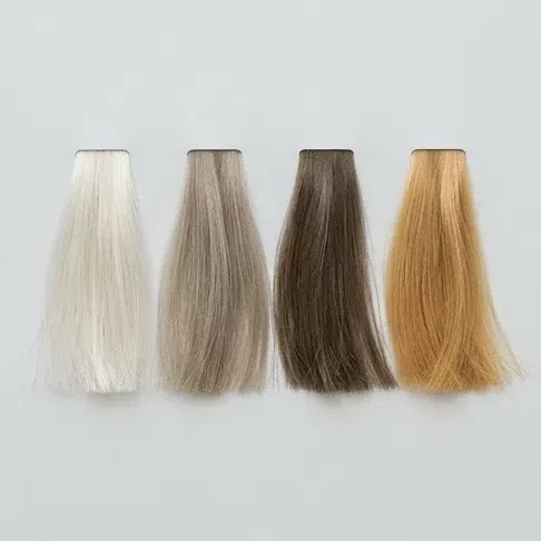
Ignore anything you have had done to it. What color was your hair at twenty?
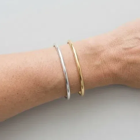
Silver bangle on one wrist, gold on the other, in daylight. Look at the skin next to each, not at the metal.
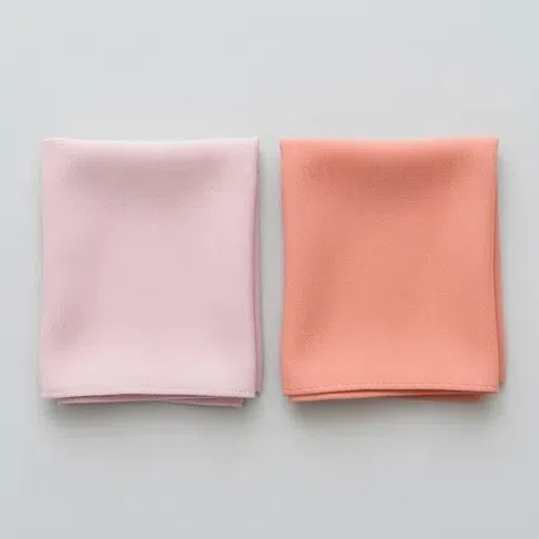
Last one, and it is the one that separates the two lightest subtypes. A cool rose pink and a warm peach coral, both at the collar.
Light first, cool second, and nothing at full strength. This is your page - the palette section is where to start.
Cool leads you rather than light does, and you can carry more depth than this subtype. Read Cool Summer instead.
Mutedness is leading you rather than lightness, and your coloring sits at mid depth. Soft Summer is the closer fit.
Just as light, but warm underneath - the gold answers gave you away. Light Spring is your season.
Treat this as a pointer rather than a verdict. Four questions cannot settle a borderline case, and the borders are exactly where people misjudge themselves - if two results feel equally true, the head-to-heads below are the tiebreak.
Light Summer vs Cool Summer
Light Summer
Light, and that is the headline. Everything about the face is pitched up toward the pale end, and your darkest garment is a mid blue.
Soft, but the color still reads. Grayed enough to be gentle, clear enough that Powder blue looks like blue rather than like dust.
Very low. Hair, skin and eyes are within a couple of steps of one another.
Pale and cool. Chalk, Heather, Peony, Powder blue - the top end of the cool range.
Light ones only. Heather stands in for charcoal; there is no black in the wardrobe at all.
Cool Summer
Light through medium. She can carry a shade that would flatten you, and often looks better for it.
Cleaner. Her blues and pinks are crisper - the dusty end of the summer palette goes flat on her.
Moderate. There is a visible step from her hair down to her skin.
Cool and clear. True navy, cool emerald, clean raspberry - shades that take over a Light Summer face.
Deeper ones work. Charcoal and true navy are hers, not yours.
The test: the navy scarf Borrow the deepest navy you can find and put it under your chin in daylight, bare-faced. A Cool Summer sharpens behind it - her eyes come forward and the face gains definition. On you the navy sits there as a block of weight and your face retreats behind it, because nothing in your coloring is that deep and there is nothing for it to answer.
Light Summer vs Soft Summer
Light Summer
Lightness. Soft comes second, and it is a consequence of being light rather than the point.
Light at any depth, and cool under it. Pink or rosy-taupe rather than gray or olive.
Ash, and light for its level. A cool medium-dark brown is as deep as it gets.
Pastel-led. Wisteria, Mint, Frost blue - shades that would disappear on a mid-depth face.
Delicate. People reach for words like fresh and gentle.
Soft Summer
Mutedness. A gray veil over everything, at mid depth rather than high.
Neutral with gray or olive over it. Harder to read, and it rarely flushes the way yours does.
Ash at any depth, including browns far deeper than this subtype carries.
Dustier and deeper. Her shades have more gray stirred in and sit lower on the scale.
Understated. Balanced rather than delicate - a different word entirely.
The test: the grayscale photo Photograph yourself in daylight without makeup and drop the color out of the picture. Then look only at where the whole image sits, not at how much variation is in it. A Light Summer photo lives in the pale grays with nothing approaching mid; a Soft Summer photo sits squarely in the middle of the scale. Both look low-contrast - the difference is the altitude, not the spread.
Light Summer vs Light Spring
Light Summer
Cool. The one axis in this pairing that actually differs, and it decides everything downstream.
Pink, rose-beige or rosy-taupe. It reddens before it tans and never turns golden.
Ash all the way through. Sun lifts it to wheat and it stays cool.
Silver, platinum, white gold. Yellow gold drops a cast on the face.
Cool pastels. Peony, Wisteria, Powder blue - pink-based, never peach-based.
Light Spring
Warm. Just as light as you, and gold-based rather than pink-based.
Ivory, peach or warm golden beige. It tans more easily and browns rather than reddens.
Golden or honey blonde. Sun brings out more gold, not less.
Gold. Silver leaves her looking a little grayed.
Warm pastels. Peach, apricot, warm aqua - the same lightness, the opposite undertone.
The test: two pinks at the collar This is the confusion worth spending five minutes on, because the two subtypes share lightness exactly and everything except temperature will look like a match. Hold a cool rose pink to your face, then a warm peach coral, both in daylight. One of them settles your skin and the other puts a flush or a yellow cast on it. If the coral is the one that works, you are a Light Spring reading a page that will send you shopping in the wrong half of the shop.
If two of these still feel equally true, go back to the leading quality rather than to the details. Depth is the easiest of the four axes to judge from a photograph, and on this subtype depth is the answer: a face that reads light overall in gray daylight belongs here even when a row or two fits a neighbor better.
Light Summer, answered
How to tell if you are a Light Summer?
What colors to avoid as a Light Summer?
Can Light Summers wear navy?
#7A9EB4, a cool mid blue that reads as a proper blue without the weight. Below the waist, or in a bag or a shoe, real navy is fine - the rule only applies within about eighteen inches of your face.
Can Light Summers wear black?
#DAD8DE - a soft gray carrying just enough lilac to stay interesting, and it anchors an outfit the way black would without the dead weight. Reach for it whenever the instinct says black.
What hair color for Light Summer?
What kind of makeup should I use for a Light Summer?
What are the main features of Light Summer coloring?
What colors suit a Light Summer in clothes?
What should a basic Light Summer wardrobe contain?
How is Light Summer different from Light Spring?
What metals and jewelry should a Light Summer choose?
What else is Light Summer called?
How is Light Summer different from Soft and Cool Summer?
Which celebrities are Light Summers?
Can I be a Light Summer if my hair or eyes are dark?
What if a different test typed me as something else?
Where this came from
Five sources, and what each one is holding up: why the lamp you stand under changes the answer, why lightness and intensity are two separate measurements, what actually makes skin the color it is, what "low contrast" means as a number, and where the four-season idea came from.
-
CIE 13.3-1995: Method of measuring and specifying colour rendering properties of light sources (opens in a new tab)
International Commission on Illumination (CIE), 1995
Behind the instruction repeated on all three undertone tests in how to tell: judge in daylight. The standard defines how a light source is rated on how faithfully it reveals the colors of objects under it - and an incandescent lamp, a warm LED and a north window do not reveal them alike, which is why the bulb you stand under can decide the result.
-
A pigment color system and notation (opens in a new tab)
Munsell, The American Journal of Psychology (Internet Archive), 1912
Behind the distinction the grayscale demo in how to tell turns on. Munsell’s system separates value (how light a color is) from chroma (how intense) as two independent dimensions - so a deep complexion and a high-contrast one are different measurements, and this subtype is described as light before it is described as cool.
-
Non-invasive measurements of skin pigmentation in situ (opens in a new tab)
Stamatas, Zmudzka, Kollias & Beer, Pigment Cell Research, 2004
Behind the caveat on the wrist-vein test in how to tell. Skin color is largely melanin absorbing light, and hemoglobin in the dermal capillaries adds its own signal that has to be separated out - so a vein is read through a layer whose depth varies, and the test loses reliability as that depth increases.
-
Aspects of facial contrast decrease with age and are cues for age perception (opens in a new tab)
Porcheron, Mauger & Russell, PLoS ONE, 2013
Behind "low contrast" in the signs. Facial contrast - how much the eyes, brows and lips stand out from the surrounding skin - is a measurable quantity, not a mood. A Light Summer starts with less of it than most faces, and that number is what the palette is built around.
-
Color Me Beautiful (opens in a new tab)
Jackson, Ballantine (Internet Archive), 1980
Provenance for the framework rather than for any one sentence. Color Me Beautiful put the four-season method in front of a mass audience in 1980; the teaching it drew on reaches further back, to Harriet Tilden McJimsey, to Belle Northrup, and before them to Johannes Itten.
One honest distinction. The lighting standard, the color dimensions, the skin biology and the contrast research above are sourced; which nineteen shades belong to a Light Summer, where the line falls between this subtype and Light Spring, and how deep a blue you can wear are our own analysis, built from the palette on this page. The twelve-season boundaries are not a standard - different schools draw them differently - and no study has been published on any of it, which we would rather state than disguise with a citation.
What is color analysis, how do you find your season, and what are the 12 types?
The main guide covers all of it - the four axes your season is built from, all twelve subtypes side by side, and a free quiz that places you in about a minute.
What is color analysis? For women and men