Warm Autumn makeup: rich, golden shades and how to wear them
Warm Autumn makeup - True Autumn, in the older naming - is warmth with depth: terracotta, copper, bronze, olive and brick, every shade with gold running through it. It is the warmest makeup of any season, and a cool base is the only thing it cannot wear. Further down: sixteen complete faces on four depths of skin, each product in the order it goes on, and every shade in one list you can save.
- Four steps, in order
- Four complexions
- Everyday and evening
The order you apply it in
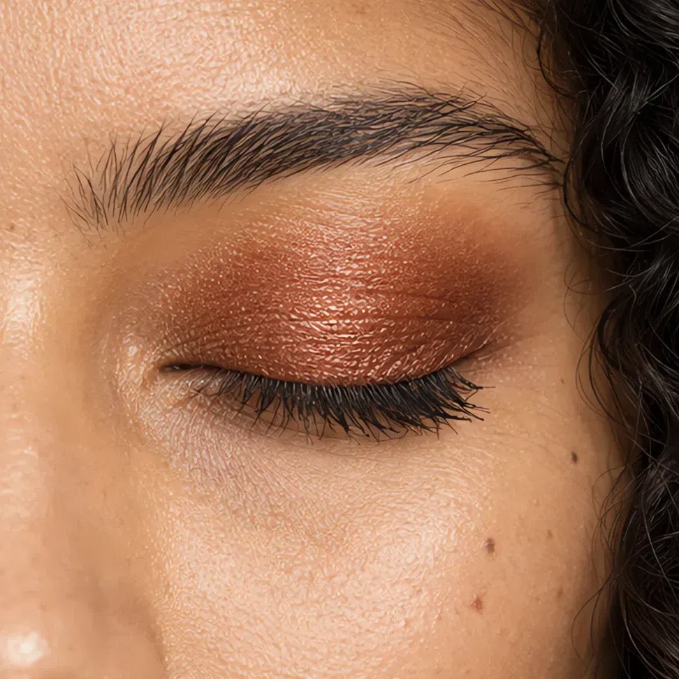
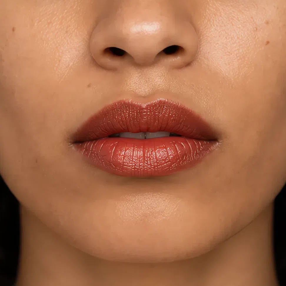
Start here
You are a Warm Autumn. Here is what to put on.
Everything below follows from one fact: your coloring is warm through and through, and rich rather than bright. Golden, peach or honey skin that tans easily, hair with copper or gold in it, and eyes that are warm brown, hazel, amber or a golden green. There is no blue anywhere in this face, and the contrast in it is medium - made of warm browns, never of black.
So the shades are the palette’s earth and metal worn on the face - terracotta, copper, bronze, ochre, olive, brick - and they can be deep. There is one main way to go wrong: cold. A pink foundation, a silver highlight, a baby pink blush or a blue-red lip turns this skin sallow, and a black line looks darker than anything else on the face.
Keep every shade golden, and let the depth come from warm color rather than from black.
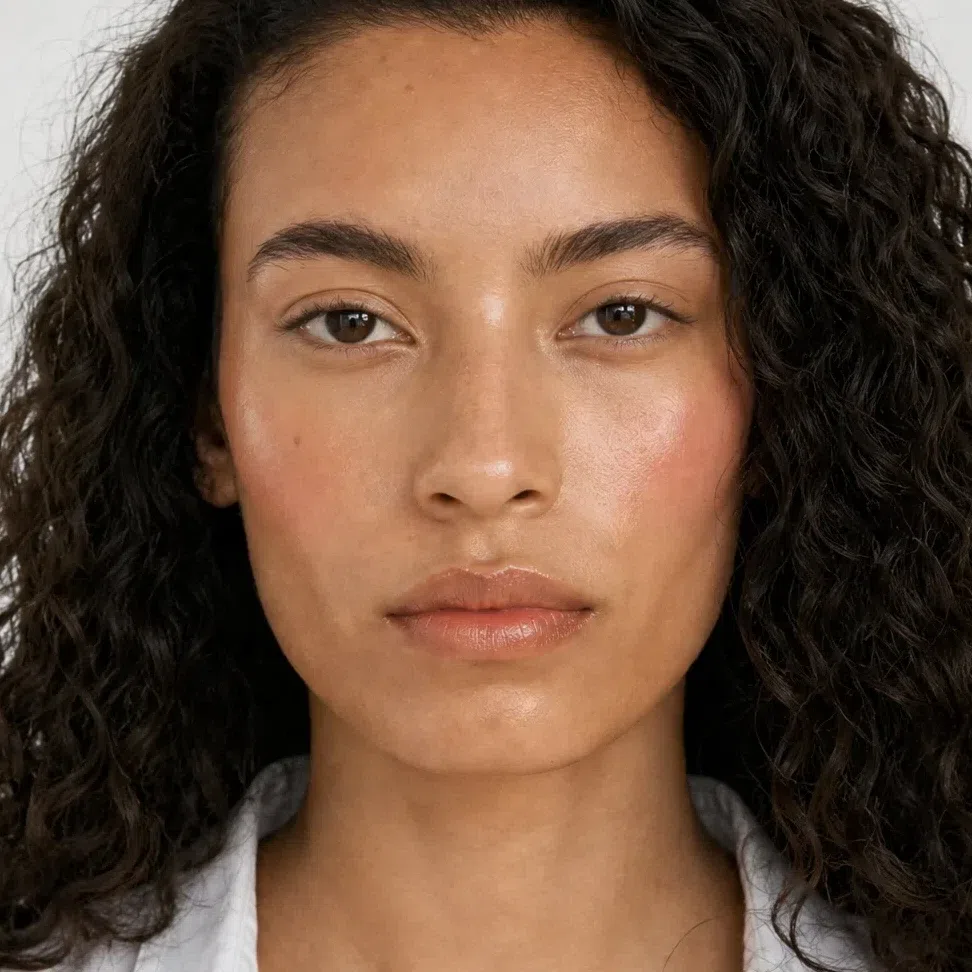
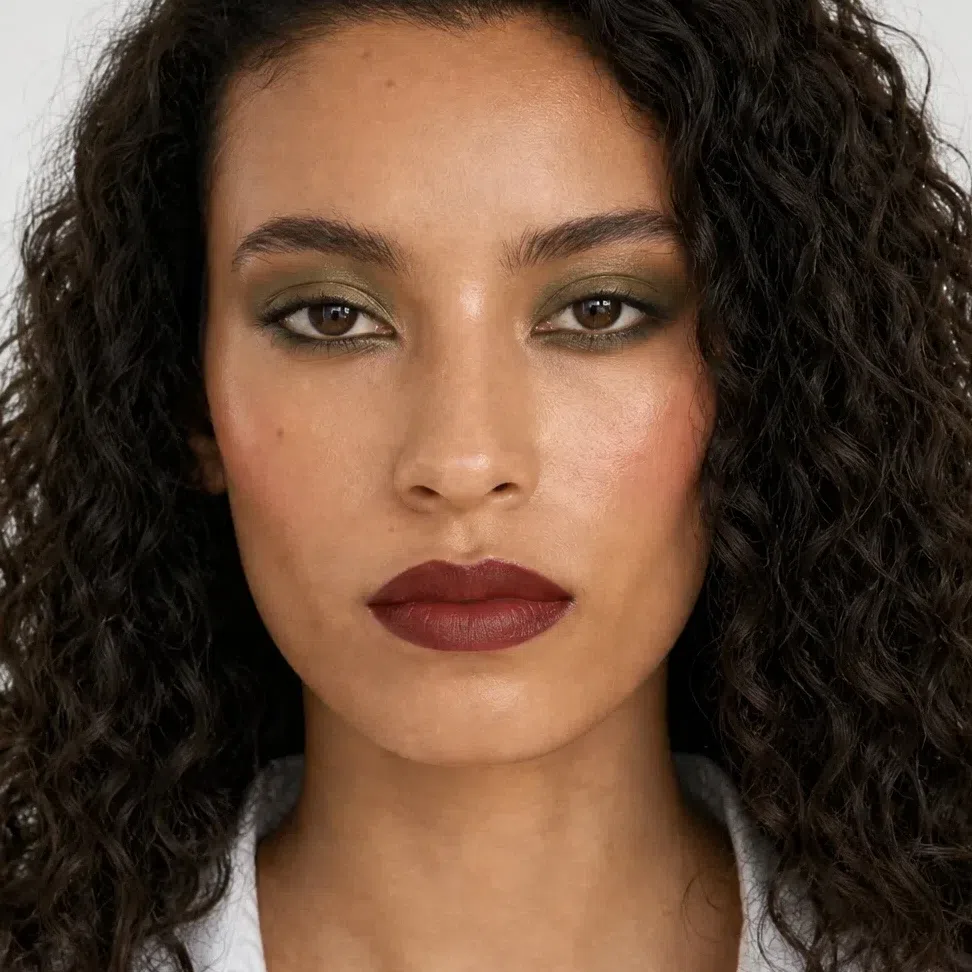
The same medium-skinned woman at her quietest and at her boldest. Between the two photographs the warm color goes deeper; its temperature never moves. Fair, light and deep follow in the next section.
What is on this page
- Sixteen finished looks Sixteen faces from a five-minute one to a wedding, each card listing what went on the lid, cheek and mouth.
- Why these shades Four swaps, each shown against the cool version a Warm Autumn usually already owns.
- How to build it Base, cheeks, eyes, lips, in the order they go on, and how to keep each one golden.
- When you need more Richer, never blacker: day and evening side by side at each depth.
- How to buy it Testing a base at the jaw, the label words that give a pink base away, and your square on the foundation grid.
- The shade list All 44 shades with their hexes in one block, sized for a screenshot.
Sixteen finished looks
Sixteen faces before any more shade names: four occasions across four complexions, and each card spells out what sits on the lid, the cheek and the mouth. Start from the row closest to your skin and follow it left to right. The right-hand card is the ceiling for this coloring - brick or cordovan on the mouth, and still no black.
If you have fair skin:
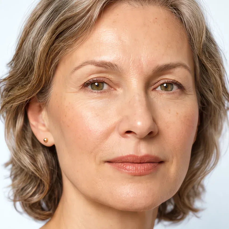
- Base Fair - warm ivory
- Blush Golden peach blush
- Lips Peach nude
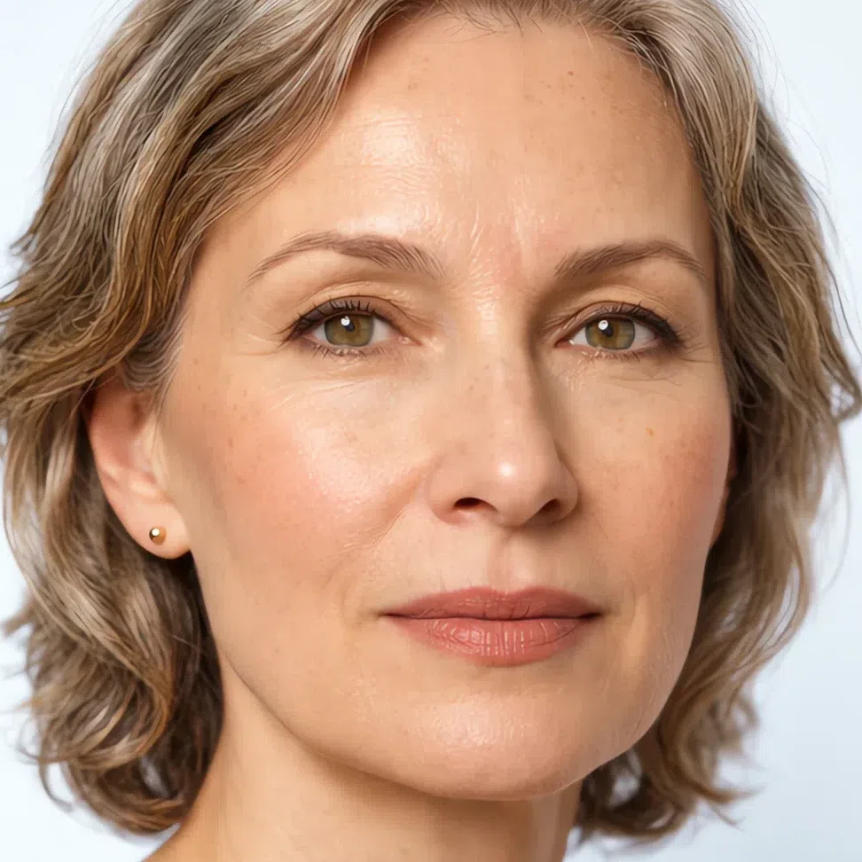
- Base Fair - warm ivory
- Blush Golden peach blush
- Eyes Golden beige lid
- Liner Chocolate liner
- Lips Peach nude
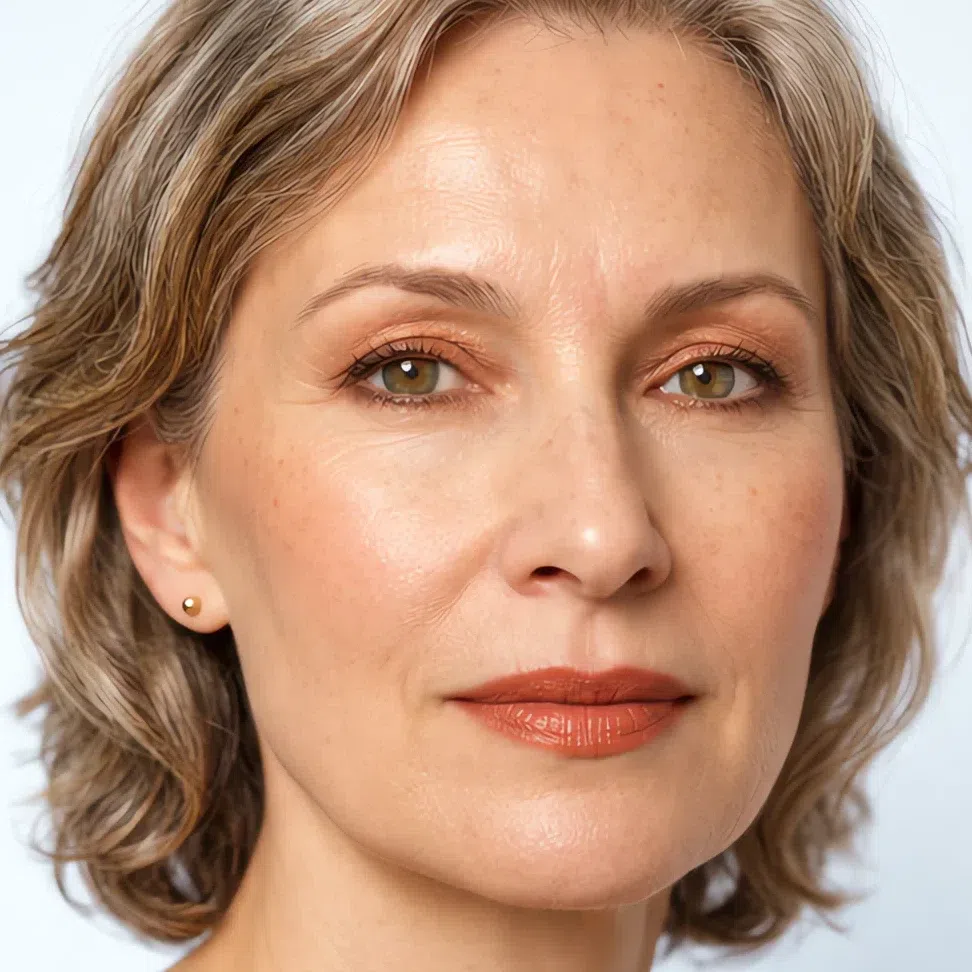
- Base Fair - warm ivory
- Blush Apricot blush
- Eyes Copper shimmer
- Liner Antique bronze liner
- Lips Pumpkin spice
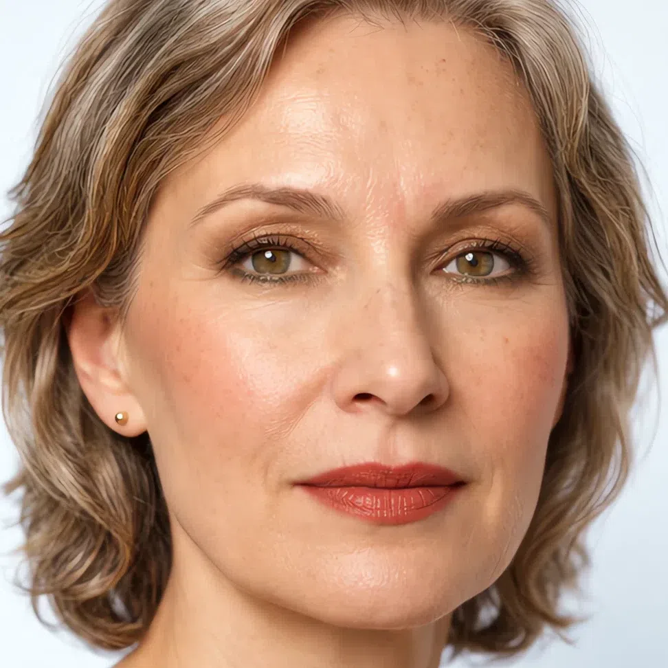
- Base Fair - warm ivory
- Blush Grapefruit
- Eyes Bronze lid
- Liner Forest green liner
- Lips Copper red lip
If you have light skin:

- Base Light - golden beige
- Blush Apricot blush
- Lips Caramel nude

- Base Light - golden beige
- Blush Apricot blush
- Eyes Apricot lid
- Liner Chocolate liner
- Lips Caramel nude

- Base Light - golden beige
- Blush Grapefruit
- Eyes Bronze lid
- Liner Teal green liner
- Lips Copper red lip

- Base Light - golden beige
- Blush Terracotta blush
- Eyes Terracotta lid
- Liner Chocolate liner
- Lips Brick red
If you have medium skin:
- Base Medium - honey caramel
- Blush Grapefruit
- Lips Terracotta nude
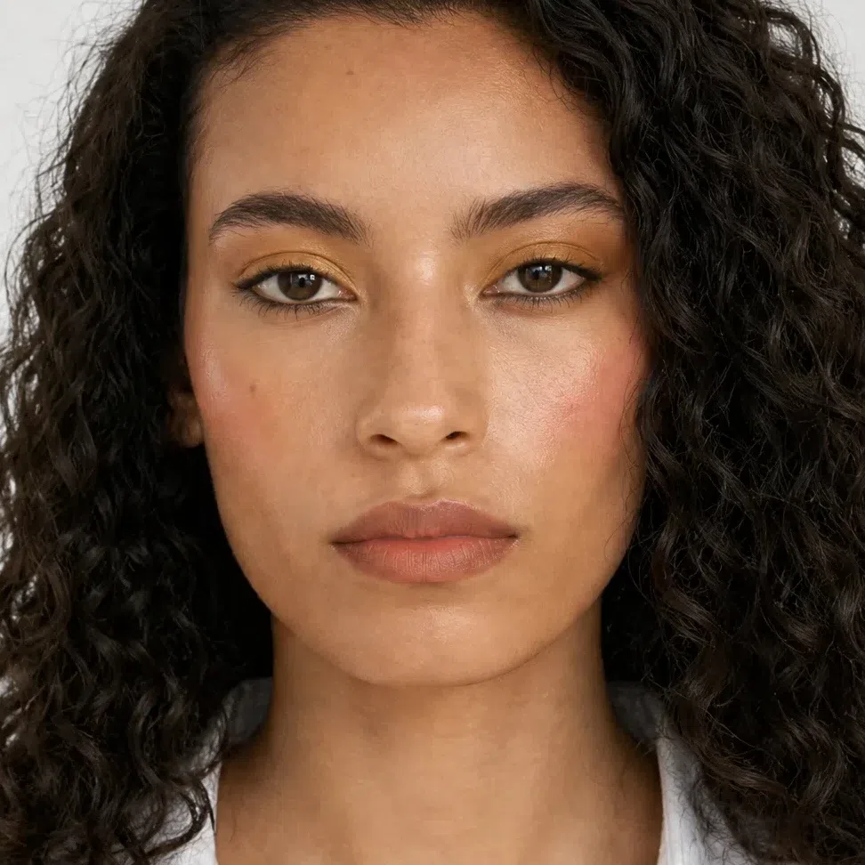
- Base Medium - honey caramel
- Blush Grapefruit
- Eyes Ochre lid
- Liner Chocolate liner
- Lips Terracotta nude
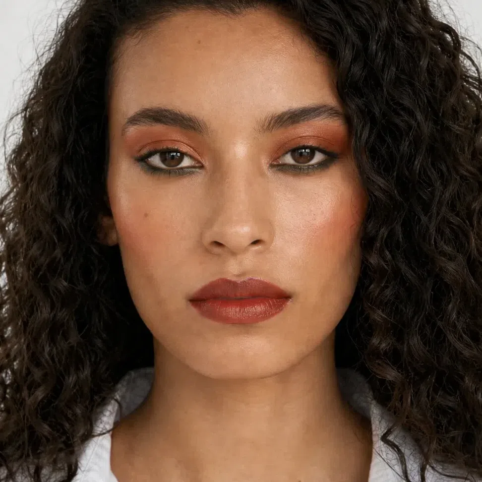
- Base Medium - honey caramel
- Blush Terracotta blush
- Eyes Terracotta lid
- Liner Teal green liner
- Lips Brick red
- Base Medium - honey caramel
- Blush Terracotta blush
- Eyes Moss green lid
- Liner Chocolate liner
- Lips Cordovan
If you have deep skin:

- Base Deep - warm cocoa
- Blush Terracotta blush
- Lips Honey brown nude

- Base Deep - warm cocoa
- Blush Terracotta blush
- Eyes Khaki olive lid
- Liner Chocolate liner
- Lips Honey brown nude

- Base Deep - warm cocoa
- Blush Terracotta blush
- Eyes Moss green lid
- Liner Antique bronze liner
- Lips Brick red
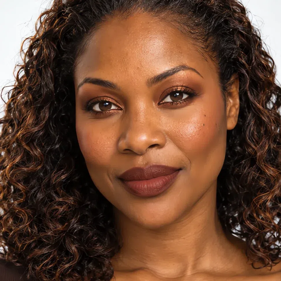
- Base Deep - warm cocoa
- Blush Terracotta blush
- Eyes Copper shimmer
- Liner Chocolate liner
- Lips Cordovan
Go down any column and the occasion holds while the shade names change. A golden peach that glows on warm ivory hardly shows on deep bronze skin, so every row down needs a deeper, warmer shade - golden peach, apricot, grapefruit, terracotta - to do the same job. The gold in each shade stays constant, and that constant is why the classic pinks and blue-reds in most makeup bags fight this face.
Why these shades, and not the ones you own
Strip the sixteen faces back and four swaps are doing most of the work. Below, each one sits next to the shade a Warm Autumn most often already owns: the classic, the safe neutral, the one a counter assistant reaches for first. None of them are too strong or too weak for this face. They are too cold.
Why these shades and not those
Tap a productBlack is the default liner, and it is the coldest color in the kit. Hair with copper in it and eyes with gold or green in them never reach true black, so a black line is darker than anything else on the face and it draws a border instead of depth. Chocolate does the same job at the depth this coloring actually has.
Taupe gets sold as the neutral that suits everyone. Most taupes are gray-brown with a hint of mauve, and against golden skin that mix reads as a bruise rather than a shadow. An ochre or khaki olive is just as quiet, and it has the same yellow in it as the skin around the eye.
This skin flushes peach, apricot or brick-red, never pink. A blue-pink blush does not blend into golden skin; it stays on top of it as a separate patch of color, and the cheek around it starts to look sallow by comparison. A terracotta of the same strength reads as your own flush.
The classic red is a blue-red, and it is the one red this face cannot wear. The blue in it makes the teeth look yellow and the skin look tired. Take the red toward orange and brown instead: pumpkin, copper red, brick or cordovan, as deep as you like.
The working shade moves with the skin - golden peach on a fair cheek becomes terracotta on a deep one - so there is no single right hex, and the cheat-sheet has yours. The failing shade does not move at all, because its problem is temperature, and a blue base is wrong on every depth. Liner is the one product that stays put on both sides: chocolate for everyone. The hexes under "What goes wrong" are examples of the mistake, not measured products.
All four failures come from one place: a cool base. Black has no warmth, taupe has gray and mauve in it, baby pink and blue-red both lean blue. Warm Autumn is the warmest coloring there is - your palette has gold running through every shade, the greens included - so the first cool product on this face looks borrowed from somebody else.
So much for what to buy. How much of it goes on, and in which order, is easier to show step by step.
How to build it, step by step
The same four swaps, now in the order they go on. Getting the shade right is the easy half; the technique under each step is what makes a rich palette look like your own warmth rather than a layer of brown on top of it.
-
Base
Golden skin, warmed rather than covered
Your base shades, by depth
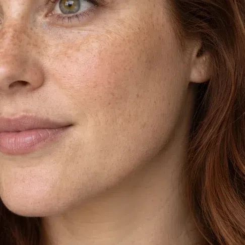
The season fixes the undertone - golden, peach or honey, and never pink. Your own skin fixes the depth.
Fair - Foundation Fair - warm ivory #F3E0CE
- Bronzer Fair - soft golden brown #C9A27A
- Highlighter Fair - golden champagne #EFE0BE
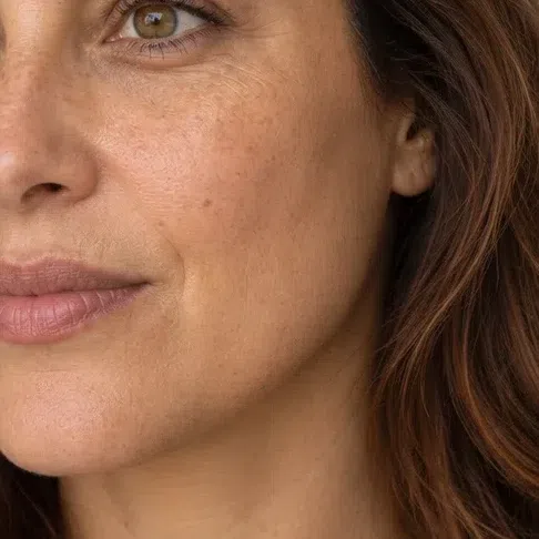
Light - Foundation Light - golden beige #E3BE93
- Bronzer Light - warm golden brown #A87141
- Highlighter Light - warm gold #F2D9A0
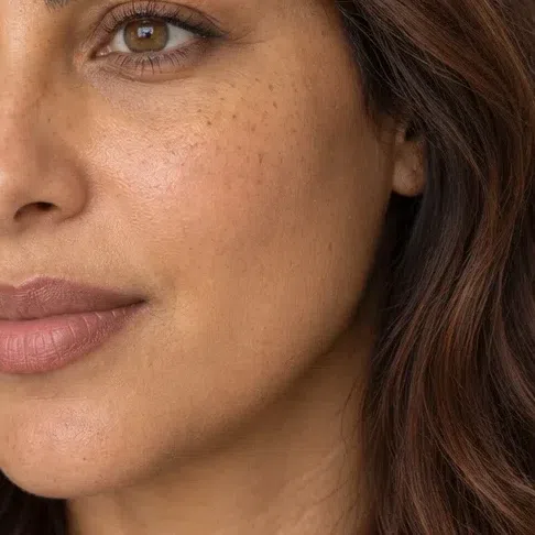
Medium - Foundation Medium - honey caramel #B98A56
- Bronzer Medium - terracotta bronze #9C5A38
- Highlighter Medium - peach pearl #F7D6BE

Deep - Foundation Deep - warm cocoa #7A5035
- Bronzer Deep - dark copper bronze #6E4028
- Highlighter Deep - bronze glow #D8AC78
This coloring looks best when the skin reads warm and slightly sunlit, so the base job is to even the tone and leave the glow. Press a light to medium golden base into the areas that need it - around the nose, the chin, any redness - with fingers or a damp sponge, and let the cheekbones show through. Freckles are part of the coloring; a base heavy enough to hide them flattens everything else too.
Bronzer does real work on this face, because the skin tans gold. Choose a warm golden brown or terracotta one or two steps below your skin, and sweep it where the sun would land: the top of the forehead, the cheekbones, the bridge of the nose. Highlighter comes last and stays small - gold, peach pearl or bronze, tapped onto the top of the cheekbone only.
Tip Check the base at the jaw in daylight. A golden shade disappears there; a pink one leaves a grayish edge and makes the neck look yellow beside it.
-
Cheeks
Warmth first, then everything else
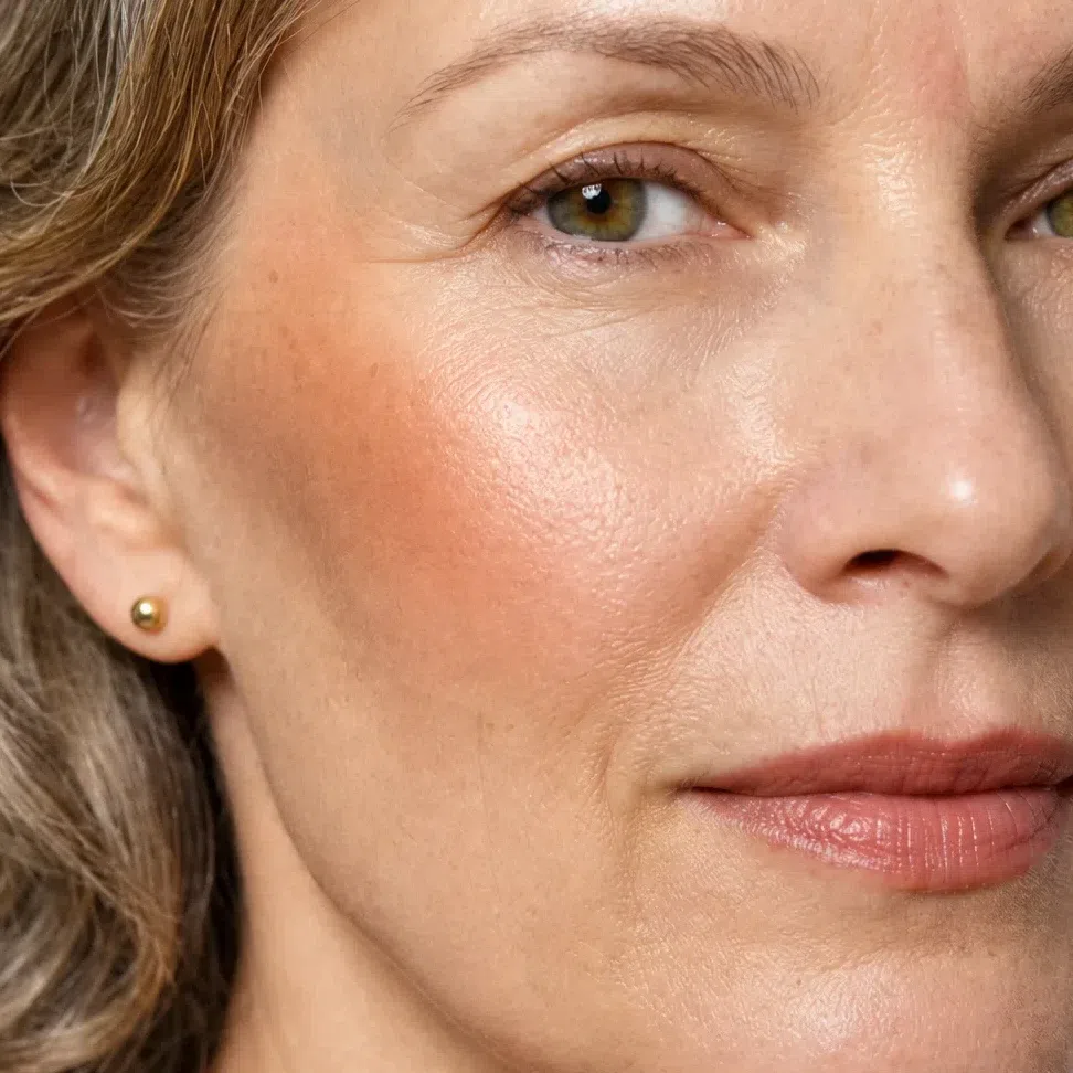
Put blush on before the eyes. A warm cheek sets the temperature of the whole face, and once it is there the eye and lip need less. Cream sinks in and looks like a flush; a soft matte powder works too on this coloring. Smile, press it onto the top of the cheek with two fingers, then sweep it up and back toward the temple so it meets the bronzer.
Blush
Golden peach on the fairest cheek, terracotta on the deepest, each step deeper and warmer than the last. Pick the one nearest your own flush after a walk outside, and start with half.
Golden peach blush #F0BE8E 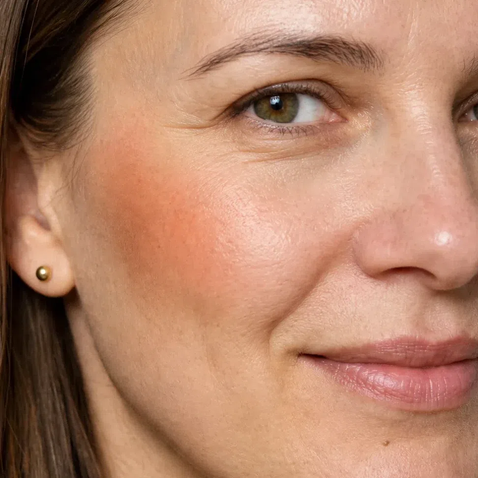
Apricot blush #F3B282 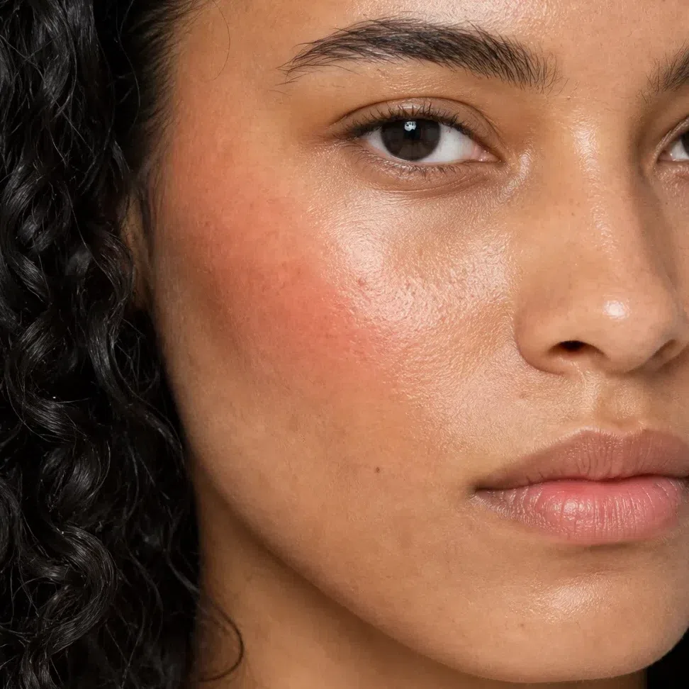
Grapefruit #E57F5F 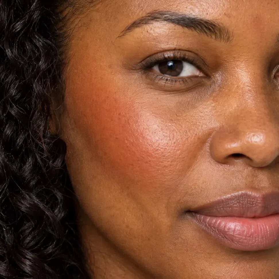
Terracotta blush #C9714F Tip Blush and bronzer should look like one warm wash where they meet. If you can see two colors, blend the line between them rather than adding more.
-
Eyes
Warm brows, an earthy lid, a chocolate line
In that order, because each one decides how far the next can go. Brows first: warm, at your hair color or a step lighter, never ash. Then one earthy shade over the lid - golden beige to khaki olive by depth. Then chocolate liner pressed into the lash roots and a warm brown mascara. By day the eye should look defined and warm, with nothing on it darker than your own iris.
Brows
Match the warmth of your hair, not its darkness: copper hair takes a copper or golden brow, dark hair a warm brown. Fill with short strokes and keep the front light.
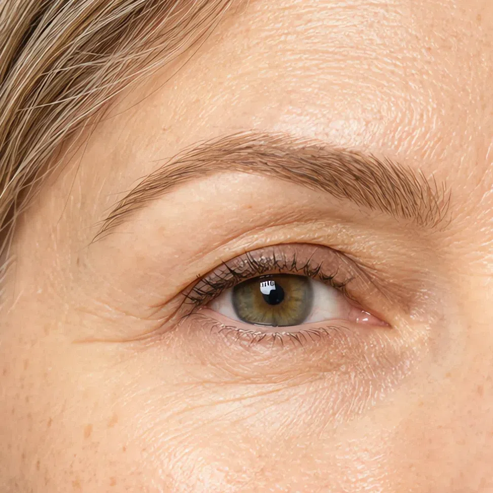
Golden blonde brow #B99664 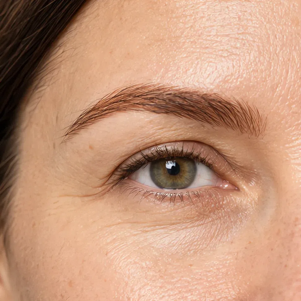
Copper auburn brow #A0603A 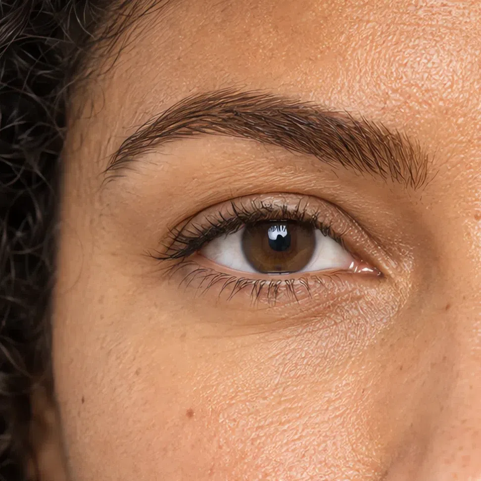
Chestnut brown brow #7A5334 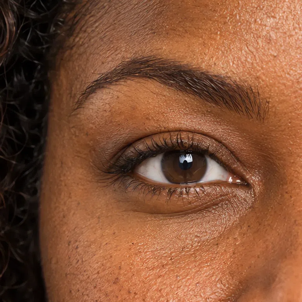
Warm dark brown brow #56392A Everyday eyeshadow
One shade across the moving lid, blended up to the crease and no further. Ochre and khaki olive make green and hazel eyes look greener.
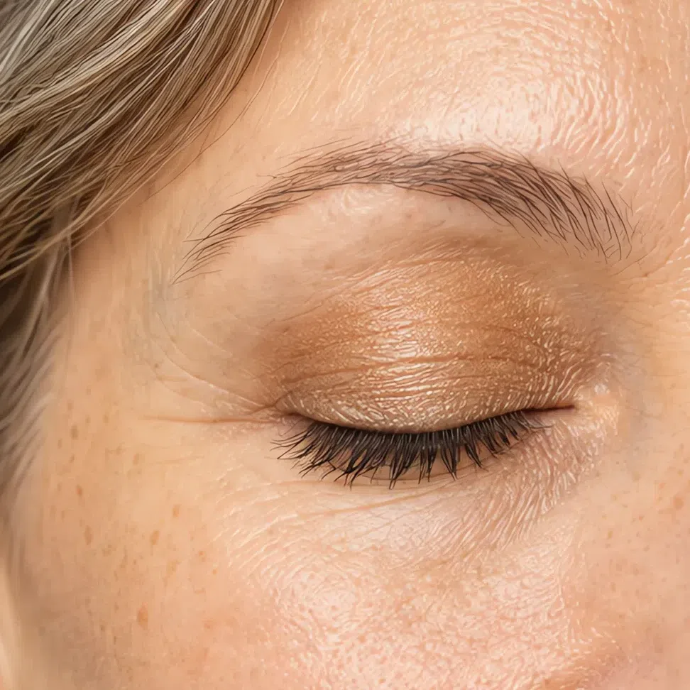
Golden beige lid #E0CBA8 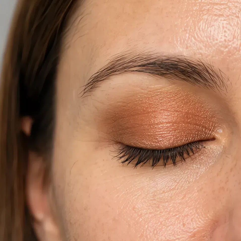
Apricot lid #EAB183 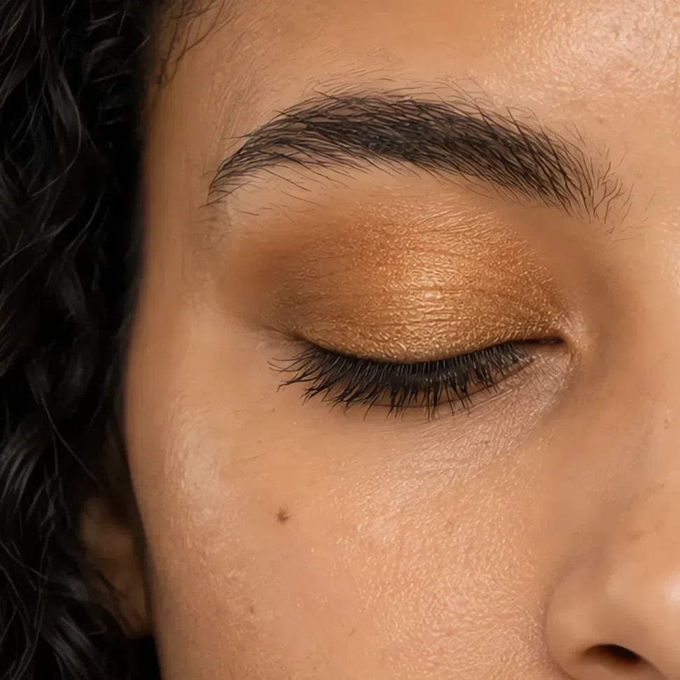
Ochre lid #C79A4E 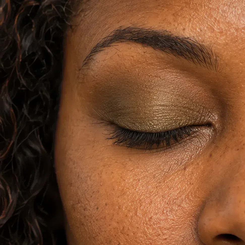
Khaki olive lid #8F8A5E Eyeliner
Four colors, not four depths - each one suits every complexion. Chocolate is the daily line; antique bronze lights the eye, and teal and forest green are the colors that do what black does without the chill.
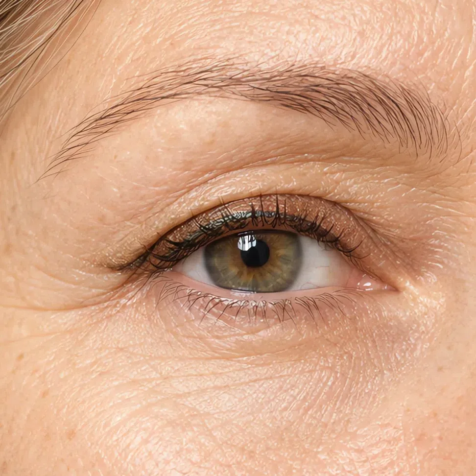
Antique bronze liner #8A6230 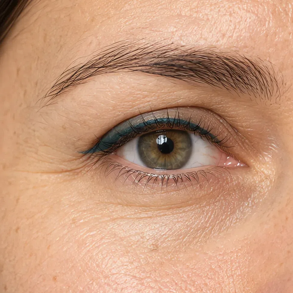
Teal green liner #2A6158 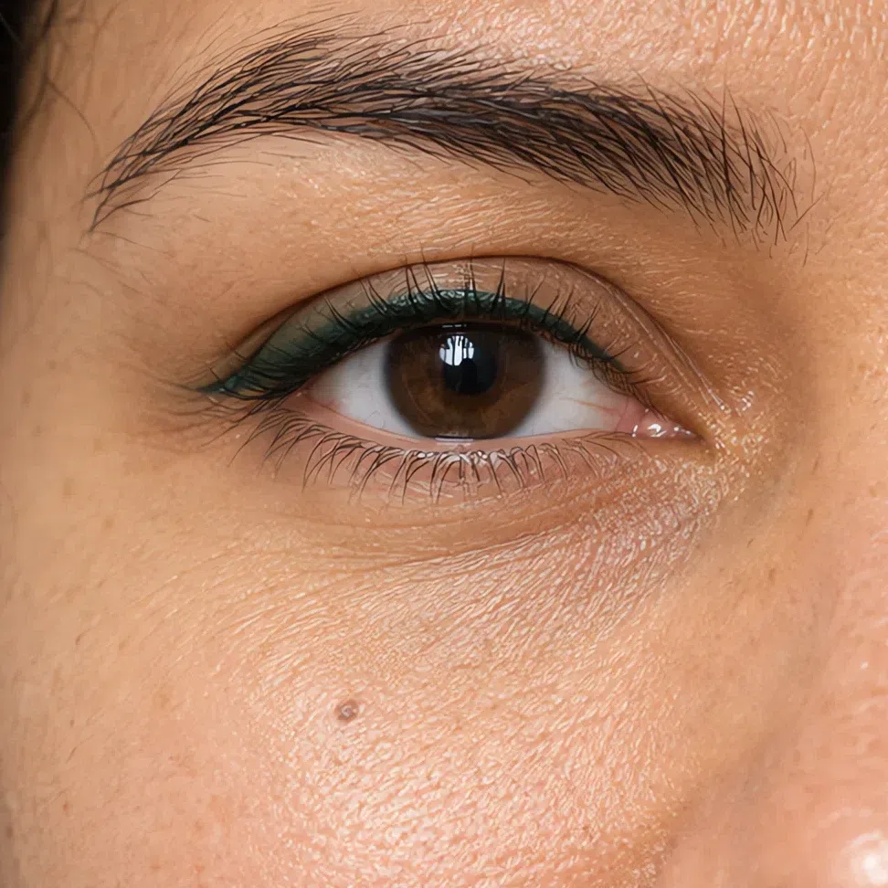
Forest green liner #33452C 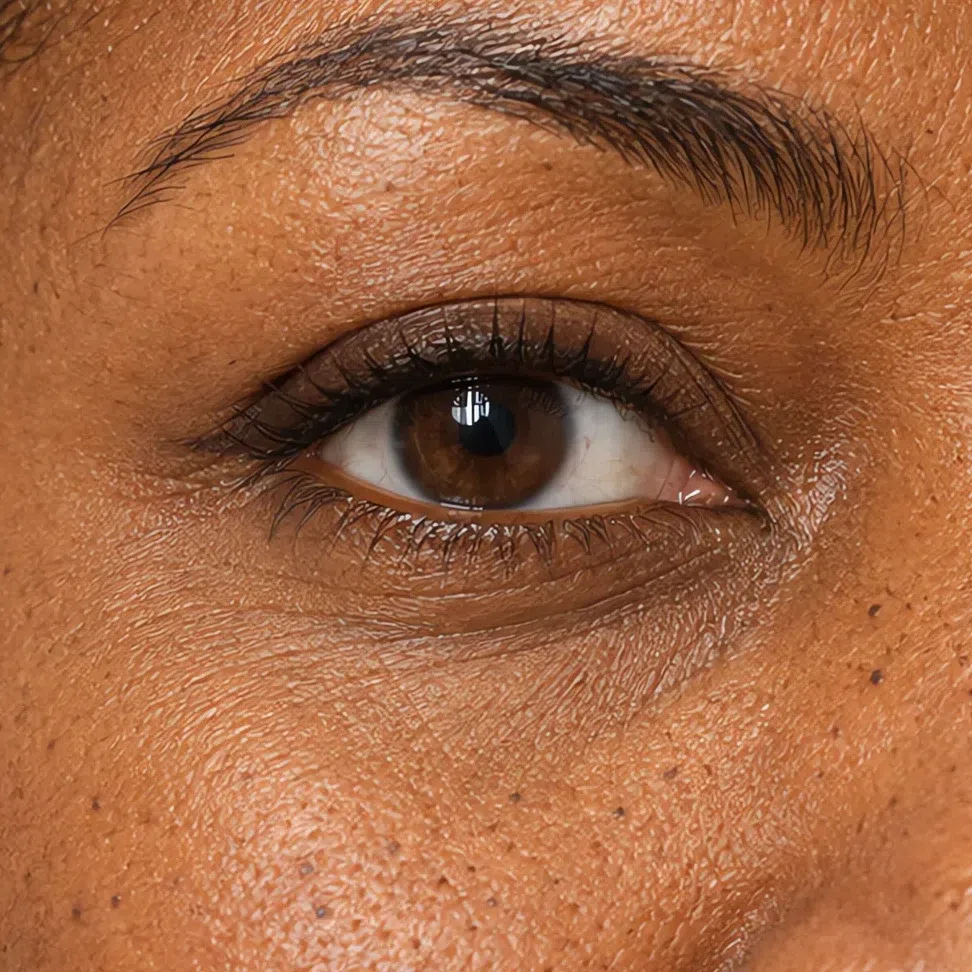
Chocolate liner #4A3122 Mascara
Match your lash root: bronze brown on the fairest, soft black-brown on the deepest. For more drama, add a second coat to the outer lashes rather than switching to black.
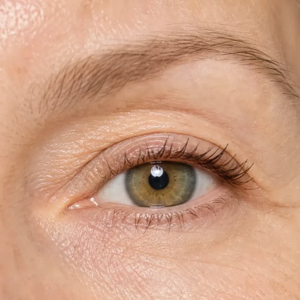
Bronze mascara #8A6338 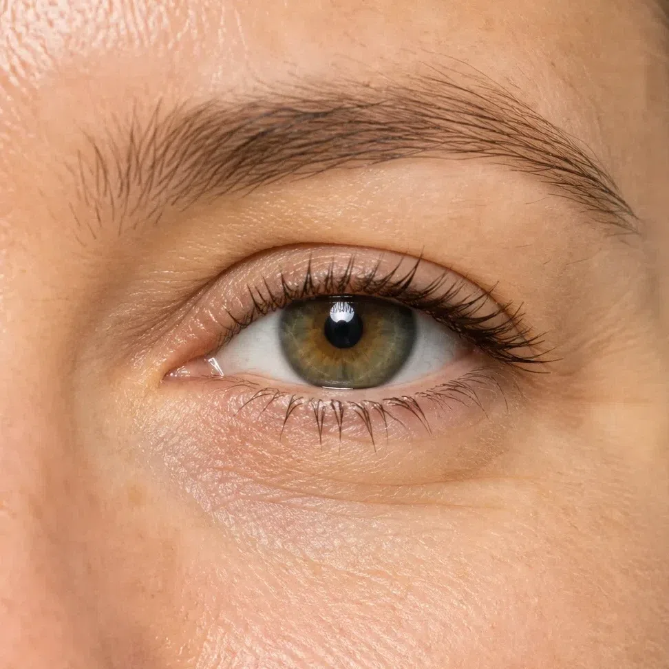
Brown mascara #6B4A32 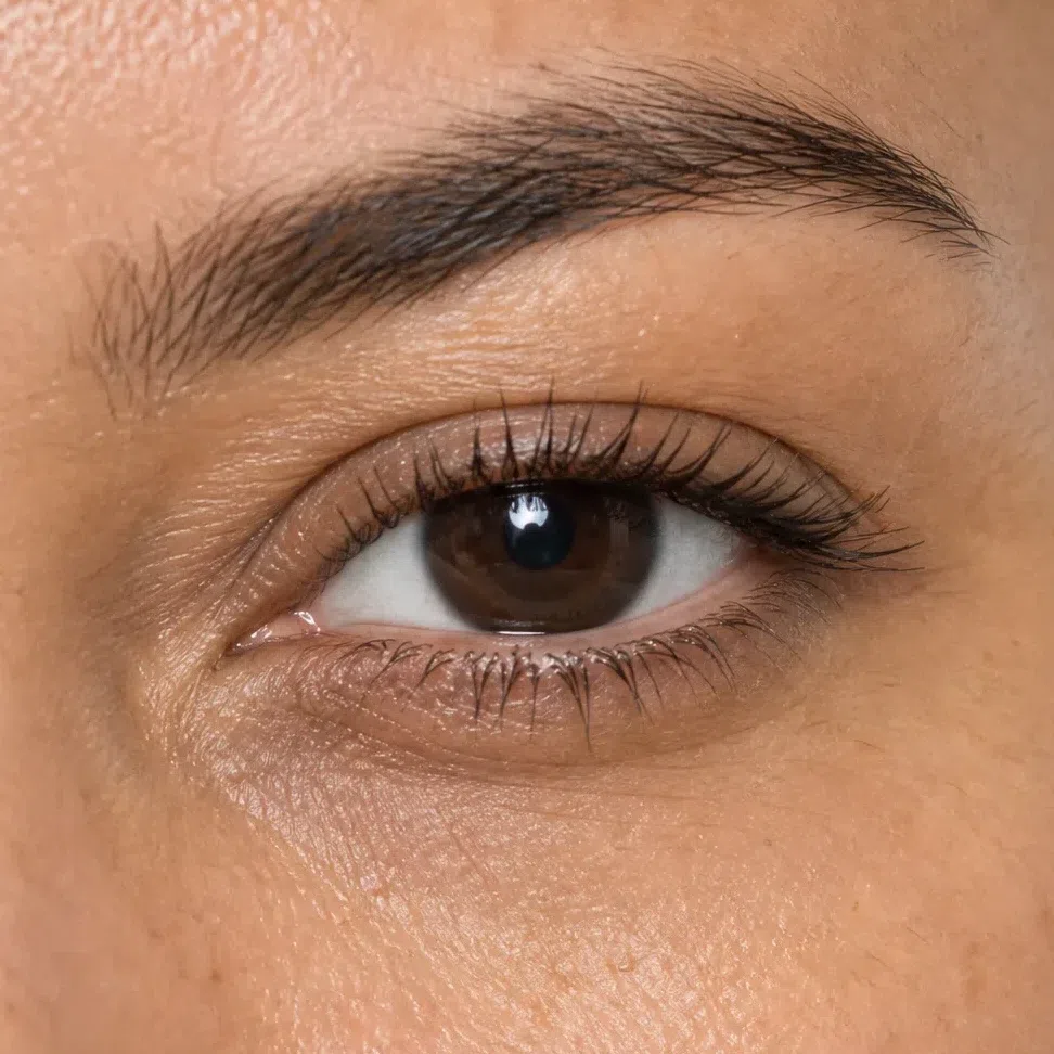
Chocolate mascara #46301F 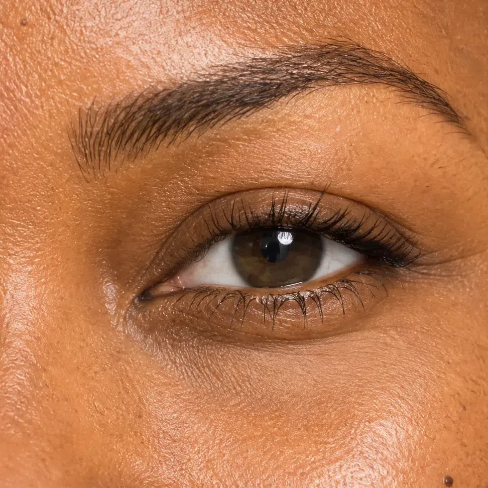
Soft black-brown mascara #2B221C Tip If you own one liner, make it chocolate. It suits every shade on this page, and in a photograph it reads as depth, where black reads as an outline.
-
Lips
A nude with spice in it
The Warm Autumn nude is peach, caramel, terracotta or honey brown - never the pink-beige that most ranges sell as their default nude. On golden skin a pink nude turns ashy and the mouth fades into the face. Pick the shade that looks like your own lip after a warm drink, press it on from the center outward, and blur the edge with a fingertip.
Nude lips
Peach at the fair end, honey brown at the deep end, all of them warm. The right one is your lip color with a little more spice in it.
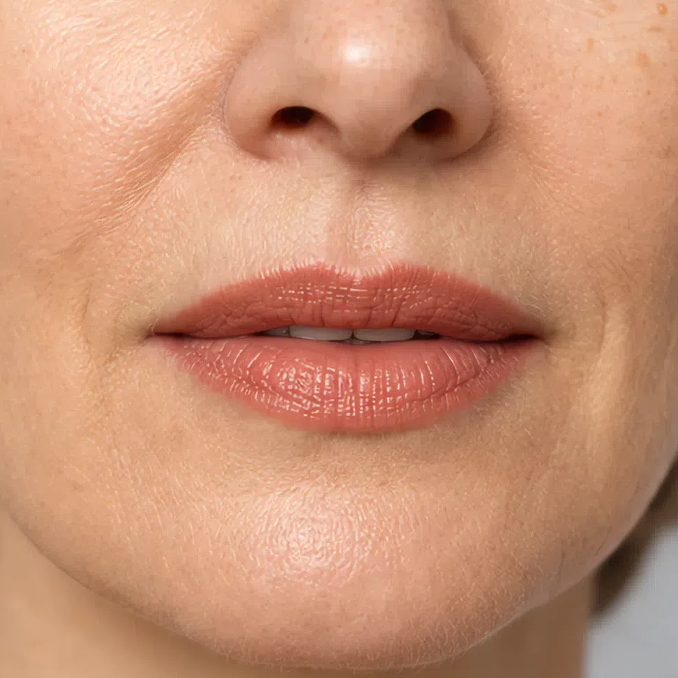
Peach nude #E9A98C 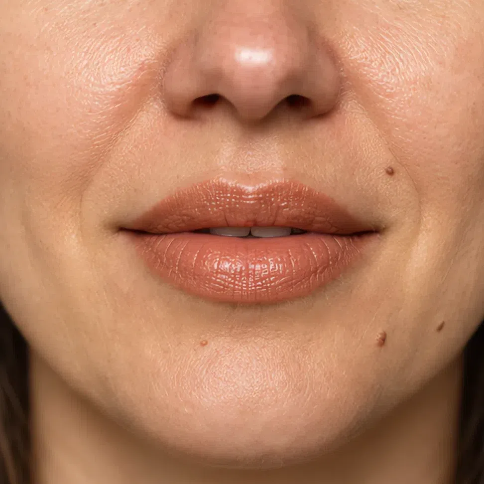
Caramel nude #B9805E 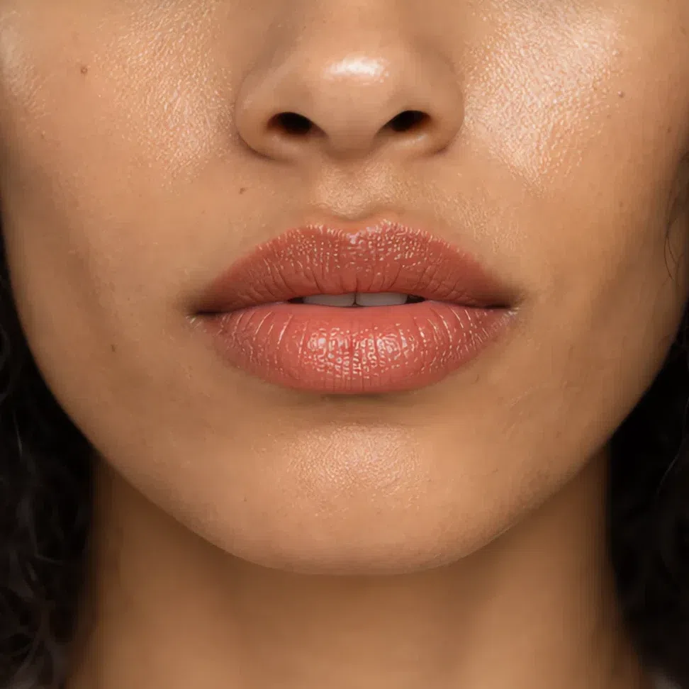
Terracotta nude #B8705A 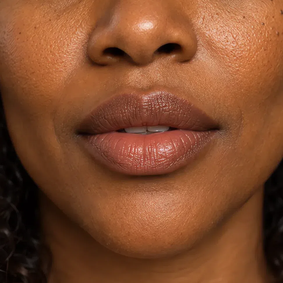
Honey brown nude #A0724A Tip A little bronze or gold gloss dabbed on the center of any of these four is an easy way to take the day face into the evening.
Four steps, and the day face is done. The evening is where most advice for this coloring goes wrong, because it reaches for black.
Your evening face: what changes, and what must not
Two things move and four stay put - less than most evening advice suggests. The evening face is the day face with the warmth taken deeper: a metal at the outer corner, a spiced red on the mouth, and a short list of things left exactly as they were. Each depth appears twice below, the same woman in both frames.
Eyes
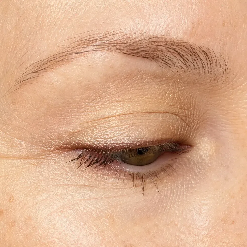
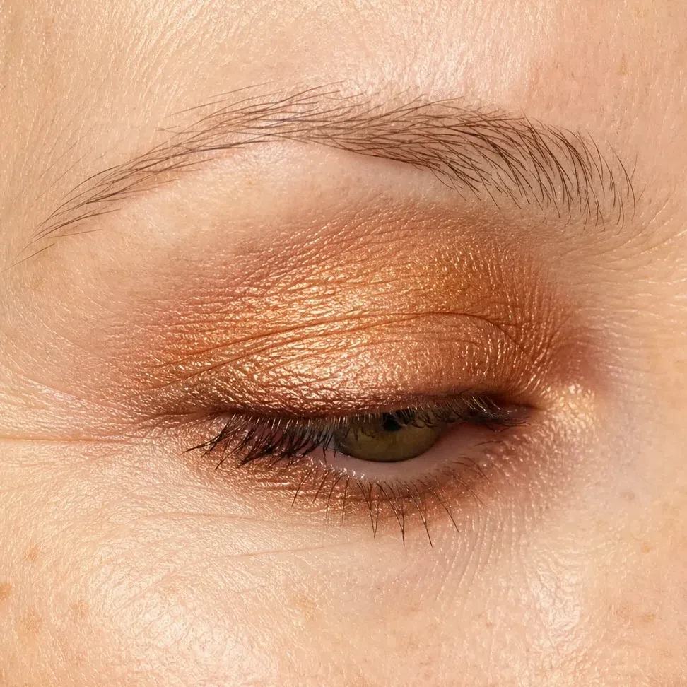
At night this coloring goes richer, not blacker. Keep the day shade on the center of the lid and give the outer third to one metal or earth - copper, bronze, terracotta or moss - from the crease round to the lower lashes.
- Start with your day shade over the whole lid.
- Press the evening shade into the crease and across the outer third of the lid.
- Smudge a little under the outer half of the lower lashes, no further in.
- Keep the evening shade off the center of the lid; it stays the brightest spot on the eye.
- Push the liner into the lash roots and soften every edge with a clean brush.
The rule A warm smoky eye, never a gray one. The same smoke done in charcoal and black is the classic mistake here: it is darker than the hair and the eyes, and it turns a warm face cold.
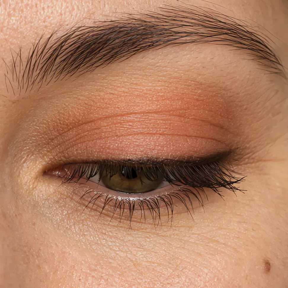
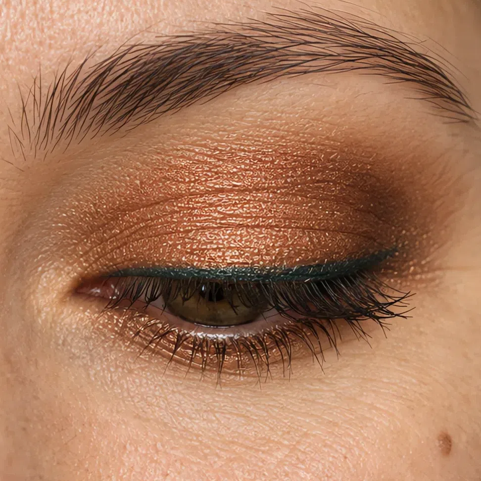
Golden beige stays on the lid, copper shimmer takes the crease and the outer corner, and an antique bronze line sits inside the upper lashes. Copper is the easiest evening color a fair Warm Autumn has: it catches the light like the hair does and makes hazel-green eyes look greener.
 Richest at the outer corner
Center of the lid stays lightest
Lower lashes: outer half only
Apricot on the lid, warm bronze through the crease and past the corner, a teal green line along the lashes. Bronze gives the depth of a smoky eye with gold in it instead of gray, and the teal picks up any green in the iris.
 Richest at the outer corner
Center of the lid stays lightest
Lower lashes: outer half only
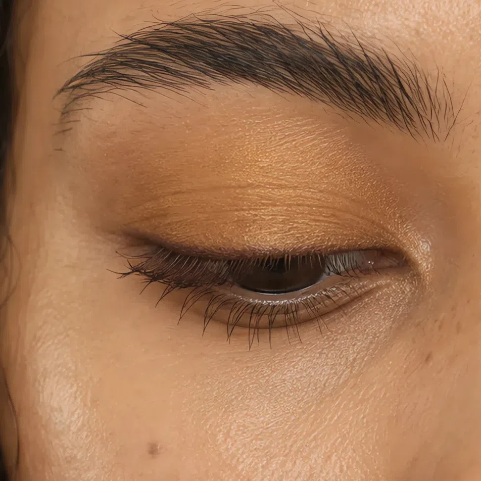
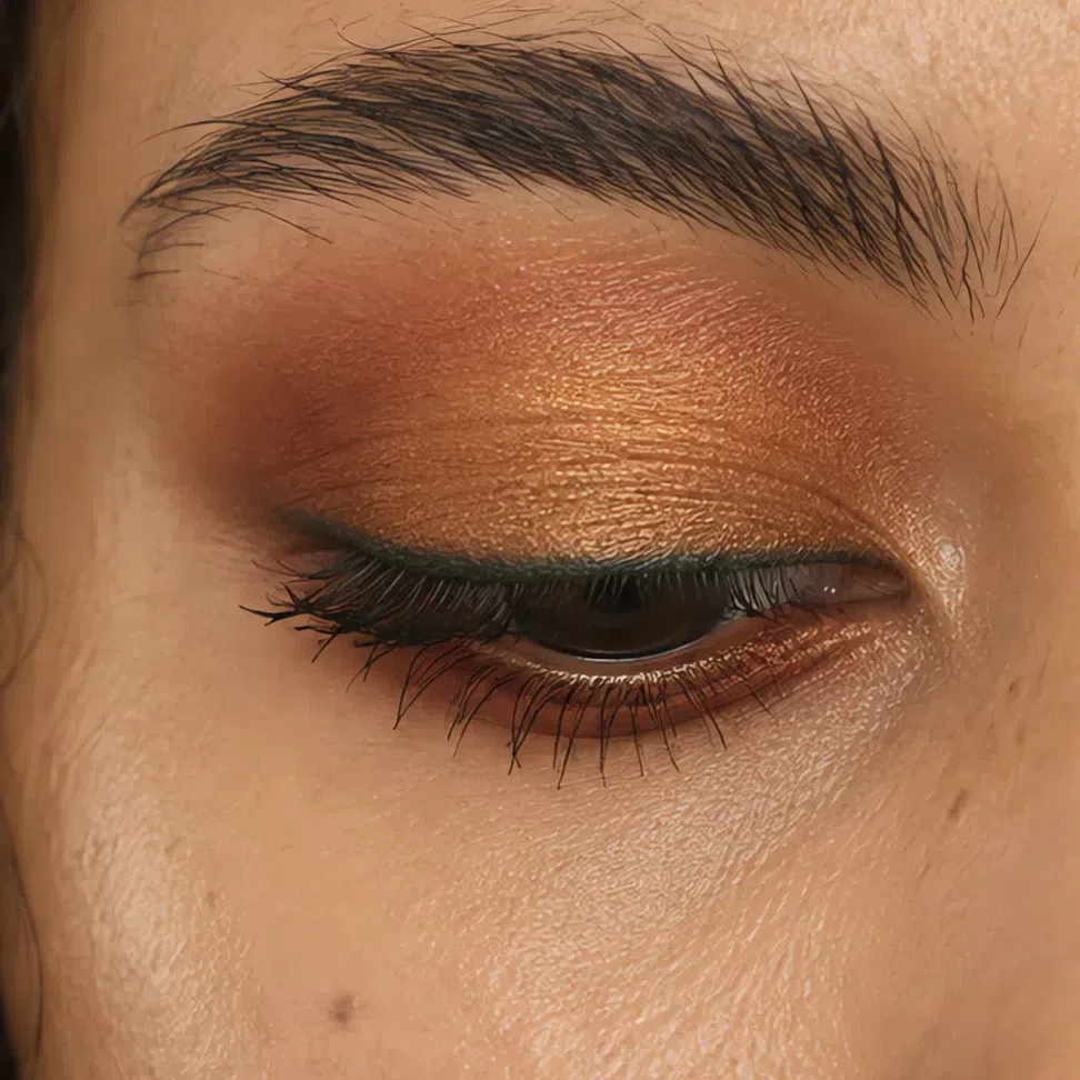
Ochre on the lid, deep terracotta through the crease, teal green along the lashes. Terracotta and teal sit opposite each other on the color wheel, so each makes the other look richer - and neither goes anywhere near black.
 Richest at the outer corner
Center of the lid stays lightest
Lower lashes: outer half only
Khaki olive on the lid, deep moss green round the outer corner, antique bronze along the lashes. On deep golden skin a moss green reads as color rather than shadow, and the bronze line catches the light the way a black one never does.
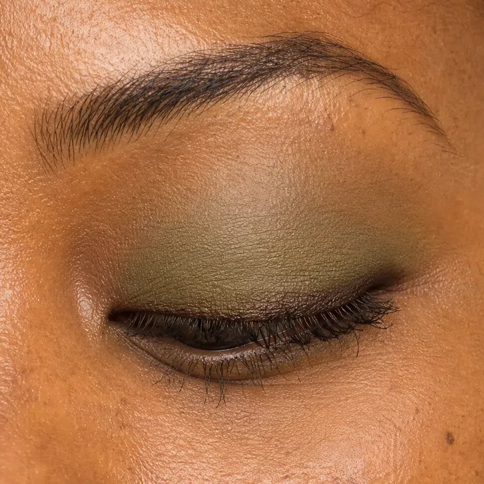
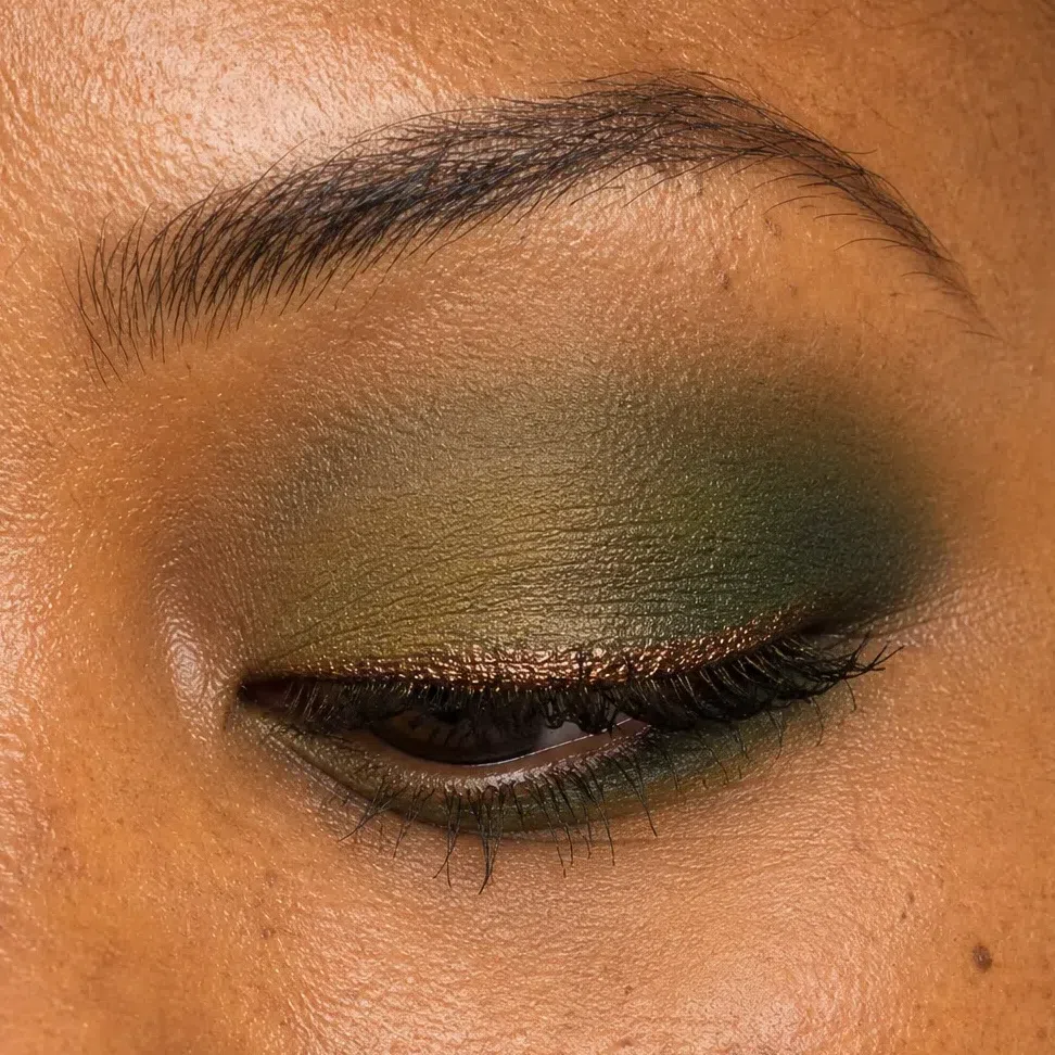 Richest at the outer corner
Center of the lid stays lightest
Lower lashes: outer half only
Lips
The day nude and the evening red share the same warm spice, so switching between them is a matter of depth, not a new choice. The one thing to keep at night is a soft edge.
- Tap the first layer on with a finger.
- Press a tissue to the lips once.
- Add a second layer to the center of the lips only.
- Leave the outline blurred - no pencil line, day or night.
The rule Your depth picks which nude and which red are yours; the hour only decides how much goes on.
Peach nude by day, pumpkin spice after dark. A burnt orange sounds brave and is not, on this coloring: against fair golden skin and copper-blonde hair it looks like it was made for the face.
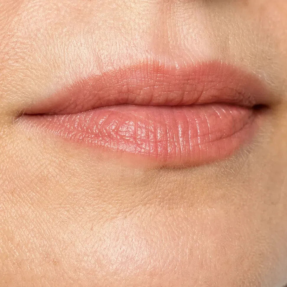
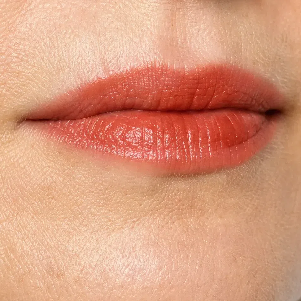 Leave the corner soft
Build through the middle
Caramel nude by day, copper red after dark - a red with orange and brown in it, and the one to own if you only buy one evening lipstick.
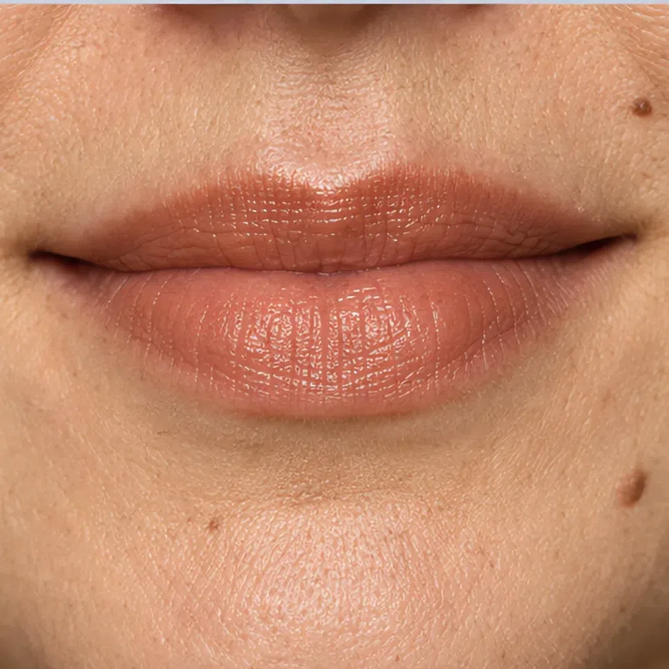
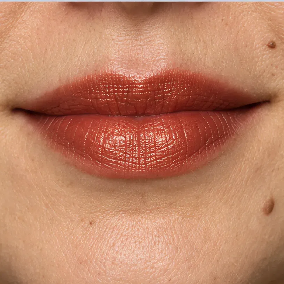 Leave the corner soft
Build through the middle
Terracotta nude by day, brick red after dark. The signature Warm Autumn lip, and on a tan complexion it looks rich rather than dark.
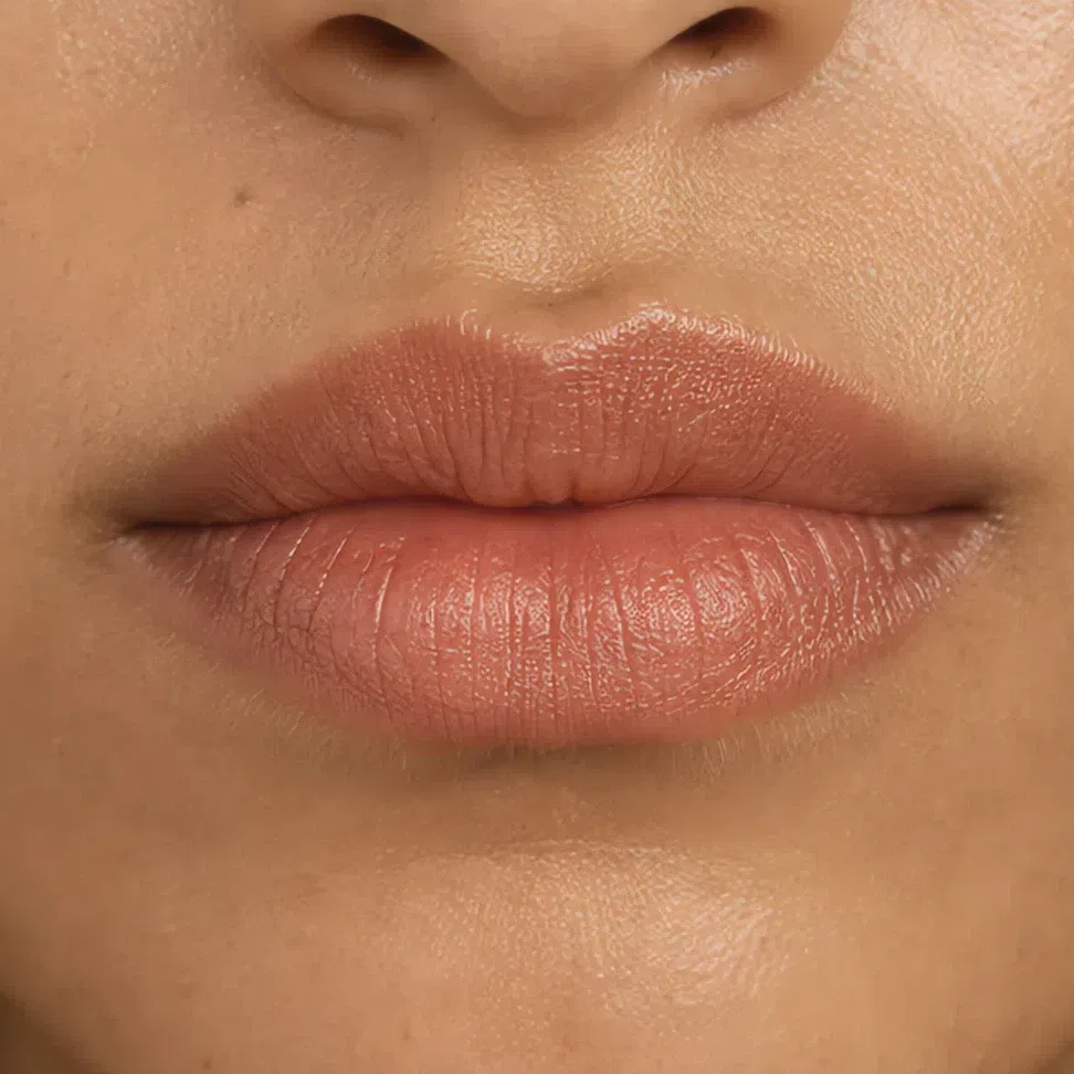
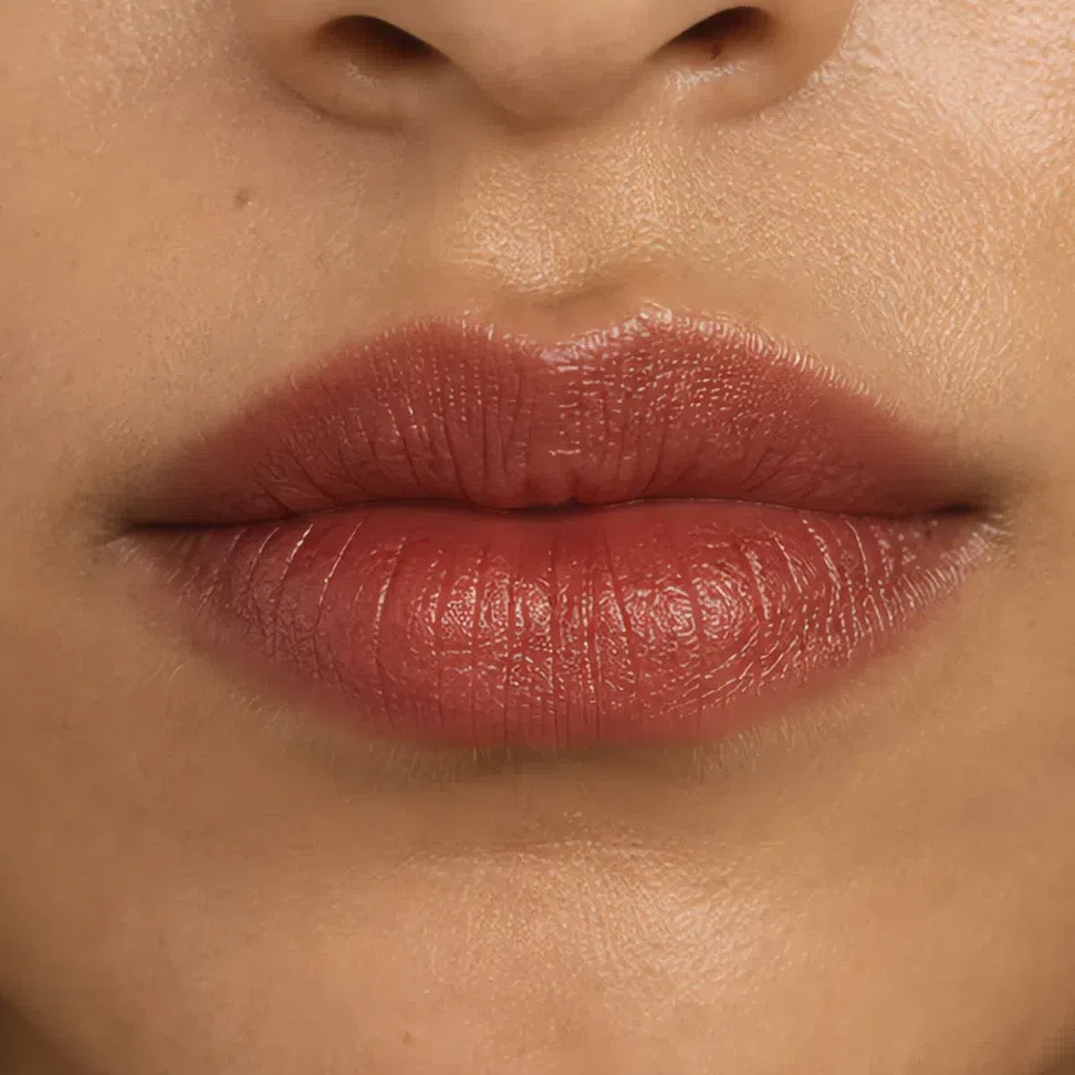 Leave the corner soft
Build through the middle
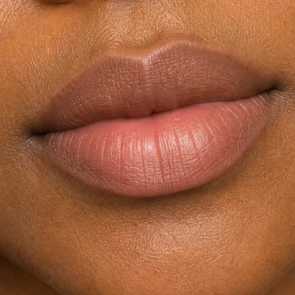
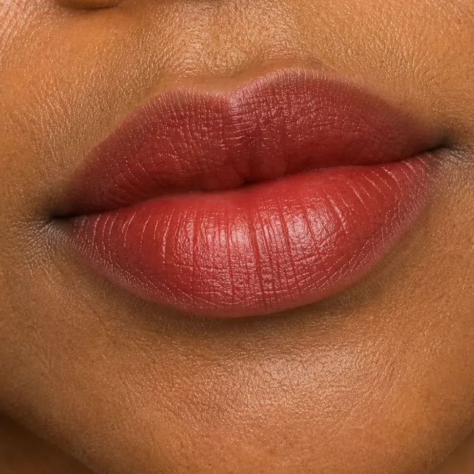
Honey brown nude by day, brick red after dark, the same shade as the row above landing deeper here. For more still, cordovan is on the palette and wears beautifully on this skin.
 Leave the corner soft
Build through the middle
What must not change
It catches the light in the morning and it still should at night. The evening shade frames it; cover it and the eye looks smaller.
Same terracotta or peach, same place, same amount. Deepen the cheek to keep up with a brick lip and the face turns one flat shade of red-brown.
They stay warm and at your hair color. A darker, cooler pencil for the evening puts a hard line above everything you kept soft.
This is not the moment for more coverage. Flash and restaurant light are harsh on a heavy base, and extra powder takes away the glow that carries a copper lid.
The short version: at night go warmer and deeper, never grayer. Whether a shade manages that depends on something its name never mentions.
Why the right shade can still look wrong
Most of the time, the finish is to blame. A product is two things, a color and a surface, and the surface - how much light it sends back, and what color that light is - is the half no box describes. Below: one lipstick on one mouth, shot four ways, the shade unchanged.
One shade, four finishes
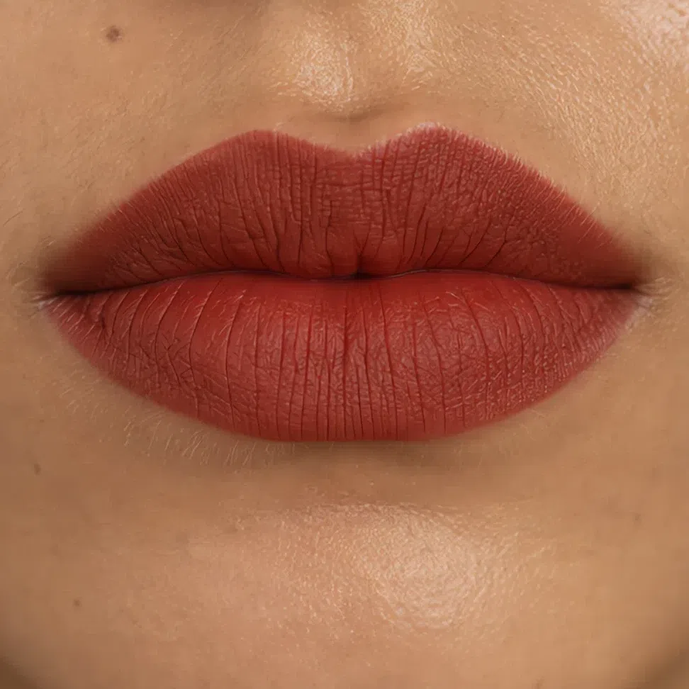
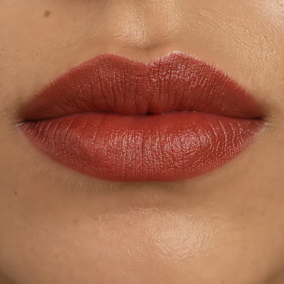
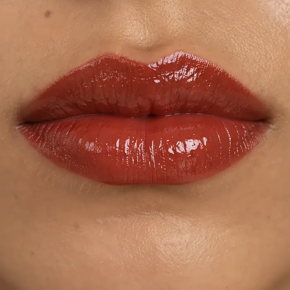
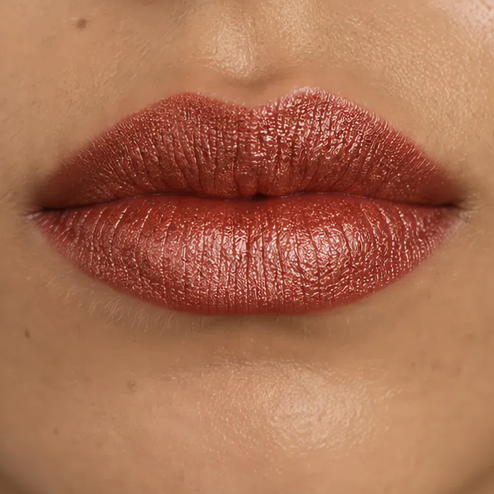
Across those four photographs two things move. The first is the specular highlight, the bright spot a smooth surface reflects straight back: none on matte, a low wide band on satin, a sharp point on gloss, and on frost the whole lip turns reflective.
Second, and this is the one a Warm Autumn has to watch: the color of the shine. Shimmer is made of tiny coated flakes, and the coating decides what they flash. Gold, copper and bronze flakes are this season’s own metals, so a metallic lid is one of the best things this face can wear at night. Silver, icy pink and blue duochrome flakes are cool, and they turn a warm base cold the moment light hits them. In the shop, tilt the pan under a lamp. If the flash is silver or pink, it is the wrong product, however warm the base color looks.
The same question, on skin
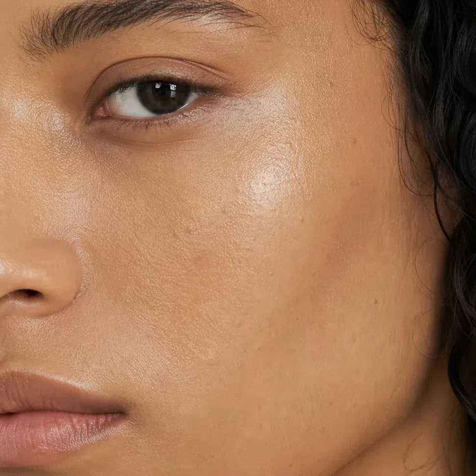
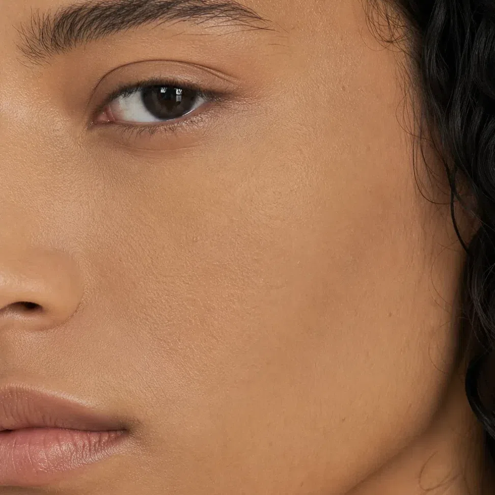
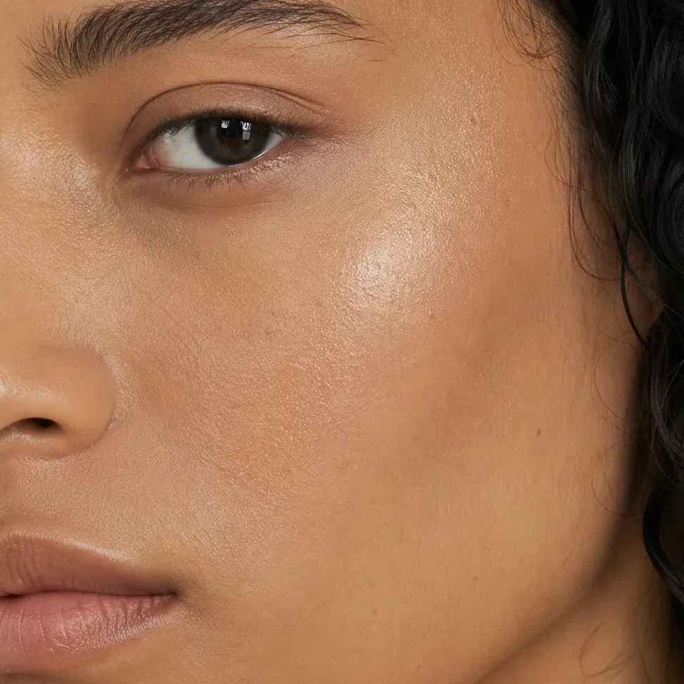
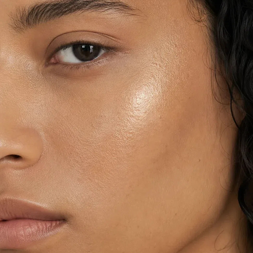
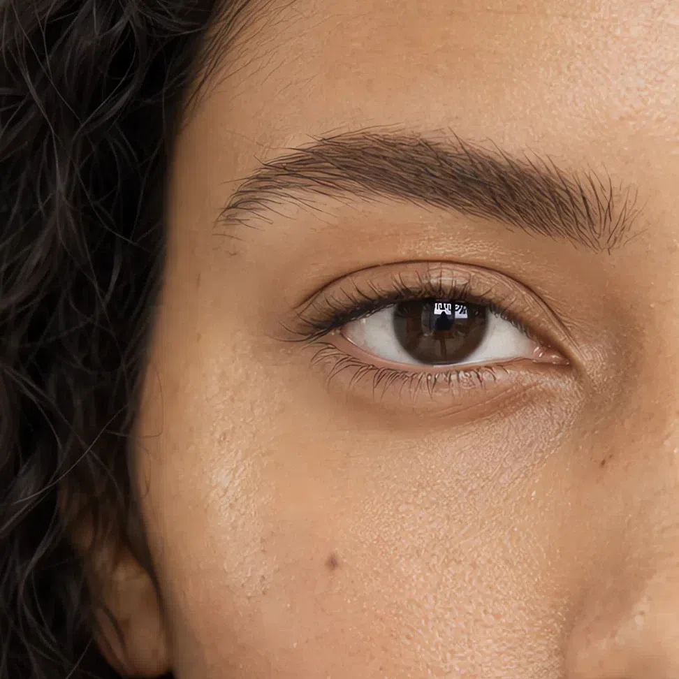
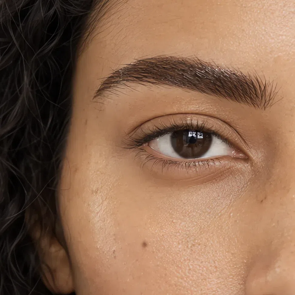
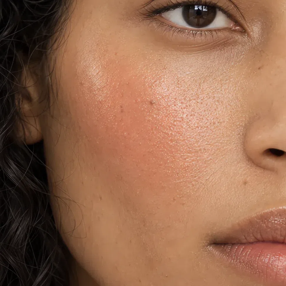
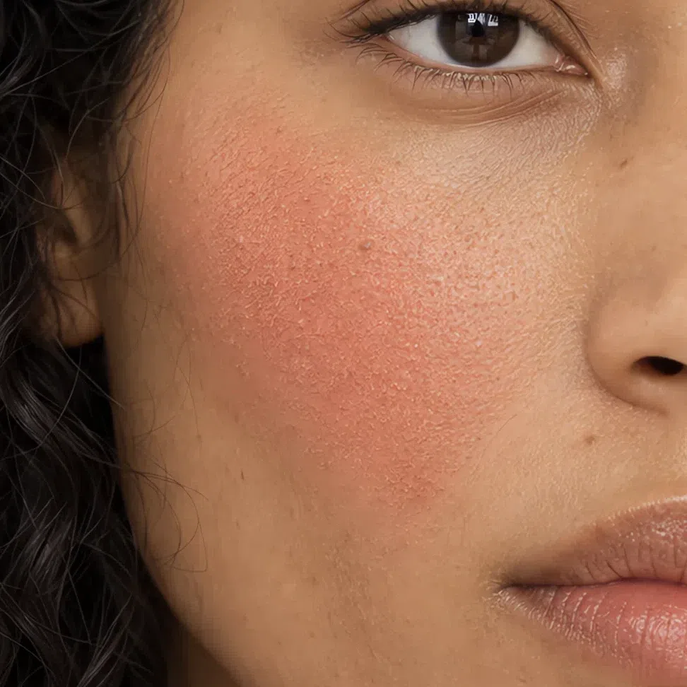
A finish does more on a cheek than on a lip, because skin brings a texture of its own that the product either keeps or hides. In every pair, the left-hand photograph is the one where skin still looks like skin.
What that means, product by product
- Base
- Satin or natural. Full matte takes away the warm glow this skin runs on.
- Blush
- Cream or a soft matte powder, both in terracotta, apricot or golden peach.
- Eyeshadow
- Matte or satin by day; copper, bronze and gold metals after dark. Check that the shimmer flashes gold, not silver or pink.
- Brows
- Powder or a tinted gel, golden blonde to warm dark brown. Never a waxy pencil.
- Lips
- Satin every day, matte for a brick or cordovan, a tinted gloss for shine. Never frost.
- Highlighter
- Gold, peach pearl or bronze, pressed in with no edge. Silver and icy pink sit on top of golden skin like frost.
Fix it with placement, not with more coverage. Powdering everything matte is the obvious move and the wrong one: it takes away the golden glow this coloring depends on, and by the afternoon it breaks up anyway. Set the forehead, nose and chin, leave the cheekbones alone, and carry blotting papers instead of a second powder.
How to get the right one home
All of the above depends on getting the right shade home, which is harder than it sounds. Below: a test that works, the label words worth believing, and why the usual wrist swatch in the aisle tells you nothing.
The jaw test
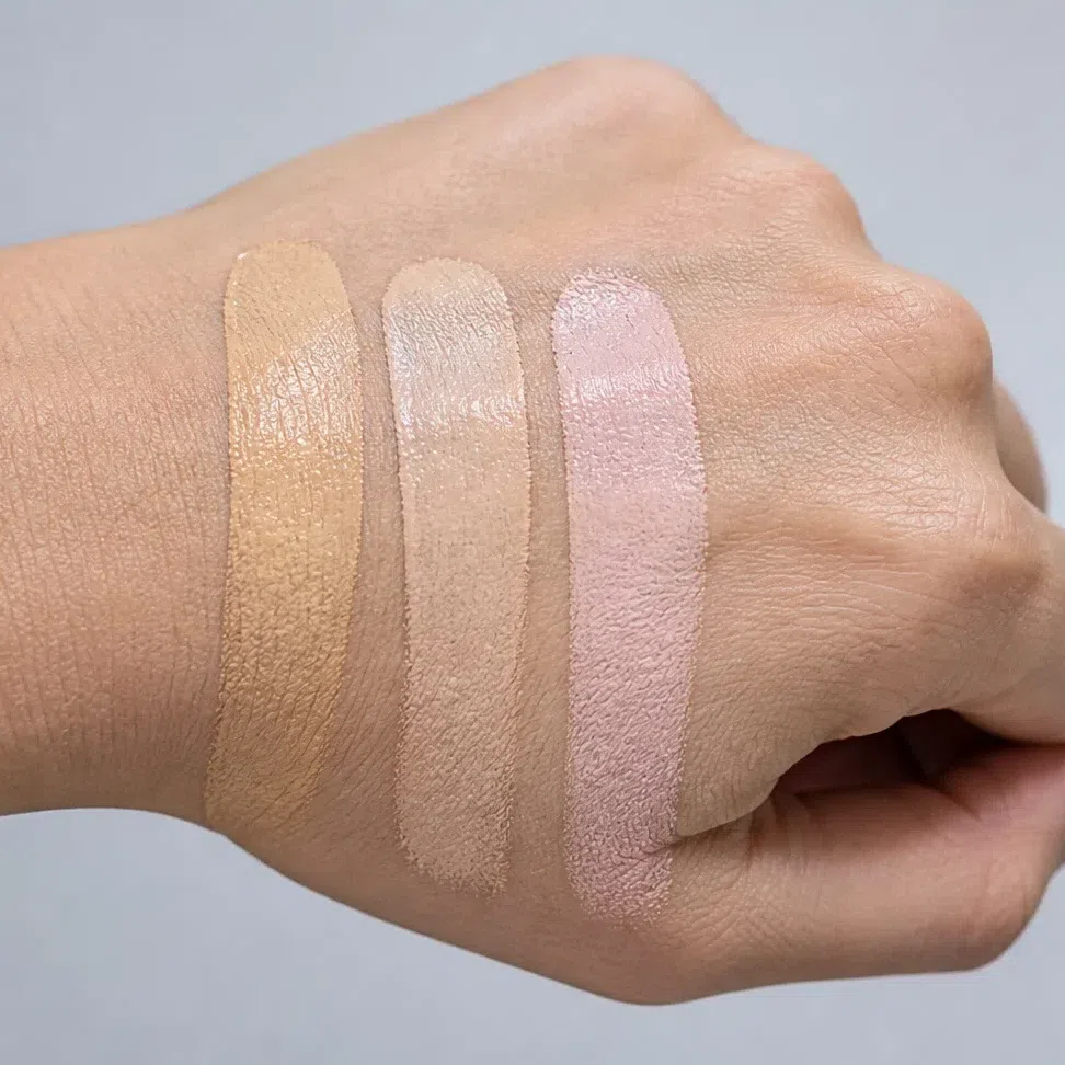
- Paint three candidate stripes from the jawline down onto the neck. Skip the wrist and the back of the hand.
- Blend all three out.
- Walk to a window. Store lighting is warm, and under it a pink-leaning base looks almost golden.
- Buy the one that has vanished - not the nicest stripe, the one you can no longer see.
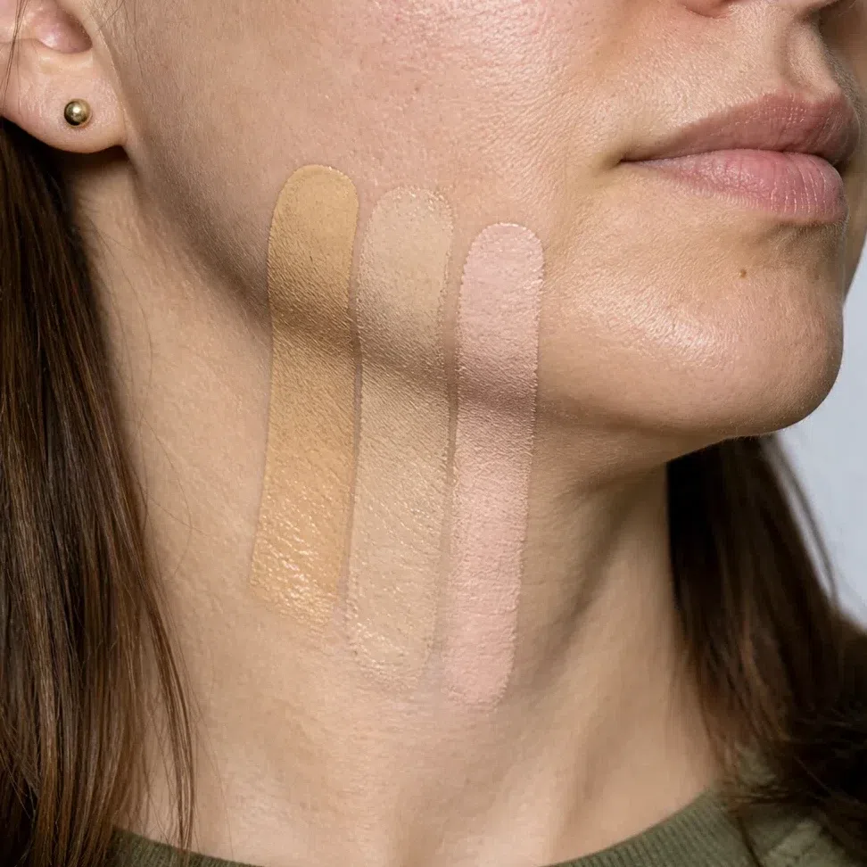
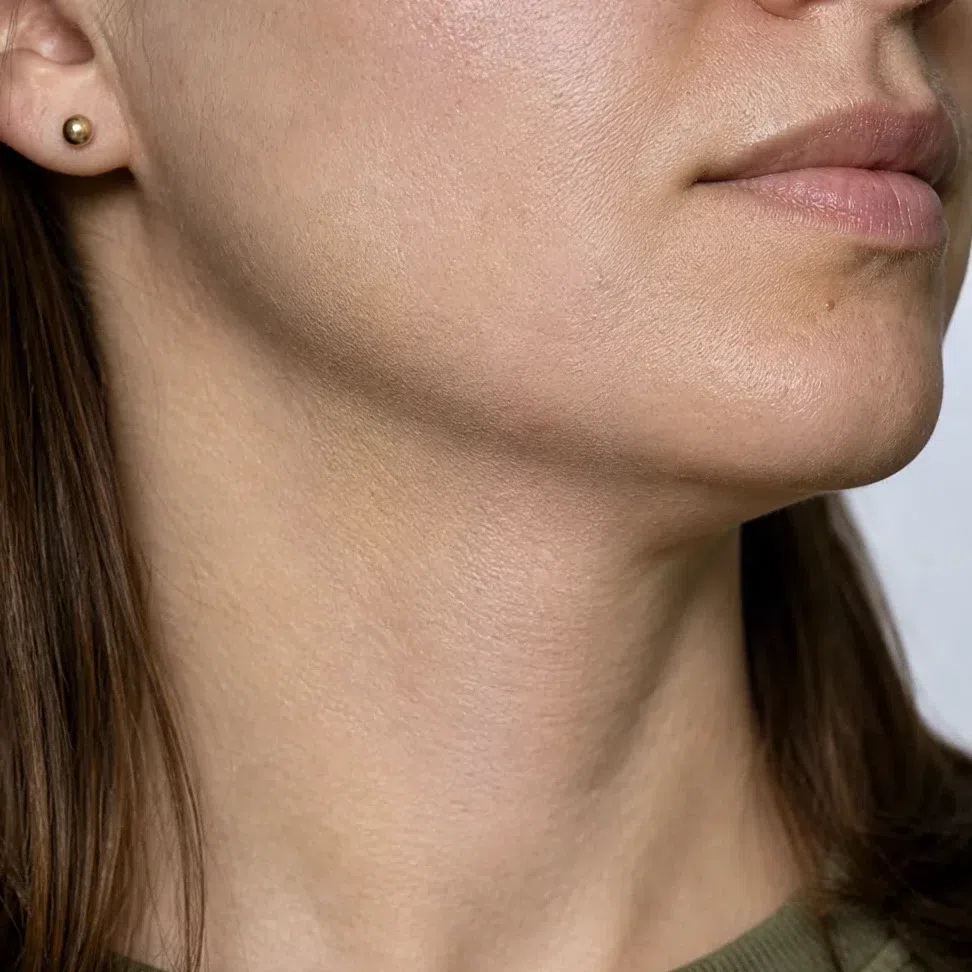
Every foundation shelf is a grid. Here is your square.
Behind every foundation range sits the same grid: how deep down the side, which way it leans across the top. The shelf rarely shows it, the shade finder always does. Below is that grid with only the Warm Autumn squares outlined.
The request never changes: one undertone letter, at your own depth. A warm ivory Warm Autumn and a warm cocoa one want the same letter with a different number, so what you ask for is your depth plus warm, never a shade name lifted from an ad.
A word on the chart itself. The warm squares are this site’s values, not any brand’s: the same letter comes out slightly differently in each range, and depth numbers mean nothing from one brand to the next, so no chart lets you order a shade unseen. The cool, neutral and olive squares are illustrations, made by pushing your warm shade toward the other undertone and naming it the way a shelf would, so a wrong letter is easy to catch. Neutral is a maybe: if one looks golden on you, count it as warm and let the jaw test decide.
Reading a shade name
For a Warm Autumn the "put it back" list is almost all temperature, which makes it easy to read - until you meet the soft words. Nude, natural, neutral and beige say nothing about undertone, and in most ranges the default nude is a pink-beige. Treat them as a question, not an answer: the jaw and the window settle it. The words that do carry warmth are the foods and metals - honey, caramel, spice, bronze, copper.
What the finish words on a label actually mean
- Satin, natural, second-skin
- The everyday answer.
- Radiant, luminous, glow
- Yours, as long as the glow is golden. Tilt it under a light and check the flash before you buy.
- Demi-matte, soft matte, velvet
- Fine on this coloring, and classic on a brick or terracotta lip. Keep the cheekbones out of it.
- Metallic, foil, chrome
- A copper or bronze foil on the lid is one of this season’s best evening eyes. Silver or rose-gold chrome is a different product with the same word on it.
- Frost, pearl-finish, iridescent
- Put it back. Dense pearl is white or silver pigment, and on golden skin it reads as frost.
Judging a swatch photo online
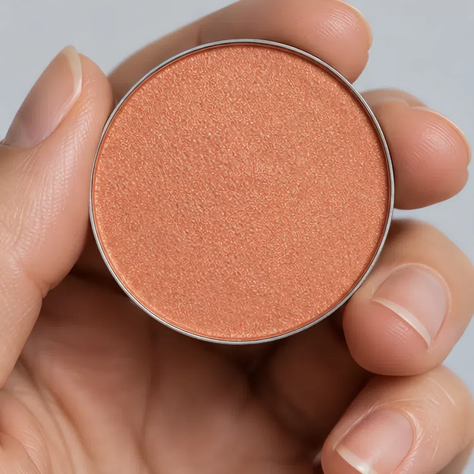
Product photos are lit to sell: bright, even and a touch warm. That light hands every shade a little gold it may not have, so a rose-beige photographs as a peach and a cool brown as a warm one. Warmth is precisely what you are shopping for, so on a screen the right shade and the wrong one can look identical. Two habits help: believe a swatch on skin over one in a pan, and believe a photo with a shadow across it, since the undertone shows where the light falls off.
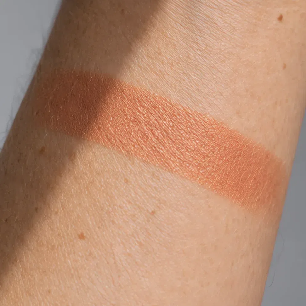
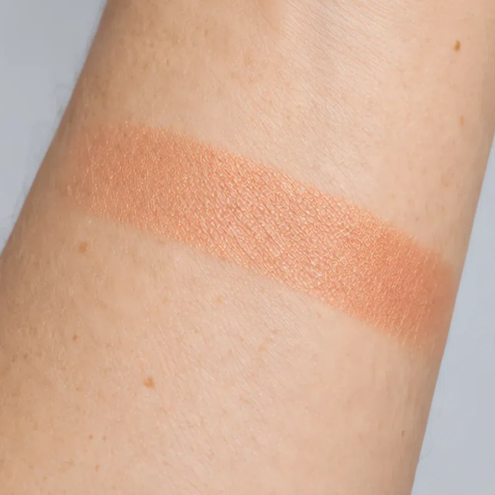
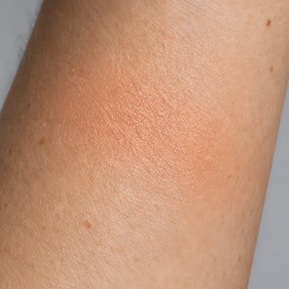
Makeup ranges get reformulated, renamed and dropped every season, so a product list goes stale from the day it is posted, and every out-of-date pick is money someone spends. Hexes, label words and the jaw test have no expiry date: they work in any store, including on ranges launched after this page.
When it does not work
You have the shades, the order, the finishes and a way to buy them. This last part is troubleshooting, for the morning a face looks wrong and the reason is not obvious.
Two ways it goes wrong
You look sallow, or a bit gray
- What it looks like
- The skin looks yellow-green around the mouth and gray under the eyes, even with concealer on. People ask if you slept badly. It is worse in daylight than under warm indoor light.
- Why
- Something cool is on the face: a pink-toned foundation, a silver highlight, a baby pink cheek, a blue-red lip. Golden skin next to a blue base does not look calmer; it looks yellower, the way a cream wall looks dirty next to a bright white one.
- Fix
- Warm it up, product by product, starting with the base. Golden instead of pink, gold instead of silver, terracotta instead of pink, brick instead of blue-red. The face should look like it has been in the sun, not under a fluorescent tube.
Everything is brown and it looks muddy
- What it looks like
- A bronze lid, a brown lip, bronzer everywhere, matte from forehead to chin. Each product is warm and on the list, and together they flatten the face into one color with no light in it.
- Why
- The over-correction. Readers who learn they are warm often swap everything for brown, then go darker still to look finished. Warm Autumn is rich, not dark: its palette has pumpkin, olive, teal and gold in it, and a face made only of brown loses the color that makes the season.
- Fix
- Keep it warm and bring back light and color. One sheen - a copper lid or a peach pearl on the cheekbone - and one clear color: a pumpkin or copper-red lip, a teal line. Drop the second brown, not the warmth.
And the shades that never work
Every swatch below misses for one of three reasons, named on its tag. Once the three make sense the list stops being necessary: any new product will show you which of them it is making.
Base and glow
- Pink-toned porcelain base cool
- Silver highlighter cool
- Gray-taupe contour dull
- Gray-beige setting powder dull
Cheeks
- Baby pink blush cool
- Fuchsia blush cool
- Dusty mauve blush dull
- Plum blush heavy
Eyes
- Icy lilac shimmer cool
- Cool taupe shadow dull
- Charcoal smoke heavy
- Black kohl all round heavy
Lips
- Blue-red cool
- Cool berry cool
- Mauve nude dull
- Black-cherry heavy
Why each one fails
- coolToo cool
- Pink-based, blue-based, silver, icy, lilac. This is the warmest coloring there is, and the cool shades fail on it first and hardest. They leave the skin looking sallow by comparison, starting at the jaw. It is the most common tag on the list for a reason.
- dullToo dull
- Gray-taupe, greige, dusty mauve. Muted shades belong to Soft Autumn; on this face the gray in them reads as tiredness, and the warmth in the skin has nothing to meet.
- heavyToo heavy
- Black, charcoal, plum, black-cherry. Warm Autumn goes deep - cordovan and forest green are on the list - but its depth is always brown or red, never black. A blackened shade is darker than the hair and the eyes, and it takes over the face.
Only the tags matter here; each swatch just illustrates its mistake, and its hex is an example rather than a measured product. If the dull ones fill most of your makeup bag and they suit you, read Soft Autumn, which carries muted warmth well. If black liner and black-cherry lips are what flatter you, read Deep Autumn, the darker neighbor.
Your shades, in one block
Every shade from this page in one place, sized for a screenshot you can hold up at a counter. Foundation, bronzer and highlighter go by depth: find your row and stop there. The other families run from the fairest Warm Autumn on the left to the deepest on the right, and you land somewhere along each row.
Base: foundation, bronzer, glow and blush
- Fair - warm ivory Fair #F3E0CE
- Light - golden beige Light #E3BE93
- Medium - honey caramel Medium #B98A56
- Deep - warm cocoa Deep #7A5035
- Fair - soft golden brown Fair #C9A27A
- Light - warm golden brown Light #A87141
- Medium - terracotta bronze Medium #9C5A38
- Deep - dark copper bronze Deep #6E4028
- Fair - golden champagne Fair #EFE0BE
- Light - warm gold Light #F2D9A0
- Medium - peach pearl Medium #F7D6BE
- Deep - bronze glow Deep #D8AC78
- Golden peach blush #F0BE8E
- Apricot blush #F3B282
- Grapefruit #E57F5F
- Terracotta blush #C9714F
Eyes: shadow, liner, mascara, brows
- Golden beige lid #E0CBA8
- Apricot lid #EAB183
- Ochre lid #C79A4E
- Khaki olive lid #8F8A5E
- Copper shimmer #B5652F
- Bronze lid #96703C
- Terracotta lid #97472C
- Moss green lid #4E5B34
- Antique bronze liner #8A6230
- Teal green liner #2A6158
- Forest green liner #33452C
- Chocolate liner #4A3122
- Bronze mascara #8A6338
- Brown mascara #6B4A32
- Chocolate mascara #46301F
- Soft black-brown mascara #2B221C
- Golden blonde brow #B99664
- Copper auburn brow #A0603A
- Chestnut brown brow #7A5334
- Warm dark brown brow #56392A
Lips: nudes and color
- Peach nude #E9A98C
- Caramel nude #B9805E
- Terracotta nude #B8705A
- Honey brown nude #A0724A
- Pumpkin spice #D2571E
- Copper red lip #B94A2C
- Brick red #9E3B2C
- Cordovan #842B2B
Two rows are not depth ladders. Eyeliner is four colors that suit every complexion - antique bronze, teal green, forest green and chocolate - and chocolate is the daily pick for all of them. Brows track your hair rather than your skin: take the shade that matches your hair or one lighter. Evening eyeshadow runs copper to moss by depth, but all four are the same metals and earths, and any of them works for anyone at night. The base on four real complexions, and the clothing palette behind all of this, are on the palette page. The full Warm Autumn palette →
Questions people ask
What makeup colors should a Warm Autumn wear?
What is the best lipstick color for a Warm Autumn?
What makeup should a Warm Autumn avoid?
Is True Autumn makeup the same as Warm Autumn makeup?
Should a Warm Autumn wear gold or silver shimmer?
Can a Warm Autumn wear black eyeliner?
Warm Autumn, Soft Autumn or Deep Autumn makeup - what is the difference?
What if my skin falls between two depths?
Which brands make Warm Autumn makeup?
Where this came from
Six sources, and what each supports: that makeup works by changing facial contrast, and that too much of it ages a face; what a flush is; why depth and undertone are two separate things a base must match; how we see gloss; and why store lighting hides a cool foundation.
-
Aspects of facial contrast decrease with age and are cues for age perception (opens in a new tab)
Porcheron, Mauger & Russell, PLoS ONE, 2013
Behind the idea this page rests on. Facial contrast - how far the eyes, brows and mouth stand out from the skin - can be measured, makeup raises it, and people read it as a cue to age. A Warm Autumn face has medium contrast built from warm browns and copper, never from black. That is why chocolate and forest green do the work of a black liner here, and why the depth this face carries is always a warm one.
-
Differential effects of makeup on perceived age (opens in a new tab)
Russell, Batres, Courrèges et al., British Journal of Psychology, 2019
Behind everything is brown and it looks muddy. In controlled photographs, makeup made women in their forties and fifties look younger and women of twenty look older. Contrast pushed past what a face carries reads as age - the mechanism behind a black rim or a face made entirely of dark bronze, and why the fix is light and color rather than more depth.
-
Skin blood perfusion and oxygenation colour affect perceived human health (opens in a new tab)
Stephen, Coetzee, Law Smith & Perrett, PLoS ONE, 2009
Behind the cheeks step. Asked to make a face look as healthy as possible, people add the color of oxygenated blood under the skin. Blush imitates that flush, and on golden skin the flush comes up peach and brick - which is why a terracotta reads as color from inside and a blue-pink reads as a patch on top.
-
Non-invasive measurements of skin pigmentation in situ (opens in a new tab)
Stamatas, Zmudzka, Kollias & Beer, Pigment Cell Research, 2004
Behind the two axes of the shade grid. Skin color carries two signals: melanin sets the depth - your row - and hemoglobin adds its own, and the two have to be separated to measure either. A base must match both, which is why a golden undertone is a column you choose, not something a darker shade fixes.
-
The dark side of gloss (opens in a new tab)
Kim, Marlow & Anderson, Nature Neuroscience, 2012
Behind finishes. We read gloss from specular highlights and their dark counterparts, and the effect disappears when they are blurred. Satin spreads the highlight into a soft band, which is why it is the easy finish on this rich coloring; a frost scatters light into a pale film, which is why it sits on golden skin like frost on a window.
-
CIE 13.3-1995: Method of measuring and specifying colour rendering properties of light sources (opens in a new tab)
International Commission on Illumination (CIE), 1995
Behind the jaw test in how to shop. Light sources are rated on how faithfully they render the colors under them, and shop lighting rates low. Warm store light flatters every golden foundation on the shelf and hides a pink one, so the test belongs at a window.
Where the line falls. The contrast research, the skin biology, the gloss perception and the lighting standard above are sourced. Which shades belong to a Warm Autumn, which suits which depth, and where rich turns into muddy for this coloring are our own analysis, built from the palette on the parent page. No study covers that, and we would rather say so than borrow a citation that does not.